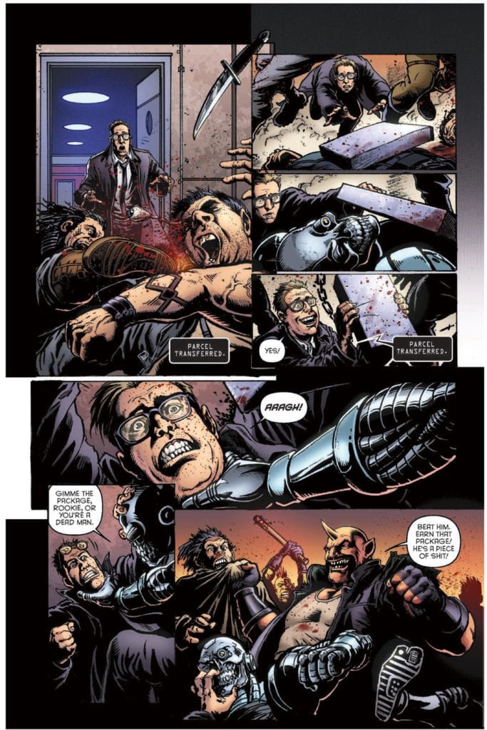
Humanoids’ Space Bastards #1 is a lot to stomach. It’s the dark comedy sci-fi we all wish we’d thought of. Writers Eric Peterson and Joe Aubrey, with artist Darick Robertson, colorist Diego Rodriguez, and letterer Simon Bowland show us a world that makes just a little too much sense. In Space Bastards, members of the Intergalactic Postal Service must do anything to get their package delivered. That includes maiming, killing, and otherwise fucking up anything or anyone that gets in their way. In fact, the more bloodshed there is, the bigger the paycheck.
Writing
Peterson and Aubrey’s script might seem wild, but it’s also incredibly simple. Violent postage people in space. That’s all it is. But it’s a simple idea that goes a long way. Part of what makes this script work is the bridge Peterson and Aubrey make between the new and the familiar. Sure, the whole Intergalactic Postal Service is new to us, but a violent, deadly, mean veteran of the service, like Manny “The Manicorn” Corns, is something we’ve seen before. He’s the unlikely mentor of our wide-eyed protagonist, David S. Proton. Proton, down on his luck and out of a job, is desperate for things to go right for once. It’s the basic set-up for any good script. But Peterson and Aubrey don’t stop there. They lull us into believing it’s a typical story and then pulls out all the stops. It’s a raucous first issue that promises to be as unpredictable as it is bloody.
Art
Robertson brings all of his famous grit and gore to Space Bastards. Whether it’s someone splattering on a sidewalk or getting knifed in the back, readers know Robertson’s the right man for the job. But Robertson does more than create a great death scene… or death scenes. He shows just how different David S. Proton and Manny are from one another. On every page, Manny looks like a damn giant. He is huge, and the terrified faces of every other character seeing him confirms that. But Proton is just one of the many characters who are running scared. He not only looks sweaty and pale, but he looks small. Robertson shows him peeking out from behind Manny’s head or getting up off the ground. He’s smaller on the page than Manny, and he’s almost always pictured beneath Manny too. Robertson shows us clearly who wears the pants in this partnership and has fun doing it.
Coloring
This entire issue is colored in just three colors. Rodriguez uses hues of orange, blue, and occasionally green to show us the world of Space Bastards. And it’s pretty clear what each of these colors stands for. Manny walks around, orange-skinned and raining destruction down on whoever gets in his way. Proton, in his blue suit, squeamishly gets through whatever comes his way. But the both of them are slaves to the green lights of the Intergalactic Postal Service’s armbands. The green lights of their screens are the futuristic version of a green dollar bill. And so Space Bastards becomes a fantastic combination of blue cowardice, orange chaos, driven by the green of greed.
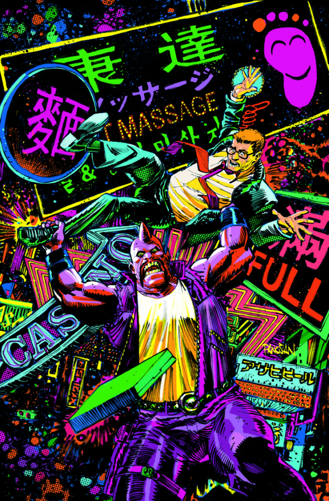
An awesome Black Light Variant Cover by Dan Panosian
Lettering
Bowland makes a point of keeping much of the dialogue together. Instead of large paragraphs being told in multiple word balloons, they get delivered in one big chunk. At first, this seems a little weird, but it makes sense as you read what’s actually being said. The world of Space Bastards is crazy. The kind of crazy that you just have to push through. So when David S. Proton is being told the details of the job he’s just signed up for, the people walking him through it don’t give the instructions much room to breathe. That’s because every moment Bowland gives us a pause is an opportunity for Proton to turn tail and run. Bowland really showcases how wild this world is by showing how quickly characters have to convey information, so no one has time to think about it too much.
Space Bastards is about as crazy as it sounds. It’s a blood-splattered charge across the galaxy, with lots of parcels to deliver. Check it out if you like dark comedies and have always wished they’d be in space. Pick up Space Bastards #1, out from Humanoids on January 13th, at a comic shop near you!
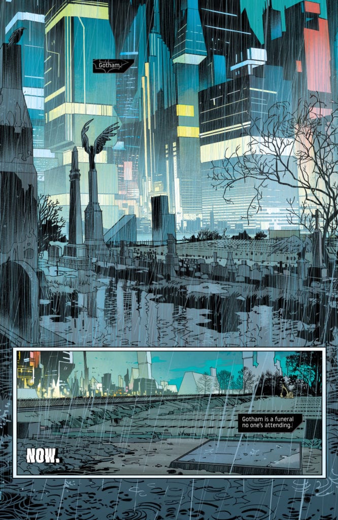
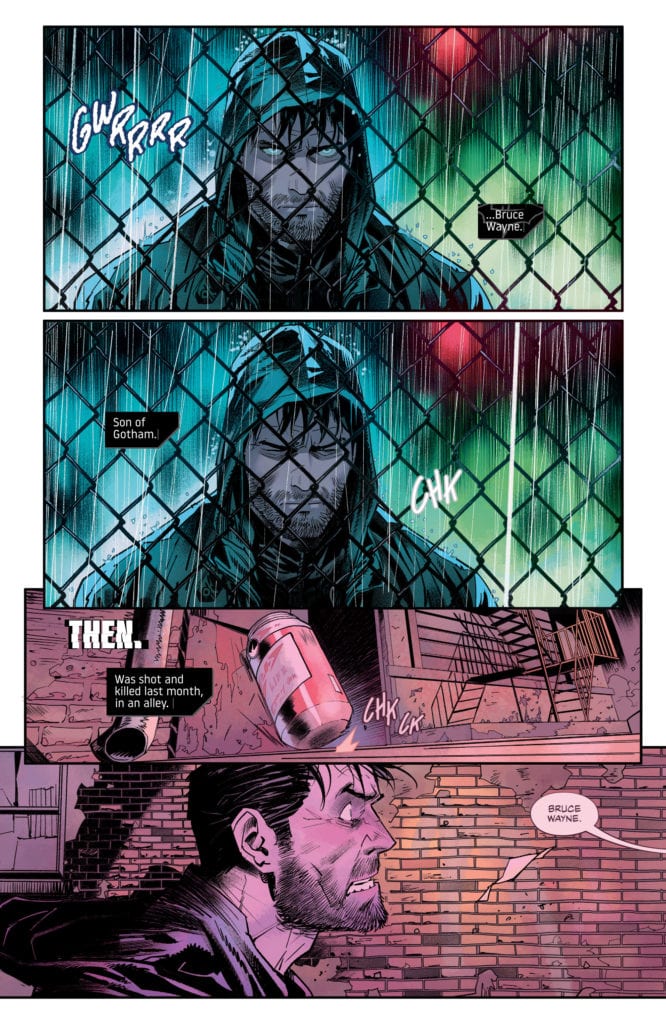
Dead looks good on Bruce Wayne. That’s because Batman’s character is always at his most entertaining when he’s backed against a wall. Plenty of creators have found new ways of doing this. Take his fortune, take his loved ones, take his sanity. But writer Mariko Tamaki, artist Dan Mora, colorist Jordie Bellaire, and letterer Aditya Bidikar have crossed even more lines in DC Comics’ Future State: Dark Detective #1. They’ve taken his life.
Writing
Tamaki immediately sets the tone, seamlessly and brilliantly. “Gotham,” she begins with a caption. “Gotham is a funeral no one’s attending.” Her false start says everything. It’s a sentence the speaker doesn’t have the energy to finish. And that’s the entire theme of this story. A Gotham City that’s even more rundown than we thought possible. People who somehow care less than they did before. And Tamaki leaves us wondering if Bruce Wayne cares anymore either. Is he fighting to save Gotham, or is he merely fighting to survive? Tamaki doesn’t answer these questions. She pulls back the dialogue and the captions, leaving the large pauses in between ripe with subtext. Tamaki shows, she doesn’t tell, and Dark Detective #1 is beautifully mysterious for it.
Art
Mora has always been a fantastic artist. But he pushes himself to new heights in this issue. His gritty images of Bruce running through the shadows are juxtaposed against his cleaner panels on billboards and in restaurants. Mora also gives this issue a sense of flow. Like ending one paragraph with a transition to the next, but instead with images hinting at the next scene. A girl getting ketchup on her hands in a fast food joint is followed by Bruce’s bloody fist as he bangs against a door. A neon image of Batman in his prime gives way to a picture of Bruce Wayne on a billboard. Mora isn’t just drawing a comic. He’s creating a visual essay, linking themes together and transitioning from point to point with subtlety and precision.
Coloring
Bellaire has been the colorist behind some of comics’ greatest hits. So it means something when I say that Dark Detective #1 is some of her best work. Everything in this version of Gotham is washed in neon lights. It’s both beautiful and claustrophobic. We don’t get to see characters as they are; we see them under Gotham’s bright “shadow.” Bellaire associates these neon colors with the new tyrannical villain, the Magistrate. So when Bruce is in danger, Bellaire underlines it with another neon yellow panel. It’s a visual warning sign, telling Bruce to run. And the few times we do see characters without a neon hue, it’s equally depressing. Bruce, on his own in an alley, looks left out in the cold. He may be free, momentarily, from Gotham’s neon eyes, but his lack of color makes him look pale with fear. We’re not left confident, exactly, that Bruce will get out of this one unscathed.
Lettering
Bidikar makes this issue fun and terrifying all at once. They punctuate moments like Bruce falling from a building. The “KRASH” exploding from the bottom of the panel gives us a sense of Bruce’s pain. But Bidikar also creates a sense of urgency. When Bruce is suddenly being followed by the Magistrate’s drones, Bidikar gives us a sense of how close they are from their dialogue. “STOP ALL MOVEMENT!” shows up in large letters at the bottom of a page out of nowhere. The drones are on top of him. But as Bruce begins to get away, their dialogue shrinks. And then, of course, as they begin to catch up with him again, their dialogue gets bigger. It’s Bidikar’s way of showing how close the danger is and getting us on the edge of our seat for what could have otherwise been a forgettable chase sequence.
Grifter in “No Future Past, Pt. 1”
Writing: 3.5/5
Art: 3.5/5
Coloring: 4/5
Lettering: 2/5
Writer Matthew Rosenberg, artist Carmine Di Giandomenico, colorist Antonio Fabela, and Andworld Design lettering brings us a chaotic look into Cole Cash’s life, AKA Grifter. As if Grifter’s life wasn’t chaotic enough, he now lives in a dystopian Gotham, so on the brink, he’s starting to look more and more like a good guy by comparison.
Writing
Rosenberg certainly understands a character like Grifter. We see Grifter living from one moment to the next, never really thinking of the future. “Friends of yours?” Luke Fox whispers to him as they come to face-to-face with a new character. “Not sure,” Grifter whispers back. He constantly improvises and has a short term memory when it comes to his mistakes. If Rosenberg had been a little more restrained with his script, trusting the reader to connect some dots instead of connecting them himself, this storyline would have hit home brilliantly. Rosenberg has these characters’ voices down pat; he needs to trust that his premise is already clearly set up between the lines.
Art
Di Giandomenico creates little moments of order in the chaos. At one point, as Grifter stabs a thug in the chest, Di Giandomenico draws an action line from the knife in one panel to it hitting its mark in the next. And in a bustling prison car, it’s not the kicking and screaming we notice, but the casual smile on the prisoner’s face. Unfortunately, we don’t get many opportunities for these little moments. Many of these pages are chock full of gunfights and chase scenes. While they are exciting, there isn’t always much to focus us in on. Di Giandomenico creates action and chaos often in these pages, but it’s the brief seconds of order that shine.
Coloring
Fabela’s color palette is quite reserved in this storyline. Despite big explosions and crazy gunfights, much of the story is red or blue. It flies in the face of the subject matter of the story. But it makes sense. This is a world that is controlled. Fabela shows us what Grifter and Luke Fox are fighting for, or at least what they’re fighting against. The oppressive simplicity of each page speaks of the micromanagement of the Magistrate and his allies. So, with a few flashes of yellow and a splash of purple, Grifter and Fox hope to get back to the colorful world they’ve lost.
Lettering
It’s hard to find much to praise in Andworld Design’s lettering. With massive blocks of text being delivered in singular word balloons, there’s no sense of rhythm or tempo. And the robotic looking “BLAM” sounds of guns going off get repetitive and boring quickly. Occasionally, though, Andworld Design makes an interesting choice, a choice you can hear. “Yo, you’re Cole Cash?” a thug says. “You’re dead,” follows it up, in a connected balloon. That’s a pause you can hear, and it has a terrifying effect. But frankly, much of the rest of the story feels impersonal and robotic. Mostly, it’s a story you’re reading with your eyes, not hearing in your head.
DC Comics’ Future State: Dark Detective #1 is definitely worth the read. Tamaki, Mora, Bellaire, and Bidikar’s story is a perfect introduction to this dystopian world. While Rosenberg, Di Giandomenico, Fabela, and Andworld Design’s story stumbles a little, it’s still an action-packed blaze of glory through DC’s new Future State. Pick up DC Comics’ Future State: Dark Detective #1, out January 12th, at a comic shop near you!
Announced last week, George Salinas of Bridge Works Entertainment has partnered with Ivan Plaza, owner and founder of the Latinx comic book publisher, Chido Comics, to produce their next TV and film titles. No timetable was announced but the partnership will bring new premium television series and films to the U.S. audience, according to the press release.
“Latinx culture has a lot to offer with many great artists coming up not being able to be seen,” Salinas explains. “We don’t have much representation to speak from in these areas, but I see the hunger of the industry to give us a platform. We need to create these platforms to develop and nurture the talent on every side.”
Chido Comics is a boutique publisher that has produced The Masked Republic Luchaverse and the Lucha Underground Comics. Next up for the publisher is the original mini-series, COQUÍ written by Plaza, with art by Matteo Illuminati, and letter work by Carlos M. Mangual.
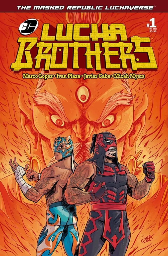
Chido Comics titles
Masked Republic Luchaverse: Lucha Brothers #1 They are arguably the greatest tag team in modern-day Lucha libre. Brothers Penta Zero M and Rey Fenix, were orphaned at birth and raised by missionaries who traveled the world teaching them about a multitude of cultures… and each one’s fighting style. Now, as adults, simply being one of the greatest luchadores isn’t enough for Penta! With the help of his brother, he has found the location of an ancient power that he believes can make them the greatest warriors the world has ever known!
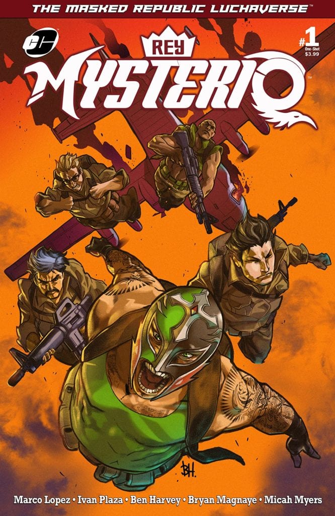
Masked Republic Luchaverse: Rey Mysterio #1 The current in a family of Mysterios that dates back centuries, each one trained to be a champion of the people and to take on a great evil that has been prophesied to return and plunge the world into darkness. Rey Mysterio is on a quest, aided by the military clandestine group known as “The Ambassadors.” The mission is clear: retrieve the one thing Rey will need to take on this returning evil… THE MASK OF THE FIRST MYSTERIO!
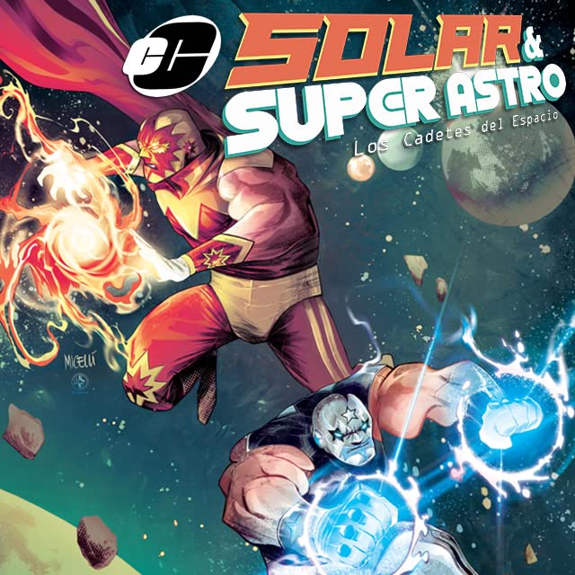
Masked Republic Luchaverse Solar & Super Astro #1 At the triumph of a centuries-old galactic war, all that was left of the warriors were Solar and Super Astro. They headed off into space to never to be heard from again…or so they thought. After a millennia of intergalactic travels, their ship crashed on Earth. Their powers had vanished, and they settled into their new mortal lives. Now, years later, a message from the deepest corner of the universe has interrupted their ordinary lives. A recent accident has released an immense destructive power back into the world, a power that they thought was lost forever. What epic adventure awaits them? Who’s attempting to contact them, and how can they save not just our planet, but the universe itself?
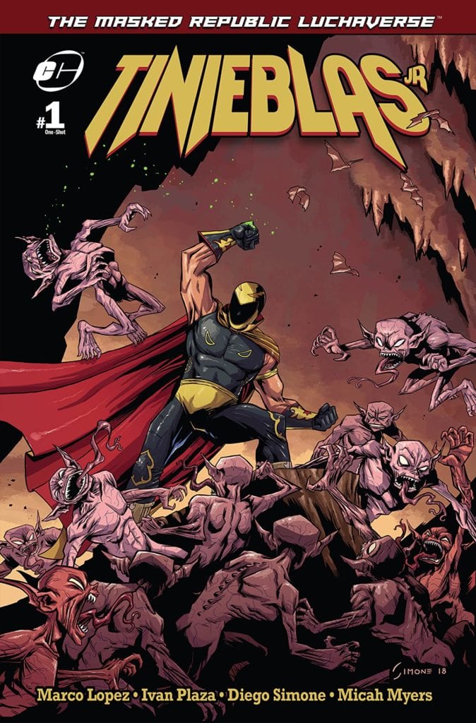
Masked Republic Luchaverse: Tinieblas Jr #1 Tinieblas Jr is the proud inheritor of a legacy that dates to the early 1970s when his father Tinieblas started his Lucha libre career. However, unknown to anyone but a small select few, Tinieblas Jr is also the protector of both human and monster realms. A monster hunter, taking on the legions of the damned and all manner of creatures that go bump in the night! Today, out of his secret lair with his assistant Ramona, they decide to help a close friend solve an age-old mystery. A mystery so old, it will change both the human and monster worlds forever!
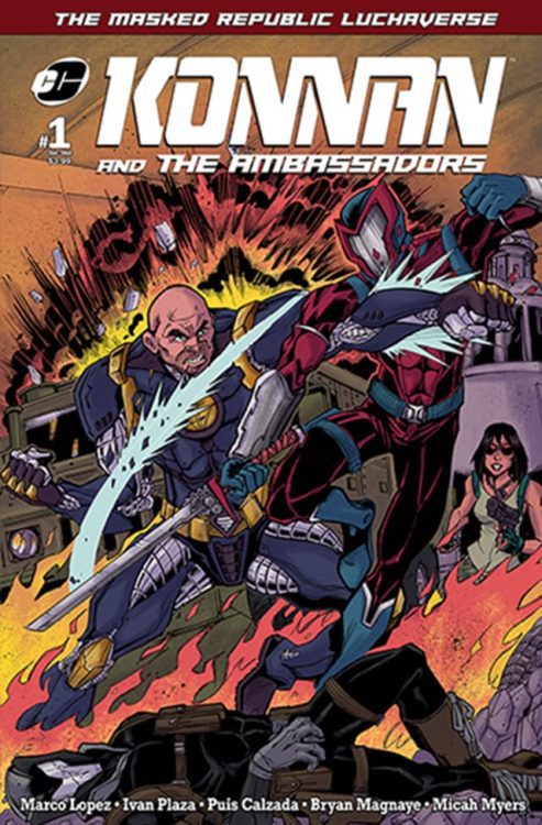
Masked Republic Luchaverse: Konnan and The Ambassadors #1 As the Ambassadors’ leader, Konnan has faced off against doomsday cults, alien invaders, rogue temporal thieves, and civilizations at the center of the earth. Now, the organization faces its greatest mission: getting to the bottom of a seemingly unstoppable series of worldwide catastrophes of unknown origin while Ambassadors’ bases are being destroyed one by one by a new global criminal faction calling themselves the Knights of Draconis! Will this ruthless and cunning organization on the rise put an end to the Ambassadors and all that they protect?
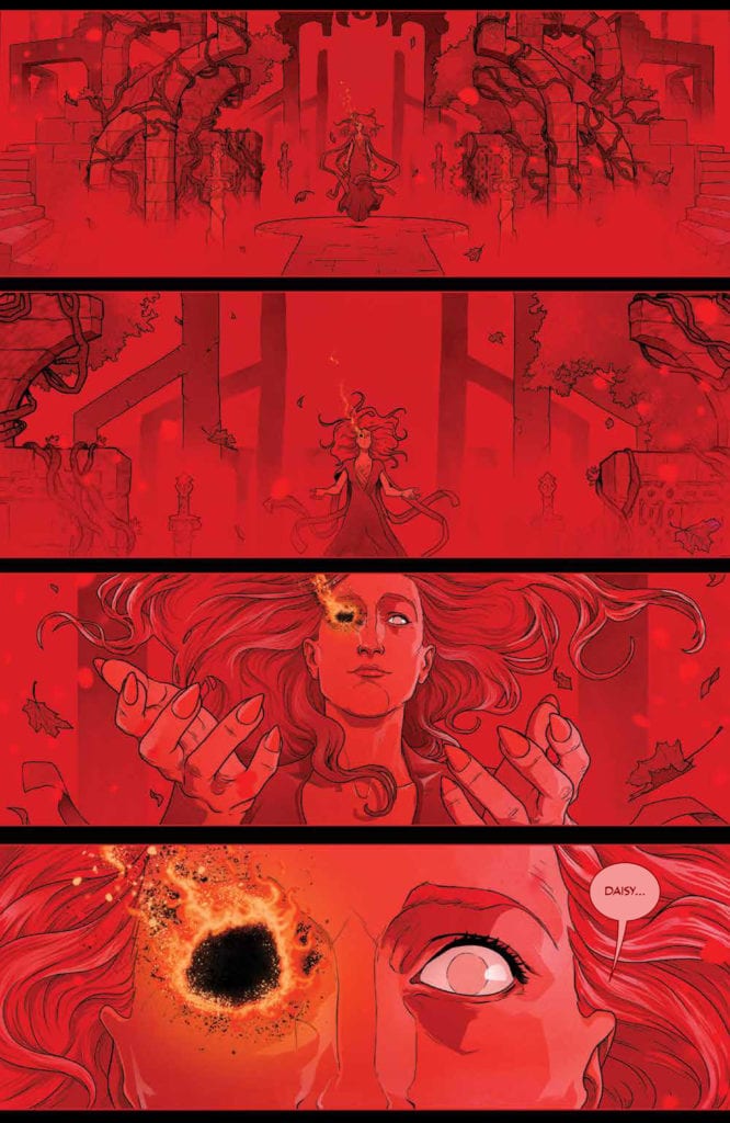
THE RED MOTHER #12, available Wednesday from BOOM! Studios, concludes a series full of horror, gore, and trepidation. Daisy’s story has been far from an easy one, yet that makes it all the more compelling.
A haunting beginning to The Red Mother #12.
It’s hard to believe that we’re already twelve issues into The Red Mother, and that this issue brings about the finale. Yet it also feels right, in a weird way. This whole time has been about readying Daisy for a final confrontation. Perhaps, somewhere along the way, the fans were readied as well.
The Red Mother #12 has a lot riding on it. There are so many questions left unanswered. Plots that need to be tied up. All while maintaining that horrifying tone that the series has perfected so early on.
That thought raises a couple of important questions. Will this be a conclusion in true horror fashion? Or will it bring about a more satisfying ending? One that feels right for all characters involved – not just the monsters that crawl out from the shadows.
That is not a world most people would want to be lost in.
The Writing
Close your eyes. Imagine all of the ways in which The Red Mother might conclude. Or don’t, because Jeremy Haun’s writing will exceed any hopes or assumptions about the series. This is a series that has chilled and thrilled from the start, so there shouldn’t be any doubt about how it’ll end.
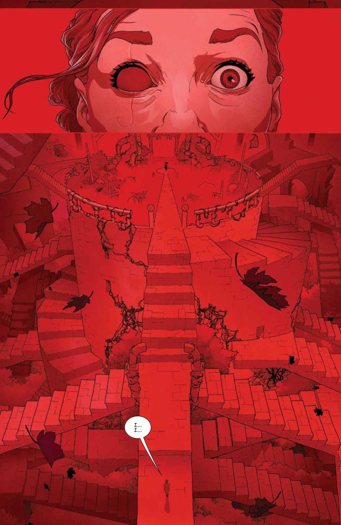
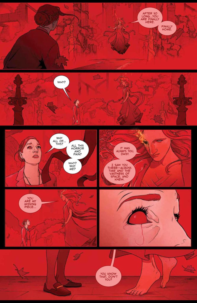
The Red Mother #12 is a haunting issue. Not just for what it puts Daisy through (though there certainly is that), but for the implications made throughout. There’s always been this sense of something larger at work, and now fans have gotten a glimpse at the true scale of things.
So, while this issue certainly does answer many of the lingering questions from this series, those answers are far from being a comfort. Then again, we wouldn’t be reading this series if we were seeking comfort now, would we?
All conclusions are bittersweet, but this one had a few unique twists worth mentioning and remembering. First, it gave a feeling like the whole ordeal was worth it. Second, while the series is undoubtedly wrapped up (with a neat little bow), it did leave room for a sequel. Gotta love it when that happens.
Just need a quick moment before dealing with this nightmare.
The Art
The artwork* found inside The Red Mother #12 may just contain some of the best art from the entire series. It still has all of those bold designs, but they’re more dominant than ever here. Of course they are – the Red Mother’s appearance is no longer a thing being hinted at.
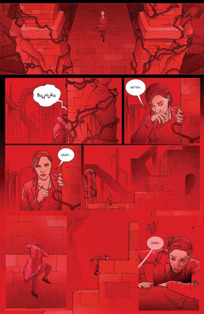
Danny Luckert’s work really does bring the whole tale to a new level. Daisy’s world can be beautiful. Or it can be terrifying. It all depends on the lens that Luckert chose to portray, as this issue made painfully clear. The stark contrast between the beginning of this issue, and the conclusion is hard to avoid, and it complements the points being made perfectly.
The colors were vital for this entire series. Really, that’s true for any series (or character) where a dominant color is such an important element. But it goes beyond that as well. While the lettering, provided by Ed Dukeshire allowed for a sense of sophisticated subtlety, both in design and storytelling.
*The Red Mother #12, as with the rest of this series, delves into graphic detail revolving around certain body parts. It’s a repeating theme, so readers likely already have an idea of what is to come in this issue. Still, it seemed worthwhile to mention here, as it is more aggressively illustrated here.
And there she is. The Red Mother.
Conclusion
The Red Mother #12 was a highly disturbing read for a lot of reasons, but it also brought with it some light. Together, these twining emotions allowed for a series finale that will stick in my mind for quite some time.
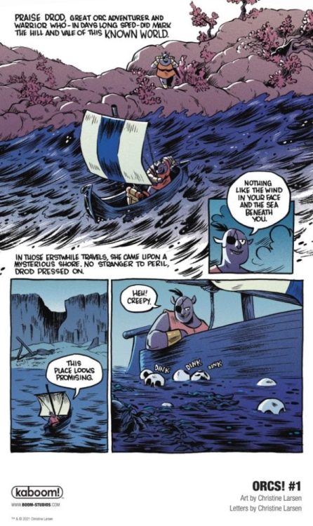
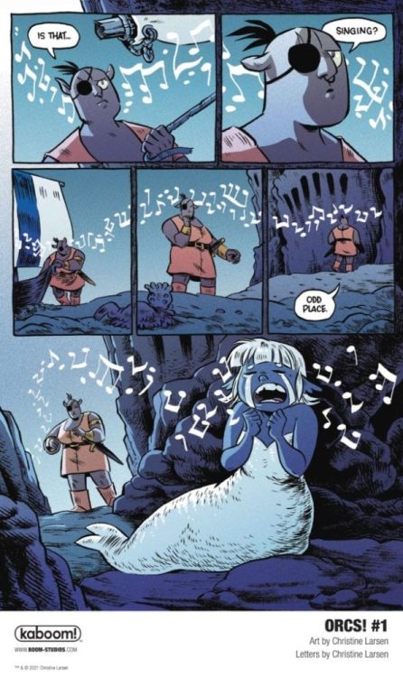
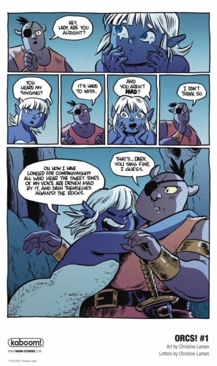
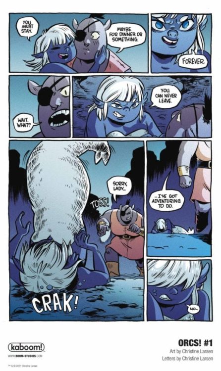
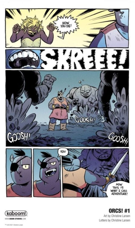
ORCs! #1 hits your local comic book shop on February 10, but thanks to BOOM! Studios, Monkeys Fighting Robots has an exclusive five-page preview for our readers.
About ORCS #1: The Adventure Starts Here! Join Bog and his crew, who were banished from their Orc village by King Hrograhgah (it was a simple misunderstanding, involving an acorn-related prank!) and must now venture out into the world to seek their fortune and hopefully, one day, find their way back home again. Bog, Zep, Pez, Utzu and Gurh’s many adventures will find them entering the dreaded Eerieasallhel Forest, facing off against Trolls, Gnomes, squirrels and more, and even following in the footsteps of the legendary Orc hero, Dod One-Eye!
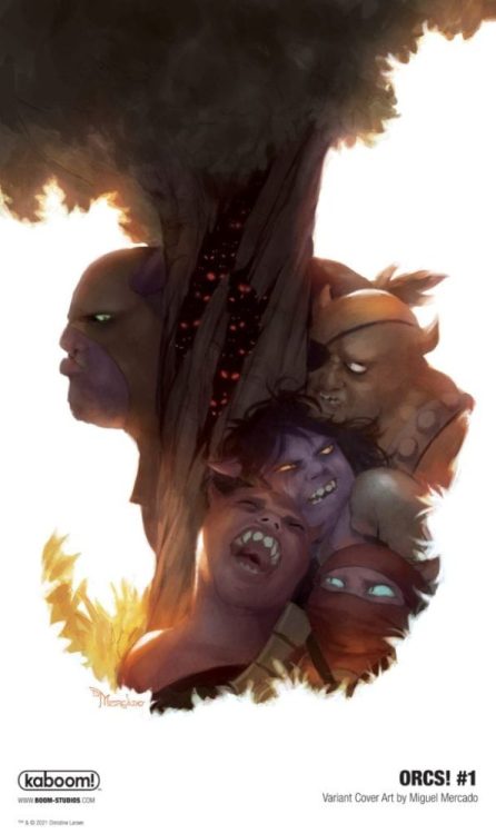
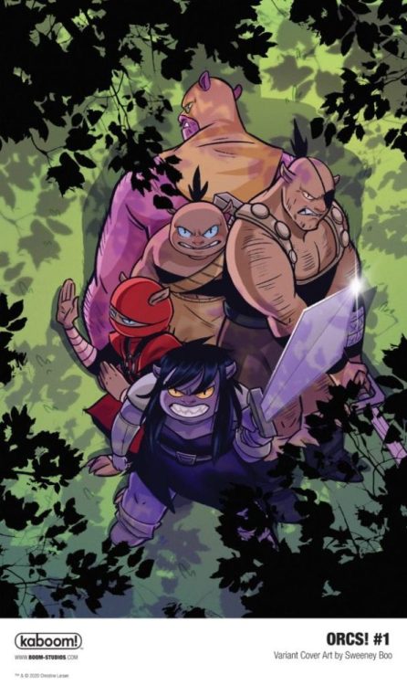
The six-issue series is by cartoonist Christine Larsen (Adventure Time, By Night) featuring main cover art by Larsen, as well as variant cover art by Sweeney Boo and Miguel Mercado. You can get a digital copy of ORCS! #1 from ComiXology, iBooks, Google Play, and Madefire.
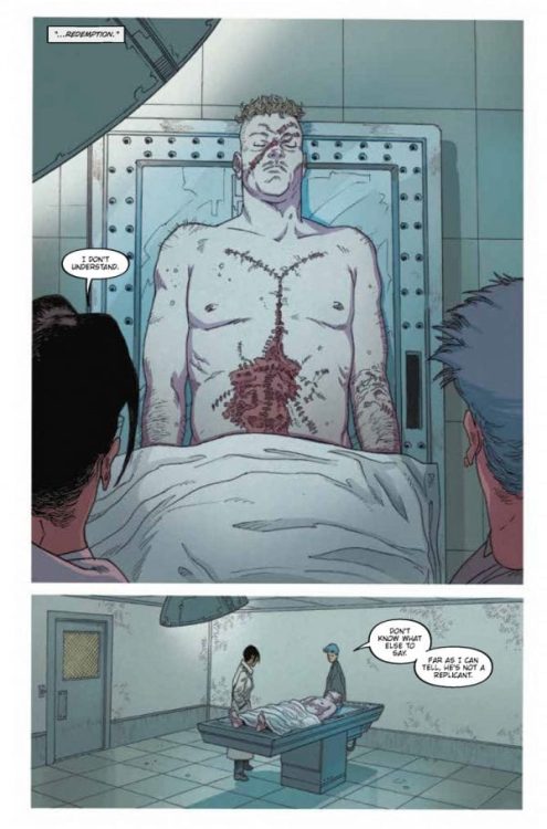
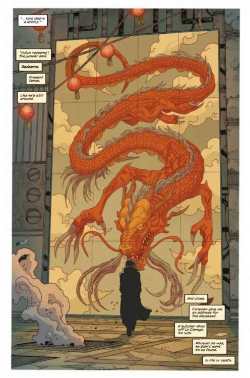
Writer Mike Johnson and artist Andres Guinaldo return with to the grimy streets of Neo-L.A. with “Blade Runner 2029” #2. Along with colorist Marco Lesko and lettering by Jim Campbell, this 2nd chapter of this Blade Runner sequel-series does exactly as a proper sci-fi installment should, offering fantastic noir storytelling while expanding on the fiction of the original story in unexpected ways.
“Blade Runner Ash hunts the streets of Los Angeles for renegade Replicants. She finds her loyalties and humanity challenged by two Replicants… one offering her salvation, the other deadly damnation.”
Writing & Plot
Mike Johnson’s focus in “Blade Runner 2029” #2 is a combination of building the case for replicant identity in this ruined future, as well as keep this story that perfect brand of cyberpunk noir this universe is known for. This comic has the plot progression of a properly planned detective thriller, with each issue so far having Ash follow a continually more engaging trail of breadcrumbs. This issue leads to a replicant underworld I hardly believe most Blade Runner fans could possibly see coming, but that also makes perfect sense and adds even more character to this oppressed group of people. The undertones of class commentary and capitalist critique are still heavy on every page, ensuring that Johnson is well aware of what this series, and cyberpunk as a whole, truly represent. The use of the comics medium to craft a complex mystery is on full display here, as Johnson uses a mix of noir-style overhead narration mixed with silent panels to portray the big moments both subtle and action-heavy. The dialogue is reminiscent of that in both Blade Runner films, a mixture of that noir-jazz, naturalistic phrasing, and in-universe references. This is a finely tuned and well-paced script that makes jumping back into this world both effortless and irresistible.
Art Direction
The pencils and direction of artist Andres Guinaldo peg him as the perfect creator to craft the visual story of “Blade Runner 2029” #2. His eye for detail in every aspect of drawing, from character animations, to clothing, and scenery straight from Ridley Scott’s original film, makes the atmosphere of the book effortless to be pulled in by. His style offers a sort of stylized grittiness to the book, with a design aesthetic that directly pulls from the films but also has its own artistic look. Guinaldo’s thin lines and detailed facial expressions feel similar to a combination of Moebius and Frank Quietly. He also has a fantastic eye for pacing and panel direction, as every scene is set with big panels that track motion and action, as well as more intimate shots that capture the small details in Ash’s investigation. The colors from Marco Lesko swing all over the place depending on environment, and they set the tone of each page perfectly. You can feel the humidity and pollution in the fog and neon filled streets of Neo-L.A. all because of Lesko’s tonally rich colors. At the same time, scenes that take place in speakeasys and the flashy homes of aristocrats sing with bright fluorescent lighting and vivid dress. The lettering from Jim Campbell is clean and modern, with a sort of standard sharpie-esque font that is easy to read while also conveying tone in narration and dialogue. The work of the visual team on this comic shows that the legacy of Blade Runner is in great hands.
“Blade Runner 2029” #2 is a foggy and tense second chapter to this next story in the iconic cyberpunk saga. The script from Mike Johnson is a demonstration of fantastic sci-fi neo-noir genre handling, with each page being a piece of an increasingly fascinating puzzle. The visuals from Andres Guinaldo and Marco Lesko bleeds with the damp and polluted cityscape of Neo-L.A., to the point where I could almost taste the cheap bourbon and dirty night air. Be sure to grab this latest issue from Titan Comics when it hits shelves on 1-13!
Marvel Voices Indigenous Voices #1 continues Marvel’s Voices project where diverse creatives put together an anthology about Marvel characters. Heading this project is veteran artist Jeffrey Veregge who writes and illustrates the “Watcher” introduction to Marvel’s indigenous characters.
Following this is “Echo: Hitting Back” with Rebecca Roanhorse as writer, Weshoyot Alvitre as artist, and Lee Loughridge as colorist. Then comes “Mirage: Multifaceted” by writer Darcie Little Badger, artist Kyle Charles, and colorist Felipe Sobreiro. Finally, my favorite of the bunch, “Silver Fox: Blue Moon” features writer Stephen Graham Jones, penciler David Cutler, inker Roberto Poggi, and colorist Cris Peter.
As a bonus, there is an afterword and a look at SkyView Way owners Taboo and B. Earl’s project featuring Sorcerer Supreme/Ghost Rider Kushala. The anthology is now available after November 18.
Marvel Voices Indigenous Voices #1 On Representation
Marvel Voices Indigenous Voices #1 features Veregge using his art and the Watcher to showcase Marvel’s numerous Native American characters. It makes the Watcher’s omnipresence feel like he touches every part of the Marvel Universe. After the intro, it’s a little disappointing that only three of these characters get segments, especially since half of the characters on the cover don’t appear at all. The ones that do appear feature each writer bringing out some of their authentic experiences through these characters.
Roanhorse talks about multiculturalism through Maya Lopez, and how that makes you open to experiences. Maya has faced a lot of loss. Loss that can’t just be fixed by a few familiar faces. So when Maya meets with people who have rituals for confronting tough pasts, it reminds her of the friends she once had in a unique way.
Little Badger uses Dani Moonstar to talk about community. She helps those like her hopefully find extended homes. Despite how the X-Men have been keeping their distance from the rest of humanity, Dani’s never been about assimilation. She is still Cheyenne and is willing to help out a fellow American Indian mutant without coercing him into Krakoa.
Jones, through Silver Fox, shows the struggle of these various communities to be more than victims of history. Silver Fox and her husband are fighting for their future, even as it becomes apparent to the husband that it’s a losing battle. Being able to see into the future can do that to a person.
That’s why Taboo and B. Earl take the time to tell the story on how they met and came to work with Veregge, at the end of Marvel Voices Indigenous Voices #1. Now they create and expand Native American characters like in Werewolf By Night and Doctor Strange’s Kushala. There are things to look forward to after Marvel Voices Indigenous Voices #1.
Art
These artists all get a chance to show how they present themselves in Marvel Voices Indigenous Voices #1. Veregge naturally opens big with his distinct S’Kallum art style for covers. The abstract nature of it presents a surreal and unique introduction to the matters at hand. While it makes the subjects seem mythical, the art following shows how human these characters are.
Weshoyot Alvitre showcases Echo: her acrobatic movements and how small she feels among the stars. And Lee Loughridge makes space look like a gigantic ocean.
Kyle Charges shows the scales of what Mirage faces through angles and closeups. These make explanations and questions feel important when it comes to Dani’s character. Coloring from Felipe Sobreiro makes these points more authentic as, during a talk, Dani looks likes she’s part of the background until she speaks up.
David Cutler puts a big emphasis on displaying emotions in the Silver Fox comics, through facial expressions. The inking by Poggi enhances the struggles. Dark patches forewarn of death. The cool to cold coloring of Cris Peter is neither friend nor foe to Silver Fox.
United Under Lettering
Ariana Maher of VC is both professional and creative in the lettering of Marvel Voices Indigenous Voices #1. The dialogue takes up just the right amount of space. Other elements like captions and text messages have a more creative touch to them. The Silver Fox story, in particular, has stylized captions that look like old timey paper, which adds to the atmosphere. It tells of Silver Fox’s age while the crinkling appearance suggests some brooding. It gives more atmosphere to the story.
Consider Marvel Voices Indigenous Voices #1
Within Marvel Voices Indigenous Voices #1 is a hopeful beginning for creatives of less represented cultures to appear in the mainstream. With representation being something to strive for, it’s going to take a number of people from different backgrounds to make it authentic. Whether it’s the story potential of future releases, evocative art, and creative supplementary elements, there’s bound to be something for readers to enjoy. Enough for readers to look forward to future releases of more comics by these creators and other voices in the industry.
FUTURE STATE: WONDER WOMAN #1, out now from DC Comics, is the first issue of a two-issue miniseries by writer/artist Jöelle Jones, colorist Jordie Bellaire, and letterer Clayton Cowles. With an ingenious, fun plot and gorgeous, captivating artwork, this issueserves in these difficult times as the ultimate escapist adventure.
Writing
Within the first 8 pages, Jones solves an issue readers have pointed out for a long time regarding DC’s heroes- they’re too perfect and powerful to be able to relate to them. Jones manages to solve that by introducing Yara Flor as a heroic character, a woman on a mission; Yara serves as the mediator between the gods and humanity. She is powerful, cheeky, and unapologetic. But, Jones doesn’t let us forget throughout the entire issue- Yara is also flawed and makes mistakes. Those errors move the plot forward brilliantly and make it too easy for the reader to fall in love with the futuristic Wonder Woman instantly.
Art
To help the reader get further engaged, Jones hones in on each background character’s looks. The feeling I’ve personally got when catching glimpses of those background characters that end up having nothing to do with the plot reminds me of the feeling people got when experiencing Star Wars: A New Hope for the first time. I couldn’t help but feel this fiery curiosity inside to know more about these characters. I immediately started wondering about their backstory or about what adventures are they going to embark on- A feeling I haven’t felt in a long while.
Also, the facial expressions look skillfully expressive; the backgrounds look well-detailed, beautiful, and engulfing. Everything about the artwork enchants the reader. Personally, I’m looking forward to getting further lost in the world Jones has created.
Coloring
Bellaire’s coloring in this issue basically invites the reader to enjoy this world’s uniqueness even more. Bellaire colors each page with vibrant, bold colors that make the pages pop wonderfully, elevating Jones’ magnificent artwork and complimenting it. Most notably, the way Bellaire colors the skin tones always remains realistic to a certain extent but still makes each character look full of life. Great work from Bellaire.
Lettering
Cowles’ lettering definitely delivers and manages to elevate the fun even more with colorful sound effects and balloons. Almost every character in Future State: Wonder Woman #1 has its own unique, stylized balloon. Cowles also places the balloons in a way that never distracts the eye. I especially liked Cowles’ choice to never design the captions as a perfect square, making it a lot more appealing to the eye. It’s another “lettering rule” Cowles breaks to elevate the comic’s freshness.
Conclusion
Admittedly, this first issue makes me wish it didn’t have to end so soon. Future State: Wonder Woman #1 is a breath of fresh air; A perfect example of why Jöelle Jones is a rising star in the comics industry. Strongly recommended to anyone who wants to escape today’s harsh realities and embark on a wild adventure.
Comic superheroes are not Sherlock Holmes, who holds a Guinness World Record for being portrayed 254 times since his creation. In terms of this number, they are not even close. Yet, ask any kid whether they know Batman and Superman along with Sherlock? The answer will very likely be YES, with the high probability that younger kids will recognize superheroes even faster.
Kudos to DC Comis: they have surely succeeded in capturing the hearts of their fans and beyond. The dominance & rivalry of Marvel and DC in the comic industry became so evident that even people whose interests are far from the comic world know the central characters and the universe they come from. Both Marvel and DC penetrated not only cinema and video games but also the more distant niches. For example, you’ll easily find Marvel-themed LEGO packs or slots dedicated to DC superheroes — brands exploit this as a sure-bet theme for their new products.
However, the knowledge of an average person about comics ends here. Sometimes, we’re sorry to realize how many universes never intersect with the minds of the majority. DC and Marvel may be the largest brands, but not the only ones worth exploring.
Today we’re going to bring some justice into this Injustice and present you with a few indie comic publishers, some of which you could have never heard about.
Aftershock Comics
Aftershock is the freshman on the comic market — the company was founded in 2015. Despite being that young, it already gained some popularity among comic fans, to some extent thanks to the prior experience of founders: Joe Pruett, author of iconic experimental book Negative Burn, and Mike Marts, who was an executive editor at both Marvel and DC of X-Men and Batman franchise.
The publisher is known for superb visuals and future-oriented, dystopian narratives. The most popular examples of its titles are apocalyptic Stronghold, a tale of dark powers Babyteeth, and insanely uncomfortable Animosity.
Antarctic Press
Antarctic Press is quite a well-known yet still an alternative comic book publisher. Specializing in “amerimanga” with its distinctive art and storytelling practices, it offers a different perspective on the American comic market and also contributed a lot to developing furry comics. Overall, they published over 850 titles since the company’s birth in 1984.
The titles to pay attention to are iconic Ninja High School, the oldest publisher’s series, which is still running, Gold Digger, and Box Office Poison. Antarctic Press also issues a lot of political parody series — right now, for example, the main page of their website is all about Trump’s comic collection.
Last Gasp
Last Gasp is positioning itself as a distributor of underground art and writing for 50 years. The themes and attitudes of the company always have been ahead of time. They are known for exploring ecological issues in their Slow Death since 1970: the times when the plastic boom everyone is talking about now was only unfolding. Also, they created an influential all-female anthology titled Wimmen’s Comix, which focused on the feminist concerns of the 70s-80s.
Nowadays, Last Gasp is focusing on graphic novels, art, and photography books. However, the vintage underground comics series are definitely worth reading today — they are still available for purchase on their website.
Oni Press
It’s hard to say that Oni Press is a little-known publisher. There are plenty of Oni Press comics based on Nickelodeon. You, as a comic fan, likely know that Rick & Morty is one of the publisher’s flagships, with Invader Zim and Kaijumax following the leader.
The publisher avoids “superhero” themes, focusing more on romance, drama, thrillers, and cartoon-related topics. They value realism in their stories, yet with some exceptions: for example, a relatively new series, The Vain, is about the company of robbers who are also vampires.
Iron Circus Comics
Iron Circus Comics was founded in 2007 and was largely specialized in issuing an erotic comic anthology named Smut Peddler, which was created by women for women. The publisher stepped aside, creating only erotic comics later on, and now the company’s titles include political-themed books like Banned Book Club and re-imagination of traditional European folktales like The Nixie of the Mill-Pond and Other European Stories. This is the one from our list that is open for submissions now: who knows, maybe you will be the next rising star in the comics universe.
Aside from these five, there are dozens of decent publishers to check out, including the younger ones. The brightest examples of those started within the last 5 years are TKO Studios, Behemoth Comics, AWA Studios, and Darkside Comics.
“The Independent Filmmaker’s Guide to the New Hollywood: Success in the Era of Netflix and Streaming Video” is author and filmmaker Gabriel Campisi’s third book about the business of filmmaking, this time focusing on the streaming storm that’s evolving the way we consume entertainment.
PopAxiom spoke with Gabriel about falling in love with movies, how things have changed, and his latest book, “The Independent Filmmaker’s Guide to the New Hollywood: Success in the Era of Netflix and Streaming Video.”
First Films
“My father was a private investigator,” Gabriel says when I ask about where filmmaking came into his life. “He had a Super-8mm camera. When I was 8 years old, I watched Star Wars, and I wanted to make movies from that day forward. But I had no idea what I was doing at that age.”
Gabriel not only received the gift of a Super-8mm camera from his father, but he also learned a few tricks. “My father taught me how to do still-frame animation,” he says. And soon he started putting all these new skills to the test. “By the time I was 13, I was shooting a lot more elaborate short films. By the time I was 15, I did one and sent it out to a huge film festival, and I won first place.”
The success of The Lost Creature was only the beginning for Gabriel. “I just kept going after that. I love it. Filmmaking is in my blood. Right after high school, I started working ground-level as a production assistant, and eventually got into camera work, production supervising, and editing.”
About The Independent Filmmaker’s Guide
“The Independent Filmmaker’s Guide to the New Hollywood: Success in the Era of Netflix and Streaming Video” is Gabriel’s latest book on the film industry. “By the time I was 25, I was doing a lot of big stuff. I was working in Hollywood, and on my way up.”
But then life happened. “At 25, I took a big detour,” he reveals. “I was forced to step away from the business due to personal family issues. I still stayed in the game by advising other filmmakers and helping with their movies.”
Consulting work is what paved the way for writing about making movies in his first book, “The Independent Filmmaker’s Guide to Writing a Business Plan for Investors.”
“The first book I wrote because I helped a friend get financing for his film in Los Angeles. He wanted to make a movie and knew all about production, but not about the business and the money. So, I started coaching him.”
Later, Gabriel says, word got around, and he “helped a few others do the same thing.” Friends kept telling him to write a book to help independent filmmakers figure out financing, but Gabriel “wasn’t convinced.”
However, after a year of prodding from and arguing with filmmaker friends, Gabriel “finally put together a business plan with a cover letter and sent it out to five book publishers. All five publishers responded within a month or two and said yes, they were interested. I was blown away. I didn’t think that would happen.”
Gabriel’s second book, “The Independent Filmmaker’s Guide to Writing a Business Plan for Investors — Second Edition,” was the 2012 follow-up. Gabriel wrote it, he says, because “the business had started to change.”
Now, “The Independent Filmmaker’s Guide to the New Hollywood: Success in the Era of Netflix and Streaming Video” comes on the heels of more seismic changes in the industry. “I’ve seen how much has shifted in just the last five years. It’s completely upended the business.”
Gabriel says what has happened is unprecedented. “The market changed, the strategies changed, the technology changed, and the business changed,” he says about Hollywood over the past decade. “Before you could sell units, you could count DVD sales or movie tickets. Now, we are dealing with online metrics and analytics, and it’s a whole different thing. So, I told my publisher it might be time for a new book.”
“The Independent Filmmaker’s Guide to the New Hollywood: Success in the Era of Netflix and Streaming Video” is not about how to make a movie. “In the introduction, I say, today the technology is so cheap that just about anyone can go out and make a movie. The book’s not about that. It’s about making a movie for commercial success in today’s industry.”
Streaming Versus Cinema
“I interviewed a bunch of my friends from Hollywood — filmmakers, producers, and executives,” Gabriel says about the book. “I spoke to studio level, the middle of the road, and independent filmmakers alike. In the pre-COVID world, they were already trying to figure out how to get people out of their homes and into theaters.”
The pandemic has hurt the exhibition business even more. “However, I don’t think movie theaters are going to go away,” Gabriel says.
We discuss the possibility of “vertical integration.” Back in the 40s, judges considered it counter-productive to allow studios to also own theaters. “They considered it unfair to third-party players,” Gabriel says. “Now, with streaming, the competition shifted, and they took it down.”
The streaming showdown is in full effect. In 2020, NBC/Universal and Warner Brothers, two major studios, launched their streaming services to compete with Netflix, Amazon Prime, AppleTV, and Disney+. Gabriel says, “A lot of people don’t know this, but Netflix and all these companies are losing money hand over fist. The competition is so fierce, and you have to get new customers and retain old customers. The only way to do that is with more products. Content, content, content. So, they’re spending billions every year to make new content so that they can stay on top.”
“The other platforms, Disney, Amazon, etc.,” he continues, “are spending billions to fight Netflix and get a piece of the streaming pie. They’re betting on the future by spending billions today. Who knows who will be standing ten years from now?”
Can streaming services continue to justify spending hundreds of millions of dollars on a project? “There’s going to come a time when they can’t justify the expenses any longer, but the reason they do it is to offer the audience something they can’t see elsewhere.”
Gabriel says no one knows for certain where this is all going to lead, and then jokes, “There’s a lot of creative accounting, too, but that’s a whole other book!”
New Game
The age of streaming presents new opportunities for both creators and viewers. But it creates new problems, too. “The biggest thing is that it’s a whole new game. I have friends that are still stuck on the old system. They’ll shoot an indie movie for a few hundred-thousand dollars, and then they can’t get the sales they need to cover the budget. They take it all around the world, and nothing happens to their expectations. It’s a buyer’s market. There’s so much product.”
“The pie is getting bigger,” he says about the modern age of seemingly endless amounts of content. “But the slices are getting smaller. That’s the number one thing I tell everyone. As long as you keep that in mind, you can proceed accordingly.”
As Gabriel’s book discusses, the proper things include taking advantage of new paradigms. “You can work with an aggregator or distributor, know where the movie is going to end up. I tell everyone now, you need to talk with your distributor first. Get an idea, realistically, about what kind of money you can make. Ten years ago, you could shoot a movie for half-a-million dollars and sell it all over the world. You’d easily quadruple the money. You can’t do that anymore. You have to try and do a deal ahead of time.”
Gabriel shares a story of how things happen today in the business. “People will now go to a channel with several projects to pitch. And the channel will say, ‘No, on this one, we’re doing something like it; this one is too dark, but we like this one.’ The channel will say, ‘If you shoot this movie and get this actor, we’ll give you a million dollars. So, the filmmakers go off and shoot the movie for half-a-million, let’s say, because they know they’re not getting more than a million. They deliver the movie, receive the money, and profit that way.”
Gabriel’s book goes into great detail about the four elements you have to keep in mind these days, which he calls the four pillars of Hollywood. “First, it’s proper communication, second is entertainment, third is technology, and fourth is the business. You have to well-versed in all of these things. If just one of these is off, you run the risk of not doing well. A lot of filmmakers tend to only worry about one or two of the four.”
Gabriel talks about a guy he knew who went out and got the best equipment available, but made a terrible movie with it. “He had the technology,” Gabriel says. “But technology alone is nothing more than a tool. A paintbrush is only as good as the artist.”
Wrapping Up
Decades after learning a little animation and how to use a Super-8mm camera, there is no lack of enthusiasm for making movies when talking to Gabriel. “Movies are our imagination come to life, and it’s part of who we are. What’s the difference between a hundred years ago and today? Nothing. We’re still expressing our imaginations.”
“The Independent Filmmaker’s Guide to the New Hollywood: Success in the Era of Netflix and Streaming Video” is out and available at book retailers both online and off.
So, what’s next for Gabriel? “Well, I had two movies that came to a grinding halt because of the pandemic. The big thing now is, and I asked for permission to reveal this, I’m working with Scott Mitchell Rosenberg, one of the coolest filmmakers you’ll ever meet. He’s the guy behind all the Men in Black movies and Cowboys and Aliens at Platinum Studios. I’m on the production and creative team that also includes filmmaker John Lechago, another amazing person. I can’t say more at this time, but hopefully soon audiences will get to see what we’ve been working so diligently at.”
Is The Independent Filmmaker’s Guide to the New Hollywood: Success in the Era of Netflix and Streaming Video on your reading list?
Thanks to Gabriel Campisi and October Coast
for making this interview possible.


")


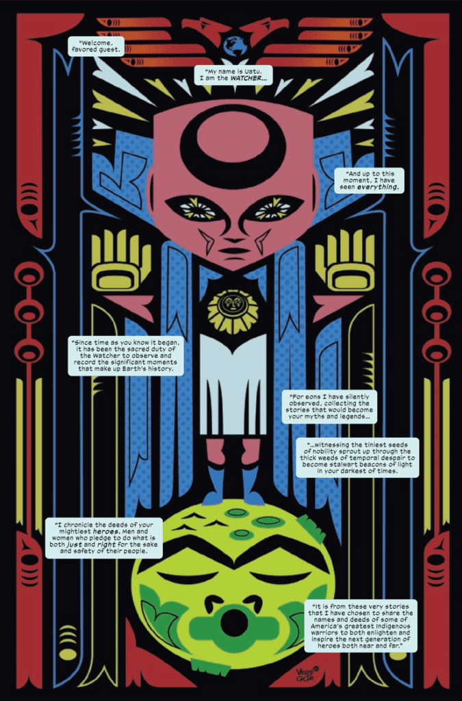 Marvel Voices Indigenous Voices #1 features Veregge using his art and the Watcher to showcase Marvel’s numerous Native American characters. It makes the Watcher’s omnipresence feel like he touches every part of the Marvel Universe. After the intro, it’s a little disappointing that only three of these characters get segments, especially since half of the characters on the cover don’t appear at all. The ones that do appear feature each writer bringing out some of their authentic experiences through these characters.
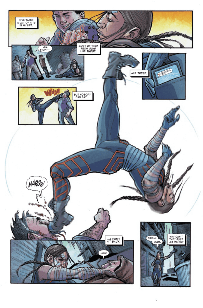 Weshoyot Alvitre showcases Echo: her acrobatic movements and how small she feels among the stars. And Lee Loughridge makes space look like a gigantic ocean.
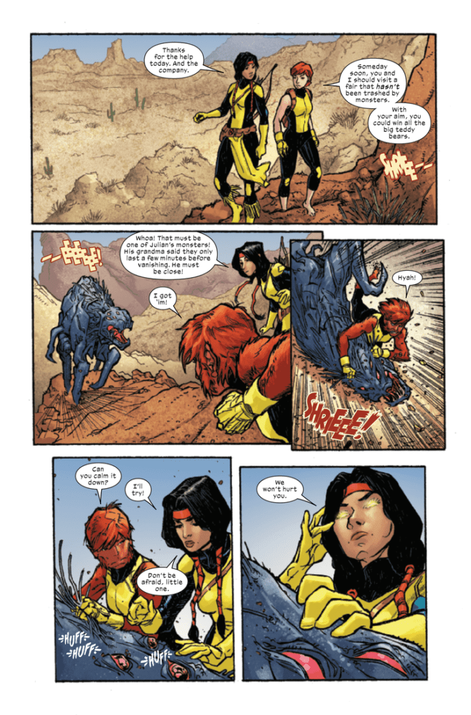 Kyle Charges shows the scales of what Mirage faces through angles and closeups. These make explanations and questions feel important when it comes to Dani’s character. Coloring from Felipe Sobreiro makes these points more authentic as, during a talk, Dani looks likes she’s part of the background until she speaks up.
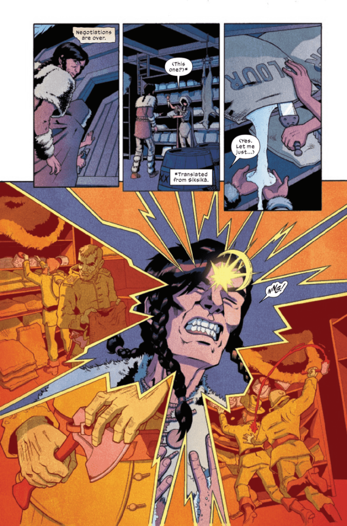 Ariana Maher of VC is both professional and creative in the lettering of Marvel Voices Indigenous Voices #1. The dialogue takes up just the right amount of space. Other elements like captions and text messages have a more creative touch to them. The Silver Fox story, in particular, has stylized captions that look like old timey paper, which adds to the atmosphere. It tells of Silver Fox’s age while the crinkling appearance suggests some brooding. It gives more atmosphere to the story.