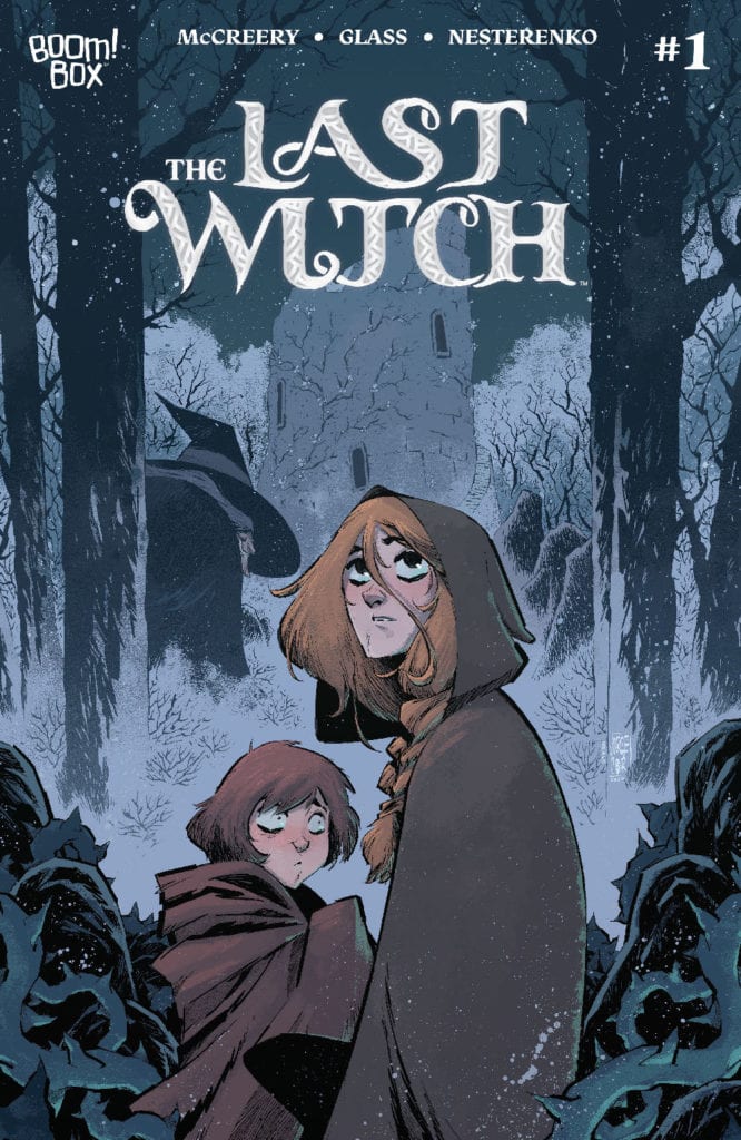
LAST WITCH #1, available now from Boom! Box is the first issue in a brand new series. One that feels like a fairy tale of old, as Saoirse starts an adventure that she will very likely find a very different ending for.
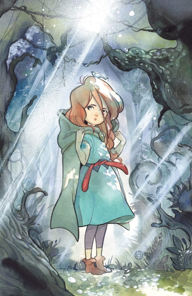
Saoirse and her brother are featured here on the variant cover of Last Witch #1
Last Witch #1 is a bright and bold introduction to a brand new series. One that feels eerily familiar in many ways. If you’ve ever read a fractured fairy tale, then the odds are good that you know exactly what feeling the Last Witch sets out to elicit.
Conor McCreery (Writer), V.V. Glass (artist), Natalia Nesterenko (colors), and Jim Campbell (letters) teamed up to bring this imaginative world to life, and it truly does strike upon the desired notes. Right from the first page, there’s this sense of magic about to descend.
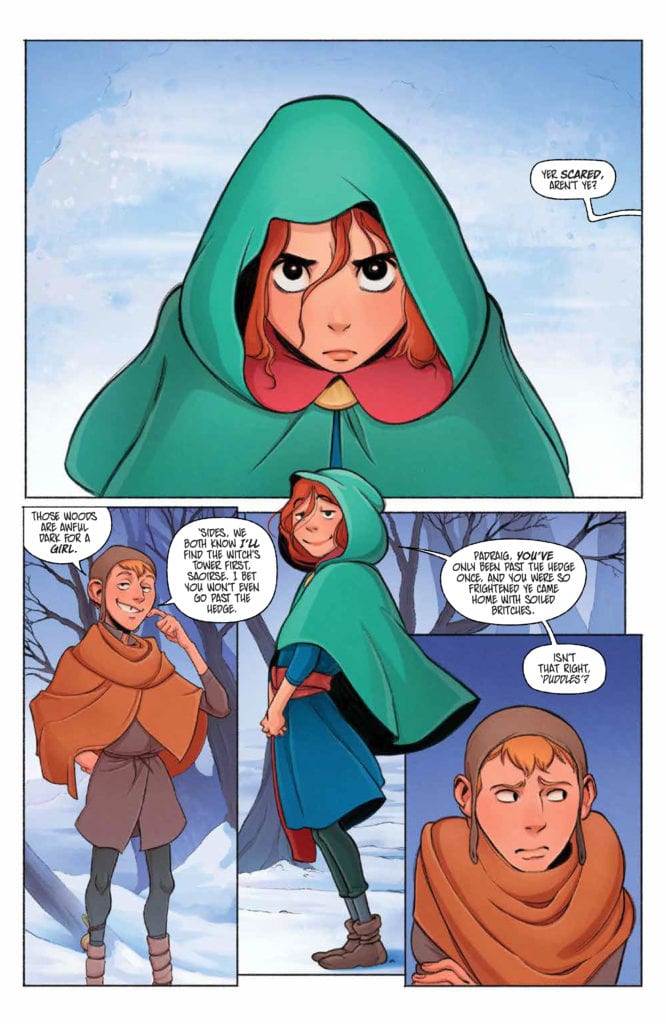
The series begins with young Saorise, a determined girl who wants to go off on an adventure. Boy, is she about to get that wish. She’s always been told to never enter the woods during this time of the year – for that is when the witch seeks her prey. As you might have guessed by now, the witch’s prey is children. Naturally, we all know that Saorise is about to disobey that order. Yet that is only the beginning of this strange new tale.
A little Saoirse takes center stage on this variant cover of Last Witch #1.
The Writing
Last Witch #1 is a tale that immediately sucks the reader into the narrative. Saorise is every bit a typical child. She’s stubborn and driven and feels chafed by all the rules that her elders set upon her. Feel familiar?
It’s the perfect setting for the rest of the tale to leap from. McCreery weaves in classic narrative elements, many of which are common to fairy tales and folklore, while also portraying a new journey in the process.
In many ways, the first issue reads with a strong sense of inevitability. We all know that Saorise is going to disobey the rules. We all know that she’s going to put herself (and potentially others) in danger. What we don’t know is how long it will take before the tide turns. Or how badly things will go once they do.
The fact that Last Witch is already proving to be compelling despite these known factors is impressive. It’s making creative use of our expectations and assumptions (thanks to years of reading tales with similar tones), and I, for one, can’t wait to see where it’ll take us next.
Another impressive feat for this first issue would have to be the characters themselves. We’ve only been reading about them for a little less than forty pages, yet they already feel real. They feel human, and thus their endangerment or loss also feels real.
A determined face for the start of this series.
The Art
The artwork is one of the many elements that make Last Witch #1 shine so. The colors are bright as the snow portrayed upon the pages. Which, combined with the bolder designs and shapes, makes for a captivating scene.
Saorise’s design steals the show on many occasions. Her vibrant hair and cloak are certainly meant to do exactly that. Yet, it isn’t the only feature worth talking about. The artwork carried with narrative elements as well, some of which would never have worked in any other format.
Take that sense of foreshadowing, which appeared simply by one repeating word. Followed by the horror that comes with its sudden absence. It was wonderfully done and helped to enhance that entire series of events.
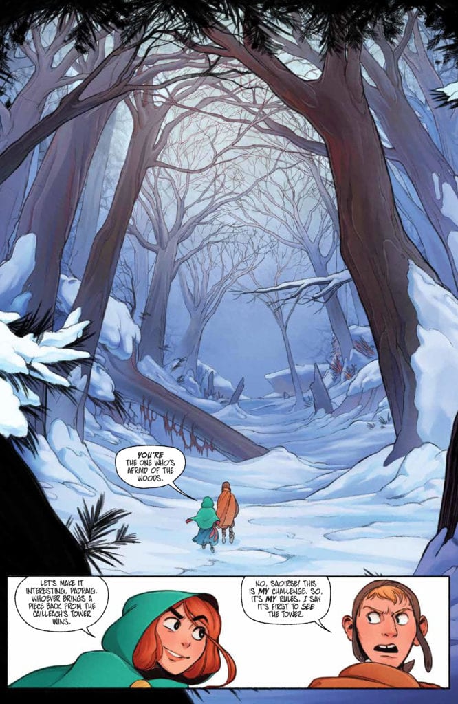
Look at that stunning forest! No wonder she wants to explore it.
Conclusion
Last Witch #1 introduces a series worth checking out – especially for any fan that loves a good retelling. With a few twists, that is. The combination of familiar and new will leave readers enjoying this series; that much is already quite clear.
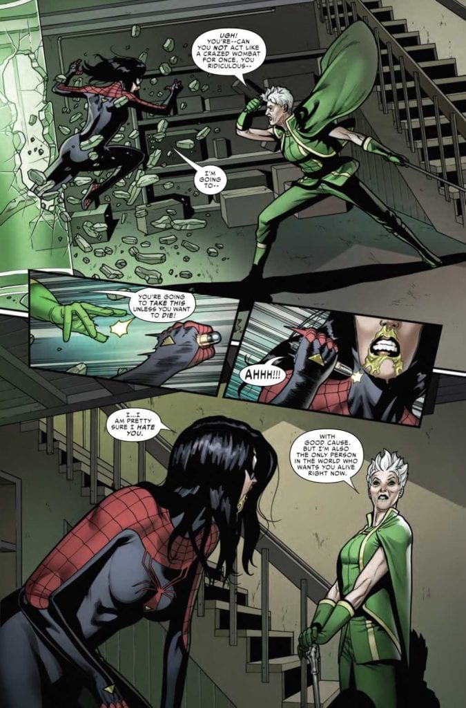
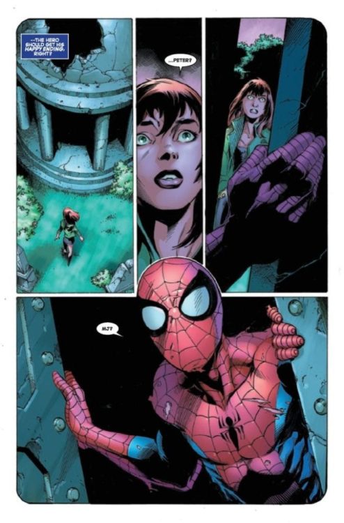
SPIDER-WOMAN #8, available now from Marvel Comics, is about to portray a version of Jessica Drew that fans don’t typically get to see. All while a major war is happening in the background, as The King in Black rages on.
Jess is not looking great in Spider-Woman #8.
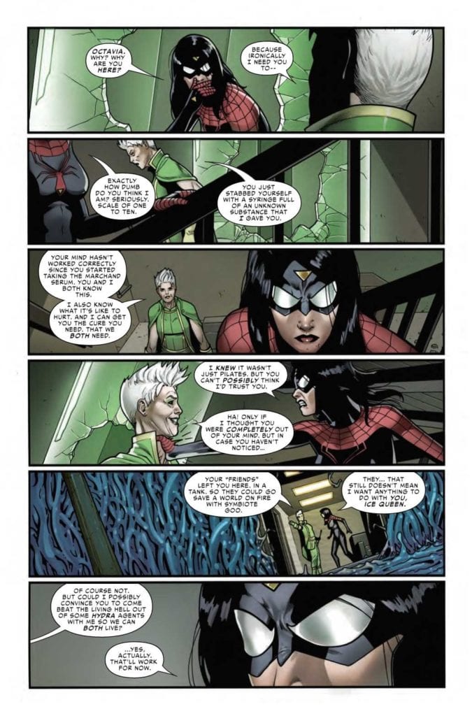
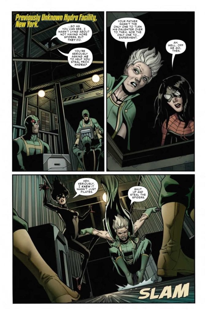
The Knull Invasion may be in full force, but that is not the first concern on Jess’ mind. Heck, it’s hardly a blip on her radar – despite all the reasons why she should be very concerned. Instead, she’s entirely focused on finding the cure not only for herself but for her niece, and eventually, for her son as well.
All good reasons to be concerned, to be sure. Yet her temporary cure comes with just as many problems as it solves. As evidenced by her behavior in Spider-Woman #7. Not to mention her reasoning for joining up with a new ally.
This is an ally that any Spider-Verse reader will recognize on sight, and with good reason. Now, Spider-Woman #8 is about to dive into a new series of adventures, and they’re going to come with quite the cost.
Not my first choice in a partner, but desperate times?
The Writing
As you might imagine, Spider-Woman #8 brings with it many surprises. Good to know that Karla Pacheco still has a few dramatic twists hidden up her sleeve. The progression (or rather, regression) of Jess’ mental state has become so painfully clear.
A fact that becomes even less avoidable if one was to go back and binge the series all in one go. Her character has changed drastically over the course of these eight issues, and it’s starting to feel like the transition is far from over.
What is really telling is that this major event, King in Black, has become a background event for Jess. Which, if one was to stop and think about it for even a minute, doesn’t make much sense. Seriously, where is her family at the moment? Is there anyone ‘safe’ at the moment?
Those concerns merge with concerns surrounding Jess’ actions, as Spider-Woman continues her hunt for a cure. It is admittedly interesting to see the different ways in which these two women think and how they handle different problems. Yet that interest is not enough to outweigh everything else rising to the surface.
And so a plan is forming.
The Art
As with the rest of this entire series so far, Spider-Woman #8 is full of brilliant artwork. Sometimes literally, as the case may be. It seems at times as if the colors themselves were about to pop right off the pages.
Pere Perez’s artwork is exactly what Spider-Woman’s series needed. The myriad of emotions and battles her character goes through in a single issue are perfectly captured here. Sometimes in shocking detail.
Meanwhile, Frank D’Armata’s set the tone. The green hues practically feel sinister, while the darker tones help to carry it all. The bright pops of color feel almost alarming in contrast, a fact that was certainly intentional.
VC’s Travis Lanham really outdid himself here, as once again, Jess’ actions really do carry impact. Sometimes literally, as crashes and crunches happen all over the pages. There’s no denying the damage this woman is causing.
Okay, this team-up is actually pretty terrifying.
Conclusion
Spider-Woman #8 is a tense and compelling read, albeit a concerning one. The creative team behind this series has done a wonderful job taking risks while also giving Spider-Woman plenty of chances to show off her abilities.
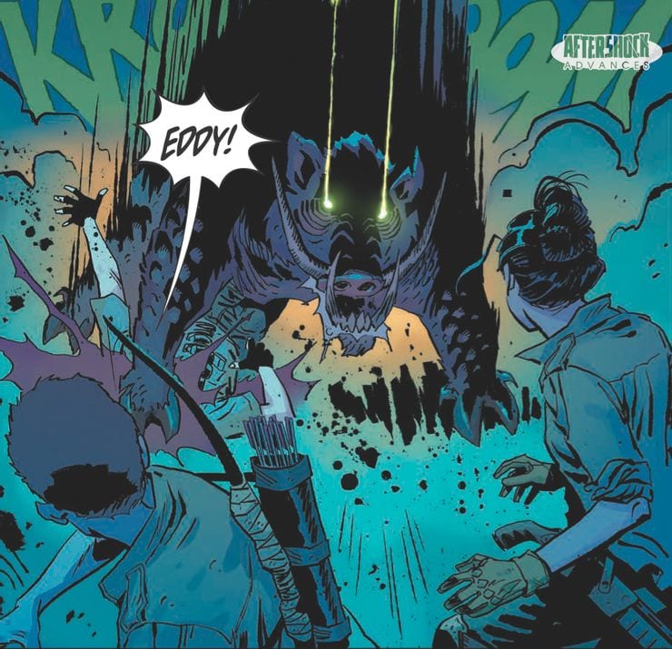
In AfterShock Comics’ latest futuristic drama, Scout’s Honor, a new world order has been built on an archaic belief system. This new series flings the reader into the distant future and asks the question on everybody’s mind, What happened to the Ranger Scouts of America? The comic is a character driven thriller from the writer of Going to the Chapel, David Pepose, and artist Luca Casalanguida.
Scout’s Honor #1 Credit: AfterShock Comics
Badge of Honor
A group of survivors fight to stay alive in a world that has turned against them. The remnants of a civilisation long since destroyed has grown up on the beliefs and teachings of one man, the true profit, Doctor Jefferson Hancock. With a problematic system of trial and reward, the new religion is based on the Ranger Scouts of America, with the worship of bravery and honor. But as the plot unfolds, age old corruption and greed are shown to have survived along with the hierarchy of power.
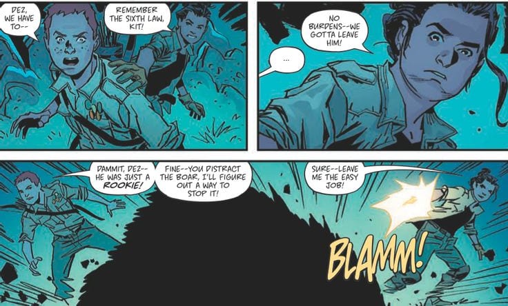
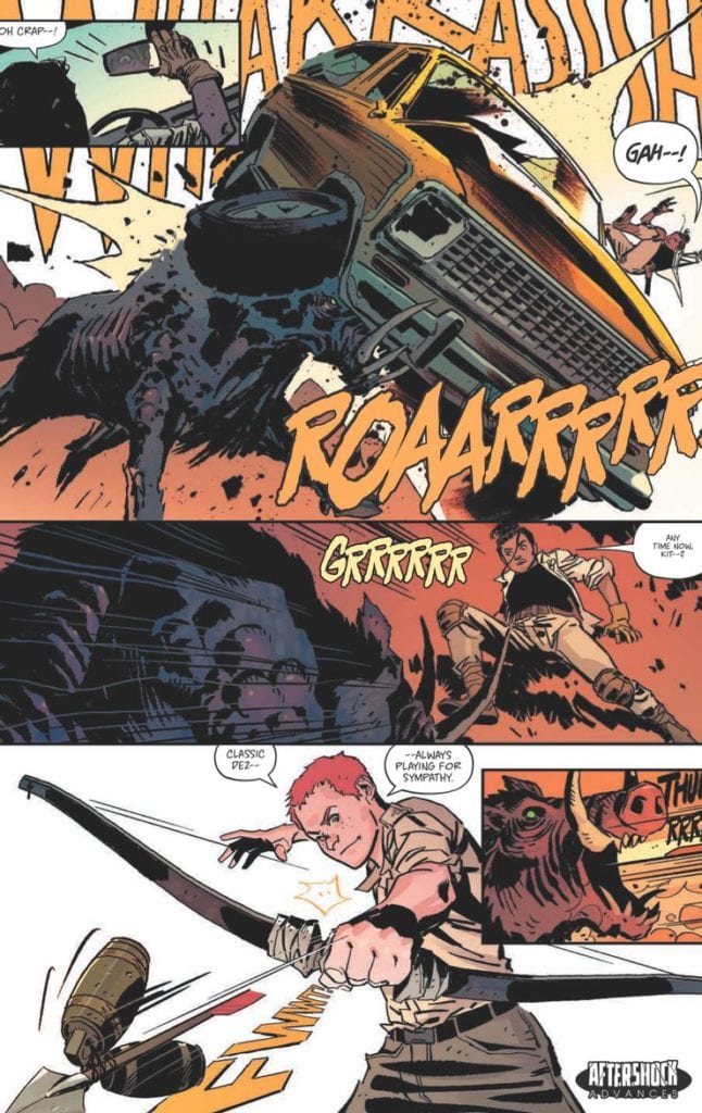
Scout’s Honor is a story told through character moments. David Pepose has crafted an elaborate world but it is presented to the reader by defining the people Pepose introduces. A dramatic opening plants the seed for the future environment before jumping forward in time to introduce Dez and Kit, the central characters. A battle with a radioactive boar is a chance to shape the environment and cement the characteristics of Dez and Kit but the moment is quickly over. The boar itself is a plot device to establish the dangers of the world and highlight the bravery of the two boys before the plot moves on.
Pepose plans each scene as a way of expanding the reader’s understanding of Kit and leaves the difficult world building to Luca Casalanguida. The art work is detailed and portrays an uninviting world where the only warmth is indicated through the orange glow around the uncomfortable religion. The contrast between the words the Scout Master says and the realities depicted across the pages is a scathing indictment of religion. The written words of a childhood organisation have been twisted to form a misogynist gang of reward seekers. It’s like the Cat Religion from Red Dwarf but without the jokes, or the assimilation of Church and Military in certain episodes of Doctor Who. Pepose has deconstructed two modern institutions and turned them into a hellish nightmare world.
Scout’s Honor #1 Credit: AfterShock Comics
Future Images
The atmosphere created in the opening of Scout’s Honor is reminiscent of The Last American published by Marvel in the 1990’s. John Wagner and Alan Grants dystopian future has a single character walk through the detritus of American culture in a burnt out, forgotten world. Casalanguida appears to be channelling Mike McMahon’s style in the opening pages of Scout’s Honor before he populates his world with a host of survivors. The sense of dissolution within the landscape is forefront in the art even as the action sequences swirl through the panels like miniature whirlwinds blowing up dust. It is clear that the actions of these survivors have no great impact on the world and this gives the entire book a solemn feel, punctuated only by the brightness of the central character.
Kit is bold and beautiful throughout. Written as a true hero, Casalanguida imbues Kit with a dynamic element that it’s impossible to ignore. The coloring throughout the book is reflective of the locations but Kit’s bright orange hair is both a reminder of the all consuming religion and a way to make Kit stand out on the page. Matt Milla makes sure that the reader can find the hero at all times. His use of lighting within the panels is cinematic at times but goes beyond this, creating a hyper-realistic setting. The emotional charge of the story is brought out through the ever changing emphasis on light and shadow. Returning to the character as the central theme of the comic, the lighting is a representation of Kit’s many emotional aspects, changing as the character’s situation changes.
Throughout the comic there are a number of overlapping voices. At some points the caption boxes relate to a church service while the panels follow Kit through the, mostly unseen settlement. Three different voices speaking together, overlaid across the panels. Carlos M Mangual gives each voice a distinctive color. He changes the intensity of the color in the caption boxes to represent the strength of the voice or voices that are speaking so that you can easily distinguish between preacher and congregation.
Scout’s Honor #1 Credit: AfterShock Comics
Conclusion
Scout’s Honor is packed with twists and turns. Pepose leads the reader through this world in the wake of Kit’s adventures, always one step behind and playing catch up. This story format never lets you take a breath so that by the end you find yourself totally engrossed in the world. It’s difficult not to be swept up in the action and, before you know it, you’re on the final page, eager to turn back to the start and retrace your steps at a slower pace. You will find yourself wanting to take in the majesty of the art work and the complexity of the storytelling.
The comic contains some big themes that it has only just begun to explore but because these fit snugly into the plot it never becomes preachy. The characters are engaging and the art work is superb. AfterShock Comics have a successful track record with thrilling and intriguing stories, check out Bad Reception and Undone by Bloodas perfect examples. And with Scout’s Honor they have another surefire hit on their hands.
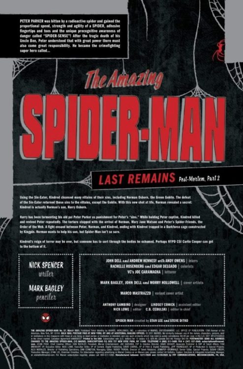
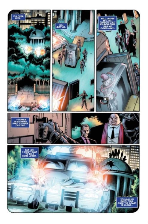
THE AMAZING SPIDER-MAN #57 hits your local comic book shop next week, but thanks to Marvel Comics, Monkeys Fighting Robots has an exclusive four-page preview for our readers.
“Last Remains: Post-Mortem, Part 2” is written by Nick Spencer, while Mark Bagley handles pencils, Andrew Hennessy and John Dell with Andy Owens drop inks, Rachelle Rosenberg and Edgar Delgado are the colorists, and you will read Joe Caramagna’s letter work.
About the issue:
Spider-Man continues to pick up the pieces and try to put his life together. But many of the gathering storms are swirling more and more violently… We want to tell you more, but it WOULD SPOIL SO MUCH OF LAST REMAINS!!!
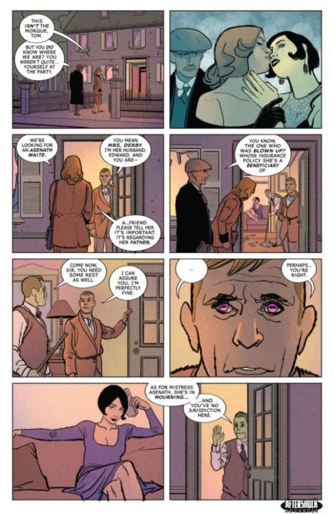
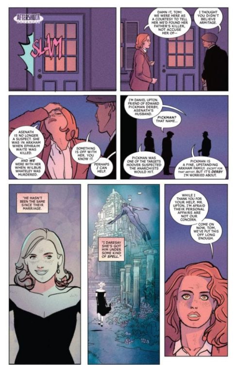
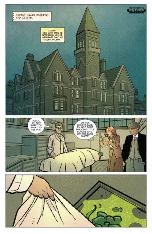
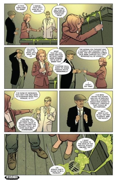
MISKATONIC #3 hits your local comic book shop on January 20, but thanks to AfterShock Comics, Monkeys Fighting Robots has an exclusive four-page preview for our readers.
The 32-page comics is written by Mark Sable, with art by Giorgio Pontrelli, Pippa Bowland drops the color, and you will read Thomas Mauer’s letter work. The main cover is by Jeremy Haun with Nick Filardi.
About the issue: Skeptical Bureau of Investigation Agent Miranda Keller and true-believer detective Tom Malone are tasked by J. Edgar Hoover to investigate a series of bombings in 1920s New England. Traveling to the Arkham Asylum, the investigators discover their suspects aren’t just insane, but also undead. Who could be re-animating them?
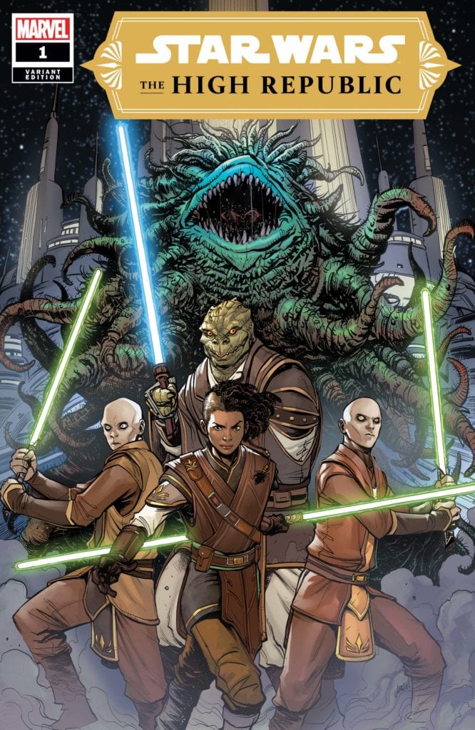
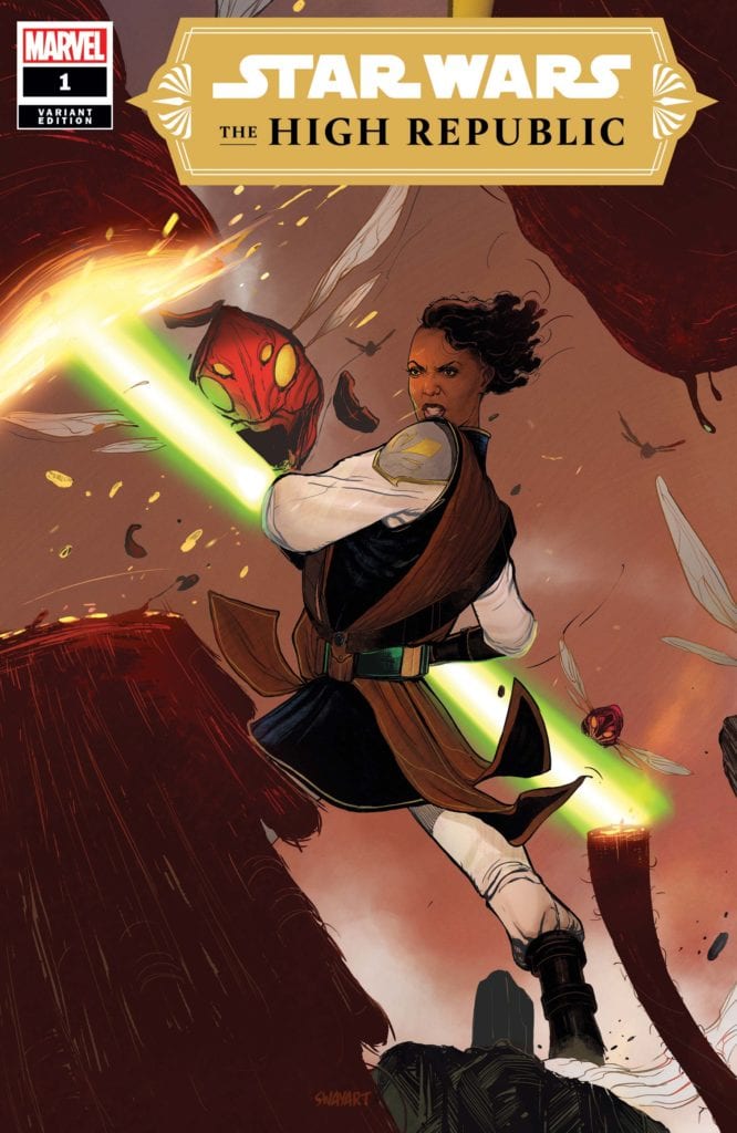
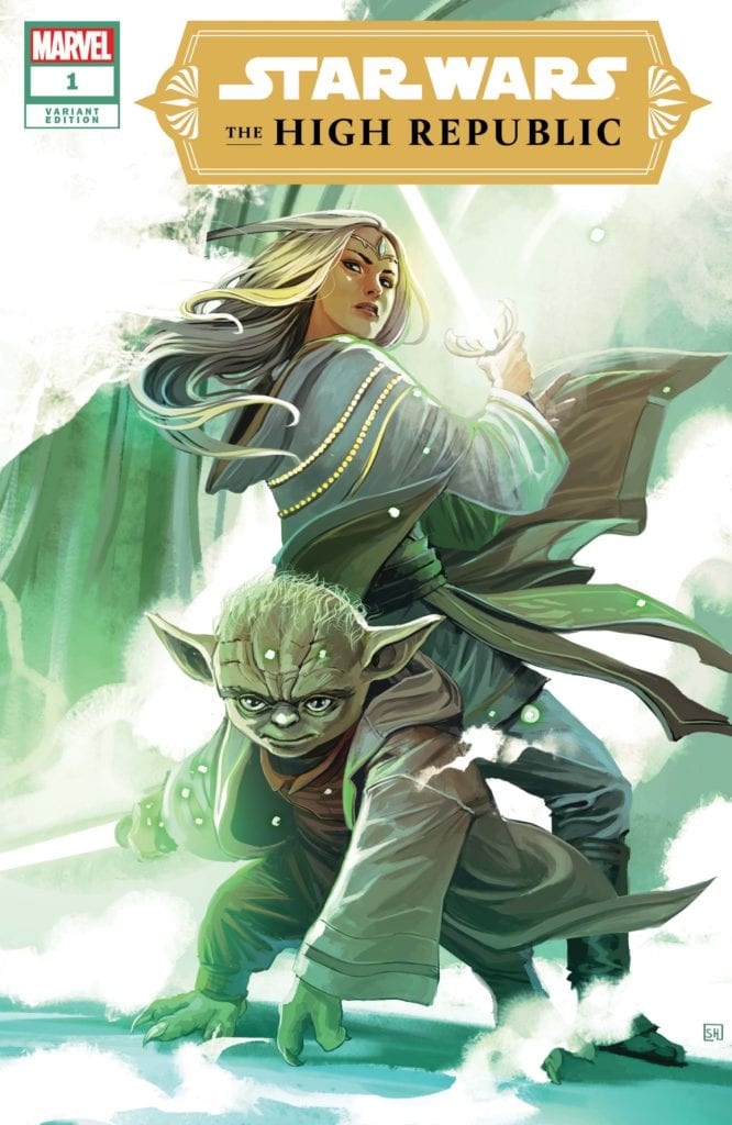
A long time ago, in a galaxy far, far away, the Republic and the Jedi Order were at the peak of their prosperity. Writer Cavan Scott and artist Ario Anindito, along with inker Mark Morales, colorist Annalisa Leoni, and letterer Ariana Maher put together “Star Wars: The High Republic” #1, the first chapter of this unseen age in the Star Wars universe. Set some 200 years before the rise of the Galactic Empire, this issue presents an era full of fantastic new characters (and some old ones) and exciting action, all through the lens of some of the best visual work seen in a Star Wars comic. There’s a lot to be excited for here.
“A new era of STAR WARS storytelling begins. It is centuries before the SKYWALKER SAGA. The JEDI are at their height, protecting the galaxy as REPUBLIC pioneers push out into new territories. As the Frontier prepares for the dedication of majestic STARLIGHT BEACON, PADAWAN KEEVE TRENNIS faces the ultimate choice – will she complete her Jedi Trials or rescue the innocent from disaster? New Jedi! New ships! New evils to fight!”
Writing & Plot
In terms of style, “The High Republic” #1 feels familiar while offering completely new faces, planets, and concepts. Tonally, Cavan Scott’s script feels like a combination of Filoni’s Clone Wars animated series and some of Dark Horse’s The Old Republic offerings. These are grafted together to create a chapter that still come off as totally new while still being undoubtedly Star Wars. Protagonist Keeve Trennis is an awesome new character, focused and loyal to the Jedi way while also having a sort of underworld grit. Her mysterious master is a character that I really look forward to reading more of, as well as just getting to witness the Star Wars universe at this time. This is an era of Star Wars we’ve never gotten a look at, in the centuries just before the fall of the Jedi Order. Scott doesn’t start this series with any kind of grandiose view of the Republic however, as he instead decides to just focus on character with some hints at the larger plot. This more intimate focus and pacing allows for an experience that makes you immediately get into the new characters ad they take you along for this force-wielding ride. The action in this issue again is reminiscent of that Filoni animated style, with a kind of wacky but serious disaster unfolding that is a blast to follow while still having serious stakes. There’s so much we still don’t know abou these characters and the focuses of the Republic and the Jedi Order (as well as their potential adversaries) in this time period, and this comic makes my desire to explore this story and part of the Star Wars universe inescapable.
Art Direction
Putting together the aesthetic and style of not just the iconic Star Wars universe, but a time period in that universe that has never been seen before, is no easy feat. Fortunately, “The High Republic” #1 has the visual talents of artist Ario Anindito and inker Mark Morales to craft a comic that is unmistakably Star Wars while still offering brand new sights. The designs and animations of alien species both new and classic are crafted with an eye for humanity, making them characters on their own regardless of their unusual physiology. Almost every panel has the mysterious design language of a Ralph McQuarrie painting, with the Star Wars brand of space opera beauty shining through. This is a comic book with obviously very high production value, and that can be seen in the high-fidelity visuals on each page. The art style of Anindito and Morales, along with the colors by Annalisa Leoni, fit in with the styles seen in the past few years of Marvel’s Star Wars comics. This is not a negative, as I’ve yet to see a recent Star Wars series with less-than-great art. The panel and page direction has the feel of a storyboard, giving the comic a very film-style feel. The highly dynamic use of lighting and fog here works brilliantly, making the stunning alien world this issue mostly takes place on feel humid, while being onboard the Starlight Beacon feels like taking a step inside the Jedi Temple in the prequel trilogy, but with a bit more golden atmosphere. The colorwork on display here is exceptional; the flora and fauna of alien planets is a varied but grounded array of natural colors, while character details (from Jedi robes to alien horns and scales) have their own wide array of tones. Seeing the cool blue reflection of readouts and holo-displays on characters is still a really cool artistic feat that I’ll never not be impressed by. The letters from Ariana Maher use a slim, modern kind of font that uses a bit of variance from character to character, along with standout sound-effect letters. Every aspect of this book’s visuals fire on all cylinders, and it’s easily one of the best looking Star Wars comics ever published.
“Star Wars: The High Republic” #1 has made me excited for Star Wars is ways I haven’t been in quite some time. This comic displays a fantastic understanding of the Star Wars universe, and uses said understanding to create characters and concepts that seamlessly blend into this fiction, but still feel totally new. The script from Cavan Scott takes the perspective of a protagonist I had a blast reading about from page one, and paints intriguing mystery into this new chapter in Star Wars history. The efforts of the visual team are absolutely astounding, creating some of the most gorgeous views and vistas seen in a Star Wars comic. Whether you’re a Star Wars fan or not, this is a comic worth reading. Be sure to pick it up from your local comic shop when it releases on 1/6!
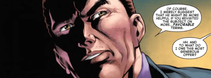
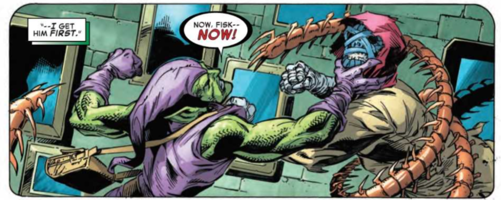
The Amazing Spider-Man #56, out now from Marvel Comics, is an explosive issue that is the first part of “Last Remains Post Mortem” and keeps the story twisting and turning.
About the book: Norman Osborn and the Kingpin have united to achieve a common goal of trapping the demonic Kindred. The alliance of two of his deadliest villains immediately spells bad news for Spider-Man, but will anyone else be caught in the crossfire?
Nick Spencer has a gift. He knows how to keep an issue entertaining, and he heavily applies that knowledge in The Amazing Spider-Man #56. It feels like every turn of a page is some twist or shocking event, making the entire issue an enthralling read. The issue also continues subplots that hadn’t been touched upon for many issues, and it was refreshing to see these characters and how their stories are playing out after everything that has been happening. The story continues to bombard us with new information, but there is always so much more that we don’t know. It is because of this that readers always want to get their hands on the next issue.
The Amazing Spider-Man #56 features Mark Bagley’s pencils and Andrew Hennessy and John Dell’s inks. Together, this team provides some breathtaking art. The characters’ facial expressions are complex but are still very easy to understand. This issue features a brilliant silent page that has so much storytelling just from the visuals alone. It’s always wonderful when the writer allows the artists to tell the story without dialogue, and there is a beautiful case of that in this issue. Bagley, Hennessy, and Dell also use the exciting technique of changing panel shapes to indicate a flashback. In this series, flashbacks were commonly portrayed through a tint applied to the panels, but the method of changing panel shape was most likely used here because the events shown were still very recent. The technique of changing panel shape is a subtle yet effective way to indicate flashbacks.
The coloring of Rachelle Rosenberg and Edgar Delgado in The Amazing Spider-Man #56 is astonishing and has a wonderfully broad color palette. This issue features many different scenes, and the wide color palette brings each of the settings to life. The shading of characters’ faces also serves a vital role in the book’s visual storytelling and causes the silent panels to pack a vicious punch. Rosenberg and Delgado use changes in the background color to indicate a shift in tone, reinforcing cues that could be understood from the characters’ facial expressions.
VC’s Joe Caramagna’s lettering in The Amazing Spider-Man #56 helps the story flow naturally and has an enjoyably diverse choice of fonts. Whether through giant bold lettering, dialogue bursting out of a speech bubble, or unique speech bubble designs for characters, Caramagna makes every instance of lettering count.
The Amazing Spider-Man #56 is another case of so much information thrown at us, yet so much is still left unexplained. The art and coloring work together to portray some beautiful and complex emotions in the characters, and the visual storytelling in this issue is remarkable. The lettering brings it all together and leaves us with an impressive issue and a story that leaves readers wanting more.
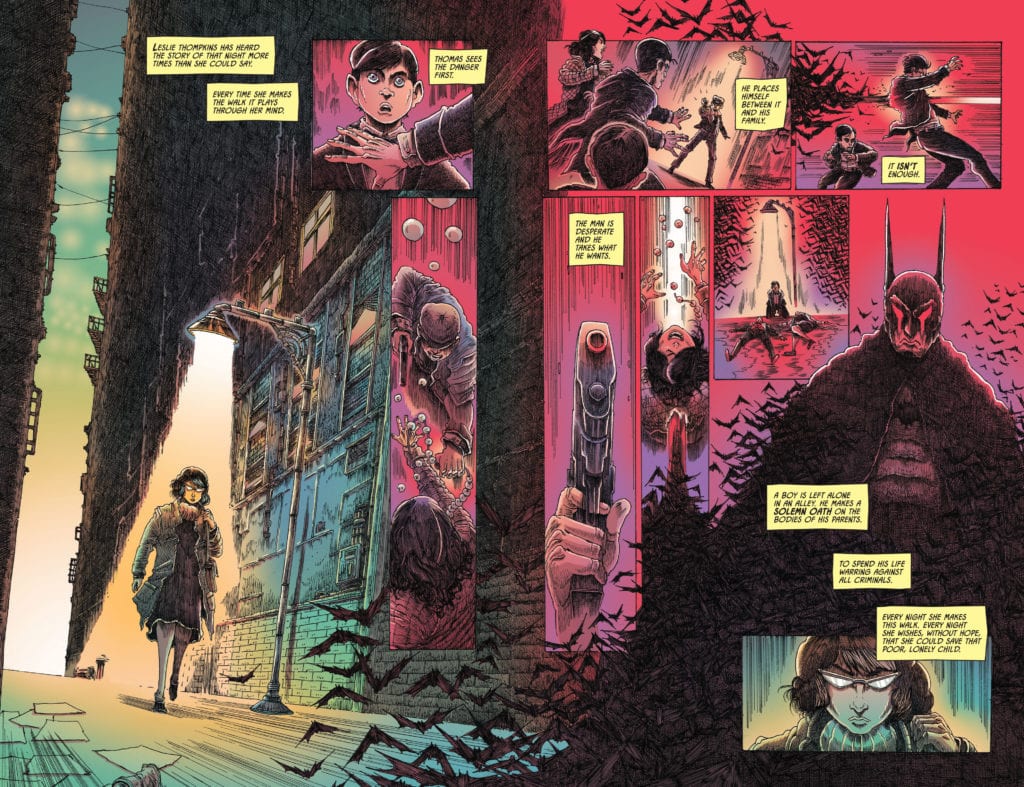
Batman Annual #5 out now from DC Comics displays new and old Batman mythos meeting at a junction. Batman writer James Tynion IV with artist James Stokoe showcase dealing with the absurdities of Gotham and Batman. Joining them is letterer Clayton Cowles to display the voices of everyone dealing with the absurd.
Batman Annual #5: Finding Common Ground
Tynion thankfully takes steps to introduce readers to Leslie Thompkins, Batman’s childhood caretaker. By juxtaposing Leslie’s presence and influence in Crime Alley, readers see her parallel with Batman. While Batman prefers to strike fear into criminals’ hearts, Leslie hopes to rehabilitate people by helping them work out their issues properly. This leads her to the main element of Batman Annual #5, the Clownhunter.
Leslie serves as an intersection for Bao Pham in his criticism of Batman. Like Bao, she thinks Batman isn’t doing what he is supposed to do while also disagreeing with Bao’s slaughter of clowns. Leslie empathizes with Bao’s struggles with the absurdities surrounding Gotham and Batman. Because needing to make sense in the absurd is a very human thing to do.
These struggles with identity and finding someone to bounce off make both Leslie and Bao good characters. It’s the interactions between different parties that can lead to greater developments. I certainly want to see where the Clownhunter goes after this.
Absurdly Grotesque
Stokoe’s art returning from Joker War Zone fits perfectly into Batman Annual #5. The inherent absurdity of Gotham City can feel like a walk through Hell, and Stokoe’s grotesque imagery displays that in full. That is certainly what Bao’s perspective has when it comes to his family’s murder.
At the same time, Stokoe’s art showcases a cooler colored glow that displays some hope in dark places. It’s something that comes to a head when Bao removes his red-accented helmet to speak with Leslie under this glow.
Cowles’ lettering showcases how characters speak under the circumstances. Most of the characters speak in an easy to follow format through the standard word balloon. Then there’s the Clownhunter who speaks in lowercase font, unlike his younger self who spoke like most people. It displays his trauma and how small he feels after encounters in the main comics.
The use of SFX from Cowles even showcases Bao’s transformation into the Clownhunter. Bao’s flashbacks have rather simple effects like knocking on a door until, eventually, Stokoe’s SFX takes over with how over-the-top they get. Every crack and crash gets as absurd as the situations they’re in.
Batman Annual #5 Is Climatic
Batman Annual #5 takes itself a step further by showcasing character development. By clashing one of the newer characters with an old but important one, a compromise is found. It’s almost like Batman’s fans, and critics find common ground by learning to live with the absurdities. Because living with that instead of against it might just be healthier. The Clownhunter is certainly a character to invest interest in his origin story.
The Elephant In The Room is a film on Amazon Prime directed by Allen Freeman (Dean LeCrone vs. the Mutants of Comic-Con) and starring Niko Vitacco (Prom Knight) as a nurse with an unusual way of treating patients based on true stories of the world of palliative care.
Based on City of Hope nurse Bonnie Freeman’s true stories, The Elephant In The Room is a dramedy following a team of doctors and nurses caring for people facing their final days. Michael (Niko Vitacco) is a nurse who adds humor and compassion to his toolkit for dealing with patients. Michael’s approach is out of the norm, and it’s put to the test when he meets Cooper, played by Craig Callo, who doesn’t see the light at the end of the tunnel.
PopAxiom spoke with Niko Vitacco, Tamir Gedalia, and William Dale about bringing Bonnie Freeman’s life to the big screen.
City Of Hope
Executive producer William Dale isn’t a movie guy. He’s the Chair in Supportive Care Medicine at the City of Hope. He worked closely with Bonnie Freeman and learned of her stories early on.
“Making the film was certainly easy for me since Bonnie Freeman did all the hard work,” William jokes. “She did a remarkable job of translating the experiences. Niko and Tamir took Bonnie’s vision and turned it into entertainment.”
Admittedly, William says, “I don’t like medical dramas and comedy very much because of the lack of realism.” He adds, “I have a soft spot for SCRUBS because they captured a couple of the real issues that go on.”
Getting the City of Hope to agree to become a film set was tricky. “We have a patient-family resource center that’s under my department. That was made available as a staging place,” William explains, “We got some approvals from the hospital to use it when essentially very few other people were around. There were caveats to that too.”
In the end, William says, “The hospital is thrilled with the way it all came out.”
Road To Hope
Niko and Tamir are both filmmakers, but their road into showbiz came via different routes.
Niko: “As a kid, I loved to tell stories. I knew at a young age that I wanted to be an actor. I’d done commercials, stage, and short films. This was my first lead in a feature. Because I was so involved during production, I was given the opportunity by Tamir, our director Allen, and writer Bonnie to take on a producer role.”
Tamir: “Back in Israel, I used to be an accountant. At some point, I started to follow my dreams of being a filmmaker. I left my job and career and moved to LA. I started volunteering on any production; short films, student films, videos, and commercials. Step-by-step, I started gaining experience and started my own production company. I started to produce commercials and videos. The Elephant In The Room is my first feature.”
How did Elephant In The Room come on everyone’s radar?
Niko: “It’s kind of a weird story. My wife knew Bonnie’s daughter (Ana) when my wife lived in Michigan. Ana reached out to my wife and asked if I’d be interested in auditioning because they just lost their lead actor. I was a little skeptical. Everyone claims to be a writer, and there’s a lot of bad material out there. Nevertheless, I said I’d be happy to read the script. Truthfully, I didn’t think I’d make it through the first ten pages. But it didn’t happen. Once I started reading the script, I couldn’t put it down. I laughed, I cried, I knew I was hooked.”
Tamir: “I got to know Allen through a friend. I knew his wife had a script, and she’s trying to make it into a film. As Niko said, we see a lot of bad material. So, that was my attitude, but I got the script, and I liked it. I thought it was different.”
Tamir admits, “We didn’t know how we were going to start, but Bonnie’s passion made me believe we would make the movie.”
William: “Bonnie worked at supportive care right next door to me. She came to me with the story early on. Niko came in and bribed me with a ball. We’re both from the southside of Chicago, and he gave me a White Sox World Series ball in the hopes that I would help more with the film. I went to my finance and risk-averse wife and said, ‘We don’t need that kitchen redesign, can we just do this film instead?'”
Becoming Michael
The Elephant In The Room is a character-driven drama that centers around Michael. How did becoming Michael happen for Niko?
Niko: “On the day of our table read, when I first met Bonnie, she told me that Michael was her alter-ego. Like Bonnie, Michael has a very unconventional approach to his patients. He values both humor and compassion. She wanted it to be clear that although Michael’s antics were over-the-top, it was only a dramatized representation of who he was. Michael is larger than life. But it was important to show the human connection with his patients and how he sees them for who they are, not where they are going to end up.”
The Elephant In The Room deals with a heavy topic with the kind of touch that has weight and levity. What’s a moment while filming that Niko will hold onto?
Niko: “I think a difficult scene that was tough for me was a scene in a stairwell. I knew how important this moment was for Bonnie. Before filming, she told me that she never got a chance to say goodbye to the real patient. So, writing this was her way of doing it, so I tried to give everything in the scene.”
“During the scene, the director let the camera roll a little bit longer,” Niko explains, “and I ad-libbed out loud ‘I love him so much.’ When the director called cut, Bonnie ran over to me with tears in her eyes and hugged me and said, ‘I never got a chance to say that out loud. Thank you.”
“Of course, the producer cut it out of the film,” Niko laughs.
Tamir: “It was the editor who did that.”
Selling The Elephant
The Elephant In The Room is a dramedy about some very weighty issues. How do they sell the film to a random person on the street?
Tamir: “It’s about a nurse in palliative care who treats terminally ill patients in unorthodox ways. He meets a tough patient and tries to get into his heart, and together they go on a journey through life and death. In the last year, I added one more sentence: ‘You will laugh, you will cry.'”
William: When I tell people it’s about palliative care, but it’s not all gloom and doom, people say, ‘You’re kidding.”
Niko: “Death doesn’t have to be dark and frightening if we talk about it. Without sounding lame, our film shows the delicate role that humor should play in this line of work.”
Wrapping Up
Who inspires Niko and Tamir as filmmakers?
Niko: “For me, two main actors stand out. Such polar opposites. Robert DeNiro, who I’ve grown up loving and watching and almost see as a father figure. He’s able to tell so much of a story with a blank face. I’ve always wanted to be more like that in my work. The other person would be Will Ferrell. He commits himself so much, regardless of how stupid the character is, he immerses himself. That commitment makes it real and brings it to life. As goofy as this sounds, my dogs inspire me a lot. They teach me to live in the present and live creatively with an open mind.”
Tamir: My favorite director who inspires me is Stanley Kubrick. I love films that every time you watch them, you find another more profound meaning. Each one of his movies you need to watch more than once. In general, I’m inspired by true stories and human stories.”
Though William isn’t a dedicated filmmaker, he admires one actor in particular. “I love Robin Williams. He’s my favorite actor. He loved doing medical characters. I loved Awakenings.”
What’s a dream project for Niko and Tamir?
Niko: “I’ve always loved The Lost Boys. It could be a great series. That would be incredible. As a teenager growing up, it gave me a sense of swagger.”
Tamir: “I would love to do our movie as a series with the same premise. Every episode would feature a different patient with different takes on life.”
The Elephant In The Room is out on Amazon Prime. So, what’s next from the filmmakers?
Niko: “A bunch of things are in the mix. The pandemic’s slowed things down, but it’s helped me re-focus on where I want my career to go. I finished a rewrite on a screenplay.”
Tamir: “I’m in the development of a series based on a true story about the Mossad’s most extraordinary operation that changed the way the world sees Israel.”
Is The Elephant In The Room on your Amazon Prime watch list?
Thanks to Niko Vitacco, Tamir Gedalia, William Dale, and Lumos PR
for making this interview possible.
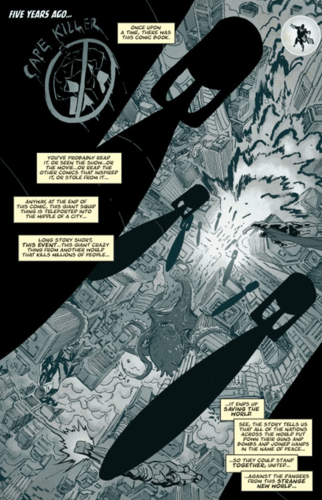
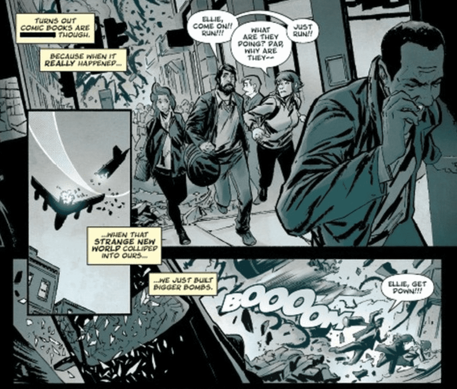
Crossover #3, out today from Image Comics, is the most monumental issue in the series thus far. Featuring the biggest battles, a great cliffhanger, and the most crossovers.
Donny Cates’ writing makes Crossover #3 a gripping read from start to finish. From us finding the truth about something we had misconceptions about, to earlier foreshadowed events beginning to fall into play (albeit just starting), the issue constantly supplies you with reasons to keep on reading. The most substantial aspect of the writing that makes this issue so notable is that it crosses over with characters from other series. This is no big surprise — note the title of the series — but who shows up in Crossover #3 is sure to shock readers. We had a taste of other characters in the previous issues, but now we get to see them directly involved in the main story, rather than just indirect cameos (for example, arms sticking out of prison cells or a drawing.)
Geoff Shaw’s art is brilliant, and I want more. There is something about his faces that make the protagonists seem friendly and approachable, and the mean characters seem absolutely despicable. There is only one character in Crossover #3 that I would classify as a villain with certainty, and the way Shaw draws him makes it looks as if he’s never felt love a day in his life. This issue also features some gorgeous use of shadows that instills a dramatic tone, some spectacularly done rainfall, and some complex architecture that is certain to impress if you stop to appreciate it.
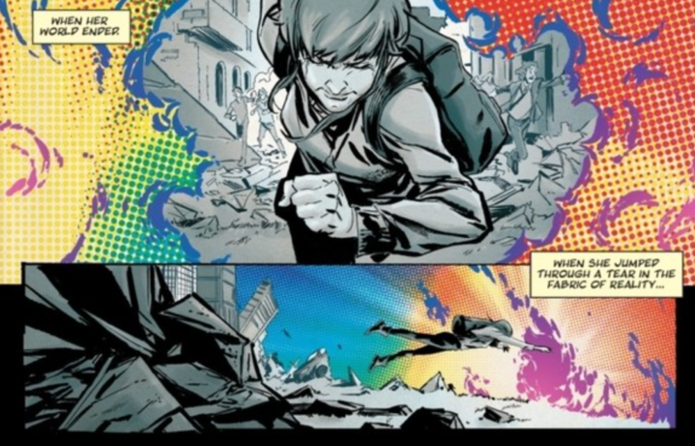
Dee Cunniffe’s coloring is quite impressive in Crossover #3, particularly in the beginning. In the first few pages, we are greeted with a bleak color palette that reflects the grim events happening on the page. When the fantasy elements are introduced to this scene, they are brightly colored and provide a stark contrast to the previous panels. I’m not certain what effect was intended by doing this. I believe it could either be that the bright colors indicate that the world for Ellie in the future will be drastically different than what it was before, or they are used to show that while the comic book characters are ordinarily fantastic and colorful, their presence in the real world results in a chaotic and horrifying scene. The rest of the issue has a pleasantly wide palette, and Cunniffe does a phenomenal job of using colors to set the tone.
Crossover #3 benefits significantly from the lettering of John J. Hill, especially during giant fight scenes. The issue features one huge battle, and Hill’s font choice makes the blows exchanged have a deeper impact. His speech bubbles’ positioning also allows for the story to flow naturally, and captions are always clear.
Crossover #3 is an incredible page-turner that lives up to its name. The art and coloring provide some breathtaking pages, and the lettering allows the story to flow smoothly. From the quality of the first three issues and what it is building up to, Crossover is looking to be a highly promising series.


 Stokoe’s art returning from