

Crossover #3, out today from Image Comics, is the most monumental issue in the series thus far. Featuring the biggest battles, a great cliffhanger, and the most crossovers.
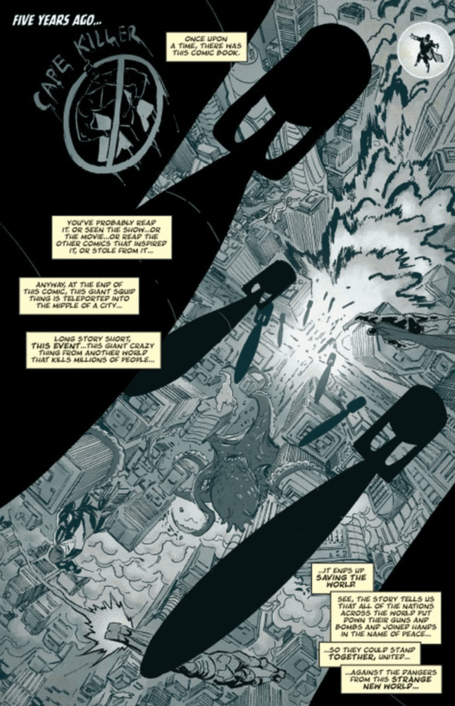
Donny Cates’ writing makes Crossover #3 a gripping read from start to finish. From us finding the truth about something we had misconceptions about, to earlier foreshadowed events beginning to fall into play (albeit just starting), the issue constantly supplies you with reasons to keep on reading. The most substantial aspect of the writing that makes this issue so notable is that it crosses over with characters from other series. This is no big surprise — note the title of the series — but who shows up in Crossover #3 is sure to shock readers. We had a taste of other characters in the previous issues, but now we get to see them directly involved in the main story, rather than just indirect cameos (for example, arms sticking out of prison cells or a drawing.)
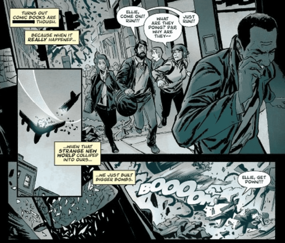
Geoff Shaw’s art is brilliant, and I want more. There is something about his faces that make the protagonists seem friendly and approachable, and the mean characters seem absolutely despicable. There is only one character in Crossover #3 that I would classify as a villain with certainty, and the way Shaw draws him makes it looks as if he’s never felt love a day in his life. This issue also features some gorgeous use of shadows that instills a dramatic tone, some spectacularly done rainfall, and some complex architecture that is certain to impress if you stop to appreciate it.
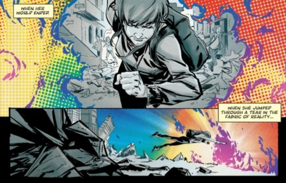
Dee Cunniffe’s coloring is quite impressive in Crossover #3, particularly in the beginning. In the first few pages, we are greeted with a bleak color palette that reflects the grim events happening on the page. When the fantasy elements are introduced to this scene, they are brightly colored and provide a stark contrast to the previous panels. I’m not certain what effect was intended by doing this. I believe it could either be that the bright colors indicate that the world for Ellie in the future will be drastically different than what it was before, or they are used to show that while the comic book characters are ordinarily fantastic and colorful, their presence in the real world results in a chaotic and horrifying scene. The rest of the issue has a pleasantly wide palette, and Cunniffe does a phenomenal job of using colors to set the tone.
Crossover #3 benefits significantly from the lettering of John J. Hill, especially during giant fight scenes. The issue features one huge battle, and Hill’s font choice makes the blows exchanged have a deeper impact. His speech bubbles’ positioning also allows for the story to flow naturally, and captions are always clear.
Crossover #3 is an incredible page-turner that lives up to its name. The art and coloring provide some breathtaking pages, and the lettering allows the story to flow smoothly. From the quality of the first three issues and what it is building up to, Crossover is looking to be a highly promising series.