Home Blog Page 196

Self-Published Spotlight: Robb Mirsky’s SLUDGY

Sludgy

Welcome to Self-Published Spotlight, a regular interview column where I will be highlighting self-published comics and the creators and small print publishers who make them.


I discovered Robb Mirsky’s Sludgy in 2020 as part of a deep dive into new mini-comics. Deceptively simple, Sludgy is a comic that really understands cartooning and all its components; from conception, to design, to production. I was able to catch up with Robb recently and pick his brain. Read on and make sure to grab Sludgy!

Monkeys Fighting Robots: First off Robb, thanks for taking the time to talk to us. How are you doing so far in 2021?
Robb Mirsky: Hey Manny! Thanks for talking to me! After the hell that was 2020, I’m feeling pretty good.  I know it’s just a number on a calendar, but I was more than happy to move on from last year.  Things still obviously suck, but I’m working on a bunch of new stuff and feeling good regardless.  Comics keep my focus away from all the BS that the news and social media keep piling on.  It’s a nice distraction.

MFR: For our readers that don’t know your work, give us an introduction. And tell us all about Sludgy.
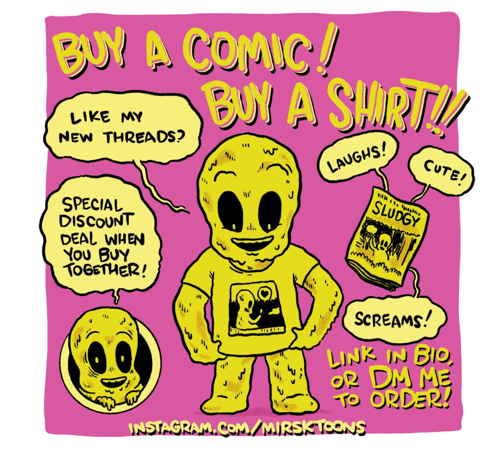
RM: I’m a cartoonist in Toronto, Canada.  I’ve been self-publishing for the better part of two decades. I work mainly in the vibes of alternative comics, or like, the undergrounds.  I don’t really mess with the Big 2 comics.  I like to make funny comics.  I’ve spent most of my childhood reading MAD Magazine and newspaper strips like Calvin & Hobbes, and The Farside.  I like to see comics as an escape.  I wanna laugh away the pain of the real world, and a good goofy comic is perfect for that.  Sludgy is one of my many characters.  They are cute, they are cuddly, and they are deadly, though I don’t think they really realize that.  In the first Sludgy story, they are just wandering around the forest looking for a companion, and wind up killing everything they try to touch… Heart of gold.  Hands of death.  I like to describe Sludgy as Casper the Friendly Ghost meets The Toxic AvengerSludgy

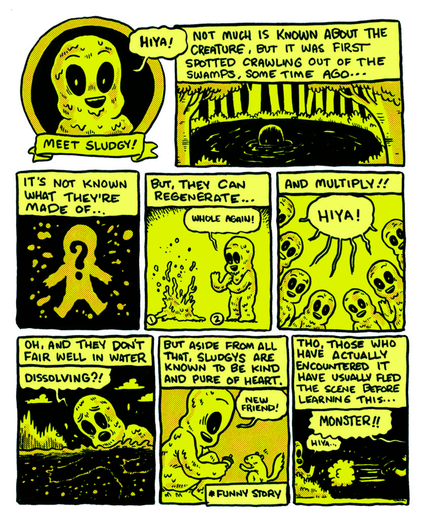
MFR: So let’s start with the classic, basic…how did you get into comics and how did you get into MAKING your own comics? Who are your influences?
RM: I’ve been into comics for as long as I can remember.  Like I said, I grew up with newspaper strips and MAD Magazine.  Things like Peanuts, Archie and Harvey Comics were really big for me as a kid.  I have comics I made when I was 8 and my dad sent them to the newspaper.  They didn’t print them (shocking), and it was my first taste of rejection in the world of comics!  I got bored of superhero comics pretty early in life but fell into The Maxx pretty hard as a teen.  It wasn’t until I discovered Robert Crumb for myself that I really felt a want to make my own comics and actually try.  All the other comics I had read up to that point looked like I couldn’t make them.  All polished and neat, and boring.  Crumb turned my head upside down (much like early experiments with drugs) and comics seemed exciting again.  Then I found Johnny The Homicidal Maniac and I was sold.  Content-wise it was perfect.  I could almost draw like that too.  It was the first time I was like “I can do this.  I wanna do this”. So for influences, I would probably say (but not limited to) Robert Crumb, Peter Bagge, Jhonen Vasquez, Bill Watterson, E.C. Segar, the art of ‘Big Daddy’ Roth, and honestly, there’s too many to list.  I’m constantly influenced by great work I see on a daily basis.  Inspiring books are spilling off my shelves. There are so many!

MFR: What’s your process for making comics? How do you start and where do you start? How long did it take to start and finish Sludgy?
RM: The process changes from project to project really.  Sludgy is an improvised comic.  I take it page by page and just try to figure out where to go next.  I don’t like heavy planning. It usually kills a project for me.  I’m part of the Toronto Comic Jam, and the idea of jamming comics is a really appealing way for me to make.  I’m currently making a new comic, and I just drew quick thumbnails of each panel, thinking only what the next panel should be, and then I break it down and lay it out on the pages.  I dunno how long it’s gonna be till I reach the end.  I like working loose.  Scripts are too formal.  If I keep it simple, I work quicker, and the results are always better.  I wrote and drew that Sludgy story in 2 months.  I just finished another Sludgy story that took 5 weeks.  So, I’m speeding up, which is great, cuz comics take a long ass time to make!

MFR: When did the idea for Sludgy first come? It’s such a wonderful character design.
RM: I literally drew the title to the first story and the first panel (a swamp) on a scrap of paper to get it out of my head, and that doodle just sat on my desk for a month before I wanted to do something with it.  I used to participate in a November drawing challenge called ’30 Days of Comics’ in which yer supposed to draw a new comic, or page, or panel a day.  Sludgy just became Sludgy cuz I wanted a comic to work on.  And the design is based on Casper.  Melty and drippy, Sludgy is basically the same shape and has a similar disposition.  That’s pretty much where the similarities end though.  

MFR: How did it progress from there? did you see a comic in it right away?
RM: I just kept drawing.  I drew a 17-page story with no planning, and thought “well that was so much less stressful than when I try!”  It was the longest story I had done at that point.  I kinda felt like I had something, and I enjoyed the character, so I just kept going with it.  And I usually think in terms of comics. I love comics.  They are the language I understand best.  So, there’s always comic ideas rolling through my brain.Sludgy

MFR: I really love the color palette you used. What color exactly is the dominant one? How did you get that unique color?
RM: Thanks!  It’s a gross kind of yellow, a perfect accompaniment to a kinda gross character!  I use a pink to shade it and when it blends with the yellow, it gets that weird sludge vibe.

MFR: What led to you deciding on such a striking color for the book?
RM: Hehehe.  So, I’m colourblind, and colouring my comics is painful and stressful.  The first Sludgy story was printed in my old collective’s anthology series ‘Read More Comix!’ (No affiliation with Cartoonist Kayfabe, we had the name first), and the anthology series is in full colour…. So my colour choice was based on a mix of finding an easy way around colouring, and it’s also supposed to simulate like old monster movie films. Instead of the same black and white, it’s a murky slime colour. I think colouring the Sludgy stories with a proper palette would ruin the story.  But I could just be lazy… who knows!

MFR: Sludgy is also a mini-comic. Why did you go with the smaller format?
RM: I love floppy comics. I love big ol graphic novel format comics too, but my true love is short stories, strips, things like that. I’m not sure if I have a graphic novel in me.  I just gotta keep trusting my gut and make things that I wanna make. I try not to worry about if anyone else will enjoy it until I’m done..  and then it’s all I worry about cuz selling books is stressful!!!

MFR: And what kind of stock is Sludgy printed on? It feels good to flip these pages!
RM:  It’s like the standard glossy paper from a printer here in Toronto.  I’m not crazy about glossy paper usually, but I lucked out.  It does feel nice!

MFR: Are you going to be working on any new Sludgy (or any other comics) in 2021?
RM: I already finished the next Sludgy story.  It’s 24 pages long.  I just gotta scan and colour it, but the writing and drawing are all done.  I have more ideas for Sludgy, so I’ll probably write more when I feel it’s time.  Currently, I’m working on a couple new things for the year.  And I’d like to draw more for the strip I created last year to ward off pandemic insanity. It’s called ‘Dingus & Dum-Dum’ and it follows two 1930’s inspired goofballs that are always on the hunt for a couple of bucks or some food or just a good grift.  You can read 75 strips of them on my Instagram now.  I’d like to do more and collect them in a book maybe, but I’m not really committed to any one idea.

MFR: And where can readers find your work?
RM: I’m on Instagram as @mirsktoons. You can read some other things on my website www.robbmirsky.com. Or you can pick up a real book. Sludgy – https://mymovingparts.com/collections/comics/products/sludgy-comic. Read More Comix! Anthologies at https://readmorecomix.storenvy.com/ (Sludgy #1 is printed originally in Read More Comix #5). I also design and co-run a shirt-making business with my wife.  She’s a screen printer and I design the shirts.  You can check out and buy stuff at www.mymovingparts.com and follow us on IG @mymovingparts. There’s a limited amount, but we made a Sludgy shirt too!  Thanks so much Manny!  I appreciate you talking to me!

Sludgy

Monkeys Fighting Robots Youtube

Review: HISTORY OF COMICS Embarks On An Ambitious Project

History of Comcis
History of Comics 1986 Credit: Foster Media Cover Design: Flops Comics

If you are a comic fan in the UK you may have heard of Comic Scene, a very British magazine dedicated to comics and (mainly) the British comic industry. The magazine included everything you would expect from such a publication, with reviews, articles, and comic strips. Despite a successful year in 2019, which saw the magazine hit the newsstands across the country, a new project by the publisher somewhat overshadowed the monthly publication and shifted the focus for the future.

Comic Scene History of Comics is an ambitious project that intends to chart a century of comics, with each book focusing on a single year. The first set of four books were launched on Kickstarter in 2020 and easily reached their required project goal. Digital and physical copies are available, in sets or individually. Basically, however you want to consume it, they’ve got you covered.

Comic Scene
Collection of Comic Scene Publications Credit: Foster Media

Content and Coverage

Deciding not to release the books in a chronological order, the first four releases cover the years 1950, 1977, 1984, and 1986. These years have some monumental pop culture releases, the Watchmen comic and the Star Wars movie for example, and allows the magazine to come out of the gate running. The covers, featuring Pop Art renditions of Princess Leia and Silk Spectre, leap off the page to entice readers. In fact, all four of the covers feature powerful and complex female comic book characters, which makes a strong statement about the magazine and establishes the inclusivity of the project.

The contents, overseen by managing editor Tony Foster, are a mixture in every sense. They cover a wide range of comics and related culture, from the classic Superhero floppies to comic strips such as Peanuts. Featured articles cover the history of characters, creators, and even publishers, while the rest of the pages are filled with reviews, general historical facts, and a gallery of images relating to the specific year. This means that you will find yourself entirely engrossed in some sections while flipping quickly past others. However, there is more than enough content in each issue to keep most readers satisfied.

Each issue opens with a Culture and Comics section written by John McShane. These articles superbly set the scene for the magazine by capturing the dedicated year in terms of Comics and the society surrounding them. They include hints to features coming up while painting a comics-centric landscape for all of the other elements of the magazine to grow in.

And there are some gems included among the articles. In the 1984 issue there is a fascinating interview with Ian Gibson about his work on Halo Jones for 2000AD. Bob Bailey shines a light on the Silver Age versions of Lana Lang and Lois Lane in the 1950 issue, which also includes some shorter articles on the Eagle and Dan Dare. 2000AD is picked up again by Chris Hallam in the 1977 issue but is overshadowed by Mark Newbold’s look at the rise of the Star Wars publications.

History of Comics
History of Comics 1986 Credit: Foster Media
Cover Design: Flops Comics

Considerations and Comic Strips

There is a very nostalgic feel to a lot of the writing, with the authors sharing personal memories along with established facts. Articles covering some of the lesser known comics and characters prove to be the most interesting reads. While pieces on more popular works, like Chris Hallam’s article on Watchmen, don’t tend to have anything new to say. In fact, the Watchmen article barely has anything to say about the comic at all and is more interested in the cultural influence and adaptations that came out of it. One of the few drawbacks to the History of Comics is the inconsistencies with some of the articles included. The 1986 issue should have featured a much more in depth look at Watchmen because of its significance to the comic book industry and the article that is included ends up being a disappointment by default.

Another example of the inconsistencies comes in the 1950 issue which features an article on the Senate Subcommittee Hearings on juvenile delinquency. Written by Christoper Irving, the article itself is insightful and well researched, however it covers an incident in comics history from 1954 and would surely fit better into the volume dealing with that year. 1950 saw the release of a number of first issues from EC Comics that have become world famous. With comics like Crime Suspend Stories, The Haunt of Fear, and Two-Fisted Tales making their debut, a feature covering the releases of these comics would have been more fitting than drawing attention to their ending.

The History of Comics project isn’t all that the Comic Scene team are up to. They also have a commitment to producing new comic anthologies using some amazing creators. Just like the magazine, the comic strips are a mix of styles and genres and have a fairly wide appeal. If you have grown up on the likes of 2000AD then the Comic Scene Annual will be worth checking out.

Comic Scene Annual Credit: Foster Media

Conclusion

There is no denying that the world of Comics is expanding. The movie industry is awash with characters from the pages of comic books, television is adapting and expanding comic narratives, and the internet is becoming a new medium to engage and consume comics. Into this mix a magazine like History of Comics is a welcome addition, feeding on the nostalgia of long time readers but also acting as an introduction for a new generation into the world of comic books. With appealing covers, a curated mix of articles and reviews, and plenty of images to break up the text, History of Comics is definitely making a lot of the right moves.

The first four issues have a few teething problems, with a little more care required to some of the article’s inclusions, but on the whole they are satisfying reads. Personally I could live without the pages of Comic Facts, most of which are elaborated on earlier in the issues, and the Comic Museum could use some work to make it more appealing. However, these aspects will appeal to some of the readers and the diversity in features is one of the magazine’s strong points.

History of Comics is an ambitious project and has got off to a great start. If you have an interest in how the modern comic industry was formed and how certain characters became Icons, then this magazine is for you. Not every page will be of interest but the majority of it will be. Even if you only have a passing interest in comic book history, there will be an issue that appeals to you and in a format that suits your reading habits.

Check out the website (comicscene.org) for news and updates on the project and to get your hands on a copy of one, or more, of the magazines.

Monkeys Fighting Robots Youtube

Review: WRONG TURN Makes The Woods Kind Of Scary Again

The Wrong Turn franchise has returned with this seventh entry that wipes the slate clean. After a lengthy hiatus, the West Virginia mountains appear to have changed, but the danger has remained. Originally titled Wrong Turn: The Foundation, Wrong Turn separates itself from prior entries by eliminating previous plot elements. This latest installment may not be what fans of the franchise are familiar with, but it’s leaps and bounds better than the abysmal sequels that have come before it. 

After the botched sixth entry, it seemed like the franchise was dead, but only part of it seems to have died. The series is known for its group of backwoods cannibals stalking stranded individuals in West Virginia. Launched in 2003, the film went on to spawn five sequels that went straight to video. Directed by Mike P. Nelson and written by Alan B. McElroy, who penned the original film. Wrong Turn stars Charlotte Vega, Matthew Modine, Emma Dumont, Adain Bradley, Dylan McTee, Bill Sage, and Adrian Favela. Similar to past entries, this film follows a group of friends who go hiking the Appalachian Trail only to find themselves trapped by a group of mountain dwellers known as The Foundation.

Adrian Favela as Luis in Wrong Turn

Jen (Vega) and her friends were warned to not stray off the trail, but an unfortunate series of traps lead them into dangerous territory. Her friends include Milla (Dumont), Luis (Favela), Adam (McTee), and Darius (Clemons). McElroy’s return isn’t wasted, but the question many might have by the end is why is the Wrong Turn title associated with this project. As mentioned above, Wrong Turn: The Foundation was the original title, but it feels like the wrong title was kept. He has penned a film that has no connection to previous entries, and The Foundation are not backwoods cannibals at all. Still, looking past the fact that Wrong Turn is not itself anymore, there is decent film underneath those hiccups.

The film delivers a sufficient group of entertaining, and slightly likable characters, but we don’t learn too much about them outside of a few minor details. The Foundation has a specific way of life that they do not want to be disturbed, and anyone who comes in contact with them learns this. McElroy has written up an interesting group of offbeat individuals that do not seem pleased with life outside of those mountains. Lead by Venable (Sage), these mountain dwellers have their own sick style of justice, punishment, and much more that will keep audiences engaged. There are plenty of intense sequences throughout this screenplay, which was missing from the past couple of sequels. The script must have included several moments of shouting because the group we follow does nothing but yell to deliver their lines. Shouting aside, the acting is solid across the board, and the film’s biggest issue comes from its underdevelopment of certain characters despite the film being nearly two hours.

Charlotte Vega as Jes Shaw in Wrong Turn

Vega and Sage deliver in every scene they are in, especially when they share the screen. With material that doesn’t resemble previous entries at its core, it is nice to have performances that make this transition acceptable. Nelson keeps the film interesting by raising the tension with each passing scene. Wrong Turn’s pacing is adequate, but it slows down a bit towards the middle and it begins to grow dull at times. This feels like a return to form, but it’s incomplete because it really has no reason to be titled Wrong Turn. Also, the score featured throughout is one of the best in this franchise. It will keep viewers on the edge and may spark a few chills as well. It heightens the sense of urgency presented at times and makes it apparent that the serious tone has returned to this series.

Wrong Turn probably won’t lead to further entries, but it’s another average entry in this series with a few issues in its narrative. It will most likely be ridiculed for erasing the cannibals, but given how poor previous entries have been, this film deserves some applause. It revives the serious tone that has been missing and offers a decent narrative about what could be lurking in the West Virginia mountains besides deformed cannibals.


Monkeys Fighting Robots Youtube

X-O Manowar #4: The Power Vacuum Tears Itself Open

X-O Manowar #4 Cover

X-O Manowar #4 drops on January 27 to close out one subplot to focus on another more dire one. It’s a plot that writer Dennis Hopeless builds up since the introduction of Troy Whitaker. Artist Emilio Laiso provides a grand scale for the reader to follow within the issue. All while colorist Ruth Redmond and letterer Hassan Otsmane-Elhaou add a  decorative spectacle.

X-O Manowar #4: Firing On All Cylinders

Within X-O Manowar #4 is a conflict with Aric’s character and how it is shared between reader and characters. In the beginning, everyone is anticipating something to happen. The reader shares feelings with just about every character on display. Aric’s adoptive family remains hopeful for Aric to defeat Ukrainian warlord Yakiov after everything he’s done. Then there’s Yakiov who, while confident that his plan against Manowar will work, connects to the reader by not being dumb enough to think he goes down easily.

Hopeless displays the best and worst of X-O Manowar #4 during the climax. He presents Aric in a place that, while not perfect, is great after everything up to this point. The problem arises when all of that development seems to go down the drain in one moment. Just when things look good, Aric flies into a blind rage. The reader shares frustration with the armor Shanhara’s who tries to be the voice of reason.

Scales Of Spectacle

X-O Manowar #4 features stakes and action rising in scale. Laiso illustrates with both detail and panel size the conflicts of the issue. Aric’s adversary Yakiov gloats like a madman at some of the damage and equipment he has ready for a slaughter. That one large panel matches two other panels on the following pages for attacks on what looks like X-O Manowar.X-O Manowar #4 page plot point

Redmond’s coloring furthers that illusion as the blow on “X-O Manowar” matches the fires Yakiov already set off. Combine this with intensely drawn SFX from Otsmane-Elhaou, and it looks like a killing blow. Unless like Yakiov, the reader finds the word balloons from his army odd after hearing conflicting descriptions. It’s nice to have characters and the reader on the same wavelength; it allows them to follow events easier.

X-O Manowar #4 Hooks Readers In

X-O Manowar #4 is enjoyable for taking the time to empathize and communicate with its readers to the point where the reader feels like they play an important part of the story. They genuinely feel the excitement, anticipation, and frustrations that come off the pages. The plot points and moods never feel like hand holding, just different points-of-view that the reader jumps into. Every character and artist brings out their best to reach out to the general audience, creating an experience where everyone is a piece of a bigger picture.

Monkeys Fighting Robots Youtube

WANDAVISION – Filmed Before a Live Studio Audience & Don’t Touch That Dial | TV Review

After an unintended yearlong break, the Marvel Cinematic Universe is back with their first show for Disney+, WandaVision. The first two episodes have been released on Disney+ and it sees the MCU go in an unusual direction.

Wanda (Elizabeth Olsen) and Vision (Paul Bettany) have moved into retro suburban America. Vision works as a company that does something, and Wanda is a housewife. They must deal with typical sitcom situations like cooking a meal for Vision’s boss and the pair having to perform at a neighborhood talent show. However, the suburban bliss is not all that it appears.

Out of all the Marvel Disney+ shows WandaVision was the one I was the most interested in. It seemed the most unique out of all the shows because of its visual style and retro approach. The first two episodes harp to sitcoms of the 1950s and ‘60s, particularly The Dick Van Dyke Show and Bewitched. They were both filmed in black-and-white, the aspect ratio was 4:3 and both episodes had title sequences that homage to the aforementioned sitcoms. The humor presented was also like what was in those shows like Vision causing a distraction to prevent his guests from seeing chaos in the kitchen and Wanda trying to fit in with the fellow housewives. Their superpowers added to the mix.

The first two episodes were more than just sitcom shenanigans. Vision died in Avengers: Infinity War and Wanda came back from the dead. This leads to questions about what’s really going on. The suburban world had a Truman Show/The Stepford Wives vibe because it seems perfect but there’s something more sinister going on. Even in the first episode Wanda and Vision get hints that not everything is what it seems, like not knowing what the message on the calendar meant and there were questions like what Vision’s company does, or why they don’t have wedding rings? It reminded a little bit of the scene in Inception where Ariadne realized she was in a dream.

The big question is Marvel doing a “House of M” style storyline where Wanda created an alternate reality to cope with her grief or is she being manipulated in some way. The first two episodes provide evidence for both cases. The first episode ends with the couple being watched on TV and the second episode showed Wanda changing the fabric of reality.

The first two episodes had a fair amount of surrealism to them. There were moments where the illusion of the sitcom was broken. In the first episode there was the eeriness of the dinner scene, whilst the second episode had the appearance of the Beekeeper. The surrealism, retro-styling, and the potential broken mental state of the main character made WandaVision seem like the MCU’s version of Legion. This surrealism and mystery give the series its hook and you would want to see where the story goes.

Even at this early stage WandaVision is a bizarre series that properly won’t please casual fans of the MCU who are more used to action and spectacle. It is an interesting homage to TV of yesteryear, and it would be interesting to see where the series goes.

Monkeys Fighting Robots Youtube

Review: FUTURE STATE: SHAZAM! #1 – The Big Red Cheese Has Changed

Future State: Shazam! #1 Cover

Future State: Shazam! #1, out now from DC Comics, introduces us to a colder and less caring version of the world’s mightiest mortal and leaves us questioning what could have made him this way.

Written by Tim Sheridan, Future State: Shazam! #1 tells the tale of the big red cheese as the leader of the JLA. As a leader, he is closed, cold, and secretive, basically the opposite of how we’ve known the light-hearted and childish hero in the past. Throughout the entire issue, the reader is left to wonder what could have caused this drastic change, and it results in each page drawing the reader in.

Future State: Shazam! #1 Writing Example

Eduardo Pansica’s pencils and Julio Ferreiro’s inks create some jaw-dropping art in Future State: Shazam! #1. The issue contains some unquestionably stunning splash pages. One thing that I really enjoyed about the art was the portrayal of Shazam. When he appears on-panel, his hulking muscles and clearly defined eight-pack make it entirely believable that he would have the power of the gods. It would also be a sin not to mention how well Pansica and Ferreiro can portray fabrics. The issue is full of capes billowing in the wind and clothes that aren’t skin tight, and each time they appear, they make the issue feel more realistic because of how accurately they are drawn. Pansica and Ferreiro also do a fantastic job at switching up perspectives between panels, which gives the issue a very cinematic feel.

Future State: Shazam! #1 Art Example

Future State: Shazam! #1 features the coloring talents of Marcelo Maiolo, who brings a broad color palette to the issue. Maiolo is never afraid to use distinct colors, which results in a visually compelling issue. The art of Pansica and Ferreiro seems to have a darker and more realistic tone, which is contrasted by the bright color choices of Maiolo. I found this quite enjoyable because the coloring felt like a nice reminder of the characters’ mystical world, despite the story taking a more grim tone. The gradients used and the shading of the faces in the issue are gorgeous and bring the art to life.

Future State: Shazam! #1 Coloring Example

Rob Leigh makes several atypical lettering choices in Future State: Shazam! #1, and each one does amazing things to improve the issue. Whether making lettering extend off-panel several times in a row to give the feeling of a blaring siren or making a font specific to a character, Leigh brings his A-game in this Future State title.

Future State: Shazam! #1 is an issue full of gorgeous art and a story that will leave you wondering. It is Shazam as we’ve never seen him before, and every page floods your mind with new questions to be answered. The end leaves off on such a cliffhanger that it would be difficult not to pick up the next issue when it is released.

Monkeys Fighting Robots Youtube

4-Page Preview RED ATLANTIS #4 From AfterShock Comics

4-Page Preview RED ATLANTIS #4 From AfterShock Comics

RED ATLANTIS #4 hits your local comic book shop on February 10, but thanks to AfterShock Comics, Monkeys Fighting Robots has an exclusive four-page preview for our readers.

The book is written by Stephanie Phillips, with art by Robert Carey, Rosh drops the color, and you will read Troy Peteri’s letter work. Robert Hack designed the cover.


About RED ATLANTIS #4:

A series of unexplained, violent crimes on Election Day around the U.S. leads the FBI to zero in on a covert group of Russian terrorists.

When a Texas journalism student named Miriam Roberts accidentally finds herself mixed up in the investigation, her life will never be the same. Gifted or perhaps cursed with powers that she can’t control, Miriam is on the run from the FBI and Russian secret agents, fleeing a crime she didn’t commit and can’t explain. Forced to question even her own identity, is there anyone left for Miriam to trust? With political espionage, treason, and even mind control, can she clear her name and stop the U.S. from entering a new Cold War?


Enjoy the AfterShock Preview Below:

Monkeys Fighting Robots Youtube

Review: RAIN LIKE HAMMERS #1 – Living The Stagnant Life In A Walking City

Master of weird and subversive comics, creator Brandon Graham (King City, Prophet) returns again with dead-future sci-fi comic “Rain Like Hammers” #1. This strangely beautiful first chapter echoes with its scant storytelling style and huge, empty rooms and landscapes. A clever and effective look at depression and dealing with change, this is likely to be one of the most unique and noteworthy comics in 2021.

“Eugene is a new inhabitant of Elephant, a walking city on the desert world of Crown Majesty. Far from friends and family, he spends most of his time navigating melancholy daydreams, toying with alien technology, and researching the best places to find high-quality fast food. At best, his life is lonely and monotonous—but all of that changes when a mysterious force begins destroying Crown Majesty’s walking cities!”

Writing & Plot

Brandon Graham’s messaging behind “Rain Like Hammers” #1 isn’t  grandiose in scale or subject like you may expect a science fiction comic to be. In fact, this is a book that only focuses on the monotonous day-in and day-out activities of the protagonist, Eugene. This entire comic is told from his perspective as he wakes up, gets cheap meals from a vending machine, goes to work, and comes home to his tiny apartment to watch reruns of his favorite tv shows before falling asleep. Then he wakes up and does the exact same thing. The fact that this all takes place in a walking city on a distant planet sometime in the presumably distant future means basically nothing until the last few pages of the comic. This could easily take place in Seattle or Little Rock for all we know. The only things going through Eugene’s mind are the people he misses in the city he came from and what he’s looking forward to later in the week (he saves his money to buy a better quality meal to go with his favorite show). Watching Eugene’s life felt uncomfortably relevant, which is exactly what good sci-fi does. What’s different here though is that the most obviously relevant part of this story is just how similar life for so many of us feels compared to Eugene’s. The man’s highlight of the week, after days of cyclically working a mind-numbing office job, is coming home to see a movie or show and getting to spend a bit extra on some slightly better quality food. The same could likely be said for many of us. The rest of the comic’s dystopian commentary doesn’t feel intentional, and more like a byproduct of the story Graham is telling. The vast emptiness of the environment reflects this dismal future, where the technological advances are incredible but they aren’t actually benefitting anyone. The scripted writing is a mixture of some scant dialogue among Eugene and his coworkers, but it mostly involves an omniscient third person take on Eugene’s own thoughts that elaborates on elements beyond the protagonist’s own understanding. There’s a quirky humor here that keeps the comic from being too bleak, as the story’s obvious commentary on depression would be too much if not for the small does of goofiness. This is a completely unique story in terms of writing, equal parts inventive, weird, and frighteningly relevant.

Art Direction

Like most comics, the true beauty and meaning “Rain Like Hammers” has is taken from the artwork, and Brandon Graham’s abilities as both artist and writer bring this book’s written and visual cohesion is as near-perfect as a comic can be. Graham’s quirky, minimalistic designs inhabit a gaping world devoid of personality, and this is exactly the point. Watching Eugene wander the massive near-empty rooms of Elephant makes the audience feel just as alone as he does. Stylistically, the art is definitely reminiscent of some of Moebius’s works, especially in the designs of the landscapes and the moving cities themselves. What’s so different in Graham’s work though is that his details are more pointedly obvious than they are just to make the world seem “real.” Everything in the city feels so sanitized, and every room looks almost the exact same as the last because that’s the point. We only get to see a few different rooms, from Eugene’s tiny apartment to the mess hall and to his office, and they all lack any sort of definition besides a couple objects and how Eugene interacts with them. The visuals make this story echo with both confused wonder and sadness and sadness. The color palette is scant and often dull, focusing on pale blues, grays, and pinks that engulf the entire page that they’re on, occasionally dotted by streams of abstract color. Eugene is often lit by the images of his television screen, which display a much larger variety of color than anything actually going on within the comic. Small details like these amplify the resounding sense of isolation that this book offers, even while its demonstrating its clever sense of humor. The lettering is a hand drawn and highly dynamic font that punctuates every moment with dialogue and narration in a manner that carves its tone across the panel just as much as the art does. This is a beautiful book in its own right, crafted in a manner that makes perfect sense for the kind of comic it strives to be.

“Rain Like Hammers” #1 is an immensely clever, deeply sad, and frighteningly relevant comic for our era in history. Brandon Graham has crafted an opening experience that is a one part dialogue on depression, another part commentary on life in our society, and another part dystopian science fiction tale. The dialogue and narration is deeply poignant and wickedly clever, while the visuals are perfectly unorthodox in such a manner that this story could only be presented in. Do yourself a favor and grab a copy when it hits your local comic shop on 1-20.


Monkeys Fighting Robots Youtube

Review: TEENAGE MUTANT NINJA TURTLES: JENNIKA II #3 Solves A Mutant Town Mystery

TEENAGE MUTANT NINJA TURTLES: JENNIKA II #3 hits comic book stores on Wednesday, January 20th, revealing the true culprit behind the unstable mutations in Mutant Town. These dangerous transformations of citizens living underground have led to an even greater stigmatization of the disenfranchised community. Fortunately, Jennika and her acquaintance Ivan are here to unearth the mystery. And as readers will find, appearances can often conceal the truth.

Story

This story opens with Jennika and Ivan exactly where it left off last issue—smack dab in the middle of a group of mutants living in the underground. Despite rumors of their danger, the two find the truth to be much more interesting. It turns out they’re no different than those living aboveground, yet they somehow face even more hardships.

Unfortunately, the conversation is broken up by an abrupt scorpion mutant’s attack. Armed with strange syringes, it becomes clear this mutant is responsible for initiating the underground people’s mutations. But is she acting alone?

Brahm Revel’s narrative accomplishes an important task. It offers clever social commentary on the nature of the haves and have-nots. Despite the supposed scariness of the mutants living underground, it appears there’s a separate player taking advantage of them. The question: Who is funding them?

Artwork

Revel’s penciling and ink work simultaneously details fast-paced action sequences and dramatic exchanges between Jennika and the other characters. These are fleshed out with his use of bright hues for our heroes set against darker backdrops, helping make their movements pop off the page. And Revel’s lettering is effectively placed around each character, preventing them from becoming obscured while simultaneously framing their forms.

Conclusion

TEENAGE MUTANT NINJA TURTLES: JENNIKA II #3 reveals the Mutant Town mystery in satisfying fashion. We’re anxious to see where this knowledge pushes Jennika in the following stories.

Do you think Jennika can handle these threats facing Mutant Town all by herself? Let us know in the comments below!

Monkeys Fighting Robots Youtube

Review: KING IN BLACK #3 – “Oh Shit!” Moments A Plenty

Review: KING IN BLACK #3 "Oh Shit!" Moments A Plenty

King in Black #3 hits your local comic book shop this week, and Donny Cates throws out one of my favorite insult lines which brought a chuckle to my body and had my kids questioning my sanity.

The first issue of King in Black was full octane, issue two took the pacing down several notches, and issue three is somewhere in the middle. King in Black #3 had several “Oh shit!” moments, but the book also felt very intimate and less like a blockbuster event. It’s like the difference between a Michael Bay and Robert Rodriguez film. This is where you would like to be a fly on the wall for the discussion between Cates and artist Ryan Stegman. Who chose the “camera angles” in the panel layout? My preference is wide shots so the reader can feel the scale of the story. The tighter shots used in King in Black #3 didn’t convey the story’s emotional tone and felt stiff. Stegman’s art is beautiful but didn’t take the story to the next level like he did in the first issue.

Review: KING IN BLACK #3 "Oh Shit!" Moments A Plenty
More panels like this, please!

Cates’ pacing in King in Black #3 works well, providing several insane comic book moments and leaves the issue with a solid cliffhanger begging us to read the next issue. Cates also sets up the issue well with the unknown narrator and hits the home run with the payoff. You can actually hear comic book nerds squeal when you read the last page of King in Black #3. It does crack me up how Cates uses Reed Richards, as he appears to be the story’s court jester. Reed is either aloof or panicking in the issue, and Cates’ intent is missed on me.

Review: KING IN BLACK #3 "Oh Shit!" Moments A Plenty
Is this in the 2021 “Marvel Way” handbook? Asking for a friend.

There were 12 large sound effects used in the story: THOK, BOOM, FWOOM, FWOOSH, BOOM (again), WHUMP, VWOOM, KRAK, KRAKKA-DOOMMM, SPLITCH, SKASH, and CLANG. Stegman and Clayton Cowles’ letter work was hit-or-miss in King in Black #3. Some sound effects were perfect and elevated the story, while others took you out of the moment. The BOOMs are the perfect example. The first BOOM looks like something directly from the current “Marvel Way” handbook given out every year (I don’t think that is a real thing, but you get the reference). The second BOOM reminded me of something out of the British animated series Danger Mouse from the early 80s. The fonts and design were all over the place.

Frank Martin’s colors are fine. I wish that the creative team took chances with a title called King in Black. The preference that appeals to me is more darkness and black tones. Convince me the heroes are going to perish with the color palette alone. You can evoke emotions with color; Martin needs to take every advantage possible to take over the reader’s mind with an epic comic book.

Overall, King in Black #3 has me excited for the next issue, the mystery at hand, and what Iron Man will do next (no spoilers!).


Review: KING IN BLACK #2 – Isn’t The Journey Supposed To Be The Fun Part?

Review: KING IN BLACK #1 — An Action-Packed Blockbuster With Heart

Monkeys Fighting Robots Youtube