King in Black #3 hits your local comic book shop this week, and Donny Cates throws out one of my favorite insult lines which brought a chuckle to my body and had my kids questioning my sanity.
The first issue of King in Black was full octane, issue two took the pacing down several notches, and issue three is somewhere in the middle. King in Black #3 had several “Oh shit!” moments, but the book also felt very intimate and less like a blockbuster event. It’s like the difference between a Michael Bay and Robert Rodriguez film. This is where you would like to be a fly on the wall for the discussion between Cates and artist Ryan Stegman. Who chose the “camera angles” in the panel layout? My preference is wide shots so the reader can feel the scale of the story. The tighter shots used in King in Black #3 didn’t convey the story’s emotional tone and felt stiff. Stegman’s art is beautiful but didn’t take the story to the next level like he did in the first issue.
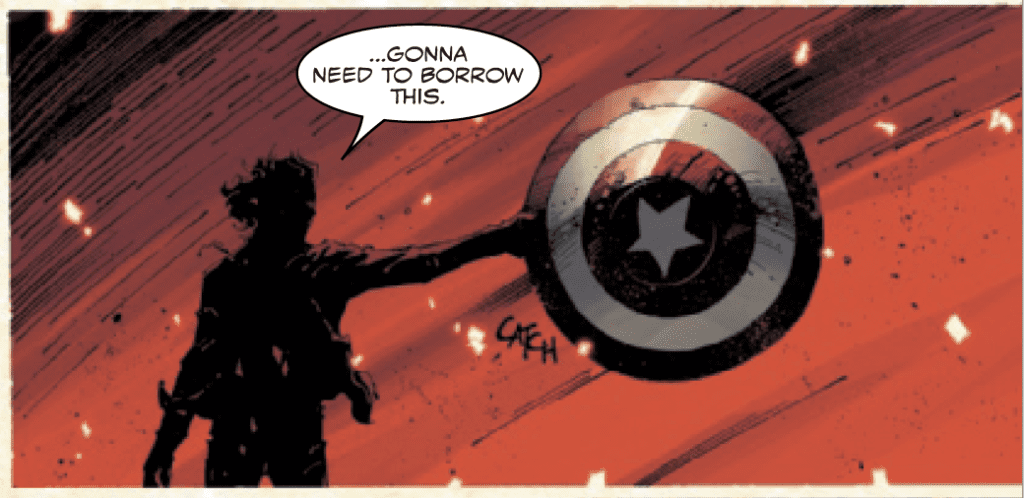
Cates’ pacing in King in Black #3 works well, providing several insane comic book moments and leaves the issue with a solid cliffhanger begging us to read the next issue. Cates also sets up the issue well with the unknown narrator and hits the home run with the payoff. You can actually hear comic book nerds squeal when you read the last page of King in Black #3. It does crack me up how Cates uses Reed Richards, as he appears to be the story’s court jester. Reed is either aloof or panicking in the issue, and Cates’ intent is missed on me.

There were 12 large sound effects used in the story: THOK, BOOM, FWOOM, FWOOSH, BOOM (again), WHUMP, VWOOM, KRAK, KRAKKA-DOOMMM, SPLITCH, SKASH, and CLANG. Stegman and Clayton Cowles’ letter work was hit-or-miss in King in Black #3. Some sound effects were perfect and elevated the story, while others took you out of the moment. The BOOMs are the perfect example. The first BOOM looks like something directly from the current “Marvel Way” handbook given out every year (I don’t think that is a real thing, but you get the reference). The second BOOM reminded me of something out of the British animated series Danger Mouse from the early 80s. The fonts and design were all over the place.
Frank Martin’s colors are fine. I wish that the creative team took chances with a title called King in Black. The preference that appeals to me is more darkness and black tones. Convince me the heroes are going to perish with the color palette alone. You can evoke emotions with color; Martin needs to take every advantage possible to take over the reader’s mind with an epic comic book.
Overall, King in Black #3 has me excited for the next issue, the mystery at hand, and what Iron Man will do next (no spoilers!).
Review: KING IN BLACK #2 – Isn’t The Journey Supposed To Be The Fun Part?
Review: KING IN BLACK #1 — An Action-Packed Blockbuster With Heart