

Future State: Shazam! #1, out now from DC Comics, introduces us to a colder and less caring version of the world’s mightiest mortal and leaves us questioning what could have made him this way.
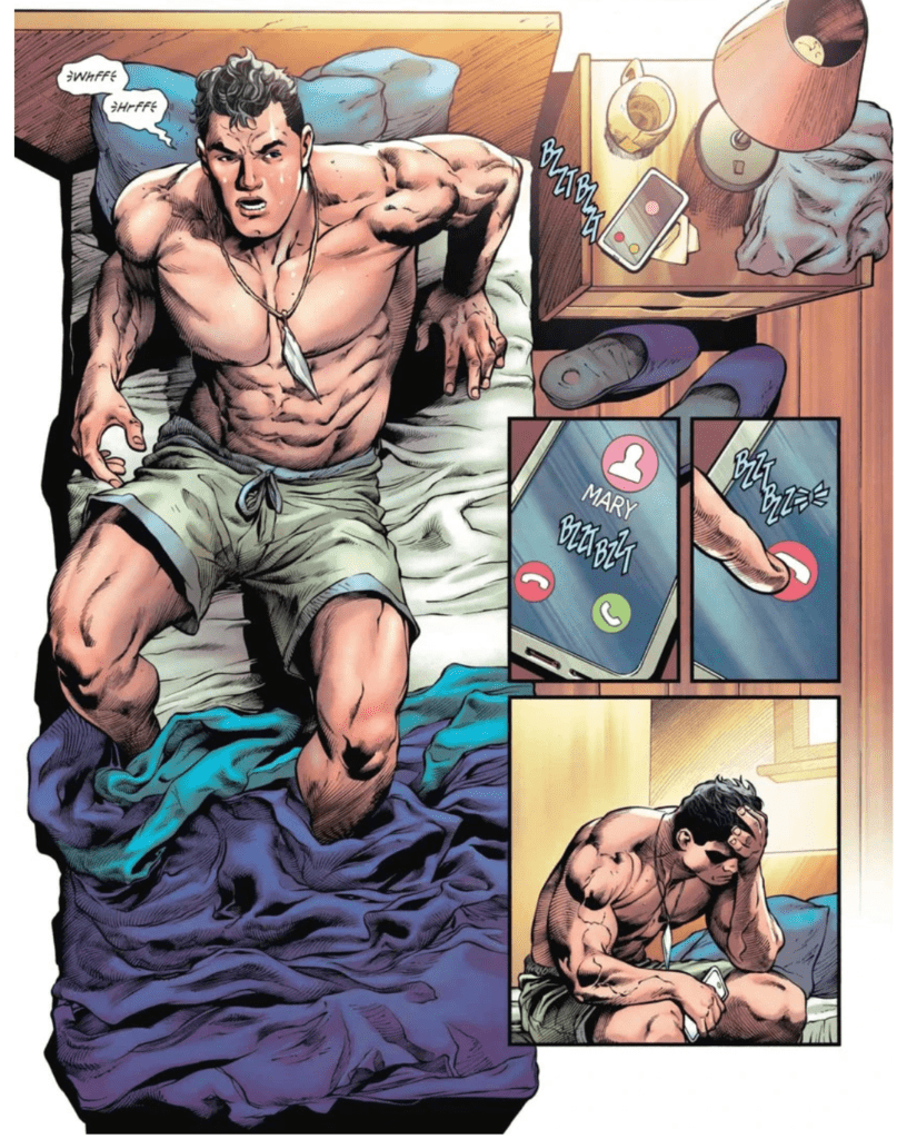
Written by Tim Sheridan, Future State: Shazam! #1 tells the tale of the big red cheese as the leader of the JLA. As a leader, he is closed, cold, and secretive, basically the opposite of how we’ve known the light-hearted and childish hero in the past. Throughout the entire issue, the reader is left to wonder what could have caused this drastic change, and it results in each page drawing the reader in.
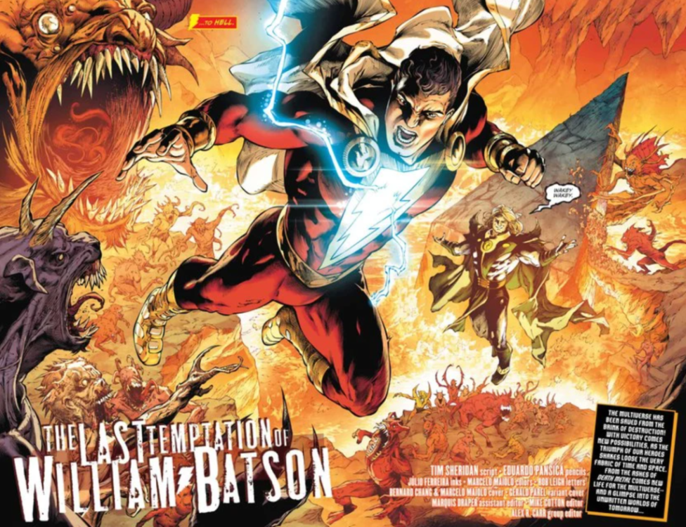
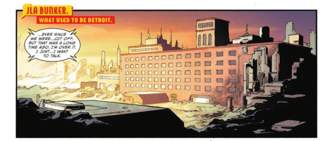
Eduardo Pansica’s pencils and Julio Ferreiro’s inks create some jaw-dropping art in Future State: Shazam! #1. The issue contains some unquestionably stunning splash pages. One thing that I really enjoyed about the art was the portrayal of Shazam. When he appears on-panel, his hulking muscles and clearly defined eight-pack make it entirely believable that he would have the power of the gods. It would also be a sin not to mention how well Pansica and Ferreiro can portray fabrics. The issue is full of capes billowing in the wind and clothes that aren’t skin tight, and each time they appear, they make the issue feel more realistic because of how accurately they are drawn. Pansica and Ferreiro also do a fantastic job at switching up perspectives between panels, which gives the issue a very cinematic feel.
Future State: Shazam! #1 features the coloring talents of Marcelo Maiolo, who brings a broad color palette to the issue. Maiolo is never afraid to use distinct colors, which results in a visually compelling issue. The art of Pansica and Ferreiro seems to have a darker and more realistic tone, which is contrasted by the bright color choices of Maiolo. I found this quite enjoyable because the coloring felt like a nice reminder of the characters’ mystical world, despite the story taking a more grim tone. The gradients used and the shading of the faces in the issue are gorgeous and bring the art to life.
Rob Leigh makes several atypical lettering choices in Future State: Shazam! #1, and each one does amazing things to improve the issue. Whether making lettering extend off-panel several times in a row to give the feeling of a blaring siren or making a font specific to a character, Leigh brings his A-game in this Future State title.
Future State: Shazam! #1 is an issue full of gorgeous art and a story that will leave you wondering. It is Shazam as we’ve never seen him before, and every page floods your mind with new questions to be answered. The end leaves off on such a cliffhanger that it would be difficult not to pick up the next issue when it is released.