WandaVision has reached its penultimate episode and it was the best episode so far as it explores Wanda’s past.
Agnes has revealed her true identity. She is really Agatha Harkness, a powerful witch and she wants to know how Wanda was able to turn Westview into a sitcom world and how she resurrected Vision. Agatha takes more extreme actions to get Wanda to reveal her secret by kidnapping her sons and force Wanda to explore traumatic events in her, including the death of her parents, the experiments that were performed on her, and finding out what happened to Vision’s body.
WandaVision has been about Wanda’s grief and making a fantasy world so she didn’t have to face reality. “Previously On” took Wanda out of her comfort zone and she had to face everything she had been trying to avoid. She had to relive all her pain. This episode showed why Wanda had a personal connection to sitcoms, offered up lots of continuity nods, and set up the future.
Despite Wanda being a prominent character in the MCU since Avengers: Age of Ultron, she has not been that developed. “Previously On” rectified this by looking at events that were only mentioned. The death of Wanda’s parents was given even more significance because it showed Wanda had a protective magical relax and when she was exposed to the Mind Stone it gave her powers. The episode also had a touching moment when Wanda and Vision had their first heart-to-heart.
This episode was the most focused in the series. It just followed Wanda and Agatha as they literally go through Wanda’s memories. The surreal visuals and the change of locations gave made this episode seem like the MCU’s version of Eternal Sunshine of the Spotless Mind or Inception.
There has been a debate on whether Wanda would be revealed to be a mutant. This episode dismisses that theory. Agatha states Wanda was a powerful witch who was able to perform powerful acts through instinct. In the comics Agatha has been a mentor to Wanda instead of an outright villain and that could be the direction the final episode and the MCU can go. But we have to remember Agatha did kill Sparky.
The lingering questions from WandaVision are the roles of mutants and the multiverse in the Marvel Cinematic Universe. This was symbolized with the role of Pietro who was played by Evan Peters, the actor who played the character in the Fox X-Men movies. The series has ended up dodging the question because Agatha said she created this version of Pietro. However, due to Agatha’s nature, she could be lying.
WandaVision has been a character-driven show and “Previously On” was the most character-focused episode yet.
TURNING ROADS is currently funding on Kickstarter, and we chatted with the book’s editor Paul Carroll about how the anthology came together and what readers can expect.
The project is a collection of Irish folklore and mythology retold in modern (and future) settings. Carroll talks more about the project below, but the stories will span various genres and styles, with over 30 creators from all around the world contributing. The campaign runs through March 28th, 2021.
Monkeys Fighting Robots: Tell us about TURNING ROADS — what kind of stories can readers expect to find in this anthology?
Paul Carroll:Turning Roads is an anthology of short comics from Irish and international creators, focused on retelling Irish myths, legends and folklore stories in modern and future Ireland. There’s a mix of science fiction, fantasy and magical realism blended through the stories, some of which take a distinct genre fiction approach to the twist, others of which treat the presence of Irish fairies in modern Ireland as a consequence of time, rather than magic — they were always there, and now they’re adapting to life here. There are 18 different teams in the book, each with their own styles and voices, so no two stories will be the same — and that’s not even accounting for the fact that one legend appears twice in the book, albeit through two very different approaches.
MFR: Where did you get the idea to put this project together?
PC: This goes back to the Before Times; there were discussions around the winter of 2019 among Irish and UK comic creators about putting together comic anthologies. I’ve had notions of organising something like this for a while, even before those conversations, and with lockdown in Ireland presenting long-term isolation for the comic community here, the timing felt right. I’ve been out of work as a result of the pandemic, while others have been busy trying to meet their deadlines or doing essential work as part of their day jobs, so I figured it was only right to put some of my time and experience to good use. At the very least, I’ve tried, and some people have paid attention.
MFR: Can you plug some of the creators who are contributing to the book? And can you tease anything about the stories they’re working on?
PC: I’m exceptionally fortunate to have over 30 creators involved in this book. There are some who’ve been around the Irish comics scene for a while — people whose work I admired before I knew the creators personally — like Hugo Boylan, Dave Hendrick, Leeann Hamilton, and Tríona Farrell. Hugo and Dave are both writing stories for the book, teaming up with Hugh Madden and Pete Marry respectively to tell some whacky tales. Hugo and Hugh have so much creative energy between them, and the one page of their story I’ve seen so far just blew me away. Leeann is joining Kerrie Smith on art in a beautiful little short that Kerrie scripted. They’re probably two of the most humble creators in the book, and they’ll be packing quite a punch with the story they’re telling. As for Tríona, I was lucky enough to get her on board to colour one of the stories in the book.
It would take hours to shine a similar light on everyone, but there’s so much talent in this book it almost makes me feel unworthy to be editing them. (Except, of course, they’re also all lovely and endearing, so they’ve made me feel like I’ve fit the part quite well!) Just off the top of my head, two of the creators I didn’t know before this whose portfolios made me audibly gasp the first time I saw them are Dominique Duong and Ember Johnstone. Each is contributing stories as solo creators, and I honestly cannot wait to see the finished work. We’ll need to adopt them as Honorary Irish when all this is done!
MFR: I’m assuming you have at least a passing interest in myth and legend since you’re putting together this anthology — where does that fascination come from? Is it something from childhood, or something you grew to appreciate as you got older?
PC: I’ve always loved stories, and myth and legend provided so many variations that my young mind couldn’t keep up. It started with the Greek legends, through old movies my dad would put on the television on a Sunday afternoon, and then Disney’s wildly inaccurate Hercules. After that, I took any chance I had to experience Greek myths, mostly through PC games as I was growing up, and then through books and reading online once the opportunities presented themselves. (Side note: we didn’t have even a dial-up Internet connection in my household until I was in my mid-teens!) That passion for mythology then spread through other pantheons, to the point of collecting books on Norse and Egyptian mythology whenever I could. At some point along the way, I found my collection included stories of Irish myth and legend, though I couldn’t tell you how or when they showed up. Still, they felt right at home.
MFR: What do you think makes Irish myth and legends stand out compared to other cultures’ folklore (other than being set in Ireland, obviously)? Are there certain themes and concepts that make them uniquely Irish?
PC: Irish stories are a funny old lot. They almost always end in misery, and sometimes they’ll just stop when the main character is dead. There’s a lot of focus on death, and on the consequences of messing about with things that you shouldn’t. There’s a strange beauty to them, though the retellings and changes made to the stories and the people that occupy them make it confusing to keep track of everything all at once. Between the arrival of Christianity in Ireland, and the occupation of Ireland by the British, we’ve ended up with many contrasting tales, each with their own focal points and morals (if you’re lucky to have a moral by the end of the story!)
MFR: You write a story yourself in TURNING ROADS — how do you like writing short stories compared to longer ones like MEOUCH?
PC: I’ve always had a soft spot for short stories. There’s a whole separate challenge in telling a complete story in just a few pages. With Meouch, myself and Gareth Luby get to play around on single scenes for a few pages at a time, and it allows for more space to tell jokes and shift the mood a bit whenever we need to, but you don’t have that freedom when you go from a 20-page issue one down to four pages. Not that that’s a bad thing. The constraint is part of what makes it fun. Unless you have a completely unforeseen twist at the end, there’s the challenge of keeping a story tonally consistent and interesting, and there’s not much room for explaining what’s happening before it’s all over.
Of course, short stories also allow writers to work with lots of different people if they want to. Don’t get me wrong, I’d do a hundred short stories with Gareth if he had the time, but even if he wasn’t working a full-time day job, there’s only so much one artist can do. For Turning Roads, I took a couple of chances on my story; I’m working with James Killian, who’s relatively new to the scene, on art, while Marvel’s own Tríona Farrell is handling colours. (I really felt like I was chancing my arm asking Tríona, but she’s a delightful person and set my mind at ease from the get-go!)
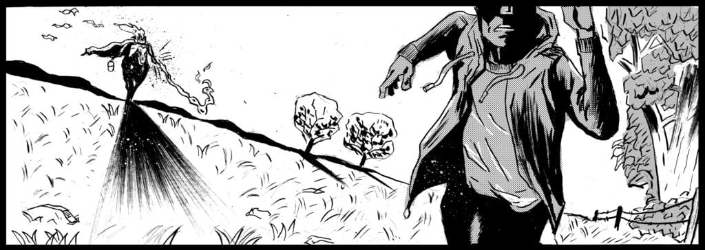
A teaser image from “Dusk and Dreaded Night” by Paul Carroll and James Killian (colors will be by Tríona Farrell).
MFR: How has the process of putting together the Kickstarter campaign and getting it ready to launch been? Any advice for creators who are getting ready to start their own project?
PC: Full disclosure: I’m an anxious person. I love having done a Kickstarter campaign, but I panic the entire way up to and through the process. It’s also been almost two years since my first campaign, so I’d forgotten so much about how it’s done. My advice boils down to a few things. The first is simple: give yourself more than enough time to complete the set-up of the project, because there are always delays on Kickstarter’s end when it comes to approving a campaign. They’re quite open about the delay — it can take up to three days to be approved — but if you leave it late, you can be stuck waiting.
Secondly, have as much work ready to show as you can. This is for more than just the Kickstart page. A good press release can result in people needing more images to include when they share something online, and you need it accessible. Save it on your computer, on your phone, in the Cloud – have it available to send to people no matter when they ask you.
And thirdly, do the work in marketing and PR. You need to be present on social media, before, during and after a campaign. Tell people about your project, as people for help, and put in the effort in contacting websites and podcasts. Craft a press release if you feel the need to put on a professional face, and have all the info you need to tell potential interviewers at hand so they can craft better questions for you.
(And, it should be said, the immortal words of Douglas Adams apply to running a Kickstarter campaign: Don’t Panic.)
MFR: What are you most proud of in regards to TURNING ROADS? What are you most excited for people to see?
PC: I have personal pride in even getting it this far, which is a difficult thing for any Irish writer to admit to having. We’re a shy, modest bunch for the most part.
For real, though, I’m excited to share the stories that were pitched. I picked the ones that spoke to me, the ones that made my mythology-loving inner child want to see them complete.
There’s also a special guest star who I’m hoping will make an appearance when we hit the stretch goal stage of things, fulfilling cover art duties. It’s a big name, I can promise you that, well outside what I considered the realm of possibility back during the initial conversations I had with people about doing the book.
MFR: And you are part of Limit Break Comics alongside Gary Moloney and Gareth Luby. Outside of TURNING ROADS, what else can we expect to see from Limit Break in the near future? Any projects coming down the pike that you want to tease or promote?
PC: Limit Break as a collective has a few projects on the go at the moment. We’re talking with a couple of creators from outside the circle of three about publishing their books under the label – we’re hopeful we’ll get to announce them before conventions return to Ireland.
Aside from that, you can expect issue two of both Meouch and Plexus in the near future. Gareth is hard at work on the art for Meouch. Plexus currently has two stories out of three completed from the art point of view, too, which is an exciting place to be in.
Joining them, I’m working on cryptid horror comics under a project name Dark House; I’ve no idea when they’ll start appearing in the world, but it’s fun to return to the genre after a few years away from it in terms of comics. While I’m doing that, Gary is putting together a wicked looking pitch, and he has plans to put together a collection of his crime comics in the future — I’m under oath not to make any promises on his behalf as to when any of that will happen, and he’s our law-talking guy so I’ve got to stick to my word!
It’s an exciting time to be making comics, though, and working with Gareth and Gary makes the journey all the better.
Thanks again to Paul Carroll for taking time to talk with us! TURNING ROADS is currently funding on Kickstarter; you can check it out here!
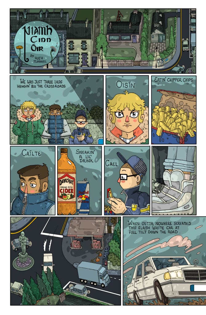
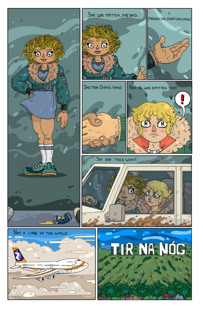
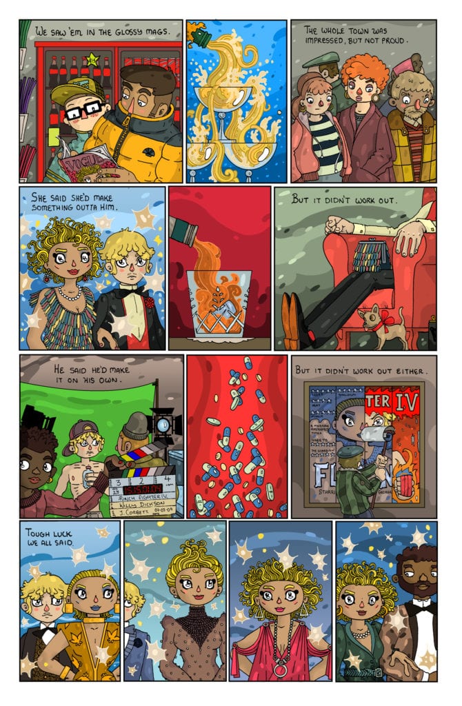
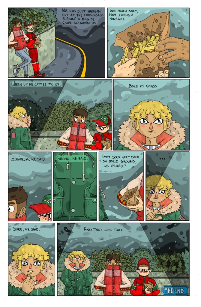
Have a look at one of the stories from TURNING ROADS, Niamh Cinn Óir by Hugh Madden:
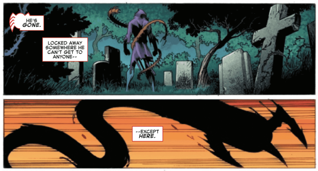
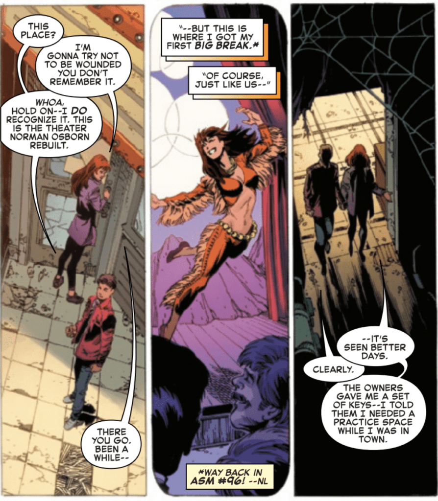
The Amazing Spider-Man #60, out now from Marvel Comics, is an intense, emotional issue that heavily delves into the inner turmoil that Peter Parker faces.
The Amazing Spider-Man #60 is an intriguing issue, to say the least. Most superhero comic book series are focused heavily on action and portraying a visual spectacle, but Nick Spencer takes an entirely different route in this issue. Mary Jane takes Peter to a theater stage she has been using to practice and guides Peter through a therapeutic exercise to work through the emotions he has been experiencing recently. Spencer’s dialogue is powerful, touching, and helps make what Peter has been struggling through in recent issues more evident. The raw emotion that is shown more than makes up for the lack of action in the issue. Spencer also employs techniques such as showing flashbacks and what the characters are imagining to prevent the entire issue from being nothing but images of Peter and Mary Jane’s faces.
It is difficult to make an issue composed of little action and lots of facial expressions visually appealing. Yet, Mark Bagley, John Dell, and Andrew Hennessy are able to accomplish this and then some. With Bagley’s pencils and Dell and Hennessy’s inks, TheAmazing Spider-Man #60 is a beautiful issue. Peter’s facial expressions and body language pair spectacularly with the accompanying dialogue and make the issue tug on your heartstrings. Silent panels say more than words could ever, and it’s thanks to the magnificent art from this creative team.
While the pencils and inks weren’t necessarily hampered by Spencer’s choice to set most of the issue in one location (since different poses and angles could vary the art), the coloring definitely was. When the source of light does not change, the colorist is left with very few options. This causes the scene taking place on the stage to be stagnant in terms of the palette. Still, Rachelle Rosenberg delivers some absolutely stunning colors for the other scenes in The Amazing Spider-Man #60. One panel of Spider-Man swinging across the city is especially beautiful and reflects the classic Spider-Man tone that we know and love.
VC’s Joe Caramagna’s lettering in The Amazing Spider-Man #60 does wonders to help the issue’s emotionally tense moments get across. The placement of speech bubbles is perfect and never once interferes with the flow of dialogue, which helps immerse readers in the story. Caramagna also uses techniques such as emphasizing certain words and giving some otherworldly characters a unique font and speech bubble. These both give readers more information on how dialogue is spoken, which is critical in a purely visual medium.
The Amazing Spider-Man #60 is a very different issue than what superhero fans expect — and that’s a good thing. The writing gives us an in-depth look at Peter’s emotional state, which is much needed after the traumatic events he has recently experienced. Bagley, Dell, and Hennessy create some gorgeous facial expressions that work phenomenally with the dialogue. The coloring also sets the right mood for the extended scene, even if variety in the color palette isn’t possible.
America Chavez #1 begins a new chapter for the titular character from Marvel Comics on March 3. TV screenwriter Kalinda Vazquez of Prison Break and Nikita fame dives into America’s more personal angles. Artist Carlos E. Gomez illustrates with plenty of dark inking and body language the title character’s personal stakes. Because while the flashy colors by Jesus Aburtov are eye-catching, America’s superhero life doesn’t hold much importance. Travis Lanham’s lettering makes a special use of captions from an outside perspective by the series antagonist.
Who Is America Chavez #1?
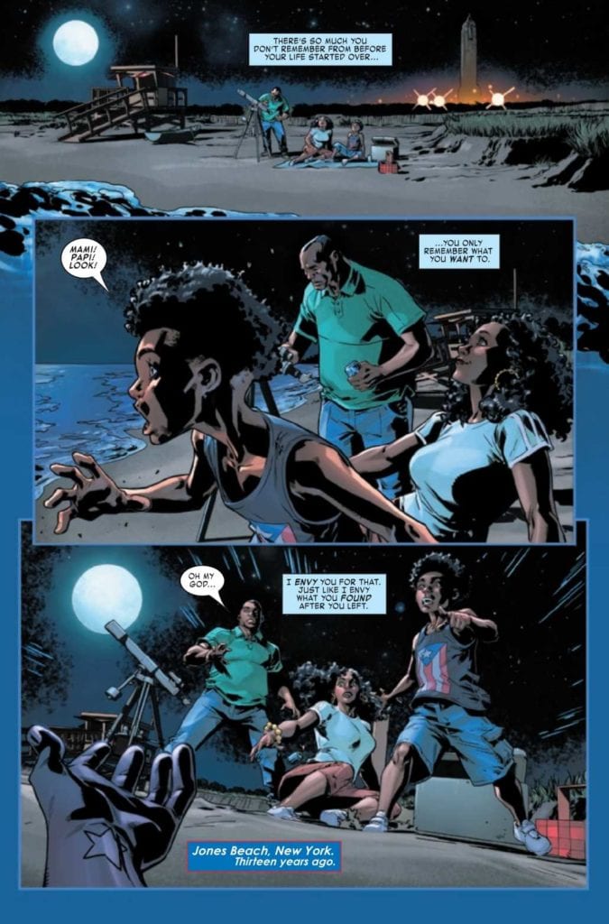
Vazquez gives America Chavez #1 an attitude and character of its own. Instead of giving all of the narrative weight to America or a mysterious narrator, the plot takes command. The opening page is a flashback sequence that looks at America’s encounter with her foster family. In juxtaposition, the narrator explains their feelings towards America in these moments. For America, this is a point more important than the nature of her powers or her home reality. It’s a feeling the narrator shares by explaining their envy of the happy life America found.
Further into the issue, the reader seems to share this feeling when looking at America’s superhero life. A fight with mutant moles is absurdly charming, especially with friends and admirers. So what happens when the superpowers and life get boring? Throughout the issue, I found myself more engaged with looking at America’s life with her adoptive family (the Santanas) than anything else. Funny enough, a Chavez admire feels the same way when bringing that up. It’s a sign of the plot pushing Chavez to confront her history to expand her character. After developing America Chavez’s powers and personality, this new phase is welcome.
Perspective Art
Gomez’s illustrations give America Chavez #1 a look evoking classic mainstream superhero pin-ups. Where this art style really shines is in what the body language and inking outlines focuses on. When America’s soon-to-be adoptive brother Berto’s outline emboldens, it shows the power he has in directing his family towards something almost out of focus. The outline of the young America Chavez’s wrist and her star mark is what tells a reader who this story is about. Provided they are already familiar with her for a better experience.
The colors by Aburtov show off the flashier parts of America Chavez #1. Most of them come from America’s powers, like when stars spark off her fists and feet. There’s an energy to them that makes every move mean something. Like when her blue star-shaped portal punches a hole in a giant purple barrier.
VC’s Lanham decorates the issue with the mundane and flashy elements within America Chavez #1. The captions that showcase a time and place look very basic yet have a stylization fitting America’s color scheme. Another caption has a very stylized look to it, like introducing America to a wide audience. That one instance is a demonstration of the life America has after her humble beginnings with the Santanas. So when she is thrust into meeting up with them, the basic stylization takes over as no amount of flashy sequences take away the down-to-earth moments that people find warmth in.
Try America Chavez #1
America Chavez #1 opens the series with a sense of interest towards its title character. Whether its readers who follow America’s journey or just getting into her story, they should stick around for more developments. Because Chavez is well on her way to being a classic character with an appearance in the coming Doctor Strange movie.
DC Comics’ villainess Veronica Sinclair, who goes by the alias “Roulette,” became more widely known after she appeared in the season two episode “Survivors” of Supergirl in 2016. She made another appearance in the episode “Supergirl Lives,” directed by Kevin Smith. But Veronica Sinclair first appeared years before in the comic book JSA Secret Files #2 in 2001. Although she does not have such a long and illustrious history as many other DC Comics villains, Roulette has become one of the most appealing female baddies of the DC universe. Let’s take a closer look at why she is so popular among comic book fans.
Veronica “Roulette” Sinclair’s Appearances
Geoff Johns and Derec Aucoin created the character of Veronica Sinclair. After her initial appearance in JSA Secret Files #2, Roulette made several appearances in other comic books, including Formerly Known as the Justice League and One Year Later. She also appeared in the animated series Justice League Unlimited and an episode of season nine of Smallville.
Who is Veronica “Roulette” Sinclair?
From Australia to Japan, people love playing カジノルーレット (casino roulette), so it is no wonder Veronica Sinclair’s supervillain name is named after a game that is so popular the world over. But she is not called Roulette without reason. The daughter of Debra Sinclair, who was an adversary of Mister Terrific, Veronica Sinclair owns a gambling establishment called The House. Using teleporter technology, she captures superheroes who must fight against each other in a superhuman gladiatorial arena as supervillains watch and place bets on the outcome.
Why is Veronica “Roulette” Sinclair so appealing?
Unlike most other villains and villainesses in the DC Comics world, Roulette is lacking in the superpowers department. In fact, she does not have any. But that is one reason why she has become so popular among comic book fans. Like Batman, she has to rely on her strength, wits, martial arts knowledge, and technology to defeat her foes. Although she is adept at hand-to-hand combat, and very handy with her hairpin that doubles as a dagger, it is Roulette’s intellect that makes her such a formidable opponent. After all, she managed to catch some of the world’s most powerful superheroes and pit them against each other, without the use of superpowers.
Roulette is an evil genius, and she knows all there is to know about gambling and probability calculations. With her tricks, traps, security devices, and robotic dog guards, she is always ready to take on the likes of such adversaries as Supergirl. She is also willing to apply the most horrible outcomes to losers in The House. For instance, she once forced Mister Terrific and Doctor Mid-Nite to go head-to-head in a game of chess in which the loser was electrocuted. Another time, she made Sand and Hawkman try to save Hawkgirl while infected with a fast-acting lethal virus. Later, after Supergirl closes down Roulette’s fighting ring, Roulette becomes involved in the intergalactic slave market, proving that she is truly an evil villainess. But it is undoubtedly Veronica “Roulette” Sinclair’s fighting ring that makes her stand out from the villainess crowd. After all, if there is one thing comic book fans love, it is seeing their favorite superheroes battling against each other.
Veronica “Roulette” Sinclair may not have appeared in many story arcs, but her appearances always bring some of the most challenging and dangerous circumstances to the superheroes she goes up against.
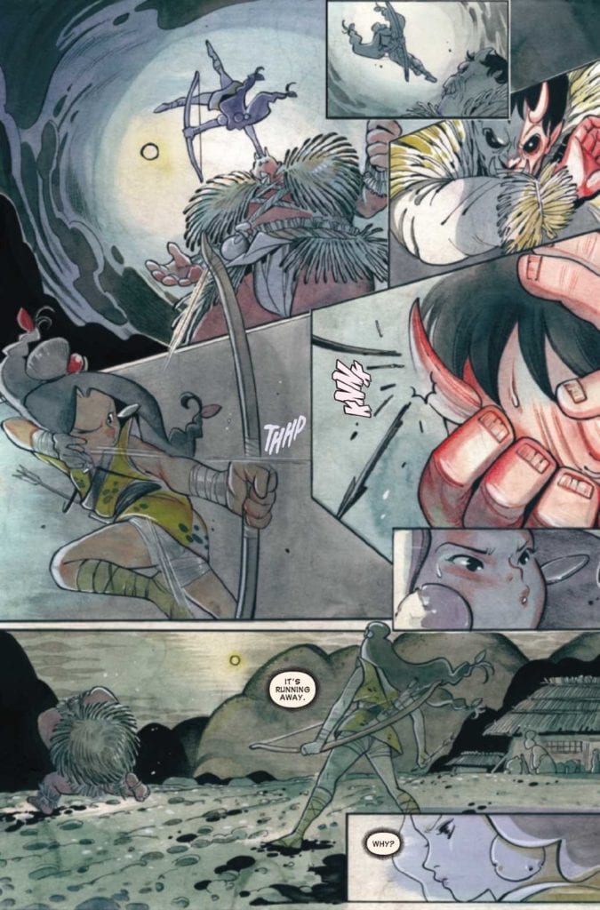
Demon Days X-Men begins a What If? take on Marvel Comics characters on March 3. Under the pen of artist and writer Peach Momoko, three of the X-Men (Mirage, Psylocke, and Wolverine) fight Yokai in a floating world. Adapting the original Japanese story into English is Zack Davisson with Ariana Maher as letterer.
Demon Days X-Men: Floating Fan-Fiction
Peach Momoko’s artwork is the main attraction to Demon Days X-Men. Just the opening page presents the title characters as larger than life legends in the style of Ukiyo paintings. The rest of the art has a similar stylization that is much less stiff to make the bodily and facial expressions more pronounceable. Perhaps the most expressive character is the one who never changes his facial features, Hulkmaru. The noh mask-like face with how it is angled displays a great range of emotion. Hulkmaru’s face tilting on an upper angle displays fear, unlike a later time when tilting downwards displays anger and mistrust. The full use of Japanese art displays a range of different styles synergizing like a kabuki play.
All of the above is necessary as the story of Demon Days X-Men is average. Momoko takes inspirations and tropes from samurai stories as well as recognizable folktales. Sai (Psylocke) takes the role of a wandering ronin helping out a village in trouble with a dog version of Wolverine at her side. The trouble in this case is trying to make peace with the oni Hulk…maru who is raiding the village gardens to survive after the village colonized oni lands. Then there comes another story about the village in danger from a yokai Venom interlocks with the previous struggle, and not in a very organic fashion. It really looks like plots resolve for their own sakes instead of going to the root of the problem.
Some Gaijin’s Translation
Between Momoko’s original design and the translations by Davisson, there some noticeable differences. Demon Days X-Men does have some noticeably striking visuals in the SFX by VC’s Maher. Unlike the Japanese SFX that Momoko designs to resemble perfectly etched brushwork, the placements have marginal matches. Some of the Maher’s SFX, like the hissing sound of Venom, look perfect in how it contrasts yet still looks like an extension of him. Others like Hulkmaru’s smash SFX look like they were pasted on from a saved image. Unlike his earlier actions that have a red coloring, this action sound is purple. Frankly, while the overall presentation is fine, it makes me more interested in seeing Momoko’s unfiltered design.
Check Out Demon Days X-Men
Demon Days X-Men is an artistically appealing start to a five-part epic. While the story and direction come up short by combining two unlike stories, the efforts to evoke many Japanese art styles is phenomenal. Peach Momoko is certainly earning her place as a featured artist, with how she portrays her enthusiasm as a Stormbreaker.
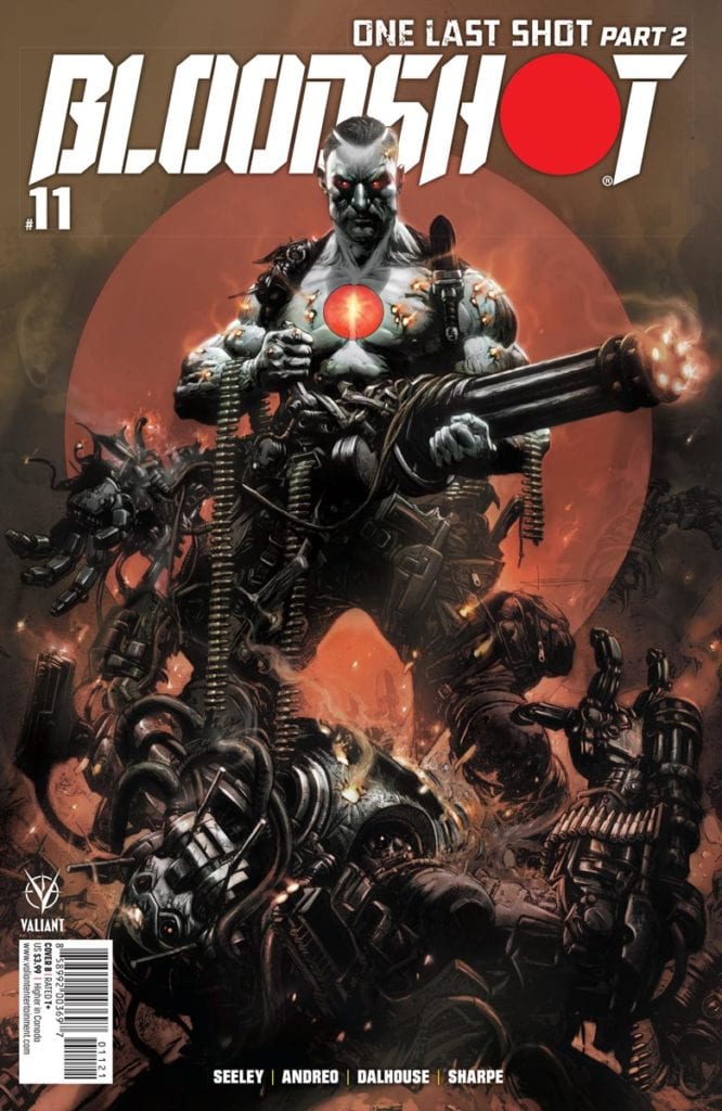
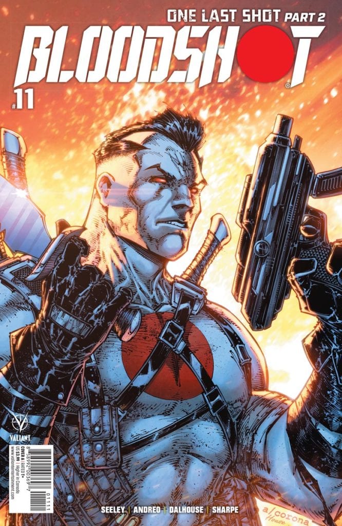
Bloodshot #11 hit your local comic book store this past Wednesday with some scenes that are reminiscent of the post-election political climate. Thanks to Valiant Entertainment, Monkeys Fighting Robots spoke with the book’s editor Lysa Hawkins and artist Pedro Andreo about all the chaos in the issue. There will be spoilers, so turn back now if you have yet to read Bloodshot #11.
Enjoy the interview with Lysa Hawkins and Pedro Andreo below.
MFR: Pedro and Lysa, thank you for taking the time to speak with me.
HAWKINS:Thank you very much for taking the time to ask the questions! ANDREO:Absolutely! Thank you for this interview!
MFR: Lysa, Bloodshot #11 was written before January 6th of this year. After the riot at the Capital, did the creative team think about changing the issue?
HAWKINS:Yes, I read the first draft of Bloodshot #11 nearly a year ago now! We actually did change a bit of the content following the election. As much as life imitates art and vice versa, I didn’t think it was too close for comfort. Our protesters in Bloodshot #11 weren’t there to storm the Capital, just to speak their minds, which is a very American thing to do.
MFR: Pedro, looking back at the issue and the events that happened in the United States, how do you feel about the pages in Bloodshot #11 depicting the political divide and Donald Trump?
ANDREO:The script and the issue were finished long before the events of January (heck, if not for the delay caused by the pandemic, this issue should have been the June 2020 issue, if I’m not mistaken). We kept the events and the likeness of the President on Bloodshot purposely vague for a reason because I don’t think it depicts these events specifically. I really believe that there’s been an escalation of conflict and division throughout the world, and the pandemic has only increased that and I think there’s a great cautionary tale in these pages and what Seeley’s trying to get across about totalitarianism, freedom of speech, and the state of the world we’re living in. In any case, I’m just a dude from Spain (and we have our fair share of sh*t to deal with, politically and otherwise), so my opinion on a political landscape I’m not familiar with nor part of shouldn’t be taken into account on this.
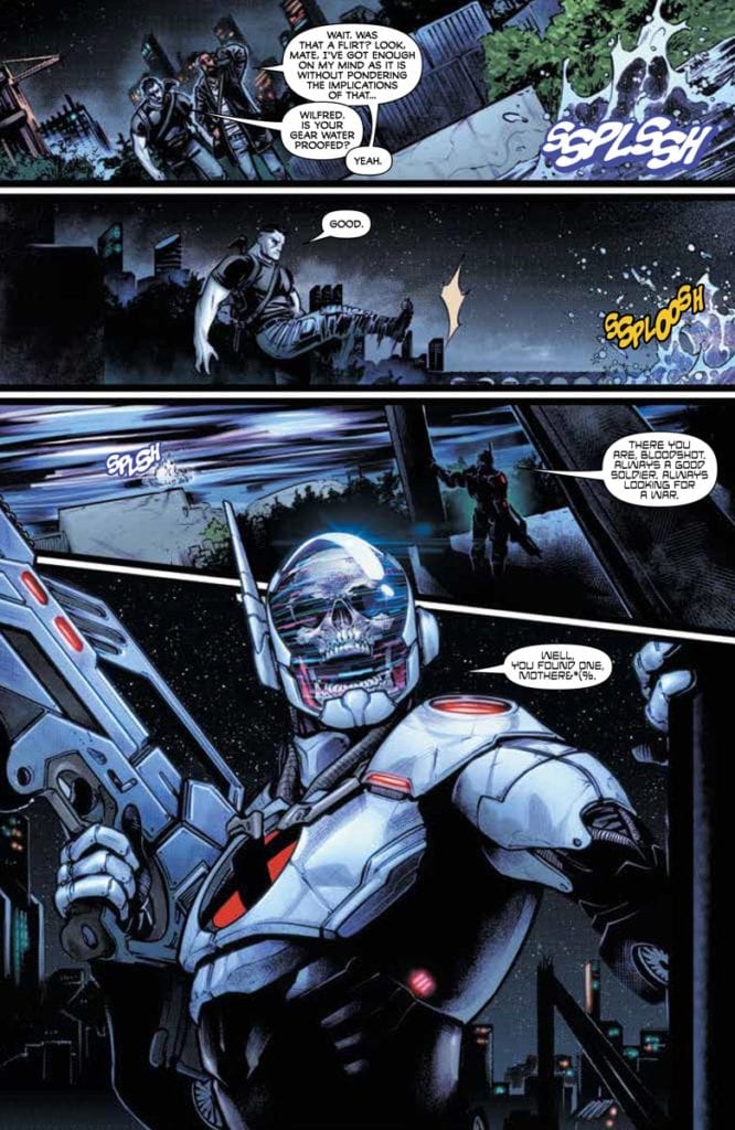
MFR: Pedro, my favorite part of the issue is the battle against Zealot. Can you talk about the artistic elements involved in creating a thrilling fight sequence?
ANDREO:Thanks a lot! There is lots going on in that scene, so I tried to make everything as clear as possible and not clutter the panels too much with information that was not needed. The design of Zealot was made almost on the spot, and I had lots of fun drawing him. There’s lots of artistic freedom when you have a killer cyborg that can split into several killer robots a-la-Voltron! I used diagonal lines between panels, tilted camera angles, and lots of kinetic lines to give more power and speed to the fight and the reading process. I think it came out really nice in the end!
MFR: Lysa, Bloodshot #11 had several plot points come together for a wicked cliffhanger. Was Tim Seeley’s script perfect out of the gate, or did you have to work with him to build the tension?
HAWKINS:Tim Seeley is a big Valiant fan. He loves Bloodshot and has been reading him for years as you can tell by how he writes the scripts, BUT, issue #11 needed a lot of revisions. NOT because it wasn’t terrific. It was, but Tim originally put characters into the script that we were off-limits, and I’d have to go back to him and say, “it’s great, but change it.” In the end, all that fine-tuning really paid off and, I think it made #11 even stronger. It became one of my favorite issues.
MFR: Pedro, Andrew Dalhouse always seems to have one color pop off every page. What’s the best part of Dalhouse coloring your work?
ANDREO:He’s great at using that one color to guide the eye and reinforce the storytelling, right? He’s great to work with. I always feel safe after finishing my go at a page because I know he’s gonna kick ass on the color process. Sometimes I use some lighting effects and such to tell Andrew how I imagine the scene to be, and he always makes it 10 times better.
MFR: Pedro, the page that stood out to me is the first time we see Zealot. The word balloons and empty space guide your eye in this nice rounded arc – and then your eyes hit this skull and a hard 90-degree angle of the gun that stops your gaze on Zealot. Can you talk about how you set up this page?
ANDREO:Glad you like it! I purposely did the thing with the gun, so you have to look at that menacing skull every time your eye wanders around the page! The construction beams, the antenna, and other elements are placed the same way, so you go back to Zealot’s weird holographic screen helmet. I wanted to give a lot of space on the first two panels for the dialog and a sense of calm on the third, so the shadow lurking there steals the spotlight, and then BLAM! the big reveal of the big villain of the issue! (Or so we want you to think!)
MFR: Pedro and Lysa, thank you for your time, and best of luck with the story arc!
HAWKINS:Thank you so much! Stay Valiant!
Bloodshot #11 is out now.
Written by TIM SEELEY
Art by PEDRO ANDREO
Colors by ANDREW DALHOUSE
Letters by DAVE SHARPE
Cover A by ADELSO CORONA, ANDREW DALHOUSE
Cover B by LEONARDO MANCO
Preorder Variant Cover by BRENT PEEPLES
“One Last Shot” fires away as Bloodshot and his crew hunt down the resurrected Project Rising Spirit!
The Vigil serves up a refreshing premise that is held back due to its narrative, and bizarre disconnect with certain plot elements. Religions utilization in recent horror films continues to influence many filmmakers. For a debut outing, The Vigil does enough to make this director someone to look out for in the future. Its narrative discrepancies don’t diminish its redeemable qualities.
Jewish religion being placed at the center of this film makes it stand out because it’s a departure from the tired use of Christianity. The Vigil could be compared to The Autopsy of Jane Doe in ways, but it doesn’t include a pair of doctors being taunted by a corpse. Directed and written by Keith Thomas, The Vigil stars Dave Davis, Menashe Lustig, Malky Goldman, Lynn Cohen, Fred Melamed, and Ronald Cohen. The film follows Yakov Ronen (Davis), a man drenched with guilt over a recent accident, who decides to do a favor for his former Rabbi, Reb Shulem (Lustig). Yakov comes from a Jewish community and he has been asked to be a Shomer, he will be watching over the newly deceased Rubin Litvak (Cohen) to protect the body from evil spirits. However, upon arriving at the house it becomes clear that Yakov is not alone.
Dave Davis as Yakov Ronen in The Vigil
The Vigil’s short runtime makes it difficult to grow fully attached to Yakov, but Thomas provides enough depth to the character for him to be a likable protagonist to follow. He has been struggling financially, emotionally, and decides to assist an old ally one night to make easy money. Yakov is not very sociable and seems more interested in his solitude at the moment. Thomas makes it easy to grow sympathetic towards Yakov but doesn’t connect certain plot elements in the best way. It appears that Yakov has medical issues stemming from his trauma and it is made to feel important until it’s thrown away as the film progresses. Also, Yakov isn’t alone in this household while he takes on the duties of being a Shomer.
Litvak’s wife, Mrs. Litvak (Cohen) attempts to get Yakov out of the house the minute he arrives. Of course, a demon is present in the house and it has been eating away at the Litvak’s for many years, especially Rubin Litvak. Thomas ties in the torment Yakov has been enduring emotionally with the methods of this demon, which assist in our protagonist learning to cope and grow from his previous mistakes. There seems to be an underlying message about the problems that could arise from not dealing with personal demons before they manifest into physical ones. Jump scares make an appearance in The Vigil, but Thomas understands to not overdo it and opts in for sparking fear through establishing a growing sense of dread. However, the script does seem formulaic and cliched at times.
Lynn Cohen as Mrs. Litvak in The Vigil
Davis is a great lead, the expressions on his face help highlight the torment Yakov is experiencing. These expressions of guilt and heartache allow Yakove to be an easy protagonist to get behind and Davis’ performance is solid overall. Yakov is forced to come out of his shell once the situation at the Litvak’s residence becomes dire. Davis’ ability to demonstrate Yakov’s antisocial reservations along with his forced behavior adjustments is wonderful to watch. Thomas keeps the film energetic by building the tension every time Yakov makes movements around the house. The shots that linger on certain areas of the house assist with letting fear settle in and Michael Yezerski’s score that blares throughout the film only adds to the terror.
The Vigil introduces a unique premise but then strays away a bit by not offering a unique approach beyond that. Thomas’ efforts here still resulted in a decent horror film that could be considered a mix of The Conjuring and The Autopsy of Jane Doe. The Vigil stops being fresh after Jewish religion is placed at the center, but the film doesn’t drop the ball that much and is still an adequate haunted house story with an important message.
Writer Stephanie Phillips is joined by artist Christian Rosado for this third monster and bloodshed-filled issue of “Taarna: The Last Taarakian” #3. This newest chapter in the Heavy Metal published comic series starring the cult classic heroine is an entertaining but completely predictable read in terms of its cosmic-fantasy script, but it’s held aloft by its incredible visual work and some really rad concepts. With colors from Jessica Kholinne and letters by Marshall Dillon, “Taarna” #3 is a relatively forgettable but still completely entertaining affair.
“The beginning of Act Two where Taarna, the lone protector of the multiverse, and her new ally are pushed to their limit to save a plnaet from destruction, while the chaotic leader called Urcuss takes his army to destroy everyone standing between them and the ultimate weapon for their lord and master, Kako! This is the story of a millenia-old battle between godlike beings, with all sentient life caught in the path.”
Writing & Plot
It’s obvious how much Stephanie Phillips is drawing from her influences in “Taarna” #3, and I don’t necessarily mean this as a bad thing. Both in terms of plot and characterization, this comic feels like a mix of Gail Simone’s Wonder Woman and the classic Conan The Barbarian sword and sorcery stories. Taarna is most definitely inspired by the classic comics Amazon, albeit without the diplomacy and more willingly brutal. The story itself here is pretty formulaic; Taarna is hunting the trail of giant monsters and picks up a hapless survivor of a vicious attack by an army controlled by what we can only guess is a super powerful deity. The merciless march Urcuss’s army and Taarna’s first contact with them really reminded me of moments from Kurt Busiek’s run on Conan, which was cool but also a bit disappointing. I couln’t get through this book without thinking “I’ve read all this before.” The pieces are freshly assembled and on the board, but it’s just been a bit of a process getting to the height of the game. Phillips clearly understands how this medium functions fortunately, as her script stays out of the way with minimal dialogue and narration. Most speech bubbles consist of simple commands, questions, or declarations made up of few words. Instead, Phillips focuses much of this comic’s time on the regular sway of kinetic action that often takes up almost entire pages. This is a comic that plays into its strengths, using its 22-page runtime to quickly run through it entertaining but cliched story to focus on the grandiose moments that make it stand out.
Art Direction
The cosmic and kinetic visual show that this comic has had thus far continues in “Taarna” #3, this time with artist Christian Rosado at the helm on pencils. Rosado replaces artist Patrick Zircher, whose detailed and outstanding style crafted the visuals in the first two issues. Fortunately, Rosado has proven up to the task here, as this book looks just as outstanding as the last two did. Rosado’s thicker lines and more shadow-heavy accents distinguish his style plenty from Zircher’s but still look proper for this comic. There’s still an immense amount of character detail and momentum in the action sequences to carry this comic. His visual direction is spot on as well, with the sweeping and grandiose fight scenes looking like they’re moving at the speed of light on every panel. The fight choreography is simple, but the grace with which it’s portrayed makes this wildly impressive. So much of this beauty is brought to life by Jessica Kholinne’s deep and vivid colors. Her work here sells the alien environments with an endless array of staggering tones, with thick shades of color on every panel. Everything from the tangles fauna to the scorched dry lands of these distant planets looks like it could be walked on, and the way Kholinne handles movement, especially the movement of basically a deity, is full unlike anything I’ve seen in other comics. Kholinne pushes the idea that Taarna is almost bending reality as she fights, with arrays of color shooting past her. The lettering from Marshall Dillon is a dynamic and modern font that is easy to read and carries the narrative and dialogue in this comic very well. In visual terms, this continues to be an absolute standout series.
“Taarna: The Last Taarakian” #3 is a solidly entertaining and gorgeously drawn comic that suffers from a derivative plat that seems to be spinning its wheels. The script feels like it’s putting all of the pieces together and bringing all the cards to the table, but it’s taking its time in really taking off. The visual work is once again an outstanding display however, and is a reason to buy this issue on its own. If you’re a fan of the cult classic Heavy Metal heroine, then pick up this latest chapter when it hits shelves on 2-24!
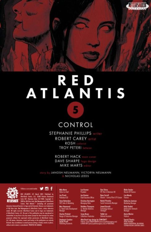
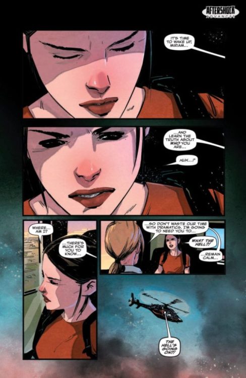
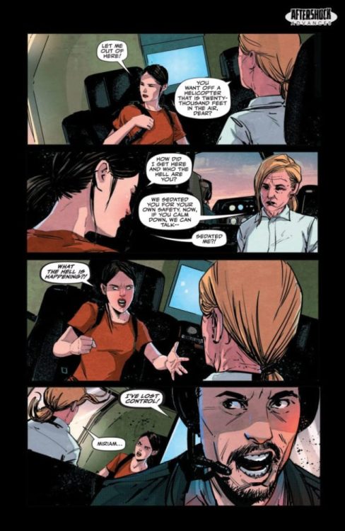
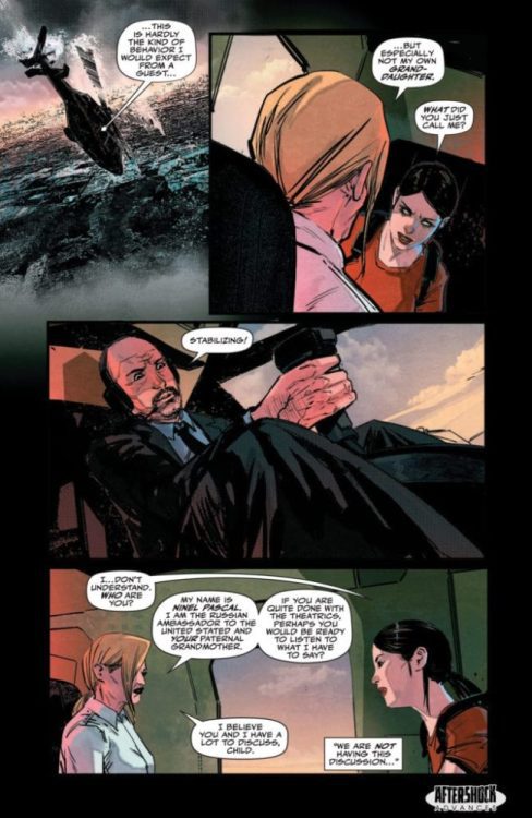
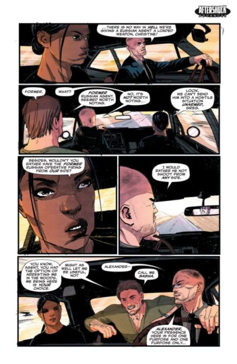
RED ATLANTIS #5 hits your local comic book shop on March 17, but thanks to AfterShock Comics, Monkeys Fighting Robots has an exclusive five-page preview for our readers.
The book is written by Stephanie Phillips, with art by Robert Carey, Rosh drops the color, and you will read Troy Peteri’s letter work.
About RED ATLANTIS #5: A week ago, Miriam Pascal was a college student worrying about exams. Now, she’s trying to harness new-found supernatural powers and stop a secret Russian organization known as Red Atlantis from infiltrating the US government. International espionage and long-buried family secrets clash head-on as Miriam races to save the world.


 Vazquez gives America Chavez #1 an attitude and character of its own. Instead of giving all of the narrative weight to America or a mysterious narrator, the plot takes command. The opening page is a flashback sequence that looks at America’s encounter with her foster family. In juxtaposition, the narrator explains their feelings towards America in these moments. For America, this is a point more important than the nature of her powers or her home reality. It’s a feeling the narrator shares by explaining their envy of the happy life America found.
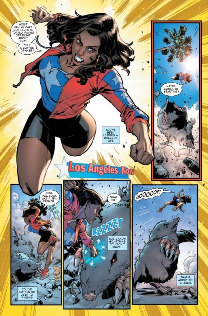 Gomez’s illustrations give America Chavez #1 a look evoking classic mainstream superhero pin-ups. Where this art style really shines is in what the body language and inking outlines focuses on. When America’s soon-to-be adoptive brother Berto’s outline emboldens, it shows the power he has in directing his family towards something almost out of focus. The outline of the young America Chavez’s wrist and her star mark is what tells a reader who this story is about. Provided they are already familiar with her for a better experience.

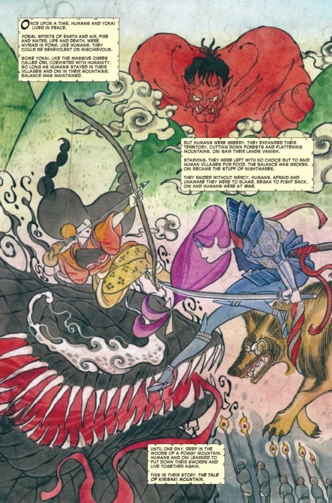 Peach Momoko’s artwork is the main attraction to Demon Days X-Men. Just the opening page presents the title characters as larger than life legends in the style of Ukiyo paintings. The rest of the art has a similar stylization that is much less stiff to make the bodily and facial expressions more pronounceable. Perhaps the most expressive character is the one who never changes his facial features, Hulkmaru. The