

Demon Days X-Men begins a What If? take on Marvel Comics characters on March 3. Under the pen of artist and writer Peach Momoko, three of the X-Men (Mirage, Psylocke, and Wolverine) fight Yokai in a floating world. Adapting the original Japanese story into English is Zack Davisson with Ariana Maher as letterer.
Demon Days X-Men: Floating Fan-Fiction
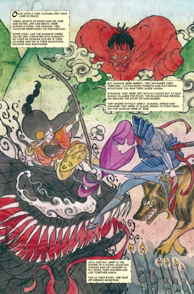 Peach Momoko’s artwork is the main attraction to Demon Days X-Men. Just the opening page presents the title characters as larger than life legends in the style of Ukiyo paintings. The rest of the art has a similar stylization that is much less stiff to make the bodily and facial expressions more pronounceable. Perhaps the most expressive character is the one who never changes his facial features, Hulkmaru. The noh mask-like face with how it is angled displays a great range of emotion. Hulkmaru’s face tilting on an upper angle displays fear, unlike a later time when tilting downwards displays anger and mistrust. The full use of Japanese art displays a range of different styles synergizing like a kabuki play.
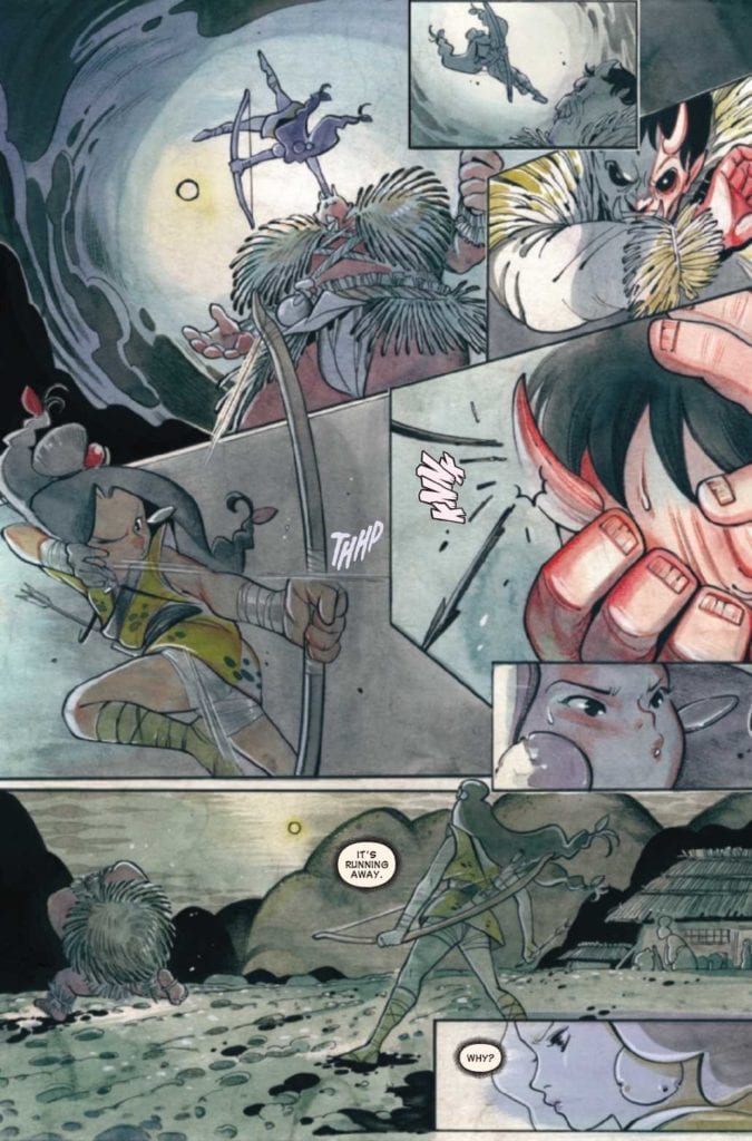
All of the above is necessary as the story of Demon Days X-Men is average. Momoko takes inspirations and tropes from samurai stories as well as recognizable folktales. Sai (Psylocke) takes the role of a wandering ronin helping out a village in trouble with a dog version of Wolverine at her side. The trouble in this case is trying to make peace with the oni Hulk…maru who is raiding the village gardens to survive after the village colonized oni lands. Then there comes another story about the village in danger from a yokai Venom interlocks with the previous struggle, and not in a very organic fashion. It really looks like plots resolve for their own sakes instead of going to the root of the problem.
Some Gaijin’s Translation
Between Momoko’s original design and the translations by Davisson, there some noticeable differences. Demon Days X-Men does have some noticeably striking visuals in the SFX by VC’s Maher. Unlike the Japanese SFX that Momoko designs to resemble perfectly etched brushwork, the placements have marginal matches. Some of the Maher’s SFX, like the hissing sound of Venom, look perfect in how it contrasts yet still looks like an extension of him. Others like Hulkmaru’s smash SFX look like they were pasted on from a saved image. Unlike his earlier actions that have a red coloring, this action sound is purple. Frankly, while the overall presentation is fine, it makes me more interested in seeing Momoko’s unfiltered design.
Check Out Demon Days X-Men
Demon Days X-Men is an artistically appealing start to a five-part epic. While the story and direction come up short by combining two unlike stories, the efforts to evoke many Japanese art styles is phenomenal. Peach Momoko is certainly earning her place as a featured artist, with how she portrays her enthusiasm as a Stormbreaker.