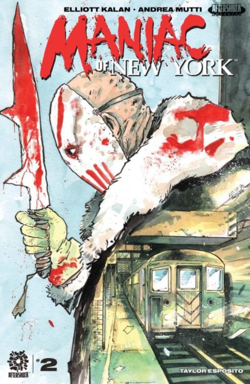
MANIAC OF NEW YORK #2 hits your local comic book store on March 10, but thanks to AfterShock Comics, Monkeys Fighting Robots has an exclusive five-page preview for our readers.
The book is written by Elliott Kalan, with art & colors by Andrea Mutti, you will read Taylor Esposito’s letter work, and Andrea Mutti created the cover.
About MANIAC OF NEW YORK #2: Maniac Harry, the unstoppable masked killer causing a significant drop in NYC property values, savagely slashes his way down the length of a packed subway car.
Can exhausted commuter Gabriella Acosta keep ahead of the Maniac long enough to save two children from his blade? Meanwhile, Gina Greene of the Maniac Task Force and NYPD detective Zelda Pettibone are willing to do anything to save those passengers — but time is running out, and the Mayor is ready to sacrifice everyone on board if it means trapping Harry for good.
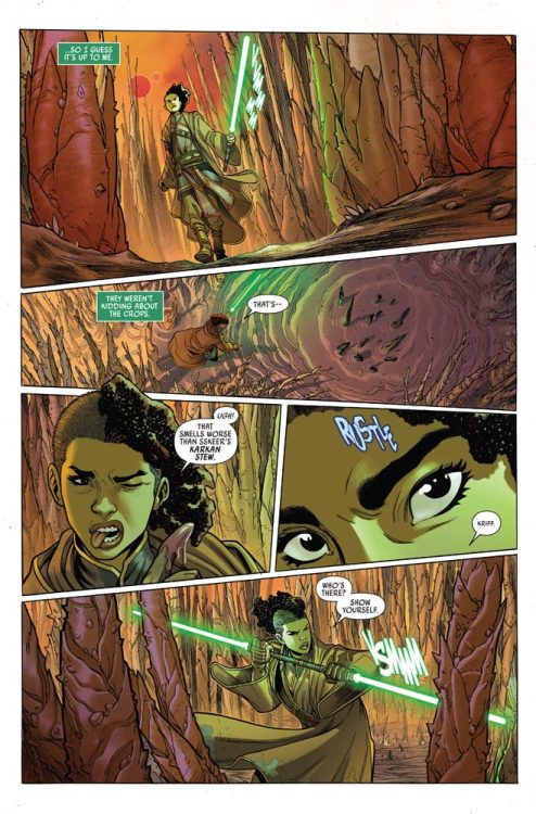
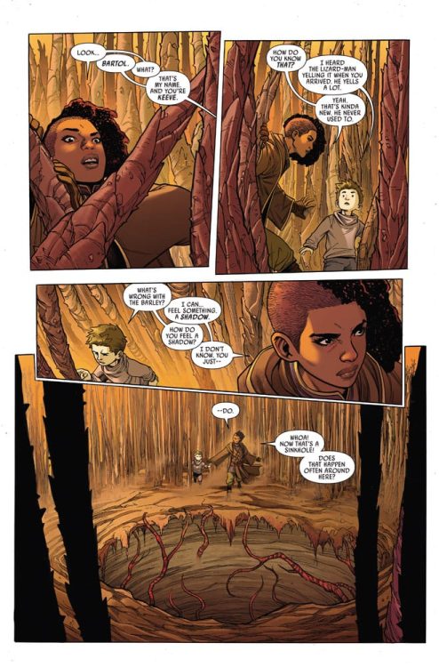
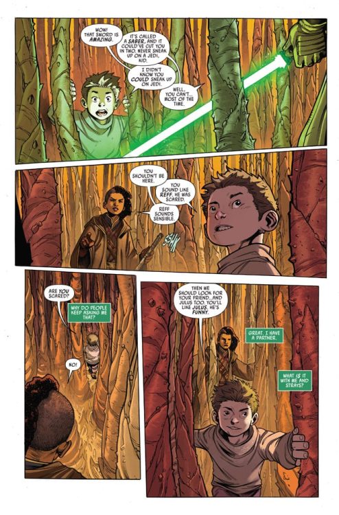
Writer Cavan Scott and artists Ario Anindito and Mark Morales, with colorist Annalisa Leoni and letterer Ariana Maher return with another intense chapter in the Galaxy Far, Far Away with “Star Wars: The High Republic”#3. This issue sees the introduction of an intriguing new threat in the Star Wars universe, while building upon the growing tension within the main cast of characters. With a tight and tense script (if not sometimes a little cornball-ish) and incredible visual work, “The High Republic” still stands as a highlight among the new Star Wars material that we’ve been seeing in recent memory.
“One JEDI missing and another driven insane. What horror lurks in the darkness beneath the rotting crops? Death is averted, but a terrible union is formed. Can KEEVE TRENNIS protect an innocent life while facing betrayal from within her own order?”
Writing & Plot
Cavan Scott focuses on the development of his plot on two fronts with the script for “Star Wars: The High Republic” #3. On the one hand, he is exploring the possibilities of a new element in the dark side of the force that suffice to say is a concept we’ve never really seen in the Star Wars univer, and is a fascinating look at how the Dark Side corrupts the natural world. On the other, he is also testing the mental fortitude of the main cast of characters in the face of a growing darkness within their own ranks. The latter of these two is an arc that continues to grow more and more fascinating. Watching a newly-promoted Jedi Knight have to contend with one of her most trusted allies falling to their basest forms and emotions is compelling for both the development of this protagonist as a character, and the context of this event in Star Wars as a whole. The use of dialogue and narrative here is still solid, if not just a tad bit corny at times. This issue almost feels like a reminder that Star Wars is for everyone (and it damn well is), so there are some playful moments mixed with a lack of subtlety from the newest foes in the pages of this comic that make it feel akin to something from an episode of Star Wars: Rebels (which is a great show, but you know what I mean). Still, this is a completely solid and entertaining comic that propels the story forward in an intriguing direction.
Art Direction
The always top-notch visual work in Marvel’s Star Wars comics continues in “The High Republic” #3. Ario Anindito’s pencils and Mark Morales’s inks put together an immensely well-detailed comic that has the look and feel of the Star Wars universe, all while making everything new. The character animations are outstanding, with the slight twists and twitches of emotion being realistic on the human characters and even easily identifiable on even the most unusual looking of aliens. The action sequences look stellar, like something right out of the cinematography in one of the films. Jedi leap, dodge, and slice with all the grace and momentum that we know them to possess, and it looks great here. The colors from Annalisa Leoni are vibrant and tonally varied, and actually give this comic much of its uniformity with the rest of Marvel’s Star Wars outings. The use of dynamic lighting in this comic continues here, with the glow of lightsabers and alien suns and how they reflect off of skin and surfaces still being a highlight for me. The letters from Ariana Maher really shines with the specials effects, as every swing of a lightsaber or scream of anguish echoes across a page with the perfect choice in size and font for the noise. This is once again a brilliantly well put together book from the visual end, and one that is fitting for the visual legacy of the Star Wars universe.
“Star Wars: The High Republic” #3 is a thoroughly entertaining comic book that uncovers new territory and mythos for the Galaxy Far, Far Away while also continuing to be a stellar character-driven tale. The script from Cavan Scott can get a bit corny at points, but the introspection in the head of the main characters and the tight pacing of the story override that minor flaw with ease. The visuals from Ario Anindito, Mark Morales, and Annalisa Leoni are outstanding and continue to provide a phenomenal visual ride for for this Star Wars comic. Be sure to grab this latest issue when it hits stands on 3-3!
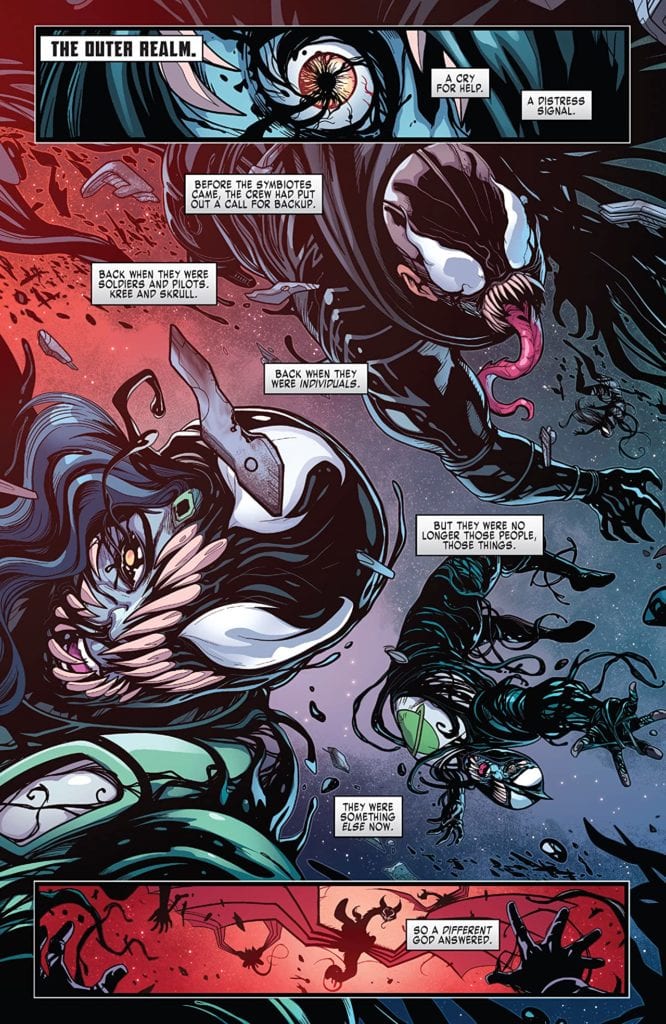
KING IN BLACK: WICCAN AND HULKLING #1, a one-shot available on Wednesday, March 3rd, tells the story of former Young Avengers Hulkling and Wiccan’s long-awaited honeymoon. But unbeknownst to them, the Symbiote God Knull rampages across the universe, destroying and taking over all sentient life. As a result, readers will see what an Emperor and his husband do when faced with a world-ending threat during the week they’re supposed to be at their most relaxed.
Story
The issue opens like many tie-ins to the King in Black event—a horrible scene of destruction at the hands of Knull’s symbiote army. The recently allied Kree and Skrull soldiers appear to have succumbed to the creatures.
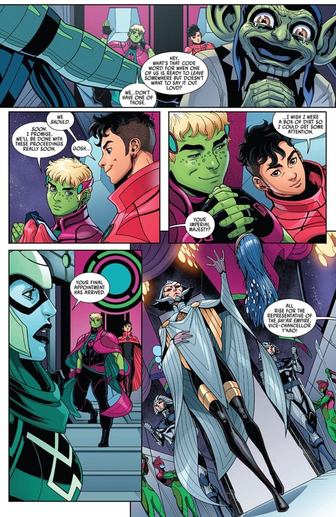
Elsewhere, Hulkling and Wiccan need a vacation. We see that they’ve been busy handling the logistics of the Skrull and Kree alliance despite having recently gotten married. Wiccan and Hulkling’s back-and-forth flirting displays realistic displays of affection between the newlyweds. Their desire to be alone together is made even more apparent when the Vice-Chancellor of the Shi-ar Empire offers them a spot on one of their resort planets. But with Knull and his symbiotes nearby, their one-on-one time might be cut short.
Writer Tini Howard captures the essence of Wiccan and Hulkling in impressive detail. Each hero retains those personality aspects fans have grown to love over the years while adding in more mature qualities. We were thrilled to watch this fan favorite couple sort out a typical superhero threat while trying to enjoy their honeymoon.
Artwork
Luciano Vecchio’s penciling and ink work, Espen Grundetjern’s coloring, and VC’s Ariana Maher’s lettering worked beautifully together in this issue. The illustrations of the married couple shows full ranges of their emotions—from their loving looks toward one another to faces full of terror at the sight of their assailants. We also loved how the lettering employed squiggled fonts to represent each horrific scream of the symbiotes, helping to emphasize the overall themes of panic.
Conclusion
KING IN BLACK: WICCAN AND HULKLING #1 is all at once action-packed, heart-warming, and frightening, which fits well with the greater King in Black event. We hope to see more of the duo in future adventures.
Do you want these two to have their own series? Let us know in the comments below!
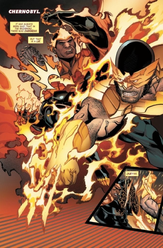
AVENGERS #43 hits stores on Wednesday, March 3rd, making this the fourth installment of the Enter the Phoenix run. After choosing some of the world’s most accomplished heroes to compete in a tournament, the Phoenix Force decides to survey all it has brought together. And after revealing a unique connection with Thor last issue, it’s attempting to forge a greater connection with him. But what purpose does it have for the other champions in this tournament?
Story
The Avengers, their allies, and a few unsavory actors have been the focus of the Phoenix’s tournament for the past three issues. And while this is still the case, we see the events told by someone other than the characters themselves. The Phoenix makes it clear that it is in charge of the narrative.
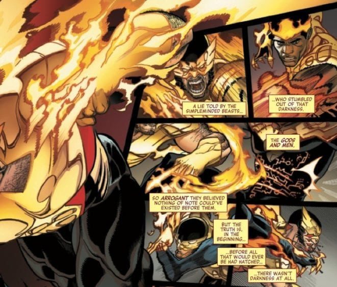
Amidst a bloody fight between Black Panther and Wolverine, the Phoenix narrates a tale of its own. It reveals that it was one of the primordial forces of creation, existing as light long before any other mortal beings. This hype up of the being’s influence establishes a clear hierarchy of power. And as its narration continues throughout each individual battle, we learn more about its motivations.
Jason Aaron’s narrative does a beautiful job showcasing the Phoenix’s personality. The rage of the heroes fighting in its power is amplified by the sheer authority laced throughout its speech. We can’t wait to see what lies in store as its might grows.
Artwork
Penciler and inker Javier Garrón’s depictions of characters in combat captures the sheer brutality of this tournament. The slugs, kicks, and flames envelop each one with red, orange, yellow, and black shades, courtesy of colorist David Curiel. These aesthetics pair perfectly with the Phoenix’s cryptic dialogue. Letterer VC’s Cory Petit’s narration boxes, cast in yellow and red, frame each scene to keep us focused on both the words and illustrations.
Conclusion
AVENGERS #43 gives readers an intriguing look into the mind of the Phoenix itself. We’re anxiously awaiting the reveal of the Phoenix’s chosen champion.
Do you think the Phoenix will assert more control in the coming issues? Let us know in the comments below!
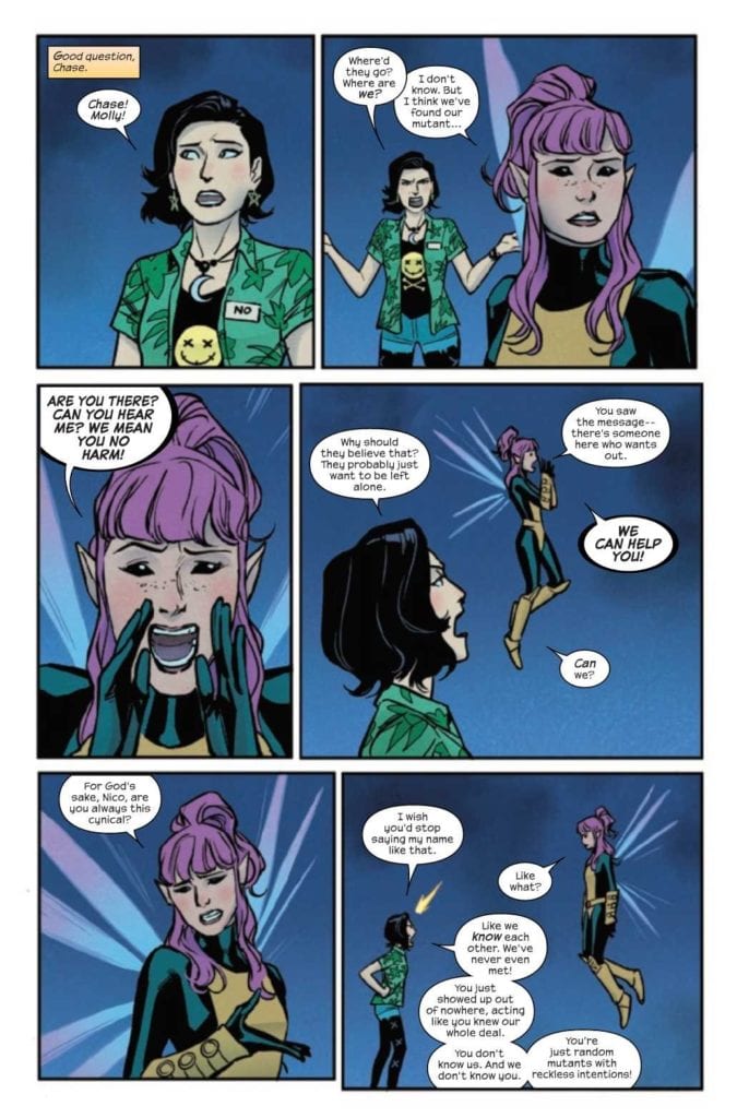
RUNAWAYS #34, available Wednesday, from Marvel Comics, brings fans back to a group of their favorite heroes. A group who have managed to avoid much of the drama happening in the wider Marvel universe – because they’re too busy dealing with their own.
Any guesses on who they’re looking for?
The last issue left us off at a bit of an uncomfortable cliffhanger. Given the characters involved, the plot could have gone several ways. Is Molly looking to bail? Is something more sinister going on? Or is this merely a hilarious misunderstanding?
For those that may not have been following along: the world has changed drastically for all the mutants of Marvel. That includes Molly, though even her friends are willing to debate that fact. All (mutants) are welcome to move to the new mutant country of Krakoa, but it isn’t a requirement.
That sets the groundwork for the twist of last month’s issue, where certain iconic mutant members showed up to rescue Molly. Or not. Again, there’s a lot that is open to interpretation in that scene, and now we finally get to find out what exactly is going on in Runaways #34.
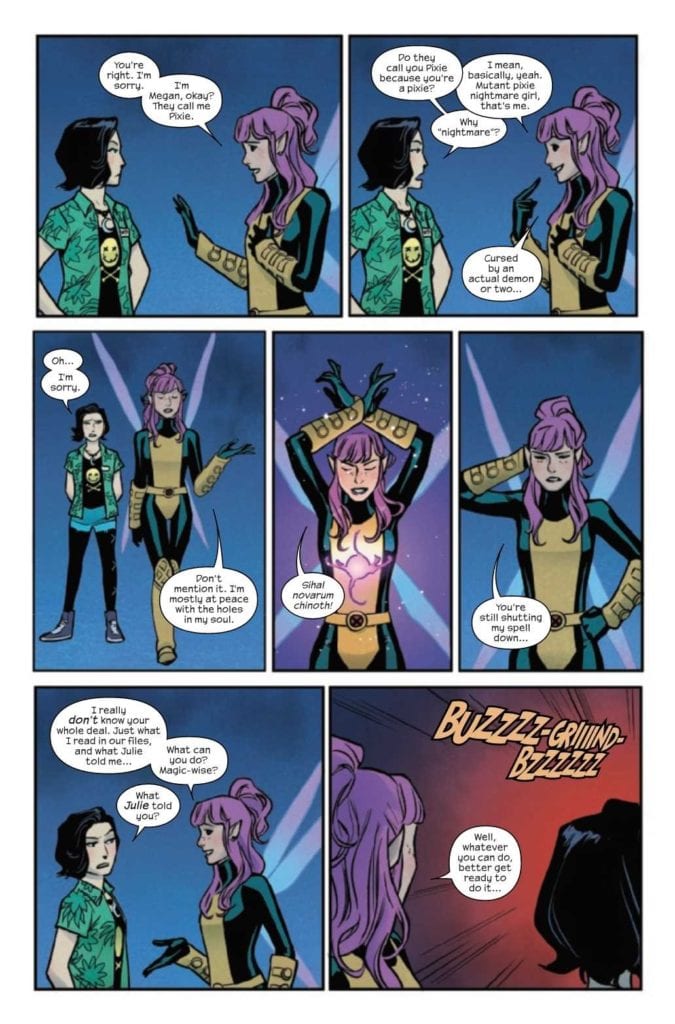
Nico’s spell is still causing havoc – that’s not as surprising as it should be.
The Writing
Runaways #34 is humorous, it’s concerning, and it has a very solid dose of foreshadowing. Good to know that Rainbow Rowell can juggle more than one plot arc at the same time.
In short, it’s a perfect Runaways plot. The funny moments make the characters feel human – and so very young. While those darker moments are easily overlooked. Or rather, they will be overlooked – right until they bring about disaster. This is the Runaways we’re talking about, something will go wrong for them eventually.
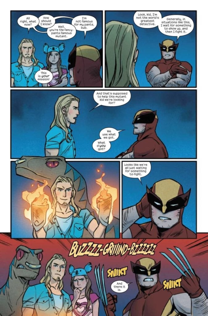
The inclusion of certain mutants helps to balance out the plot even further. Individually, they added room for conversation, as well as violence, humor (again, there was a decent amount of it in this issue), and tension.
There’s a lot of subtlety and nuance woven into the narrative as well. Hints, promises, and even threats for what is to come. One more way to make sure we’re staying engaged, and looking forward to the next issue.
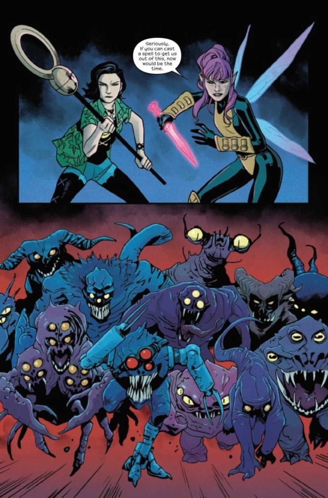
They’re all geared up and ready for a fight!
The Art
The Runaways have always had a certain aesthetic about their series, and this latest issue has done a brilliant job of capturing that feel. Runaways #34 is bold and bright, with sharp pops of color and plenty of dramatic shots to go around.
Andres Genolet’s scenes really are eye-catching. They can easily bounce between dramatic (say, a battle against a large number of enemies), or hilarious (such as an iconic hero getting picked up by a little girl). The end result is something visually entertaining, and certainly memorable.
As I already mentioned, Dee Cunniffe’s colors are bright, but they also compliment the plot with ease. The fights are made more dramatic thanks to their hues, and attention is (rightly) drawn to certain movements over others.
The lettering, provided by VC’s Joe Caramagna, was another prime example of subtle, yet complimentary art. The reader is guided from panel to panel, with clear design and intent. It made everything flow so smoothly, even as multiple threads are forming.
Uh, those don’t exactly look like great odds.
Conclusion
Runaways #34 is a chaotic yet highly entertaining issue. One that has both heavy and funny moments, and even more reasons to want to keep reading the series. There’s a lot going on in the lives of these kids (really, young adults now), and they’re still here to save the day despite it all.
BRZRKR #1, after a Kickstarter campaign no one saw coming, is out on March 3 from Boom! Studios. Keanu Reeves gives his likeness to the titular character and serves as co-writer to Matt Kindt. It’s a likeness that Ron Garney artist and colorist Bill Crabtree capture in brutal action. Even the lettering by Clem Robins nails down the simplicity evoking Reeves characters like John Wick.
Kindt, who built his career off the nature of memes in Mind MGMT and Bang!, is the perfect writer for this series. Keanu Reeves’ own recent career has practically turned him into a meme. With Reeves’ face in every form of mass media, Kindt and Reeves comment on the actor’s oversaturation.
In essence, the titular character of BRZRKR #1 is every major depiction of Keanu Reeves’ career, no doubt because Reeves himself is providing it. The berserker has the general appearance and attitude of Reeves’ character, John Wick. He’s a maverick with enough influence to do whatever he wants, like kill instead of capture a target in his blind rage. The berserker is also immortal, with scientists trying to figure stuff out about him, including a psychologist who regularly meets with him. This gives the Berserker an almost godly presence that he wishes he hadn’t.
What makes the Berserker interesting isn’t that he’s searching for death; he just wants to be mortal. I can’t help but think this is what Reeves’ wants in his career. Because in all honesty, who wants to watch or keep playing the same role? Which considering reports of a fourth John Wick movie, the franchise and Reeves’ career could be in danger of becoming a Franchise Zombie. This is why the artistic elements of BRZRKR #1 present this as a parody of Reeves’ meme status.
The Art of Keanu Reeves Depictions
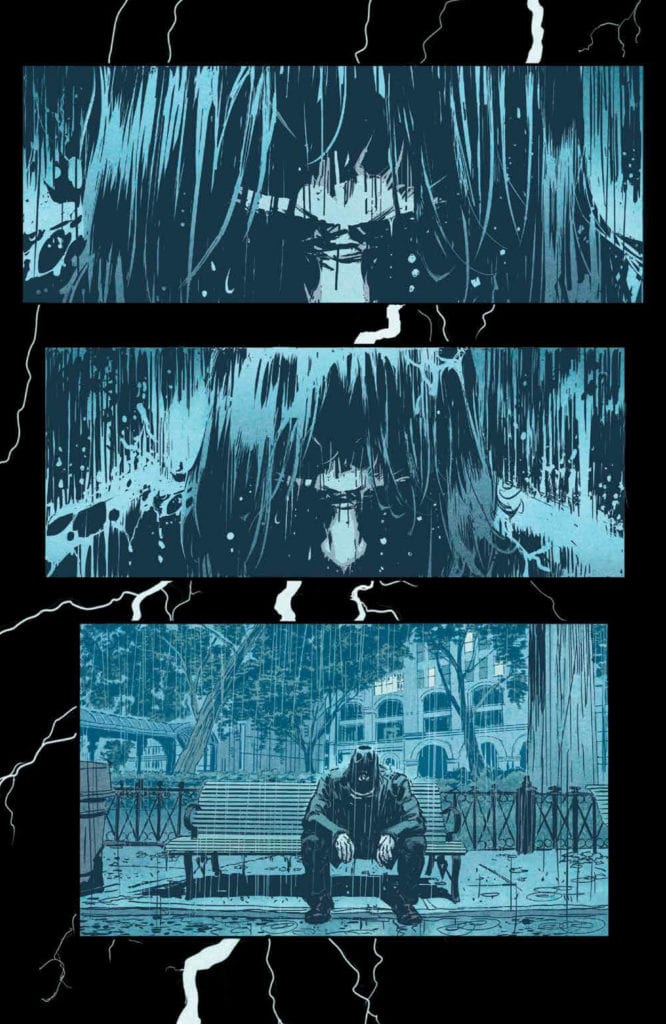
In just the opening of BRZRKR #1, we see the berserker in a scene evoking the Sad Keanu meme. For Reeve’s fans, this tells the reader what kind of character the berserker is, a super-powered John Wick, which given the brutal over the top actions that Garney illustrates, this comparison isn’t far off. Combining with red colors that Crabtree uses to accompany the berserker, the title character remains the center of attention. Sometimes it’s when the background disappears, like when the berserker dodges a bullet or when he’s being operated on in a blue room.
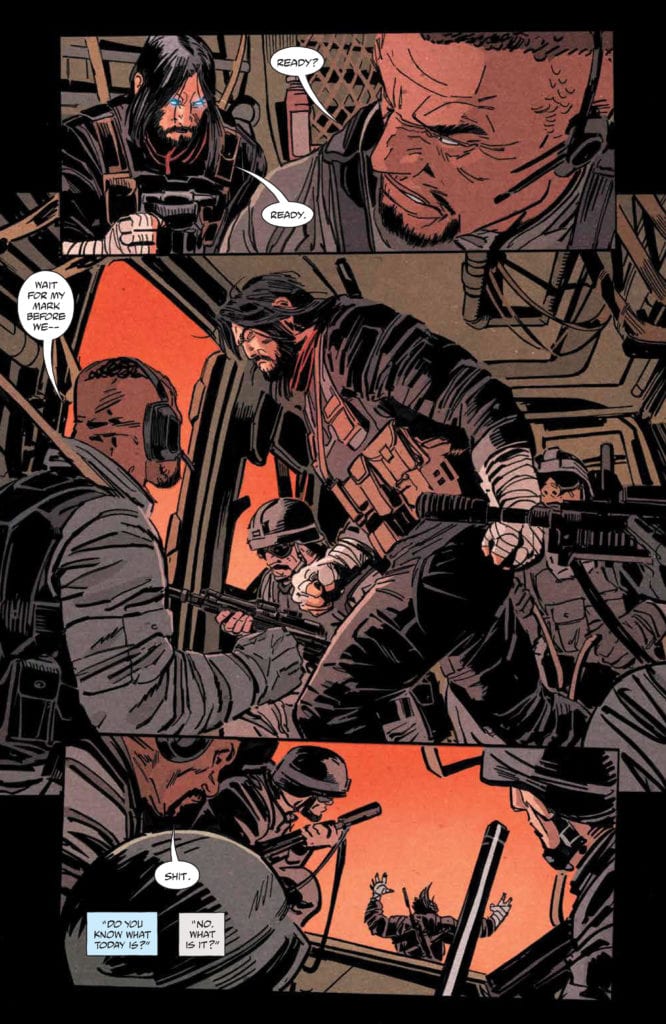
The most clever art in BRZRKR #1 comes from the lettering by Robins. The captions that the berserker talks to his psychologist are in juxtaposition with the berserker killing people. Considering Kindt has it written like the Berserker is talking to a significant other, this comes across as a parody of John Wick. I mean, the psychologist says, “it’s our anniversary,” like she’s his wife. The blue captions are a light blue color indicating a sense of ease, unlike the cold gray ones of the berserker. So when the berserker turns up at an operating table, it indicates this loving sense the reader got on implication is just part of the berserker’s job. It’s a rather tragic comedy when you look at it like that.
BRZRKR #1 For Keanu Reeves Fans
BRZRKR #1 is an interesting beginning to a Keanu Reeves satirical commentary. By going into how the memes that catapulted his career made him like an undying god, Reeves and the creative team parody oversaturation. Which considering the satirical layer some fans like Wisecrack find in John Wick, it’s on-brand.
What do you all think? Is there more to BRZRKR than a comic profiting off a celebrity?
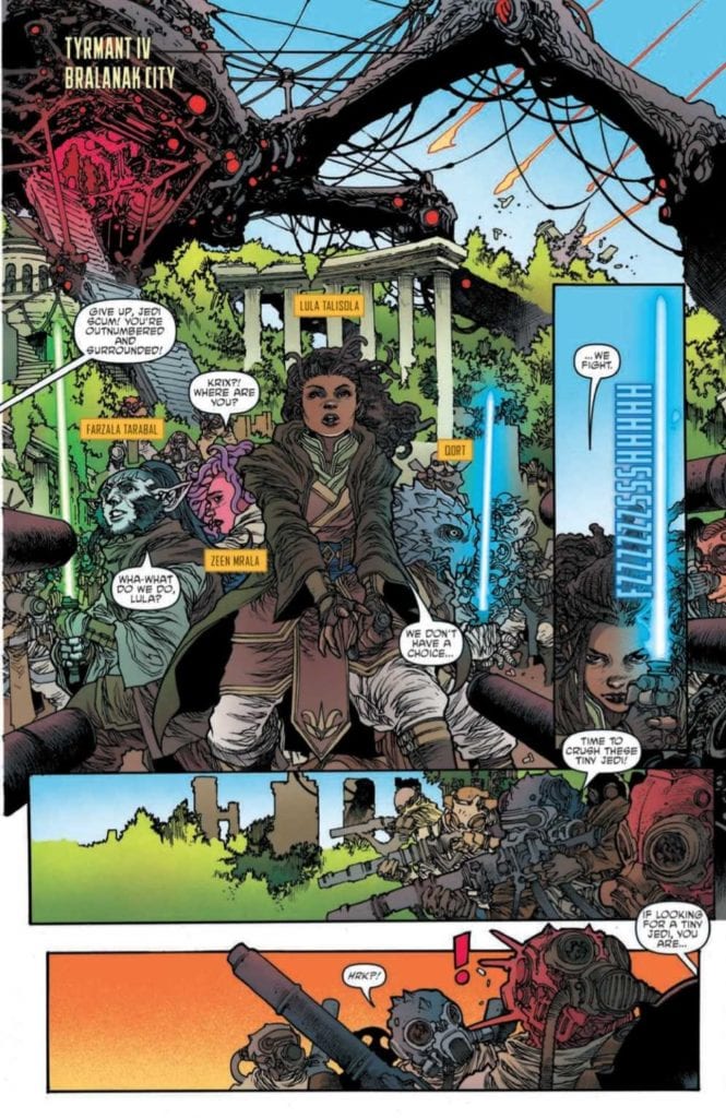
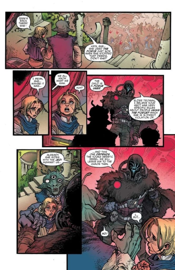
STAR WARS: THE HIGH REPUBLIC ADVENTURES #2, available Wednesday from IDW, continues the tale of several younglings set in the time of the High Republic. Namely, young Zeen and Lula, two determined young women.
Things are not looking great on Trymant IV.
All of a sudden there has been so much in way of new material surrounding the High Republic. Both in books and comic books, the time period is blowing up. Thankfully, not literally. In fact, you probably noticed that there’s another series with a very similar name (Star Wars: The High Republic).
Both series do feature a combination of Jedi and their Padawans, though the focus for each feels very different. In this case, the dominant themes are loyalty, learning to make decisions, and the power of secrets.
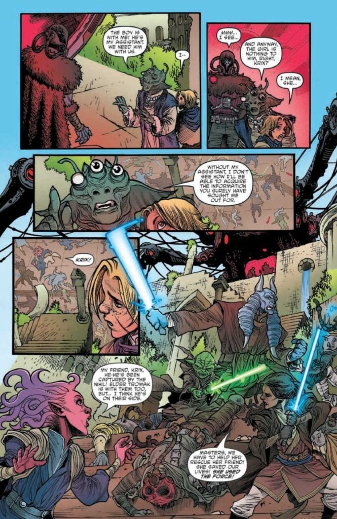
Star Wars: The High Republic Adventures #2 brings us back to Trymant IV, a planet that faces a fiery end. This is the planet that Zeen and Krix grew up on, and the planet that Padawans Lula, Farzal, and Qort all came to help.
Now would probably be a good time to mention that there’s a Nihil ship involved as well, and regular readers are probably already dreading what that could mean.
The Writing
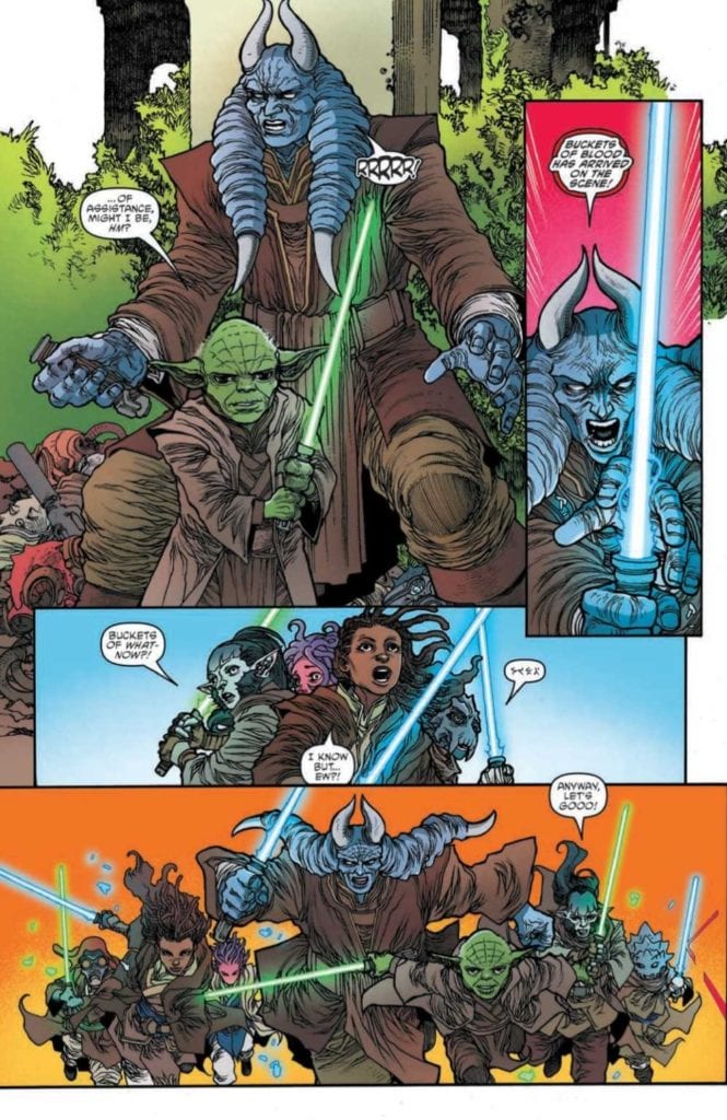
Yet the Jedi and their young Padawans rally, even now.
While there’s no doubt that Star Wars: The High Republic Adventures #2 is targeted at a slightly younger audience, it makes no effort to dumb down the plot. Daniel Jose Older has written a plot that is both thrilling and tense, one that will hopefully result in plenty of character development down the line as well.
The devastation happening on Trymant IV won’t surprise anybody, myself included. It’s literally in the comic description. Yet there are several surprises throughout this issue. The first being that there’s a bit of humor hidden in this tense moment in time (thanks to a certain character and their odd choice of names).
Many characters were given a chance to shine here, getting a chance to show how they fight, think, or otherwise take action. It was fascinating to see and leaves me hopeful that this will be the expected pattern going forward.
There are many themes in this issue that will be familiar to Star Wars readers, as Daniel Jose Older made clever use of them. Such as the belief of staying true to oneself, and the consequences of decisions made. They feel right at home here, and help to solidify the series, rather than bring it down.
Meanwhile, another youngling must make a choice.
The Art
Star Wars: The High Republic Adventures #2 has to be one of the brightest Star Wars series I’ve read, and that’s saying something. The bright backdrops allow for a stark contrast, while also setting up for several fantastic action shots.
Harvey Tolibao and Pow Rodrix (Magnus Arts) were the lead artists, and their character designs are still one of the many highlights in this series. Each character looks unique and memorable, especially the ones that have been named (obviously). There are some intentional contrasts being drawn here, both in writing and in design, and it makes for an iconic look.
Rebecca Nalty’s colors really do give this issue such a bright look to it. These are bright battles, space scenes, and so much more. The use of solid and bright colors for backdrops is not new but is used to great effect here.
Jake M. Wood’s lettering is surprisingly evocative, capturing the depth and complexity of the situation, not to mention the high emotional levels that are running all over the place. The letters also help to increase that feeling of danger, as impacts feel and look real.
Who will he choose? The one speaking up for him, or his friend?
Conclusion
Star Wars: The High Republic Adventures #2 continues to build upon the characters and world that have been introduced. These young Padawans feel full of potential, and it’s impossible not to root for them as we watch their journey progress.
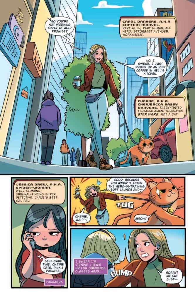
MARVEL ACTION: CAPTAIN MARVEL #1, available Wednesday March 3 from IDW, is about to bring two iconic heroes together for a highly unique tale. It’s a tale that brings in concerns of the modern age. Namely, social media.
Look at Chewy on that leash!
Is it true? Is Captain Marvel really getting another Marvel Action series? Well, yes! She is. Marvel Action: Captain Marvel #1 kicks off an all-new series, featuring a beloved heroine, her stubborn flerken, and all of her allies.
Given that this is Marvel Action we’re talking about, we already know that this series is going to be both light and approachable. It’s perfect for all ages, but especially for those readers out there that could use a bit of a break from all the doom and gloom.
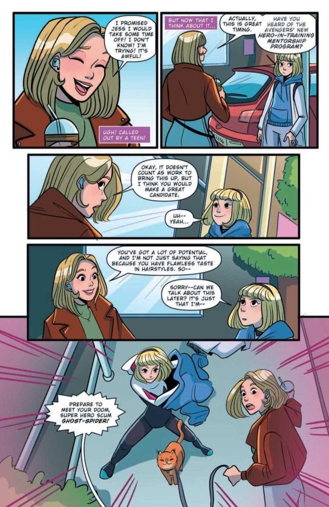
And you just know that this issue is going to be full of humor. How could it not be, when the core concept revolves around Captain Marvel, queen workaholic, trying to take a vacation? A vacation ordered by her best friend, mind you.
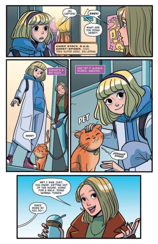
Enter young Gwen, aka Ghost-Spider, a fan of Chewy, and a great potential candidate for Carol’s new program.
The Writing
Marvel Action: Captain Marvel #1 is a lot of fun, thanks to Sam Maggs’ writing. It’s light and not afraid to get a little silly at times. Hard to believe, I know. But even somebody like Carol Danvers has a silly side. Probably.
The issue starts off with the highly entertaining concept of Carol taking Chewy for a walk (on a leash and everything) and quickly escalates from there. It’s exactly the sort of chaos one would expect from somebody promising to have a ‘relaxing vacation.’
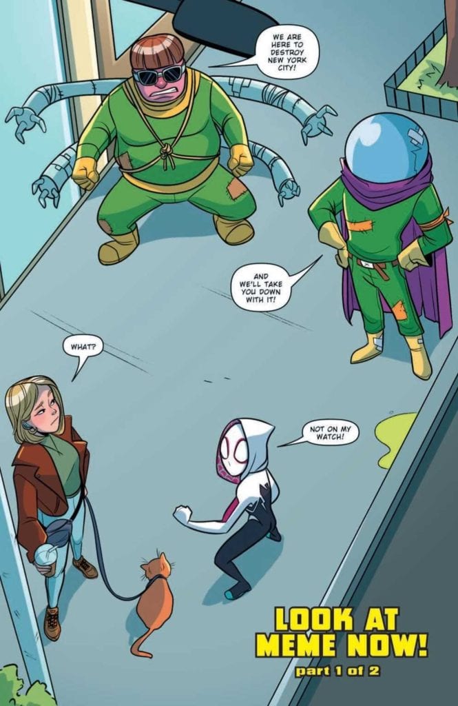
That is to say, Maggs threw everything in Carol’s way, but did so in the most amusing ways possible. These scenes involved several other iconic Marvel ladies, including Ghost-Spider, Squirrel Girl, and Ms. Marvel. That alone makes it worth the read, don’t you think?
All things considered, this isn’t a plot that dives too deeply into character growth, drama, or any of the heavier concepts that Marvel loves to play with. And that’s not a bad thing. It makes for a bright break from the norm and is diverting and comical in its own right.
I would like to mention how refreshing it is to see social media handled in such an open way. Maggs played with the concept of superheroes (especially the younger ones) living in a world full of social media. This also opened the door to (briefly) touch upon the dark side of that subject: the comments section.
So much for Carol’s vacation, huh?
The Art
As much fun as Maggs must have had when writing, Marvel Action: Captain Marvel #1, the artists also seemed to really enjoy their work here. Mario Del Pennino (layout artist), Isabel Escalante (inks), and Heather Breckel (colors) were all involved in this project, and they really let so much personality shine through.
The scenes portrayed in this issue are all lighter in tone, matching the writing perfectly. They portray everything from bubbly and BFF vibes, to chaotic fun. Am I giving them bonus points for creating a scene where Chewy somehow not only got leashed, but happily walked through New York City? Yes. Am I okay with that fact? Also yes.
The character and costume designs are another noteworthy feature. Right away readers can tell when something is off, and that really does heighten the whole experience. As do the occasionally over-the-top reactions that occur.
Something seems…off here…
Conclusion
Marvel Action: Captain Marvel #1 is a fun and light read, one that is perfect for anybody looking for a bit of a break. Or a lot of tongue-in-cheek humor. Either way, it’ll get you laughing at the antics of this crew.
Fear Case #2 from Dark Horse Comics, out March 3, depicts the titular MacGuffin and how it controls the plot. Under the pen of writer Matt Kindt, known for his work about the influence of memes like this series’ predecessor Bang! this issue shows how the plot tells itself. With art by Tyler Jenkins and Hilary Jenkins’s colors, the anticipation on display creates a thick atmosphere.
Fear Case #2: The MacGuffin Case
For clarity, a MacGuffin is a plot device that advances the plot and character motivations despite its insignificance. Think of the iconic case from the movie Pulp Fiction in how it drives the plot. It’s not a doomsday device or money; it’s just something everybody wants and can change a subplot’s direction. With Kindt at the writing-table, this concept combines with Lovecraftian horror.
Our quirky secret service agents Mitchum and Winters, who the audience comes to love in the last issue, chase every lead. From how the case has rules surrounding it, Fear Case #2 provides context as to why. While the Secret Service wants to secure it, Mitchum and Winters are becoming obsessed with it. It doesn’t help that there’s a criminal gang looking for it too. Hence why there’s a time limit for the agents, stay on the assignment too long, and the case consumes them.
It sounds ridiculous when you hear the outline, not that the reader won’t feel the obsession. The case, through its own set of rules it instills, sends whoever is pursuing it on a wild goose chase. Nobody knows how or why, but somehow, it can motivate whoever has it to pass it along, all from a box that has no value other than the one it fabricates. Through Mitchum and Winters, the reader feels the frustrations behind it all.
Anticipate The Madness
Tyler draws out the tension throughout Fear Case #2 with panels and images that make the reader feel uneasy. The pencils that make panel layers alone create small permeable barriers between situations. It’s like whatever’s on a page is ready to invade a moment of clarity. The images of eldritch horrors appearing at random times in characters’ thoughts only add to the cosmic horror. If Tyler also does the lettering, he arranges it in a way that assists in anticipation. Like when the agents feel the scent of death, leaving the reader anticipating.
Hilary certainly helps drive that feeling forward with her coloring. That rotten smell Mitchum and Winters feel gets a visual equivalent when Hilary shows the red colors of intestines. Those eldritch horror scenes often have colors that look gloomy with an otherworldly green and purple.
Does Fear Case #2 Have You?
Fear Case #2, much like its MacGuffin, digs its way into readers’ minds to see it through. Now that the rules of engagement are set up, it’s time to see what comes next. Just be sure to set up your own rules of engagement. Otherwise, the anticipation will kill you.
Dead Dog’s Bite #1 begins a new Dark Horse series on March 3. With full creative duties going to Tyler Boss, this series opens on the relatable dramedy of adolescence.
Dead Dog’s Bite #1 Captures Awkward Adolescence
Tyler Boss gives Dead Dog’s Bite #1 a substance by evoking a sense of adolescent self-consciousness. Being self-conscious is a state that readers can find very humanizing; it’s one of the few ways to display character flaws without being too jerkish. It’s what makes Joe’s sass bearable as she’s a rocky stage of transition in life; she’s 18, on medication, and her best friend is missing. It’s what makes the semi-confrontational conversations she has with a cop and her best friend’s boyfriend easier. Joe’s one of those flawed yet empathetic people you can’t help but relate with.
That’s all especially relevant with how Joe’s town of Pendermills is very… odd, to say the least. The townsfolk are quirky as they can be, like the mayor whose cowboy cosplay at a search party can feel insulting. So why does it feel okay to the point of a town elder joining in on it? Probably because they just want to raise morale in an awkward fashion.
Then there’s someone who stands out among everyone in Dead Dog’s Bite #1, a narrator straight out of the Twilight Zone. From beginning to end, he’s the one who instills the reader’s interest in everything by putting them in the sense of self-consciousness. This makes the reader feel like they’re part of the town by interacting with this narrator.
Presenting The Anxiety
Throughout Dead Dog’s Bite #1, Boss presents every page with a sense of control and lack of it. The first pages have 9-panel grids that have the narrator catch the reader’s interest. Coming out of a manhole then following up with a disclosure certainly does that. The more important piece comes from how consistent the next page is until the last panel vanishes. It says time ran out after going over some rules with the reader needing to figure it out as they go.
Most of the pages follow the grid formats for similar acts of control and immersion. Most of them go for mixing between the formats of each grid. A 3-panel grid combines with a 9 panel to act like comic strips. Each row tells a story like Joe entering a story, and a newspaper is in the corner, foreshadowing a later event in the issue.
In juxtaposition, Joe’s actions control the moments the reader sees. So when the grids break apart the last row, Joe loses her control. The rest of the page continues with this as Joe interacts with people. Anytime she shares screen time with someone, they and Joe cause the panels to break down further. One page features a panel where Joe and her best friend’s boyfriend, Allen, say the same word as they share control of that moment.
Talking Weirdly
Standing out the most in Dead Dog’s Bite #1 is Boss’s implementation of unique dialogue between each character. Joe speaks defensively with a dry wit that hides thoughts of confusion expressed in a ball of lines. She wants to get control of her life by using her words to take power out of confrontations but has trouble getting everything together.
Compare this to the narrator, who is practically an extension of the narrative itself. He constantly has the reader’s attention to keep control, especially with how his word balloons arrange. The geometry they arrange in is neat and follows an easy pattern. Then he gives exposition in the form of an allegorical story. Unlike Joe, the narrator retains control and rarely seems to get thrown off.
Get On Dead Dog’s Bite #1
Dead Dog’s Bite #1 begins a phenomenal take on surreal towns like Twin Peaks by capturing the subjectivity of self-consciousness. Going into adulthood is a difficult thing to depict without alienation. It’s because it’s a period that is a spectrum of feelings ranging from funny to outright uncomfortable. Going onto a state of mood that fluxes between those feelings just happen to be the proper depiction. Boss takes on an unenviable task and blows everyone’s minds away with how he presents this phase.


 In just the opening of BRZRKR #1, we see the berserker in a scene evoking the Sad Keanu meme. For Reeve’s fans, this tells the reader what kind of character the berserker is, a super-powered John Wick, which given the brutal over the top actions that Garney illustrates, this comparison isn’t far off. Combining with red colors that Crabtree uses to accompany the berserker, the title character remains the center of attention. Sometimes it’s when the background disappears, like when the berserker dodges a bullet or when he’s being operated on in a blue room.
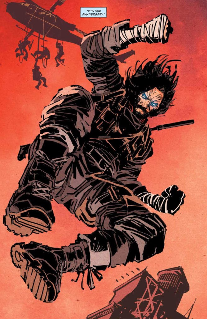 The most clever art in BRZRKR #1 comes from the lettering by Robins. The captions that the berserker talks to his psychologist are in juxtaposition with the berserker killing people. Considering Kindt has it written like the Berserker is talking to a significant other, this comes across as a parody of John Wick. I mean, the psychologist says, “it’s our anniversary,” like she’s his wife. The blue captions are a light blue color indicating a sense of ease, unlike the cold gray ones of the berserker. So when the berserker turns up at an operating table, it indicates this loving sense the reader got on implication is just part of the berserker’s job. It’s a rather tragic comedy when you look at it like that.