Home Blog Page 171

Review: Monkeys Vs. Dinosaurs In YOUNG HELLBOY: THE HIDDEN LAND #2

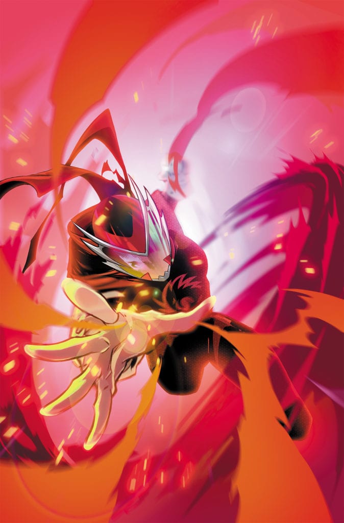
Series creator Mike Mignola and co-writer Thomas Sniegoski, along with artist Craig Rosseau, colorist Dave Stewart, and letterer Clem Robins return to the Hidden Land in “Young Hellboy” #2. This issue dives deeper into the jungle and the dark magics it holds, while having a clear focus on big Golden Age adventures with dinosaurs, giant apes, and lost civilizations. With a tight and fun script and outstanding visual work, this mini-series could easily go on to be a gem in the treasure trove that is the Mignolaverse.

“After meeting a missing adventurer and being taken in by the island’s Ohnar people, Hellboy and Professor Bruttenholm delve deeper into the strange island’s mysteries. Exploring a previous civilization’s ruins reveals more about local history . . . and grabs the attention of some gruesome foes!”

Writing & Plot

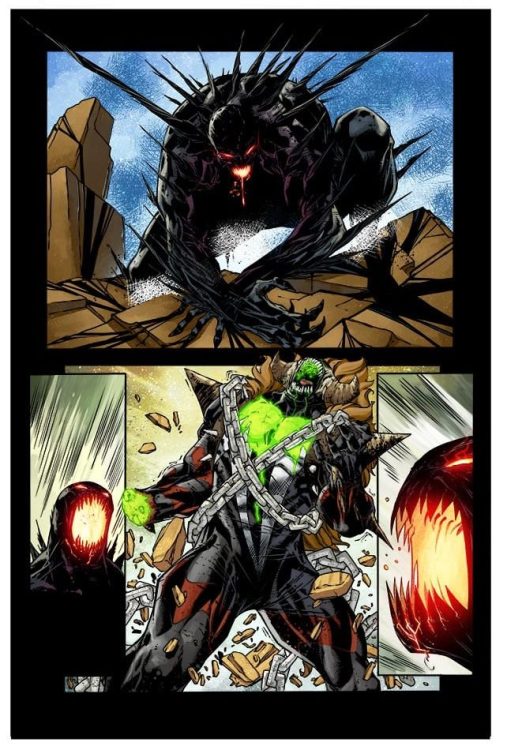
Writers Mike Mignola and Thomas Sniegoski double down on the classic sources of inspration in “Young Hellboy: The Hidden Land” #2. This issue opens with, well, a young Hellboy gushing over the adventures of the Golden Age pulp adventure comic he’s been reading (in true excited child spirit), only to be dropped into such a story himself. This comics sense of paying homage to an immensely influential genre is outstanding, and the comic’s inclusion of dinosaurs, survivalist jungle women, and sentient apes all come straight from the Golden Age of adventure stories. The wonderful thing about the Mignolaverse that makes this work so well, outside of just the writers’ efforts, is how the Mignolaverse is already a melting pot of genre stories as it is. This comic fits right into the rest of the Hellboy library, as the problems that tend to follow HB, Professor Bruttenholm, and the BPRD as a whole are here as well. The later stages of the comic go into full Mignola-mode, complete with dark magics and ancient beings carrying curses. While it obviously makes sense, it’s almost disappointing leaving behind the lost island adventure even for just a moment to introduce the conflict that needs to happen in a Hellboy book. This being said though, the upcoming ultimate villain we get introduced to still looks like it could be a good time (if ultimately a predictable one). Seeing our immeasurably charming and fun to read kid Hellboy go up against his first big bad with the help of a kickass jungle-living adventurer could very well be as much of a treat as reading this single fantastic slice of excitement is.

Art Direction

Any time a Mignolaverse book is discussed, the visuals are almost always the first elements to be judged. The art has to ‘feel’ like a Mignola work, like something that fits in the the creator’s own vision for Hellboy and the world he lives in. That’s why it’s so fortunate that we have the likes of Craig Rosseau on pencils and Dave Stewart on colors for “Young Hellboy” #2. Rosseau puts together a design language that manages to pay homage to the Golden Age adventure tales we’ve discussed at length while also having that uncanny yet fascinating aesthetic that we’ve come to know from Mignolaverse comics. Rosseau’s thick pencil lines and heavy inks disguises a ton of detail in its outward simplicity. The shadows and dimensions he gives characters and environments are full of life and animation, as well as a ton of kinetic energy. The panel direction is rife with a flow that floolows its characters and draws the eyes to their persoonalities and actions, as well as making excellent framing for the action and suspenseful revelations. The colors from Dave Stewart (a regular on Hellboy universe comics) are deep and rich, but also murky and dark in a way that adds to the combination of high-energy adventure and supernatural suspense this comic aims for. Clem Robins’s letters are a familiar and clean font used by most other books in the Mignolaverse, with a dynamic font size and great as always sound effect lettering. This is a stellar looking comic with an energetic and light yet simultaneously spooky visual style that is perfect for this story.

“Young Hellboy: The Hidden Land” #2 is a blast, held aloft by an unendingly enthusiastic and fun Kid HB, a classic sense of adventure, and pitch perfect visuals work. Mignola and Thomas Sniegoski’s script is smart and delightfully fun, with a perfect blend of Golden Age action, magic, and supernatural suspense. The visuals from Craig Rosseau and Dave Stewart are gorgeous and energetic, while still abiding by the sense of uncanny weirdness that fits in with the rest of the Hellboy universe. Be sure to grab this issue when it hits stands on 3-31!

Monkeys Fighting Robots Youtube

Review: SPAWN #316 – Who’s Friend And Foe?

SPAWN #316 hits comic book stores on Wednesday, March 31st, the third and final installment of Todd McFarlane’s “Chain Gang” event. The fight against Omega Spawn is one of the most difficult in Spawn’s career, even with Medieval Spawn’s assistance. But an additional player has joined this battle of titans in the form of Plague, a mysterious force the protagonists and readers will find to be quite troubling.

Story

Last issue saw Spawn and Medieval Spawn on their last leg in the fight against Omega, but the arrival of Plague now gives them a moment of respite. The trouble is that our heroes have no clue as to which side this being is on. Its appearance is unsettling, especially for the big bad Omega.

Just when Spawn and his medieval comrade believe they have a chance to escape while Omega is distracted, a military group arrives to take out all the Hellspawn. Fortunately, the two are finding they work well together and manage to elude capture.

McFarlane’s script does a fantastic job of pacing this action-packed story so readers don’t get lost in the many sequences. It was also a thrill to see a powerhouse like Omega put in his place by a being completely alien to himself.

Artwork

Carlo Barberi’s penciling and ink work, Jay David Ramos’s coloring, and Tom Orzechowski’s lettering once again hit it out of the park when it comes to Spawn illustrations. The contrast between the figures of Plague and the other Hellspawn is clear for readers to see—from the simpler design of the former to the intricate details of the latter. The shades of black, silver, red, and green swirl throughout the action in stunning brilliance. We also loved

Conclusion

SPAWN #316 is the conclusion we were waiting for in this arc. The many potential door opened up could lead to more engaging stories going forward.

Do you think Plague will join Spawn’s team? Let us know in the comments below!

Monkeys Fighting Robots Youtube

Review: SHADECRAFT #1 Examines The Shadows That Follow Us

From the creative mind of writer Joe Henderson comes SHADECRAFT #1, available in comic book stores on Wednesday, March 31th. This new series promises to explore the concept of “shadows”—whether they be those we literally see or the figurative forces that follow us. Readers will find a lot to identify with in the character of Zadie Lu, our main protagonist. An event in her past haunts her present, and she’ll find it difficult to leave unfinished work behind.

Story

The story sets up the character of Zadie on a dark evening stroll with her friend/crush Josh. Zadie wonders why he is walking her home. When he appears to begin confessing romantic intentions, she plants a kiss on him.

To her horror, a stunned Josh reveals he only wanted to pick up his Switch from her house. As readers, we can identify with the embarrassment through her well-written internal dialogue. We don’t know what she means by “get back to normal” just yet, but it reminds us of those times when things were going our way one minute and those circumstances were shattered to pieces the next.

Joe Henderson’s narrative guides us through a series of mysterious events surrounding Zadie. We learn of a tragic event that happened in her past, which seems to follow her every move. Unfortunately for Zadie, her past isn’t the only thing following her. A shadow with a mind of her own begins tailing her every step. But what does this force want from her?

Artwork

Lee Garbett’s penciling and ink work gives Zadie impressive expressiveness to help readers identify with her. In addition, Antonio Febela’s coloring does a brilliant job of giving the animated shadows depth—it’s as if we see them moving from panel to panel. And Simon Bowland’s lettering ties it all together with an effective use of fonts that capture Zadie’s sheer terror.

Conclusion

SHADECRAFT #1 is an exciting new series. We can’t wait to see where Henderson and team take the story next.

Why do you think these shadows are going after Zadie? Let us know in the comments below!

Monkeys Fighting Robots Youtube

Review: NOBODY Serves Up Unoriginal Action Fun

Nobody may come across as a copy and paste of other titles, but it still delivers a thrilling tale from start to finish. The John Wick similarities are in your face, and given the film is written by the same person it’s hard to not make comparisons. Nobody doesn’t overstay its welcome, wastes little time, and features some terrific action sequences throughout. This unoriginal film won’t break new ground, but it still delivers an effective action film.

Fans of John Wick will spot the similarities shown throughout the film, and yet Nobody still doesn’t come across as a shameful recreation. A middle-aged man, who appears to be living the typical life has a past that he has been trying to let go of until it is needed to protect himself and his family. Directed by Ilya Naishuller and written by Derek Kolstad, Nobody stars Connie Nielsen, Aleksey Serebryakov, Christopher Lloyd, Gage Munrow, Paisley Cadorath, and Bob Odenkirk. The film follows Hutch Mansell (Odenkirk), a reserved individual who lets his family down one night during a break-in. This sparks division in the household, but during a bus altercation, Hutch’s hidden abilities are brought to the surface and his entire family is placed in danger as a result.

Bob Odenkirk as Hutch Mansell in “Nobody,” directed by Ilya Naishuller.

Kolstad’s screenplay provides everything you’d want from an R-rated action film. Blood-soaked violence, high stakes drama, and a lead character who surprises you as the film progresses. While Nobody wastes little time getting to the action, it still spends enough time developing its titular character for viewers to relate to him. Mansell is a family man trapped in his day-to-day activities. An aspect that makes him easy to relate to, as plenty of people go through this every day. He isn’t particularly happy with his life, and to make matters worse a couple of burglars drive a wedge between himself and his family. Kolstad implements moments of comedy that assist with providing a lighthearted vibe to this insanely fun film. As mentioned above, there isn’t much originality to be found here with this script, but it’s executed effectively.

Odenkirk impresses as Mansell, a rather surprising casting choice for this type of film. He portrays this role with ease, and the performance gets increasingly better with each obstacle thrown in Mansell’s direction. His rival in the film, Yulian Kuznetsov (Serebryakov) wants Mansell dead after he learns of his recent behaviors. Again, just like many other films before it where a character’s actions spark attention from a group of individuals they must take out. Kuznetsov is believable as this drug lord who will not rest until he takes out Mansell and his entire family. All the performances are solid, but Odenkirk steals the show here with his switches between fight or flight. Nobody is probably a one-time outing, but there is room for more, and Odenkirk thrives in this environment.

Hutch Mansell (Bob Odenkirk, seated with back to camera), Albert (Neil Davison, fourth from the left), Yulian Kuznetsov (Alexey Serebryakov, seventh from the left) with members of the Russian mafia in “Nobody,” directed by Ilya Naishuller.

Naishuller’s direction makes this an edge-of-your-seat treat, and there is very little downtime in between the bloodshed. Despite its quick pacing, Nobody never feels rushed, or messy at any point. Naishuller keeps viewers engaged with moments of tension, suspense, and well-shot action sequences galore. The music by David Buckley is a great addition to the film and makes the more comedic moments that much better. Naishuller captures the choreographed action in the best way possible, it’s truly a visual treat to watch at times. The tension is never absent once it’s introduced, so the director knew how to keep this film consistently thrilling once the burglars came into play.

This unoriginal, formulaic film impresses in more ways than one from start to finish. Nobody isn’t a complete retread of John Wick, it carves its path for sure. It delivers the action with high risks involved, a relatable lead character that is brought to life wonderfully by Odenkirk, who is very believable in this type of role. A series of Nobody films doesn’t sound likely right now, but they’d be fun if they are anything like this initial outing.

Monkeys Fighting Robots Youtube

SHADOWMAN #1: An Action-Packed Start To The Mystery

Shadowman #1 Cover

Shadowman #1 out from Valiant Entertainment on April 28, reintroduces its title character to readers. Writer Cullen Bunn keeps the character and motivations at an easygoing pace. With the horror-action aesthetic by artist Jon Davis-Hunt and colorist Jordie Bellaire, a simple plot is easy to digest. Clayton Cowles’ lettering beckons the reader’s attention by enhancing all of the story elements’ expression.

Shadowman #1: Who Is Jack Boniface?

From an interview with Bunn from 2020’s C2E2 there’s a lot going into this series since his earlier Voodoo series Punk Mambo. But before any of that happens, Shadowman #1 serves to set-up the title character and the conflicts he will face. Jack Boniface is a semi-average person who just wants to play his saxophone. Only for his supernatural superhero life as Shadowman to take priority. Spirits coming out of the Deadside and wreaking havoc? He’s your guy, even if the smarmy death loa Baron Samedi is the one pointing him in the direction.Shadowman #1 players

So when a cultish rich bunch are up to something, superhero fans like myself expect something big to come out of it. Only to find that this event barely counts as plot progression. These are cheap thrills at some poor souls and a spirit’s expense for a ritual. Surprisingly it’s rather good with the horror-action themes; Shadowman is quite capable against things going horribly wrong. Seeing ghost locusts burst out of a body can scare away regular men. But when Shadowman realizes that someone else set these events into motion, the reader can’t help but immerse themselves into the mystery. Things look like they’re about to get worse.

Action Before Horror

Got everything you need?

Shadowman #1 features action-style panel work by Davis-Hunt. This style makes a strong first impression by steadily displaying elements at play. As the reader approaches the site of conflict, there comes images to ready them for something big. A damaged mask with bloodstains, sharp pale teeth, and Shadowman’s dog tag gives way to a big action scene in a two-page spread.

Within this two page spread comes an action sequence where the panel size showcases how much time moves. One big image is practically frozen in time to give a short but sweet exposition in art and lettering. The first thing the reader sees is a white alligator-headed spirit with a height advantage over Shadowman. Bellaire’s coloring is a strong contrast to the darker Shadowman, like he wasn’t already a threat to the hero before. The fact that Cowles color-coded captions are heading towards Shadowman feels like the action is happening in slow motion until the smaller panels speed up the battle with the yellow backgrounds used to highlight moments of impact.

Don’t Skip Out On Shadowman #1

Shadowman #1 may not be the most impactful start to a series, but it does give new readers a chance to know Jack Boniface. Besides, action-horror thrives on how capable characters like him are against initial threats. It’s what this issue prepares in the background that will keep readers around.

Monkeys Fighting Robots Youtube

The Trials of School In MARVEL ACTION: SPIDER-MAN #1

A new adventure awaits in Marvel Action Spider-Man #1.

IDW’s MARVEL ACTION: SPIDER-MAN #1, available March 31st, is about to throw Peter Parker back into school – his favorite years. Sarah Graley, Stef Purenins, Philip Murphy, Maria Keane, Ronda Pattison, and Shawn Lee are at the helm of this latest Spider-Man attraction.

Marvel Action: Spider-Man #1 is the start of the third series of its kind. Once again, Peter Parker is the focus. His origin has been set, but his time in school is not complete. That makes this series pretty approachable for all audiences, knowing full well what sort of messes he’ll get up to in the meantime.

It’s worth mentioning that the school Peter is attending is…not a standard one. He’s heading to Oscorp Charter School, and fans that know his history well can probably safely start guessing what exactly is going on inside that building.

One small change is the perfect setup to lots of surprises, new plots, and interesting twists. Making this a fun Spider-Man adventure for all.

The Writing

Written by Sarah Graley and Stef Purenins, Marvel Action: Spider-Man #1 is a blast to read. It’s a lighter version of the sometimes overly heavy series many fans are familiar with. Yet there’s no doubt that mischief is just around the corner.

Sometimes literally, as the case may be. This series is already doing a solid job of showcasing the work/life balance that Peter just never seems to get a grip on. The struggle is real, especially in this series. The inclusion of his school (and the implications surrounding the faculty) make that pretty clear.

It’s worth noting that those who are familiar with Peter’s story will pick up on the implications right away. But a younger reader might not know what is about to happen and thus really enjoy the surprises that certainly await. It’s a nice balance, creating something nostalgic for some fans to read into while setting up surprises for a new audience.

Overall, Spider-Man #1 is proving to be the start of a fun and light series. While it may get darker at times, I doubt it will ever reach the heaviness that Parker’s series is sometimes known for (still miss you, Uncle Ben).

The Art

Marvel Action: Spider-Man #1 had a full team of artists helping to bring Peter’s latest adventure to life. Philip Murphy (art), Maria Keane (inks), Ronda Pattison (colors), Shawn Lee (letters) were all involved in this project.

Much like the story itself, this issue is full of a lighter style of artwork – one that almost feels bubbly at times. Peter’s proportions are played with from time to time, but it actually enhances the feeling that he’s constantly in motion.

Admittedly, the fight scenes in this issue are a lot more fun than usual, but for a different reason. The villains (by villains, I mean thugs – not proper antagonists) are goofy and heavily stylized in their wardrobes. It’s entertaining and adds a bit of levity to the situation.

This series’s reactions are over-the-top and humorous, making it pretty clear who the intended audience is. Still, it adds a certain amount of charm to the series as a whole and makes Peter come off as being even more endearing.

Conclusion

Marvel Action: Spider-Man #1 is a fun, lighthearted, and entertaining introduction to this latest Marvel Action series. It’s perfect for fans of all ages, especially if they’re looking for something a little less gruesome. There’s no doubt that this series has charm, and it intends to use it to keep readers coming back.

Monkeys Fighting Robots Youtube

Blue Wraith’s War In DRAGON AGE: DARK FORTRESS #1

Dark Horse’s DRAGON AGE: DARK FORTRESS #1, available Wednesday, March 31, is the start of a new Dragon Age adventure. Written by Nunzio DeFilippis and Christina Weir, with artwork by Fernando Heinz Furukawa, Sebastian Heinz, and Michael Atiyeh, this series is ideal for fans of the BioWare game.

A flashback to set the scene, and start the series off right.

While Dragon Age: Dark Fortress #1 is the start of a new series, it does bring back many familiar faces. The games introduced characters like Blue Wraith into the mix, while the comics carried their stories onward.

Dark Fortress may be the most recent Dragon Age comic series – but it is not the first. It’s not even the first one including the same characters. Fans could pick up the story here, but the story will make more sense if they have read Dragon Age: Blue Wraith at the very least.

This is the first issue in a three-part miniseries, so buckle up and get ready for a whirlwind adventure. There won’t be a lot of time for hand-holding, but there will be plenty of action – we can safely assume that much based on the previous series.

That would be nightmare-inducing – literally.

The Writing

Dragon Age: Dark Fortress #1 is the start of yet another venture to save Thedas. It’s a plot that Dragon Age fans are familiar with. But probably not a plot we’ll grow tired of anytime soon. Written by Nunzio DeFilippis and Christina Weir, Dark Fortress #1 wastes no time, throwing readers right into the thick of things.

For that reason, I feel like readers would do better having read some of the previous series beforehand. Many of the characters, their history, and their motivations might not make as much sense without that context. Though gamers will naturally recognize certain characters, so that is a plus. Everything else in the book can be inferred – it just takes more work.

Interestingly, while the series does kick off with a point of action, it is also an emotionally charged scene. One that provides a stronger connection to Ser Aaron. Does that imply that his role (or history) will be pivotal in what is to come? Only time will tell.

The issue also works to get readers caught up in some of the motivations for the other characters. Though naturally, there isn’t all that much time to do so. Some characters get left by the wayside, while the more relevant (and intense) emotions take center stage.

Meanwhile, other characters are struggling to deal with more recent events.

The Art

Dragon Age: Dark Fortress #1 is a stunning piece of work. Fernando Heinz Furukawa, Sebastian Heinz, Michael Atiyeh, and Nate Piekos of Blambot did a fantastic job of capturing that iconic Dragon Age look.

Granted, there are some changes – there always are when changing from one medium to another. The characters all match the style—especially those that made an appearance in any of the games (for obvious reasons).

In this instance, they all seem to look especially tired, worn out, or in some cases, emotionally compromised. The artistic team did an excellent job of portraying all of that, despite the variety of causes.

The colors and backgrounds found within Dark Fortress #1 are breathtaking. They are always in bold contrast with the characters. There are many shifts in perspectives and scenes within this issue. And the backgrounds are one of the easiest ways to tell when that has occurred.

What new revelations await?

Conclusion

Dragon Age: Dark Fortress #1 is a tense and thrilling start to a new adventure. It’s perfect for fans of both the games and the comics. It has been fascinating to see how the story progresses with each series, and this time will be no exception.

Monkeys Fighting Robots Youtube

Review: STRANGE ADVENTURES #9 and the Man of Two Worlds

Strange Adventures DC Comics King

Strange Adventures has given us all the answers. Well, all except one. With the revelations of the last issue, we’re seeing Adam Strange in a new light. His trauma, his cruelty, and his brutality are all bubbling to the surface. But Strange refuses to be kept in a box. With Strange Adventures #9, we’re still left wondering how we feel about Adam. Writer Tom King, artists Mitch Gerads and Evan “Doc” Shaner, and letterer Clayton Cowles delve into Adam’s troubled mind in this issue. When we come out the other side, we’re not sure whether to hate him or hope for him.

Writing

One of the biggest themes King plays on in this chapter is the idea of Adam being a “Man of Two Worlds.” It’s an odd thing, having two homes. Adam, in some ways, is luckier than most. Most people just have the one home. But, in other ways, Adam is more confused than other people. We follow him as he fights on Rann. The warrior within him takes over. He’s calm and collected in the face of great danger. But it’s as though happiness dries up around “Adam the Soldier.” When he’s playing the role of a warrior, he feels empty inside. And so, King shows Adam come up with a simple plan: he’s going to bring Alanna with him back to Earth. But, as we’ve seen, Adam doesn’t fully feel welcome on Earth either. His actions are being dissected by the Justice League and the Pyykt have followed him there. King shows just how isolating it can feel to belong in two places and nowhere all at once.

Art

The beat-by-beat nature of Shaner’s art makes many of his scenes feel kind of playful. Which is ironic, because Shaner is depicting Strange’s time in the Pyykt/Rann War. Images of Pyykt standing guard, being shot through the head, and then collapsing out of sight are delivered in ways that almost get a chuckle. Through this, Shaner shows just how much this has become a part of Adam’s day-to-day. Killing the Pyykt is right under “do laundry” on Adam’s to do list. And Shaner’s art matches the dialogue. Strange, as he’s sneaking through Pyykt camps, is making dark jokes. He’s unfazed by their deaths. His brow is set, his eyes are full of rage. He isn’t haunted or scared, he’s angry.

Gerads’ Adam Strange feels less sure of himself. Gerads makes it look like there may be anger on the surface, but there’s pain deeper down. This Adam is haunted by Shaner’s Adam. He wants to be the man who fought in the Pyykt/Rann War, but the trauma is catching up with him. Gerads almost makes this Adam seem ashamed. He obscures Adam’s face often. At one point, Adam’s gun is covering his face as he aims at a Pyykt ship. We only see his eye peaking over the gun. Later, this happens again, but it’s the rays of light coming from his gun that get in the way of his expression. This makes it feel like Adam wants to hide behind something. It makes him seem like he’s not happy with the violent man he’s become.

Strange Adventures DC Comics King

Coloring

Nearly all of the color has drained from Shaner’s panels. With the war raging on, nothing seems to hold much weight in Adam’s life. Except for poisonous gases and Pyykt robes. These are shown in brilliant green and red. They’re the only moments that mean anything to Adam now. Gerads juxtaposes the bleak atmosphere of war with the warm interior of a bar. We go back and forth between Mr. Terrific watching the news and Adam fighting the Pyykt. Gerads helps us relate to Adam. He might have made some mistakes, but he’s still out there fighting. Meanwhile, the man who holds Adam’s life in his hands is having a beer. We see things from Adam’s perspective for a second. We see how unfair it feels to him to be stuck in the cold, blue setting of war, while others can curl up in a warm, orange bar.

Lettering

We begin to bridge the gap between Shaner and Gerads’ stories in this issue. Cowles, rather than using large sound effects in the Shaner pages and small, quiet sounds in Gerads’, gives the same treatment to every page. This is war and it’s the same today as it was yesterday. So, the “PEW” noises of Adam’s gun look the same. The sound of explosions, the stomping of feet, the smash of a bottle, it’s all big and bold. And as Adam screams at Superman, with his words in large red font in a word balloon that has a thick, jagged outline, we see just how much war pushes people. In Gerads’ scenes, Adam has always been subdued and put together. As the war rages on, we’re seeing him turn into the cartoony man of his memoir. His dialogue and sound effects are proof of that.

Strange Adventures DC Comics King


DC Comics’ Strange Adventures might have answered lots of questions, but it hasn’t sacrificed any of its mystery. It continues to be a title full of intrigue and action. This creative team is still doing some of the best work in the industry. Pick up Strange Adventures #9, out from DC Comics March 30th, at a comic shop near you!


Monkeys Fighting Robots Youtube

Review: Anything Can Happen in BATMAN CATWOMAN #4

King Batman Catwoman DC Comics

It’s hard to believe we’re only a third of the way through Batman Catwoman. That’s because writer Tom King, artist Clay Mann, colorist Tomeu Morey, and letterer Clayton Cowles aren’t spinning their wheels. They’re creating a series that’s going places. Often, those places feel dangerous. DC Comics’ Batman Catwoman #4 is no exception.

Writing

King has somehow set up a plot, with three separate timelines, that still has a sense of stakes. Though we see Selina in the future, we still worry for her safety in the present. This is a nearly impossible feat of writing. Just as Romeo & Juliet gets us to hope against hope that they’ll come through all of this, even though the Chorus assures us from page one that they will not, Batman Catwoman makes us fear despite our assurance of safety. Selina will live on to a ripe old age. She and Bruce will be happily married for years. But Selina digs herself deeper and deeper into a hole. And with every passing moment, we feel that the future might not come to pass. King uses our knowledge against us, almost. He leaves us wondering “How will they get through this?”

Art

Mann’s layouts create a real sense of calm for much of the issue. Even when Batwoman, the futuristic Helena Wayne, is fighting goons, the page looks peaceful. Just as when Selina and Bruce are having a tense conversation. Each of these moments feels ordered and simple. Mann’s art style is gentle and soothing, but his panels are also neat and tidy. It makes these scenes, especially those that do have fights or danger, feel familiar. Sure, danger lurks behind every corner, but it’s a danger we know well. We’ve seen Batman punching Penguin goons, Batwoman doing the same feels comfortable and on-brand. But then we get panels that tilt and twist. We see the frenzied last few seconds of Batman defusing a bomb. These moments stand out and shock the reader just as they twist out of sync with the rest of the page.

King Batman Catwoman DC Comics

Coloring

It’s in the Iceberg Lounge that we discover a new element to this story. Morey shows Batwoman arriving. She’s doing research into a murder. And though this is a bleak venue, there are specks of brilliant color on these pages. We see her yellow gloves and the orange of Penguin’s outfit. As simple as the scene is, there’s a sense of brightness. Helena seems like her father, suddenly. A much younger version of Bruce, still learning the ropes and still bright eyed and bushy tailed. At the end of the issue, we return to the Iceberg Lounge. This time, we’re following Selina there. The page is almost identical in how it depicts the setting, except in its coloring. The page is bland. The colors that are present are muted and soft. Morey shows us how a mother and daughter see the world quite differently. Helena’s bright days are still ahead, Selina’s have faded into the past.

King Batman Catwoman DC Comics

Lettering

Cowles shows us the complicated nature of these characters. When we first see Helena fighting the Penguin’s goons, the “CLNK” of her batarangs knocking away their guns is small. It’s a quite noise, a subtle noise. But when she’s in the thick of battle, she whacks one goon upside the head. The massive “POW” is followed by a small speech bubble. “I’m aware,” she says simply, in answer to one of Cobblepot’s claims. The juxtaposition between those two moments, right next to each other on the page, shows that Helena really is the daughter of both her parents. She’s the subtle, quiet, and assured daughter of Catwoman, with all the bombastic punchiness of her father. Cowles continues to do this throughout the issue, showing Clayface’s elegant speech in scratchy green letters, and Phantasm’s cool logic in dark, twisting, black word balloons. Under Cowles’ pen, every character is a layered enigma.


DC Comics’ Batman Catwoman continues to deliver. It’s a story that feels dangerous. Even some of its own elements seem to threaten one another. But that’s because this creative team has imbued this story with a tremendous feeling of stakes. Every scene feels like it could go anywhere, even when future scenes tell us otherwise. Pick up the next issue to this fantastic series, out from DC Comics March 30th, at a comic shop near you!

Monkeys Fighting Robots Youtube

Kickstarter Spotlight: INFERNO GIRL RED – Check Out These Artist Prints And Variant Cover

ULTRAMAN Comics Co-Writer Mat Groom and CAPTAIN MARVEL Artist Erica D’Urso Launch INFERNO GIRL RED On Kickstarter

Writer Mat Groom and artist Erica D’Urso launch INFERNO GIRL RED On Kickstarter tomorrow morning at 9 AM PT, but Monkeys Fighting Robots has a sneak peek at a few artist prints and variant cover to the 100-page, hardcover graphic novel. Artwork below by Francesco Manna, Dash O’Brien-Georgeson, Tiffany Turrill, Federico Sabbatini, and Kath Lobo. Check out the press release after the prints for full details on the Kickstarter Campaign.

Francesco Manna

ULTRAMAN Comics Co-Writer Mat Groom and CAPTAIN MARVEL Artist Erica D’Urso Launch INFERNO GIRL RED On Kickstarter

Dash O’Brien-Georgeson

ULTRAMAN Comics Co-Writer Mat Groom and CAPTAIN MARVEL Artist Erica D’Urso Launch INFERNO GIRL RED On Kickstarter

Tiffany Turrill

ULTRAMAN Comics Co-Writer Mat Groom and CAPTAIN MARVEL Artist Erica D’Urso Launch INFERNO GIRL RED On Kickstarter

Federico Sabbatini

Federico Sabbatini

Kath Lobo


ULTRAMAN Comics Co-Writer Mat Groom and CAPTAIN MARVEL Artist Erica D’Urso Launch INFERNO GIRL RED On Kickstarter

From Mat Groom, the co-writer of Marvel Comics’ hit ULTRAMAN comics, and rising star artist Erica D’Urso (CAPTAIN MARVEL and XENA: WARRIOR PRINCESS) comes INFERNO GIRL RED, an all-new original graphic novel that combines the high school super-heroic drama of INTO THE SPIDER-VERSE with the dynamic storytelling and world-building of Japanese tokusatsu superheroes, and the intrigue and relationship drama of British boarding school fiction. A Kickstarter campaign to crowdfund this all new 100-page, hardcover superhero graphic novel by Groom, D’Urso, colorist Igor Monti, letterer Becca Carey, editor Kyle Higgins, and design group For The People,  will launch later this month and run through May 5th, 2021.

We all need something to believe in. Especially Cássia Costa. An ancient cult and their army of demons have stolen Cássia’s home, Apex City.  When a magical dragon bracelet rockets into her life and affixes itself to her arm, Cássia’s the only person equipped to stop the cult from offering the entire city to their dark lord. There’s just one catch…

The magical bracelet is powered by belief, and Cássia — an intensely pragmatic, rational girl – doesn’t have much to spare. She’ll have to find something to kindle her faith, though, and fast —because she has a secret legacy to live up to. Because her mother’s life is on the line. And because Apex City needs Inferno Girl Red.

“I’ve been working on this story for about three years now,” said writer and co-creator Mat Groom. “I’ve always thought it was worthwhile, but I was never certain it would work… until I met Erica D’Urso. Erica is just wickedly talented. You can see that in her work on JAMES BOND, CAPTAIN MARVEL and XENA: WARRIOR PRINCESS. But it was her energy, her tremendous passion, that made me believe. Erica loves Cássia, and Cássia’s world… and that love infuses every part of this project. There’s nobody I would rather be co-creating this world with.”

The graphic novel is edited by Kyle Higgins, Mat Groom’s co-writer on Marvel’s hit ULTRAMAN Comics, and co-creator of the recent Image Comics’ smash hit, RADIANT BLACK. “Kyle and I share a passion for the Japanese tokusatsu genre, which is a big influence on INFERNO GIRL RED, along with British boarding school dramas and American superhero comics. There’s little coincidence that Cássia was first introduced to the world in the back of the first issue of Kyle’s series, RADIANT BLACK. In fact, the connections between RADIANT BLACK and INFERNO GIRL RED may run deeper than you think…”

In INFERNO GIRL RED, Cássia’s not shy– but bouncing around from city-to-city as her Mom bounced from job-to-job meant it was hard to make friends… and any friends she did make disappeared pretty quickly once they found out who Cássia’s mother was. So instead of socialising, she focused on learning– showing a particular aptitude for science. Now Cássia has a chance for a fresh start in Apex City. Her impressive test scores have earned her an invitation to the world-famous entrepreneur Doctor Janine Caro’s prestigious boarding school for promising young minds. There, Cássia starts to settle in. She starts to make friends. She starts to see a future for herself.

But when a magical bracelet blasts through a window while Cássia is studying late one night, everything changes. Cássia’s quickly drawn into a strange war that she previously only heard about from her mother…

The INFERNO GIRL RED Kickstarter campaign features the oversized, deluxe format hardcover (7 x 11 inches) with an exclusive, Kickstarter-only cover and Kickstarter-edition-exclusive concept art, as well as a RADIANT BLACK/ INFERNO GIRL RED team-up print by RADIANT BLACK artist Marcelo Costa and INFERNO GIRL RED artist Erica D’Urso and fourteen collectible INFERNO GIRL RED giclee art prints by Darko Lafuente, Doaly, Francesco Manna, Eduardo Ferigato, Dash O’Brien–Georgeson, Federico Sabbatini (with Martina Fari), Wil Sur, Kath Lobo, Serg Acūna, Eleonora Carlini, Tiffany Turrill, Nicola Scott, Nicole Goux and Valeria Favoccia!

The INFERNO GIRL RED campaign concludes May 5, 2021, 2021. For updates, follow INFERNO GIRL RED on Twitter.

To support the campaign, visit Kickstarter: https://www.kickstarter.com/projects/matgroom/inferno-girl-red-by-mat-groom-and-erica-durso


Monkeys Fighting Robots Youtube