Home Blog Page 168

Review: BLACK HAMMER: VISIONS #3 and a Superhero’s Midlife Crisis

Black Hammer Zdarsky Dark Horse

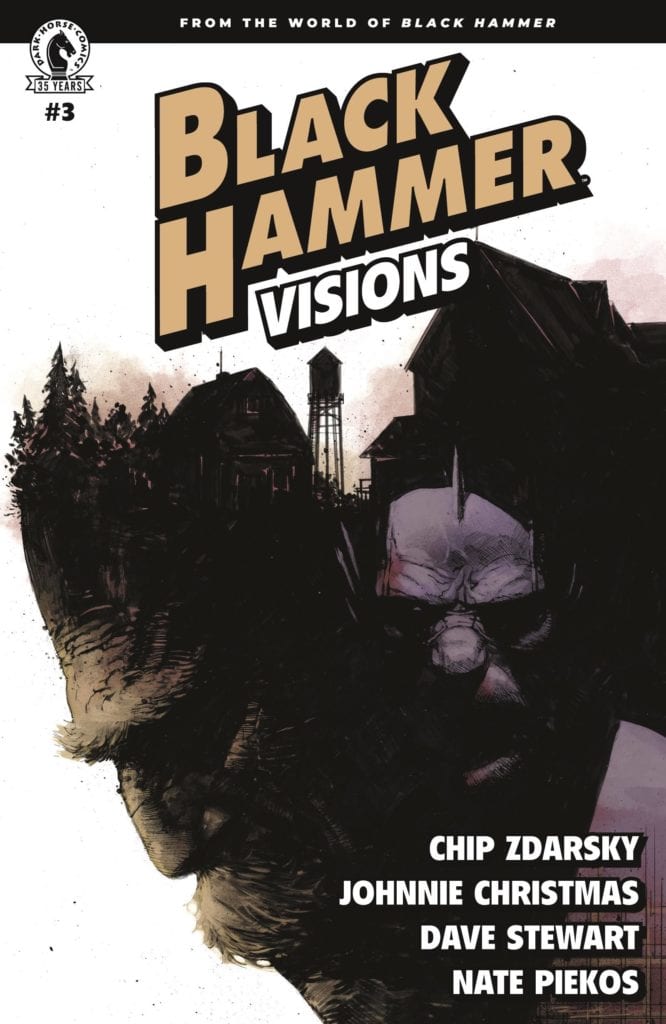
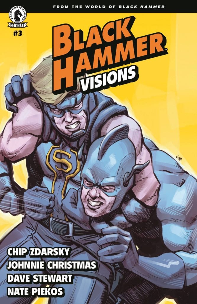
Dark Horse’s Black Hammer: Visions #3 follows Abraham Slam, a superhero who owes a lot of his creative DNA to Captain America, as he wrestles with his own retirement. Writer Chip Zdarsky, artist Johnnie Christmas, colorist Dave Stewart, and letterer Nate Piekos show us what it’s like to be itching to get back out into the world. This issue couldn’t have landed at a better time.

Writing

Zdarsky makes us understand what it’s like to be in Abe’s skin. Abe feels useless and old. Zdarsky gives us some perspective for this though. He shows us how Abe is haunted by his daring, younger, superhero self. It’s natural for him to feel hit harder than most by his old age. To make things worse, a new hero is cracking heads under the name “The Slam.” Abe has every reason to be angry, but so do the people around him as he lets his life implode. Zdarsky writes about what it means to finally grow up. It’s not always about doing the right thing. Sometimes it’s about being big enough to know you’re not the right person to do the right thing.

Black Hammer Zdarsky Dark Horse

Art

Christmas brings a whole lot of humanity to Abe. We see him, furious as people mock him, right next to an image of him looking into the mirror, defeated. In just those two panels, Christmas tells us everything we need to know. Abe has a huge amount of rage in him. He sees what’s wrong and he wants to right it. But he’s depressed over the fact that he just doesn’t have it in him anymore. Yet slowly, Abe learns that being a superhero isn’t as important as he thought. Christmas shows how kicking ass is impersonal and small compared to what Abe could be doing with his life. The fighting all happens in blurs, with faces turned away. No, it’s Abe’s conversations with an old friend, him getting groceries, or making dinner that are shown in great detail by Christmas. These are the things that should be occupying Abe.

Coloring

And while Christmas shows us what things should be important to Abe, Stewart is showing us how Abe feels about them. His life is pretty colorless at first. His apartment is colored in light browns, purples and beige. But when he springs into action, the page lights up. We see deep blues and oranges. These moments make Abe feel alive again. But the resulting return to normal is bleaker than before. Abe feels even less fulfilled, having tasted a little of the glory days again. But funnily enough, when we see Abe walk out of the gym as the issue ends, his normal life is looking colorful. There are no fist fights or big world threats, just Abe walking down the road. Yet the bricks are a deep red and the windows are lit up in yellow. Abe is starting to see things differently.

Black Hammer Zdarsky Dark Horse

Lettering

When Abe gets into a fight with The Slam, Piekos’ lettering mimics the feel of the fight. The captions are short and spread out. They have our eyes darting around the page. We get the feeling of Abe being hit from all angles, too fast to respond. And later, as Abe thinks back over it, the captions stay even. They don’t move around the page much. Abe’s thoughts are calm and “matter of fact” now. He’s telling himself he’s an old loser like that’s just the truth. But Piekos gets him out of his pity party by placing a word balloon over part of a caption. Throughout this issue, Piekos does a fantastic job of giving us a window into how Abe is feeling.


Dark Horse’s Black Hammer: Visions #3 is a simple and charming story, much like the first of this series. It tells the story of Abraham Slam trying to teach himself it’s okay to retire. It’s a pleasant addition to the Black Hammer Universe. Pick it up, out from Dark Horse April 14th, at a comic shop near you!

Monkeys Fighting Robots Youtube

Review: LOCKE & KEY/SANDMAN: HELL & GONE #1 – A Bumpy Start

Locke & Key Hill IDW

Neil Gaiman’s Sandman has left an unforgettable mark on the comic book industry. And in recent years, we’ve seen comics that feel like descendants of the series. Joe Hill and Gabriel Rodriguez’s Locke & Key is one such series. So it’s fitting, and very exciting, to see these worlds collide. IDW Publishing and DC Comics partner to bring us Locke & Key/Sandman: Hell & Gone. But in this first issue, writer Joe Hill, artist Gabriel Rodriguez, colorist Jay Fotos, and letterer Shawn Lee seem a little daunted by the task at hand.

Writing

Hill’s Locke & Key is charming and brilliant. It seamlessly mixes horror with moving character development. The same could easily be said of Gaiman’s Sandman. So it’s a little odd that Hill’s script for this first issue is so clunky. Lots of characters deliver dialogue that feels out of place, often in the form of exposition dumps. And Hill’s versions of some of Gaiman’s characters don’t seem to be themselves. Cain speaks in a way that’s giddy and more verbose than we’ve seen him. But ultimately, these are all problems that are typical of a first issue.

Any writer starting a series would be overwhelmed by all the information they have to convey. Add onto that all of the pressure of playing in Gaiman’s proverbial sandbox (pun totally intended) and you can see why Hell & Gone #1 suffers from these issues. Hill is a capable writer, finding his footing in a world that isn’t totally his own. If Hill’s track record tells us anything, this issue is just him struggling to his feet. Once he’s comfortable, we’re in for a wild ride.

Art

Rodriguez suffers from some of the same problems. His art is beautiful, and with every issue of Locke & Key he pens, it gets more nuanced. But one of the Sandman characters we meet, at the start of the issue, looks very unlike his appearance in the parent series. While that starts us off on a confusing note, the excitement of seeing Rodriguez’s versions of some of our favorite characters quickly eclipses that feeling. His landscapes and character designs will leave you wondering why he never did work on the original Sandman series. He’s perfectly fitted for it.

Coloring

Fotos’ choices in this issue are interesting. The entire issue uses subtle coloring. We don’t get any striking pages of deep colors. At first, the only truly colorful things in Hell & Gone are things of magic. We see a deep purple energy come from the Anywhere Key and a red glow from the Dream Stone. But when we see the Dreaming, we’re seeing a world of magic. Some of that magic is nightmarish, to be sure. In those instances, the bleak color palette is fitting. But occasionally, we see landscapes that are just a little too pale to be breathtaking. Perhaps there’s a reason for Fotos’ reserved approach, but this issue has a tendency to feel a little visually bland.

Locke & Key Hill IDW

Lettering

Lee’s lettering seems equally reserved, with a few exceptions. These pages aren’t littered with big sound effects or much experimenting with fonts. At one point, as Mary Locke stumbles onto something horrific, her font changes. “What’s that about your buddies Willard and…” she says in a simple, polite way. She follows up with “AHHHHH GOD OH GOD OH FUCK!” in messy, big lettering. Her panic is clear. But this is a highlight in an otherwise run-of-the-mill approach to the lettering. Hopefully, in the issues to come, we’ll see Lee attempt new things that bring life to the page.


IDW’s Locke & Key is charming and exciting, DC Comics’ Sandman is mysterious and moving. With these worlds colliding, we have reason to hope Locke & Key/Sandman: Hell & Gone will be all of the above. The first issue shows a creative team that’s nervous to enter a new world. But it’s all the shortcomings typical of a first issue. This creative team has shown themselves to do brilliant work in their prequel series In Pale Battalions Go. Hopefully, we’ll see them bring some of that magic in future issues. Pick up Locke & Key/Sandman: Hell & Gone #1, out from IDW April 14th, at a comic shop near you!

Monkeys Fighting Robots Youtube

Check Out Aaron Kuder’s Cover For THOR ANNUAL #1 – Infinite Destinies Crossover

Check Out The Cover To THOR ANNUAL #1 - Infinite Destinies Crossover

Hey MFR readers! Marvel Comics sent us the cover to THOR ANNUAL #1 coming out in July, and part of the Infinite Destinies Crossover.


THOR ANNUAL #1

AARON KUDER (W) • AARON KUDER (A/C)

THOR VS. THOR!

Thor and the other leaders of the Ten Realms (and, uh, Hawkeye?) have gathered for a World Tree celebration! But the festivities come to an abrupt halt when a mysterious guest — and his otherworldly powers — crashes the party. And his “plus-one” is a dark, twisted version of Thor who is determined to become the iron-fisted ruler of all the realms!

ALSO IN THIS ISSUE: Part 5 (of 8) of “Infinite Fury”!


Check Out The Cover To THOR ANNUAL #1 - Infinite Destinies Crossover

About Infinite Destinies:
The Infinity Stones have played a key role in some of the Marvel Universe’s most defining moments, and now they’ve returned in the hands of Marvel’s most popular new characters. The chase for the powerful Infinity Stones will play out in INFINITE DESTINIES, launching this summer!

In a series of eight annuals, each installment will pair Marvel’s biggest heroes like Captain America and Iron Man with some of Marvel’s newest heroes and villains including Star, Amulet, and more. These exciting new additions to the Marvel mythos may or may not possess one of the sought-after stones — but the real question will be who will be holding them in the end, and what will it mean for the future of the Marvel Universe?

“We’ve had a wave of incredible new characters over the last few years, and INFINITE DESTINIES will shine a light on eight of them,” Editor Nick Lowe said. “We’ll discover new aspects of these heroes and villains in adventures with our the most archetypal Marvel heroes.”

Writer Jed MacKay (Black Cat) and artist Ibraim Roberson (Old Man Logan) kick things off in IRON MAN ANNUAL #1. When Iron Man learns about the strange people who kidnapped and tortured Miles Morales, he HAS to look into it. What he finds out about the Assessor and especially Quantum will shock him…and you!

“The Infinity Stones have found new homes — as people!” Jed MacKay said. “INFINITE DESTINIES is the next chapter in the story of the Infinity Stones and the people they’ve bonded with — and the powers in the Marvel Universe who are taking interest in these powerful new players.”

Writer Gerry Duggan (Marauders, Cable) and artist Marco Castiello (Doom 2099) will then turn the focus on the fugitive known as Overtime in CAPTAIN AMERICA ANNUAL #1. After breaking out of death row when the Time Stone chose to bond with his soul, Overtime was gifted powers he barely understood. Now, thanks to Captain America… his time is up.

Each annual will also contain a chapter of “Super-Spy vs. Super-Spy,” a story following Nick Fury as the Agent of Nothing and Phil Coulson as the Agent of Mephisto — two brothers-in-arms who will face off and reunite for the first time since Coulson’s death.

The Infinity Stones and their abilities have always been shrouded in mystery, but one thing is for certain: where these stones go, trouble follows. Expect cataclysmic battles, shocking twists, and jaw dropping revelations about some of Marvel’s most promising new characters when INFINITE DESTINIES begins this June! Stay tuned for announcements about other INFINITE DESTINES annuals coming in July and August from Marvel’s top talent including Kelly Thompson (Captain Marvel) and Saladin Ahmed (Miles Morales: Spider-Man).”

via marvel.com

Check Out The Cover To THOR ANNUAL #1 - Infinite Destinies Crossover

Monkeys Fighting Robots Youtube

Review: SWEET TOOTH: THE RETURN #6 – So What Was That All About?

Contemporary comics all-star Jeff Lemire (Moon Knight, Black Hammer, Animal Man) and colorist Jose Villarrubia end their return to the world of hybrids and apocalyptic plagues in Sweet Tooth: The Return #6. The final chapter of this sequel series is full of the satisfying emotional beats and character-focused storytelling that we come to expect from Lemire, complete with great nods to the original series. It’s taken down a peg however by ultimately rendering this sequel as inconsequential. With consistently perfect visuals and ever-strong writing, this issue – and the series at large – is struck down by its own context.

“Once upon a time a young boy with antlers lived in a little house under the earth. He had a father and two nannies. They raised him to be good and to obey their every command. They said they loved the boy, and maybe some of them did, but Father? Well, he only loved himself. Father says the boy is a weapon against those who stand in opposition to humanity, while the rebellious Undersider dissidents believe the child to be the second coming of a mythological savior from the past. Haunted by dreamlike memories of a life he never lived and hunted by the man who created him, the boy must choose what and who he will be, and bring this chapter of his life to a close.”

Writing & Plot

Purely in terms of writing quality, Sweet Tooth: The Return #6 is just as solid a script as any of Lemire’s other chapters of this story. The ending does not feel rushed, the payoffs all feel earned, and the emotional weight of the end feels satisfying and is a fitting tribute to the original series. The nods to the motifs and characters from the prior series are all great nods that will no doubt land in the right spot for long time Sweet Tooth fans. So this all being said, what exactly is my issue with this final chapter – and by extension, the rest of this mini-series? If someone who were a Sweet Tooth fan were to ask me if The Return were worth the read, my answer would be yes – but you don’t have to. It isn’t going to do anything to alter your experience of Sweet Tooth, it’s just a neat and well-made diversion if you wanted to spend some more time in the universe of this tale (a tale which has one of the single best endings of any long-form comic). This isn’t dragging Jeff Lemire or his desire to return to this world; it’s reasonable to understand why he might want to revisit the story that essentially launched his career (and that is getting the Netflix treatment). It’s just I wish there were reason for this story’s existence than it just being more Sweet Tooth.

Art Direction

If there’s any single lesson that should come from Sweet Tooth: The Return #6 it’s that no one but Jeff Lermire and Jose Villarrubia should ever be the art team for a Sweet Tooth comic. Lemire’s charming lo-fi pencils convey the setting and characterization in this comic in a way that sells the story’s tone and message perfectly. Some fourteen years after this comic’s introduction, it still blows me away how Lemire is able to craft such relatable, likeable (and detestable) characters with such a rough-hewn and simplistic art style. The watercolors from Jose Villarrubia set the atmosphere for every panel with a mixture of tonal approaches. There’s a warmth and still beauty to the emotional and human scenes, which can switch on a dime to a cold or almost esoteric atmosphere when The Boy/Gus starts visualizing plot points from the world prior. Sweet Tooth has always been a comic known for its unusual but endearing visual work, and the final issue of The Return cements that legacy.

Sweet Tooth: The Return #6 is a well-written and superbly well-made final issue to this sequel-series that finishes this wholly solid mini-series, but ultimately renders the story kind of unnecessary. The plot and characterization that Lemire put on display here is up to par with the rest of this work and even the original Sweet Tooth as a whole, but it fails to make itself a necessary sequel in any way outside of it just being some more Sweet Tooth. His and Jose Villarrubia’s visuals are brilliantly charming and match up perfectly with the original series. If you’re a fan of the original comic, then this is a solid recommendation if you just want more of Lemire doing that thing he does so well but from a different perspective. Be sure to grab this final issue when it hits shelves on 4-13!

Monkeys Fighting Robots Youtube

Review: Something Like RORSCHACH #7 Has Never Been Done

Rorschach King DC Comics

This comic shouldn’t exist. Rorschach #7 throws out the rulebook. It’s not a comfortable, exciting, neo noir thriller. It’s an uncomfortable and experimental dissection of the comic book medium. Writer Tom King, artist Jorge Fornes, colorist Dave Stewart, and letterer Clayton Cowles aren’t here to provide a mainstream fluff piece. With DC Comics’ Rorschach #7, they’re breaking all the rules to show that they mean business.

Writing

King’s boldness rivals that of Quentin Tarantino in this issue. He seamlessly melds together his own version of history with the events of his story. Real people, though the details about them have been fictionalized, not only appear in the story but they play major roles in moving the plot forward. But the plot almost seems secondary to King’s interests. He’s more interested in discussing the medium of comics. After all, that’s what much of our investigation into the life of this new Rorschach has turned out to be.

Wil Myerson, the man behind the mask, is a comic book writer. And so, we not only learn more about his work and drive, but about how his work has touched others. In this issue, King discusses the legacy a comic book writer leaves behind and the huge shoes one comic writer must fill when a predecessor has reinvented a character. And through all this, King never loses sight of his plot. Though it’s clear King’s main goal is to discuss comics, he sprinkles in clues to where this is all headed. For every epiphany we get about the medium, we also get one about the characters and plot. It’s interesting, nuanced, and incredibly close to home.

Rorschach King DC Comics

Art

Fornes is living in an artist’s playground in this issue. We see Watchmen-esque versions of famous comic covers. We see alternate versions of The Dark Knight Returns and Amazing Fantasy #15. His ability to effortlessly move from the style of the 60’s to modern figures is incredible. We get glimpses of panels that come right out of Watchmen itself. Through all of this, Fornes manages to maintain his own unique style, while borrowing from the styles of others. Yet the scenes that are actually occurring in the comic couldn’t be more different than those other time periods. Fornes makes the whole thing feel cinematic. We focus in on the small changes, watching a door close or seeing someone press buttons on a tape recorder. Fornes takes us on a tour of the medium’s highlights, all while sticking to his subtle approach to this story.

Coloring

We’ve seen in past issues that colors mean something in Rorschach. Myerson’s memories are often shown in a red tint. He’s a very angry person and that colors everything he does. But Laura’s scenes are often shown with bright yellows. When she meets Myerson, their colors begin to coincide. They complete one another. In this issue, we see similar things happen. We see Myerson’s red memories and Laura’s yellow aura. But when they go to meet a third party, it’s clear they leave their mark. Stewart shows us, when the detective meets this third party, that Laura and Wil still occupy this man’s mind. We stare down at the scene, looking at the red table with yellow chairs. It’s as though Laura and Wil never left.

Rorschach King DC Comics

Lettering

There’s something about placing captions at the bottom of a page that makes a character’s thoughts sound defeated. Cowles knows this and uses it to his advantage. When we meet with this mysterious character who met Wil years ago, he explains what it was like to meet one of his heroes. He’s doing a pretty good job, in what he’s saying at least, to not sound disappointed. But it’s clear he was. “I didn’t speak to him again for what? Fifty years,” he finally says. Cowles places this all the way in the corner. But later, when he reconnects with Laura and Wil, Cowles shows this man succumb to their charm. As he sees them out, we see captions narrating his thoughts. Each caption is lower than the one before, like stairs going down the page. Cowles gives us a visual representation of a man giving in to insanity, slowly letting it take his will.


There isn’t anything like Rorschach #7. And there probably won’t be anything like it again. This creative team is actively pushing themselves to shake things up. And they’re breaking all kinds of rules to do it. DC Comics’ Rorschach #7 is a fantastic discussion of the comic book medium and a brilliant next step in this incredible plot. Pick up Rorschach #7, out from DC Comics April 13th, and prepare to have your mind blown.


Monkeys Fighting Robots Youtube

Review: DARKHAWK: HEART OF THE HAWK #1 Celebrates The Character

Darkhawk

Darkhawk: Heart Of The Hawk #1 out this week from Marvel Comics marks the 30th anniversary of the character’s introduction. Darkhawk has made many cameos since his ongoing series was canceled and even had a mini-series in 2018. This issue offers three stories showcasing the character’s past, present and even leaves hints about what may come for Darkhawk in the future. This anniversary comes courtesy of Danny Fingeroth (Writer of the first story), Mike Manley (artist of the first story and co-creator of Darkhawk), Chris Sotomayor (Colorist for the first story), Dan Abnett (Writer of the second story), Andrea Di Vito (Artist for the second story), Le Beau Underwood (Inker for the second story), Sebastian Cheng (Colorist for the second story), Kyle Higgins (Writer for the third story), Juanan Ramirez (Artist for the third story), Erick Arciniega (Colorist for the third story), and VC’S Travis Lanham (Letterer for the whole issue).

Summary

Celebrate the 30th anniversary of the ’90s hottest hero in three spectacular stories! First, an untold story from Darkhawk’s early days by creators Danny Fingeroth and Mike Manley! Then explore the winged hero’s cosmic years by Dan Abnett and Andrea Di Vito. Finally, find out what the future holds for Darkhawk by Kyle Higgins and more!

Darkhawk

Writing

Each of the three stories in the issue looks at a different time in Darkhawk’s history. The first story, “Cry of the City” by Fingeroth, feels like it was missing from the original series. It introduces a plot point that would have made Darkhawk’s struggle to become a hero much harder. It’s sad the story can’t be expanded upon or inserted back into the character’s history.

The second story by Abnet, “Long Way From Home,” takes a look at the more modern stories. Since Infinity Countdown, Darkhawk has been popping up in titles such as Guardians of The Galaxy connecting him to a more cosmic side of Marvel Comics. This story shows Darkhawk finding his way through space and coming face to face with one of Marvel’s most vicious alien races. It’s the least gripping of the three stories, but it is still an entertaining story.

Darkhawk

The final story, “Last Flight” by Higgins, takes the time to set up a possible future for the Darkhawk. The story hints at something called the “Shadow War,” a possible event on Marvel Comics’ horizon. It’s impossible to go into detail about this story without spoilers. It definitely takes Darkhawk and his secret identity, Chris Powell, somewhere they have never gone before.

Artwork

With “Cry of the City,” Darkhawk’s co-creator Manley provides a nostalgic feel for the character. Though with Sotomayor providing the colors, the character does have a more modern look. Overall the pair deliver a story feeling like a missing piece to the original series.

Darkhawk

The look of “Long Way From Home” by Di Vito and Underwood has a fantastic look to it, thanks to their combined work. With recognizable alien species in every panel, it feels like the cantina scene from Star Wars. Cheng’s colorwork helps elevate the action, especially as Darkhawk has to use his powers when a fight breaks out.

“Last Flight” ends the issue on a more somber note. Ramirez’s artwork features a more reflective look to Chris Powell as he contemplates how he got to this point. Arciniega’s colorwork utilizes darker colors for a bleaker outlook for Chris and brighter ones when a cosmic disaster is on the horizon.

Darkhawk

The Lettering by VC’s Travis Lanham deserves a lot of praise in this issue. Between all three stories, Lanham captures the look of lettering from the past and present. The lettering for “Cry of the City” feels like it was pulled directly from the 90s.

Conclusion

DarkHawk: Heart Of The Hawk #1 is a definite read for fans of Darkhawk but could be an ideal starting point for new readers curious about the character. Darkhawk has become a supportive character for teams such as the New Warriors and Guardian Of The Galaxy. If Darkhawk is ready to return to greater things later this year, this issue is a perfect way to understand Chris Powell better.

Monkeys Fighting Robots Youtube

THE FALCON AND THE WINTER SOLDIER – The Whole World is Watching | TV Review

Following the events in Madripoor, the episode “The Whole World is Watching” takes the titular characters to the Latvian capital where the show feels like it’s spinning its wheels.

Sam and Bucky continue their search for Karli Morgenthau (Erin Kellyman), believing that finding the location for a funeral would be their best chance. But they face complications due to Jack Walker encroaching on their mission and the Wakandans demanding Sam and Bucky demand they hand over Zemo after eight hours.

The Falcon and The Winter Soldier felt nowhere near as revolutionary as WandaVision. It looks and feels more like a Marvel movie being stretched out rather than a TV show. The first two episodes did a fair enough job setting up the new situation for the MCU world and the characters and ‘Power Broker’ functioned as a focused episode.

‘The Whole World is Watching’ felt meandering. The best example of this was the reintroduction of the Dora Milaje. Their appearance did make some sense because they wanted to bring Zemo to justice because of the events of Captain America: Civil War. But their appearance boiled down to them having an action scene against the new Captain America and give him the humiliation he deserved. They were a plot device and to help fill some time.

Ayo suffered from an issue that affected characters in the last episode: over expository dialogue. Yet it was even worse for her because she was recounting information that both the audiences and the characters already know. It was redundant.

Where the episode does succeed was with the character moments. One of the key scenes was when Sam met Karli and they talked about the morality of her cause. It showed some moral complexity of the new world. Karli can be summed up as her cause was understandable but her methods were questionable.

Jack Walker got some character development. In “The Star-Spangled Man” Jack had doubts whether he could live up to the Captain America mantle and in this episode, he was shown to be impulsive. The episode ends with a dark moment but there should have been more of a build-up. The program needed to show more of Jack’s violent tendencies. Comic book fans would have predicted this turn but in the context of the show, it came across as too sudden.

“The Whole World is Watching” had smaller scale action than in the previous episodes. It worked in the context of the episode. The first action sequence had a parkour feel to it as characters get chased in an old warehouse. The final action sequence had the air of Skyfall and Mission Impossible III because characters had to race across a city to stop the villains from enacting their plans. It was fun to watch the Flag Smashers using knives when they were fighting.

“The Whole World is Watching” was at best a fairly standard episode of TV that felt more like filler.


Monkeys Fighting Robots Youtube

BATMAN DETECTIVE #1: Putting ‘World’ Back In The ‘Greatest Detective’

Batman Detective #1 Cover

Batman Detective #1 from DC Comics hits comic stores on April 13. Writer Tom Taylor challenges the Dark Knight by focusing on “The World’s Greatest Detective.” Artist Andy Kubert brings forth some interesting designs in costumes for the cast. Something that colorist Brad Anderson ensures to stand out. Letterer Clem Robins makes the internal strife and actions of Batman easy to follow.

Batman Detective #1: World’s Greatest

Taylor takes a page out of Batman Inc., where Batman’s title as ‘World’s Greatest Detective’ becomes more literal. Beryl Hutchinson’s return as Knight is a nice callback to that line with how Batman franchises his mantle. It feels like a means for people anywhere to use the Dark Knight as inspiration to help others. So what happens when a group of extremists wants to disenfranchise him by killing innocent people?

Batman Detective #1 Conflict
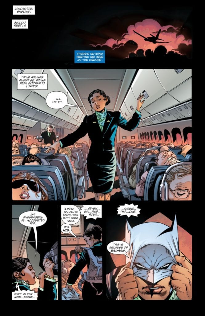
Worse still, Bruce Wayne already feels powerless with some “current” events. All of this destruction to smear Batman’s name feels like rubbing salt on a wound. This is why it’s good to see Knight and Squire bring some levity to Batman’s personal crisis.

Finally, Batman as a noir-style detective is on full display. The connections he uses to investigate crimes, his preparation and ability to think on his feet, and above all else, Bruce’s hardboiled attitude. Despite Batman’s capabilities, he feels like he’s already lost his battle against crime. It’s a feeling that many longtime Batman fans have to grapple with, making the connection to Batman even greater.

Costumes Make The Detective

Kubert’s designs give a unique perspective to Batman Detective #1. Batman, for example, wears a costume resembling Zack Snyder’s post-Apokolips costume. Doing away with the iconic campier Batsuit helps accentuate the mood of the series. There’s no time for theatrics for Batman this time around, only the detective.

Especially when the anti-Batman terrorists go out in all white versions of his iconic costume, these designs are meant to mock Batman with how bright Anderson makes them. Unlike Batman’s darker costume, which allows him to move through the shadows, these “anti-Batmen” want his image to be seen in full view. This way, whenever anybody sees Batman’s visage, the innocent will cower in fear.Contrast at large

If all of this isn’t enough, Robins’ lettering gives voice to the internal and external conflicts of Batman Detective #1. The captions that display Bruce’s thoughts feel slow and heavy, which coincides with his defeatist mind. The sound effects from the anti-Batmen, meanwhile, are loud, fast, and merciless. For them, there’s no thinking or second-guessing, only a mission.

Investigate Batman Detective #1

Batman Detective #1 is a must-read for fans of the Caped Crusader. It’s not just the sensational storylines but how people see the different sides of the Dark Knight. The detective angle just happens to have this deep sense of introspection on the character’s limitations. That way people can learn to love Batman even more.

Monkeys Fighting Robots Youtube

Preview: SIRENS OF THE NORSE SEA – A Mythic War Of Vikings And Mermaids

Fierce Vikings and mystical Sirens face each other in a neverending battle over their greatest source of life: the sea.

Adapted from Isabelle Bauthian’s original work, “Sirens Of The Norse Sea” from writer Françoise Ruscak and artist Phil Briones is a stunning tale of high-fantasy on a mythical sea full of beats and wonders alike. A hit overseas, this graphic novel is  finally available here in the States for your reading pleasure!

Mixing popular mythology with intense action and wildly imaginative fantasy, “Sirens of the Norse Sea” is a wondrous tale to behold for fans of the genre.

“Vikings, the world’s fiercest warriors and greatest sailors rule the land. But the sea has never been so easy to claim, for another creature dwells within it: the Siren. For generations, Viking clans have had to face Siren tribes: a constant battle between cunning and brute strength, and charm and sorcery, with the vast ocean in between.
In each book in the series, their paths intersect, for better or for worse.”

Be sure to order this stunning graphic novel from your local comic shop today or directly from Humanoids publishing today!

Monkeys Fighting Robots Youtube

Exclusive Preview: MIGHTY MORPHIN #6 – Zordon’s Past Threatens Angel Grove

Exclusive Preview: MIGHTY MORPHIN #6

MIGHTY MORPHIN #6 hits your local comic book shop on April 14, but thanks to Boom! Studios, Monkeys Fighting Robots has an exclusive four-page preview for our readers.

The book is written by Ryan Parrott, with art by Marco Renna, Walter Baiamonte with assistance by Katia Ranalli and Sara Antonellini drop the colors, and you will read Ed Dukeshire’s letter work. MIGHTY MORPHIN #6 features main cover art by acclaimed illustrator InHyuk Lee, and variant covers by Eleonora Carlini, and Peach Momoko.

About the issue:
Still reeling from the revelation of the New Green Ranger’s true identity, the New Mighty Morphin team must join with former Ranger Grace Sterling to save Angel Grove from a new threat tied to Zordon’s surprising past. But nothing could prepare the Rangers for the two people who stand in their way…


Enjoy the preview below.

Monkeys Fighting Robots Youtube