Home Blog Page 158

Review: JUSTICE LEAGUE: LAST RIDE #1 – Much Left to Uncover

Justice League: Last Ride #1 Cover

Justice League: Last Ride #1, out now from DC Comics, shows us a possible future where the Justice League has disbanded, and many things are in disarray as a result.

Chip Zdarsky takes an interesting approach to introduce us to this new world in Justice League: Last Ride #1. A reader could get through more than a quarter of the issue before realizing that the story they are reading isn’t in current continuity. What’s so interesting about the story that Zdarsky presents us with is that the characters have not gone through a radical event that has changed them significantly from the characters we know. The world isn’t an entirely dystopian regime that has hardened our heroes or changed their ideologies; our heroes are the same as they ever were. Maybe a little sad and scared, but overall mostly the same. Justice League: Last Ride feels like a story DC would tell if they wanted to take a drastic turn in their continuity. The story is not too far along this deviated path in the timeline, so it does a fantastic job of making readers wonder where the story will lead and how much will change from what we know.

Justice League: Last Ride #1 Story Example

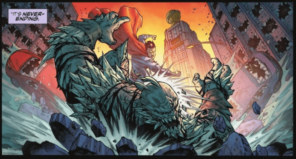
The art of Miguel Mendoça in Justice League: Last Ride #1 is gorgeous. There is tons of depth in panels that give the issue a cinematic feel, and Mendoça continually has characters and objects overlap the borders of a panel. This not only makes it so that these characters or items pop out more on the page and draw the attention of the readers, but it also has the effect of making the entire issue feel more immersive. Mendoça uses heavy shadows, which compliments the more somber tones of the issue, and overall
his work in the issue is what gives the somber moments weight.

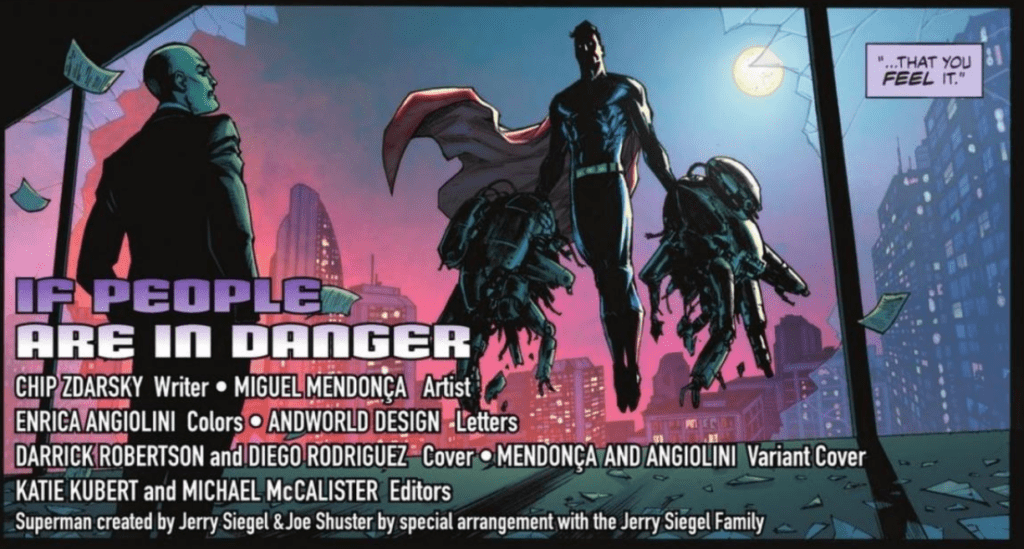
One of Justice League: Last Ride #1‘s best aspects is its coloring. Done by Enrica Angiolini, the colors of the issue are not afraid to be bold, which helps place emphasis on specific moments and make the issue itself stand out. For example, when Superman is shown performing various heroic acts around the city, Angiolini decides to backlight him with a gorgeous sunset, which provides the moment with a certain amount of reverence. Angiolini also uses brightly colored backgrounds that don’t match the setting for certain panels as a way of helping the character express emotion and add energy to the scene.

Justice League: Last Ride #1 Coloring Example

AndWorld Design goes all-out in Justice League: Last Ride #1 and uses various methods to better express the characters’ manners of speaking. Examples of this include: expanding words past the borders of their speech bubble or making the border of a speech bubble bold to show that a character is screaming, making the letters of a sentence slightly misaligned to signify that a character is disoriented, and giving a particular word it’s own speech bubble to emphasize its importance.

Justice League: Last Ride #1 is an intriguing introduction to a world that only gives us as much information as we need and leaves us dying for more. The art, coloring, and lettering all come together to create some stunning visuals and an issue that quickly draws a reader into the series.

Monkeys Fighting Robots Youtube

Review: RED ROOM #1 Goes For The Jugular

Red Room

RED ROOM, Ed Piskor’s much-hyped new series from Fantagraphics, has finally arrived. And it’s the gore-splattering, blood-dripping horror comic masterpiece you have been waiting for. But we warned…entering the RED ROOM is not for the faint of heart.

Red Room: The Anit-Social Network #1
Written, penciled, inked, and lettered by: Ed Piskor
Published by: Fantagraphics Books

Aided by the anonymous dark web and nearly untraceable crypto-currency, there has emerged a subculture of criminals who live-stream and patronize webcam murders for entertainment. Who are the murderers? Who are the victims? How do we stop it?

Red Room is being billed as a series of stand-alone issues in a shared universe, and this debut certainly sets that up. Issue# 1 introduces us to Davis Fairfield, a seemingly schlubby and mild-mannered court clerk beset by a car accident that kills his wife and one of his daughters, with his oldest daughter, Bree, surviving. But in the tradition of Tales From The Crypt (and other pre-code horror comics) things take a dark, dark twist with Davis (SPOILERS AHEAD!).

See Davis is much more than a court clerk, he’s a snuff stream watcher and creator and because of that he is recruited by the Thelema family and becomes our eyes and ears into this new world (this a great bit of storytelling by Piskor.) The Thelema family is a group of murders who run one of the biggest red rooms in this world and they are the stars of Red Room. Costumed and themed, the Thelma clan is as if the Texas Chainsaw Sawyer family adopted wrestling gimmicks. It’s an idea that allows Piskor to create some crazy killers and concepts, and if this first issue is only a glimpse, then we are in for a brutal gallery of sickos. I can’t fucking wait.Red Room

The art in Red Room is comics and cartooning of the highest caliber. Anyone who has followed Piskor knows the man is extremely detailed. He fills pages and panels to the brim. Red Room is no different and in fact, seems even hyper-detailed. A lot of this is due to the various cartooning tools and techniques Piskor is using. Duotone, heavy-shading, cross-hatching and much more are prevalent on just about every page. And the level of detail is of course outstanding. The layouts and lettering are also fantastic, with pages using inventive things like ‘webcam’ POV panels and chatroom conversations.

The character designs are to die for. As said before, each killer has a ‘gimmick that allows Piskor to draw some great costumes and sets. It’s a great visual hook that opens up a lot of possibilities and that ‘rogues gallery’ is one of the main draws of the book (personally I’m hoping for a ‘killers’ trading card set or some kind of Who’s Who book!).Red Room

Red Room is definitely going to be one of the best comics of the year and frankly, a MONTHLY title like this a rare and should be supported. So make sure you add it to your pull list and enter the Red Room!Red Room


Red Room is available at your local comic shop and directly from Fantagraphics. 

Monkeys Fighting Robots Youtube

Review: TEENAGE MUTANT NINJA TURTLES: BEST OF SPLINTER Explores The Sensei’s History

TEENAGE MUTANT NINJA TURTLES: BEST OF SPLINTER is available in comic book stores on Wednesday, May 19th, bringing together the most popular Splinter stories in TMNT history. The collection contains four stories, ranging from pre-IDW continuity to the series’ current iteration. Readers will be thrilled to explore the talented works within each issue.

Story and Artwork

TMNT ADVENTURES #45

Steve Murphy’s narrative retells the origin of the martial arts master from his own perspective. This origin details Splinter’s life as Hamato Yoshi, a ninjutsu student in training. Murphy places our protagonist in mid-century Japan, detailing his experiences of hope and despair in the midst of World War 11.

Ken Mitchroney and John Beatty’s penciling and ink work is reminiscent of classic animated cartoons. With Barry Grossman’s coloring and Gary Fields’s old-school lettering, readers will experience strong feelings of nostalgia.

TALES OF TMNT #2 (VOL. 2)

Murphy offers readers an intriguing look at Splinter’s mystical abilities in TMNT #5. The old master finds himself in a challenge of willpower when a nefarious spirit enters the Turtles’ domain.

Jim Lawson and Eric Talbot’s penciling and ink work, combined with Digikore Studios’s coloring, craft images that look like they’re straight out of an anime production. The bright colors and bold outlines help highlight the action sequences. And Peter Laird’s lettering makes effective use of onomatopoeia, adding a sense of sound to these effects.

TMNT #5 (IDW)

Writer Tom Waltz crafts yet another Splinter backstory for IDW continuity. But instead of rehashing each and every detail from the original, Waltz adds a dynamic historical and mystical flair. Casting Splinter and the Turtles as reincarnated humans from Japan’s past answers long held fan questions.

Dan Duncan and Mateus Santolouco’s penciling and ink work, alongside Ronda Pattison’s coloring, created realistic tones and figures for the characters’ past selves. And Shawn Lee’s lettering placements are spaced out well to draw attention to the somber scenes.

TMNT: SPLINTER MICRO-SERIES

The final story featured in this collection is Erik Burnham’s Splinter micro-series, which serves as an alternate version of Splinter’s backstory based on IDW continuity.

Charles Paul Wilson III’s penciling and ink work, Jay Fotos’s coloring, and Lee’s lettering provided fantastic panels for this issue. The pastel colors help generate a dreamlike quality as Splinter remembers his past. We also enjoyed the unique character designs and effective use of font sizing.

Conclusion

TEENAGE MUTANT NINJA TURTLES: BEST OF SPLINTER is the perfect collection for fans wanting to learn more about the Turtles’ beloved sensei. We hope to see more of these special books published in the future.

Monkeys Fighting Robots Youtube

AfterShock Comics Exclusive Preview: BUNNY MASK #1

bunny mask aftershock comics exclusive preview

BUNNY MASK #1 hits your local comic book store June 9th, but thanks to AfterShock Comics, Monkeys Fighting Robots has an exclusive four-page preview for you.

About the issue:
A new horror series from the creator of the Eisner-nominated Colder!  

Sealed in a cave before the dawn of man, released by a crazed madman, Bunny Mask walks our world once more. But for what dark purpose does she use her unnatural powers? And what’s her connection to Bee Foster, a young girl murdered by her father fourteen years ago? In order to save his life – and his sanity – one man will have to discover the truth of what waits behind the mask.

BUNNY MASK #1 is by writer Paul Tobin and artist Andrea Mutti, with letters by Taylor Esposito. The main cover and “mask variant” are by Mutti, with an incentive cover by Charlie Adlard.

Tobin is the co-creator of the Eisner-nominated horror series Colder, while Mutti has most recently worked on the AfterShock slasher series Maniac of New York.

Check out the BUNNY MASK #1 preview below:

bunny mask aftershock comics exclusive preview

bunny mask aftershock comics exclusive preview

bunny mask aftershock comics exclusive preview

bunny mask aftershock comics exclusive preview


bunny mask aftershock comics exclusive preview


Are you excited for BUNNY MASK? Sound off in the comments!

Monkeys Fighting Robots Youtube

Review: The Shobijin Steal The Show In GODZILLA: MONSTERS AND PROTECTORS #2

Godzilla

Godzilla: Monsters and Protectors #2 out this week from IDW Comics gives special attention to the Shobijin. The twin tiny priestesses of Mothra receive a dangerous prophecy of destruction and decide they have to take action. This new installment in the new Godzilla series arrives thanks to Erik Burnham (writer), Dan Schoening (pencils and ink), Luis Antonio Delgado (color), and Nathan Widick (lettering).

Summary

Godzilla is sitting in judgment on humanity, and the verdict could spell doom for life on Earth! The Shobijin become aware of this and know they could ask Mothra to intervene… but does humanity deserve Mothra’s help?

Godzilla

Writing

The Shobijin are the main draw of this issue. Especially as Godzilla doesn’t appear except in a vision. Unlike their depiction in the Showa Era (1954-1975 films) these twins don’t talk in unison (well they do for like a panel but not constantly like in the films). Instead, they act more like the version from the Rebirth of Mothra Trilogy, possessioning individual personalities. They have yet to be individually named but one seems to be more cautious, while the other seems more adventurous.

This issue isn’t without its faults though. Cedric is showing his young age and some of his lines of dialogue have a cringe factor to them (see the page below for a perfect example of this). At the same time, Linival Company the corporation seems to be evil for evil’s sake. The main reason the company president wants to destroy Godzilla because it made the company look bad. Not exactly a deep character motivation but this series is supposed to be for a younger audience so some leeway is allowed.

Godzilla

Artwork

The art by Dan Schoening offers an intriguing mix of appealing and striking moments. The appealing comes with the adorable way the Mothra larva is drawn showing it resembling a giant stuffed animal. The striking comes as the twins have a prophetic dream showing Godzilla’s rage and what such a future would entail.

The color by Luis Antonio Delgado adds great emotional effect at just the right moments. One of the best examples of this comes in the final two pages of the issue. These two pages are presented as a splash page with the color offering a perfect lighting effect to showcase something ominous is on the horizon.

Godzilla

The letter work by Nathan Widick offers a great auditory feel throughout the issue. Special attention is paid to make sure specific message boxes distinguish between Cedric’s voiceover and those who are talking. Also, the accurate depiction of the monster roars continues to impress.

Conclusion

Godzilla: Monsters and Protectors #2 moves the story slowly but it still has an entertaining element to it. There are some great visuals in this issue which the Mothra fans will truly enjoy. Hopefully, Kaiju fans are giving this series the chance it deserves because it still has a lot to offer.

Monkeys Fighting Robots Youtube

Review: THOSE WHO WISH ME DEAD Is A Thrilling Adventure

Those Who Wish Me Dead delivers a heartfelt story packed with tons of great action. It’s an effective throwback to older action films but does feel slightly unfocused at times with its narrative. The film is saved by its stellar cast, gripping story, and score that feels like a character itself. Those Who Wish Me Dead may not live up to the backwoods adventure it’s based on, but it’s still a fun thriller that can pull at your heartstrings thanks to the creative minds that came together for this film.

This film, while not offering many surprises along the way, stays strong by delivering a great bond between two people looking for peace. A film such as this is right up the director’s alley too, given he has worked on similar projects in the past and directed them to perfection. Those Who Wish Me Dead is directed by Taylor Sheridan and written by Michael Koryta, Charles Leavitt, and co-written by Sheridan. The film stars Finn Little, Jake Weber, Tyler Perry, Nicholas Hoult, Aidan Gillen, Medina Senghore, Jon Bernthal, and Angelina Jolie. It centers on Connor Casserly (Little), a young boy who is being hunted by assassins after his father (Weber) is killed. Connor finds an ally in Hannah Faber (Jolie), a smoke jumper struggling to forgive herself for a forest fire accident that resulted in the death of three boys.

(L-r) FINN LITTLE as Connor and ANGELINA JOLIE as Hannah in New Line Cinema’s thriller “THOSE WHO WISH ME DEAD,” a Warner Bros. Pictures release.

Based on Koryta’s novel, Those Who Wish Me Dead delivers a visceral 90’s style action treat. The writing for this film succeeds for the most part, and minor details for both Connor and Hannah make them a likable pair to follow throughout the film’s short runtime. Hannah’s struggles have caused her to flirt with death, she performs risky maneuvers, has a drinking problem, and suicidal tendencies. Connor has been tossed into the lion’s den after his father’s death, while he tries to avoid the assassins, he ponders his future because without his father his next steps are uncertain. The trust that grows between these two is the heart of this film, and it’s wonderful to witness the look of uncertainty they both have after initially meeting turn to full-fledged trust over time. Hannah is being given a chance to redeem herself, as she does everything in her power to keep Connor safe from the two assassins.

Those Who Wish Me Dead stumbles a bit with its narrative at times when it juggles trying to develop both Connor and Hannah. The film starts being about Hannah, but then it shifts to Connor, so when they come together the focus becomes jumbled. While the events on-screen lend to both character’s growth, it would have been great to get more focus on one particular person. The ambiguous nature of the two assassins and what they are trying to prevent is a nice touch. Though it does seem overly vague sometimes, and the emotional subplots amongst the two leads and the side characters keep this film from growing dull. Jolie’s return to action is great overall, her motherly nature towards this scared boy is felt through the screen during all of their interactions.

(L-r) ANGELINA JOLIE as Hannah in New Line Cinema’s thriller “THOSE WHO WISH ME DEAD,” a Warner Bros. Pictures release.

Little’s performance as Connor is terrific as well and his expressions throughout the film assist in the viewer wanting to see him make it out alive. Sheridan’s direction here makes up for the film’s shortcomings in its character development, as he takes you on this emotionally exhausting ride that starts at a slow pace before maintaining its edge of your seat adventure feeling. The film is shot wonderfully and accompanied by Brian Tyler’s magical score. Tyler’s score swallows the scenery, raises the stakes, and builds on the emotional tale being told on screen.

Those Who Wish Me Dead stays afloat despite its narrative hiccups and delivers a solid action film. The performances from Little and Jolie will be more than enough reason to endure its initial slow start. Sheridan’s previous works certainly opted for more character development, but his direction here filled in those gaps and allowed the film to end up on the positive side. Those Who Wish Me Dead probably won’t impress those who have seen countless films like it, but it’s still an effective thriller that is carried by two fantastic lead performances.

Monkeys Fighting Robots Youtube

Review: HOME #2 Details Life On The Run

HOME #2 hits comic book stores on Wednesday, May 19th, following the young Juan after his escape from the U.S. border’s detention camp. Last issue detailed the horrific conditions Juan and his mother Mercedes experienced after crossing the border. But the boy discovered hope in his newfound superpowers, which led to his unintended jailbreak.

Readers will find the trials and tribulations of Juan mirror those experience by real life immigrants.

Story

Despite finding a way to escape the facility, Juan is still far from safety. Border patrol officials continually scour the area after hearing rumors of the escapee who blew up a solid wall. Now the frightened child must elude his would-be captors.

The officials’ shock at Juan’s powers reflect our own society’s fear of the marginalized; they fear what they don’t understand.

Writer Julio Anta’s narrative empowers the stories of immigrants everywhere. Rather than focusing solely on the horrific treatment of these people, he highlights the incredible talents and inner strength.

Only time will tell what our hero’s new abilities mean for the character’s future.

Artwork

Anna Wieszczyk’s penciling and ink work provides readers with more realistically proportionated characters than most comic books, adding a sense of realism to the art. It was also great seeing how colorist Bryan Valenza’s bright reds helped place the focus on Juan, our star protagonist.

Hassan Otsmane-Elhaou’s lettering was particularly helpful in distinguishing the different languages being spoken. Using red for Juan’s Spanish dialogue fits well with his coloring, too.

Conclusion

HOME #2 moves this new series forward in an exciting direction. We anticipate the excitement brewing as Juan searches for his aunt.

Do you think other people in Juan’s life have powers? Let us know in the comments below!

Monkeys Fighting Robots Youtube

Review: NIGHTWING #80 Deepens Tragedy by Ignoring It

Nightwing Taylor DC Comics

DC Comics’ Nightwing #80 is an incredibly fun comic. Especially since it occurs right after a grisly murder. But writer Tom Taylor, artist Bruno Redondo, colorist Adriano Lucas, and letterer Wes Abbott know that the best way to underscore tragedy is by ignoring it.

Writing

As the issue opens, Dick Grayson is informed that a man he tried to help has been found dead. It’s a pretty rough way to start a comic, but you wouldn’t know it from Nightwing #80. Immediately, Dick jumps into detective mode. There’s no time for the trauma to sink in and no soul searching in these pages. Taylor doesn’t spend time having Dick search his emotions. He knows that’s bad writing. Taylor has Dick ignore everything and get straight to making it right. In a way, this makes the trauma of the situation feel even more powerful. One of Dick’s first good deeds with his newfound wealth ends in tragedy. “Did you know him?” someone asks. “Not really,” Dick responds. He gives a brief synopsis of meeting the man. “I’m sorry,” the person says. “We’re getting off here,” is all Dick replies. He can’t think about it and he does what he can to make his own evasiveness as noble as possible.

Art

Redondo does just as much work in making this issue fun. He experiments with a double-paged spread that shows Dick and Barbara moving through Dick’s apartment. He has Barbara appear as a tiny cartoon character at one point. Redondo shows us a step-by-step of Nightwing assembling his baton, looking like something right out of a safety guide on an airplane. Every page pushes the art to new, entertaining heights. But there’s a darkness beneath the surface too. One of the few times Dick actually talks about the murder, his face is obscured. We see him as a black outline, with his domino mask showing in bright blue. Even as a silhouette, he almost looks angry. So, Redondo sprinkles in hints that everything isn’t as alright as everyone is trying to make it seem. Dick is hurting inside and the fun of the issue is making for a great distraction.

Nightwing Taylor DC Comics

Coloring

Just as in the last issue, Lucas colors everything like the sun is setting. Scenes have an orange haze to them. At times, it makes the comic feel both beautiful and a little lifeless. The characters occasionally look pale in the light, like they’re not feeling like themselves. But when Dick runs into some supervillains, everything changes. We see the bright purple power emanating from them, and the blues on Nightwing’s costume look brighter than ever. Lucas points out to us here how some of Dick’s coping is unhealthy. He’s pushing his emotions down and jumping at the chance to distract himself. Even if it means beating up two-bit baddies.

Nightwing Taylor DC Comics

Lettering

Abbott uses the page brilliantly to show the timing of the dialogue. Some word balloons practically overlap each other. Often, they’re followed by a bigger gap between lines of dialogue. It gives us a sense of the rhythm of what each person is saying. But more than that, it makes us feel like these characters know each other well. They’re comfortable butting in and saying what they were thinking. They also know each other’s cadence enough to know when someone is done talking. But that’s only half of what makes Abbott’s lettering so great. The rest of it is his sound effects. Many of them work seamlessly into the art: a “TOK!” behind a villain’s head as it’s getting hit or the “FZZZZT!” of another villain shooting lightning. All of his sound effects are bold, bright, and lots of fun to see.


Not only is Nightwing #80 a blast to read, it shows this creative team gets people. They know how the human brain works. In the wake of a strange and unexplained tragedy, this cast of characters is chipper. They’re all working overtime to avoid thinking about it. Every member of this creative team shows us that. Pick up Nightwing #80, out from DC Comics May 18th, at a comic shop near you!

Monkeys Fighting Robots Youtube

Exclusive First Look at SPECTER INSPECTORS #4

Exclusive First Look at SPECTER INSPECTORS #4

SPECTER INSPECTORS #4 from BOOM! Studios hits your local comic book store on May 26, but thanks to the publisher, Monkeys Fighting Robots has an exclusive four-page preview of the penultimate issue in the five-issue series. The book is created and written by Bowen McCurdy and rising star Kaitlyn Musto, with art by McCurdy and letters by Jim Campbell. McCurdy creates the cover art for SPECTER INSPECTORS #4, with a variant cover by Erica Henderson.


About the issue:
The Spector Inspectors are on the trail of a demon and just met a ghost. The problem is, that’s the good news. It turns out Cape Grace has a whole lot of secrets, and none of those are good.


Enjoy the preview below.

Monkeys Fighting Robots Youtube

Review: RAIN LIKE HAMMERS #5 – Disappearing Into Orbit

Brandon Graham, auteur of strange and wonderful comics, ends his latest satirical and insightful science fiction story with “Rain Like Hammers” #5. This final chapter of this outstanding comic is a vast and gorgeous gulf of bittersweet emotions, bringing this series to an end in a way that some will find a bit unusual (if you didn’t already think that of the whole series), but in truth feels like the only way it could have ended.

“On the desert world of Crown Majesty, space butler Brik Blok, Little Monster, and Eugene fend off desert marauders and witness a trial for the fate of known space. Who will be the winner? That’s for the ancient demon-king-judge to decide.”

Writing & Plot

All of the scattered and seemingly unrelated plot points in this series finally all meet together in “Rain Like Hammers” #5, an they do so in deeply satisfying fashion. We finally get back together with our friend Eugene from the first issue, and his inclusion fits perfectly alongside that of Brik Blok and the rest of the cast we’ve met since then. Brik’s isolation in his new body, and his alienation from his old allies, fits perfectly with the loneliness felt in Eugene’s story, and everything comes full circle. The massive and faraway-seeming machinations of those in power play in the background while deep introspection and decision making plays out in the heads of our two main protagonists, which makes for a quiet but beautifully well-deserved ending to this story. Graham’s sense of oddball humor mixed with poignant emotional struggles makes for yet another dynamic and effective script that endears itself to its readers in a multitude of ways. The overhead narration fits in this story as it describes the actions of characters in an unrecognizable setting, and grounds us in this story’s reality. This is a beautiful narrative that we’re given here, and while I obviously can’t talk about what happens, it wraps up superbly both emotionally and in terms of its plot, and it will be something that stays on my mind for some time to come.

Art Direction

As unbelievable as this is to say, Brandon Graham really saved his best work on this series for last in “Rain Like Hammers” #5. The visual range this issue has as it closely examines our characters in their most intimate moments, as well as surveys the landscape as space-faring cities and interstellar gods make landfall, is utterly astounding. Every time I have been taken aback at Graham’s visuals in prior issues was multiplied tenfold in the pages of this final chapter. The tone evoked by the drawings of a barren planet being traveled by a lonely Eugene in a gumball machine-shaped land walker is both soothing and somehow disquieting. The sense of awe I felt once I realized the mountain range I was looking at was actually a massive god-king entity was something I rarely ever feel in any medium. In all honestly though, I believe that the best and most impressive moments were the ones where we got to see the characters up close as they traveled and reflected on their decisions. Brik Blok’s quiet contemplation regarding the how’s and why of his quest for the woman he loves is a genuinely painful moment, all conveyed in the careful and minimalistic detail in his expressions. There’s a melancholic solitude conveyed in every panel in this book, and in all honestly that’s probably how I’d describe the entire series. Of course all of the zany designs and clever little artistic witticisms are still here, but this finale feels so much quieter and more reflective than what came before. It’s a stellar ending that fades out in a bittersweet and beautiful manner.

“Rain Like Hammers” #5 is an emotionally satisfying, intelligent, and poignant end to this brilliant comic series. Brandon Graham reflects on the struggles and societal ills that have created both the larger isuues in the series, as well as the steps that brought both Eugene and Brik Blok to the point in their lives where they are now, and what they decide to do about it. With series-best art and hard-hitting reflective moments, this is an incredible comic that I cannot recommend enough. Be sure to finish this series off when this final issue hits shelves on 5-19!

Monkeys Fighting Robots Youtube