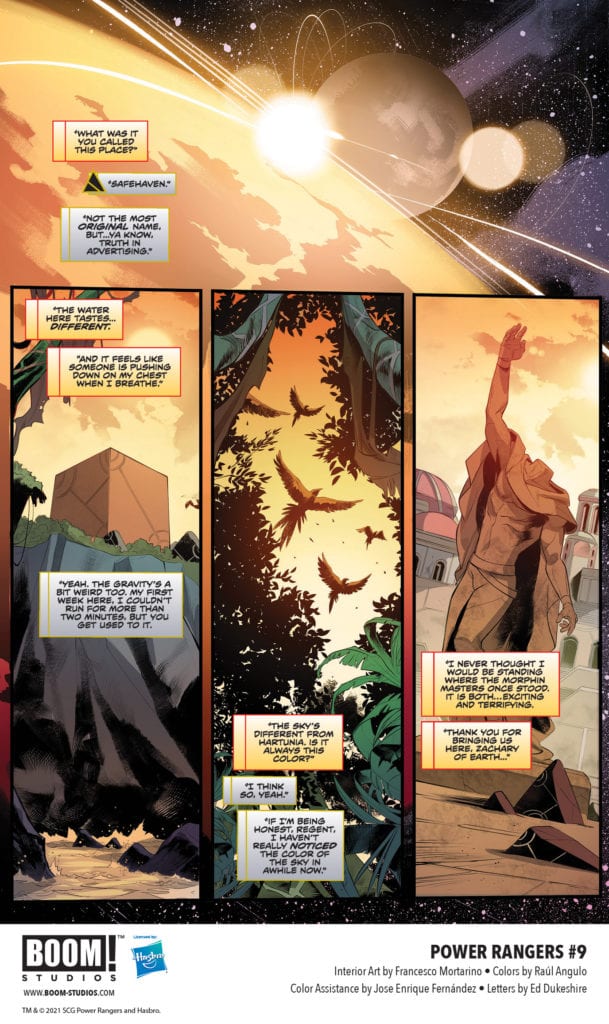
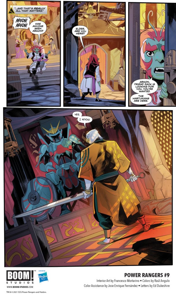
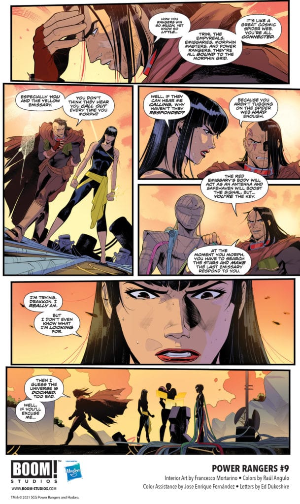
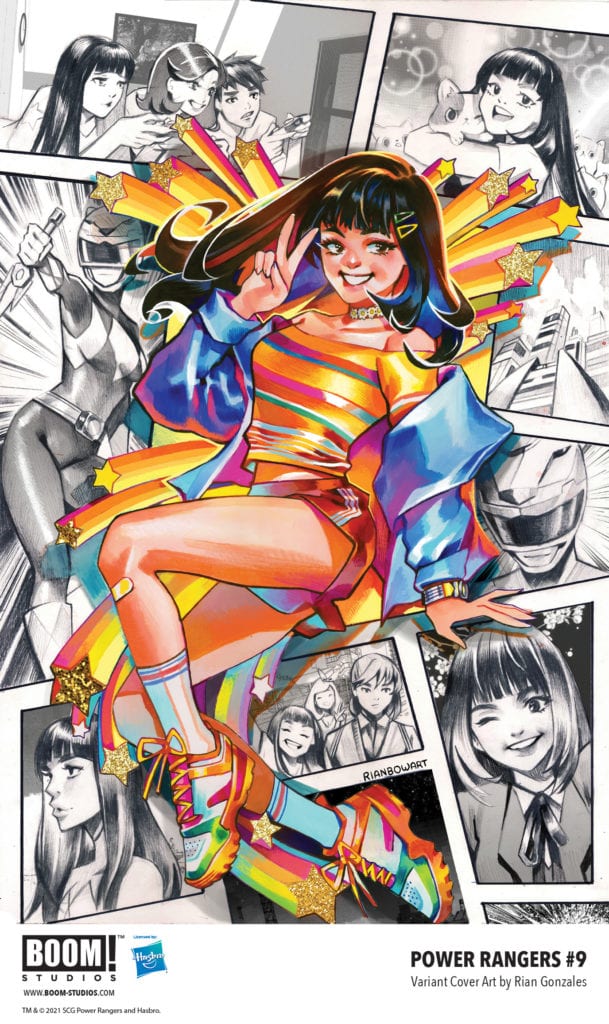
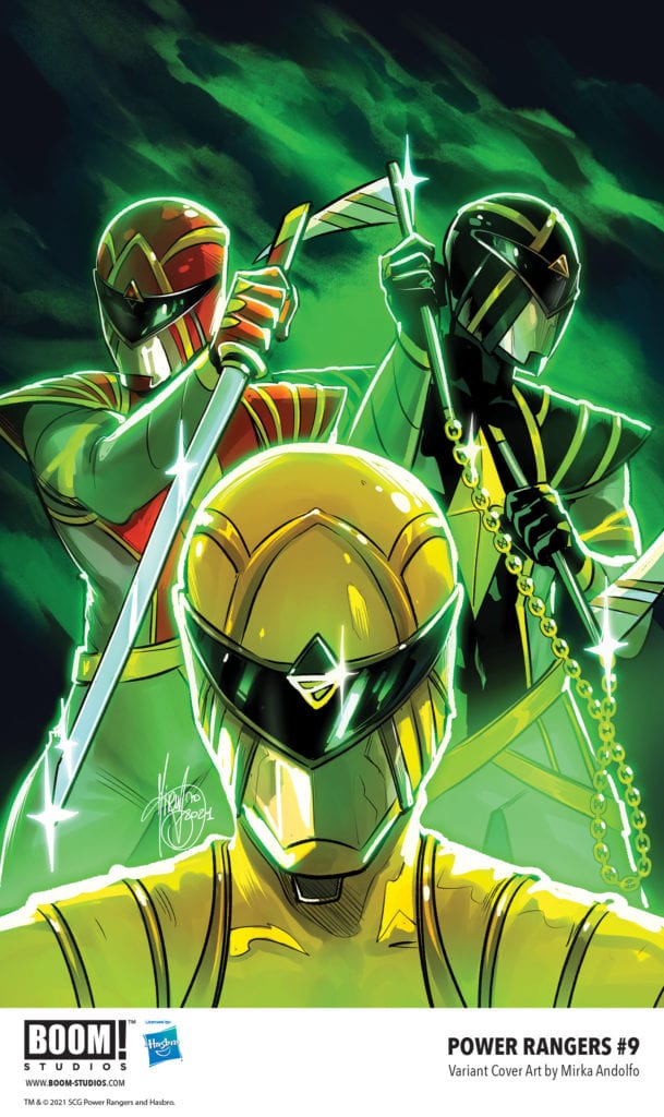
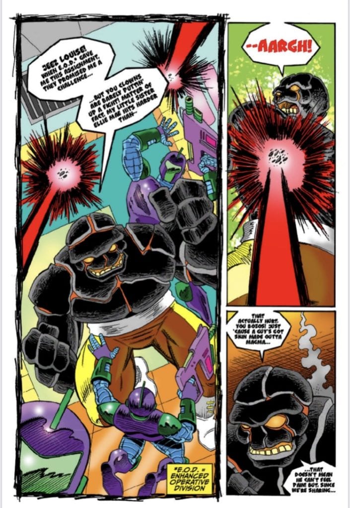
POWER RANGERS #9 hits your local comic book store July 21st, but thanks to BOOM! Studios, Monkeys Fighting Robots has an exclusive five-page preview for you.
About the issue: The Omega Rangers return to a Safehaven, but all is not well with the new arrivals. After a confrontation in the streets, can Zack help bring peace… or will a friend’s need for revenge against the Hartunians be too much for one Ranger?
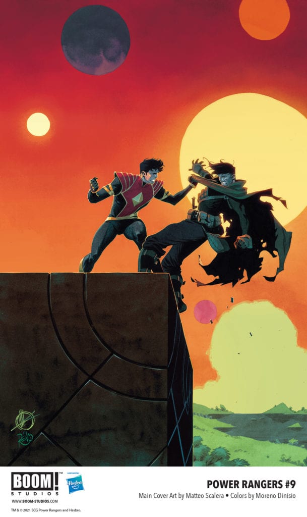
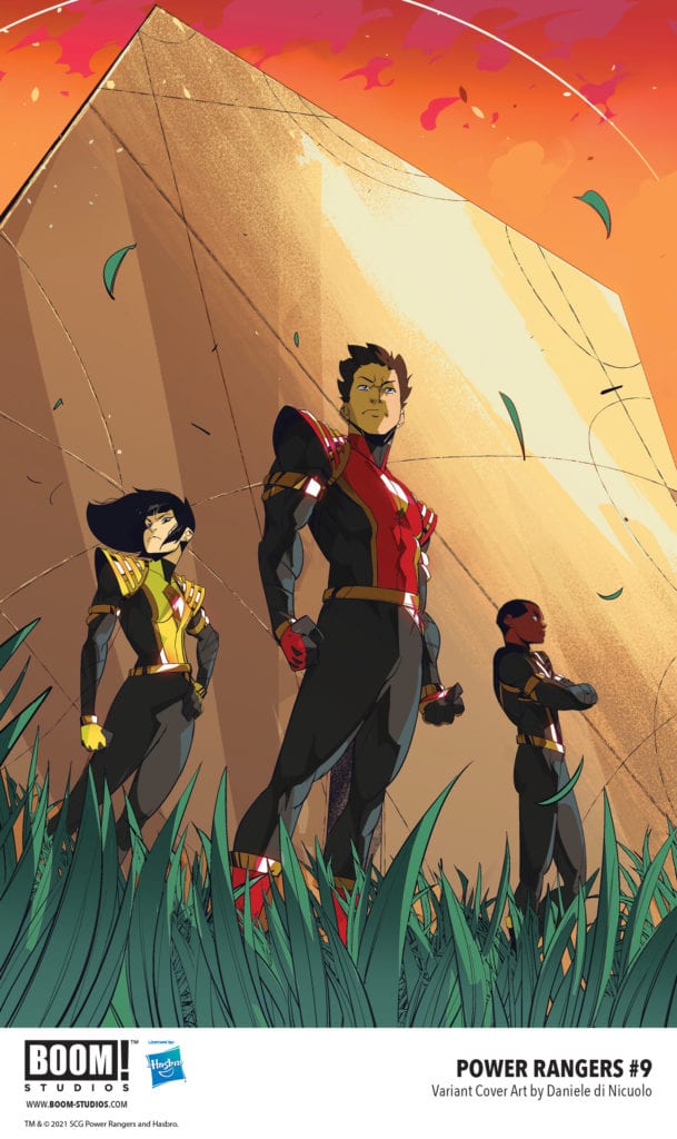
POWER RANGERS #9 is by writer Ryan Parrott and artists Francesco Mortarino & Moisés Hidalgo, with colors by Raúl Angulo with assistance by Jose Enrique Fernández, and letters by Ed Dukeshire. The main cover is by Matteo Scalera, with variant covers by Daniele Di Nicuolo, Ruan Gonzales, and Mirka Andolfo.
The series is running in conjunction with the MIGHTY MORPHIN series, also written by Parrott.
“Two New Series. Two New Teams. The Era of UNLIMITED POWER continues HERE—and only Lord Drakkon, their greatest enemy, can save the Power Rangers in July 2021!”
Check out the POWER RANGERS #9 preview below:
Are you reading POWER RANGERS? Sound off in the comments!
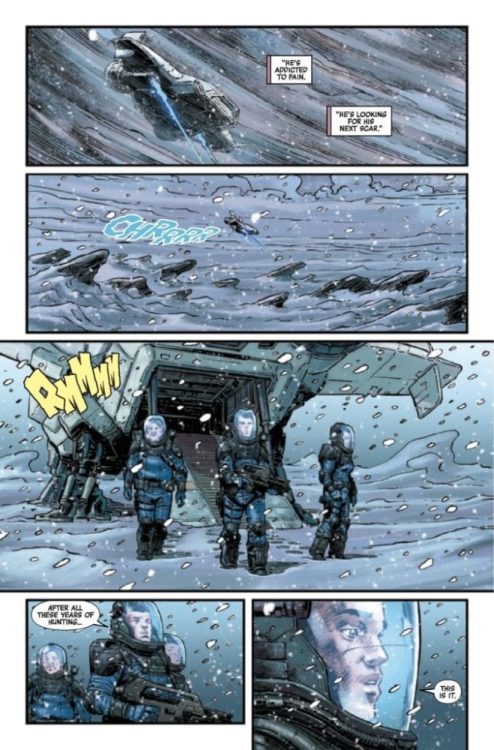
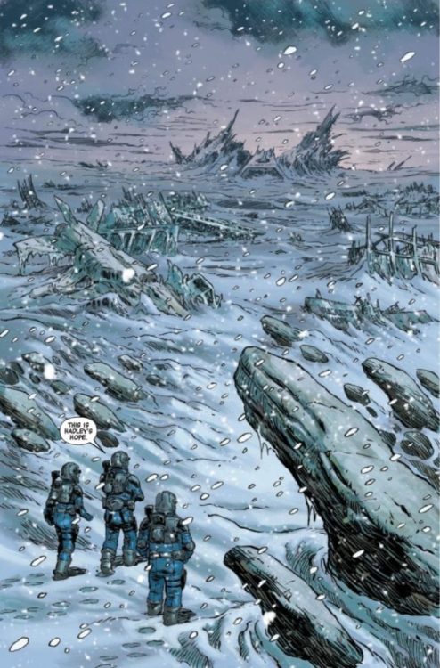
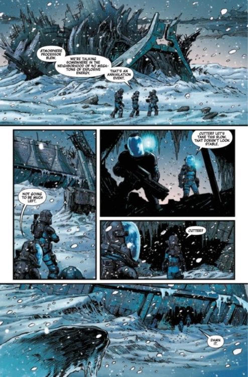
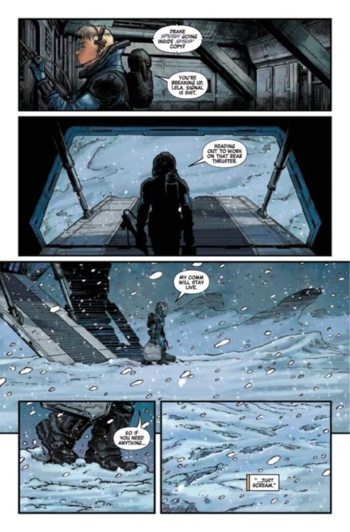
ALIENS AFTERMATH #1 hits your local comic book shop on July 14, but thanks to Marvel Comics, Monkeys Fighting Robots has an exclusive four-page preview for our readers.
The book is written by Ben Percy, with art by Dave Wachter, colors by Chris Sotomayor, and Phil Noto is the cover artist.
About the issue: FOR ALIENS’ 35TH ANNIVERSARY, A RETURN TO HADLEY’S HOPE!
It’s been 35 years since the tragedy of the Hadley’s Hope colony, but what happened to that ill-fated venture has been shrouded in mystery. A renegade crew of investigative journalists are heading towards the moon that Weyland-Yutani has wiped from all records, and they’ll bring back the truth even if it kills them…and what remains in that bombed-out site will try to do just that. Benjamin Percy and Dave Wachter imagine a terrifying possible future for LV-426 in this celebration of the 35th Anniversary of one of the most influential science fiction films of all time!
Ninjak #1 from Valiant Entertainment comes to comic stores on July 14 with a fresh new take on espionage stories. Joining writer Jeff Parker and letterer Dave Sharpe is cartoonist Javier Pulido. The unique art style of Pulido blends together with a story where a world these spies inhabit turns upside down.
Background
Ninjak, AKA Colin King, is the last of MI6’s Ninja Programme, after cutting ties with the corruption backing it. Since then, Colin King is making his way as a mercenary for hire.
Ninjak #1: Progressing Dynamics
Ninjak #1 has Parker get every character out of their comfort zones. With a plot of spies’ secrets being revealed, it takes a unique approach to show how drastic it is. With Pulido co-writing the story, the plot’s progress matches up with its layouts. Take for example the initial pages where the orderly conversation between two spies are interrupted. As a triangular panel barges into the page, it serves as a point where power is taken from MI6.
If that isn’t enough, the next page features a spread where the perspective shifts diagonally. In addition, the pages coloring changes from its initial red into mesmeric greens. All while the antagonist smiles at her victims who are in pain.
Lettering Layout
So with a setup like that, it’s going to require a hero who can keep up with this threat. Pulido decorates Ninjak #1 with SFX for eye-catching uses of tools, like a buzzsaw Ninjak takes from an opponent in the blink of an eye. While it’s cool to see how capable he is, Pulido also gives space for Sharpe to deliver exposition. The kind of exposition that reveal Ninjak is at disadvantage after his fallout with MI6.
Stick Around For Ninjak #1
Ninjak #1 features the kind of action people expect from its title character and more. There is a threat brewing that the reader dreads from simply tantalizing pictures. Because in this presentation, the feeling of safety is never a guarantee.
Welcome to Self-Published Spotlight, a regular interview column where I will be highlighting self-published comics and the creators and small print publishers who make them.
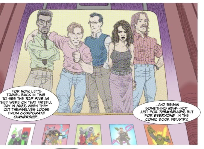
Dave Howlett’s THE MAKERS is one of the most joyful comic-reading experiences I have had in a while (and I am not the only one. Check out fellow MFR writer Zac Owens’ glowing review). Without saying much, THE MAKERS takes the origin of Image Comics and fictionalizes it…and then comes the Galaxy Quest-type twist! See, I bet that caught your attention!
I had the chance to shoot creator Dave Howlett some questions about his fantastic comic and he was gracious enough to answer them. So check out our chat below and make sure you get yourself a copy of THE MAKERS!
Monkeys Fighting Robots: First of all, thanks for taking the time to talk to us. How are you doing today? Working on anything? Dave Howlett: No problem! Doing all right, working on a commissioned piece that is very involved but in a way that suits me just fine.
MFR: So what’s your comic book origin story. How and why did you get into comics? DH: It’s a bit like the beginning of Goodfellas. “As far back as I can remember, I was always obsessed with comic books,” to paraphrase Henry Hill. My mom used to buy me those Spidey Super Stories comics that tied in with The Electric Company TV show when I was very young—which is a detail that tells you I’m now kinda old. But I don’t remember a time when I wasn’t obsessed with reading, and making comics.
MFR: Did you always want to create your own comics? Was there a specific moment or book that made you want to take that leap from fan to creator? DH: I don’t remember a specific moment, but the urge was always there. It just seemed like a very accessible creative outlet, unlike, say, learning to play an instrument, or being good at sports.
MFR: So for those who haven’t had the pleasure of reading The Makers, what’s your elevator pitch for the series? DH: A group of comic creators who were superstars In the 1990s reunite 25 years later for a convention appearance, only to find themselves whisked away on a cosmic adventure. It’s like a fictionalized version of the history of Image Comics, crossed with a reality-bending intergalactic quest.
MFR: Was that sci-fi element always part of the story, or was this more of a traditional attempt to tell the ‘Image Story’ at first? DH: At first it was going to be a more traditional 1990s period piece, but I thought I could jazz it up a bit and really explore the themes of creators and their creations, via a SF type approach. That type of story has always appealed to me, whether it’s in Frankenstein, or Preacher, or Star Trek: The Motion Picture.
MFR: Why do you think the ‘Image Comics’ story still interests people so much? It seems to really be resonating again for a lot of people in the comics community. DH: Part of it is nostalgia—the 90s are back!—but part of it also the fact that something like that couldn’t happen again. The market conditions, the conditions creators were working in, and the rock-star status the Image founders had achieved, will probably never be duplicated. So it was a once-in-a-lifetime kind of perfect storm, one that’s maybe hard to convey to anyone who wasn’t around for it. But I had to try!
MFR: Who was your favorite Image founding father? And is it still the same? Or did it change over time? DH: At the time it would have probably been either Todd McFarlane or Jim Lee, but now it’s definitely Erik Larsen. He’s the only one who truly committed to his book for life, and he’s still going strong today.
MFR: What about your favorite Image title/character? DH: Savage Dragon for sure. I had read some of it before, but a few years back I acquired most of the run for very cheap and decided to complete it…I think I only need 9 issues now? It’s pretty fascinating to watch Larsen’s style and interests evolve over the decades.
MFR: What kind of research did you do, as far as the more ‘realistic’ aspects of the story? DH: My research largely consisted of a pair of excellent documentaries—The Image Revolution, and the multi part SyFy doc So Much Damage. Sean Howe’s book Marvel Comics: The Untold Story filled in some gaps nicely regarding the Image founders’ split from Marvel, plus I was buying comics throughout that period, so I had a lot of memories of it to draw on.
MFR: Did any particular books or media help inspire this? I do get some Galaxy Quest vibes from the first issue and concept. This is a compliment because Galaxy Quest is one of my favorite movies! DH: I love Galaxy Quest! That’s in the mix for sure, along with Terry Gilliam’s Time Bandits, and the flashback/flash-forward structure is straight outta Lost.
MFR: Did you always envision it as a 6 issue mini-series? DH: I think so? Six issues made sense—five issues to individually spotlight the five Attitude Comics creators, and a final one to wrap up the story. I have a short attention span for my projects, so they’re always finite—I haven’t stumbled upon my own Savage Dragon yet, you know…something that I’d be happy to work on for the rest of my life. We’ll see.
MFR: Were you always gonna self-publish this? Did you ever maybe even think about pitching it to Image (laughs). DH: I actually did submit it to Image! I never heard back, which is not surprising. I’m not sure it’s quite up to their standards. But self-publishing means total control over the final product, so that appealed to me too.
MFR: The printing on The Makers is fantastic. It feels like an older comic. What made you want to go with newsprint? DH: Well, my friend and employer Calum Johnston, owner of Strange Adventures, was the one who wanted to go ahead and get it printed up, and he wanted to use a local printer who could do it up old school. Newsprint is of my era too, so that appealed to me. Modern comics are too slick! I just think the colour looks better on newsprint.
MFR: How did you create The Makers? Was this pencils and inks or digital? What was the creative process like? DH: Pencils and inks for the line art, digital for the letters and colours. The digital stuff is good to learn, but I personally prefer the look of hand-lettered comics, so I’ll probably switch to that for whatever I do next. As for colours, maybe a mix of old and new school? We will see.
MFR: The Makers also has art from the ‘comics’ within the comic. What’s it like to use different styles in one book? DH: I like the conceit, but it’s a lot to keep track of! Some artists like Rick Veitch and Jim Rugg seem to be able to try on different styles like they were ball caps, but I find I struggle with it a lot more. The colouring has had to do a lot of the heavy lifting, but, you know…your reach should always exceed your grasp. I had to give it a shot.
MFR: I also love the fake ads and ‘Bullpen Bulletin’ type pages in the book. Was this a detail you wanted to include from the beginning? DH: Oh, most definitely. 1963 by Alan Moore, Rick Veitch, Steve Bissette, Dave Gibbons, and Don Simpson is one of my favourite series, and they really nailed the whole package with the fake ads, letters pages, Bullpen Bulletins-type stuff…each issue of The Makers has at least one sorta “artifact” page along those lines to try to immerse you in the world of it. I would have liked to have done a bunch, but there are only so many hours in the day, you know?
MFR: Have you or will you send this to any of the creators that influenced the story? DH: Probably not? We’ll see. I mean, they all definitely influenced a lot of aspects of the characters, but I don’t want to give anyone the impression that it’s 100% based on anyone real.
MFR: Is there a story beyond these 6 issues? or will this be it? DH: Nah, this is it for now. It’ll have a finite conclusion, and I don’t have any ideas for it beyond that. Honestly, it’s been such a big undertaking that I’m really itching to work on something different. But never say never!
MFR: love your Bob The Goon mini-comic. Any chance for more Bob stories? DH: At least one more idea! I’ve always had a fondness for the character, and the actor who plays him, Tracey Walter. He’s just one of those “that guy” type of character actors, who turns up in everything. He’s great in Repo Man. But then again, he’s always great. Poor Bob. So loyal to the Joker, and look where it got him.
MFR: What else are you working on? DH: I’m doing the art for a five-part series called The Last Paper Route that my pals Sean Jordan and Alex Kennedy wrote—it’s a comedic series about a couple of paperboys having misadventures in the 1990s. See? Something in the zeitgeist these days. Other than that, I’ve been trying to use Instagram for different types of comics and strips—there are some interesting possibilities there. I’ve done a bunch featuring a character called The Hashtag, who’s kind of like my take on faceless detective characters like The Question and Rorschach. He makes for good little one-panel comics. I’m still trying to figure out what my next long form series will be.
MFR: Where can people find you and your work? DH: My comics (including digital versions of the first four issues, and the print edition of issue one) are up for sale on Gumroad (https://gumroad.com/paskettiwestern), and I’m usually posting stuff on Instagram a lot (people can find me at @paskettiwestern). I have that handle on Twitter too but I don’t use it much, because that place is a bit of a…I don’t want to say hellscape, but I don’t know what else to call it.
MFR: I really loved the autobiography short ROASTED at the end of issue 1. Will there be more of this? DH: For sure! I have a three-pager going into the print edition of issue 2, and probably some more down the line. Like I said, I wish all the backup stuff could have been in-world type material, but I was getting stretched too thin so I thought I would just pilfer my archives (most of that stuff has been on my IG account in the past).
MFR: Any final comments for our readers? DH: Stay safe! Read more comics. And make more comics!
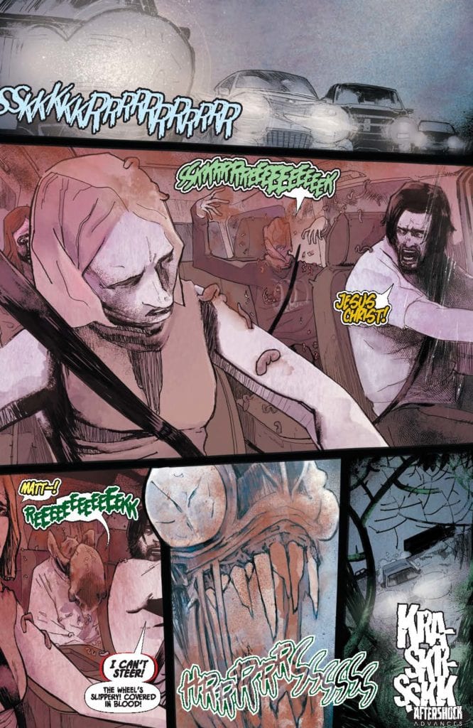
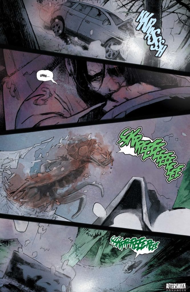
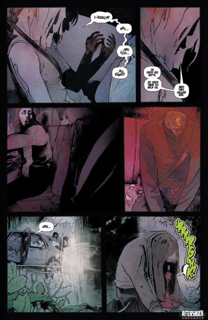
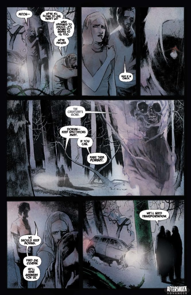
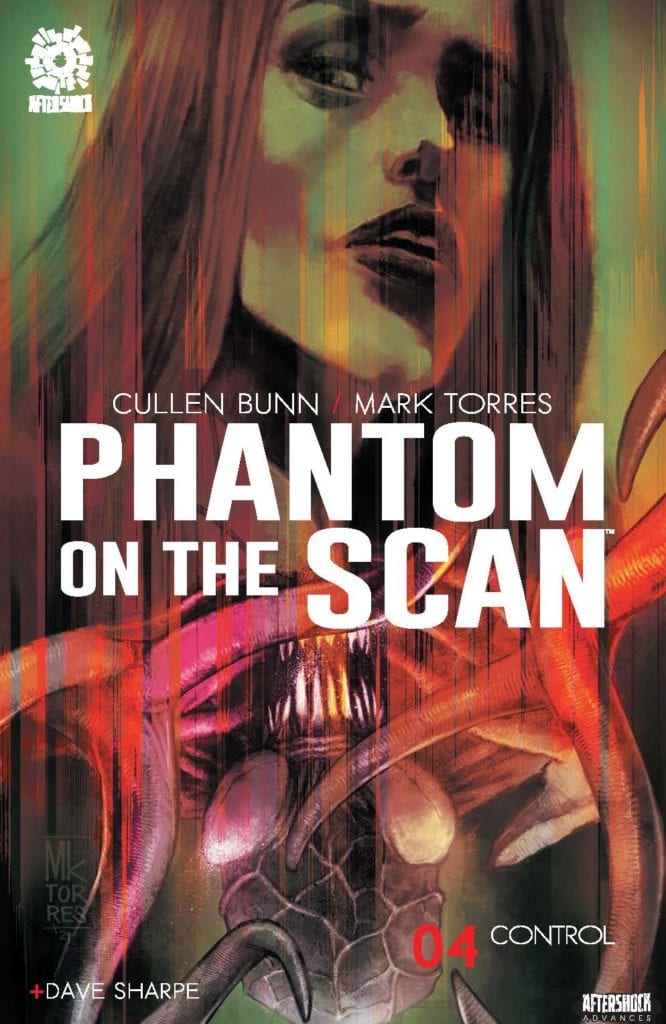
PHANTOM ON THE SCAN #4 hits your local comic book store July 28th, but thanks to AfterShock Comics, Monkeys Fighting Robots has an exclusive four-page preview for you.
About the issue: With the body count rising – with murderers from this world and from the astral plane in pursuit – a group of doomed psychics draws ever closer to the horrifying truth about the abilities that are slowly killing them. What awful secret is the mysterious Trellux Institute hiding?
PHANTOM ON THE SCAN #4 is by writer Cullen Bunn and artist Mark Torres, with letters by Dave Sharpe. The cover is by Torres.
Check out the PHANTOM ON THE SCAN #4 preview below:
Are you reading PHANTOM ON THE SCAN? Sound off in the comments!
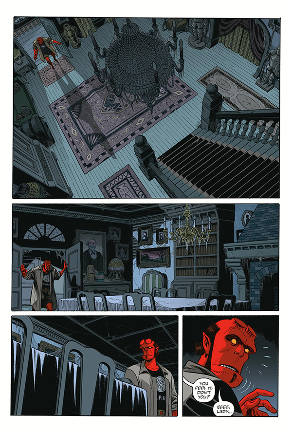
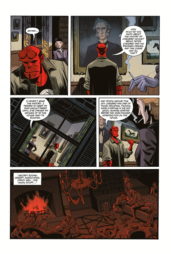
It’s hard to judge Dark Horse Comics’ Hellboy & the BPRD: The Secret of Chesbro House #1 by typical standards. As a comic, it’s just not typical in its storytelling and structure. Where many creative teams avoid things like exposition dumps, this story is deliberately full of them. But writers Mike Mignola and Christopher Golden, with artist Shawn McManus, colorist Dave Stewart, and letterer Clem Robins, are bringing us back to older forms of storytelling.
Writing
Mignola and Golden don’t shy away from exposition in this issue. In fact, that’s what most of this issue is. It’s a cast of characters that walk into the scene and begin to explain what they know. It’s a revolving door of exposition dumps. But while it’s tempting to fault the comic for this at first, something about its shameless use of this format suggests it’s not a mistake.
No, it seems that Mignola and Golden are using this Hellboy story to connect us back to how stories used to be told. Like ghost stories swapped around a campfire, this issue feels mythological. We don’t see events, we hear secondhand accounts of rumors of what happened. Mignola and Golden create a narrative distance. This is a technique Mignola often uses in hisHellboy universe. In telling us all of our information through people who weren’t there to witness things, Mignola and Golden add in a layer of mystery and ambiguity. And as the issue closes, we begin to question everything we’ve heard.
Art
McManus’ style is quite an interesting match for this issue. His “casting” of characters is fantastic. Along with Hellboy, we have a short caretaker, with a brow that bulges out grotesquely, a buttoned-up old woman whose whole facial structure screams “I’m better than this,” and a young couple that seem picturesque and ideal. Not only do the physical aspects of these characters tell us so much about them, but it gives events a cartoony feeling. McManus cuts through the horror and dread. He brings a levity to our spooky setting. But he can turn on a dime. One moment, he’ll make you laugh, the next, with the slightest shift, he’ll make you recoil in terror.
Coloring
Stewart sets the stage beautifully for events to unfold. Chesbro House is devoid of life. As Hellboy enters the front door, he’s the only source of color in the scene. Everything else is a cold blue or grey. And as the characters gather around and tell each other what they’ve heard about the house, their retellings get different treatments by Stewart. The first has a soft red tone to it. The events of that account feel seedy, but perhaps not altogether evil. Another retelling, maybe the most realistic of them, is shown in grey with yellow accents. Stewart makes it feel more real, less dramatic. And the final retelling is in a dark red. It is full of violence and theatrics. Thanks to Stewart, each story not only has its own series of events, but its own unique, overpowering flavor.
Lettering
Much of the lettering of this issue is rather reserved. Even Robins’ use of bold is deliberate and carefully parsed out. But as the ghosts and ghouls gear up to cause havoc, so does Robins. The pages that were once filled with conservative text boxes and word balloons are soon covered in big, blocky sound effects of all shapes and sizes. We see the thin lettering of the “FWOOSH” sound of flames going out and the squashed block letters of a head hitting the floor with a “PLOP.” Robins’ chaotic style mirrors the feeling of what is going on in the room. And with slight distortions of word balloons and a final use of bold, he makes our hearts drop. Robins brings the order and chaos into this issue, often mixing the two joyfully.
Dark Horse’s Hellboy & the BPRD: The Secret of Chesbro House #1 is a strange tale. It relies on rumors and secondhand accounts. In doing so, this creative team makes us skeptical of what’s really going on. Surely, the next issue will show us that we have only seen the tip of the iceberg. Pick up Hellboy & the BPRD: The Secret of Chesbro House #1, out from Dark Horse Comics July 7th, at a comic shop near you.
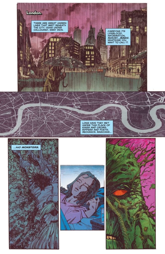
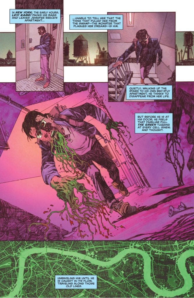
DC Comics’ The Swamp Thing continues to experiment with its content. This series has consistently been an innovative one. Yet it also borrows generously from comics of the past to create its fresh tone. The Swamp Thing #5, which reads much like a one-shot, sees this creative team influenced by the comics of Grant Morrison. Writer Ram V, artist John McCrea, colorist Mike Spicer, and letterer Aditya Bidikar deliver a psychedelic chapter that echoes some of the strangest moments in comics’ history.
Writing
V really does seem to be deliberately writing in Grant Morrison’s style. Morrison, who had their own run on Swamp Thing, was also behind such masterpieces as Doom Patrol and Animal Man. But they are often known for not making logical sense in their comics. Morrison presents villains like Mr. Nobody, gives us stakes too huge to comprehend, and writes monologues that are delightfully nonsensical. Morrison often doesn’t seem to want to make sense. They want you to feel something.
The same can be said of The Swamp Thing #5. On the surface, there is some sense to it. There’s a bomb beneath a block in London and Swamp Thing is here to get rid of it. But quickly, things get strange. Magic, dreamscapes, and metaphors make things a little unclear for the reader. And while there is an emotional sense to it, even a metaphorical one, V occasionally distrusts his own writing. He dwells on the stranger parts of his plot, seemingly trying to explain the metaphysical nature of what he’s doing through some of the dialogue. Characters untangle things for us, in lines that don’t always feel natural. But this issue already works, no explanation is needed. V brings us a story that is rooted in nightmares of our world dying. A dream many of us are all too familiar with.
Art
Regular artist Mike Perkins takes some time off in this issue, allowing artist John McCrea to step in. While Perkins’ art style is gorgeous, something I harp on often, this feels like the perfect issue for McCrea to fill in. The ethereal, metaphorical nature of the plot lends itself perfectly to McCrea’s twisting style. McCrea’s figures aren’t quite cartoony, but they’re not the realistic proportions we see in Perkins’ art either. Swamp Thing looks stretched out, emphasizing his giant stature. This whole issue feels like we’re dreaming about these characters. We’re not seeing the characters as they really are, but their physicality is beginning to match their personalities. So in a way, we’re seeing them in a truer form. Yet, as the danger passes, the last few pages feel like the calm after the storm. Reality seeps back in. The characters look proportional and realistic. It’s a subtle but brilliant change.
Coloring
Spicer’s colors jump right off the page in this chapter. They’re what gives this issue much of its psychedelic tone. Many of the panels have a pinkish-purplish haze to them. These hues blend seamlessly into reds and yellows. Swamp Thing, himself, sticks out in his vibrant green. But all of it feels like the colors of dreams. And in the midst of this, Spicer colors one reoccurring panel differently each time it comes up. We see what looks like the streets of London in a pale blue. When the image comes back, it looks like plant cells and chlorophyll, colored in a brilliant green. And later, it appears red, like arteries pumping blood through the body. It’s generally the same image, the pencils stay the same, but Spicer’s color gives it new meaning with each iteration.
Lettering
Two of the guest characters in this issue clearly have a history together: Sierra Kirre, a woman who is caught in the middle of this whole mess, and John Constantine, magic man and scoundrel. It generally goes without saying that if Constantine has a history with anyone, they probably hate him. And while V’s writing hints at this, Bidikar’s lettering actually does a lot for their dynamic. Sierra’s words balloons often almost seem allergic to John’s. If his words are shown at the top of the panel, hers dive low, creating a large expanse between them. It gives us a sense of Sierra’s distaste for John. And what’s just as telling, is that the few moments their word balloons collide, she’s often telling him off. A “Sshhh,” or a “Already on it,” bump into what John is saying. She’s fast to shut him up, but slow to show any kind of familiarity or closeness.
DC Comics’ The Swamp Thing is an incredible series. At times it channels Alan Moore, other times it channels Grant Morrison. But in all of it, this creative team is producing a brilliant, fresh work. It’s a patchwork of what’s come before, in some ways. Yet it has just as much new, exciting things as it does homages and callbacks. The Swamp Thing #5 is out from DC Comics July 6th at a comic shop near you! Pick it up and buckle in for a wild ride.
‘The Nexus Event’ returns Loki back to its grand roots are a smaller, character-driven episode ‘Lamentis.’
Loki and Sylvie’s fate seems sealed after The Ark on Lamentis gets destroyed. However, they are able to cause a major Nexus Event and get arrested by the TVA. When in TVA custody Loki tries to prove to Mobius that everything he knows about the TVA is a lie.
Out of all the Marvel Disney+ Loki has been the most interesting. WandaVision was a personal story about someone processing their grief and The Falcon and the Winter Soldier was an average Marvel movie that happened to run for six hours. Loki’s selling feature has been its mystery and had lots of reveals and twists. Because of the mystery fans of the series have developed their own theories. An example of a Loki fan theory was regarding the identity of Sylvie. Some fans have speculated that Sylvie might not have been a female version of Loki but actually have been Enchantress. The evidence for this theory was Enchantress used Sylvie as an alias and Sylvie’s powers were different to Loki’s. This episode has disproven this theory. ‘The Nexus Event’ showed Sylvie as a child dressed in the same costume as the MCU’s Loki. The other way this episode disproved the Enchantress theory was the titular Nexus Event.
‘The Nexus Event’ does present another mystery: what is Ravonna Renslayer’s role? Ravonna has already been shown to be a powerful figure within the TVA. She is a gatekeeper to the Time Keepers because she acts as their representative to the agents. This episode showed Ravonna being the TVA agent who had arrested Sylvie as a child and she clearly knows more than she lets on. Sylvie even questions Ravonna, what was her crime that made her a Variant. This backstory shows why Sylvie hates TVA and how much she has suffered at their hands. She has been on the run since she was a child and had to learn how to survive.
Despite Ravonna’s best efforts to launch a cover-up, the appearance of Loki and Sylvie does sow seeds of doubt within the TVA. Loki has already had a friendship with Mobius which leads to Mobius investigating what happened to Hunter C-20. Hunter B-15 had been shown to be hostile to Loki, so she had an unexpected change of heart when she interacted with Sylvie. The appearance of Loki and Sylvie at the TVA could lead to the downfall of the organization.
Whilst Loki had grand art design and sets, it does feel more like it suffers from the limitations to a TV show, more so than the previous MCU Disney+ shows. A prime example of this was during the action sequence in the episode. It took place in a small room and it was staged without any real flair. It was a little disappointing for a TV show linked to one of the biggest film franchises.
On a final note, it was fun to see Jaimie Alexander reprise her role as Sif, even if it was just a cameo. It led to a bit of humor that forced Loki to have some introspection.
‘The Nexus Event’ was at its best showing the inner workings of the TVA and how it seems that the organization is facing the beginning of the end. It was also an effective episode at showing character development and big reveals.
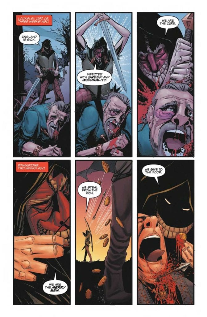
Nottingham of Mad Cave Studios releases for trade on September 22. Writer David Hazan’s grimdark depiction of Robin Hood follows the character Sheriff Everett. Artist Shane Connery Volk may make the sheriff look frightening, but nowhere near as frightening as the Merry Men. Colorist Luca Romano paints these guerrilla fighters with red masks and blood, it’s enough to question who’s really heroic. The lettering by Joamette Gil shows that each character has a unique perspective.
Nottingham And Changing Perspectives
Calling back to the first issue, Nottingham shakes away any pretense of good or evil. The ballads about Robin Hood are messy, especially when it comes to his loyalty to King Richard. So it’s always good to be open to new interpretations. This one in particular challenges readers to look beyond the typical charitable depiction of the Merry Men. Because despite whatever chants they make, Hazan paints them as a militant cult, not unlike the crusaders.
Which ties back to the sheriff, Everett, a grizzled veteran of the crusades who leaves a bad first impression. He’s willing to get into the face of Maid Marian for her involvement with Hood, so it’s easy to see him as the traditional villain. That is until we learn more about how Everett and his men came into their positions in the first place. They’re not bad people as much as they are people with a lot of bad luck. At least in how they have to deal with their corrupt and overbearing superior. Sheriff Everett, in particular, is easily the most transparent character out of everyone. He’s crude and doesn’t hold much sway in politics, but he always tries do best by the common man.
Predation In Art
Volk’s art in Nottingham is very complex. Even his design of the sheriff is completely memorable. Sheriff Everett’s hunched figure with adornments make him look like a vulture, a truly haunting presence. Later as the story develops, the reader finds that the large regal cape he wears looks symbolic of the burdens of war and the responsibility of his position. Even that vulture comparison can be positive. Vultures are known to slow the spread of disease. Just as the sheriff tries to contain the collateral damage of the Merry Men.
That’s probably what makes the Merry Men’s coloring by Romano so striking. Their usual green clothes make them blend in with the forest and common folk. But their red masks, with exaggerated grins, are like a disease hiding in plain sight. The black cloaked Hood looks especially terrifying with how they can move in the shadows.
Letters Of Confession
Gil’s lettering in Nottingham has a powerful form of presentation. It’s probably at its most effective is in a confession letter a traitorous captain leaves for the Sheriff. By presenting the letter in caption form to the reader, regret and sorrow permeates throughout the Sheriff clashing with clergy in the forest. Amid the violence the Sheriff commits with basic word balloons and sound effects, the reader feels fear for the captain. So by the time the Sheriff finds the letter after his rage dies down, the dour feelings finally sink in.
Look Into Nottingham
Nottingham is an enthralling dive into the legend of Robin Hood. Characters have more complex motivators than what their first impressions imply. How it all presents itself is what makes each interaction so memorable.
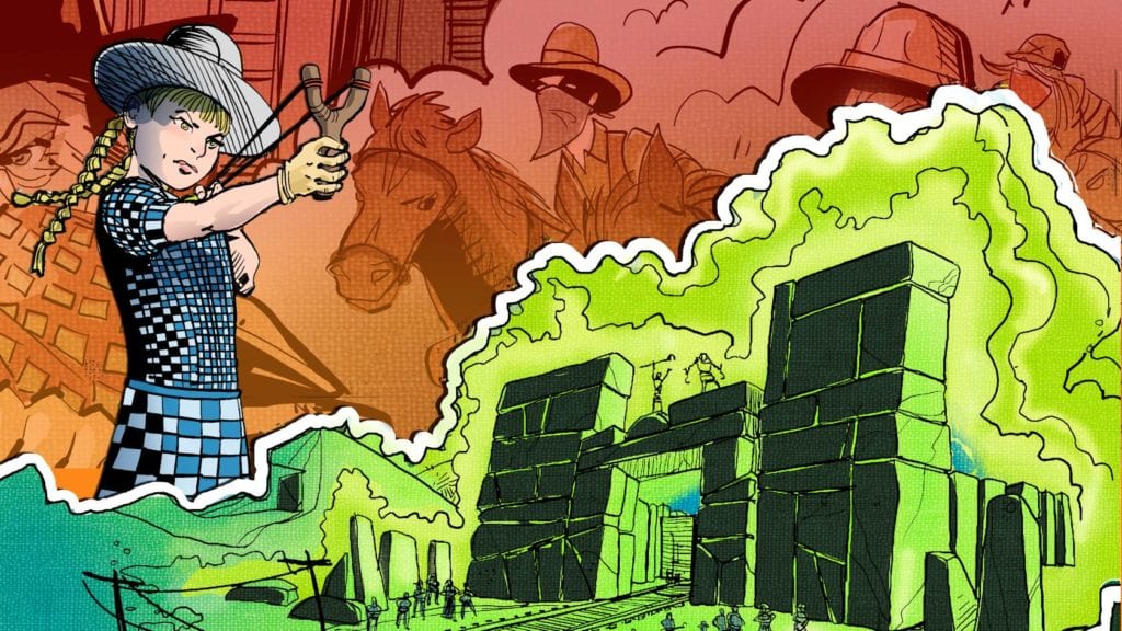
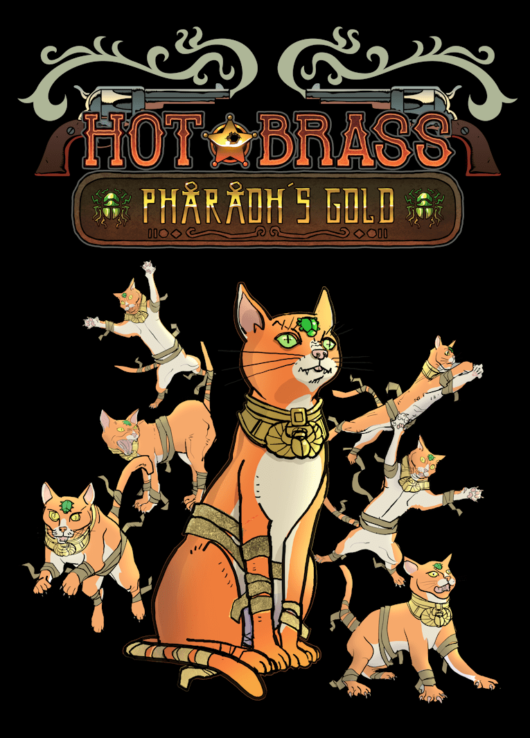
Hot Brass: Pharaoh’s Gold is the newest one-shot from Unlikely Heroes Studios. With a Kickstarter ongoing until July 15, writers John and Will Pence craft a Weird Western to enjoy. And artist Joe Koziarski has a good time with some campy elements, like mummy cats!
Hot Brass: Pharaoh’s Gold: Camp Out!
Hot Brass has the creative chaos that defines UH Studios. It helps that John Pence is a writer on another UHS title, The Surgeon. So, with Will at his side, here comes a one-shot for a child-friendly audience. Despite the presence of alcohol, smoking, and mummies around a child character, there’s no hand holding. Characters act as anyone should in this situation: the museum curators are greedy opportunists, the train robbers are fumbling about, and the deputy is ready to start a fight. There’s no bigger context behind their actions, they just do what they want; they’re almost like Larpers playing a game. Because how else do mummies and cowboys go together?
Color To Impress
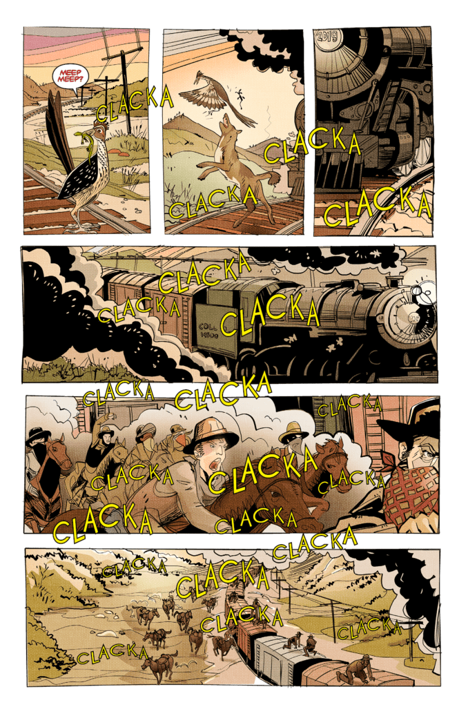
Hot Brass: Pharaoh’s Gold features some simple yet effective art from Koziarsky. Some of the designs that come out of this are in the name of making this scenario more memorable. Take for example the mummy cat, John and Koziarsky like it so much that the cat shows up in some random places. Of course the cat’s bright orange coloring makes it so eye-catching, it’s a bit distracting. Unlike the heroine Sally, whose bright blue dress makes her stand out to match with her outgoing personality.
John, as the letterer, injects personality into every word and action. Like giving a roadrunner the iconic “Meep-meep” sound from Looney Tunes. The inclusion of a coyote in the next panel makes this quick instance twice as memorable for its own sake. Otherwise it would just be in the background of a train making loud repetitive noises.
Try not to chuckle with this.
Get A Shot At Hot Brass: Pharaoh’s Gold
Hot Brass: Pharaoh’s Gold is pure campiness that readers can tell the creators had a good time with. It’s a weird western with all of the nonsense for a memorable pass time. Get involved in the Kickstarter so you can check out this fun, wild ride!


")


 Ninjak #1 has Parker get every character out of their comfort zones. With a plot of spies’ secrets being revealed, it takes a unique approach to show how drastic it is. With Pulido co-writing the story, the plot’s progress matches up with its layouts. Take for example the initial pages where the orderly conversation between two spies are interrupted. As a triangular panel barges into the page, it serves as a point where power is taken from MI6.
 If that isn’t enough, the next page features a spread where the perspective shifts diagonally. In addition, the pages coloring changes from its initial red into mesmeric greens. All while the antagonist smiles at her victims who are in pain.
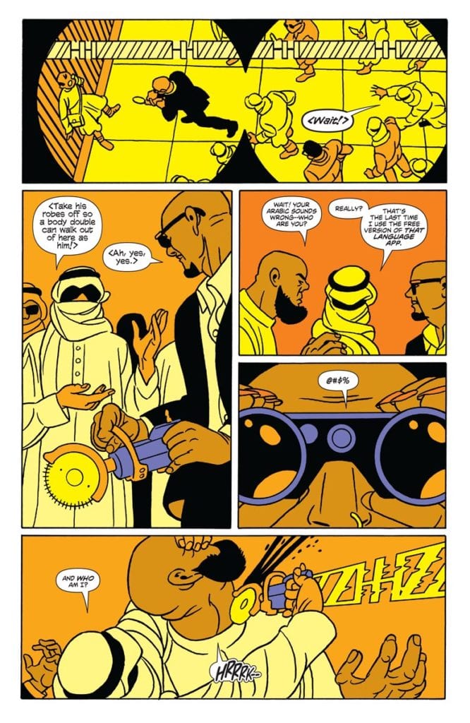 So with a setup like that, it’s going to require a hero who can keep up with this threat. Pulido decorates Ninjak #1 with SFX for eye-catching uses of tools, like a buzzsaw Ninjak takes from an opponent in the blink of an eye. While it’s cool to see how capable he is, Pulido also gives space for Sharpe to deliver exposition. The kind of exposition that reveal Ninjak is at disadvantage after his fallout with MI6.


 Calling back to the
 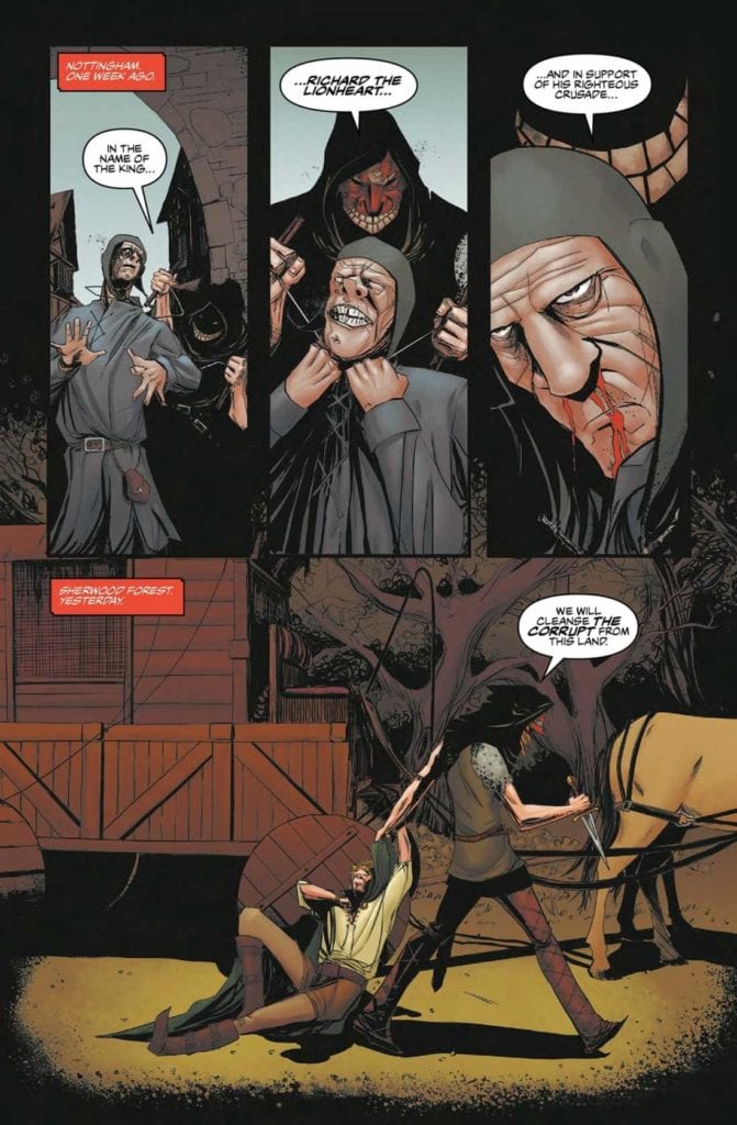 Volk’s art in Nottingham is very complex. Even his design of the sheriff is completely memorable. Sheriff Everett’s hunched figure with adornments make him look like a vulture, a truly haunting presence. Later as the story develops, the reader finds that the large regal cape he wears looks symbolic of the burdens of war and the responsibility of his position. Even that vulture comparison can be positive. Vultures are known to slow the spread of disease. Just as the sheriff tries to contain the collateral damage of the Merry Men.