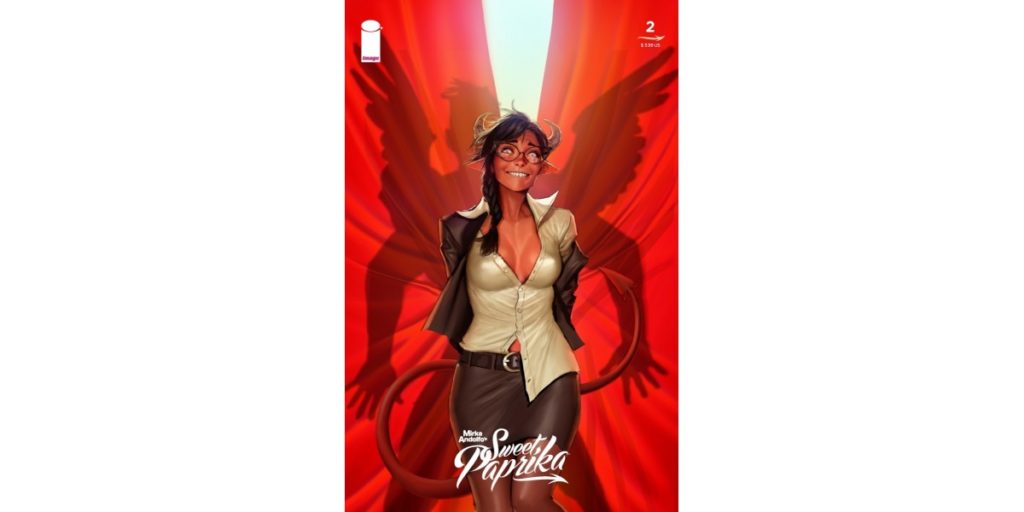
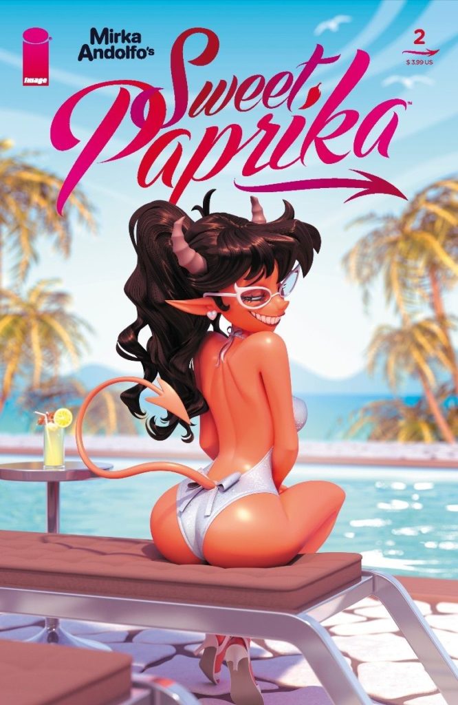
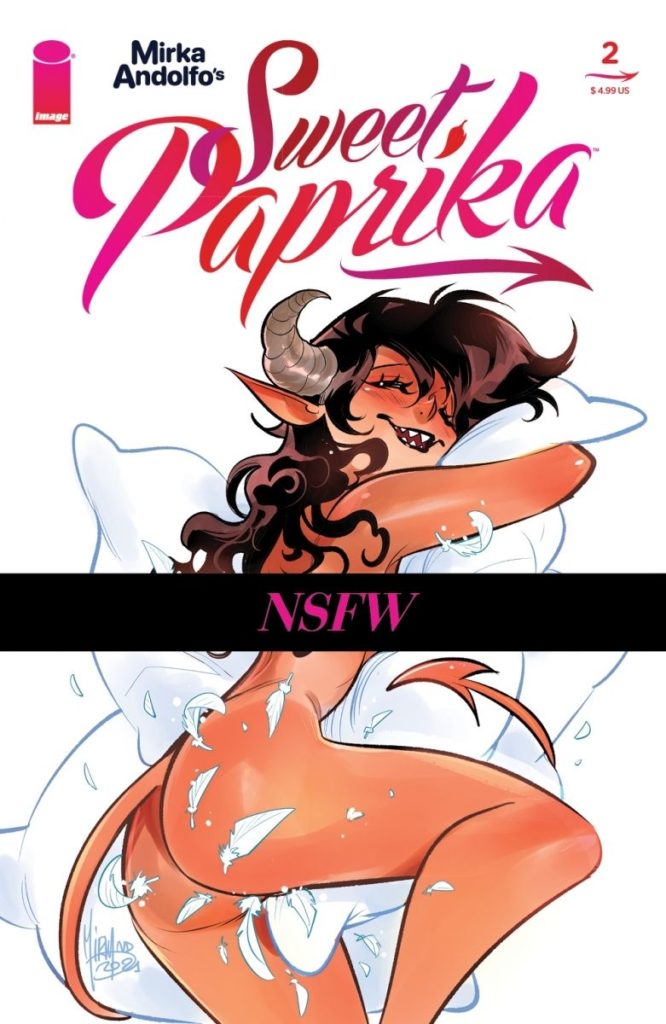
Creator Mirka Andolfo returns with the second chapter of her newest erotic comedy series in Sweet Paprika #2. Along with colorist Simon Tessuto, letterer Fabia Amelia, and localization from Steve Orlando, this new issue maintains all the greatness of the first issue. With a deeper dive into Paprika’s traumas and more great raunchy hijinks, this visually stunning and hilarious comic nails the landing for a second time around.
“Paprika is living a difficult situation brought on by her father’s illness and the complex work situation that awaits her. It’s the only kind of business she’s not really able to handle: a dinner where being dynamic, kind, and relaxed is just as important as being competent. But there is also another reason why the young and skilled professional is in trouble: she doesn’t want to see one of the guests again…”
Writing & Plot
Sweet Paprika #2 continues to blend deep personal storytelling with goofy erotic comedy, and it absolutely nails it. Mirka Andolfo continues to tell a relatable story while keeping the overall tone fantastical and hilarious. This chapter focuses more on Paprika’s troubled romantic past, as well as the source of her trauma and apprehension towards sex. She then delves more into how these problems can affect every other aspect of a person’s life. Andolfo keeps her heavier subject matter light by dotting it with more absurd, humorous moments. Her character work is compelling, and her use of raunchy and often silly humor is still great.
Dill, our package delivering (*wink wink*) angel is the source of most of the comic’s erotic moments and ridiculous comedy. His time in the comic may be a bit too in-your-face for for some, but I find that he fits the overall tone well. He also functions as a great foil for Paprika. I also have to note Steve Orlando’s work here on localization. He does a fantastic job fitting Andolfo’s words to suit English-speaking readers while keeping everything she wants to tell. The charming humor is aided by Andolfo’s quirky dialogue and fantastic timing and pacing. All of the scripted storytelling aspects mesh together fantastically for this smart and funny second issue.
Art Direction
Of course, what really draws readers to Sweet Paprika #2 is most likely Mirka Andolfo’s visuals. It’s for good reason, as her work here sees the already incredible artist in top form. Her highly animated and ultra-expressive characters are a joy to see on every panel. Every character’s design is unique, making it near-impossible to mix up even minor characters. The almost cartoonish style makes the more fantastical scenes and designs a slight surprise, but one that flawlessly fits the world. Her panel design stays unconventional as well. Characters often break out of panels in the more over-the-top moments before the structure returns to “normal.” Mind you, normal here is constantly shifting panel and page structures that still flow naturally. Her detail work is fantastic as well, with elements such as outfits and environmental design are drawn with a keen eye.
The colors from Simon Tessuto perfectly fill in Andolfo’s work. Much of what keeps Paprika so lively is the energetic palette he utilizes for this comic. Every panel is bright and lively, with perfectly reflected light on every surface. Paprika and all of demon-kind shine with a vibrant multitude of reds. The multitude of colors on clothing capture the varied walks of life different beings (angels and demons alike) in this book. Every page of this comic is alive with rich energy provided by Tessuto’s work. The lettering from Fabia Amelia is highly dynamic and surprising as well. Her classy modern font shifts at all times, often exploding in line with the characters. Visually, Paprika is equal parts funhouse attraction and comic-book visual mastery. This is easily one of the most fantastic feats of visual art on shelves right now.
Verdict
Sweet Paprika #2 is a deceptively deep and all-around stellar second issue. Mirka Andolfo’s script is both heartfelt and hilarious, with a focus on past traumas as well as the usual sexy hijinks. Her art colored by Simon Tessuto is beyond stunning, full of a life and vibrancy seldom seen. Be sure to grab this issue when it hits shelves on 9-1!
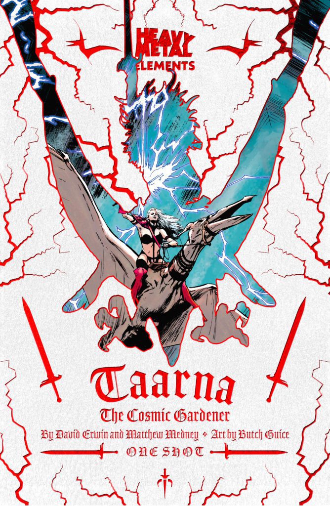
TAARNA: THE COSMIC GARDENER is available at your local comic shop September 1st, but thanks to Heavy Metal, Monkeys Fighting Robots has an exclusive three-page preview for you!
About the issue: 13.8 billion years ago, the universe burst into existence. Each universe has one guardian that is responsible for protecting and nurturing its growth and health. From the death of the last Taarakian and a collapsed universe, Taarna was born. Heavy Metal’s flagship character from the animated film returns in a new series of cosmic mystery and battles throughout the multiverse. Originally published in Heavy Metal Magazine, Taarna: The Cosmic Gardener follows Taarna’s journey from her past into a bold new direction. This issue also contains “Evolution of a Scene,” featuring drawings and commentary by Butch Guice.
TAARNA: THE COSMIC GARDENER is a one-shot by writers David Erwin & Matthew Medney and artist Butch Guice, with colors by Chris Sotomayor, and letters by Marshall Dillon.
Check out the TAARNA: THE COSMIC GARDENER preview below:
What’s your favorite Taarna story? Sound off in the comments below!
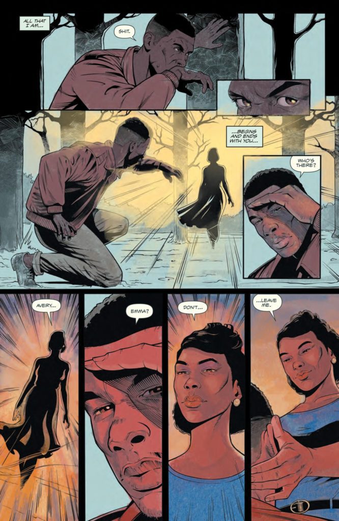
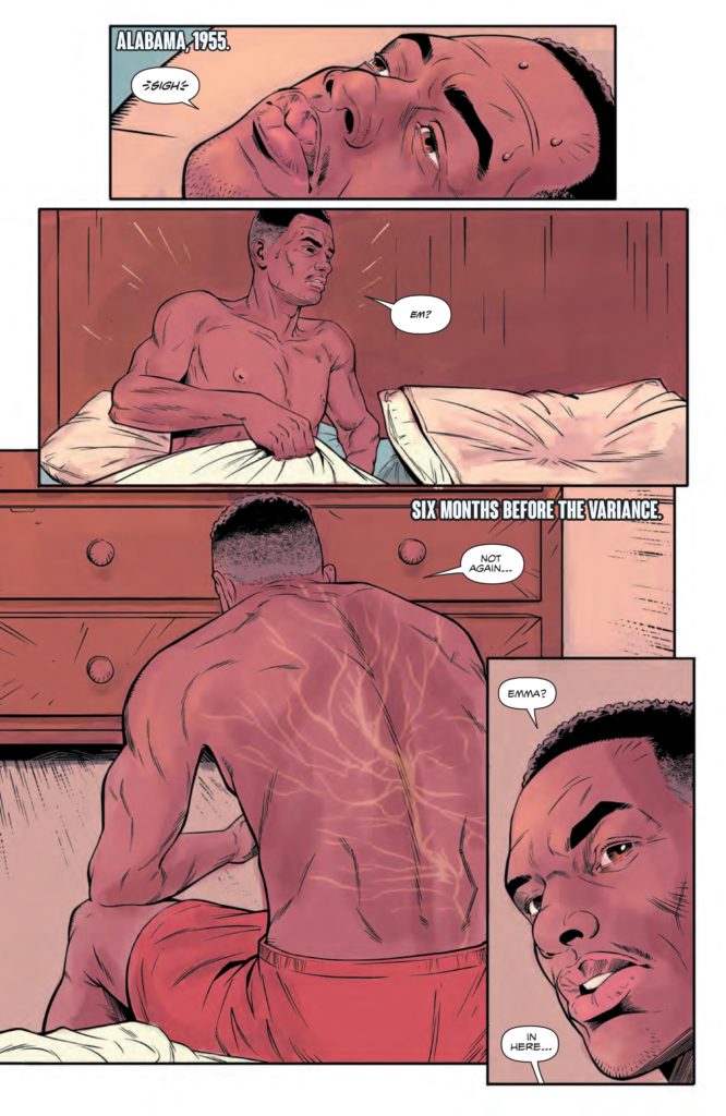
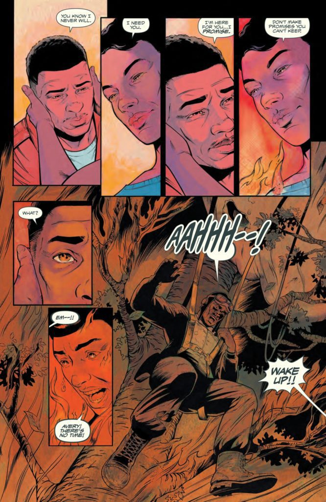
Writer Latoya Morgan and artist Walt Barna return with an emotionally powerful new chapter with Dark Blood #2. Morgan crafts a script full of both loving hope and ever-frustrating injustice. Guest artist Moises Hidalgo, along with colorist A.H.G. and letters from Andworld Design, all help Barna create a setting and characters that pull the reader into the story with ease. This is a second issue that carefully builds towards the inevitable super heroics, and it makes this story increasingly engaging.
“Does even the kindness of strangers come with a cost? Avery has adjusted to his post WWII life in Alabama but when an altercation with some local boys leaves him hurt, an unlikely bystander steps in. And while Carlisle, a white university doctor, not only offers Avery immediate first aid but free ongoing medical care… nothing is truly free, not even a stranger’s kindness.”
Writing & Plot
Writer Latoya Morgan makes the brave choice to be deliberately methodical in Dark Blood #2. When I say brave I’m remarking on the fact that this entire second chapter is a big flashback. Here we get to see Avery living with his family and witnessing his experiences in the segregated South before his powers manifest. Morgan lays down a strong emotional base for us to relate to Avery that also re-contextualize his struggles as a black man and a war veteran. Witnessing him live with and work for his family’s happiness makes us care for this character even more than we may already have. His wife and daughter are written wonderfully as well. The trio all read and feel like real human beings with quirks and numerous qualities. Morgan’s decision to use a whole issue for backstory pays off in spades with a beautiful and emotional second chapter.
Art Direction
Walt Barna, along with guest artist Moises Hidalgo, capture intimate character moments beautifully well in Dark Blood #2. The two artists get to focus almost entirely on characterization through expression in this issue. Most of the art is animating characters as they react to one another, both loving families and hostile neighbors. Barna captures the emotional range perfectly. There are picturesque moments of sweetness, dotted by realistic worry between Avery and his wife. These are juxtaposed by faces twisted in malicious malice, reminders of Avery and his family’s reality. The environmental art is stellar as well. Barna nails the sense of place and time, recreating 1950’s Alabama country and small towns with genuine detail. Hidalgo’s guest art is noticeably different from Barna’s, but only slightly so. The guest artist maintains the book’s visual style without missing a beat.
I dare attribute the clean transition between the two pencilers to the colors from A.H.G. The colorist uses a softer palette of mottled greens and browns blended with warm interior colors. The visual feel these colors provide sells the time period and tone of the scenes. The mud roads of rural Alabama look hot and sticky. Avery and his family’s home is bathed in warm light. The restaurant Avery works at is colored by harsh fluorescent light. A.H.G’s work here is both practical and tonally rich. The lettering from Andworld Design is clean and spot-on in terms of crafting dialogue tone. The modern-style font changes size and italics to match a scene’s tone very naturally. This is a stellar comic on the visual end.
Verdict
Dark Blood #1 is a bold and emotional second chapter for this uniquely built comic series. Latoya Morgan scripts an issue that focuses on us getting to know Avery as a family man and gets us to know him for what he fights for. The visuals from Walt Barna, Moises Hidalgo, and A.H.G. are well-animated and tonally rich. Be sure to grab this issue when it hits shelves on 8-26!
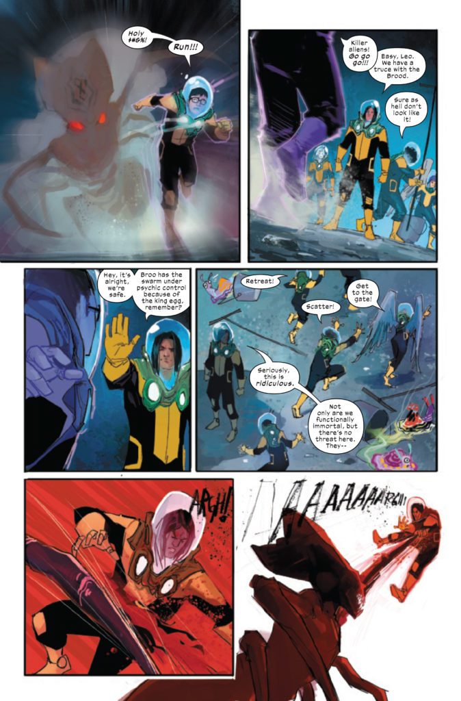
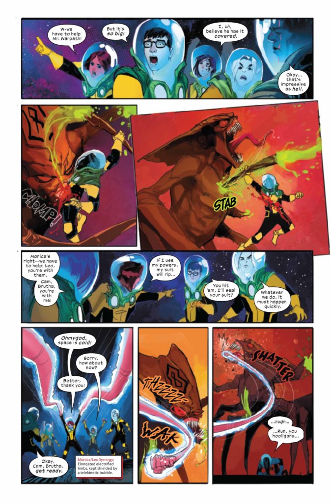
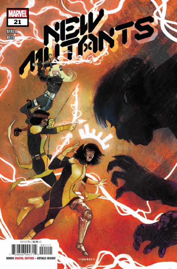
NEW MUTANTS #21 hits your local comic book store September 1st, but thanks to Marvel Comics, Monkeys Fighting Robots has an exclusive early preview for you.
About the issue: MAYHEM ON THE MOON! There’s something creeping in the shadows of the Summer House…and the NEW MUTANTS are about to come face-to-face with it. And back on Earth, the team is turning against itself as they gear up for their biggest battle yet.
The issue is by writer Vita Ayala and artist Rod Reis, with letters by Travis Lanham and Joe Caramagna. The cover is by Martin Simmonds.
Check out the NEW MUTANTS #21 preview below:
Are you reading NEW MUTANTS? Sound off in the comments below!
Welcome to Self-Published Spotlight, a regular interview column where I will be highlighting self-published comics and the creators and small print publishers who make them.
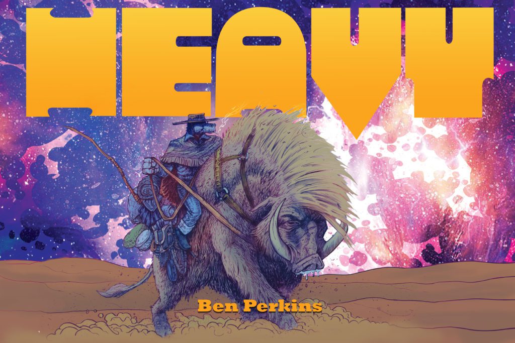
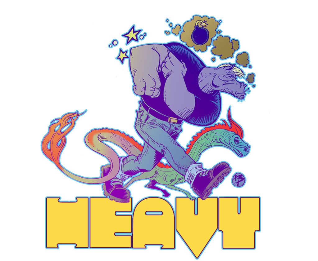
When I started seeing Ben Perkins’ art on social media, I was floored. This guy can draw! So when Ben launched the Kickstarter campaign for his book, HEAVY, I was immediately on board. The book has reached its goal, and with the end of the campaign looming, the prospect of holding HEAVY in my hands has me stoked beyond belief. I reached out to Ben and he was gracious enough to take some time to chat about his art, process and of course HEAVY. Make sure to support and grab the book before the campaign ends!
Monkeys Fighting Robots: First off, thanks for taking the time to talk Ben, I know how busy you are with various projects!
Ben Perkins:Thanks for taking the time to speak with me. Very exciting times and I’m never too busy to talk about comics!!
MFR: I always start every Spotlight by asking about comic book origins. So what’s your comic book origin? When did you get the four-color bug?
BP:My comic book origins are murky. I know I loved cartoons from an early age and was really into the Batman ’66 show which would run on Nickelodeon in the afternoons and weekends, and I know comics swirled around somewhere, but it was really in fourth grade when my buddy Alan gave me a Flash book, I can’t remember the issue, but I do remember it ended with this huge villain, with a morning star beats the bloody paste out of the Crimson Speedster and the last panel had Flash with blood all over his face in the foreground, like RIGHT THERE!!, with this behemoth of a man headed towards the city. I was riveted. After that it was finding them at the drug store and such. It wasn’t until I got in high school, I learned there was a comic shop in my small town and then I was nearly spending every day there.
MFR: Do you have a comics Mount Rushmore? Who are your biggest influences?
BP: Mt. Rushmore of comics, huh? I can never remember how many white dudes are carved upon that stolen rock. Four? Five? Regardless, I think mine would be Miller, Eisner, Mignola, Smith, and Klaus. (I know there are four, I just cheated.)
MFR: What’s your favorite thing about creating comics? Or favorite thing about comics in general?
BP:My favorite thing about making comics is the puzzle making. For me, it’s the layout. I love laying out a book, and when I learned that a good trick is to lay out the entire book at once, it unlocked so many things for me, in terms of pacing, viewing angles, etc. I like the fact that, if I can use filmmaking as an analogy, you get to be everyone. The director, the costume designer, the special effects house, the editor, the choreographer, make-up artist, lighting, set designer, etc. It’s daunting when you really think about tearing down all those decisions into a whole department of people, you understand just how much thinking goes into cartooning. For me, at least.
MFR: Alright so let’s get into HEAVY. Can you give us an elevator pitch? What’s the history behind the story and idea? Is it something you had been cooking for a while?
BP:The pitch for HEAVY is very simple: In a ruined world, Heavy must navigate the wastelands to restore balance to a world he has inadvertently destroyed. The history behind the character is long. Very long. I’ve been developing this story for fifteen to twenty years. Honestly, I’ve lost count. It started as a joke between me and some roommates I was living with when I was in my early twenties and had just moved to Portland. Years later we would reunite and reminisce and he mentioned this “heavy horse” threat we used to use and it just sparked my imagination and I saw this horse-headed badass coming out of the shadows. Really powerful. It didn’t start how it ended up. It started as a joke. A farmhouse horse who took mushrooms all the time. It was limited. So I just kept rotating worlds around Heavy that I thought would work. None really did until I realized I could use the horse motif easier if I made the story a western. That’s when the ideas I’d been cultivating really took off.
MFR: This is also your first Kickstarter project. What made you take the leap and what was the process like?
BP: Kickstarter wasn’t an easy decision for me. Primarily because of how I was aware that not all of them did well, and the people I saw running the successful ones seem a heck of a lot smarter than me. I was at the time in a fortunate position of having a small publishing company license the pages for their app as I was creating the pages for the first issue, effectively paying me to work on the book. It was a real dream come true and a real nice bump in finances, but they had to close because the publisher felt the app wouldn’t be viable for what they were spending. Fortunately, I had the first issue all done. So I decided it was time to maybe crowdfund and see if I should make more of this book.
MFR: Kickstarter has become one of the best ways to publish comics. Why do you think the method has taken off so much?
BP:Kickstarter has taken off for most because you can control every aspect. This is my first one, so I have no real experience to speak of, but I took about three weeks to read, and speak to other folks who have run a campaign so I could understand the pitfalls and responsibilities. I wanted to understand the amount of work it would be, and I’m glad I did. I still have the other side, with the fulfillment section, that will be when the real work comes in, but I’m prepared and excited.
MFR: Do you think you will use Kickstarter again on a future project?
BP: I will definitely use Kickstarter in the future and be able to really take advantage and try something new. I don’t know what that would be, yet, hopefully, more Heavy, but I have other ideas that are coming into fruition and other gimmicks I want to try out that I think people will really enjoy.
MFR: Your art is fantastic. There is a lot of weight and texture to it. How do you create the images? Like what tools do you use? More specifically, what is your creative process like?
BP:Thanks for the compliments about the art. I appreciate that. I just use regular pencils. I have some Japanese brush pens I like and I love my Gpen, but I’ve been using digital a bit more, obviously for coloring, but I’ve found some brushes that simulate what I need to do. I can never give up the analog though, so most of the Heavy pages are traditional pen and paper.
MFR: Did you approach HEAVY differently than past projects?
BP:Yeah, with HEAVY, it was this thing where I had this character that I didn’t know what to do with. It started as a Miller/Sin City kind of homage/spoof, and I didn’t really like that, because I couldn’t write detective fiction at the time, and so the world around him and his role in it kept getting redefined. A boxer, a mental patient, a cab driver, all these things and different worlds and tones for each. It was getting overwhelming. So I hit on the idea of trying to do every version. Then when I made Heavy immortal, that was the key. From there everything seemed to fit. It was a trope, in a way, but it was a way to give his moods context by time period. It was a weird notion I clung to. Then just figuring out what that world would be like with him running around on this planet. And what would happen if his meddling may have accidentally destroyed Earth? What would happen then? How do you fix that? How do you take responsibility for that? That’s the story I found.
MFR: Are there any other projects you want to mention or talk about?
BP:I’m doing a number of fan projects. Both Batman fan comic projects, 1963 Annual and Darker Image. I have a secret anthology I’m a part of that I’m excited about. I’m in the new WEAPON ECHH, which I’m super happy with. What else? Oh! I have an original graphic novel dropping on Friday so I’m excited to share that at that time. I’m working with Eli and Cosmic Lion for a really cool gimmick I think I’ll keep to myself right now, but I can almost promise you’ve never seen a comic like it. That I’m really excited for!
MFR: Can we expect more HEAVY stories in the future?
BP:With HEAVY, I don’t know what to do with him now. I have the first half of the next issue done but I’m at a stage with it right now that I’m thinking of restructuring. Initially, it was very overblown. It took me about a month to figure out how to make it twelve issues. I really like the idea of that, but as a Kickstarter, I’m not sure I can ask people to hold out and keep coming back, and I don’t know how long twelve issues at average 40 pages a piece it’ll take me. I’m debating seeing how much fat I can trim off and still be able to tell the story and see if I can shrink it to half the size and make it a one-and-done type of adventure. Jim Rugg’s AFRODISIAC kind of inspired me on how to handle a character in multiple ways. I don’t think I can use that exact model, but that off-balance nature of the narrative he was pulling off, while at the same time keeping everything in this understandable continuity, is something I took away from that project. Plus it looks really pretty.
MFR: Where and how can readers get your work and output?
BP:Right now, my Kickstarter is where you can sign up for the first issue of Heavy. You should be able to search that and it’ll pop right up. I have a book I did with a very good friend of mine over at galaxygator.net which is Galaxy Gator. I think there are five or six issues. There’s a trade. It’s actually pretty beautiful and a great all-ages book. Very proud to be a part of that one. Otherwise, I’m plugging things on Facebook, I’m @brattyben on Instagram and if you’re a dinosaur like me, DeviantArt as well.
MFR: Any final thoughts or comments you wanna share with us?
BP:Anyone out there that wants to make a comic, just do it. Keep on keeping on!
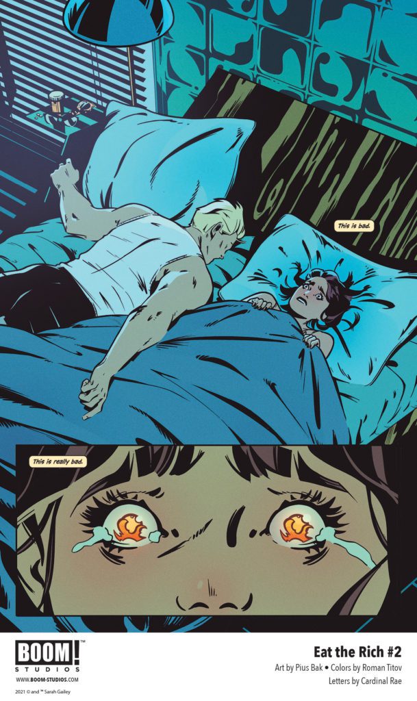
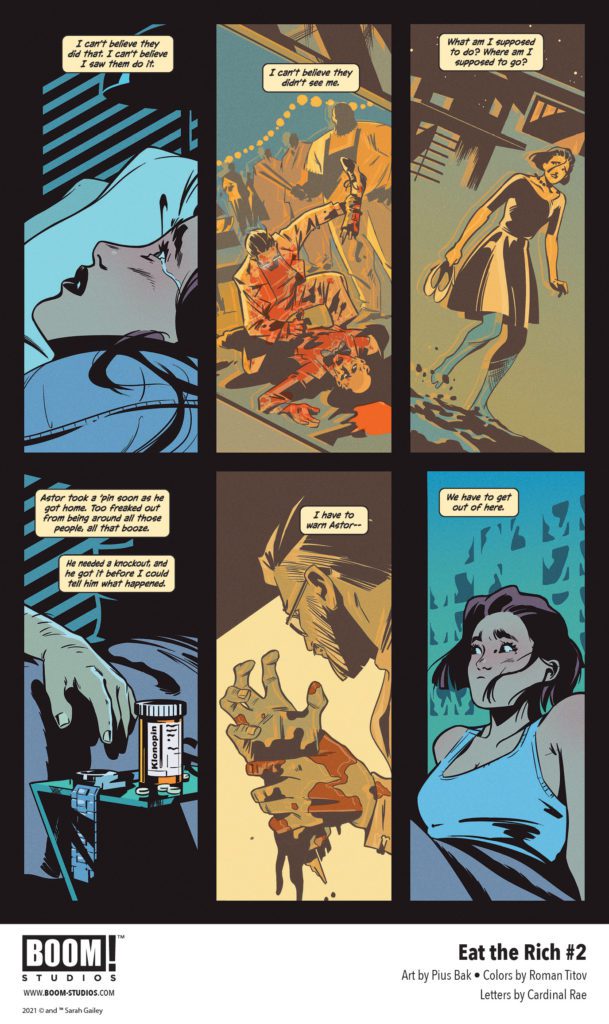
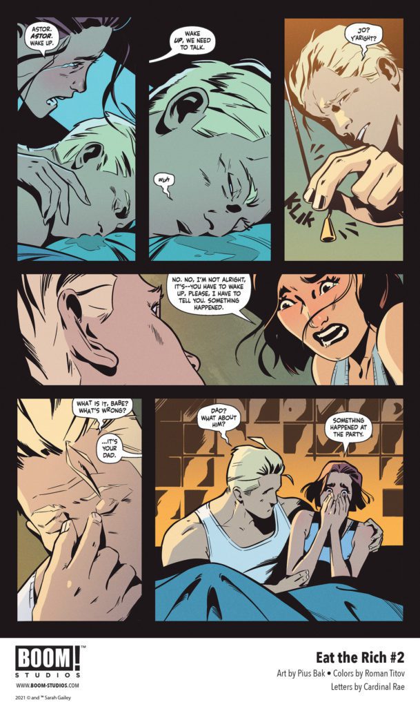
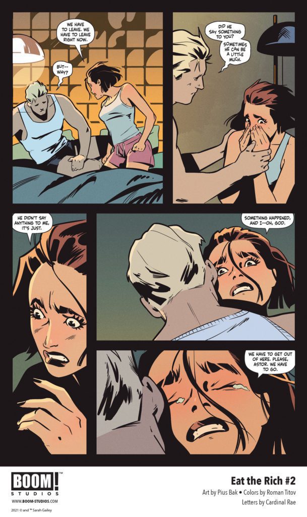
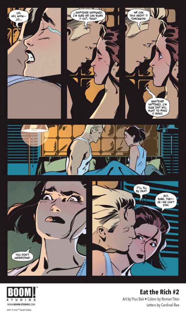
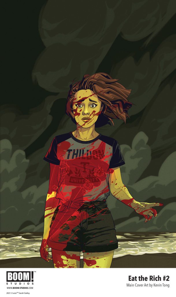
EAT THE RICH #2 hits your local comic book store September 22nd, but thanks to BOOM! Studios, Monkeys Fighting Robots has an exclusive five-page preview for you.
About the issue: Is Joey willing to pay with her life to uncover the gruesome secrets behind Crestfall Bluffs? Joey is beyond disturbed by what she has just witnessed, but when she confides in her boyfriend Astor, his reassurance about his family’s weird rituals and traditions only fuels her suspicions. As she digs further, what she finds produces more questions and danger than answers!
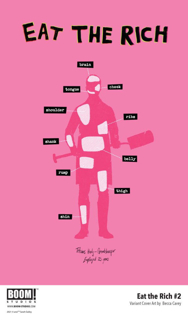
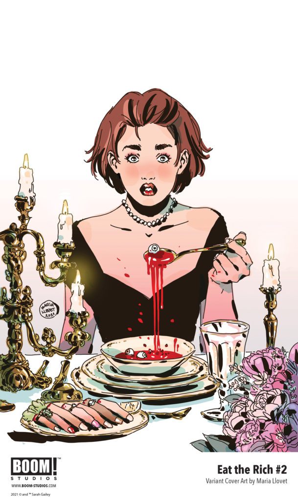
EAT THE RICH #2 is by writer Sarah Gailey and artist Pius Bak, with colors by Roman Titov, and letters by Cardinal Rae. The main cover is by Kevin Tong, with variant covers by Becca Carey and Maria Llovet.
What unspeakable horrors are lying in wait behind the idyllic lives of the one percent?
Check out the EAT THE RICH #2 preview below:
Are you reading EAT THE RICH from BOOM! Studios? Sound off in the comments!
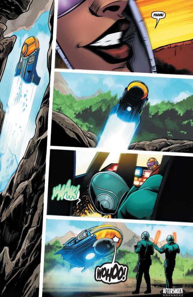
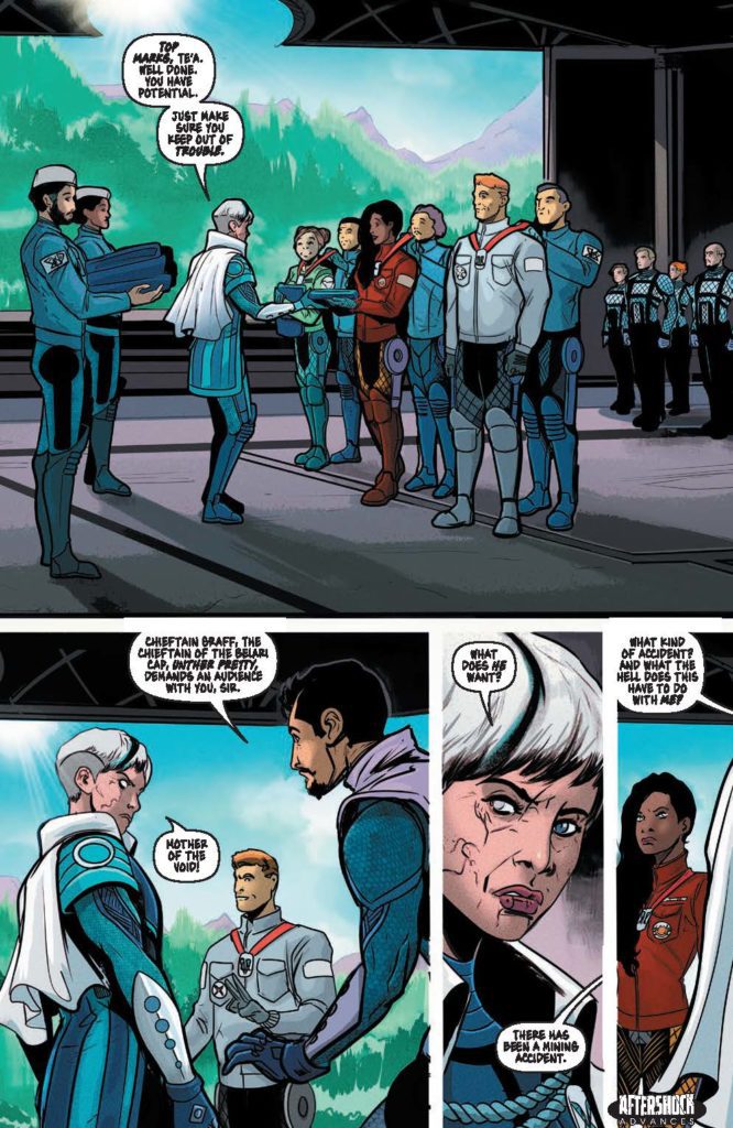
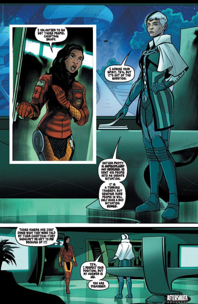
CLANS OF BELARI #3 hits your local comic book store September 15th, but thanks to AfterShock Comics, Monkeys Fighting Robots has an exclusive four-page preview for you.
About the issue: After Gummy bribes the right people, Te’a is able to pursue her dream of being a pilot. As it turns out she is a gifted pilot, whose accomplishments quickly earn her notoriety. But her maverick decision-making puts her at odds with her own Chieftain, Burke Graff.
Cluthian’s quest for alien-tech weaponry leads him to a surprising discovery: a technology that is destined to alter the balance of power in the System. But for Cluthian to carry out his plan, he needs someone capable, and expendable…
The series is by writers Rob Blackie & Peter Blackie and artist Daniel Maine, with colors by Carlos Lopez, and letters by Taylor Esposito. The cover is by Andy Clarke with Jose Villarrubia.
Check out the CLANS OF BELARI #3 preview below:
Are you reading CLANS OF BELARI? Sound off in the comments!
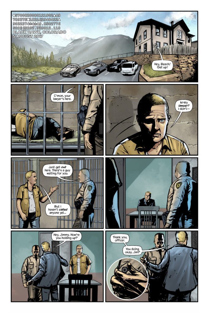
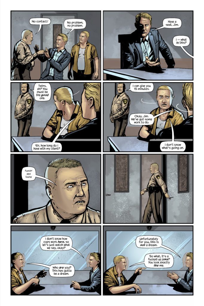
Martian Lit’s The Tessellation #1 is, quite frankly, terrifying. But it’s not necessarily a horror comic. Its scares go deeper than a typical horror story. The Tessellation isn’t about ghosts or nightmares. It’s about all the little, seemingly insignificant choices in life that can lead to all kinds of horrible consequences. Writer Mike Phillips, artist Hernán González, colorist Javi Laparra, and letterers Julian Darius and Steve Legge deliver a haunting first issue to this anthology series, all about how easy it is for your life to go off the rails.
The Premise:
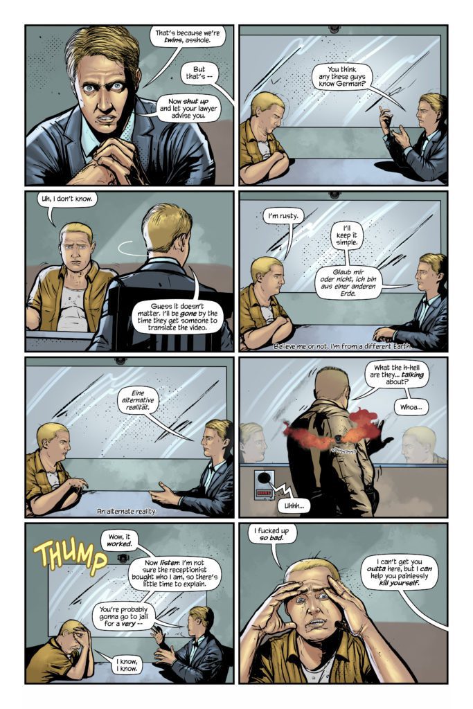
What if every decision you (n)ever made, big or small, became a new reality, with infinite you’s living out those decisions. What if you could travel to these other realities, even observe other versions of you? Welcome to The Tessellation. This dazzling, mind-bending first issue tells four related stories in four separate “reality rows,” playing out horizontally through the issue… Buckle up for a new kind of anthology!
Writing
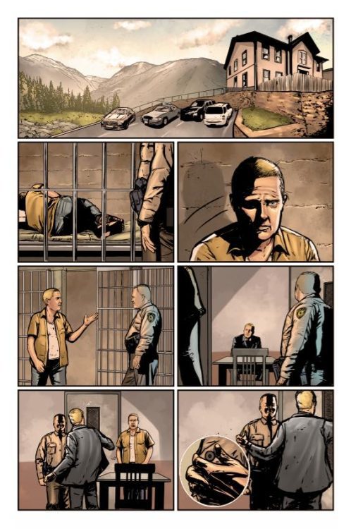
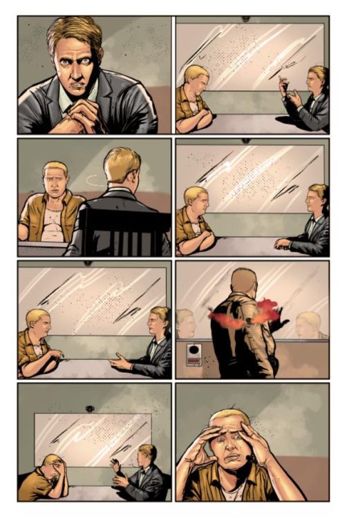
The Tessellation #1 marks Phillips’ first outing as a solo writer in comics. But you certainly wouldn’t know it. Phillips’ confidence in storytelling is what makes this issue so compelling. Instead of carefully setting up the rules of this narrative, Phillips throws readers right into the action. We see the life of our protagonist, James Beach, play out. Or maybe “lives” is the better word. At first, the issue seems to be stuck in a loop. The same scenes happen over and over. But as the issue progresses, tiny changes begin to occur. Soon, we’re witnessing massively different versions of one person’s life. And Phillips lets each of these moments speak for themselves. No explanations are provided, no exposition dumps occur. Instead, the reader coaxes answers out of every scene, getting fully immersed in the world this creative team has created.
It’s tempting to go into more details about the plot and the incredibly efficient script, but it’s the process of discovering these details that make this such a strong first issue. Phillips is a master of the golden rule of writing: “Show, don’t tell.” What seem like normal conversations are full of subtext. Little quips from characters are actually brilliant tools for Phillips’ worldbuilding. The Tessellation #1 is subtle and explosive, all at the same time.
Art
González creates a visual rhythm in these pages. As the issue begins exploring the idea of multiple realities, we see rows of repeated images. But it’s when these realities begin to diverge that González’s work really shines. An image of a hospital bed is juxtaposed against an image of a bed from a brothel. Similarly, a scene in a graveyard mimics a panel of a couple fighting. The gravestones stand in a similar place in the panel as the couple did before. González seems to be showing that even James’ worst moments have become impossible to get back to. That reality is dead to him now.
González also hones in on each character’s body language in this issue. You can see the awkwardness of James trying to be a good dad. His shoulders are tense and his face is anxious. Elsewhere, you can see his casual anger or disregard for morality. It’s in the shape of James’ brow or the look in his eyes that González tells us everything.
Coloring
Laparra’s coloring shows us a lot of the differences in James’ many lives. The James we meet at first, stuck in a prison cell, lives in a world that’s devoid of color. When his alternate self shows up, we see a huge difference. This version of James lives a colorful life. His panels are full of bright red signs and vibrant blue suits. He’s an adventurer. But the other versions of James are often just busy surviving. In their lives, we see when tragedy strikes that color slowly fades from each panel. Laparra is showing us visually how much each loss is affecting James’ outlook on life.
Lettering
Darius and Legge’s lettering is brilliant. Right from the get-go, we see how they’re always changing up their font to show rhythm or volume. When James is confused by his lawyer’s presence, the cop in the scene has had enough. “fuckin’ jeez louise,” he says in small lettering. The lower case “F,” even the oversized “ee” in “jeez,” tells us everything we need to know to hear this line in our head. But that’s far from the only brilliant example of lettering in this issue. At one point, the rows on the page almost act as a kind of acceleration of events. We see bad things occur, and they get worse and more impactful as the page goes down. Darius and Legge mirror this in the sound effects. As the page progresses the sound effects get bigger and more messy looking, showing us the impact and destruction caused by each moment.
Martian Lit’s The Tessellation #1 is an incredible start to this anthology series. This creative team presents a complicated idea in a surprisingly simple way. Yet, they never overexplain or talk down to the reader. It’s a smart, tight script for a great new series. We can only hope there’s plenty more where that came from!
From Martian Lit Comics comes a fantastic new anthology series, The Tessellation. Writer Mike Phillips sat down with Monkeys Fighting Robots to talk about his strange and brilliant new sci fi series.
About The Tessellation #1: What if every decision you (n)ever made, big or small, became a new reality, with infinite you’s living out those decisions. What if you could travel to these other realities, even observe other versions of you? Welcome to The Tessellation. This dazzling, mind-bending first issue tells four related stories in four separate “reality rows,” playing out horizontally through the issue… Buckle up for a new kind of anthology!
Written by Mike Phillips, with art by Hernán González, colors by Javi Laparra, and letters by Julian Darius and Steven Legge.
Monkeys Fighting Robots: Thanks for being willing to do this interview. Again, I absolutely loved this issue and am excited to talk about it. I feel like there’s so much to talk about and I could go on for days. This is really one of those issues that when people read it they’re all going to go, “Damn, I wish I’d thought of that!”
Mike Phillips: It’s my pleasure! Thank you for the compliments! I’m so happy you liked it!
MFR: My first question for you is something you cover a little in your afterword, but I’d still love to revisit it. You mention that THE TESSELLATION #1 partially sprung from your anxieties as a new parent, finding that you picture yourself doing the wrong thing. How did you go about harnessing that and making a story out of it?
Phillips: I don’t know about other parents’ experiences, but I know from mine that there isn’t a week that goes by that I don’t feel like I could have done more with / for my kids. I’m tired. I’m grading quizzes. I’m writing. I’m decompressing from work. I’m whatever. And during all of that, my boys are asking to play, asking about life, needing to be fed, needing to be washed, wanting to tell me a non-sequitur-laden adventure they had. And when I sometimes say “I can’t do that right now,” I immediately feel like a piece of shit. It’s inevitable and depressing.
But not only that, I’m in charge of these wonderful beings. Their life is in my hands most of the day. I drive them around. I make sure they don’t fall off of the playset. I make sure they don’t choke on their food. You get the idea. You can imagine what my overactive imagination does with all of that stimuli. And then there’s a whole other branch of this relating to how I treat my wife… So long story short, it’s pretty easy to come up with a bunch of story ideas of a dad / husband who fucks all of that stuff up.
MFR: Another thing you mention, which I love, is your willingness to just do things with the idea that “If it makes sense to you, then keep going!” A lot of writers have a tendency to do too much hand holding, but you just throw us right into it. It’s great! Did that approach happen from the beginning or did you go through a few drafts before working up to that?
Phillips: Yes, that was the game plan from the outset. It was the only way this comic was going to get finished. And as I mention in the backmatter of the issue, it’s all David Lynch’s influence. That dude rarely explains anything. And that was a mantra for me. I’m an over-explainer by trade; as a K-to-12 teacher I was taught to deliver the curriculum in many different ways. (They called it “differentiated instruction”; every student absorbs information in their own way, so try to reach them all by disseminating the info in as many ways as you can: verbal, visual, auditory, tactile, etc.)
I had to mute that instinct, which was a challenge, because I’m OCD, so there’s always an urge to say it and double back and say it again in a different way. But being a student of David Lynch helped me just shut all of that out and trust where the story took me.
MFR: I just kind of marvel at your confidence in storytelling, in that sense. It’s very refreshing.
Phillips: Thank you so much! I had a lot of good teachers: Grant Morrison, Alan Moore, Neil Gaiman, Frank Herbert, David Lynch, Stephen King, George R.R. Martin, Paul Chadwick, Christopher Nolan, and Julian Darius. They created the guide posts.
MFR: This next question is kind of a double-whammy. Your titles are awesome. The Tessellation is great, tessellations even show up on the page layout. “A Nicer Cage” is also brilliant. How do you feel these titles tie into the themes of what you’re talking about?
Phillips:The Tessellation as a title was a long time coming. How to sum up the Multiverse, you know? Eventually I settled on the idea that all of our realities are right next to each other. All nestled in together. Just a decision away from each other. I was trying to find a title that would encompass the entire thing. So I envisioned that every reality was a corridor, from the past to the future. The best “tube” I came across was a hexagon, as they can tessellate into infinity, so I ran with it. Only later did I remember that the linoleum flooring of my childhood home was a hexagonal tessellation. Branded in my brain, I guess. The pattern repeated from the dinner table to the stove to the fridge. The hexagons were brown and the lines between were beige. Totally ’80s! As far as the issue’s title “A Nicer Cage,” I’m going to leave that to interpretation.
MFR: Going back to the tessellations on the page layout: that’s a really effective technique. Artist Hernan Gonzalez does some incredible work throughout the issue. Did you both come up with that technique together? Was it you? Was it Gonzalez?
Phillips: It was me. My longtime collaborator Julian Darius [Sequart, Martian Lit] made the hexagonal “reality borders” from my instructions. I needed a non-verbal way to communicate to the reader that these stories are in different realities, and this seemed like the simplest solution. So after Hernan delivered the art, Julian laid the “reality borders” over the relevant spots.
MFR: This issue is such a great one-shot. Of course, you have more planned as you’re already working on the script of #2. But there are a couple things in this issue that feel like they hint at a larger arc. Loose ends which, even if they just stay loose, are kind of satisfying in a mysterious way, but could lead to more. Do you plan on having these issues include connecting characters and overarching stories? If so, how many issues are you hoping to produce?
Phillips: Yes, there will be many connections throughout the series. It’s a slow burn, however, so I’m hoping readers will be patient with me! My goal is to make at least 25 issues before I go into “crazy climax & finale mode”. But yeah, there will be loose ends that won’t get fully answered, and I’m okay with that. That’s for the readers’ imaginations to fill in, which is another great lesson from Lynch: “If you answer every mystery — if everything gets solved — why would anyone talk about it afterwards?”
MFR: The actual structure this issue takes is just fantastic. The parallel storylines. You mention in your afterword that issue #2 will have characters that are very different from each other. Is that affecting the structure of the issue as you write it?
Phillips: Thank you! The structure for issue #2 is slightly different, but that’s the joy of using this format; there are mutations and avenues I didn’t think of in the first issue. But I’m sure that if readers figured out how to absorb issue #1, then issue #2 will be no problem. Incidentally, issue #3 will be a typical anthology with no “reality rows”. Just a few stories moving the whole series forward.
MFR: You mention some of the work that inspired issue #1. People who you say were good teachers throughout the process, like Morrison, Moore, Gaiman and Herbert. Who were some of your influences for issue #2?
Phillips: I decided that since issue #1 focuses on various versions of a man, issue #2’s main character should be a woman, so I came up with Camila Rodriguez-Santiago. A lot of issue #1 leans heavily on “write what you know”, so I figured #2 should be a foray into personal unknowns. There was a lot more research involved this time. I decided one of the versions of Camila would get into politics, and over the past few years I’ve been inspired and energized by Alexandria Ocasio-Cortez, Stacey Abrams, and Elizabeth Warren.
During my research, I discovered U.S. Representative Louise Slaughter, who recently passed away, but her legacy as an advocate for women’s rights and women’s health was a huge find for me. Simply put, she was awesome. Look her up. Camila’s mom is a strong presence in the issue, and a major influence on Camila, so I made sure to focus on the major female influences in my life: my wife, my mom, and my sister. Between the three of them, I’ve learned so much about empathy, ingenuity, art, self-respect, and tenderness. I’m doing my best to pour aspects of that into these characters.
MFR: And lastly, when are we going to see a TV show of this? I mean, come on! It’s just waiting to be adapted.
Phillips: 2022! Just kidding. (But thank you for the compliment!) Yeah, this has crossed my mind once or twice, and I’m 100% open to seeing other media interpret it. But I did use some of the comics medium’s most unique elements to make it as hard as possible to adapt, didn’t I?! (Totally worth it, though!) I can definitely see a major streaming service using remote-control functionality to allow the viewer to move between the issue #1’s various stories / realities to create an interactive experience.
MFR: Thank you for chatting with us about this! It was a pleasure to read!
Phillips: Thank you! It’s so satisfying to hear that you were entertained! Mission accomplished!
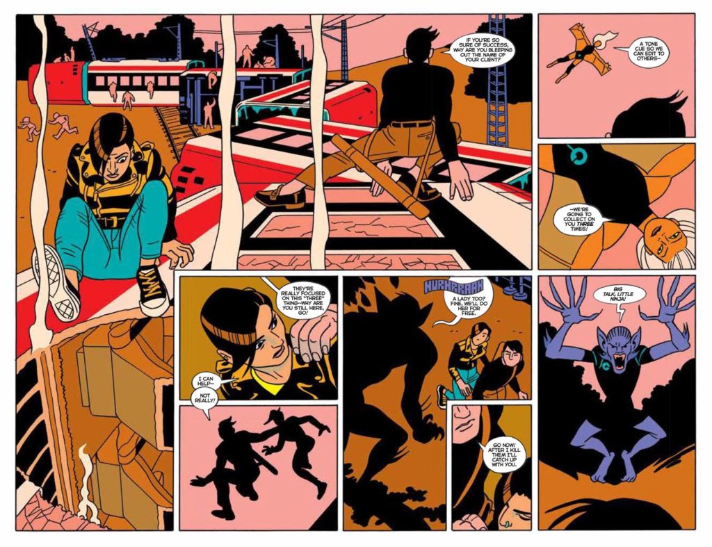
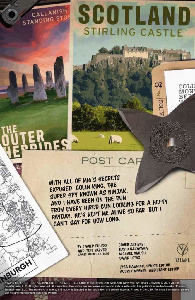
Ninjak #2 from Valiant Entertainment comes to comic stores on August 25th. Writer Jeff Parker and artist Javier Pulido’s high octane series showcases the medium’s biggest strengths.
Background
Ninjak and the rest of MI6’s connections are exposed. With killers at his heels, Ninjak must use every resource he has to survive, and take out the perpetrators.
Simple Stories and Outlines
Jeff Parker’s story in Ninjak #2 follows a simple outline. With Ninjak and his co-starring spy’s covers blown, there’s a strong sense of vulnerability. Between a battle with characters that act as X-Men stand-ins, and the main villains always appearing to be a step ahead, safety doesn’t seem to exist.
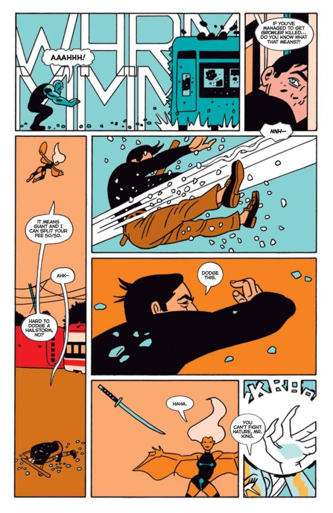
Ninjak #2: Blink And You’ll Visual Storytelling
Ninjak #2 wastes absolutely no time when it comes to its plot’s pacing. With Parker planning out the outline, work in tandem brilliantly to get the plot rolling. Pulido’s visual storytelling, which showcases the strengths of the comic medium, is the real attraction. Readers experience a whiplash effect when they and Ninjak study the faux X-Men’s biographies and powers on a hologram. While the reader may take a while to get through the intel, it’s apparent from the lettering that Ninjak only needed a quick look to turn the tide in battle.
Pulido shows the power of these villains in intricate ways. A spiraling two-page spread with complex panel layouts, character movements, and an artistic display of one villain’s psychic powers guides the reader’s attention. In these instances and the page’s red hues, the antagonists control the reader like they do their enemies.
Report In For Ninjak #2
Ninjak #2 presents many of the exclusive strengths that comic books use to tell stories. Whether it’s the pacing or how the page layouts guide readers through events, readers connect with these characters and to the story.


 Ninjak and the rest of MI6’s connections are exposed. With killers at his heels, Ninjak must use every resource he has to survive, and take out the perpetrators.