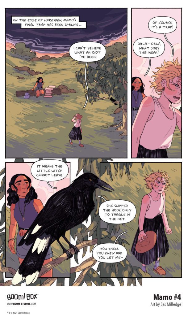
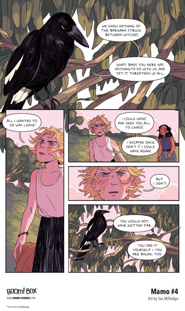
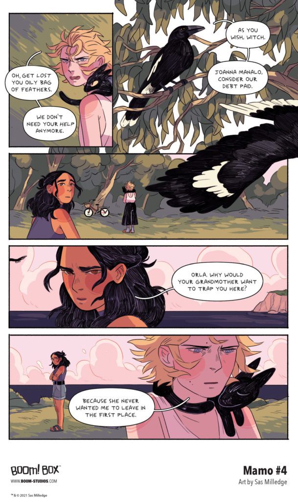
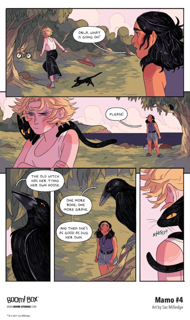
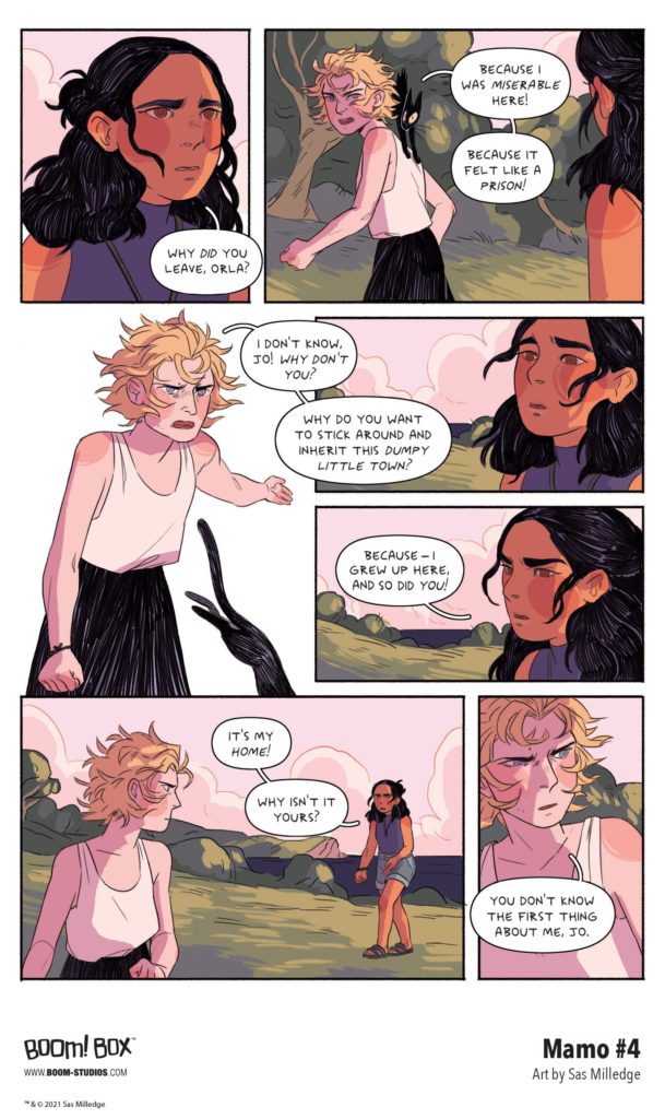
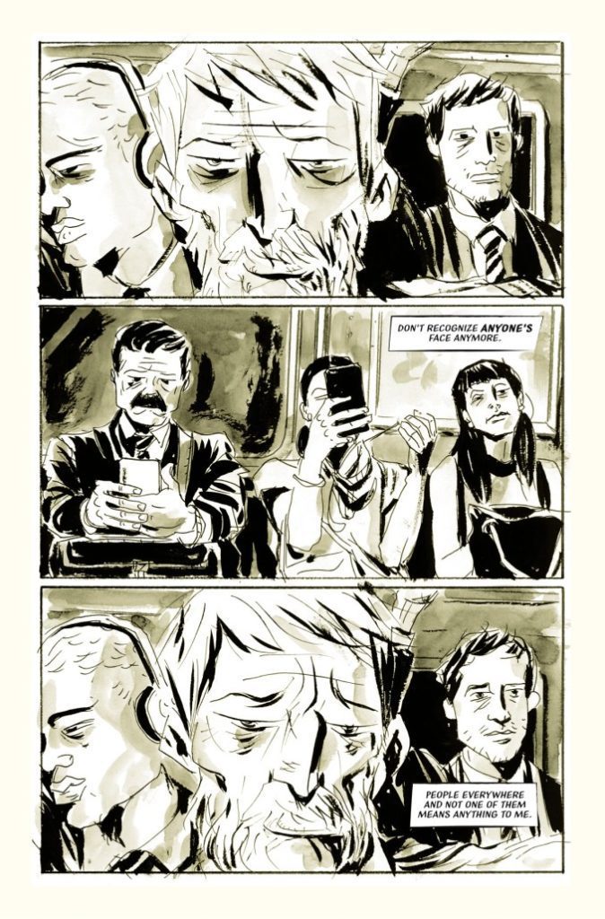
MAMO #4 hits your local comic book store October 13th, but thanks to BOOM! Studios, Monkeys Fighting Robots has an exclusive five-page preview for you.
About the issue: Mamo’s final trick is revealed! Will Orla be able to escape the trap her grandmother set from beyond the grave? And with tensions rising, will Orla and Jo’s burgeoning friendship survive, or is Orla going to have to face Mamo’s angry spirit all on her own? Orla struggles with the fact that if she saves Haresden, she’ll be stuck there forever, but if she doesn’t, the town will fall to chaos and be destroyed. Which will she choose, or is her destiny already written?
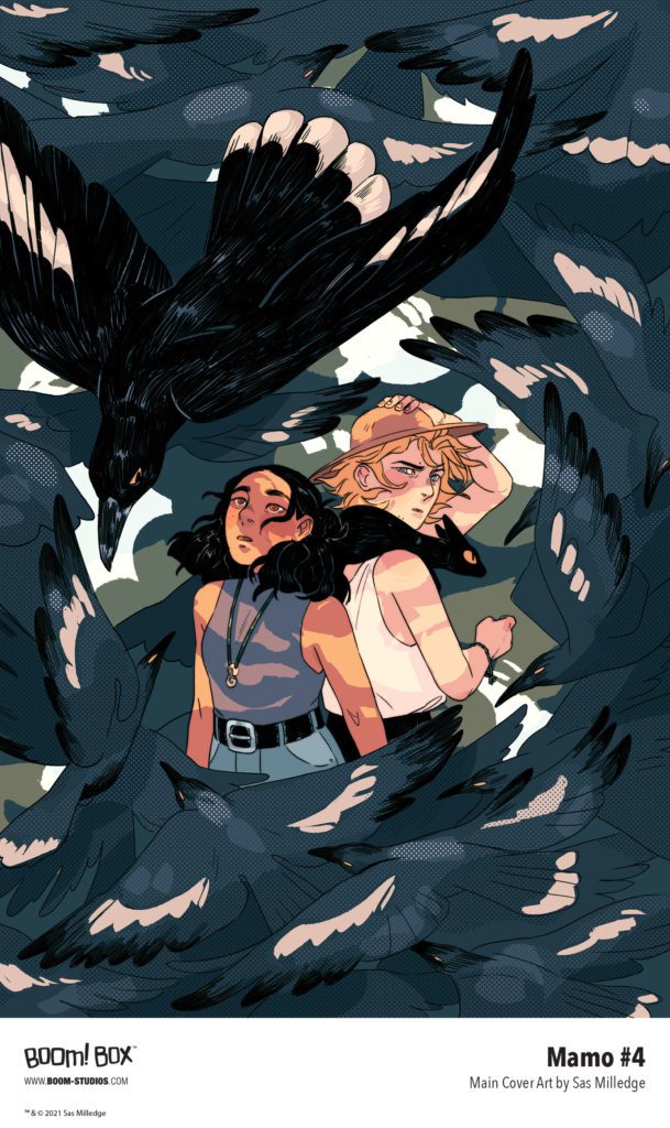
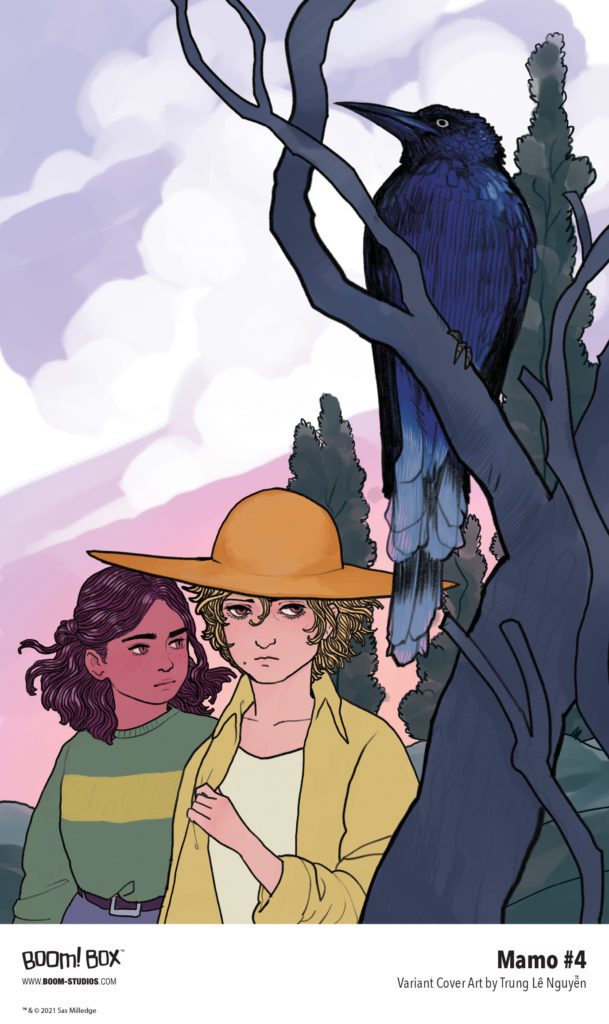
MAMO is the five-issue debut comic series from cartoonist Sas Milledge (The Lost Carnival: A Dick Grayson Graphic Novel). It’s the story of “a young hedge witch who returns to her hometown after her grandmother’s death, only to find an unlikely new friend and a series of mysterious magical disturbances that need to be solved.” Milledge illustrates the main cover herself, with the variant cover by Trung Lê Nguyễn (The Magic Fish).
Check out the MAMO #4 preview below:
Are you reading MAMO from Sas Milledge and BOOM! Studios? Sound off in the comments!
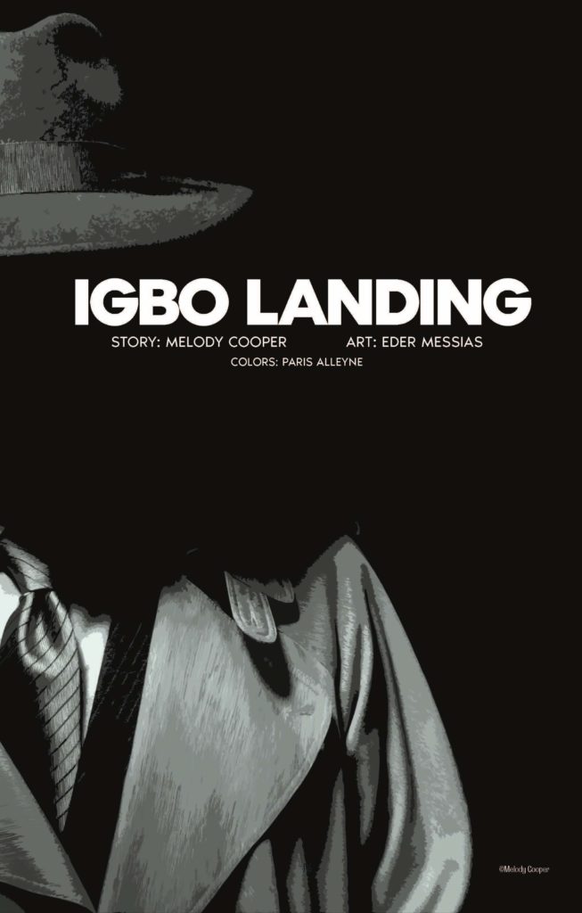
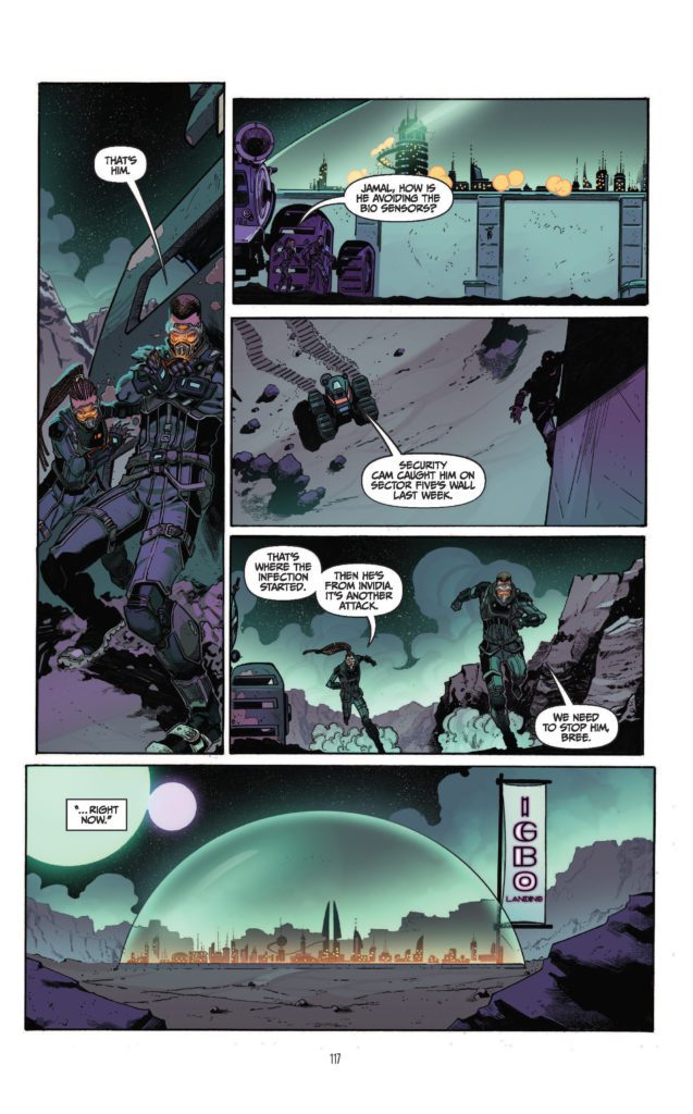
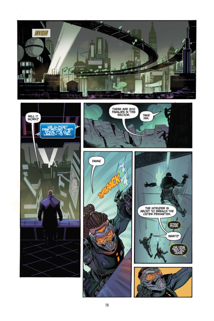
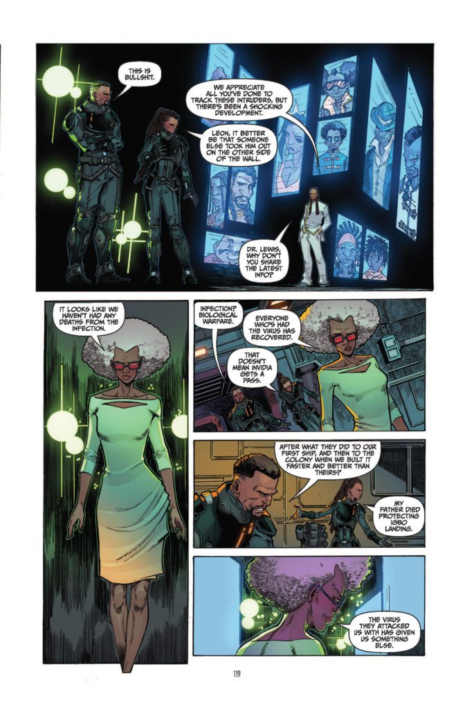
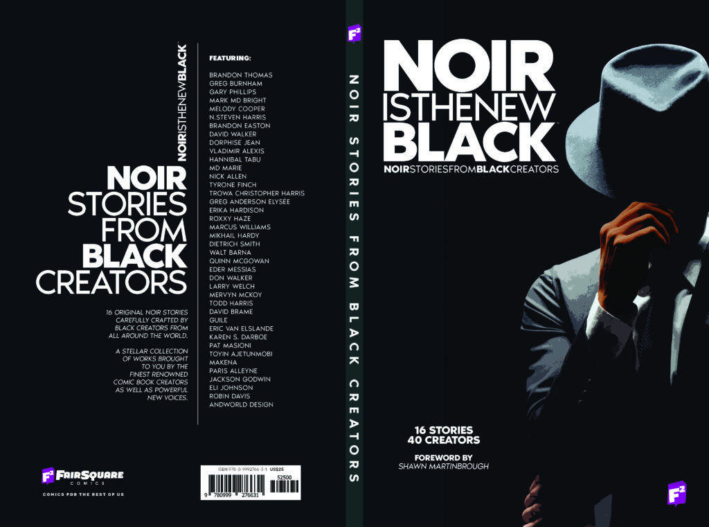
NOIR IS THE NEW BLACK is out in comic shops today, and Monkeys Fighting Robots has an exclusive preview of “Igbo Landing”, one of the short stories in the anthology.
About the book: Unhinged. Unfiltered. Unstoppable…This is Noir Is The New Black: 40 Black creators delivering 16 Noir stories in a unique way. for the first time, the most successful African American comic book creators like David F. Walker, Brandon Thomas, Brandon Easton, Melody Cooper, M.D. Bright, N. Steven Harris as well as a new generation of writers and artists of color from all around the world such as Karen S. Darboe, Walt Barna, Marcus Williams, Quinn McGowan, Roxxy Haze, Greg Burnham, and many more, are banding together for a unique anthology of 100% creator-owned Black Noir comic stories.
The anthology originally launched on Kickstarter last July, and is now coming to comic shops after a very successful campaign. It’s being published through FairSquare Comics, and the stories were curated by Fair Square’s Fabrice Sapolsky and writer/editor TC Harris.
We have the privilege of sharing a preview of one of these stories with you all: “Igbo Landing” by writer Melody Cooper, artist Eder Messias, and colorist Paris Alleyne.
“Black Noir is a different lens to explore ignored shades of nuance in the Black experience. A beautiful dark and blinding light that lets us examine the past, confront the present, and re-imagine the future through the Black gaze of a new Noir.” – Cooper
Check out our preview of “Igbo Landing” right here:
Are you excited to check out NOIR IS THE NEW BLACK? Were you one of the book’s Kickstarter backers? Sound off in the comments!
Horror is a genre with a long history in the comics industry and BOOM! Studios is no stranger to the genre. With past hits such as The Empty Man and the recent original graphic novel The Down River People, the publisher has proven that they can pick worthwhile and chilling titles for their readers. This week sees the release of Maw, described by BOOM!’s Executive Editor, Sierra Hahn, as a series that “expertly uses the horror genre to explore gender, identity, hidden trauma.” Promising gruesome horrors, plot twists, and the examination of the beast inside, Maw has a lot to offer; as long as you aren’t too squeamish.
Maw #1 Credit: BOOM! Studios
The Story
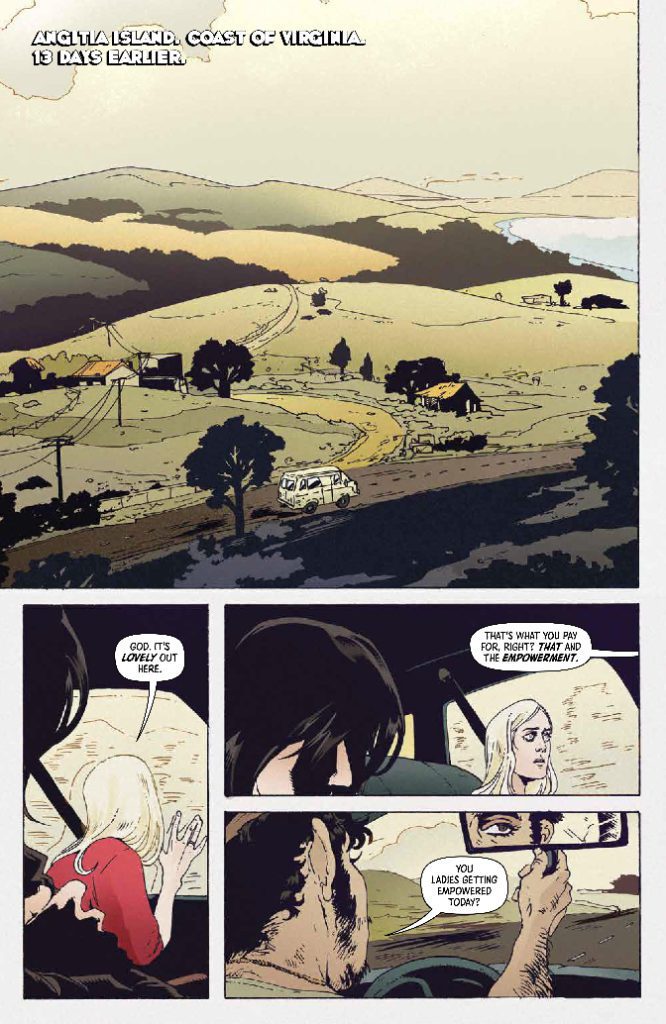
Maw opens with two sisters heading to a women-only retreat on the coast of Virginia. Their taxi driver knows about the retreat and engages the women in conversation. It is through this discussion that the reader is introduced to the characters of the two sisters: their similarities and their differences. At first it is easy to label each woman, with words such as dreamer or cynic. But writer Jude Ellison S. Doyle sets up these labels just to break them down as the story progresses. They make a point of giving these women, and to a small degree the driver, simple traits in the opening to demonstrate how easy it is to characterize individuals. Here are two women who are opposites, positive and negative, and from that you believe that you understand them and their relationship. Doyle would disagree. And as they begin to add depth to the characters, the reader also comes to understand the misjudgment.
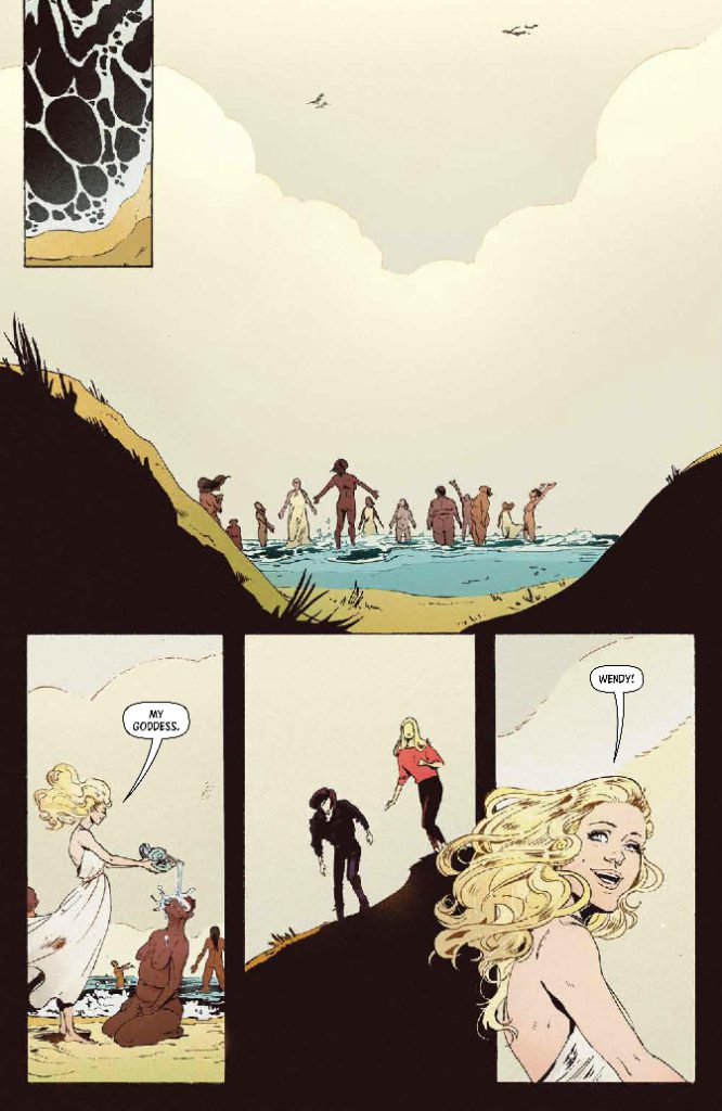
There are a number of other characters within the comic who instantly feel like clichés, but their representations are fleeting. We only experience these people through the eyes of the sisters and therefore our impression is distorted. Miranda, the host at the retreat, is almost angelic with her flowing white dress and long golden hair. But this is what Wendy is expecting. She has high hopes that the retreat will help her and she embraces the place and the experience with awe. Marion, her sister, less so. Through her, we see the local nightlife: a slimy bar with ominous visuals in every panel. The contrast between the two places is striking and yet, as both sisters explore each place, there is a darkness underneath both.
What happens next, and the histories that are revealed, is brutal and disturbing. This is a story about rape and the trauma caused by it. The physical torture is only briefly eluded to but the mental and emotional distress is at the heart of the two sisters characters. How they deal with the after effects, the lack of justice, and their relationship, are the central themes of this opening issue and Doyle brings that dynamic to the page magnificently. The conversations between the two women and their reactions to each other are so naturalistic and realistic. By the end of this first issue, the sisters are fully rounded characters and so much more than the initial ‘types’ that Doyle made the readers see in the opening.
Maw #1 Credit: BOOM! Studios
Cause and Visual Effect
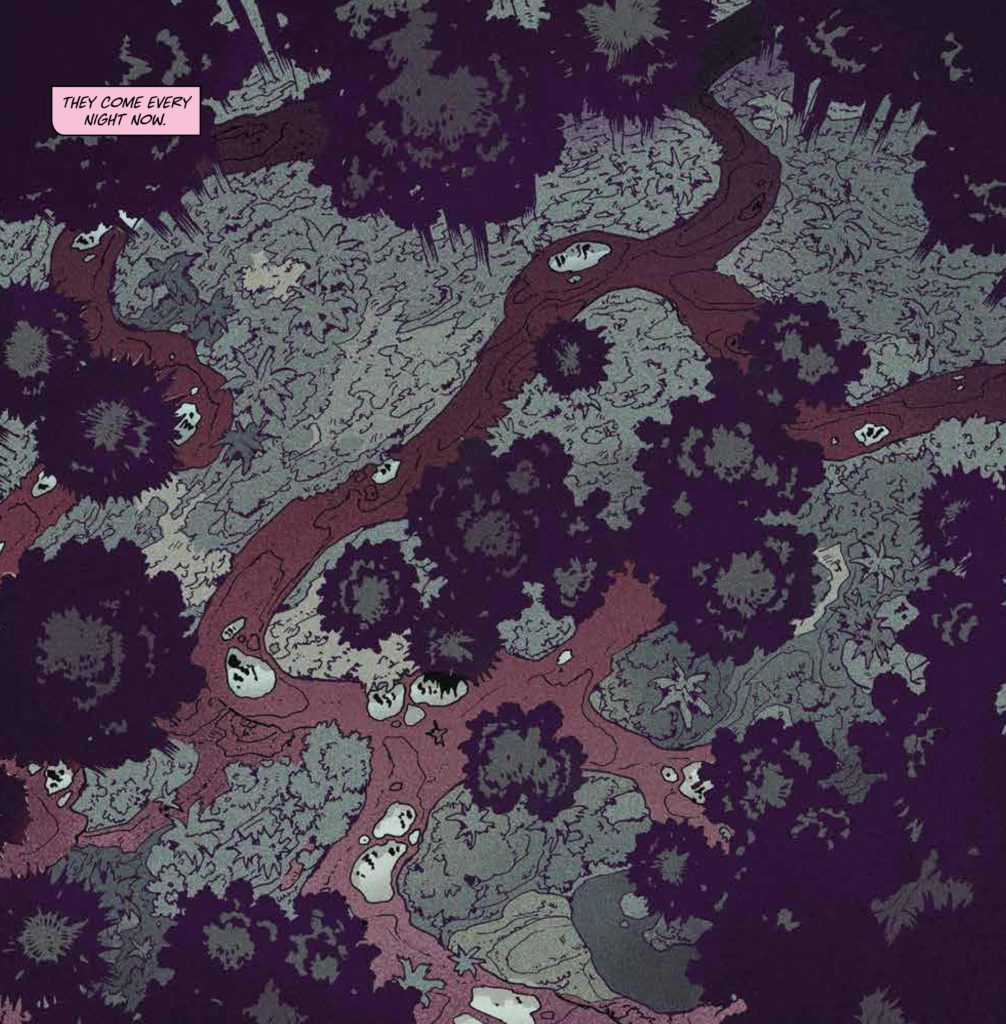
Outside of the central plot there is a visual disturbance that undermines the serenity of the world that the sisters have entered. It is the use of aspect-to-aspect panel transitions, employed by Artist A. L. Kaplan, that gives the world of Maw it’s uncomfortable undertones. Similar to the build up in Ari Aster’s Midsommar, the tranquility displayed by Miranda, the retreat’s host, is undermined by the often obscure cuts to objects laying on the floor or trinkets hanging in a tree. The significance of these is yet to be explained, but their importance is obvious as they become the focus of several pages, drawing the reader’s eye.
Kaplan’s layouts are wonderful as they set the scene, allowing large panels to illustrate the openness of the landscape while smaller panels focus on close ups of the characters and objects. A large number of the pages have a specific rhythm that allows the story to flow across them. But occasionally, the panel placements are more jarring, helping to visually create a sense of unease without picturing anything that is obviously disturbing. This first issue of Maw is about creating an uneasy feeling caused by something that the readers can’t quite put their fingers on. Similar in style to the current Nicole Kidman starring Amazon Prime television series Nine Perfect Strangers, Maw is displaying a safe space while purposefully undermining it. Kaplan uses compositions that would make you feel uncomfortable in a children’s play park and they pick just the right angles for close up shots that make you distrust the characters.
One of the more striking aspects of Maw is the use of color. Fabiana and Federica Mascolo create impactful contrasts between light and dark throughout the comic. The color sets a tone for each scene, as is instantly seen in the shift from the dark purple and reds of the first page to the clear white and yellows of the second. But, as with everything else in the comic, the tones are undermined by the application of a dark shadow across a figure or small streaks of red through the central object of a panel. There is always an implication of something more underneath the surface representations. This is a comic of layers and this first issue is the top layer with areas of translucency indicating the depths.
Maw #1 Credit: BOOM! Studios
Conclusion
The writing in Maw is engaging and allows the story to flow. The art is both beautiful and disturbing, leaving the reader continuously on edge. It deals with difficult subjects in often blunt and direct ways, but this represents the characters perfectly. From a disturbing beginning, Maw never really allows the readers to settle into a safe space, almost contradicting the central location of the story.
There are a number of creators who have recently worked in the modern folk horror genre, people such Alison Sampson, Adam Smith and Matt Fox. And if you enjoy this brand of horror, then you won’t want to miss out on Maw. Making an instant mark with strong storytelling, engaging characters, and stunning visuals, Maw is a massive hook that no reader will be able to wriggle free from.
Writer: Jude Ellison S. Doyle
Artist: A. L. Kaplan
Colors: Fabiana Mascolo/Federica Mascolo
Letters: Cardinal Rae
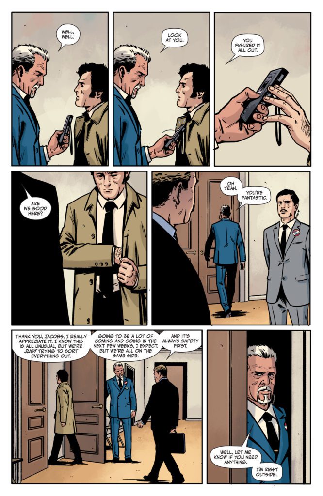
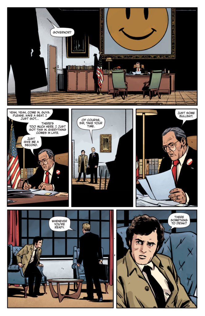
DC Comics’ Rorschach is complicated and subtle. It’s about politics, greed, purpose, and insanity. But every commentary the series is making is also deliberately muddied by the humanity of the characters. Writer Tom King, artist Jorge Fornes, colorist Dave Stewart and letterer Clayton Cowles aren’t dishing out life lessons in this finale. Rorschach #12 isn’t about answers. It’s about being lost and finding some kind of purpose, whether good or bad.
Writing
King doesn’t seem to have an overarching commentary in this series. There are themes of radicalization and the danger of conspiracies. But King’s conspiracy theorists aren’t the big bad guys. They’re dangerous, sure, but the people they’re fighting are just as awful. In Rorschach, everyone is evil. Everyone is lost. There is a subtle beauty to the work of Wil Myerson (Rorschach) and Laura Cummings (The Kid). They may have been insane and tried to assassinate a political candidate, but they lived like the heroes of the old west. Yet their lives were violent and tragic. They caused pain and misery, driving the people they met into insanity.
As King closes this series out, he doesn’t give us a better way of seeing these two. We see yet another person who has been deeply affected by their lives. We see him make decisions that are as heinous as they are inspiring. But it all ends with a smirk. King seems to joyfully leave us in the lurch. He wants us to muddle through and make our own conclusions. His script is robust and wordy, but incredibly stingy when providing information. King fills these pages with speeches, lines from movies, and small talk. We are drowned in a sea of words, but King never tells us what to think. It places us right in the shoes of our protagonist: a man who has to sort through a barrage of information to find real clues. It’s a frustratingly beautiful end to the series that feels truly fitting.
Art
Fornes makes us feel as though we are seeing every moment. Characters move their arms or make different expressions from panel to panel, but rarely does the art move faster than that. We see our detective suit up in his coat and walk out the door. It takes an entire page. We see Turley inhale a cigarette and blow it out his nose. Fornes shows us time passing, but he does it slowly. By doing this, Fornes amps the tension up to 11. We know something is coming, we just don’t know what. Then, when the action of the issue has occurred, Fornes speeds things up. We see scenes from different angles, breezing from one location to the next. It’s the exhale after we’ve been holding our breath.
Coloring
The inside of Turley’s office practically looks like an American flag. Whether it’s the dark blue sky out the window, or the red carpet and drapes, the whole place looks like July 4th. But it’s actually only the actual American flag and Turley’s tie that look bright. Every other red or blue looks a little muted. But Stewart still makes the whole scene feel lifeless. Even the bright colors of the tie and flag look artificial. It’s only after our protagonist has left the office that we see the warm color palette of the night air. It’s not in office buildings that our characters see beauty, but in the world outside.
Lettering
Cowles lettering ping pongs across the page. When Turley tries to look busy, it’s not his body that’s doing the movement, it’s his dialogue. His word balloon comes up on the left side of his face, then in the next panel it comes up on the right. Later, as we hear something happening off panel, Cowles uses height to tell us what kind of energy each piece of dialogue is colored by. The dialogue begins high on each panel, but by the end of the sequence the word balloons are at the bottom. We can see the situation deescalating, even if we can’t see what is happening.
DC Comics’ Rorschachis a series about terrorism, political greed, and the medium of comics. But this creative team doesn’t hold your hand through it or tell you what to think. They show you a story, and when it’s over they simply ask, “What do you see?” Rorschach #12 is out from DC Comics on the 14th of September at a comic shop near you. It is a brilliant and satisfying conclusion to this complex series.
Welcome to Self-Published Spotlight, a regular interview column where I will be highlighting self-published comics and the creators and small print publishers who make them.
Jamie Jones entered my radar when he started drawing the weekly Monkeys Fighting Robots strip. After some searching, I discovered Jamie’s solo creation, The Baboon (a pulp adventurer along the lines of Indiana Jones, Doc Savage and even a little The Shadow) and loved it right away. So when I read that Jamie was doing a new Baboon one-shot, I was on board immediately. I quickly supported it on Kickstarter, then reached out to Jamie to ask him all about the book. Always gracious, Jamie answered all my questions and you can check them out below. And make sure you head over and supportThe Baboon: Skull of A King.
Monkeys Fighting Robots:First, Jamie, why don’t you catch us up on what you have been up to. It’s been roughly a year since we last spoke. When we chatted, The Baboon and Pink Lemonade Jamboree book you did with Nick Cagnetti had just come out. What’s been going on with you in the past year? Jamie Jones:Oh gosh, so much! I wrote and drew the second Baboon Comic, a 94 pager that I’ve been releasing first on Patreon. I bounced around the whole southeast crashing on friends’ couches for several months before officially moving from St. Pete, Fl to Savannah, Ga. I’ve been slowly adjusting to the change. I started a Twitch channel and now I launched a Kickstarter for a Babs one-shot.
MFR: Some of our readers may not be familiar with you and your work, so give us a quick rundown.
JJ: I’ve been doing the self-publishing game since I started making comics. First with Tres Dean and our sci-fi western book, DODGER. Those comics got me some gigs for some pro wrestlers and KICKING ICE (written by Stephaine Phillips). I then went off and made the Baboon 2 years ago, launched the first book on Kickstarter. I also did the ComiXology original book QUARTER KILLER with Vita Ayala and Danny Lore. I’ve been working on Baboon stuff since then. Oh and I do the Tales of MFR comic strip on this here website!
MFR: So let’s get into your latest book, The Baboon: Skull of a King. Give our readers the elevator pitch on the latest Baboon adventure. JJ:There’s a gem-encrusted skull of an ancient king that Babs and Monkey Bones go to recover from an ancient tomb. But, they are not alone. Enter The Baboon’s old rival, The Cyclops Barbarian. And the race to see who can get the skull first ensues.
MFR: What made you go with a one-shot floppy this time? JJ:I wanted to. haha. The beauty of the Baboon and how the book exists in my head is just a lot of one-shots really. One-shots of varying length. The books don’t have one long narrative tie. So when I was working on this story I knew it was going to be a “flash in the pan” kind of story and the single issue fit that.
MFR: Did you use any different approaches, tools or processes on this new book? JJ: Not really. This year I’ve been introducing more Papermate-flair pens into my drawing. But they were always kind of there. I used to draw with those pens all the time in school. Just doodling in the margins. I guess I’m chasing the joy of drawing again. And using tools that I used when I was younger is one of the ways I’m doing that. But, other than that, I’m still using my number 4 Silver Black Velvet brush dipped in Sumi ink.
MFR: This is, I believe, your fourth successful Kickstarter project. What’s it like working within that system now that you have experience? JJ:It gets easier each time. The hardest part is in the promotion. I’ve thought about hiring someone to help me out on that end. But, the constant push is very draining. Kickstarter has made the back end so much easier to use since my first campaign too. They keep updating, making it more user-friendly. Now it’s just another tool to help gauge interest in the product.
MFR: What is it you love about Kickstarter? Is there something about it you don’t like? JJ: Kickstarter is great for name recognition. People on the street know what’s up when you say you’re running one. The only thing I don’t like about Kickstarter, and I’ve said this so many times, is the integration of shipping costs on books in the total money you’ve earned for the project. I wish they would hold shipping payments in a different space so I could see the final total without the shipping. I think it would be more honest to the backers to show exactly how much has been collected for making the project.
MFR: Do you see yourself using Kickstarter exclusively going forward? Like would you ever work with a publisher? JJ:Kickstarter is a lot of work. I think in the next few years I’ll be making the move from Kickstarter to a more direct approach through a site that I run. Taking preorders and the like on my end. But, Kickstarter is so good for building that initial audience. As far as publishers go. I’d love to have a publisher. It’s just finding one that is willing and wanting to work with me on this book. I’ve been pretty uncompromising on the look and feel of The Baboon, which I have found, can be off-putting to publishers. I have found Publishers don’t really know what to do with a Pulp Action-Adventure “all ages” comic where people smoke and there’s no potty humor. But, readers get it. So, maybe down the line, I can do the Jeff Smith thing and just give a publisher a whole mess of comics for them to release.
MFR: You have been live streaming as you create on various platforms, especially Twitch. What is it about streaming while you draw that you like? Does it benefit the art? Does it affect how you work?
JJ: Twitch has become the thing for me. It’s great! I love the community over there. This is a great question that I wish I had a better answer for, but there is really no change in the art production. I sit, I turn my camera on, I start drawing. What Twitch does do, is let people into my insights while I draw or layout a page. Insights that if
I was not streaming, would still be said out loud as I talk to myself. So Twitch makes me a little less of a crazy person.
MFR: What else do you have going on? Anything you want to announce? JJ:I’ve got some stuff in pitch mode, which is fun and great. So maybe you’ll see some of that stuff, maybe you won’t. What I can say is The second Baboon book is going to be launching on Kickstarter early next year. And then, and I’m really excited for this, The Baboon Magazine. The magazine format is something I really love and I’ve always wanted to play around with it. I have no timeline for that yet though. It’s a lot of moving pieces.
MFR: And where can folks find your work?
JJ: I’m @artofjamiejones on all social media!
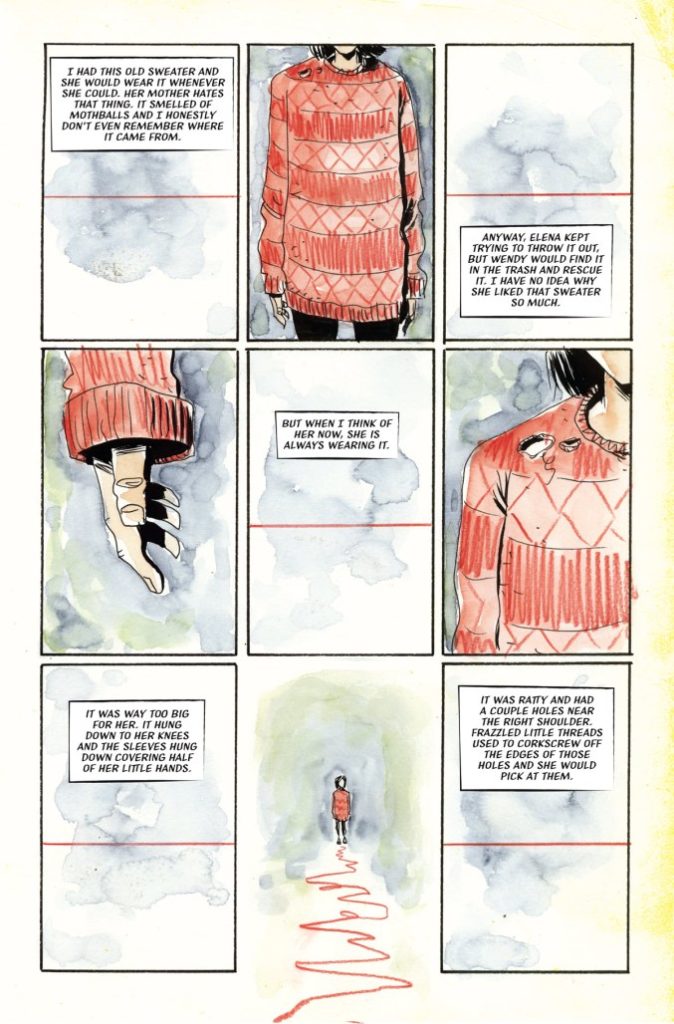
Acclaimed creator Jeff Lemire (Sweet Tooth, Black Hammer) begins a cerebral story of loss and grief in Mazebook #1. Featuring letters by Steve Wands, this first issue demonstrates the emotional devastation of loss and the hollowness it can create. With moving narration and Lemire’s signature expressive visuals, this is a painful yet enticing opening to this new mini-series.
“A lonely building inspector still grieving the loss of his puzzle-loving daughter receives a mysterious phone call one night from a girl claiming it’s her and that she’s trapped in the middle of a labyrinth. Convinced that this child is contacting him from beyond this world, he uses an unfinished maze from one of her journals and a map of the city to trace an intricate path through a different plane of reality on an intense and melancholy adventure to bring his daughter back home.”
Writing & Plot
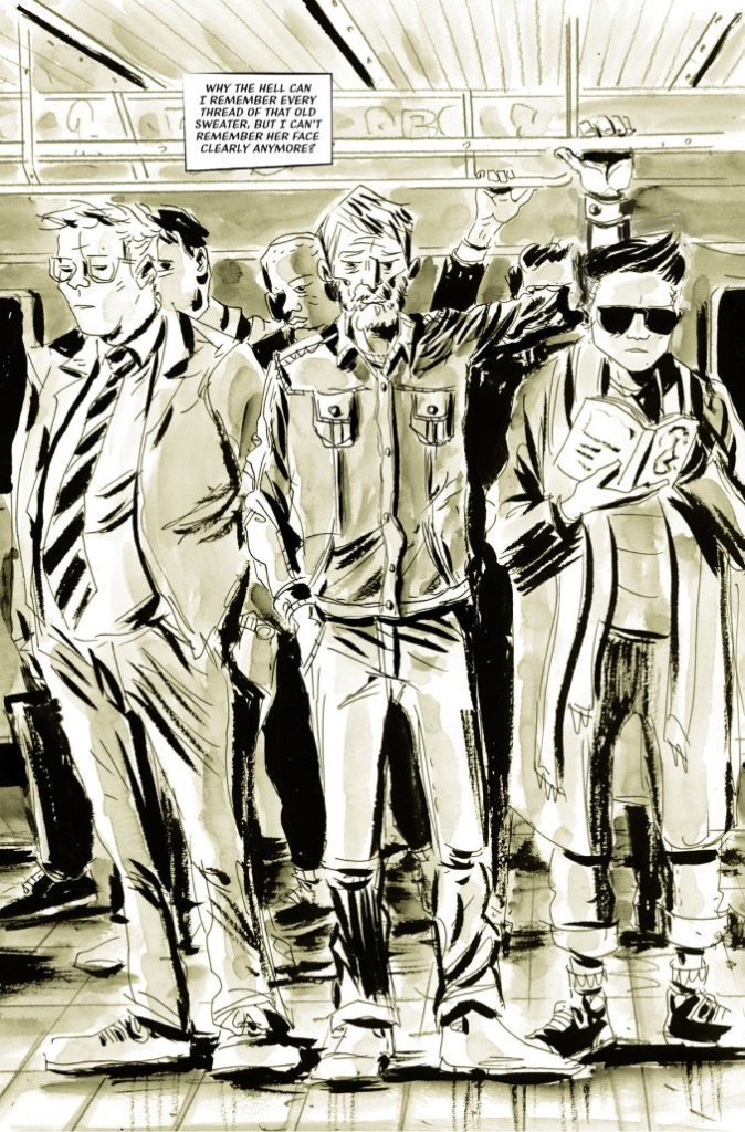
Jeff Lemire keeps his plot close to the chest for Mazebook #1. This first issue introduces us to our protagonist and the devastating effects loss and grief can have. Lemire demonstrates this man’s life as a lonely routine, with no social life. He spends all of his time on physical autopilot while his mind trails off on memories of his lost daughter. Lemire’s portrayal of this man’s grief is so effective because it’s so familiar. Any form of sadness can throw us down this same spiral for a period of time. However, here it has completely consumed every aspect of a man’s being. Lemire juxtaposes detailed narrative laced with mourning against the minimal, short dialogue given by the protagonist. His inner turmoil just further drives him away from forming any relationships with those outside of his routine. This makes for a deeply effective and painful read.
While there is of course a potentially supernatural thread here at the end, Lemire hides this part for most of the book to build the tension for the next issue. After this, I absolutely intend to be there to see it.
Art Direction
Jeff Lemire brings his signature unique art style to Mazebook #1. His rough-hewn, deceptively simple aesthetic provides immense detail to his characters. This especially goes for the main character. Lemire’s almost jagged linework creates an almost gaunt and tired visage for the protagonist. It also betrays the anguish going on inside his head. The panel direction and images Lemire uses are repetitive and detailed, increasing that feeling of never-ending isolated routine.
Almost the entire comic is bathed in this sort of sepia-toned color filter. This intentionally drains life from the world and characters to reflect the protagonist’s mindset. The only parts of the comic not like this are the scenes taking place in the protagonist’s head. Here there are a few more details fleshed out with color. Their inclusion actually makes the overall tone of the comic even more heartbreaking. The lettering from Steve Wands is not like any I’ve seen in anything but other Lemire comics. It’s a sort of thin, slanted font that is noticeably different from most other lettering styles. It captures the reading experience very well despite its subtlety. This is a brilliantly put-together comic from the visual end, a quality I would expect from a Lemire comic book.
Verdict
Mazebook #1 is an emotionally riveting and mysterious opening chapter. Lemire focuses on the emotional devastation of grief and how it ravages every aspect of a man’s life in an intensely sad yet relatable script. His visuals see him utilizing his unique style to show the wear on our protagonist and how bare his life has become just as his journey takes place. This is a brilliant and deep first issue, so be sure to grab it from your local comic shop today!
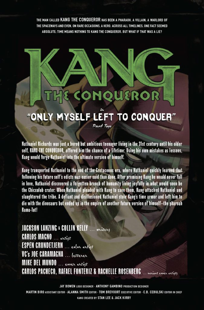
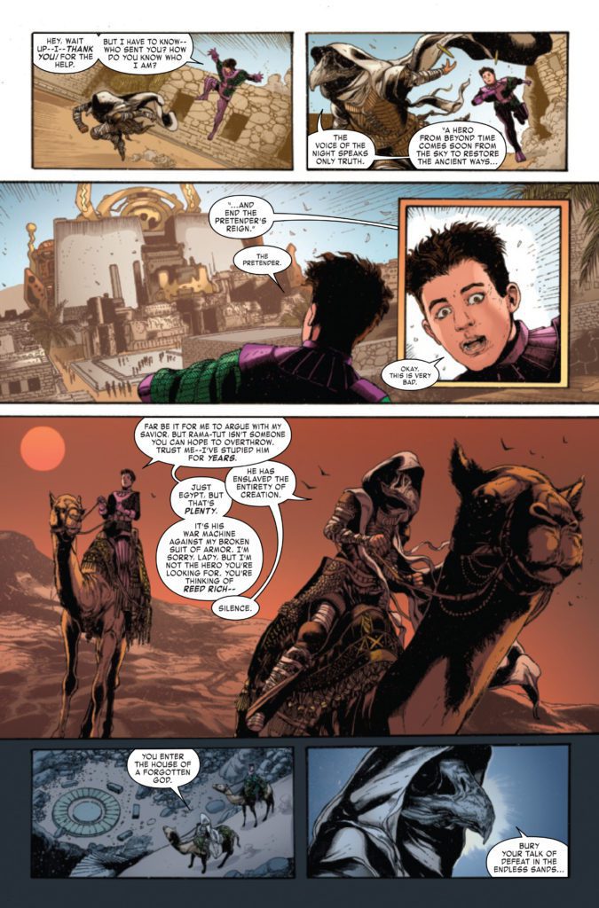
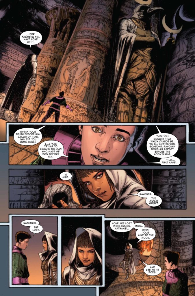
KANG THE CONQUEROR #2 (OF 5) hits your local comic book store September 15th, but thanks to Marvel Comics, Monkeys Fighting Robots has an exclusive four-page preview for you.
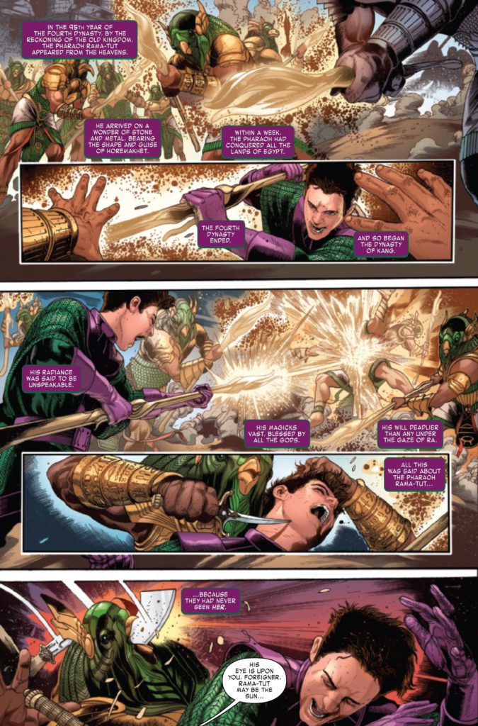
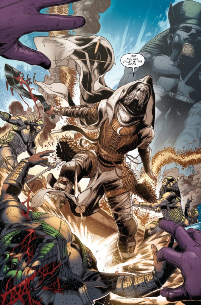
About the issue: A young, rebellious and idealistic Kang finds himself in Ancient Egypt, where an older version of himself is ruling with an iron fist as the pharaoh Rama-Tut. When the Moon Knight draws young Kang into a battle against his future self, tragedy strikes. But will it knock Nathaniel off the course of his destiny or lock him into one path forever?
The issue is by writers Jackson Lanzing & Collin Kelly, and artist Carlos Magno, with colors by Espen Grundetjern, and letters by Joe Caramagna. The main cover is by Mike Del Mundo.
Kang has been a major Marvel villain dating back to 1964. He is poised to be the next big bad of the Marvel Cinematic Universe, as played by Jonathan Majors. He first appeared in the season final of Loki, and is set to make his film debut in 2023’s Ant-Man and the Wasp: Quantumania (unless he makes a surprise appearance elsewhere first).
Check out the KANG THE CONQUEROR #2 preview below:
What Marvel Comics villain do you want to see get their own solo title? Sound off in the comments!
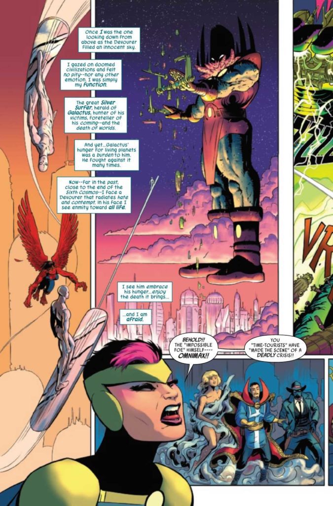
Defenders #2, out from Marvel Comics on September 8th, presents a high octane tribute to Jack Kirby. With writer Al Ewing and cartoonist Javier Rodriguez presenting a nonstop thrill ride, it’s hard not to get invested. Especially with the lettering of Joe Caramagna to guide readers.
Defenders #2: A Herald’s Epic
Ewing shows Defenders #2 through the Silver Surfer’s point of view. As a former herald of Galactus, Surfer knows the threat the team currently face. He accepts the absurdity of his current situation since it happens so regularly to him. It’s more than a little heartwarming seeing Silver Surfer comfort his future master as an infant, with a sense of appreciation for their history together.
The new characters of Taaia and Omnimax are a sight to behold as well. Taaia’s boisterous personality leaves quite a memorable impression. Aside from being the mother of Galactus, she seems to live a life of adventure in common with the Defenders. Then there’s Omnimax whose design by Rodriguez and presence combines Kirby-style machinery with a Cthulhu monster. Unlike Galactus, this monstrosity towering over everything with an obscured face genuinely looks indifferent to everything.
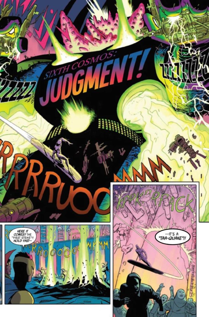
The Grand Cosmic Scale
Rodriguez’s cartooning presents many moving pieces in Defenders #2 converging into a single point. The wildly flying colors, shapes, and sound effects evoke the two-page spreads and collages of Kirby. Within mere moments, the reader gets an impression of threats and bursts of energy. Caramagna’s lettering guides us through the wild art.
Don’t Wait On Defenders #2
Defenders #2 gives cosmic Marvel an exciting depiction, worthy of Jack Kirby. New larger-than-life characters mingle with the cast as the plot develops. With many issues to come, readers are sure to want more of this series.
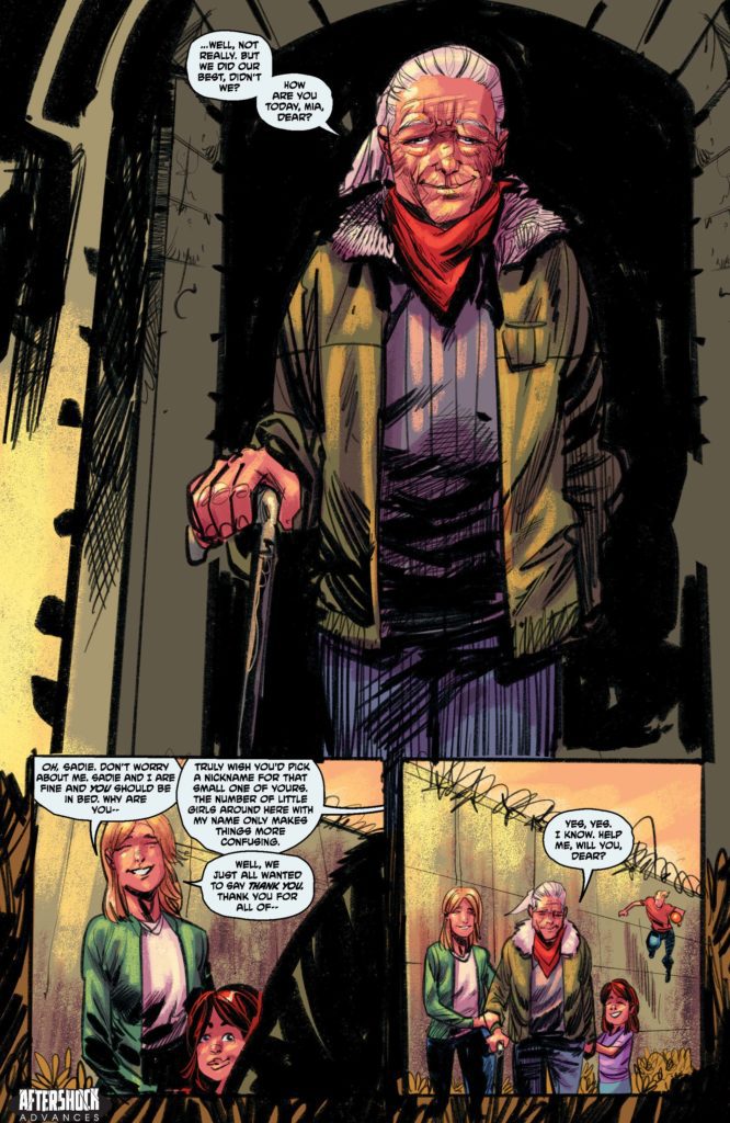
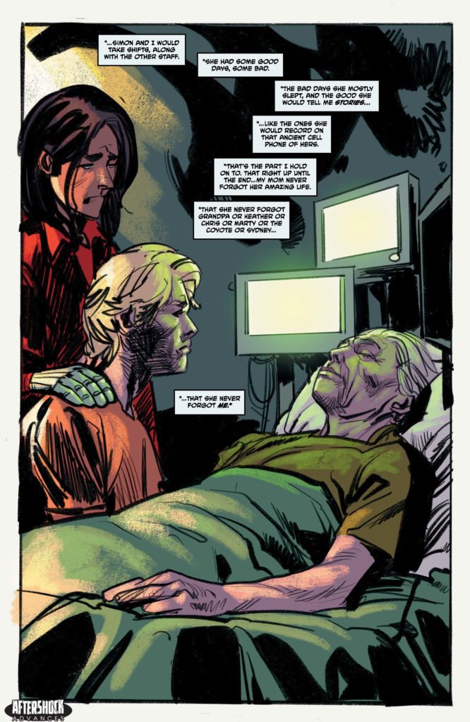
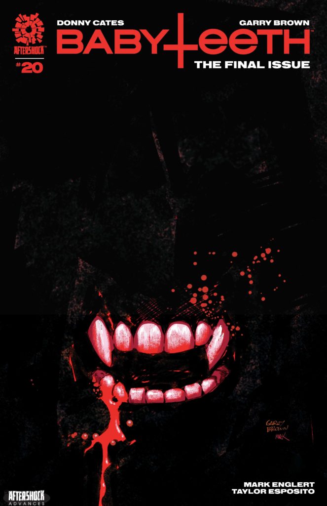
BABYTEETH #20 hits your local comic book store September 22nd, but thanks to AfterShock Comics, Monkeys Fighting Robots has an exclusive four-page preview for you.
About the issue: Everything ends. Sadie prepares her son to meet his maker. Can the apocalypse be called off?
Stay tuned for the exciting climax to BABYTEETH!
The series is by writer Donny Cates and artist Garry Brown, with colors by Mark Englert, and letters by Taylor Esposito. The cover is by Brown and Englert.
Issue #20 marks the series finale of BABYTEETH, which launched in 2017. It’s the story of Sadie Ritter, a teenage mother whose baby turns out to be the antichrist. Their journey is an epic quest full of action, hellfire, and demon raccoons. If you haven’t read it yet, we highly recommend you pick it up and read it in its entirety now that it’s concluding.
Check out the BABYTEETH #20 preview below:
Have you been reading BABYTEETH from the start? Sound off in the comments!
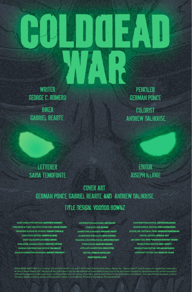
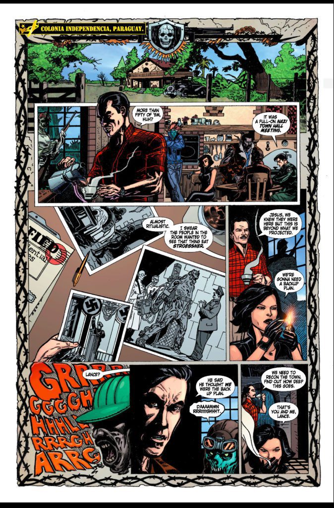
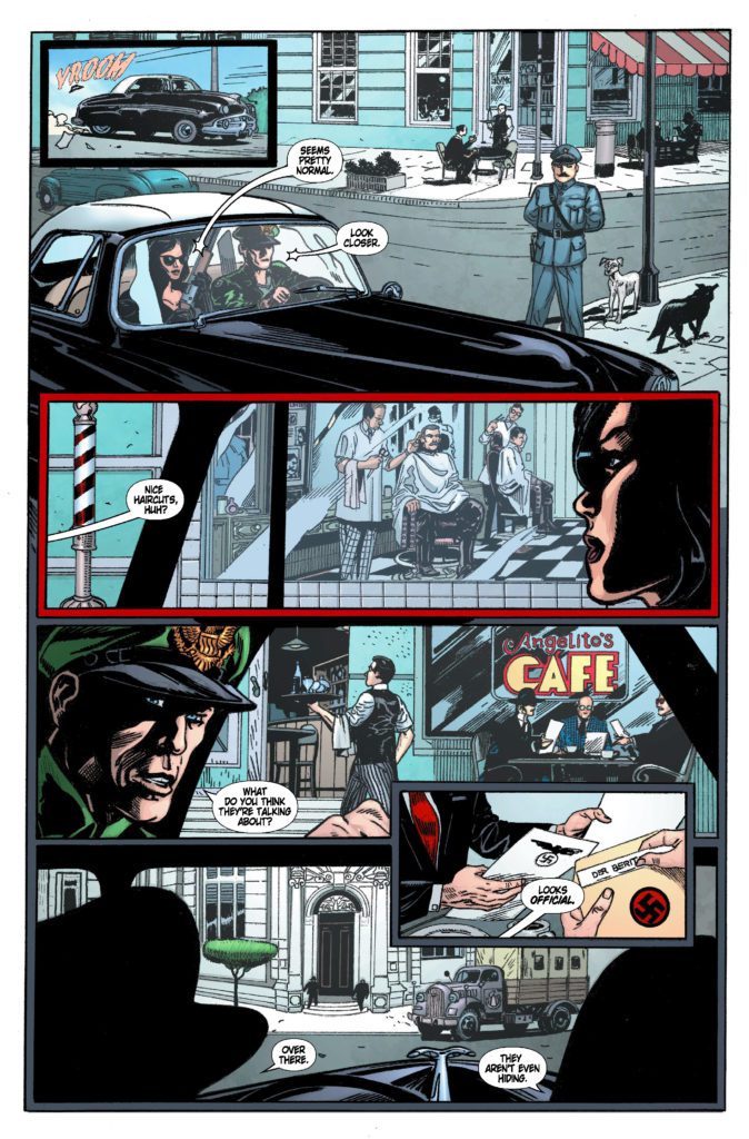
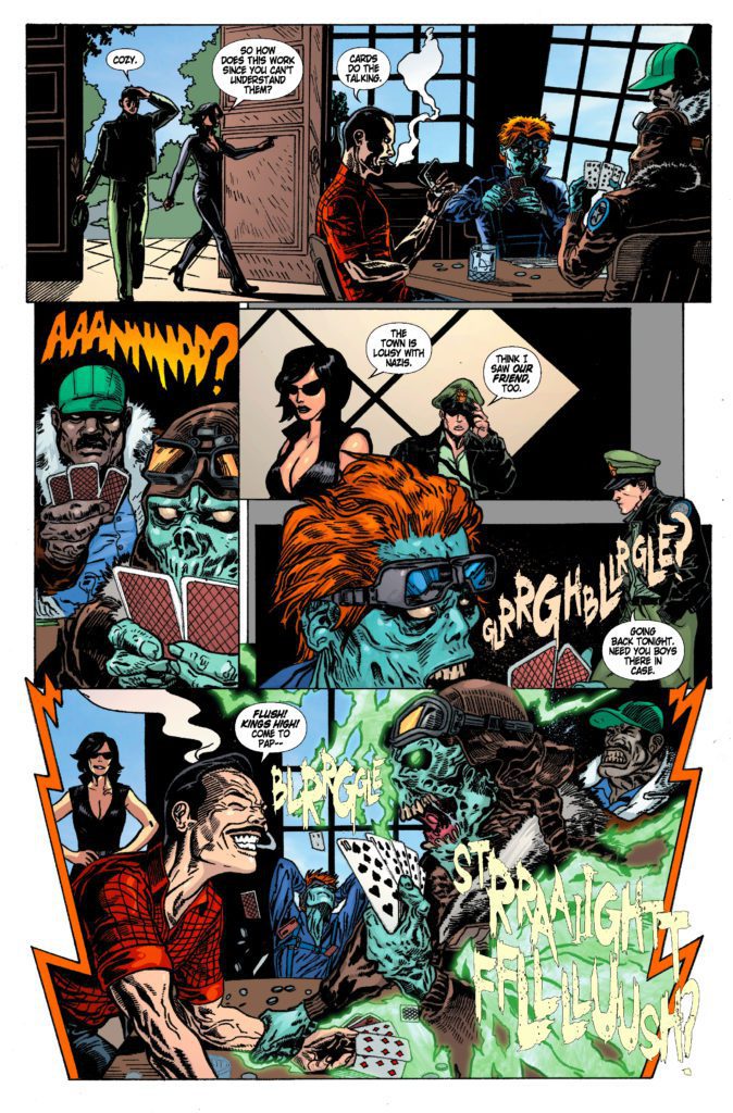
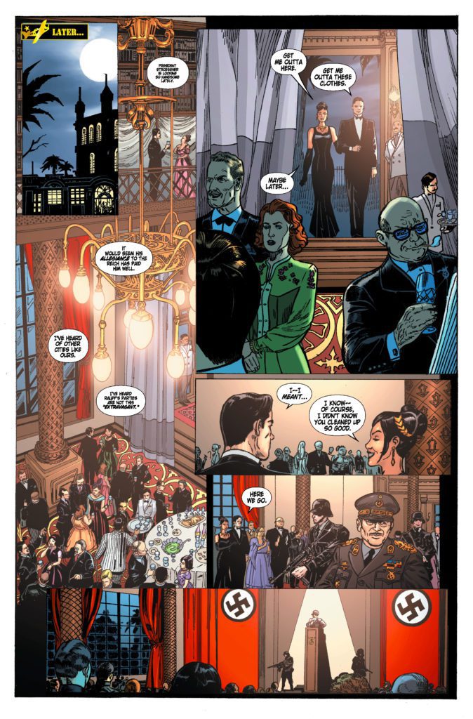
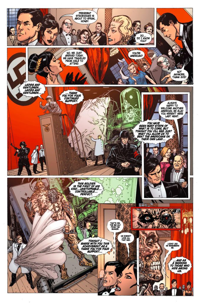
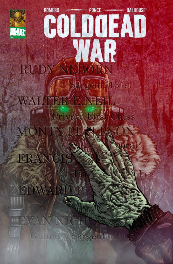
COLD DEAD WAR #4 is out September 22nd at your local comic shop, but thanks to Heavy Metal, Monkeys Fighting Robots has an exclusive six-page preview for you!
About the issue: It’s the last stand of The Cold Dead—America’s covert zombie pilot squad—as a mission to infiltrate a Nazi stronghold goes sideways, and nothing less than worldwide freedom and liberty are at stake. Live forever! Never say die!
COLD DEAD WAR #4 is written by filmmaker George C. Romero, with pencils by artist German Ponce, inks by Gabriel Rearte, colors by Andrew Dalhouse, and letters by Saida Temofonte. Romero is the son of George A. Romero, creator of Night of the Living Dead.
Check out the COLD DEAD WAR #4 preview below:
Are you reading COLD DEAD WAR? Sound off in the comments!