Home Blog Page 130

INTERVIEW: Dan Larson Documents Nostalgia On YouTube Channel Toy Galaxy

toy galaxy-youtube-interview-pop culture

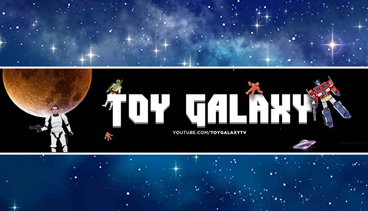
Nostalgia’s a hell of a drug in the 21st century as beloved franchises are rebooted, re-imagined, or continued seemingly endless, and over at the YouTube channel Toy Galaxy, they deep dive into the origins of that nostalgia.

Transformers, A-Team, GI Joe, Knight Rider, Robotech, Wizard magazine, Max Headroom, and more feature as subjects of Toy Galaxy videos . For roughly 20 minutes, Dan and his partner Greg take viewers on a content-dense ride through the behind-the-scenes elements that gave rise to many of the things we know and love today. While Netflix is hurtling two new He-Man shows at us in one year, Toy Galaxy is riding through memory lane to tell us just how He-Man and the Masters of Universe came to be in the first place. In addition, the channel will discuss details that even larger documentaries on the same subject might overlook.

PopAxiom spoke with Dan Larson, the man in front of the camera for Toy Galaxy, whose clear, calm, and light-hearted delivery (with a dash of delicious Gen X snark) makes watching the channel a delight every time.

Page Maker

Before Dan was informing and entertaining on YouTube, he “went to Rhode Island College. That school is mostly about teaching teachers. I was looking to break into comic books and publish my books.”

“I graduated with a degree in printmaking,” Dan says, “so like limestone blocks and woodcut prints and lithography. But my real education came from working at the campus newspaper. Then, from 1994 to 1998, I learned how to do digital desktop publishing. It was the first time I touched a digital camera.”

The transition from the old-school ways to new was something Dan will never forget. “My freshman and sophomore year, we were using photocopy machines to reduce and enlarge images and glue them down, then suddenly we’re doing all that on a computer in Adobe Page Maker.”

toy galaxy-interview-dan larson

Creating Toy Galaxy

Dan’s a lifelong fan of action figures, and his partner Greg is a cinephile. So when conceiving of Toy Galaxy, the pair as themselves, “Do we want to do a ‘zine’ where it’s sort of photocopies and stapled or do we want to something that looks and sounds professional.”

“When we started,” he says about the initial days of creating the channel,” we saw a lot of low-tech stuff out there with bad sound and picture; long run-times. We didn’t want to be that. We wanted it to look like there’s a whole team behind it.”

Over the years, he says, “We’ve established what’s long enough for us. There are definitely videos where I start to get too deep into the weeds, and I lose the narrative. I have to pull back.”

“Fifteen or twenty minutes is our sweet spot,” he definitively says. “Anything longer than that, and I lose the narrative. Anything shorter than that feels like we didn’t cover it.”

Galactic Evolution

Toy Galaxy began in April of 2015. After six years, what’s changed in how they create videos? “It’s a whole different process. The focus of the channel’s shifted. The original intent was to do action figure reviews. At the time, YouTube wasn’t putting a focus on long videos. Now, they like long videos because it keeps eyeballs on YouTube.”

“We were watching people doing toy reviews,” he continues, “and thinking ‘ten minutes to do an action figure review?’ So we focused on short, concise, and, most importantly, entertaining. We knew we were never going to be the first to review something. Channels were doing it for years already. We could not compete with that; we weren’t getting free merchandise or anything like that.”

Dan explains, “The approach was, we want to make our videos so entertaining to watch that even if you watched the other 100 reviews, you still want to watch ours. So how is Toy Galaxy going to do it, and what jokes will there be this week?”

Early on, Toy Galaxy “put in a timing mechanism by calling the videos four minutes or less. This review of Spider-Man in four minutes or less. That was the hook and gave us our angle.”

“Over the years,” he adds, “we envisioned our channel as sort of a network. We wanted to approach action figures and the industry in the same sort of way. So we were offering up a variety of things with the reviews, versus videos, ten things you need to know about whatever.”

Franchise Universe

Dan and Greg focused on creating a successful business and watched the numbers. “We knew what people were responding to and weren’t responding to. So, we pushed the channels in the right directions. Ten things you need to know evolved into longer format videos, becoming the ‘History of.’ The other shows we were doing weren’t doing as well, and one-by-one we cut them off.”

“We know exactly our demographic — to the birthday.” Dan laughs, and so do I because that demographic is primarily people like me. Though, Toy Galaxy undoubtedly appeals to a broader audience as there are fans of franchises of all ages. “We appreciate when people message us saying, ‘Hey, I love what you’re doing. It’s a show I can watch with my kid since we’re both into Masters of the Universe or Voltron.”

Though the six years, Dan asserts, “The one thing that’s never changed is our approach, we’re always trying to answer our questions first. I always think, what will make me or Greg laugh? I never considered myself a journalist; I never studied journalism, but at the end of the day, I have questions, and those are the questions we ask.”

“Why were Masters of the Universe this shape versus GI Joe, who was this shape,” he continues, “Where did it come from? Why were 12-inch action figures popular in the 60s, but by the 80s, it’s smaller figures? How do these things evolve and change?”

Processing

“Greg programs the channel,” Dan begins the discussion of Toy Galaxy behind-the-scenes. “I’m the in the blood fan of all these things. Greg was more the type who watched them, didn’t get too involved with them, then immediately turned to other things. His obsessions are more cinema and film.”

Greg’s lack of sentimentality for most of Toy Galaxy’s subjects is “a good thing … none of this is precious to him. If we need to put something out there, that is a fact; even if we know, it’ll upset the discourse or the fandom. We’re stating facts.”

“It used to be we’d program out a few weeks in advance,” he’ says, but things have slowly changed. “Since we’ve taken on sponsors, it’s more like 10 to 12 weeks now. Though it’s not set in stone, and it’s fluid. We can respond to feedback from one video to the next.”

“Tuesdays, we’re doing research. Then, Wednesday, I take that research and immerse myself in whatever it is. So, for The Transformers: The Movie, I went back and watched the movie.”

Dan makes sure to have “a good understanding of the generalities and where we want to go with it. I will go deeper in the research because I watch the thing, and I compare the experience to my understood experience from my life. Having watched the thing as a kid, I can draw from that and understand the community’s opinion on the topic.”

“On Thursday, I spend the whole day writing it all up,” Dan adds, “Friday we shoot. Greg will edit over the weekend or Monday, and we start all over again on Tuesday.”

toy galaxy-interview-youtube

The Transformers: The Movie

At the time of this interview, Toy Galaxy put out a video for the animated Transformers movies from the 80s in time for the film’s 35th anniversary. Throughout, Dan clearly says the full name of the movie, The Transformers: The Movie. “Greg was adamant about that. So in the script, I shortened it to just Transformers or Transformers: The Movie, but Greg said, ‘no, stop, it’s The Transformers: The Movie. That’s the name of the movie. Transformers is the Michael Bay movie.’ So I did a ‘control plus F’ and changed them all to The Transformers: The Movie.”

“We put out that The Transformers: The Movie video and people have responded saying ‘It was so refreshing,'” Dan shares, “They say, ‘so many videos are about it being the best or worst movie ever made’ and neither of those things is true. So we’re not coming at it from a perspective of how it ranks in terms of good or bad cinema; we’re telling you here’s how it was made, here are some of the circumstances behind it, here’s why it is a box office failure, but it was still a success.”

Deep Thoughts

As superficial as franchises and merchandising might seem, it speaks to profound truths about society. Of course, fandom doesn’t usually dive too deep into those kinds of thoughts, but Dan does. “At a higher level, we ask why is this generation still so obsessed with this stuff to the point that it’s still driving movies and cartoons and all that stuff?”

“I go back and forth thinking about how we were guinea pigs,” Dan says as we discuss the political changes in the 80s that gave rise to franchise dominance. “We were this experiment. Thirty-five, forty years later, what did the experiment produce? What kind of society did unregulated children’s advertising produce?”

In a sense, human society is one giant laboratory in constant motion. “YouTube is sort of another social experiment. What happens when you have whole generations of kids raised on this mostly unregulated thing?”

Wrapping Up

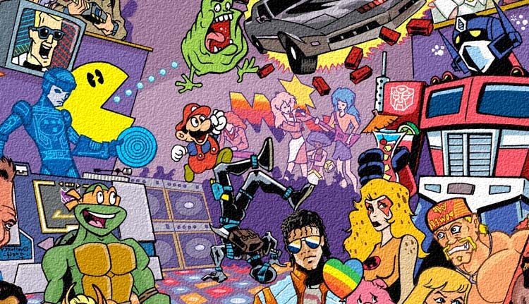
Toy Galaxy covers more than just toys; it’s more like a pop culture universe. “One of our best performing videos was Max Headroom. We just had a video about Wizard and Toyfare magazines.”

Six years into their experiment, and with subscriber numbers still on the rise, Dan says, “We’re hoping we’ve built up a fan-base that doesn’t care what we talk about and just want to hear how we talk about a particular thing.”

“Growing up and through my 20s and 30s,” he reflects, “before we started the channel, I always had this vision of a museum or writing a book about the history of toys. Part of the drive of building my collection was that I needed every version of Captain America because I may need to go back to these and talk about them at some point in the future. I never thought something like Toy Galaxy was in my future.”

Are you subscribed to Toy Galaxy?

Thanks to Dan Larson for making this interview possible.

Find more interviews from Ruben R. Diaz here!

Monkeys Fighting Robots Youtube

Top 7 Manga Adaptations of All Time

Top 7 Manga Adaptations of All Time

Manga has been massively influential in the pop culture world, although its impact outside of Japan is more down to animated adaptations rather than the original comics.

Today there is a multitude of movies and TV shows that are based on or inspired by manga, and as with any adaptation, the quality can vary wildly.

If you only want to watch the cream of the crop, the following line-up of exceptional interpretations of game-changing manga series will be a good starting point.

Black Jack

Despite its name, Black Jack isn’t the best gambling manga of all time. It’s more interested in telling unique tales of medical breakthroughs, self-sacrifice, and the importance of modesty in the face of significant achievements.

These elements are translated expertly to the screen in the first full-length film adaptation, released in 1996. It may lack the extreme edge of some of its contemporaries but in retrospect Black Jack: The Movie is an intriguing and artistically striking artifact of a time when Japanese animation was still relatively unknown in the West.

Ghost In The Shell

Doubtlessly managing to outdo the manga on which it is based, Ghost In The Shell is another 90s anime adaptation that pushed the envelope with its art style and visual effects.

In fact, if you watch the movie today, it’s hard to appreciate just what effect it had on audiences at the time. So many touches that we take for granted now were first found here, and it is no surprise to see it cited alongside Akira as one of the main influences for the Matrix franchise. The less said about, the more recent live-action remake, the better.

One-Punch Man

When the first season of One-Punch Man hit in 2015, it felt like a breath of fresh air, standing out from the cookie-cutter anime crowd by parodying so many elements and skewering them perfectly while still cramming in some incredible action set pieces and mega-scale battles.

The tone of One-Punch Man is undeniably silly, but it wears this ridiculousness on its sleeve and manages to avoid the po-faced sincerity, which can compromise many of the other more modern manga adaptations that are doing the rounds today.

Akira

Arguably the most famous manga adaptation ever made and undoubtedly the most critically acclaimed, Akira still stands like a behemoth over the industry more than three decades after its release.

Its ability to blend political commentary and sci-fi smarts with brutal action and deep characterization helps to justify the high esteem in which it is held by fans. If nothing else, it proved that complex manga could indeed be adapted to feature-length film format without making sacrifices in the transition.

Fullmetal Alchemist

Like all popular manga series, there is a cavalcade of adaptations of the steampunk universe of Fullmetal Alchemist, with multiple anime series, two animated movies, and the inevitable hit-and-miss live-action iteration.

While seeing hand-drawn characters recreated by flesh and blood actors is clearly not always a good idea, the animated interpretations of Fullmetal Alchemist fare far better. The first anime is probably the one to watch as a priority, partly because it takes the story in a different direction to the manga and packs plenty of surprises as a result.

Devilman Crybaby

While opinions were divided upon release, Devilman Crybaby had gained critical traction in the past few years and is now regarded as a well put together adaptation of a vintage manga series that once again proved a hit with Western audiences, who made up the majority of the viewership on Netflix when it debuted in 2018.

Once again, it manages to explore some intriguing themes and topics, presenting debates around the likes of sexuality and growing up in a way that does not feel preachy or pared back. And, of course, the unflinching intensity of the many set pieces proved that modern manga adaptations could still go hard when called upon.

Fist of the North Star

Fist of the North Star is not exactly the most sophisticated franchise out there, but that does not stop the stupendous strength and stoicism of its protagonist Kenshiro from being compelling.

Various adaptations exist, and the 1986 animated feature film is gloriously violent and over the top as fans would hope.

The world of manga adaptations is vast and growing all the time, so explore these examples and then see what else is out there!

Monkeys Fighting Robots Youtube

Review: Brimstone, Blood, & The Blues In NITA HAWES’ NIGHTMARE BLOG #1

From Killadelphia creators Rodney Barnes and Jason Shawn Alexander comes a spinoff tale in a new town with a new kind of terror. Along with artist Patric Reynolds, colorist Luis NCT, and letterer Marshall Dillion, Nita Hawes’ Nightmare Blog #1 is a tense and deep opening to this new horror series. With the same kind of character driven writing that makes Killadelphia so successful, and incredible as ever visual work, this new series is off to one hell of a start.

“Jimmy Sangster might have left Maryland for the vampire-infested city of “Killadelphia,” but there is still untold evil lurking the streets of Baltimore. The demon Corson has surfaced from the underworld to possess a once-wronged man, and his vengeance will come at the cost of humanity’s despair! But Jimmy’s former lover Nita Hawes—a woman with demons of her own—has begun a quest to root the evil out of her city. Guided by the ghost of her dead brother, she must come to terms with her own past, lest she join her brother in a state worse than death!”

Writing & Plot

Rodney Barnes constructs horror the right way in Nita Hawes’ Nightmare Blog #1. Much like with Killadelphia, he constructs the story in a two-fold direction. He builds the character and backstory of Nita Hawe and other cast members to make them relatable and feel human. When he isn’t doing that, he’s scaring the hell out of us with his antagonist. Hawes’ experience with evil comes from her past – both from her ex Jimmy Sangster (protagonist of Killadelphia) and the tragic manslaughter of her brother. The problem is, her brother won’t leave her be now. Hawes’ guilt takes a unique form here, as her little brother’s ghost pusher her to make this blog and root out evil.

Barnes does fantastic work making Hawes a well-rounded character that is simultaneously experiencing and dealing with trauma. We are only at the tip of the iceberg with her investigations into the underworld, and I can’t wait to see how she navigates that threat. On the other hand, we have Corson. His backstory is as compelling as any slaughter-loving demon’s can be. This blues-singing monstrosity is a genuine terror on the page, with every one of his scenes sticking well into my memory. Especially with what may very well be the single most jolting turn-of-the-page scare in comics this side of Junji Ito.

Art Direction

Jason Shawn Alexander’s work on Spawn has likely prepared him well for what he does here in Nita Hawes’ Nightmare Blog #1. Much like with Killadelphia, he and Patric Reynolds are responsible for the art and layouts in this spinoff. Alexander displays a keen sense of horror direction in this issue. He typically sets up 5 to 8 panels per page, capturing moment to moment movements from different perspectives. In the case of character moments, its a great way to get a sense of people’s emotional states and personalities. In a horror scene, it’s an intense play-by-play for the approach and slaughter by a demon to his victims. This intricate directing shifts just for the last turn-of-the page scare. A full page image creates one of the most chilling scenes in horror comics.

Alexander and Reynolds have a distinct, gorgeous style that is perfect for character detail and horror. Their use of realistic references has an almost photorealistic effect that never gets into uncanny valley territory. Minute expressions are portrayed with perfect detail to give us a view into the heads of our main characters. The demonic details come to life with ferocious surprise, with disturbing designs and gory aftermath. Much of the horror here is based on staples of the genre, but it’s handled so well that it’s a welcome sight for any horror fan.

Color & Lettering

The painted style colors from Luis Nct add a whole other layer of complexity to the book’s aesthetic. Every image is saturated with a palette of shades due to the color work instead of a flat tone. His work is especially memorable on the more monstrous and supernatural sequences. These moments bathed in blood, viscera, and/or hellfire feel akin to the works of Francisco Goya. Marshall Dillion’s lettering deserves note here for its simple yet creative touches. His main font is a standard, highly legible contemporary font that come alive during the demon Corsan’s passages. The red-on-black lettering is such a smart move. His SFX letters are really cool as well, coming off as scratchy disturbing shockwaves. This comic is a phenomenal work of visual horror storytelling.

Verdict

Nita Hawes’ Nightmare Blog #1 is a phenomenal and frightening start to this spin-off series. Rodney Barnes pens a script that builds its characters to make their troubles relatable to the reader while never letting up on the brutal terror that has come to their world. The visuals from Jason Shawn Alexander, Patric Reynolds, and Luis NCT are densely detailed and darkly atmospheric, making images that will stay with you long after you close the book. If you’re a fan of Killadelphia or a horror fan in general, be sure to grab this issue when it hits shelves on 10/20!


Monkeys Fighting Robots Youtube

Marvel Comics Exclusive Preview: DARKHAWK #3

marvel comics exclusive preview darkhawk #3

DARKHAWK #3 (of 5) hits your local comic book store November 3rd, but thanks to Marvel Comics, Monkeys Fighting Robots has an exclusive four-page preview for you.

About the issue:
Someone very close to Darkhawk is dead! But who is it? And is it Darkhawk’s fault? More importantly, will the new Darkhawk cross the line that no hero should ever cross?

The issue is by writer Kyle Higgins and artist Juanan Ramírez, with colors by Erick Arciniega, and letters by Travis Lanham. The main cover is by Iban Coello and Jesus Aburtov.

Bonus: You can check out MFR’s exclusive first-look at Ron Lim and Superlog’s variant covers for DARKHAWK #4 right here!

Check out the DARKHAWK #3 preview below:

marvel comics exclusive preview darkhawk #3

marvel comics exclusive preview darkhawk #3

marvel comics exclusive preview darkhawk #3

marvel comics exclusive preview darkhawk #3

marvel comics exclusive preview darkhawk #3

marvel comics exclusive preview darkhawk #3


What’s your favorite DARKHAWK run? Sound off in the comments!

Monkeys Fighting Robots Youtube

AfterShock Comics Exclusive Preview: CHICKEN DEVIL #2

aftershock comics exclusive preview chicken devil

CHICKEN DEVIL #2 hits your local comic book store November 10th, but thanks to AfterShock Comics, Monkeys Fighting Robots has an exclusive four-page preview for you.

About the issue:
The most unlikely chicken-fried revenge story continues. Mitchell, our overmatched hero, must contend with the bloody aftermath of his first run-in with the Russian mob…as he deals with nosey detectives, his shady business partner, Antonio and the stolen heroin.

The series is by writer Brian Buccellato and artist Hayden Sherman, with letters by Hassan Otsmane-Elhaou. The cover is by Sherman.

Buccellato compares CHICKEN DEVIL to BarryThe End of the F***ing World, AMC’s Fargo, and various Quentin Tarantino films, calling the series “a dark tragicomedy that puts an edgy spin on the revenge/vigilante genre.” The first issue came out on October 6th.

Check out the CHICKEN DEVIL #2 preview below:

aftershock comics exclusive preview chicken devil

aftershock comics exclusive preview chicken devil

aftershock comics exclusive preview chicken devil

aftershock comics exclusive preview chicken devil

aftershock comics exclusive preview chicken devil


Did you pick up the first issue of CHICKEN DEVIL from AfterShock? Sound off in the comments!

Monkeys Fighting Robots Youtube

INTERVIEW: Writer, Producer, Director Hilton Ariel Ruiz Discusses ZOMBIE WITH A SHOTGUN

Zombie with a Shotgun is a horror film on Amazon Prime from writer, producer, director Hilton Ariel Ruiz with some fresh ideas for the zombie mythos, including giving the living dead some heavy firepower and a bone to pick with a lot of people.

The world in Zombie with a Shotgun is under assault by a viral infection that’s turning people into flesh-eating monsters. However, unlike many zombie films, some people retain their humanity. That doesn’t matter to law enforcement that’s decided to kill the infected on site. The government wants to catch the infected and learn from the illness. Another group may or may not be responsible for causing the virus. Zombie with a Shotgun is a very indie film, but that didn’t stop Hilton Ariel Ruiz and his team from turning his 2012 web series into a cult hit while teasing the larger world.

PopAxiom spoke with Hilton Ariel Ruiz about becoming a filmmaker and the rise of Zombie with a Shotgun.

When did Hilton’s relationship with movies begin?
I tell people I grew up in the Latin Brady Bunch. We had three boys, three girls, mom, and dad. My aunt lived with us, and she was like Alice. Instead of the dog, we had a cat. So, the cheapest way to get six rowdy kids to calm down was the movie theater. So Saturday and Sunday we’d go to the movie theater.

We’d come home after the movies and re-create scenes. I was the youngest one in the family, so I wasn’t allowed to play anything. So we’d go home after something like Return of the Jedi, and my brother would be Luke while my cousin played Vader. They made a fake camera out of cardboard to not make me feel bad, and I’d be the ‘director.’

When did Hilton get a real camera?
I got a camera at 13 or 14 and started making movies with my friends. We’d do recreations of Halloween or Friday the 13th. It got serious when I got to high school, where they accidentally put cinema studies on my schedule. So I went to the class, and I loved it. As the course kept going, I was saying, ‘this is me.’ I had a great teacher named Ms. Wilson. We would watch amazing films like Citizen Kane and Vertigo.

Who are some of the directors that influenced Hilton?
I love Ridley Scott; Alien, Blade Runner, and Legend. Cronenberg’s The Dead Zone is one of my favorites ever. John Carpenter with The Thing and Halloween. Those guys were such a massive inspiration to me.

zombie-film-interview-director

Where did Zombie with a Shotgun begin?
It’s been a long roller-coaster with Zombie with a Shotgun (ZWAS). Not many people know this, but ZWAS will be ten years old soon. It started in 2012 when web series started to get popular. I wanted to do it from the zombie’s point of view with a monster that wasn’t crazy but was aware of his surroundings.

What happened after the first episode when online?
It was the first time I experienced going viral. I was like, ‘holy sh*t.’ We hadn’t even finished the series, we’d just put out the first episode, and I was getting calls from production companies and producers. A lot of people thought it was a trailer for an already produced series. So, we finished the series, and I said, ‘let’s go on to the next thing.’ So, I left Zombie with a Shotgun alone. It had its time, I thought.

But every subsequent project, people would ask me, ‘what’s going on with ZWAS?’ It kept growing, and questions kept on coming. No matter what I did, the zombie thing was just overshadowing it all.

Not a lot of people get that viral experience. I realized I brushed something off that had more to it. We started to plan a feature when I met this great comic artist Simone Guglielmini who helped me do the first issue of a comic book.

What do you think made the web series so popular?
The episodes average around five minutes. But that first episode, there’s a moment at the end where the zombie kisses the girl, and I think that’s what people reacted to because they’d never seen something like that. So it got this whole thing going.

Did the growing cult popularity make it easier to find the money for the movie?
I thought having the social media explosion with the web series, and the comic book would easily get the budget I wanted. I spoke to many producers, but no one wanted to pull the trigger. Finally, the conversation came up with some that they would take it over and give me a percentage. I said, ‘hell no.’ It happens a lot in the industry, but I decided not to give in.

zombie-interview-director

How did Hilton make the movie without help from a studio or producer?
I went on a campaign to raise money. In 2016, we shot in New York for ten or twelve days until we ran out of money. We did two more campaigns to raise funds until the movie was released in 2019. On November 28th that year, it went onto streaming services which was exciting. We went to conventions and everything until COVID shut it all down.

Is the series required viewing to enjoy the film?
The series was more atmospheric. There is some sort of continuity though the web series is more about the idea. So, you could watch Zombie with a Shotgun without having watched the series.

How does the feature compare to the web series?
The feature was very ambitious. We had multiple locations and 30 cast members compared to the web series with two, maybe three people. Writing the web series was five or six pages at a time. The feature requires a lot more of that. On top of that, indie filmmaking means there will be changes. The script is changing by the day. The first script we had for Zombie with a Shotgun is entirely different from the 2019 film. That’s how things go when you’re in indie filmmaking. You just have to keep on going and figure out how to move forward. It’s a lot of work—three years of raising money. Bless the crew and actors who didn’t abandon the project.

What’s the reaction been like over the years?
I get emails and DMs all the time from people telling me how much they love the film. Then you get the other group who tells you that’s the biggest piece of sh*t film they’ve ever seen. One of the biggest complaints from real fans, you know who they are, was the lack of gore. But that comes down to budget. We didn’t have that kind of budget to blow things up and blow people away with the shotgun all the time.

What’s the future for Zombie with a Shotgun?
There’s a huge universe to play within Zombie with a Shotgun. We want to push the gore some more. But of course, that’s the budget provided. So we’ve got to raise the money to make the next film gory. We also plan to have vampires in the sequel as one of the main parts of the story line. Not to spoil anything, but it’s going to introduce a whole bigger story. We’re excited; we think it’s going to be different and cool.

Zombie with a Shotgun is available to Amazon Prime subscribers
or on Hilton Ariel Ruiz’s YouTube channel for free!

Read more interviews from Ruben R. Diaz!

Monkeys Fighting Robots Youtube

Review: X-O MANOWAR #7: A Big and Satisfying Reveal

X-O Manowar #7 cover

X-O Manowar #7 is where this Valiant Entertainment run reaches its climax, on October 20th. After so many obstacles and red herrings, this series true villain reveals himself.

Background

In this run of X-O Manowar, Aric and his battle suit Shanhara are in battle against a nanite singularity swarm. Fortunately, they have tech billionaire Troy Whitaker to help out.

X-O Manowar #7: Leaked Truths

Dennis Hopeless writes the tertiary character Troy as a compelling presence. He has a Tony Stark-like charisma that ranges from humanitarian to subtle schemer. Throughout X-O Manowar #7, Troy helps Aric with a lot of the burdens he’s carrying. Without his help, Aric would be in real trouble. But at the same time, Troy takes advantage of Aric in times of high risk. Add to the fact that Troy deflects his knowledge about the nanite swarm, and it’s clear that he’s hiding something.X-O Manowar #7 conflict opening

point I couldn't highlight

High Octane Distractions

Emilio Laiso continues to illustrate eye-catching images throughout X-O Manowar #7. The movements of each character, object, and the setting itself keeps the reader’s attention. If not for the bold inking by Raffaele Forte, the key elements of those scenes would blend together. Then there’s the coloring by Ruth Redmond, almost every major scene involves a bright light or a color blend. Along with the hand drawn SFX and ever shifting word balloons of Hassan Otsmane-Elhaou, the art ensnares the readers’ attention.Just because this is the best lettering

X-O Manowar #7: Don’t Blink Or You’ll Miss Everything

This issue’s fast pace, attention arresting artwork, and big revelation make it arguably the best in the series. But even that’s just a small sample of a groundbreaking arc involving a dynamic character. It leaves readers ready for more.

Monkeys Fighting Robots Youtube

Review: CATWOMAN: LONELY CITY #1 – New Old Neighborhood

From all-star comics creator Cliff Chiang (Wonder Woman, Paper Girls) comes this tale of a tired old thief coming back to a city that wants her gone. Catwoman: Lonely City #1 is an intriguing and gorgeous opening chapter from DC’s Black Label imprint. With Chiang seting up a troubling new era for Gotham that’s brought to life by his ever-spectacular visual work, this is a new series that will be a must-read for DC fans.

“Ten years ago, the massacre known as Fools’ Night claimed the lives of Batman, The Joker, Nightwing, and Commissioner Gordon…and sent Selina Kyle, the Catwoman, to prison. A decade later, Gotham has grown up—it’s put away costumed heroism and villainy as childish things. The new Gotham is cleaner, safer…and a lot less free, under the watchful eye of Mayor Harvey Dent and his Batcops. It’s into this new city that Selina Kyle returns, a changed woman…with her mind on that one last big score: the secrets hidden inside the Batcave! She doesn’t need the money—she just needs to know…who is “Orpheus?”

Writing & Plot

A big question leading into Catwoman: Lonely City #1 was if Cliff Chiang can write as well as he can draw. Well so far, the short answer is damn near. Lonely City sees us in a changed, unfamiliar Gotham without the Batman. Instead, we are guided into the life of a much older and fresh out of prison Selina Kyle. Chiang writes this Catwoman as a guarded, struggling version of the confident thief and part-time villain she used to be. She’s carefully tip-toeing around this “peaceful” new Gotham all too aware of her physical limitations due to her age. Some other favorite  villains (and one old hero) make some appearances as well, and really sell just how much has changed. Gotham under the protection of Harvey Dent teeters on dystopic fascism, where some of his old co-rogue’s have to hide in the undergrowth of dives and alleys.

Chiang’s choices of plot focus show a range of what he wants to focus on for both Gotham and Selina as a character. Catwoman’s knowledge that she is obviously older and not as physically capable is at war with who she is. She cannot allow herself to give up, especially with the guilt she feels at events prior to her imprisonment. She’s still absolutely Selina Kyle, but now she’s one with no reason to exist than to, well, keep being Catwoman. It’s like a more measured version of what Miller did in The Dark Knight Returns, but more graceful and a more believable commentary on modern fascism. Every character interaction has enormous weight, and every plot detail answers a question while posing a dozen more. I am immensely intrigued by what Chiang has opened up here in this first issue.

Art Direction

While the question of his writing skills was a draw for this comic, Cliff Chiang’s art is basically a no brainer. Unsurprisingly, Catwoman: Lonely City stands tall as yet another visual piece of comics brilliance. The Wonder Woman and Paper Girls artist brings his signature brand of expressive, colorful storytelling to this alternate Gotham City. It’s an absolute treat seeing Chiang draw his takes on various iconic Batman characters. They are all obviously easily identifiable, but drawn with a compelling in-universe important design rethinking and Chiang’s own artistic touches. The cast have all aged in different ways and we see it both in their features and their expressions. Chiang draws Selina absent the usual hyper-feminine, “feline” figure most artists give her in favor of a regular athletic woman’s build. This could be a deliberate choice by Chiang, or it could just be his own style.

Color & Direction

Chiang’s panel direction carries the comic’s pacing carefully and with momentum. There’s a natural sense of being carried along through the comic at a pace that ebbs and flows with events. Conversations are full of loaded pauses and detailed choices of focus (hand movements, room details) that lend weight to these scenes. The action scenes, which are mostly Selina hiding and running from guards cat burglar style, are carried along by quiet tension. This often explodes into intense escapes Mission: Impossible style.

Much of this direction is held together by Chiang’s unique color style. His pages all have a unifying palette, such as a range of blacks and dark blues for a break-in or browns and dim-yellows for a bar. This sort of flat style an unmistakable mark of Chiang’s work that brings out the pacing by quietly separating the sequences. Every artistic beat is measured in a manner that only comes from the writer and artist being the same person.

Chiang’s lettering (yes, he does all of it) is just as carefully built as his art. The main font is a semi-standard and clean modern comic font. This is punctuated by Selina’s inner dialogue which is depicted as actual handwriting. It’s even on little notebook pages instead of bubbles! His SFX lettering is uniquely understated for little effects, then turns massive for the big sequences. It’s some of the most finely tuned SFX lettering I’ve seen in recent comics. Every part of this chapter visual experience is part of a gorgeous, well-oiled machine.

Verdict

Catwoman: Lonely City #1 proves two things: first, there is absolutely room at DC for more Catwoman a stories. The second thing, Cliff Chiang can do anything. His writing is flavorful yet naturalistic, weaving great character interactions with a mysterious and compelling plot I have to get more of. His visuals are… I mean it’s Cliff Chiang, it looks incredible. His visual style paints this strange new Gotham in a light we’ve never really seen it as, and I can’t wait to see what he has in store for this city and it’s most famous surviving denizens. Be sure to grab this issue when it hits shelves on 10/19!


Monkeys Fighting Robots Youtube

Review: BATMAN/CATWOMAN #8 Takes a Dark Turn

Batman/Catwoman King DC Comics

When DC Comics’ Batman/Catwoman began, it was a love story, with some dark undertones. Now, Batman/Catwoman #8 verges on being outright horror. Writer Tom King, artist and colorist Liam Sharp, and letterer Clayton Cowles take us down a dark new path in this chapter. It’s riveting and terrifying.

Writing

A lot of King’s writing changes in this issue. We aren’t dealing with the happy couple from issue one. But what’s even more unnerving about this issue, is how much of King’s style stays intact. The same nonchalance we’ve seen Selina have in previous issues is still on full display. Only now, she’s surrounded by dead bodies and murderers. The Joker is just as giggly, his punchlines are just far more gruesome. It’s the laid back attitude of some of the characters, in the face of great darkness, that actually deepens the horror of what’s happening. When Selina yawns as Batman tries to save someone, it’s disturbing. King leans into the more terrifying corners of this story by holding onto the levity of these characters.

Batman/Catwoman King DC Comics

Art

Sharp’s artwork is just as much of an uncomfortable mix of the light and dark. Sharp wants us to question these characters and this world, by switching up his style mid-page. In one scene, we see Selina and the Joker talking. The Joker is a twisted cartoon character. When he and Selina laugh at something, their faces are about as detailed as a character from Peanuts. As the scene continues, the Joker stays that way. The linework on his face is simplified, the colors are exaggerated. But soon, Selina looks fleshed out. Her face is almost three dimensional, full of detail and realism. Sharp joyfully jumps back and forth between these styles, from panel to panel. He captures the complex nature of this story in this scene. It’s a tug-of-war of themes. Batman is a gritty realist, Joker is a cartoon monster, and Catwoman is stuck in between.

Coloring

Sharp gets us back to the color coding we’ve seen in this story. Scenes from different timelines have different hues. That way, when we read the story, we can tell when each event is happening at a glance. But Sharp takes it a step further, deliberately muddying some of the lines between each scene. The grey of a future scene blends into the grey tones of a scene from the past. Sharp is pointing out the common threads of these characters’ lives. He’s pointing to the repetition of what they do, the endless cycle of violence and mayhem. Batman and Catwoman are just small players in a never-ending struggle against evil.

Batman/Catwoman King DC Comics

Lettering

Cowles lettering is filled with a simple and effective flair. The Joker’s warped font and word balloons lend him an unearthly tone. The small “shake shake shake” noise of a boy lifting a Christmas present is understated, showing the quietness of the noise. Cowles keeps these details in mind. But on one page, Cowles isn’t trying to show us what the dialogue sounds like, he’s showing us something else. While Batman and Catwoman are fighting, they each stand on either side of the page. They have a lot to say, but their word balloons steer clear of each other. It’s a small thing, but with it Cowles shows the widening distance between these characters.


DC Comics’ Batman/Catwoman #8 is wild. It’s a patchwork of different styles, both visually and tonally. But it captures the complex nature of this story beautifully. This creative team is taking their gloves off to take us to dark new places. Pick up your copy of Batman/Catwoman #8, out from DC Comics October 19th, at a comic shop near you!


Monkeys Fighting Robots Youtube

Review: A Masterful Blend Of Classic & Modern Horror In NIGHT OF THE GHOUL #1

Interview: Scott Snyder Talks About The Future Of comiXology

From modern legends Scott Snyder (Batman, American Vampire) and Francesco Francavilla (Detective Comics, Black Beetle) comes a chilling opening chapter of comics horror. Night Of The Ghoul #1 is a perfect union of Golden Age and modern horror sensibilities. With a taut and carefully-planned script and stunningly atmospheric art, this is the start of something horrifyingly beautiful.

“A dazzling work of horror, intercutting between the present-day narrative and the story of a lost horror film. The writer and artist behind Batman: The Black Mirror reunite to shed light on a celluloid artifact once thought forever missing, perhaps with good reason..”

Writing & Plot

Scott Snyder’s skill with the horror genre reaches an arguable peak with Night Of The Ghoul #1. Both the careful world-building and tense, mounting terror are pulled off with thoughtful skill. There is little to no exposition in this comic. Every plot point is brought out by character interaction and in-panel events. The tense relationship between Forest and his son Orson is played out through fantastic father-son dialogue. The pair’s damaged relationship is never delved into in detail, but we’re given just enough to understand what may have happened. Snyder intentionally leaves much to our imagination, and to be delved into in later chapters.

The same goes for the core horror plot itself. Aside from the Inman’s meeting of a mysterious man in a retirement home, there’s another story in another time. This bit is the equivalent of a film’s “explaining the monster” trope, but done in a manner only comics can pull off. The tension mounts as the B-plot’s story intensifies and the events in the nursing home become more unsettling. Tonally, this comic feels like something that would be introduced by Vincent Price that is somehow also directed by Mike Flanagan. Every aspect of the horror story is kept with details close to the chest, though. This is an intense and deftly paced comic that isn’t quite a slow burn, but settles just enough to keep the reader mired in tension. This opening chapter is a potential career-best for Snyder.

Art Direction

There is no artist alive that could have been a better choice for Night Of The Ghoul #1 than Francesco Francavilla. His iconic style that has graced pulp covers and horror-tinged Batman stories blesses the interiors of this tribute to Golden Age tales of terror. Francavilla’s thick pencils and heavy inks craft an immersive and oppressive atmosphere. His character designs are deceptively simplistic but well-detailed. We can catch the nuances of complex emotion that every person feels; from regret to apprehension and  – naturally – fear.

The comic takes place almost entirely at night in a poorly-lit building. As such, environments are cloaked in darkness and lit primarily by soft light reflections. Francavilla does impeccable work in this regard. Character features are lit by the blue screens of phones and computer monitors, or by the soft glow of dim fixtures. The coloring and framing Francavilla uses in the main plot is reminiscent of horror films from the 70’s and 80’s. The B-Plot (which I will not get into) is colored in a fine sepia tone due to its time period. This is a simple decision that Francavilla turns into a stroke of genius, setting an unsettling tone through even more of this comic. Francavilla’s monstert design is a shape that will stay in my mind for some time to come.

The lettering from Andworld Design is professionally legible while carrying a great deal of tone. The font changes subtly to mark the steady changes in the speakers’ tone. Every aspect of this comic’s visual storytelling is a masterful feat of atmospheric tension.

Verdict

Night Of The Ghoul #1 is an incredible opening chapter of horror storytelling. Scott Snyder delivers one of his best scripts yet with a tense, carefully paced plot that guards its secrets close. Francesco Francavilla’s art is as stunning as it is unsettling, with excellent panel direction and tension-building design. If you’re a horror fan, you need to read Night Of The Ghoul #1 when it releases on Comixology on 10/19.

Monkeys Fighting Robots Youtube