Home Blog Page 123

Review: STRAY DOGS: DOG DAYS #1 Will Tug On Your Heartstrings

Image Comics’ Stray Dogs is back for a short interlude in Stray Dogs: Dog Days #1. So if you’re in the mood for more stories (and heartbreak) from this crew, tune into this latest issue by Tony Fleecs and Trish Forstner, available December 29, 2021.

That missing poster though!

Stray Dogs: Dog Days #1 brings readers back to the beloved dogs introduced during Stray Dogs. This miniseries (consisting of two issues) is a prequel, so all of it takes place before the events of the previous plot arc. Most of the stories involved take place before the dogs even find their…new home.

As one might imagine, that results in a very bittersweet series of stories. On the one hand, it is lovely to see many of these dogs happy and with their owners. On the other hand…not all stories end on a happy note. Not to mention, we all know how it is going to end.

On the bright side, if you have a favorite dog from this series, you’ll probably love their moment in the spotlight here. Each of the dogs introduced in the primary plot arc will get their own short story to tell throughout these two issues.

*Spoiler/content warning: Stray Dogs and Stray Dogs: Dog Days is essentially Silence of the Lambs merged with All Dogs Go to Heaven. It gets pretty heavy at times, especially for animal lovers in the audience. As the saying goes, viewer discretion is advised.

Aww, they’re looking to trade! But what is Killer going for?

Writing

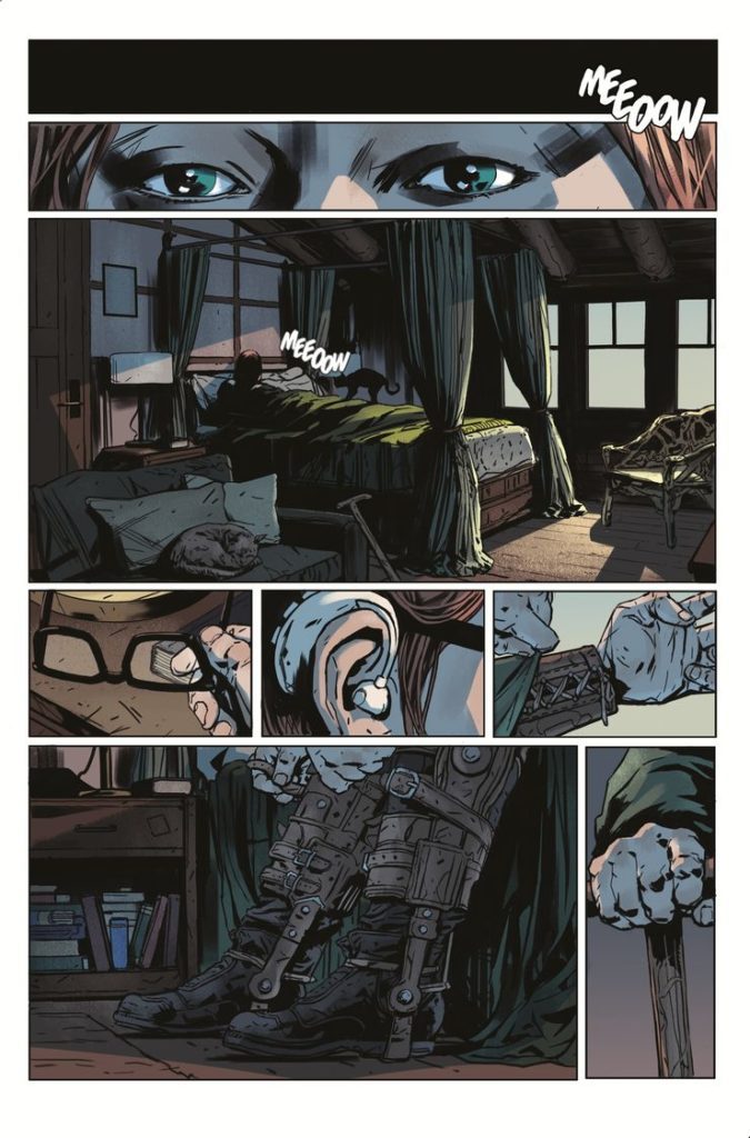
If ever there was a series explicitly designed to tug at readers’ heartstrings, it would be Stray Dogs: Dog Days #1. Written by Tony Fleecs, this issue is everything it promised to be: vignettes from the lives of the leading characters. 

However, there’s a darker twist in each of these stories. Take Killer’s story. His tale (pun intended) reveals the family he had once upon a time, including the friendly monster in his life. There’s this sense of unease that passes from one panel to the next. Likely because we’re all waiting to see how it’s all going to go wrong (hint: it goes horribly wrong, we already know this!).

Then there’s Gucci. Her story would be pretty cute if you were to remove a single panel. This short story is a perfect example of using imagery to tell a story. We can immediately tell Gucci’s loved and what sort of life she had. Likewise, it’s rather hard to miss that sense of foreshadowing snuck in.

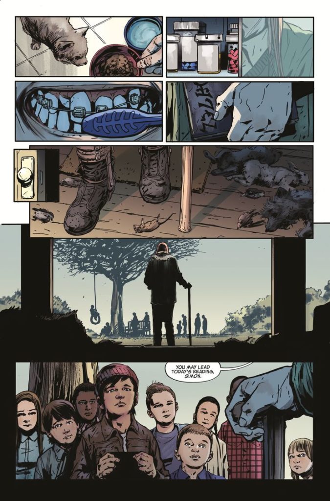
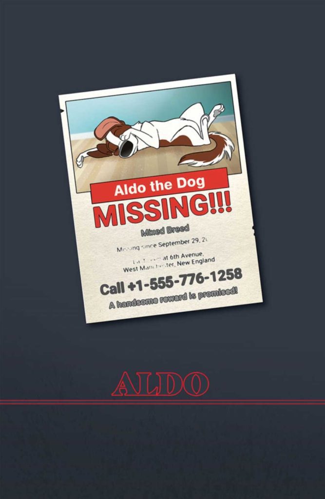
Aldo’s story is the one that stands out from the rest. His story occurs when all the dogs are in their ‘new home,’ but before the story really takes place. It’s jarring and more than a little upsetting. But it also is a strong fit for the main series.

Not to be forgotten, Henry, Imogene, and Roxanne have shorts in this issue. Theirs are in a similar vein to the first couple described. However, their tales are also more graphic as far as timing is concerned.

All things told, there are six short stories in Stray Dogs: Dog Days #1, and I have no doubt that the rest of the pack will be following in the second issue. This is a read that weighs heavy on the heart. And yet, it’s so tough to look away from.

Oh. Uh. That’s not the best toy, buddy.

Artwork

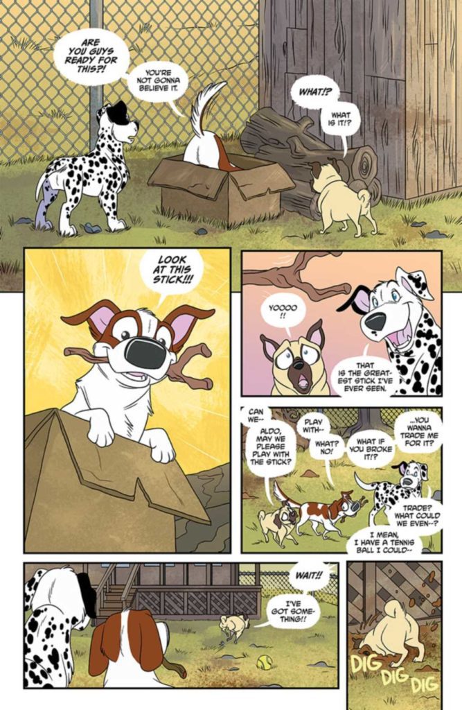
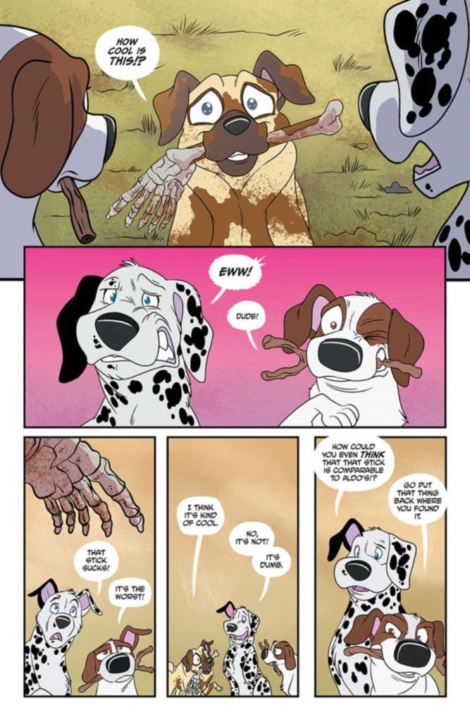
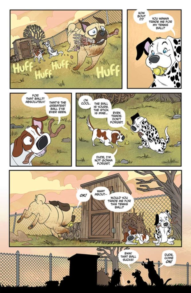
The artwork in Stray Dogs: Dog Days #1 cannot be ignored. Trish Forstner was the lead artist, with Brad Simpson providing colors. Together they created an issue that rings true to the saying that a picture is worth a thousand words.

Much of the story relies on visual elements, especially Gucci’s story. There’s almost no need for words or explanations at any point. It’s brilliantly done. Naturally, this storytelling style is well suited to a story with dogs as the main characters.

As mentioned above, there are still some graphic scenes within these pages. On the whole, they do an excellent job of dancing around the worst of these elements – letting scenes slip out of the frame and the like. 

The artwork shines when one looks closely at the animals’ expressions. You can almost feel what they’re going through – and it will make you want to hug each and every one of them. One scene in particular really struck me for the sheer amount of emotion packed into such a small amount of space. I’ll be curious to see if other readers react as strongly as I did.

Brad Simpson’s colors are vibrant and so very alive. It’s another intentionally jarring element to this series. Yet it also makes the connection to All Dogs Go to Heaven even stronger. Simpson knows how to make the forefront pop through the use of solid backgrounds as needed, and it is never overdone or overstated.

Another impressive feat is how loud this issue feels, despite the relatively low amount of actual conversations that occur within these pages. Every bang or bark practically makes you jump, and the lettering has a lot to do with that reaction. It all feels so real and raw.

Back to trading!

Conclusion

I won’t say that Stray Dogs: Dog Days #1 is the closure fans have been needing (I feel like issue #5 of Stay Dogs handled that quite nicely). But I will say that there is something beautifully bittersweet about these tales and how they fit into the larger whole.

Monkeys Fighting Robots Youtube

Review: Unraveling a Dark History in LADY MECHANIKA: THE MONSTER OF THE MINISTRY OF HELL #1

The beloved Lady Mechanika returns in Image Comics’ latest series, Lady Mechanika: The Monser of the Ministry of Hell #1. Written and illustrated by Joe Benitez, this is the beginning of an adventure we’ve all been waiting for.

A variant cover of Lady Mechanika The Monster of the Ministry of Hell #1

So in case my intro didn’t make it painfully clear: I am a huge Lady Mechanika fangirl. If you have not been lucky enough to read any of the previous series, I would strongly urge that you do so! Especially as this latest one relies very heavily on previous plots and character arcs.

As the title implies, Lady Mechanika: The Monster of the Ministry of Hell #1 is the first in a new miniseries focusing on the one and only – Lady Mechanika. Her fans have long gotten used to a volume popping up here and there.

However, this series is a bit different. You see, we’re finally going to learn a bit more about Lady Mechanika’s past. Until now, much of it had been shrouded in mystery. The leading lady and readers don’t know how she came to be so altered, though that is likely to change soon.

As it turns out, the truth may be even darker than we could have anticipated. This is saying something, given the predilection of the series thus far. Time to dive on in and finally get some answers, yes?

Any guesses on who this mysterious monster is?

Writing

Lady Mechanika: The Monster of the Ministry of Hell #1 was written by Joe Benitez, with writing assistance from M.M. Chen. Much of the issue is split into two distinct points in time: the past and the present.

The past unfolds as if listening to a story, with Lady Mechanika taking up the narrative. It’s dark and gritty – even more so than I had anticipated. This part of the story is turning out to be surprisingly complex, and yet it still feels like we’ve only begun to scratch the surface.

In stark contrast to this would be the present, where Lady Mechanika is safely walking in the light of day. At a fair, of all things. This transition is jarring, intentionally so. It also serves as a reminder of how far she has come—and a reminder of her safety when we look back to darker times.

There are three more issues left to this series, and thus three more issues full of revelations and details. This is good, as I currently have even more questions than I did going into this issue. On the bright side, this is perfect proof that I’ve once again become invested in the tale. I’m certain I won’t be the only one feeling that way.

Whatever it is, it certainly is both fast and dangerous!

Artwork

As a whole, Lady Mechanika has always been a series known for its stunning artwork. Pick up any random issue, and you’ll know exactly what I mean. Each one is a masterpiece, especially the covers.

Lady Mechanika: The Monster of the Ministry of Hell #1 is a heady blend of steampunk aesthetic and horror. Likewise, it doesn’t shy away from the more gruesome imagery that comes alongside this plot – so do consider yourself warned. 

Joe Benitez was the lead artist for this issue, with art assists from Martin Montiel. Benitez’s work is stunning as always. The sheer attention to detail on every page is borderline overwhelming, creating a feast for the eyes. What is most impressive, alongside the obvious, is how delicately Benitez handles the gore. While it is obviously present, it never crosses the line into grotesquery. 

Beth Sotelo provided the colors, and wow, do they have an effect on the tone here! They are very much in line with a classic steampunk color palette, with a strong horror influence here and there. It’s a perfect balance.

Finally, there’s the lettering, crafted by Michael Heisler. I love Heisler’s style, as it makes heavy use of sound effects, colors, and the implication of texture to make the world (and words) come to life. 

Well, that explains a thing or two. While raising many more questions.

Conclusion

Lady Mechanika: The Monster of the Ministry of Hell #1 brings fans back into the fold, yet it somehow has managed to up the ante. Readers are more excited than ever to learn of Lady Mechanika’s backstory. I, for one, will be counting down the days until the next release.


Monkeys Fighting Robots Youtube

Review: DAISY #1 – Here There Be Giants

Writer and artist Colin Lorimer brings us an unsettling horror tale pulled from biblical origins in Daisy #1. This slow yet satisfying opening chapter delivers mystery and brilliant worldbuilding interweaved with disturbing and suspenseful horror undertones. With detailed atmospheric visual work to boot, this is one of the most enticing debut issues i’ve read this year.

“A desperate mother’s five-year search for her missing son leads her to the small town of Brimount and to the mysterious Phillips family. Daisy Phillips, like many teenagers, has a hard time fitting in, but not for the usual reasons. She stands eight-and-a-half feet tall and is still growing, but her troubles with ill health, daily ridicule, and custom-made clothing are only the tip of the iceberg. Daisy may well be descended from a race of cannibalistic giants spawned from the outcasts of Heaven!”

Writing & Plot

Colin Lorimer spins a tale of murder mystery and religious mythology in Daisy #1. We meet the massive teenager as she leads a bible study group with small children. We understand almost immediately, due to the braces and cane she has to use, how different she is. This is increased when we read her dialogue – too solemn and pained with wisdom for a normal teenager. All of this falls in the background of the murder mystery happening at the same time. The mother looking for her long-missing son comes face to face with the massive Daisy – and the rest of this comic’s twists and turns occur. This comic’s plot goes in some delightfully unexpected directions. As a fan of creators taking liberties with mythologies and religions, I found this issue a lot of fun and immensely engaging.

Much of Lorimer’s script here is narrative being read from a book, or recanted from memory. The biblical recitations lend a solemn seriousness to the comic’s pages and perfectly reflects the increasingly dark goings-on. Daisy herself is a character we don’t get much of in this comic, outside a few lines and her – literally – massive introduction. I wish we could have seen more of her here (she is the title character after all), but the rest of the comic is interesting enough to make the wait acceptable.

Art Direction

Even more impressive than his writing is Colin Lorimer’s artwork in Daisy #1. His thoughtfully detailed and heavily inked style works well for crafting this world and creating atmosphere. Character details are intricately thought out and displayed. Daisy’s braces are a mass of delicately interwoven pencils. Every character’s clothing appears in various stages of wear, creating a sense of realistic place. The more unsettling imagery is disturbingly crafted and will likely stay in the reader’s mind for some time to come.

Lorimer’s character and environmental detail are put in place by his thoughtful storytelling direction. His panelling itself is nothing too out of the ordinary, but it’s how he uses it that impresses. Lorimer uses a lot of tightly focused panels to highlight relevant details before backing out into the larger world. This can come in multiple small panels on a page or panels inserted over a splash page. These scenes come on like a Chekov’s gun, with their relevance arriving in climactic surprise. It’s a huge part of what makes this book’s pacing so effective.

The colors from Joana Lafuente and Anita Vu are deep and tonally varied. Their work compliments Lorimer’s heavy inks by staying on the darker side of the color palette. Every choice made is influenced by shadow, overcast skies, or moonlight. The density of their work here really adds to this comic’s atmosphere, and perfectly this comic’s visual design overall.

Verdict

Daisy #1 is an unnerving, intriguing, and unique opening chapter for this horror-mystery comic. Colin Lorimer’s writing mixes tense, enticing pacing with fantastic allegory and scenes of shock and surprise. Colin’s art, along with Lafuente and Vu’s colors, is beautifully detailed and unnervingly atmospheric. If this sounds like your brand of unsettling, be sure to pick up this one-of-a-kind horror entry when it hits shelves on 12/8!


Monkeys Fighting Robots Youtube

Review: WEST SIDE STORY Stuns Under Spielberg’s Direction

West Side Story shines as a heartwarming, brutal, and vibrant musical from Steven Spielberg. The musical numbers are handled with care, and a star is born in a breakout performance. Spielberg had no musicals in his resume, but West Side Story comes off as if he has done plenty. Spielberg’s take on the classic musical should open doors for an entire generation.

The original West Side Story is recognized as one of the best musical films. In this stunning remake, Spielberg delivers a spectacle that is right up there with the original. Acting as a sign of respect while carving its own path. West Side Story follows Tony (Ansel Elgort) and Maria (Rachel Zegler), two teens from rival New York gangs that fall in love. Honoring its source material, the film remains set in the ‘1950s.

Tony is affiliated with the Jets, and Maria is associated with the Sharks. This poignant love story grows into a hard-hitting film rooted in racial tension. Tony Kushner’s screenplay reimagines the musical for a new generation while staying close to home. Some moments are a bit jarring, and character decisions don’t make sense after certain events. For instance, a brawl between the Jets and the Sharks leads to a horrific end.

Maria proceeds to act as if all is forgiven and it doesn’t come across well due to the brawl happening minutes ago. The racial divide between the Sharks and the Jets feels appropriate like it did many decades ago. Zegler’s performance is breathtaking to witness. Her chemistry with Elgort amplifies the development between their two characters. This is one of the best debut performances I’ve seen this year. She displays emotional range, charisma, and conviction as Maria.


There’s so much to appreciate from West Side Story. The immaculate set design, stunning choreography, and brilliant direction make this a must-see event. It felt as though Spielberg had spent decades preparing for this moment. Tackling this genre without any prior experience and then having it turn out so well is incredible. The film’s energy is infectious and the lively performances will keep you invested.

I was apprehensive about this film being remade, but this exceeded every expectation while silencing my doubts. Kusher provides well-rounded characters to grow attached to and then shatters your heart when the conflict reaches its climax. While the first two acts are almost perfect, West Side Story rushes to the finish. It felt as though the fallout was lacking the same care that came before. Combine that with the jarring decisions from Maria and the film ends on a lukewarm note.

Spielberg’s visual spectacle doesn’t completely lose its footing, but the resolution is rushed. Everything before is meticulously crafted and handled with precision. Janusz Kaminski’s cinematography accompanied by Spielberg’s direction makes the choreography breathtaking as it unfolds. Elgort shines as Tony, the young man driven by guilt and love. His reserved, but boisterous behavior keeps Tony an interesting protagonist to follow. Every supporting character is brought to life by crowd-pleasing performances.

West Side Story’s runtime might be felt towards the third act, but it will all be worth it for this 2 hour-long spectacle. Zegler and Elgort’s impressive vocals will warm your heart, especially Zegler, who accomplishes a lot in this star-making debut. With West Side Story, Spielberg continues to prove why he is regarded as one of the best filmmakers in the industry. The original musical film still holds up, and now it has a proper remake that doesn’t stray too far. West Side Story is a glorious achievement and should be experienced on the biggest screen possible at least once.

Monkeys Fighting Robots Youtube

Review: WORLD OF KRYPTON #1 – It Began With A Party Crasher

Writer Robert Venditti (Hawkman, The Surrogates) and artist Michael Avon Oeming (Cave Carson Has A Cybernetic Eye, Powers) come together to revisit events on a long-destroyed planet in World Of Krypton #1. With colors by Nick Filardi and letters from Hassan Otsmane-Elhaou, this opening issue reintroduces the iconic DC setting with settings and characters new and old and in a light we haven’t quite seen them in before. With a perfectly paced and sharply written script, as well as wholly unique visuals, this mini-series is off to a stellar start.

“Krypton is a utopia admired across the universe for its achievements in science and culture, but its shining towers and regal people conceal a planet rotting at its core. When a catastrophic event befalls Krypton’s natural world, it points toward a mass extinction in the making. Jor-El, head of Krypton’s revered Science Council, embarks on a mission to save a world that may already have passed the point of no return.”

Writing & Plot

Robert Venditti writes a tight and very compelling script for World Of Krypton #1. The characterizations, plot unraveling, and dialogue are all so stellar that they make one of the oldest stories in comics fresh for a new audience. Witnessing the beginning of the end for Superman’s home planet from the eyes of its inhabitants has scarcely been more engaging. Venditti wraps several interesting plot threads together. A xenobiological tragedy falls in the background of an important naming ceremony for a new family member of the El’s (who I can’t say). This then gets tied up in Kryptonian political and ideological conflicts and a Shakespearean betrayal that came even as a surprise to me.

Venditti goes about recanting Jor-El’s discovery of the oncoming destruction of Krypton by prioritizing worldbuilding and characterization. Longtime readers of DC comics, especially Superman-centric ones, will no doubt be familiar with Kryptonian customs. However, seeing them in practice in a modern style like Venditti writes makes the old feel new again. His dialogue writing here is fantastic as well. His naturalistic tone makes every scene compelling. Venditti also gives each character a unique voice makes each interaction memorable and stick out on its own. Making the old feel fresh and new is what this script needed to accomplish, and it has done so in spades.

Art Direction

When I saw Michael Avon Oeming’s name attached to World Of Krypton #1, I was both excited and a bit nervous. On the one hand, I adore Oeming’s work. His interiors on comics like the Young Animal Cave Carson series is delightful and brilliantly unique. On the other hand, that uniqueness to his style doesn’t always lend itself to certain comics – especially mainstream ones. Fortunately, Krypton really benefits from Oeming’s singular vision and artistic touch. His heavily inked and distinctly alien designs for the Kryptonian setting paints the long-destroyed world in a previously unseen light. The xeno-affluence in the house of El’s architecture and décor is a perfect atmospheric touch. This comic’s setting mostly being a cocktail party on another world is a great opportunity for Oeming to put his own spin on Kryptonian fashion and design.

Oeming’s character animations and style are great at portraying emotion and personality. His pencils may not be to everyone’s tastes, but it works tremendously well for this comic. Oeming’s work is colored by Nick Filardi, who delivers rich and off-kilter tones to every surface. His use of deep colors, especially the rich purples and golds in the party scene, perfectly compliment the alien setting. Hassan Otsmane-Elhaou’s lettering perfectly captures the dialogue tones and matches Oeming’s artistic sensibilities. Overall this is a fantastic looking comic.

Verdict

World Of Krypton #1 is a fascinating opening chapter to this reimagining of the beginning of the end for the doomed planet. Robert Venditti’s script is smart, tense, and full of fantastic dialogue. The visuals from Michael Avon Oeming and Nick Filardi bring Krypton to life in a style we’ve never gotten to see before, and it works brilliantly. Be sure to grab the beginning of this new mini-series when it hits shelves on 12/7!


Monkeys Fighting Robots Youtube

INTERVIEW: Curt Pires Talks About The Darkness Within MEMORIA

INTERVIEW: Curt Pires Talks About The Darkness Within MEMORIA

Memoria, a ComiXology Original, drops on its platform today. The book is a dark tale in the spirit of True Detective and American Rust. Memoria is written by Curt Pires, with art by Sunando C, Mark Dale drops the color, and you will read Hassan Otsmane-Elhaou’s letter work.


About the graphic novel:
When an aged terminally ill detective and a young burnout are partnered up and saddled with an unsolvable case, they begin to unravel a sprawling conspiracy that points to one thing: The most prolific serial killer in American history. As they further investigate the case, they make discoveries that will force them to question everything and everyone they know.


Pires joined Monkeys Fighting Robots to talk about his new book and the darkness between the pages.

MFR: Memoria is a dark book, talk about where you were as a person writing it.

PIRES: It’s certainly the darkest thing I’ve ever worked on. It could be hard to spend time in that world, but at the end of the day, it’s just a book. The real world, the challenges we face out here are darker than any fiction.

MFR: Sunando C’s art has the perfect amount of grit for Memoria. Why does Sunando C’s style work well for the story?

PIRES: Just a gut instinct really. Sunando’s art has a grit to it but is also just jaw-droppingly beautiful as well. He’s a great storyteller, which I think is the most important thing.

MFR: Mark Dale adds graininess to the color. Did you request that, or was that all Mark?

PIRES: I think early on, we might have talked a bit about the palettes in Fincher films and how I love the sort of green and yellows and browns of those films. But the credit really goes to Mark. He’s a great storyteller with color.

MFR: The crime genre is way older than the superhero genre; how did you find a new lens to tell a story like Memoria.

PIRES: I don’t think of Genre really when I’m creating my stories. I have the idea for a story, which is usually influenced by stuff I like and thinking of how I can put my own spin on things, or push things forward, and then we run from there. I think just looking at crime – there are so many subgenres and different types of crime storytelling, it’s an incredibly diverse space to play in.

MFR: Se7en was a film that broke me as an 18-year-old kid. What crime thrillers had a significant influence on you and your writing?

PIRES: I loved Se7en, but I haven’t watched it as much as I watched Zodiac or Fincher’s amazing GIRL WITH THE DRAGON TATTOO adaptation. Mindhunter was an influence too. The films of Michael Mann – Manhunter and Thief. That first season of True Detective. Cormac McCarthy’s stuff. It was important to move beyond these influences and craft something personal to me and unique. There’s nothing worse than a cover band. I think we succeeded.

MFR: Since I’ve watched more than a few films and read more than a few comics, my imagination takes over when I read a comic, adding music and voices to my read. The more immersed I get in a book, the better the experience. Do you think about how people interact with your writing because every interaction is unique?

PIRES: I do think about it. I hope people get what I was going for and feel something. Evoking emotion is really the point of all art.

MFR: There were a few pages in Memoria where there is no dialogue, and the art carries the narrative. What is your thought process with a page with no dialogue?

PIRES: I’m prone to do that in my books. I think it’s important to let the artists tell the story at times. Like silent sequences in a film. There’s an epidemic of overwriting in comics – often with the goal of appearing intellectual or showing off as a writer – that I just find insufferable.

MFR: I was surprised by how quickly the book moved. What was the editorial process like, trimming down the script?

PIRES: Lots of writing and rewriting until I had exactly what I wanted. It’s the hardest part getting everything perfectly calibrated, but once you do, you just know it.

MFR: There was one censored panel. Did you try to push the envelope of what you could show in a ComiXology Original?

PIRES: That was less of a censorship issue and more of a clarity issue. It looked like something was happening, that wasn’t happening, so I just playfully redacted the panel. I think everyone at ComiXology will attest to the fact that I’m constantly trying to push the boundaries of what we can show in these books – and I’m grateful for their seemingly infinite patience in that regard.

MFR: Memoria is a story that will linger with me for a bit. As the writer, does Memoria ever leave your soul?

PIRES: I’ll miss the characters. Those two detectives. Lots of the broken parts of myself ended up in those men. Godspeed.

MFR: Curt, thank you again for talking with me, and best of luck with Memoria.

Memoria is available now on ComiXology.

Monkeys Fighting Robots Youtube

Review: ONE-STAR SQUADRON #1 -Superheroes at Affordable Prices!

One-Star Squadron Russell DC Comics

“Life is largely a rotation of indignities.”

The Heckler, a forgotten superhero of the 90’s, delivers this line with a wry smile. That seems to be the moral of the story, in DC Comics’ One-Star Squadron. And if you have any doubts about life’s indignities, a quick flip through these pages will show you that the Heckler is smarter than he looks. Writer Mark Russell (The Flintstones, The Wonder Twins, Exit Stage Left: The Snagglepuss Chronicles), artist Steve Lieber (Superman’s Pal: Jimmy Olsen), colorist Dave Stewart, and letterer Dave Sharpe present us with a hilarious, depressing, and moving story about being past your prime and feeling kicked to the curb in DC Comics’ One-Star Squadron #1.

About One-Star Squadron (from DC Comics):

Who you gonna call? One-Star Squadron! Meet DC’s superhero team where heroism meets capitalism. This ragtag group of heroes led by Red Tornado is here to provide service with a smile. All you must do is send a request via their on-demand hero app and they’ll answer any call. Whether it’s a children’s birthday party or an alien invasion, no job is too small or too big!

One-Star Squadron Russell DC Comics

Writing

Too often, comics have had a tendency to ignore some of the less exciting details of a character’s life. We haven’t seen Superman make payments on his mortgage, or watched the Flash beg the Justice League for an advance on his next paycheck. Until now. With One-Star Squadron, Russell is writing a comic that’s about exactly those kinds of nitty-gritty details. He wants to know how Flying Fox or Black Condor feel about no longer being in the spotlight. He wants to see what they have to do to make ends meet.

But all of One-Star Squadron also has a subtle meta flavor to it as well. G.I. Robot and Powergirl aren’t on the Justice League because they aren’t that popular with real-world fans. We see Red Tornado pull up a Wikipedia page to figure out who Gangbuster is, just like readers of this comic will probably be doing. And when Red zones out, thinking about a time he ran into Superman, it’s Minute Man who snaps him back to reality. “Are you in a flashback?” He asks. “Are you even listening to me?” Russell has a ton of fun blurring the line between the DC Universe and the real world.

Art

Lieber has a fantastic knack for visual comedy. At times, he makes scenes feel monotonous. We see three panels, side-by-side, of Red Tornado picking a chair up off of the ground. The perspective never changes, and you can feel Red’s tired resignation in how he moves. But elsewhere, Lieber makes this comic almost seem like a sitcom. When Minute Man and Red Tornado are having a discussion, every panel shifts back and forth between the two of them. We see Minute Man deliver his line, we see Red’s tired response, we see Minute Man getting angry, then Red looking even more tired. It’s the visual equivalent of banter. Lieber creates movement and humor by bouncing us between these two characters who couldn’t be more different from one another.

Lieber also gives this issue an overdose of emotion. Every character wears their heart on their sleeves. We see big smiles, dramatic frowns, and eyes filled with fury. It feels cartoony, often funny, but it’s there to do more than just get a laugh. When we see Gangbuster show up to HEROZ4U, he’s a shell of a man. His whole body almost looks like it’s wilting and his face is full of an intense sadness. Then, Powergirl shows up to say that she’ll watch the shop while Red Tornado tries to help out. She’s smiling from ear to ear. Immediately, we feel even more sorry for Gangbuster. Not only is he depressed, but he’s surrounded by people who don’t seem to care.

One-Star Squadron Russell DC Comics

Coloring

Colorist Dave Stewart is a master of mood. He tends to give every scene an unmistakable ambience. So it’s interesting to see how flat Stewart’s colors are in this issue. The red of Red Tornado’s skin is just as bright, whether he’s standing at someone’s doorway in the middle of the night or in a fluorescently lit office space during his lunch break. Stewart is actively fighting against mood or ambience in One-Star Squadron. There’s already enough depression lurking in the writing, Stewart is the happy painted face on the outside. And the bright colors do an incredible job of making it feel like these characters are burying their feelings of inadequacy. Gangbuster is one of the only characters who we see dimly lit, without any vibrant colors to off-set his depressing demeanor. He’s the only character who’s willing to be honest with himself about where he’s at in life.

One-Star Squadron Russell DC Comics

Lettering

There are plenty of little details that make Sharpe’s lettering so entertaining. The height of each word balloon on the page gives us a an idea of the energy of each line that’s delivered. When someone asks Hawk for a selfie, he replies “No” in a word balloon that’s near the bottom of the panel. You can practically hear it as a low growl. When Red Tornado has a flashback about the glory days, fighting the Royal Flush Gang, Sharpe places the sound effects behind some of the figures. It helps to show that what’s making the sound is the same thing that’s pushing those characters out of the way. But Sharpe also pulls back on the lettering quite a bit. Rarely do we get special fonts in the dialogue, or flashy sound effects. Sharpe allows us to feel the monotony that these characters are experiencing, by only sparingly changing up the flow and rhythm of the lettering.


DC Comics’ One-Star Squadron is hilarious and depressing all at once. This creative team has delivered a biting, moving, side-splitting series that asks “What happens to superheroes who are past their prime?” Pick up One-Star Squadron #1, out from DC Comics December 7th, at a comic shop near you!


Monkeys Fighting Robots Youtube

Review: The Storm Begins in DARK KNIGHTS OF STEEL #2

Dark Knights of Steel DC COMICS Taylor

DC Comics’ Dark Knights of Steel #2 begins with a scream and ends with a whimper. Writer Tom Taylor, artist Yasmine Putri, colorist Arif Prianto, and letterer Wes Abbott set the stage for the chaos that’s coming. But before all hell breaks loose, we witness the quiet, personal attacks that are going to set off the powder keg.

Dark Knights of Steel DC COMICS Taylor

Writing

Issue #1 of Dark Knights of Steel showed us the idyllic, if tense, world of a medieval DC Universe. But issue #2 makes a point of kicking this story into gear. Taylor begins with the final, violent scene of the first issue. But it’s not the violence that makes this story so terrifying. In fact, the rest of the issue feels relatively calm. The House of El mourns their loss, but they also very matter-of-factly discuss retaliation. It’s in that that Taylor finds the true tension of this story. The bureaucratic discussion of war and peace is far more chilling than impassioned duels could ever be. And Taylor also fills this chapter with a general sense of doom. Each character almost seems resigned to the imminent war. They don’t want rampant death, they just know they can’t avoid it. It feels like an all too realistic response to an act of war.

Art

This issue begins in quite an emotional place. But quickly, Putri pushes those emotions to the sidelines. After their initial release of fury and sadness, we see that few characters show how they’re feeling. Instead, Putri shows them with looks of concentration and knitted brows. Clark is one of the few who allows himself to look angry. With this, Putri lends her version of Clark a wide eyed innocence, a youthful energy. He hasn’t become jaded. He’s open and trusting, allowing people to see how he feels. The same can be said of Zala, this world’s version of Supergirl. Putri shows that there’s something different about how the Els grew up. They’ve always been so untouchable that they never learned to guard themselves when danger comes a-knocking. This isn’t to say that the other characters Putri presents aren’t emotive. But they express everything subtly, holding back the true passion of what they’re feeling.

Dark Knights of Steel DC COMICS Taylor

Coloring

Prianto’s scenes, on the other hand, have a very emotive quality to them. It’s part of what tells us what’s brewing under the surface of our more stoic characters’ faces. When Bruce and Clark go into the castle’s dungeons, the scene is lit by the fire of torches. The reddish light gives us a hint of the fury Bruce is feeling. When Zala spars out in the sunlight, the warm yellow glow of the setting matches her face, which is brimming with joy. And when we reach the heartbreaking conclusion of this chapter, the night is cast in a cold blue light. Prianto displays every moment of this comic as a kind of litmus test for each character. Prianto doesn’t just paint with reds, blues, and yellows. He paints with joy, anger, and sorrow.

Lettering

There is a lot of movement in Abbott’s lettering of Dark Knights of Steel #2. The “SHLK” noise of someone’s limb being chopped off actually slices through the air in a jagged, haphazard trajectory. It almost seems to separate the limb from the rest of the body. When the rain douses someone’s pipe, Abbott writes the “TSSSS” noise in the shape of smoke, slowly rising and growing in its font. The “FTT” sound of a flying arrow cuts through the air, and the “THP” of someone catching it feels stationary, like screeching to a halt. Abbott explores how his sound effects can create motion in this comic. His lettering gives so much life and energy to every page.


DC Comics’ Dark Knights of Steel #2 starts setting everything in motion. This creative team hints at some of the doom that’s on its way, like an oncoming storm. But we’ll have to wait and see what the House of El and the Kingdom of Storms next moves will be. Pick up Dark Knights of Steel #2, out from DC Comics December 7th, at a comic shop near you!

Monkeys Fighting Robots Youtube

Review: All Such Beautiful Clichés in THE SWAMP THING #10

The Swamp Thing DC Comics V

There’s one thing that makes DC Comics’ The Swamp Thing such a mesmerizing series. It’s a horror series, but it’s full of beauty and joy. Writer Ram V, artist Mike Perkins, colorist Mike Spicer, and letterer Aditya Bidikar know that without joy and light, the darkness has no real effect. The Swamp Thing #10 is a textbook example of this approach. You won’t have any confusion around why this brilliant series got extended.

Writing

This is one of the darker chapters of The Swamp Thing. After the final pages of our last issue, it would seem that everything is going to fall apart. Yet V still fills these pages with so much optimism and magic. Even as Levi faces his brother, who is hell-bent on killing him, he isn’t full of rage or revenge. He’s thinking back on the times they spent together as children. And when we get to the twisted ending of this chapter, we see the bad guys still have a few cards up their sleeves. But so do our heroes. For every moment of horror and doom, V adds in a scene of happiness and hope. It’s a beautiful balance that helps readers really feel the stakes of this series.

The Swamp Thing DC Comics V

Art

The exact same thing can be said of Perkins’ stunning artwork. When his characters feel happy, you can’t help but feel it with them. When they feel terrified or furious, the intensity of their emotions gushes off of the page. But it’s in the marriage of these two extremes that Perkins’ art really shines. On one page, we see the quiet, simple scene of Levi and Jacob on a tire swing. We see Levi’s laughing face as he swings out, into the air. But overlaid on the page are three panels of death and destruction. One man stares at the reader, a mix of fear and fury in his eyes. And then we’re back to the boys and their tire swing, now seen as a silhouette against a gorgeous sunset.

Later, amidst the chaos of Mr. Pilgrim escaping the Swamp Thing, we see Pilgrim’s face briefly. He’s a villain. Perkins has previously depicted him as the kind of guy who could get away with wearing a flowing cape, dramatically playing an organ. He’s rotten, and we’ve seen the joy on his face when he’s made other people suffer. But now, he looks quietly terrified. Perkins is empathetic to this character. Instead of a villainous trope, Perkins presents us with a human being. Despite everything he’s done, you can’t help but feel for him. Even if it’s just for a second.

The Swamp Thing DC Comics V

Coloring

Spicer’s pages are truly breathtaking. And he absolutely dives into the double nature of some of his colors. At first, we see his dazzling oranges used as the backdrop to a charming scene of childhood innocence. The orange sunset paints everything in its wake, giving these scenes a golden hue. Later, the same colors are used to show the fires of destruction. And it’s in The Swamp Thing #10‘s bleakest scene that we really see Spicer’s work in its full glory. He strips back the scene, making everything look grey and lifeless. And as hope slowly finds its way back in, so do Spicer’s colors. Spicer has the ability to make everything look gorgeous, while also giving every shade and tint a deeper meaning.

Lettering

Bidikar’s lettering is really something to behold. We see the calm, casual cadence of Jacob talking to the Swamp Thing, in the midst of battle. His font stays the same size, his words are rarely even bolded. He isn’t frightened or desperate. Later, when we see Jennifer Reece yelling at Mr. Pilgrim, her word balloon is surrounded by a thick red border. “You won’t get away with this!” she yells in bold. But her font isn’t huge, her words don’t try and break past the border of her word balloon. Bidikar hints that even as she says it, Reece knows her words are pointless. And later, Bidikar shows us what true desperation looks like. The Swamp Thing gasps for breath, he screams, and the “GNAAAH!” sound he makes barely sits in his word balloon at all. It reaches out far, just as he urgently reaches out for life.


DC Comics’ The Swamp Thing continues to be a beautiful and compelling series. Part of the magic of it comes from this creative team refusing to create something that’s monotonal and bleak. Instead, they have created a series that has just as much hope as it has terror. The result is a balanced, poetic, moving series that thankfully is getting a well-earned extension. Pick up The Swamp Thing #10, out from DC Comics December 7th, at a comic shop near you!

Monkeys Fighting Robots Youtube

INTERVIEW: OH MY GHOST #1 is Coming Through Kickstarter!

Oh My Ghost is a comic from Web Toons with over 48,000 subscribers. The highly-rated series features the story of Loi, a boy who finds out his new home is haunted by Maya, a ghost with a penchant for snacking. Now the series creator, GhostMaya has launched a Kickstarter to offer the first physical collection of the comics. GhostMaya was kind enough to sit down and tell Monkeys Fighting Robots a little about the project. 

  1. For those who have never read your series before, what is Oh My Ghost about?

Oh My Ghost is a webtoon or webcomic series about the story of Loi who is broke and desperate to find a place to stay. So he decides to rent a very cheap haunted house where he will meet Maya, the ghost, who has no memories of her past and who is afraid of scary stuff, including ghosts. Also, Maya loves to eat and her favorites are ice cream and cake. Yup, you heard it right, this Ghost can eat because logic is useless in my series. 

By the way, Oh My Ghost already has 7 seasons and 700+ episodes.


  1. What series influenced you to create Oh My Ghost?

The early seasons of Oh My Ghost were inspired by the series of 90’s – 2000’s anime era, like Chobits, Sailor Moon, Ranma ½Dragon Ball Z, Card Captor Sakura, and Revolutionary Girl Utena. Later on, in season 5 and especially in season 6, most of my story was inspired by Bleach and Jojo Bizarre Adventure, Hunter x Hunter, and Gintama. There’s been a shift of genre since season 5, since I like to try action scenes and improve my story as well. Just think of my series as like Dragon Ball becoming Dragon Ball Z and Jojo’s Hamon becoming Jojo’s Stand. Yeah, you can clearly tell that I was influenced by Anime.

I still remember when I was 5 years old, every day at 5 pm, I would peek into my neighbor’s window just to watch anime since my family was very poor and we lived in a slum area here in the Philippines. Since we were poor we couldn’t afford to buy western comics.  

  1. What is the favorite storyline you have written for the series?

I like the season 1 storyline because it has a romantic comedy theme, but my favorite is season 6. The tone of the story becomes darker since there’s a mystery, and murder theme involved. I actually did a lot of research about psychopathy and some real crime cases about murder since the main villain of season 6 has the fetish to kill beautiful high school girls. 

The Villain’s character was influenced by Kira Yoshikage from Jojo Bizarre Adventure, Patrick Bateman from American Psycho, and the song “Polly” by Nirvana. Most of my fans and readers didn’t expect who the villain was. Can’t spoil it, better to read season 6 (Season 6 starts at episode 343).

  1. Your stories have featured both comedy and fight scenes. Which do you find easier to create?

To be honest, it really depends on my mood and inspiration. If I get tired of wholesome romance scenes, I will create a comedy episode. Then if I get tired of comedy scenes, I will create an action and fighting episode. 

I think all of them are easy to make, as long as you have an inspiration or an idea. Like when you watch a movie/series then you ask yourself “What if the ending is like this?” or “What if the characters are like that?” or when you listen to music you can relate to. When you walk to a mall and you see a scenario. Sometimes my stories are based on real-life experiences. Also, my mind is full of stories, that’s why my series ended up having 700+ episodes.

5. Why did you decide to go with crowdfunding for the project?

I decided to go with crowdfunding for Oh My Ghost because it is similar to the interview with Rick Lopez (The Power). Lots of creators are tired of giving away their best ideas to companies and I’ve been a Webtoon Canvas Creator for 5 years and hoping to become one of the Webtoon Originals. But I started to lose hope and I feel that I’m not growing anymore and it felt stagnant. So I decided to try self-publishing instead and hope to gain experience as a comic artist. I’ve always dreamt of making my passion for comics my actual job, and with crowdfunding, I was hoping it will fulfill my dream.

Oh My Ghost

  1. Your series is already up to 700+ strips. Do you have an ending in mind?

 Since Episode 1, I’ve already had in my mind the perfect ending of Oh My Ghost. Spoiler Alert! It would be a tear-jerking ending. Muahaha *evil laugh* but of course, my fans and readers know that I’m unpredictable, so who knows.

  1. What can fans expect in the upcoming season 8 of Oh My Ghost?

More Adventure, more hints at Maya’s past, more lore, more wholesome stories, and more characters to be introduced. And of course, more stories to tell.


Are you a fan of Oh My Ghost or just hearing about it for the first time? Leave a comment below and let us know. Also, click here to check out the Kickstarter.

Monkeys Fighting Robots Youtube