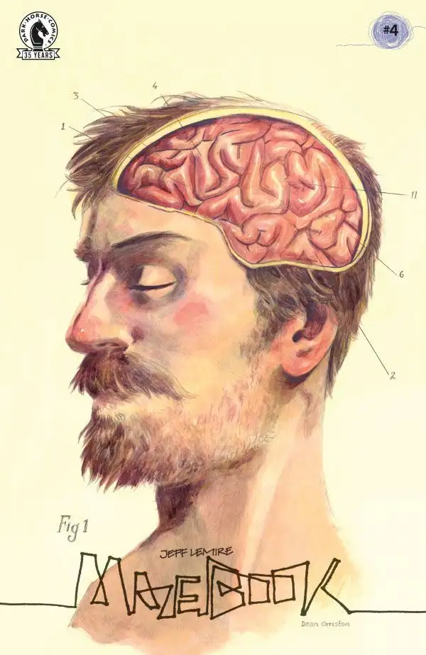
Jeff Lemire returns to his story of loss and grief at his most creative in Mazebook #4. With lettering from Steve Wands, this issue sends Will full-on into his dreamlike journey to find his daughter with suspenseful results. With sharp, naturalistic writing and brilliantly creative direction, this is yet another powerful chapter in this emotionally charged series.
“Stuck in an urban labyrinth of his own torment, melancholy building inspector Will and his talking canine companion fight their way through a dangerous metropolitan maze and head underground on the hunt to find his long-gone daughter.”
Writing & Plot
Lemire’s focus and pacing in this issue changes as much as the story’s setting with Mazebook #4. This time around, Will has finally arrived in the dream(?) realm where he believes his long lost daughter still lives. Here he meets up with a canine companion and the two hunt down the mysteries – and threats – awaiting them. As per usual, not much about the actual plot is discussed. Instead we find out as much about this world as Will does. He is our eyes and ears for this whole chapter. The surprises and dangers come across as surprising but almost natural feeling obstacles in an unnatural setting. The dreamlike state we’ve experienced this entire series in makes these new occurrences make sense in an unexpected way.
Our experience of the narrative is quite different in this issue due to Will’s change in focus. Where as in prior issues we’ve gotten his grieving internal narrative, here we only get his direct dialogue. He’s driven in this issue, more so than he’s been this whole series thus far. He has a purpose now that he’s here in this strange realm – and he has company. Lemire’s dialogue sensibilities really shine in this series, and this issue is no different. Will and his new friend’s back and forth is funny and endearing, and feels like real conversation. The comic’s steady pacing and uncertain progression makes this a charming yet tense installment in this outstanding series.
Art Direction
Jeff Lemire’s now signature art style crafts the perfect atmospheric experience in Mazebook #4. Admittedly not a visual style many readers can get behind, I find his brand of character art and design charming and emotionally evocative. This particular issue, however, sees Lemire in a previously unseen top form in terms of design and layout. Here, many of the pages are two-page spreads where the action is directed via a visual maze. It can start in the middle of the prior page then drop to the bottom, then swing back to the top of the facing page. This sort of approach has been done before, but rarely to such neat (and plot-relevant) effect. Lemire’s application of inks and watercolors over his pencils brings the usual sense of rich atmosphere, with a more foreboding touch.
The lettering from Steve Wands complements Lemire’s rough-hewn pencils with a similar approach. His fonts appear as if they were made with a #2 pencil, and I mean this in a positive way. There’s a handwritten quality to them that fits this comic perfectly.
Verdict
Mazebook #4 is a fascinating, tense, and brilliantly designed chapter in this stellar series. Lemire’s dialogue sensibilities, pitch-perfect visual aesthetic, and engaging page design make this another incredible issue in this engaging comic series. Be sure to grab a copy when it hits shelves on 12-15!
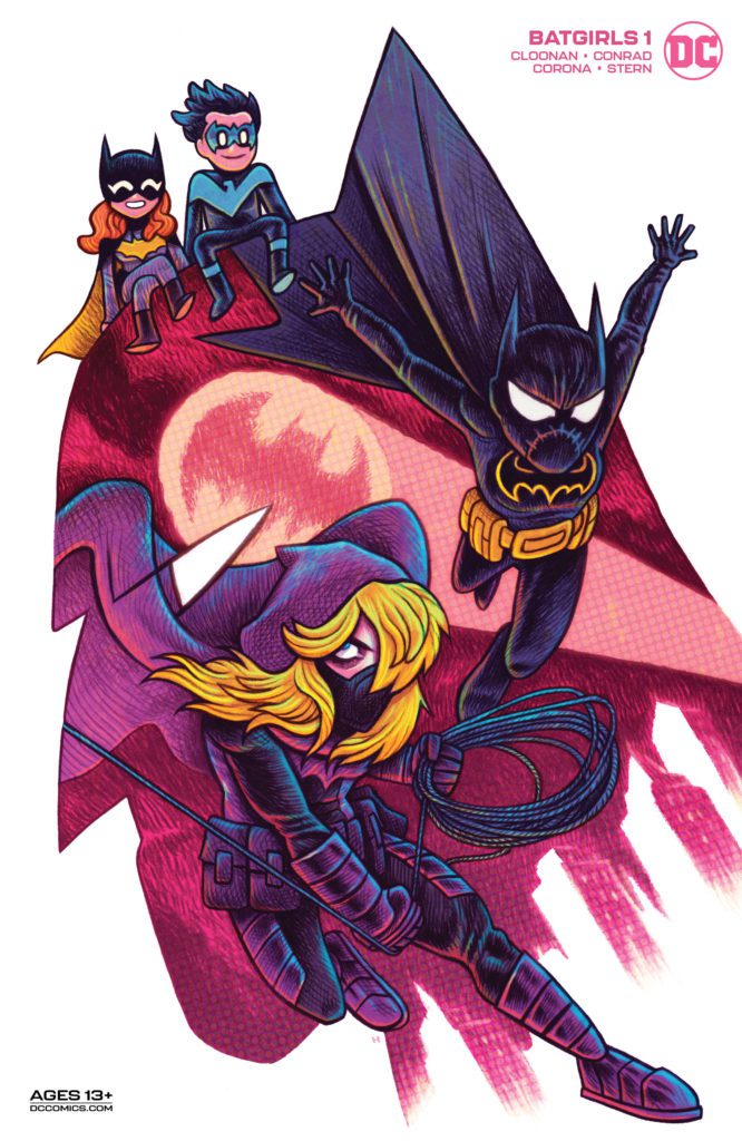
DC Comics’ Batgirls #1, available now, is about to give readers three for the price of one. Three Batgirls, that is. Becky Cloonan, Michael W. Conrad, Jorge Corona, Sarah Stern, and Becca Carey come together to tell this tale. All while the three Batgirls are still on the run from Seer, which means finding low-tech ways of protecting the city.
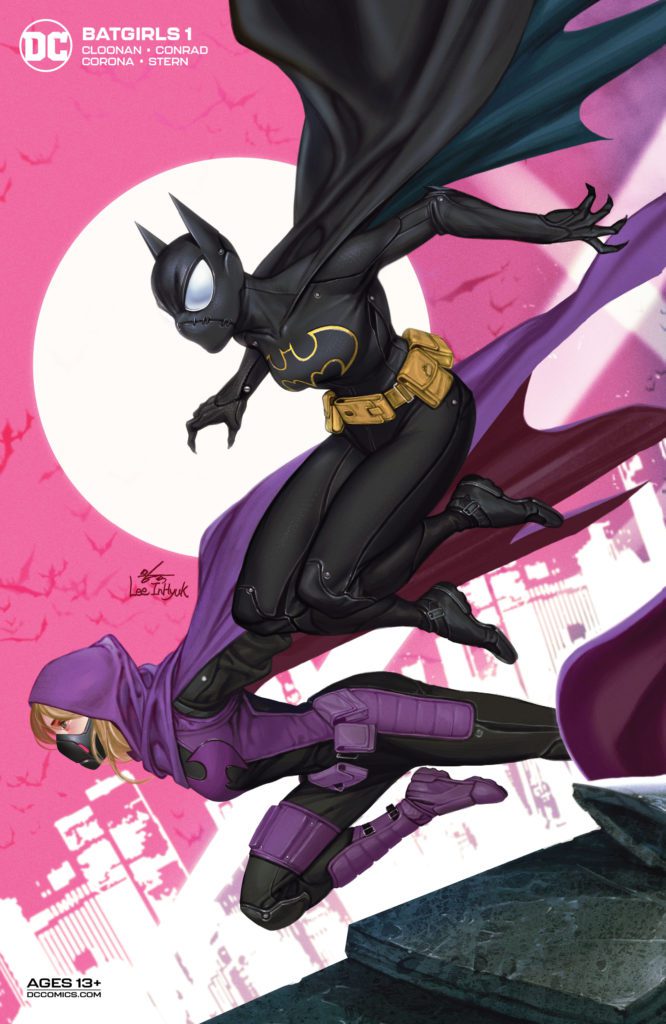
Cassandra and Stephanie take center stage on this cover of Batgirls #1.
The women who share the Batgirl mantle have been having a rough go of it in recent issues. First, their beloved (and iconic) clock tower was blown to bits. Then they were framed for its destruction. And finally? They’re dealing with a new villain, one that perfectly counters Oracle and her talents.
Despite these concerns, it is fantastic to see the trio back together for their own series in Batgirls #1. If there’s one thing we know about these heroines, it is that nothing keeps them down for long. So yeah, they’re going to rally, which involves finding new ways to keep on fighting.
The Batgirls aren’t going to let an enemy like Seer stop them from doing what is right.
Writing
Batgirls #1 is every bit as charming as readers could have hoped, if not more. Becky Cloonan and Michael W. Conrad perfectly capture three fan-favorite characters’ voices and blend them into an entertaining and energetic issue.
The sheer amount of energy in this issue allows each character’s personality to shine through. Barbara is calm, exhausted, and forming a plan. Stephanie is as bright and bubbly as ever. And Cassandra is still driven and succinct. There’s an added level of sweetness here as Barbara does her best to step up as caretaker for the other two, despite all of the complications that come with this action.
The issue starts as one might expect, with the trio in desperate need of a new sanctuary. While their new building doesn’t have the iconic look of the clocktower, it does still have a fair amount of personality. Whether or not that is a good thing remains to be seen.
That is but one of the changes portrayed in this issue, as a lot is going on. There are several threats on the horizon, not least of which being Seer. Seer has already proven to be a fascinating counter to Batgirl/Oracle, and it will be interesting to see how this character develops over time.
Hey, even a hero needs a break every now and then!
Artwork
If you think the characters and their personality within Batgirls #1 are bright, just wait until you see the artwork! The characters are expressive, the colors pop off the pages, and the action sequences demand attention.
Jorge Corona’s take on the three Batgirls is shockingly brilliant. It’s easy to see minute details on each of their faces, from Barbara’s exhaustion to Cassandra’s battle for control over her own life.
A thousand little details grab the eye, thanks partially to the coloring by Sarah Stern. To say that Stern’s colors are vibrant almost feels like an understatement. They’re the bright neon hues that only street art seems to capture, and yet here they are on the pages for us to adore.
Becca Carey’s lettering is the grounding feature necessary for this issue. The words help keep readers on track, guiding us from one panel to the next. It’s impressive how well-done the lettering is here, as they don’t remotely get lost in the sea of action, details, and colors.
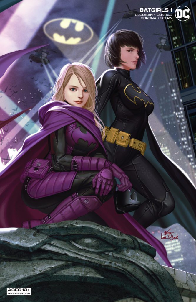
Batgirl and Nightwing look so proud on this variant cover of Batgirls #1.
Conclusion
Batgirls #1 is the start of something fun and new. In other words, it’s going to be the perfect read for any Batgirl fan — regardless of which one you adore. Given how quickly this issue dives into the thick of things, it’s going to be a blast seeing what happens next.
I shouldn’t be at a loss for words about this issue. With writer Jeff Lemire, artist Andrea Sorrentino, colorist Dave Stewart, and letterer Steve Wands manning the ship, frankly, I should be expecting this level of excellence. Yet, Image Comics’ Primordial #4somehow manages to be even more beautiful than all the issues before it. This creative team knows that sometimes the simplest things are also the most meaningful.
Writing
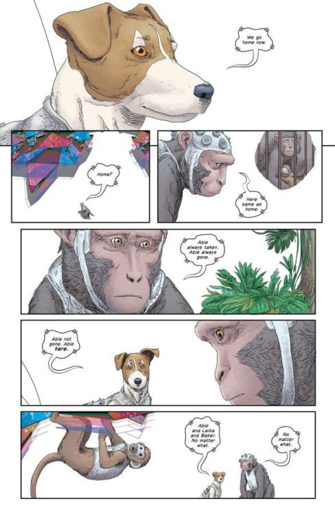
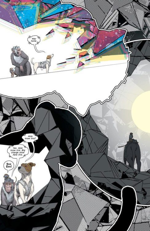
Lemire’s script for Primordial #4 is led almost entirely by our three animal characters: Able, Mrs. Baker, and Laika. While they’re still undergoing the changes spurred on by previous issues, they are able to communicate in basic, if powerful, terms. They use words like “good,” “bad,” and “home.” But in giving these animals such a basic script, Lemire connects us to some of our most primal feelings. We want to be good. We want to be home. And when we see that these animals do too, that’s all that matters. Lemire doesn’t get distracted by the complexities of his story, and neither do we as readers. Those things, though interesting, get pushed to the margins. It’s the little critters that are navigating these complexities that we hone in on. In putting the story on their backs, Lemire makes this issue so moving, yet still easy to digest and understand.
Art
Sorrentino’s imagery is also a big part of what keeps us focused in this issue. He chooses all the right details to give us the feeling of every scene. When things begin to go wrong for our animals, we don’t see big images of them running or cowering. We see a panel of Mrs. Baker’s eyes peeking out from between her fingers. Or we see Able’s hands, desperately grasping at the side of a rock. And yet these images are often panels found in pages with wild layouts. Sorrentino will scatter panels across a page, like glass shards falling to the ground. That way, these small, intimate, emotional moments, tied together by the chaos of the panels on the page, make for deeply moving scenes.
Coloring
There are massive sections in this issue that don’t have much color in them. Stewart first shows us Able, Mrs. Baker, and Laika walking through scenes that are grey and white. The scenes feel quite matter-of-fact. We’re left worrying, for a second, that in gaining a higher intellect, these animals have traded away their joy. But then color splashes onto the page. It’s a joyous and beautiful return to emotions. And once Stewart has brought us back, he doubles down. When the animals are in danger, the page is covered in neon yellows and bright oranges. By stripping away the color for a while, Stewart gets us on the edge of our seats, our faces buried in the page. And that’s where Stewart wows us with dazzling colors and fills us with potent emotions.
Lettering
The most interesting aspect of Wands’ lettering comes through in how the animals talks. We see Able and Laika talking in broken sentences. Their word balloons have wavy borders and their font is small and tidy. It all feels quite refined. But when Mrs. Baker – who still communicates in “Eee eee!” noises – speaks, her word balloon is simple and her font is bold and slightly messy. Later, we see Laika panic. She talks about what’s wrong, but she barks too. And when she barks, Wands abandons the wavy borders and tidy font. We see Laika’s animal instincts rise back up into her throat. It’s a fantastic way for Wands to show us the emotion of that moment.
Image Comics’ Primordial somehow gets more beautiful with each issue. This creative team communicates in the simplest terms, to navigate us through a complex story. It’s stunning and moving. Pick up Primordial #4, out from Image Comics December 15th, at a comic shop near you!
JUST ROLL WITH IT from Random House Graphic hits your local book shop today. I wish this graphic novel was around when I went through sixth grade; it would have been a great comfort. Also, the universe that Lee Durfey-Lavoie and Veronica Agarwal created is one that we should all aspire to work towards. JUST ROLL WITH IT is fun, timely, and absolutely charming.
About the book:
JUST ROLL WITH IT is about Maggie, an anxious girl who turns to her twenty-sided die whenever she feels unsure. As long as Maggie rolls the right number, nothing can go wrong… or so she thinks. But what happens if Maggie rolls the wrong number? Perfect for fans of Guts and Real Friends, JUST ROLL WITH IT is the debut graphic novel from writer Lee Durfey-Lavoie and the second graphic novel from artist Veronica Agarwal.
After reading JUST ROLL WITH IT, I had to speak to the creators about their motivations and perspective. Enjoy the interview below.
MFR: Lee Durfey-Lavoie and Veronica Agarwal, thank you for taking the time to chat with me. Did you need to publish JUST ROLL WITH IT, or did you want to publish the book?
Lee:JUST ROLL WITH IT was very much a need. For me, it was really an emotional fulfillment- of being able to say ‘I can write this story,’ of fulfilling my childhood dream of being an author, and a kind of lighthouse-like beacon when I was in a job I didn’t like—and meeting all those landmarks, with Maggie? A scared kid going through a lot of hard emotional days? It was just perfect.
MFR: What will your emotions be like when the book gets into the hands of readers?
Lee:I’m going to be very honest—I’m going to lose my mind. We’ve worked really hard, a LOT of people have worked really hard, to get this book here finally, and it means a lot. For people to connect to and relate to Maggie and her story is kind of mind-blowing that it’s finally here.
Veronica:It won’t feel real for a while, I don’t think. I think my mind will deflect a lot and be like, “well okay, it’s out, doesn’t mean anyone bought it,” or “they bought it, doesn’t mean they read it,” or “they read it, doesn’t mean they liked it”… but Lee will do what he does best and remind me that the question “what if everything goes wrong” can be easily changed to “what if everything goes right?” I plan to hold onto all the positivity coming our way and hug the Maggie doll that my best friend, Alex Graudins (@toonyballoony) made me a whole bunch.
MFR: Can you talk about your creative partnership? You’re dealing with several subjects that can get emotionally charged; how did you ensure that each others’ visions came to life on the page?
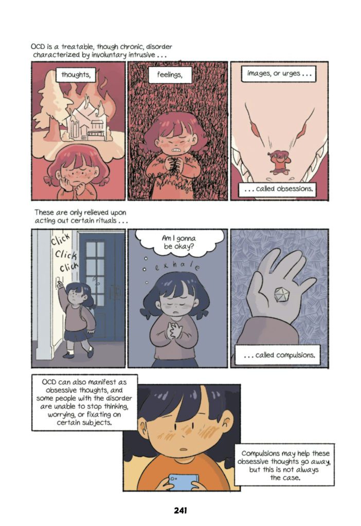
Lee:I think a lot of it just boils down to being honest and open. If something on the page—be it a line in the script, the direction of a thumbnail, etc.—didn’t sit right with us, then we would bring it up to the other. There was also a lot of ‘off the page’ conversation between each version (from the original mini, to the outline, etc., etc.) where we discussed what we thought was important and needed to be on the page. We also realized early on that it would basically be impossible to fit every variation and example of OCD and anxiety onto the page so we had to narrow it down to make narrative sense for Maggie.
Veronica:As Lee mentioned, it was a lot of communication! Sometimes I would be drawing a page out, and I would have to consult Lee about changing a line to fit the expression of a character or the flow of a panel better, or reordering something or adding a scene. I think our creative partnership is a little unique because we’re life partners as well, so I was constantly bugging him about changes I wanted to make, and if he thought they worked—more often than I might bug a professional partner, haha. But I think that worked in our favor because it let me finesse a lot… and let him keep me from finessing too much.
MFR: Veronica, why was it important to tell your audience you used a 1.5 Faber-castell pen?
Veronica:Okay, to be really honest, our editor told me to list the specific supplies that I used when making it, so I did. I also do just love that pen though! I’ve tried using other things for thumbnailing, and 1.5 Faber-castell pen is what I feel most comfortable with; it keeps me from getting too hung up on detail when it comes to the planning stage, and I just love how it feels when you draw with it!!
MFR: The “How We Made This Book” section at the back is brilliant. As a creative team, you went the extra mile. Do you realize how much of an impact you could have on a person with those four pages?
Lee:These are such kind words, thank you so much, and all that praise has to go squarely to Veronica because that was fully and totally her idea.
Veronica:Thank you so much! As an artist, this was my favorite type of bonus content that could be included in books. When I was growing up and reading manga, I loved seeing the mini sections about what the artist was doing in between drawing, getting to know them across multiple chapters, or meeting them briefly at the end of the book…it felt like such a special connection from artist to reader. It’s something I thought about, but to hear that you think my pages could make that same connection with a reader now means so much.
MFR: There are some great colors and textures in the book, do you, as a creative team, have a conversation about the color palette and what were you trying to accomplish?
Lee:Yes and no. A lot of this is up to Veronica; she is the expert. Occasionally there would be a page or a panel here, and there she asked if I liked better, but the vast majority is all her hard work and talent. Some of the stuff we DID collaborate on was the albino animals, Maggie’s die, the inky black swirls that crowd Maggie when she gets stressed, some of the stuff like that.
Veronica:Admittedly, I didn’t consult Lee on this very much!! I went with my gut for color selection, and I tried to reflect the mood with my use of texture. My secret was taking screenshots of the ink PDF in the books app on my iPad, putting those screenshots into Adobe Fresco, and coloring over them in batches at a time, so I could get a look at how things worked together as opposed to doing each page individually. That helped a lot in regards to setting a visual mood for certain pages and scenes!
MFR: Lee, what was the process like finding Maggie’s voice?
Lee:After brainstorming sessions way back in 2016, short stories and drabbles as we developed characters and plot, the 12-page mini, and an outline I revised probably like four times, I can say Maggie’s voice came kind of naturally, haha. But really, there were some dialogue revisions right up until the very end, making sure everything sounded right. I can say that the easiest time I had writing her is when she’s having fun—writing the moments where she’s surrounded by a semi-chaotic group of friends, and family members comes very naturally to me.
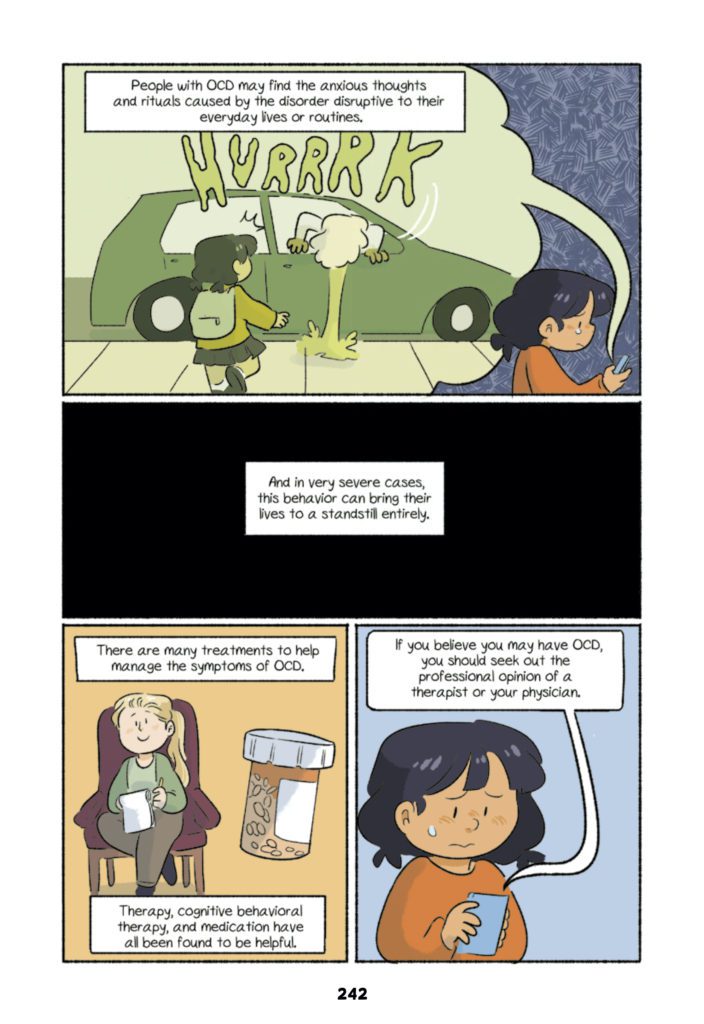
MFR: Veronica, can you talk about the visual techniques you used to bring Maggie’s OCD and frustration to life?
Veronica:When I was brainstorming on how to represent anxiety visually, I tried to think a lot about how it feels for me physically. Anxiety is different for everyone, but for me, panic feels like a bird fluttering desperately in my chest. For Maggie, I went for a kind of buzzing feeling, something that shuts everything else out with its own inescapable noise.
MFR: You have three albino animals in the book; what’s the hidden meaning?
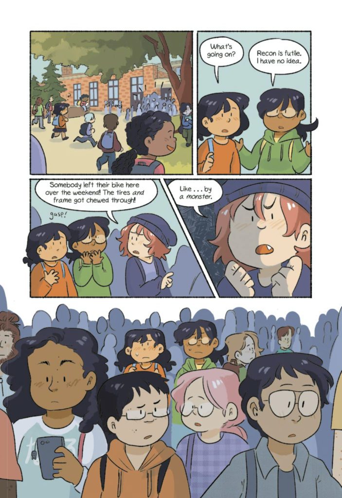
Lee:Well, I’ll be honest, I don’t really remember. I know the monster outside the school was actually a product of our (amazing) agent Susan Graham (@Grahamophones) – which is an outside reflection of Maggie’s inner turmoil. As to specifically why it’s an albino, I believe it was because being albino, in the wild, is a unique marker—but one that can put you in danger. It’s not necessarily a bad thing, but untreated, unadjusted for, it can put you in situations that are bad for your health.
MFR: After JUST ROLL WITH IT becomes a hit, what next for our brave, creative team?
Lee:Thank you so much for your confidence and enthusiasm! Currently, we have a sequel for JUST ROLL WITH IT, and while it doesn’t have a name just yet, you can follow us on Twitter at: @Anuanew and @Leedurfey for updates and events and the like! We have other stories we want to tell that we’re also developing right now, but at the moment, they’re top secret.
Veronica:I won’t repeat what Lee said, but I will just say thank you so much for your kind and insightful interview questions as well! We had such a wonderful time answering these, and they were so so kind.
MFR: Lee and Veronica, thank you again for your time, and best of luck with JUST ROLL WITH IT!
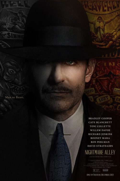
Nightmare Alley is an impressive noir film from Guillermo del Toro that features a career-defining performance from Bradley Cooper. Cooper’s talent is undeniable, but he channels a darker side and brings it to life brilliantly. Paced very leisurely, Nightmare Alley does have its dull points. Toro decides to kick it up towards the end with a heart-pounding final act that keeps you invested. Nightmare Alley is a stylish crime drama that keeps you on the edge despite its sluggish moments.
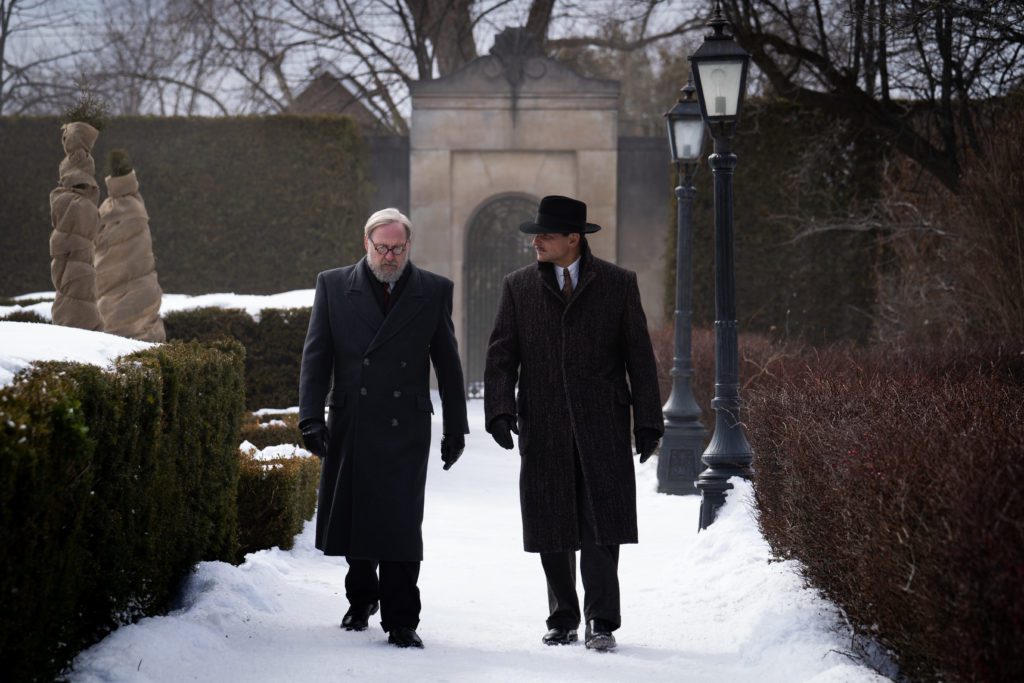
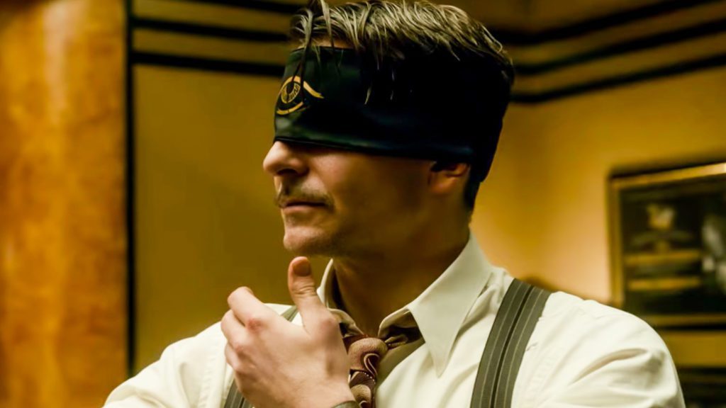
The costume and set designs featured in this film are breathtaking and immaculately crafted. There’s a feeling of intimacy with each frame, and it grows into a very tense affair once Cate Blanchett enters. Her presence shifts the film into a different gear that elevates your curiosity till the true intentions of her character are revealed. Nightmare Alley follows Stan Carlisle (Cooper), a man down on his luck until he cons his way to the top. He partners up with a psychiatrist, Lilith Ritter (Blanchett), who proves to be savvier than he expected.
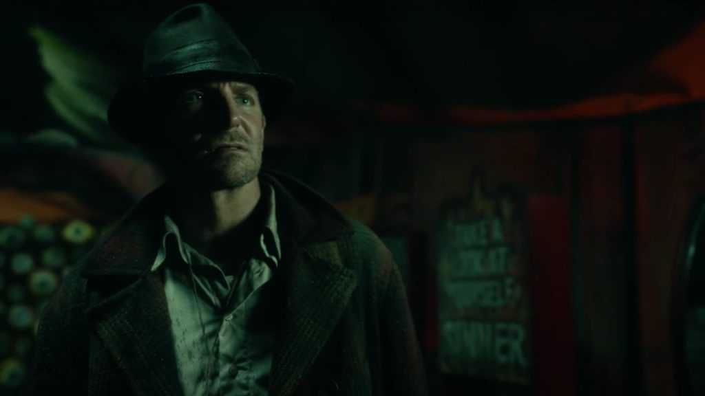
Toro collaborated on the screenplay with Kim Morgan. The allure of Nightmare Alley can be found in its carnival setting, but that disappears halfway through. Opting for a more prestigious setting as Stan cons his way through life. Down on his luck, and believing himself to be capable of something better. Stan takes his lover Molley (Rooney Mara) and himself out of the carnival life to perform tricks in a disastrous get rich quick scheme.
Stan is reserved and very gracious at first, but the allure of success and wealth transforms him into a greedy monster. His conniving ways lead him down a path of self-destruction after meeting Lillith. Molley grows into this sympathetic protagonist while Stan unravels. She isn’t aware of his new mistress, or the schemes he keeps hidden. Stan’s likable qualities are subdued by his desire to acquire wealth by any means necessary.
Nightmare Alley keeps Stan intriguing through constant flashes of a horrific act that clogs up his mind. His feelings of guilt about this are made evident by his compensating through his greedy habits. There’s a substantial amount of effort put into developing Stan. He isn’t very likable as the film progresses, but the thought of him getting caught makes the payoff that much more rewarding. His affair with Lilith provides Nightmare Alley with some of its best moments.
Cooper and Blanchett’s chemistry cast a spell when Stan and Lilith are together. An irresistible feeling of curiosity takes over, as you try to figure out which character will best the other. Cooper’s performance is going to be talked about for quite a while. The talent he displays in this role is a testament to his range as an actor. His delivery, facial expressions, and overall breathtaking portrayal are a true highlight.
Toro thrives at the helm of his first film to be void of any mythical elements. This alone makes the inner struggles of Stan more disturbing, as Toro brilliantly draws attention to real-world monsters for a change. Nightmare Alley’s pacing becomes its worst enemy, but Toro turns the sluggish middle act into a thrilling finale. Even when its runtime is felt, Nightmare Alley is so well crafted that you can’t help but grow attached.
Nightmare Alley is a spine-chilling noir film that features the best performance of Bradley Cooper’s career. The slow burn may feel unnecessary, but each moment becomes relevant in the film’s conclusion. It’s a visual delight thanks to the film’s phenomenal production design. Nightmare Alley has an attractive appeal that makes up for the sluggish pacing, but Cooper and Blanchett are what keep this story compelling.
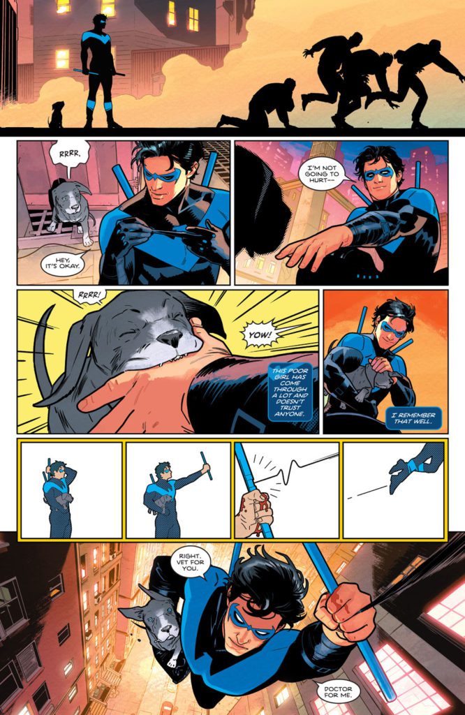
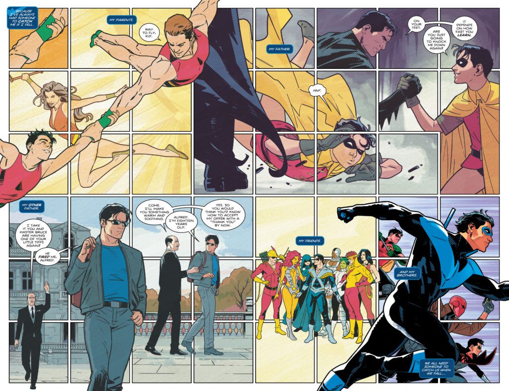
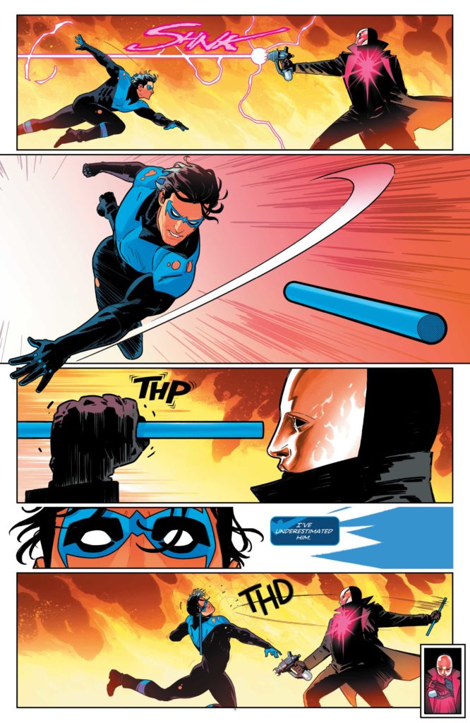
Dick Grayson is back! With more resources than ever, he’s hell-bent on whipping Bludhaven into shape. But fate has other plans. As Blockbuster pulls the strings of the Bludhaven elite, Dick learns a startling secret from his past, and must face off against a serial killer who’s in the habit of collecting people’s hearts. Nightwing Vol 1: Leaping into the Lightis the first collection of this run by writer Tom Taylor, artist Bruno Redondo, colorist Adiano Lucas, and letterer Wes Abbott. It collects the heartfelt stories found in Nightwing #78–83.
Writing
Taylor’s script is just magic. He brilliantly balances hope and fear, joy and despair. Instead of throwing readers right into the madness, Taylor gives us a joyful first issue. We see hints of the danger that’s nipping at Nightwing’s heels, but we also see him enjoying being alive. So when things get darker in this series, readers are left with something to hope for. And even when this series does get dark, Taylor still fills these pages with little moments of light. Whether it’s a new pet, a moving letter from an old friend, or even just a great joke, Taylor gives us something to smile about.
Art
Speaking of things to smile about, Redondo’s art is outright grin-inducing. And he’s never been as versatile or experimental as he is in this series. We see hilarious play-by-plays of a characters’ faces, watching their reaction to something slowly unveil itself. We see Nightwing somersault through the air, each twist and turn shown in the panel to mark his trajectory. And we see instructional images of Nightwing putting his baton together, like something out of the information booklet on a plane. Redondo shows characters through a doorway peephole in a round panel, their image warped by the magnification. He does a tour through Nightwing’s history, mimicking the Ben Day dots of each era as he does so. There are just too many examples to give of Redondo’s brilliance. He is constantly changing up his page layouts and his visual language, yet he’s always serving the story. It’s incredibly entertaining and more than a little bit breathtaking.
Guest artists in this volume include pencillers Rick Leonardi and Neil Edwards along with inkers Andy Lanning and Scott Hanna. Leonardi, Edwards, Lanning and Hanna do a great job of bridging the gap between Redondo’s incredible style and the more traditional approach of golden age comics (which is where their segment is set.) They celebrate that era of comics, while imbuing it with a modern flare.
Colors
Lucas makes you feel as though you’ve lived through these scenes with the characters. He gives each moment a real sense of time. So, when we see the bright rays of the early morning sun seamlessly transition into the soft coloring of a late afternoon, we feel like we’re there. You’ll experience full days with Nightwing, feeling like you’re perched on the rooftop next to him in the night, tinted pink by the lights of the city. And when the storyline briefly detours to the past, Lucas’ color palette becomes totally flat. Every shape is colored in a single tone. It immediately feels like a story from an old comic, because Lucas makes it look like one. Lucas makes every panel both beautiful and immersive.
Lettering
Abbott’s lettering is playful, even hilarious at times. He uses his letters to guide us through the page, like any good letterer, but he also helps us feel the impact of every sound. When Nightwing swings his baton at someone’s head it makes a “TOK” sound in thin white letters. The letters almost seem to explode in the character’s face, knocking him over. And later, when the same thing happens with a bigger character, we see those letters used in a very different way. “TOK” shows up in the background, in huge yellow font. You can almost feel the knock on the head and the buzzing in your ears. Abbott is having a ton of fun. His letters practically chase the characters across each page, playing an equal part in the joyful mayhem.
Nightwing Vol 1: Leaping into the Light is a love letter to Nightwing fans. It takes stock of Dick Grayson’s past, touring through his many years on the page. But it also takes this character to exciting, new places. Pick up the first volume of this fantastic series, out from DC Comics December 14th, at a comic shop near you!
Johnathan Hickman’s swan song to his X-Men run, Inferno, hits its penultimate issue with book #3. Joined by R.B. Silva, Stefano Caselli, Valerio Schiti on pencils, colorist David Curiel and Joe Sabino on letters, we see the cracks begin to form among some of the closest friends.
WRITING
Last issue, Xavier and Magneto let Emma Frost in on what has been going on with Krakoa. As a result, Emma has become a significant player in this issue, and as a reader, we don’t know what side she’s on. Hickman is in a class all alone when it comes to writing the X-Men. His characterization and storytelling are incredibly compelling, and he leaves us wanting more. Mystique and Destiny shine in this issue as Hickman writes sharp dialogue and good exposition between them and Emma Frost. Unfortunately, Hickman shows us what Mystique and her lover have cooked up for Xavier and Magneto, and it isn’t pleasant.
ART
There were several artists on this issue, Silva, Caselli, and Schiti. The trio of artists does a fantastic job depicting the severity of the situation between the mutants and the Orchis. As Professor X gets a cry for help from Moira Mctaggart, we see the excruciating look on both of their faces. Another small detail the artists give us is during a conversation between Magneto and Xavier. The facial expressions and looks on Magneto’s face may lead you to believe he’s turning back to the dark side. The background panels of Moira in Paris highlight the amount of talent that worked on this phenomenal issue.
COLORING
Curiel is one of the best in the business when it comes to colors. Every book that he applies colors to is enhanced by his style and professionalism. In this issue, from the first panel, we get a gorgeously colored view of Krakoa. The first panel is the calm before the storm. Curiel really shines on pages where Omega Sentinel and Nimrod are talking. He uses vibrant oranges for the background as the two villains discuss their next move. These backgrounds are, so eye-catching that you are drawn to them repeatedly. Curiel uses dark colors to depict the mood of the page too. As some of our heroes enter a trap, it’s not a coincidence that the colors get darker too.
LETTERING
With any X-Men title, lettering is huge because of all the telepathy. There actually isn’t any telepathic lettering in this issue, but Sabino makes his money in panels where Nimrod talks. The word boxes are altered to signify a robot is talking. This is a necessary change in the way word bubbles appear. Sabino gives us a spot on teleportation sound too. We can almost hear the noise “ZZOOOMFF” in our heads as we read the words on the page.
Conclusion
Inferno #3 is everything you would want from a high-stakes comic book. Hickman gives us action, big revelations, and drama all in one big book. The art team makes sure that everything Hickman writes looks beautiful on the page and captures the reader visually. Pick up Inferno #3, out from Marvel comics on December 7th, at a comic shop near you!
Contemporary comics juggernaut Skottie (Middlewest, The Me You Love In The Dark) returns to his most infamous work of fairytale satire and debauchery with the return of I Hate Fairyland. The first issue of his follow-up series, featuring artist Brett Parson, doesn’t arrive until July of 2022. However, there is a surprise to keep us occupied in the meantime…
Some of Skottie’s friends, namely the incredible duo of Fabio Moon and Gabriel Ba for starters, are embarking on their own tales within this universe with The Unbelievable, Unfortunately Mostly Unreadable and Nearly Unpublishable Untold Tales of I Hate Fairyland. Their story just dropped today, with more stories from other creators dropping soon!
I got to talk to Skittoe about his return to Fairyland, his collaborators, and a few other topics.
MFR:Hi Skottie, thanks for letting me pick your brain about all the new stuff you have coming out.
MFR:What brings you back to I Hate Fairyland? Was returning to this goofy, insane world you created something you thought about after the original comic ended, or was it more spur of the moment?
SY: I’ve never had more fun making comics than I did while I was writing and drawing I Hate Fairyland. I knew I would be back at some point. In fact, some may remember in issue 20 (which was the surprise last issue), I wrote a goodbye in the back of the comic saying this was more of a pause than an end. The world is too fun to let it drift off into history. I did think the break would only be a year or so, but it ended up being like three, haha.
MFR:When I heard you were letting other creators tell their own stories in Fairyland, I honestly felt like it was a long time coming. This concept feels like it lends itself to having other artists and storytellers put their own weird stamps on it. Again, was this something you had considered for awhile or was it a lightbulb moment?
SY: Oh, it’s been a part of my plans from jump. I was already bringing in other artists to do special stories for the ongoing series. And I was planning to have people come in and work on shorts, but I needed a break. We had just moved to KC with our then 9- and 2-year-olds, and life was getting EXTRA. I just needed to pause, write a few other projects and get excited to come back and call in some pals and start playing pretend again.
MFR:First up for a chapter of The Unbelievable, Unfortunately Mostly Unreadable and Nearly Unpublishable Untold Tales of I Hate Fairyland are the ridiculously talented Fabio Moon and Gabriel Ba. How did you get involved with them and what was the process like seeing them play around in your world?
SY: Well, we’ve all been friends for many years now. About 10 years ago, we ran around Germany together and it was one of the funnest times. I had always loved their work, but spending time with them like that made me realize that we have so much in common. Over the years we’ve spent every SDCC hanging out, talking about life, love, and comics, all while sipping some adult beverages at the Hilton Bayfront or down by the Marina! So, when it was time to start asking friends to join the fun, they were first on the list.
The process was simple. I explained the concept of the short stories and said “Do whatever you want!” And then, you know, they made magic! It’s so amazing to see these two masters show me my own characters through their unique eyes!
MFR:The original I Hate Fairyland was all you in terms of writing and art. For its return you’ve teamed up with the ultra-talented Brett Parson (who could not be a more perfect fit). How did you get involved with him and how has your creative process together gone so far?
SY: I’ve been a fan of Brett’s work for a long time. We met in Chicago a number of years ago and got along pretty quickly. Sometime later at a different convention I was hanging around with him and Eric Powell and they told me Brett was coming on to do a run on THE GOON! Before I could stop myself I said “Fuck, i’m jealous! I want you to come draw a run on I Hate Fairyland!” Ha Ha! He said “That would be awesome!” Funny thing, though, I had already decided to end the series for a while so I knew it couldn’t really happen.
Flash forward to now and I decided to bring Gert and the Gang back…BUT I still want to draw a few other projects. Then I remembered Brett and talking and reached out and offered him the job! Luckily, he said yes and now i get to see his beautiful artwork bringing I Hate Fairyland back to life. It doesn’t get much better than that.
MFR: Obviously there was a huge amount of discussion surrounding Substack and creators jumping over to it a few months ago. How has that platform helped you sculpt Stupid Fresh Mess into what it is?
SY: I officially launched my company STUPID FRESH MESS two years ago with help from one of our closest friends, Megan Hodges, who now runs operations while I sit in my office and cook up new projects! We started the Stupid Fresh Mess newsletter to connect with our community and let them know when new books, prints, stickers, etc were coming out through our online store at SKOTTIEYOUNG.COM.
Then I started adding some more personal stories and things into the newsletter and the reactions were really great. The timing of that was wild, because all of the sudden, Substack came knocking and offered up a platform to keep doing exactly what we were doing, but with a little boost behind it.
We moved the newsletter to SubStack and have continued to grow our subscribers who make all of this possible! Their support helps us to hire editors, creators, designers, and producers to build more and more content that we then give back to our members! It’s been a really fun experiment so far and we have many more things in the works over there!
MFR: The comics people will most likely know you for (outside of your variant covers), Fairyland, Middlewest, and the currently ongoing The Me You Love In The Dark, are all tonally and thematically completely different kinds of stories. What kind of itch does jumping around genres and styles scratch as an artist and storyteller?
SY: I treat my job how I treat all my hobbies and life. I jump around genres of movies depending on what mood I’m in. It’s the same with music, restaurants, and reading. I feel the same with making comics. I’m changing all the time which means my tastes and interests are as well. My comics reflect that.
Keep an eye on Skottie Young’s Stupid Fresh Mess vis Substack, and be sure to read Untold Tales Of I Hate Fairyland before heading to your local comic shop to preorder Young and Parson’s return!
Here’s the official word on these new stories below:
Prepare for more fantasy-skewering ultra-violent hilarity, muffin huggers, at Young’s Stupid Fresh Mess Substack on 12/9
Kansas City, MO—Following his 20-issue run on I HATE FAIRYLANDat Image Comics, acclaimed Eisner-winning cartoonist Skottie Young is opening the borders of his whimsical fantasy universe for new writers and artists to wreak havoc. Fábio Moon and Gabriel Bá, the acclaimed fraternal artists behind The Umbrella Academy and the creative team of Daytripper and Two Brothers, join a line of creators with their new contribution, “I Hate Gert!”—a six-page descent into madness exploring some of the comic’s most quirky foes.
This chapter is just one of many guest-created comics in a new monthly series called The Unbelievable, Unfortunately Mostly Unreadable and Nearly Unpublishable Untold Tales of I Hate Fairyland—debuting exclusively for freeon Young’s Substack Newsletter, Stupid Fresh Mess. These mini-comics pave the road to Young’s relaunch of I HATE FAIRYLANDat Image Comics, debuting with a new first issue in July written by Young with art from Brett Parson.
These stories further explore the comically inept, bloody journey of Gert—a young girl sucked into a world of eccentric fairy tale conventions building on the legacies of L. Frank Baum, C.S. Lewis, Lewis Carroll, and beyond. Upon failing to reach home over more than two decades, Gert (stuck in her 6-year-old body) wages a one-child war on her new home with a very, very large axe, aided by her exhausted bug guide, Larry.
“After a few years away from Gert and the gang, I was starting to miss the energy ofI HATE FAIRYLANDand the stories I could tell only in that universe,” Young explains. “I thought it was time to bring it back, but not only continue Gert’s ongoing saga, but also introduce short stories that fill in the many gaps in all the years she’s been in Fairyland. So I decided to reach out to some of my awesome cartoonist pals and invite them to join in on the fun.”
“Reading I HATE FAIRYLAND, I felt like the kid who grew up reading Sergio Aragonés’ Groo and MAD Magazine‘s ‘Spy vs. Spy’ all over again,” Moon explains. “Gert is just the perfect character to surprise the reader with absurd stories, and the ever-growing cast of supporting characters inspired us to imagine a story in this universe.”
“There was something about the ‘everything goes’ fantasy setting of the story that we felt we could explore creatively in our work in ways that we usually can’t,” Bá continues. “We could swap roles and combine roles while doing this—ink each other’s pencils, or color each other’s pages, have fun while doing it, and create a story that’s the fusion of both our visual styles and different from everything we’ve done before.”
“Fabio and Gabriel are two of my favorite people on the planet, outside of their insane amount of talent. Now, not only do I get to call them friends, but collaborators. It really is surreal to think these two geniuses jumped into my I HATE FAIRYLAND sandbox and started causing havoc. I’m the luckiest cartoonist in the world,” Young says.
The Unbelievable, Unfortunately Mostly Unreadable and Nearly Unpublishable Untold Tales of I Hate Fairyland: I Hate Gertwill be available on the Stupid Fresh Mess Substack Newsletter on 12/9. The monthly subscription tier includes such rewards as digital art books, live stream access, art process videos, creator commentary, and access to giveaways and contests. The annual subscription tier include all monthly perks plus a physical copy of The Untold Tales of I Hate Fairyland, releasing in 2022.
About Skottie Young:
Skottie Young got his start at Marvel on titles like Spider-Man: Legend of the Spider Clan, Human Torch, and Venom. He soon began adapting the L. Frank Baum OZ novels at Marvel with Eric Shanower. After five years, four Eisner Awards and six OZ graphic novels, he began writing and drawing the hit series Rocket Raccoon, illustrating the children’s book Fortunately, The Milk by Neil Gaiman, and the Young Marvel variant covers. He then created, wrote and drew the series I Hate Fairyland at Image Comics. Skottie followed that with co-creating and writing Middlewest with artist Jorge Corona and Bully Wars with artist Aaron Conley. He wrote Deadpool for Marvel with artists Nic Klein and Scott Hepburn. Skottie is currently writing Strange Academy, a new Marvel series, for artist Humberto Ramos. His newest project with artist Jorge Corona, The Me You Love In The Dark, launched in August 2021.
About Fábio Moon & Gabriel Bá:
Multiple Eisner Award winners Fábio Moon and Gabriel Bá were born in Sao Paulo on June 5th, 1976 and have, in one way or another, been telling stories ever since. Now, they tell stories creating comic books and graphic novels (which are essentially the same thing). They are Brazil’s very own WONDER TWINS.
About I HATE FAIRYLAND:
The Adventure Time/Alice in Wonderland-style epic that smashes its cute little face against Tank Girl/Deadpool-esque violent madness has arrived. In an adventure that ain’t for the little kiddies, (unless you have super cool parents, then whatever), you’ll meet Gert—a 6-year-old girl who has been stuck in the magical world of Fairyland for 30 years and will hack and slash her way through anything to find her way back home. Join Gert and her giant battle-axe on a delightfully blood soaked journey to see who will survive the girl who HATES FAIRYLAND.
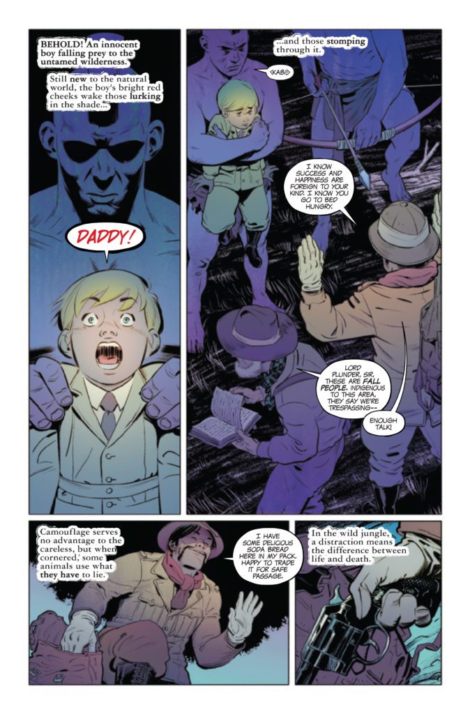
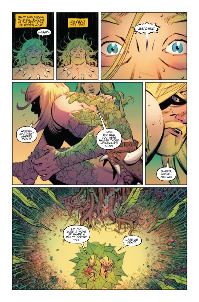
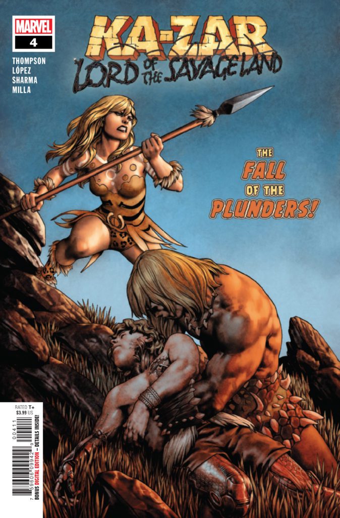
KA-ZAR LORD OF THE SAVAGE LAND #4 hits your local comic book store December 14th, but thanks to Marvel Comics, Monkeys Fighting Robots has an exclusive three-page preview for you.
About the issue: THE CHAMPION OF THE SAVAGE LAND IS NOT WHO YOU EXPECT!
For years, Ka-Zar has thought himself the master of the Savage Land. Turns out he’s only a tolerated guest…and not nearly as powerful as he believed. Domovoy’s power grows as the land decays! When the Plunders discover the mysterious subterranean Cradle, they think they’ve found the answer. But what’s born in the Cradle will bring only death…
The issue is by writer Zac Thompson and pencillers Álvaro López & Lalit Kumar Sharma, with inks by López, Belardino Brabo, Marc Deering, & Le Beau Underwood, colors by Matt Milla, and letters by Joe Caramagna.
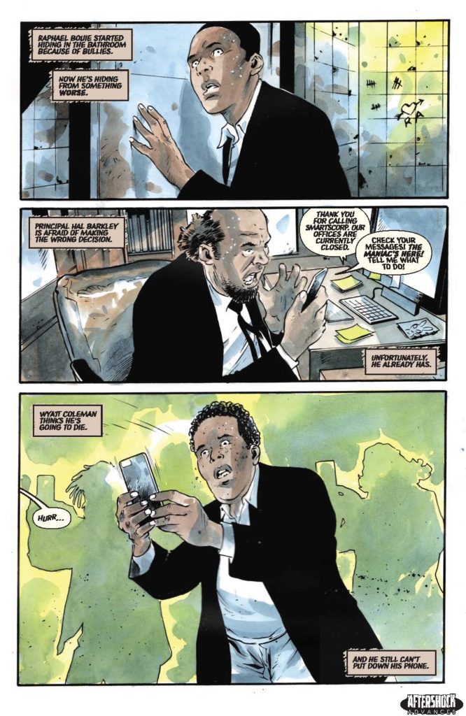
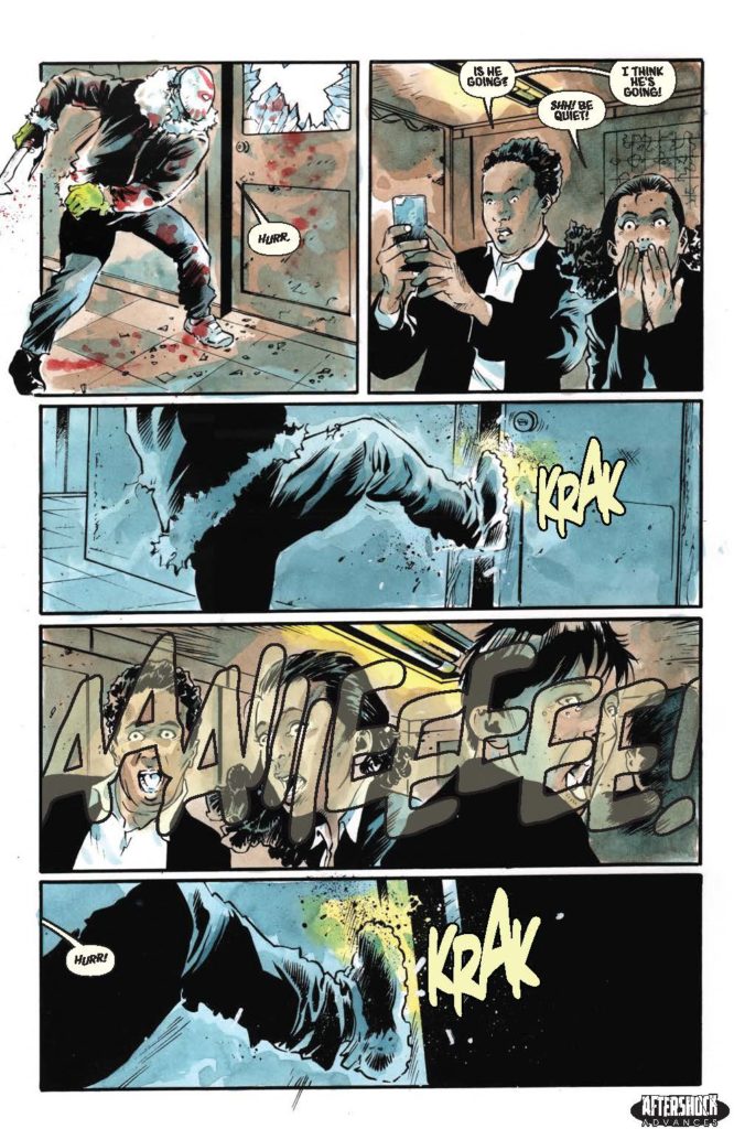
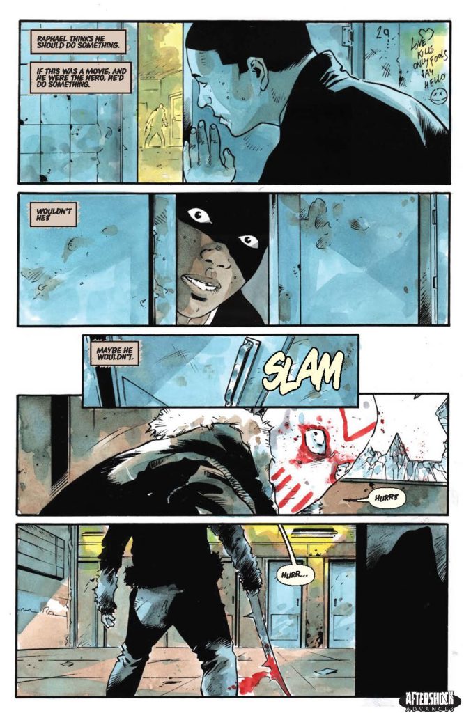
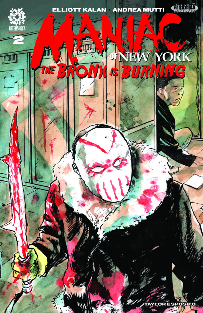
MANIAC OF NEW YORK: THE BRONX IS BURNING #2 hits your local comic book store January 12th, but thanks to AfterShock Comics, Monkeys Fighting Robots has an exclusive four-page preview for you.
About the issue: Maniac Harry is loose in a Bronx high school, and it’s not so he can finish his GED!
With video of Harry’s bloody rampage going viral, seemingly everyone is converging on Bright Future Academy: protestors, police, media and our heroes, Mayoral Aide Gina Greene and NYPD Detective Zelda Pettibone. Can the so-called grown-ups get out of each other’s way in time? And what happens when an ordinary student risks his life to save his classmates, only to be chased by the worst bully of them all: The Maniac?
The series is by writer Elliott Kalan and artist Andrea Mutti, with letters by Taylor Esposito. The main cover is by Mutti, and there is also a “Horror Fanatic” variant by David Lopez.
Check out the MANIAC OF NEW YORK: THE BRONX IS BURNING #2 preview below:
Are you reading MANIAC OF NEW YORK? Sound off in the comments!