Home Blog Page 116

INTERVIEW: Kids Imagine Nation Creates Educational Musical Theatre Magic

interview-kids imagine nation-entertainment

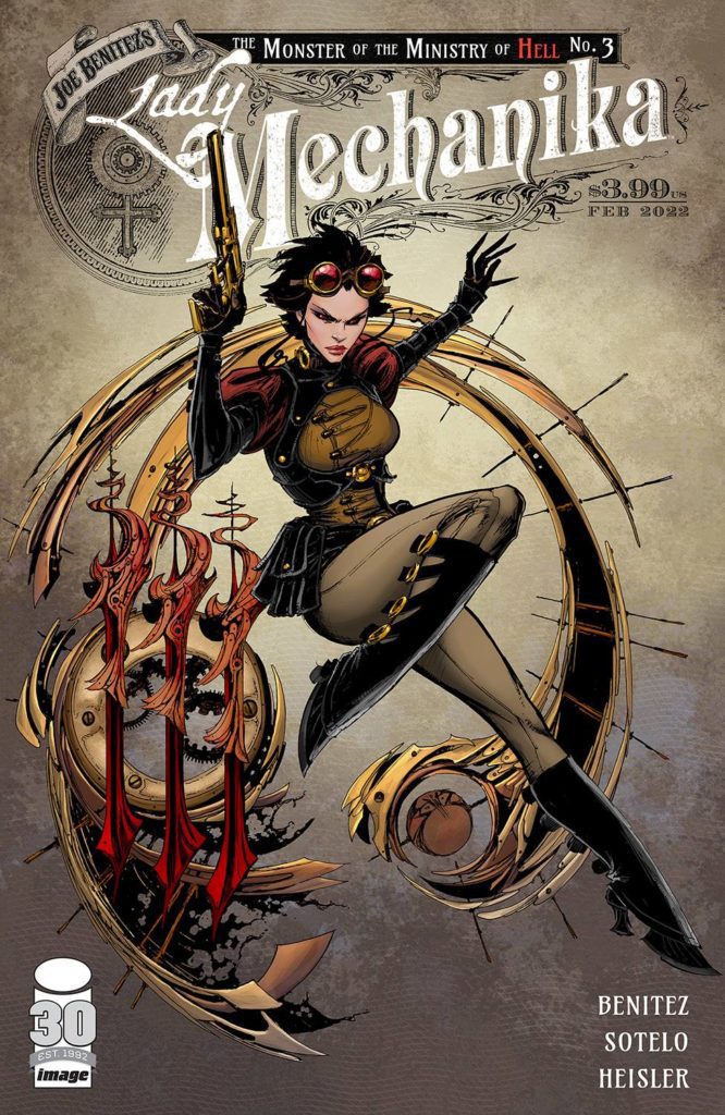
Kids Imagine Nation is a trio of former Disney performers making vibrant, head-bobbing, visually exciting entertainment for kids and the whole family. It’s equal parts educational and undeniable fun!

Seconds into any Kids Imagine Nation (KIN) video will have viewers bobbing their heads. The music is something that people of any generation can relate to, making Aaron, Rachel, and Beatz the Robot stand out as a kids entertainment troupe. KIN covers topics ranging from colors to creativity, consistently delivering it with energy fueled by the singing and dancing and thriving on a growing narrative between the characters and the world they inhabit.

PopAxiom spoke with Rachel and Aaron about the trio coming together, the process behind creating Kids Imagine Nation. Unfortunately, Beatz, the Robot, was unavailable due to the interview taking place during his recharging cycle.

Happiest Place

Aaron and Rachel have been into musical theatre since a young age. So, where did the trio meet? “We all met through Disneyland,” Rachel says. “We were all performers. Aaron and Beatz the Robot were musicians, and I also performed there. We were passionate about creating our original music and show.”

Aaron continues, “Beatz the Robot and I started writing music for kids. We wanted to keep that energized element because our band (Suburban Legends) is a ska band. But we wanted to make sure rock is there and musical theatre to get kids to see the love of creating.”

“It’s a culmination of everything we love to do,” Rachel adds, “It keeps us young and in the mindset of the kids.”

Kids Imagine Nation packs a lot of electric entertainment into a small package. “At the root of it, we’re storytellers. We write a new summer musical every year. So, we said this year was going to be about ‘saving imagination,’ and so we created a great theme song for that.”

kids imagine nation-interview-rachel-aaron

The Process

Kids Imagine Nation features original music, singing, dancing, creativity, and education for a relatively small operation. “We follow a traditional film organization with pre-production, production, and post-production,” Rachel answers when asked about their process. “We try to think as outside the box for each video as possible so that they are all unique. That’s part of imagination, so we want to inspire people to get creative. Whatever you can bring to the table, there’s no right or wrong with art.”

One video, Colors, examines the spectrum of reflected light. “For Colors,” Aaron shares, “we had that idea for two years before we could do it.”

“That’s a big factor,” Rachel affirms, “pulling all the pieces together to do the video. For Colors, we needed someone that would let us throw paint around.”

Videos on their YouTube channel or website contain plenty of creative filmmaking. Aaron explains, “We do use green screen which allows you to do a lot of stuff. We sometimes build tiny sets, sort of dioramas and green-screen ourselves onto it which allows us to make some elaborate stuff.”

Rachel happily declares, “We stumbled on that, but it goes so well with our theme of imagination. It shows that we can do anything with just this little box.”

Creating their storylines includes a lot of magic. “We wanted magic to be such a huge part of our show. But we also wanted to sort of normalize it; it just sort of happens. We don’t make a big deal about it or react because we just disappeared. It’s part of our world.”

kids imagine nation-interview-music

Creating Music

Kids Imagine Nation has a lot of music. The group creates YouTube content but even more content on their website plus live shows. “We were writing a lot of music in the beginning just to get us going for our live shows,” Aaron explains. “We decided to take that and make it our TV show. When we started writing actual episodes, we said, ‘we want a song there, and it’s about having a bad day, so we’d write a song for that so that it flows.”

Rachel adds, “So, some of our songs already existed from our live repertoire, and some we do write specifically for episodes where it needs a ‘musical theatre moment.’”
The trio sits down to write songs together, sometimes in as little as two hours. “Beatz the Robot produces all the music.”

“Beatz the Robot’s production is incredible,” Rachel says.

The process continues when Beatz “… brings a microphone where we are,” Aaron says, “We write. Beatz goes , yeah, that’s me making music. That’s how we musicians do it. We record the vocals and film the next day.”

YouTube & Beyond

Rachel and Aaron love YouTube. She says, “It opens up what we can do. Instead of having to fill a box of what a network might require, there are so many people out there with a voice and a space to be creative.”

Being a part of YouTube means understanding the state of its inner workings. “For two years,” Aaron shares, “we were doing something every week because the algorithm at the time said that’s what you do. We’d do a story episode that was about 7-15 minutes long, which were our adventures, then we’d do these educational vignettes. I’d teach musical instruments, and Rachel would interview guests for her tea party. Beatz was doing curriculum for ages 3 and 4.”

“Those vignettes would focus on one character,” Rachel continues. They were “easy to film,” according to Aaron, and Rachel affirms, “We’d do three at a time sometimes.”

Aaron would have musicians “… come in every hour, film [the vignette] real quick, get those out and new people in.”

The trio made content in batches; Rachel explains, “… a lot of the filming, we’d do every Saturday and Sunday for a month. So we have a lot of stuff on our website.”

Current fans and future fans of Kids Imagine Nation can catch them on YouTube, but the website is where even more magic happens. Both beam with the excitement to share, and Aaron begins, “The way we do our live streams on our web channel, it’s all our content for kids. When we go live, it cuts into that channel. We do transitions; we go outside and inside; we play games. All the while, there’s a chatbox.”

“It’s a sort of choose your own adventure too,” Rachel joyfully adds.

Aaron ends by saying, “So, maybe someone says ‘Zachary loves the trumpet’ so we say ‘I love the trumpet just like Zachary!’

Wrapping Up

Kids Imagine Nation inspiration in every corner of the entertainment spectrum; Rachel says, “I’m inspired by musical theatre, especially modern musicals like Legally Blonde, Wicked, or Hamilton. Anything that’s a current modern pop musical we love so much.”

“Also, anything that Disney does,” she continues, “Their musical animated movies; the magic, joy, and positivity of that we love. We’re always looking for inspiration. Canadian rock band Marianas Trench makes very story-based albums, which inspired us to do the same with our albums.”

Always at work, Kids Imagine Nation has a new album coming. “Our newest album is a musical. So, if you play it from top to bottom, there’s a sort of radio play that comes between the music.”

Aaron adds mention of some pop-culture inspirations. “Doctor Who, Ghostbusters, Back to the Future. I love science fiction. To take that and meld it into something new for kids is what I want to put that out to kids.”

What’s next for Kids Imagine Nation? “A million dreams keep us awake,” Rachel utters with a smile. “We’re working on a few new albums and pre-production on our next web series. Then, of course, our streaming service always has the things we learn and share because we’re always traveling.”

Get creative with Kids Imagine Nation!

Thanks to Rachel, Aaron, and Impact24 PR
for making this interview possible.

Read interviews from Ruben R. Diaz here!

Monkeys Fighting Robots Youtube

Review: BOLERO #1 – Angst, Heartache, And Doing It All Over Again

From writer Wyatt Kennedy and artist Luana Vecchio comes Bolero #1, a debut comic with a serrated edge dipped in young love, heartache, local punk, and interdimensional travel. While it certainly has some rough edges, this issue keeps its audience engaged with great characterization and perfectly fitting visual design.

“A woman running away from a broken heart discovers a mother-key into parallel universes. The rules are: The key can work on any door. The mother will only let you visit 53 universes. Do not ask to speak to the mother. Never hop more than 53 times.”

Writing & Plot

Wyatt Kennedy’s script for Bolero #1 fuses relatable character drama with crazy sci-fi hijinks in a compelling – if not a bit stilted – manner. Our protagonist Devyn is like a romanticized version of a person you have most definitely met. In fact, almost everyone in this book is like that. If you’ve ever been to a local band’s show in a dingy venue that used to house a random small business but is now empty and smells like piss and PBR, you have met these people. Devyn’s fractured relationship with her parents and fiery (yet doomed) new romance and tattoo apprenticeship are semi-relatable…in a very vibes kind of way. This comic feels like an episode of Euphoria, but with hints of Saga and Scott Pilgrim Vs. The World. This is a comic made for the current generation and their sensibilities, but with the neon-tinged lens of Gen Z L.A.

The main character storytelling is so compelling that by the time the interdimensional stuff shows up, it feels like a distracting afterthought. Don’t get me wrong, I quite like the sci-fi elements this comic brings in. I was just so invested in Devyn and her trials & massive screwups that I wanted to hurry through the weird stuff and back to her grimy L.A. life. The core premise of the series is presented at this point, and it is one built on this character’s pain and all the failings that have happened to her. The chance to start over blank slate is one many can relate to, and while it’s immediate presentation felt almost like an interruption, I’m thoroughly compelled by where this story will go.

There’s a note I feel I should add regarding a writing decision made towards one of the characters. Devyn’s romantic partner Natasha happens to be a trans woman. The way we find this out is through a a single ham-fisted line regarding her dead name (that is, the name Nat would have used before she transitioned). I understand that writing a trans character and making it known that they’re trans is a bit tricky without falling into any stereotypical issues. It has to be said though, Devyn noting that she “didn’t ask for her (Nat’s) deadname” as if that’s a major feat, was definitely not the way to go. This could be a character flaw – I mean, Devyn is made out to be a very flawed, broken individual. Regardless, let this be a lesson.

Art Direction

Artist Luana Vecchio brings the exact mood, tone, and aesthetic to life for Bolero #1. Every panel looks like it is made of solidified dream-stuff. Her sense of detail in the environments screams that she knows *exactly* what each of these moments looks like. It’s proof of good visual reference. Her character’s outfits are like this as well, with clothing that looks like the stuff worn by the folks who go to local shows with no A/C and $2 beers.

Her colors are what really bring this book’s aesthetic together. Vecchio brings consistent neon hues to every page, typically consisting of deep greens, light blues, purples and pinks. We in the twitter-sphere know this as “bisexual lighting.” It’s a look that very much fits the exact vibe this comic goes for. Her panel design is unpredictable and brilliant. She often overlays panels showing simultaneous events, but in non-parallel ways. She never loses sight of the story’s trajectory though, and the plot is always easy to follow.

The only complaint I have would be regarding her character designs themselves. Her animations are solid. However, she runs into the not uncommon problem of a “sameness” across the facial designs of multiple characters. Their overall feature set and individual aesthetics makes them easy to tell apart in everything else, but when you look at two characters next to each other it becomes a bit obvious. Overall, Vecchio crafts a visual tone that captures the exact vibe this comic goes for and is sure to attract a dedicated readership.

Verdict

Bolero #1 is an atmospheric and compelling opening chapter of young angst, pain, and the longing to leave town and do it all over again. Wyatt Kennedy’s script makes a couple faux pas, but still comes across as heartfelt and will no doubt be relatable to a large portion of a generation. Luana Vecchio’s visuals, while a little same-y in regards to facial design, are detailed and aesthetically nail the neon-doused mood that is draws the audience in. If this brand of alt-tinged and emotionally heavy sci-fi is your cup of tea, be sure to grab a copy when it hits shelves on 1-19!


Monkeys Fighting Robots Youtube

Marvel Comics Exclusive Preview: AMAZING SPIDER-MAN #87

marvel comics exclusive preview amazing spider-man

AMAZING SPIDER-MAN #87 hits your local comic book store January 26th, but thanks to Marvel Comics, Monkeys Fighting Robots has an exclusive four-page preview for you.

About the issue:
With NYC reeling from Doc Ock’s attack, Captain America and Black Cat need to know something…if Ben Reilly is really down, is Peter Parker able to step up and be Spider-Man again? You may think you know where this story is going, but you do not.

The issue is by writer Jed MacKay and artist Carlos Gómez, with colors by Bryan Valenza, and letters by Joe Caramagna. The main cover is by Arthur Adams and Alejandro Sánchez.

This is chapter thirteen in the “Beyond” storyline; as you can see in the preview below, Peter Parker is recovering from his injury, with some help from Captain America and Black Cat.

Check out the AMAZING SPIDER-MAN #87 preview below:

marvel comics exclusive preview amazing spider-man

marvel comics exclusive preview amazing spider-man

marvel comics exclusive preview amazing spider-man

marvel comics exclusive preview amazing spider-man

marvel comics exclusive preview amazing spider-man

marvel comics exclusive preview amazing spider-man


Have you been reading AMAZING SPIDER-MAN: BEYOND? Sound off in the comments!

Monkeys Fighting Robots Youtube

AfterShock Comics Exclusive Preview: THE LION AND THE EAGLE #1

aftershock comics exclusive preview lion eagle

THE LION AND THE EAGLE #1 hits your local comic book store February 16th, but thanks to AfterShock Comics, Monkeys Fighting Robots has an exclusive four-page preview for you.

About the issue:
1944: Imperial Japan still commands most of Asia. Determined to regain their hold on Burma, the British send a special forces unit – the Chindits – deep behind Japanese lines. Their mission is to attack the enemy wherever they find him. What awaits them is a nightmare equal to anything the Second World War can deliver. 

Colonel Keith Crosby and Doctor Alistair Whitamore have old scores to settle, being veterans of the long retreat through Burma two years before. But neither the jungle nor the foe have gotten any less savage, and when the shooting starts and the Japanese descend on the smaller British force in their midst, every man will be tested to his limit.

The oversized, prestige format miniseries is by writer Garth Ennis and artist PJ Holden, with colors by Matt Milla, and letters by Rob Steen. The main cover is by Tim Bradstreet, and the incentive variant is by Keith Burns.

A tale of hellish jungle warfare, as apparently civilized human beings descend into an apocalyptic heart of darkness.

Check out the THE LION AND THE EAGLE #1 preview below:

aftershock comics exclusive preview lion eagle

aftershock comics exclusive preview lion eagle

aftershock comics exclusive preview lion eagle

aftershock comics exclusive preview lion eagle

aftershock comics exclusive preview lion eagle

aftershock comics exclusive preview lion eagle


Are you excited for THE LION AND THE EAGLE? Sound off in the comments!

Monkeys Fighting Robots Youtube

INTERVIEW: Monsters Save Lives In Filmmaker Micheline Pitt’s GRUMMY

interview-micheline pitt-grummy

GRUMMY is a dark, gothic fairy tale from writer-director Micheline Pitt and R.H. Norman about a young girl who escapes her abusive real world into an imagination filled with amber fields and long fangs.

Micheline took a deeply personal story about abuse to create Grummy. She worked with fellow filmmaker and husband R.H. Norman to craft the ten-minute, live-action short film. Violet McGraw (Black Widow, The Haunting of Hill House) stars as Sarah, the young girl finding solace in her imagination. Tom Degnan (King Richard, Limitless) and Alexander Ward (Army of the Dead, Westworld) co-star in the movie that also plays as a love letter to old-school practical FX, including animatronic creature effects from Kevin Yagher (Sleepy Hollow, Tales From the Crypt)

PopAxiom spoke with Micheline about becoming a filmmaker and making the short-film Grummy.

A Million Things

Micheline’s a woman of many talents and interests. “I worked behind the scenes in the world of filmmaking for most of my life.”

“My first real idol growing up was Jim Henson,” she says, taking us back to her early days. “To me, he is a multi-hyphenate. He can direct, build worlds, do animatronics, draw, and sing. There’s so much Henson could do. He used to have this thing on Nickelodeon that was a behind-the-scenes look at how he did everything. That fueled my fascination with storytelling and filmmaking.”

However, Micheline says she “gravitated toward the world-building. So when I moved out to California, I worked at an FX shop running foam, making molds, sculpting, paint, and all the basics.”

“It was tough being a woman in a male-dominated industry,” she adds, noting the harsh realities of the business. “It was a mixed experience, and I had to move on.”

Micheline moved on to animation, which she “enjoyed very much. But, at the time, it was also male-dominated. That’s changed a lot now.”

“I ended up in fashion design,” she continues, “because I’ve been making clothes since I was a kid. I am someone that loves to learn and do a million things. So fashion became a career for a long time.”

However, Micheline’s longtime love of filmmaking made it hard to stay away. “I was a little scared of going into filmmaking after my previous experience in male-dominated industries. How am I going to be treated? Am I going to get a seat at the table? Will people take me seriously? It’s scary.”

interview-grummy-dark fantasy

Facing Fear

“Now, I feel it’s a great time to be a woman,” she says with a smile. “I feel so safe and comfortable in the space now. There are so many more women in filmmaking with creative positions within studios and production companies. So there’s a lot more space for specific stories to exist.”

Women in filmmaking go back to its earliest days. “So many women fought to get doors open that’s created the space in the industry that exists now. Now I can do it and commit to it and go after it 100 percent.”

“The world is such a diverse place with so many experiences,” Micheline says, noting how the growing inclusivity is only going to lead to great stories. “We’re at the helm of what I think is the most creative and interesting storytelling period in cinema since it began.”

About Grummy

Grummy is a dark fantasy short film that sends a heavy and important message wrapped up in a wildly visual and fantastical package. How did the idea get started? “When I turned 30, I had a lot of repressed memories come back and ended up being hospitalized. It was a traumatic experience. I was aware of certain situations in my youth and knew about specific stuff. But people tend to repress those experiences as a form of self-protection. As people get older, it surfaces.”

“I decided to start writing my experiences and memories down as a form of therapy,” she continues. “I told my husband about the writing and what I was going through. After a while, I showed him stuff, and he said, ‘why don’t we make this into a movie or short?'”

Micheline thought about it. “I was already working with RAINN at that time as an advocate. I’d come out about my abuse and was raising money for awareness. So I thought a film would be something good to help other people and for me to get closure. So that’s how it started.”

interview-grummy-micheline pitt

Ambitious

“At the time, we knew this would be an ambitious short because of all the fantastical elements,” she says. “We had money put aside but realizing we needed more; we did a Kickstarter.”

Micheline and RH never put together a Kickstarter. “That was a ton of work. You think it’s going to be easy, but there’s so much. We had friends help us out.

Grummy became the highest-earning, live-action Kickstarter campaign for a short film at the time. “We raised a good fraction of the money there.”

Making Grummy

“We were lucky to get the film shot,” she admits, noting that the film finished shooting “right before COVID hit the US. It was about two months after we wrapped. After that, though, post-production saw a lot of delays because so many studios were shut down.”

Grummy features a lot of practical effects. “Most of the film is all practical, but we had to do some VFX stuff. A little cleanup of matte paintings or erasing a wire, that sort of stuff.”

Naturally, indie projects like Grummy often need to call in some favors from friends. “Our VFX guy was working on Mulan at the time and would take whatever free time that he could to do stuff for Gummy. So, it took some time to get the project finished.”

Grummy’s not only ambitious as a visual project but as a narrative as well. “At the time, no one had done a project like this with this subject matter in this landscape. Usually, when people deal with child abuse, it’s dramas. Instead, we used the genre, fantasy world to approach the subject matter and also show the importance of imagination as a sanctuary.”

Actions

So, how did they go about putting together the story before filming? “My husband and I sat and broke everything down together. Here’s the story, here’s what happened, and here’s how I reimagined that into something digestible for other people to experience. We do this dance where we work back and forth. We pass things between us. We do that with everything from an outline to treatment to the script.”

“The short was only going to be 10 minutes,” she continues. “So, we had to think about how to tell this story in such a time. How do we get viewers to care about this little girl? They have to feel and see her innocence then care that she’s losing it.”

As Micheline explains, they “tried to have things that were representations of actions without showing actions. We used those ideas as keys for people to understand what’s deeper and darker without showing that onscreen. Less is more.”

Deadline

Getting Grummy out to audiences took some more work still even after post-production. “Because of COVID and how it changed the demographic of festivals, it was tough to figure out how to release Grummy to the world. What would have the biggest impact? But it’s hard when you make a fantasy short. There are not a lot of festivals geared toward fantasy or dark fantasy specifically.”

Deadline loved the project,” she says with joy, “and wanted to release it, so we went in that direction. It was a great platform and a great opportunity for people to see the film.

The importance of Grummy and films like it cannot be overstated. “There’s a lot of stigma about CSA (Childhood Sexual Abuse). Too many people feel shame and guilt when they shouldn’t. There are 43 million people living in the United States that experienced abuse as a child.”

Thanks to Deadline and online support, more people will see Grummy. “Since Deadline premiered the short, we’ll be submitting to the Oscars for next season.”

Is Grummy on your watch list?

Thanks to Micheline Pitt and Marion PR
for making this interview possible.

Read more interviews from Ruben R. Diaz!

Monkeys Fighting Robots Youtube

Review: Jen’s Back to Basics in SHE-HULK #1

Marvel’s Jennifer Walters is about to get her own solo series for the first time in years, thanks to She-Hulk #1. Rainbow Rowell, Roge Antonio, Rico Renzi, VC’s Joe Caramagna all lent a hand in bringing this latest series to life.

She-Hulk is looking as sensational and fashionable as ever!

One of the best parts about Marvel’s slew of new series is that it is creating new levels of hype. This, in turn, gives fans rare opportunities: such as brand-new series focused on characters we know and love. Take the most recent Marvel Disney+ series, which undoubtedly helped launch a new five-issue Hawkeye: Kate Bishop series.

Now? Now is the time of Jennifer Walters. AKA, She-Hulk. She-Hulk #1 brings the sensational character many know and love to the forefront and does so with style. It’s actually quite impressive, creating a series compelling to long-standing fans while still welcoming to new audiences.

Jen’s life has been full of ups and downs as of late…okay, that is probably the understatement of the century. She’s been put through hell and back, and now it is time for her to once again find her footing.

She really can rock a confident pose, can’t she?

Writing

Given the last appearance of She-Hulk (see Avengers #50), it was somewhat difficult to predict how Jen’s latest series would start. Yes, she is back to her normal self. “Normal” meaning she’s constantly fighting to keep that balance between Jen and Hulk.

At a glance, She-Hulk #1 looks to be a somber start to the series. Jen’s in the midst of a new life crisis (I can’t say I blame her), and that is always upsetting to witness. However, writer Rainbow Rowell clarifies early on that Jen is not giving up. Pretty sure those words aren’t even in her vocabulary.

As such, this issue spent a lot of time setting up She-Hulk for her new life. New job, new home (sort of), new wardrobe (also sort of), the works. The only things that haven’t changed are the enemies. It seems like the same ones always target her first, but maybe that isn’t a bad thing. Stability is nice, you know?

The final three pages of this issue take things off the rail. An old face makes a shocking appearance, which will create even more drama (and probably danger) for She-Hulk.

Time for a quick fight, as per usual.

Artwork

Covers carry a lot of weight, especially when they’re the first in a series. The cover of She-Hulk #1 is so perfect and so nostalgic; I do not doubt that it’ll bring a smile to each and every one of her fans. You can thank Jen Bartel and Adam Hughes for that cover.

That cover sets the tone for this issue. She-Hulk #1 is full of attention-grabbing artwork created by Roge Antonio. Antonio’s work lets She-Hulk’s personality shine so brightly here, with lots of little details to remind us of why we love her. The sense of motion and scale help significantly when subtly reminding readers just how much She-Hulk has to hold back daily.

Rico Renzi did a fantastic job balancing the muted colors appropriate for a life crisis with the vibrant colors that will always follow She-Hulk around. It makes the transitions clearer while adding a little bit of much-needed levity.

The letters provided by VC’s Joe Caramagna are pure perfection. Especially early on during She-Hulk’s first major fight since stepping back from being an Avenger. It’s kinda hard to ignore how much that fight must have hurt, thanks to those helpful sound effects and their placement.

She-Hulk
Not the sort of question you expect to see popping up during a fight, huh?

Conclusion

She-Hulk #1 promised lots of change while staying true to a hero we all know and love. So far, the series has delivered on that front. Better yet, it appears to be a solid starting point for new fans hoping to read up before the Disney+ series drops. Talk about a win-win.

Monkeys Fighting Robots Youtube

Review: Delving Into a Dark Past in LADY MECHANIKA: THE MONSTER OF THE MINISTRY OF HELL #2

Lady Mechanika is back in action in Image Comics’ Lady Mechanika: The Monster of the Ministry of Hell #2. Written and illustrated by Joe Benitez, die-hard Lady Mechanika fans should not miss out on this series.

Readers have long wondered about the history of Lady Mechanika. And while we still don’t know the whole story of what happened to her, Lady Mechanika: The Monster of the Ministry of Hell #2 is starting to fill in some of those gaps.

It is also working very hard to shred our hearts along the way. I think most readers always guessed that her backstory would be a dark one, but it would have been difficult to imagine just how far that went.

Lady Mechanika’s series have always been perfect for steampunk, fantasy, and horror fans. But now it seems like there’s room for fans of the precise craft of foreshadowing. Or perhaps it merely feels that way, given how much my spine tingled while reading…

Lady Mechanika is looking calm and ready for her next battle on the cover of Lady Mechanika: The Monster of the Ministry of Hell #2.

Writing

Lady Mechanika: The Monster of the Ministry of Hell #2 was written by Joe Benitez, with writing assistance from M.M. Chen. It continues the pattern established in the previous issue, with the story splitting into two parts.

Unlike the last issue, this one seems more deeply invested in the past. Given how much there is to learn, that is hardly a surprise. What is a surprise is how heavily this issue weighs on the heart.

The few times the present becomes the focus feels intentional – there’s a story being told through the transitions as much as anything else. Points are heavily emphasized to ensure they’re stuck firmly in our minds.

Likewise, the contrast between these two timelines is…jarring. Here we see real horror mashed against the shallow horror that comes from manufactured scenes and events (such as carnival houses).

Take a look at the details on this cover of Lady Mechanika: The Monster of the Ministry of Hell #2.

Artwork

Lady Mechanika: The Monster of the Ministry of Hell #2 lives up to the expectations set by the previous incarnations. That is to say; the artwork is exquisite. Joe Benitez is the lead artist, with Beth Sotelo and Sabine Rich providing colors and Michael Heisler doing the lettering.

As always, there’s a merging of steampunk and horror elements. However, this issue is much darker than many other issues, and I mean that both figuratively and literally. There are panels shrouded by darkness. At other times, the brightest of scenes somehow come off as all the more terrifying. It’s beautifully (and horrifically) done.

Joe Benitez’s attention to detail makes the scenes within this issue all the more alarming. Speaking of alarming – the raw emotions Benitez stuffed into specific panels is borderline overwhelming. Consider yourselves warned.

The colors compliment these details, helping them stand out or blend in as necessary. There’s one page, in particular, where the colors bring the impact of the scene to its full potential. It’s a moment that will linger in my mind for quite a while to come.

Michael Heisler provided the final piece to complete this issue: the lettering. Heisler’s style is perfect for this series, as there’s no avoiding the painful crack that comes with pain or the subtle ways in which characters let the truth slip out.

A sneak peek at what is in store in Lady Mechanika: The Monster of the Ministry of Hell #3.

Conclusion

Lady Mechanika: The Monster of the Ministry of Hell #2 is a dark and tense issue, but it is also part of a larger whole that many fans have been waiting for. As such, it is the perfect read for anyone who wants to know about Lady Mechanika and her past.

Monkeys Fighting Robots Youtube

Review: SHADOWMAN #5 – A War of Ideologies

Shadowman #5 cover

Shadowman #5 resurrects Valiant Entertainment’s horror hero for a thrilling new arc on January 19th.

Background

The Deadside of the Valiant Universe is reacting to the mortals’ vices and misery, creating blights of spirits. Jack Boniface, the titular Shadowman, tries to keep the peace but finds himself in a losing battle. Because the Deadside isn’t simply a realm of spirits to manage, but a spirit with free will.

Progress Or Payback

Shadowman #5 Preview Page 1
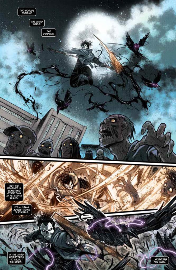
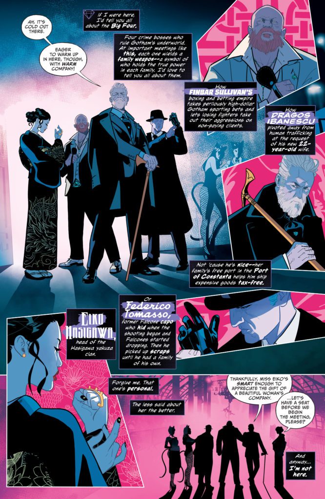
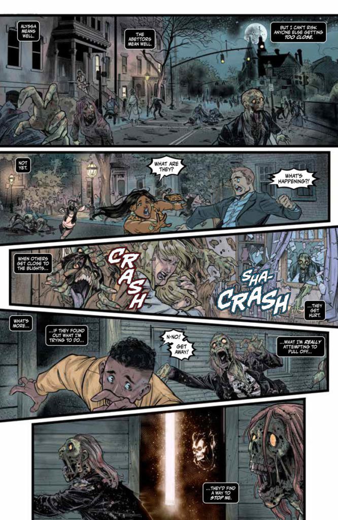
Cullen Bunn cleverly makes this issue about an inevitable ideological war. Jack wants to change approaches instead of retain a broken system of spirit management with coexistence. It’s a neat idea that fits into Jack’s development from runs before by learning to live with his Shadow Loa, making Shadowman an example to follow. But it’s not just the Deadside herself causing mayhem that he has to worry about. A returning supporting character Alyssa and the Abettors would rather have the status quo remain as is. Between the two threats, there’s a nervous tension that leaves readers on edge.

Blurring Lines

Pedro Andreo’s artwork showcases impressive designs of characters and the grotesque undead. Each one has a very memorable trait to identify among all of activity on a page.

But it wouldn’t be half as memorable without the colors by Jordie Bellaire. Her choices in color highlight the most important events taking place. Brightly colored innocents running from the ravenous undead practically tell the story. But not as much as the transitions in a spread where the warm lights among the zombies dim out for foreboding foreshadowing of a coming disaster.Just something to add

If only the more spectral interactions with greater spirits weren’t so distracting. In practice this shows off the otherworldly power of Shadowman and the Loa. But sometimes the inking and coloring get so blurry that it’s hard to tell what’s happening.

In Clayton Cowles’ lettering, there’s a lot of character put into every sound made. In one of the most compelling instances, the notes from Jack’s saxophone performance arrange in a way that evoke sheet music. Meanwhile, word balloons reflect different things about the speakers’ personalities. The manifestation of the Deadside speaks in the same shape of distorted word balloons as the Loa pantheon, but the color and classical font suggest she’s older and more powerful than they are. It’s what adds to the reader’s anticipation of her next move.

Ready For A Thrill Ride?

Shadowman #5 comes back with plenty of intrigue. This new chapter has a few characters with motivations ready to be explored, especially in relation to the title character. This is one saga that people will want to see through.

Monkeys Fighting Robots Youtube

Review: PRIMORDIAL #5 Expertly Balances Intrigue and Emotion

Primordial Lemire Image Comics

Image Comics’ Primordial series is full of beauty and heartbreak. It takes complicated concepts and boils them down to the devastatingly powerful emotions at the center of this story. Primordial #5, the penultimate issue to this stunning series, is no exception. Writer Jeff Lemire, artist Andrea Sorrentino, colorist Dave Stewart, and letterer Steve Wands deliver a gut-punch of an issue, setting us up for a high-stakes finale.

Writing

Lemire writes with such subtlety, slowly teasing out a completely different version of world history. In Primordial #5, we see how these subtle differences have rippled out into giant changes. But still, Lemire doesn’t get distracted by his own version of history. Sweden being a Soviet state in 2024 is an interesting detail, but not the focus of the narrative. Lemire continues to focus on the characters who have been gently driving this story forward. Their interactions are full of heart and emotion. The animals, aboard their spacecraft, communicate with each other earnestly. Lemire has developed this earnestness in these characters organically, but their sincere exchanges feel perfectly timed to up the stakes in a series that is running out the clock. It’s almost as though the characters know they only have one more issue in which they’ll get to share a page.

Primordial Lemire Image Comics

Art

Sorrentino has shown a wildly different art style in Primordial than what his readers are used to. Laika, Able, and Mrs. Baker, on their spaceship, have always been rendered in a Frank Quitely-esque style, with no shadows. In Primordial #5, Sorrentino blends this style with his usual shadowy chiaroscuro style. It results in bright panels full of photorealistic characters that have small but dark shadows, contrasting with the overall glow of each scene. Peppered into this issue, as well, are pages with a painted quality to them. It’s abundantly clear that Sorrentino is pushing himself to try out new things and experiment with different styles. Even the moments that feel a little strange and out of place – like a cartoon heart doodled over a painted panel – are exciting to see. Because they’re proof that Sorrentino is a creative force to be reckoned with. Everything is on the table for his experimentation, and we haven’t even begun to see what he’s capable of.

Coloring

Primordial #5 starts with panels that are bleak but beautiful. Stewart infuses scenes of grey and brown with a subtle brightness. And as the issue continues, Stewart ups the brightness more and more. There’s a joy that’s rising up in each character. As they’re feeling lighter, so does each page. But then Stewart makes a turn for the more ominous. He begins to associate bright colors with moments of violence and panic. Neon reds are used to show flashbacks of death. So as we get to our last few pages, the vibrant colors feel like they’re balancing on a tightrope. They could be heralds of joy, or omens of oncoming danger.

Primordial Lemire Image Comics

Lettering

Wands’ lettering is full of small details that make this issue shine. Just like in Primordial #4, we get a moment when our animal characters panic. We see Abel’s dialogue revert from the wispy word balloons that represent his newfound intelligence back to the simple balloons of his animalistic days. His font in this moment is scratchy and looks primitive. He’s scared, and his words show that. Elsewhere, Wands adds little elements to his sound effects so that they stand out in the chaos. The “CHK” of someone arming a weapon pops out at the beginning of a panel. Meanwhile, the “AT-AT-AT” of the weapon firing is cut off by the panel edges. With this, Wands breaks down each moment of a wild scene. Each individual step has its own flavor and purpose.


Image Comics’ Primordial has always been about an alternate version of history. But Primordial #5 finally shows us what the present in that world would look like. This creative team perfectly balances the intrigue and emotion of this series, leaving you both devastated and hungry for more. Primordial #5 is out from Image Comics on January 19th at a comic shop near you!


Monkeys Fighting Robots Youtube

Review: Swinging into a New Adventure in CATWOMAN #39

DC’s Selina Kyle, aka Catwoman, is about to step out of Alleytown and back into the world of Gotham in Catwoman #39. Once again, she’s not content to take the simple road, especially not while Tini Howard (writer), Nico Leon (artist), Jordie Bellaire (colorist), and Tom Napolitano (letterer) are in charge.

Catwoman #39 marks the start of something new. New plots, new creative team, new potential allies, and plenty of new threats. Selina has done her time, stepping back to see what threats would track her down. Well, as with any cat, she’s gotten quite bored of that game, so now it is time to start a new one.

Where Alleytown took Catwoman back to basics, a return to Gotham City is like returning to the main event. Here she is in a world full of adventures, enemies, and potential heists. Where will this cat strike first?

Does anyone else think she looks like she’s thinking up new mischief?

Writing

This issue is surprising for various reasons. Catwoman #39 is a blend of old and new. On the one hand, we are very much returning to form, with Selina making trouble for herself in ways that only a cat could pull off. And yet it all feels so familiar.

Adding onto that sense of newness is Tini Howard, as this is her DC Comics debut. She’s already showing a strong grasp of at least one classic character here, while throwing her own flair into the mix.

This latest plot promises lots of trouble, alongside a new set of secondary characters for fans to love or hate (or that odd mixture of both). While this is exciting, it’s also somewhat bittersweet as readers reflect on the goodbyes recently thrust upon us.

Overall, Catwoman #39 has a lot of fun in a limited amount of time. Howard pulls out most of Selina’s vices in a short period of time, reminding us of everything that can distract this cat. Oh, and let’s not forget the heavy cat theme; that was a nice touch.

Catwoman
Heavy thoughts to start this issue off strong.

Artwork

The artwork in Catwoman #39 comes off as fresh, which is fitting, given the new plot and team. Nico Leon (art), Jordie Bellaire (colors), and Tom Napolitano (letters) team up with Tini Howard to bring this latest arc to life.

Everything about this issue feels vibrant and flashy. It is reminiscent of a laser light in that sense – meant to catch our eyes and lead us off on a merry chase. Leon’s art makes for a strong foundation, creating bold new characters, striking backdrops, and mixing in some surprising details. While many panels pop from the page, one, in particular, stood out to me, proving that Leon knows how to turn a feline into a gem.

The colors are even bolder than the plot, bouncing back and forth between shadows and bright hues. Thanks to these choices, it’s easy to see it like Selina’s at a party or otherwise having a blast.

Finally, there’s the lettering, which is highly effective here. Tom Napolitano had a lot to work with, as Selina generally is not quiet when she fights. Likewise, a lot is going through her mind that must make it onto the page.

Catwoman
Vibrant colors and dark characters meet in this surprising mixture of elements.

Conclusion

Catwoman #39 is a solid start to a new Catwoman plot arc, one that sets the scene for countless conflicts and adventures to come. One can only hope that the pace will stay this steady for the foreseeable future.

Monkeys Fighting Robots Youtube