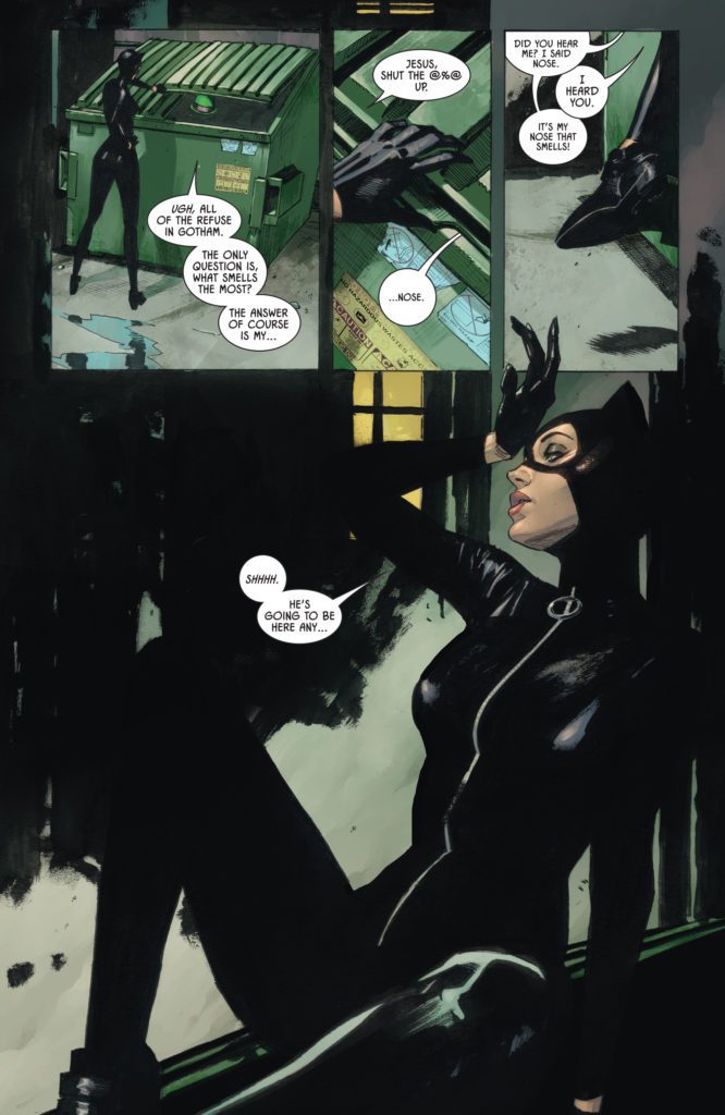
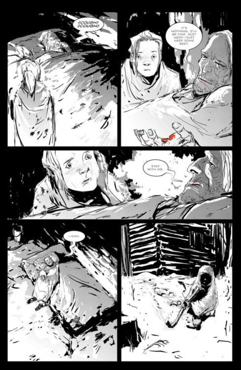
DC Comics’ Batman/Catwoman has been a complex series. The creative team — writer Tom King, artist Clay Mann, colorist Tomeu Morey, and letterer Clayton Cowles — have generally had an incredible knack for making the story (which happens over three distinct timelines) clear. WhileBatman/Catwoman #11 still manages to be clear in its storytelling, despite introducing another timeline (or two?) to the narrative, its intricacies make it hard for any of the emotional beats to land.
Writing
There’s nothing wrong with writing a complex series. King tends to be a master when it comes to making you feel for characters, even when you don’t fully understand what’s happening to them. And part of what complicates things for Batman/Catwoman has occurred outside of its own story. The series has been plagued by scheduling delays. A guest artist, the incomparable Liam Sharp, was brought in to fill in on some issues. Sharp’s visual language is quite different to Mann’s. As stunning as Sharp’s work is, it was a departure from the status quo from the series, which made some of the narrative a little harder to follow at times. Mann’s return to the story, interestingly enough, had a similar effect.
So, maybe King’s script would flow brilliantly if not for these creative speedbumps and delays. But as it stands, Batman/Catwoman #11 feels a little dry. Nearly every scene is a fight scene or a chase. These blend together and ultimately have little effect. We jump around in time so often that the reader is spending more time trying to keep track of where they are now. It’s hard to actually take in and experience any given scene. Batman/Catwoman #11, however, is a climax of sorts. All of the shit that’s gathered over the series thus far is flung at the proverbial fan. And so, maybe the chaos and confusion of the issue is deliberate. Maybe we’re supposed to be left scratching our heads when we turn the final page. As is often the case with penultimate issues, only the finale will really tell us if this issue was effective in what it was setting up. Perhaps this series will read better as a collection, where the reader can more easily keep track of each avenue this story goes down.
Art
Mann certainly knows how to set a scene. And in the chaos of this issue, he manages to make certain moments stand out as more action-packed than others. Panels teeter, looking like they’re barely holding in place. Characters fall into the gutters of the page, punched or kicked over by an adversary. Much of Mann’s work has a 3D effect in that sense. You feel like characters are about to fall into your lap, like you could reach out and catch them before they hit the ground. Some moments feel like they’re fully focused on the theatrics of the scene, rather than the emotion surrounding what’s happening. There are many pages throughout this issue that feel like they pull away from the characters. Several moments obscure characters’ faces in shadow, or show them at such a distance that it’s hard to see their expressions. When Mann focuses us in on someone’s face, he speaks volumes through subtle looks and gestures, counteracting the drama of every other scene. Unfortunately, it doesn’t feel like there’s enough of these moments to create a good balance in this issue.
Coloring
Morey’s coloring choices continue to tie the threads of this story together, color coding each timeline to give us a sense of when events are happening. There is one moment, however, that is quite distracting. The Riddler hides in a dumpster as Catwoman pulls the lid over his head. In the dumpster, as Catwoman closes it, we see Riddler’s hat standing out in brilliant green and purple. It feels like his hat should at least look a little duller due to the shadows, if not be completely invisible. Despite this moment, Morey brings plenty of cohesion to Batman/Catwoman, while also telling us something about each scene. In a Christmas themed showdown between Batman and Joker, the scene becomes gradually more and more violent. As the violence increases, so does the red glow that’s cast over events. Another rooftop scene is shown in a mix of pinks and greens. The warm pinks are slowly overpowered by the cold greens, as hope drains from one of the characters. Morey’s work isn’t just eye-catching. It also helps guide this issue through its many thematic arcs.
Lettering
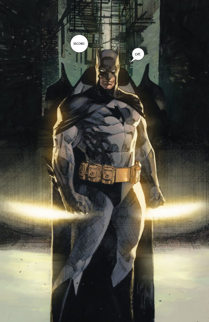
The one big upside to the near constant action of Batman/Catwoman #11 shows up in Cowles’ lettering. The “BZZZPP” of a futuristic taser, Joker’s laugh trailing off far outside of its word balloon in uneven letters, the “BLAM,” “POW,” “BAM” sounds of battle… all of these moments stand out in colorful glory. The fight scenes feel fun and vibrant thanks to Cowles’ work. And then, as the issue comes to a close, he shifts his tone. A “SLLLLKKKKTTTTT” sound effect, accompanying an action that ends out this issue, is shown in scratchy red letters. Cowles doesn’t want this moment to feel lighthearted or run-of-the-mill. He makes it look desperate and brutal.
Verdict
There is a lot about Batman/Catwoman #11 that feels like it should be high stakes. But the convoluted nature of this chapter, and the art’s tendency to pull away from character faces during action sequences (which make up most of this issue) means that most of the emotional beats fall flat. Batman/Catwoman has gone through changes in its creative team and delays in its release dates, disrupting the flow of the story at times. So it’s hard to know how much of Batman/Catwoman #11 is deliberately delving into chaos and confusion, and how much of this effect is accidental. Pick up Batman/Catwoman #11, out from DC Comics April 12th, at a comic shop near you!
The Super Bowl is the second-biggest sporting event of the year behind the World Cup, and Carvana introduced that captive audience to the Oversharing Mom who loves everything about her car a little too much. Director Paul Trillo figured out the puzzle to create this popular advertisement.
It’s entirely possible that the Super Bowl is the only event where millions of people watch the commercials. In fact, studies suggest that nearly 50 percent of viewers watch solely for that reason. In the Oversharing Mom, viewers are treated to a hilarious performance from Michelle Simms, some precision editing, and slick direction. The piece comes from ArtClass, a next-gen production and post-production company founded by award-winning director Vincent Peone and veteran producer Geno Imbriale.
PopAxiom spoke with director Paul Trillo about making the shortest short films, known as commercials, and making the Oversharing Mom.
Problem Solving
Paul’s love of film began early on, when he received a video camera in middle school and began making stop-motion Star Wars toy videos. Things only progressed from there. “In high school, we’d do weird skits and Tom Green-esque kind of things. Our school had a green screen and some cameras.” By the end of high school, he was learning Premiere and After Effects.
Paul went to art school for painting, but gave that up because he kept wanting to pick up the camera. His time in film school wasn’t conventional. “It was very much an experimental, conceptual-based school. So I resisted that a little.”
“I wanted to do comedy stuff,” he explains, “while everyone else was doing their art films.” That teaching started to trickle into Paul’s work after college, despite the clash. He began doing experimental and technique-based short films and music videos.
His brand of filmmaking garnered attention on Vimeo a little over ten years ago. Eventually, after a lot of technical work around camera moves, VFX, and blocking, he started on commercial work. “The problem-solving aspect is very engaging. It gets stale after a while to have only technical work.”
About The Oversharing Mom
Things freshened up immensely when ArtClass and Carvana came calling. “I was excited about the Carvana spot. It was part of four ads, but this one was more comedy-based.”
“All four spots are so different,” he explains. “The other ones have some sort of technique or production design element. For one, we built a goldmine on a stage. Another is told in an Edgar Wright sort of style. Another is VFX heavy. They all had these different ingredients. So, they were looking for a director who could adapt and have a lot of different things that they’ve explored in their work.”
That director was Paul. “It was a competitive pitch, but I gravitated toward the Oversharing Mom. They gave me a template about a mom badgering different people with her spiel. So I found different ways to have fun with that.”
“We probably had about three weeks of pre-production and eight shooting days,” he shares. “That’s for all four. One spot was on a stage; another was in multiple locations; we had interiors, exteriors, and night exteriors. So it was a huge puzzle trying to figure out how to shoot all these ads in just a few days.”
The answer to the puzzle was planning. “We shot one vignette with the mom one day. Another day we shot on the set. So we could spread it out and shoot multiple things per day.” Filming ended in November, then there was about six weeks for post-production. “It’s been a long process, but the spot landed in the Super Bowl.”
Working With Arne
“It was bizarre and surreal,” Paul says about the Oversharing Mom ending in the Super Bowl. “I found out just at the beginning of February.” Paul spent several months with the spot close and on his screen, so he had to watch the Super Bowl at someone else’s house “to make sure it was real.”
What’s an essential part of Paul’s process? “Working with storyboard artists. Some people are comfortable without storyboards. But a lot of the stuff I do is precisely timed or has some sort of shot design to it. So nailing the storyboards and animatics is vital to make sure each shot fits. You can figure out a lot of stuff later, but you have to have the bones of it ready.”
“For this particular campaign,” he continues, “there was a lot of production design. So, working with our production designer Arne Knudsen is also super-important to get things right. The tones, paint color, where we’re putting the cameras in our 3D set design. So, it’s only little surprises when you walk on set.”
The Right Mom
“We were so lucky Michelle Simms came through,” Paul says of the star who made the whip-camera moves and to-the-second editing all the better with her performance as ‘Mom.’ “This was a non-SAG shoot, so our talent pool was reduced. The whole thing lives and dies on the mom’s performance. It made me nervous.”
Paul admits that the auditions weren’t bringing in anyone who had the right mix. “But, Michelle brought so much character to it, and she was the clear winner for all of us.”
“Michelle Simms’ strength,” he adds, “shows how she stands out against these other ads with superstars. I hope they extend her contract and do more with her. She could carry more of these ads.” Why not an ‘Oversharing Mom’ sitcom?
Wrapping Up
Paul’s a cinephile who can rattle off a long list of influences. But he narrows it down for us. “I love the Coen Brothers. Everything they do always has such a strong tone. They’re masters of tone and a huge influence on me. Early on with music videos, Michel Gondry and Spike Jones were able to do these conceptual-based music videos. I loved how what they do is very simple and very complicated. On paper, it’s simple, but to execute it is where they show their strengths.”
For the Oversharing Mom, Paul pulled creative energy from a particular place. “For this spot, I loved the work of Swedish director Roy Andersson (A Swedish Love Story, About Endlessness). He does these pathetic comedies with sad people in long takes. But it’s sad and funny and poetic.”
“I’m developing projects and taking a little break from the ad work. Last year [2021] was crazy,” he admits. “It felt like two years packed into one after the near-stoppage of production in 2020.”
One of those projects is a sci-fi documentary about a blind man who gets his vision back with the help of a device that’s providing visual information.
What did you think of the Oversharing Mom?
Thanks to Paul Trillo and Impact24 PR
for making this interview possible.
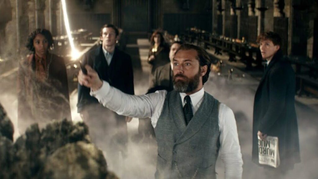
Fantastic Beasts: The Secrets of Dumbledore is a tremendous reminder of just how wonderful The Wizarding World can be. Arriving a few years after its predecessor, the film manages to push the narrative forward in exciting ways while exploring the character of Dumbledore. The last entry sparked doubts about the series retaining its appeal for three more entries. Fantastic Beasts: The Secrets of Dumbledore provides enough heart, humor, and spellbinding duels to satisfy many fans of this world.
There’s no denying that J.K. Rowling dropped the ball with Fantastic Beats: The Crimes of Grindelwald. While the visuals remained strong, its narrative was riddled with one too many subplots. Steve Kloves returns to co-write The Secrets of Dumbledore, and those “problems” from before have been fixed. Allowing itself to focus on its larger conflict helped Fantastic Beasts: The Secrets of Dumbledore convey a compelling and action-packed adventure.
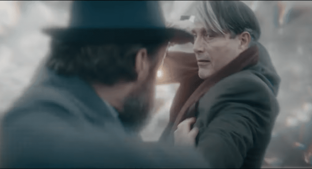
Grindelwald’s (Mikkelsen) rise to power across the community has caused Dumbledore (Law) to request the assistance of Newt Scamander (Redmayne) and his allies. As tensions rise, Dumbledore questions how much longer he can stand on the sidelines. Meanwhile, Grindelwald and his army continue to chase their goal of terrorizing the muggles. Directed by David Yates, Fantastic Beasts: The Secrets of Dumbledore stars Jude Law, Mads Mikkelsen, Ezra Miller, Eddie Redmayne, Dan Fogler, Callum Turner, and Alison Sudol.
Newt Scamander’s progression here was a remarkable aspect of this new film. Previously, I have felt that the films were trying to force audiences into caring about him. Knowing that Fantastic Beasts is building toward the highly famous battle between Dumbledore and Grindelwald, made it questionable as to why these films weren’t centered on Dumbledore. Scamander’s importance to this pending battle is highlighted better thanks to his scenes with Dumbledore.
Newt’s attitude towards these creatures and his desire to do what’s right without reward seems to be why Dumbledore has so much faith in him. Newt has always been a likable character, but it just seemed that the wrong character was being focused on. While Dumbledore and Newt continue to share a healthy bond, Grindelwald and Credence (Miller) have the complete opposite. The Secrets of Dumbledore lives up to its title by further addressing shocking revelations.
While The Crimes of Grindelwald left many fans frustrated and confused, most of the confusion should be cleared up here. Some would argue that Credence’s history came out of nowhere, but there are many moments of foreshadowing that took place. Admittedly, Fantastic Beasts: The Secrets of Dumbledore builds more intrigue with its foreshadowing. Since the narrative is focused and not held back by multiple subplots, audiences might have a better time connecting with this new revelation.
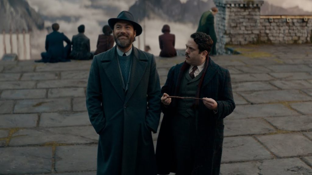
Perhaps the film has too many characters involved, but they are all likable and Jacob Kowalski’s development here is terrific. Fogler has always been great in the role, so it was nice to see everyone’s favorite no-maj (muggle) get involved in Dumbledore’s affairs. Speaking of Dumbledore, the film’s subtitle isn’t there to simply draw in Harry Potter fans. There are several advancements in Dumbledore’s story that make him a more complex character. Sure, some additions weren’t always planned from the start, but longtime fans will enjoy the new details surrounding Dumbledore’s sister, Ariana.
The chemistry between Mikkelsen and Law makes their interactions emotional, intense, and highly entertaining. The relationship between Dumbledore and Grindelwald is the heart of this Franchise, and it’s unpacked quite well here. Both share differences on muggles, have a troubled history, and their inability to battle emphasizes the tension between them. Mikkelsen’s portrayal of Grindelwald is captivating, it demands your attention, and I can take him more seriously in this role. Every performance is stellar, but Fogler and Mikkelsen were my favorites.
Kloves’s return to the writer’s room certainly made a difference as far as I can tell. Yates remains one of the best directors for this universe and the energy that was missing from the last installment is present throughout. Fantastic Beasts: The Secrets of Dumbledore takes you on an emotional rollercoaster while delivering several crowd-pleasing moments. One, in particular, the crab walk sequence, should have audiences laughing uncontrollably.
Yates’ passion for this universe is always evident through his visual style, and James Newton Howard’s score is the ultimate source of nostalgia this time around. If one were to argue that this series relies on the Harry Potter legacy too often, they wouldn’t be wrong. However, Howard incorporated certain aspects to his score that I would say are needed in a Wizarding film. Some visual aspects are disappointing, such as the Hogwarts featured in the film, which isn’t a practical effect.
Fantastic Beasts: The Secrets of Dumbledore doesn’t erase every issue with this series, but it did a fine job restoring my investment in what’s to come. A more focused narrative that provides a coherent beginning, middle, and end while never growing dull. There’s better pacing, iconic duels, and Newt’s beasts are an integral piece of this story. Harry Potter might be the superior franchise, but this series still has signs of greatness coming soon.
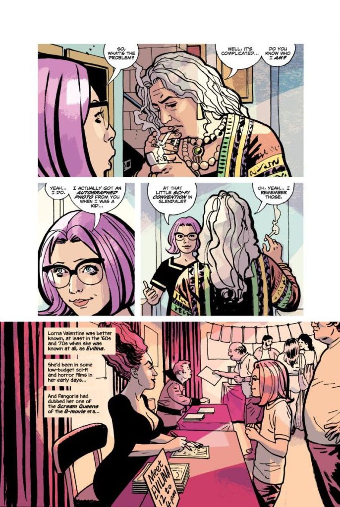
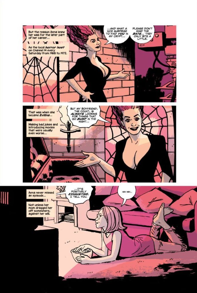
Ethan Reckless is out of town on a case. His assistant, Anna – a pink haired, bespectacled punk rocker – is more than capable of holding down the fort. Trouble is, she’s got her boss’s knack for attracting mountains of trouble. Image Comics’ The Ghost in You, the fourth book in the Reckless series, is a fresh, satisfying new chapter in this already brilliant run. Writer Ed Brubaker, artist Sean Phillips – the creative team behind classics like Fatale, Kill or Be Killed, Criminal, and Pulp – and colorist Jacob Phillips, take us through haunted houses and family trauma in their new Reckless book.
Writing
Though the stories in this series are narrated by Ethan Reckless – our grizzled private eye with a name that matches his lifestyle – Reckless doesn’t show up much in The Ghost in You. Instead, his assistant Anna runs the show. It changes everything about this comic. Even Ethan’s tone in his narrations has a lighter, funnier feel to it. Anna is a breath of fresh air, so naturally the book where she’s pulling the strings would feel the same way. This book is easygoing and fun. But Anna is also more complicated than that, and so is Brubaker’s script. She’s the kind of character who isn’t sure if she believes in ghosts, but knows she no longer believes in people. She’s quick to smile but quicker to scowl. The Ghost in You, like Anna, looks like a mosaic at first. It’s full of scenes, themes, and storylines that feel disconnected. But when you back up, you see it’s all part of the same complex picture. Brubaker will make you laugh, wince, and cry all within a single page, for vastly different reasons. He’ll make you feel scattered and confused by the emotional rollercoaster he has you on. But in the end, you’ll be brought back to the beating heart at the center of his story, and it will suddenly all seem simple again.
Art
One thing that sets Anna and Ethan apart is their relationship to the rest of the world. Ethan has a huge presence. He’s often pictured looking down at the people he’s getting information from. Anna looks up at people. You could chock it up to a difference in height, but there are a few telling moments in The Ghost in You where Sean Phillips shows there’s more going on. For one thing, Anna’s placement in each scene communicates an uneasiness in the job. She’s not as confident as Ethan is with other people. But when she’s doing research, something that she loves and feels good at, she’s always looking down at her work with a collected and self-assured look on her face. Even when she calls an old boyfriend for some help, she gets lost in some blueprints and is shown eye-to-eye with him, on his level. The same is true when Ethan’s old handler, Frank, hands Anna some findings on someone he looked into for her. She stands above him, engrossed by the papers he’s handed her, while he sits in a chair nearby. She comes alive with factfinding and analysis. You see it in how she holds herself in each panel where she’s doing research. But put her in a room full of people and her wry smile becomes a determined grimace. She shrinks under the presences of other people. She’ll do the work, but she sure as hell won’t enjoy it.
Coloring
Jacob Phillips’ coloring is succinct, yet full of texture and stylistic flare. He gives you a keen sense of the lighting in each scene, while ensuring that everything still has a painted look to it. Streams of light pour over buildings and streets, flowing in beautiful, uneven brushstrokes across each setting. Trees and backgrounds are shown in dappled colors, sometimes looking like paint that’s been flung at a canvas. At one point, Anna is walking through a dark house, guided by the light of a flashlight. The glare of the flashlight is reflected in her glasses, shown in yellow and orange blocks that collide together in front of her eyes. The best way to describe Phillips’ coloring work is that it almost looks like an Impressionistic painter brought these pages to life. Phillips clearly has a thorough understanding of light and shadow. The placement of his colors is precise, but the colors themselves almost seem to be in a brilliant war with one another. They jostle together, mixing and overlapping to create stunning effects.
Lettering
Sean Phillips gets quite experimental with his lettering in this issue. We get a couple of things that we’ve seen before: small lettering in a bigger word balloon to show a character saying something under their breath, or the straight edges to a word balloon of someone who’s panicking. These effects make these moments stand out. You can hear the quietness of one moment and the panic of another. But there are several effects that are new to this series. Anna plays some old punk rock music on vinyl at her apartment. The lyrics are shown in jagged balloons that have a thick, scratchy black outline to them. The words are barely contained by the balloons, some letters getting lost in its borders. It’s the sound, the feeling these words are creating that’s important, not what they’re actually saying. At another point, Anna gets into a fight with someone. In the aftermath, someone asks “Hey, are you okay?” The font is blurred, like it’s coming through a fog. If you listen, you can almost hear the ringing in Anna’s ears that’s drowning out all the noise.
Verdict
It’s no surprise that Reckless continues to be a great series. It would be a surprise if this creative team ever came out with anything less than excellent. But a Reckless book that focuses almost exclusively on Ethan’s assistant, Anna? It’s a great premise with a flawless execution. This book is funny, sad, and altogether riveting. You don’t want to miss the latest installment in the Reckless series, The Ghost in You, out from Image Comics April 13th at a comic shop near you!
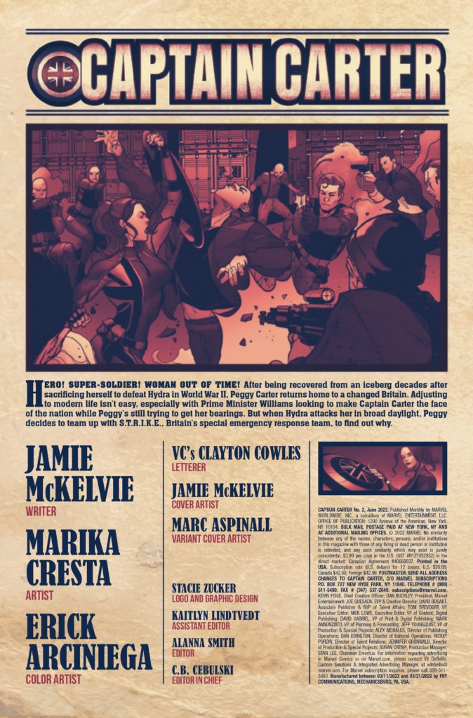
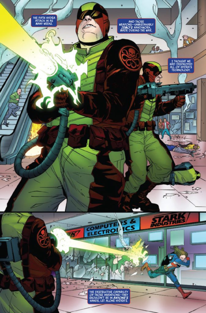
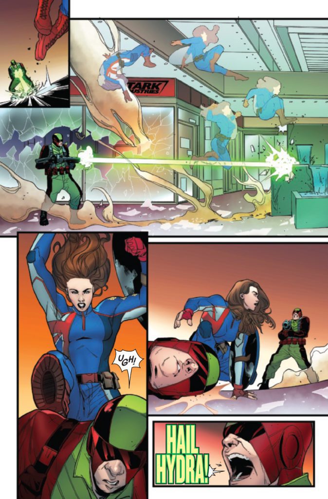
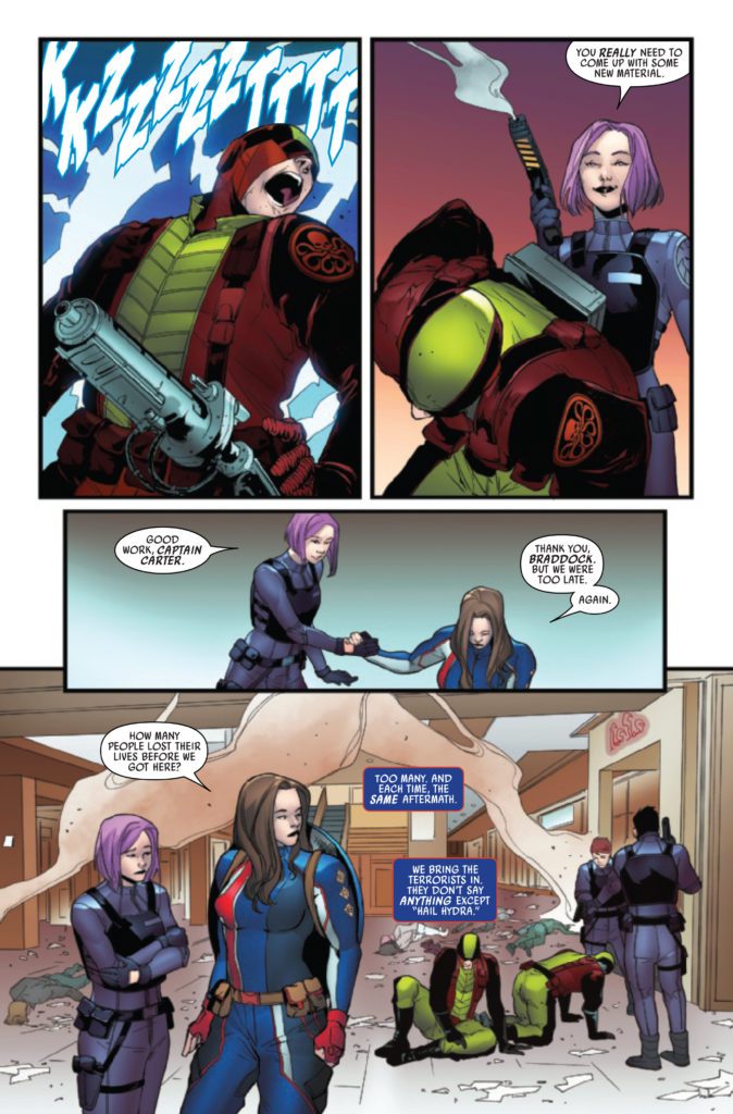
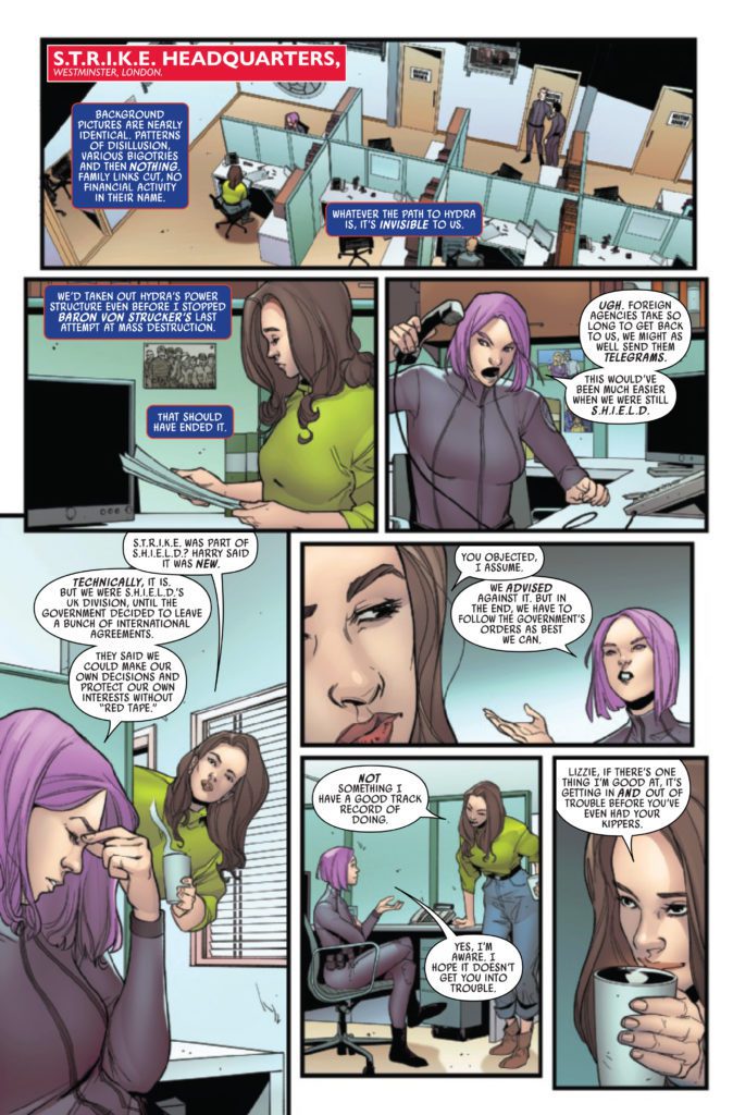
CAPTAIN CARTER #2 hits your local comic book store on April 13th, but thanks to Marvel Comics, Monkeys Fighting Robots has an exclusive four-page preview for you.
About the issue: “WOMAN OUT OF TIME” CONTINUES!
Captain Carter is back, and now the whole world knows it! Reeling from her new celebrity status, Peggy teams up with S.T.R.I.K.E. to investigate the sudden resurgence of Hydra, but something doesn’t feel quite right. Can Peggy trust what she’s being told, or is someone trying to use her as a high-profile pawn in a game she doesn’t yet understand?
The issue is by writer Jamie McKelvie and artist Marika Cresta, with colors by Erick Arciniega, and letters by Clayton Cowles. The main cover is by McKelvie.
The character of Captain Carter first appeared recently in What If…? on Disney+ before making the jump to comics. There is hope and speculation that she will make her live-action debut in the upcoming Doctor Strange in the Multiverse of Madness.
Check out the CAPTAIN CARTER #2 preview below:
Did you read the first issue of CAPTAIN CARTER? Sound off in the comments!
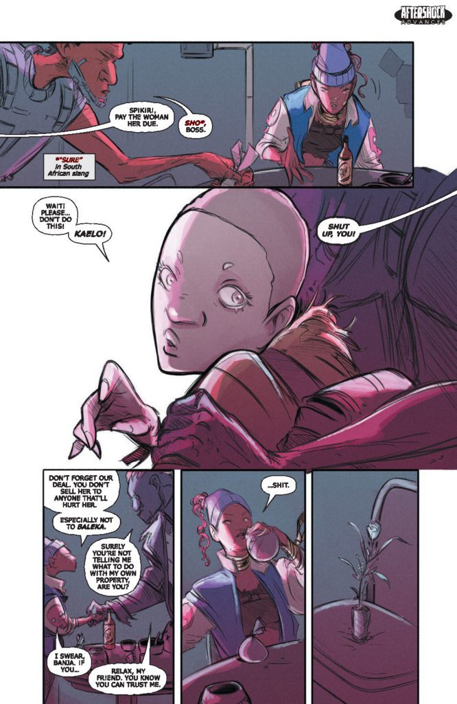
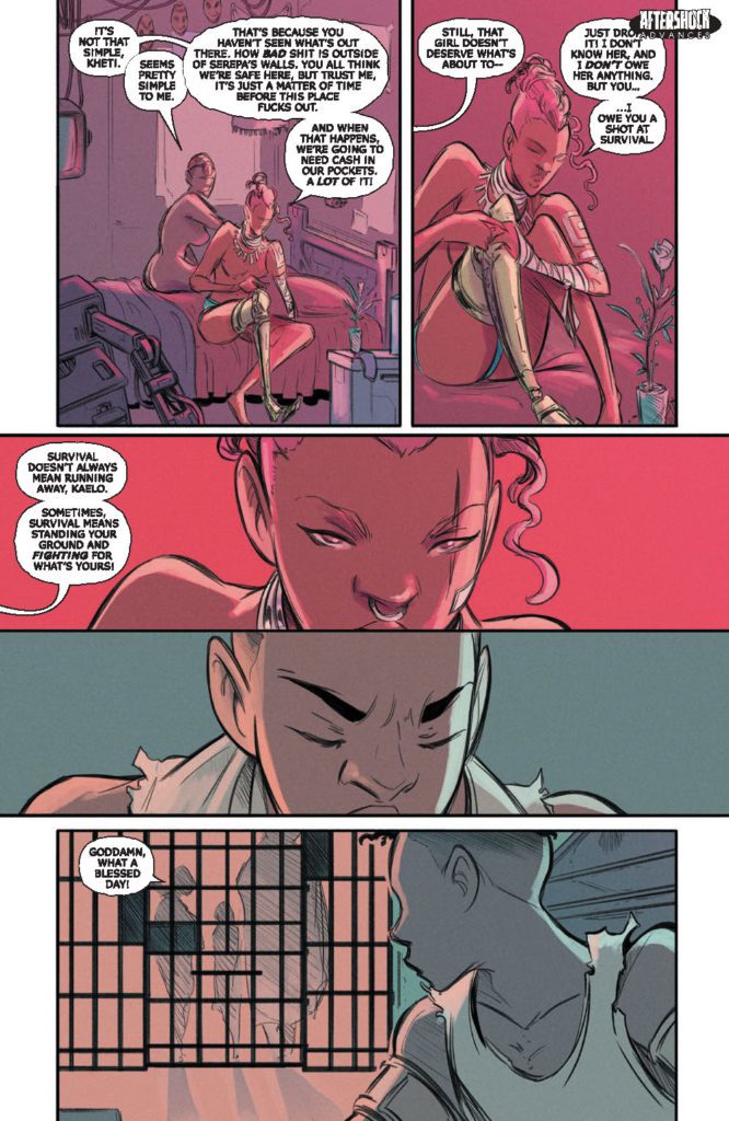
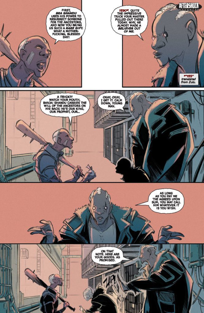
LAND OF THE LIVING GODS #3 hits your local comic book store April 20th, but thanks to AfterShock Comics, Monkeys Fighting Robots has an exclusive four-page preview for you.
About the issue: After selling Naledi to Shandu’s witch for ritual sacrifice, Kaelo grows tormented by memories of her past and the betrayals that she herself suffered as a child. Meanwhile, Naledi has a chance encounter with someone that harbors a seemingly impossible secret – a secret that could unravel the very foundations on which the stronghold of Serepa is built.
The series is by writer Isaac Mogajane and artist Santtos, and letters by Carlos M. Mangual. The cover is by Santtos.
Check out the LAND OF THE LIVING GODS #3 preview below:
Are you reading LAND OF THE LIVING GODS? Sound off in the comments!
From modern comics icon Jeff Lemire (Gideon Falls, Black Hammer) and artist Dustin Nguyen (Descender, Robin &Batman) comes the stellar second chapter of their tiny vampire survival series in Little Monsters #2. Featuring lettering from Steve Wands, this issue delves into the past of certain cast members and reveals more about the children’s situation – and what has been kept from them. With a perfectly paced script and functionally perfect art work, this comic will be an absolute joy for fans of vampire fiction needing something new.
“When a man stumbles into their camp, the long-forgotten taste of human blood is quickly remembered.”
Writing & Plot
Jeff Lemire continues his streak of near-impeccable writing projects with his script for Little Monsters #2. Where the first issue worked as an introduction to this concept and the cast of characters, the 2nd chapter is a perfect launch point for the coming conflicts. Here, we get to see into one character’s past and an inkling of how they may feel about their vampiric life – and what that life sometimes means. We also get the exact opposite view of this lot in life, and some more hints as to the nature of the being who made all these children into little creatures of the night. The pacing of this chapter’s plot development is absolutely perfect. Lemire switches from a tense flashback sequence to the present view of multiple characters and it all feels so seamless. Being a cartoonist, with writer/artist credits on acclaimed titles like Sweet Tooth, Underwater Welder, and most recently Mazebook, he’s well aware of how to pace a comic to take advantage of the visual medium. Lemire leaves many panels and pages without dialogue, allowing for Nguyen to carefully craft a tense reading experience that will surely enrapture readers. We will need to have a conversation soon about how Jeff Lemire may very well be the most consistently great comics writer currently working.
Art Direction
As stated previously, Dustin Nguyen really gets to flex his creative muscles in Little Monsters #2. His stunning use of black & white in conjunction with his detailed and unique penciling will leave an indelible mark on a reader’s mind. If you’ve read the prior issue, or his work with Lemire on Descender or Ascender, none of his raw artistic skill will surprise you. However, his rendition of the story’s methodical pacing is true comics-exclusive magic. The way Nguyen takes Lemire’s narrative and so carefully blocks and directs it with his drawings is truly fantastic work. Scenes in this comic will stay with me for some time just because of how Nguyen places them, and how perfectly paced out the whole issue feels. The lettering from Steve Wands is subtle, and sort of blends into the reading experience. I mean this in a positive manner. Even his SFX lettering is subtle, coming in at the perfect moment in small doses to add the perfect punctuation to a tension-filled scene. Visually, this comic is an absolute feat, featuring the kind of storytelling only possible in this medium.
Verdict
Little Monsters #2 is a stellar 2nd chapter for this unique post-apocalyptic vampire tale. Jeff Lemire’s script is perfectly paced and steps in a compelling direction for the next stages of this plot. The visuals from Dustin Nguyen are starkly drawn and carefully directed, making for one of the most striking comics of the year. Be sure to grab this issue when it hits shelves on April 6th!
One of the most intriguing things about this new era of X-Men has been the Quiet Council. While they’ve always played a role in every book, as readers we’ve never been able to see everything that they are up to. With Immortal X-Men #1 Kieron Gillen makes his triumphant return to the world of X-Men. Joined by Lucas Werneck on pencils, David Curiel on colors and Clayton Cowles on letters, we get an explosive first issue that won’t be forgotten.
WRITING
Kieron Gillen uses Mr. Sinister as our narrator for this first issue. Gillen has written Mr. Sinister before during his stint on Uncanny X-Men. Gillen’s voice for Sinister has not changed in Immortal X-Men. He’s cocky, hilarious, dangerous and untrustworthy. Gillen sows the seeds of discord throughout the council as they disagree on which new member to add to fill a vacancy. As a reader, we get to see all the backstabbing going on in the political world of mutants. One of the most fun parts of the issue is when potential candidates apply for the council seat. Gillen shows us why they feel they would be a good fit, and we also get the council members discussing why they wouldn’t. As far as first issues go, Gillen knocked this one out of the ballpark.
ART
Lucas Werneck’s pencils look great this issue. The beginning of the issue takes place in 1919. Werneck draws Paris gorgeously as Sinister sits next to a blue fountain. Werneck also draws Sinister cocky as he listens to the council argue over who gets the remaining spot. Werneck has him slumped in his chair with a crooked smile on his face. The background of Krakoa also looks beautiful as trees have sunlight shining in through them. Werneck’s pencils make it easy to go from panel to panel as the transitions are smooth. Pages where the council vote, Werneck goes through each member. Your eyes flow from mutant to mutant as you see them and it works really well on the page.
The colors by David Curiel are fantastic as well. During the council meeting, Curiel uses a light blue for the water in the background and some nice shading on the trees. This allows our eyes to focus on the mutants applying to be on the council. As the five bring a mutant back to life in Arbor Magna, Curiel uses a dark blue behind the characters. He offsets this with a vibrant orange and red as the mutant is reborn. These contrasting colors are gorgeous to look at and work perfectly together.
The letters by Clayton Cowles have a couple of stand out panels. Mr. Sinister, using fake outrage, yells “WHAT?!?!” during a council meeting. The text is large and goes the full length of his panel to show his outrage. This is a funny panel for readers and Cowles making the text large adds to the comedy. During a fight scene near the end of the issue, Cowles gives us a “BAMF” from Nightcrawler. The letters in the “BAMF” are staggered, which makes you feel the dynamism of the action.
CONCLUSION
Immortal X-Men #1 is an exhilarating read. Kieron Gillen writes the cast flawlessly as he reunites with his favorite mutants. The art team delivers a great performance that will be sure to please fans. Immortal X-Men #1 is available from Marvel Comics at a comic shop near you.
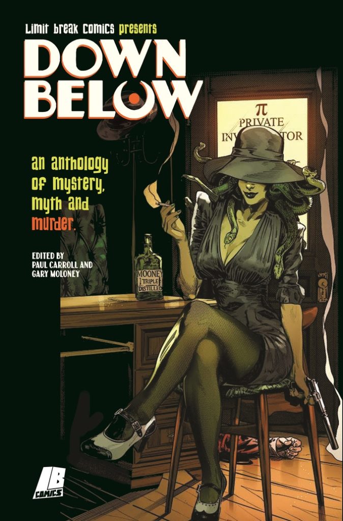
The book is a collection of stories inspired by Greek Mythology “with a noir twist.” Moloney is editing the anthology alongside Paul Carroll; the two are founding members, along with Gareth Luby, of the Dublin-based comic collective Limit Break (we’ve previously spoken with Carroll about TURNING ROADS, another anthology project published under the LB banner).
Check out the campaign for a full list of the creators involved, but know that DOWN BELOW boasts 22 creative teams to bring readers almost 90 pages worth of comics.
Read on for our full interview with Moloney:
Monkeys Fighting Robots: DOWN BELOW is the second anthology from Limit Break after TURNING ROADS; what did you guys learn from your first campaign that you brought into this one?
Gary Moloney: DON’T UNDERCHARGE FOR SHIPPING! In all seriousness though, I should clarify at the start that Paul Carroll was the sole editor on TURNING ROADS. I only contributed a story last time around. So, to a large extent, these are lessons I learned second-hand. We did speak at length, however, about what we wanted from this campaign specifically taking into account the experience of having done TURNING ROADS.
The success of TURNING ROADS took us all by surprise. We were always confident that we’d meet our goal, but we didn’t expect to more than double it. So while there had been some preliminary ideas for stretch goals, which mainly included prints from established Irish artists, the pressure was on to come up with ideas on the fly. They proved to be quite popular and that’s why this time around we built those into our initial funding goal, the result being we had our pin-up artists on-board before launching the project. It also meant that we could structure our stretch goals around providing increased page-rates to our existing 22 creative teams rather than using it to commission new artwork.
MFR: What about Greek mythology and noir made you guys think, “These things need to go together?”
Moloney: We’d been talking about what a follow-up to TURNING ROADS might look like for a while. We knew that we didn’t want to do a second volume on the same theme (or at least not straight away). Paul and I had been engrossed in the video game HADES for a good chunk of last year, which led us into a downward spiral of binging all of Rachel Smyth’s LORE OLYMPUS (which I’d highly recommend) and listening to HADESTOWN. The more we thought about it, the more we thought that Greek Mythology would make for an interesting canon to explore, though it was Paul who originally suggested the idea. The noir of it all really came from looking at the core themes of those stories. They’re filled with betrayal and tragedy. There is always a bittersweetness to Greek myths even when they ostensibly have a happy ending. What is noir but that same aftertaste?
So, thematically, it made sense to us and I thought it would really spur the creativity of those pitching to us given that crime comics are more popular than they’ve ever been. And, truth be told, I just really wanted to edit a crime anthology. I’d discovered my love for writing in the genre a few years ago when I was taking Declan Shalvey’s comics writing course and it had been something I’d been threatening to do for some time. DOWN BELOW gave me the opportunity to co-edit a book that would standout amongst the myriad of crime anthologies that are out there.
Cover Art by Stephen Mooney (Inks) and Tríona Farrell (Colours), logo and design by Becca Carey
MFR: You and I have discussed our mutual love of noir at length; what is it about the genre that speaks to you personally?
Moloney: As you can imagine, I’ve been mulling this over quite a bit recently. I think many people hear the word “noir” and immediately think of a particular aesthetic. They jump to the pinstripe suit and fedora stereotype of Raymond Chandler novels (or at least what they think a Chandler character looks like). An aesthetic is not a genre though. Noir is so much more than that as modern comic creators have shown time and time again.
To me, when you really get to the heart of what noir is about, it’s the struggle against an unfair world. The protagonists of a noir story (for they are rarely heroes in the traditional sense) often find themselves coming up against societal structures far more powerful than themselves. Sometimes it’s the struggle against those systems and other times it’s the desire to become part of it. These structures, be they organised crime or something endemic like poverty or corruption within the police are things which no one person can dismantle. They require systemic change underpinned by collective action that is often not forthcoming. At most, all an individual can ever hope for is to make some small impact in the world around them. Noir is about those individuals. It’s about those who face the impossible odds. The noir detective or private eye can solve a particular case, but the underlying issues that brought it about remain at the end of the story. They’re under no illusions about the scope of their ability to affect change. They know they’ll lose more than they win. Their victories are short-lived, but they’ll take what they can get. So those fleeting moments are what noir authors tend to focus on even as they find themselves coming close and closer to a tragic end. That’s where the bittersweetness I spoke about previously comes into play. It’s also what distinguishes a noir story from other forms of crime fiction.
MFR: Care to tease some of the stories we’ll be seeing in DOWN BELOW?
Moloney: One of the things we really wanted to make sure is that we had a nice variety of stories that drew from different corners of the mythology. We didn’t want the same characters to be tripping over each other across stories. This made the process of narrowing down pitches very difficult as we had to choose between competing visions for certain myths. That being said we did have to make an exception when it came to Odysseus because the specific pitches in question each touched on him at such different points of his life that they’re effectively different characters. So those familiar with “The Odyssey” will be well-looked after.
Many of our stories are thematically inspired by Greek myth as opposed to engaging in a strict re-telling or adaptation. While you’ll see stories inspired by Sisyphus, the Minotaur, or Hades and Persephone, don’t come in expecting a simple re-skin of the classics. We weren’t really interested in going down that road, we gravitated towards stories that looked a little deeper and went beyond mere adaptations.
One of our contributors, Oliver Gerlach, is a classicist who works in this area, so he comes to the project not only with his comic background, but with the study of Greek mythology as his day job. I think because of that foundation people will get a kick out of his and artist Alex Moore’s take on Dionysus. If ever was there a team suited to tackling this material in comic form it’s them.
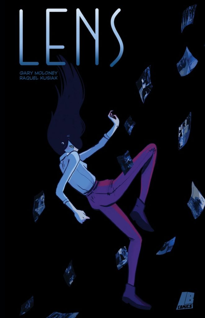
MFR: One of the add-on items for DOWN BELOW is your new comic LENS with Raquel Kusiak. Can you speak to that story and let readers know what it’s about?
Moloney: LENS is an espionage-thriller in the vein of Jack Reacher or Bridgette Sharpe which follows the adventures of Jane Danner, an award-winning photojournalist who also happens to moonlight as one of the world’s greatest assassins. The elevator comp pitch is essentially: “what if Lois Lane was secretly John Wick?” The original germ of the idea came from that same comic class I mentioned earlier. I had this image of a sniper concealing their gun in a camera bag, travelling the world to carry out political hits. The idea was to play with the notion that the 20th century had been shaped by the assassination of prominent public figures (such as MLK or JFK) as well as the advent of photojournalism which produced images that imprinted themselves on our shared cultural consciousness (the Tiananmen Square Massacre or Vietnam War). So, my question was, what if you had a hand in both?
Initially, I’d conceived of it as a standalone short story but a friend rightfully pointed out that the concept would be better suited to something longer in form. This led to my pitching the series to editor extraordinaire, Claire Napier, when she was began putting together a new comics anthology magazine: BUN & TEA, with the view to serialising a number of stories over the course of six-issues. Claire presented me with a number of potential artists to collaborate with and I was immediately struck by Raquel’s use of colour and her dynamic style. LENS wouldn’t be the book it is without her.
The magazine was designed to emulate UK-style anthologies such as 2000AD or SONIC THE COMIC, so each chapter or episode was to be five pages in length. While we were only supposed to put together a single pilot episode to begin with, the three of us ended up enjoying the process so much that we completed the whole six-episode story arc ourselves. The pandemic caused BUN & TEA to be delayed, but we eventually serialised LENS as a webcomic for free which can now be read collected as a one-shot in print form for those so inclined.
This first season sees Jane hired to take out a prominent tech-entrepreneur who for mysterious reasons has come to be viewed as an unacceptable liability by the US government. She quickly learns, however, that she’s not the only one on the job. What’s funny is that I wrote that entrepreneur character, Zack Zimmerman, very much as a satire of the kind of tech bros who would talk in nebulous terms about certain technologies which they claimed would revolutionise our everyday lives without ever explaining how or why that might be something we’d want in the first place. I was slightly worried in hindsight that this guy would come off as too much of a parody in the current climate. Of course, that didn’t account for everything that’s happened with the Blockchain these last few months and the almost cult-like nature of its proponents. If anything I think I didn’t go far enough!
In short, LENS is a neon-filled pulpy escapade that fans of JENNIFER BLOOD, FATALE, or THE COLDEST CITY are likely to enjoy. While this collection is a self-contained mission, we’ve built a story engine here that allows us to follow-up with further instalments in the future. We want this to be a series that has an underlying lore but is accessible to new readers no matter where you pick it up.
MFR: How have you changed and grown as a writer after making the jump to editor/publisher?
Moloney: I think that’s something I’m going to find out myself as I begin a few new writing projects over the coming months, we’re still in the process of making the book after all. Immediately, though, I know my mentality towards pitching short stories has changed. This process really cemented for me the need to design pitches in a way that immediately catches an editor’s attention. Writers need to learn to write for the pitch rather than the story.
We had 189 pitches — more than double what TURNING ROADS received — which was quite the undertaking. You simply don’t have the time to linger on pitches that aren’t clear or are otherwise difficult to navigate. With most anthologies, you can anticipate the kinds of pitches they are likely to receive. Those who submit Future Shocks to 2000AD are warned off “prisons of the mind” and “time travel” stories for this exact reason. So how do you stand out? Well, statistically speaking, you’re better off trying to look at under-explored themes or subjects rather than the more well-trodden paths. At the end of the day, most anthologies will only give you four pages. It’s not a lot. That’s a constraint but also an opportunity. You can afford to experiment with form and content. Even if it doesn’t work, you’ve learned a lot more by doing so and your next effort will be all the better for it.
MFR: Can you tease anything that’s coming up for Limit Break following DOWN BELOW?
Moloney: It’s important to understand that, outside of these mythology anthologies, Limit Break is more of a collective than a publisher. When we started we never had any intention of curating books like TURNING ROADS or DOWN BELOW. We were simply looking for a way to pool our creative resources and encourage each other to refine our craft. The scope of what we do has changed over time though as our network has expanded and people began to approach us with ideas. Most recently, fellow Irish writer Seamus Kavanagh asked if he could put out his short story collection, OLD GAME PLUS, through Limit Break. As fans of his previous work, we were only delighted to be able to help him through the process of putting that book together. There may be one or two more additions to the Limit Break roster before the year’s end, but I can’t say more than that.
In all honesty though, DOWN BELOW really is the focus at the moment. These anthologies are huge undertakings for us and take up a lot of creative headspace. At the same time each of us are still working away on our own books for self-publication or to be shopped around elsewhere. Paul and Gareth are getting started on the last issue of their funny-animal series, MEOUCH. Meanwhile, I’m currently working in the background on a fantasy-western with Daniel Romero and Becca Carey. Don’t be too surprised if you see another “myth-anthology” from us next year. All good things come to threes after all. As for the theme? Well, that would be telling…
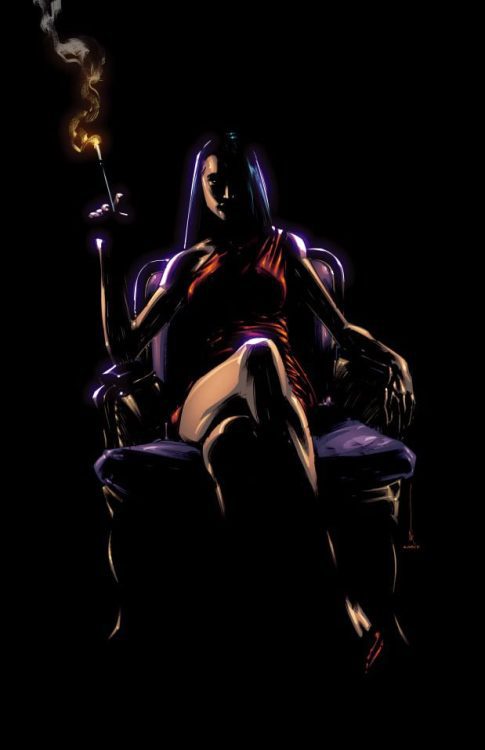
Print by artist Kevin Keane, available as part of the print pack through the Kickstarter.
MFR: And I’ve discovered some great comics just in chatting with you, so I’m always inclined to ask: what have you been reading lately?
Moloney: As a new parent, I haven’t had the chance to read as much or as widely as I’d like to of late. I do still manage to carve out time though to keep up with a few titles. I’ve been following the Massive-verse with great interest over the last year. I think those are a group of creators are doing something really unique with the independent superhero. Something we haven’t seen in many years. I’ve written a lot in the past about superhero comics being an intergenerational conversation between creators which each successive wave commenting or iterating on what came before. This is the first time you’re really starting to see the influence of Japanese imports such as anime and tokusatsu seep into the American superhero landscape. They’re taking that ball and running with it.
I’ve also really enjoyed TIME BEFORE TIME from Rory McConville, Declan Shalvey, Joe Palmer, and Hassan Ostmane-Elhaou. That’s an example of taking a well-trodden concept like time travel and doing something new, by removing the risk of paradox and focusing on the personal drama.
On the Irish side of things, I’ve just finished BLAZE BEYOND THE PALE, a new graphic novel by Aaron Losty and Becca Carey (with colour assistance by JP Jordan). It’s an incredible work about growing up in inner city Dublin and the very particular experiences that come from that. Few comics ever truly capture the feel and character of a place, but there Fingal is perfectly realised. If you want to get a real sense of what urban life and culture is like in certain parts of Ireland, I can’t recommend BLAZE BEYOND THE PALE enough. I’m really glad that the team on that book also have a story in DOWN BELOW which will be an absolute visual treat for all involved.
I’ve also found myself following along with daily webcomics published on Irish Comics Dot IE. Every day features a new instalment from a different series by Irish or Ireland-based comics creators. There’s something for whatever mood you’re in whether its comedy, action, or romance.
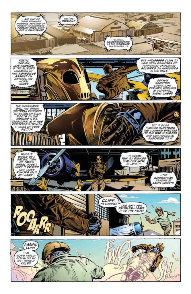
The Rocketeer: The Great Race #1 Credit: IDW Publishing
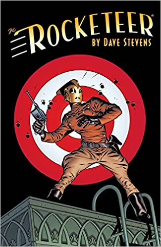
It has been 40 years since Dave Stevens’ adventure comic The Rocketeer was first published in the pages of Starslayer. Despite only a handful of stories existing that feature the old school adventurer, Cliff Secord, and his friends, there is a loyal fan-base, especially within comic creators. When IDW launched a new anthology series based on the character in 2011, a host of big name creators produced a collection of short stories that read like a love letter to Stevens’ original work.
For those who don’t know, The Rocketeer is influenced by the classic Hollywood movie serials of the 1950’s and the larger than life actors of that era. Stevens’ was drawn in by the beauty of Bettie Page and the distinctive looks of actors like Rondo Hatton. The original story was an unashamed tribute to the latter day Golden Age of Hollywood, with obvious villains, larger than life stunts, and a lovable rogue for the lead. The artwork was stunning and the story pure entertainment in the vein of Indiana Jones. It is not surprising that so many within the comic industry are drawn to the potential of the character.
The Rocketeer: The Complete Collection Cover Credit: IDW Publishing
Lights..
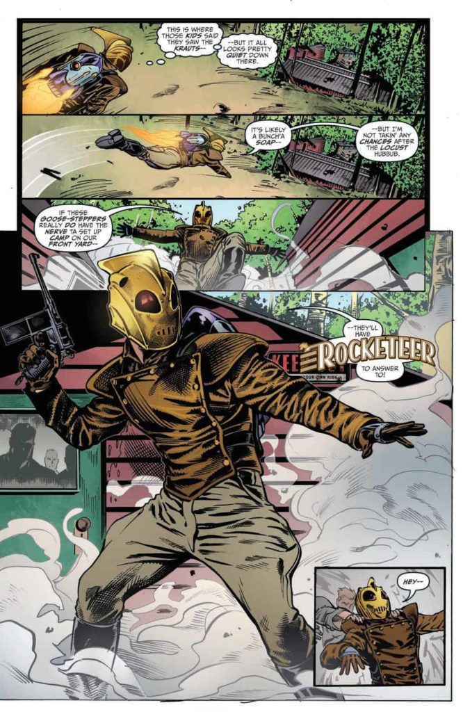
Over the years, a number of great creators have worked on The Rocketeer, from the likes of Mark Waid to Alex Ross, each incorporating their own idiosyncrasies into the style designed and mastered by Dave Stevens in the 1980’s. Some have been more successful than others and they have been able to capture the spirit of the character while still making it relevant to a modern audience. One look at Stephen Mooney’s previous comic work will explain exactly why he is a perfect fit for this franchise. Aside from his artistic work on titles such as Image’s The Dead Hand from 2018, written by Kyle Higgins, and Half Past Danger from IDW in 2013 with Jordie Bellaire, who has already contributed to the legend of The Rocketeer, Mooney has produced work for Dynamite’s Betty Page comics. His style is already suited to the Art Deco, romanticized Hollywood of the 1940’s and 1950’s.
The Rocketeer: The Great Race opens with a scene setting action sequence that places the story historically and thematically. A news report spreads rumors that German spies are training in the hills around California promoting Cliff Secord to don the jet-pack and fly into action. Mooney incorporates a classic superhero costume change and flight into action with the aesthetics of 1940’s adventure comics. The result is awe-inspiring and entertaining. It captures the emotional excitement of watching the adventure serials as a child and the pleasures of reading the original Stevens comic strips. The emphasis is on excitement and adventure with a side order of style.
The Rocketeer: The Great Race #1 Credit: IDW Publishing
..Camera..
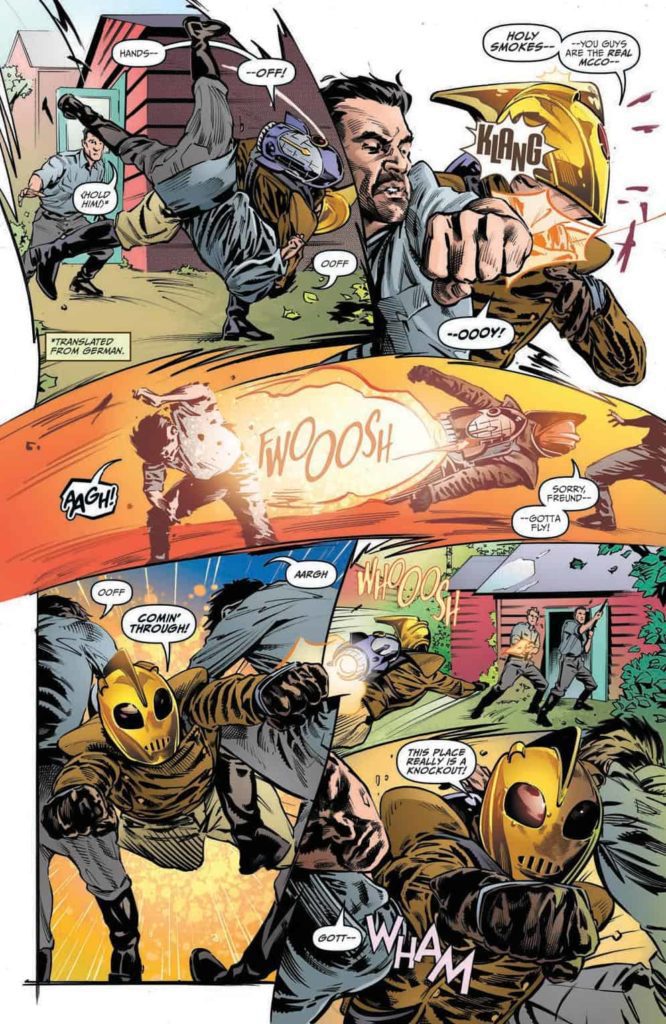
The pacing of the artwork is superb. The story unfolds from panel to panel at a speed that matches the narrative beats. Some pages have a steady movement from top to bottom while others are more chaotic, the panels twisted by the action they contain. Mooney isn’t afraid to play with the page layouts and switches from standard layered panels to obscure panel shapes to pages without any panel borders at all, merely a collage of images laid next to and on top of each other. All of this diversity in layout is held together by the distinctive style associated with the Rocketeer.
The opening sequence not only shows off Mooney’s majesty over comic artwork but also his abilities at telling an engaging story that gives the reader everything they need to know in a short and entertaining few pages. Mooney sets the scene, the tone, and pays homage to the history of the character, in a magnificent few pages. And this approach continues throughout the rest of the comic. Mooney tells an almost perfect Rocketeer adventure using the characters and the narrative styling employed by Stevens’ 40 years ago.
The Rocketeer: The Great Race #1 Credit: IDW Publishing
..Action!
One of the most pleasing aspects of this new Rocketeer comic is the vibrancy of the color. Len O’Grady makes the images leap from the page and never dampens the action in unnecessary darkness. So much of the narrative takes place under the bright blue Californian skies and O’Grady brings the visuals to life with classic cinematic coloring. The bright colors add to the playfulness of the comic but also allow O’Grady to highlight more serious elements of the script. There are panels with flat, red backgrounds that emphasis the horrors spoken in the word balloons, or contrasting colored objects that act as symbolic warnings. The entertaining pace of the comic is not broken but these occasional color shifts allow the narrative to subconsciously lay the groundwork for future twists and turns.
Shawn Lee does something similar with the lettering. Overtly playful speech balloons exaggerate elements of the script to mirror the larger than life characteristics of the cast. Meanwhile, the clever use of bold text hints at double meanings in the speech and, as with the coloring, future twists. Lee’s placement and separation of the word balloons leads the reader across the page while helping to enhance the character’s personality. And whoever’s idea it was to include thought balloons is a perfect fit for the overall design of the comic. It brings to mind early 1980’s comics and the style employed by Dave Steven’s in the original Rocketeer adventures.
The Rocketeer: The Great Race #1 Credit: IDW Publishing
Conclusion
From the cover to the final page, The Rocketeer: The Great Race #1 is both a thrilling ride and a beautiful homage to a forty year old franchise. Mooney shows the utmost respect for the original material and he clearly enjoys playing in Stevens’ sandbox. The artwork, colors, and lettering, all invoke a classic Hollywood aesthetic that compliments the high adventure narrative. Not all of the stories in the franchise have captured the essence of the original or do the character justice, however, The Great Race could have come straight from the pen of Stevens himself. It is a near perfect follow up to the original.
Mooney, O’Grady, and Lee are clearly fans of Stevens’ work and their excitement for the character is evident from the pages in The Great Race. First and foremost this comic is a piece of entertainment that one hundred percent succeeds in this role. However, the comic is so much more as it is tied to comic and cinematic history. It has depth and a pedigree worthy of study. The Rocketeer: The Great Race is a pleasure to read and will demand more attention from you than you might expect.