
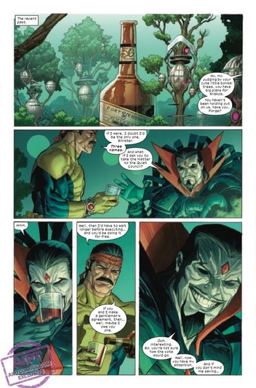
To say the X-Men have had a rough time lately is an understatement. The team has been dealing with a battle against the Eternals and being judged over in A.X.E. Judgement Day, and are also having problems gelling as a newly formed team. X-Men #16 brings the drama to a head as Forge dives into the Vault to rescue Darwin and the team battles it’s own demons. Gerry Duggan is the writer for this issue. He’s joined by Joshua Cassara on pencils, GURU-eFX on colors and Clayton Cowles on letters.
WRITING
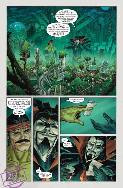
Gerry Duggan has been giving readers quality X-Men issues since the Krakoa era began. This current issue revolves around Forge going into the Vault to rescue Darwin and the new dynamic between the team. Duggan makes it known that Forge will do what he needs to do to get what he wants. This is evident as he makes a deal with Mr. Sinister. As Forge makes his way further into the Vault, trouble brews outside. Duggan does a nice job of portraying the sibling rivalry between the Summers brothers. Scott tries to control the situation while Alex loses his temper and does something irrational. In this moment, after Havok unleashes trouble on them, Duggan show what the team is truly capable of. Cyclops and Havok work together. Magik saves Firestar. Iceman shows why he’s an omega mutant. Duggan allows the X-Men to execute their game plan on the fly and the team actually works well together. This is just the beginning of Duggan building this new X-Men team. The future seems like it will be dramatic, fun and full of great character moments.
ART
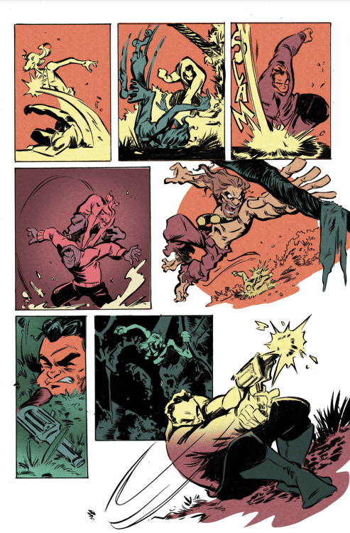
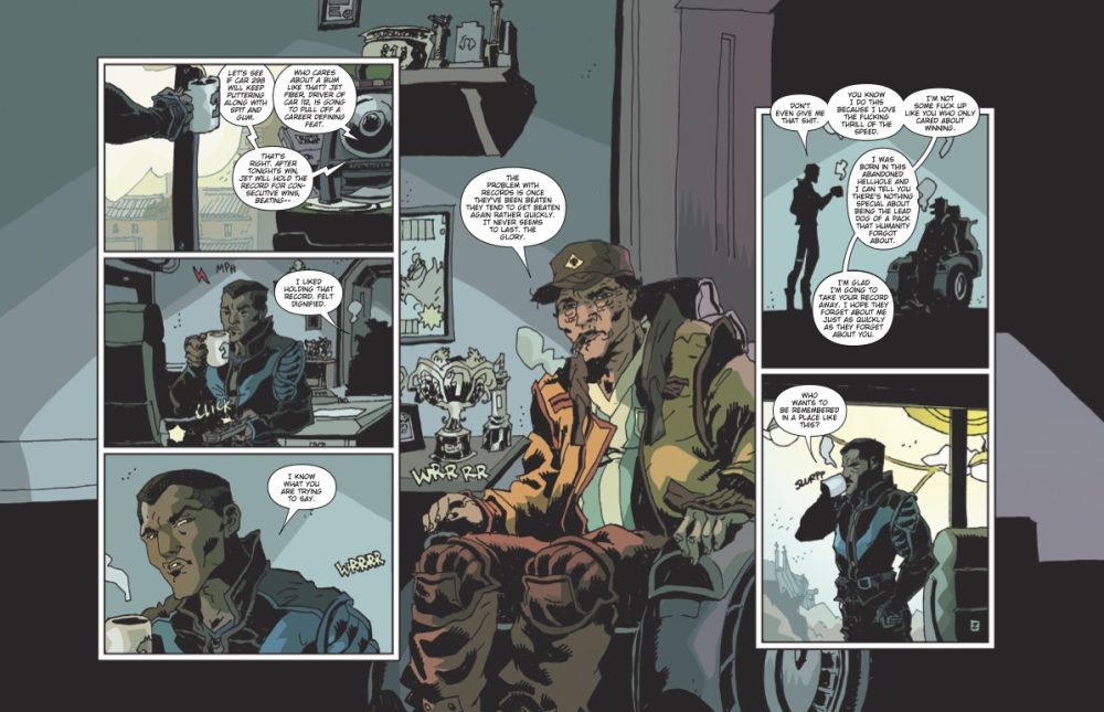
There aren’t many names in the artist circles that are hotter than Joshua Cassara right now. Cassara’s art is visually stunning and gives us images that seem life like. In the early pages of the issue, as Forge talks with Mr. Sinister, Cassara gives us one of the most realistic images of Mr. Sinister. The line work is great in these panels and Cassara draws Sinister with his iconic devilish grin. Another key part to the art this issue are the facial expressions. This is extremely important during the fight between Cyclops and Havok. Cassara uses his talent to show the anger on the Summers’ faces as they yell at each other. As Alex does something stupid and lashes out at Scott, Cassara shows his remorse after the fact.
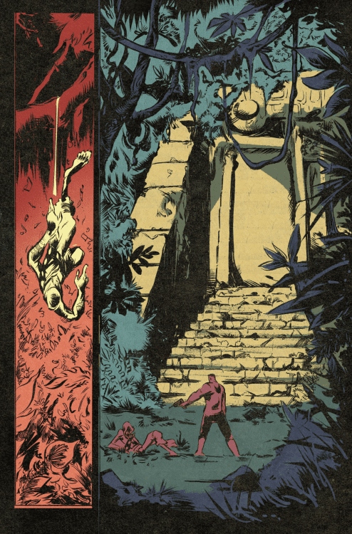
The colors by GURU-eFX are amazing. He takes the pencils laid down by Cassara and allows them to leap off the page. This is clear as Forge navigates the Vault. As he floats above all the buildings, GURU e-FX uses a vibrant blue below that illuminates Forge as he floats. The neon looks gorgeous in the city. GURU e-FX also gives us good looking pastel backgrounds for certain panels. As Scott and Alex bicker, the light blue and red backgrounds make the characters pop out.
The letters this issue are handled by Clayton Cowles. One thing that Cowles has always been great at is his use of sound effects. As Havok punches Cyclops, Cowles put a large “KRAK” perfectly placed between Scott and Alex. Another great example is Perro attacking Iceman. As Perro attempt to escape Iceman’s ice wall, he smashes with a powerful “SKRABOOM.” This is placed in the upper corner of the panel and the letters are scattered unevenly to show destruction.
CONCLUSION
X-Men #16 is another thrilling entry into Duggan’s run. The writing is fun and fresh with a less than ideal team dynamic. Cassara’s art absolutely slays as he draws your favorite heroes in action. X-Men #16 is available at a comic shop near you!