

An impending snow storm in small town America forms the setting for BOOM! Studios The Approach, a new mini-series from writers Jeremy Haun & Jason A. Hurley, and artists Jesús Hervás & Lea Caballero. Billed as a “turbulent new horror,” the opening issue is pure scene setting, introducing the characters and location. The narrative tension builds as the reader becomes familiar with the claustrophobic setting and the limited cast. The mood is then heightened with the introduction of something unexpected and out of the ordinary.
For a snap comparison, think The Thing meets 30 Days of Night. The Approach promises to be an uncomfortable ride, and — being a mini-series — none of the characters are safe. This is the perfect setting for a horrific encounter.

Coming In..
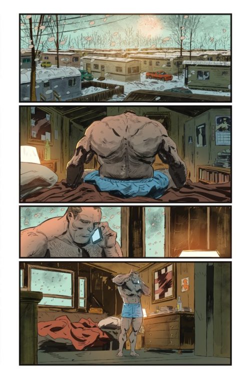
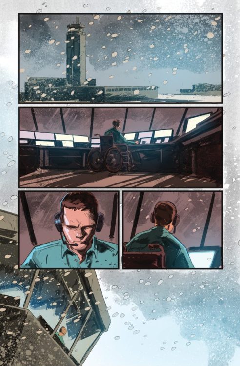
The construction of this first issue is solid and enticing. Just like Steve Niles’ 30 Days of Night, Haun and Hurley lead the reader through their world in the footsteps of a single character: Mac. Mac works for a small airport and is charged with making preparations for an unexpected landing during an escalating snow storm. As the environmental situation worsens, the claustrophobia intensifies. The creators produce a tangible feeling of the world shrinking around their cast; of a nightmare closing in. The strength of this opening issue is the knowledge that something is going to happen but not knowing what it is or when it’s going to rear its ugly head.
The writers want the readers to empathize with the cast, so each interaction becomes a character moment, teasing out a little bit of information in each panel and scene. Mac is obviously the center of attention, but there are a number of other characters who enter the story with backstories and traits that are instantly intriguing. Like the population of Barrow, or Matt Hawkins’ town of Eden in Postal, the small, contained cast each seem to serve a narrative purpose, although what that purpose is has yet to be disclosed.
The Landing
Hervás and Caballero provide some outstanding atmospheric work, using the negative space produced by the snow fall to great effect. Shadowy shapes loom out of the whiteness of the page. This draws the reader’s attention to the interior panels, full of shadow and color, but also allows for some stunning visual panels such as a plane flying out of the storm.
The composition of the pages are wonderful. The panels are layered on top of each other, often employing the use of a single point of focus running through the central axis of the page, a visual technique used by movie directors such as George Miller. The opening page is a prime example of this with the ‘Bzzz’ sound effect in the top panel opening the story and the page. The reader is then led down the center of the page, across Mac’s spine, down the window pain and directly onto Mac in the final panel. The sound effect at the beginning tells the reader that the telephone conversation is important and the rest of the panels all lead us to Mac being the central aspect of the narrative. Here the artists have manipulated the page to highlight the important aspects of the narrative. They use the format of the comic book page to its best ability.
This is something that is true to the comic book as a whole, with the cover being as important to the story as the rest of the art work. The story starts with the single engine aircraft flying out of the storm and ends… well, you’ll just have to buy it to see where it ends.
The color work is striking, with Brett Weldele using the contrasting orange of the characters’ uniforms perfectly against the white of the snow storm. Your eye is drawn all over the page following the moving cast members as they struggle with the environment. Add to this the excellent placement of Ed Dukeshire’s lettering and you get a uniform experience from the artwork. It gels together like the work of a single artist. Dukeshire understands the narrative flow of comics and leads the reader through the panels and the pages effortlessly. You will only notice the lettering when it becomes important, such as with the sound effects at the beginning.
Conclusion
Horror works well when you have a good villain, massacring their way through a bunch of victims, but it works even better if those victims are actual, fully-rounded characters. In The Approach, Huan, Hurley, and company have spent their first issue introducing the characters and building an empathetic cast. The tension within the narrative slowly grows as Mac moves from location to location, scene to scene. It is a masterclass in modern horror comic book storytelling.
The artwork compliments the tone of the script and draws the reader into this blizzard encased world. The creative team works together to create a cohesive comic that works at the panel level, the page level, and even as the full comic book package from cover to cover.
As October crawls on and more and more horror comics come out of the woodwork, it is a pleasure to read a contemporary comic that lives up to the history of the genre in this format.