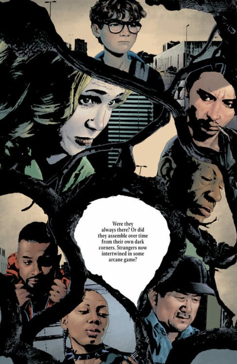
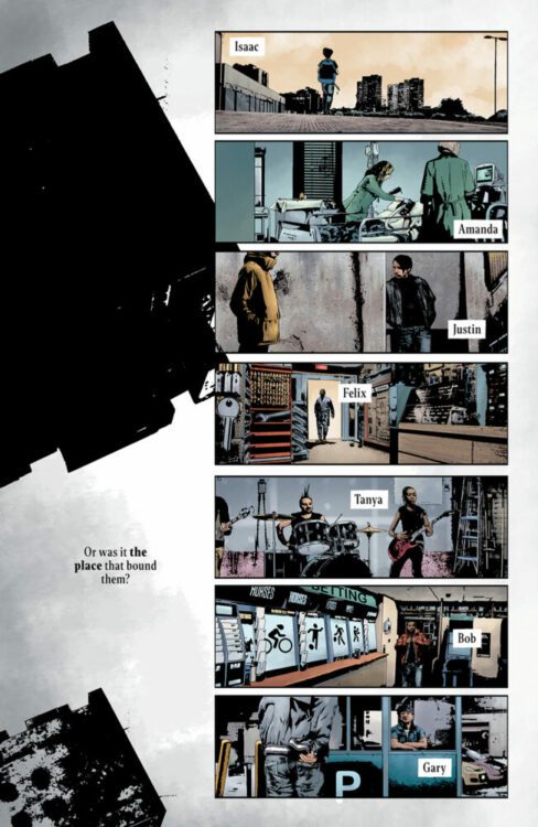
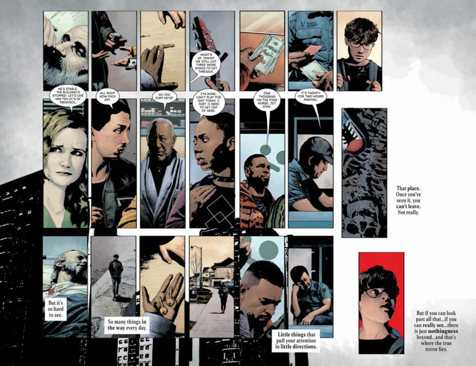
The premise is simple: read one comic every day for the entire year. It seems like a simple task but there is no way that I read 365 comics last year, even if you count the individual issues in collections. So, this year, I am committing myself to this reading challenge, in the hope that I can broaden my reading habits and fully engage with my favorite hobby again.
It’s my third week of trying to read comics from a specific year. So far, it’s not turned out to be the most successful plan, mostly because I’m easily distracted. However, this week I’m heading back to 2007 when my buying was at a high (in the sense of number of comics), and my excitement for comics was being fueled by Marvel’s Civil War crossover event — one of the few events where I read 99% of the tie-in comics and I have a special box which contains only Civil War banner comics. There is some good stuff in that event. None of which I am reading this week.
Credit: Image Comics
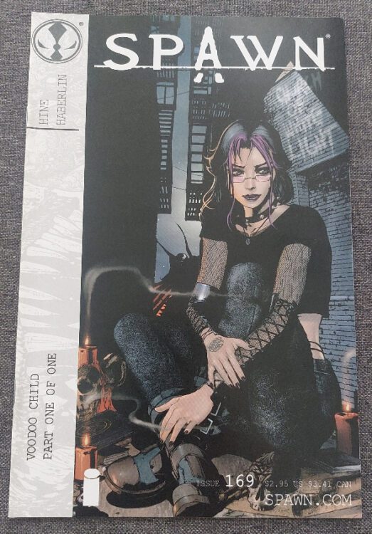
Comic Number 148: Spawn #169
I was a Spawn fan back in the day. I enjoyed the first extended story arc where Al Simmons had a countdown of demons to work through to reach salvation. After a while, I drifted away from McFarlane’s baby, but returned sometime in 2006 when I discovered different writers and artists working on the title.
Issue #169 is a stand-alone story written by David Hine and illustrated by Brian Haberlin. Yes, it helps to have some knowledge of the characters to really get the most out of the comic, but it can also be read as a single issue. A story with a start, a middle, and an end that doesn’t require additional reading. Hine masterfully creates an uncomfortable world for the characters to move through and the sense of tension and desperation inhabits the script.
Haberlin’s artwork is very dark, with shadows enclosing the characters and seeping out of the panels to infest the gutters. This creates a feeling of immersion as if you, poor reader, are being sucked into the magical world.
Andy Troy’s coloring is instrumental to the creation of this atmosphere. For the most part the colors are dark with faded tones but an occasional contrasting color draws the eye across the page. Constantly teasing the reader to jump ahead a number of panels to see what is happening.
Early Spawn is very much of its time, although some of the later stories are probably more accessible to new readers. The problem is that the continuing story aspect became increasingly complex and very difficult to follow for casual readers. However, there are moments of genius, like this one, that can be picked out of the greater mire of continuity.
Credit: DC Vertigo
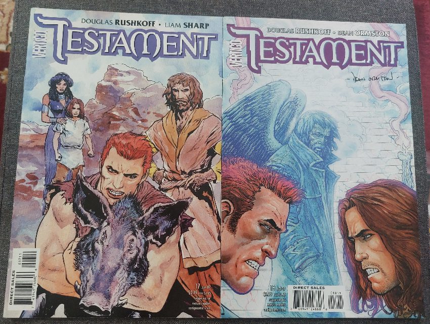
Comic Number 149: Testament #17 and #18
Science fiction and fantasy is a hotbed of religious allegory and sneaky re-working of mythological or religious stories. In Douglas Rushkoff and Liam Sharp’s Vertigo title Testament, there’s nothing subtle about the religious undertones. In fact, the undertones are bubbling up all over the narrative, becoming the upper crust for large segments of the story.
In issues 17 and 18, the central characters are reaching a turning point in their lives and the supernatural beings, the Gods, are making themselves more prominently known. The comic raises questions of free will and the manipulation of characters by other worldly, and human, sources. Situation and society creates the rebels in the narrative but are their actions guided by fate (controlled by gods) or do they create their own mythology to justify their actions?
Rushkoff is a media theorist and the religion/technology comparisons are made at several points throughout Testament, however, in this two-part story, it is human nature that is under the spotlight. These issues are also drawn by Dean Ormston and have a different look to Liam Sharp’s usual interiors. The pages have a more rigid appearance with layouts that repeat from page to page. This helps to make visual links between different stories and characters. Ormston has an illustrative style that focuses on emotional representation. There is a mild expressionistic feel to the visuals but this allows Ormston to bring out the emotions of the characters.
With the color work by Jim Devlin and the lettering by Todd Klein, these two issues of Testament have some excellent visual storytellers working on the script. It almost goes without saying that the two-part Blood Brothers story line is an impressive and intriguing read.
Credit: Avatar comics
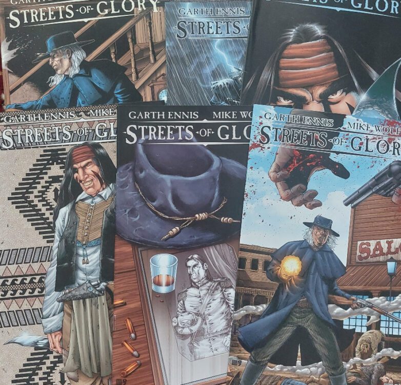
Comic Number 150: Streets of Glory #1-6
I was only going to read one issue of Streets of Glory because I think you can get everything you need to know about the mini-series from a single issue — however, the story pulled me in.
On the one hand, this comic is a typical, well-told western about the dawn of a new age and the retirement of the past. The two central characters represent the different era’s and the uncomfortable transition from one age into the next. Garth Ennis handles this metaphor with aplomb but parts of the narrative are marred by aspects of Ennis’ writing that have become known as his trademarks.
The violence is full on. It leans heavily into gross, over the top, exhibitionist blood thirst. A character doesn’t just get shot, parts of his body are torn apart as the bullets fly through them. The skin is stretched to tearing point and blood splashes across the page. In some cases less is more but that clearly wasn’t the brief for artist Mike Wolfer.
Wolfer definitely has a style that lacks character versatility, but this is made up by clear atmospheric pages and attention to detail. Granted, most of the detail is in the gore and violence but it proves that there is a deft hand at work with the pens and ink.
As you read through the series there are some questionable representations, especially in the blood lust of Red Crow. He is the only Native American in the comic, and is defined by uncontrollable violence but has no other characteristics. The female characters also lack any depth, although in the first couple of issues it does seem that Ennis was setting a number of them up for something. Unfortunately, nothing really comes of them.
Having said all of that, I enjoyed re-reading Streets of Glory. Partially because it was a pure western story, no mixed genre here, but also because Ennis is able to tell a good story. If you overlook the need for excessive violence, the central flow of the narrative is a strong and sturdy metaphor for the notion of changing times.
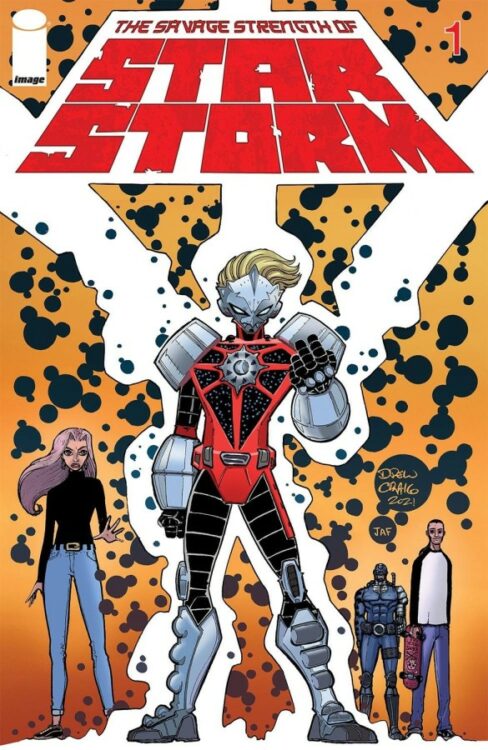
Credit: Image Comics
Comic Number 151: The Savage Strength of Starstorm #1
It’s New Comic Book Day, so I thought I’d try an actual new comic. Starstorm #1 (published by Image Comics) is a homage to the early days of the publisher, or so says Drew Craig, the creator, writer and artist for this comic. And in a lot of ways, he’s right. Unfortunately, not in a good way.
I had no expectations for this comic, and the cover does resemble some of those early Image books that launched the careers of a number of creators. I can see this comic finding an audience and some will rave about the rawness of the images and the straight forwardness of the narrative. The artwork has the appearance of a small press, photocopied amateur comic that has been hand stapled and sold for $1 at a small convention. This, generally, is not a bad thing and lots of fun can be found from this type of comic. However, this does not distract from the problems with this comic.
The characters are stiff and lifeless, with blank expressions and zero emotion. The script at one point mocks the clichés of high school while itself being nothing but layers of clichés from page one. The dialogue is also unwieldy and laughable in places. Is this an homage? A clever insider joke playing on the awkwardness of those early indie comics? Or is it just poor writing? If there had been any contrasting elements that demonstrated that the writer understood the medium and wasn’t just mimicking the superhero genre of yesteryear, then maybe we could give them some leeway. But there is nothing here that hints at a subtly pastiche with deeper meaning.
I don’t often write negative reviews, instead either look for the positive or ignore the work entirely, but somebody is going to pay $3.99 for this and, unless you’re a massive fan of the early, low-quality Image comics, it will be a waste of money. A few dynamic images do not make a good comic.
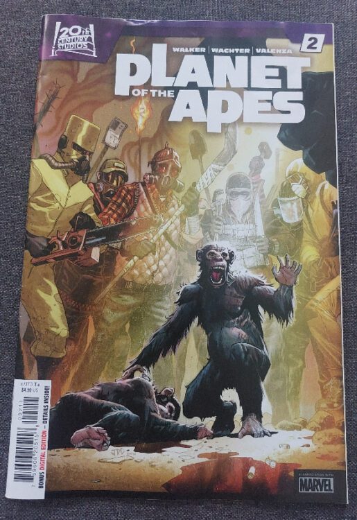
Credit: Marvel Comics
Comic Number 152: Planet of the Apes #2
I’ve drifted away from 2007. How easy is it to distract me? Simple, give me issue 2 of Marvel’s new Planet of the Apes comic.
I found the first issue to be a touch lackluster, with nothing firm to hold on to, and I would say the same with the second issue. The artwork by Dave Wachter is good but the coloring for a lot of the story is quite bland. I understand that they are aiming for a realistic aesthetic, more in keeping with the recent films rather than the bright and boldness of the original apes. However, this creates an atmosphere that drowns the characters in the seriousness of the story making it difficult to engage with.
The backup story starting in this issue, “The Smartest Gorilla in the World,” has a more interesting visual. The short opening is steeped in conflict and is told like a myth, like one of the ancient scrolls from Ape lore. The coloring is more intense and reflects the exaggerated narrative. It is also reminiscent of Conquest for the Planet of the Apes by using a similar color scheme, which essentially boils down to the impression of the old world burning to the ground. This backup story has more going for it and represents the rebellion of the apes in a more engaging way than the lead story.
This Planet of the Apes hasn’t grabbed me yet. None of the characters are particularly memorable or can carry the story. I still believe it was a mistake to set the comic so close to the end of the third reboot movie. Maybe the creators don’t want to step on the toes of the forth movie or have been given a mandate to set all stories in this time period, but it seems a waste not to explore the future of this planet.
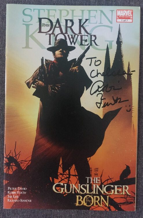
Credit: Marvel Comics
Comic Number 153: The Dark Tower: The Gunslinger Born #1
For those who don’t know, The Dark Tower is a series of books by Stephen King that weave a very large web around the author’s entire back catalog. Characters from numerous different books turn up in one guise or another and there is a lot of hopping through time and space. Just like any long, self involved series of books, you tend to find people love or hate them. The Gunslinger (Book 1) is one of my favorite Stephen King books.
In 2007, Marvel began producing a series of tie-in and adaptations of The Dark Tower, all under the watchful eye of Robin Furth (King’s personal research assistant, and the author of Stephen King’s The Dark Tower: A Complete Concordance). The comics are painstakingly researched to fit in beautifully with the novels, and as such, they could so easily pamper to the fans. But they don’t. The comics stand on their own and, as long as you start at the beginning, you don’t need to read the books.
The first issue of The Gunslinger Born introduces the hero, Roland Deschain, and tells a story of his early days as a child. The series is a journey into adulthood and sets Roland on his quest for the Man in Black.
It’s a coming of age story buried in a mix of western and fantasy tropes. There is some excessive violence but the visuals are not gore orientated. The way that artists Jae Lee and Richard Isanove portray the injuries is unsettling; you feel the pain that is inflicted. In contrast to the violence in Streets of Glory, there is a realism to the physical trauma which in turns makes it more psychologically disturbing.
Although this is issue one, there is a self contained story within these pages. There is a narrative dilemma and that dilemma is solved by the end of the issue. But at the same time, writer Peter David has filled the pages with a vast array of background and setting.
This comic is outstanding. It sucks you into the narrative and blows you away with the visuals. There is a page with twelve full-width panels, stacked like pancakes on the page and the golden colouring seems to drip down the page like honey. In describing the page it sounds like a bad idea: the panels are too thin, how can you start a confrontational gladiatorial action sequence in such a way? But the finished page is an absolute work of art. It creates a tension building back and forth between two characters and is clearly influenced by the spaghetti westerns of Sergio Leone.
This is easily the best comic I have read this week.
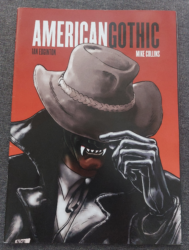
Credit: Rebellion
Comic Number 154: American Gothic
Finishing the week with more 2000AD reprints (see last week). American Gothic by Ian Edginton and Mike Collins fits quite nicely in with some of the other titles I have read this week. The western theme with an element of the supernatural squeezes it beautifully between Streets of Glory and The Dark Tower.
The story follows a group of misfits trying to find a place in the world away from the cruelty of humans. The metaphor is clear, and Edginton handles their blight with empathy. No explanation is given, or needed, about who the travelers are or where they came from. They are simply people who are different in appearance and beliefs. Their persecution at the hands of small minded, greedy people is the driving force of the story and leads to the violence against, and by, them.
The artwork by Collins is wonderful and looks stunning in black and white. Dark shadows fill the panels and the action breaks out to cross the gutters as if the ancient battle between the old world and the new cannot be contained. The theme of old versus new that was the backbone to Streets of Glory is again a significant theme in American Gothic, but there is an emphasis on the idea of stories — of myths and legends. As the new world begins to take hold, the old world is being lost. The stories are being pushed out to be replaced with something derogatory and lacking substance. A comment on popular culture of the time? Surely not.
This week I have read a number of comics, roughly from the same time period, that have dealt with similar themes but in very different ways. There is such a range of art and storytelling techniques in just these five comics (not including Planet of the Apes and Starstorm) that it goes to demonstrate that there are comics for everyone, whatever your taste in story. Three of these five are westerns at heart and each is very different despite being built around the same initial themes.
I’m not sure where my reading will take me next week but I intend to find a range of different comics to illustrate the breadth of the medium. Comics are often associated with the superhero but we all know there is more on offer. Why don’t you drop some examples below, and maybe I can give them a read in the future?
")