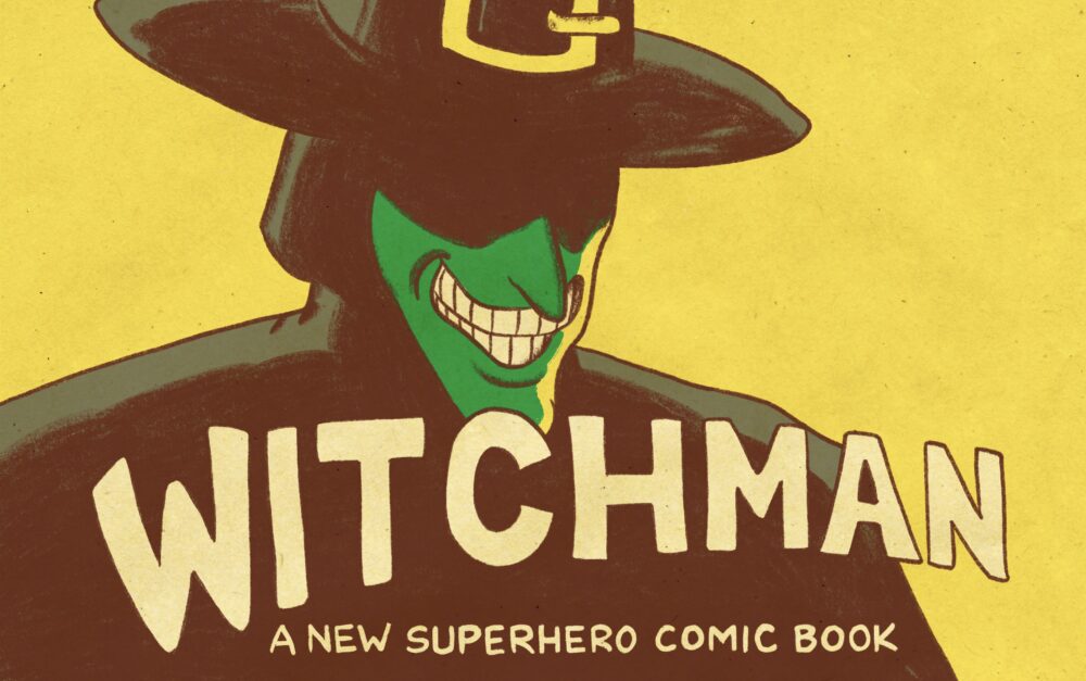
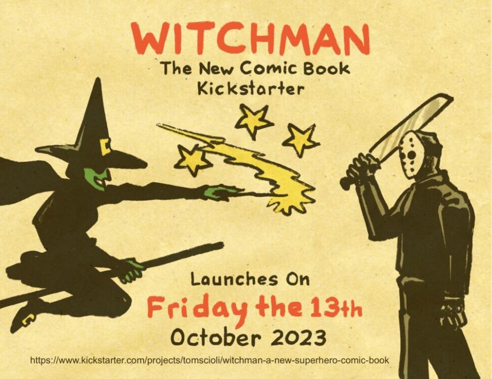
Home Blog Page 46

AfterShock Comics Exclusive Preview: SAMURAI DOGGY #5

aftershock comics exclusive preview samurai doggy

SAMURAI DOGGY #5 hits your local comic book store April 5th, but thanks to AfterShock Comics, Monkeys Fighting Robots has an exclusive six-page preview for you.

About the issue:
A hugely powerful machine threatens the life of Samurai Doggy and a fierce battle begins.

Without much time to think, Doggy must fight against this new technology of the Clan Empire and try to survive this surprise attack by the robot playground park gang.

The series is by writer Chris Tex and artist Santtos; the cover is by Santtos.

Check out our SAMURAI DOGGY #5 preview below:

aftershock comics exclusive preview samurai doggy

aftershock comics exclusive preview samurai doggy

aftershock comics exclusive preview samurai doggy

aftershock comics exclusive preview samurai doggy

aftershock comics exclusive preview samurai doggy

aftershock comics exclusive preview samurai doggy

aftershock comics exclusive preview samurai doggy

aftershock comics exclusive preview samurai doggy


Have you been reading SAMURAI DOGGY? Sound off in the comments!

Monkeys Fighting Robots Youtube

Review: DOCTOR STRANGE #1 — The Doctor Is Back!

DOCTOR STRANGE #1 is out now, and writer Jed MacKay seems to be working his way through the Marvel Rolodex. He’s already done wonderful runs on Moon Knight, Black Cat, and the Clea-led Strange series. Now, Stephen Strange is back, and naturally MacKay was tapped to write the story. Joining MacKay for this issue is Pasqual Ferry on art, Matt Hollingsworth on colors, and Cory Petit on letters.

WRITING

It’s hard to complain about a book when Jed MacKay’s name is attached to it. His track record speaks for itself and has been excellent. With Doctor Strange #1, MacKay takes you through the first week of Stephen being back. This includes everything from helping Spider-Man deal with demon issues to greeting aliens and catching up with Black Cat. MacKay injects some humor into this issue as well. Something as simple as Stephen helping Felicia feed the dragon in Central Park provides a laugh. One of the most interesting parts of this issue are the connections to Stephen Strange that MacKay continues to build. There is a visit to Doctor Doom, as well as the visit to Black Cat mentioned above. These interactions matter because MacKay continues to build on the continuity in stories from the past. Doom and Strange worked together in Triumph and Torment and Savage Avengers, and Black Cat and Strange worked together in MacKay’s Black Cat series. For a first issue, Doctor Strange is fun, humorous and great at bringing readers into the issue without confusing them.

ART

The pencils this issue are handled by Pasqual Ferry. His style seems to fit perfectly with this series. Ferry’s strong line work and detailed faces convey a lot of what he wants to say in this book. Funny panels, like when Stephen is talking with Luke Cage about the Warlord of Manhattan, rely on Ferry’s facial expressions to show how these friends interact. Ferry draws Doctor Strange with a suspicious look on his face. These small panels matter to readers and it’s one of the areas that Ferry Excels at in this issue. Another part of the issue that looks great is the body language used as Strange visits people. Black Cat is stretched out and relaxed, while Doctor Doom is standing tight as he nearly meets Strange at eye level. These pages show the tension or easy going nature of the relationship Strange has with other characters that he interacts with.

The colors by Matt Hollingsworth work very well with the pencils by Pasqual Ferry. Hollingsworth uses a light color palette, which is effective as Strange and Clea travel to different dimensions. The Purple Dimension has a light and smooth purple tint to the background that is actually pretty eye catching. Hollingsworth uses brighter and more vibrant colors when someone uses their powers. An example of this would be when Dr. Strange feeds the Central Park Dragon. Hollingsworth uses a pink that illuminates the page. The cooler blue color that Hollingsworth uses for bats also comes off really well in this issue. It almost seems like Hollingsworth and Ferry were destined to work well together. Their art and color style mix so well with one another it’s really a treat for the readers.

The letters by Cory Petit needed to be precise for this issue. There are lot of dialogue heavy pages, and Petit had the chore of dodging all the beautiful images. Petit is able to effortlessly make this work. As Aggamon talks with Clea, both characters are positioned in the center of the page. Petit uses his word balloons perfectly as they slide in between the tiny space by the characters. My one gripe with the letters is that are almost no sound effects. Sound effects are a way to enhance the reading experience and MacKay/Petit didn’t use many in the beginning of the book. Near the end we start to see some and they are effective.

CONCLUSION

Doctor Strange #1 is a fun gateway into the world of mystic arts! Jed MacKay continues his hot streak with another superbly written book. The art flows together nicely and works well with the story being told. Doctor Strange #1 is available at comic shop near you.

Monkeys Fighting Robots Youtube

Project 365: One Comic Every Day Week 12: Movies to Comics

comic box
Project 365 image

The premise is simple: read one comic every day for the entire year. It seems like a simple task but there is no way that I read 365 comics last year, even if you count the individual issues in collections. So, this year, I am committing myself to this reading challenge, in the hope that I can broaden my reading habits and fully engage with my favorite hobby again.

Gary R Bortolotti and Linda Hutcheon stated in an article for New Literary History (Vol 38 No 3) that when it comes to adaptation, “critical tendency has been to denigrate them as secondary to what is usually (and tellingly) referred to as the ‘original.'” This discourse is easily illustrated by scrolling through Twitter whenever a new superhero movie is released, and the vast amount of negative responses hinged on the idea that it isn’t like the original, i.e. the comic books. However, I agree with the sentiments in Bortolotti and Hutcheon’s article that adaptation should stand as its own piece of work and the relationship to the source material should be seen as a journey or evolution from one form to another.

This week I’m reading more adaptations, this time focusing on those comics that are based on movies (and not the ones that are made into movies). Some films spawn vast franchises that often begin with comics. Titles such as Star Wars and Planet of the Apes have thrived in the spaces between the movie releases and they often start with the adaptation of the films. Movies are big business and the comics are part of that, whether through direct merchandising or for the creation of a cultural following.

Transformers
The Transformers The Movie Winter Special Credit: Marvel UK

Comic Number 78: The Transformers: The Movie

Last week’s indulgence of 1980’s Transformers comics leads perfectly into this week’s reading and the topic of movie adaptations. In 1986, The Transformers animated movie hit the big screens to the excitement of children everywhere. Several years of cartoons, comics, and toys had captured children’s imaginations and the movie was inevitable.

In the same year, Marvel Comics released a three-part mini-series adapting the film. This was released in the UK in a single Winter Special and included all of the movie action in the palm of your hands.

This comic highlights a number of elements that have to be considered when contemplating adaptation and the translation from one medium to another. With The Transformers, both the movie and the comic were aimed at the same audience, so the tone of one could be matched easily in the other. Also, the concept of fidelity is important in this adaptation because the creators of the comic wanted to give readers an experience as close to the movie as possible. However, one of the most notable aspects of the movie, for better or worse, is the soundtrack, something which could not be reflected in the comic. Personally, I think this is a good thing because the music in the movie is like an audio onslaught that just won’t give up. Watching the movie today gave me a migraine and I was tempted to turn off the sound and just read the subtitles (for reasons involving a Japanese import and a less than high-tech DVD player, it wasn’t actually possible to do that). The cartoon sound effects and some of the verbal characteristics are represented well in the comic by letterer Janice Chaing but a large part of the movie experience, the incessant surround sound of 1980’s soft rock, is noticeably missing.

The effect of this audible space means that a greater emphasis has to be given to the visuals. Unfortunately, the artwork in this miniseries is nothing special. In fact, after reading the numerous comics last week, I would go out on a limb and say that the artwork isn’t up to the standard of the usual monthly comic run. Whether there was a rush to get the comic produced and released, or the design specifications the artists were working from weren’t very good, I don’t know, but there is a distinct lack of care given to many of the panels. For every cleverly composed panel with detailed scenery or character work, there is a page of paint-by-numbers artwork that provides nothing more than something for the narrative to hang from.

The comic lacks the narrative structure of the movie and also the humor, although not all of the jokes worked in the film. Where the comic is most notably different from the film is during the scenes of violence. Optimus Prime and Megatron’s fight fills numerous pages. And where Prime’s death is more harrowing in the movie, Ultra Magnus is tortured to death over several panels, whereas a quick scene cut seals his fate on screen.

Comparing the comic and movie side by side, it becomes clear that the adaptation process here was to provide the audience with a replacement for the film in the period between the cinema and home video releases.

Alien 3
Alien 3 adaptation published in a magazine format

Comic Number 79: Alien 3

The third film in the Alien franchise had a long, difficult journey to the screen, but the hype was big. Everyone involved was really trying to sell the film and make it a success. Merchandising was a big part of the pre-release program and Dark Horse Comics played their part in getting the word out. From August to October 1992, the Alien 3 comic adaptation was serialized and released in one of Dark Horse magazine format comics in the UK, joining titles such as The Terminator, Star Wars, and Aliens, on the shelves. The comic strip itself is an interesting take on the movie with a few additional sequences cut from the film only a few weeks before release. The character design is off-putting, as they were unable to use the actors’ likenesses, and it becomes difficult to tell one character from the next. The final third of the comic is especially chaotic, whether this was influenced by the narrative or just poor planning on the layouts is difficult to ascertain. One thing is clear though, the black page borders and gutters used throughout most of the strip gives the setting and the narrative a claustrophobic feel. As a reader, you become trapped in that desolate prison with Ripley.

However, the most fascinating thing about Alien 3 (issues 1 to 3) is not the actual comic element but the packaging it comes in, i.e. the magazine format. Dark Horse Comics International provided a large part of my teenage reading, focusing as they did on franchises based on some of my favorite movies. The Alien 3 Movie Special not only provided a comic adaptation but news and behind the scenes information about the movie itself. It includes features on special effects, design and story boarding, interviews with the cast and crew, and even a feature on a company producing licensed merchandise. Differing from a number of earlier adaptations, this magazine embraced the fan on every level, giving them something more than just a cheaper interpretation of the story. In the same way that Lord of the Rings DVDs were loaded with extras and features, Dark Horse wanted their readers to experience the whole movie making journey, of which the comic strip was a small part. When you read Steve Grant and Christopher Taylor’s adaptation you don’t really get a sense of scale within the prison, or the detail in the characters development, however the paratextual features and posters help to complete the image. As a reader you are surrounded with information about the movie which you then bring to your reading of the comic. The extra material enhances the reading experience which is not something you get from many other adaptations.

Planet of the apes
Two versions of Escape from the Planet of the Apes

Comic Number 80: Escape From the Planet of the Apes

I picked today’s choice for two reasons. The first is that I have two different comic book versions of this film, so I can illustrate the different motivations behind adaptations. Secondly, the Marvel adaptation came out after the release of the film, not as a glorified advert but as a serious addition to an ongoing comic book franchise.

In the middle of the 1970s, fans’ interactions with franchises was different to today’s on-demand society. Films came and went. The need for adaptations of movies, whether in novel or comic form, was born from the fans desire to relive the excitement of the film. As Rich Handley notes in the introduction to Volume 3 of the Planet of the Apes Archive, “it wasn’t easy for fans to watch their favorite movies unless a theater brought them back for a limited release, or else a local television station aired versions heavily edited [..] However, those who followed Marvel Comics’ Planet of the Apes magazine, published from 1974 to 1977, could re-experience the films as often as they liked”. The adaptations were not temporary fill-ins until the movie was available on video, they had to stand up to constant re-reading and provide a more sophisticated experience.

Luckily for Apes’ fans, Doug Moench and Rico Rival’s five part comic is an excellent example of movie to comic translation. Not only did they capture elements of the movie perfectly in comic form, such as the scene where Milo is killed at the hands of a primitive gorilla, but they also added intricate detail to the visuals. Although not directly a horror, the narrative was more of a social commentary, the pages are filled with references and nods to early, pre-code comics, especially those from the horror genre. Screaming and shocked faces fill panels, each one a different contortion of features.

Moench, working from an earlier script of the movie, also included scenes that were edited from the released movie version. These scenes were cut to allow moments of surprise to have full effect but the comic could use these scenes as elements, such as actors voices, would not ruin the moment. Moench put emphasis on different elements of the narrative, ones that worked better in the comics medium than on film. Quick edits in the movie provided sudden reveals to shock audiences, however Moench used character responses to elicit the same reaction in the readers.

Power Records Book and Record set version of Escape is more akin to the Classics Illustrated approach. The entire film is edited down into 20 pages of comic. The main way that this is achieved is by simply cutting large sections of the story. Milo doesn’t suffer the same fate as his movie counterpart because he doesn’t feature in this version at all. All of the scenes with Zira and Cornelius discovering 1970’s culture are also removed, which eliminates half of the narrative’s meaning and purpose. This version is clearly a piece of merchandise, although the artwork and scripting is very good for a condensed version of a complicated movie.

It’s interesting to note that the comic does not credit the artists/writers but only refers to Arvid Knudsen and Associates. This product is a novelty. A comic/record combo aimed at fans of the film but not intended to replace it.

Batman and Batman Returns Credit: DC

Comic Number 81: Batman (And Batman Returns, because it’s the best Batman film)

One of the things about modern superhero movies is that they are not really based on any one particular comic. Yes, you can draw parallels between a number of different runs or a collection of issues, but as a general rule the movies treat the source material as a cooking pot which they can draw from, keeping and mixing different elements of the stew. This is not a bad thing.

When it comes to adaptations of superhero movies, it creates a fascinating conundrum for the creators and publishers: how do you represent one medium’s impression of another medium’s text using the original medium? Batman was a comic first and liberties were taken to translate it to the big screen. The comic was reinterpreted for the cinema, which is a very different medium, so how can you then revert it back into a comic while maintaining that element of difference that the translation has achieved?

When DC picked Dennis O’Neil to write and Steve Ordway (for Batman) and Steve Erwin (Batman Returns) to illustrate the adaptations, they knew what they were doing. Working directly from the scripts and designs for the movies, the creators have been able to represent the visual flair of Tim Burton’s Batman movies without resorting to the appearance of the other Batman comics being published at the time. These adaptations are significantly different in appearance, however, they still relate to the ethos of the other Batman titles. O’Neil subtly altered elements of the narrative to be more in line with the comic universe; for example, Batman does not kill anyone in the comic whereas it is inferred (almost visualized) that he does in the movies.

By being able to recreate likenesses of the actors, and beautifully representing the sets of the movies, the creators were able to produce clear tie-ins that appeal to the films audience but also, through superb layouts and storytelling, they stand as great comic books in their own right.

Freddy's Nightmares
Freddy’s Nightmares with the reprint of Freddy’s Dead The Final Nightmare (not in 3D)

Comic Number 82: Freddy’s Nightmares

What do you do when the main selling point of the film you are adapting is a cinema gimmick like 3D? You just copy the gimmick and release a 3D comic.

The only problem with Trident Comics UK Nightmare on Elm Street magazine, Freddy’s Nightmares, is that when it re-printed Freddy’s Dead: The Final Nightmare, it wasn’t in 3D. Which is a shame because the adaptation of Freddy’s Dead is utterly pointless without the 3D. It’s not really scary or disturbing, unlike the back up strips in the magazine: Dreamstalker and Yours Truly. The first benefits from being in black and white and uses the stark contrasts to create disturbing scenes where your mind completes the horror. And Yours Truly riffs on one of the most terrifying of historical figures, Jack the Ripper. The painted artwork by Tony Harris oozes from the page, thick and tactile in your hands.

Freddy’s Dead adds nothing in the retelling and actually becomes more ridiculous than the movie it is based on, which is saying something. The magazine does, however, boast some other wonderful stories which is a point I pick up on with my next comic.

Jurassic Park
Jurassic Park Credit: Dark Horse International

Comic Number 83: Jurassic Park

Cash. Cow.

That’s all I’ve got to say about the official comic book adaptation of Jurassic Park. The narrative is a sanitized version of the movie with the gore removed and the horror dialed back. The artwork is uninspiring and over exaggerated. The comic was designed as a way to make money from the buzz of the exceptional movie.

However, what is exciting about the Dark Horse International (UK) publication of Jurassic Park is the back up strips and continuation of the story (starting in issue 4 and 6 respectively). Firstly, they included Xenozoic Tales by Mark Schultz, first published by Kitchen Sink Press starting in 1985. Schultz uses the comic format to bring out the tension and excitement from his narratives. There is a sequence in the first chapter of Xenozoic Tales where three aspects of a scene are split across the rows of three panels. This creates a grid of panels that can be read across, in the usual manner, or downwards, column by column, while maintaining coherency. It is a magnificent example of comic book storytelling, illustrating that Schultz knows his way around a comic page.

Xenozoic Tales
Excellent Storytelling by Mark Schultz in Xenozoic Tales

The second back-up strip, Age of Reptiles by Ricardo Delgado and James Sinclair, is a silent comic relying exclusively on the visuals. The combination of color and dynamic panels produces an enthralling narrative about the life of dinosaurs. It is a visual treat.

And then, starting in issue 6 with the story Raptor, writer Steve Englehart and artist Armado Gil begin to expand the Jurassic Park adventure. Continuing directly after the end of the movie, Raptor tells the story of Alan Grant and Ellie Sattler returning to Isla Nubar to supervise the clean up after the disasters of the movie. Although the story itself is nothing particularly exciting, the way it is told is far superior to the movie adaptation. The script is punchy, fitting the comic in a way that the movie script didn’t. And the artwork is dynamic, with page layouts that split the page into a dangerous territory for the characters to inhabit. There is a greater sense of danger in this continuation and has more to say about adaptation than the movie comic does. Raptor shows how the characters and situations from the movie could be represented in a different format to create the same sense of tension, danger, and excitement while maintaining a medium specific aesthetic. In my opinion, they should have got Englehart and Gil in to do the adaptation.

Alien
Alien The Original Screenplay Credit: Dark Horse Comics

Comic Number 84: Alien The Original Screenplay

Back in 2020, Dark Horse started to release a mini-series based on the original screenplay for the outstanding Alien. This proved to be an interesting exercise in adaptation because they were returning to a fan favorite from over 40 years earlier (therefore not really cashing in on the success of the film) while trying to introduce new elements that would shock and surprise readers.

How successful was it? Well, I reviewed it at the time of release (you can find that review here) and after a few years and a new read through, I still stand by my original impressions. Alien: The Original Screenplay is an interesting attempt to breathe new life into a well known property, similar to BOOM! Studios Planet of the Apes Visionaries, which I have already read this year. Is this an adaptation? Yes, without a doubt, but by using material not previously or widely known it risks being overly compared to the original source material and, by default, is harshly judged.


I started this week with a quote about adaptation, and I’m going to end on one. In A Comic-Book World, published in World Literature Today (Vol 81, No2), Stephen E Tabachnick says that the graphic novel “provides many of the advantages of both print and electronic media while creating a unique and subtle experience all of its own”. When it comes to comic adaptations, the most successful understand the concept behind Tabachnick’s statement and give the readers an interpretation of a film but with a unique style that only comics can provide. The Planet of the Apes comics, the first two Batman adaptations, and others such as Bram Stoker’s Dracula (Topps Comics 1992), Dune (Marvel 1985), and Star Wars (Marvel 1977) have all been able to translate the spectacle of the cinema into comics while maintaining the uniqueness of the medium, making them objects of art unto themselves. Separate from the original but still sharing a link, this makes them part of the same ideas and concepts proving that movie adaptations are still an important part of the comic industry.

Monkeys Fighting Robots Youtube

INTERVIEW: Costume Designer Nina Ayres And The Steampunk Fantasy Of Amazon’s Carnival Row

carnival row-interview-amazon

Mythical creatures such as fairies have fled their war-torn homeland in the Amazon series Carnival Row starring Orlando Bloom and Cara Delevingne. Nina Ayres dressed the neo-noir fantasy for its final season.

Carnival Row exists in a gritty, Victorian-era world where reality and fantasy clash. Creatures from another world are trying to find a home in our world, leading to tension and new, dangerous alliances. Philo (Bloom) navigates it all as a detective. Vignette (Delevingne) is a faerie, and former lover of Philo caught in the fight to help her people find a place to exist. Through two seasons and 16 episodes, the pair face their feelings for each other while becoming lynchpins in a growing struggle between powerful factions.

PopAxiom spoke with Nina about her career and creating the unique look for the gritty fantasy series Carnival Row.

Transitioned

Nina’s interest in costumes began early in life. “I needed to learn every art or craft technique from a very young age, and as soon as my Nan taught me how to use her old, hand-operated Singer sewing machine, I was off.”

“From the age of seven or eight, I was making clothes for my dolls and stuffed toys, and even for myself,” she says, adding, “I can only imagine how disastrous they looked. Luckily my parents didn’t seem to care what I was wearing.”

Nana studied in the UK, where she had to choose two “non-academic” subjects. “I had to convince the school that I could not give up art, drama, or textiles, and somehow they agreed.”

“A teacher almost laughingly said I could be a costume designer,” she laughs, adding that it was a career “I had never heard of, and immediately I knew that was what I wanted to be.”

During her education, Nina put on some rather bizarre fashion shows. “I used our family oven to melt old records and crisp packets and inner tubes and old net curtains to make the garments.” But, Nina admits, “It was obvious that I was never going to become a fashion designer because my love of drama and characters was too immense.”

“I traveled for a while, as I felt I needed to gain some experience of the world,” she says of her time before attending London’s Central School of Speech and Drama, where she studied theatre design.” Nina loves “the process of learning.” She included set design, costume props, and puppetry in her studies there. “When I left, I worked for a costume prop company in between designing theatre shows.”

After about ten years and having published a book ‘Creating Outdoor Theatre’ via publisher Crowood Press, Nina transitioned to TV and film via the costume breakdown department. “Heading the breakdown department on Game of Thrones, I was asked to become assistant designer, which I did for around four years while assisting on other films and tv shows before working as a head designer on various shows.”

interview-carnival row-amazon

About Carnival Row

When a call came in, Nina was in Los Angeles for the Costume Designer Guild Awards and her nomination for Outlander. “My agent asked me to go for an interview with Legendary Productions while I was there as they needed a designer for Carnival Row.” Nina met with series writer Travis Beecham and showrunner Marc Guggenheim. “We got along rather well, so off I went to Prague.”

“It was centered around how long it had been since the final events of season 1,” she says about her first discussion with the creative team about the show. “What had been happening to the characters and their world in general.”

The creative team wanted “continuity for certain characters,” she explains, “especially those whose situation hadn’t changed much since season 1, and where the characters that were in different situations were headed.”

“Juri Matura, the production designer, and I worked hard on creating a new aesthetic for the Row which would show imprisonment as well as a sense of dignity, a level of wear and tear but with a solidarity and desire to not live in squalor.” In fact, season two ups the detail in every shot, making an already visually appealing show even more interesting to watch. “We discussed the new creatures to be introduced, such as the Kallos and the Elfin Mauro, and delved into their personalities and strengths, and I began designing them along with Nick Dudman, the MUFX designer.”

After becoming part of a project, Nina immerses herself “in the script and find out as much as I can about each character and the paths on which they are headed. In this case, that involved also writing to all the actors which were returning to find out about any particular wants or needs or previous issues they might have had I should be aware of.”

“I then begin fabric sampling and researching the era,” she explains step two, “or further afield, to begin the designs. Typically, I begin with mood boards for each group of characters. Before beginning specific costume designs, this includes silhouettes, color, texture, jewelry, etc..”

VFX and Costumes 

What’s the interplay between VFX and costumes? “The majority of cases, it affects the practical side of a costume more than the visual side. Each time one reads of a wound or blood splattering in a script, the first question is, ‘practical blood or VFX blood’? Many factors play into the decision, but generally, in costume, we love it when, on rare occasions, the answer is VFX. This implies we don’t need to make at least 4 or 5 repeats of the same costume to allow for shooting the scene.

“Todd Shifflett, the VFX supervisor, and I had many discussions early on about his requirements for the faerie’s wings,” she adds. “These were sometimes practical and at times needed to move, so therefore VFX. We had to be careful not to have any costume covering the part where the wings attach to the body.”

Carnival Row is full of fantastical characters. “The centaurs or the kobolds, which involve VFX, still required the costumes to be made and fitted so that they are body scanned and a proper representation of the chosen fabrics, colors, and fit is achieved.” Other characters that were largely VFX “still required two or three versions of their costumes and a thorough knowledge of how and where the action occurs on the body to be able to shoot a ‘before,’ ‘after’ and ‘mid occurrence’ that Todd’s team could work from.”

Unique Challenges

“One of the unique challenges with Carnival Row was the many shifts in the direction it took,” she says after working on other costume-heavy shows like Outlander and The Last Kingdom. “Due to COVID and other factors, we encountered halts in filming, which resulted in changes that affected the character’s storylines. As a result, we had to be ultra vigilant about continuity in the costume department, with a ‘through’ line for the costume journeys.

Because of these stops and starts in filming, seasons changed. “We spent a lot of time trying to keep actors warm in ‘summer clothing’ while the actual temperature dropped, and cooler in their winter clothing as we were suddenly picking up scenes during an August heatwave.”

“The most fun and challenging part about Carnival Row is all the creatures,” she declares. “The inability to hire any of these costumes from hire houses meant the pressure on our workroom and resources was immense. After the quantities of the various creatures had been designed, made, and fitted to the individual cast or crowd, the same had to be done to each species in the warmer climate of Ragusa’s free New Dawn population. Then, each species dressed as a New Dawn soldier, then on the Row but in happier times. It all amounted to huge amounts of new designs and makes.”

The shows Nina works on tend to require a lot of breakdowns and repeats for stunt action. “ But this season of Carnival Row’s scale of destruction was very challenging. Certain outfits required up to 8 repeats in various stages of breakdown as events left their mark on them, and others needed repeats to reshoot a scene a number of times with practical damage occurring. There seemed to be an unusually high number of these situations, which at the time was demanding, but was imperative to creating the beautifully gritty world the show inhabits.”

Wrapping Up

“A big one is directors wanting period costumes to ‘fall off’ in a nanosecond, or a character
getting dressed without assistance in period costume just as quickly,” she says about her least favorite request. “I dislike clothes being ripped off characters, as this is unrealistic, and it’s tough to pull on an invariably well-made period garment, then make it tear away.

Nina’s also not a fan of new clothes appearing out of nowhere. “I’m always so fully involved with each character’s narrative and the world around them that I like some logic to a change of clothes. I’m always asking myself, ‘where did they find them?.’” She fully understands the need for dramatic action, “and I am desperate for the ability to have an actor wear the fabulous new outfit I have designed, but I’m so immersed in the characters and story that I either have to wait or suggest a way of making it happen.”

“My favorite things are just good design,” she states. “I love it when a design tells a story and has a history and subtle, nuanced imagery or suggestion. I love it when I notice some motif or flash of color which reveals an emerging allegiance. It’s storytelling through design decisions that absolutely enthralls me.” She’s also a fan of something readers might not expect. “I also love it when a costume is destroyed, and the designer takes that outfit on a journey. The interest in how one garment can evolve and breakdown fascinates me, and I love to see that played out.”

How does Nina recharge her creative batteries? “While in Prague working on Carnival Row, I rescued a beautiful little dog, so I go for many fabulous walks and runs in the countryside or on the beach with her.”

“There are so many things,” she answers when asked about projects she has yet to do. “I’d love to design something set in the future or, indeed, the recent past so that I get to play with ideas of modern dress and explore the way people wear garments now. I’m fascinated by modern tech but rarely use it in my current designs.”

What’s coming next that Nina can talk about? “There’s a couple of projects in the mix but nothing I can speak of just yet.”

Is Carnival Row on your watch list?

Thanks to Nina Ayres and Impact24 PR
for making this interview possible.

Find more interviews from Ruben R. Diaz!

Monkeys Fighting Robots Youtube

Marvel Comics Exclusive Preview: DEADPOOL #5 — Carnage Breaks Loose!

marvel comics exclusive preview deadpool carnage

DEADPOOL #5 hits your local comic book store on March 29th, but thanks to Marvel Comics, Monkeys Fighting Robots has an exclusive four-page preview for you!

About the issue:
CARNAGE BREAKS LOOSE! Oh – did we not mention that the thing growing inside of Wade was Carnage? Because it is. And he’s extremely done with hitching a ride with Wade and WANTS OUT NOW. Brace yourself, Wade – you’re about to get ripped a new one!

The issue is by writer Alyssa Wong and artist Martin Coccolo, with colors by Neeraj Menon, and letters by Joe Sabino. The cover art is by Coccolo and Menon, and Tom Muller is the book’s designer.

Check out the DEADPOOL #5 preview below:

marvel comics exclusive preview deadpool carnage

marvel comics exclusive preview deadpool carnage

marvel comics exclusive preview deadpool carnage

marvel comics exclusive preview deadpool carnage

marvel comics exclusive preview deadpool carnage


Are you reading DEADPOOL? Sound off in the comments!

Monkeys Fighting Robots Youtube

Review: W0RLDTR33 #1 – A Viral Spread

From acclaimed horror specialist James Tynion IV (Something Is Killing the Children, Blue Book) and artist Fernando Blanco (Detective Comics) comes an unsettling new series spawned from the dark underbelly of the internet with W0rldtr33 #1. Featuring colors by Jordie Bellaire and lettering from Aditya Bidikar, this opening chapter presents readers with a disturbing sci-fi premise very much based in our own reality – with end results that may hit a little close to home for some. With a sharp, intelligent script and brilliantly atmospheric visual work, W0lrdtr33 is off to a phenomenal and intense start.

“In 1999, Gabriel and his friends discovered the Undernet, a secret architecture to the Internet. They charted their exploration on a message board called W0RLDTR33. Then they lost control. Someone broke into W0RLDTR33—someone who welcomed the violent hold the Undernet had on them. At great personal cost, Gabriel and the others thought they sealed the Undernet away for good. They were wrong. And now they will know the meaning of PH34R.”

Writing & Plot

James Tynion IV once again channels fears both unique and familiar with his script for W0rldtr33 #1. Combining the factors leading to real life tragedies with a fictionalized idea of the internet, this first chapter is a contemporary marvel of sci-fi horror. At the core of Tynion’s issue is a view of the internet similar to what Ellison created in I Have No Mouth and I Must Scream (which Tynion references multiple times). There’s this idea that the web harbors some kind of malicious, sentient program created by all of the vitriol humanity displays in its dark corners that finally comes out to play (see also the “Roko’s Basilisk” thought experiment). The other aspect of this horror story is the unflinchingly real part of watching a teenager worked into a murderous frenzy by something he sees in a forum. Seeing as how this is a very real phenomenon, this part of the comic is easily its most chilling – to the point I could see some putting it down for hitting a little too close to reality. Fortunately, Tynion is as subtle as he is incisive, making for a reading experience that guides us from the bitingly real to the more genre-focused elements of Woldtr33 with ease. Tynion shows off a little bit of Warren Ellis influence with not just the plot, but the characterization of some of his cast as well. The notion that there is a crew of reluctant techno-wizards led by a wealthy, pale-haired entrepreneur is about as WildStorm as it gets. This opening issue truly feels like something out of Global Frequency or Injection, but still completely original and written with Tynion’s specific voice. Disturbing, emotionally upsetting, and wildly intriguing, Tynion does it again with a phenomenal script for an original thriller and one of the best debut comics of the year so far.

Art Direction

Tynion always ends up working with astonishingly gifted visual talents, and the same goes for W0ldtr33 #1 thanks to Ferando Blanco’s pencils and Jordie Bellaire’s color art. Blanco uses stellar character animation, heavy shading, and some neat visual trickery to craft this techno-thriller’s intense atmosphere. A highlight of his work here is this sort of digital effect he uses in the murder sequences, where reality “digitizes” for a moment mid-panel just before a bloody death. It’s a neat effect that I’d love to see how he brought to life. His character designs are all distinct, especially that of the pale-haired Gabriel and the mysterious tattoo-covered woman known as PH34R (Tynion sure loves his dangerous blondes). Fernando nails the comic’s intensity with his sequential direction as well. He carefully chooses what details to focus on during conversations among characters, and his chaotic moments are loaded with suspense. Horror is most often about what the audience *can’t* see coming, and Fernando keeps that in mind with his POV sequences and moments of sheer chaos. Jordie Bellaire’s color art is the perfect atmospheric touch to bring the visuals to life. She utilizes what looks like a super-dense watercolor style, but without the blotchiness that typically comes with that approach. The color palette itself leans on the murky side of each shade, nailing the comic’s tense, foreboding aesthetic. The lettering from modern powerhouse Aditya Bidikar is some of my favorite work I’ve seen from him. His dialogue balloons all have a hand-drawn feel to the fonts. His best work here though is the SFX. Bidikar’s work there subtly works among the characters and pieces of the background in each panel, being noticeable while never overtaking the rest of the art. Overall, W0rldtr33 is a stunning looking thriller, and one of the best-looking comics of 2023.

Verdict

W0rldtr33 #1 is a brilliant and unsettling comic from some of the best talents in the industry. James Tynion IV does it again, this time with a painfully relevant script that mixes techno-thriller genre moments with genuine horror pulled from our own reality. The visual work from Fernando Blanco and Jordie Bellaire is atmospheric and well-sequenced, with some smart artistic choices that help make this comic one of the best debut issues of 2023 thus far. Be sure to grab this opening chapter when it hits shelves on April 12th!

Monkeys Fighting Robots Youtube

Project 365: One Comic Every Day Week 11: More Than Meets The Eye

comic box
Project 365 image

The premise is simple: read one comic every day for the entire year. It seems like a simple task but there is no way that I read 365 comics last year, even if you count the individual issues in collections. So, this year, I am committing myself to this reading challenge, in the hope that I can broaden my reading habits and fully engage with my favorite hobby again.

While I gather the comics for the continuation of my exploration of adaptation and comics, I’m having an easy read week. Luckily, I’ve just sorted out my British Weeklies from the 1980’s and early 1990’s, so I can spend all week reading The Transformers. (If you’re not a fan, I suggest skipping this week, because I really am going to be reading The Transformers all week, I have over 300 of the original Marvel UK weekly/fortnightly comics to get through)

Firstly, a bit of history. When The Transformers comic first came out in 1985, my friend was collecting it while I used my pocket money for other titles such as Spider-Man. All of the comics we bought were published through Marvel’s semi-independent British offices and therefore packaged differently to the American originals. Most titles had a main feature story with a back-up strip from one of Marvel’s lesser known titles. So it was through The Transformers that I was introduced to Rocket Raccoon, Hercules, and Machine Man.

Back then, we used to buy several comics in a week, take them to school and lend them to friends. When my friend switched from reading The Transformers to Action Force (the British title for GI Joe) we swapped our collections. A few years later, I got Action Force back but I can’t remember what I swapped in return. The Transformers was an instrumental title in introducing me to the world of comics and what they could do. The mix of American reprint stories and the new British “fillers” (required because the UK title would constantly get ahead of its American counterpart) gave me an insight into two very different worlds of storytelling. Writer Bob Budiansky’s initial output, designed to advertise Hasbro’s range of new toys, were adventurous war stories that often had a human character central in the narrative. Simon Furman’s, on the other hand, were science fiction heavy, and the messages were more complex and ambiguous. It was like reading 2000AD and the 1970s Avenger comics mixed together in an uncomfortable cooking pot.

The Enemy Within
The Transformers Collected Comics 4 Credit: Marvel UK

Comic Number 71: The Enemy Within

Simon Furman weaves a tale of treachery and physiological imbalance in a story that ends with a pitched battle between the overworked Autobot named Brawn and the backstabbing Decepticon, Starscream.

The story first appeared as a black and white strip in issues 13 to 17 of the fortnightly comic and was later reprinted in full color. Gina Hart provided the colors and her bright, painterly style is fixed in my memory of early Transformers comics. John Ridgeway’s dynamic artwork is brought to life by Hart’s work and I favor the collected edition more than the original.

The story appears very simple: two outcasts, one from each side of the war, battle each other to prove themselves to their respective leaders. But underneath, Furman packs the narrative with moral quandaries and a surprising amount of violence.

Transformers comic
The Transformers #51/52 Credit: Marvel UK

Comic Number 72: Shooting Star

My second pick from the stack of reads is a reprint of an American story and first published in the UK in issues 51 and 52 (issue 13 of the American title). The story is actually Transformer lite featuring Megatron in his gun mode for the majority of it and few appearances of other giant robots. Written by Bob Budiansky, the narrative follows Joey Slick and his rise from cheap hood to a kingpin of crime, thanks to the off world power of Megatron.

The small amount of Transformer action allows Budiansky to indulge in a crime comic clearly inspired by the early 1950’s titles. It has the low life beginnings for Joey, that just aren’t quite enough to justify the violence that follows. This is followed by pages of violence, cruelty, excess, and the disregard for people that made crime comics a target for outraged organizations in the 1950’s. And in the end, a few panels to show that Joey is punished for his life of crime. A small redemption is thrown in to make Joey appear heroic but ultimately Shooting Star is about a mobster using one of the most evil leaders in the universe to rob banks. What’s not to like?

UK Transformers comic
The Transformers #63/64 Credit: Marvel UK

Comic Number 73: Second Generations

First published in issues 63 and 64, these were the first two Transformers comics I bought with my own money. Issue 63 has one of the funniest Robo-Capers strips (in my opinion) by the British humorist Lew Stringer and a text piece summing up the story so far. If you hadn’t read any of the previous 62 issues then this would be the perfect jumping on point.

However, comics were a bit different back then and it wasn’t that difficult to get into any of the issues. The stories were a lot more episodic and when they were split across multiple issues there was always a recap. More often than not, any important backstory information was written directly into the comics themselves so any new reader wouldn’t be left in the dark. This is an art form that I think is lacking from many new comics, especially those put out by the Big 2 publishers.

Anyway, Second Generations was written by Simon Furman (who wrote most of the UK stuff and eventually jumped the pond to write for the American title as well), illustrated by John Stokes with Mike Scott and J Firmin. The most notable aspect of this story is that it clearly a marketing ploy for the new range of toys being released at the time. The Transformers was originally a four issue mini-series devised between Hasbro and Marvel to advertise a toy range. As the series developed, that initial raison d’etre was still present within the pages for years to come. However, it never seemed to diminish the storytelling. In fact, I would argue it made the writers and artists more creative as they had to find ways to introduce characters whose designs were dictated by a toy company based on molds bought from another country. In some respects, it’s surprising the stories are as good as they are.

Transformers
The Transformers #67/68 Credit: Marvel UK

Comic Number 74: The Smelting Pool and The Bridge to Nowhere

This two-parter is just pure science-fiction fun. The story returns to Cybertron and introduces a host of new characters. Some don’t last too long, such as the Autobot spy Scrounge, while others become mainstays in the series. Introduced among the ranks are one of my favorite Autobots, Blaster (the good guy version of Soundwave) and one of the strangest Decepticon leaders, Straxus. Straxus was nasty. Evil in robot form. And his story-line appears to end in this two part story but that’s not the case. In fact he becomes instrumental in future story-lines, in the weirdest ways.

Again, these American reprint issues are written by Bob Budiansky, this time with Don Perlin, William Colletta, Janice Chiang, and Nel Yomtov providing the art work. Apart from the pure enjoyment factor, these two issues also open up the narrative, creating a link between two worlds and an infinite host of new characters.

Transformers
The Transformers #73 Credit: Marvel UK

Comic Number 75: Showdown

As if wanting to prove that any genre could be covered by giant robots at war, Showdown in issues 72 and 73 (reprinted from issue 20 of the American comic) is stuffed with western tropes.

Skids runs away from the Autobots, sick of the violence, and takes up residence with Charlene, a human who becomes infatuated with him. Unfortunately, their peaceful co-existence doesn’t last long when Ravage turns up and attacks Skids. There is also an added element of danger; a road rage human who wants to trash Skids because of a small altercation between them in an earlier issue.

This is another fun, at times daft, story that can’t help to entertain. There are some undercurrents of greater meaning and moral discussion but the heavy handed coating buries the messages deep. There’s nothing groundbreaking here but what do you want from a comic created to sell toys of giant robots?

Transformers
Target: 2006 issues from Marvel UK

Comic Number 76: Target: 2006

This is where it changes. This is the story that trapped me in The Transformers world and cemented my love of comics. I have read and re-read this story so many times, I’ve lost count but will always read it again.

In issue 78, on 13 September 1986, Simon Furman and Jeff Anderson introduced the British comics reading public to Galvertron, over two months before Transformers: The Movie would officially introduce the character into continuity. At the time the American writers had decided that they weren’t going to use any of the new characters from the movie so Furman was given free reign and the story he produced, Target: 2006, is an absolute blinder.

In the Prologue, three Autobots — Ratchet, Prowl, and Optimus Prime — disappear in an almighty flash, leaving nothing but black scorch marks. Elsewhere three brand new Decepticons appear on the scene, proclaiming to have traveled back 20 years in time. Imagine being 10 years old and reading this introduction to a story. The seeming death of three major characters. The introduction of three new characters. Time travel! And the story just gets better over the next 10 issues. Furman introduces time paradoxes, leadership struggles, the destruction of hope, allegiances with evil, and zombie Jazz! (that’s a possessed Transformer, not a type of music). It really does have it all.

It’s also interesting to see that when the prologue was written and drawn, the creators had not seen the designs for the characters from the movie. Therefore, at the end, when Galvatron and his lieutenants make an appearance, they are based on the toy designs, not the cartoon designs. This is then changed for Part 1 of Target: 2006 in issue 79.

Target: 2006 is an epic narrative superbly written and has a long lasting influence on the ongoing saga. As is noted in Volume 6 of the Complete G1 Collection, the movie “ticked all the right boxes, and its darker tone [..] was a perfect fit for the Marvel UK Transformers comic.” Simon Furman took the characters and premise of the movie and produced one of my all time favorite comic stories. I still blame Target: 2006 for my ever growing obsession with this medium.

Transformers comic
The Transformers #100 Credit: Marvel UK

Comic Number 77: Distant Thunder (Issue 100)

What happened to Optimus Prime when he was ripped out of time at the start of the Target: 2006 story-line? Where did he, and the other displaced characters, end up? Well, in the 14 February 1987 issue, Simon Furman lets the readers into the secret.

Distant Thunder is a morality tale told by Optimus Prime to his dying comrade, Outback. In the previous issue Outback is fatally wounded and Prime is forced to sit with him while he dies. The tale within a tale is a dissection of the nature of violence, while the book-ending narrative is touching and even heartbreaking. No mean feat for a comic about giant shape changing robots on an impossible planet. And we’re only a third of the way through Marvel UK’s ongoing series.


Apparently I didn’t get through as many of these comics as I thought I would this week. To be honest, I thought I would skip over many of them and just pick out some of my favorite story-lines but it seems I like more of them than I remember.

I am continuing to read my box of Marvel UK Transformers comics (which dropped its “The” from the title with issue 200) and will no doubt drop a few of the stories into future articles. Because, I know what’s coming, and there are some outstanding comics in there.

Do you have any childhood favorites that you still continue to re-read today? If so, let me know in the comments below, maybe we can share some memories.

Monkeys Fighting Robots Youtube

Marvel Comics Exclusive Preview: SHE-HULK #11

marvel comics exclusive preview she hulk

SHE-HULK #11 hits your local comic book store on March 22nd, but thanks to Marvel Comics, Monkeys Fighting Robots has an exclusive three-page preview for you!

About the issue:
New arc! Great jumping on point! A new villain starts a thieving spree through New York City and ends up face-to-green-face with Jennifer Walters, the Sensational She-Hulk! Also, have you noticed that this is LGY #174? You’d almost think something very special is coming!

The issue is by writer Rainbow Rowell and artist Andrés Genolet, with colors by Dee Cunniffe, and letters by Joe Caramagna. The main cover is by Jen Bartel.

Check out the SHE-HULK #11 preview below:

marvel comics exclusive preview she hulk

marvel comics exclusive preview she hulk

marvel comics exclusive preview she hulk

marvel comics exclusive preview she hulk

marvel comics exclusive preview she hulk


Are you reading SHE-HULK? Sound off in the comments!

Monkeys Fighting Robots Youtube

AfterShock Comics Exclusive Preview: BULLS OF BEACON HILL #3

bulls of beacon hill aftershock comics exclusive preview

BULLS OF BEACON HILL #3 hits your local comic book store March 29th, but thanks to AfterShock Comics, Monkeys Fighting Robots has an exclusive five-page preview for you.

About the issue:
Boston Surgeon Christopher Boldt has spent his whole life ashamed of his father’s gangster background – so, when Chris decides to run for public office, it’s in the name of building his own legacy. Unfortunately, his father can’t tolerate that, and puts a hit out on his own son. But no matter how far it tried to fall, the apple landed close to the tree. Chris’s family tradition of violence explodes, he survives the hit, and now he’s out for revenge on his own father, someone his mother hates as well, but never divorced…so just where do her loyalties stand?

The series is by writer Steve Orlando and artist Andy MacDonald, with colors by Lorenzo Scaramella, and letters by Carlos M. Mangual. The main cover is by MacDonald.

Check out our BULLS OF BEACON HILL #3 preview below:

bulls of beacon hill aftershock comics exclusive preview

bulls of beacon hill aftershock comics exclusive preview

bulls of beacon hill aftershock comics exclusive preview

bulls of beacon hill aftershock comics exclusive preview

bulls of beacon hill aftershock comics exclusive preview

bulls of beacon hill aftershock comics exclusive preview

bulls of beacon hill aftershock comics exclusive preview


Are you reading BULLS OF BEACON HILL? Sound off in the comments!

Monkeys Fighting Robots Youtube

Review: SUPERMAN: LOST #1 – Into the Singularity

From acclaimed veteran writer Christopher Priest (Black Panther, Deathstroke) and artist Carlo Pagulayan (Planet Hulk, Wonder Woman) comes a story of the Man of Steel adrift in space and time in Superman: Lost #1. Featuring inks from Jason Paz, colors by Jeremy Cox, and lettering by Willie Schubert, this opening issue features Priest’s signature intelligent scripting and some incredible visual work to create a comic that is wholly engrossing – and sets up potentially one of the most personally challenging Superman stories in recent memory.

“SUPERMAN’S ODYSSEY OF SOLITUDE! After Superman is called away on a routine Justice League mission, Lois Lane awakens to find a complete stranger standing in her living room. The Man of Steel, home much sooner than expected, reveals he has, in fact, been lost in space for 20 years. Nothing and no one seem familiar to him anymore, and the timeless bond between them has been severed…or has it? Can love conquer all?”

Writing & Plot

Christopher Priest brings a softer yet still wholly compelling version of his brand of intelligent writing with his script for Superman: Lost #1. The Black Panther writer is famously known for his sardonic sense of humor, biting satire, and tendency to make many of his arcs centered around some sort of geo-political conflict. Those first two habits are entirely missing from this first issue – but this isn’t a bad thing. Priest does hit readers with some political drama early on, but it’s used as fodder for a playful conversation between Lois and Clark. Priest flexes his character writing abilities in this comic in a way that often gets overlooked in his other books. He’s always been a solid character writer – his Deathstroke run and his handling of that series’ cast is ample proof of this. However, even for a veteran mainstream comics writer, writing an entertaining and emotionally fulfilling Superman comic can be a serious challenge. Just from this first issue though, Priest seems to already have it nailed. While much of the script is broiled in action and political jargon, there’s a sense of personal weight and character understanding on every page. Priest’s script may be wordy, but the dialogue flows remarkably well and is constantly fascinating. This book serves as a reminder that superheroes are typically supposed to be super-smart, and watching the Justice League rattle off info about an otherworldly mystery they uncover is truly awesome. Every character’s voice sounds distinct and true to themselves, all while still making the book feel like a Priest comic. Lost itself is home to a familiar premise, but it’s written so well that the wait for the next issue is going to be a difficult one.

Art Direction

The whole Deathstoke team made their way over for this series, with Carlo Pagulayan and Jason Paz providing an incredible visual experience for Superman: Lost #1. Pagulayan’s pencils are full of detail for both characters and setting, making for a high-fidelity mainstream comic experience that holds a distinct artistic feel. His defined linework is unique among other “Big 2” comic artists, with a slightly edgier aesthetic that still feels perfectly suited for action scenes and quieter moments. His facial expressions bring an intensity and intimacy to both the big JL action sequence, and the conversations in Lois and Clark’s apartment. Lost is given a lot of dimension and atmosphere by Paz’s inks. The dynamic between his work and Pagulayan’s pencils makes for a stunning visual experience that pulls the reader into the room with Supes, Lois, and any other guests they may have. There’s a sullen sadness at a certain point in the book that I could scarcely imagine being better crafted by another creative team. The color art from Jeremy Cox finishes the visual experience with vivid yet subtle tones. Every part of his work here is impressive, but an absolute highlight has to be the cityscape shots from Lois and Clark’s apartment in Metropolis. The way the distant city lights mimic stars – and how that parallels with this story’s subject – is truly stunning. Finally, Willie Schubert’s lettering makes for a stellar reading experience with reflexive fonts that reflect character tone in each exchange.  Overall, this opening chapter is a phenomenal visual read, fitting this sci-fi driven and emotionally tense Superman story.

Verdict

Superman: Lost #1 is a fantastic opening chapter to this new limited series from the acclaimed former Deathstroke creative team. Christopher Priest takes a familiar science fiction premise and wonderfully applies it to a Superman story, all while offering emotional intensity and his signature brand of geo-political bantering. The visuals from Carlo Pagulayan, Jason Paz, and Jeremy Cox are absolutely stunning and expertly sequenced, making for one of the best-looking DC comics to come out this year so far. Be sure to grab this debut chapter today!

Monkeys Fighting Robots Youtube