When writer Mike Mignola, artist Duncan Fegredo, colorist Dave Stewart, and letterer Clem Robins get together, you can bet your ass that magic is about to happen. Giant Robot Hellboy #1 is just more proof of that. It’s exactly what you would want from a robotic Hellboy story — the perfect amount of goofiness, action, and mystery.
Writing
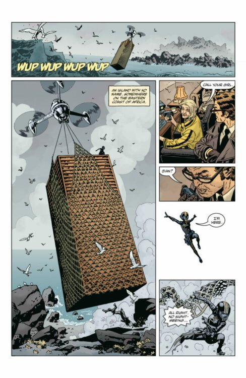
There’s a wonderful simplicity to Mignola’s writing. This isn’t a story that treats its readers like children. Mignola doesn’t lead us by the hand, explaining the whole set up. No, the joy of Giant Robot Hellboy is that it drops you directly into the action. You have no time to pack your bags or gather your thoughts before the shit hits the fan. In the first couple of pages, Hellboy is hit with a tranq dart and thrown into the back of a van. When he wakes up, he doesn’t know where he is or what’s happening to him. And that goes for us too. But there’s so much joy to the mysteries these pages hold. You almost don’t want the answers, because the unabashed stumble into adventure is so thrilling.
In terms of dialogue, Mignola pulls things way back. He only hints at things he’ll most likely come back to in the next two issues, giving us small clues to why Hellboy has gotten wrapped up in all of this. But Mignola keeps the dialogue out of the way of the action of the issue. Some pages have no dialogue at all, and others only have a couple of word balloons. Mignola knows there’s no need to complicate fun, and that is exactly what this issue is.
Art
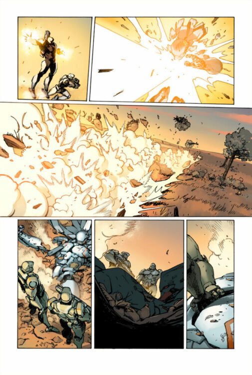
There is so much detail to Fegredo’s art. The first page has a poster of the 1967 James Bond spoof movie, Casino Royale. (Not to be confused with two other movies of the same name.) The poster itself is covered in stickers and notes that litter the wall. When Hellboy enters a phonebooth, you can see the dirt splattered against its windows. Every scene is full of walls that have chipping paint, spreading mold, or scratched surfaces. Every character has wrinkles, scars, and zits. Fegredo’s world is one that is imperfect and grimy. You can smell the wet, smoky streets of London, and the thick, dusty air of abandoned office buildings.
But Fegredo also works brilliantly in the big picture, too. His panels have depth and drama. You feel like you’re right in the middle of the action. When Hellboy is led into a trap in the first couple of pages, Fegredo frames the panel with the menacing figure of Hellboy’s mysterious attacker in the foreground. The mystery man’s hip and the gun held by his side leaves just enough room for us to see Hellboy in the background, looking on with panicked eyes. Fegredo continually places powerful and relatable characters in the foreground, giving us a sense of the dynamics at play. We feel like we get to know something about these characters just by Fegredo’s placement of them on the page, before we have any answers about who they really are. It’s visual storytelling at its best.
Coloring
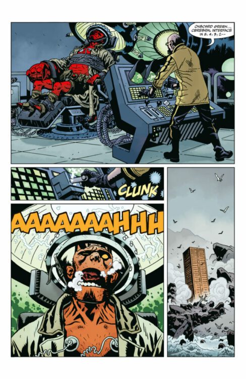
A lot of the colors in this issue feel really cold. We open on a late night in London. The skies are a dark blue. The streets are obscured by light grey clouds of smoke. Even the red phone booth that Hellboy climbs into looks subdued in its colors. It’s only when Hellboy gets hit with a tranq dart that we get a sudden burst of warmth. The panel practically glows with orange energy. Soon after, the night swallows back up the noisy life that broke through for a second. The faded white truck that they pull Hellboy into careens down the road past the pale yellow lights that stream out of the windows of nearby buildings. This comic is as moody as it gets. Stewart pulls back in nearly every area, except when it comes to Hellboy. His brilliant red skin stands out, not only reminding us that he’s not fully of this world, but also helping us to immediately focus in on the man we’re rooting for in every scene.
Lettering
Robins has been lettering Hellboy books for almost as long as they’ve been around. As such, his letters have become synonymous with the series. There’s a wonderful familiarity to his fonts and sound effects. Normally, because Robins’ work is so familiar, you don’t notice a ton of the little choices he makes to enrich each issue. Giant Robot Hellboy is an exception. There’s a no-holds-barred feeling to this issue that you don’t see in other Hellboy comics. Whether it’s the thick outline to Hellboy screaming as he’s electrocuted, the bubble-like “BLAM” of a sci-fi gun going off, or the tumbling “SPLOOSH” of someone falling into water, there are plenty of bold uses of sound effects that bring a ton of vibrancy to this story. Robins and Stewart work perfectly in tandem to create a moody yet action-packed atmosphere.
Verdict
If you’re looking for intrigue, fun, and plenty of robot-powered excitement, look no further than Giant Robot Hellboy. Mignola, Fegredo, Stewart, and Robins’ new series is a delight. Giant Robot Hellboy #1 is coming out from Dark Horse Comics on October 25th at a comic shop near you!
The premise is simple: read one comic every day for the entire year. It seems like a simple task but there is no way that I read 365 comics last year, even if you count the individual issues in collections. So, this year, I am committing myself to this reading challenge, in the hope that I can broaden my reading habits and fully engage with my favorite hobby again.
This is going to be easy and straightforward this week as all I have read is Fear Itself (and various tie-ins). Honestly, I thought by now I’d have finished it, having zipped through it at a rate of knots, a handful of comics every night, but thanks to the majestic quality of one title and the frustrating tediousness of another, It has been a slow process.
But, I have some exciting comics lined up for next week and a collection of some fang-tastic horror comics for the week after. So stick around.
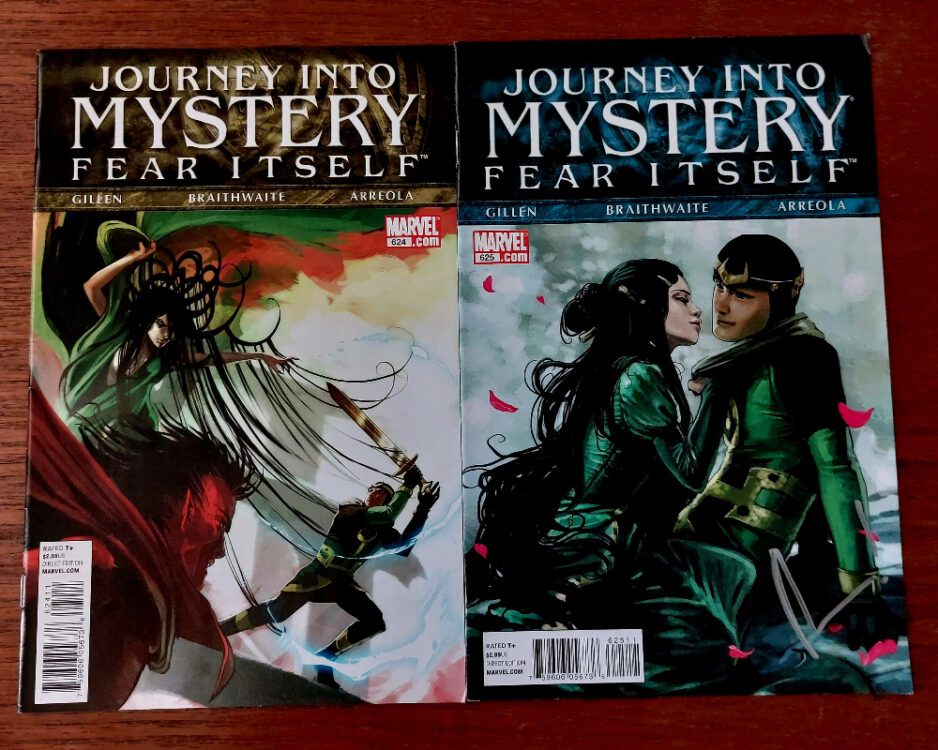
Journey Into Mystery #624-625 Credit: Marvel Comics
Comic Number 286: Journey Into Mystery #624-625
Kieron Gillen uses the backdrop of the Cross-over story to tell magnificent character driven tales. I’ve said it before, and I’ll say it again, this run of Journey Into Mystery is as close as Marvel gets to telling a Sandman story.
In issue #624, the new child Loki does what Loki is known for doing but with a guile that only a child could get away with. Volstagg would not be so quick to leap to Loki’s defense if the god of mischief was an adult, and Leah would not be as trusting of someone who is physically older than her. All of the tiny puzzle pieces that Loki sets up begin to form a single shape but there are still gaps, still mysteries to be revealed and Loki’s real intentions are still hidden from everyone.
This title takes me so long to read because I know that every part of the narrative is important in some way, nothing can be taken for granted and, as a reader, you are encouraged to savor every caption box, every speech balloon, and contemplate possible meanings.
Plus, the artwork by Doug Braithwaite, with colors by Ulises Arreola, and letters by Clayton Cowles, are phenomenal. The style gives it that magical feel. It has a visual aesthetic you can easily associate with mythology and Dungeons and Dragons. There is a sense of wonder on every page with beautifully painted images seeping from one panel in to the next, creating an ease of storytelling that is often lacking in superhero comics. The panel borders are there but they don’t act as barriers between the images but rather grammatical pauses, allowing the reader a very small breath before the next sentence.
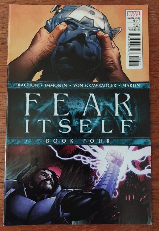
Fear Itself Book 4 Credit: Marvel Comics
Comic Number 287: Fear Itself book 4
Thor has returned to Earth and the Serpent’s avatars are spreading mass destruction across the globe. Matt Fraction manages to make you care about some of the characters but, unfortunately, each element of the narrative is merely a set up for the spin off comics. So, you get a few interesting pages of Tony Stark sinking into a drunken stupor but for the reasons and consequences you’ll have to go elsewhere.
Unlike Civil War, that had a strong central story — albeit lacking in depth of character — Fear Itself reads more like a highlight reel. It shows you the various stories happening elsewhere in the Marvel universe and gives you the choice picks. But there is a lack of coherency between these story threads. I know the meaning of Stark’s outburst because I have read Invincible Iron Man, but I have no idea what is going on with the fish people in British Columbia or what the rioting in Illinois signifies. I don’t even know if these stories are picked up in other comics because nowhere in this sprawling Crossover comic does it give you a list of tie-ins. Again, with Civil War there was a handy month by month guide to the other comics you needed to pick up. In this, there is a page recommending three of the other comics but that is all.
Having said all that, Fear Itself is enjoyable, with good superhero artwork. You just need to switch off your brain and not think about it: the complete opposite from Journey into Mystery.
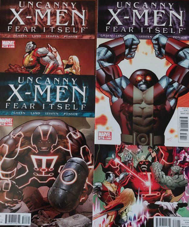
Uncanny X-Men #540-543 Credit: Marvel Comics
Comic Number 288: Uncanny X-Men #540-543
I’ve lumped these together although they are spread throughout the Fear Itself reading order.
This is a nice little X-Men story written well by Kieron Gillen with some clear links and set ups for his greater X-Men story. The artist is Greg Land which instantly turns me off. The reasons for that are a much larger conversation which I may return to in the future but for now, lets just accept that he drew this comic and it’s okay. The story is better than the art.
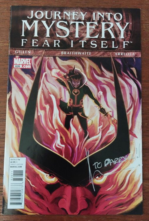
Journey Into Mystery #626 Credit: Marvel Comics
Comic Number 289: Journey Into Mystery #626
I’m not going to dwell on this issue because it’s much the same as I have written above. Loki being Loki, almost coming unstuck… or does he?
The characters that Gillen brings into the story are amazing, becoming bigger and more outrageous as the series moves forward. J. Michael Straczynski successfully reintroduced Thor and the Asgardians into the Marvel universe a few years before this, but Journey Into Mystery makes the greater Asgardian world interesting for the first time in decades.
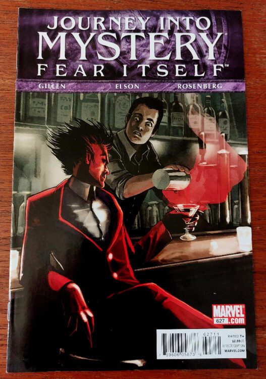
Journey Into Mystery #627 Credit: Marvel Comics
Comic Number 290: Journey Into Mystery #627
The devil walks into a bar…
This issue of Journey Into Mystery is a stunning comic book that at first seems so out of place with the comics around it. But it’s also the perfect companion to the entire Fear Itself series.
Kieron Gillen tells the story of Mephisto visiting a bar after a hard day’s work. The Marvel demon in turn tells the barman of his devious cunning in stirring up trouble in other worlds. Mephisto is Loki elevated, setting schemes in motion and using a few choice words to make people do exactly what he wants while they believe their decisions are their own. This issue is 100% devilishly cunning: from the narrative, to the writing, to the artwork. I think if it wasn’t for this comic I would have given up on Fear Itself back in the day.
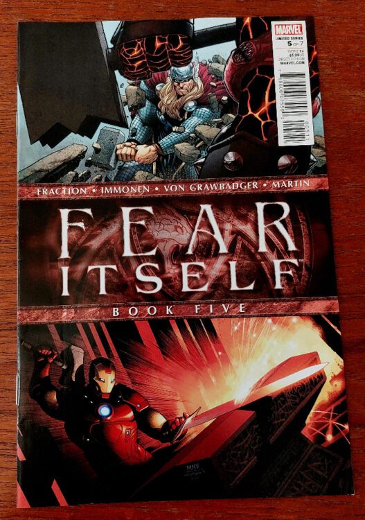
Fear Itself book 5 Credit: Marvel Comics
Comic Number 291: Fear Itself Book 5
This chapter is entitled Brawl.
Pretty much ‘Nuff Said. The heroes fight the enhanced avatars of the Serpent and cause utter destruction. And because there are still two issues left, it looks like the heroes are going to lose. Cliché driven superheroes at its finest.
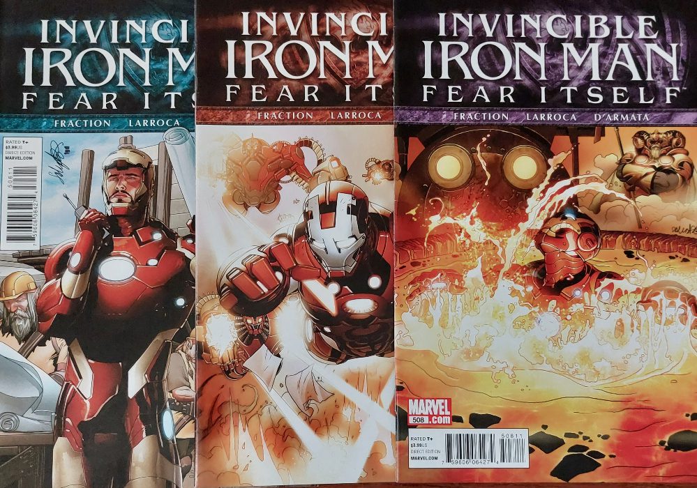
Invincible Iron Man #506-508 Credit: Marvel Comics
Comic Number 292: Invincible Iron Man #506 – 508
Tony Stark gets drunk, goes to an Asgardian weapon forge, and faces his demons. I enjoy Matt Fraction’s work on Iron Man more than the Fear Itself comic. There is a sense of character development for Tony Stark and his journey into the world of ‘magic’ is fascinating. Molding the two aspects, magic and science, of the Marvel universe is a difficult task and has failed on numerous occasions but Fraction succeeds by focusing on Stark. Although all of the rune swearing gets a little annoying and the joke quickly wears thin.
Elsewhere Pepper Potts is embroiled in fisticuffs with overpowered super villains and henchmen in mech suits. Basically, she’s filling the Iron Man role while Iron Man is busy. Pepper hasn’t got the same resonance on the page as Stark, not yet, but I know that Fraction improves her character over time.
Personally, I am not a big fan of Salvador Larroca’s artwork. I find it can often be quite static. Although, when he focuses on a character he can create some very emotional moments. His work on Invincible Iron Man at this point is a lot more compelling than some of his later work, so it won’t stop me reading.
I can’t believe that I still have some Fear Itself comics to read. As an event, it is such a mixed bag of comics. Part of me wants to read all of the other tie-ins to see if the whole can outweigh the sum of its parts but there is nothing in this event that is compelling enough to make me spend money on it. Except Journey Into Mystery. This was one of my favorite comics at the time and I would highly recommend this run to anyone. Kieron Gillen knocks it out of the park, scores a hat trick, breaks the world record, and various other sporting metaphors that mean it’s good.
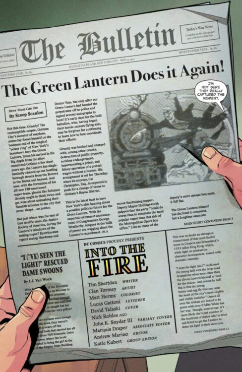
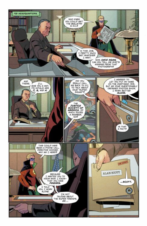
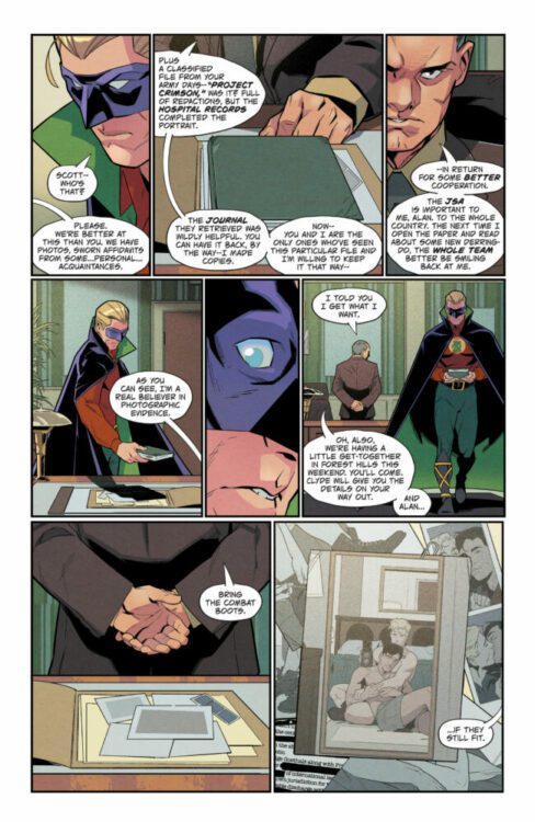
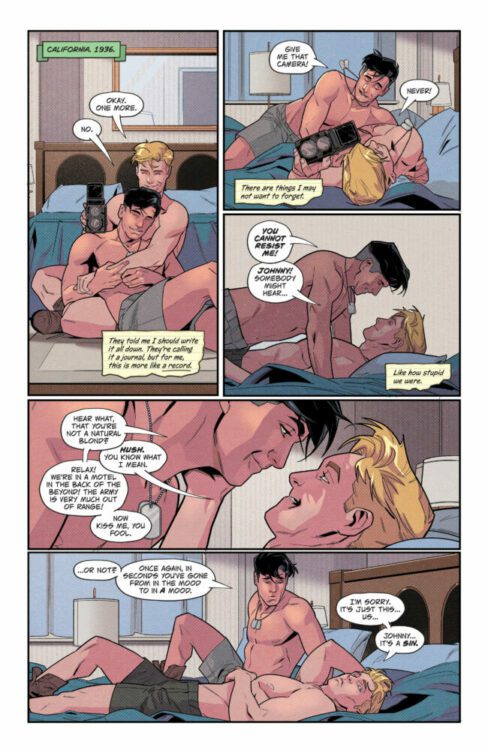
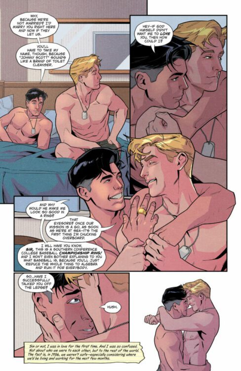
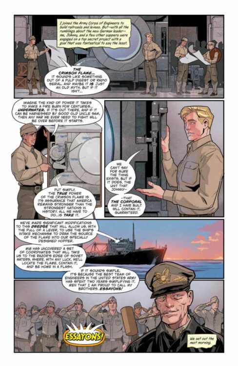
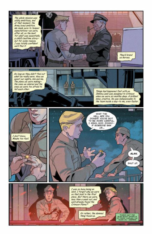
ALAN SCOTT: GREEN LANTERN #1 hits your local comic book shop today from DC Comics; it is an emotional comic that will hit you in the gut. The six-issue mini-series is written by Tim Sheridan, with art by Cian Tormey, Matt Herms drops the colors, and you will read Lucas Gattoni’s letter work. Check out my review and a six-page preview below.
About the series:
A POWERFUL TALE OF ALAN SCOTT’S EARLY DAYS AS GREEN LANTERN! Alan Scott’s early days as the Green Lantern are seen in a new light! The Green Lantern is the most powerful member of the JSA, beloved by all of America, but his personal life is a well-kept secret. This is a story about love, about fear, and most of all, about the courage to stand up to that fear. Alan Scott’s past is the key to his future when the Red Lantern appears, ready to strike down the mighty Green Lantern!
Robert Kirkman spoke to the media after the Energon Universe panel at New York Comic Con Saturday afternoon. I asked him what the core elements that make up Duke and Optimus Prime are; both answers are very good and have me excited for the franchise moving forward. Check out the full video clip below.
“I think the key to Optimus Prime and Daniel (Warren Johnson) could probably talk about this more is his heart, his gentleness, his compassion. He’s this very heroic character that is extremely capable in battle and does all kinds of cool stuff, but the fact that he cares and the fact that he cares about humanity and the fact that this big giant robot made out of steel has this heart to him. He’s a big softy and I think that that’s something that Peter Cullen really brought to the character with his voice work and it’s something that I’m actually in awe of how well Daniel is able to embrace that core aspect of his character I mean it’s on display in almost every scene that Optimus Prime is in and it’s really just showing the the strength of this character,” said Kirkman.
“Just wait till issue two,” Daniel Warren Johnson chimes in at the end.
Are you excited for the shared Energon Universe?
Transformers & G.I. Joe: Welcome To The Energon Universe
10:45-11:45 a.m. ET, Room 405, Javits Center
THE ENERGON UNIVERSE IS HERE! The TRANSFORMERS and G.I. JOE are back at Skybound, joined by the mega-hit Void Rivals! Superstars Robert Kirkman (Void Rivals), Lorenzo De Felici (Void Rivals), Daniel Warren Johnson (TRANSFORMERS), Joshua Williamson (Duke, Cobra Commander), Tom Reilly (Duke), and Sean Mackiewicz (SVP/Publisher, Skybound) reveal the secrets behind the biggest new comics of 2023. Moderated by Arris Quinones (Host/Co-Creator, Variant Comics). Attendees will receive a copy of the Duke #1 Aschan (while supplies last).
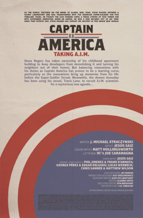
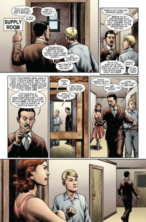
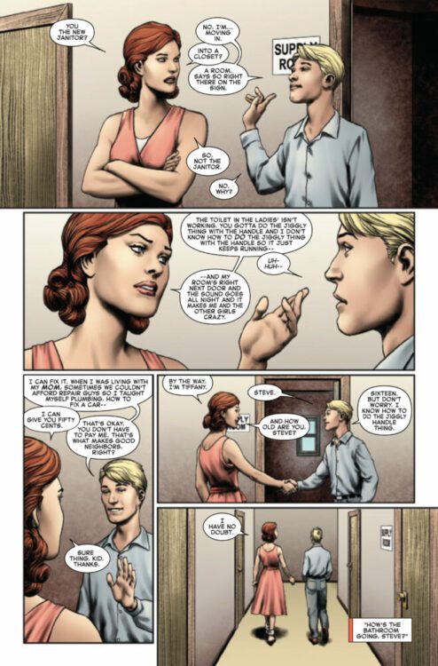
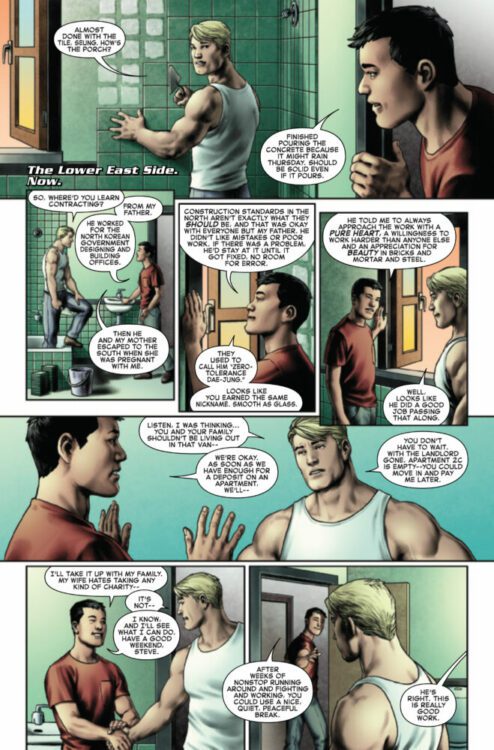
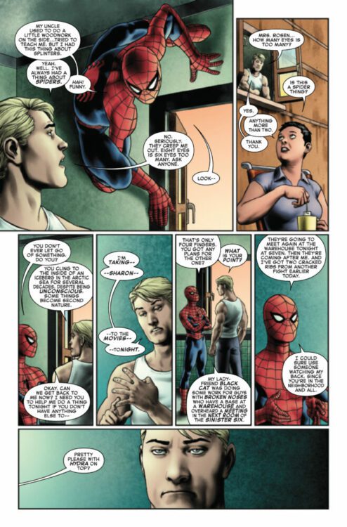
CAPTAIN AMERICA #2 hits your local comic book store on October 25th, but thanks to Marvel Comics, Monkeys Fighting Robots has an exclusive four-page preview for you!
About the issue: When Spider-Man interrupts date night to ask for help taking down the Sinister Six’s latest plot, Captain America begrudgingly obliges. Meanwhile, more and more of Steve’s former enemies are being recruited by a mysterious new threat – one seemingly connected to an enemy Steve faced long before he picked up the shield…
The issue is by writer J. Michael Straczynski and artist Jesús Saiz, with colors by Matt Hollingsworth, and letters by Joe Caramagna. The main cover is by Saiz.
Check out our CAPTAIN AMERICA #2 preview below:
Did you pick up the first issue of CAPTAIN AMERICA? Sound off in the comments!
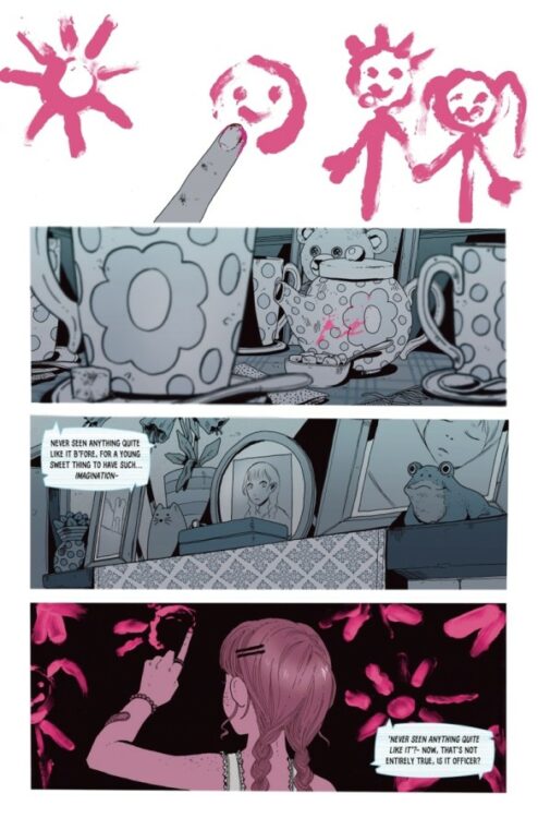
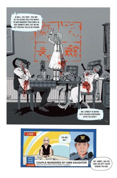
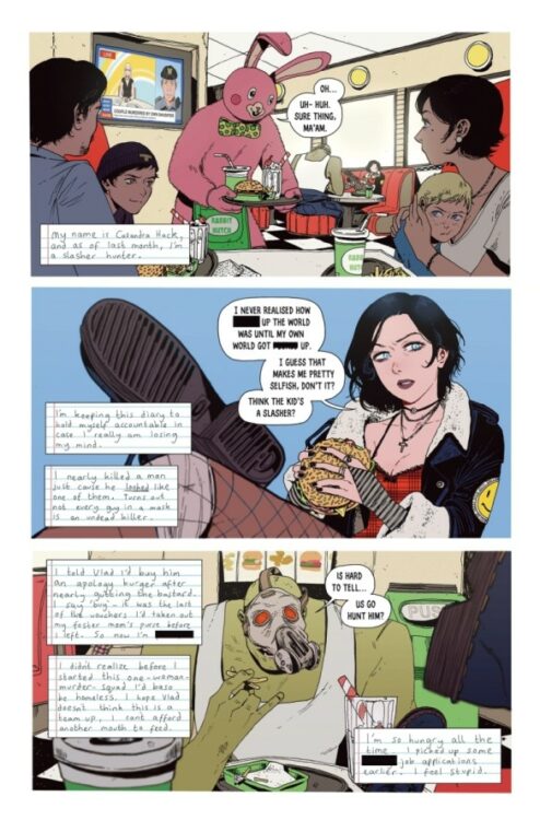
From acclaimed comics creator Zoe Thorogood (Rain; It’s Lonely at the Center of the Earth) comes the newest addition to one of the medium’s bloodiest sagas in Hack/Slash: Back to School #1. Originally created by Tim Seeley and Stefano Caselli, Thorogood adds her own twisted humor and unmistakable style to this demented world with hilariously disturbing effect. With a plot that mixes humanity with the absurdly grotesque alongside phenomenal artwork, Back to School will be a must-read for series fans and horror readers alike.
“Slasher hunter Cassie Hack is only just getting used to her man-monster partner, Vlad, when she’s drawn into a new case involving a murderous bunny mascot, dead kids, and an entire squad of maladjusted teenage serial-killer hunters!”
Writing & Plot
Anyone familiar with Zoe Thorogood’s work over the last couple of years know how good she is at writing traumatized protagonists. Her streak continues with Hack/Slash: Back to School #1, albeit with a much lighter tone than her previous work. There are few modern writers who are better suited to creating a chapter of Image staple Cassandra Hack’s life than Thorogood. The Eisner-winning cartoonist takes a hold of the damaged slasher hunter fresh off of her first encounter with a slasher. While sharing some fast-food with her new monster hunting partner, a big lovable killer named Vlad, she’s confronted by another slasher – and formally introduced to the wide world of slasher slaying. Thorogood’s clearly having a lot of fun writing characters new and old for Seeley and Caselli’s beloved world of bloody horror comedy. Her script strikes a great balance between twisted humor and genuine humanity. While killing crazed slashers in bunny costumes makes for a great time, there’s no mistaking that Cassandra has gone through something wildly traumatic. Her working through that trauma while integrating herself into a school full of other traumatized girls adds a layer of depth to what could easily be a paper-thin comic story. The cast of ladies from the slasher school are all wonderfully varied and unique in their own ways. This especially goes for the chain-smoking & professionally gaudy headmaster Darla Ritz, and the bubbly Lollipop Chainsaw homage in Boo. Thorogood’s brand of disturbed humor blends in perfectly with the material laid out before, making for a comic that will be a familiar yet surprising treat for Hack/Slash fans and a blast for newcomers.
Art Direction
Unsurprisingly, Zoe Thorogood’s visual work in Hack/Slash: Back to School #1 is a stunning menagerie of bloody delight. Thorogood’s work in her original stories has demonstrated her ability to make some truly unique monstrosities, so her work here feels almost rudimentary by comparison. Her takes on Cassandra and Vlad are spot-on with Seeley and Caselli’s designs, but her distinct sequential direction and animations make them feel like her own creations. Thorogood’s designs for Darla Ritz, Boo, and the rest of the cast are rife with detail, with their own unique spins on school “uniforms.” It’s easy to see how much fun Thorogood must have designing character looks on top of drawing over-the-top gore. Speaking of gore, it wouldn’t be a Hack/Slash book without a lot of it, and Thorogood fires on all cylinders with her renderings of decapitations and smashed organs. Her color art is similar to her work on her other comics, but with a variety of tones that fit with this universe’s atmosphere while filling it with surprising shifts. She uses very little shading, instead relying on lighting and heavy pencils to add more dynamic shades to her colors. In tandem with her panel direction, sometimes creates two completely different scenes split in the middle or at a diagonal. She uses this approach early in the comic as a flashback for Cassandra, and it’s one of the cleverest approaches to a one I’ve seen in the medium. Overall, Thorogood knocks the visual storytelling out of the park with her unique artistic approach.
Verdict
Hack/Slash: Back to School #1 is a devious blast of a first issue, and a perfect fit into this established world. Zoe Thorogood takes her patented approach to writing dark humor and traumatized characters and applies them to Seeley and Caselli’s world with a natural ease. Her visuals are brilliant, as she utilizes her singular art direction to great effect, introducing us to characters new and old through her distinct creative lens. Be sure to grab this new issue when it hits shelves on 10/18!
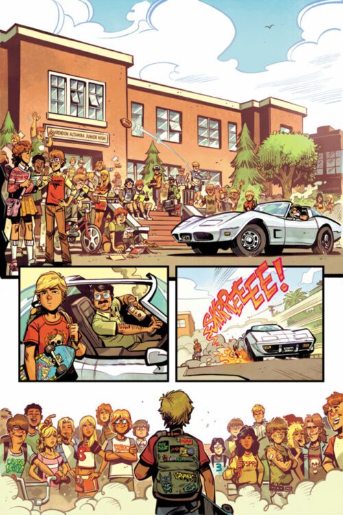
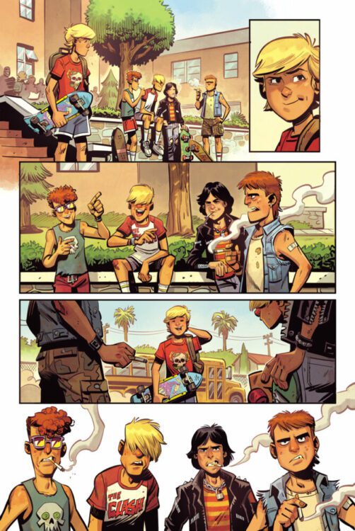
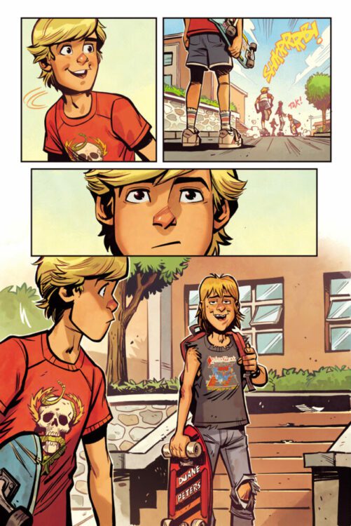
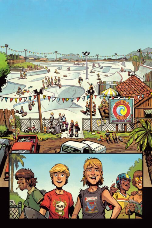
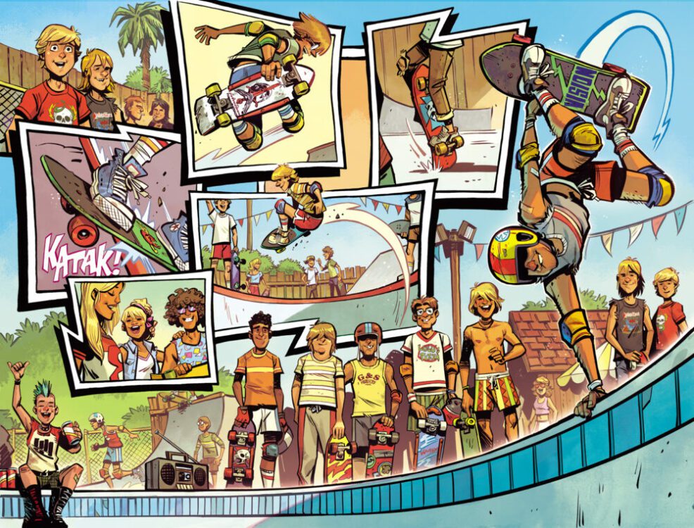
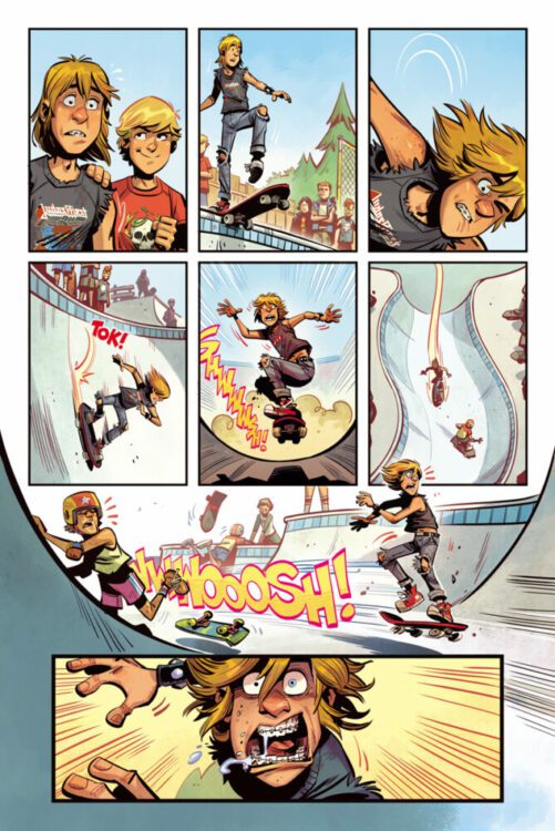
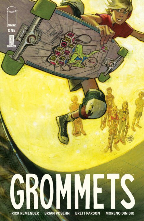
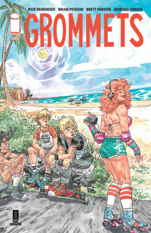
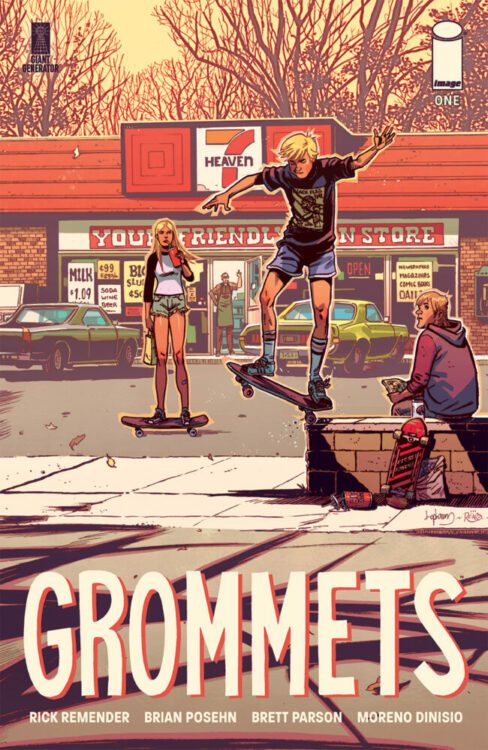
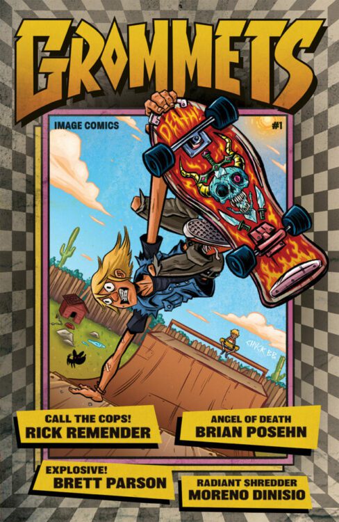
At New York Comic Con this afternoon, Image Comics announced a new ongoing series GROMMETS from writer Rick Remender, comedian Brian Posehn, and artist Brett Parson. The book will hit your local comic book shop in April 2024. Check out a seven-page preview below.
About the series: In Grommets, two outcast best friends navigate the Sacramento suburbs of 1984, where they find a home in skateboard culture and punk rock. Grommets is both an authentic look at ’80s skate culture—a snapshot of the generation that turned skating into a worldwide phenomenon—as well as a heartfelt coming-of-age story following two friends from troubled homes navigating their damage in an era when no one cared.
The series’ title sprints from skater slang, a “grommet” is a commonly used term for a young up-and-coming skater or surfer. Since the ’60s it’s been used to describe the next generation of kids who, with youthful exuberance, love the sport but want to put their spin on it.
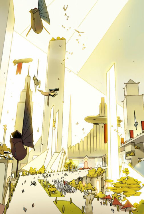
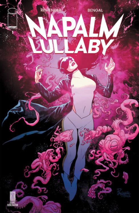
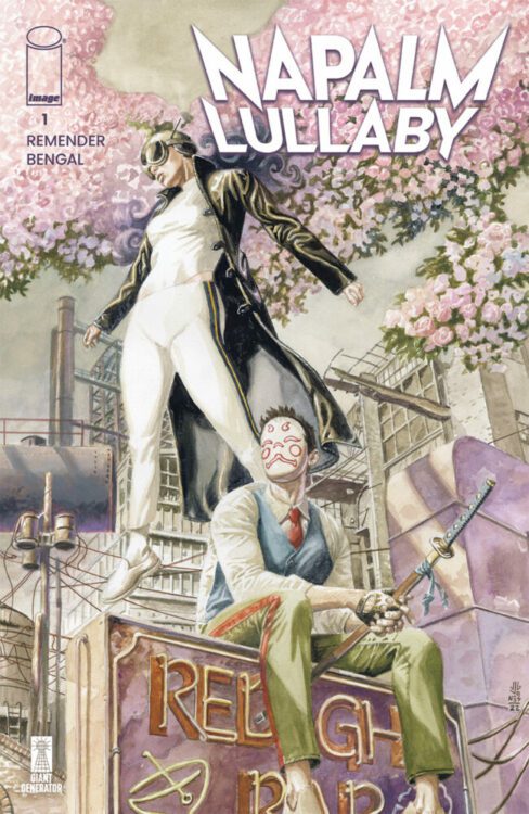
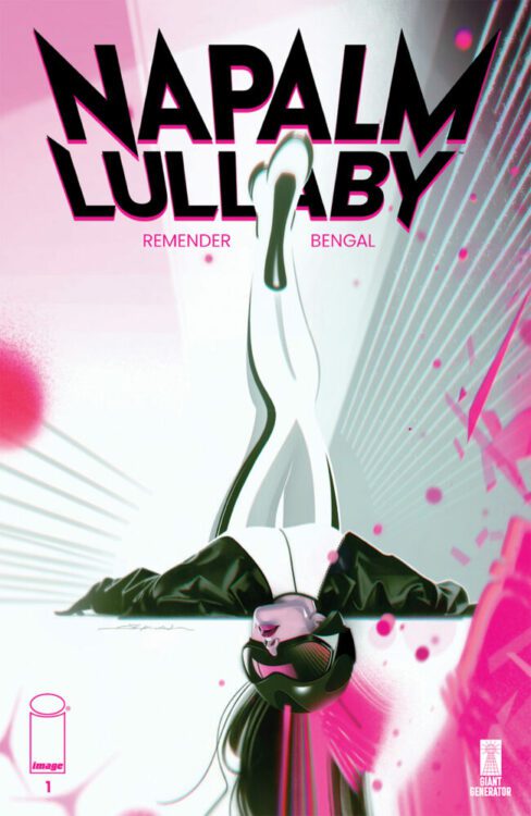
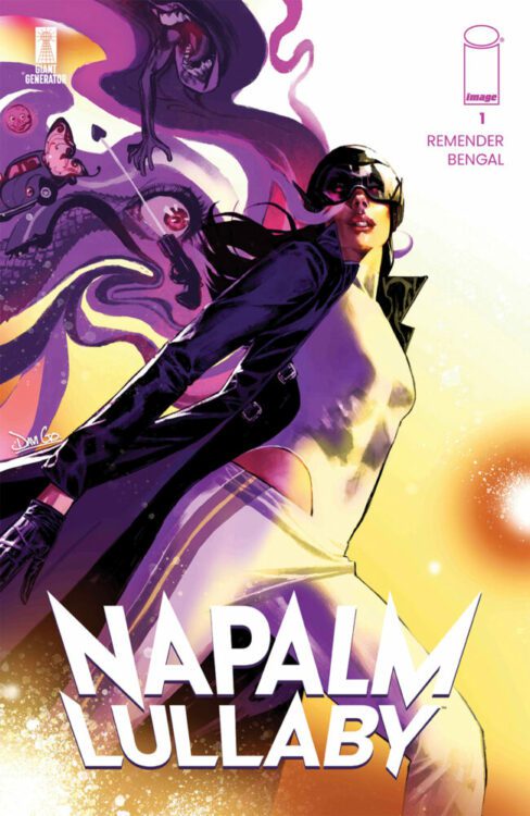
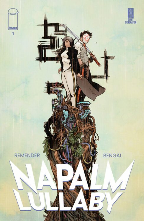
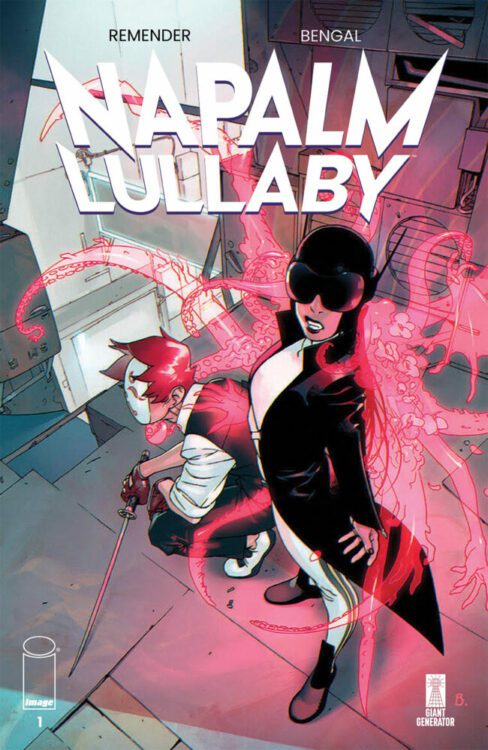
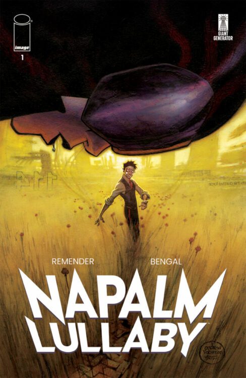
At New York Comic Con this afternoon, Image Comics announced a new ongoing series NAPALM LULLABY from writer Rick Remender and artist Bengal. The book will hit your local comic book shop in MARCH 2024. Check out a five-page preview below.
About the series: What if a child with unimaginable power was discovered and raised to believe he was God by a cult built upon hatred and populated by zealots utterly confident in the purity and absolute moral authority of their religion? Enter a world ruled by The Magnificent Leader, where just such a cult imposed their will on an entire world to create the ultimate theocracy. Join up and buy in—or be cast out to suffer in the toxic slums with the masses of humanity.
The story of Napalm Lullaby begins 50 years after the cult’s subjugation of Earth, when two of the messiah’s bastard children—each with powers that are strange and difficult to control—set out to escape the slums of their birth. Determined to infiltrate the Magnificent Leader’s domed fortress of adulation, they’ll stop at nothing to kill the man responsible for the nightmare they were raised in.
The premise is simple: read one comic every day for the entire year. It seems like a simple task but there is no way that I read 365 comics last year, even if you count the individual issues in collections. So, this year, I am committing myself to this reading challenge, in the hope that I can broaden my reading habits and fully engage with my favorite hobby again.
Gen V is delighting superhero fans on Prime TV with its mix of fascinating character work, twisted takes on superhero powers, and violent action sequences. It is a series that manages to deal with serious subjects, such as self harm and eating disorders, while also engaging in a superhero discourse, and still finds time to be funny and entertaining. Whether or not the series can maintain its momentum will have to be seen, but for now Gen V is great television.
We have also entered the Halloween season. So, mixing superhero stories and horror is where I wanted to go this week. I nearly read Marvel Zombies. I should have read Marvel Zombies but I couldn’t find the box they were in (I’ll keep looking). Instead I started reading the Marvel crossover/event story Fear Itself.
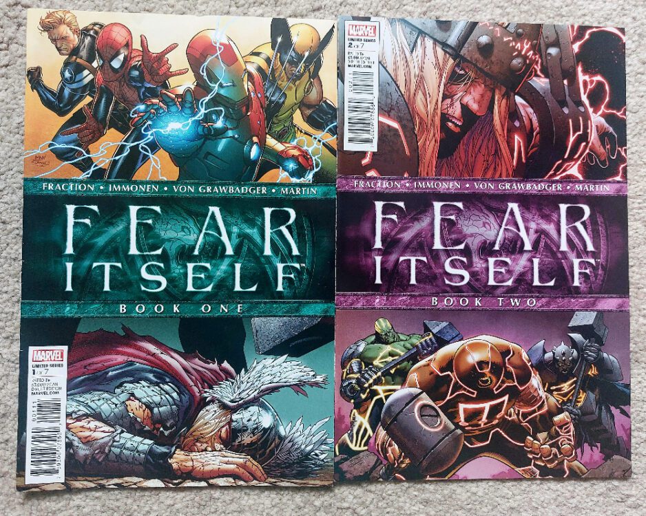
Fear itself came out at a time when Marvel was running event stories at least once a year. Following on from the success of Civil War, the publisher just kept trying to recreate the excitement, drama, and tie-in potential, with more and more outlandish crossover events.
After Civil War came World War Hulk, an event I tried to re-read recently and faltered about a third of the way in. The central story was okay, Hulk hits things, but the tie-in comics were hard to read. They just weren’t engaging enough.
Then came Secret Invasion, leading into Dark Reign and Siege, until finally, we reach Fear Itself in April 2011. I was initially only going to read the main title but I realised I own about 20 of the tie-in issues so I’ve fed them in and, now I’m about a third of the way through.
Fear Itself book 1 and 2 Credit: Marvel Comics
Comic Number 279: Fear Itself #1-2
I read issues one and two before deciding to include extras so there are a number of comics that fit between these two.
Like all Marvel event stories, there appears to be a writers room of creators who all have their own titles that tie in with the main story, which is credited to one writer. For Fear Itself, Matt Fraction is the lead, with Stuart Immonen and Laura Martin on art duties. Strangely, Wade Von Grawbadger gets a credit on the cover but is not listed on the title page. (I assume this is a printing error as his name turns up in issue two)
According to Joe Quesada, Marvel’s Editor in Chief at the tie, Fear Itself was a reaction to real world events, especially the rise in terror attacks and alerts in the early 2000s, and this is clear from the opening couple of issues. Issue one starts with a riot in lower Manhattan and demonstrates S.H.I.E.L.D.’s ineffectiveness at handling such problems. Without a clear villain to punch in the face, the superheroes stand by and watch as civilians and the law enforcement clash. This chaos and sense of hopelessness is a foreshadowing for the superhero antics to come. Meanwhile Sin, the daughter of the Red Skull, takes her crew of Nazi’s to fight another group of Nazi’s so that she can get her hands on a magical hammer that will grant her astronomical power. Power enough to awaken the Serpent, a mythical villain of the Asgardians that only Odin seems to know about.
The result of Serpents awakening is that Odin leads the Asgardians off Earth, abandoning the Avengers to face the oncoming storm by themselves.
The over-sized first issue includes a lot of story, and a lot of conflict. The uncomfortable riot scene in the opening pages is reflected throughout as the comic seems to focus on internal fighting rather than fighting the good fight, or battling the enemy. Nazi fights Nazi, Asgardian fights Asgardian, and humans bicker among themselves. Matt Fraction is building a world of mistrust, fractured by general animosity. He is laying the groundwork for the fear that is to come.
Issue two has seven (I think) hammers crashing to Earth, each of which is found by a hero or villain. Picking up the hammer transforms them into an Asgardian-esque, angry, smashing machine. Just like the Hulk but with runes. What is noticeable from issue two, and I think this is exacerbated by the fact I only own a few of the 100+ tie-in comics, is the lack of story. The entire issue is a montage of recognizable characters picking up hammers. Without the impressive artwork, which captures the power of each transformation, this issue would be a washout. There is no depth to it and, as a reader, you know you’re missing the narrative from other comics.
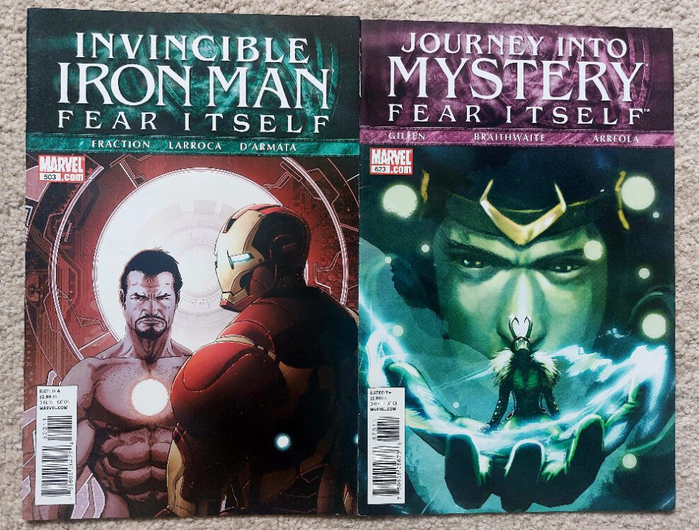
Journey Into Mystery #623 and Invincible Iron Man #503 Credit: Marvel Comics
Comic Number 280: Journey Into Mystery #622 and Invincible Iron Man #503
After reading the first two issues of Fear Itself, I went back and filtered in the tie-in comics I have. These largely consist of Iron Man and Journey Into Mystery. I did, at one point, own a lot more of the tie-ins, such as Fear Itself: Spider-Man, Fear Itself: The Home Front, and Fear Itself: The Deep, but over time I have sold these off. I think that says something about my engagement with them.
Journey Into Mystery, however, is a definite keeper for me. This is because it is the start of Kieron Gillen’s run on the comic: an excellent and superbly orchestrated story with a very clear beginning, middle, and end. Gillen takes the overused villain Loki and transforms him into an empathetic character with a complicated history and future. The current interpretation of Loki used in the movies and on television owes a great debt to Gillen’s remodeling of the character. Kid Loki, as he comes to be known, is a genius character and the story that starts in issue #622 is a complex narrative that is more akin to a Sandman story arc than it is a Marvel Superhero.
Matt Fraction’s Invincible Iron Man is also intriguing, as from this issue (and throughout Fear Itself) it deals with the characters reactions to the concept of death, whether that means the threat of or the actual physical experience. Fraction’s characters are placed in difficult situations and often react out of character as they try to deal, and even cheat, their fate. Unfortunately, the artwork in Invincible Iron Man is not always up to the task of conveying the strong emotional character acting. The visuals are dynamic but lack the nuance required for the complex discussions Fraction is trying to portray.
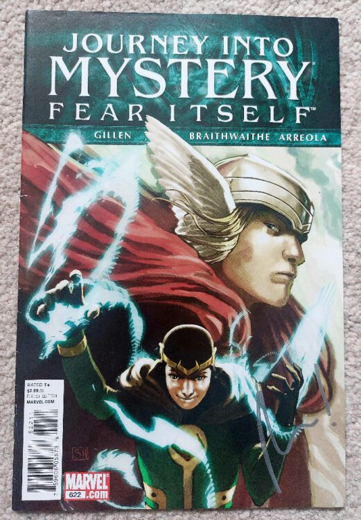
Journey Into Mystery #622 Credit: Marvel Comics
Comic Number 281: Journey Into Mystery #623
In which Gillen lays the groundwork for his run on the comic, albeit subtly and symbolically, just like Jonathan Hickman likes to do.
It also contains one of my favorite pages of artwork from this run. Doug Braithwaite’s painted style is magnificent and suits the epic, mythological tale that Gillen is weaving. And page eleven of this story is such a simple page but has a massive impact on me. There is something about the stacked panels and the slow zoom into the character, in this case Ikol the magpie, that packs a big punch. Braithwaite draws you into the page, into the moment and you can feel the suddenness of Loki’s arm appearing in the final panel. Despite the panel being on view from the page turn, it still has a visual impact. We see Loki leap into the pit, and the anticipation grows over the next four panels, getting ever tenser as the image tightens up on Ikol.
This is superb visual storytelling. I’ve almost forgotten what the comic was about.
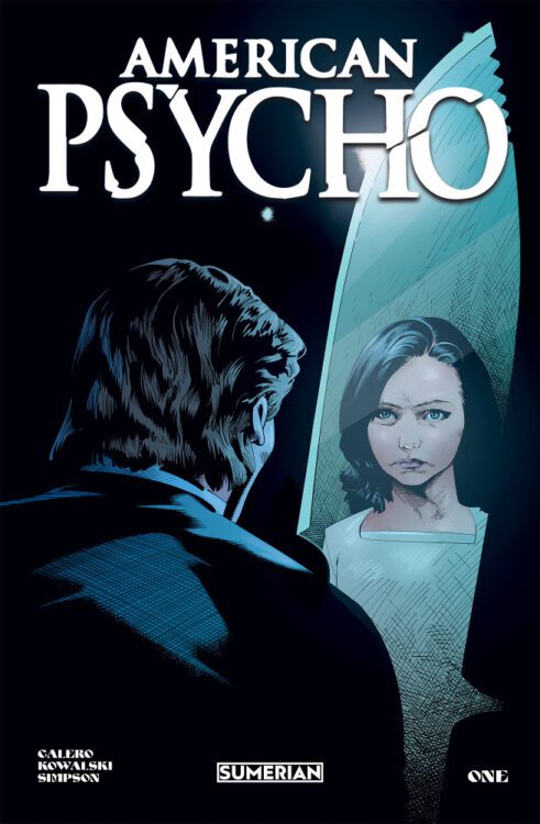
American Psycho #1 Credit: Sumerian Comics
Comic Number 282: American Psycho #1
A break from Fear Itself to read a brand new comic from Sumerian Comics. American Psycho is a comic that I have very conflicting views on.
Firstly, the writing by Michael Calero is very good. The introductory voice-over resonates with Bret Easton Ellis’ original novel and lulls the reader into incorrect assumptions about the narrative. Coupled with the amazing artwork of Piotr Kowalski, the imagery and atmosphere created throughout this first issue is tangible and often unsettling. The subject matter is, as you would expect, difficult and not for the faint hearted.
And then there is a twist. When the twist comes, it doesn’t change the quality of the writing or artwork but it does frustrate me . This is because it seems to fundamentally misunderstand the original source material, just like the sequel to the Christian Bale movie. I don’t want to spoil the comic for anyone who is going to read it, but Patrick Bateman is the most unreliable of unreliable narrators, and by providing a third person perspective on the events it incorrectly interprets the narrative. This almost becomes a What If..? comic where the ‘what if’ reinforces a misunderstanding of the original text.
If this comic wasn’t linked to American Psycho, it would be easier to enjoy. But by making that connection, the creators are purposefully wanting the reader to link this to the other iterations, especially the movie version because throughout this Bateman looks exactly like Christian Bale. This is a sequel and is written with that in mind, but it contradicts the original in an important way. Unless, of course, there are to be more twists and turns and the reliability of the new narrator is as questionable as Bateman himself. In which case, this comic could become something quite special.
I think I’ve talked myself into liking this comic.
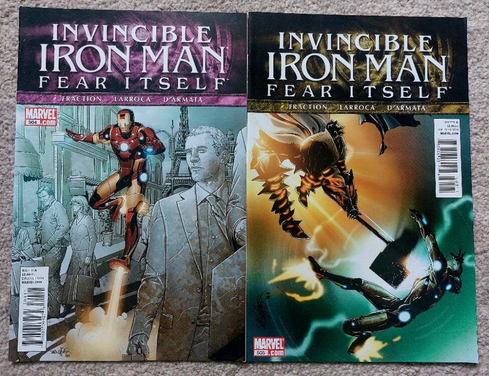
Invincible Iron Man #504-505 Credit: Marvel Comics
Comic Number 283: Invincible Iron Man #504 – 505
Tony Stark goes to Paris and fights an enhanced Grey Gargoyle. Don’t know who the Grey Gargoyle is? I don’t think it matters; I’ve never come across him before. In this story he has the ability to turn those he looks upon into stone. This causes problems when Iron Man battles him because they just keep smashing these statues to pieces.
This story allows Fraction to confront the cost of Iron Man’s battles and the lives that are lost. It’s interesting to note that the death of thousands of Parisians, although lamented, becomes a lesser tragedy than the death of a single member of the Iron Man cast. And not even a prominent member at that.
These two issues tie in directly with the larger story in Fear Itself, and the sense of terror that is a part of that narrative is prominent in both of these comics.
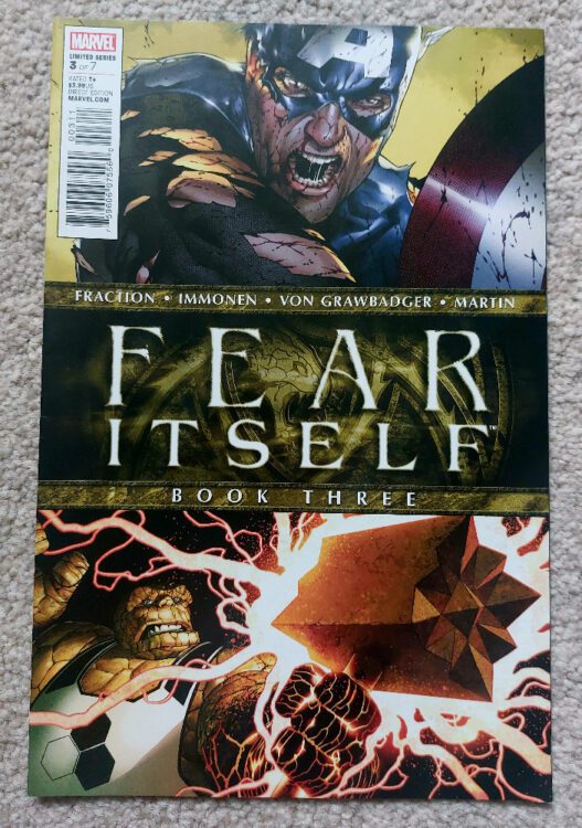
Fear Itself #3 Credit: Marvel Comics
Comic Number 284: Fear Itself #3
Technically Fear Itself #3 comes between the two Iron Man comics mentioned above but I don’t think it matters. At this point in the narrative, there is no sense of connection between a lot of the events that are going on. It’s like the writers had some good ideas about scenes that would look cool but didn’t know how to link them.
I’m being harsh. The purpose of this event is to entertain. They pepper the narrative with some clunky real world issues but that element doesn’t land very well. After the initial riot scene in issue one, a scene that narratively has nothing to do with the rest of the comic but is a tone setter, none of the conflicts have a meaningful impact outside of the superheroes the story focuses on. However, the hero-on-hero action is exactly what the readers of this type of comic want. Their scenes are big and brash; violent and destructive; cinematic and shocking.
So far Fear Itself has done what the Marvel Cinematic Universe has done over the last decade and a half: told tales of extravagance and excitement with characters that are larger than life.
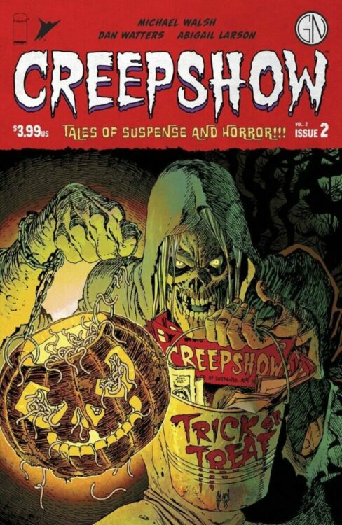
Creepshow Vol 2 #2 Credit: Image Comics
Comic Number 285: Creepshow Vol 2 #2
Halloween is approaching and I have some great horror-themed comics ready to read. To be fair, I always have horror-themed comics ready to read, but this month I have a good excuse.
I’ve been enjoying the new Creepshow comics. The creators involved have been impressive and featured some of my favorite names, such as Becky Cloonan. This month is no exception with a beautifully chilling ghost story from Dan Watters and Abigail Larson. It has a creepy yet poetic narrator slowly unraveling the tale over carefully constructed images. Even the gutters are used to express the slow descent of the situation.
The opening story by Michael Walsh and Pat Brosseau is equally clever, misleading the reader through composition and expertly placed shadows. Although, in the end, this strip is more direct and grotesque with a final panel that will haunt me.
It’s been a good reading week, all said and done. Hopefully, I’ll be able to make it through more of Fear Itself next week and not be distracted by some real horror comics.
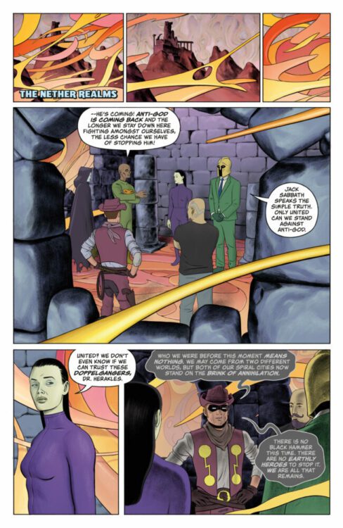
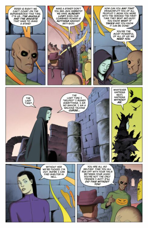
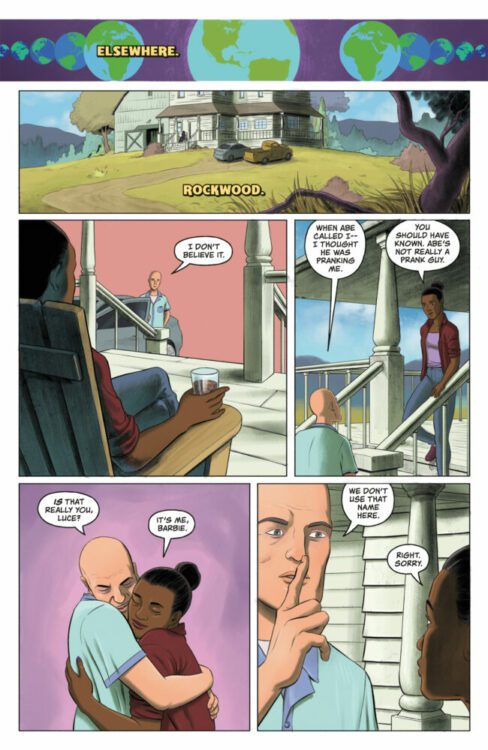
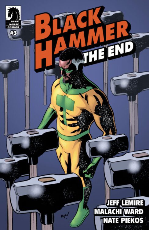
BLACK HAMMER: THE END #3 hits your local comic book store on October 25th, but thanks to Dark Horse Comics, Monkeys Fighting Robots has an exclusive five-page preview for you!
About the issue: A multiversal nightmare unfolds as hordes of demonic hellamentals attack Spiral City, while dark heroes congregate in hell fearful of another onslaught by the world destroyer Anti-God.
Black Hammer: The End is the next era of the Black Hammer Universe; a six-issue event series by Jeff Lemire and Malachi Ward that pulls the Black Hammer world into crisis.
The issue is by writer (and BLACK HAMMER co-creator/architect) Jeff Lemire and artist Malachi Ward, with letters by Nate Piekos. The main cover is by Ward, and there will also be a variant cover available by Wilfredo Torres and Bill Crabtree.
BLACK HAMMER: THE END is the culmination of every BLACK HAMMER story that’s been told from 2016, serving as both a conclusion and a fresh start for the Black Hammer Universe moving forward.
Check out our BLACK HAMMER: THE END #3 preview below:
Cover: Malachi WardCover: Wilfredo Torres with Bill Crabtree
Are you reading BLACK HAMMER: THE END? Sound off in the comments!