

The premise is simple: read one comic every day for the entire year. It seems like a simple task but there is no way that I read 365 comics last year, even if you count the individual issues in collections. So, this year, I am committing myself to this reading challenge, in the hope that I can broaden my reading habits and fully engage with my favorite hobby again.
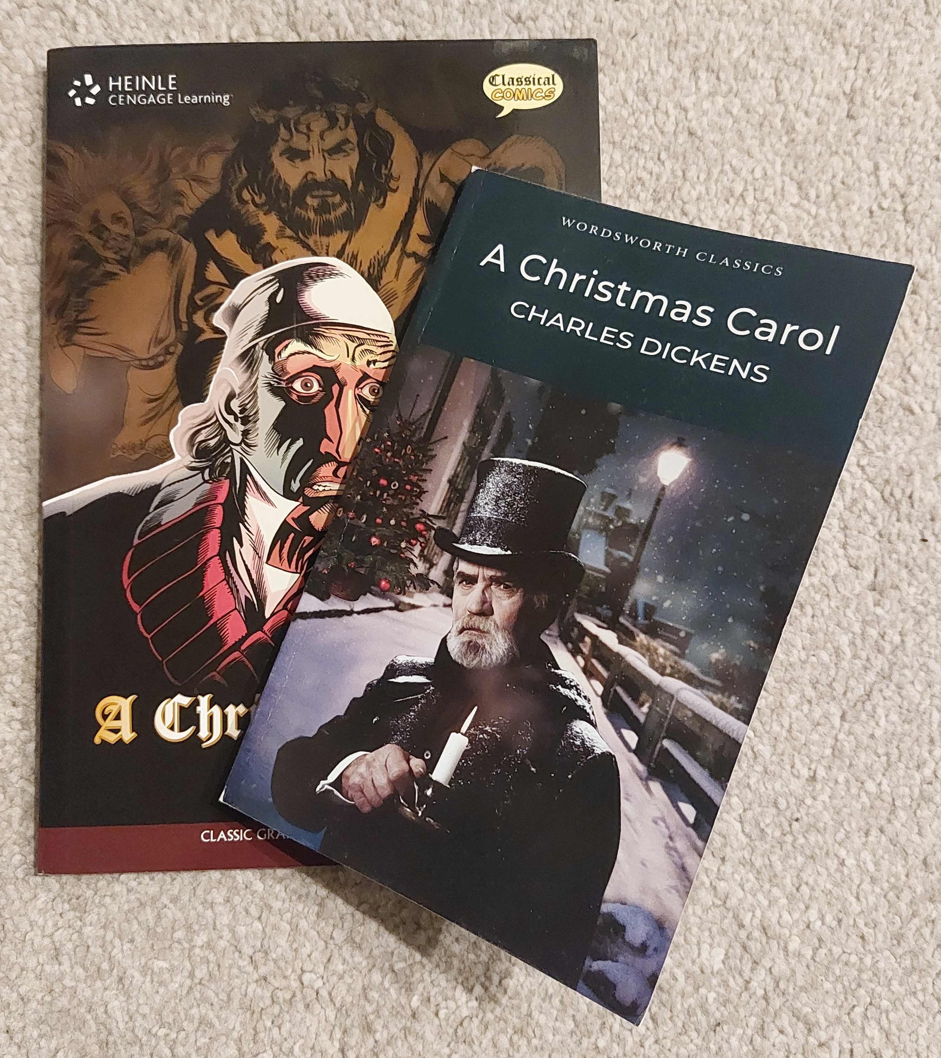
I am continuing the theme of adaptation this week. To be fair, it is going to be a regular theme this week as adaptation — just like comic studies — is an often under-represented or even maligned area of study. But it is still an important part of comics history and its continued existence. For the next seven days or so I will be focusing on one graphic novel and comparing aspects of it against the “original” source text. I use quotations there because the “original” text I have is a book published in 1993, a mere 150 years after the story was first published.
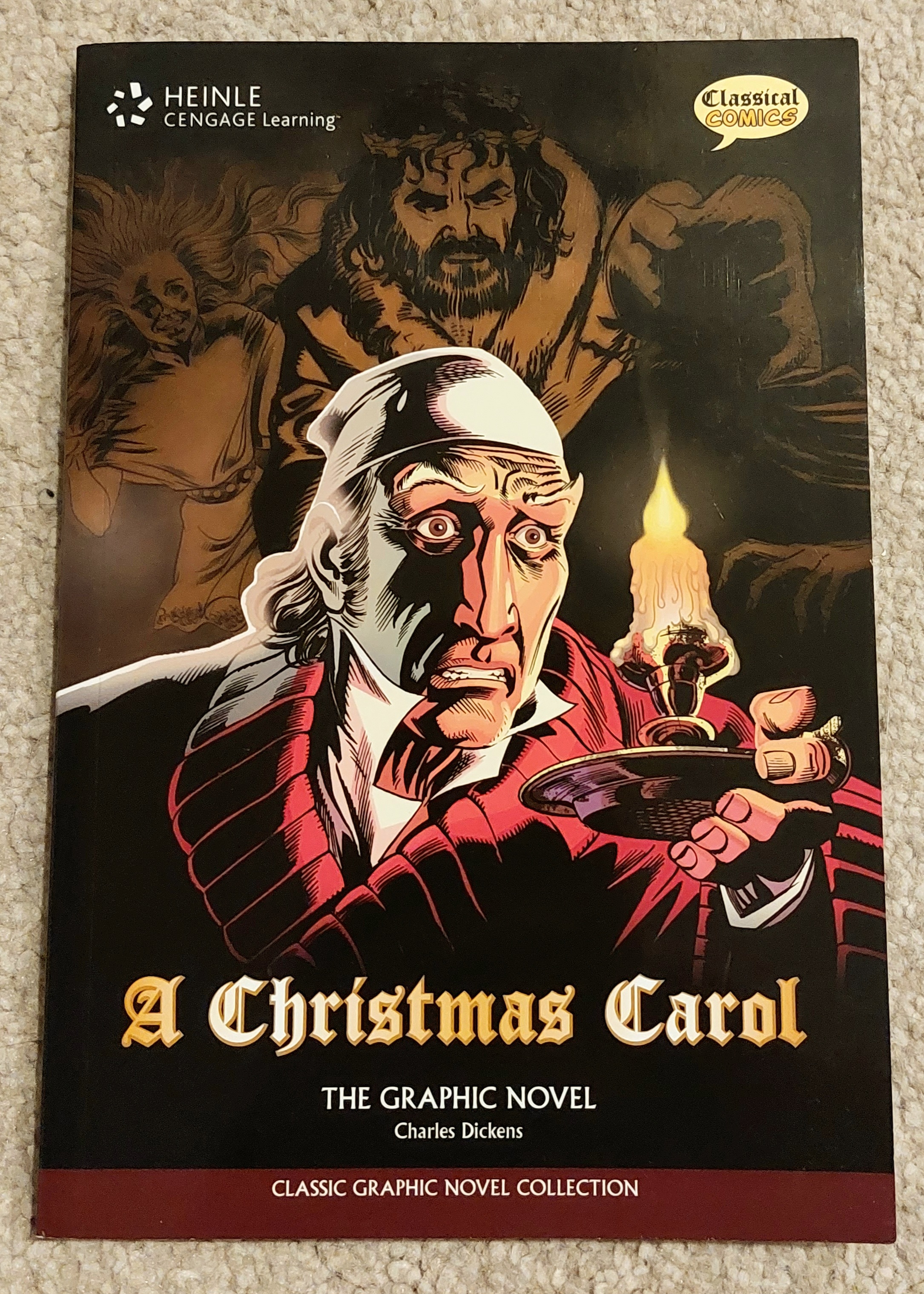
The novella is A Christmas Carol and the adaptation I am reading was published by Heinle Cengage Learning in 2011. The graphic novel is illustrated by Mike Collins and David Roach with James Offredi on colors and Terry Wiley on letters. It’s based on a script by Sean Michael Wilson.
Comic Number 85: A Christmas Carol (chapter 1)
“Marley was dead, to begin with” opens both the novella and the graphic novel alike. To me, the opening line of a novel is very important. It makes a statement about the book and has to capture the reader instantly — and the opening of A Christmas Carol is magnificent. It serves a narrative purpose, it sets the scene and the tone, and brings the reader directly into the story. The line is even spoken in several of the film and television adaptations because it is iconic and expected to open the narrative.
So, I was at first quite surprised that a truncated version of the line opens chapter 1 of the graphic novel. It starts with the first three words and then the text skips to the end of the first paragraph. However, the first page of the comic acts as the first line of the novel and takes on the expectations from that opening. Because we take in the full page of a comic initially, before concentrating on the actual text of the page, the impact of the first line has to become a visual aspect of the comic. The tone will be set through that visual inspection, not the first few words. Therefore, Collins et al have to interpret the opening line into a more complex sequence of images. In this instance, the reader is greeted with a wintry church yard, a yellow light trapped behind a tall, arched window which is contrasted with the dark headstone, etched with the name of Marley. Even before you read those first three lines you know that Marley is dead, the images have told you so. The first thing that the reader experiences in the narrative is that Marley is dead. The rest of the sentence is superfluous. The three panels set the scene, give you an indication of the time period, and let you know, from the beginning, that Marley was dead. It is a wonderful opening to the graphic novel.
I picked A Christmas Carol for this comparison because the novella is very visual. Not only is is about a man who is shown visions, but the language that Dickens uses throughout is visual in nature. It is designed to conjure images, and Dickens teases his readers with a mix of wonderful sights and contradictory words. The narrative is full of word play and almost impossible visual concepts. This aspect makes it perfect for adaptation because there is so much interpretation in certain elements, while the narrative structure creates a very solid backbone. The description of the first spirit is a perfect example; how can you illustrate something that is both old and young, something that is big and small, something that is far away while right next to you? Dickens uses language to create images but it is mere trickery — no more real, or tangible, than the visions Scrooge experiences. Our sense can be deceived, “a little thing affects them. A slight disorder of the stomach makes them cheats.” Dickens’ words are his undigested bits of food that give us, the readers, these wonderful visions.
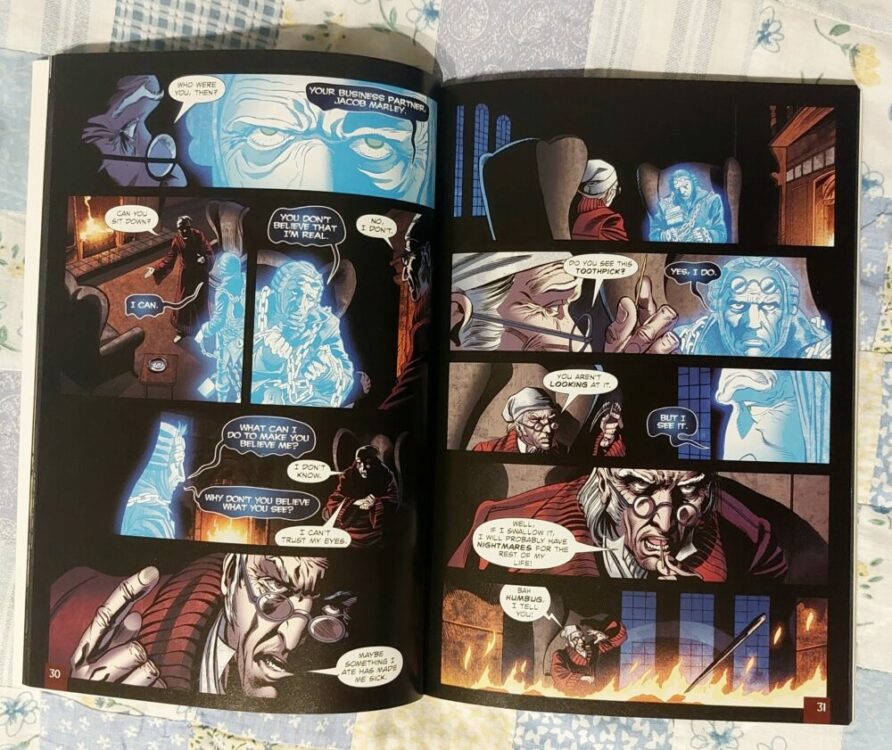
This beautiful bit of wordplay, ending with the best pun in the novel (“There’s more of gravy than of grave about you”) doesn’t feature in the graphic novel. Instead it is replaced with a single, wide close up panel of Scrooge’s face with the words “Maybe something I ate has made me sick”. This is followed at the top of the next page by a silent panel where the reader is looking over the shoulder of the seated Scrooge at Marley’s ghost, a dour, disappointed look on his face. And we know why. It’s because they missed out one of the best bits. And, unlike the opening, it wasn’t replaced by anything visual.
Comic Number 86: A Christmas Carol (chapter 2)
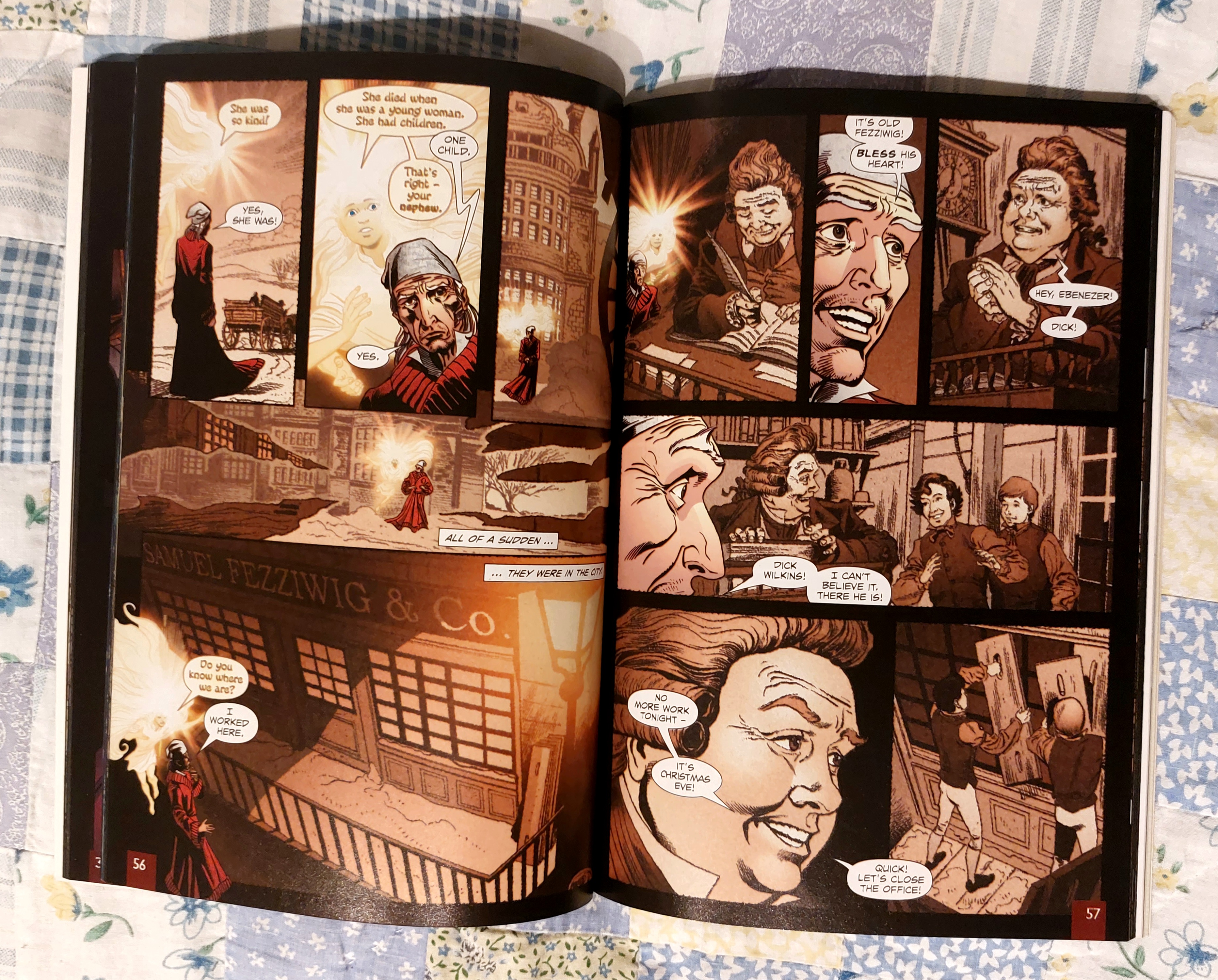
I have already touched on chapter 2 above with the visual representation of the first spirit. The fascinating aspect of this chapter is the way that the artists depict the visions shown to Scrooge. Audrey Jaffa wrote that “in order to make Scrooge and the story’s readers desire the real, the text has to offer not everyday life but rather its image” (from PMLA Vol 109 No2 from March 1994). In this chapter, the reader is presented with images of Scrooge’s past, snapshots of the scenes of his life. The novel allows Scrooge some semblance of interaction with those scenes but only in a superficial way whereas the readers can only view them like photos.
In the graphic novel, these scenes are depicted in a faded photographic style, sepia in tone and twice removed from the reader. The sequences are layered with Scrooge and the ghost inhabiting a middle ground between the reader and Scrooge’s past. The style of artwork is different to represent this separation and the reader is forced to experience history through Scrooge’s eyes. It is a clever way of manipulating the visuals on the page to produce the depth provided by the novel.
Comic Number 87: A Christmas Carol (chapter 3)
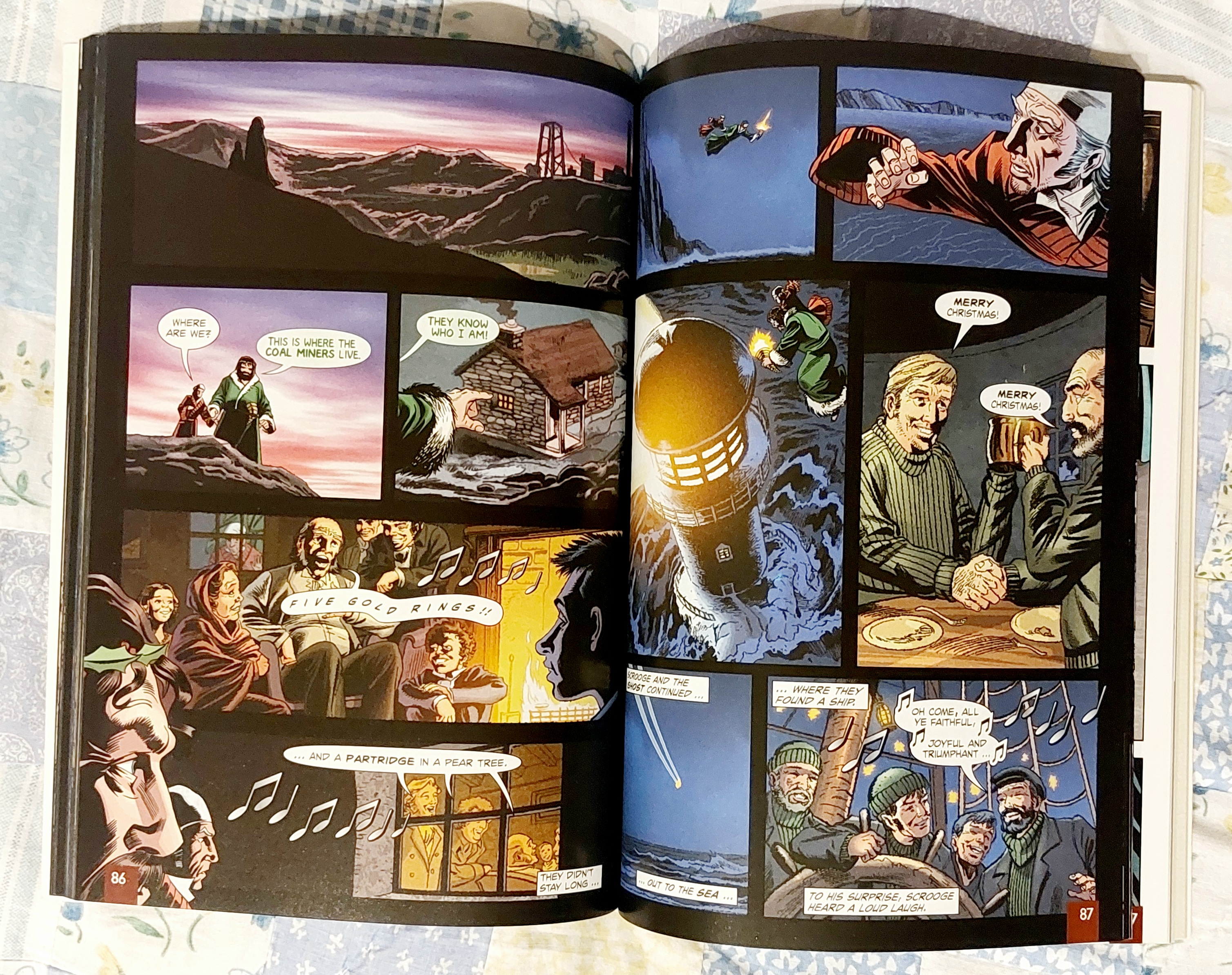
Last Christmas, I watched the 1999 TV version of the novella starring Patrick Stewart as Scrooge. Although it wasn’t groundbreaking television, Patrick Stewart was his usual brilliant self, and there was a sequence that made me take notice. While the Ghost of Christmas Present sweeps Scrooge around contemporary London, their journey extends outside of the urban setting and passes over the countryside and the ocean. Like a scene from The Snowman, Scrooge bears witness to the Christmas celebrations of a miner’s family, workers in a lighthouse, and sailors at sea.
Why was the scene so captivating? Because I didn’t recognize it. Cedric Watts points out in the introduction to the Wordsworth Classics version that the story’s “fame is so great that we probably know of Scrooge and his transformation already.” You wouldn’t be mistaken for thinking that each scene is as equally known as the next; to know one part of the narrative is to know it all. Except, Patrick Stewart proved that wrong. The scenes of the working class throughout England celebrating the season in their own way is often dropped from the adaptations because it doesn’t directly affect the central character or his redemption. Sequences not directly relevant to the overarching plot can be eliminated to save time, streamlining the story. The graphic novel has more space for a fuller adaption so that it can include more of the original source material.
The scene in question is short, spread across two pages, and highlights the different working class men as featured in the novel. The main difference is the that the 11 panels in the graphic novel do not express the hardships of life in Victorian Britain, but instead merely illustrate the far reaching effects of Christmas. The emphasis on social commentary is replaced by a reiteration of the emotional power of the season. You could argue that the message is toned down to suit the audience, but it’s just as possible that the creators felt the initial message was no longer relevant or relatable.
Comic Number 88: A Christmas Carol (chapter 4)
The fourth chapter is full of greed and the grotesque consequences of a life selfishly lived. For the most part, the characters in this section of the graphic novel are drawn with a disgusting air about them. They are bloated and mean, with angry, wrinkled faces which could be found in any horror comic. The characters don’t receive much description in the novella; Dickens instead allows their actions to dictate the readers interpretation of their appearance. However, in the graphic novel the artists design the characters based on their actions, in the same way that Chester Gould designed the villains in Dick Tracy.
As you read this chapter, it is not the intimidating Ghost of Christmas Yet to Come that makes your skin crawl, but the malicious, grinning faces of horrible people laughing at another person’s death. It is unsettling and disturbing, more so in a visual format than in text alone.
Comic Number 89: A Christmas Carol (chapter 5)
Everyone knows the end of the story. The miser Scrooge repents his ways and becomes the beacon for Christmas joy ever after. How best to illustrate this in a comic? I suppose there are a number of ways, but for this graphic novel, a very simple, visual piece of design instantly gets the message across.
For the majority of the book, the pages have been designed with black borders and gutters. Each page is steeped in darkness that stretches from inside the panels to the very edge of the pages so as you hold the book your fingers encroach this blackness. You get an almost physical feeling of entering into the darkness with Scrooge and each page turn becomes a moment of concern. However, when you reach the final chapter, as Scrooge’s spirit is saved, the borders and gutters become white, cleansed of darkness. It is so simple but 100% effective. Everything appears brighter, cleaner, a slate wiped clean.
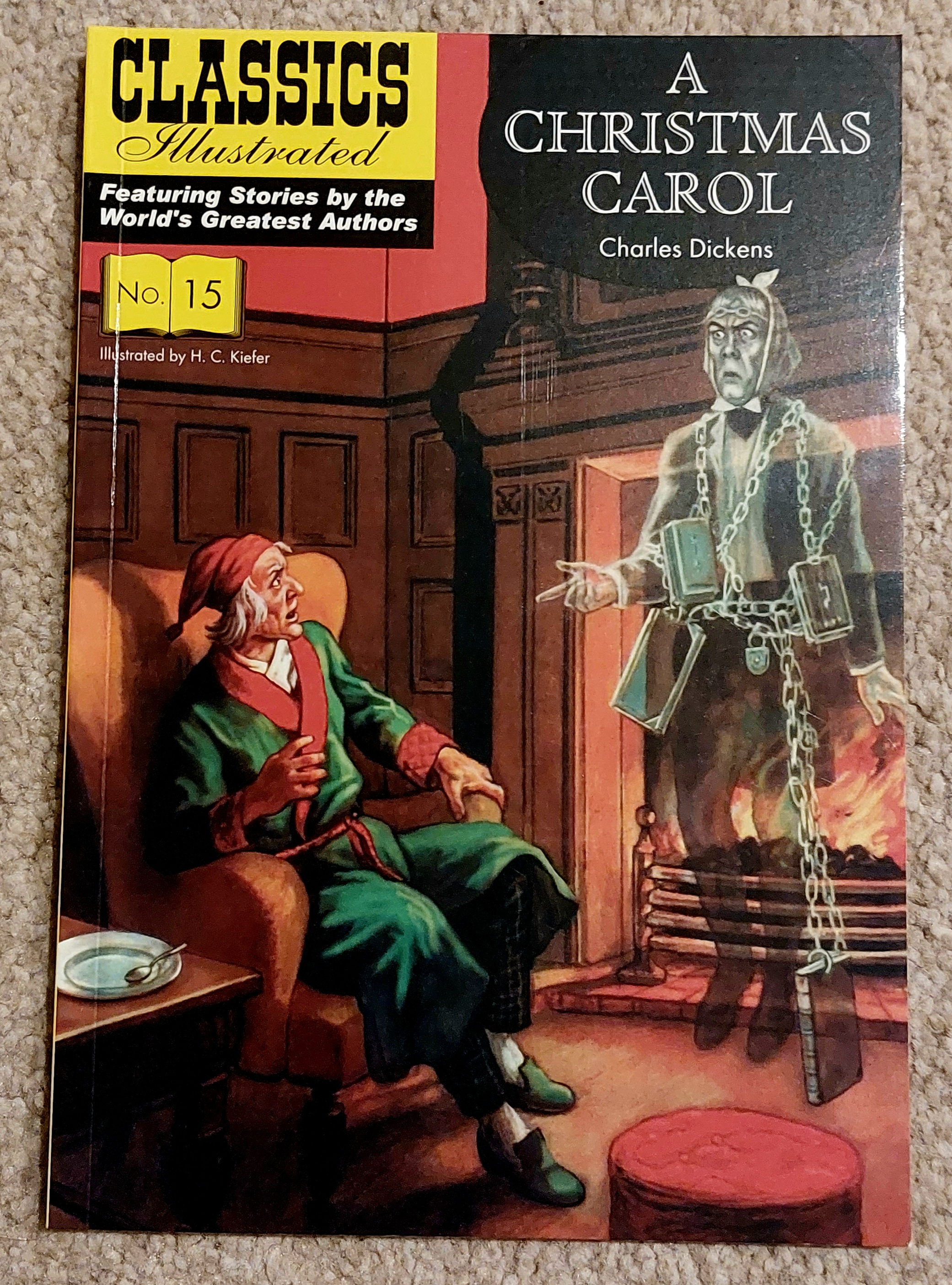
Comic Number 90: A Christmas Carol (Classics Illustrated, again)
Only thirteen weeks in and I’m already re-reading comics that I’ve read this year. After reading the Heinle Cengage Learning (HCL) version in conjunction with the original novella, I thought it might be interesting to bring in another version for extra comparison. The Comics Illustrated version shares one major similarity to the HCL version outside of the narrative: it has been designed for educational purposes. The comic strip contains the highlights of the story, stripped back to its essentials, and in doing so, some of the meaning is left out, but that’s where the back matter comes in.
Both of the comic book versions have extended text sections at the end containing information about Charles Dickens’ life and further considerations when reading the narrative. Any of the deeper meanings that may have been lost in the translation from novel to comic are brought up in the text sections at the back, giving the reader some food for thought and maybe the inclination to re-read the narrative.
I would say that the one thing lost from both adaptations is the social commentary of Victorian Britain, something which is a central thread in Dickens’ original. But as these comics are aimed at younger readers, with literary studies as their central aim, what have become historical concerns are not central to later translations. Neither adaptation is a depiction of the hardships of Victorian life, instead both focus on the redemption aspect of the narrative. In fact, the later version contains less period specifics focusing on character rather than setting. I find the fidelity in both of these comics unsurprising, because most adaptations of A Christmas Carol tend to stick close to the original, even film versions starring Muppets.
The main difference between adaptations of A Christmas Carol is not with the narrative itself but with the style used to tell it. Even outlandish versions like Scrooged with Bill Murray contains the same basic narrative structure.
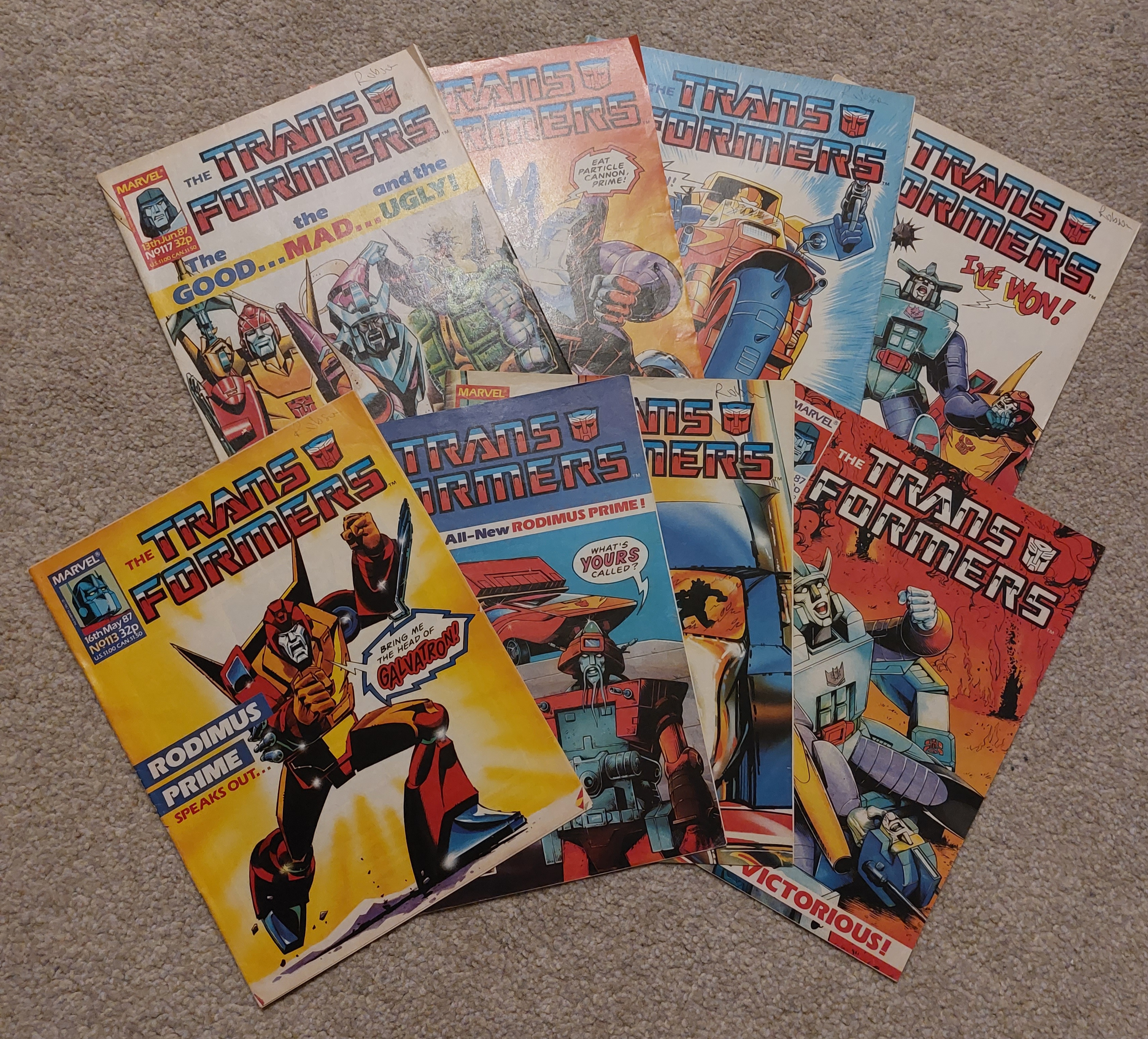
Comic Number 91: More Transformers (issues 113 to 120)
I’ve had quite an intense reading week this week, reading a graphic novel alongside its original source material (on occasions, literally alongside), so today I just wanted to chill out with some easy going comics. And what could be easier than Wanted: Galvatron, Dead or Alive?
Written by Simon Furman with rotating artists during the 8-week run, the story continues the future epic started with Target: 2006, introduces an alternative origin for Goldbug (because the Action Force/Transformers storyline wasn’t published in the UK), and chucks Death’s Head into the mix. There is another epic battle between Ultra Magnus and Galvatron, and even a hint of a love story that, on reflection, is a little bit disturbing. But all in all, this was a perfect way to unwind.
The next few weeks might be simpler, more straightforward, and shorter even, as the Easter break kicks in and feeding on chocolate with my kids eats into my comic reading time. But we’ll see what happens.
As always, why not let me know in the comments below what you’re reading. Maybe I can get some ideas of what to read in the coming weeks.