The premise is simple: read one comic every day for the entire year. It seems like a simple task but there is no way that I read 365 comics last year, even if you count the individual issues in collections. So, this year, I am committing myself to this reading challenge, in the hope that I can broaden my reading habits and fully engage with my favorite hobby again.
When someone mentions comic book adaptations to you, what do you think of first? Is it one of the movies from the MCU? Or possibly Christopher Nolan’s Batman trilogy? Maybe it’s a television series such as CW’s Arrow or Supergirl. For me, it’s the magnificent world of Classics Illustrated, or the various comic versions of Frankenstein based on the original novel and the numerous film adaptations. You see, I find adaptation infinitely fascinating, and the different translations from one medium to another has so much to say about the process of creating comics, film, and novels. Adaptation is an art form unto itself.
This week I’m going to be working through (or at least start on) a collection of comics based on novels.
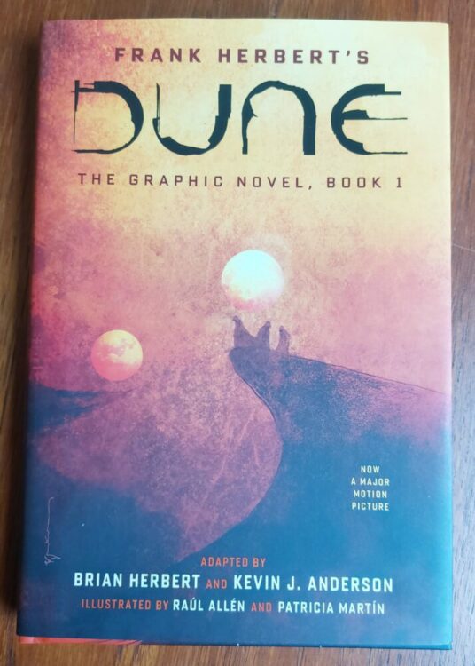
Comic Number 64: Dune (2021)
Frank Herbert’s Dune has a long history with adaptation. First there was the David Lynch movie, which was adapted into a three-part limited series by Marvel Comics and later collected in Marvel Super Special #36. The novel was then given the TV treatment, an ambitious project, but surprisingly bland. More recently, the novel hit the big screen again, and this time BOOM! Studios began releasing prequel comics based on the expanded universe novels — those not directly linked to the movie. Also, Abrams ComicArts started a three book adaptation of the novel, again not directly linked to the 2021 movie.
It is the first of these books that I am currently reading. The cover is by Bill Sienkiewicz, and he perfectly captures the raw power of the atmospheric novel, just as he did with the Marvel version in the 1980’s. It’s a shame, then, that the artwork by Raul Allen and Patricia Martin does not have the same effect. The work is good and has some dramatic flair but it does not own the narrative in the same way Sienkiewicz did. This book is an interesting study for adaptation purposes because it is a very faithful re-imaging of the original text, with much of the script lifted directly from Herbert’s novel. The question remains, how much is added to the graphic novel to distinguish itself from the original book? Is it merely a recreation with illustrations replacing descriptive text?
I am enjoying the book, but I am reading it much more like a novel than I am a comic. The script — the actual text on the pages — is more important than the images. There is very little added by the artwork, with only the occasional elaborate panel or two bringing a visual dynamism. The book highlights one aspect of literary adaptation: that of constant space. In a novel the characters are well defined but their locations are fixed at specific points and then barely mentioned. As a reader, you place the character in the location outside of the actual written word. In a comic, the location is constantly visible. In this version of Dune, the artists choose to fill each panel and page with scenery and location, almost to the point of over saturation. And only rarely does it add anything to the narrative. In the 2021 movie, it could be argued that the focus is primarily on the locations, with the scenery and props telling the story, which works very well. Filmmaker Denis Villeneuve is telling his version of the Dune legacy through a visual spectacle because that is cinema’s strength. Allen and Martin occasionally accentuate an element of the novel in a visual, comics specific way, often through their use of color saturation, but this does not happen enough.
Maybe, when the story gets going, this will change.
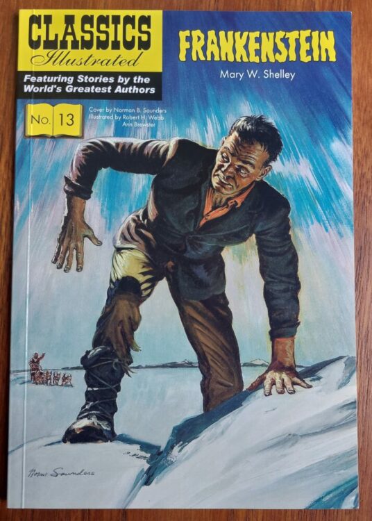
Comic Number 65: Frankenstein (Classics Illustrated)
The Classics Illustrated range of comics was devised to introduce literary texts to children and reluctant readers. The series has been described as “uneventful, one-dimensional, often blatantly silly literary adaptation” (from Literary Adaptations in Comics and Graphic Novels by Jan Baetens, 2020). However, that standpoint is counterproductive to the purpose of the comic. The Classics Illustrated range was specifically aimed at younger readers, therefore potentially falling into the realms of children’s books, and almost by default they do one thing that is uniquely comics: they embrace reduction.
Comics are all about reduction — about taking an idea or an image and reducing it to its minimal form while still being recognizable. Cartoons and comic strips use the least amount of lines to depict characters and places. This reduction, however, does not make the comics infantile or unworthy.
In Frankenstein (numbered 13 in the series I have), Ruth A. Roche cherry picks the elements of the novel that are important for representing the key themes. These are then illustrated by Robert Hayward Webb and Ann Brewster to a strict page count. It is true that some sequences of the novel have been massively condensed or removed altogether, however it is the way in which they handle what is left that is truly impressive. Webb and Brewster pack so much tension, horror, and raw emotion into each page that the essence of the novel shines through. One panel can contain enough information to warrant jettisoning whole sections of the book. And the use of the space on the page is brilliant. The sequence where the creature first awakens is composed upon the page in such a way as to visually demonstrate the hold the creature already has over Victor. The scientist is trapped within the panels and overshadowed on the page.
It is this visual image play that makes comic adaptations of novels so interesting. Seeing the way that people interpret a text and the ingenious ways in which they represent emotional and psychological themes in a purely visual way.
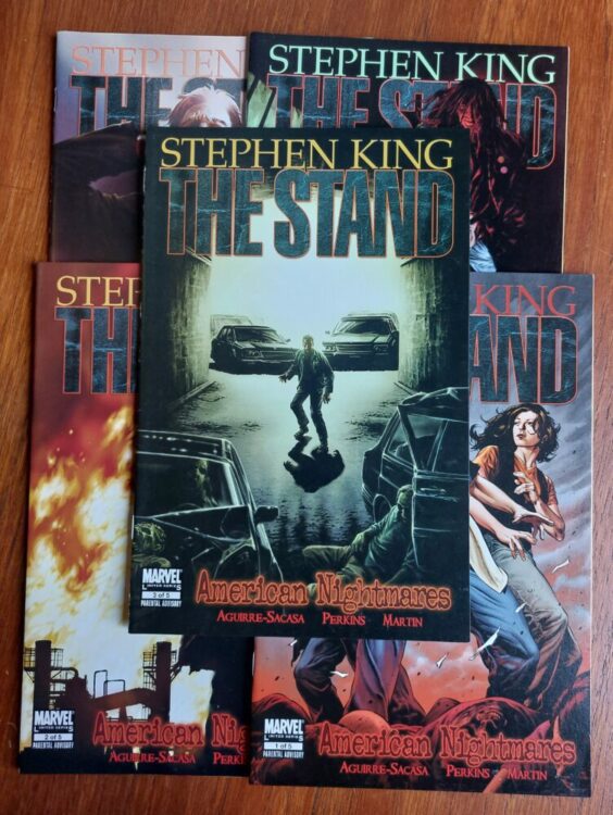
Comic Number 66: The Stand (Marvel Comics)
Stephen King’s The Stand is arguably one of his best novels. Yes, it has some moments that flounder, and the “kill them all” shock two thirds of the way in clearly exists only to move the plot on (King has admitted as much, himself), but that doesn’t detract from the score of horrific scenes, intense characters, and compelling End of Days story that is a precursor to the modern obsession with apocalypse narratives.
And for today’s reading, I picked up issue 3 of The Stand: American Nightmares. This comic is a perfect example of how to adapt the written word. This issue is centered on Larry Underwood and his journey out of the disease ridden New York. In the grand scheme of things (by which I mean the 1002 pages of tightly printed text in my Complete and Uncut edition of the novel), this sequence is a fleeting moment. A few pages of unnerving exodus used to bring two characters closer together and highlight to the reader the move from the closed, isolated plot threads to the wider world beyond. And yet, it is possibly one of the most memorable parts of the story. It contains everything required to scare the reader and get inside their heads. In an interview with Marvel.com, series artist Mike Perkins shared his excitement for this particular part of the book, stating “This scene with Larry just oozes tension,” and was one of the reasons that, unlike most book to comic adaptations, the scene was extended to include elements that weren’t in the original. Perkins and writer Roberto Aguirre-Sacasa stretched Larry’s journey through the Lincoln Tunnel so that they could get inside the characters head and add new levels of horror that were not in King’s novel.
The way that Perkins depicts the intense claustrophobia in this comic is almost perfect. The gruesome images of murdered pedestrians and imagined zombies creates a visual horror akin to cinema’s body horror genre. However, it is the all encompassing darkness that really gives this comic its menace. On pages 13 and 14, Perkins switches the darkness from a vast space for Larry to be lost in to a closed, claustrophobic space. On page 13, the images of the stabbed man are surrounded by light and appear in the boxed panels, while the text, the third person narrative of Larry’s journey, is across the entire page. This reminds the reader that Larry is ever present, even in the black, borderless sections of the page. Then, moving across to page 14, this pattern is reversed so the actual images (thoughts inside Larry’s head) exist in the border-less part of the page while Larry becomes trapped in the panels. The darkness shuts him into a confined space.
In King’s novel, the darkness is alluded to by Larry’s obsession with his lighter and most of the journey is about the things that he imagines to be there. But in the comic, Perkins is able to create the same sense of nervous horror through the depiction of the darkness, coating the pages in pitch blackness. The result is unnerving and creepy. Exactly the right level of tension that Perkins spoke about in the interview.
It’s also worth mentioning Rus Wooton’s lettering in this comic because they do some heavy lifting. The characters’ emotions are brought out in the tone depicted by the changes in text size and emphasis. Larry’s anger, Rita’s pleading and stubbornness, and then the fear in the characters’ voices as they make the most horrific journey of their lives — Wooton’s work perfectly captures the nuances from the novel, proving that you can recreate written emotion using visual techniques.
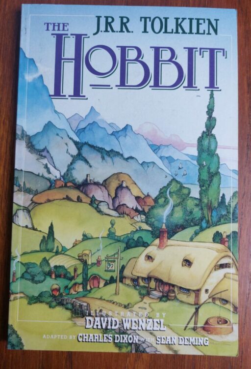
Comic Number 67: The Hobbit published by Grafton Books
I could not get on with the Lord of the Rings books and (confession time) never got more than 150 pages into the first book. I do remember reading The Hobbit. And, probably more so, I remember reading the comic book adaptation of The Hobbit illustrated by David Wenzel.
Wenzel’s work is whimsical and majestic. At times the artwork feels more like the illustrations in a children’s book and less like the dynamic characters in an exciting comic. However, that is how this book is meant to be read. It is a dense children’s book, though. If you pick this up thinking that it’ll be a quick way to read The Hobbit, you’ll be disappointed because “text heavy” is a fitting phrase. There are pages where the beautiful watercolor images almost disappear under crammed caption boxes and weighted down word bubbles.
Having said that, Wenzel extracts the atmosphere of the novel and splashes it across the pages. The humor of the hobbits, the stupidity of the trolls, and the creepiness of Gollum are all present in this book. It is also stylistically consistent, something which Peter Jackson’s movie version cannot be accused of.
If the purpose of literary adaptations is to introduce new readers to the originals, then I’m not sure that Charles Dixon, Sean Deming, and David Wenzel’s version of The Hobbit is a good example. Mainly because, after reading this version, I can’t think of any reason why you would be compelled to read the novel, because this book already feels like reading a novel.
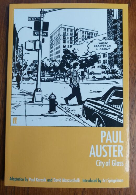
Comic Number 68: City of Glass
There are novels that are dubbed “unfilmable” — books that for one reason or another are too immense to be given the cinema treatment. Obviously, this doesn’t stop people from trying, and the same is true for comic book adaptations. However, comics have an advantage over film in that they have less restrictions. A graphic novel project, for example, is not limited to space, allowing the creators to include more from the source material. Movies are often limited to 2 hours (up to 3, possibly, but this is still rare even in today’s movie industry) whereas a graphic novel can have as many pages as are needed to tell the story the creators want to tell.
City of Glass fits both of the points that I have made above, first being a difficult novel to adapt and secondly a fine example of what creators can do when given the freedom that graphic novels allow.
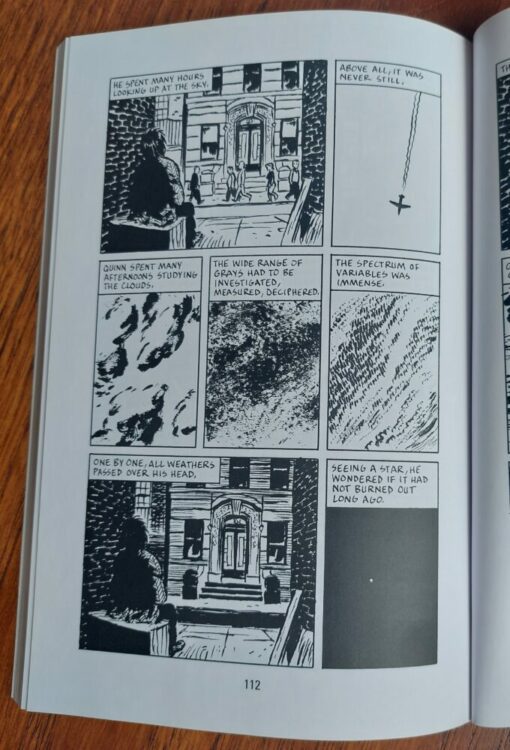
David Mazzucchelli and Paul Karasik’s adaptation of Paul Auster’s novel is an exciting and fascinating read. Auster’s novel is a complex narrative that relies on wordplay and deals with subjects of time and the nature of fiction, all of which are difficult to represent in the visual forum. However, Mazzucchelli translates the word play into image play. He takes the essence of the novel, and how it relates to that particular medium, and injects that into the comic, making it comic specific. The general narrative runs through both versions but their emphasis relates to their own media. This means that a level of abstraction is evident in the graphic novel version, with a high number of non-sequitur panel transitions. It is a visual feast and challenges the reader in the same way that Auster’s novel required the reader to engage with the fiction and solve the literary puzzles.
Comic Number 69: Academic Papers
Replacing today’s comic is an article written about the application of literary adaptation to comics and graphic novels. (That’s not because I haven’t read a comic, though. I’m working through Hickman’s Fantastic Four run and today read issue number 583. It just didn’t fit this week’s topic.) Entitled Literary Adaptations in Comics and Graphic Novels by Jan Baetens, published in The Oxford Handbook of Comic Book Studies in 2020, the article investigates why literary adaptations are under-represented within the comics world. Movies and television embrace novels and there are hundreds of adaptations, which are often praised and studied. Baetens points out that in cinema it is “assumed that the best adaptations are based on the worst novels, the good ones being resistant to any kind of faithful reworking,” whereas in comics only a few classics are constantly adapted and re-adapted. I have also found this to be the case, especially this week as I have looked for adaptations to read. There are a few modern writers whose work has been faithfully re-imagined as comics — Stephen King and Anne Rice for example — but these appear to be few and far between.
The article also discusses the types of adaptation, drawing on the pros and cons, and constantly comes around to the concept of fidelity. Fidelity rules the roost on the internet with the release of every superhero movie but the actual relationship between fidelity and adaptation is complex. Baeten’s starts the discussion here but it is too large a subject for this one article.
Finally, Baetens asks the question, are literary adaptations in comics second-rate or do they offer something new from the process of translation? The answer, as you can imagine, is not straight forward. I personally believe that any form of adaptation can be worthwhile but we have to stop being fixated on the concept of fidelity. Spiritual adaptations, by that I mean adaptations that take the essence of the original text, can produce the most interesting work. You only need to look at the history of Shakespearean adaptations to see this in practice.
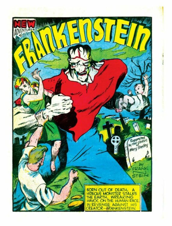
Comic Number 70: Prize Comics #7
The idea of multiple versions of the same story is a fundamental part of Frankenstein’s history. Even before the array of adaptations appeared, the original novel was revised and re-released several times in Shelley’s lifetime, and nearly 300 editions have been released since.
In 1940, Dick Briefer brought the Frankenstein narrative to life in a successful comic strip. Briefer’s Frankenstein starts life as a horror comic strip in Prize Comics #7 where it retells a large portion of Mary Shelley’s novel before introducing a twist ending. The ending was to serve a purpose: it allowed Briefer to continue the story beyond the original narrative. It also allowed him to re-introduce a theme from the novel that was lacking for much of his interpretation. You see, in this initial version, the creature does not speak for the majority of the story. He is a “grunter,” which is a term given to a particular interpretation of the creature and made popular by the 1931 film.
Although Briefer’s monster is influenced by the look and vocabulary of the earlier adaptations, much of Shelley’s story is condensed into the few wonderful and energetic scenes. One aspect that Briefer draws on is the use of setting to reflect mood. This is an important part of the original and Briefer is able to make great use of it in this visual adaptation. The contrast between consuming darkness and oppressive light features in several juxtaposed panels, capturing the struggle within the creature as it tries to understand the life and the world it has been born into.
Despite the low page count, Briefer proves that it is possible to successfully capture the essence of a novel, re-imagine it in visual terms, and even add something to the source text to, on this occasion, give it longevity.
The Further Adventures of Frankenstein can be read in the pages of Prize Comics, available for free on the archive website Comic Book Plus. They are worth looking at, and get quite gruesome in places.
So, what is the point of comic adaptations of novels? I would argue that if your comic doesn’t add anything to the original then it has failed as an adaptation. If all your comic has done is retell the book but with pictures, the final product serves no purpose.
Adaptations have the ability to help education (Classics Illustrated), enhance magical worlds (The Hobbit), enrich or even alter the perspective of the original (The Stand), or re-imagine a concept so that it fits modern, alternative societies, using the familiarity of the source material as a grounding or point of contrast. They can even create something new and exciting while still remaining true to the original (City of Glass). Comics, as a medium, have the ability to do things that other media are not able to do, in the same way that film or photography can. So, what is wrong with allowing comics to embrace works of literature and interpret them in new and imaginative ways?