Home Blog Page 435

Review: BATMAN: LAST KNIGHT ON EARTH #2 – All Hail Omega!

Monkeys Fighting Robots

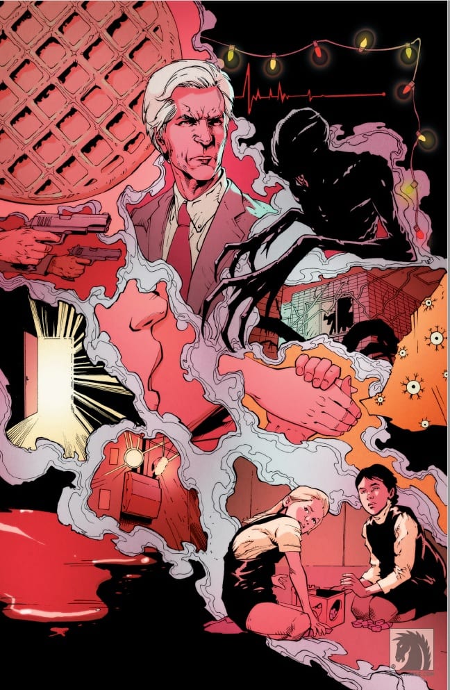
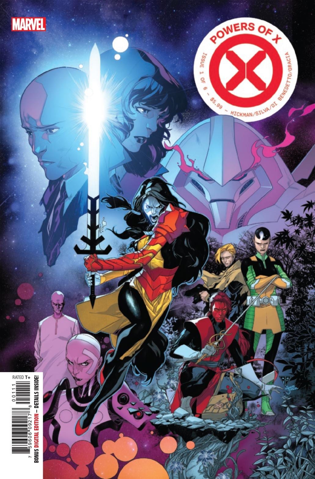
Scott Snyder and Greg Capullo take Batman through a wasteland of horror and heartbreak in the second issue of Last Knight on Earth.

The whole team is back together again for the last chapter of their Batman story that began in the New 52. Jonathan Glapion and FCO Plascencia have the inks and colors, while Tom Napolitano is handling the lettering. There will always be a soft spot in my heart for this creative team. Capullo has created a Batman for a generation; this is my Batman. Hopefully, this is not Snyder and Capullo’s last Batman tale.

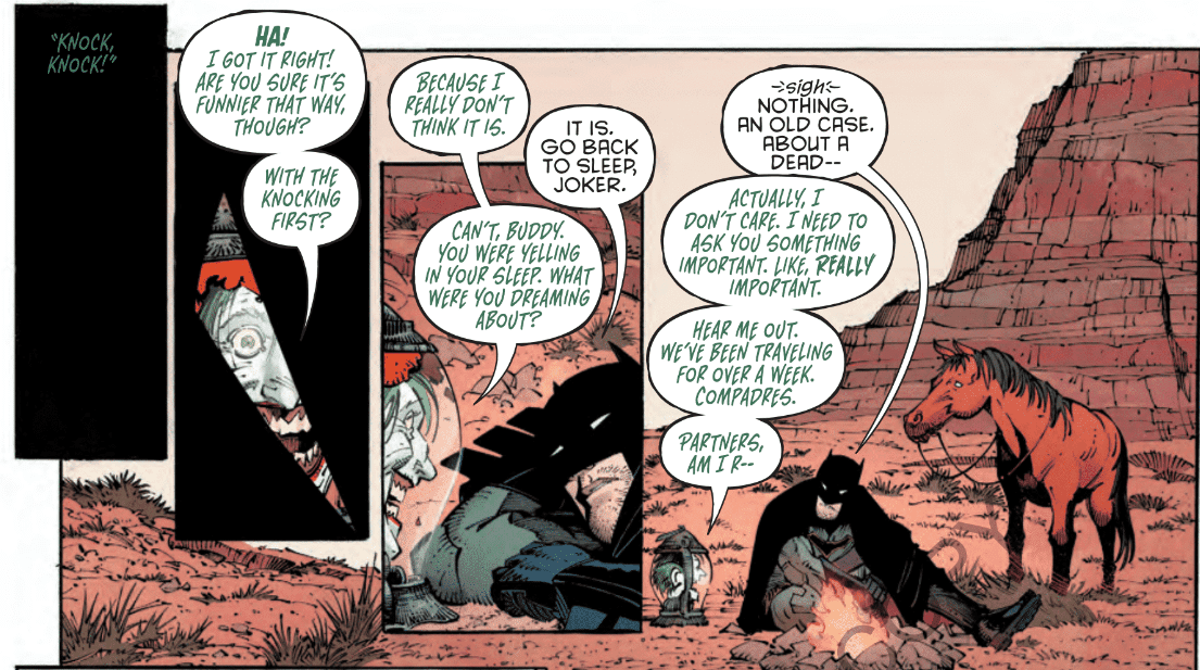
Napolitano’s lettering is top-notch. The way the Joker’s speech bubbles appear scratchy and hurried always works so well. The Scarecrow’s words are stylized in such a way that you know he’s trying to be scary and haunting with his voice. Deciphering who is speaking and what narrative you’re reading is straightforward.

Glapion always captures the greatness in Capullo’s pencils and keeps the finished product looking prestine as if Capullo initially drew it in ink. FCO always mixes dark and gritty with bright colors when appropriate, which makes every page a pleasure to look at. Alfred is confronted by the unlikely duo of Bane and Scarecrow, and while Scarecrow is hanging onto Bane Yoda-style, Bane’s veins seem to glow almost illuminating the alley.

WARNING: Spoilers Follow.

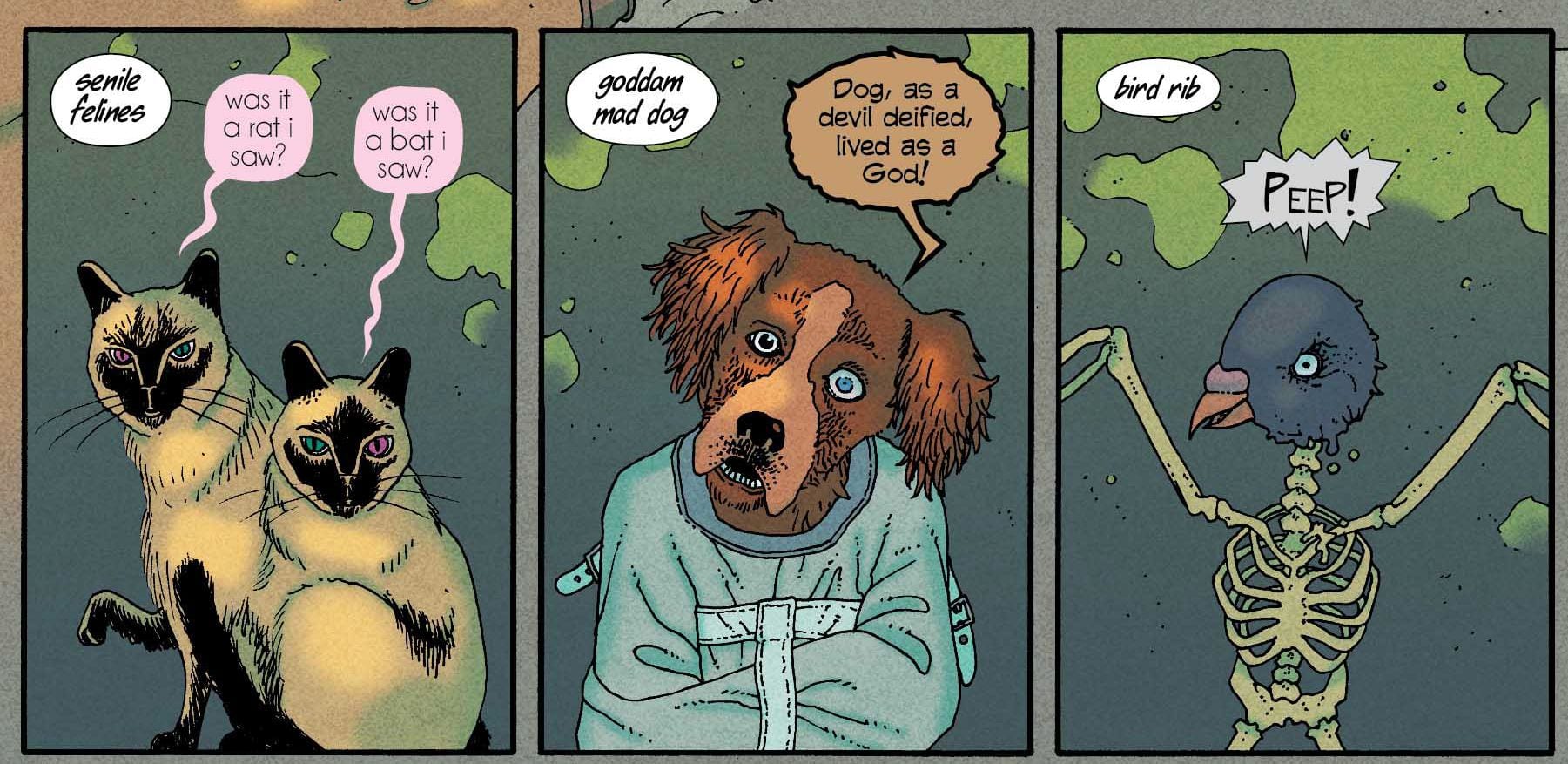
This post-apocalyptic Batman story has a Mad Max type of feel mixed with some Bladerunner and Fallout. It feels like every part of the country has its own horrors to deal with. Speed force storms, Hush soldiers, Animal Men, haunted tanks, formerly boiling oceans, calcium coastlines made up of fused bones, the Red and Green wreaking havoc, all the while Joker wants to be the new Robin.

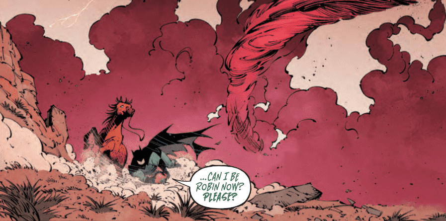
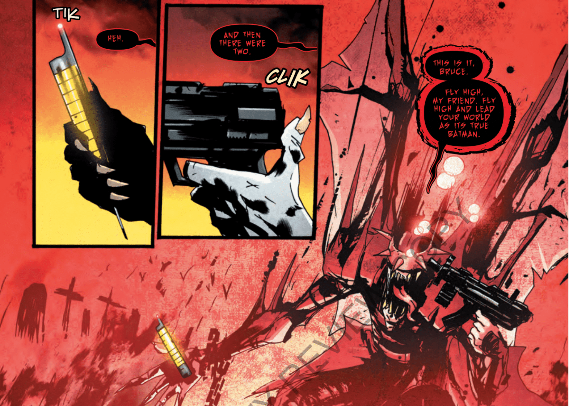
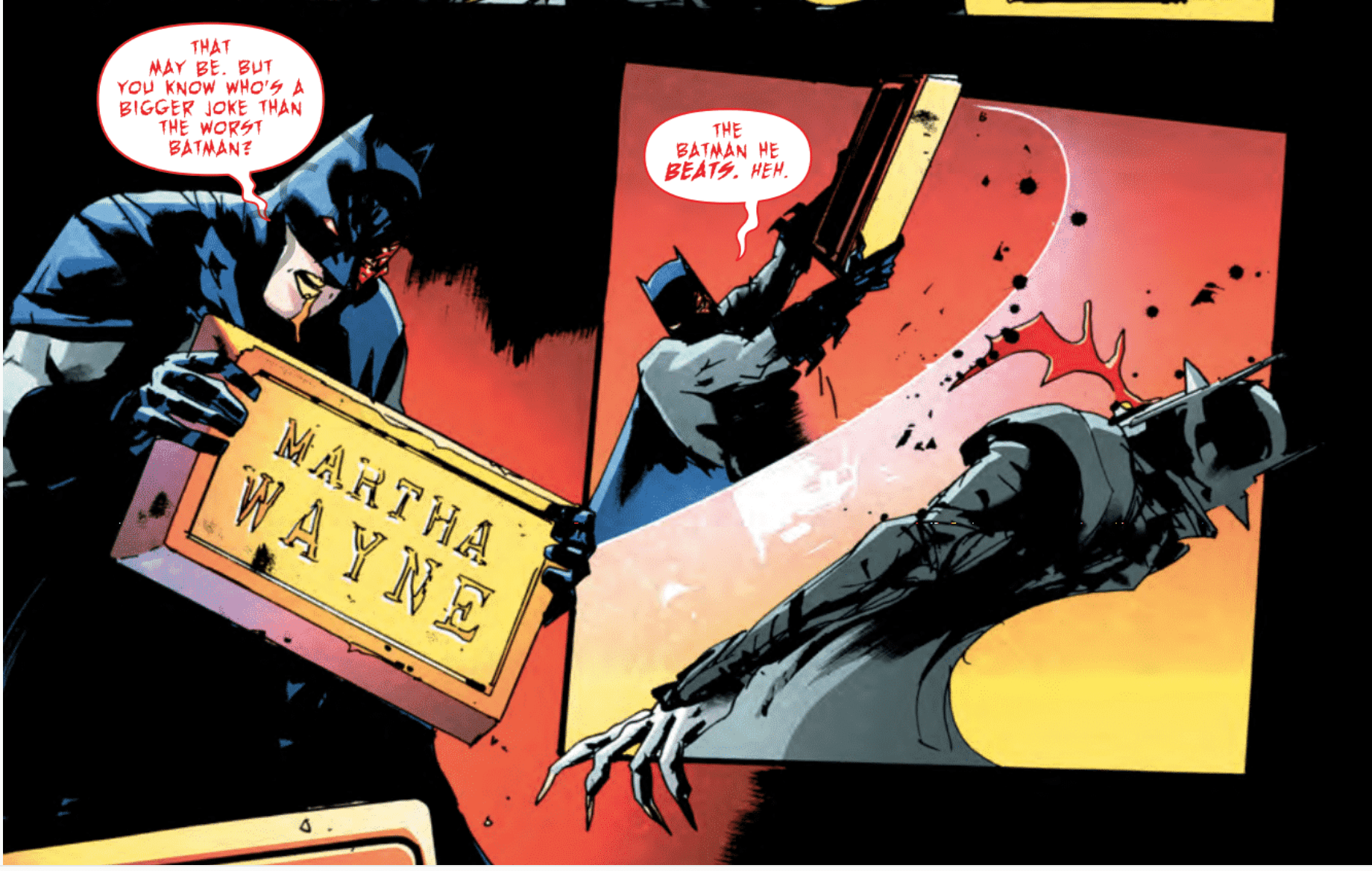
Character designs for this future scenario are incredible. Every character appears as if they’ve been through something pretty terrible in order to be where they are now. Wonder Woman has a facial scar and a mohawk, Luthor is a shriveled old man, Scarecrow has no bottom half, and his fingertips are syringes. We discover that someone connected to Batman is responsible for all this terror and destruction. Looking like the final boss version of Batman, Omega rules all.

Snyder refers back to many aspects of his writing during the New 52, even his run on Swamp Thing. The Court of Owls is by far the best aspect to continue from that run, and their appearance in this book is truly a shocking reveal. If this is, in fact, the last Batman story from this creative team, I hope a different team gets the opportunity to elaborate on the madness that caused this apocalypse to happen. Why are there crocodile men, imp deathgrounds, and what about this Space Cavalry?

I’m not even an Aquaman fan, but even I want to know why the oceans were boiling and why the coastline is made up of bones. Why on Earth would anyone put the Joker’s head in a lantern? How did this speed force storm trap three Flashes in it? Why is the dead Spectre’s giant cloak now a portal? What happened at Fort Waller, and not to be dismissed, what happened to the real Superman?

If issue three of Last Knight on Earth doesn’t explain a few of these events, hopefully we’ll have a mini-series in the near future to cover the end of the world as Bruce knew it. So many aspects of this story are incredibly intriguing. This series could’ve been lengthened to a maxi-series just to cover all the events that are being glossed over. Maybe that’s a story for Snyder to pass down to a young writer trying to make their mark on the Batman mythos. With stories of caged universe hearts, god engines, zeta cannons, and speed force tornadoes, sign me up.

Issue three has quite a bit to wrap up to finish off this final chapter, but I am locked in and excited for what Snyder has in store.

Would you let a talking Joker head be your Robin? Let us know what you thought about this comic in the comments below.

Monkeys Fighting Robots Youtube

Review: ICE CREAM MAN #13 Is A Beautifully Horrific Palindrome

Monkeys Fighting Robots

We’ve seen some creative plotlines come out of the ICE CREAM MAN comic, but #13 is unique in that it’s literally structured as a palindrome. Readers can choose to dive into the horror-filled story from either the front or the back panel, ultimately reaching the same point either way. This adds to the building sense of uncertainty the series is best know for (ie., the constantly changing protagonists). And it shows us why we keep coming back to the Ice Cream Man and his dastardly machinations.

Story

If one so chooses to read this issue the traditional way (front to back), they will be introduced to Paul, who’s experiencing tremendous grief after the recent death of his husband Michael. Readers get an inside look at a man experiencing grief and it’s nothing short of astonishing. In just a few panels, W. Maxwell Prince convey both the emptiness one feels after loss of a loved one and the determined denial in their refusal to let their memory go.

Paul undergoing the grieving process

But this story takes the notion of grief to a new level, one that quite literally depicts a man refusing to accept death itself. Will descends into an open manhole cover near his home in search of the King of the Underworld. However, such a bizarre turn of events is only the beginning; the story ascends to its climax rather quickly only to retell the events in reverse order.

Such a masterfully crafted palindrome will leave readers hungry for more creativity in the tales to come. Fortunately, there’s plenty of opportunity when Paul uncovers the secret connecting the murders from the previous twelve issues.

Art

animals living in the underworld sewer

Martín Morazzo’s penciling and Chris O’Halloran’s coloring generate an organic somberness fitting of the narrative. Morazzo uses extreme detail for the array of eccentric characters, penciling in each drop of slime and bit of decay found in the sewer’s “underworld,” and O’Halloran’s pale, dreary tones complete the effect.

Good Old Leon’s lettering is particularly effective for this story. He uses varied fonts for each character speaking in palindromes, which is quite fitting for Prince’s off-kilter storytelling style.

Comic Covers

ICE CREAM MAN #13 variant cover

Morazzo and O’Halloran’s main cover artwork features the nefarious Ice Cream Man holding an arrow, drawing more attention to the comic’s palindrome structure. Wes Craig’s variant cover depicts a disturbing image of the character to set a somber tone.

Conclusion

ICE CREAM MAN #13 showcases the brilliant creativity of Prince, Morazzo, and the rest of the team in a fresh way. Having a comic that can be read backward as well as forward shows us why the comic medium is alive, well, and always full of surprises.

What did you think of the palindrome style of this issue? Let us know in the comments below!

Monkeys Fighting Robots Youtube

Review: THE GREEN LANTERN ANNUAL #1: A Jordan Family Affair

Monkeys Fighting Robots

THE GREEN LANTERN ANNUAL #1, in order to celebrate the legacy of Hal Jordan, tells a story of his large and eccentric family. Readers get to sit in on a family reunion hosted by Uncle Titus. But a massive hangover affecting the adult relatives following the event leaves Hal wondering whether of not foul play may have been involved, especially considering the attendance of the irresponsible “Uncle Hip” Doug Jordan. Was Doug involved with the fiasco, or is something Green Lantern related going on?

Story

Hal wakes up in a bathtub

The issue begins with Hal waking up in a bathtub to an alarm from his Green Lantern ring. Waking up from a late-night binge is something the intergalactic cop is no stranger to, but the fact that every other adult in the family is passed out seems particularly worrisome. This is when Hal Jr. and the rest of Hal’s nephews and nieces explain that an alien named Zzyptzz is on the run from his own race, the Wireless Ones, and may have disturbed the sound frequencies in the Jordan house and left the adults unconscious.

Analyzing the situation like any respectable police officer would, Hal proposes to investigate the Wireless Ones. However, Hal Jr. volunteers to take on the pursuers with his newly awakened sonic powers, only to rebuked by his uncle: “Idealism is a virtue, Hal. But so is discernment. Don’t take anyone or anything at face value.” We see a true teaching moment here and find Hal may have the skill set needed to train up a hero for the next generation. The young man decides to disregard this advice and fight the Wireless Ones as the hero Air Wave, but Hal’s advice will prove useful in the coming conflict.

Grant Morrison’s clearly testing out the idea of giving Hal a sidekick. The eagerness with which Hal Jr. is willing to tackle this unknown threat, his loyalty and respect for his uncle, and most importantly, having the same name, all point to the notion of granting the Green Lantern a partner and potential successor.

Art

Giuseppe Camuncoli’s penciling and Trevor Scott’s inking render this issue in the styling of the character’s most common past iterations. This is includes Hal’s classic square jaw and slightly tousled hair, the bulky drawing style of the heroes, and the loose sketching bring up memories of the comic line throughout the ages.

Olyoptics and Steve Oliff’s coloring give this comic a lighthearted touch, using varying shades of green for Hal’s famous uniform and bright primary colors for Air Wave’s outfit . In addition, Tom Orzechowski’s lettering brings Zzyptzz and his alien race life by crafting lettering balloons with jagged lines to simulate the static infusing their speech.

Comic Cover

Guillem March and Alex Sinclair’s main cover for the issue grabs our attention by featuring Hal trapped inside a mobile phone. Air Wave appears to be holding the phone, alluding to the fact he may contribute to Hal’s plight in the coming pages.

Conclusion

THE GREEN LANTERN ANNUAL #1 does a wonderful job of humanizing the larger-than-life Hal Jordan. We get to learn about the quirks and relationships within the family while witnessing the startling powers of his nephew. Readers will surely look forward to more Jordan family team-ups in the future.

What would you think if Air Wave became Hal’s sidekick? Let us know in the comments below!

Monkeys Fighting Robots Youtube

Catastrophe Strikes In STRANGER THINGS: SIX #3

Monkeys Fighting Robots

We all knew that things were going to go south in the Stranger Things prequel From Dark Horse Comics, STRANGER THINGS: SIX. After all, Eleven is the touted success of the series. But the manner in which this set of experiments is crashing and burning is somewhat surprising.

***SPOILER WARNING***

Stranger Things SIX #3
Six about to get put into the sensory deprivation tank.

For those that haven’t been following along, Stranger Things: Six is a prequel to the hit Netflix series. It follows one of the other experiments run by our twisted doctor. You can probably guess which test subject, her name is in the title.

Unlike Eleven, Six actually had a home and a life before her time in the lab. That has made her somewhat more resistant to the not-so-good doctor’s methods. While other subjects of his are literally throwing everything they have at making him happy, Six is steadily sinking into depression thanks to her situation.

If this issue proved anything, it’s that the human mind is amazingly resilient. Six feels betrayed by the world and everyone around her, and yet she cares so much about her fellow test subjects. She wants out, and the events in this issue just proved to her why they all need to get out.

Stranger Things SIX #3 Pg 2
It looks like nothing has changed here.

Stranger Things: SIX #3 did an excellent job of showing us the familiar while also seeding new elements along the way. There were hints of the future to come, but the horror of what was happening in the now was never lost.

Jody Houser, the author for the series, has made us care about Six. And the other subjects around her, to different extents. This has increased the fear for them and their situations – because even though we don’t know the details of how their experiment ended, we know it can’t be good.

This issue, in particular, managed to nail the horror known to the Netflix series. Before now, that feeling was bubbling underneath the surface – but it lacked the impact necessary. Now that’s been handed to us without hesitation.

Stranger Things SIX #3 Pg 3
Time in the tank, because that has always gone over well.

Admittedly this series wouldn’t have nearly the same level of impact to new fans. You have to really have followed at least the first season of the Netflix series in order to have any background or driving passion for the story being told. That isn’t a bad thing, of course. Plenty of series adapt well to comic form, knowing full well that only the loyal fans will follow it.

That being said, this series is perfect for fans looking to learn a little bit more about the other subjects that came before Eleven. The drama and dangers will be different from the series (remember, things didn’t get dangerous in the supernatural sense until Eleven came around), but they’ve made it work.

Stranger Things SIX #3 Pg 4
Some of these images should look familiar…

Stranger Things: SIX has a full set of artists working on the project, and it shows. Edgar Salazar is the artist, while Keith Champagne handled the inking. And then Marissa Louise colored all of the panels. Last, there’s Nate Piekos, who did the lettering.

Together they made this world come alive. The art style carries many of the tones familiar to fans of the Netflix series. But it also has its own flair. The art style is slightly more streamlined and clean, but that works well with the subject matter.

Stranger Things SIX #3 Pg 1
The style is a close match to the original series.

Stranger Things: SIX has been an interesting read so far. Like some of the other attempts to bring Stranger Things to other formats, it occasionally falls flat. But ultimately the attempt has been a successful one, telling us the story of the people who walked this path before Eleven.

Monkeys Fighting Robots Youtube

FANTASTIC FOUR #12 – A Very Grimm Honeymoon

Monkeys Fighting Robots

FANTASTIC FOUR #12 is a good old-fashioned breather issue with Mr. & Mrs. Ben Grimm finally getting to take their honeymoon.

fantastic four 12 cve
Puny Thing

***SPOILERS LIE AHEAD***


After preventing Dr. Doom from wielding the power of Galactus and their roles in War Of The Realms, the Fantastic Four get some time to themselves. More importantly, Ben and Alicia get to take their belated honeymoon.

Reed fixes Ben with a device that will revert him to his human form once a countdown concludes. It doesn’t take long for the honeymoon to be cut short as the Hulk shows up for a beach brawl under the control of The Puppet Master, Alicia’s father.

Writer Dan Slott pens himself a short and sweet script that’s full of delightful little moments. He shows off his very-fitting voice for The Thing in this issue. In addition to the usual banter with Johnny, Slott also treats us to a hilarious couple of exchanges between Ben and the hotel bellboy.

The Thing tipping people with a signed autograph of himself is absolutely hysterical.

Gimme Some Of That Sweet Flesh

There’s a really sweet moment between the newly weds on the beach concerning how Ben’s wedding ring is going to fit once he transforms back to his tiny, human form. These two are one of the best pairings in all of Marvel history, it’s satisfying to see them get legitimately touching moments handled with such care.

Artist Sean Izaakse and colorist Marcio Menyz deliver a very warm issue. The use of light on this beach landscape make for a wonderful contrast once the sun goes down and the attack commences. We’re in the era of Immortal Hulk, it’s only appropriate that he arrives at night.

Johnny Got BURNED
Johnny Got BURNED

We’ve seen Hulk and The Thing fight each other countless times, but Izaakse and Menyz keep it fresh. The action sequences hit the notes that they need to. Izaakse even does a pretty good job with specifying that this is Immortal Hulk that we’re dealing with.

By issue’s end, we see Mr. Grimm has less than a minute before he turns back into a useless sack of flesh. It’s a layered comic book scenario that doesn’t require any extra thought, it’s just a classic tight spot for a pro like Grimm to be in.

Fantastic Four #12 is a breather issue done right. It’s highly entertaining, loaded with plenty of heart. There’s no treading of water, it doesn’t feel like a waste of time issue that readers would be better off skipping.

Monkeys Fighting Robots Youtube

Review: THE BATMAN WHO LAUGHS #7 Is A Thrilling Conclusion To DC’s Best Horror Story Of 2019

Monkeys Fighting Robots

The Batman Who Laughs #7 is the heart-pounding climax and conclusion to a miniseries that increasingly leaned into the horror genre. By the end, writer Scott Snyder crafted a grim horror story befitting Hollywood.

Batman Who Laughs #7
The Batman Who Laughs looks demonic in the finale of this miniseries.

Beginning with the cover, this issue makes it clear that the reader is diving into a scary movie in the form of a comic book. Jock, the artist of the book and the cover, pays tribute to The Shining on the latter. He borrows from the classic scene with Jack Nicholson where Jack busts through a door and yells, “Here’s Johnny!” Here, the cover shows the corrupted Batman yelling, “Here’s Brucie!” Right off the bat, the reader knows he’s in for a wild ride.

Batman Who Laughs #7
With each passing page, The Batman Who Laughs #7 feels like a horror movie.

Jock’s art complements that tone throughout the book itself. Sometimes, sketchy art can detract from the story but it complements Snyder’s work in this series. The increasingly jagged lines make the Batman Who Laughs look demonic and David Baron’s colors augment this effect through the consistent usage of fiery yellows, reds and oranges. These colors are mainly present in the scenes featuring Batman and his evil counterpart, which helps further the sensation that both characters are vying for the Dark Knight’s soul in a Hellish setting while the other story beats play out.

Batman Who Laughs #7
Snyder puts a clever spin on the infamous “Martha” moment.

With this issue, there’s a lot to sink your teeth into. For the sake of spoilers, we won’t dig into all of it. But two highlights include the sights of Alfred getting pretty trigger-happy with a shotgun and the Caped Crusader beating the Batman Who Laughs with his mother’s tombstone. These snippets hammer home the fact that Snyder successfully captured the experience of a horror movie climax.

Practically every comic featuring the Dark Knight asks the question, “Who Is Batman?” Countless writers have taken that question and explored it through various avenues. Even when DC Comics announced The Batman Who Laughs, most fans took notice because Snyder has been the company’s primary writer for the Caped Crusader for several years. (Aside from Tom King’s run on the main series, of course.) Given Snyder’s history with the character, fans expected an impactful analysis of the World’s Greatest Detective. With this miniseries wrapped up, it’s safe to say that Snyder succeeded on that front.

Batman Who Laughs #7
A lengthy monologue explores what it means to be Batman.

Snyder takes some unconventional steps in his approach to answering that famous question in this issue. The most thorough exploration comes at the end, when Bruce Wayne practically gives a monologue to Alfred. Bruce uses a brief consideration of a bat’s anatomy to deliver the main idea: Batman is about being “better than you’re supposed to be,” as Snyder writes. “Because the truth is Batman isn’t knowing who you are, but who you want to be,” Bruce says. Neither of those ideas are ground-breaking, especially in relation to the Caped Crusader. But Snyder has such an intimate feel for Bruce’s character, and that of Batman itself. For this reason, each line grabs the reader because it feels like Bruce himself is talking to you. Snyder doesn’t just rely on his connection to the character, though; the story itself offers a fresh take on the typical “Batman overcomes his demons” plot.

Like most horror movies, The Batman Who Laughs #7 sets up the inevitable sequel by leaving a few narrative threads to explore next time around. Based on the success of this series and its satisfying conclusion, readers will likely be begging for more.

What’d you think of the Batman Who Laughs #7? Where do you hope to see one of the most famous evil Batman go from here?


Monkeys Fighting Robots Youtube

Review: DEATH’S HEAD #1 – Big Guns And Mile-A-Minute Action

Monkeys Fighting Robots

Cyborgs, dimension-hopping, space bounty hunters…sounds interesting, yes? All that and much more is here in Death’s Head #1, the new title from Marvel.

After a meeting with his employer goes south, Death’s Head finds himself transported to Earth. He revives in the middle of a punk show, only to find himself squaring off against Wiccan and Hulkling of the Young Avengers, and antics ensue.

The Writing

Death’s Head isn’t exactly an obscure figure. The cybernetic bounty hunter is a cult favorite first introduced in the UK in 1987. In the character’s own way, Death’s Head is a perfect distillation of ‘80s dark age, hyper-violent excess. And, in that spirit, Death’s Head #1 doesn’t spend much time establishing the character, preferring instead to jump right into the action.

The book doesn’t offer readers much time to breathe. It’s one action sequence flowing into another, with Death’s Head intent on killing just about anyone he can get his hands on. It may just be the shared UK roots, but one can’t help picking up on hints of Judge Dredd here, at least in terms of style.

Writer Tini Howard is not shy about weaving humor into the story as well, though. In fact, it’s that balance of humor and action that proves critical to making the story work. The banter between Hulkling, Wiccan, and Death’s Head is among the strongest assets present in Death’s Head #1. There are chuckle-worthy moments spread throughout the book, too (“Drain in floor detected. Statistics suggest that the likelihood of being eviscerated in a room with a drain in the floor is 94%.”) Without that critical counterbalance, the book could come across as very one-note.

That said, there are more subtle themes at play here, too. Even though Death’s Head is the name on the cover, much of the real conflict seems focused primarily around Wiccan. The character’s desire to rejoin The Avengers seems to be central to his development, and to the story at large.

The book provides some intrigue as well, closing this initial issue with a hook meant to ensure readers return. Based on what we see, it looks like we’re in for an interesting ride.

Death's Head #1

Death's Head #1

Death's Head #1

The Artwork

Artist Kei Zama brings some fairly impressive artwork to the table in Death’s Head #1. Her illustrations are dynamic and crackle with energy on each page. This works especially well for the fight sequences through most of the book. Still, it’s richly-detailed, which helps to securely ground the reader, especially in those quieter passages.

The inks effectively convey the mayhem of these scenes. Of course, that does have its downsides, too. Some sequences can be hard to follow, given the constant shifts and unorthodox use of perspective. There is the odd panel here and there in which it’s hard to make out what’s really being shown. Despite those issues in composition, it’s a strong and well-stylized showing overall.

Colorist Felipe Sobreiro employs a wide and very vibrant color palette in Death’s Head #1. The colors can almost overload the reader’s eye at certain times; the effect works, though, underscoring the chaotic action unfolding on the page. Sequences seen through the eyes of Death’s Head employ hazy, yellow-tinged effect that clearly echoes notes of The Terminator, further underscoring the ‘80s action tone.

Final Thoughts

Death’s Head #1 is a great beginning for Marvel’s new miniseries. If you’re in the mood for big guns and mile-a-minute action, you won’t want to miss this one. Pick it up July 31 at your local comic book shop.

Monkeys Fighting Robots Youtube

Review: POWERS OF X #1 – A New Epic Beginning For The X-Men

Monkeys Fighting Robots

Jonathon Hickman’s Powers of X #1 gives fans tangible evidence that his run will be one of X-Men’s best. The art team consisting of R.B Silva, Adriano Di Benedetto, Marte Gracia, VC’s Clayton Cowles on letters, and Tom Muller with designs are no slouches propping up Hickman’s story with stellar art. It may be too early to call, but all signs point to Powers of X being one of X-Men’s essential reads.

Take all of that with a grain of salt because this is very much a Hickman story. Creepy Anthropomorphic aliens? Check. A Strong Inclination towards Prophecy? Check. Unconventional Storytelling methods? Check. Graphs consisting of made-up statistics, terms, and languages? Super Check. If you are not a fan of Hickman’s previous runs on Fantastic Four, Secret Wars, or his stellar Image Comics‘series East of West then Powers of X may be a bit of a difficult read.

Review: POWERS OF X #1- A New Beginning For a New X-Men Epic

As mentioned prior, Powers of X #1’s script can be a bit difficult to follow as it takes place in four separate time periods.

Year 1: The Dream
Year 10: The World
Year 100: The War
Year 1,000: Ascension

With each having to do with the prominence of Mutants in that time. It’s difficult to speak much of the plot without giving too much away; it should be read rather than explained. It seems like the more critical time periods are Year 100: The Man-Machine-Mutant War and Year 10: when House of X takes place.

Hickman’s writing style thoughtful and meticulous and it is refined to precision in Powers of X #1. The use of the fortune cards from Year 1 in Year 100 was particularly noteworthy. If there is one critique of Hickman’s script, it’s that there are a lot of moving parts, especially in Year 100. It’s almost confusing to decipher who are the mutants and who are the machines and what exactly they are fighting about. A graph comes in later to help explain and put some things into context, but it requires a couple of rereads.

Review: POWERS OF X #1- A New Beginning For a New X-Men Epic

The artistic team of Silva, Di Benedetto, Garcia, Cowles, and Muller proves ideal for Powers of X. Silva’s lines are expressive and defined, Di Benedetto and Silva’s ink is exact, and Gracia’s colors are deep and add nuance to each scene. The highlight of the issue remains the overall design of Krakoa in Year 10 and the Human-Machine Monolith and surrounding town in Year 100. Krakoa looks naturalistic and spiritual like an Elvish Cathedral while The Tower of Nimrod is industrial and stoic, like a cleaned-up version of Blade Runner’s L.A.

The art team does struggle somewhat with scenes containing a lot of movement or action. While the action panels are neatly drawn and colored, the overall fight between mutants and humans/machines in Year 100 feels poorly choreographed. It looks like characters are just charging at each other and screaming. It can also be confusing to remember where characters are in the fights in relation to the enemy, and their weapons as most of the shots are intense close-ups on the faces before pulling out to wide explosions or action panels.

Review: POWERS OF X #1- A New Beginning For a New X-Men Epic

Also, in the scene where Nimrod is putting his prisoner in the torture machine, there is a surprising lack of detail on Nimrod himself compared to his machine. Nimrod’s lack of sharp define lines makes him look made of clay or silly putty when viewed from afar.

In tandem with its twin House of X, Powers of X #1 is shaping up to be the exact reboot X-Men needed. Hickman’s script is nuanced and political, and the art team proves they are more than capable of delivering on their potential. Simply put, every X-Men fan should be reading Powers of X #1.

Monkeys Fighting Robots Youtube

Why DAWN OF X Is Different From Previous Relaunches

Monkeys Fighting Robots

We are now living in the age of Jonathan Hickman’s vision for the X-Men. We’ve seen plenty of line-wide relaunches for Marvel’s beloved mutants, but this time is different. This is the DAWN OF X.

House Of X #1 was as bold a statement as one could make, this creative shift is deadly serious–and an absolutely bombshell. Every comic book fan has heard it all before, the publisher promises that this new series will “shake the world to it’s core” and how nothing will ever be the same.

DAWN OF X

The difference this time is that Jonathan Hickman is behind the wheel in a monumental return to Marvel. His time away from the publisher has allowed him to evolve into undeniably one of the top talents in the industry.

He brings with him all the experience and tools he’s gained from his work on East Of WestBlack Monday Murders, and The Manhattan Projects. Combine the layout and structure of those brilliant works with his already well-established Marvel credibility (Fantastic Four, FF, Avengers/New Avengers, Secret Wars, Infinity, etc.) and we’ve got a recipe for exhilarating comic books.

Die-hard X-Men fans have been through some tough times over the last decade and beyond. False promises, failed relaunches, that whole Inhuman agenda, etc. It’s time to put that behind us. This is no simple shake-up on the surface level, this is a foundational re-imagining.

Dawn Of X is what the line of X-Men comics will be called once House Of X and Powers Of X lay the groundwork on a weekly basis for the next three months.

PROFESSOR HICKMAN


Here’s why you should buy what Hickman is selling…


Dawn Of X won’t just be a shift to more colorful art, that didn’t cut it. During the ResurreXion in 2016 we were promised a “return to form” for the X-Men. The only promise kept by Marvel was these characters and costumes being more vibrantly colored like they were before the 2000s.

We’re not just swapping roles between heroes and villains, that was a dead horse beaten one too many times. The mutants are a united front, even a militant one. We may have seen them remove themselves from society plenty of times, but not like this. The concept of Krakoa is far from that of Genosha, Utopia, or Nation X.

This isn’t some stunt like bringing the x-teens to the current timeline. There were plenty of good stories to come out of Battle Of The Atom, but it was a gimmick that ran it’s course well before it was reversed. The changes Hickman is implementing are full-scale.

HOUSE OF X 1

No longer are these mutants in dwindling numbers, fighting to survive. Powers Of X may show us different times in a newly established timeline, but this is nothing like Death Of X or post-House Of M. Our mutants aren’t struggling, they’re thriving. It forces the whole world to be on their heals.

This is a relaunch that’s birthed out of story rather than gimmick. There’s no resurrection or death of a major character as the driving force. This is a united mutant front, the evolution and progression that these characters have needed for a long time. We now have a creator who’s willing to finally push them forward.

There’s plenty of mystery, and not just who’s underneath a mask, there’s a large web of story and information to uncover that can’t be contained to one short series. It may be a sleek and beautiful looking modern comic book, but it still reads like a classic comic book mystery–it’s just dressed up in an astonishing and complex manor.

POWERS OF X 1

It’s also a bold new direction in design, mirroring Hickman’s other grand scale work. Previous relaunches were half-assed, they played it safe. Whether that was editorially mandated or fell on the creative teams themselves, it did little to generate the kind of excitement surrounding Dawn Of X.

There’s nothing safe or regurgitated about the path Hickman has readers set on. This is uncharted territory surely to keep everybody on the edge of their seats.

X-Men comics are going to get weird again. One of the greatest points in X-Men history was when Grant Morrison was behind the wheel during New X-Men. Hickman has his own brilliant brand of bizarre that he won’t be shying away from as we’ve seen already in the first issues of House/Powers Of X.

This is a bold new direction, one that’s not just confined to one corner of the vast 616 universe. Demonstrated in House Of X #1, this new direction for mutants will be impossible not to incorporate into all of Marvel’s books whenever path’s cross. This will be a benchmark moment in Marvel’s long universal continuity.

The endgame here for Hickman’s X-Men isn’t just to trick people into buying X-Men comics again. The mission statement here is to make the mutants matter again in a major way. This is to be achieved through unrivaled creativity, bold storytelling, and expertly crafted execution.

The effects of this launching point will be felt for many years to come. This is not a drill, prayers have been answered, Hickman’s vision has arrived. The X-Men are front and center once again, right where they belong.

DAWN OF X TITLES


Monkeys Fighting Robots Youtube

Review: MANOR BLACK #1 Offers Spooky, Gothic Goodness

Monkeys Fighting Robots

Manor Black #1, the inaugural issue from creators Cullen Bunn and Brian Hurtt’s new Dark Horse miniseries, is a true gothic horror treat.

Roman Black, the patriarch of an old magical family, faces a crisis. He must select an heir to his line before he “ascends.” However, he’s unready to make a decision, seeing all of his children as either unready or unworthy. Things change, though, when a new young mage enters the picture through happenstance.

The Writing

Cullen Bunn and Brian Hurtt are no strangers to balancing spooky and fun elements in stories. The pair collaborated on the critically-acclaimed supernatural western The Sixth Gun. Now, they team-up again to introduce what promises to be another spellbinding work of magic and mystery with Manor Black #1.

This issue provides a nice opening for the narrative. It introduces our cast of characters, the central conflict, and sets the plot in motion. It’s surprisingly concise in that regard; almost a textbook example of what a first act should accomplish. Despite that, it still manages to be engaging and tell a compelling story from page one. This is a difficult balance to strike as a writer, yet the team pulls it off well.

The reader definitely picks up on the tension in Roman’s situation. It’s never explicitly stated, but one clearly reads the distrust bubbling within the family.

One nitpick would be that we don’t know as much about Ari, the mage Roman rescues. While the book opens with her story, we quickly divert away to follow a pair of local cops for much of the middle section of Manor Black #1. How much bearing their subplot will have on the broader narrative is unclear. Regardless, it might have been nice to get more about Ari here.

Beyond that minor sticking point, the writing is excellent overall. It leaves the reader asking several questions, while setting an eerie tone for the broader narrative. While the book may just be setting the stage, it does so in a surprisingly incisive, yet tactful manner.

Manor Black #1

Manor Black #1

Manor Black #1

The Artwork

Given the strength of the storytelling, it could be easy to simply provide adequate visuals and let the writers carry the book. Fortunately, artist Tyler Crook is not willing to take the backseat in Manor Black #1. After collaborating with Bunn on Harrow County (also from Dark Horse), the pair are back together here, and promising great things to come.

Crook strikes a fine balance between detailed and a minimalist approaches. He employs each in careful measure, hewing toward a minimal look when the focus is on the action or character interaction, but more fully illustrating other panels to establish setting, tone, and mood.

That’s to say nothing of the illustrations themselves. Crook’s style is soft and watercolor-esque. It’s charming, though despite the softer look, it’s still remarkably effective at conveying apprehension or malice. It’s a difficult balance to achieve, but the artist demonstrates a sense of mastery over his style, commanding it as needed. Crook presents some striking imagery in Manor Black #1. Roman Black’s conference with his ancestors stands out as a particularly interesting sequence in this regard. The way the artist illustrates their grotesque visages, and the ghostly entities that rise from them, is particularly strong.

Crook also provides colors for the book. The washy textures possess that unique watercolor look, but are still crisp, precise, and absolutely gorgeous. It’s difficult to judge the colors and line work in isolation, as the two are so closely connected. Still, really great stuff either way.

Final Thoughts

Manor Black #1 is a home run. Bunn and Hurtt’s storytelling is sharp, and brought to vivid life by Crook’s sublime artwork. Definitely worth checking out, so grab a copy this Wednesday at your local comic book shop.

Monkeys Fighting Robots Youtube