The end of the year is upon us, and it is time to reflect on the books we read in 2023. I reviewed 43 comic books this past year; here is a breakdown by publisher.
Image Comics / Skybound – 15
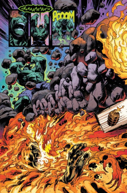
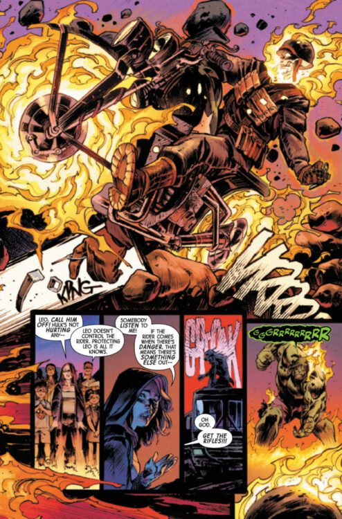
Marvel Comics – 11
DC Comics – 10
Mad Cave – 2
Dark Horse – 1
DSTLRY – 1
IDW – 1
Valiant – 1
Vault Comics – 1
What was your favorite single issue of 2023? Check out my full breakdown and watch the individual reviews below.
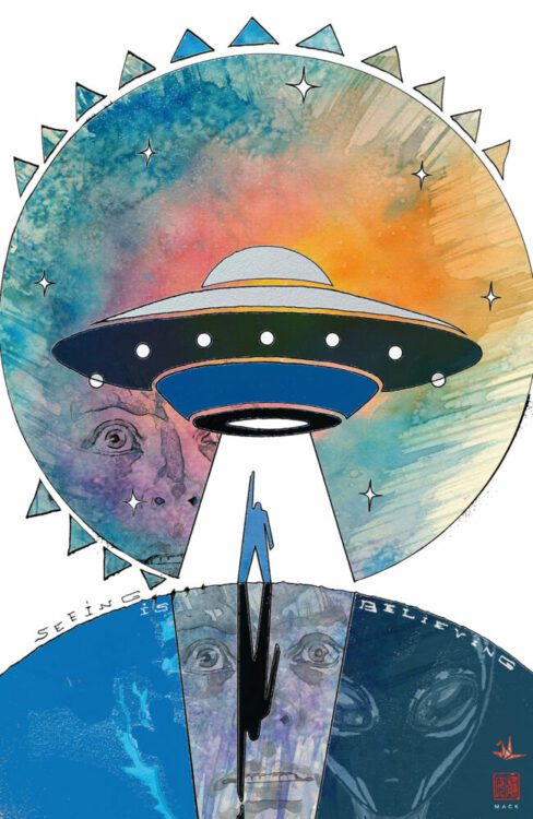
5. DUKE #1
FYI – I know DUKE just came out, but man, I was a massive fan of the first issue.
DUKE #1 hit your local comic book shop on December 27th from Image Comics and Skybound Entertainment. The book is written by Joshua Williamson, with art by Tom Reilly. Jordie Bellaire drops the colors, and you will read Rus Wooton’s letter work.
DUKE #1 is intense and full of emotion, and the artistic team is pushing the envelope of storytelling.
Synopsis: NEW SERIES! DUKE JOINS THE ENERGON UNIVERSE!
Conrad Hauser has made first contact with an alien being… or was it a UFO? Was it both? But no one, not even Colonel Hawk, will believe the story of the jet fighter converting into a colossal alien robot that nearly killed the man known as Duke.
Now, one of the US Army’s most decorated officers is on the hunt for answers, drawn into a conflict that no amount of training could ever prepare him for. A war that only a real American hero has any chance of surviving…
Superstar writer Joshua Williamson (Superman, Batman) and artist Tom Reilly (The Thing, Ant-Man) kick off the first of four action-packed miniseries that will introduce the best and worst humanity has to offer in the Energon Universe.
4. KILL MORE #1
KILL MORE #1 from IDW Publishing came out on September 13. Scott Bryan Wilson writes the 10-issue thriller, with art by Max Alan Fuchs, and Valentina Briški drops the colors. This book got under my skin, and that cover will haunt me until the end of days.
About the series:
The city of Colonia is suffering from total economic collapse, but worse than the unemployment and urban decay is the skyrocketing homicide rate. Most of the few cops left on the force think it’s just another symptom of the city’s decline, but one detective has a darker theory… that the most depraved killers in the country have all moved here to take advantage of the chaos. As he and his new partner dig deeper into their rapidly growing list of open cases, they’ll find themselves in the crosshairs of a growing group of maniacs who realize that the best way to stay ahead of the cops in a city full of killers… is to kill more. Nothing can prepare you for Lady Facesmasher, The Sufferer, The Obituary Machine-and worse. Lock your doors and journey into the mouth of madness!
3. KLIK KLIK BOOM #1
KLIK KLIK BOOM #1 came out on June 14 from Image Comics. The first issue had me excited for the five-issue miniseries; exceptional art and color work cemented the bold and fun concept.
KLIK KLIK BOOM #1 is written by Doug Wagner, with art by Doug Dabbs. Matt Wilson drops the colors, and you will read Ed Dukeshire’s letter work.
About the series:
In Klik Klik Boom, readers meet Sprout, a mute assassin who communicates exclusively through Polaroid pictures. After being raised by her doomsday-prepping grandfather in the rolling hills of Idaho, Sprout has grown up with little exposure to other people, TV, or seen clothes outside of Army fatigues. Now she’s headed to the big lights of New York City to avenge her grandfather’s murder, but will the city’s mesmerizing glitz and glam help her succeed—or be the death of her?
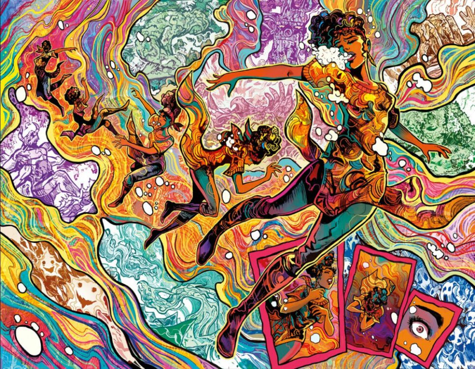
2. MIDLIFE (OR HOW TO HERO AT FIFTY) #1
MIDLIFE (OR HOW TO HERO AT FIFTY) #1 from Image Comics came out on October 11. I was blown away by how much this book spoke to me. The book is written by Brian Buccellato, with art by Stefano Simeone, and you will read Hassan Otsmane-Elhaou’s letter work.
About the series:
RUBEN KWAN is a 50-year-old firefighter who’s been afraid of fire his whole life. Instead of running into burning buildings, he pushes papers, living in the shadow of his father—who died a hero on the job. After 25 years in the LAFD, he’s firmly in the middle of an unremarkable life…until his new wife gets pregnant, and a random act of courage reveals that Ruben is FIREPROOF!
1. BIRDS OF PREY #1
BIRDS OF PREY #1 came out on September 5 from DC Comics. This was my thoughts back then – Stop what you’re doing and immediately pick up this issue; it is BONKERS GOOD! This book has a vibe, and it feels special. Fantastic writing and artwork; the second issue can’t get here soon enough.
BIRDS OF PREY #1 is written by Kelly Thompson, with art by Leonardo Romero. Jordie Bellaire drops the colors, and you will read Clayton Cowles’ letter work.
About the issue:
BREAKING HEARTS AND FACES—THE BIRDS OF PREY ARE BACK! Every mission matters. Every life saved is a miracle. But this time, it’s personal. Dinah Lance is one of the DCU’s most elite fighters, and combined with her sonic scream, she’s a fearsome foe in any scenario…but sometimes even the Black Canary needs help. Faced with a personal mission brought to her by a mysterious new ally, and up against near-impossible odds, she re-forms the Birds of Prey with an unrivaled group of badasses—Cassandra Cain, Big Barda, Zealot, and Harley Quinn—and only one goal: extraction without bloodshed. What could possibly go wrong? Kelly Thompson (Captain Marvel, Black Widow) makes her long-awaited DC Universe writing debut, and is joined by her Hawkeye partners-in-crime Leonardo Romero (BATMAN) and Jordie Bellaire (WONDER WOMAN) to debut an all-new, all-deadly Birds of Prey series…still breaking hearts and faces after all these years!
What do you think of the list? My goal for 2024 is to review at least 75 books and expand the publisher list. What books are you excited about in 2024? Have a great New Year, and thank you for being part of my journey.


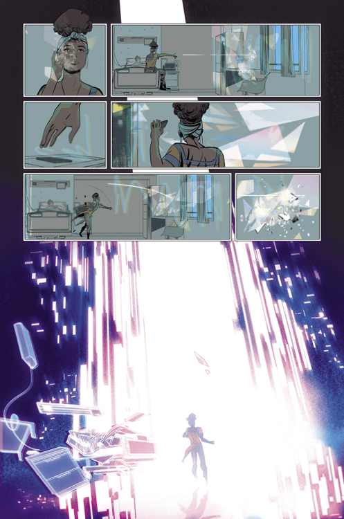
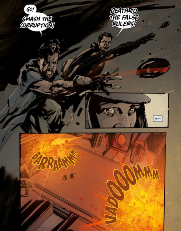
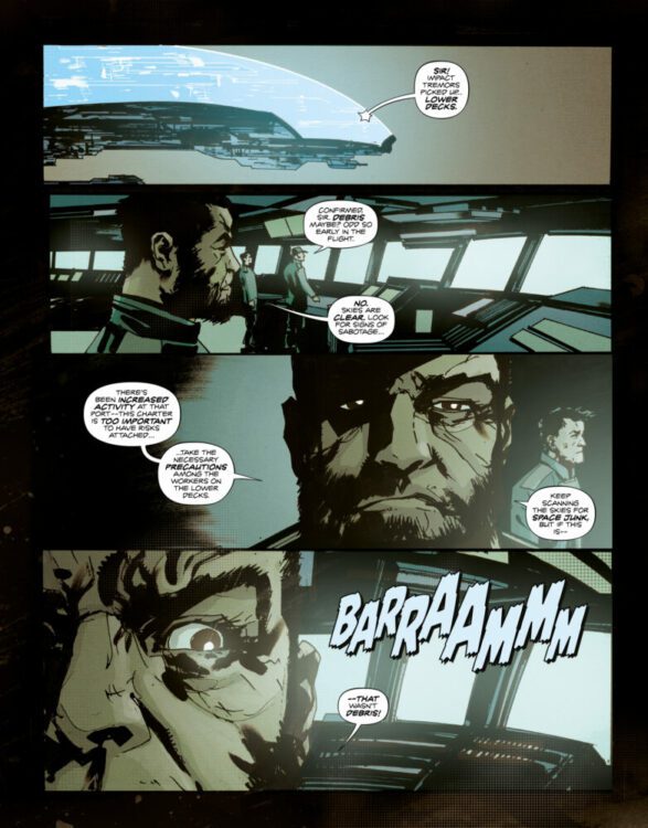
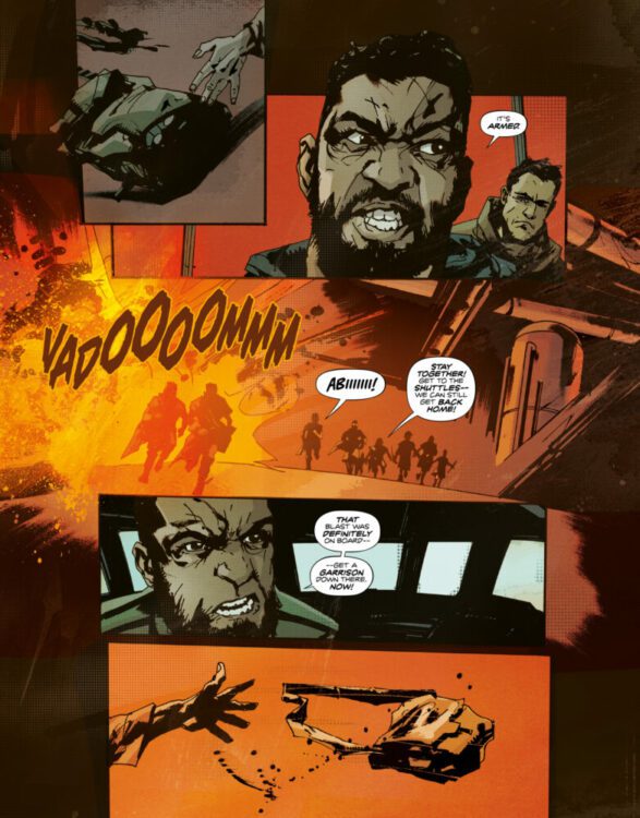
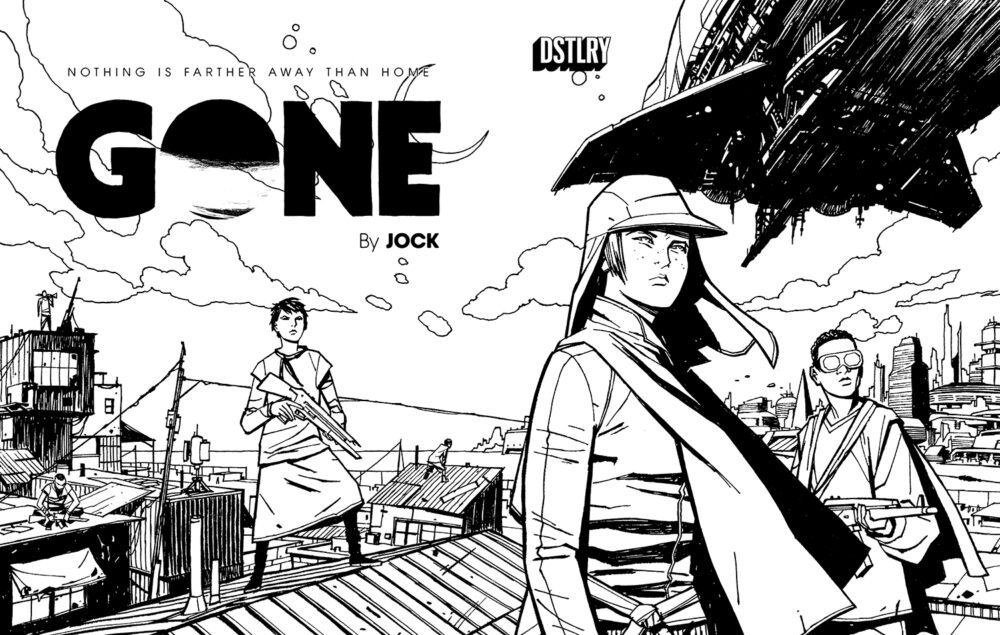
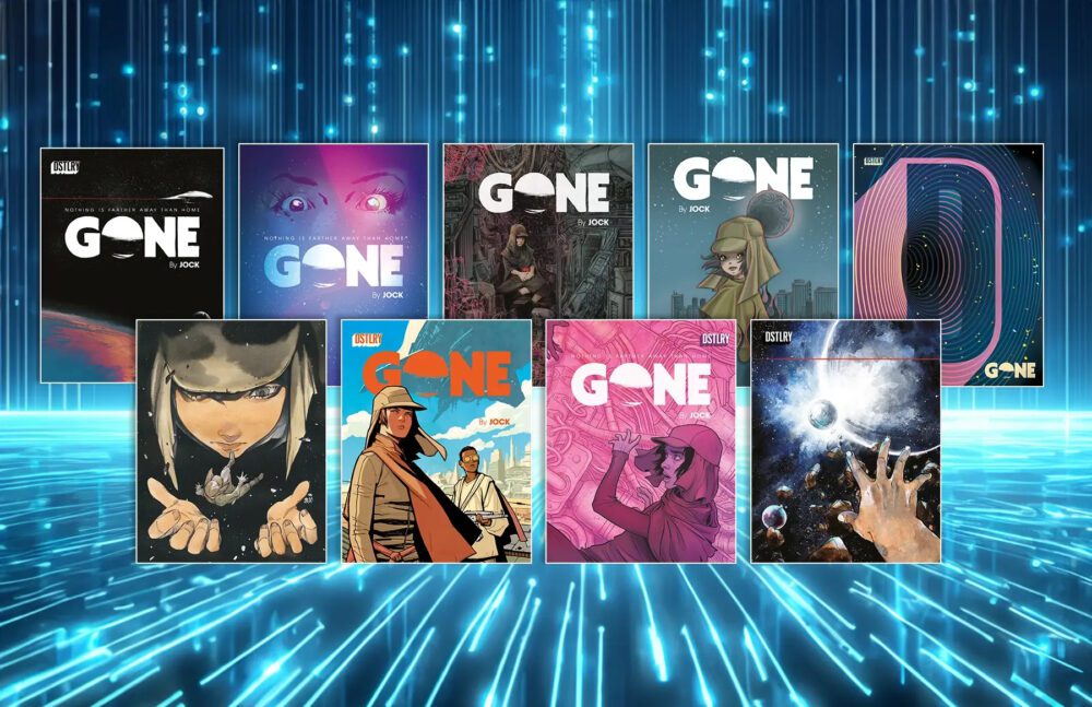 From renegade comics supergroup publisher DSTLRY comes the digital debut of Jock’s sci-fi epic with Gone #1. The highly sought-after and acclaimed opening issue is now available to read online on DSTLRY’s own v0.1 desktop reader beta at
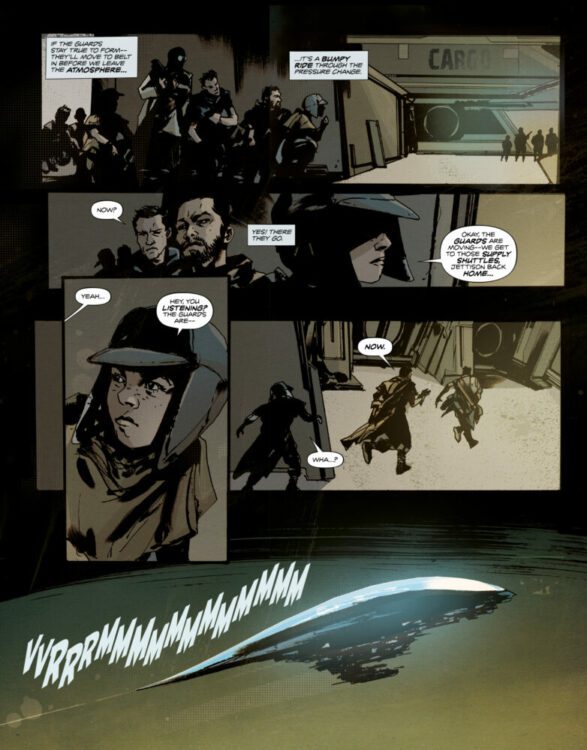

")