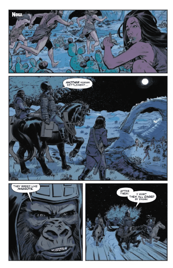
Marvel’s new Ultimate Universe is in full swing (pun intended) with Ultimate Spider-Man #1, out today.
The series is by writer (and orchestrator of this new Ultimate Universe) Jonathan Hickman and artist Marco Checchetto, with colors by Matthew Wilson, and letters by Cory Petit.
Ultimate Spider-Man is the first ongoing series set on Earth-6160, picking up directly after the events of November’s Ultimate Universe one-shot. Peter Parker is not a superhero—thanks to The Maker’s meddling—but a 35-year old husband and father of two. Peter is not unhappy with his life, but for as long as he can remember, he’s felt like something is wrong with him, like he’s not who he’s supposed to be.
Fans were elated when Ultimate Spider-Man was announced, because it promised a new status quo for the webhead, and a fresh start for readers. Most excitingly, Peter was going to be a family man, something people had been clamoring for since 2007. The new world looked like it would be familiar and give fans what they’ve been looking for, and it does, but maybe not exactly how you expect it to.
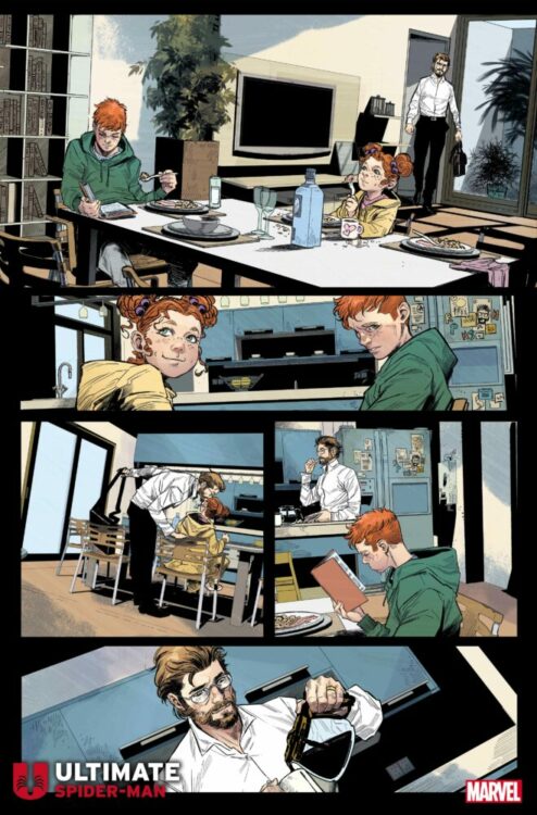
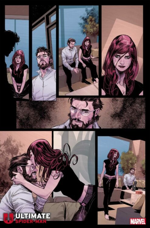
Yes, Peter and Mary Jane are married with children, but this book’s success goes so much deeper than that. As mentioned, Peter is no superhero in this universe, so it should go as no surprise that there’s no web-slinging happening in this debut issue. This is a book about people—about Peter navigating life’s complications with his friends and family. It’s about Peter exploring who he is and what he wants out of life, with the help and support of those friends and family. The best Spider-Man books put the characters and their relationships first and the superheroics second, and Hickman seems to understand that. We care about Peter, MJ, and the rest, not just because they’re already familiar to us from another universe, but because Hickman writes them to be likable and sympathetic. When Peter is down and questioning himself, MJ is there to reassure and support him. The human element is front-and-center.
To be clear, and without spoiling anything, this is not the world of Spider-Man that you’re used to. It’s not like Hickman and Checchetto just carbon copied Earth-616 and reinstated Peter and MJ’s marriage. Some of these relationships are different than readers are used to. There are plenty of changes and surprises to keep this new world interesting and exciting for fans, while keeping the heart of Spider-Man intact.
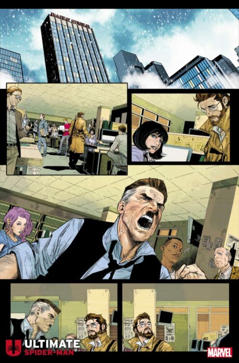
Which brings us to the other, more “grand scale” purpose of this book: establishing the new Ultimate Universe. This is our first real look at Earth-6160 from ground level. Hickman focuses on Peter and his supporting cast, obviously, but we get a look at the larger picture as well and how the citizens of this universe go about their lives—including some familiar faces. It’s world-building, and world-building is what Hickman does best.
Establishing the new status quo here never feels forced or over-expository. None of the charts or graphs that Hickman has become known for are present here. All of the world-building is done naturally through character interactions, and any necessary information is provided so that this book is accessible even if you missed Hickman’s previous Ultimate books. There is one scene towards the end that could be viewed as an exposition dump, but even that is woven into the narrative pretty seamlessly. Exposition in this script never disrupts the flow of the story; you’re given exactly what you need when you need it, with plenty more to still be learned through experience.
With all that out of the way, let’s talk a bit about how incredible it is to have Marco Checchetto on this book. I have personally gushed about Checchetto previously regarding his work on Daredevil, and I specifically stated that, whatever the artist did next, I hoped it was a Spider-Man book. My prayers were answered.
Checchetto, joining forces once again with his Daredevil colorist Matthew Wilson, is one of the top artists working on superhero books today. There is a grit and an edge to his work that makes the world feel real, and yet there’s a softness to his characters that never lets you forget the humanity at the core of this book. His is a style that helped set DD apart from all of Marvel’s other titles at the time, and it’s a style that’s helping establish this new Ultimate Universe as its own entity, independent from both the Ultimate Universe that preceded it, as well as the mainline Earth-616. Ultimate Spider-Man #1 is light on action, which means you really get to see Checchetto’s strength in storytelling. You’re pulled into the conversations within these pages, fully immersed, and that’s because Checchetto knows the angles, beats, and character acting needed to keep readers invested. His character designs are pretty similar to what fans are used to, which helps maintain a sense of familiarity and emotional attachment in this new world. Just wait until the web-slinging starts and the artist gets to fully let loose.
Wilson’s color palette here is more muted than his work on Young Avengers or The Mighty Thor; it’s more in line with his aforementioned work on Daredevil, which helps ground this book in realism. His NYC feels cold and isolating, mirroring how Peter is feeling inside, right up to the final page which suggests a warmer, more inviting day is coming. Wilson’s been one of comics’ top colorists for years now, so it’s no surprise how masterfully done this book is.
Cory Petit, similarly, is a veteran letterer himself, and no stranger to Spider-Man books. He had his work cut out for him with this script—again, it’s establishing a new universe and it’s fairly dialogue-heavy. But at no point does the reading feel like a chore, and Petit keeps the flow of the narrative strong while conveying all of the information Hickman wants to get across. With Checchetto, Wilson, and Petit all working in unison, this is an issue that you’ll be glad to read again after you’ve turned the last page.
What more can be said? Ultimate Spider-Man is giving fans some of what they wanted, and even more that they didn’t even know they wanted. If you’re a Spider-Man fan, you need to call your local comic shop and have them add this to your pull-list, because you’re going to want to see where this goes next. As familiar as this world feels, something tells me we have more than a few surprises coming our way.