The premise is simple: read one comic every day for the entire year. It seems like a simple task but there is no way that I read 365 comics last year, even if you count the individual issues in collections. So, this year, I am committing myself to this reading challenge, in the hope that I can broaden my reading habits and fully engage with my favorite hobby again.
“Look, Chief, you can’t go off half-cocked looking for vengeance against a fish. That shark isn’t evil. It’s not a murderer. It’s just obeying its own instincts.” — Jaws by Peter Benchley
Jaws 2 was on television last night and I watched it yet again (missing only the opening few scenes). I’ve no idea how many times I have watched it — slightly fewer times than the original Jaws, which I’d probably name as my favorite film of all time if I was put on the spot. My enjoyment of both films hasn’t waned, not once, in all these years. In fact, after a revelation about the underlying story a few years ago, my appreciation of them as one continuous narrative actually increased.
And fueled by that human versus nature vibe from the film, I went crawling through my draws for some comics that matched. Hook Jaw was an obvious choice, as it is a comic book reaction to the success of Jaws, however other similar comics with a monster/horror vibe, especially in my collection, were harder to find.
What makes horror stories so endearing, and why do we keep coming back to them in various media? And how do writers and artists continue to instill that sense of fear in us when, as an audience, we are used to the visual horror lexicon?
In his essay The Face of the Beast, Jonathan W. Thurston discusses predators in fiction and the visual signs that writers and artists use to trigger our internal fear responses. He highlights base instincts that horror is aimed at and, by reference to the work of Paul A Trout, lists some of the triggers that literature, movies, and comics use to elicit a response. These triggers include, “staring eyes, an open mouth, flashing sharp teeth, a lollering tongue” along with “menacing movements, blood, bones, certain sounds, tracking signs, and darkness.” Obviously some of these are difficult to represent in comics, especially the sounds and movements, but the others listed are instrumental in building horrific narratives in a visual medium. By using simple visual triggers, creators can produce scary and horrific comics.
This week I’ve selected a number of comics that can be considered horror based on some level, and will use the triggers mentioned above to illustrate how successful the comics are at expressing the horror and initiating a response from the reader.
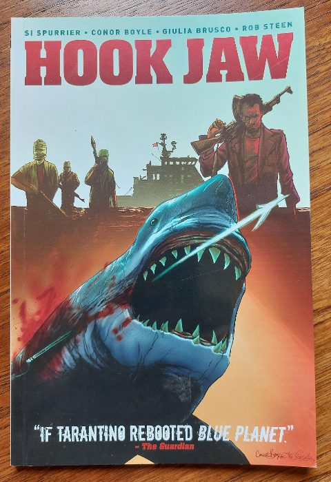
Comic Number 120: Hook Jaw
The “monster” in Hook Jaw has it all. When the titular shark is finally introduced to the story, it comes with: 1) staring, empty eyes, 2) a gaping, relentless mouth packed with razor sharp teeth, 3) a trail of blood contaminating the ocean around it, and 4) the blackness of the stormy waters. Even the way that Conor Boyle draws the shark in the panels gives the impression of the slow, methodical movement of a beast hunting. You can almost hear the swish of the great white’s tail as it glides through the water. The last page of chapter 1, showing the beast in all her glory, is reminiscent of the opening to Peter Benchley’s novel Jaws: “The great fish moved silently through the night water, propelled by short sweeps of its crescent tail.”
Simon Spurrier’s Hook Jaw works as a horror comic not simply because of the violence and blood that are ever present. Spurrier brings all of the horror tropes into play to unnerve and unsettle the reader. For example, dream sequences quickly shift direction as the dreamer loses control, almost like a scene from A Nightmare on Elm Street. There are also tension-building sequences where a slow burn in a scene allows the reader’s anxiety to take over and skip quickly through the panels, only to be greeted with a sudden image of violence that jolts the reading flow. Instinctively you stop, like a jump scare in a movie, only in comics you linger on the image as it burns itself into your brain.
Hook Jaw gets under your skin. Through the first chapter you might find yourself wincing at some of the two dimensional characters, or even laughing at the stupidity of the situation. However, just like in Jaws, this comforting place at the beginning is eroded by the horror that follows and as your fear responses kick in and you start to retreat, you remind yourself of the safety from the opening, and you convince yourself it can’t be that bad. Can it?
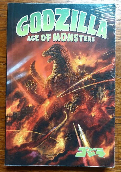
Comic Number 121: Godzilla, Age of Monsters
Everyone knows Godzilla. Whether it’s from the original 1950s Japanese movies, the American takes on the creature from 1998 and 2014 onward, or even the 1970s cartoon series with the adorable Godzooky, the giant kaiju has towered over films and comics for decades.
Although Godzilla is the very definition of a monster, very few of the stories containing him could be situated comfortably in the horror genre. Godzilla represents the destructive force of nature, an uncontrollable and unstoppable power that comes from the Earth and is older than humans. It is this representation that stirs any fear within the audience, just as it does in many of the protagonists of the stories themselves.
In Age of Monsters, written by Randy Stradley and Steve Bissette, the central character, Noriko, remembers the traumatizing experience she lived through as a child. The monsters of old woke up and swept towards the city where her father fought to save her and her mother. Initially, artists Steve Bissete and Ron Randell use visual triggers involving Noriko that are usually associated with the monster. A blank expression and staring eyes are the major focus of the first page of the comic. Bissette creates the impression of a slow zoom into Noriko’s face as she stares out, into the rainy city. The final panel contains a close-up of her eyes but the rest of her face has been visually transformed into the destruction wrought by Godzilla many years earlier. The reader is introduced to the concept of the monster, and the horror that comes with it, through the eyes of the victim. When we reach the end of this first chapter, we have a better understanding of the character and what she waits for. This then makes us reassess the opening page and the trauma that she went through.
It is a fascinating way of introducing horror tropes into a narrative, especially in a comic that isn’t necessarily classed as a horror. Bissette has some history with drawing modern horror stories, and corrupting genre, so that as a reader your expectations are shattered and your comfort zone removed. You only need to look at his work on The Saga of the Swamp Thing to see what I mean. (see Comic Number 124)
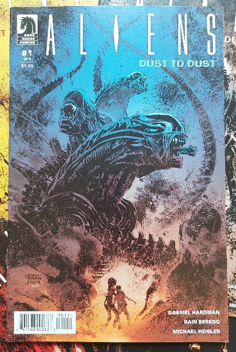
Comic Number 122: Aliens: Dust to Dust
Jonathan W. Thurston states that “the artistic rendering often reduces the predator to a dark shape with glowing eyes and dripping fangs.” This description aptly fits a number of classic horror monsters, from the Vampire and Werewolf to more modern invasion movies such as Attack the Block, which features creatures that were literal black shapes on the screen with wide, drooling mouths visible only because of the glowing teeth.
In Ridley Scott’s 1978 movie Alien, the director relied on hiding the black skinned creature in the shadows and only hinted at the creature’s true shape. Although there were no glowing eyes, the mouth within a mouth design highlighted the difference between the creature and the human prey. The Xenomorph is a perfect example of the horrific beast that Thurston was discussing.
Almost from the beginning, the Alien franchise found a home in the pages of comics. In 1979, Alien: The Illustrated Story was released and there have been a string of adaptations and continuations ever since. The franchise works as well in either medium.
Gabriel Hardman’s 2018 standalone mini-series is, on the surface, a pretty standard Aliens story: a planet of colonists are exposed to the alien threat and most do not survive the ensuing onslaught. Where the story differs is in the new take on the Xenomorph/mother connection that grew out of the movie franchise and the visual presentation by Hardman and colorist Rain Beredo.
From the very beginning, the reader is given a very visually driven narrative with details picked out of the darkness and emphasized by unexpected and brief changes to background color. For example a character’s reaction to something disturbing is placed over a background of burgundy for one panel only, before the background returns to the murky teal of the colonists home.
The comic makes the reader uncomfortable through visual tricks, such as shattering a panel into a collection of haphazard smaller panels, or by illustrating a long vista with dark shadows indicating the alien threat. The grainy artwork, calling back to the title of the comic, fills each page with an almost unbreathable atmosphere, heightening the uncomfortable environment the protagonists inhabit. Just like Ridley Scott’s original movie, this comic is about the environment the characters are in and less about the history or motivation of the creature. We fear for the central characters because they already seem lost from the beginning of the story. Our fear responses are then triggered further by the jumps between full illustrations of the aliens and shadow encased mouths, drooling out of the darkness. Just as the reader grows accustomed to the alien, Hardman is able to make them scary again with a change in visual emphasis.
Aliens: Dust to Dust came out towards the end of Dark Horse Comics’ run in the franchise and I personally think it was the best interpretation at the time and hasn’t been topped since.
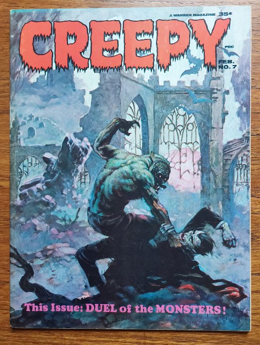
Comic Number 123: Creepy #7
In “Duel of the Monsters” from Creepy #7, you have two classic creatures of the night duking it out in a territorial fight for killing rights to a small Spanish village. The script by Archie Goodwin is tongue-in-cheek but still manages to include moments of unnerving horror.
This eight-page, black and white story, illustrated by Angelo Torres is a charming comic that demonstrates how artists can tickle a reader’s fear response in a story that, for the most part, is a supernatural mystery. On the opening page, Torres draws two images of a werewolf stalking the village. The first shows the creature in an almost majestic pose, perched on the top of a house, with its mouth wide open, baring its fangs. The creature is out in the open, well lit, and clearly visible, seemingly in contrast to how a creature should be introduced.
The reader’s fear is provoked not directly by the creature but what the creature represents. By the time this comic was published in 1966, audiences were accustomed to werewolves thanks to the numerous novels, comics, and of course movies, that featured them. Anyone picking up a story featuring a werewolf knows what to expect when the creature goes hunting so, in this opening panel by Torres, the trepidation and fear comes not from the creature but the prey illustrated within the creature’s line of sight. Drawn in darkness, with a small lamp shedding a meager light, the victim is almost an afterthought to the image. His fate is predetermined. This sentiment is reflected in the text written beneath his window: “crouched on a roof top is a figure as much beast as a man… poised and panting as the bloodlust rises… nostrils flared in the cold air, its prey is at hand!”
The second panel on the page contains a perfect example of a beast designed to elicit a fear response. The monstrous beast stares directly towards the reader, its mouth hanging open, its teeth bared, and its body is shrouded in darkness. The face of the villager is a reflection of the readers, aghast in horror.
In contrast, the vampire, Sergeant Vega is depicted as almost human. His introduction shows him with fangs and a dead body by his side but his body language and awkward positioning in the panel do not instill a sense of fear. It is only in the presence of the werewolf where his beast side is revealed and he takes on those tropes of a visual monster, with staring eyes and gaping mouth. Throughout the story the reader is not meant to fear Vega as he is the reluctant hero of the piece.
The cover for Creepy #7 shows two wild animals tearing into each other in the ruins of a church but the story contained within is much more subtle. Goodwin injects the tale with humor, suspense, and some charming characters. This, combined with the visual signifiers for a horror story, leads to a complex, layered comic that is more than the sum of its parts.
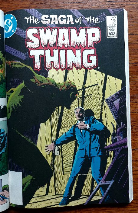
Comic Number 124: The Saga of the Swamp Thing #21
I used to work with someone who would never watch the same film or read a book twice. Once he finished reading a book he would give it away because what is the point in re-reading it when you know what happens at the end?
I’ve watched Jaws at least once every year since I was a teenager. I don’t know why you wouldn’t want to immerse yourself in something that you truly enjoy and draw-out every aspect of the film, book, or comic so that you can engage with every facet of it. I guess people are different.
I doubt you’ll find anyone who would argue that Alan Moore’s run on The Saga of the Swamp Thing is anything other than brilliant. Within his run, there are a few issues that go to weird places you were not expecting, and others that tell simple, world building superhero stories. And then there are a few that are the pinnacle of comic book storytelling. The Anatomy Lesson is one such issue.
Its opening page — which bears an uncanny resemblance to another opening page I’ve looked at this week by the same artist, Stephen Bissette — introduces the setting and the situation but it also creates a sense of atmosphere that will permeate the narrative. The relentless rain, feeling of entrapment, and references to blood, set the tone for what the reader is about to read.
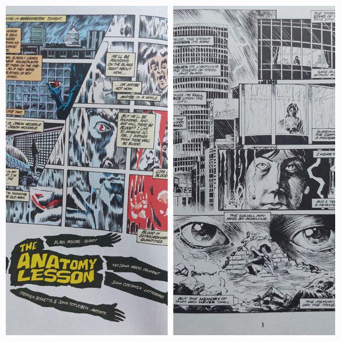
This particular issue of the Swamp Thing is fascinating for so many different reasons, as the writer dissects the central character as a form of meta-fiction, picking apart the history and narrative of the comic. Alan Moore manages to re-write the origin without changing it, and reinvent the character in a natural and logical way.
However, our focus here is on horror, and what Moore, Bissette, and Totleben achieve in this comic is to create a scary, intimidating anti-hero with the title character. The villain, Jason Woodrue, plays the role of facilitator, allowing the evil of one character, the General, to become the victim to a monster he helped to create, the titular Swamp Thing. The artwork focuses on the horrific elements of the plant creature and, once again, uses the fear response triggers to make the reader, and the General, retreat from the character. The Swamp Thing is drawn with wild, staring eyes, gritted teeth, and an imposing shape that looms out of the darkness.
Moore gives us nothing but monsters in this issue. The obvious one, with all the traits I’ve been looking at this week, is the Swamp Thing himself, but the other two characters are also monsters in their own way. Doctor Woodrue transforms himself as we watch, with his skin crawling from his body. Parts of him dissolve and become misshapen representing an other, something different than ourselves. Coupled with his glee in death and destruction the impression we get of him is more monstrous than human.
The “Old Man” is a different kind of beast, he represents the worst part of humankind. He is master and king in his glass tower with complete control over the building, lording it over his subordinates that are never seen. He raves about his power and control but he is alone, living a solitude life within his office. Comparing him to the Swamp Thing, he is very similar as he is no more than a husk of a man. The difference is that he enjoys the lack of humanity that the Swamp Thing is clinging onto. In the final scenes Swamp Thing kills the general in an emotional rage spurred by the fact he has just learned that Alec Holland, the man he believes himself to be, is dead. A soulless monster kills for a humanity he has lost and the human he kills was fighting to keep a soulless existence alive.
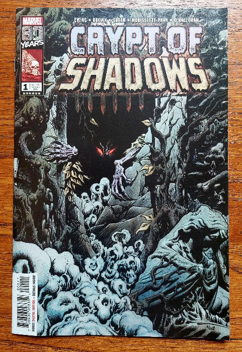
Comic Number 125: Crypt of Shadows #1
Marvel Comics enjoy toying with horror and have wonderful series with some classic monsters such as Frankenstein’s monster, Dracula, etc. They even include a number of ghoulish characters in the main Marvel Comic Universe, but the less said about Franken-Castle, the better.
When the Crypt of Shadows was released in 2019, I was sold on it because of writer Al Ewing and artist Garry Brown. Both creators have produced work I have enjoyed previously, plus I love a good horror comic. Crypt of Shadows takes a standard approach to a horror anthology with a framing story that allows the other tales to be told. And this comic is a lot of fun.
However, what I really want to talk about is the very first page. It is a simple nine panel grid with a central focus panel and two word balloons that set the tone. The central panel is a head and shoulders image of a woman with no background. There is no setting and at this point you have no idea who she is or what she’s doing. In essence she is talking directly to the reader and she is saying “Cynophobia. Fear of Dogs” The remaining eight panels contain images of a snarling, yellow eyed, blood thirsty dogs. Cynophobia? You can see why.
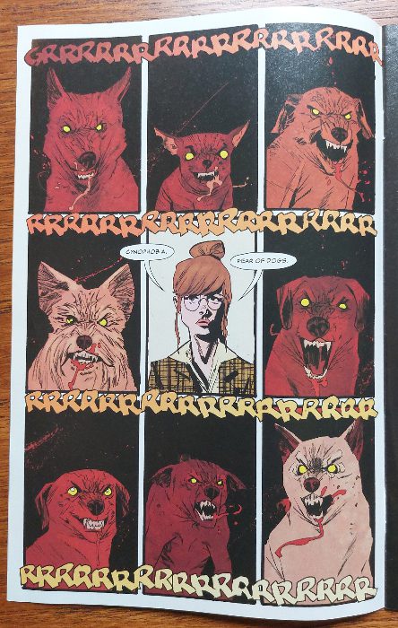
Brown has captured the trigger images for a fear response perfectly. Each panel contains “staring eyes, an open mouth, flashing sharp teeth,” and each image of a dog has a pitch black background. There is no grounding here for the reader to hold on to except in the central panel. Try as you might you end up focusing your attention directly on the woman because she is the only safety. As it turns out, she is a therapist and on that first page the reader is her patient.
It sets up the story by, in a small way, inflicting you with the fear of dogs so that you instantly have sympathy for Mr. Radley, the therapist’s patient. Ewing plants the seed early and the first page introduces a horror that waits in the background as the other two stories are told. And as it lingers, the horror grows, which in turn allows for a terrifying payoff.
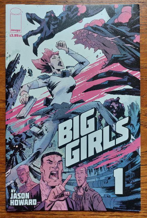
Comic Number 126: Big Girls #1
I found something fun to end the week with. I love Jason Howard’s artwork. It’s raw and emotional, and captures the energy of the characters perfectly. With Big Girls, Howard is also the writer, weaving a wonderful tale of giant against giant.
Remember I said it was fun? Well, I’ll take that back. The first issue is harrowing, and when I first read it in 2020, it knocked the breath out of my body.
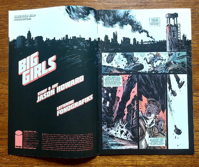
The opening two pages introduce the monsters of the series in a way that sows the seeds of apprehension. A voiceover explains that something bad happened, without going into detail, while the images show people running in fear through streets of debris. Glimpses of the monstrous creatures can be seen and many of the panels are soaked in a dark blood red color. In these opening pages, Howard sets a typical monster horror scene, falsely preparing the reader for what is about to happen. The reader’s expectations are immediately contradicted over the next two pages where we are introduced to the central character, Ember, who towers above a city street. Is she the consequence of the mistake referred to in the opening? Are these the monsters that we should expect throughout the series?
Howard plays with his readers, using unreliable narrators and contradictory sequences. He promises horrific giant monsters and then gives us a giant child, playful and inherently child-like. What happens next shifts the focus of the monster away from the giants and onto the humans.
There are traditional monsters in this comic, creatures of unnatural size, deformed and violent but even those are an enigma that Howard solves over the course of the six issues. With Big Girls, Howard adopts the history and traits of classic monsters, especially the Japanese Kaiju, and twists them to create a narrative that contains as much mystery as it does the expected violence.
I feel as though I have only just begun to look at the representation of monsters in comics, especially as it is something that crosses genres and can take on many different meanings. I opened with a list of traits that trigger the fear response within us and throughout this week I have found those traits in very different comics and used to tell very different stories. Putting the fear of the unknown or uncontrollable into the reader can serve a number of different purposes, and such a strong emotional reaction can have a lasting effect on you. Out of all of Alan Moore’s Saga of the Swamp Thing run, The Anatomy Lesson is one of the few that really sticks with me, despite enjoying them all. This is because it elicits the strongest reaction in me. I am equally drawn to and repulsed by the monsters that inhabit the pages.
Maybe my love of horror comics is more than a simple enjoyment of the narratives and actually comes from a deeper seated emotional response to the material.