

Monkeys Fighting Robots Youtube
WONDER TWINS #8 – A Tale of Reunions Unravels

Reunions can be a hard, good thing DC Comics’ WONDER TWINS #8 does its in a hilarious and witty manner.
If you need to catch up on Wonder Twins, check out the review of the previous issue. Or pick up the last seven comics when you grab Wonder Twins #8 this Wednesday at your local comic shop. The whole series has been fantastic.

A Story of Reunions
Writer Mark Russell dramatically begins Wonder Twins #8, with both parties of the plot losing. Meaning, you can only go up from there, right? Yes, but no. Russell continues the trend of winning, yet not winning. But, instead of winning against a villain while having the feeling of not winning; Wonder Twins #8 makes the theme more personal with two grand reunions.
Although the themes and plot are serious, Russell keeps the fun/light-hearted feeling that has been throughout the series. Be it: dialogue, background gags, character moments, or the infamous accidental public confession trope with Principal Turner. This moment humanizes Principal Turner immensely while making him one of the most relatable characters for any adult.

School of Art
Pencils change hands from Stephen Byrne to Norton for Wonder Twins #8. The change is barely noticeable as the duo’s art style mirrors each other magnificently. But Norton’s style leans more on the realistic style, whereas Byrne’s had more a Saturday morning cartoon style. Norton’s style fits significantly with the focus being on the more human side of Wonder Twins.
Much of Wonder Twins hasn’t consisted of action, which continues in Issue 8. The few panels that do have action look fluid while staying cartoonish. One panel that exudes this elegantly has Zan sliding to fist bump Jayna. The panel may look hilarious, but Zan building speed in the panel before to slide under the villains and fist-bump his sister works perfectly. Chris Peters’ colors help the action sequence.
Peters’ colors gel gorgeously with Norton’s pencils. Although the colors never get as bright as the previous issues, the subdued colors help portray the more down to earth story. Peters’ colors help the action mentioned above significantly. Adding a yellow blur to Zan’s legs, show how fast he is sliding while guiding the reader. Another beautiful color moment is the duo activating their powers. Norton uses a small panel to show the famous fist bump, while Peters adds sparkling white lights and brilliant blues.
Dave Sharpe continues his great work on letters. Throughout Wonder Twins #8, Sharpe helps guide the reader through the dialogue. But in some cases, Sharpe adds huge bubble breaking dialogue that shows the character’s excitement. This happens more during the ice-cream truck scene, showcasing how exciting ice-cream is.

Wonder Twins #8 Conclusion
Russell continues the trend of meaningful commentary in an enjoyable, fun-filled issue of Wonder Twins. Norton’s pencils and Peters’ colors amplify this theme.
Memorable Quote: “Time has turned your principal into a geyser of petty failures and disappointments.” – Principal Turner
Time has done this to us all, buddy.
Extra Credit: I love that Jayna’s overalls have her superhero emblem on it. Also, I loved Zan as the ‘Pit Boss.’
Dear Readers
What did you think about the reunions in Wonder Twins #8? Let us know below!
Monkeys Fighting Robots Youtube
Review: COBRA KAI #1 Is A Fun, Energetic Book That Looks Fantastic
IDW’s Cobra Kai by Denton J. Tipton (X-Files), Kagan McLeod (Infinite Kung Fu), Luis Antonio Delgado and Neil Uyetake is a solid book, with energetic and unique art that expands both the classic Karate Kid film and the current Cobra Kai show on YouTube.
From IDW- “JOHNNY’S STORY,” Part 1. See The Karate Kid in a whole new light in this retelling through the eyes of Johnny Lawrence, two-time All Valley Tournament Champion. When the new kid makes moves on the girl that broke Johnny’s heart, he vows to settle the score and win back her love. Or so goes the story Sensei Lawrence tells his students nearly 35 years later.
Cobra Kai #1
Written by: Denton J. Tipton
Art by: Kagan McLeod
Colors by: Luis Antonio Delgado
Letters by: Neil Uyetake
Story
Although Cobra Kai #1 is a direct tie-in to the show, it’s not exactly necessary to have seen it in order to enjoy the book. Writer Denton J. Tipton makes it more of a re-telling of the film Karate Kid (but through Johnny’s POV) and that is what makes it accessible and fun. He softens teenage Johnny enough to make you start to feel for him, without making him a hero per se; anti-hero is more like it. Johnny has a terrible stepdad and he is also wanting to change himself. But it’s not dark and brooding either, the issue is written with a light, breezy tone (much like the show) that occasionally bumps into more serious moments without becoming melodramatic. It may not re-invent the wheel of the comic, but as far as licensed comics go, it’s a strong start; good for hardcore fans and good for newer, casual fans. 
Art
The art is where Cobra Kai shines. Brining in Kagan McLeod was a great idea. McLeod is well known for Infinite Kung Fu, a Top Shelf graphic novel that made quite a crane kick of its own back in 2011. McLeod’s art is all sketchy, but it’s far from messy. Energetic is more like it; loose linework yet easy to follow panel layouts that move the story along at a great clip. His looseness also carries over to the faces, giving everything that softer touch that helps the whole Jonny POV take. 
Luis Antonio Delgado’s colors, pulled from a more matte and muted pallet, accentuate McLeod’s soft art and doesn’t overpower it. This is more indie comix art that what you usually find in these kinds of licensed books. It’s a touch that elevates a bit out of the norm and should catch the eyes of comics fans.
Conclusion
Cobra Kai is a fun book and well worth it to just have more Kagan McLeod on a printed page, once again drawing martial arts. If you loved the movie and like the show, you’ll totally be into this. It’s fast and fun. Throw in McLeod’s art and you have a book that should be checked out. Grab it at your local comic store today.
Monkeys Fighting Robots Youtube
Review: DOCTOR DOOM #1 – Sympathy For The Devil
Thanks to the story by Christopher Cantwell and outstanding art by Salvador Larroca and Guru-eFX, Doctor Doom #1 makes you feel concern for one of the evilest supervillains in the entire Marvel Universe. How do they achieve such a feat? By backing the bad doctor into a corner, he may not escape.
Summary
Between running a country, having drinks with a time-traveling conqueror, and being framed for a major act of terrorism, Doctor Doom starts to have realistic dreams of the road not taken.

Writing
The entire issue serves as the perfect framework for everything a first issue should feature. The reader is presented with a look into the everyday life of Doctor Doom. Being a guest on a news show, running a country, ordering a kidnapping of a reporter, and having a late-night drink with Kang the Conqueror. All of it plays out in a way where the reader will find themselves thinking, “Yeah, that’s probably what his days are like.”
Still, Christopher Cantwell isn’t merely content on such a simple story of what Doctor Doom does with his Tuesdays. Instead, Doom is framed and put into a situation that will take all of his knowledge and skill to get out of. While at the same time, he keeps having flashes showcases a life where he wasn’t the world’s greatest villain and instead used his knowledge to better humanity and obtain a family. Will Doctor Doom clear his good name and find a way to enjoy the peaceful he keeps hallucinating about? Only future issues will tell.

Artwork
The artwork by Salvador Larroca is rich and offers a great look at Doom’s world. His lavish castle and all the treasures he fills it with are drawn with impressive bits of detail. Also, the look of alternate happy reality is drawn to feel like it would feel like a slice of heaven, even for a supervillain.
Thanks to the coloring work by Guru-eFX, the effects work in the action scenes seems to burst off the page. The coloring also works to add to the beauty of the scenery and the carnage of destruction. It also helps to add to the moments when Doom is lost in deep pontification of what he needs to do next.

The lettering by Cory Petit aids in helping the story to flow in a very dramatic fashion, as the dialogue is delivered at just the right moments where the reader can feel the narrative beats at work. Some of the fonts on the effects can be a bit distracting but not enough to detract from the overall quality of the issue.
Conclusion
Doctor Doom #1 might be the best way to look at the character in a long time. Unlike the Infamous Iron Man, where Doom was trying to be Iron Man. Here he can be himself. Doctor Doom #1 is a must-read for fans of not only the good doctor but anyone who is looking for an engaging storytelling comics provides.
Monkeys Fighting Robots Youtube
Review: RONIN ISLAND #7 Asks, “How Should We Fight Oppression?”
Our two favorite samurai’s in training—Hana and Kenichi—reunite once again in RONIN ISLAND #7, available in stores Wednesday, October 9th. While Hana remained under the Shogun’s oppressive rule in his standing army, Kenichi managed to recruit a group of bandits to take on the imperial forces. Both want to end the overlord’s treachery, though their proposed methods couldn’t be more opposed.
Story
The Shogun’s army of soldiers and subservient Byonin has grown more ruthless than ever. Aside from chaining up the zombie-like creatures to fuel their rage, he’s managed to keep them in such close proximity that they’ve effectively merged with one another, resulting in the creation of a singular beast capable of far more destruction. It is this monstrosity Hana and Kenichi must face following their short-lived reunion.

Readers get to sit back and watch Kenichi describe his plan to kill the Shogun with his army of murderous bandits, all for the good of Ronin Island. To this Hana can only stare in disbelief, soon experiencing a flashback to when the two companions were training on the Island as children. Their trainer during this time, Master Ito, showed them why fighting together was more important than simply seeking to destroy one’s enemies. And it’s this lesson Hana attempts to relay to her friend.
Over the course of this series, writer Greg Pak has been slowly unveiling the differences in Hana and Kenichi’s ideologies—features stemming from their past experiences—and they’re highlighted more than ever before in RONIN ISLAND #7. Hana’s desire to bring more people under her protection via compassion stands in stark contrast with Kenichi’s willingness to use nefarious means in order to protect his “own.” But in a surprising twist, Pak blends these two philosophies into one in the story’s final scenes, leaving readers to sort out the moral questions on their own.
Artwork
Giannis Milonogiannis and Irma Kniivila’s talents prove once again that they’re perfectly fitted for this series. The contrasts between the surrounding forests and the walking death of the Byonin plays on the narrative’s dichotomic themes. The putrid reds, oranges, and yellows stand out like a sore thumb throughout the landscapes and the people themselves.
Simon Bowland’s lettering adds to the Byonin’s distinctive features as well, primarily through his use of a large red font to show both its anger and almost otherworldly qualities; only a unique creature could utter the horrific sounds represented by the text.
Comic Book Covers
Main Cover
Milonogiannis and Msassyk’s artwork for the main cover depicts a blood-stained path that appears to be leading to the Island, adding immense foreboding based on the danger the Shogun and his Byonin pose.
Preorder Cover
Ethan Young’s preorder cover illustration is once again crafted using East Asian stylistic elements. It features younger versions of Hana and Kenichi playing in their homeland, reminding the reader of their shared past.
Unlocked Retailer Variant Cover
Takeshi Miyazawa and Raúl Angulo’s variant cover contrasts Hana and her fellow soldier with an encroaching horde of Byonin. The warriors’ unity stands out with bright, diverse colors while the Byonin fade into the dull, orange background.
Conclusion
RONIN ISLAND #7 is a major turning point in this series in that it brings Hana and Kenichi’s differences to a head. The fate of the island will ultimately depend upon where the two heroes go from here.
Did you agree with Hana’s declaration that Ronin Island wasn’t, in reality, an actual place? Let us know what you think in the comments below!
Monkeys Fighting Robots Youtube
GWENPOOL STRIKES BACK #3 – The Insanity Continues
Gwen’s gambit for sales continues in GWENPOOL STRIKES BACK #3, out this Wednesday from Marvel Comics. Gwen is a force of chaotic energy, steamrolling her way through the Marvel Universe in her attempt to stay relevant.

***SPOILER WARNING***
Gwenpool has had a complicated history within Marvel Comics. Some fans loved her right off the bat. Others didn’t fall for her until Christopher Hastings picked up her series. Meanwhile, other comic readers just get her confused with Gwen Stacy. But that never slowed this girl down – not even for a minute.
Gwenpool Strikes Back is a miniseries focused on the one and only Gwenpool, aka Gwen Poole, and her fight to become famous, or at least slightly more well known, within the Marvel world. And she’s not afraid to drag other beloved characters into her battle. She’s already pounced on Spider-Man and the Fantastic Four, and she even enlisted Deadpool for help. So what’s next?
As it turns out, she’s far from done. If anything, the third issue in the series ups the ante, with Gwen becoming painfully aware of everything that is at stake. And what she has to do in order to continue surviving. Mainly; she’s got to sell comics. Low sales are the death of many a series, and Gwen’s afraid of what that’ll mean for her character if she is again, relegated to team or cameo status.

Gwen’s fate has been placed firmly in the hands of Leah Williams, who has taken over writing the series. And it’s a task she’s having a bit of fun with. And who can blame her? It’s not every day you get to write for a wild, quirky, and fourth-wall-breaking character.
Previously, this series has been a load of laughs, even when it was making a more serious point (the argument about sales and fan loyalty). This issue turns the table, bringing the serious Gwen to the front. And Gwen is not a character afraid to fight dirty, especially when she’s cornered.
Gwenpool Strikes Back #3 quickly goes from a purely comical element to something significantly more intense. And it’s all courtesy of a realization made by Gwen. And her new tactic for becoming a hit series.
And frankly, it was refreshing to see this side of Gwen. It was an intensity bordering on insane, fueled by determination and desperation. But it was also a brilliant – if extreme – plan that Gwen came up with here.
The commentary running alongside Gwen’s plan brought everything to a whole new level and helped to lighten the mood slightly. It also highlighted the trials comic authors go through when they reference other much loved Marvel characters (and the hate that can get dumped on them for it). The honestly and quips were poignant, but also humorous. In short, it was perfect for Gwenpool.

David Baldeon’s lines were perfect for this issue, toeing the line between amusing and intense as needed. Meanwhile, Jesus Aburtov’s colors were brilliant – dynamic and bright, which is really a perfect fit for our pink-clad non-heroine. And finally, VC’s Joe Caramagna’s lettering got a chance to shine in this issue, with lots of thought bubbles, explanations, and Gwen-specific expletives.
The artists behind this issue had a lot to work with. But likewise, they also had a lot that they needed to pull off. It is no small feat to include over twenty Marvel characters into one issue, and do so in a way where each character is immediately identifiable. This task is even more complicated when said characters are outside of their typical garb. But the creative team did an excellent job here.
The portrayal of these characters was a source of entertainment, as were all of the exaggerated expressions stuffed within the pages. Gwen was the most over the top, but there were plenty of other moments to appreciate along the way.

Gwenpool Strikes Back only has two more issues left in this miniseries, so fans are forced to hope that it’ll be enough to kick up more interest in this insane character. On the bright side, that means that there are two more issues left for her to pull off more balmy stunts – plenty of time for a character such as this one.
Monkeys Fighting Robots Youtube
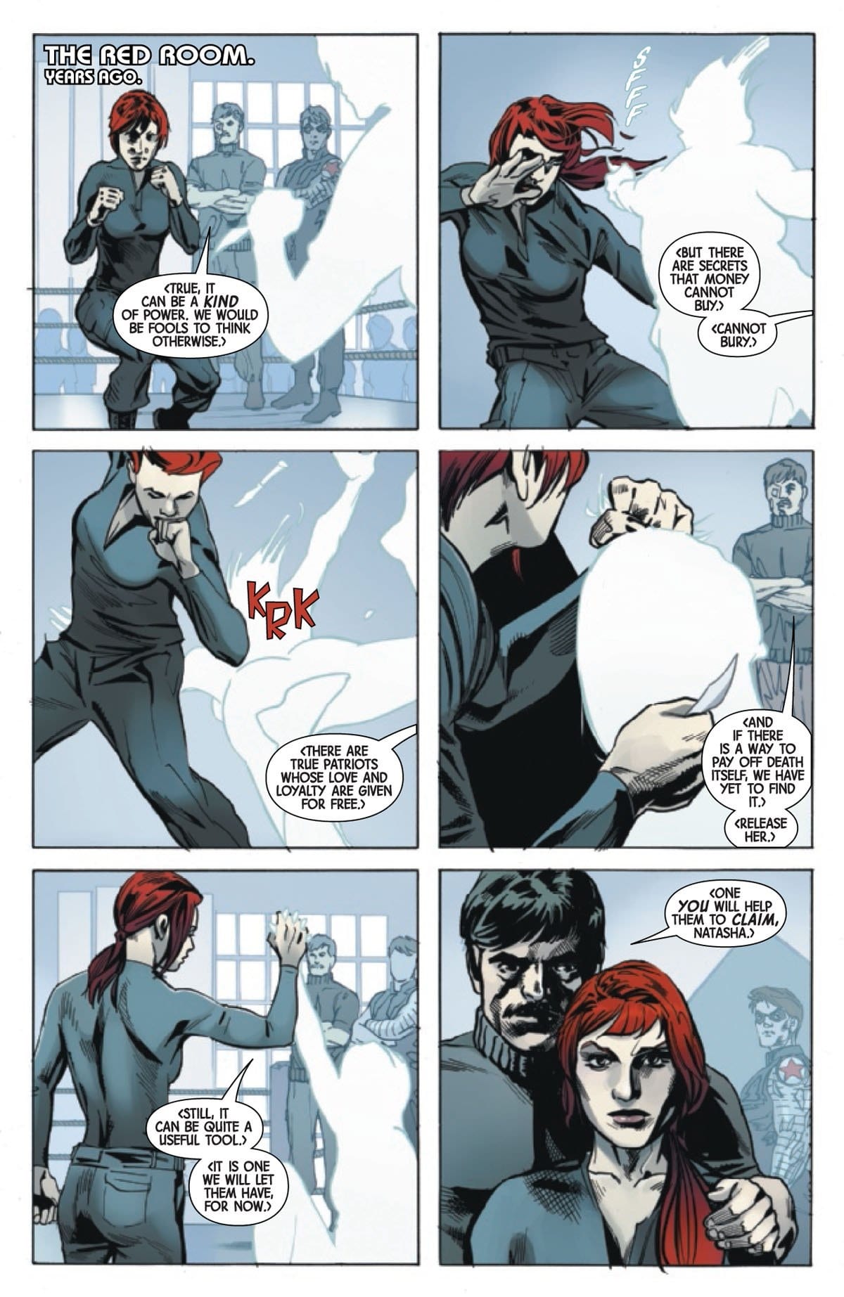
The Plot Thickens in WEB OF BLACK WIDOW #2
Natasha’s quest for answers and resolution continues in WEB OF BLACK WIDOW #2, out this Wednesday from Marvel Comics. Black Widow’s past is dredged up and used against her in this thrilling new miniseries, forcing the character and readers to acknowledge what she has lost.

***SPOILER WARNING***
Natasha Romanoff is a character with a complex and dynamic history. The problem is that she’s not always proud of that history. And she can’t always recall all of the details, thanks to some of the things she’s been through. So when the past comes back to bite her, it somehow manages to exact a higher toll than expected.
But this is the Black Widow we’re talking about. If there’s one thing we can count on her for, it’s that she’ll always get back up and keep on fighting. And she’ll do so with or without help. That’s just how she operates.
In this case, her ability to work alone is a positive thing, given that she is by all appearances being framed. The how and why are less clear, but you can bet that Natasha will be getting to the bottom of this mystery. No matter how many faces she has to break in the process.

Web of Black Widow #2 is written by Jody Houser, and the issue was a poignant reminder of Natasha’s sordid history. We all know that she’s done things in her past, but this is more than that. This is a reminder of Natasha’s history with other heroes – the good and the bad.
Let’s be honest; Natasha’s ability to be a more grayscale character is one of the reasons fans love her. This series is perfect for her in every way possible. She’s once again forced to deal with a situation all on her own – and in the process forced to confront allies, she’d be happier trusting.
The plot bounced back and forth between the past and present with total ease, weaving together multiple points in Natasha’s history. In this way, it was easy to connect the dots between what she has done and what she must do next. It was an elegant way of telling the story, and one that is well-suited for this format.
As for the catalyst behind the entire plot? It’s not as simple as it seems, but it is very clearly a personal battle for Natasha. Whoever is doing this has a reason they want to hurt her – or her reputation. The real question is, who could it be? Enough enemies are lingering in her past to choose from.
The artwork in Web of Black Widow #2 leans more towards the dramatic edge, with dynamic poses and lots of action sequences. Which makes sense, given that this is Black Widow we’re talking about.
Stephen Mooney was the lead artist for this issue, with Triona Farrell providing the colors. These two worked well together, with her keen sense of color and shading complementing Mooney’s sharper drawing style. Meanwhile, VC’s Cory Petit did the lettering, and as per usual, he did an excellent job of it.
They did an excellent job of showing off Natasha’s strength in this issue. There’s no doubt that the woman has muscles, and that she knows how to use them. Likewise, the series of flashbacks reminding us of her history with the Winter Soldier was exceptionally done. In just a few panels, their chemistry and romance were laid out for the fans.
Some of the style choices were a bit off, here and there. But it was not that distracting. And it was easily balanced out with the fight scenes. Though how Black Widow’s suit stayed in place will forever be a mystery.

Web of Black Widow #2 is the perfect issue for fans of Natasha Romanoff. It’s steeped in her backstory, as well as the general air of mystery known to her character. It also puts Black Widow back in her natural element; the type where she’s forced to fend for herself to get the job done. In many ways, this plot is taking the character, full circle.
Monkeys Fighting Robots Youtube
Turning the Tables in STAR WARS ADVENTURES: RETURN TO VADER’S CASTLE #2
The eerie tales surrounding Vader’s Castle continues in STAR WARS ADVENTURES: RETURN TO VADER’S CASTLE #2, out this Wednesday from IDW. No matter how hard fans try, we can’t stop indulging in our fascination with the dark side and everything it includes.

***SPOILER WARNING***
Return to Vader’s Castle, unsurprisingly, brings us back to the dark building that has been a source of fascination and mystery. This time, the series has a new focus; the dark being left behind and what he’s been up to in Vader’s absence. And the people who keep getting trapped in the castle, of course.
You’d think at some point people would learn to stay away from Mustafar, or at least away from Vader’s section of the planet. But of course, all it does is attract the bolder members of the universe. Or those seeking answers (or treasure).
On the bright side, that means there are more stories for fans to read. So we can hardly complain when people keep insisting on showing up, right?

Cavan Scott is in charge of writing the series, and he’s had a roundabout way of connecting all of the subplots. It would seem that one very talented soul has been collecting stories – and treasure – all over the galaxy. And he’s got a lot to say on the matter.
There seems to be a trend – each issue focuses on a different famous antagonist from the universe. This time around, it is Grand Moff Tarkin and his unique brand of merciless reasoning.
The tale woven within this issue was fascinating and believable. Everything Scott told us fits in well with the Tarkin we all know. It was exciting to see some of the consequences of his actions – it’s not a side typically shown within the movies or comics.

The artistic team for Star Wars Adventures: Return to Vader’s Castle #2 comprised of Francesco Francavilla and Kelley Jones as the main artists. Francavilla also helped out with the coloring alongside Michelle Madsen, and Andworld Design provided the lettering.
The art style was evocative of the movies, while also being its own entity. The shading and line work were heavier, similar to the styles shown in other Star Wars Adventures series. There was a lot to enjoy about the art in this issue, from the backdrops to the fire effects.
While some of the secondary characters were lacking in detail, the named and familiar characters were distinct – showing a little bit of extra attention to detail. The monstrosity within this tale was an unusual combination. They were designed to look like something far from humans; an intentional juxtaposition to their behavior.

Star Wars Adventures: Return to Vader’s Castle #2 continued the trend of one-shot stories within the series. But it went a bit further, by explaining how all of the mini-stories ended up tying together in the end. Having one character as a storyteller is always a smart solution to this sort of dilemma. Though it does leave us curious about what he’ll tell us next – and who it’ll revolve around.
Monkeys Fighting Robots Youtube
Review: A Battle Royale With Christmas Elves In BATTLEPUG #2
The last Kinmundian and his loyal Battlepug (a.k.a. Sprinkles) recently reunited with Bryony, their plant mage friend, so she could show them a message from the warrior’s cruel, former overlord—the King of the Northland Elves. Fueled by revenge, the Kinmundian sets out to confront his adversary, while the other mages journey to the city of Rensselaer to find additional help. But what both groups don’t know is that the King is dead, and a more formidable foe lies in wait.
Find out what happens when BATTLEPUG #2 from Image Comics hits store on Wednesday, October 9th.
Story
With the Kinmundian and Sprinkles are off on their mission to the Northland, the mages make their presence known to the town of Rensselaer and its mayor: Callistus the Pirate King, or rather, the reformed Pirate King. The eccentric old fellow claims to have reformed the once corrupt town and focused on other pursuits, such as his self-proclaimed amazing “hamball” meal.
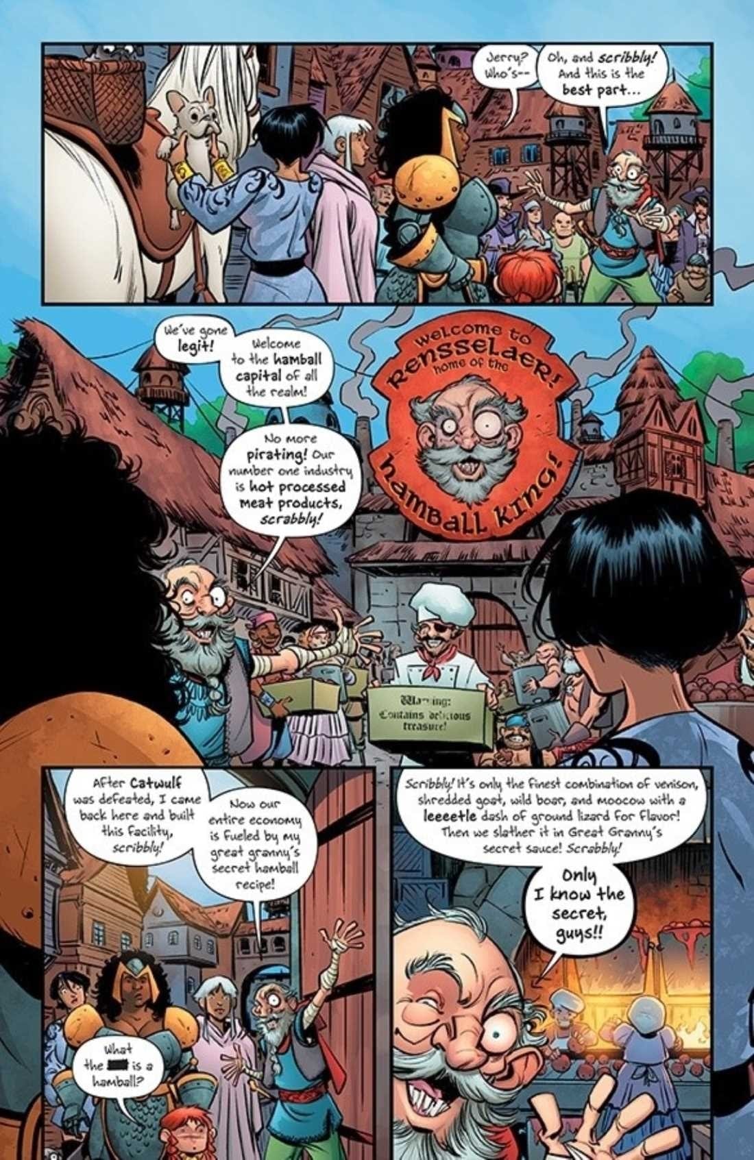
Our group (mostly Bryony) isn’t immensely impressed, but they believe the former villain to be trustworthy enough to help them in their quest. He’s the only person around who knows much of anything about the Elven Kingdom, and they believe he will be a valuable asset. Fortunately, he agrees to help, and the ever-growing band of heroes makes it way to the Kingdom.
As the story progresses, we seamlessly transition to the Kinmundian and the Battlepug in the northern lands of the Kingdom, confronting a group of elves lead by none other than the Putin look-alike, Jofel!
It’s these hilarious surprises (the unicorns, Jofel, etc.) that writer Mike Norton leverages to keep the reader on their toes throughout this narrative, always wondering what could happen next. And that feeling only grows when the Queen of Kingdom makes herself known to our heroes. What fate could possibly await them?
Artwork
Norton and Allen Passalaqua’s unique brand of art plays wonderfully into the narrative’s quirky tone. The landscapes, buildings, and characters have an almost cartoonish quality to them, as if one were in the midst of a Looney Tunes episode—albeit with more adult humor. And this works perfectly for the series. The story’s bizarre features, such as Jofel’s candy cane hands, are exactly what make us love this series. This applies to CRANK!’s unique lettering as well—the fonts often look like they were handwritten, adding to this story’s sense of originality.
Comic Covers
Cover A
Norton and Passalaqua’s main cover art features an epic fight between the Kinmundian, Sprinkles, and the elves of the Northland Kingdom. This scene stokes readers’ anticipation levels by giving them a taste of the exciting fight to come.
Cover B
Tony Fleecs’ variant cover features bright and colorful illustrations reminiscent of the My Little Pony series, giving readers a lighter tone to the murderous unicorns Bryony and rest must face.
Conclusion
BATTLEPUG #2 is a thrilling addition to the first issue, taking us further into the Kinmundian and team’s world through insane antics. We’re locked in tight and can’t wait to see how Norton, Passalaqua, and team continues to blend themes of epic fantasy with endearing low-brow comedy.
Do you think the Kinmundian and Sprinkles will be able to escape from the Queen’s grasp? And will Jofel get his revenge? Let us know in the comments below!
Monkeys Fighting Robots Youtube
AMAZING SPIDER-MAN #31 Revisits Spidey’s Rivalry With Norman Osborn
In Marvel Comics’ Amazing Spider-Man #31, on sale October 9, writer Nick Spencer explores the historical rivalry between Spidey and Norman Osborn. By digging into their past and comparing it to the present, Spencer shows the circuitous pattern of the feud, which makes Spidey’s eventual ability to break from the loop even more satisfying.
Writer: Nick Spencer
Penciler: Ryan Ottley
Inker: Cliff Rathburn
Colorist: Nathan Fairbairn
Letterer: VC’s Joe Caramagna
Sometimes, it’s easy to forget that Norman Osborn is the Joker to Spider-Man’s Batman; their bitter rivalry spans decades and no other villain in Spidey’s rogues’ gallery can match the personal hatred in this conflict. Before Absolute Carnage, Norman had faded into the background since “Go Down Swinging,” which set the stage for the event currently threatening the Marvel Universe. Now, Norman is back at center stage and he’s determined to do what he does best ―make Spider-Man’s life a living hell.
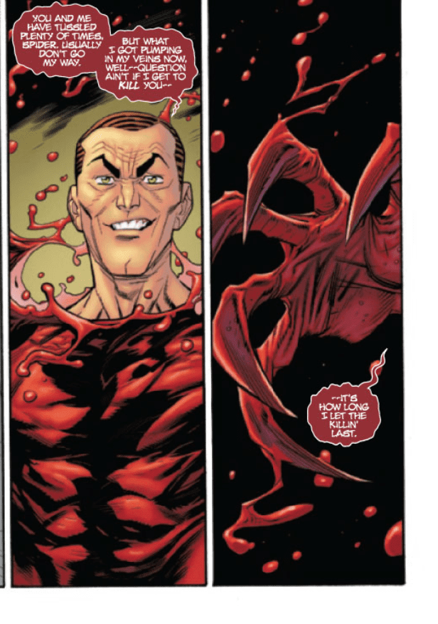
With the Carnage symbiote, Norman is stronger and crazier than ever. That’s why, last time we saw Spidey in the previous issue, Norman was standing over the bloodied and battered hero. As Peter’s narration (along with the usage of flashbacks) show, this scene is a familiar one in Spider-Man’s world. Peter is the last line of defense that’s keeping Norman from his next targets, Normie Osborn and Dylan Brock. At first, Norman’s just too powerful and Peter thinks that he’s once again unable stop his nemesis. Spencer juxtaposes the present action with cuts to Peter’s past, when failing to defeat Norman has caused him unfathomable tragedy.

Norman has taken everything from Spidey; he killed Gwen Stacy and he’s been tormenting Peter’s loved ones (like Mary Jane and Harry Osborn) for a long time. Spider-Man reflects on this pain while he lies on the ground and helplessly watches Norman prepare to attack Dylan and Normie. In the span of one issue, Spencer guides the reader through an exploration of Spider-Man’s self-doubt; through his narration, the hero conveys his belief in the inevitability of Norman’s heinous actions. But the threat of losing the two kids drives Spider-Man to keep fighting. The entire issue feels like a compelling example of the classic proverb, “Fall seven times, stand up eight.” No matter how often Spidey gets knocked down, he’ll always get back up. That’s the heart of the character and Spencer’s ability to portray it continues to be the series’ clearest strength.
Throughout the issue, the art team shows the distinct shifts in Norman’s personality. In the first flashback, when Peter tries to visit Harry during his struggle with substance abuse, he’s the aggressive, overbearing father who’s trying to protect his son. Penciler Ryan Ottley makes Norman look like he’s gone mad in response to his concern about Harry. Colorist Nathan Fairbairn adds shades of red to Norman’s eyes, a fitting nod to his future bond with Carnage that further displays his wrath. The fury on Norman’s face is tangible and it’s clear he doesn’t need a Carnage symbiote or a Green Goblin suit to be terrifying. Of course, when he does wear the symbiote later in the issue, he’s even more scary because of the deranged grin on his face.

In Amazing Spider-Man #31, Spidey overcomes his fears and hands Norman/Carnage his most significant defeat since the beginning of Marvel’s latest crossover event. The analysis of Peter’s emotions stands as a highlight of the issue and put Spidey back on top after he briefly hit rock bottom.
What’d you think of Amazing Spider-Man #31? Where do you hope to see the series go from here?
Monkeys Fighting Robots Youtube