Home Blog Page 388

Review: X-MEN #2 – Long Lost Lovers Reunited

It is a match made in Terra as the X-Men are stuck in the middle of love in X-Men #2, out this week from Marvel.

Jonathan Hickman continues to lead X-Men into a future filled with terribly accurate representations of humanity.  When reading House of X/Powers of X some might say that Hickman writes humans in a very unfavorable light, but then you turn on the TV or open up Facebook, and it’s just too painfully accurate.

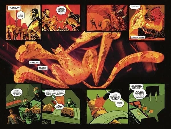
Leinil Francis Yu takes us on a gorgeous journey through Arakko with three members of the Summers family. The island of monsters is beautifully designed with thick foliage that hinders the ability of the X-Men to travel quickly. As the family slices their way through, they discuss how the island reminds them of Hawaii, so the pressure is on Yu to deliver an amazing landscape and he nails it.

Gerry Alanguilan inks Yu’s pencils and preserves his style for the finished product. The inks stay thin to keep all of Yu’s detail easily visible. They are a dynamic duo and work extremely well together.

Sunny Gho is the king of colors and steals the show once again. With all the tech, magic, and monsters, there is no shortage of light sources throughout this issue and Gho does a masterful job of illuminating the pages. Every gun blast, explosion, and eye beam lights up the surrounding environment showing that these artists have taken their time to make this island as alive in our minds as it is in theirs. Gho is truly a Jedi of color.

Clayton Cowles’s work is always easy on the eyes. His letters have nice soft edges and rounded corners which gives the appearance of a calm narrator. His word bubbles never cause me to squint or put any extra stress on my eyes, which is something that can be taken for granted, especially if this is the 3rd or 4th book you’re reading in a sitting.

X-Men #2 begins with news that another island has appeared 100 miles to the southwest of Krakoa, and Krakoa is hauling dirt towards it. The other island, Arakko, is populated with monsters and Scott, Cable, and Rachel are headed to make sure there’s no danger to them and their sentient home.

We’re introduced to a Summoner and to a few of the monsters populating Arakko, and after a pretty hilarious interaction, the High Summoner explains why Krakoa sought out Arakko and the long lost lovers embrace after so much time apart.

The unification of the two islands shows the yin and the yang, where Krakoa is paradise Arakko is hell, one is life and the other death, one was thought to be safety, the other danger. I have a feeling the island has many more surprises in store for the X-Men now that they are joined together.

Reeling after the events of X-Force #1, the X-Men, and all mutants, are on edge, Krakoa is on lock-down, but no one can control what the island itself does. In a time of sorrow and sadness, Krakoa shows the mutants that shutting themselves off is not the answer. There will always be set-backs of violence and jealousy as long as humans are living and breathing.

Will Arakko be an ally or an enemy? What will Apocalypse do after what has happened to Xavier? Can the High Summoner be trusted?

Stay tuned for X-Men #3. Same X time. Same X channel.

What did you think of X-Men #2? Did you love the family bickering as much as I did? Let us know in the comments below.


Monkeys Fighting Robots Youtube

Review: Old Magic and Sinister Deeds Abound In THE DOLLHOUSE FAMILY #1

Vertigo veterans Mike Carey and Peter Gross (Lucifer, The Unwritten) come together once again to deliver “The Dollhouse Family” #1, the spooky and delightfully interesting start of a six issue mini-series on Joe Hill’s “Hill House Comics” imprint at DC.

On her sixth birthday, little Alice Dealy receives a massive and ornate antique dollhouse from a distant relative. It doesn’t take long for her to realize that the little dollhouse family inside is very real indeed. The five members of the doll family are sweet and happy, and invite Alice for games and tea. Meanwhile, Alice’s own real family begins to fall apart, and the house itself makes Alice a sinister offer to fix it all – for a price. After all, such is the way of magic. All young Alice has to do is accept.

Highly accomplished longtime writer M.R. Carey (aka Mike Carey) brings his usual amount of expertise and nuance to this project. The writing in this debut issue of “Dollhouse” is a brilliant balance of interweaving plot threads and vastly different styles of dialogue. Anyone who has read any of Carey’s work knows how fantastic he is at juggling multiple voices and building a puzzle piece by piece with a story. This issue proves he likely isn’t going to lose his touch anytime soon. The central plot with Alice, her family, and the dollhouse is a mysterious and emotionally painful journey to witness. The revelations about the house are a strange joy that contrasts directly with the disintegrating home life going on around Alice. Without getting into spoilers, there’s also an immensely intriguing subplot that teases how large this story could be in scope, but it never feels boggy or unnecessary. Carey’s dialogue swings from standard British English with slang to the high-class pomp of Victorian speech, and even to more mystic and vague moments. Every bit of the writing here is airtight and entirely enjoyable to read.

While Peter Gross provides the layouts for “Dollhouse,” the actual art work goes to fellow Vertigo veteran Vince Locke (Sandman). Gross’s layouts give the issue a fantastic sense of pacing and easy-to-follow flow from page to page and panel to panel, often with some original design choices thrown in for atmosphere. Locke’s penciling gives the book its pitch perfect creepy aesthetic, however. “Dollhouse” may be a part of DC’s Black Label, but it has the soul of an early 90’s Vertigo title. The sort of unpolished penciling with thick line work and purposefully messy shading help give the comic its strange and unsettling elements and aid the plot itself. This is reinforced by Chris Peters’ very classic styled coloring. The colors in this issue all have a sort of muted vibrancy to them that casts a light shadow over everything in the book, while still being a gorgeous set of colors to look at. There’s a definite mastery of the nuances in this book, as would be expected from a team of longtime professionals.

Speaking of veterans, there are few more practiced hands at lettering than Todd Klein. Klein displays just what great lettering can do for the reading experience of a comic of this caliber. Characters and scenarios are given their own fonts based on the context of what is happening in a scene. The choice and frequency of bold words keeps the eyes drawn to each and every bubble and box, improving the pacing of the sentences themselves. There’s one particular font choice for a mysterious supporting character (no spoilers) that mirrors the font used by the likes of Dream of the Endless or Lucifer Morningstar, and seeing it increases the importance of a passage tenfold. Fantastic work by a legend in the medium.

“The Dollhouse Family #1” is a brilliant and wholly engrossing start to what’s sure to be a fantastic mini-series. M.R. Carey brings his usual near-unmatched plotting and dialogue variety, while Peter Gross and the art team bring the story to life in an atmospherically perfect manner. If you’re a fan of suspense and mystery with a supernatural edge, or just of great comics in general, be sure to put this on your pull list come 11-13.

Monkeys Fighting Robots Youtube

Review: A New Green Lantern Takes Flight in FAR SECTOR #1

Accomplished Sci-Fi and fantasy writer N.K. Jemisin teams up with artist Jamal Campbell to try her hand at the comics medium with Far Sector. While this first issue has a couple small flaws typical to #1’s, the creative team still pull of an impeccably drawn and enticingly written space murder-mystery that’s also a welcome addition to Green Lantern lore.

Newly appointed Green Lantern Sojourner “Jo” Mullein has been placed in charge of keeping the peace of The City Enduring, a massive metropolitan planet home to three separate races that were once at war. To reach peace, these three societies stripped themselves of all emotion, and there has been no violence on the planet for 500 years – until now. A sudden and brutal murder on Enduring will put Mullein’s skills as a detective and a Lantern Corps member to the test, especially as it becomes more clear that no one on this planet can be trusted.

As expected, Jemisin has a confident and effective style on display while building the world, characters and plot of Far Sector. She has created a clever scenario with this story where the characters clearly know much more than the reader, and it’s a brilliant way to build intrigue. This concept seems obvious, but it’s easy to see how being lost in exposition can kill the interest in a story. However, Jemisin handles the information surrounding Mullein and this otherworldly society with a deft hand; she gives just enough info to keep the reader engaged, but holds back just enough to keep the story engrossing. Mullein herself is a cool treat as a character. She’s given a confident noir-ish personality with composed professionalism, but also a level of uncertainty that keeps her just barely off balance. She knows what she’s doing, but she is still a relative novice. The overall premise and plot is somewhat familiar feeling – the opening pages parallel Grant Morrison’s Final Crisis if you’re familiar – but there’s just enough originality to keep it fresh. The dialogue is a mix of formal character interactions (lots of alien bureaucrats) and Mullein’s cool-headed internal narration. There’s quite a bit being thrown around here, but it manages to stay interesting to take in.

As well written the prose here is, this issue does use a considerable amount of exposition blurbs to inform the reader of the plot. This issue is scene after scene of Jemisin using Mullein to explain the history of City Enduring, the relationships of the three races, as well as her own thoughts on the murder case at hand. While the writing itself makes this all mostly worthwhile, it’s pretty likely passages will take more than one pass to fully comprehend. Also, the issue’s final page doesn’t feel like a clean transition to the next issue. It’s a tense final page moment, but just a bit too sudden an end for a month long wait to see what happens next.

A great sci-fi comic needs stellar art in order to enrapture its audience. Fortunately for Far Sector, Jamal Campbell is here to draw this new creation into life. There’s a pristine beauty that Campbell’s digitized style brings to this kind of Utopian alien world. Soft colors wrap around futuristic structures, and hues bathe entire sequences with a realistic effect. Character facial expressions are given proper attention without ever being distracting or over the top. If there was one critique to be had, it would be the kind of “sameness” a lot of the characters have regarding their design and facial structure. It can be a bit hard to tell characters apart from one another. This may be attributed to the purposeful Utopia the plot describes, but it is something to make note of.

Deron Bennett’s lettering here plays it pretty safe, but is still sharp and focused as far as lettering goes. There’s an interesting choice made with a kind of softer font, but it works with the tone of the world created in the comic itself. Tense moments and arguments are highlighted and bolded to the exact amount that seems necessary for the scene playing out. Overall, completely professional work here.

“Far Sector #1” is an enticing opening to a murder mystery that’s sure to bring plot twists, unexpected dangers and revelations about this new member of the Green Lantern Corps. N.K. Jemisin’s writing is confident and maintains a sense of mystery, even if it does get a little bloated with exposition at times. Jamal Campbell’s art provides a stunning setting with believable character expressions that completely sells the mood of the issue. Far Sector is looks like it could shape up to be a great new addition to Gerard Way’s Young Animal imprint, as well as to DC’s Green Lantern mythos. Pick it up at your local comic shop on 11/13.


Monkeys Fighting Robots Youtube

RUNAWAYS #27 Brings Us A New Team Leader?

RUNAWAYS #27, out this Wednesday from Marvel comics, brings us once again to a changing team. Is it time to have a new leader for the Runaways? Or is there something much more sinister happening behind the scenes?

The Runaways are looking a bit…different than usual.

***SPOILER WARNING***

Runaways #27 is an interesting read. Here we are facing change, once again. But most of the team seems incapable of seeing that. Woven throughout these pages are individual concerns, humorous moments, and relationship dynamics. All in a day’s work for this team.

A fun arm. That seems safe. Right?

The Runaways are still at Doc Justice’s mansion, and that means that they’re slowly being subsumed into his world. Or not so slowly, as the case may be. The Runaways are no strangers to change, but this seems dramatic even for them.

And that is leaving readers feeling like the other shoe is about to drop at any moment. After all, it isn’t exactly normal to see things going well for the Runaways for any length of time. And there’s just something…off about this Doc Justice and his assistant.

Adding to an already complex situation are several other concerns. Such as what is going on with Gibb and how Gert fits into the larger picture these days. It seems that each character has been given their own subplot to work through, and it’s Gert’s turn to be a bit more on the vocal side of things.

Molly is digging Chase’s new armor. Nico? Not so much.

Rainbow Rowell has done an outstanding job sowing the seeds of something larger here. It’s clear to the readers that there’s something not right about this situation. But it’s impossible to put our fingers on what it is – though there are plenty of theories out there.

While there was obvious and subtle tension weaving in and out of these pages, there were also moments for comic relief. What was striking about these comical moments is that they can also be construed as commentary. It would seem that the creative team behind Runaways has some opinions about the costumes women in comics have been forced to wear in the past. Honestly, it was refreshing to see this subject openly discussed amongst characters in that world.

Runaways #27 may have seemed like a calmer issue on the whole, but it also felt like it’s building up towards something larger. Each character is dealing with their own emotions and reactions to the changes around them. And while they have been overwhelmingly excited about that fact, that just means when the truth hits, it’s going to hit hard.

And here’s a look at what has been going on, and what creative team is involved for this latest issue.

As per usual, Runaways #27 boasts a large creative team. First, Kris Anka is working on the pencils for the artwork. Anka also provided some of the inkings, alongside Walden Wong. Dee Cunniffe and Jim Campbell provided the coloring for this issue, while VC’s Joe Caramagna did the lettering.

Together they’ve created another vibrant issue. And they had a lot to tackle in this issue, as most of the characters faced at least one costume change (with a few exceptions). As mentioned above, the costume changes resulted in some commentary, and thus these outfits had to be extreme and noteworthy.

The final costume designs our characters went with were actually quite striking. Karolina’s design is perhaps the best one of the bunch, but there’s something to be said about all of them. But once again, all of these changes are leaving us wondering what’s going to happen next.

Runaways #27 was an issue full of foreshadowing events. Though it was perhaps just a bit more relaxing than its predecessor (oh Runways #26, how you broke our hearts and freaked us out). Rowell’s commentary allowed for some lighter moments in what was otherwise an issue dedicated to building up a plot.

Monkeys Fighting Robots Youtube

Review: BATTLEPUG #3 Features Disruptions In The Balance

BATTLEPUG #3 cover artwork

BATTLEPUG #2 left the last Kinmundian in dire straits; the Queen of the Northland Elves overwhelmed him with Jofel’s forces and, adding insult to injury, convinced Sprinkles to leave with an other-worldly, giant human. Crushed in both body and soul, the Kinmundian must somehow find the strength to defeat the evil Queen all alone, lest she continue terrorizing the realm. Elsewhere, Bryony and the rest of the group continue to track their friend through the countryside, leading to an unfortunate confrontation with the Nobody’s Ponies, a group of horse thieves intent on murdering the entire group.

Can both groups use their connections to the mystical Balance to defeat their foes, or will these events cause a disruption in the world’s forces unlike any before? Find out when BATTEPUG #3 hits stores on Wednesday, November 13th.

Story

The Nobody’s Ponies have no intention of letting anyone pass through their woods unscathed, especially a group of mages. Their prowess in stomping is nothing to brush aside. Sasha, the Immortal, leads the charge against the lead Pony wearing her impenetrable armor in hopes of alleviating the threat. But the hero acted too soon; another thief snuck up on her partner, Ladora, threatening to chomp her head off.

But in this moment of felt powerlessness, Bryony’s mage abilities erupt in a powerful display. A mass of vines entangle the Ponies before any harm can be done, squeezing the life out of them. The rage the girl expresses toward those who would harm her mother is unparalleled. We feel the anger of Bryony at anyone who would harm our loved ones. And it’s a this moment that the young mage pushes past self-defense and seeks vengeance, claiming the Balance would be on her side as well.

Back in the Northland, the Kinmundian faces torture at the hands (or candy canes) of Jofel while the Queen explains her master plan (as villains often do). We learn her ultimate quest is the seek a power beyond the Balance led her to the giant boy, a being said to come from another reality. In exchange for Sprinkles, he grants the Queen a mystical amulet that could grant her far greater powers.

Writer Mike Norton is ramping up the Queen’s powers in these gut-wrenching ways. But with the incredible might of Bryony and the other warriors, it looks like the coming conflict will be earth-shattering.

Artwork

Norton’s penciling and inking, Allen Passalaqua’s coloring, and the lettering from CRANK! work together beautifully in BATTLEPUG #3. Norton’s ability to craft illustrations that are fantastical distortions of the real world gives readers the impression that this world could theoretically exist in a parallel universe alongside our own. Passalaqua aides in this effort by featuring bright, wild colors alongside the lush greens and icy blues found throughout the story’s setting. And CRANK!’s lettering uses fonts that appear to be handwritten; it’s almost as if the dialogue were taken from one of the character’s journals, adding to the story’s immersive effects.

Comic Covers

Cover A

Norton and Passalaqua’s main cover for the book places all the focus on Bryony; she’s pictured in a mass of her own vines holding a miniature version of the Nobody’s Ponies boss, representing her power over them.

Cover B

Jason Shawn Alexander and Luis Nct’s variant cover hearkens back to the original two characters in this series—the Kinmundian and Sprinkles. The use of pastel colors gives the illustration an almost historic look.

Conclusion

BATTLEPUG #3 unveils many of the mysteries we saw in issue #2, but opens up another batch of unanswered questions. We’re excited to learn more about the Queen and Bryony’s powers.

What do you think the Kinmundian’s chances of survival are at this point? Let us know in the comments below!

Monkeys Fighting Robots Youtube

FAMILY TREE #1 – A Twisted and Knotted Tale Begins

FAMILY TREE #1 is the first in a brand new series by Image Comics, out this Wednesday. The series blends fantasy, horror, and family drama all into one twisted form. This series is going to be perfect for those looking for something unusual.

A striking cover for a brand new series.

***SPOILER WARNING***

Family Tree #1 launches a new series from the minds of Jeff Lemire, Phil Hester, Eric Gapstur, and Ryan Cody. This series merges together the mundane and the horrifying. The family dramas and the grotesque. And in doing so, it’s creating something entirely new along the way.

When the day first started, Loretta’s biggest concern was her dull job as a grocery store clerk. Or perhaps she was once again worried about her son, and what trouble he might be getting up to this time. She certainly wasn’t prepared for the new dangers that were about to pop up in her life.

That may sound like the beginning of any old tale, but Family Tree is different. It’s a true Cronenberg horror – the fear of losing control over what happens to our very own bodies. And that means Loretta is about to lose control over her life – and quite possibly her family.

A gloomy start to Family Tree. That’s not at all foreboding.

Family Tree #1 was a subtle beginning to what is sure to be one of the more horrifying series on the shelves. But that’s just going to make it more painful in the long run. You see, now we have time to get to know the family. And possibly even start liking them. Now we’re invested in their welfare. And that means we’re going to care about what happens to them. And whether or not they turn into a tree, as pictured on the cover of this issue.

Jeff Lemire really knew how to weave a fascinating introduction into this world. It is full of the mundane drama, the family issues, the troubled teenager, the quiet daughter, the works. But it takes all of that and throws it off the deep end.

And there are plenty of little tidbits for readers to pick up on. Not to mention a new mystery introduced at the conclusion of this issue. All in all, this issue did an outstanding job of grabbing onto our attention and refusing to let go.

Nothing is quite what it seems here.

The artistic team behind Family Tree #1 knew what they were doing. They knew how to capture the mundane, this quiet and boring little town. But they also knew how to weave in the horror elements as needed. The steady growth of the unusual is not something that can be ignored, as we’ve been clearly shown here.

Phil Hester, Eric Gapstur, and Ryan Cody all played a hand in making this series what it is. The dramatic shading went a long way in foreshadowing the darker events down the road. Overall, the tone was finely balanced between something commonplace and something…more. It will be exciting to see how they push the horror elements in later issues.

And that does not look good! Nope, not one bit.

Family Tree #1 proved to be an intense and unexpected introduction to a series that will likely prove to get even more interesting with time. The groundwork has been carefully laid out, and now it is time to see it all get torn apart.

Monkeys Fighting Robots Youtube

Review • BIG HERO 6: THE SERIES #1 – The Heroes Are Back!

BIG HERO 6: THE SERIES #1, out this Wednesday from IDW, is the beginning of an all-new tale following some beloved heroes. This tale is one perfect for all ages and isn’t afraid to take on a slightly more silly or whimsical tone.

Our heroes are back for another round of adventures!

***SPOILER WARNING***

Big Hero 6: The Series #1 brings back all of our fan favorites. If at all possible, this series is even more kid-friendly than ever before. The tale included within these pages is slightly silly and fanciful, but is still full of all the charm fans will remember (especially fans of the movie).

The first issue in this series is split into two stories though both have a Fred-centric leaning. As if you needed more proof that the series wasn’t afraid to go a little bit silly for the sake of entertaining its readers.

This alternate cover for Big Hero 6 The Series #1 is looking absolutely amazing.

The first plot in Big Hero 6: The Series is called ‘Fred’s Comic Book Adventure’ and you can probably already take a guess at what happens here. Fred is pumped up from his most recent battle as part of Big Hero 6, finds himself unwilling to lounge around his house all day. Sorry, his mansion.

So instead, why not be productive? Makes sense. Except that Fred’s idea of productivity is a bit different from most people. He’s going to plan out how to take down their next villain. And by plan, we of course, mean he’s going to draw a comic.

Imagine Fred’s idea of storytelling. Now add artwork. Now you have a solid idea of what’s going to happen over the next several pages of this series. That being said, it was a pretty funny collection of events. The tongue in cheek humor surrounding Fred’s limitations in his artwork brought it all to a whole new level.

This plot was written by Hanna Blumenreich, and illustrated by Nicoletta Baldari. Blumenreich had some fun writing Fred’s story if the teasing nature is anything to go by. Meanwhile, Baldari did an exceptional job of portraying two different art styles (the ‘real’ versus Fred’s comic).

Our heroes are ready for a fight, in this series cover.

Next up on the list is ‘Mini Maximum Noodle Boy.’ This one was written by Joe Caramagna, but it was also drawn and colored by Baldari. This plot was significantly shorter than the first one. But it was also a little bit crazier, so it balances out in the end.

Once again, the plot is focused on Fred. And that means that things are about to get silly. Throughout this mini-arc, we learned a whole lot about Fred’s preferences in foods and restaurants. So you can probably guess at how comical everything is about to become.

As far as quick one-shots going, this was a pretty funny series of events. It perfectly captured the insanity machine that is Fred. And how he tends to warp everything around him to suit his nature. And Baldari managed to keep up with all of the crazy demands, which is even more impressive.

And here’s a look at the cover for next month’s issue.

What made Big Hero 6: The Series #1 so brilliant were all of the elements worked into it that brought it all together. The issue is split into two plots could have gone several ways. But having it all centered around Fred gave it a sense of cohesion. Having the artist and letterer (Christa Miesner) be the same throughout was another smart touch. It made the issue all look like a whole cohesive piece, instead of two random short stories stuck together.

The real question now is, how is the rest of the series going to go? Will each issue be a collection of short stories? And if so, will each member of Big Hero 6 be given a chance to shine? That would certainly be a different take on this team so far, so that certainly seems possible.

Monkeys Fighting Robots Youtube

Review: STEEPLE #3 – The Enemy Of The Enemy

STEEPLE #3, out this Wednesday from Dark Horse Comics, brings us back to a sleepy little town full of monsters from the sea. Oh, wait, not so sleepy after all. Once again, this is a town that finds itself on the face of change. But it isn’t the monsters that are the threat.

Not in my back yard! So um, what do you think is the cause of this little protest?

***SPOILER WARNING***

You might think that in the world of Steeple, there are enough threats and antagonists already. But you’d be wrong. Steeple #3 went above and beyond in proving to us that sometimes the enemy isn’t the monstrous-looking creature you’d expect.

Steeple #3 is perhaps the most bizarre issue of the series, featuring a new set of characters who believe they can utilize the power of windmills in order to force an early rapture. And yes, that is as risky and crazy as it sounds. And it’s going to force enemies to work together in order to stop it from happening.

Is that a windmill with a cross on it?

Written and drawn by John Allison, Steeple #3 has a particular sense of humor about itself. It isn’t afraid to have a little bit of fun, while also exploring human nature, all while commenting on religious organizations. It’s an interesting and unique blend, one in which Allison has found an ideal balance.

Billie is settling in well in her new town, even if she is still a bit well, shocked about what she witnessed at the end of the previous issue. Thankfully that doesn’t seem to be enough to chase her away.

What’s more, a flashback is required in this issue. It was all done to explain the sudden appearance of a bunch of windmills. Windmills that mysteriously have crosses on their fronts. The twists that follow are unexpected and proof that not everything is as it seems.

Naturally, there were plenty of amusing moments during this series of events. After all, we’re talking about a plot revolving around three different forms of religion, and how two must join up to stop the third. And the third is using windmills, which should be enough said in and of itself.

Allison’s humor is very much of the tongue in cheek variety. It’s a breath of fresh air in a series that is utterly unique. It’s impossible not to look forward to seeing more of this series, and towards getting to know the characters better.

As mentioned above, John Allison was the lead artist, as well as being the author. That’s why the artwork matches the plot so perfectly. He’s created capricious characters that are full to the brim of drive and personality. And their personalities shine through in their sense of style and expressions.

The colorist for this issue was the one and only, Sarah Stern. She did an excellent job applying a color palette that fit the nature of this story. All of the colors were done in bright blocks, except for the stormy backdrops, which were delightfully dynamic.

And finally, Jim Campbell was the brains behind the lettering for this issue. Thanks to the unique story told, he had plenty of opportunities to shine in this issue. His lettering added a comical edge, while also providing vital information about what was going on.

Steeple #3 in many ways was the most surprising issue of the series so far. It was slightly insane and comical, while also taking a moment or two to establish something larger happening. The unique tone and plot of this issue are sure to make it a memorable one. And it’s left us looking forward to seeing what will happen in Steeple #4.

Monkeys Fighting Robots Youtube

DOCTOR MIRAGE #4 – Death, Questions, And A Beginning To The End

The beginning of the end starts this Wednesday, as The Death Defying Doctor Mirage defies death yet again in the fast-paced penultimate issue of Valiant Entertainment’s DOCTOR MIRAGE!

Art by Nick Robles. Colors by Jordie Bellaire

As Doctor Mirage #4 takes place directly following issue three’s cliffhanger, there may be a few spoilers. To save yourself from getting spoiled, check out our review, or pick up the previous issues from your local Comic Shop!

A Story Built Upon Questions

It turns out Doctor Mirage isn’t called “The Death Defying” for nothing, as yet again she lives! How long was she “dead”, or how exactly did she survive a hole that big? Well, much like a multitude of other questions, these are never answered! But, that’s one of writer Magdalene “Mags” Visaggio’s strengths. By answering past questions, Visaggio adds in new queries. Or keeps said answers questionable.

In the previous issue’s review, we questioned Grace’s motive. Taking a break from the deadly action, Visaggio gives the duo a quick catch up scene, since Grace mentioned time had passed while Shan was dead. The amount of time is never mentioned, with Shan asking Grace multiple times how long it had been, but never receiving an answer. Proceeding this, Shan starts to question Grace more on her motive.

Having Shan give Grace the benefit of the doubt in the first two issues was understandable. In issue three, when she started questioning her, that progression made sense. But her only pushing it so far in Doctor Mirage #4 didn’t make much sense. After having just defied death, and supposedly been there for awhile, wouldn’t you ask and demand a question? Shan makes the interrogation with Grace quick as she breaks down crying. As Shan says, this action is understandable with Grace’s age. But, with everything the duo have been through, why shouldn’t Shan push even further? All of these story moments hit hard, but Shan could’ve/should’ve hit harder.

Letters by Dave Sharpe. Art by Nick Robles. Colors by Jordie Bellaire

A Sight to Behold

Doctor Mirage #4 continues the trend of being a beautiful work of otherworldly wonder. This theme of the visuals being phenomenal may soon get to the point that the dictionary will run out of explanatory words. Much like the other issue, art is courtesy of Nick Robles, with colors by Jordie Bellaire, and letters via Dave Sharpe.

Robles keeps the panel sequences sublime, never shying away from trying something unique, or different. One page’s visuals could be an easy three paneled page, with the following consisting of thee panels yet bending the rules. Or during the dialogue driven moment Robles moves the scene around the room and characters helping portray emotion, while keeping the ready interested.

Keeping the colors bright and popping, Bellaire continues the vibrant spectrum seen throughout Doctor Mirage. One sequence stands out more so than the others. That being when Shan explains the history behind the knife. In this flashback of ancient Egypt, Bellaire adds a filter of sandy brown, giving the feeling of being in the desert where the moment transpires.

Doctor Mirage #4 has heavier dialogue moments than its previous issues; luckily Sharpe is able to maneuver the bubbles around the characters while keeping the readers eyes moving. All that while keeping the font styles changing for dramatic effects, or helping portray someone else’s speech.

Letters by Dave Sharpe. Art by Nick Robles. Colors by Jordie Bellaire

The Death Defying Doctor Mirage Defies Death. Again

Doctor Mirage #4 contains only one moment that kills its perfect score. That being an important panel looking muddied, resulting in its visuals all blending together. Beside that small blemish, the beginning of the end is an action packed, character driven fantastic penultimate issue.

Cover Story: Doctor Mirage #4 received a few variant issues. The best one would be Cover C by Yoshi Yoshitani (seen below). Yoshitani has a fun and unique style that pops, while Yoshitani makes the title transparent while drawing ‘beings’ grabbing Shan. I absolutely love when artists mess with comic titles/logos. Even if it’s this small of a change.

Cover C by Yoshi Yoshitani

Dear Reader

The endgame now in sight, what did you think of Doctor Mirage #4? Let us know down below!

Monkeys Fighting Robots Youtube

Review: STRAYED #4 – A Tale of Time and Loss

Dark Horse’s cat-centric series, STRAYED #4 is out this Wednesday. Lou’s unique tale (no pun intended) continues here, as he learns the true consequences of his actions. This is one series sure to tug at the heartstrings of any cat lover in the audience.

The big bad is on the cover of Strayed #4.

***SPOILER WARNING***

Strayed #4 is the second to last issue in the series, and as such it’s got a lot of development to get through. After all, it has to set up for the dramatic conclusion of the series. All while giving us more time to fall in love with adorable little Lou.

In the last issue of the series, we saw Lou forced to confront the truth of his actions. Now we see the direct consequences of his realization. And what exactly he’s going to do about it. This is a moment we’ve been waiting for since we first heard about this series. And it’s finally here.

This alternate cover for Strayed #4 is both striking and powerful.

Written by Carlos Giffoni, this series has had its ups and downs. It took us a little while to become invested in Lou’s tale (with the exception of the cat lovers in the audience – we were sold from the start). There were more questions than answers in the beginning. But over time, the story has unfolded, revealing a universe full of complex beings and motives.

And one very obviously bad guy running an evil corporation. We really didn’t need to know more than that to hate him, did we? Alright, we were seeking a bit more information about his goals or motives, which we have gotten in a piecemeal format.

Then there’s Lou. For such an adorable cat, he sure has one unique gift. The last few issues have taken the time to show us how he came into being, how he can communicate. And most importantly, the price he pays each time he’s sent off on a new journey. The last issue left is concerned about Lou’s fate, as he had pushed himself harder than ever.

Lou is reeling while his health plummets in this series of panels.

With all of that in mind, Strayed #4 leaps into being. Lou has been forced to face an awful truth – and it’s one that he helped build, albeit unknowingly. But Lou is a sweet cat, one not content to let all of these horrendous acts of genocide slide. And that means he’s about to start acting out.

This was the plot described to us when the advertising for Strayed first began. And thus, this has been the moment we’ve all been waiting for. Lou’s adoration of his owner isn’t enough to stop him from taking a risk because this risk is required in order to do what is right.

This whole time we’ve been wondering what Lou would do when it came time for him to start resisting. And now we finally have an answer to that question. It’s not the answer we expected. But it does fit in well with the characters we’ve come to know, and with the story as a whole.

The conclusion of this issue, once again, has left us eager to see what will happen next. It’s somewhat hard to believe that the series will have enough time to wrap things up, given that there’s only one issue left.

Poor little Lou. He’s been through so much these past few issues.

Strayed #4 has some of the most brilliant and striking artwork of the series, and that’s saying something. Juan Doe outdid himself this time. There are several two-page scenes to be found within this issue, and they’re all worthy of praise.

Doe’s representation of Lou’s astral projected form is beautiful, elegant, and unique. It’s the highlight of the series, in many regards. And that is why this issue was so stunning since Lou spent a tumultuous amount of time in that form. Doe managed to capture the strife Lou was facing, all while showing off what makes the series so wonderful.

Matt Krotzer was the letterer behind this issue. And as usual, he did an ideal job. There were plenty of sound effects worked into these pages, and Krotzer kept them fresh, all while not interfering with the iconic artwork.

You’ve got to admit, these pages have been striking.

It’s hard to believe that Strayed is almost at an end. And yet, Strayed #4 did its job well, setting up for the final issue. The stakes have been set, and Lou is finally in action. And it looks like he might be learning a new ability or two, just in the nick of time.

Monkeys Fighting Robots Youtube