Home Blog Page 369

Review: These Robots are Not Alright in THE KILL LOCK #1

Transformers artist Livio Ramondelli brings an engaging new premise to bear with “The Kill Lock” #1. An intriguing plot, smart dialogue and top-notch artwork make this a definite must-read going into the new year.

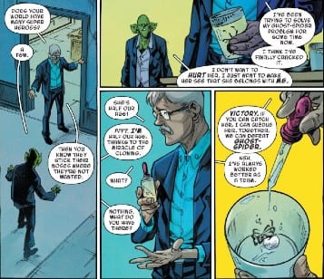
Each found guilty of an irredeemable crime, four robots find themselves banished from their homeworld and bound together by the Kill Lock-a programming link that means if one of them dies, they all will. Now a soldier, an addict, a murderer, and a child find themselves forced to protect each other while in search of a cure to survive.

Writing & Plot

Livio Ramondelli proves himself to be creatively multitalented on “Kill Lock.” The Transformers artist shows off his narrative capabilities with a killer original premise, tense pacing and excellent dialogue. The advantage of having a knowledgable artist write a comic is that the art is often made to speak for itself. There’s no overhead narration here. Every bit of storytelling is delivered through just the art or through character interaction. The dialogue here is (ironically) organic and varied among the four main protagonists. This works wonders in making the audience relate to a set of characters who aren’t even human. The plot also is very matter-of-fact about its presentation. There is no narrative discussing how this reality of human-like robots came to be. It just is what it is. It’s a courageous storytelling move that pays off in spades here.

Art Direction

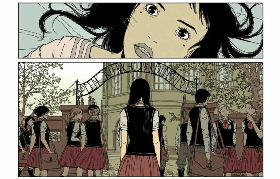
Ramondelli’s art here in “Kill Lock” #1 is some of the most stellar work seen in comics this year. The amount of detail in the environments and robotic characters is staggeringly gorgeous. The oppressive blizzard of a planet the quartet finds themselves stranded on looks as though it were crafted from a hybrid of nature documentary and sword & sorcery landscape. The robots themselves are all given distinct and memorable designs with their own sets of features (as much as these machines can have them). Their metal exoskeletons are pocked with scratches and dents to their paint. The hydraulic lines that make their musculature can be seen on some shots, making them anatomically eerily similar to humans at times. The lettering from Tom B. Long as well is fantastic, as each character is given their own font that matches their tone; from The Child’s innocence to The Soldier’s stoicism. Every aspect of the design going into this comic is phenomenal.

“The Kill Lock” #1 is a brilliant debut to one of the most promising series going into the New Year. Livio Ramondelli proves his storytelling talent with a unique premise and excellent narrative technique. The artwork is breathtaking and brings this oppressive atmosphere and these characters to life in an immediately engrossing way. Be sure to pick up “The Kill Lock” at your local comic shop this week.


Monkeys Fighting Robots Youtube

Exclusive Christmas Preview: DAREDEVIL #16

Daredevil #16 hits your local comic book store next year (January 1, 2020), but thanks to Marvel Comics, Monkeys Fighting Robots has an exclusive Christmas present for you, the first five pages.

The book is written by Chip Zdarsky, with art by Jorge Fornés, Nolan Woodward is the color artist, Clayton Cowles added letters, Julian Totino Tedesco was the cover artist, and Ryan Benjamin & David Curiel are the Marvels X variant artists.

The setup for Through Hell Part 6:
Matt Murdock and Elektra paid a visit to the governor after learning he made the call to stop the police from entering Hell’s Kitchen. Interrogating the governor provided the names of the people truly behind the decision: The Stromwyn Family

Meanwhile, Wilson Fisk had a face-to-face with the Stromwyns at their campus, which turned in to a brutal beatdown by armored thugs on their payroll, ending with Fisk being thrown out a window.

Check out the five-page preview of Daredevil #16 below:


Are you reading Zdarsky’s Daredevil? Comment below with your thoughts.

Monkeys Fighting Robots Youtube

Comic Books: The Good and Bad of Other Media’s Influence

Comic Books: The Good and Bad of Other Media's Influence

Comic book fans love to see adaptations of his or her favorite characters on the big screen, but the creative decisions that directors take may result in changes to the source material. Is this adapting of comic books a good thing for the medium, or just complicating already complex continuities?

The reason that comic book companies choose to alter its current continuities so that they resemble other media is very practical. They do so because film and television have a much larger market than comic books. If someone is exposed to an adaptation of a comic, it may urge them to check out the original series, and they may be shocked to find that the comic version is substantially different from the version in the film, TV show, and or game. To prevent this, comics books adapt to other media, in ways that may help or hurt them.

For instance, Samuel L. Jackson’s Nick Fury debuted in the Marvel Cinematic Universe during the end-credits scene of Iron Man in 2008 and became an essential character in the first Avengers movie in 2012. Before the films, Jackson’s likeness was used for the Ultimate Universe version of Nick Fury, so while Jackson may not have resembled the Main Universe version of Nick Fury, there were few people displeased with the actor taking up the role.

MCU Adaptation of Nick Fury

In 2012, Marvel Comics decided that having the Ultimate Universe counterpart of Nick Fury resembling Jackson was not enough, and the six-part series Battle Scars introduced Nick Fury’s son, Sgt. Marcus Johnson. This son of Nick Fury is African American, and during the series loses an eye and has his real name revealed to be Nick Fury Jr. The series concludes with the original Nick Fury retiring and his son joining S.H.I.E.L.D, leaving the Marvel Universe with a Nick Fury that closely resembles Fury from the MCU. The character rarely ever uses his suffix, leaving most new readers unaware of the existence of the previous version of Nick Fury. Deciding retirement wasn’t enough to keep the prior Nick Fury out of the way, the character was given the role of “The Unseen,” and now resides on the moon after the events of Jason Aaron’s Original Sin. 

Battle Scars Nick Fury that resembles film adaptation

While the work put in to alter Nick Fury may be convoluted, other media has resulted in positive changes in comics before, such as Batman: The Animated Series’ retcon of Clayface’s origin. Previously, there were five villains with malleable clay bodies who had taken up the mantle of Clayface, and it was difficult to keep track. The Animated Series chose to make it so that Basil Karlo was the first and only Clayface. When DC Comics went through a reboot, they followed in the Animated Series‘ footsteps. A few of the other versions of Clayface later returned, such as Lady Clay, but using Basil Karlo as the main Clayface has made following the Batman mythos much more accessible for new fans.

Batman from Batman: The Animated Series

In January of 2013, The Amazing Spider-Man comic series was ended in favor of a new The Superior Spider-Man series. This new series told the tale of Otto Octavius, Doctor Octopus, stealing the body of young Peter Parker and trying to be a better Spider-Man than Parker ever was. This fun and quirky series was unlike anything in comics at the time and received fan acclaim. However, in 2014, the series was ended, and The Amazing Spider-Man series was revived so that the new issue one would line up with the release of The Amazing Spider-Man 2 movie. In favor of the sales boost associated with the release of a movie regarded by fans and critics alike as awful, Marvel Comics ended one of the best Spider-Man series fans had seen in a long time.

The Superior Spider-Man

A change in comic books that causes much debate among fans occurred after the release of James Gunn’s Guardians of the Galaxy movie in 2014. The movie brought in a relatively obscure group of characters for their very own blockbuster and the risk in doing so paid off immensely. The movie grossed more than $600 million and received praise from critics and fans alike. Where the debate lies in fans of the comics is the way that Star-Lord’s character was altered in the movie and in the comics following. Before the character appeared on-screen, he had a pessimistic view from many years of combat, and while he was sarcastic, he was not the jovial goofball that Chris Pratt portrayed in the film. The comics soon changed to fit the personality shown in the movie, but many fans prefer this new Star-Lord. A good laugh is something many readers need, so the new Star-Lord was a breath of fresh air. Some fans still prefer the old version, making people unsure whether this is a good or bad instance of movies changing the comics.

Picture of Star-Lord in front of a space background

Recently, DC Comics has announced a new limited series titled Harley Quinn and the Birds of Prey, mimicking the lineup of the new movie, Birds of Prey and the Fantabulous Emancipation of One Harley Quinn. The pairing is in no means outlandish for current continuity, but only time will tell if we can thank the movie for bringing the villain/anti-hero and the group of heroines together or if we will rue the day that the two ever became associated with each other.

Harley Quinn and the Birds of Prey Comic

Comics are a media that is very near and dear to our hearts, but there is no doubt that movies, games, and television shows are more popular. Due to this, it is only natural that companies attempt to make the comic books similar to other media. We can get angry over change, or we can try to embrace it and see the good in each alteration. While it is difficult to see the positives in some of the changes described above, the most we can do is voice our displeasure and see if the next issue improves.


Do you think comics should be adapting to fit their movie adaptations? Let me know in the comments below!

Monkeys Fighting Robots Youtube

Holiday Flashback: Larfleeze and the Truth About Santa

Santa Claus and the Christmas season are no strangers to the comic medium. Every year come the holiday season, there are a slew of Christmas one-shots and specials involving everyone’s favorite heroes in heartwarming holiday tales. One of the best and most memorable of these holiday specials is the Larfleeze Christmas Special one-shot by Geoff Johns and Brett Booth.

Johns’ Green Lantern is a galaxy-spanning epic made of tense battles and compelling character drama. Once each of the new Lantern Corps is introduced, they are all fleshed out so well that none of the main Corps leaders – no, not even Sinestro – are considered truly villainous. Larfleeze is kept a bit of a mystery as a character by comparison, but is also the only one made a victim of his own power. The orange light latches onto a being and gives them its power, at the price of being cursed with everlasting gluttony. This absolves him of any serious evil and easily makes him a sympathetic character to the audience. Which also helps him be so damn fun to read. Nearly every page the character is on is given his cartoonish desire for every random thing he sets his eyes on. He doesn’t care about the Lantern struggle against the Blackest Night or quests to protect the galaxy. He sure would like a toaster oven though. Whatever that is.

The “Larfleeze Christmas Special” comes about after the Orange Lantern keeper makes his home on Earth. He does so after hearing about our planet’s consumerist love of getting stuff. He and Green Lantern Hal Jordan manage to arrange a tenuous agreement so Larfleeze can stay in the massive junkpile of items he’s collected. Things seem fine. Then the greedy alien learns about Christmas – and a certain red-clad jolly figure who brings gifts on a great sled. Larfleeze’s excitement about such a prospect is snuffed out when he looks under his well-decorated tree (seriously, he got and decorated a Christmas tree) to find nothing from his roughly thirty-mile-long list. Furious, he flies out to hunt down Santa for his betrayal. After terrorizing a shopping mall Santa and a small-town Christmas parade, Hal Jordan catches him and tells him the truth about the holiday.

What makes this special so endearing is how it takes advantage of the tone Larfleeze brings as a character. His obsession collides with the Christmas spirit in a visual manner that will immediately put a smile on your face. Brett Booth’s artistic renditions of Larfleeze’s snazzy decor and how he dons his gay apparel are immensely entertaining. Even better are Johns’ clever fourth wall breaks, especially his now-infamous Holiday Cookie Recipe. Johns mixes the Orange Lantern’s humorous greed with the meaning of the holidays to ultimately deliver an emotional ending to the issue. It reminds the reader that Larfleeze is, after all, a tragic character who has been through more than most would give him credit for.

No, seriously – he made cookies!

Geoff Johns and Brett Booth’s “Larfleeze Christmas Special” one-shot is a heartfelt and hilarious holiday issue that’s sure to make even the most jaded comics fan smile. If you’re needing a bit of a Christmas-time pick-me-up, give it a read from a site like Comixology or in the back issues of your local comic shop.


Monkeys Fighting Robots Youtube

INTERVIEW: Chad Eikhoff Made An Elf’s Story Into a Christmas Classic

An Elf’s Story: The Elf on the Shelf is a holiday children’s movie that has
been airing for eight years straight, and writer, producer, and director,
Chad Eikhoff was a big part in bringing the beloved Christmas book to
cinematic life.

Based on the 2005 children’s book, An Elf’s Story: The Elf on the Shelf is
about the little guys and gals who help Santa make all the toys for Christmas.
Chippy, one of Santa’s elves, is assigned to a family that is losing belief in the
magic of Christmas. For Chippy, the job is tough, and he questions his
relevance. However, with the help of his friends and the big guy in the red suit,
Chippy learns just how important the magic of the holiday season really is.

PopAxiom spoke with Chad Eikhoff about his career as a writer, director, and
producer, and making a modern-day children’s classic.

Road To Elves

The road to making An Elf’s Story started in a small town in Georgia called
Powder Springs. Chad recalls loving the look of Christmas, with “snow-
covered roads and lights.”

Chad’s love for animation started at an early age. He remembers growing up
reading comic strips in newspapers. “My very first desire was to be a
cartoonist. I wanted to be Charles Shultz. I just thought it was amazing that
drawing characters could be a job.”

As early as middle school, Chad was creating and submitting his own strips.
But then a realization created a new desire. “Finding out that you can make
them move and bring the character to life is what really pulled me into
animation.”

What pulled Chad into animation are still driving him today. “I am fascinated
with the imitation of life. How a pencil and paper could turn into a character
that had a sense of life to it. It is magical to me.”

elf-christmas-movie

Christmas Specials

To say that Chad is a fan of the holiday season might be an understatement.
“I absolutely love Christmas specials. I love the entire Christmas season,
starting with Thanksgiving morning. My first cat as a grown-up was named
Macy, after the famous Thanksgiving Day parade.”

Watching An Elf’s Story might give you a familiar feeling if you have ever
watched the evergreen specials created by Rankin/Bass back in the 60s.
“What resonated with me was the use of artwork and a unique sense of style,
which really captured a sense of spirit, wonder, and whimsy.”

Capturing the spirit of Rankin/Bass films was “definitely intentional,” said
Chad. “I love those movies and have a great memory of them,” he said, “and I
know I’m not alone.”

Chad also realized that there had not been a holiday special since those
earlier Christmas films, which were made in the 60s. “There really hadn’t been
a sort of evergreen Christmas movie that came on every year like those,” he
stated. While creating An Elf’s Story, Chad says, “I wanted to lean into, ‘How
do we mimic what makes them resonate with so many people?’”

An Elf’s Story premiered in 2011 and has been playing every holiday season
since. It has aired once a week on TV since Thanksgiving. “It’s mind-blowing
when I see it next to the classics, such as the Grinch, Charlie Brown, Rudolf.”

https://www.dailymotion.com/video/x5d9xmr

About An Elf’s Story

An Elf’s Story uses computer-generated imagery to achieve its visual style.
However, the film still has an old-school charm about it. “In An Elf’s Story, we
worked with traditional animation techniques. Pixar, and later Disney, brought
these ideas back. For a while, there was a push toward making things look
like live-action. But, Pixar did a great job with storyboards and finding the story
in there.”

Chad continues to describe the process for An Elf’s Story: “We worked with a
story reel and edited it until it felt almost like an animated comic. We were
able to quickly move it into an animatic, which is set in the 3D universe. We
were scripting, rewriting, and re-conceptualizing in the same files we were
going to be using for the animation.”

A rare process, though, Chad mentions a recent Disney film that did a similar
thing. “The Lion King … did that same thing …” “We’re able to create the
world and build the story inside of that,” he said.

Wrapping Up

“There is a sense of wonder and whimsy in these holiday specials,” Chad
said, “and a sense of spirit. I found this as an adult when reconnecting with
the films through my kids.”

Chad continued: “The impact that’s so positive. And I am focused and inspired
by things that are creating positive, wondrous, whimsical worlds, stories, and
characters.”

As a writer, producer, and director, what movie would Chad like to get his
hands on in this age of remakes? His answer is unique and welcomed.

“There are certainly worlds that are fun to explore. With the techniques we
have, you can build out some of these worlds in incredible ways.”

Chad elaborates, “Glen Keane (The Little Mermaid, Beauty and the Beast)
was an animator and director who is someone I look up. He created all kinds
of characters for Disney. Now he’s working in hand-drawn, virtual reality
projects. Working with someone like that on creating something new would be
very interesting to me.”

For Chad, being able to draw and have it be his profession is a dream come
true. And despite today’s fancy tech, he says, “even when you’re working on
virtual reality in 3D, everything starts with a pencil on paper.”

Will you be enjoying the latest classic Christmas
children’s movie this holiday season?

Thanks to Chad Eikhoff and Impact24 PR for making this interview possible.

Want to read more interviews like this? CLICK HERE.

Monkeys Fighting Robots Youtube

A Slow Descent Begins in HEARTBEAT #2

Maria Llovet’s blood filled story of Eva’s slow descent into a world unlike her own maintains a rhythmic heartbeat that’ll keep you on your seat until its final page in BOOM! Studios’ HEARTBEAT #2.

I also wake up terrified of going to school. Even though I don't!
Interior art by Maria Llovet

Make sure to check your heartbeat with our review of the previous issue. Or if you’d fancy a look at the next issue, here’s an exclusive preview.

A Heartbeat That’s Slow And Steady

Llovet’s style of storytelling in Heartbeat is different them most other comics out there. Being the storyteller and the artist gives her the freedom to plot out her story at her own speed with however much dialogue she wants. Using this to her advantage, Llovet puts a heavier emphasis on her visual elements, expecting it to carry the brunt of what’s happening. That’s not to say it isn’t heavy with dialogue at points. But, when Llovet adds dialogue, she does for the furtherment of the plot, not just to hit a word count.

Heartbeat’s storytelling can feel slow to some, but to those who enjoy a slow burn, Llovet achieves said burn perfectly. A scene that perfectly encompasses this is when the detective who is at the high school questions the kids. Instead of having a few pages consumed of the Detective questioning multiple kids, Llovet joins the conversation towards the end. By starting this segment with the end of the interrogations as the Detective asks if the students have anything else to add.

Furthering the point of keeping only what’s necessary on the page; Llovet only shows four students answering, besides Eva — thus giving the reader the feeling that these characters might be as crucial as Eva, or factor in later on. But that’s not all. Whereas the other students give a hard one bubble “no,” Eva’s response differs. This small studder may not seem like much, but with this, Llovet elegantly shows how far Eva has strayed since we met her in Heartbeat #1.

Who doesn't miss school? What, with it's singing, cluttered halls, and interrogations from a Detective? Just another day in Heartbeat!
Interior art by Maria Llovet

Passionate Art

In Heartbeat #1, we spoke on Llovet’s panel rhythm, as she kept the pace with same-sized rectangular panels while adding in varying sizing to “beat” faster or slower. This heartbeat panel structure can be seen during issue two, with its inclusion helping amplify the tension. Much like the writing, no panel feels wasted when it comes to adding to the overall story. In some instance’s Llovet includes Eva just wondering around, but during these moments, the silence/inaction says a lot on her character.

The pages seen throughout Heartbeat #2 show how Llovet’s range of palette works in tremendous harmony, with most pages mirroring colors from the real world. Some instances are bright, yet never too bright, while the same can be said on the opposite spectrum of colors. This sense of realism helps the haunting story being told in Heartbeat by making the images that much more eerie.

How about a NO?
Interior art by Maria Llovet

Written in Blood

Llovet’s Heartbeat was originally in Spanish and translated into serval different languages later. With this in mind, BOOM! Studio’s English version needed a translator, that being Andrea Rosenberg. It’s hard to say how true to the source it is, as I haven’t read the original release. But, in no moment does anything seem off in a translation sense. As Heartbeat #2 relies more on visuals than dialogue, it helps that AndWorld Design remains on lettering. In the previous issue, AndWorld Design was able to maneuver the dialogue bubbles around what was transpiring in the panels. Luckily they can do the same in the second issue.

A Heartbeat That’s Slow, But Not Bradycardia (Conclusion)

Much like its first issue, Heartbeat #2 is hard to recommend to just anyone walking into the shop. The themes presented throughout are known and shown in western media, yet in a manner that’s more mature and can be hard to process. Those themes and the fact that Llovet takes her time to tell her story may shy readers away. Yet, if all those sound like your cup of tea, then you’ll have one mighty fine drink (comic) in your hands!

Time To Check Your Heartbeat

Have you enjoyed the slow-paced tale of Eva that Llovet is crafting so far? Let us know down below!

Monkeys Fighting Robots Youtube

Review: EAST OF WEST #45 Featuring The End Of It All

East of West #45
East of West #45 Credit: Image Comics

This Christmas, Jonathan Hickman and Nick Dragotta bring their apocalyptic comic East of West to its climactic conclusion. After 44 issues published by Image Comics, all of those story threads are finally woven together but the main question is, can anyone survive the end of days?

East of West #1 came out in March 2013 and introduced a dystopian future that was on a one way journey to the end of the world. From the very beginning, with the introduction of The Message, the majority of the main characters were working towards one goal: the destruction of the world as foretold in their pseudo-religious cult. 

Throughout the series, each member of the cast has been forced to face their beliefs and choose a path to follow. There has been death and destruction along the way, with switching allegiances and complex political manoeuvrings. As the final year of the apocalypse played out it became apparent that no-one was safe and everything was to play for.

Hickman has garnered a reputation for detailed planning and long term plotting, something which is evident in East of West. There were moments throughout the series where a speech would appear and, as a reader, you would realise that elements of that speech had been quoted before in the opening issues. Scenes hinted at in the beginning, played out in full later down the line. And each character’s motivation slowly unravelled month after month, year after year. 

East of West has been a mammoth undertaking with an exceptional story line and some of the best art and design work in any comic published in the last 7 years. As individual issues it has been amazing, as a collection it is breathtaking. So, how do you end something of this calibre? With a number of other popular genre series ending this year with mixed success, see The Walking Dead comic or the Game of Thrones TV series, does Hickman deliver a finale fitting the series as a whole?

East of West #45 cover
East of West #45 Credit: Image Comics

The End, Of Our Elaborate Plans..

With a series that has been running for 7 years and 44 issues, the one thing that you think would go without saying is that this final issue is not new reader friendly. All the story has been set up and played out with very little left but the clear up. But that’s not entirely true of East of West. There is something familiar about the style and themes that the comic embraces that even at this late stage the general thrust of the comic can be picked up from this single issue. The characters may have motivations that aren’t clear and present but the overall narrative is one that anyone can understand and relate to.

The opening scene of this issue if a classic western scene, plain and simple. For the second time this month I’m impressed by a clever take on The Good, The Bad, and the Ugly. Hickman has a lot to cover in this issue, it is the End of Days after all and there is a massive cast to take care of, but at no point is the narrative rushed. The opening scene plays out with as much drama and suspense as the Sergio Leone movie. Those first few pages generate a sense of an epic western all by themselves.

There is a great deal of pressure on this single issue to provide a more than satisfying climax for a host of characters and story-lines. Luckily, Hickman knows what he is doing and, as has been mentioned, the story has been planned from the beginning. Each narrative thread drops into place like a piece of a jigsaw with the overall image becoming clearer and clearer with each turn of the page. Characters meet the end of their story in satisfying ways, even if it is not how you would have expected. The larger plans conclude with the same exciting drama that they were built on.

In essence Hickman knows exactly what he is doing and you are pulled through this issue from page to page, witnessing a majestic ending to a beautiful series. Character arcs are fulfilled, prophecies alluded to early make sense, and in the end we get what we deserve: an Ending.

East of West #45
East of West #45 Credit: Image Comics

Can you picture what will be..

Everything that has made this series good is on display in this final issue. Nick Dragotta’s artwork perfectly blends the energetic Manga style with classic Western sensibilities. If there is one thing you will take away from this comic it is the energy burning up the page. The characters appear to move with amazing speed and have unlimited force behind them. Their presence on the page is larger than life, reflecting the narrative theme of the series. 

But there are also touching moments: small, intimate exchanges between characters. And it is in these emotional scenes where the real power of this comic comes from. The larger than life violence is entertaining and definitely page turning but the ability to switch from that to brief, introspective and emotional moments is true genius.

The coloring within East of West has often set the tone and differentiated settings, something which continues through this final issue. Frank Martin drowns the violence in blood red washes and throws a frontier orange hue over the confrontations. He continues to pick out characters by allocating them their own color, a technique he started with the first issue, making the action easy to follow for even the newest of readers.

If you come looking for a weakness you’ll not find one. Not in the dynamic composition work or the pace setting speech. The placement of the balloons lead you into and out of the action, accentuating the panels and the dramatic punches of the narrative. Rus Wooton adapts the style of speech balloon to fit the character, sometimes subtly and sometimes more noticeably. Just like the coloring, the borders of the balloons and the coloring within relate directly to the speaker while the text inside informs the tone and emphasis.

This comic’s main problem is that you will be so wrapped up in the brilliance of everything that you’ll not have time to appreciate the exceptional work that has gone into producing it. At least not until the second or third read through.

East of West #45
East of West #45 Credit: Image Comics

Conclusion

Like everything in this final issue, there are breaks to the norm; flashes of a brighter future portrayed through cut panels with blue skies. And therein lays the real surprise. After 44 issues of impending doom, often inspired by the breakdown of real world politics, the ending here is not steeped in despair. The main take away from the narrative and the art is a strong impression of Hope. Hope for the future; a future not yet written.

If you have been reading East of West for the last 7 years there’s not a chance you are going to miss this issue. It is by far one of the best endings of the year and does justice to the previous issues. The entire creative team have produced their best work, month after month, and this issue is the icing on the spectacular cake. It is A grade work from cover to cover.

Allow yourself a moment to take a breath, because this is The End.

Monkeys Fighting Robots Youtube

GHOST-SPIDER #5 Has Double The Jackal For Double The Trouble

Cover by Jorge Molina

Hitting stores in your dimension this week from Marvel Comics, Ghost Spider #5 creeps up on us with more Miles Warren drama.

Last issue, upon returning home from school on Earth-616, Gwen was followed through her dimensional portal by The Jackal into her own home dimension, Earth-65. Blinded by his oh-so creepy obsession with Gwen Stacy, Warren is doing anything he can hunt her down and “convince” her that they are meant to be.

Two Miles Warrens. Two times the headache…

Writer Seanan Mcguire really expresses the stalker tones in this issue but fluctuates them between being cartoonish and realistic making Warren all the more eerie. Teaming up with Miles Warren of Earth-616 is who else but Miles Warren of Earth-65. Warren-65 is much less obsessive and creepy but still gives off sinister scientist vibes as he has discovered a way to suppress, and potentially even kill, Gwen’s symbiote.

The banter between these two can be funny at times. Though it breaks my heart to see one of Gwen’s Symbiote Spiders shrivel up like that.

While the last few issues have given us some down time with Gwen, this one has The Jackal as the main focus, following his perspective from the start. Almost showing us that Gwen’s time off has come to a stop and it’s time to get back to her real Superhero affairs, rather than stopping some guys with guns here and there.

As a whole, Ghost-Spider #5 does a lot to progress this first story arc for the renumber series and hastens the pace of events happening. Gwen’s still as snippy as ever and there’s a lot of fun humor in the dialogue while also bringing the overall tone to be a bit darker and resemble more of what we’ve seen in the past with this character and her constant looming theme of death.

The art team had a clever impact on this issue as The Jackal really sticks out like a sore thumb in the setting. Notably it seems artists Takeshi Miyazawa and Ig Guara put a lot of attention into detailing him more than the other characters in panel as well as Ian Herring making his big slick green head clash with the rest of the color palettes used in Earth-65’s setting. Making him not only stand out in appearance, but really show he does not belong there. Even his dark green monologues stand out over everything else, which is even more impactful thanks to VC’s Clayton Cowles.

Worth noting since Gwen Stacy is the most notably weird thing the public has seen in Earth-65, a green faced elf looking dude in a suit is definitely going to stand out.

Moving forward I am interested in seeing where McGuire takes Gwen’s story, admittedly I am hoping one day this Gwen Stacy can truly move out of the shadow of Earth-616 Gwen Stacy and the theme of drawing comparisons between the two dies down. It certainly started to feel improved on when Gwen got her own original villain in the form of The Man-Wolf, who is still out and about thanks to being mayor J. Jonah Jameson’s son. But adding in The Jackal does seem to bring these themes back around again.

Ghost-Spider #5 helps liven up Gwen’s current story but surprisingly is taking place more dominantly in her home universe. While the villain does come as the result of her attending school in Earth-616, going into this new run I imagined her interweaving more with conflicts in that universe. I am happy to see that the Man-Wolf story was not just swept under the rug after the renumber and that we still get more gorgeous Earth-65 backgrounds and settings. I definitely recommend keeping up with Gwen’s adventures still for any fan of her series. She’s still my favorite web-head of the bunch.

How do you feel about Gwen Stacy of Earth-65’s constant comparisons and themes revolving around Gwen Stacy from Earth-616? Do you share my gripes? Or do you want to see more of it? Lend a voice in the comments and let us know!


Monkeys Fighting Robots Youtube

Review: READ ONLY MEMORIES #1 is Masterful Cyberpunk Noir

Read Only Memories #1, the first chapter in a new four-issue limited series out this week from IDW Comics, is a true sci-fi treat. Inspired by the critically-lauded game 2064: Read Only Memories, the book takes us into some fascinating territory.

A robot hires private investigator Lexi Rivers to track down her lost human lover, dragging her into the middle of a gang war in the process. For full disclosure: I never actually played the game on which this book is based. That said, newcomers will have no problem getting invested.

Read Only Memories Page 1

The Writing

What begins as a seemingly-mundane P.I. story quickly develops into a much richer tapestry of sci-fi tropes, creative ideas, and social commentary. By the halfway point of Read Only Memories #1, it’s clear that writer Sina Grace has something much more interesting to say than paying basic homage to genre clichés.

One of the book’s greatest assets lies in the worldbuilding. While it can be a bit jarring to drop straight into this world at first, readers can quickly pick up on the lay of the land. The society introduced here is a fascinating, libertine vision of cyberpunk neo-noir. It’s not dystopian, instead remaining thoroughly believable and grounded. At the same time, the book retains its authenticity by hewing to real-world concerns.

There are clear references to class, gender, and queer politics throughout Read Only Memories #1, which Grace handles tactfully. He largely avoids overt comments, instead showing how the political and economic climate nonetheless shapes the world around the characters. The result is an impactful and ultimately much more satisfying touch to navigate these dynamics. At the book’s center, though, is a genuinely interesting story. While narratives about detectives on the fringes are dime-a-dozen, this one stands out from the pack.

Overall, the writing is sharp, well-scripted and focused throughout. With each page, you find yourself drawn further into this world, its characters, and the story unfolding.

Read Only Memories Page 2 Read Only Memories Page 3

The Artwork

Read Only Memories #1 is a gorgeously-stylized book. Each page drips with a neon, eighties-inspired aesthetic. At the same time, it avoids feeling like another tired throwback; artist Stefano Simeone’s crisp artwork and soft lines give the book a very contemporary vibe.

The style is reminiscent of the artwork of Patrick Nagel in some regards, but it still feels very its own thing. The softer lines are somewhat sketchy, but it fits the tone of the book, retaining a very clean presentation. Details in the background are used selectively, giving the reader an impression of the world without providing a great deal of laborious or overwhelming scenery. The result is that the focus remains on the characters and the mystery unfolding in Read Only Memories #1.

For color, the artist bathes every page in a palette of blues and pinks. While reds and other colors sneak in here and there, those two tones dominate the color scheme. It melds perfectly with the inks, creating a singular, cohesive presentation.

Read Only Memories Page 4

Final Thoughts

By the end of Read Only Memories #1, you find yourself hooked into the story and its fascinating futurist vision. This is one of the most intriguing new comics on the stands, and it comes highly recommended.

Monkeys Fighting Robots Youtube

DC Comics Exclusive Preview: BOOKS OF MAGIC #15

Books of Magic #15 hits your local comic book store on January 1st, but thanks to DC Comics, Monkeys Fighting Robots has an exclusive six-page preview for you.

About the issue:
For months, as his magical abilities have grown, the edges of Tim Hunter’s mind have been haunted by a vision of his future self…an older Tim Hunter who’s grown to become a living nightmare. So with his friends turning away from him and the magical law officers of the other side on his trail, what will Tim do when that nightmare steps out into our world?

Books of Magic #15 is written by Kat Howard. Layouts are by Tom Fowler, with finishes by Craig Taillefer, colors by Jordan Boyd, and letters by Todd Klein. The cover is by Kai Carpenter.

The preview below shows that Tim Hunter is still dealing with the fallout from the Sandman Universe Presents Hellblazer Special, in which readers see a future version of the young wizard gone evil.

Check out the Books of Magic #15 preview below:

dc comics exclusive preview books of magic #!5

dc comics exclusive preview books of magic #!5

dc comics exclusive preview books of magic #!5

dc comics exclusive preview books of magic #!5

dc comics exclusive preview books of magic #!5

dc comics exclusive preview books of magic #!5

dc comics exclusive preview books of magic #!5

dc comics exclusive preview books of magic #!5


Are you reading Books of Magic? What is your favorite Sandman Universe title? Sound off in the comments!

Monkeys Fighting Robots Youtube