Home Blog Page 365

Review: The Kinmundian Fights Against The Forces Of Armageddon in BATTLEPUG #5

BATTLEPUG #5 cover artwork

BATTLEPUG #5, available in comic book stores on Wednesday, January 8th, forces the Kinmundian’s nightmares into his reality. The portal to another dimension has been opened by the Queen of the Northland Elves, and she’s unleashed a horrific beast on the group. No one is sure what the villain is planning, but it’s clear one thing is driving her actions: revenge.

Story

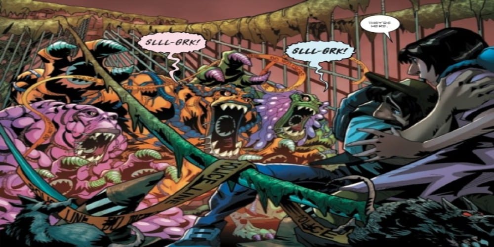
All tensions are high in this climatic scene in the Northland. Even the giant boy, who claims to own Sprinkles, sees the dangers the Queen poses by opening up the dimensional door. As a desperate measure, the boy realizes he must risk his life to close the door. Fortunately, the Kinmundian, Moll, and the others have the same goal in mind.

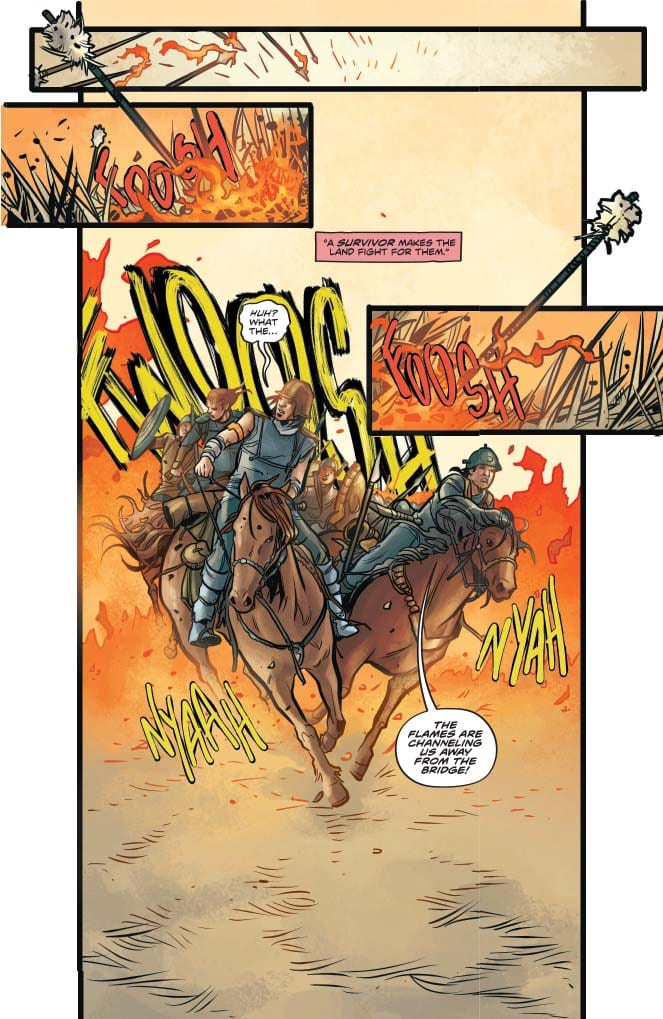
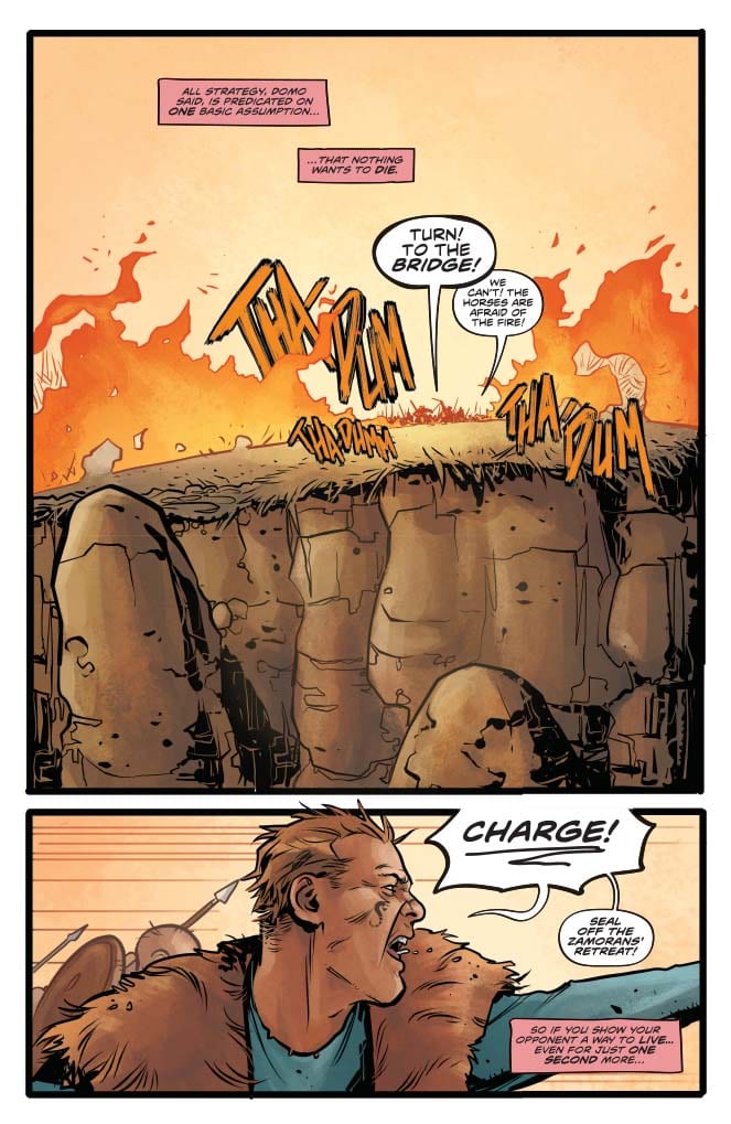
The allies unleash the full force of their powers on the Queen and the Beast. Bryony uses her plant magic on pumpkin seeds in a creative fashion, Sasha trades blows with the help of her enchanted armor, and Moll, along with the Kinmundian, use their connection to the forces of nature to conjure up a beast of their own.

Mike Norton’s writing captures the desperation in each character, yet balances it with their determination to fight the Queen, her monsters, and whatever else the alternate dimension has in store at all costs. If readers didn’t know it already, this group of misfits are true heroes. The question is: Can the Kinmundian prevent to impending doom the dimensional break poses, or will the images that have haunted his dreams for weeks come to fruition?

Artwork

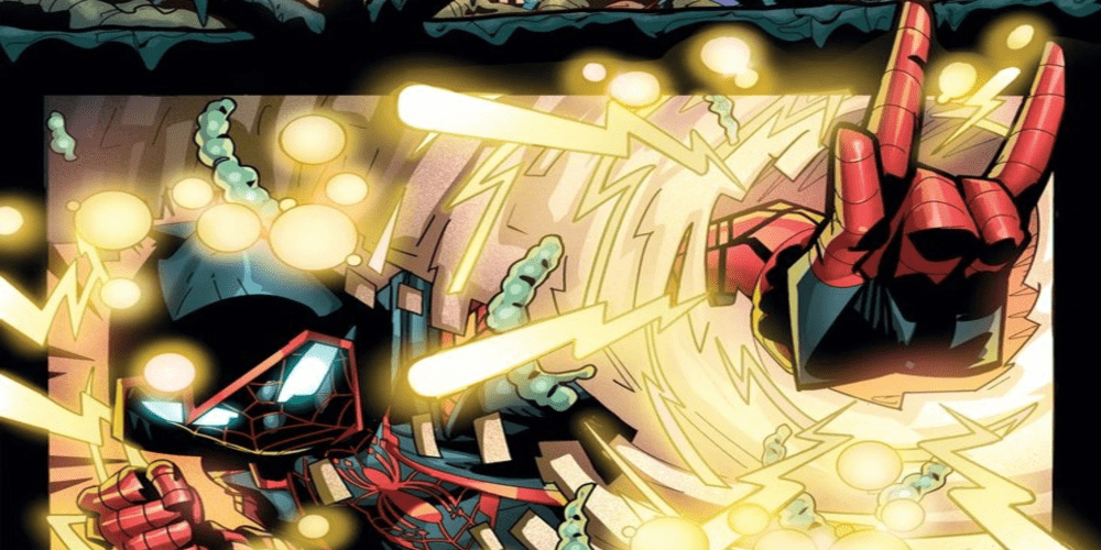
The artwork within this issue contains all the thrills and frills of a multidimensional battle scene. Norton’s penciling and ink work pairs well with Allen Passalaqua’s coloring, In addition, featuring horrific details on the beast and an assortment of colors ranging from one end of the color wheel to the other. And CRANK!’s lettering ties the scenes together with impressive styling of the onomatopoeia sound effects, allowing readers to imagine they have landed right in the middle of this climatic battle.

Comic Covers

Main Cover

Norton and Passalaqua’s main cover depicts Sprinkles and the Kinmundian locked in combat with the beast from the alternate dimension. We see the desperate look on our heroes’ faces as they fight a creature far surpassing them in power.

Variant Cover

Gene Ha’s unique variant cover gives us an otherworldly version of Sprinkles, as if he was transformed into one of the beings from the dimension door. This effect makes us question the beloved dog’s true origins.

Conclusion

BATTLEPUG #5 is the issue readers have been waiting for since the plot’s unveiling in issue #1. We finally see the Kinmundian’s nightmares come to life, and the fate of the world lies in the balance. We’re anxious to find out how this all turns out!

Do you think the Kinmundian and Sprinkles will be able to reach the other dimension? Let us know in the comments below!

Monkeys Fighting Robots Youtube

The Return of a New Enemy in STAR #1

A new Marvel villainess rises to the top in STAR #1, out this Wednesday from Marvel. Originally introduced in Captain Marvel’s series, Star is getting her own miniseries – which means a lot of bedlam and machinations are about to ensue.

Look who’s back! It’s Star, as first introduced in Captain Marvel.

***SPOILER WARNING***

Fans of Captain Marvel will surely recognize the name Star. She was a character (villain, really) introduced in her latest series – and she pushed Captain Marvel’s limits and boundaries in ways that we’ve never seen before.

For her part, Star wasn’t always a villain. Her name is Ripley Ryan, and she used to be a reporter – one who genuinely enjoyed her job. Then one day she was sent to interview Captain Marvel for Ms. Magazine. And that’s the day that everything changed for her.

Long story short, her entire worldview was blown apart thanks to one macho jerk of a villain. And the rest, as they say, is history. Well, perhaps not so much. This miniseries is enough to prove that Star’s story is far from over.

Star #1 brings us back to the villainess that caught our attention with her unique design and brutal plans. Now she’s beaten, but far from broken. Her first issue in this series is full of cameos, and thus not something you’re going to want to miss out on.

Star #1 shows us what would admittedly be a very unpleasant memory…

The Plot

Let’s just say it now: Kelly Thompson has done it again. Star was an interesting character right from her first introduction, but this plot has taken her to all-new levels. Star #1 is a finely balanced issue. It’s impossible to forget all of the horrible things Star did – and all the things that she is still willing to do. And yet there’s something so…human about her struggles here. Well, mostly human at any rate.

You see, Star is in a unique situation. She’s beaten, yes, there’s no doubt about that. But she’s not broken. And she’s free. That’s giving her the time to learn how to work and control a pesky but powerful stone in her body.

That in itself would be enough to make this issue a remarkable one, but the truth is that the story has just begun. There are several cameos to accompany Star’s plotting and scheming – and they’re the sort of interactions fans live for.

We’re not going to spoil it all by talking about who walks into these pages. But we will say that it was a blast to read – and had several extremely satisfying moments. One of which may or may not include a beating and a few Spider-Man worthy quips.

Star may be a villain, but we can sympathize with some of her issues here.

The Art

Star #1 features some truly outstanding artwork. That second page is a total eye-catcher. Not only is it vibrant and compelling to look at – but it’s a poignant reminder of what Star has already gone through (even if it was something of her own creation).

Javier Pina and Filipe Andrade were the lead artists for this issue, and they clearly enjoyed the challenge of drawing for a villain. Ripley’s expressions are plain to read, even as she masks up and makes some tough decisions for herself.

Meanwhile, Jesus Aburtov’s colors are what make this issue what it is. His understanding of rich tones and color combinations is impressive and given Star’s color palette (mainly red and white) that creates a lot of striking scenes.

Then there’s VC’s Clayton Cowles, who provided the lettering for this issue. There was a lot of information that had to be introduced and done quickly. Take a look at that first page, where the credits are included. That’ll give you a solid idea of what we’re working with here.

The fact that a villain bar exists shouldn’t be as surprising as it is.

In Conclusion

Star #1 was an intense and memorable introduction to this miniseries. Ripley’s quest is an interesting one, but it is brought to new heights thanks to the characters revolving around her. Or targeting her – whichever you prefer.

Monkeys Fighting Robots Youtube

Revenge and Kidnappings in DRAGON AGE: BLUE WRAITH #1

DRAGON AGE: BLUE WRAITH #1, out Wednesday, January 15th from Dark Horse is the beginning of a whole new set of adventures. Once again we’ve been transported back to the delightful yet dangerous world that is Dragon Age.

The cover of Dragon Age: Blue Wraith #1 is a concerning image, if ever we’ve seen one.

***SPOILER WARNING***

There are a lot of reasons why Dragon Age fans should consider picking up Dragon Age: Blue Wraith #1. For starters; do you remember Fenris from Dragon Age II? Odds are pretty good that you do – he’s about to make his first comic book appearance in these pages.

It’s also worth mentioning that this is the very same team behind Dragon Age: Knight Errant and Dragon Age: Deception. So if you enjoyed either of those series, this is one to check out (hint: they have some characters in common!).

That is not the best way to cultivate talent…just saying.

The Plot

Dragon Age: Blue Wraith #1 starts off strong. Given that this series is only going to be three issues long, that’s probably not too much of a surprise. They only have so much time to tell us this tale. Right away we’re pulled into the action – with Fenris, aka the Blue Wraith, cleaving a bloody path to his goals.

Which sounds about right, when you think about it. This has always been a world full of magic and conflict, and that’s one of the many reasons why fans have been so drawn to it. All of the danger and epic qualities have been perfectly captured here, though the gore always seems to feel more real when it’s on the pages.

Nunzio DeFilippes and Christina Weir are a dynamic writing duo, bringing us a complex plot full of dynamic characters. There’s a unique blend of characters here, as they’ve pulled characters from the games (obviously), as well as creating several of their own.

If you haven’t read the other series they’ve created, you might find yourself a bit confused about some of the events referred to here. But honestly, you can get a lot of information from the context alone, so don’t let that intimidate you away from giving this series a try.

While the majority of this issue has a harsh and heavy tone, there are some delightfully funny moments sprinkled throughout. That is thanks mostly to the character development they’ve invested in thus far.

Talk about not pulling those punches! There are plenty of brutal battles to be found in Dragon Age: Blue Wraith #1.

The Art

Unsurprisingly, Dragon Age: Blue Wraith #1 has some truly stunning artwork. Likewise, one should anticipate plenty of brutal and bloody battle scenes. For this is a series that doesn’t shy away from the more graphic elements that come with fantasy fights.

Fernando Heinz Furukawa was the lead artist for this issue and should get most of the credit for what we see here. At least in regards to the designs for the battles and poses – all of which are epic. Meanwhile, Michael Atiyeh was the colorist and did an exceptional job nailing the tone and colors of the world we know so well. Finally, Nate Piekos of Blambot was the letterer, and you can see their trademark style throughout. It works rather nicely in this particular world.

If the faces here are anything to go by, then there’s a fair amount of tension building in the background.

In Conclusion

Dragon Age: Blue Wraith #1 was an intense and interesting start to a series. Honestly, the only downside we’re seeing to this series thus far is that it’s going to be a short one. But we’ll take what we can get, and enjoy learning a bit more about Fenris and what he’s been up to in the meantime.

Monkeys Fighting Robots Youtube

A Changing of the Minds in STEEPLE #5

STEEPLE #5, out Wednesday, January 15th from Dark Horse is filled with witchcraft, second-guessing and self-doubt. And thus ends another brilliant and quirky series.

Steeple #5’s cover has some interesting implications and concerns.

***SPOILER WARNING***

It’s hard to believe that Steeple is coming to a close, but that is exactly what Steeple #5 signifies for its fans. This may be the final issue in the series, but the door has been left open for those fans desperate to see more – and to have their lingering questions answered.

Steeple was always meant to be a miniseries, so we can’t pretend to be surprised by this early conclusion. But that won’t stop us from being sad about it. Billie’s personality was so unique and charming, it was difficult to do anything but look forward to whatever antics she was going to get into next.

The silver lining here is this: John Allison (writer and lead artist) isn’t done. In fact, we already know of at least one new project he’s working on called Wicked Things. He’ll be working alongside Max Sarin, which is really all the more reason to get excited here. So at least we have something to look forward to there.

The alternate cover of Steeple #5 is vibrant and brings hints at a reappearance of certain characters of the monster persuasion.

The Plot

Steeple #5 is not your ordinary wrap-up issue. But then again, Billie isn’t exactly an ordinary leading character, is she? That’s where the charm of this series comes from. So we really shouldn’t be surprised by any additional twists that John Allison throws our way.

There is a lot to love and appreciate about this issue. The entire series has been this exploration of the human condition, about doubt, hesitation, and questioning your very nature. But this fifth and final issue in the series takes it so much farther.

With it comes several changes. Those changes may be for the better, or they may not be. That depends entirely on your perspective, and that is part of the point behind this whole series. It’s been beautifully showcased here, and done in such a way as to make the readers sit down and think.

Interestingly, while this issue is intended to be the end, it is left with enough wiggle room to easily continue. We’re not saying that it will – but the door has been left open, and that has gotten us curious.

The Art

Steeple #5 contains much of the charming artwork that we’ve seen in the previous issues. John Allison was the lead artist for this issue. His writing and his art merge together flawlessly, creating a world full of interesting and admittedly very peculiar characters.

As for the colors, those were provided by Sarah Stern. Her work is lovely, finding a balance between the muted colors of a small town and the vibrant colors that come from magic and life. It’s a fine balance, but it has given Steeple such a distinctive feel.

Finally, Jim Campbell was the letterer for this issue. And once again you can see how subtlety is key. There are several moments in which Campbell was allowed to get a bit more creative in this issue, and he didn’t waste those opportunities. The end result was something subtle, but fascinating. It was one of those moments that added layers to the story being told.

In Conclusion

While we’re sad to see Steeple end, we have to admit that Steeple #5 was another brilliant addition to this series. It pushed the boundaries and comfort zones of our characters, forcing them to think for themselves and make some tough decisions. That has always been a highlight of this series, so it was wonderful to see one last monumental decision before it all came to an end (for now).

Monkeys Fighting Robots Youtube

MIGHTY MORPHIN’ POWER RANGERS/TEENAGE MUTANT NINJA TURTLES #2 – Continues The 90’s Into 2020

It may be 2020, but the ’90s were such a great time people can’t let it go, this rings true with BOOM! Studios (in partnership with IDW and Nickelodeon) Mighty Morphin’ Power Rangers/Teenage Mutant Ninja Turtles #2 where lovers of both respected franchises get the chance to relive his or her action figure crossovers.

What happened to never showing your secret identity?
Interior art by Simone Di Meo with assistance from Alessio Zonno. Colors by Walter Baiamonte with assistance from Igor Monti. Letters by Ed Dukeshire

Make sure to read our review for the first issue if you haven’t or pick it up from your local comic shop.

TALE WITH ATTITUDE

Akin to their respective TV series, MMPR/TMNT #2 is fast-paced with barely any slow down, yet, it never swerves into break-neck speed. Instead, the second issue (of five) is able to give a fair amount of new information effectively. While keeping some revelations in its pocket. Writer Ryan Parrott is able to achieve a great feat of making each conversation fun while being informative and important to the plot/characters. When the Turtles and Power Rangers interact, they stay true to their characters and play off of each other perfectly. The aforementioned excellent character interaction happens anytime the teams are on the page together, but hits exceedingly harder during an action moment.

During one fight scene, there is a conversation I’d like to note. Not due to what it’s about (pizza), but because of how Parrott wrote it. As the fight with the two teams and Foot Clan rage on, each member teams up with another from the other team to fight the clan. During this, the pairs of fighters banter back and forth to the reader’s great enjoyment. But, when Parrott jumps from one pair to another, we join them in the middle of a conversation, instead of the very beginning. This may not seem like much, but this joining in makes the scene feel real. This technique makes the fight feel as if everyone is having conversations we can’t hear (read).

MMPR/TMNT #2 reveals the reason why Green Power Ranger, Tommy Oliver, has joined the Foot Clan. At first, some readers may think it’s awkward writing, yet it’s entirely in line with how he is. This furthers the point of Parrott understanding what these characters are fundamentally about.


Great weapons opening page.
Interior art by Simone Di Meo with assistance from Alessio Zonno. Colors by Walter Baiamonte with assistance from Igor Monti. Letters by Ed Dukeshire

LEAN GREEN NINJA ART TEAM

Simone Di Meo continues the high energy art seen in MMPR/TMNT #1 into the second issue with assistance from Alessio Zonno. Each fight scene packs in a beautiful fluidity that feels like animation cells coming together for a cartoon. During the fights, the duo exaggerates some actions/movements, but it never looks weird or overdone. Instead, these exaggerations help make the battles feel alive with static energy, precisely what you’d expect from both franchises. Yet, the beautiful art isn’t limited to just action moments. When the story calls for the few slow-paced character moments, they literally break the panels.

The art duo makes sure that when characters are talking during non-action scenes, the panel they adorn is layered upon the others to make them pop. Another element that pops is the gorgeous colors by Walter Baiamonte with assistance from Igor Monti. During some scenes in MMPR/TMNT #1, the colors are too bright, which causes problems. But in MMPR/TMNT #2, this blight never occurs. Instead, the colors are vibrant and jazzy as they should be.

A great panel in a great issue.
Interior art by Simone Di Meo with assistance from Alessio Zonno. Colors by Walter Baiamonte with assistance from Igor Monti. Letters by Ed Dukeshire

One of the best moments of color usage is a more subdued one. When the Power Rangers unmask, instead of making it take a large panel or some big ordeal, the team makes it a smaller moment with minimalist motions. In this scene (shown above), when the masks deform – for a better word – it’s shown with a few colored shapes coming off their heads. It’s simple, yet one of the coolest moments in MMPR/TMNT #2.

In the previous issue, Ed Dukeshire’s lettering was a highlight with a mood mirroring the show while helping MMPR/TMNT #1 pop more. Dukeshire’s amazing lettering returns in MMPR/TMNT #2. Per usual, Dukeshire makes sure none of the letters obscure the are while helping the viewer’s eyes. On top of that great skill, he changes the format for words in a few cases that make said moment stand out more.

When the two leaders say enough then you know it's for sure enough.
Interior art by Simone Di Meo with assistance from Alessio Zonno. Colors by Walter Baiamonte with assistance from Igor Monti. Letters by Ed Dukeshire

Conclusion

MMPR/TMNT started with a solid issue that had a few minor hiccups. With the second issue, all of these blemishes have vanished, leaving a comic book that warrants a read if you’re a fan of either story. Even if you’re not a fan, the creative work inside is with your time.

Memorable Quote: “Just hit her in the head, guys don’t overthink it.” – Yellow Ranger

She does have a very valid point.

MIGHTY MORPHIN POWER READERS

What did you think of the second issue? Let us know down below. I enjoyed the first issue so much I went and started reading each team’s new comic series.

Monkeys Fighting Robots Youtube

Review: MILES MORALES: THE END #1 Offers A Strange Glimpse Of The Future

Miles Morales

With Miles Morales: The End Saladin Ahmed, Damion Scott, and Dono Sanch-Almaraez bring a glimpse of what the future would be for Miles Morales: Spider-Man. Does this trip to the future present a satisfying ending or one which is best left unexplored?

Summary

THE FINAL MILES MORALES STORY! Humanity makes its last stand in the only place strong enough to survive: BROOKLYN. Former Spider-Man, Miles Morales, leads the last bastion of civilization into the future! Penned by MILES MORALES: SPIDER-MAN author SALADIN AHMED!

Miles Morales

Writing

Marvel’s The End books help to showcase a “final” issue and offer an ending a character may not usually receive. With Miles Morales: The End, the reader sees an older Miles facing a world of monsters and a band of zealous raiders to protect Brooklyn, the last safe haven in a world gone mad. It’s a good premise, but for some reason, it just feels like Miles deserves more. His character always worked to try to prove his own path and be seen by the world as being different than Peter Parker. It feels like a story showing him finally able to become more significant than his predecessor would be the ideal way to go.

Of course, Saladin Ahmed was the writer on Miles Morales: Spider-Man, so he does know a thing or two about the character. A future where Miles can keep the home he loved and protected feels like something the character would be satisfied to achieve. It’s a proper enough execution, but you can’t help but wonder if there couldn’t be a grander story to tell.

Miles Morales

Artwork

The art by Damion Scott presents a unique look at this post-apocalyptic world. The juxtaposition between the safety of Brooklyn and the chaos of the rest of the Earth is present. Yet, the character designs seem off as if they don’t fit in such a setting. As if they need to be more grizzled and hardened.

The colorwork by Dono Sanchez-Almara aids in the overall art experience, as it adds some excellent technical and action effects in the issue. The color also helps to show character intensity, especially with adding emotions to the eyes.

Miles Morales

The lettering by VC’s Cory Petit adds to the issue’s inability to keep the hard edge associated with post-apocalyptic futures. The lettering seems better suited for a more light-hearted issue instead of one trying to tell the final emotional adventure of a character. It isn’t terrible, but it doesn’t give the issue the boost it needs.

Conclusion

The story doesn’t give Miles a chance to become great but instead shows a future where he can keep his home safe. Though not as grand as one would think a final story for Miles Morales: Spider-Man would be, its still an interesting read. Fans of the character should check out for themselves and see if its an ending they agree with or not.

Monkeys Fighting Robots Youtube

GIDEON FALLS #20 – Don’t Drink the Dirty Evil Black Water

Father and Mother get to the village at the center as they prepare for death, in Gideon Falls #20, out this week from Image Comics.

First Impressions

After some mind bending reveals in previous issues, the journey to the center of it all begins here. Our characters are confused and ill prepared, but they’re running towards the danger. Everyone is preparing for the next step, but they don’t really know what that step is.

Creative Team

Jeff Lemire is following three groups in this issue and doing a magnificent job of pacing. After finally finishing Twin Peaks in a binge over the weekend, I’m able to pick out more similarities in the two stories. The only reason I even started watching Twin Peaks is because Lemire mentions it quite a bit. Gideon Falls is the weirdest and most evil parts of Twin Peaks. GF is what TP would be if it completely focused on the Black Lodge with a narrative much easier to follow, but without the comedy and awkwardness.

Art

Andrea Sorrentino continues to amaze with his work on this title every month. Nothing I can say about his work that I’ve not already said in previous reviews. His work is amazing, it’s haunting, and his panel layouts are unique in the industry. If there was a way to capture the weirdness of David Lynch cinema on a comic book page, Sorrentino does it.  If I needed someone to draw one of my nightmares, I know exactly who to call.

Dave Stewart nails the colors for Gideon Falls, just like he does for every title he works on. He gets it. I would be surprised if he’s given any notes about how things should look anymore. Bright colors are toned down, and the only color that ever stands out is red. If I’ve learned anything from Twin Peaks it’s that red and black usually mean something is not right. Red doors, red rooms, red curtains, just stay away from the red stuff!

A bunch of bugs kept letterer Steve Wands busy this issue. The way the sounds of the bugs looks makes it feel like it’s a loud and bold sound that just burns into your mind and drives you crazy. Like your dryer squeaking or the brakes of a train screeching, you just want the sound to stop immediately. The sound still haunts you.

My 2 cents

The story feels like it’s winding down to a resolution, but if this story is anything like Twin Peaks was, it could go on forever. Since Gideon Falls is more of a narrative, hopefully we can expect an ending without more questions, but I think that was what drew people to Twin Peaks. It’s so strange and dreamlike that just about every scene can be interpreted a different way by different people.

We’ve seen that the Black Barn is connected to many different realities, but will it behave like the Black Lodge? If they find and destroy the barn, what happens to those other realities? Do they still exist? How will the characters be able to get back to their own world?

Can they even defeat this kind of evil? Check back next month for the next chapter of Gideon Falls.

What do you think of Gideon Falls? Have you seen Twin Peaks? What the hell did I just watch in Twin Peaks? Let us know in the comments below.


Monkeys Fighting Robots Youtube

Review: The Final Battle Rages in RED SONJA #12

Red Sonja #12

It all comes down to this. With Red Sonja #12, out this week from Dynamite Entertainment, we have the final showdown between Sonja’s rag-tag band and the full might of the Zamoran Empire.

Can the barbarian queen and her forces pull it off? Dragan has the numbers and the resources, but Sonja still holds the only bridge across the Vilayet Sea. Plus, she has more cards up her sleeve than she lets on.

Red Sonja #12 Page 1

The Writing

Mark Russell’s writing in Red Sonja #12 is tense and fast-paced. We’re locked in minute-by-minute, watching the climactic battle unfold. We don’t know how Sonja and her Hyrkanian forces can win, but she seems to have one trick after another she can use to harry Dragan and strike where her enemy is vulnerable.

We can chalk how Sonja’s plans unfold up to a combination of tactical brilliance and sheer luck in timing. As a result, a Hyrkanian victory still feels plausible, even despite the overwhelming odds. The storytelling is tight, but doesn’t stretch the belief of the reader, which is a very fine line to walk.

Scattered throughout the book are flashbacks to Sonja playing a game against her old mentor, Domo. Russell used this framing device throughout his run as a means to make a direct address to the reader about the broader themes of his work on the series. Here, we see the writer expound on the nature of war and violence: cyclic, and ultimately futile. However, we also see Sonja manage to triumph against her master, not through overwhelming force, but through cunning and compassion, which adds layers of profundity to the work.

Red Sonja #12 manages to feel climactic, epic, and satisfying as the conclusion to this story. Truth be told, the writer’s run on the character has been so well-constructed from a narrative standpoint, this could even work as a standalone, 12-issue maxiseries. Despite the tight storytelling and conclusion, Russell manages to setup several conflicts that will come with the next story arc. It’s a fully-formed finale, yet with a hook to bring readers back for issue #13.

Red Sonja #12 Page 2 Red Sonja #12 Page 3

The Artwork

I’ve had some gripes regarding Mirko Colak’s style from time to time during his run on the series. Few of those critiques hold up with Red Sonja #12, though.

Colak’s artwork is well-suited to Russell’s writing. The grime and grit of war is palpable throughout the book. In addition, we have some marvelously kinetic action sequences brought to life with lively, dynamic illustrations. In earlier issues, I commented that the artist’s figures sometimes felt rather static and lifeless; here, though, the characters practically leap off the page at points.

The visuals are not always the most clear and distinctive in Red Sonja #12. This has been another recurring complaint about Colak’s style throughout the run. In this chapter, though, it feels less like an artistic oversight, and more a product of the chaotic battle scenes on the page. While not perfect, the composition of individual panels is solid.

Red Sonja #12 is a very…well…red book. Irony red tones, courtesy of colorist Dearbhla Kelly, dominate the pages of this issue. The palette works well as a backdrop to the fighting. Plus, by employing a significant amount of blue-green to compliment the reds, there is plenty of contrast going on.

Red Sonja #12 Page 4

Final Thoughts

Red Sonja #12 is a masterfully-crafted conclusion to what may be one of the best stories in the history of the character. Go out and buy every issue of this run NOW.

Monkeys Fighting Robots Youtube

Panel Breakdown: STAR #1 By Kelly Thompson, Javier Pina, and Filipe Andrade

Welcome to PANEL BREAKDOWN, a weekly series where we take a look at our favorite panels of a comic book. This week we are talking about the new Marvel Comics series STAR #1 (of 5) written by Kelly Thompson, with art by Javier Pina & Filipe Andrade, Jesus Aburtov gave the book colors, and you are reading Clayton Cowles’ letters.

The first issue establishes Ripley Ryan as a wildcard force in the Marvel Universe. The unpredictability of the character is entertaining, and the artwork of Pina and Andrade demands attention.

About STAR #1:
BORN OF THE REALITY STONE, THE BREAKOUT CHARACTER FROM CAPTAIN MARVEL FLIES SOLO!
Ambitious reporter Ripley Ryan rocked New York City when she became the hero STAR, adored by everyone. But in truth she was Dr. Minerva’s attempt at a Kree-human Super-Soldier. Desperate for the strength to control her own destiny, she tried to kill Captain Marvel – and failed. Ripley was left, defeated and powerless, in the Raft…or so she thought. The Reality Stone has found her, and now no prison can hold her. You thought you knew what the Infinity Stones were capable of. Think again.


Do you have STAR on your pull-list, let me know what you think after you read it.

Monkeys Fighting Robots Youtube

Panel Breakdown: STAR WARS #1 By Charles Soule And Jesús Saiz

Welcome to PANEL BREAKDOWN, a weekly series where we take a look at our favorite panels of a comic book. This week we are talking about the new Star Wars series written by Charles Soule, with art by Jesús Saiz, Arif Prianto & Saiz worked on colors, and Clayton Cowles added the letters.

The new series takes place right after Luke’s confrontation with Darth Vader in Empire Strikes Back. I was hooked immediately, and one of the main reasons was Saiz’s artwork. Powerful is the word that comes to mind with the combination of Saiz’s work and Soule’s words as you turn to the last page.


What did you think of Star Wars #1, did you have a favorite panel? Comment below with your thoughts.

About Star Wars #1:
“No…I am your father.”
In the wake of the events following The Empire Strikes Back, it is a dark time for the heroes of the Rebellion. The Rebel fleet…scattered following a disastrous defeat at the Battle of Hoth. Han Solo…lost to the bounty hunter, Boba Fett, after being frozen in carbonite. And after being lured into a trap on Cloud City and bested in a vicious lightsaber duel against the evil Darth Vader, Luke Skywalker…learned the horrible truth about his past. Vader did not kill Luke’s father Anakin–Vader is Luke’s father! Now, after narrowly escaping the dark lord’s clutches, and wounded and reeling from the revelation, Luke, Princess Leia, Lando Calrissian, the Wookiee Chewbacca, and the droids C-3PO and R2-D2 must fight their way back to the Rebel Alliance-for the fate of the entire galaxy is at stake! After so many losses is victory still possible? But, what Leia, Luke, and their ragtag band of freedom fighters do not realize is that they have only traded one Imperial trap for another! Enter the cunning and vengeful Imperial Commander Zahra, at the helm of the Tarkin’s Will!

Monkeys Fighting Robots Youtube