Home Blog Page 356

QUANTUM & WOODY #1 Shows How To Make The Basics Funny

Quantum & Woody #1 back in action.

The worst superhero duo is back in Quantum & Woody #1, and it’s proof that you don’t need to read every piece of what came before. These dysfunctional step brothers have such a simple life; who needs to take them in a new direction?

Recap Just Because

Quantum & Woody follow two step brothers Eric Henderson and Woody Van Chelton who got superpowers through an accident involving metal wristbands. Due to the unstable nature of their powers, if they don’t clang each other’s wristbands every 24 hours, they’ll dissolve/explode. The problem is, Woody and Eric are complete opposites who can barely stand each other. Even though they became superheroes for hire, Quantum & Woody often bicker and cause more mayhem than the mad scientists they clash with. Dubbed the worst superhero team, they’re often down on their luck trying to make ends meet. To top it all off, the voice of reason in this team is their father’s consciousness occupying the body of a superpowered female goat. Comics are weird and Quantum & Woody #1 revels in that.

Quantum & Woody #1 Story Premise

Quantum & Woody #1 opener 
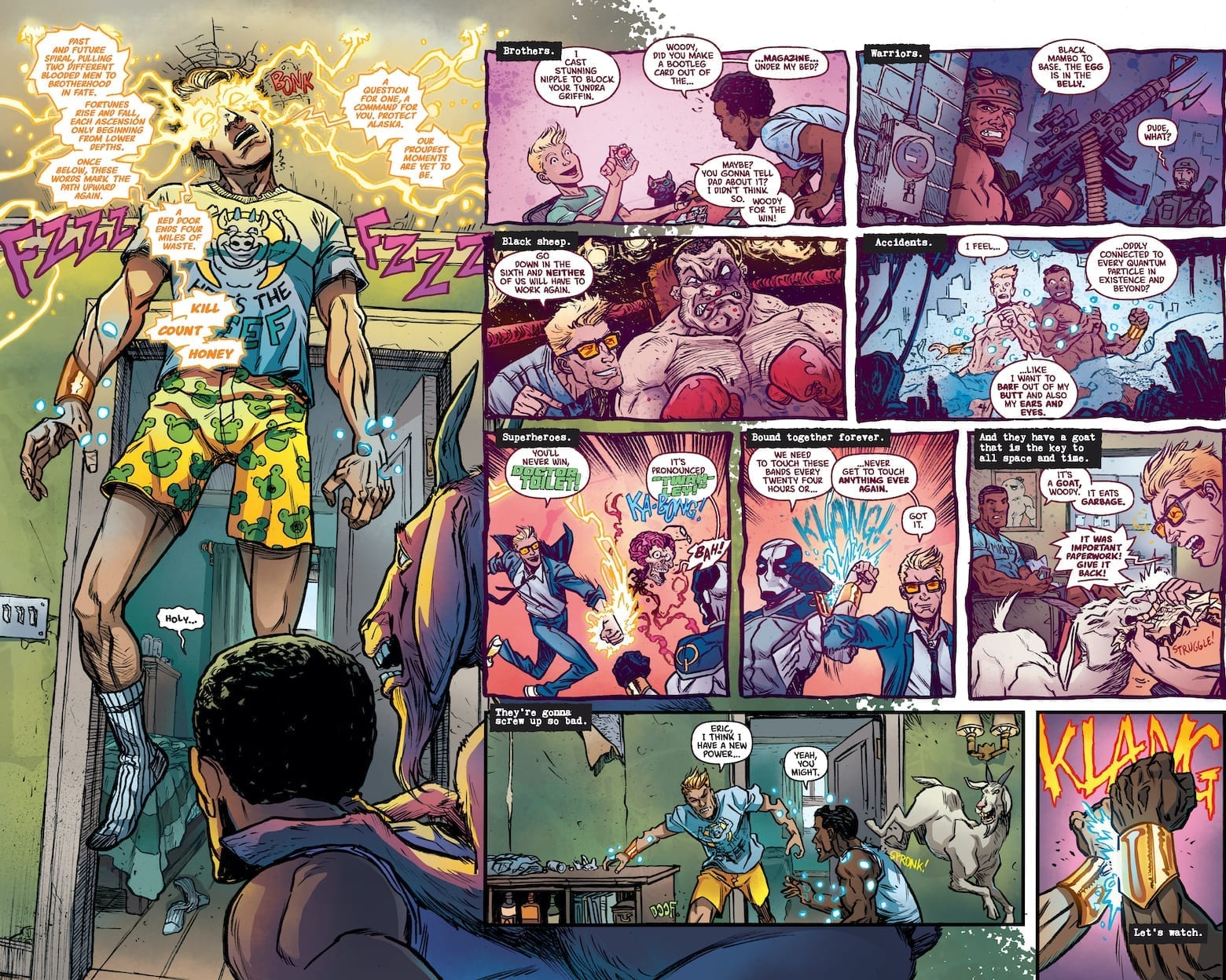
The writing of Quantum & Woody #1 is a great way to reintroduce readers to the characters (just look at our exclusive preview of the debut issue). Unlike Valiant cash cows like X-O Manowar or Bloodshot, Eric and Woody’s comedy focus offers an easy way in. They don’t have any grand ambitions or arcs, they’re just trying to get by, all the while trying to survive each other and their antics. Quantum & Woody has always been a Buddy Cop story with themes of family sticking together. This series is no different especially when this dynamic duo have to face the Kammerjäger family. Eric and Woody might not have the best chemistry like this hitman family, but they do get the job done. Especially when Quantum & Woody have a good art team behind them.

Art

Ryan Browne’s mixture of moods and camera angles assist in making Quantum & Woody #1 scenes immensely humorous. The close-ups work with exaggerated facial expressions to bring out the issue’s most hilarious scenes. But humor is just half of the art; the rest of the penciling and inking process go into keeping the reader focused. Because if the scene goes in too many directions, who will get the joke?

Most of Ruth Redmond’s coloring is somewhat muted, while the brighter coloring acts as beacons for major developments, from Woody’s fortune telling yellow sparks, to the green light of the Capitol Building entrance. Even the Kammerjäger family gets an introduction through a stove’s bright blue flame. It’s what makes the revelation about them as the issue’s villains all the more hilarious because readers are in on the joke. Finally there’s the lettering by Hassan Otsmane-Elhaou.

Lettering Highs and Low

The lettering’s main job of guiding the reader through the story is allowed to go out of direction during certain periods. This gives readers a choice on which directions to take. Because some people have a preference of following the images instead of text. Only for Hassan to subtly raise the emotional intensity. Perhaps the most obvious are the times when bold red words pop up to evoke excitement. From surprises to anger, the audience is hooked in.

Sure some people can get by with just the artwork, but this lettering style makes Quantum & Woody #1 even better.

What Are You Waiting For? Get Quantum & Woody #1!

What the headliner said! But before you do, got any thoughts? Leave them in the comments.

Monkeys Fighting Robots Youtube

Review: Willpower Versus Ultimate Control In GREEN LANTERN: BLACKSTARS #3

GREEN LANTERN: BLACKSTARS #3 main cover

GREEN LANTERN: BLACKSTARS #3, available in comic book stores on Wednesday, January 29th, concludes writer Grant Morrison’s three part miniseries, and it’s definitely one for the books. The newly created Blackstar order, made from the old universe’s Green Lanterns, is poised to assert absolute control over its beings. But Blackstar Parallax, a.k.a. Hal Jordan, dreams of a world long forgotten, one in where he’s a Green Lantern. Can he uncover the secrets of this alternate reality before free will as we know it is erased?

Story

Jon Kent, the son of Superman, a boy with pent-up angst and disappointment in his world’s “heroes,” has officially joined the Blackstars. Hal knows this puts his teammates in the sights of Superman, but believes reaching out to the boy was the only way to show him he was understood. Unfortunately, Superman sees this as an act of aggression and levels much of the Blackstar militia.

Morrison brilliantly portrays the tensions that inevitably arise between the new generation and the old guard, the restless and the unmovable. We witness Jon unleash the anger that’s been buried for a long time, while Superman attempts to reach out to him in understanding, albeit too late. Each group believes one couldn’t exist while the other was around. Unfortunately, they failed to realize that their fear of losing control over the other would ultimately lead to their destruction.

But all hope is not lost. Hal asks Belzebeth to give him more information about his dreams of another life, only to hear the faintest whisper in his ear—the voice of his old Green Lantern ring A.I. And, in a blaze of glory, the old Hal jumps into action. The former superhero ditches his Blackstar gear and encourages the Blackstars to cling to their own willpower, rejecting any Controller who would decide their destiny for them. But will rousing their forces be enough to topple Belzebeth?

Artwork

The artwork within this miniseries’s final issue captures the essence of the entire run: a blending of dystopian nightmares and hopeful new beginnings. Xermanico’s penciling and ink work, combined with Steve Oliff’s coloring, give readers a fully-realized look at the chaotic world that is this version of Earth. What’s more, the details of each character are incredibly in-depth. Readers can see their heroes in all their glory, right down to the threads of Superman’s cape. Coupled with the bright red flashes of light from the Blackstars, one will feel like they’re in the middle of the action.

Steve Wands’s lettering was well-placed throughout the book as well. It followed the action to help readers pace themselves through the fast-paced scenes.

Comic Book Covers

Main Cover

Liam Sharp’s artwork for the main cover depicts an epic clash between Hal and Belzebeth, pointing readers to the issue’s ultimate confrontation.

Variant Cover

Diego Rodriguez and Darick Robertson’s variant cover illustration features Hal and Belzebeth fighting the Justice League, showing readers the painful division that’s arisen.

Conclusion

GREEN LANTERN: BLACKSTARS #3 is a thrilling conclusion to the Blackstar saga. We’re excited to see where Morrison and team take the mythos next!

What do you think lies ahead for the Green Lantern Corps? Let us know in the comments below!

Monkeys Fighting Robots Youtube

Review: The New Ronin Wrecks The City In HAWKEYE: FREEFALL #2

HAWKEYE: FREEFALL #2 main cover artwork

HAWKEYE: FREEFALL #2 hits comic book stores on Wednesday, January 29th, continuing the sharp shooting Avenger’s solo adventure. Last issue introduced readers to a nefarious figure known as the Hood, who seems to have much of the city in his back pocket. In addition, a person running around dressed as Ronin is causing trouble, and many consider Clint to be the perpetrator. How will the hero handle these thorns in his side? The way he always does—a little luck, a little skill, and a devil-may-care attitude.

Story

Hawkeye’s been on a losing streak in terms of crime fighting. He was unable to apprehend the crime lord the Hood, and the mysterious figure committing felonies in his Ronin costume continues to evade him. In this issue, the anonymous vigilante runs through a number of cronies serving the Hood, slowly clearing them out for unknown purposes.

While “Ronin’s” going on a rampage, Clint uses some recently acquired funds to fund a gala for F.E.A.S.T., the charity run by May Parker. Writer Matthew Rosenberg purposely leaves his motives unknown, allowing readers to decide whether it be for egoistic glory or nobler purposes. This ambiguity allow us to put ourselves in Clint’s shoes.

We then learn Spider-Man has caught wind of the Ronin figure’s escapades and attempts to subdue him. But the figure proves to be too much of a trickster, outsmarting someone as capable as the arachnid hero.

Who is this masked figure? Is it just a coincidence he has similar skills to those of Clint? These answers and more are revealed in this action-packed issue.

Artwork

Otto Schmidt’s artwork for this series’s second issue is unique in its pleasing simplicity. The fluidity of the characters’ designs pairs well with varying purple shades, reminding us that this is undoubtedly a Hawkeye-focused story. What’s more, VC’s Joe Sabino’s lettering employs its own purple variations for Hawkeye’s internal dialogue and the Ronin figure’s speech, bringing greater cohesion between the illustrations and text.

Comic Covers

Main Cover

Kim Jacinto and Tamra Bonvillain’s artwork for the main cover depicts an aerial fight scene between Clint and the Ronin doppelganger. It’s a scene that prepares readers for the inevitable confrontation between these intriguing characters.

Variant Cover

Kyle Hotz and Dan Brown’s variant cover illustration chooses to present Clint and his other rival, the Hood. The sprawling red cloak from the villain covers up much of the city backdrop, perfectly representing the influence he has upon the people.

Conclusion

HAWKEYE: FREEFALL #2, on the one had, takes us further into the life of Clint as Hawkeye and his lackluster escapades. These moments help further humanize the “worst Avenger,” wooing his fans even more. On the other hand, the mystery of Ronin’s identity is intertwined throughout these events, keeping readers on the edge of their seats all the way through.

What did you think of the big Ronin reveal? Let us know in the comments below!

Monkeys Fighting Robots Youtube

Carol Choosing Her Own Resolution in CAPTAIN MARVEL: THE END #1

CAPTAIN MARVEL: THE END #1, out this Wednesday from Marvel Comics, is part of a larger series of events. Like the rest, this is the final tale of Carol Danvers. So get ready for an emotional roller coaster of a ride.

Carol is literally glowing on the cover for Captain Marvel: The End #1.

***SPOILER WARNING***

The End is the latest event in Marvel comics, featuring the final plot arc for several fan-favorite characters. And now it’s time for Captain Marvel’s final tale. Knowing Carol, and how the rest of these have gone so far, this is going to be one bittersweet tale.

Captain Marvel has always been one of those heroes to push herself harder than the rest. She’s always hoping to be better, to save more people. To be the hero that she wants to be and that the people deserve. With that sort of character, there’s little doubt that her ending is going to have as much impact as possible, with Carol going out doing what she does best.

Yeah, that sounds exactly like the Captain Marvel we know and love.

The Plot

If you’ve been a fan of the current Captain Marvel series, then odds are good that you’re going to enjoy Captain Marvel: The End. Kelly Thompson has once again stepped up to the plate, this time to write Carol’s final story.

In case it wasn’t painfully obvious, this is an emotionally powerful issue. Set in the year 2051, Carol is still fighting the good fight. But many things have changed for her – and much of it not for the better. Or more accurately, much has changed for the world, and that changed Carol.

Not the least of those changes is the physical one made to Captain Marvel. If you ever wondered what would happen to her and her powers as she got older, consider those questions officially answered. Though it may raise even more questions (because how could you not be curious for all of the details).

The jump to the future allowed for several clever moments, mainly showing Thompson’s view of what some characters have been up to, or what sort of legacy they’ve left behind. It’s fascinating, heartbreaking, and heartwarming all in one.

Finally, let’s talk about the elephant in the room. With a title such as “The End”, we kind of all know what is going to happen, even without the details. And in this case, it is very clearly telegraphed before the end (no pun intended). That’s a good thing in this case, because you’re going to need as much time as possible to emotionally prepare yourself for that blow. Even then it might not be enough. So get ready to cry. Just remember that Carol chose to go out this way, and if that isn’t the perfect ending for Carol Danvers, then we don’t know what is.

Take her advice screaming alien, you won’t regret it.

The Art

The artwork behind Captain Marvel: The End is truly striking. Carol simultaneously has changed so much, and so little, all in one. That the artists were able to portray this dichotomy is quite impressive.

The scenery and plethora of characters (some new, some cameos) is another impressive feat for this issue. So all credit to the artistic team for what they were able to bring together here. Carmen Carnero was the lead artist for this project, working alongside David Curiel for the colors, and VC’s Travis Lanham for lettering.

Together they’ve created something visually stunning to support this thrilling yet bittersweet tale. It’s the perfect combination.

Yeah, you shouldn’t have made her mad.

In Conclusion

Captain Marvel: The End may just be one of a series, but it truly did justice to Carol’s character. Her future may be slightly bleak in this version, but you’ve got to admit that there’s something really beautiful about the choice she made in the end.

Monkeys Fighting Robots Youtube

A Chaotic Beginning in FINGER GUNS #1

FINGER GUNS #1, out February 26th from Vault Comics, is a brilliant and chaotic start to a new series. And perhaps it is a strong reminder for all the reasons why teenagers should not suddenly wake up one day with powers.

What a psychedelic cover for Finger Guns #1

***SPOILER WARNING***

Finger Guns #1 is the start to an all-new series from Vault, written by Justin Richards, and drawn by artist Val Halvorson, with colors by Rebecca Nalty, and letters by Taylor Esposito.

This is a story about two teenagers and the sudden appearance of a very specific power: they can control other peoples’ emotions by pointing “finger guns” at them.

Their abilities may seem odd enough before taking into account the fact that they’re running parallel to one another. On the bright side, this is the opportunity they’ve been looking for. It’s time to change their lives and use this outlet for what it is.

The best part about the cover for Finger Guns #1 is that it’s a flip cover!

The Plot

A teenager wakes up one day to inexplicable yet incredibly useful powers. We’ve all seen that story a time or two. So it’s going to take some effort to surprise us. Yet that is exactly what Finger Guns #1 manages to do.

This is not your typical teenager getting powers story. There is no epic saga for them to go off on. There is no prophecy. No. This is just the story of two kids messing around with something that is way over their heads.

Justin Richards has introduced us to this world in a whirlwind of an issue. Wes and Sadie both have very different lives – yet it’s their powers that bring them together. While there were certain predictable elements (teenage boy gets powers and immediately uses it to mess with people) it was the fun sort of predictable, with lots of drama and fooling around.

The series starts off on a light and even slightly teasing tone, but it also proved that it isn’t afraid to get seriously dark when the time calls for it. That ability is going to take this series farther, and let it grow into something even bigger as time goes on. Just you watch.

And a casual beginning for Finger Guns #1.

The Art

Finger Guns #1 features a lot of really clever and fun artwork. Take that cover issue, for example. It’s a flip cover! That’s pretty cool, and not something you see every day. It’s also fairly symbolic in regards to our two main characters, for more than one reason.

The artwork is light and fun but full of bold colors and determined expressions. Our teenagers are full of angst – and it shows. Their emotions are raw and clear to see, as was intended. Meanwhile, the color palette is slightly off from reality, but that gives it this great twist to make the series stand out. And arguably it suits the plot itself very nicely.

Boy meets girl? Boy bumps into girl?

In Conclusion

Finger Guns #1 was a fun and chaotic introduction to this series. Wes and Sadie are not your ordinary protagonists, and it will be interesting to see how their story develops from here. This is not a series for fans to miss out on, thanks to the unique nature of it all.

Monkeys Fighting Robots Youtube

Review: DOCTOR TOMORROW #1 – A Well Illustrated Hero’s Beginning

Doctor Tomorrow #1 Cover

Doctor Tomorrow #1 is yet another attempt by Valiant to bring back older characters like The Visitor. This time around, Valiant begins to embrace a superhero staple of parallel universes. But is it enough to keep people’s interests? Let’s find out.

The original Doctor Tomorrow was created by Mark Waid and Brian Augustyn for Valiant’s Acclaim Comics universe. The character is a tribute to Golden Age superheroes and their pulp science fiction influences. Using technology from the future, Bart Simms helped fight Nazis as Doctor Tomorrow, a self-proclaimed time traveler. Unfortunately, after the war things weren’t going so great; people around Bart died and his daughter hated him. So he tries to prevent his superhero origin.

Much like the new Visitor series, the current story changes the structure for a modern audience.

Doctor Tomorrow #1 Writing

That's one way to make an entrance in Doctor Tomorrow #1

In the new series, rather than Bart getting his tech from 20 minutes into the future, he gets it from an alternate future, one where Doctor Tomorrow is a respected astrophysicist and superhero that’s on good terms with the other Valiant heroes. But even that couldn’t stop his archenemy Hadrian. As the villain’s name suggests, his collision with the heroes ends up annihilating their world. So what hope does a fifteen year old have even with his older self? Probably completing the Hero’s Journey.

Bart’s call to adventure is twofold. Like most teens, he’s trying to find what he wants to be. But with his dad busy, he’s struggling to find meaning. Most people can relate to this kind of character as Bart’s losing his motivations in life. By the time he and his friend Gretchen meet Doctor Tomorrow, things are looking up. This supernatural aid and mentor allow Bart to live his comic book fantasies. Even if it does mean the fate of the universe rests on a kid who can’t control his emotions. It’s not a bad set-up, but it’s something that’s happened so many times that Alejandro Arbona needs to add more unique factors to keep the series interesting moving forward.

Doctor Tomorrow #1 Art

Doctor Tomorrow designsJim Towe’s penciling and inking are of high quality with designs that evoke golden age flare. Bart’s costume after meeting Doctor Tomorrow probably has the most obvious homage with its trunks. More than that though, Towe’s art follows a sequence of movement, cinematic placement, and subtle expressive moments. All of these assist in making the story easy to follow and exciting enough to finish.

Diego Rodriguez’s coloring certainly brings up the excitement with just the right amount of blends and contrast. The blends help build the anticipation to the big flashy moments. Something as simple as the background of a pitch transitions to a baseball in front of the sun. Other times the blends help illustrate the states of mixed emotions like Bart’s talk with his dad.

Lettering

Clayton Cowles uses lettering as a way of exposition and foreshadowing. With proper placement, the lettering serves as a means of transitioning from the doomed timeline to the current timeline. Cowles also excels at guiding the reader through the issue with his balloon placement. As for the onomatopoeia, most of them are color coded and display the appropriate volume of their acts. The alarms going off near the end of the issue are the perfect indicator that this series could be something great.

Take a Chance With Doctor Tomorrow #1

So while the set-up to this story is very similar to what’s come before in books like Marvel’s Sentry, it has potential. At the very least, the artists working on this are good enough for the reader to pick up the series. Because with the energy and emotion going through some of the panels, it’s hard not to look away. The readers who stick around might be in for a good surprise.

Monkeys Fighting Robots Youtube

Review: The Plot Picks Up (A Bit) In WITCHFINDER: THE REIGN OF DARKNESS #3

The third issue of “Witchfinder: Reign of Darkness” brings us the best issue in this mini-series yet. Unfortunately, that isn’t saying much. While this issue reunites the reader with another fan favorite from the Hellboy universe, as well as introduces more supernatural revelations, it’s still not so good as to make the series wholly recommendable.

After consulting Panya about the Ripper case and Asquith’s suspicious connections with the Heliopic Brotherhood of Ra, the Witchfinder sneaks into the Brotherhood’s temple. But he’s completely unprepared for the informant he finds there! Meanwhile, a turn in Sarah Jewell’s undercover operation in Proserpine Home suddenly makes her search for the truth much more urgent.

Writing & Plot

“Reign of Darkness” #3 has the most engaging script thus far in the series. This is all due to the issue’s full embracing of the supernatural elements of the universe it inhabits, as well as the introduction of everyone’s favorite Victorian mummy, Panya. The sinister nature of the Whitechapel murders and their supernatural connection is teased through twist encounters and a steadily intensifying B-plot. This is all a welcome change, even if it’s over halfway through this thus-far inconsistent series. The dialogue has improved slightly as well, as most revelations are given in plot events and not walls of text. Grey still mostly explains things at his contemporaries here which still can make it a bit dull, but overall this is a more well-written issue than the previous two.

Art Direction

The unusual art choices made in “Reign of Darkness” are still here in the third issue, although much like the writing it seems to have slightly improved. The penciling remains just descript enough to identify the main human characters, and actually has the chance to shine with the reintroduction of Panya. The streets of Victorian London still look suitably foggy and gray thanks also to the colorwork. The strange “half-rendered” look still applies to the normal characters, but fortunately this is at least assisted in this issue by solid work on the supernatural characters and environments.

“Witchfinder: The Reign of Darkness” #3 is an improvement in terms of both writing and art over the prior two issues of this mini-series. The intensifying of the murder case alongside the firm introduction of the Hellboy universe‘s supernatural elements makes for a more engaging read, although it is still held back by some overwritten dialogue and strange artistic choices. Though this is a solid issue, it may not be enough the make this a part of the Hellboy universe really worth exploring.

Monkeys Fighting Robots Youtube

The Dark and Bloody Truth in CRONE #4

CRONE #4, out February 5th from Dark Horse Comics, provides a series of dark revelations courtesy of one mad man’s monologue. How will the once Bloody Bliss handle the truth of what has come to pass?

That is a foreboding cover for Crone #4. How will Bloody Bliss get out of this situation?

***SPOILER WARNING***

Crone has been a deliciously dark and disturbing series from the start. But it’s also addressed several important factors along the way, making this series unique. While also being full of battles and blood (what else would you expect, with a main character named Bloody Bliss?).

Bloody Bliss is bloody no more, being an aged and old crone waiting for death. She was content (mostly) to stay up on her mountaintop, waiting either for death or the return of her loved one. It was only the revelation that her job wasn’t truly done that got her to come back down to earth.

Now the Crone is not the Bloody Bliss that she once was, while still being perfectly capable of putting up more of a fight that her frail body may hint towards. But that doesn’t mean she’s up for what’s about to happen next: mentally or physically.

The Plot

Crone #4 is arguably the most disturbing issue in the series so far, but perhaps not for the reasons one might expect. Bloody Bliss was a maiden who stood up for those who couldn’t fight for themselves. But if we’re being honest, she was also a woman who loved violence and fighting.

Now that arc has come full circle. Major revelations are made in this issue, as Bliss finds out the truth of what had happened in the past, and what it cost her. It turns out that this one final and epic quest of hers was based on lies and trickery, though it might still give her the end result she was hoping for.

Dennis Culver has written a beautifully tragic plot arc here. In one issue he revealed all of the tragedy that Bliss had been unaware of. And that is the sort of thing that will always take a toll. Always. Combine that with a brutal man bent on owning everything his corrupt heart desires, and you can almost understand the cliffhanger conclusion to this issue.

The Art

The artwork behind Crone #4 is just as impressive as ever. Once again we’re regaled with Bliss in two forms: Bloody Bliss and the Crone. The past and the present, merging into one bloody tale. The two simultaneous portrayals have done so much for this story, and it’s really all thanks to the artists that it had all the impact it did.

Justin Greenwood was the lead artist for this issue, working alongside Brad Simpson for the colors, and Pat Brosseau for lettering. Together they brought a bloody palette to the pages, showing us the true horrors of this newly risen monster (or was it always there, lurking in the shadows?).

What really hit close to home in this issue had to be the expressions. Here we see characters seeing the depth of their loss, and dealing with those emotions accordingly. Rage, desperation, despair. They’re all portrayed in agonizingly beautiful detail in this issue.

In Conclusion

Crone #4 was a dramatic issue in which we learned the truth about the quest. It had all of the impact we were hoping for – perhaps more than even that. Bliss’ tale may be close to an end, but that won’t stop her from stomping on our hearts at least one more time.

Monkeys Fighting Robots Youtube

A Chaotic Tale Begins Again in QUANTUM & WOODY #1

QUANTUM & WOODY #1, out this Wednesday from Valiant Entertainment, is full of all the fun and chaos one would expect. With characters like these under the control of Christopher Hastings and Ryan Browne, fans just know that things are going to get crazy.

That is a very full cover for Quantum & Woody #1!

***SPOILER WARNING***

Quantum & Woody were originally created by Christopher Priest and M.D. Bright. From the moment of their first creation, these two characters have been up for a whirlwind of an adventure. Going from misfits to heroes to deeply misunderstood and all over the place. Now they’re back once again, and they’re hoping to get a better reputation this time around.

Taking up the reigns for this new (and chaotic) series you’ll find Christopher Hastings (writer), Ryan Brown (artist), Ruth Redmond (colorist), and Hassan Otsmane-Elhaou (letterer). That team alone should probably give you a good idea for what is in store.

Don’t worry, he’s got his own secret disguise!

The Plot

Quantum & Woody #1 wasted no time diving right into the plot. It is perhaps the most entertaining and compelling introduction one can have to a series. It’s the sort of introduction that will likely make old fans smile while comforting the new fans with a quick run-down.

In short, this series has already proven to be friendly for fans old and new. That’s more than we were hoping for, and we’ll gladly take that fact. It’s good to know that Christopher Hastings put in the effort to make this series so approachable.

Speaking of Hastings, his sense of timing and humor shines through so strongly in this first issue. Quantum and Woody are very quickly off to the races, but they still find time for some sass and banter before it all begins. And boy, are there a lot of quotable jokes already forming here.

The plot itself is an interesting one, albeit one that is slightly out of this world (literally, during one point). What made this plot so particularly compelling is the uncertainty of it all. Is everything what it appears? Or is there really something darker and more sinister happening? Hopefully, we’ll find out in the next issue!

Quantum & Woody #1: where you can’t identify them as long as they’re not together.

The Art

The artwork in Quantum & Woody #1 is heavily stylized, but it’s honestly a perfect fit for this duo and all of the insanity they bring with them. Oh, and don’t forget their goat. He’s important too. So let’s go with trio, yes?

You can tell that the artists had so much fun with this issue. Ryan Brown’s lines provide the foundation, with little humorous moments woven into even the most serious of scenes. That being said, there are some great design elements that he has incorporated into this series. It’s perfect.

Ruth Redmond’s colors make the scene. They’re vibrant, especially when portraying powers or the strange and otherworldly. Even when the backgrounds are otherwise plain, the use of color makes them shockingly compelling and worth looking at.

Finally, let’s talk about the lettering by Hassan Otsmane-Elhaou. There was a decent amount of dialogue in this issue, and just as many sound effects (where were on point). Yet they all felt balanced. More than that, they fit the space in ways you don’t get to see every day. It made for a delight to read.

Enter the antagonists and their super flashy powers!

In Conclusion

Quantum & Woody #1 was the first in what will surely be a fun and chaotic adventure. So far, the only downside we’re seeing about this series is that it’s going to be a short run. But there’s little doubt in our minds that it will be exciting while it lasts.

Monkeys Fighting Robots Youtube

USAGI YOJIMBO COLOR CLASSICS #1 – Breathes Life Into A Classic Tale

Stan Sakai’s classic Rabbit Rōnin, Miyamoto Usagi, receives the IDW Color Classics treatment in this week’s Usagi Yojimbo Color Classics #1.

Sakai’s Usagi has been around since 1984, appearing in his own titular series and many others. To catch up on the 36 years of Rabbit Rōnin adventures, take a gander at the Wikipedia page. Plus check out our review for the first issue of the newest full-color IDW series.

Art by Stan Sakai. Colors by Ronda Pattison

USAGI YOJIMBO’S CLASSIC STORY

Usagi Yojimbo Color Classics #1 (Usagi Yojimbo CC #1 from here out) is a reprint of Sakai’s classic first issue from 1986, but in color. One amazing factor of Sakai’s classic is how 30 years later the story is still relatable, giving it a timeless factor. Sakai’s story begins with Usagi dueling another who has betrayed his Lord, Mifune. Once said duel is over in a few beautiful pages, Sakai introduces the Bounty Hunter Gen as a plot device to tell Usagi’s history. In this flashback, Usagi regales Gen (and the reader) with his training to become a Samurai.

Usagi Yojimbo CC #1 reads like most Samurai tales, yet there is a certain charm that makes you love it. It may be over 30 years old, but the humor, pace, story structure, and verbiage stand the test of time. Yes, there may be a little blood (more pronounced due to color), but Usagi Yojimbo #1 retains an all-ages vibe. Yet, as an adult, you can equally enjoy every factor of the storytelling.

Usagi Yojimbo has been a creator-owned series for years with Sakai pulling triple duty as Writer, Artist, and (multiple Eisner-winning) Letterer throughout most of it. This trifecta of hands-on everything works perfectly for his tale as he knows exactly where to place dialogue bubbles. There are a few moments immensely heavy in dialogue, yet Sakai makes sure the letters never take over the art.

The past comes to life in Usagi Yojimbo #1
Art by Stan Sakai. Colors by Ronda Pattison

USAGI YOJIMBO FUNHOUSE

These new Color Classics come with extra behind-the-scenes moments and little side-stories. Usagi Yojimbo CC #1 is bundled with a one-page side story dubbed Funhouse. This singular page is done by Stan Sakai, Julie Sakai, and colorist Emi Fujii. Although it is only one page, Funhouse is adorable and would make a fun series by this team.

ART THAT TRANSCENDS TIME

Reading through Usagi Yojimbo‘s history, Sakai’s art has been constantly great while growing even better. Not much needs to be said that hasn’t been for how amazingly simple, yet beautiful his art is. But, before we move on to the big change in the classic, Usagi Yojimbo‘s opening pages are worth note. During the opening pages, Sakai pits Usagi and Gunichi in a Single Stroke Battle, a fighting method made famous in Samurai films and anime where two skilled warriors run at each other and strike once.

As overdone as this trope can sound, Sakai made it look gorgeous in its execution. Sakai keeps it silent with only a few sound effects and builds up the tension with a few pages. On the final page, Sakai shows the final effect with long rectangle pages that mirrors movies. When the defeated falls, animals watching run away in fear. These few pages are gorgeous in their cinematic likeness.

Usagi Yojimbo #1's beautiful beginning
Art by Stan Sakai. Colors by Ronda Pattison

USAGI YOJIMBO COLOR CLASSIC

The higher focus for the Color Classics is Ronda Pattison’s colors. Pattison’s name is well known to fans of famous anthropomorphic, as she worked on IDW’s TMNT. Although Usagi Yojimbo is great in its original black and white style, Pattison’s colors adds an updated feeling. After its first release 33 years ago, the lively colors Pattison adds brings the world to alluring life.

Between the lush green backdrops, to the bright colors of some of the suits, the colors perfectly blend in. In a time were coloring over classics can outrage fans by changing the overall feel, Pattison does the opposite of that. If anything, her colors bring about a rejuvenation to Sakai’s classic, which will have old fans clamoring to buy it and new fans wanting more.

Art by Stan Sakai. Colors by Ronda Pattison

THE BEGINNING OF A CLASSIC (CONCLUSION)

Sakai’s Usagi Yojimbo is a classic that has received years of praise. Meaning it’s hard not to recommend it, as it’s stood the test of time and stands tall. The difference with the Color Classics is the added color from Pattison. Her colors match the atmosphere of the anthropomorphic world perfectly. At no point do her colors seem too modern or out of place. Instead, the colors feel as if they were there since the beginning.

Fun Fact: I’ve never read Usagi Yojimbo. It has been one I’ve wanted to read as it’s at the local library. After finishing this Color Classics it’s moved up high on the read list. If you haven’t read any of the long-running stories, now’s the best time as ever.

NEW FANS, OLD FANS ALIKE

If you’re a new reader or a classic reader, we’d love to hear what you thought of the classic now in color down below.

Monkeys Fighting Robots Youtube