Home Blog Page 353

The Battle’s Over, but the War’s Just Begun in RED SONJA #13

Dragan is dead. With the Zamoran forces defeated and chased from Hyrkania, one might think Sonja and her people could take the opportunity to relax and celebrate in Red Sonja #13, out this week from Dynamite Comics. Just because the fighting is finished, though, doesn’t mean things get easier.

With food and other supplies perilously low, Sonja sets out on a mission to the one place she should never return: Khitai.

Red Sonja #13 Page 1

The Writing

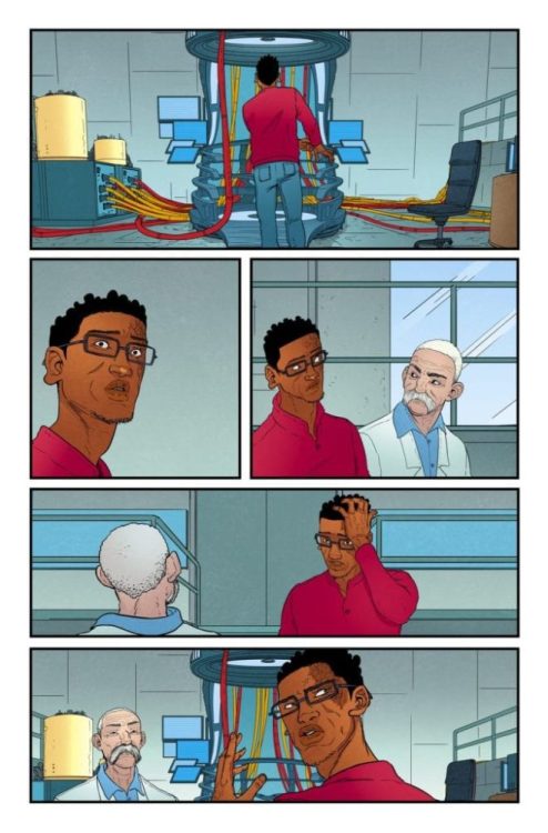
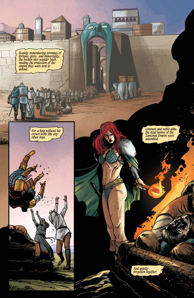
Despite the Hyrkanian victory, Red Sonja #13 opens with a quiet and somber vibe. A meditation on Dragan’s fate occupies the first several pages of the book. Writer Mark Russell notes that, while he may have once been the most powerful man in the world, Dragan is now just another corpse on a battlefield.

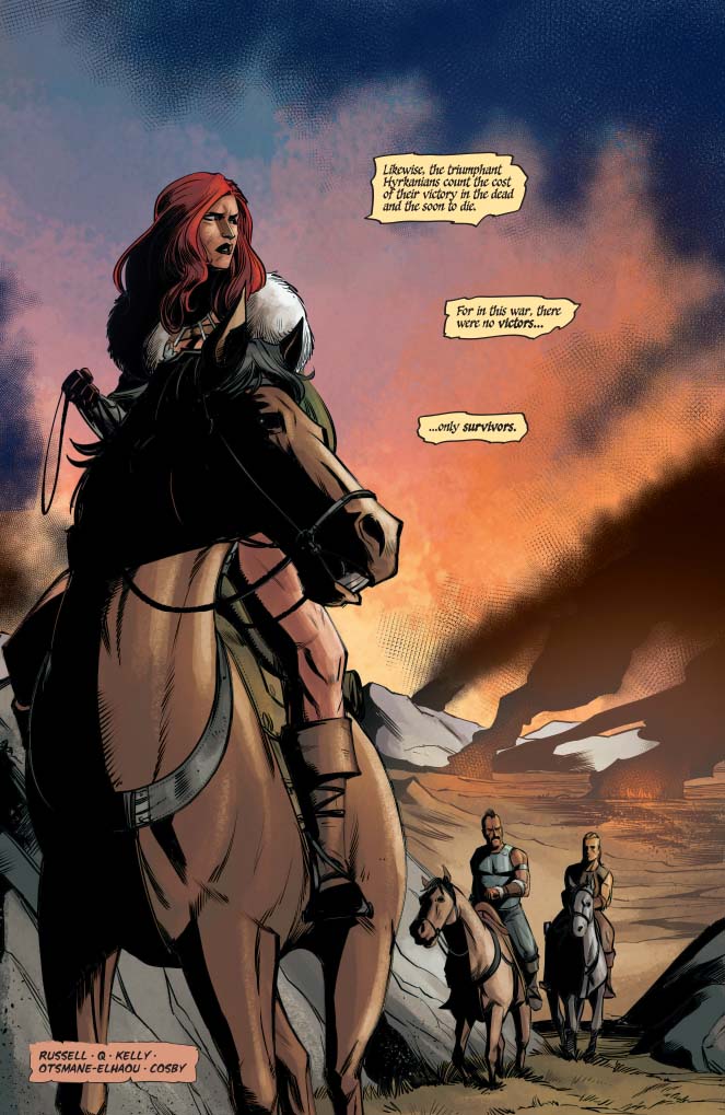
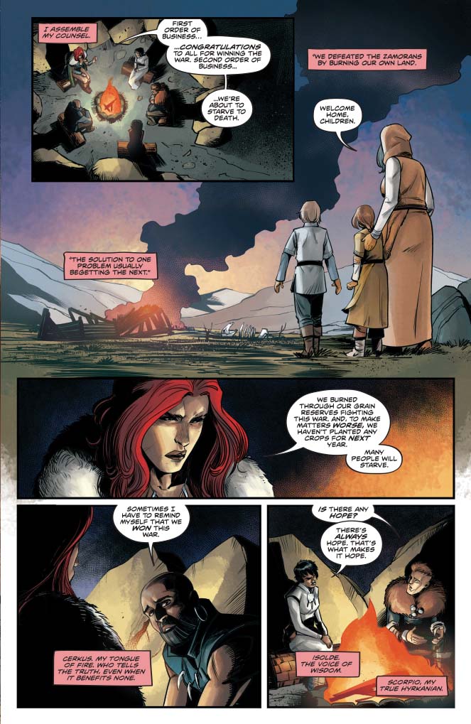
The effect of the mood is compounded by the gloom among Sonja’s council. We see the Hyrkanians dealing with the aftermath of their victory over the Zamorans, regarding it not a triumph, but simply a mutual waste of life. Despite the victory, their population is decimated, and their land, food, and other resources are exhausted, making the situation more desperate than ever.

Red Sonja #13 serves as a necessary transition point to pivot into a new arc. Much of the issue reestablishes the story and lays the groundwork for several potential conflicts. It takes on a somewhat expository role, catching the reader up on the current situation. So, while the book wouldn’t be super-engaging as a jumping-on point, it carries a lot of narrative momentum.

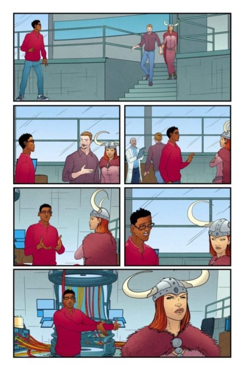
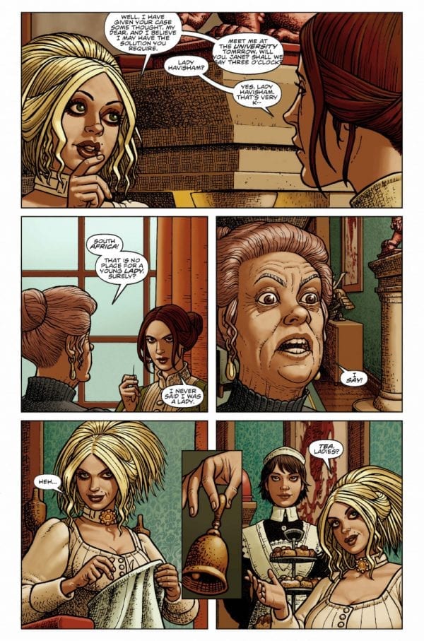
We see tension build as Russell lays out the interpersonal dynamics that define conflicts to come. The relations between Sonja and the King of Khitai, and those between Isolde and her Hyrkanian charges, form potential bases of this new arc. At the same time, we get some setup for the upcoming new series Killing Red Sonja, which focuses on Prince Cyril’s vendetta against the titular character.

Overall, Red Sonja #13 provides an excellent foundation for this new arc. It promises the same kind of complex and engaging storytelling we’ve come to expect from Russell. This new story should please fans of the series.

RS13_page2

Red Sonja #13 Page 3

The Artwork

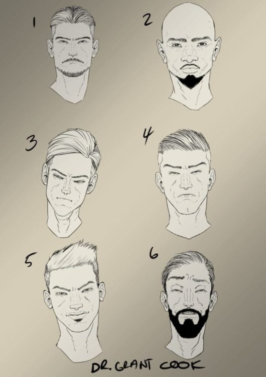
Bob Q provided artwork for a few issues in our first story arc, including the masterful issues Red Sonja #7 and Red Sonja #9. While not as stylized as Mirko Colak’s work, Q’s illustrations really shine in terms of their sharpness and detail.

Bob Q takes pains to meticulously illustrate minor background elements and scenery. This helps draw the reader deeper into the world of the book. There doesn’t seem to be as much purpose behind the page layout. However, the work still flows nicely and hits the story beats well enough. Plus, there are some impressive, dynamic illustrations throughout.

At the same time, he doesn’t skimp on the character designs, which are fluid and emotive. One can clearly read the emotion conveyed in a character’s eyes and facial expression, running the gamut from rage to determination to fear. Some of the gore can be a bit overly-cartoonish, but it doesn’t clash with the tone of the larger work.

Dearbhla Kelly is on colors for Red Sonja #13, bringing more of the earthy tones employed throughout the run. The style works well alongside Q’s more angular, detailed illustrations. It seems that the level of detail in the inks presents more opportunity for Kelly to explore a wider range of tones without sacrificing definition.

RS13_page3

Final Thoughts

Red Sonja #13 offers a succinct and engrossing first chapter for this new arc. This book continues to be one of the most exciting ongoing series currently on the market. We’re excited to see where the creative team takes us next.

Monkeys Fighting Robots Youtube

JUSTICE LEAGUE #39 Shows Us Why The World Still Needs Superheroes

Justice League #39 Cover

“We’re not their heroes anymore,” says a defeated Bruce Wayne in DC Comics’ Justice League #39. At the climax of writer Scott Snyder’s epic conflict between justice and doom, the good guys lose. The villains didn’t cheat to win the war. They simply encouraged the world to live selfishly and, in doing so, preyed on humanity’s base nature. By giving regular people such a crucial role in this outcome, Snyder paints a grim portrait of modern society.

Justice League #39 Manhunter
Martian Manhunter tries to rally in the face of impending defeat.

Early in the issue, J’onn J’onzz telepathically connects with everyone on Earth and delivers one last emphatic speech. He tells everyone to live collectively, rather than individually. “If we banded together, we could overcome our nature, our flaws, and be more than we were designed to be,” says J’onzz. He says that love and hope can help us become the best versions of ourselves. He then ends the speech with an emphatic rallying cry:

“Together, we are more. Together, we are heroes….Now, if you will join us, we will upend faith together, upend destiny, upend everything and rise higher! So please, will you join us? Will you?”

Justice League #39 Perpetua
Justice League #39 explores whether people would side with good or evil.

Unfortunately, J’onzz’s plea fails. The doom symbol, that had disappeared during J’onzz’ monologue, reforms in the sky. The heroes are heartbroken. Superman doesn’t understand what’s happening, and a despondent Batman tells him the devastating truth: humanity has officially sided with doom.  When Perpetua, the “big bad” who has dominated this war, basks in the heroes’ defeat and explains why they lost, Snyder adds even more meta flavor into the story.

Perpetua demands humanity to destroy their “false heroes” and give in to their primitive nature. When people align with doom instead of justice, they do exactly what she wants. She knew, at the end of the day, that people would embrace the worst part(s) of themselves. If people willingly choose to do the wrong thing on such a massive scale, what hope do superheroes have? Snyder suggests that such a devolution leaves heroes powerless. Most damningly, Perpetua tells the heroes, “This world no longer has any place for you.”

Next, Perpetua reboots reality and removes superheroes from the equation. In this new world, the age of heroes is over. J’onzz, standing on the moon, looks at the Earth, which has been branded with the doom signal. Here, the fallen heroes regroup. They’re wearing plain black suits, which are a far cry from their iconic colorful costumes. This loss of color accentuates the heroes’ hopelessness, as noted by Diana’s observation that they don’t belong on Earth anymore.

Of course, even in the face of defeat, Clark Kent tries to go down swinging. He maintains his hope and valiantly takes flight, only to come back down to the surface. Kent refuses to believe that this is the end. But some of his teammates aren’t so sure. Diana points out that humanity was too scared to stand up to Perpetua, and Arthur Curry wonders if the Justice League needs a reboot of its own. “Things rise and fall with the tides,” says Arthur. “This moment, maybe it’s not ours.” It seems clear that, whatever happens next, the heroes will have to make some drastic changes in order to defeat doom.

As compelling as the literal plot of this comic is, there’s a lot to dig into beneath the surface. We live in a world that can feel like it’s swaying toward the darkness that leads to the heroes’ downfall in Snyder’s story. He contributes this defeat to the lack of faith humanity has in the battle of good versus evil. He also points to the “fear, anger and disillusionment” that have been perpetuated by constant divisions at every level of society.  These dynamics ring true because it can be so easy to feel hopeless in a world with corrupt politics and a litany of other sociopolitical issues.

Typically, that’s where superheroes come in. Characters like Superman give us ideals to strive toward. They represent the best versions of ourselves and the hope that, in the end, good will triumph over evil. Snyder grounds this fantastical story with realistic reflections on society, and, by the end of the issue, we’re left feeling like superheroes don’t work the way they used to; they can’t always save us from ourselves.

But that’s the point. We can’t always depend on a Superman-like savior to fix all of our problems. We have to do it ourselves. Snyder shows that people, in the context of this story, side with doom and, by extension, the worst parts of human nature. But there will always be people who fight for what’s right, who defy the darkness in an attempt to give the world the light it needs. No one person can save the world, but, as J’onzz says, uniting together with love and hope can help us reach even higher. Ultimately, the real purpose of a superhero is a balance of both truths: we can use these symbols of hope, courage, and justice to strive for a better tomorrow, and we also have to be our own heroes by working together to save the world ourselves.

Monkeys Fighting Robots Youtube

Interview: Karl Mostert, The Artist Of THE MAN WHO F#%&ED UP TIME

Interview: Karl Mostert, The Artist Of THE MAN WHO F#%&ED UP TIME

The Man Who F#%&ED Up Time #1 hits your local comic book shop this week (February 5) and thanks to AfterShock Comics, Monkeys Fighting Robots has an exclusive interview with the artist of the series, Karl Mostert.

Interview: Karl Mostert, The Artist Of THE MAN WHO F#%&ED UP TIME

About the first issue:
Sean Bennett is just your everyday, ordinary lab worker in a high-tech lab with a proto-type time machine. And, yeah, he’s got the same temptations any of us would have about going back in time, just a bit, to correct mistakes of the past and right old wrongs. So, when he meets a version of himself from the future who encourages him to do just that, Sean takes the temporal plunge. Only…can you guess what happens next? Did you read the book title? Yup. All of TIME is f#%&ed up now, and it’s up to Sean to cor-rect it-or else!

Presenting a time-twisted sci-fi action-comedy, a butterfly effect noir, by multiple Eis-ner-winning writer John Layman (Chew, ELEANOR & THE EGRET) and talented new-comer Karl Mostert. Order it today…before time runs out!


The FOC for issue two is coming up next week, so make sure to contact your favorite comic book shop, and add it to your pull list.

Karl Mostert Q&A

Comics are a collaborative medium. How was your experience working with John Layman?

MOSTERT: We hit it off almost immediately. He contacted and friended me on social media and started chatting about the work and was helpful all the way, still is. My experience working with him on this story is truly an enriching one.

So, you get a script from John, what’s your first step after reading it? Your first reaction?

MOSTERT: This book specifically… “How in the seven hells am I going to do that?”

How do you make a comic feel like it’s taking place in a fully fleshed out world? Especially as the timeline starts getting more and more complicated?

MOSTERT: I’m not gonna lie, I e-mailed Mike and John a couple of times in the beginning and said, “I’m lost. I don’t know what’s going on.” To which they replied, “That’s the point.” I am a firm believer in backgrounds being super important to each and every panel and that they flesh out the world the characters inhabit in any story. I do fiddle with that rule of mine now and then, but mostly it’s understanding what’s going on in the background and keeping it constant. Also, telling stories of my own in the background with the art, besides the actual story, helps with fleshing out worlds for me.

Do you have a favorite character from TMWFUT? How about a favorite scene?

MOSTERT: Future Cops or Time Police or whatever they’re called. I love them. The scene where they burn a…I don’t know if I’m allowed to say.

Can you talk a bit about your approach to character design, and how specifically you went about designing the characters in TMWFUT?

MOSTERT: I think the normal people here were normal run-of-the-mill type designing, getting a certain look for a person’s face right after understanding what they’re about…the other things that John made me design…I remember reading in an interview that John said when we meet face to face one day, I would punch him in the face. That’s probably true. To be specific, I take a lot of references and mash them together is the best way to explain it.

What other forms of media would you say have influenced your style?

MOSTERT: Definitely video games, lots and lots of video games

What are your favorite eras of comic book art? Golden age, silver age, bronze age, or contemporary?

MOSTERT: Ooh, I don’t think I have a favorite, I could pick from all the different eras a couple of artists that I find I enjoy most, I could give two who are my absolute favorites, Frank Quitely and Moebius.

The aesthetic of the future is usually dominated by dystopian visuals. It seems like visions of the future either fall into Mad Max or Blade Runner, retro-futurism, or cyberpunk. How do you create an original vision of a future where time travel has mashed everything together?

MOSTERT: To be brutally honest, I think you’ve just answered the question yourself. This is a totally new take on a future landscape of mashed up things, and the more things get out of control for Sean, the more mashed up it gets. It’s a bit of a headache keeping things in order in my mind.

Making periods of time visually distinct seems like a challenge. How did you go about letting readers know visually that the characters were now in a different time period? Or that the Sean on the page was a Sean from a different timeline?

MOSTERT: Luckily for me, John wrote these things into the script, and chatted with me in detail about what he wants—I try my best to follow what it is he wants. Thankfully, everything I did so far worked for him. I think for the readers, you will definitely know that Sean’s gone to a different time. There aren’t subtle hints; there are massive Blue Whale-sized clues.

There seems to be some inspiration from RoboCop in the Time Police Sean runs into at the end of the first issue. What was it like designing time cops, and how did you make them distinct from future police/time law enforcement in other media?

MOSTERT: Definitely some Robocop in there, the Eighties version not the newer one. But I think I made them with the mindset that their looks can be deceiving. They don’t look tough, but they seriously are quite deadly.

What’s your favorite Sci-Fi or Sci-Fi inspired world? Favorite time travel story?

MOSTERT: Sci-fi it would have to be Blade Runner, both the original and the sequel. As for time travel, I think Edge of Tomorrow was superb.

Do you have a favorite AfterShock title?

MOSTERT: ANIMOSITY is something I really like the look of.

Can you pinpoint the moment you knew you wanted to be a comic book artist?

MOSTERT: Ooh, no. Been fascinated by comics and art for my entire life.

Who were your major influences along the way?

MOSTERT: Joe Mad used to be one of the favorites, but as I started looking at Frank Quitely’s art, that’s stuck for years now. The man can do no wrong.

Do you have a mentor?

MOSTERT: Not that they know it, but Quitely and Moebius influence my work quite a lot.

A movie that should have been a comic first but wasn’t.

MOSTERT: Big Trouble in Little China.

A comic that should have become a movie but didn’t.

MOSTERT: Trencher.

Do you listen to music while drawing? And if you do, who do you listen to?

MOSTERT: I don’t, unfortunately. I do, however, listen to British game shows.

Best moment of your career that has happened so far…

MOSTERT: As a South African artist, to get noticed by people in America where comics are huge and have them like my work was HUGE!!

Best moment of your career that is yet to come?

MOSTERT: Winning an award for my art. 😊


What did you think of the interview, and The Man Who F#%&ED Up Time? Comment below with your thoughts.

Monkeys Fighting Robots Youtube

Box Office Flashback: February – Sweet Revenge, Ghostface Returns, And Tormented Dicaprio

Thirty years ago it was a former cop out for revenge. Ten years later, a horror film within a horror film. And ten years after that, a mind lost within itself.

One-hundred-plus years of film making provides a long, rich, and deep history to look back on. Retro reviews and analysis of old films are practically necessary full-time specialties. Month after month, films release, vying to make as much money and grab as much attention as possible. Some rise, some fall, but regardless of financial success, the lasting effect of a film in popular culture is unpredictable.

So, where does that leave past box office champs? Let’s take a look back ten, twenty, and thirty years ago at the biggest movies released in February.

1990 • Hard To Kill • 47.4 Million

hard to kill - steven segal

The early 90s belonged to the action movie star. The former cop or military vet, either betrayed or framed and out for revenge. Between 1988 and 1992, Steven Seagal (Under Siege) starred in five, hit action films. The second one, Hard to Kill, released on February 6th and wound up being the biggest money-maker released in the month.

After Hard To Kill, the silver medalist for the month was Madhouse, a comedy starring Kirstie Ally (Cheers) and John Laroquette (The Librarians). Madhouse is forgettable, but something of note is that it sports a zero percent rating on Rotten Tomatoes from a handful of votes. Stella, the third feature film based on the novel Stella Dallas and starring Bette Middler (Hocus Pocus), made 20 million against a reported budget of 19 million. Revenge starring Kevin Costner (Waterworld), one of many sexy thrillers of the time, came in fourth. It was just ahead of Italian film Cinema Paradiso which made back almost three times its budget.

2000 • Scream 3 • 89.1 Million

neve campbell-scream-horror

In 1996, Ghostface made its debut in the original Scream and quickly became part of the great pantheon of cinematic slashers. In 2000, the franchise released its third installment. Tormenting Neve Campbell (The Craft) was big business at this time as the film went on to moderate success. However, the franchise went to sleep for a bit before a fourth movie, and a TV show revitalized things. For a little while, anyway.

After Scream 3, the second-place winner is Snow Day, a comedy starring Mark Webber (Scott Pilgrim), Chris Elliot (Schitt’s Creek), and Chevy Chase (Community). The film scooped up 60 million at the box office and has since been forgotten. Matthew Perry (Friends) and Bruce Willis (Glass) teamed up in The Whole Nine Yards to take third place. The dark comedy film even spawned a sequel. The Tigger Movie took fourth place, beating out The Beach starring Leonardo Dicaprio and directed by future Oscar-winner Danny Boyle.

2010 • Shutter Island • 128 Million

shutter island-leonardo dicaprio-film-horror

Ten years after The Beach, Dicaprio starred in Shutter Island from director Martin Scorsese, which took the box office title for the month. February’s slow shift into releasing box office hits continued as Shutter Island and the second-place finisher, Valentine’s Day, finished with more than 100 million at the domestic box office. Valentine’s Day, directed by legend Garry Marshall features a star-studded ensemble cast with Jessica Alba, Jaimie Foxx, Topher Grace, Anne Hathaway, Ashton Kutcher, Queen Latifah and more! The film also includes Taylor Swift’s film debut.

Percy Jackson and the Olympians: The Lightning Thief , the first film in the franchise, took third place with nearly 90 million. Right on its heels was Dear John, a romantic drama starring Amanda Seyfried (Big Love) and Channing Tatum (Magic Mike). The Wolfman with Benecio DelToro (The Last Jedi) completes the top five money-makers for the month.

February 2020

February film releases have continued to evolve into higher-profile premieres. Two such notable films jump into the fray this month. First, it’s Birds of Prey, the spin-off from Suicide Squad focused on Harley Quinn and her gang of arse-kicking women. It’ll take on Sonic the Hedgehog, which was shamed in 2019 into re-doing its terrifying FX. Teeth? WTF were you thinking? Also in the mix is the horror film The Lodge.

My prediction …

There’s a lot of talk that Birds of Prey is not going to do well because of the bad taste left by Suicide Squad. However, SS made a butt-ton of money, and I think Birds of Prey will easily win the month. As much as Sonic will compete, Birds of Prey seems to have a better buzz overall and more money pumped into its marketing. The Lodge premiered at Sundance last month and received positive reviews so, maybe, just maybe, it’ll be a sleeper hit that takes the box office belt for February 2020.

Where to next? There’s so much more to read on PopAxiom.

Monkeys Fighting Robots Youtube

Predictions for the Mobile Gaming Industry

Predictions for the Mobile Gaming Industry

Mobile gaming is exactly what it says on the tin. It is any form of gaming that used a smartphone or other portable device game. The games are often downloads and apps, but can also be games from mobile-friendly sites such as the best online casinos. Yes, that means gamers logging into RoyalVegas CA and other popular casinos to play slots while on the move are also mobile gaming.

The mobile gaming industry is already buzzing due to the success of the gambling industry, stellar games, and apps – and the desire to break up the working day when the boss’s head is turned. With mobile gaming doing so well, where will it go next? Here are the best predictions for the mobile gaming industry in 2020 and beyond.

5G Will Make Mobile Gaming Better

5G is the next generation of wireless internet connection, and it will enhance the mobile gaming space significantly. 5G will eventually roll out across major cities and towns, giving everyone unbeatable download speeds and more. To provide some perspective, 5G is tipped to be around 1000% quicker than the current 4G network. What this means for mobile gaming is:

  • Better graphics
  • Developers have the freedom to make more detailed games
  • Easier accessibility when roaming through these so-called smart cities
  • Less buffering or interference

5G has already started making an appearance in some locations, but 2020 may be the year when it starts to expand even more.

In-App Purchases Will Become Cheaper

Another sound prediction is that cryptocurrency will be used in apps and downloaded games for the purpose of microtransactions. At current, players can buy small bonuses, weapons, or even a new hat for their avatars but have to hand over a small fee. When multiple payments are made, even small ones, the total cost of these purchased add up.

This fee grows even more due to bank handling fees and authorizations. Cryptocurrency can avoid the need for these because it is decentralized from a central authority, and miners are used to authenticate payments instead of card issuers or banks. The bottom line? Using cryptocurrencies for these micropayments or in-app purchases will save gamers money. And it could be much more available in the coming years.

Let Streaming Battle Commence!

With faster internet speeds through 5G, there is also an argument that streaming of mobile gaming may also take off. Many gamers choose to stream console gaming action through sites like YouTube and Twitch, but it is rarer to do with mobile games.

When faster internet speeds eventually land, this will give more currency to gamers who want to stream the games they play from mobile devices. Ultimately, this will create even more streaming channels for gamers in this niche of gaming – and simultaneously increase the exposure of mobile games.

The future looks bright, fast, cheaper, and entertaining for the mobile gaming world!

Monkeys Fighting Robots Youtube

Review: ADLER #1 Introduces a League of Extraordinary Women

Adler #1 Character design
Adler #1 Credit: Titan Comics

In the spirit of The League of Extraordinary Gentlemen, Titan Comics new title Adler fuses a host of fictional and historical characters in an exciting adventure story. Set at the turn of the last century with an almost all female cast, creators Lavie Tidhar and Paul McCaffrey invite readers into a spectacular but dangerous world with a touch of the steampunk aesthetic. 

Following the adventures of Irene Adler, as told by her new companion Jane (surname rhymes with ‘air’), the set up is pure Sherlock Holmes. But does the comic manager to escape these well known roots? Is there more on offer then a simple female Holmes and Watson story?

Adler #1 Cover
Adler #1 Credit: Titan Comics

Telling the Tale

Lavie Tidhar is an awarding winning novelist, in fact he has been nominated or been the winner of an award every year in the last decade. He is also no stranger to mixing historical and fictional characters.  

The story starts by introducing the reader to Jane and her time in the Boer War. This comic’s tone is set in that opening sequence. It has a sense of adventure, a pioneering spirit, but is also brutal when dealing with violence. It is also just as brutal to the characters, dispensing with extra’s with little fanfare but extreme violence. 

Long before the titular character is introduced, Tidhar sets up the world where his characters live. This allows the reader to become immersed in the atmosphere before the plot begins. Each cast member is brought into Jane’s life naturally so that the reader meets them in the same circumstances as the character. Tidhar leads you through his version of London, pointing out people and places of interest as he goes.

This does mean that there are a few exchanges early on that have awkward dialogue. The conversation doesn’t flow as naturally as you would expect and reads like over rehearsed lines in a mediocre television drama. While these moments might give you a little insight into one of the characters it does little for the supporting cast.  The stereotypes of steampunk fiction are harshly contrasted with the tropes of romantic prose.

However, this is a minor criticism of Adler as the majority of the dialogue sparks with life and brings the characters to life in a fun, exciting way. The personalities are drawn from the speech giving the leading ladies distinct individuality, which is refreshing. Tidhar has crafted a group of fully rounded characters, each with their own strengths and flaws. 

This is especially exciting with an all female hero group. It is true that each character has a specific defining aspect but even within this first issue of Adler there are depths waiting to be explored. Tidhar has pushed his narrative beyond two dimensional characters representing a type and instead given the reader a team of characters for us to get to know.

Adler #1
Adler #1 Credit: Titan Comics

Art and Design

Paul McCaffrey has a singular style that suits this type of modern adventure. His layouts and panel transitions underline the fast pace within the narrative and owe as much to television dramas like Sherlock than to traditional comics. There is also a startling sense of energy to the artwork. The characters leap from the page, and even drinks around a table doesn’t feel static in any way. 

The design, especially with the leading women’s costumes, takes inspiration from the historical dress but then pushes it into fantastical realms. Elements of Steampunk filter through but there are also hints of other influences. It is sleek, and sexy, but most importantly everything fits with the characteristics of those wearing the clothes. For example, the eccentric Miss Havisham has attire that reflects her outgoing personality. She is like a Victorian version of Emma Frost.

McCaffrey’s coloring is also very detailed and bold. This fills the pages with a vast amount of information to take in, sometimes making pages seem busy. There is a lot going on and this can become distracting, especially if you want to take in as much as possible on the first read through. Once you have become accustomed to McCaffrey’s work, it becomes easier to read and by laying down his own colors, he is able to make the page entirely his. 

Another slight drawback of McCaffrey’s highly detailed style is that it does, on occasion, leave Simon Bowland with very little room to play with on the lettering side. When he has short speeches or interplay’s of dialogue, Bowland is able to produce a brilliant sense of back and forth between characters. He picks up on the fact pace of the narrative and reflects this in his balloon placement. There are, unfortunately, panels where large pieces of text sit heavily in single balloons because there is simply no-where else to put them. 

Bowland has a difficult job of deciding between bunching the speech into a single area or covering up McCaffrey’s great art work. It is a lose/lose situation for him but he makes up for it throughout the rest of the comic.

Adler #1
Adler #1 Credit: Titan Comics

Conclusion

If you are looking for adventure and a large dollop of sass, then Adler will be right up your street. Drawing on the tradition of League of Extraordinary Gentlemen, Tidhar brings together an exciting mix of fictional characters, with a few hints at others let to come. He also creates a wonderful comradery between the women, filling the script with as much humour as there is action.

The links with Sherlock Holmes are somewhat integral to the plot but don’t actually require any real background knowledge. The story is self contained and easily accessible. The artwork is enchanting with beautiful design work. There is a definite style which could, potentially, put some readers off but is more likely to attract readers. Like Titan Comics previous comic, Anno Dracula, Adler is a fun and playful historical-ish adventure story. 

Monkeys Fighting Robots Youtube

Review: Southern Running & Gunning in KILL WHITEY DONOVAN #3

Sydney Duncan and Natalie Barahona’s Civil-War era revenge story “Kill Whitey Donovan” reaches its third chapter with more intriguing backstory and narrow escapes. Despite the stellar dialogue and page-turning pacing, it’s tough not to see this issue as merely ‘issue #2.5″ rather than issue #3. Regardless, its mysterious plot and brilliant visuals maintain this as a highly entertaining comic.

As the third chapter of this thrilling journey unfolds, more history between Hattie and Anna is revealed–but the answers provide little comfort. Meanwhile, in the present, Tyson draws ever closer, while the distance to Donovan feels farther away than ever.

Writing & Plot

Sydney’s Duncan‘s script on “Kill Whitey Donovan” #3 once again walks the line between carefully constructed character drama and fast-paced action. She continually generates intrigue with the pieces of the backstory behind Anna and Hattie’s relationship in every issue. This issue focuses more on Anna and the fall of her “Southern-Belle” lifestyle at the hands of Donovan. The flashbacks are expertly presented and are full of mystery, making them stellar companion pieces to the frenetic action going on in the present plot. Duncan knows how to build menace from antagonistic characters, making the tension from page to page palpable. She also remains aware of how to let the art do the storytelling, as there are plenty of panels with no dialogue whatsoever.

If there’s a minor nitpick to be had with this issue, it’s that this doesn’t feel like a fully fleshed-out single issue, but rather an extension of the prior chapter. This sounds a bit absurd given that it is a continuous story, but the chain of events and ending just seem incomplete. The events here could have been rearranged (say the early stages had in issue #2 and the last page be an opener for #4) to make for a more even story. Regardless this is still a highly entertaining issue, even if it doesn’t feel as complete as its predecessors.

Art Direction

Natalie Barahona‘s gloomy yet elegant and detailed art reigns supreme yet again in “Kill Whitey Donovan” #3. While most of her art has been set in the dark woods and stormy humid Southern nights, she gets to flex her talents here in a ballroom scene. Once again her character details are spectacularly good, with a massive range of styles and expressions for characters both main and extra. The aesthetic remains menacing and dark, but there’s still the unique polish to the art as it glows under firelight or moonlight. The script allows Barahona to demonstrate her skill in crafting action sequences as well, allowing the art to tell just as much of the story as the dialogue does.

“Kill Whitey Donovan” #3 is a brisk and intense middle chapter in Sydney Duncan and Natalie Barahona’s mini-series. While it may come across as a bit too brisk, it still manages to engage the reader with a compelling backstory and fantastic artwork. “Kill Whitey Donovan” still proves to be a damn good read from month to month.

Monkeys Fighting Robots Youtube

WHY YOU NEED A GOOD DRAINAGE SYSTEM IN YOUR HOME

Monkeys Fighting Robots

Homes are ideal places to build your dreams, raise a family, retire to after a long tasking day at work, and fulfill other demands. Having a home means that you need to provide all that is needed to make such a place comfortable and safe; this includes having a good drainage system. With a proper drainage system in your home, you can be assured of prevented domestic accidents and health hazards. Also, waste materials can be easily disposed of through a drainage pipeline to the sewer. Having a good drainage system also helps curb unwanted floods. Excessive water can be transferred from the house and roads to the river. Your owns can be prevented from collapse by having a proper drainage system that steers clear flood from the ground level or foundation level.

How Does The Drainage System Function?

You may wonder how the drainage system functions, therefore, we will discuss this in detail. When it rains, the rainwater is collected through the house gutters to the drains in the residential area via the downpipes. The water in the residential drains is then transported to a nearby river. However, it is important to note that the residential drains can be linked to other drains, thereby forming a network through which water can be easily moved.

Why Do You Need To Have A Good Drainage System?

There are several benefits that come with having a good drainage system in your home.

To Avoid Water Accumulation:

Having a well laid-out drainage system helps prevent floodwater from accumulating within your residential home. This implies that you do not need to worry about flooding. Your house will be free from wastewater that gets stored up within your building as they are channeled through the residential drains.

It Prevents Soil Erosion:

When a house is equipped with a proper drainage system, soil erosion will be curbed in the process because there will not be leftovers of water on the soil, which in turn won’t get muddy. Drainage system helps avoid soil degradation which most times lead to soil erosion. That way it saves you from the stress of maintaining the soil constantly.

Furthermore, you will not need to be bothered about coming in contact with bacteria bred as a result of muddy soil. You can do a routine checkup on the state of your drainage system by employing the services of a professional plumber. Inspections should be carried out for any sign of blockages which can lead to water storage.

The Adverse Result Of Not Having A Drainage System In One’s Environment

  • The lack of drainage system can lead to the flooding of one’s environment during a heavy downpour, resulting in several roadblocks.
  • It can lead to water pollution and water scarcity in a worst-case scenario.
  • Having a good drainage system not only helps dispose of water but also stores it. Without a drainage system, water can’t be stored.
  • The absence of a drainage system can make it difficult to fill the water gap in groundwater resources.

Having gone through this mind-opening article on the need to have a proper drainage system in your environment, it is time for you to make your home and environment a better place. You can utilize your drainage system for storing excess water and even channel it towards your agricultural projects. If you wish to know more about how to go about this, please check out this link: click here

Monkeys Fighting Robots Youtube

THE FIVE TYPES OF SAMURAI SWORDS

THE FIVE TYPES OF SAMURAI SWORDS

An ancient elite class of men, the chosen few, only the best of the best had the honor to be called a Samurai in medieval Japan. They made up the ruling class of the military and later rose to be the highest class in the Japanese hierarchy. These Samurai warriors were equipped with a range of weapons such as spears and guns, bows and arrows, but their main weapon and symbol was the sword. There are five main streams of the samurai sword, namely Katana, Wakizashi, Tanto, Nodachi and Tachi swords. 

  • Katana

The most iconic and well known of all the Samurai swords; the katana is distinguished by its long blade and handle that is made to accommodate two hands and strike from a large distance. It has a curved, slender, single-edged blade with a circular or squared guard. The katana has a set of dimensions that separate it from other samurai swords. A traditional katana will measure 3 to 4 feet in total length, with the hilt taking up one-fourth of the total and a characteristic curvature of more or less than 1 inch. 

  • Wakizashi

The Wakizashi is similar to the katana but shorter in length. The average Wakizashi is about 50 cm long and was usually worn together with the katana by the Samurai of feudal Japan. When worn together the pair of swords was called daishō, which translates to “large and small”.  This sword acted like a side weapon and was worn by the Samurai at all times. 

  • Tanto

The Tanto, although not technically qualifying in the category of swords, is the traditional Japanese dagger. It can have a single or double edge. It acts like a Wakizashi and is worn at all times. The main purpose of a Tanto is to be used as a stabbing instrument but having a pretty sharp edge, it can be used to slice and cut. The Tanto has become more ornate over the years and towards the end of the Samurai era, they were mostly used as decorative pieces, and still are mostly used in decorations to this date.  

  • Nodachi

Nodachi approximately translates to “field sword” or “great sword”. They are larger and longer than a typical katana. They were typically used as weapons for foot soldiers and were effective against cavalry and open field encounters. They are not very effective in close range or constricted space.

  • Tachi

The sword is the predecessor to the Katana; the Tachi is a Japanese sword that is more curved and longer than a katana. Having an average length of 75 cm. It was primarily made for Samurais on horseback where they needed more length and curvature to effectively charge on foot soldiers. 

While all of these are types of the bladed weapons used by the noble Japanese warriors, each and every one has its unique characteristics and uses. It would be unfair to ignore all the different types of swords, just to popularize one over the others. A wider approach is needed to recognize the skill and genius of the Japanese Samurai and craftsman.

Monkeys Fighting Robots Youtube

Kickstarter Review: JUPITER JET AND THE FORGOTTEN RADIO

jupiter jet 2 review

Written by internet personalities Jason Inman and Ashley Victoria Robinson, with artwork by Ben Matsuya, colors by Mara Jayne Carpenter (volume one), and letters by Taylor Esposito, Jupiter Jet is the story of Jacqueline “Jacky” Johnson, a sixteen-year-old girl who rides the sky on an experimental jet pack that she discovered in her dead father’s workshop and does what any other teenage girl would do – steal from the rich and give to the poor while keeping her neighborhood safe! 

Now, the creative team (with new colorist Elizabeth Kramer!) is back with a second Jupiter Jet adventure, taking the character and story to new heights in a mold that hearkens back to the golden age of comic books. 

Story 

Jupiter Jet and The Forgotten Radio tells the story of a girl confronting what it is to be a young woman while saving her planet from a dangerous interplanetary threat. 

Jupiter Jet is clearly written by people with a great love for comic books. The duo of Jason Inman and Ashley Victoria Robinson manage to craft a wholly enjoyable superhero adventure, while tugging on just the right amount of nostalgia strings. It’s a truly fun throwback to pulp science fiction heroes like The Rocketeer and Buck Rogers.  

There’s a lot of love put into the character development. The first adventure follows Jacky as a relative newcomer to the whole heroics thing. She’s still learning how to use her jet pack, and is even a little clumsy. The first part of the second volume picks up after the exciting twist of a conclusion where Jupiter Jet Volume One left off. The writing feels much more mature than in the previous story, which seems to be intentional, as the titular hero has grown as well since we last saw her. But that’s not to say this book isn’t filled with fun, adventure, and even more surprises, because it most definitely is. 

Art 

Ben Matsuya has also shown considerable growth in his artwork from Jupiter Jet Volume 1 to Volume 2. The first volume is packed with character expressions akin to a Disney animation. In Jupiter Jet and the Forgotten Radio, the style is more modern and conservative.

Meanwhile, the first volume features vibrant colors by Mara Jayne Carpenter, while the sequel’s colors by Elizabeth Kramer are noticeably muted. This shift in style is an intriguing choice, as if Matsuya and Kramer are taking the readers on a journey through the various eras of the comic book medium.

The lettering by Taylor Esposito is everything you’d expect in a classic sci-fi comic book. Specific words are in bold, or in a larger size, making it all too easy to get a sense of the characters’ inflections in their dialogue.

jupiter jet exclusive page

Conclusion 

Jupiter Jet is an absolute fun ride, with endearing characters, and a story that is filled with humor, heroism, adventure, and exciting twists. 

Catch up with the adventure of Jupiter Jet by purchasing the first volume on Amazon or comiXology. Then, you can get a copy of Jupiter Jet and the Forgotten Radio by supporting the Kickstarter campaign.  

Monkeys Fighting Robots Youtube