Marvel Comics has been hinting a new book involving Kurt Busiek and Alex Ross, and now we know what it is. The Marvels will be hitting stores in May, written by Busiek and illustrated by Yildiray Cinar, with covers by Ross.
But what is The Marvels, exactly? The publisher describes it as “the biggest, wildest, most sprawling series ever to hit the Marvel Universe,” adding:
Telling stories that span decades and range from grand adventure to intense human drama, from street-level to cosmic, starring Marvel’s very first heroes to the superstars of tomorrow, Kurt Busiek and Yildiray Cinar’s THE MARVELS begins a new chapter in the spectacular 616.
Busiek spoke with Marvel.com about the book, with some highlights below.
On his initial pitch:
The whole idea of THE MARVELS is to be able to use the whole Marvel Universe—not just all the characters in it, but all the history of it. The sweeping scope of the whole thing. I think I described it to Tom Brevoort as something like a Tom Clancy thriller, in that there would be multiple threads of story going on, and those threads could come together and split apart again, or maybe never even meet—there could be characters involved in a story that do something important but never meet the other characters in the story, which will very much be the case in the opening storyline, at least.
On the genesis of the idea:
It’s been kicking around for a while, yeah. I think it started back when I was writing AVENGERS (1998), or maybe even earlier, and I’d hear people suggesting that Wolverine or Spider-Man or the Punisher or whoever was big at the time should be an Avenger, because they were big, important characters. And I thought they probably shouldn’t, not in AVENGERS, but that didn’t mean there couldn’t be a book like that anyway…
I talked to Tom about it way back then, about a book where you could use all the big characters at once, in big, expansive stories that didn’t require them all to be on the same team, or even be allies. And the best title I could come up with was THE MARVELS, which I thought might be confusing back then.
On which characters will be included:
We kinda wanted to go extra-big with the first arc, and show off the big sweep of it all, so we deliberately wanted to do something that involved characters from many areas of Marvel. Avengers, FF members, X-characters, someone from the Spider-side of things, and so on. To have a real crossroads feeling going on. We talked about, but didn’t include, Guardians of the Galaxy characters, but we can always get to them later.
And we’ve got characters from the distant past, like Aarkus the Golden Age Vision, and characters who are very new, like Aero… We wanted to make a statement about the size of it all.
On artist Cinar:
I’ve been a fan of his since way back when he did an indie comic called Fist of Justice, and it’s been exciting to see him get better and better as he progressed to bigger and bigger stuff. And for THE MARVELS, we knew we needed someone who could draw whatever part of Marvel we threw at him, from gritty mean-streets stuff for a Punisher scene to hi-tech Super Heroes with the Avengers to cosmic oddities and ancient history and more. And Yıldıray can do all that and make it feel spectacular and active and human and quirky, all at once. He’s just ideal for the book, and it’s looking sensational.
You can head over to Marvel.com to read the whole chat. Look for The Marvels in comic stores this May.
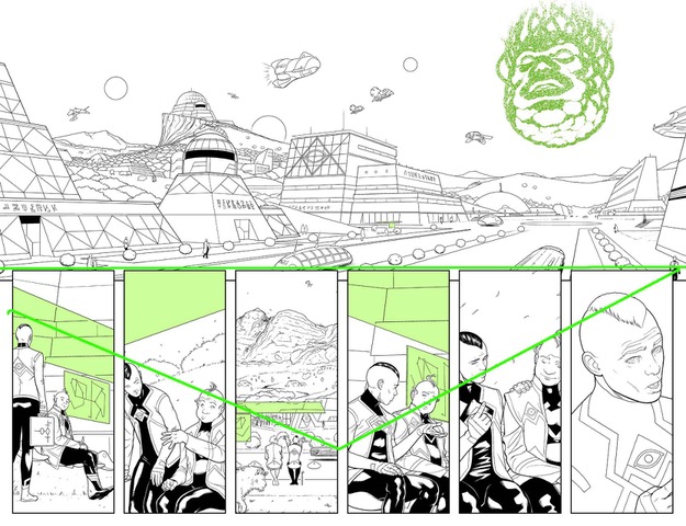
Guardians of the Galaxy #1 dropped last month with Al Ewing and Juann Cabal at the helm. After I talked about the book on the Panel Breakdown, Cabal offered to explain his thought process behind his panel structure, and relationship with Ewing and colorist Federico Blee.
Enjoy the interview below
MFR: With Guardians of the Galaxy, can you talk about your relationship with Al Ewing? Does he keep his scripts tight, or does he give you artistic freedom?
JUANN:This is the first time Al and I work together, so there’s this logical “info given-info needed” imbalance in issue #1. Luckily, we overcame it pretty fast, and now we are more and more “synchronized” (same with Darren (Shan), Lauren (Amaro) and Federico (Blee))
Al is an excellent writer. His scripts are very descriptive and literary, but clear and precise at the same time. It’s quite easy for me to know what crazy beautiful idea he’s thinking of and how to best translate it into images (and how to boost it, given the chance).
Also, he’s very open-minded in terms of layouts, ambients, and the graphic part in general. This, for an artist (and a control freak) like me, is a dream come true.
MFR: Can you talk about your panel layout in the first issue so the average person can get a better understanding of your work? Some pages had horizontal rectangular panels, and then some had vertical rectangular panels. What’s the meaning behind them?
JUANN:My work is based mainly in dualities. In every project, I like to start with a general idea and then experiment, putting it face to face with opposite concepts, depending on what each scene asks for. This approach covers everything, from character design to rhythm. In the case of panel layout, for example, I wanted to make a contrast between expansive cinematic horizontal panels for cosmic sequences and other kinds of compositions for the rest (character development, introspection, etc.)
In order to give a general idea of my working process, I’m going to address some specific pages, if you don’t mind:
MFR: We don’t mind!
JUANN:
PAGE 1 – Vertical paneling and Kirby dots in the kid’s cereals foreshadow de impending doom coming from the sky.
PAGES 2 & 3 – Utopian planet (horizontal) VS dead looming (vertical), again.
PAGES 4 & 5 – I wanted this sequence to look ominous and apocalyptic in a cinematic way.
PAGE 7 – Again, the pace is broken by someone coming from the sky.
PAGE 9 – The family splits. OK, this is the kind of experimentation I love. It’s relatively easy to make it work in action scenes, but you have to be subtle in quieter ones.
PAGE 13 – I used a circular composition to introduce Marvel Boy in a classic comic-book fashion. Something cheesy but awesome.
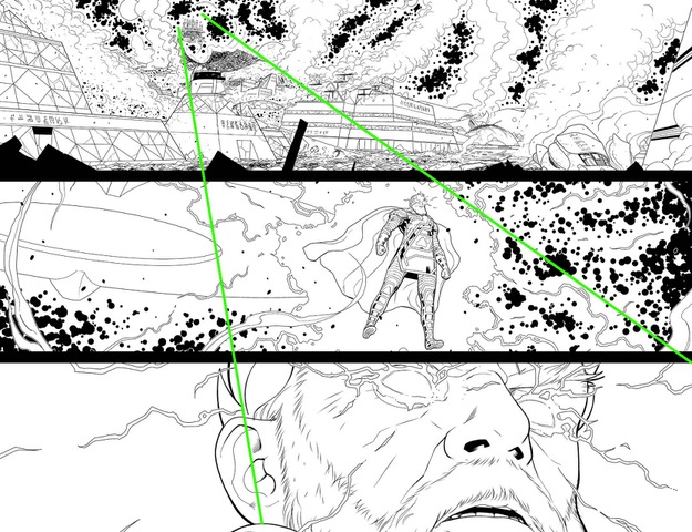
PAGE 14 – Yes, a broken man under pressure.
PAGE 15 – Here, there were two factors to push me towards this composition:
I needed space to represent Nova’s isolation.
When Nova falls, Star-Lord rises.
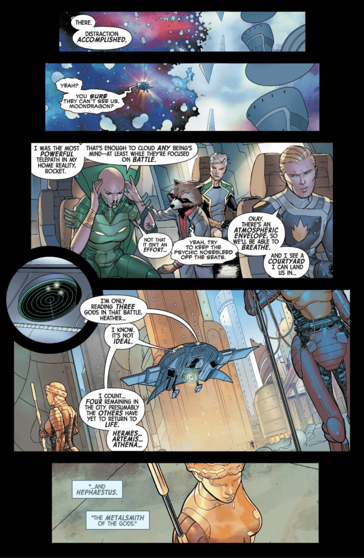
PAGE 16 – This one is a meta-joke. Too subtle, apparently. My fault. You don’t know what’s on Rocket’s hand until he bites it. First, the composition connects it to the citadel, and you may think it has something to do with the plan, but in the end, it’s just some kind of space fruit. This matches the line, “we need a distraction.” That’s the fruit, a distraction for the reader. 😀
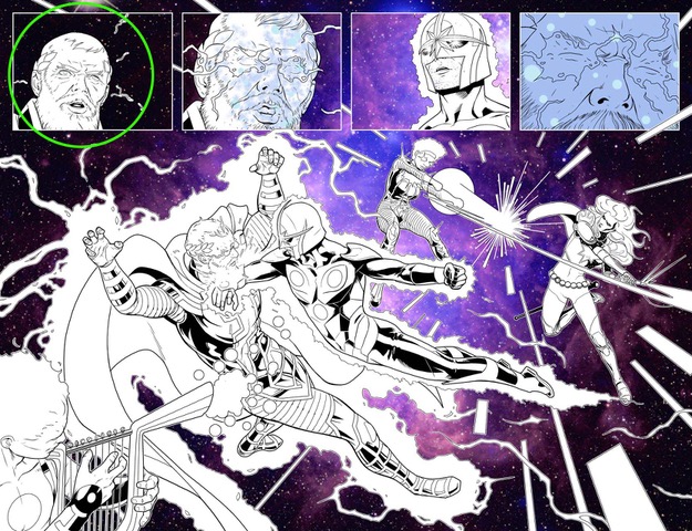
PAGES 18 & 19 – Hmm. That face may look familiar to fans. This is one of the few closeups of Zeus in his human form, and I wanted to establish some kind of visual parallelism with his Norse counterpart (wink, wink). A visual representation of all the gods in all mythologies having the same primal essence.
PAGE 20 – Love what Federico did with the citadel.
PAGES 22 & 23 – I wanted Moondragon to be the only character to keep the concentric narrative as she’s the one influencing everyone else’s minds.
PAGE 25 – Contrast again! Speed from the last page VS Hermes striking. I needed something to “break” this sequence as it breaks Moondragon’s manipulation too, so the idea was this panel to look like something static, frozen in time. Think of Quicksilver in X-Men movies.
PAGE 26 – Classic “Z” structure to isolate the action in space from the citadel.
PAGE 27 – My favorite one! I gave lots of thought to Noh’s gauntlets, and I’m very happy with the result. You’ll see.
PAGE 28 – Here I experimented with the technique of having different characters following the same motion.
PANEL 29 – My guideline here was: open panels for space closed ones for the citadel.
JUANN:These are a few examples, but I think it’s easy to get the idea. As you can see, there are no pre-established rules (apart from basic composition ones, but even those are not written in stone) and is very intuitive and adjustable to what the script demands.
MFR: Guardians of the Galaxy has a great cast of characters to draw, which character puts a smile on your face when you get to draw him or her, and why?
JUANN:I love Marvel Boy’s weirdness. I’m always thinking of new cool ways to portray his crazy powers. Also, I tried this David Lynch-inspired haircut, and I think it suits him nicely.
Phylla is ultra-cool too. I always liked the depiction of the Cosmic Awareness in the Peter David era. I wanted her to look a little less “knightly” and heavy, and more Barbarella-like.
MFR: With the evolution of coloring, do you leave your art cleaner to let Federico Blee add depth with his colors? What’s the artist/colorist relationship like?
JUANN:I think the colorist needs complete freedom. With Federico, firstly, he told me to guide him a bit with ambients and that kind of stuff. He caught on very fast, and now I barely have to send him notes. He nails it in every scene, plus his rendering and brushstrokes are simply amazing.
MFR: When you draw Peter Quill and Richard Rider, what are the artistic elements that separate them? Did you give them different postures?
JUANN:Reading the script I thought it’d be interesting to swap a bit their features and body language to match their roles in the first arc. You can see a beaten, dejected Richard while Peter looks sharper and cleaner than usual. Again, we’re playing with contrasts. When Nova falls, Star-Lord rises.
They’re both much-beloved characters, so we took extra care to stay true to their essences; and, most importantly, to make them look cool no matter what.
MFR: Friendly Neighborhood Spider-Man and Guardians of the Galaxy both have a ton of humor. How do you set up humor with art in comics?
JUANN:At the end, all emotions come from the interpretation of the script. I need to read not just the character, but the scene and the context. That tells me when a goofy face or a visual gag is appropriate and/or necessary.
MFR: What are you most excited to draw in upcoming issues of Guardians of the Galaxy?
JUANN: Crazy stuff. Lots of crazy stuff. Even crazier than our usual standards. That’s all I can say. ;D
What did you think of the interview? The visual guide Cabal sent over helps so much in understanding the different concepts of the process that we as a reader sometimes miss.
Guardians of the Galaxy #2 hits your local comic book shop next week, on February 19.
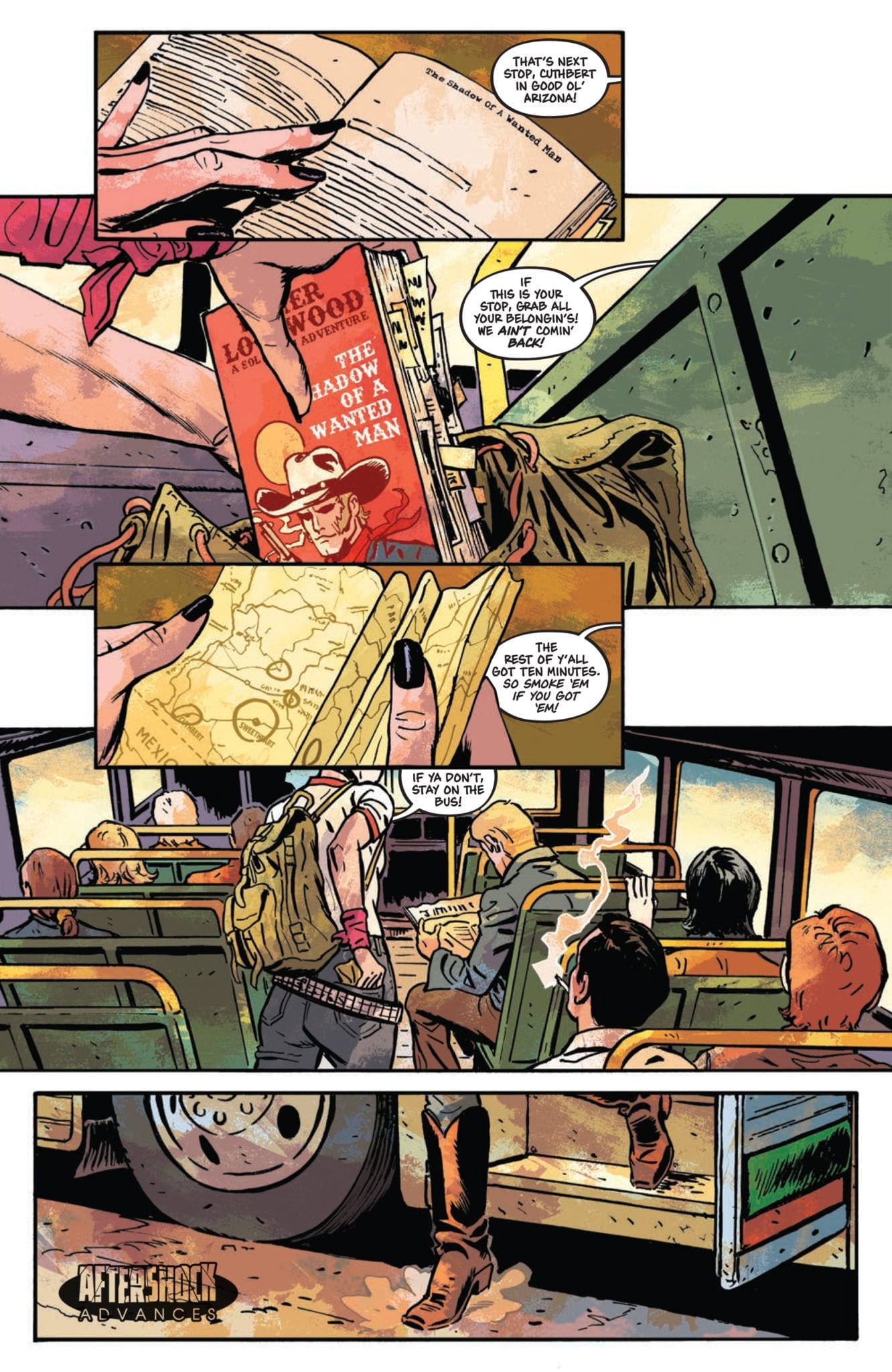
Western tales based on vengeance are almost always a good time, full of gritty atmosphere and bloody action. Writers Lonnie Nadler and Zac Thompson have teamed with artist Sami Kivela to throw their hat into that genre ring with “Undone by Blood” #1. Although this issue is held back a bit by a detached frame narrative and vague characterization, it’s held up by its engaging premise and excellent artistic design.
“In the early 1970s, Ethel Grady Lane returns to her hometown of Sweetheart, Arizona with one thing on her mind: killing the man who murdered her family. But first, she’ll have to find him. As Ethel navigates the eccentric town and its inhabitants, she learns that the quaint veneer hides a brewing darkness. She has no choice but to descend into a ring of depravity and violence, with her only ally an Old West novel that follows famed gunslinger Solomon Eaton. As both stories unfold simultaneously, a love of fiction informs choices in reality, for better or worse.”
Writing & Plot
Zac Thompson and Lonnie Nadler have penned a rather complex script in the first issue of “Undone By Blood.” The frame narrative created by Ethel’s novel weaves a back and forth between a cowboy changing his outlaw ways and a girl heading into the mouth of vengeance and bloodshed. The switch from the careful prose of the novel to the main plot’s narration-less dialogue is an impressively smooth feat. The often crude but realistic dialogue of Ethel and the small-town residents contrasts sharply with the neat romanticism of the protagonist’s book. The naturalistic dialogue and reliance on the art to tell much of the primary story work wonders for the atmosphere and this comic’s ability to pull the reader into its world. Thompson and Nadler also utilize the comic medium to lets the visuals do the storytelling at times, as there are a couple of lengthy wordless passages that let the visuals carry the narrative.
However, the novel-frame narrative detracts from this engagement despite having tons of potential. At this stage, Solomon Eaton (the novel’s protagonist) is in a completely different life stage from Ethel. As such, the book’s cut-ins from the main plot damage the pacing more than aid in its messages. This being said, it’s abundantly clear that this will lead to somewhere much more relevant to Ethel’s story. That’s why this comic has so much potential, as this frame narrative could easily become one of the most brilliant aspects of this series as it progresses.
Art Direction
Sami Kivela brings “Undone by Blood” #1 to life with a true 70’s cinematic eye and attention to detail. The cast of characters is distinct but certainly fits this story’s mold, from Ethel’s permanent scowl to Sol’s wise caution. The random supporting characters that fill up a roadside bar manage to look like characters from both a Sergio Leone flick and a 1970’s biker bar. The scenery itself is full to the brim of this sort of barren atmosphere that’s alive with impending danger and attitude. The impression that the air is full of desert dust kicked up from the roads and cigarette smoke carries through the whole issue. This is largely due as well to the coloring of Jason Wordie. This neo-western Arizona is full of such atmosphere due to his choice of coating the world with shades of orange and red. The 35mm film appearance in the comic is a gift given by Wordie’s expertise, and it sells this comic’s environment and atmosphere near flawlessly.
“Undone by Blood” #1 is the start of a gritty neo-western tale that promises character development and carnage in the chapters to come. The quiet setup of Ethel’s quest for vengeance set against the frame narrative of the novel she reads has plenty of narrative potential, but here it admittedly detracts from the pacing. The art from Sami Kivela and Jason Wordie nails the comic’s atmosphere while guiding much of the story with wordless passages that let the panels do the talking. If you’re in the mood for a grimy 70’s revenge story, then be sure to grab “Undone by Blood” on 2/12!
Hexagon #1 is the start of a new series by publisher Impact Theory. After something like Neon Future however, Impact is going to need something big. Don Diablo‘s Hexagon does just that by playing with trends. Taking place in the 80s, the series uses tropes like those from Stranger Things and Paper Girls. From arcade machines to kids on bikes, there are plenty of nostalgic moments. However, Hexagon takes steps to stand out from its contemporaries.
Hexagon #1 Writing
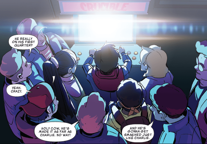
Protagonist Don Van Vliet just wants to join his friends in playing a popular arcade game, Crucible. His dad, however, won’t let him. Most gamers are familiar with the public debate of video games in the 80s, especially in how they might affect children’s minds. Surprisingly though, Mr. Van Vliet is a Yoda imitator and builds Gundam models. Nerd culture was kind of looked down upon in this time, so to see an adult okay with fandoms but not with arcade games is kind of interesting. Prior to meeting Mr. Van Vliet, however, readers see a player experience a devastating loss at Crucible. By the end of Hexagon #1, that opening scene serves as foreshadowing for the series’ plot.
Don is a good kid who wants to make the best of both worlds with his dad and friends. He and his dad also come very close to that intersection in some pages. Mr. Van Vliet wants him and Don to bond over a different hobby, but Don only does it to please his dad. While Don loves his dad, that doesn’t mean he has to put up his dad’s excuses. It’s an expertly crafted dynamic by writer Michael Moreci. So it’s only natural that Don decides to sneak out to play and impress his crush. Don even seems to get what he wants when he wins Crucible on his first try. But all forms of wish fulfillment come with a price near the end of the issue when news of Don’s achievement reaches far, far way. It’s a carefully crafted narrative by producers Tom Bilyeu, Don Diablo, and Moreci that hits just the right beats for readers, thanks largely to the worldbuilding we get throughout the first issue.
Hexagon #1 Art
With so many artists putting their energy into this comic, it’s hard not to feel their passions. The penciling by Jheremy Raapack puts forward some simple but very effective designs. For example, the ship designs reflect how they would look in a 16-bit game, whereas the human characters have simple designs that allow for a variety of expressive faces, allowing readers to feel the effect Crucible has on the gamers’ minds. The inks meanwhile keep the reader focused by making the main subjects’ outlines bold. Everything else has softer lines. That doesn’t mean that these background elements don’t serve a higher purpose, like Don’s Star Wars memorabilia. It tells you everything you need to know about the characters and setting along with the main story.
Assisting in those areas are the coloring by art director Abraham Lee as well as David Kim, Nuo Xu, and Marc Conroy. In the fantasy sequences, everything looks bright and vibrant, standing out against the setting. The real world meanwhile is just a colorful but there are more times when everything blends into the background. Even the characters with softer lines but contrasting colors serve the purpose of raising the conflicts. But perhaps the biggest contributions come from the illumination effects. Each ray of light that touches someone is a sign of what serves the overall plot. Whether it’s reflecting against a character’s hair or just shining a lamp, light acts as someone’s guide.
Lighting The Lettering
The letterers (composed of “A Larger World Studios”, Farhad Heydarian, and Lee) probably have the most underrated job in Hexagon #1. Anyone worth their salt arranges word bubbles and captions in a way that doesn’t disorient readers. However, the arcade machines don’t seem to have the fonts that would typically appear on their screens. No pixels or tech fonts; it kind of breaks the immersion. A number of onomatopoeias however perfectly fit their effects. The most mesmerizing one comes from the boss character in the game as the onomatopoeia materializes with it.
Sneak Out And Get Hexagon #1
When It Hits Stores March 18th
I don’t know how many musicians can collaborate with such skilled creatives for work that can give people so many sensations. But Don Diablo and his crew have done just that. So get ready for a series that will make your 80s nostalgia sense explode, because there’s a whole lot more coming. What do you all think? Leave your thoughts in the comments.
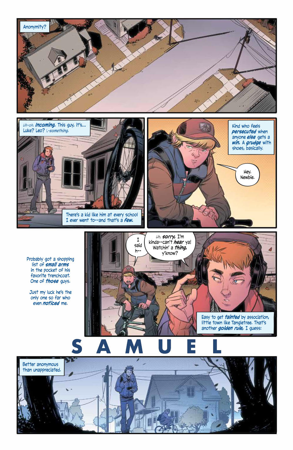
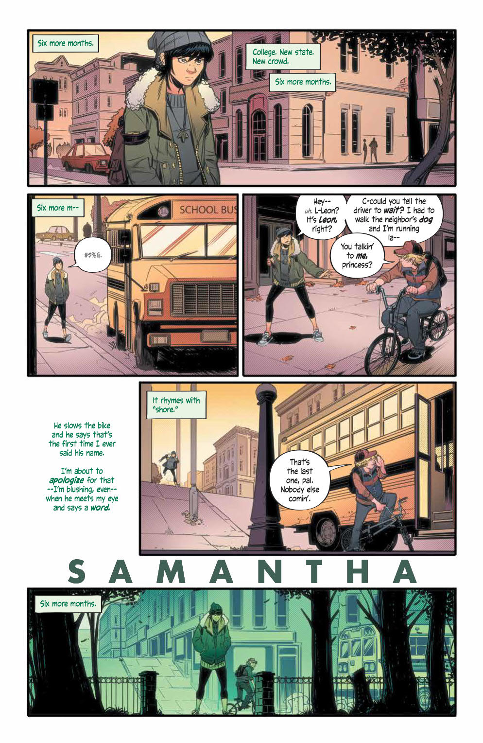
From the creator of The Spire and current Hellblazerscribe, Simon Spurrier, comes a new science fiction, adventure comic called Alienated. Published by BOOM! Studios on 12 February, the comic is co-created by Chris Wildgoose, artist on Batgirl and the wonderful Porcelain series.
Populated with teenage outcasts and focusing on the everyday struggles of being in high-school, this opening issue has more in common with a demon free Buffy the Vampire Slayer than it does with any of Spurrier’s previous titles, that is until the cliff-hanger ending.
Alienated #1 Credit: BOOM! Studios
Scripting Teens
The opening pages introduce the readers to the three Sam’s of the story. Samuel, Samantha, and Samir are all outcasts at their local school, linked by a bully called Leon. Spurrier uses Leon as a narrative tool to lead the reader from one character to the next. The three are then forced into a meeting which changes their lives forever.
The focus of Alienated #1 is the characters: almost the entire issue is given over to building up their personalities. The tool Spurrier uses to reveal their characteristics is linked to the greater, Science fiction element of the story but for the most part, you’re not entirely sure what this comic is. Despite being an unsure mix of genre’s, this approach serves the comic well and makes it much more engaging.
If you ever read any ComixTribe comics you may have come across a comic called Find, written by Sam Read and drawn by Alex Cormack. It too was a science fiction drama and has a similar tone to the one captured in Alienated. It is sedated, with the action provided by a mostly ineffective bully. There isn’t a sense of threat in the plot but there is a slow layering of character and narrative. This builds up at a comfortable pace until the outstanding ending.
Spurrier’s decision to use telepathy between the characters, thanks to an incident early on in the comic, not only gives the plot the science fiction rooting required for what’s to come but it also allows the reader to get to know the main cast. Usually the dialogue box is used to give the reader access to a single character’s thoughts, here Spurrier evolves that making these disconnected words a larger part of the narrative and integral to the plot.
A major comic book element, something unique to comics, is used not only to tell the story but to be a part of it. Spurrier elevates a mechanism of the medium in a similar way to Jim Jarmusch in The Dead Don’t Die where some of the cast become aware they are in a movie.
Alienated #1 Credit: BOOM! Studios
Outlining Thoughts
Chris Wildgoose has a detailed art style which is accentuated by his fine inked lines. He is able to create complex scenes in single panels without making them seem crowded. All of the location shots overload the reader with information. This helps to set the scene and build character but it also controls the readers pace. It becomes difficult to rush through the pages because there is so much to see and take in.
You find yourself spending time soaking up the contents of a bedroom or the architecture within a street scene. The desired side-effect of this is that you subconsciously spend more time with the characters than you realise. As you digest the setting you are also experiencing their day to day lives. This is a wonderful storytelling technique. It’s subtle, informative, and also a little bit manipulative.
The panel layouts are also impressive. They produce a noticeable structure to the comic, especially in the introduction to the characters. Each member of the main cast has an introductory page which is laid out in exactly the same way. Four rows are split with a widescreen panel top and bottom. There are then two panels on the second row. Finally, the third row has one panel with dialogue hovering in the large space to the left of the panel.
This identical structure links the characters even before they have met and helps to highlight the differences in their personalities. As a reader you are forced to compare and contrast because the structure demands it. It is a wonderfully satisfying part of the comic and makes you want to read on.
Andre May also uses this part of the comic to layout his color language for the comic. Each of the three Sams has a different color assigned to them as illustrated in their introduction pages. The color of their speech is reflected in the coloring of the panels so that the final panel on each page is distinctively different with a hue that matches the character. As this is so noticeable, it makes it easier for the reader to know who is thinking what later down the line.
This color language continues throughout, with shadows succumbing to the different shades and the clothes matching their speech color. Jim Campbell makes the distinction between the characters’ speech very obvious which is important in a comic like this. He also adds extra tweaks to some of the speech balloons to give the words and phrases different emphasis. He has a cool technique of altering the size of the font within a speech to create a whisper effect or an emotional uncertainty.
Alienated #1 Credit: BOOM! Studios
Conclusion
Alienated is a comic about comparing and contrasting. The creators use the tools at their disposal to build a world of characters that is believable and complex. By the end of the first issue you will feel as though you have been with the three Sam’s for a lot longer.
The artwork is beautifully designed and laid out with great coloring and lettering that lead you through the narrative effortlessly. Everything is dense, in a good way, making this single issue seem so much more. It is so satisfying and exciting.
You may not know what Alienated is, going into it, or even throughout the majority of the comic, but that’s okay because the journey here is so well presented. Spurrier captivates with his lyrical finesse allowing him time to build up to the more outlandish elements of the story.
James Tynion IV is the newest writer of Batman, with his first issue — Batman #86 –having premiered early this January. Before we get the writer’s unique take on the Caped Crusader, let’s look at Tynion’s history in comics, and what makes him suited to write the Dark Knight.
Tynion began working for DC Comics at a very young age. He first started at twenty-three, and according to his e-mail newsletter, “[He] spent most of the last eight years as the youngest person in the writing pool at the company.” The writer turned thirty-two recently and has been feeling anxious about the release of his first Batman issue. According to the writer’s newsletter, his run will be much darker and “should feel like a scary book.” Tynion says, “I’m going to try and push every scene from a horror angle, and I hope you [the reader] do the same.” Batman #86 arrived on store shelves on January eighth.
This is not the first time Tynion has written Batman before, and if his run on Detective Comics is any hint towards his talent to write the Caped Crusader, we’re in for a treat.
Beginning Detective Comics after DC Comics’ 2016 relaunch, Rebirth, Tynion wrote more than forty issues and is responsible for writing the issues that brought together the series’ fantastic team.The combination of Batman, Batwoman, Clayface, Orphan, Red Robin, and the Spoiler was a team unlike any seen before, and brought fresh light to the series. During his time on Detective Comics, Tynion also gave us amazing stories such as “Rise of the Batmen” and “The League of Shadows” story arc. Tynion was also one of the writers that wrote the Batman Eternal series, along with Scott Snyder and Ray Fawkes, showing clearly Tynion’s ability to write for the iconic hero.
Tynion also worked on the mini-series Justice League: No Justice, which followed the aftermath of the Dark Knights: Metal event. While in this instance, he was one of many writers, Tynion assisted in the epic follow-up to the massive multiversal event. After Justice League: No Justice, Tynion went on to write the new Justice League Dark series, and brought together Zatanna, Wonder Woman, Detective Chimp, Swamp-Thing, and Man-Bat. Once again, Tynion gives a redemption story to a well-known Batman villain, showing his view of these villains as three-dimensional characters, rather than the flat characters many see them as.
With all of the horror comics Tynion has written in the past, there is no doubt that his run on Batman will have its terrifying moments. Currently, Tynion is writing a limited series called Something is Killing the Children, with its fifth issue to be released in late January. The series has gotten many near-perfect reviews from sites such as Amazon, Goodreads, and even Monkeys Fighting Robots. By the first issue, it is clear the art and story work together to create a profoundly chilling experience and highlights the horror talent Tynion possesses.
James Tynion IV may still be young, but he is still one of the best writers in comics today. His past with Batman and horror comics are sure to help create an enjoyable run that gives us a Batman unlike any we’ve seen before. Batman #86 is available now, so make sure to pick up the first issue from the new author.
Are you a fan of Tynion’s previous work? Tell me what you think in the comments below!
Welcome to PANEL BREAKDOWN, a weekly series where we take a look at our favorite panels of a comic book. This week we are talking about the new Marvel Comics series Star Wars: Darth Vader #1 written by Greg Pak, with art by Raffaele Ienco, colors by Neeraj Menon, and you are reading Joe Caramagna’s letters.
With Star Wars: Darth Vader #1, we take a look at the action sequence that takes place over 8-pages on Tatooine. The panel setup and the artwork by Ienco make it really easy to get sucked into the story and start swinging your pencil around like a lightsaber.
About Star Wars: Darth Vader #1:
“JOIN ME, AND TOGETHER, WE CAN RULE THE GALAXY AS FATHER AND SON!”
THE TRAGEDY OF DARTH VADER CONTINUES!
In the shattering climax of The Empire Strikes Back, Darth Vader infamously reveals his true relationship to Luke Skywalker and invites his son to rule the galaxy at his side. But Luke refuses — plunging into the abyss beneath Cloud City rather than turn to the Dark Side. We all remember Luke’s utter horror in this life-altering moment. But what about Vader? In this new epic chapter in the Darth Vader saga, the dark lord grapples with Luke’s unthinkable refusal and embarks on a bloody mission of rage-filled revenge against everything and everyone who had a hand in hiding and corrupting his only son. But even as he uncovers the secrets of Luke’s origins, Vader must face shocking new challenges from his own dark past.
Writer Greg Pak and artist Raffaele Ienco unleash Darth Vader on his dark quest of vengeance and discovery this February! With covers by InHyuk Lee!
Do you have Star Wars: Darth Vader on your pull-list, let me know what you think after you read it.
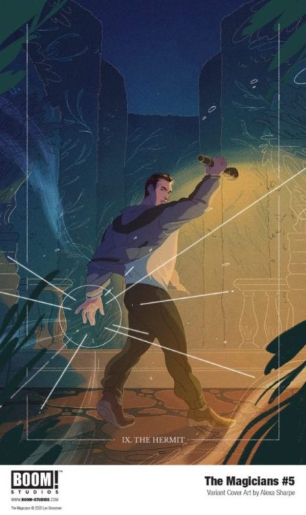
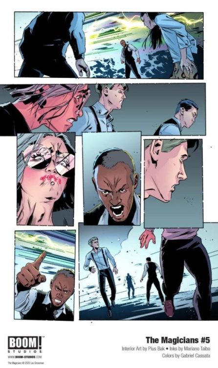
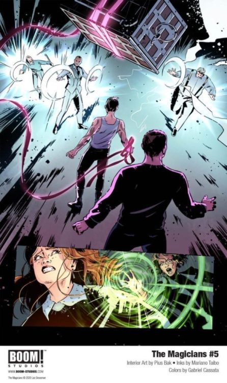
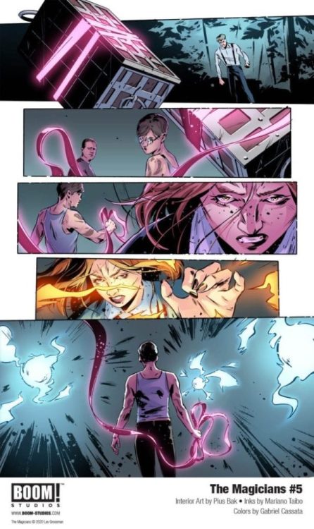
The Magicians #5 doesn’t hit your local comic book store until March 4, but thanks to BOOM! Studios, Monkeys Fighting Robots has an exclusive first look at the interior art by Pius Bak with inks by Mariano Tiabo and colors by Gabriel Cassata. Also included is the main cover of the issue by Qistina Khalidah, along with a tarot card variant cover by Alexa Sharpe.
About the issue: As the true reason behind Brakebills welcoming Hedge Witches comes to light, the students realize that they are in even more danger than they realized. With their terrible secret bound in magic and blood, the students and adults are all heading blind into the coming storm.
The book is written by Lev Grossman and Lilah Sturges, and you will read Mike Fiorentino’s letter work.
Check out the first look of The Magicians #5 below:
What do you think of The Magicians, is it on your pull list? Comment below with your thoughts.
Where can you find a copy? Print copies of The Magicians #5 will be available for sale March 4, 2020, exclusively at local comic book shops (use comicshoplocator.com to find the nearest one) or at the BOOM! Studios webstore. Digital copies can be purchased from content providers, including ComiXology, iBooks, Google Play, and Madefire.
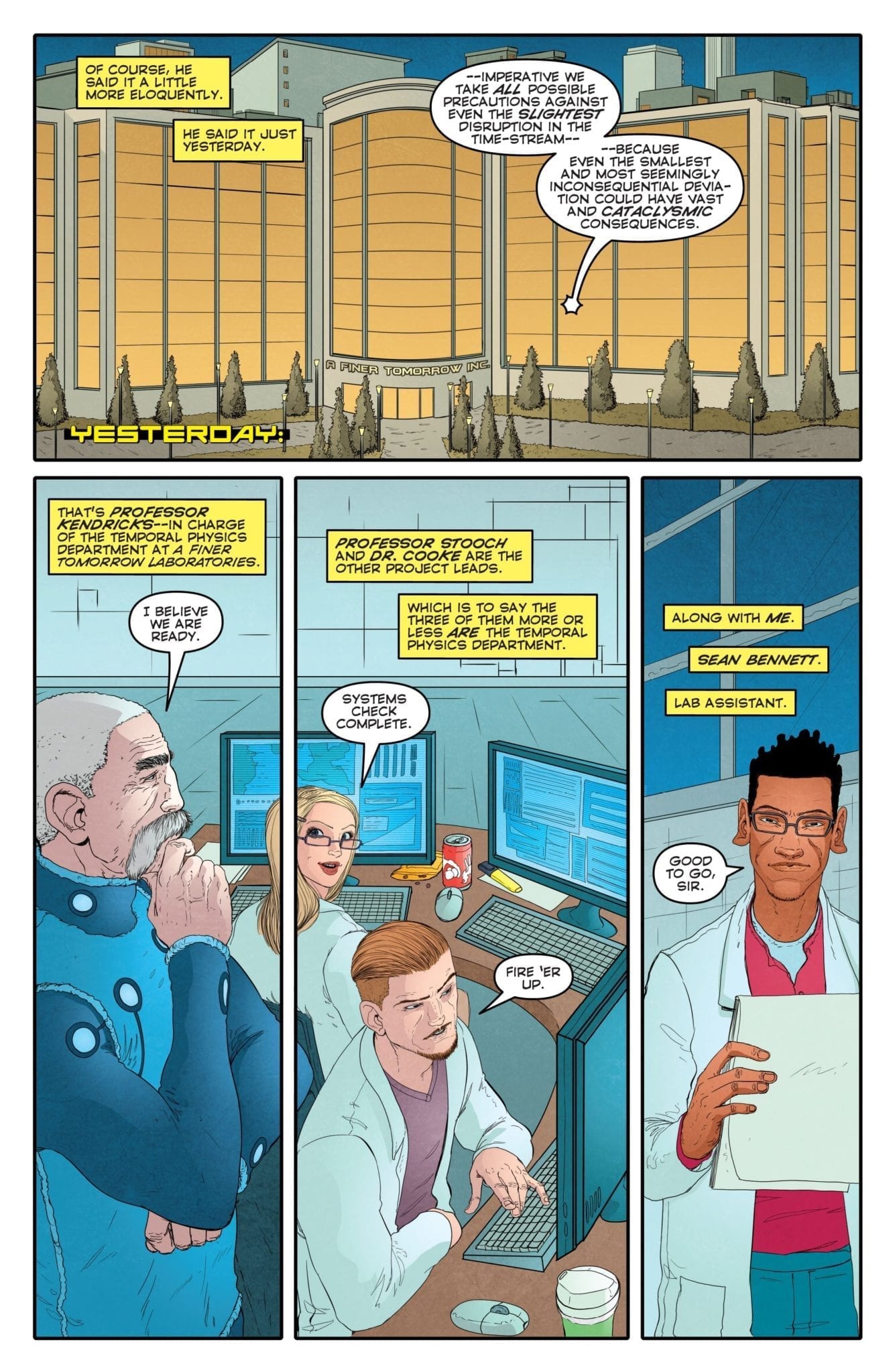
The dangers of time travel and trusting yourself are the name of the game in the colorfully titled The Man Who F#&%ed Up Time, out this week from Aftershock Comics. Conjuring up images from a number of movies, TV shows, and comics from the last 100 years (depending on what your ‘go to’ time travel favorite is) this new comic by John Layman and Karl Mostert lays it’s cards on the table very early on.
With box office blockbusters like Avengers: Endgame messing around with time travel and Doctor Who making massive time waves on television and in comics, is it possible that Layman and Mostert have found a new angle for this type of story? Or is it a case of repeating past ideas?
The Man Who Effed Up Time #1 Credit: Aftershock Comics
Time Lines
Aftershock Comics are not new to time travel stories. There was an element of time warping in Jackpot,The Revisionist was obsessed with the consequences of time travel, and it can be argued that the more abstract offering from Warren Ellis and Paul Hester, Shipwreck, is the best of the bunch. This means that The Man Who F#&%ed Up Time has very big shoes to fill.
Layman’s approach is to jump right in. When the reader meets Sean Bennett, he has already caused cosmic chaos and the opening, energetic pages introduce the mixed up world that Bennett has created. This all comes with an internal voice-over from Bennett, laying the groundwork for the story and, to a certain degree, fleshing out his character.
When the narrative time hops to before the mess began, Layman continues to use the voice-over to introduce the rest of the cast, their awkward histories, and the mechanics for time traveling. After the outlandish opening the rest of it seems rather mundane. The scientists experimenting in a lab: the smart underling who should have a greater part in the team: the bully pushing the hero around. If you had a list of cliches, you’d be ticking them off, one after the other as you turned the pages.
There are some moments of engaging conversation with witty speech and nuanced character development. Unfortunately, there is a lot more tired exposition and conversations that will seem very familiar as they closely resemble a number of other similar stories from across multiple mediums.
Ultimately, only the central character, Sean Bennett, comes out of this opening issue with any personality worth mentioning. The rest play the extra’s game perfectly, doing nothing more than existing to give Bennett motivation. They are narrative props fulfilling a role in the same way that this comics time machine does. The lack of depth is disappointing.
The Man Who Effed Up Time #1 Credit: Aftershock Comics
The Art of Time
As with the narrative, Mostert’s artwork peaks in the opening sequence. The energy and urgency of Bennett��s character in the first few pages is palatable and, as a reader, you get a sense of threat from the images. The way that the panels are designed, with large open spaces in half page-sized panels followed by crowded scenes in much smaller panels, helps to intensify the action.
When the plot moves into the lab, the energy and excitement leave the comic. The characters become quite pedestrian while the backgrounds are architecturally sound but not very emotive. There is a contrast here between the two time periods, one that is important to the story, or at least to Bennett’s character, but the change is too great. Bennett’s mundane and disappointing life could still visually be interesting to the reader, however, it isn’t.
Unfortunately, when the plot returns to the alternative future, the damage has been done in more ways than one. From that point on the art doesn’t capture the exhilaration of the opening pages and as more futuristic elements are added, the more unoriginal it all starts to feel.
What doesn’t help Mostert is that the plot itself stops making sense. Whereas the reader is wanting a clever Back To The Future Part 2 story, they are left with a hastily written What If? Comic.
The saving graces for this comic are the colorwork by Dee Cunniff and the lettering by the writer, John Layman. Cunniffe’s colors are reminiscent of Jordie Bellaire’s work on The Manhattan Projects from Image Comics. It creates locations and draws comparisons between one place and another; namely the alternative timelines. The atmosphere in the Lab and the world surrounding is completely different to the monumental landscape of the alternative world Bennett finds himself in.
The Man Who Effed Up Time #1 Credit: Aftershock Comics
Conclusion
At the end of the day, The Man Who F#&%ed Up Time is a fun romp. You can laugh at the silly inclusion of dinosaurs in a ‘modern’ world setting and the cliched time machine surrounded with wires and bright lights. Unfortunately, there is nothing that elevates this above mild curiosity.
The writing is inconsistent and the plot is problematic if you think about it for more than a second. Overused cliches pad out the character development in an attempt to justify the actions of the central character. There are too many time travel stories out there doing a much better job than this comic.
The artwork is enjoyable and there is some fun to be had but this is nothing more than a throwaway comic. It’s like a Sunday afternoon movie that can help pass the time but you wouldn’t go out of your way to watch. Potentially, over the course of the next few issues, this comic could improve and become something special. It just isn’t there yet.
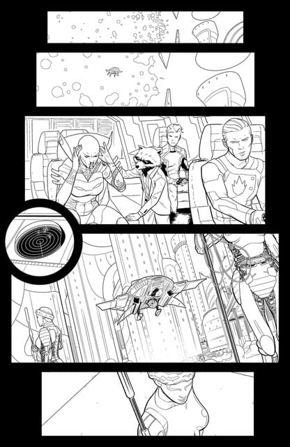
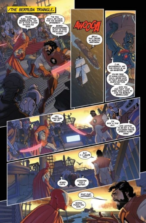
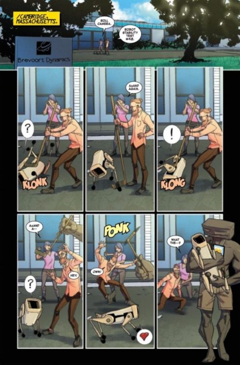
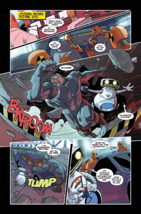
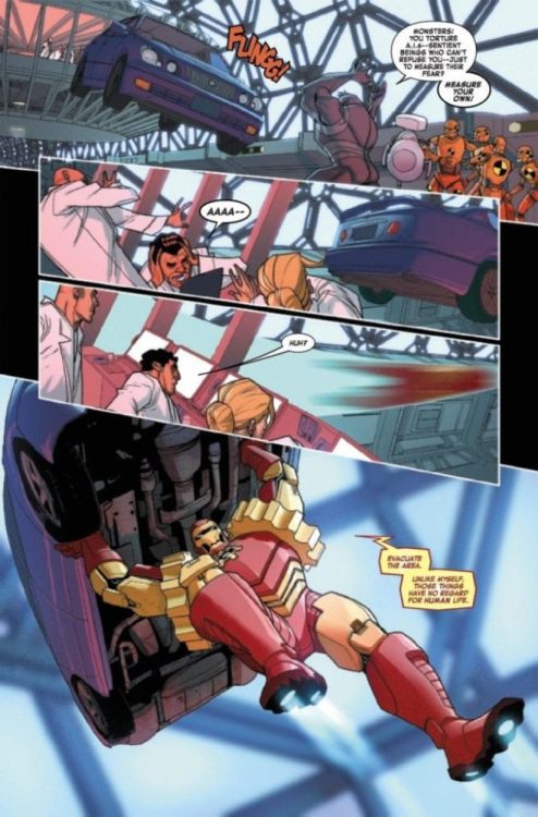
Iron Man 2020 #2 (of 6) hits your local comic book shop on February 12, but thanks to Marvel Comics, Monkeys Fighting Robots has an exclusive four-page preview.
The book is written by Dan Slott and Christos N. Gage, with art by Pete Woods, and you are reading Joe Caramagna’s letters.
About Iron Man 2020 #2: “The Rebel Compliance”
All is well. The Robot Rebellion has been dealt with. Humanity is perfectly safe. You may all thank Arno Stark, the Iron Man of 2020. Don’t you feel better now? Machine Man is NOT coming to kill you and everyone you love. 1010101111001100110000. Pay no attention to those numbers. Those were a typo. We apologize for any errors, glitches, or… unforeseen problems with any of your Baintronics devices. A new software patch is coming. For EVERYTHING.
The first book is pretty crazy, over the top, and a enjoyable ride. We broke down the artwork in the first issue here:
Check out the Iron Man 2020 #2 (of 6) preview below:
Do you have Iron Man 2020 on your pull-list? Comment below with your thoughts on the series.
Iron Man was co-created by writer and editor Stan Lee, developed by scripter Larry Lieber, and designed by artists Don Heck and Jack Kirby. The character made his first appearance in Tales of Suspense #39 (March 1963) and received his own title in Iron Man #1 (May 1968).