Home Blog Page 338

Review: DEATH TO THE ARMY OF DARKNESS #2 – Fighting With Oneself

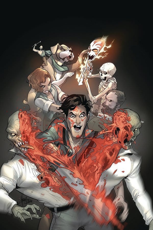
Dynamite’s Death to The Army of Darkness #2 continues to show how Team Ash may be one of the best teams out there, as they kick deadites’ asses this March 11th at your LCS.

If you’ve been buried in a grave and need a refresher of Death to The Army of Darkness #1, then check out our review of the chainsaw revving first issue.

My favorite Variant Cover for Death to The Army of Darkness #2
Variant Cover by Juan Gedeon

MULTIPLE SHADES OF ASH

Ryan Parrott starts Death to The Army of Darkness #2 with a scene that fans of the Evil Dead series will recognize: Ash getting his ass handed to him on a platter. Who doesn’t love seeing Ash get knocked down to get right back up? Yet, this time Parrott has Team Ash backing him up against deadites. Nonetheless, the age-old question stands, “is multiple versions of Ash better then one full Ash?” Okay, that may not be the exact quote but the question remains, how is Team Ash?

In Parrott’s hands, Team Ash may be one of the Evil Dead’s best plot points. Death to The Army of Darkness #2 proves this with non-stop fun, humor, action, and Ash’s usual attitude towards things. Parrott absolutely nails every aspect of Ash with respect to the original, while building upon it. Within Death to The Army of Darkness #2, there are moments where you can see Bruce Campbell acting out to great effect. But, that’s not limited to Ash, as this is a team-up comic.

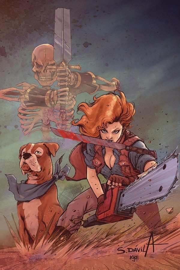
We learn that Team Ash was formed by the mistranslation of a singular word in the Necronomicon. Of course, this is something that would happen to Ash; nothing out of the usual. Yet, Team Ash is one of the best aspects of the series so far, especially with issue two where they are truly introduced. Each character takes a single characteristic from Ash. Intelligence, femininity, aggression, fear, and impulsivity. All of these combine to make one of the best teams out there

Always love Mirka Andolfo's work!
Variant cover by Mirka Andolfo

THE TEAM THAT SLAYS TOGETHER, LOOKS GOOD TOGETHER

In Death to The Army of Darkness #2, Jacob Edgar is able to flex more of his action-heavy muscles. And damn do those muscles look gorgeous. The first six pages continue the fight seen in the previous issue with each member taking on deadites in their own way. Edgar keeps the violence crisp, fast, clear, violent and comedic in the way it’s handled. Each panel during the fight is a blast to read, as he keeps the realism of his art intact, yet continues to make it cartoonish. That’s not all in that aspect though.

Ash’s Chainsaw takes the aggression aspect of Ash, and although it doesn’t speak much, Edgar makes it visual anytime it does. Instead of having the Chainsaw be static when it talks, Edgar adds a bend in its blade. Just because it can speak doesn’t mean it stops cutting people in two. Call that a transition to Kike J. Díaz’ fantastic color palette.

During the deadite-splitting-in-two panel, Díaz uses a singular yellow/orange background to help emphasize the moment. Seen in the foreground is Ash & Chainsaw behind the deadite splitting him in two with blood spraying everywhere. The background helps the blood’s red hit harder, making the scene have a more gore feeling. This mixing of color continues throughout in a few bloodier moments, keeping the above statement. These aren’t the only moments Díaz’ colors stand out, as they are captivating throughout, especially the fire scenes.

A very Conan esque cover.
Variant Cover by Sergio Fernandez Davila

THE LETTERS THAT GO VROOOOM

Another great moment in the chainsaw panel is Hassan Otsmane-Elhaou’s sound effect. Instead of simply having the VROOOOM effect linger on the top, Otsmane-Elhaou portrays it in a V movement the reads from left to right. This isn’t the only example of great lettering, as throughout Death to The Army of Darkness #2, Otsmane-Elhaou includes eye-popping sound effects. Otsmane-Elhaou also keeps the trend of making key words large and bold to help make the word bubble pop.

DEATH TO THE ARMY OF DARKNESS CONCLUSION

Everything about Death to The Army of Darkness #2 oozes love and appreciation that the team has for the film/TV series. If you’re hesitant to read it as it’s based on a franchise, don’t be. So far the series has been new reader friendly, while containing callbacks and other great moments that long time fans will love. Issue #2 proves that the first wasn’t just luck, but that the team knows exactly what they’re doing.

Cover Story: Having a wearable mask of Ash on the cover that (it seems) you can cut off is awesome! Now you need to buy two so you can cut one off.

Who doesn't want a face full of Ash? Death to The Army of Darkness #2 COVER
Cover by Ben Oliver

Memorable Quote: “Please tell me you’re not trying to make a move on yourself.” – Ashley Williams.

This moment had me laughing like crazy because I need it was only a matter of time before Ash tried this. Plus it nails his character perfectly. Ash and Team Ash had so many great banter moments.

Monkeys Fighting Robots Youtube

How DAREDEVIL: BORN AGAIN Changed My Concept Of What A Comic Could Be

DAREDEVIL: BORN AGAIN

Alan Moore and Frank Miller ushered the comic book world into a new age in 1986. Gone were any traces of the slapstick humor that still permeated from the wacky days of the Silver Age. Grit, dark shadows, and subverting the norms of the genre became, well, the new norm. Moore, whose Watchmen series at DC Comics remains quite possibly the most famous comic book storyline ever, and Miller, who was also revolutionizing capes and cowls at DC, were flipping the conventional wisdom applied to superheroes. There is, however, a more overlooked work of Miller’s from that year in “Daredevil: Born Again” with artist David Mazzucchelli at Marvel.

So often, the canonical superhero comic book stories have been limited to Watchmen and Batman tales over at the Distinguished Competition. There are The Dark Knight Returns and “Batman: Year One,” both of which are from Miller. The Dark Knight Returns is an iconic out-of-continuity series that focuses on an aging futuristic Bruce Wayne coming out of retirement, taking up the mantle of the Bat once again in protection of a crime-ridden Gotham City. It’s dark and dreary and bleak in the way few mainstream comics were beforehand.

“Batman: Year One” is a timeless origin story of the Caped Crusader, one that has appealed to readers of all generations and backgrounds for over thirty years. You can have no preconceived notion of Batman and still enjoy it. I’m sure it’ll still captivating audiences for the next three decades too.

Matt Murdock Kingpin

“Daredevil: Born Again” is so different, though. Miller had already completely reinvented the character in his seminal late-1970s run, creating classic characters like Bullseye and Elektra while also showcasing that Wilson Fisk was much more than a mere Spider-Man villain, he was a force to be reckoned with both physically and psychologically.

This wasn’t some dystopian version of Matt Murdock either. This was the real Matt Murdock who had been around for over thirty years, a man who had loved and lost and beaten to the brink of destruction countless times across hundreds of comic book issues. This was the real version of Karen Page too, as she struggles through drug addiction in a way no superhero comic had covered since the classic Green Lantern/Green Arrow volume from Dennis O’Neil, Neal Adams, and a whole host of other creators in the ’70s.

Frank Miller

Miller re-imagines a version of Bruce Wayne readers never knew existed in The Dark Knight Returns. Miller re-imagines a version of Matt Murdock, who readers had grown to care about for years and years in “Daredevil: Born Again.” That’s what separates the two for me. His Bruce Wayne is some totalitarian god machine. His Matt Murdock is still a blind Catholic lawyer from Hell’s Kitchen.

Miller widens the scope of his story in a manner similar to the way Moore does in Watchmen too. He hits on the themes of nationalism, patriotism, and the growing fear of nuclear holocaust with his creation of the character Nuke, a name that lacks any semblance of subtlety, and the inclusion of the red, white and blue shield-carrying Captain America.

As the Cold War was reaching its zenith, Miller was unafraid to have those real-world fears come to life in the panels of Daredevil. The fact that is an in-continuity story, not something that could’ve been spun as an alternate universe, only heightens that impact. This is part of the reality of the main 616 Marvel Universe. It’s just as much part of Daredevil’s history as Stick teaching him to harness his otherworldly gifts.

Born Again Frank Miller

I loved “Daredevil: Born Again” so much that I took it to an academic level. When I was a junior in college at the University of Pennsylvania, I took an English class on the comic book medium. When it came to writing our final term paper, I naturally gravitated to the work of Miller. We had covered The Dark Knight Returns as part of assigned reading, but there was obviously another of Miller’s stories from 1986 that I wanted to incorporate into my analysis as well. I compared the state of each superhero universe, the graphic displays of violence that were prominent in these stories, and how they both reflected the geopolitical climate of the Cold War in the mid-late 1980s.

Frank Miller changed how I viewed the Marvel Universe with his earliest Daredevil work, as I began to see that there was a more sinister layer afoot beyond the shiny exteriors of Captain America and Iron Man. He changed how I viewed superhero comics as a whole with “Daredevil: Born Again.” His stories with the Dark Knight will always remain his most prominent, but I will always hold a soft spot for his greatest tale about the Man Without Fear.

Monkeys Fighting Robots Youtube

Review: THE FLASH #750 Celebrates the Character Through Stories

Flash 750 cover

The Flash Age Begins!

Eighty years ago, comics introduced the fastest man alive, The Flash. While it may not have started as Barry Allen, the Scarlet Speedster has been one of DC’s cornerstones in history. Now we reach issue 750, which might not be an accurate number, but still impressive nonetheless. It’s been an epic ride so far, but this run certainly has been a rough one.

The Flash has been at a crossroads since the end of Rogues’ Reign. His powers have grown out of control, and he nearly killed Captain Cold. After freeing the city from Cold, Barry meets with Pied Piper to help. While he can’t fix him, the ex-Rogue is able to stabilize Flash enough to allow him to continue being a hero. When Barry returns home, his future self arrives and warns him of the villain Paradox before disintegrating. Is the fastest man alive prepared for this new threat?

Flash 750 cover

**Some Spoilers Below**

Story:

The Flash Age begins with the citizens of Central city talking about their hero. From reformed criminals to students at school, it’s clear that Barry Allen’s heroic alter ego has made a change. These stories are being gathered by Iris, who wants to publish an article about the Flash. Barry, however, has been doubting himself as of late with all that has happened during Rogues Reign. Iris admits she made this story to remind him that he is the hope of the city and does so much for the people. Before he can get too comfortable, the pair are visited by Godspeed, who challenges Flash once more.

The Flash 750 p1

So there will be people who hate the opening chapter of The Flash Age due to its treading old ground. It recaps the past few arcs, including Flash War and The birth of the other Forces. Honestly, I forgot it was a part of it until the last three pages when Godspeed arrived with Paradox. Truth is this story felt more like a celebration of what made the character of Barry Allen enjoyable.  This shouldn’t be seen as a study of the series but a study of the character himself.

As for the other stories in the book, we have a mixed bag. While some were able to bring a smile to my face, others fell flat. One of the standouts was a Jay Garrick Flash tale. We see him face the Thinker before leaving us a tease of his return later this year. One of the mediocre ones come in the form of a Flash against Mirror Master story, full of references to the silver age. While it isn’t one of my personal favorite, the variety of stories will impress a wide range of readers.

The Flash 750 p2

Art:

With this issue being as massive as it is, we got a large array of art teams to help bring the tales to life. For The Flash Age, we have Rafa Sandoval returning, and he brings his A-Game. He had always done a spectacular job in working on the Scarlet Speedster and his powers, and here is no different. The brief battle between Godspeed and Flash is still plenty to excite as we head into the rest of the arc.

Other standout art teams are David Marquez and Alejandro Sanchez with their Jay Garrick story and Francis Manapul. Both stories have exceptional art with memorable moments that stay with readers days after reading it. Overall, it’s just a good looking comic!

Conclusion:

The Flash has just turned 80, and this comic does a pretty good job of honoring the character. There are stories for every type of reader. The main story isn’t perfect due to it mostly being a recap of the current series, but considering what this issue is, it fits. From the slow-paced character pieces to action-packed romps, this comic will bring delight to any fan of the fastest man alive.

Monkeys Fighting Robots Youtube

The Place To Bet – Vera And John Casino

Monkeys Fighting Robots

Many online gambling sites have been emerging recently to cater to the vast market of players who want to gamble. 

This is a natural turn of events. The use of smartphones has become an integral part of life for the majority of the human population. It is a means of connecting. 

And, most people now want to gamble from the comfort of their homes. To give the consumer what they would find a truly remarkable experience, Vera and John Casino is the place to check out.

As soon as you visit the site, the player is elevated to another platform which gives you a surreal feeling of actually being in a casino. 

The website design is lavish and posh creating an atmosphere of a grand casino where one can play any number of games from blackjack to baccarat, and from slots to roulette. 

It really is quite refreshing and liberating, as the player can be at ease at going around picking and choosing from a large number of gambling games – 700 games for the PC and 500 games for smartphones.

Then, to hook the players, Vera and John Casino gives what all gamblers love – freebies. There are welcome bonuses, no deposit bonuses, free spins, and free games.

To give you a clear idea of how royally the players are treated, you receive a $30 bonus for simply registering. And, that’s when the games truly begin. 

The welcome bonus is what comes next. Here, the player gets a bonus for making a deposit. The bonus is matched to the deposits up to $500. The second bonus is 25% of the deposit up to $ 250 and the third one is a 50% matching bonus up to $ 150.

These bonuses are not equivalent to cash though. And, can only be used once your cash. The bonus will be transferred as cash when the withdrawal conditions are met.

But, Vera and John Casino appeals to the hardcore players who love to gamble. That is to say, there are tournaments on the most popular games. New avatars and various achievements are awarded as the player frequent the site regularly.

Also, you can win coins as you keep playing. The more you play, the more coins you make. These coins can then be used in the online shop where players can purchase bonus cups, locked bonuses, and even free rounds.

How do players make deposits asap and begin to play? There are many sites that take payment only through Neteller, but not at Vera and John. They want to make things simple for their players so you can make deposits through credit cards, which is way quicker and hassle-free compared to other payment methods.

Vera and John Casino is an online gambling casino that is a user-friendly site – easy to use, understand and play. It is smartphone compatible and just as great to be used on your personal computer. 

So, gamblers and gamers alike, be prepared to have a world-class experience at berazyonn casino. It is truly an online casino to have fun and win big time.

Monkeys Fighting Robots Youtube

5 Brilliant Reasons for Auto Care

Monkeys Fighting Robots

The Introduction

It isn’t possible to function effectively in your everyday life without transport. And, if you seek to cut down on your daily transport expenses, get yourself a car.

But, everyone can’t put down so much cash in one go to get a car. Hence, there is now car financing.

However, many argue that car financing includes vehicle insurance that tends to raise the monthly premium paid. And, the obvious question asked is, why should we pay so much?

Well, there are umpteen reasons for you to get vehicle insurance. Read on to find out more.

Benefits for getting vehicle insurance

Safe From Accidents

Accidents happen all the time. There may be a time that your car gets hit even if you are standing at a traffic light. 

And, getting your car insured means that you are safe, from paying an enormous amount of money right out of your pocket when you do run into an accident.

Paying Less Even If You Do Get Into An Accidents

You may pay a small amount of monthly premium but that saves you from paying a huge amount at the time of the accident.

That is the biggest benefit – the small amount paid for coverage today covers you in the time of even a large accident in the future.

Prevents Devaluation Of Your Car

Some auto insurance policies provide cover for the devaluation of your car too. Naturally, it is something that you are required to pay for in the vehicle insurance policy, but the benefits far outweigh the costs incurred.

Gives You Peace Of Mind

The fact that your vehicle is insured, does give you peace of mind. Unforeseeable events are a part of life but taking security measures in advance does mitigate the losses. 

If, in the case of an accident, you know that your vehicle is insured and that it will not cause a severe financial constraint on you.

Safeguards You Against A Lawsuit

Even if you end up damaging someone’s property, having auto insurance means you will have help when others make a claim against you. This even includes legal defense.

Covers For Damages Even If It Is Not An Accident

It is not really necessary that your car can only get damaged in an accident. Auto insurance covers you for events such as fire, theft, and other eventualities such as damages caused by a run-in with an animal, or even a hailstorm.

The Conclusion

In other words, the best thing to do against the uncertainties of life is to take precautions. Auto or vehicle insurance helps you to do just that. 

And, the best thing it does is to provide people with a sense of security. You know that if you do run into an accident and damage your car or someone else’s car, your monthly budget won’t turn to nil. 

So, if you own a car or a van, look up the internet to find a good van insurance deal here.

Monkeys Fighting Robots Youtube

Review: RED SONJA #14 Asks “Will She Sell Her Soul To The Devil?”

Red Sonja #14, Cover By Jae Lee

RED SONJA #14 tells a multi-plot story of Faustian bargains in a time of desperation and starvation. Writer Mark Russell challenges Queen Sonja to use her wits instead of her sword, and Bob Q’s art brings even a simple negotiation to life.

Summary

Queen Sonja’s kingdom is on the brink of starvation after a devastating war. She reaches out to an unlikely ally in her desperation, but how far will she go to save her people?

Cover Art

Jae Lee paints a winning cover. Lee’s image is not just cool imagery; it calls back to a minor scene within the book that’s much more dangerous than it looks. Red Sonja, here, doesn’t look like the statuesque warrior she’s historically is seen as, but more roguish and sly. It’s a refreshing take on the character.

Writing

Mark Russell put together a story that forces Queen Sonja to rely on wit and diplomacy over swordplay. In short, her strength as a Queen is put to the test. The dialog is clean and sometimes witty. The overall plot flows well. That said, this issue is much more conversation than action. If you pick this issue up looking for the glory of battle, reset your expectations. It’s a good story, but it’s not an action-packed.

Lettering

Hassan Otsmane-Elhaou does a phenomenal job with the lettering; especially in two key areas. 1) Otsmane-Elhaou clearly transitions carryover dialog from one panel to the next which keeps the reader’s eyes moving. 2) He expertly bolds just the right words to visually interpret inflection and emphasis in the character’s voice. Very well done.

Red Sonja #14, Lettering Sample

Coloring

There are a lot of browns, greys, and earth tones in this issue, but Dearbhla Kelly manages to keep all the panels looking distinctive. You have a lot of static scenes, but that’s not surprising since there isn’t much action going on. Still, each panel is bright and visually interesting.

Pencils/Inks

Bob Q’s illustration is a standout in this issue. Q shows a knack for facial expressions that say just as much as Otsmane-Elhaou’s lettering. Q raises and lowers the eyebrows asymmetrically on each character to convey how they’re considering each others words in less-than-pleasant terms. Also, the slant of each mouth really sells how the Aristocratic adviser (on the left) is arrogantly ambivalent to the plight of the peasants, and Isolde’s (on the right) lopsided frown deftly conveys disgust at the adviser’s indifference.

Red Sonja #14, Illustration Sample

Conclusion

In all, we thoroughly enjoyed this issue. It’s very conversation heavy over action, but the story moves. Queen Sonja takes an important step toward developing as a mature and wise(?) leader. We recommend you pick up this issue.

Monkeys Fighting Robots Youtube

We Salute You, Memorable Comic Book Characters

Hulk
Image via https://twitter.com/zonesixnet

The evolution of various characters associated with entertainment, be it in the movies or in our comic books, has been quite remarkable over recent years, partly thanks to the numerous technological innovations we’re exposed to. Developers have far more to work with, meaning the characters we love to are changing all of the time. There are certainly more characters around than ever before, that’s for sure.

The world of gaming, for example, has some truly iconic characters that have left their mark on society. The likes of Pac-Man, Zelda, and Mario immediately spring to mind, alongside a whole host of other memorable names. Not all games require strong characters, of course, like, for example, casino brands such as leading scratch cards site casino.com as many of their games simply don’t need one, but plenty of other creations do. The same applies to a movie, where, for instance, if a production has a memorable lead character, people tend to remember the film and all things associated with that particular character. It’s that simple.

We’re here for comic books, though, and – more specifically – comic book characters. So, without further ado, and in an attempt to show our appreciation to some of the greatest and most memorable comic characters ever, here’s a selection of a few who have made a big impression over the years.

The Hulk

Everyone knows who the Hulk is, right? Recognizable the world over, the Hulk likes to punch things continuously, and in doing so, he has well and truly punched himself to the top after being considered a major player in the Marvel Universe these days, especially with the successes of Planet Hulk, World War Hulk, and the Red Hulk storyline. The madder he gets, the stronger Hulk gets too. What an icon.

The Thing

The heart and soul of the Fantastic Four, The Thing is one of the most likable comic book characters in history. Despite clashing endlessly with Hulk and usually losing quite convincingly, The Thing is still a formidable character, although he isn’t a happy one. Trapped in a body he despises, Ben Grimm suffers the occasional bout of depression along the way. Still, this large creature with incredible endurance, and his popular “It’s clobberin’ time!” catchphrase, is much adored.

The Joker
The Joker

(Image via https://twitter.com/Mattthewwwww)

The movie was a huge hit, but before that The Joker really made a name for himself in the Batman franchise. With many seeing him as the greatest comic book villain ever, The Joker pretty much has everything a villain would want. He’s sadistic, he loves a sick joke, he’s annoyingly hard to pin down, he’s tough to defeat, and he looks and sounds incredibly odd with his green hair, white face, fixed grin, and creepy laughter.

The Punisher

One of the most iconic characters ever seen in the Marvel series, The Punisher, is hard to miss with his black-shirted chest, which features a giant skull, his love of guns and his never-ending desire to seek revenge. A lot of people don’t know this, but The Punisher is actually 70 years old according to the fact he ages in real-time. He was born on February 16, 1950, but he’s still very much someone you don’t want to cross.

Marv

Marv is a stable of the Sin City franchise. Usually confused with something, this dumb beast is capable of handling himself once he figures out exactly what it is he has to do. Battling with corruption in the city, Marv is intent on doing things his way. A hard man with a heart of gold, Sin City wouldn’t be the same without Marv.

Monkeys Fighting Robots Youtube

Review: BILLIONAIRE ISLAND Brings Cathartic Satire to the One Percenters

Ragging on the rich may be the order of the day for current fiction, but few would likely be able to do it quite like Snagglepuss Chronicles and Second Coming writer Mark Russell. Here the satirist teams back up with Flintstones co-creator and artist Steve Pugh for “Billionaire Island” #1, a brutally funny examination of the ultra-wealthy’s lifestyle – and what will one day come of it. Welcome to Billionaire Island, where anything goes…if you can afford it. But the island’s ultra-rich inhabitants are about to learn that their ill-gotten gains come at a very high price.

Writing & Plot

Mark Russell‘s brand of sardonic language and gallows humor brings the overall message to immediate life in “Billionaire Island” #1. The script introduces the plot to be at where many believe to be at the near-apocalyptic endgame of capitalism, but it’s presented with the hokey advertising style of a 90’s gameshow host. The comic keeps this kind of language and narrative presentation over the top of much more grounded realities – some relatable, some grim. This is where Russell’s satire makes itself at home. The comic also has a catharsis at its core; a sort of “coming storm” if you will. Without getting into spoilers, this should prove to be a grossly satisfying experience to get to watch play out. The comedy mixture of absurdist black comedy and flashes of a brutal underlying reality make for a sharp, even read that is both hilarious and compelling.

Art Direction

Artist Steve Pugh between goofy cartoonist style and natural character art in ” Billionaire Island” #1. On the one hand, Pugh’s work is fantastically detailed with human characters that all look distinct and realistic. On the other, he also knows how to implement facial expressions and absurd settings to match Russell’s satirical script. The primary billionaire antagonist is given features that are vaguely rodent-like, while also exuding physical persona of a cocky used-car salesman. There’s also a scene involving a giant hamster wheel which (again, no spoilers) really helps set the tone both visually and story-wise for this comic. Much of the winding aesthetic this issue has is due to the colors from Chris Chuckry. From the 80’s neon hues of the tacky commercial segments to the grounded colors of this world’s harsh realities, the whole book is given a top-notch visual experience in terms of character, setting, and tone.

“Billionaire Island” #1 is Mark Russell and Steve Pugh teaming up to do what they do best. Russell’s brand of satire hits the sort of absurd marks found in political cartoons, but on a larger and more poignant scale. The visual direction of the comic from both Pugh and colorist Chris Chuckry creates a vivid experience that lends itself perfectly to the story being told here. Albeit a bit on the nose, the timely exigency of this series coming in such a politically charged moment towards the one-percent is sure to make it find an audience ready to partake in some much-needed satire. Be sure to pick up “Billionaire Island” #1 when it hits stands on 3/4!


Monkeys Fighting Robots Youtube

Review: It’s A Family Reunion In IRON MAN 2020 #3

Iron Man 2020

The showdown everyone has been waiting for has arrived in Iron Man 2020 #3 thanks to Dan Slott, Christos Gage, Pete Woods, and VC’s Joe Caramagna. Will this battle be the highlight of the event or will it fall short of expectations?

Summary

Arno Stark vs. Tony Stark (aka Mark-1). Who will win?

Iron Man 2020

Writing

The dynamic between Mark-1 and Arno is on full display in this issue. Arno keeps seeming to come off as the more prepared and by his own words “smarter” Stark boy but this doesn’t paint him in the best life. Again, Arno’s actions come off more like a villain than a hero. By his own account, he wants everyone to bow down to him. Name the last time it was a good idea for a hero to want the world to bow to him? Off the top of the head, does Superior Iron Man rings a bell? The series where Tony’s personality was completely inverted and he acted like a villain.

The writing by Dan Slott and Christos Gage isn’t all just angst between the Stark siblings. HERBIE seems to steal the spotlight in every panel he is in. The little guy frequently bites off much more than he can chew and it’s amusing to witness.

Iron Man 2020

Artwork

Pete Woods providing the pencils, inks, and coloring for the issue and all of these aspects are at an incredible level of quality. The action scenes are intense, especially as Arno showcases the gear like shoulder pads aren’t just a strange design choice. There is another scene later where Arno decides to go all out with his attack and is shown to have laser blasters appear in a very menacing fashion.

The lettering by VC’s Joe Caramagna is on the usual level of high performance seen in the previous issues. By offering a great flow to the dialogue, the lettering helps the story to flow from panel to panel. The sound effects during the fight scenes also have a very bombastic feel to them.

Iron Man 2020

Conclusion

Iron Man 2020 #3 has the battle fans have been waiting for since the first issue. It unfolds in incredible detail and still leaves the reader guessing where things will go from here. The real question remains though. Is Arno Stark a good guy or is he no better than a villain?

Monkeys Fighting Robots Youtube

Review: VENGEANCE OF VAMPIRELLA #6 Is A Supernatural One-Shot With Some Rough Spots

Vengeance of Vampirella #6, Perrillo cover

VENGEANCE OF VAMPIRELLA #6 is a creature feature that matches the spirit of Vampirella’s creator, Forrest J Ackerman. However, some rough art and clunky writing put a damper on the moody fun.

Cover Art

Lucio Parrillo painted the main cover, and it’s gorgeous. If I had a full print of this cover, I would hang it in my home. Parrillo captures Vampirella’s seductive beauty and dangerous potential in one simple pose. I can’t praise this cover enough.

Writing

The overall story by Thomas Sniegoski is simple, unique, and interesting. Something causes a supernatural jungle to suddenly sprout in the middle of Virginia, and Vampirella is called in to stop it. The jungle is growing fast, and it’s populated by assorted mythical monsters.

However, where the plot works, the narration and dialog do not. Sniegoski liters the narration with odd grammatical choices that make it cumbersome to read. The narration is not necessarily wrong or bad; it just doesn’t flow. A few passes of the “read aloud” test would make it a cleaner.

Vengeance of Vampirella #6 Dialog Sample

Lettering

Troy Peteri checks all the right boxes with his lettering. It’s clear and easy to distinguish between conversations and narration. The letters stand out boldly, and the lines don’t look cluttered.

Coloring

Ori Remalante Jr.’s coloring is another highlight of this issue. Most of the action takes place in panels overrun with jungle. That’s a LOT of green, and it would be tempting to lose focus on where Vampirella is placed at any given moment. Not so here. Remalante Jr. keeps the surrounding foliage distinctive and structured in a way that avoids having every panel crowded out with a green blobs.

Pencils/Ink

I liked parts of the pencils/inks by Roberto Castro, but was put off by the lack of consistency. In some of the earlier panels, Castro inks characters characters with a very rough, sketchbook style. Castro’s creative choice can work if it’s carried through the whole issue. Here it is not.

VoV #6 ink sample

Others panels do not have that rough style. The book sometimes looks like it was drawn by different artists on different pages. It would be more visually appealing to choose a style and keep it through the whole issue.

VoV #6 ink sample #1

Conclusion

VENGEANCE OF VAMPIRELLA #6 has a fun story and a superb cover, but the clunky writing and inconsistent art put a damper on the fun. Recommend picking up only if you’re a Vampirella completest.

Monkeys Fighting Robots Youtube