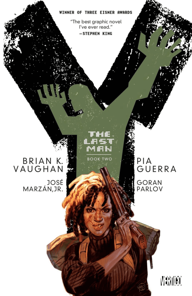
Two of the last surviving males take center stage on this cover of Y: The Last Man Vol. 1
Y: THE LAST MAN VOL. 1 originally released back in January of 2003, as hard as that may be to believe, is still as heavy-hitting and impactful as ever. If not more so, given the current events we’re facing.
Y: The Last Man is a series that continuously shocked and thrilled fans, thanks in part to the massive concept it ran with. It took a post-apocalyptic event (or nearly so) and used it to comment on politics and human nature itself.
When fans think of a series that was bold and brave, while carrying a more profound message, they’ll probably put Y: The Last Man somewhere on that list. And with good reason. That being said, the series now carries new weight, thanks to the pandemic we’re facing. Perhaps it is no longer a theoretical and fun escape to be found, but that hasn’t lessened its value in the least.
Another irony this series has faced is the struggle to get a television or film adaptation. It isn’t unheard of for a comic adaptation to appear almost cursed, continually coming up against one problem after another. Unfortunately, that is also true for Y: The Last Man. While fans have been eagerly hoping to see it on the big or small screen, we’re going to keep waiting a while longer yet. Thankfully, it still is in the works, so there is always that hope to cling to.
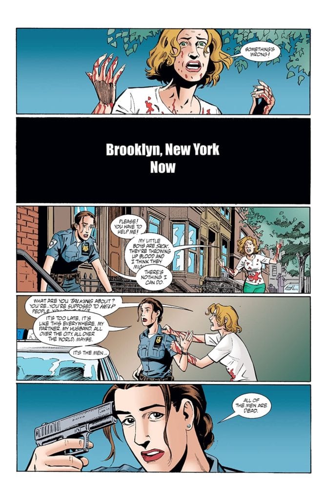
And so it all begins, with blood and near death.
Story
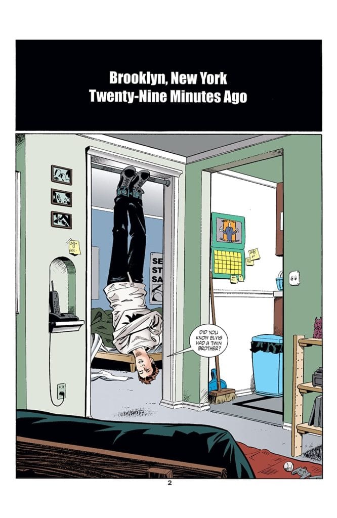
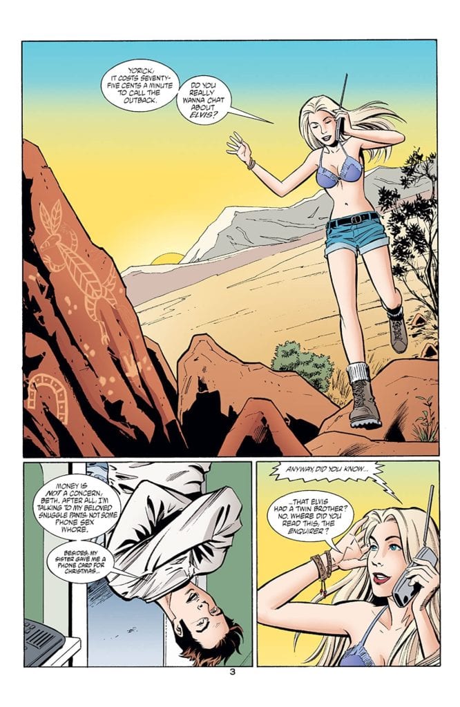
Written by Brian K. Vaughan, Y: The Last Man Vol. 1: Unmanned is the traumatic and dramatic introduction to a series. The whole premise of the series is that nearly all of the males on earth have died. That includes all of the animals. There are a couple of iconic exceptions, most notably Y (Yorick) and Ampersand, his monkey.
Naturally, that means this is a world full of chaos, as well as more than just a few bodies. It’s a post-apocalyptic graphic novel, but with an interesting perspective. With half of the world suddenly dead, those left behind have to figure out how to pick up the pieces.
Unfortunately, that is a task easier said than done. Not only is there a lot of clean-up that needs to be done, but there are significant power vacuums left behind (thanks to the tendency to have males higher up in ranks).
The first volume takes the time to establish Yorick, as well as his plight. It then rapidly moves readers forward, showing us the disaster (while not yet explaining the why), as well as the fallout of it.
Meanwhile, Yorick’s introduction is at a completely different speed.
Why We Love It
Y: The Last Man hit so many fans for a variety of reasons. There’s the plot, of course. The whole concept of a post-apocalyptic world has always engaged readers. But it’s more than that. It was the mystery of what happened – as well as this vision of a world with only women (mostly).
The fact that the series wove in politics and wasn’t afraid to make commentary on the matter was huge. The statements made were poignant, and made to feel all the more real thanks to the very human feeling characters involved in the series.
That being said, there are some criticisms to be found in the series. These elements bother some fans more than others, so it’s all about perspective. Some readers were less than thrilled about the concept of the leading character being male when the whole point was to show a world of women. Others were concerned about the negative light that was shined upon the surviving humans. Both are valid complaints, of course. But most fans choose to see it in another light.
You can probably guess where this is going.
Artwork
Y: The Last Man Vol. 1: Unmanned had a variety of artists working to make it the iconic masterpiece we know it as. Pia Guerra, Jose Marzan Jr., Jose Marzan, and Goran Sudzuka all had a hand to play here.
While the plot of the series is often brutal and bold, it would never have had the same impact without the artwork to support it all. There is a raw feeling to the art style within these pages, and somehow that further exposed readers’ nerves, forcing us to acknowledge this world that Vaughan, Guerra, and the rest created together.
Unsurprisingly, one of the highlights for this series is the ability to evoke emotion. Yorick faces trial after trial throughout ten volumes, and yet we can still read him as clearly as a book. His emotions are clear for us to see and to experience alongside him. It makes for a powerful impact.
Of course, we can’t forget about dear Ampersand and the rest of the characters, either. Ampersand is frequently a moment of chaos, action, or humor, depending on what was needed. His antics helped to break up the dire portrayal, giving the artists a little bit of levity to play with. Something we will always appreciate.
Agent 355 is looking fierce on the cover of Y the Last Man Vol. 2.
Conclusion
Y: The Last Man Vol. 1: Unmanned was the start of something larger than life. Yorick’s tale is not a pretty one – not by any means. Yet it carried with it something real and substantial. This theoretical post-apocalyptic world is one that can be easily pictured by the readers, and surely our imaginations made the scenes all the more horrific or terrifying.
Yet there’s also this sense of lingering hope. Yorick’s quest to find his love, halfway across the world, is both beautiful and heartbreaking. Who among us didn’t have hope for his success? Who didn’t fear his failure?
All these reasons, and more, are precisely why this series still lingers so strongly in our minds and our hearts. There’s no doubt that it will linger for even more time to come, especially if the adaptation continues to make progress.
Joe R. Lansdale is one of the most prolific writers in any genre. He’s written everything from horror to crime fiction, historical fiction and even some non-fiction. He’s also written a bunch of comics (like the excellent Jonah Hex series for DC/Vertigo) and is a die-hard comics fan. With that in mind, we at Monkeys Fighting Robots tapped Champion Joe (as his fans call him) for a chat about what else but comics! Read on and enjoy.
Monkeys Fighting Robots: Joe, first of all, thanks for taking the time to talk to us during this national crisis. How are you and yours holding up? As a writer has social distancing changed your day to day life?
Joe R. Lansdale: We are holding up very well. I hate it for others, but for us, it’s really no different than when there isn’t a pandemic. We’re home as usual, and I write in the mornings as usual. I always read, but I might be reading a hair more, and we watch films. I exercise at home. Only thing missing is my martial arts class that I teach. I only teach private lessons these days, but I miss that. I do travel from time to time for fun or for business, so we’re not doing that, of course. Otherwise, nothing is really different for us. I’m one of those peculiar people who likes being with people, but I like being home with my wife and a routine as well. When the virus passes, I will be glad to go to the bookstore and visit with people, and we have a couple of trips we’d like to make, but again, for us, it really isn’t bad. We have food stocks anyway, just because we tend to do that, and of course, we have the essential, toilet paper. Special items our son picks up for us and delivers. He goes early in the morning, dressed in his mask, looking like a bandit, and he buys us anything we might need once or twice a week, but we don’t need much. Thanks for asking. I hope you are well.
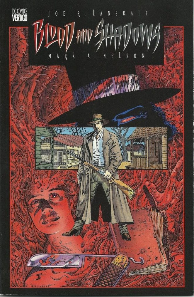
MFR: I’m holding on strong, thanks for asking! So apart from being an acclaimed novelist, short-story writer and screenwriter, you have also written many comics. What was your very first comic book writing? JL: My first comic gig was BLOOD AND SHADOWS. It was an original comics I wrote and Mark Nelson illustrated. Only problem was, Mark was slow. So by the time he finished I had written and seen published TWO GUN MOJO, the Jonah Hex comic. That did great. BLOOD AND SHADOWS finally came out, but by then the wind had blown out of its sails and it never got the attention it deserves. It’s creator-owned, so someday it may see the light of day again.
Cover to ‘Blood and Shadows’ #1
MFR: How do you approach writing a comic book as compared to a short story, or prose piece? JL: Ishow up. It used to seem very different for each concern, but less so now. I do have to spend a day or two becoming comfortable with the comic or screenplay format, but then it’s about telling the story in that form, and story is the thing. I also try to write scripts that do more than tell you what happens next, but are fun to read. Prose is always natural for me, as I do a lot more of it, but comics and screenplays after that initial readjustment to form, are pretty much the same. Scripts have the time limit factor, or in the case of comics, the page limit factor. Tim Truman and I did a Hex series where we started out doing five comics, but they cut it to four, so I always felt it was truncated more than I liked. So there are limitations like that. Requested short stories can have a limit, but mostly they don’t have a drop-dead number. Comics do have that as far as page count goes, so that’s something to keep in mind and the thing I have the hardest time with.
MFR: Were comics a huge influence for you growing up? How about as an adult? JL: I started reading comics in the fifties, and they are to this day the most important thing, along with parental encouragement, that led me to my career, and for that I am deeply grateful. Like most kids, it was the superhero stuff that excited me. I read the kid comics, the ones with talking animals, Casper the Ghost, Hot Stuff, and so on, but it was Superman who moved me first, and then I found Batman, and that was a sure-fire fit for me. I read all the DC comics heroes. Loved The Flash, Wonder Woman, and I read comics and collected them right on up until I was sixteen. And during that time I also read Classics Illustrated, which are the flip side of comics. They led me to reading a lot of the books they were based on. They have been revived, and they are reprinting and adding new comics to their line, and I buy them. I read them religiously as a kid. They led me to so many books, and since I never graduated at the University, they were a great source of my education. Without them there are so many novels and stories I wouldn’t have discovered. There are other influences, early television shows, all the reruns they did of Hopalong Cassidy, as well as new shows they made for TV. The Superman TV show, Lone Ranger, showing old serials like Flash Gordon and Buck Rogers. And the Tarzan movies were a big influence. But that’s getting off the comic subject a bit. Bottom line, they are what made me want to be a writer. I was trying to write and draw my own comics when I was four years old. My mother stapled them for me after I finished. As an adult, I read fewer comics. Like a lot of teenagers, I was dating and learning about myself. I was reading still, but comics were less and less a part of it. I would now and again buy a batch, as everything wasn’t continued. The stretched out stories that went issues and crossed over to other comics, sort of sucked the wind out of it for me in the nineties. But before that I would read them in patches, so to speak. Friends would suggest a run of comics, and then I would buy the whole run, so as not to wait for each issue. I could read a comic in fifteen to twenty minutes, so I preferred to have the whole storyline to sit down with. But I wasn’t reading them nearly as much by the time I was sixteen, and only begin to pick them up on a regular basis at the end of the eighties and into the nineties, and then, as I said, the multiple crossovers burned me out. I read a number of comics that weren’t superhero comics during the nineties, and then I dried up on the new ones for a while, even though I was writing comics. In the last ten years, I’ve gone back to reading a few new superhero comics, but the stuff I’ve really enjoyed, are comics like Capote in Kansas, and the To Kill A Mockingbird adaptation, Richard Stark Parker novel adaptations–there weren’t many, as it’s a long series. SAVAGE SEASON based on a novel by me was adapted but printed way too dark, but I enjoyed reading the artist’s interpretation. It was almost exactly the novel. MUCHO MOJO has been done, and it’ll be out in the wild eventually. What I really enjoy reading these days is rereading the DC archives, the ones before I was reading comics, the ones during my time growing up, the Silver Age, as well as gatherings of later periods. I buy nearly DC exclusively. Marvel was better in the sixties, but DC caught up, and though I like Marvel, it was always the DC characters that thrilled me. I buy a lot of old comics I used to read that have been collected. Stuff like Brothers of the Spear, Tarzan, Korak, anything to do with John Carter of Mars, and I’m once again buying the Classics Illustrated. I order a few every few months, and they are a treat.
MFR: Do you have a favorite comic creative team? A favorite writer or artist? JL: If Tim Truman is involved in a comic, with anyone, I try and read those. I loved a lot of different comics, so I don’t know if I had a favorite team. Gardner Fox was always a name I looked for when I started seeing his name on comics. The Julie Schwartz edited comics with so many different creators were really important to me when I was young. I got to know Julie and we became friendly. It was quite an honor for me. The comics he edited were important to my childhood, and the making of my career.
MFR: Do you have a favorite comic book character? JL: Batman. Duh.
MFR: Did you have a favorite title? JL: I still love Batman, though I don’t read the comics regularly. I watch animated films with Batman in them, and I wrote for Batman the Animated Series, as well as wrote the script for Son of Batman. The animated series is a highlight of my career. It was like being a kid again, but with adult sensibilities. That is my favorite version of Batman, comics, film, or otherwise. I also wrote a plot outline, or that’s how I was credited, for a Superman episode. I wrote a stand-alone, unnamed Jonah Hex short, that was on the blu-ray of Under the Red Hood, and was in a DVD collection of short animated films about a variety of DC characters. I love writing for animation and would like to do more of it.
MFR: I actually discovered you through comics, in a back door kind of way. I first read Preacher in trade and the edition of volume one I had contained a forward by you. I was so taken by how you wrote about the comic that I looked up the rest of your work and read the first ‘Hap & Leonard’, Savage Season, novel shortly after. How did you end up writing that forward to Preacher? JL: Garth was a fan of my Jonah Hex comics, and he and DC thought I’d be the right person to write it since I was a reader of the comics. It was a lot of fun, and interestingly enough, a lot of readers tell me they came to my work through that introduction, or through the comics I wrote.
MFR: You mentioned Tim Truman a few times. I wanted to get into your relationship with Tim, who I think is one of the best artists in the industry. How did you first get linked up with Tim? Were you a fan of his work like Grim Jack or Scout? JL: I love Tim. He’s a brother. DC comics put us together. I think Tim had read something of mine and suggested it. I’m not certain, to be honest, but it is always great fun to work with Tim. There are a lot of great artists out there, but Tim is a great one with a unique style that really knows how to tell a story through his art. They aren’t just pictures in panels, they manage to tell the story by the way they are constructed. He’s my favorite artist to work with, and my favorite comic book artist, period.
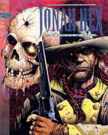
Cover to DC/Vertigo Jonah Hex: Two-Gun Mojo.
MFR: How did the development of Jonah Hex: Two Gun Mojo come about? JL: That was Tim and DC, I think. They teamed us up because as someone said: “He draws like you write”.
MFR: What led to the sequel, Riders of The Worm and Such? JL: Popularity of the first series of Hex comics, TWO-GUN MOJO. Success breeds sequels. I like all of the ones we did, but the first, TWO-GUN MOJO is my favorite, hands down. Each time we did a Hex series we tried to do something different with it.
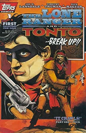
MFR: Now you guys also worked on Topp’s Lone Ranger & Tonto series in the 90s. What was like that? Was it working on Hex that led to that gig? JL: Topps was trying out comics, and Hex led us to that gig. I actually wrote two scripts for the Lone Ranger, but by the second Tim had to move on as he had another gig, the artist who worked with me on the second was great, Ted Naifeh. It hit right when Topps decided it was cutting back on comics, perhaps cutting them out altogether, I don’t remember exactly. Anyway, that one, which was a Gung-fu Western in San Francisco Chinatown, was never published.
Cover to Topps’ Lone Ranger and Tonto
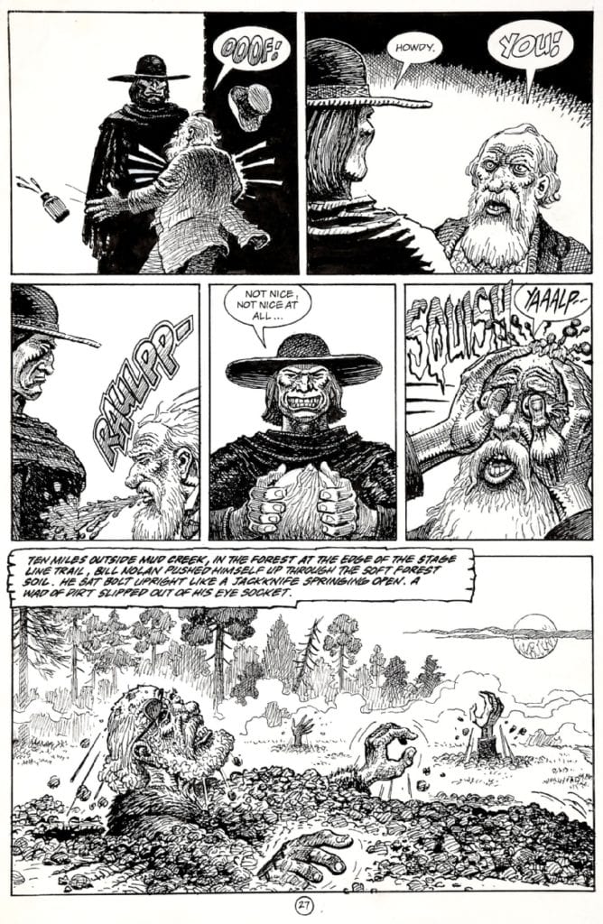
MFR: One of my personal favorite comics of yours is Dark Horse Comics Dead In The West adaptation, which was illustrated by Jack Johnson (Jaxon). Johnson who has a history that goes back to underground comics as, well drawing historical and war comics. Did you have a choice in him as an artist? Were you aware of his work? JL: I always liked Jack’s stylized work. I knew Jack a little, and my friend Neal Barrett Jr. did the adaptation. It was cool. Would love to see a new version of it done. I did have a choice, and I was aware of his underground work. I read a few underground comics here and there and thought it would be an interesting idea. It was.
Jaxon page from Dead In The West from Dark Horse Comics
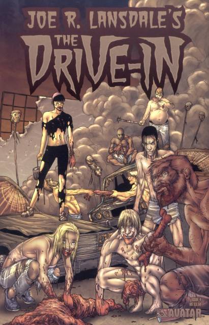
MFR: Avatar has also adapted some of your work in the past, what was it like working with them? JL: We made a deal, they did the comics. Pretty much it. I liked the comics, though the artwork, good as it was, sort of got monotonous on THE DRIVE-IN. Good stuff, but being more suggestive than specific, the white space began to feel like a brain wound after a bit. Again, that’s not the artist, it’s just that the sort of art wears without color over long spaces. I like black and white a lot, but most comics need color. That’s one of the tools that makes them comics. Film black and white is a different matter, and certainly, specific comics in black and white are great, but if there was a comic that needed to be in moody colors, it was THE DRIVE-IN.
MFR: How involved are you in those comic adaptations of your work? JL: I was very involved in some, less in others. BY BIZARRE HAND was a comic series based on my stories, first done by Dark Horse, later by Avatar, who I think added a few stories. Anyway, I like the idea of that and would love to see it as a TV series.
The Drive-In from Avatar Press.
MFR: Do you have a favorite comic adaptation of your work? JL: I’m pretty damn fond of several. ON THE FAR SIDE OF THE CADILLAC DESERT WITH DEAD FOLKS that Tim did for Avatar was a favorite. There have been some Italian adaptations I really love. Western material of mine, and horror/sci-fi adaptations
MFR: What are you working on now, comic or non-comic related? Anything you want to talk about? JL: There’s a possible comic that isn’t quite up to bat, yet, but is waiting in the dugout. We’ll see. I’m writing another novel for LITTLE BROWN/MULHOLLAND. I don’t normally talk about something unless I’m finished with it, so nothing to say yet. I do have novels and short story collections coming out. JANE GOES NORTH is out from Subterranean, and a short story collection of Hap and Leonard stories, about their youth, is forthcoming, as well as the stand-alone novel in July, MORE BETTER DEALS from Mulholland Books. And then a collection from Subterranean Press titled FISHING FOR DINOSAURS.
You can check out more information on his official website, The Orbit.
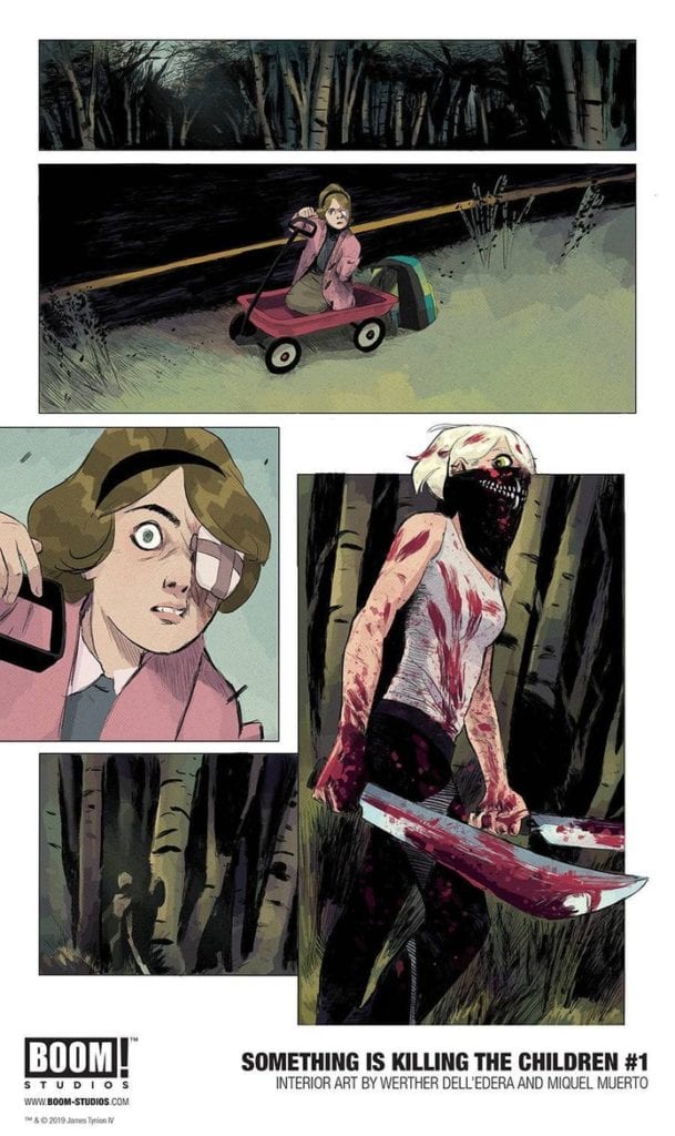
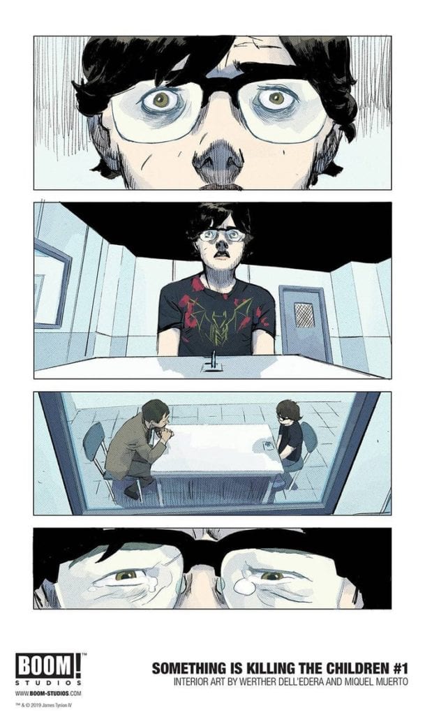
Writer James Tynion IV and artist Werther Dell’Edera, along with Miquel Muerto on colors have created the start of what could go on to be a new classic in comic horror with Something Is Killing The Children. This first volume from publisher Boom! Studios collects the first five issues, which is more than enough to grip any horror fan. The unique plot, excellent character writing, and nailbiting presentation are sure to excite, intrique, and scare the hell out of you.
“When the children of Archer’s Peak—a sleepy town in the heart of America—begin to go missing, everything seems hopeless. Most children never return, but the ones that do have terrible stories—impossible details of terrifying creatures that live in the shadows. Their only hope of finding and eliminating the threat is the arrival of a mysterious stranger, one who believes the children and claims to be the only one who sees what they can see. Her name is Erica Slaughter. She kills monsters. That is all she does, and she bears the cost because it must be done.”
Writing & Plot
James Tynion IV attacks a specific weak point most people have in Something is Killing The Children by making kids almost exclusively the victims. The disappearances and brutal fates many children face in this comic hone in on the discomfort of watching kids get the axe. However, while this element is certainly unsettling in the story, it’s never done with any kind of “edgy” malice. The horror here is not just in the deaths, but the Lovecraftian circumstances behind their deaths. Tynion exploits children’s imaginations and irrational fears to create the monsters in Something is Killing the Children. The unique circumstances by which the monsters exist is the springboard for both the characterization in the comic as well as the lore that gets quietly spread throughout the pages.
The two main protagonists – James, the lone survivor of the opening massacre, and monster hunter Alice Slaughter – are honed as characters through very different means. James has to respond to the trauma he’s experienced completely alone, while also facing the adversity of suspicion due to the fact that he was the lone survivor. Alice, on the other hand, is built almost entirely on mystery. She’s the quiet expert, the one who knows exactly what’s going on but keeps her mouth shut to keep others safe, but also because no one would believe her anyway. There’s a slew of engaging lore under the surface that Tynion teases, but never explains. There are silent panels disclosing Alice’s past exploits, but the wise choice is made to stay in the present and string the audience along for the ride if they want to find out more. The concept that these first five issues at but the precipice of a much larger world grows with every chapter, and it’s an enticing treat to uncover these mysteries as the series continues.
Visual Direction
Arguably more than any other genre, horror needs a distinct and memorable visual aesthetic to sell its atmosphere. The art style of Werther Dell’Edera has an unmistakeable look that is just perfect for Something is Killing the Children. Dell-Edera uses sharp character detail with a sort of unrefined linework to craft a distinctly offputting look. There’s an almost crayon-esque look to the lines, which is actually poignant given the chosen victims in the story. This is in no way a jab, as again it’s a stellar and unnerving fit for the comic. The monster design is roughly reminiscent of Mike Mignola’s work in its high contrast/low details. The contrast with the character detail pushes the questionable existence of the monsters themselves. The environmental design is eschewed in favor of more focus on the characters themselves, but this works to make the world more threatening and oppressive. Everything from the school to the woods surrounding the town feel haunted. This is also due to the work of Miquel Muerto’s colors, whose palette ranges from muted daytime colors and foggy grays to deep blacks when the monsters arrive. Red too. He gets to use a lot of red. The high contrast/low detail in the physical design is what keeps away any notion of the gore or violence being over-the-top. There’s a simplicity to the design that works in conjunction with great character detail and atmospheric color choice that creates the signature visual style this horror comic needs.
Something is Killing the Children Vol. 1 is the start of what could go on to be a classic among horror comics. The unique premise, teased lore, methodical pacing, and pitch-perfect visuals make this a series primed to deliver stellar stories and scares for the chapters to come. If your local comic shop can provide, be sure to order this trade paperback when it releases to the direct market on 5/20.
The first thing to hit a reader when turning the page of a comic, such as AfterShock Comic’s Undone By Blood, is the panel layout. Although it might not consciously affect the reader, a well designed layout can set the scene for the page and the narrative. Emotional connections to characters and events can be built instantly just from the interaction of one panel with another.
Most people are introduced to comics through single row, newspaper comic strips such as Peanuts or Dick Tracy. The layouts are straightforward with a limited number of panels that share the same height, and for the most part are rectangle in shape. The next step is to extend the number of rows, creating a page of comic strips.
The UK publication the Beano is a fine example of a young reader comic which contains these stacked rows with a collection of rectangular panels. This format is one of the easiest to follow while still providing the writers and artist with plenty of room for creativity. Panel layouts such as these still form the basic structure of most comic books. Medium defining titles use a grid system of tiers and columns to produce immensely creative reading experiences.
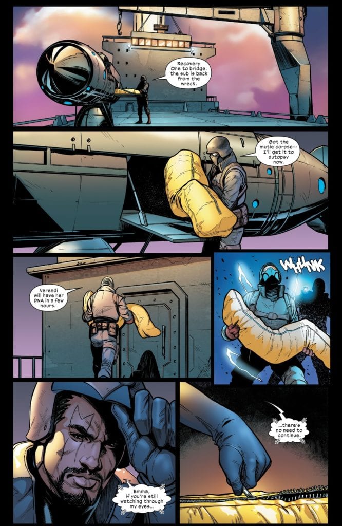
Marauders #8 Page 10 Credit: Marvel Comics
Panel Placement
The page, and how it is broken up into panels, is one of the most important aspects of Comics. Unlike film, comics are static. They have more in common with photography than they do big blockbuster movies. The object of the creators is to produce a sense of movement, a journey through time, using the panel transitions to invoke that experience. It is not always necessary, however, to use a rigid grid to achieve this.
The placement of one panel next to another, with the images they contain portraying a slight movement of the characters or change in the scenery, are a very straightforward approach to time depiction. See the example above, taken from issue 8 of Marauders published by Marvel.
The guard is shown unloading the body bag and crossing the deck of the ship. Each panel represents a small moment in time, with each subsequent panel a little further along in the time-stream. It’s easy to follow and allows the artist and letterer, Stefano Caselli and Cory Petit, to spread the expositional speech across the page. In turn this makes the speech less rushed and therefore more natural. It also allows them to build up a little tension for Bishop’s sneak attack in panel 4.
But what if the moment you are depicting is, by its very nature, more static in the first place? How do you make a scene like that more exciting, more powerful? Step one might be to ask Sami Kivela to illustrate it.
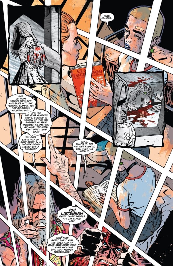
Undone By Blood #1 Page 9 Credit: AfterShock Comics
Panel Against Panel
In Undone By Blood, Lonnie Nadler and Zac Thompson are telling a tale of revenge that also reflects the contents of a book the central character is reading. This already creates an interesting dynamic in the comic. Artist Sami Kivela, colorist Jason Wordie, and letterer Hassan Otsmane-Elhaou, produce two contrasting visuals for the separate parts of the narrative and each matches the genre style of each narrative thread.
The form of the narrative allows the artists to create some beautiful moments within the pages. Identical page layouts across a number of pages (see Issue 1 pages 9 and 10 for example) help the reader to compare the central character with the fictional character she is reading about. The difference in color between the two sections highlights the treatment of violence within different genres and fictional era’s.
There is one page in particular in the second issue that illustrates Kivela’s superb awareness of panel design. The fourth page in see’s central character Ethel locked in a prison cell. She is having a conversation with one of the deputies when the occupant of the adjacent cell butts in.
Just look at this page for a moment:
Undone By Blood #2 Page 4 Credit: AfterShock Comics
Page 4 Highlights
The layout is absolutely wonderful. It is striking in design and immediately captures your attention. The way it does this is by looking like nothing else in the comic. There are a number of different elements at work to create what appears at first glance to be a single image.
Firstly there is the general layout. Although it does abide by the accepted use of a grid system to contain the images, Kivela has subverted it’s appearance. Instead of the usual tiers of rectangle panels stacked on top of each other, the panels are mis-shapen to produce the effect of looking down across the page. There is a point, just off the page at the bottom left, that acts as a disappearing point for the trajectory of the white gutters.
The gutters then form part of the images themselves, acting as the prison bars where Ethel finds herself. In what passes for the top tier, the police deputy is on the outside of the bars, crossing the gutters. On the second tier the view has shifted into the neighbouring cell as illustrated by the manly arm that again crosses the gutters. All the while Ethel is trapped behind the bars, almost as if she is locked into her own story; unable to escape the narrative that she is a part of.
This idea of being trapped by fate is emphasised by the insert panels that stand out in discord against the rest of the page. These panels portray Ethel’s disturbing past, with a grey scale effect and heavy black panel borders informing the reader. The importance of this moment in history upon Ethel’s life is made obvious by the way that the panels cover everything else. The present day scenes are pushed to the background and obscured.
In the final tier, the anger of neighbouring prisoner is pulled out of the page. This is achieved by a shift in the color palette. Jason Wordie darkens the red from earlier in the page and gives the final panels a bloody wash. The depicted man is so enraged that his hands reach out of the panels and grab the gutters in defiance of convention. Although we have already established that the gutters form the bars of the cell, this act is still a powerful moment, squashed at the bottom of the page, ready to erupt like a volcano of frustration.
Undone By Blood #1 Page 10 Credit: AfterShock Comics
Experiments In Layouts
Overall, the page layout has a lot to say about the central character and her current situation. Just compare this to the X-Men example mentioned previously; in that comic, without images, you have a number of white boxes stacked together. There is nothing distinguishable about the panels or layout. Now, if you were to take the images away from Undone By Blood you are still left with something that feeds the narrative. The page is seemingly chaotic and expands beyond the boundaries of the page. With just the layout of the panels you get an insight into the character, the diminishing orderliness of the scene and even the imprisonment caused by the narrative.
There are a lot of exciting things happening in Undone By Bloodand page 4 of issue 2 is a work of genius. By using the elements of the medium to their full advantage, Kivela and Co. have produced something expressive and unique to comics. They are elevating the storytelling and the artistic quality of the medium.
Friday #1, out now from Panel Syndicate by writer Ed Brubaker, artist Marcos Martin, and colorist Muntsa Vicente, is the kind of fresh storytelling the comic book industry sorely needs right now. With Friday #1, this creative team reinvents old genres to come up with something new. Taking from elements of classic YA like Nancy Drew, a hint of occult comics like Hellboy, and a splash of coming-of-age stories, we get what Brubaker calls “Post-YA.” Whatever you want to call it, it’s one of those things you wish you’d thought of yourself.
Writing
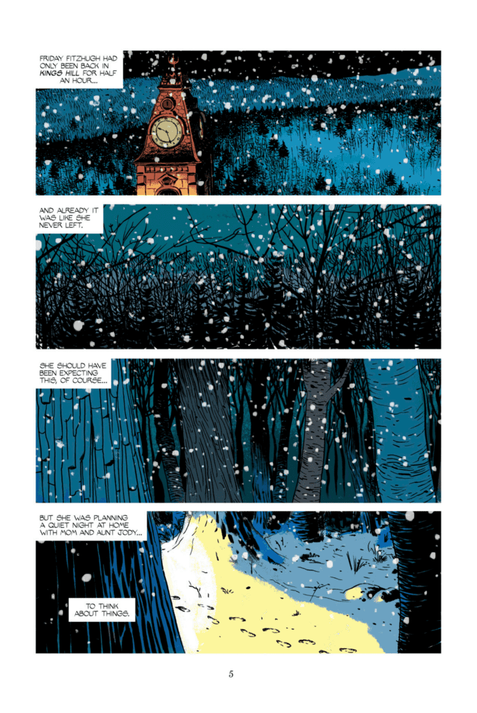
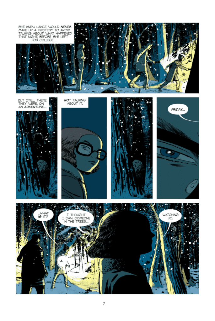
Brubaker shows us a grown up kid detective in this series. We tend to leave the doe-eyed investigators of such franchises long before the innocence of youth has gone out of them. With Friday Fitzhugh, Brubaker creates a character that is somehow immediately familiar. We feel like we’ve grown up reading her novels, solving crimes over her shoulder. So when Friday returns to Kings Hill after a year at college, change is in the air. Thanks to her ever-approaching adulthood, we feel as though we’re revisiting Kings Hill with Friday for one last case. We’ve never met her before, yet we’re nostalgic from page 1.
The tone of the narrative captions is clearly borrowed from old YA mystery novels, like The Hardy Boys. It accounts for much of the issue’s nostalgia. Yet the understated references to sexual tension, and the gradual transition to things more spooky makes it all feel more adult. We get the sense that the characters are being given an option. Keep moving on, keep growing up, or return to the patterns of your childhood. Though they can’t have it both ways, Brubaker’s empathy for his characters makes us wish they could. We relive our own loss of innocence through Friday. And while we know she must grow up, and already has in many ways, we see the growing pains on the horizon.
Art
Martin strikes a perfect balance with his art. He seamlessly moves from sweet characters to creepy tapestries without skipping a beat. It simultaneously lends the comic a sense of familiarity and mystery. We feel as though we’re walking through dark woods, trying to stick close to these characters who make us feel safe. At one point, as Friday is walking through the woods, she spots someone watching them further out. Or so she thinks. Martin manages to depict what Friday sees in such a way that you’re unsure if it’s snow or a figure in the darkness. He obscures details to enhance the mystery, and the mystery is chilling.
Coloring
With the light blues of shadows and the yellows of flashlights, Vicente sets a creepy tone for much of the comic. Yet it’s clear, even from a comic that mostly takes place in the woods, that this is not a monochromatic series. The moments that aren’t in the woods are often bright and colorful. And when Friday hucks an ice-ball at someone who’s fleeing the scene, the panel lights up in bright neon colors. With every page, Vicente makes us feel safe or afraid, but never unmoved. She sets the tone and the rhythm of this issue, as we rush to get back to safety and then dwell there once we arrive.
Friday #1 is wonderfully reminiscent of the mystery novels you read as a kid. But it feels appropriate to read this, years later. It feels like you’re checking up on how those kid detectives are doing and what they’ve done with their lives. Don’t miss this brilliant new comic. Get it at Panel Syndicate, a platform for digital comics, straight from the creators at whatever price you’d like to pay. Learn more about the awesome work and projects the Panel Syndicate crew are producing on their “About” page.
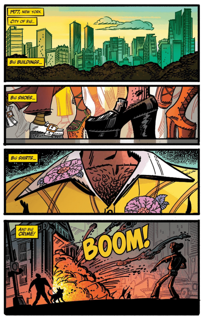
In the early 2000’s legendary animator Genndy Tartakovsky was working on a Luke Cage comic for Marvel, but nothing ever came of it until 2016’s CAGE! which took the titular character back to his ’70s roots as only Tartakovsky could.
Marvel Comics’ CAGE! originally came out in four separate issues throughout 2016 with the story, art, and some color by Tartakovsky. CAGE! also employed long time inker, Stephen DeStefano. Helping Tartakovsky on colors was Scott Wills and Bill Wray, with VC’s Clayton Cowles on letters.
BREAKING OUT OF MY CAGE!
Luke Cage isn’t a character I go out of my way for. He is a cool character to read when written well, but it seems that it doesn’t happen often. I had heard Marvel Digital Original Luke Cage #1 was good, yet never looked into it. The few Epic Collections Marvel has released of his original series aren’t bad for when they came out but hasn’t aged too well. Nonetheless, when Luke Cage and Danny Rand (Power Man and Iron Fist) team up, its a damn blast. Yet when these two characters are separated, they don’t interest me.
Enter Tartakovsky’s CAGE!
Big Story! – Genndy Tartakovsky, Stephen DeStefano, Scott Wills, Bill Wray, VC’s Clayton Cowles
When it was initially published it got favorable reviews. But, following its debut, it is barely spoken of. This is surprising as this mini-series was Tartakovsky’s second comic he ever did. Plus, his name is extremely well known for Dexter’s Lab, and Samurai Jack, among other works. Even more so, this year marked the return of Samurai Jack and its final season. With such a big name doing such a significant character, it seems four years it has since been forgotten.
BIG CHARACTER, BIG 70’S STORY
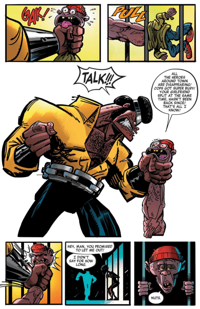
Tartakovsky’s CAGE! is a return to Luke Cage’s original ’70s era with its share of amazing and less amazing features. Tartakovsky’s dialogue and narration ooze the ’70s vibe perfectly, which makes sense has he grew up on these comics. The dialogue and story beats would be something you’d see back in the day. On the story side, CAGE! begins with Luke Cage looking for Misty Knight after being stood up. Sadly, he isn’t able to find her or other heroes. That is until he is kidnapped like the rest of the heroes to fight a rhyming villain’s creations.
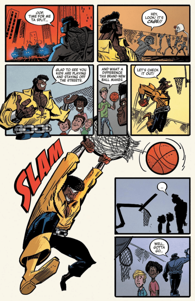
This plot of kidnapping a bunch of powered beings, putting them on an island, and having them fight themselves, or monsters isn’t new. Hell, it was used quite often back in the day. But what sets Tartakovsky’s story apart is Luke Cage himself. The series features weird, yet fun humor, high stakes, and breakneck pacing. It helps that Luke Cage is fun as hell to read in this series and a cool cat to boot. Hell, he even has time to play ball with local kids! To dramatic effect, though.
Oops – Genndy Tartakovsky, Stephen DeStefano, Scott Wills, Bill Wray, VC’s Clayton Cowles
Nonetheless, one thing that stands out most is the humor. A lot of CAGE!’s humor comes in the form of Looney Tune’s visuals, which Tartakovsky absolutely nails. At times his visual humor is reminiscent of Kyle Baker’s Plastic Man. If the series was based on anything other than the ’70s, this aesthetic wouldn’t work. Yet, since it is it makes it a strong suit and is a joy to read.
Something you’d see in Looney Tunes – Genndy Tartakovsky, Stephen DeStefano, Scott Wills, Bill Wray, VC’s Clayton Cowles
CAGE! AND BLAXPLOITATION
Luke Cage was the first black superhero to receive his own titled series and debuted June of 1972 during the blaxploitation era. As famous as this genre of media became, it also had a lot of backlashes. A fair amount of blaxploitation films had questionable characteristics for characters that leaned on the racist side. This happened often by being very stereotypical towards races and taking this to far. Much like Tom and Jerry that had some racist undertones, it was sadly a product of its times.
Yet, the original Luke Cage series never went too far, especially since it was the first of its type. But, Tartakovsky’s CAGE! can be seen with a few of the stereotypes. Such as an absurdly muscle-bound angry black character, and the way some of the black villains are drawn, mainly the character he meets in jail (seen above). As the series released in 2016, these problems were looked at less favorably, which is understandable.
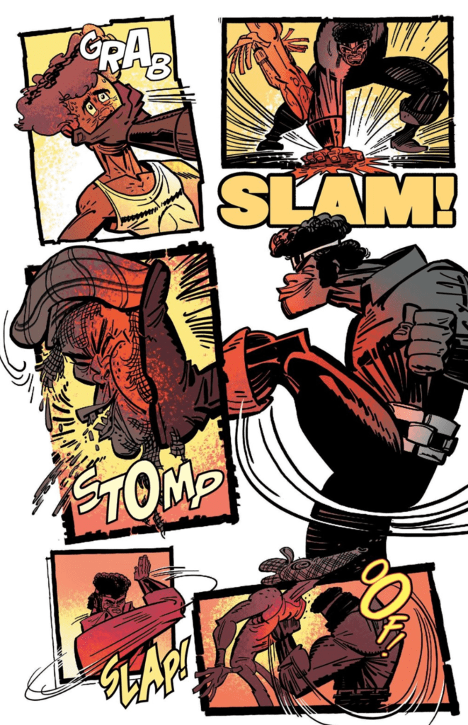
OVER THE TOP ART
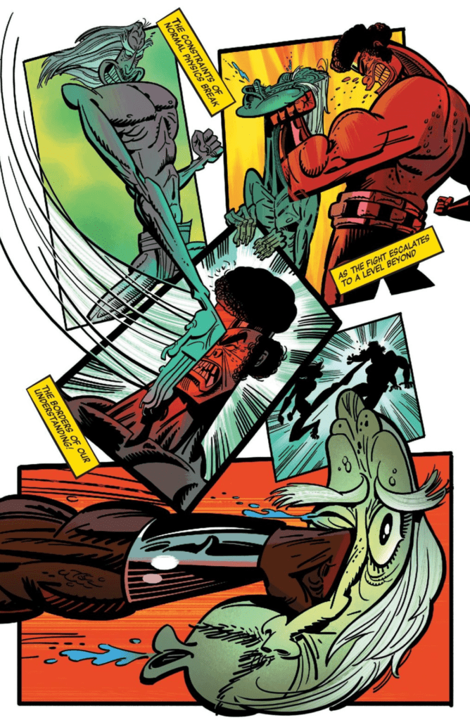
As much as people were hyped for Tartakovsky’s story, another aspect was even more desired—his art. Damn, does Tartakovsky’s artwork amazingly for fun comics. If you’ve watched Samurai Jack, you’ll know he understands action scenes. He brings this knowledge to CAGE! and it is gorgeous. Tartakovsky plays with negative space and panels fantastically. During the first issue, he showcases this skill to great effect when Luke Cage fights some bank robbers.
Ouch – Genndy Tartakovsky, Stephen DeStefano, Scott Wills, Bill Wray, VC’s Clayton Cowles
The flow of the action elegantly guides the reader while he breaks the panels making the actions seem larger than the page itself. Each fight that takes place involves heavy movements that make you feel each hit in your gut. CAGE! shows that Tartakovsky knows how to do action even in comic form. But this isn’t due to just him, as DeStefano’s inks help the characters and action pop.
Looks painful – Genndy Tartakovsky, Stephen DeStefano, Scott Wills, Bill Wray, VC’s Clayton Cowles
Nevertheless, not everything involves action, but even the quieter moments look beautiful due to Tartakovsky’s art.
PSYCHEDELIC COLORS/’70s LETTERING
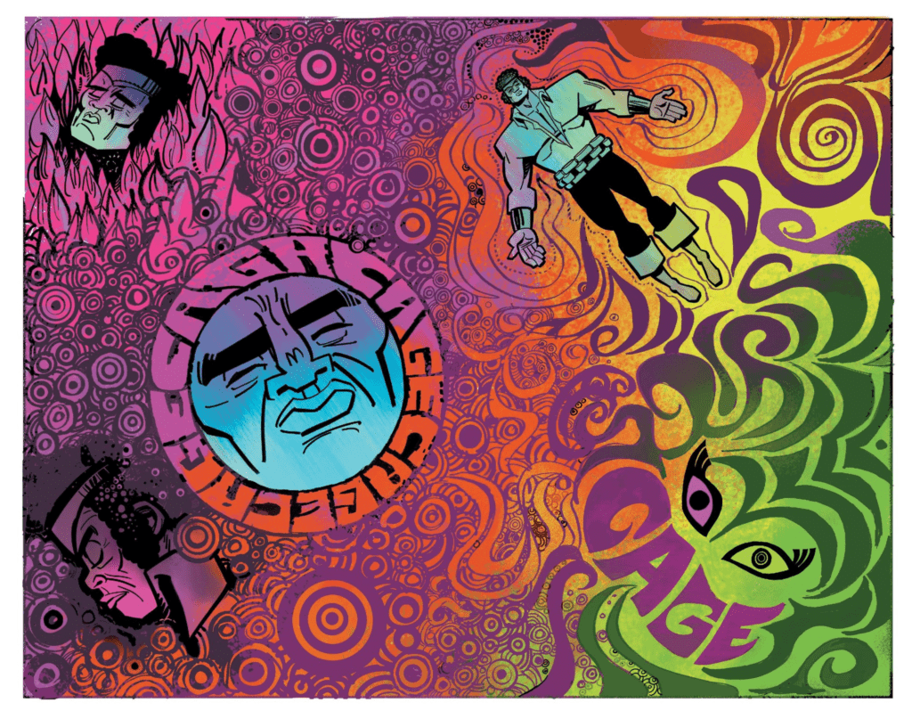
Much like the rest of the series, the colors by Tartakovsky, Wills and Wray emulate the ’70s fantastically. The colors are bright, popping, and oozing with life. It almost seems like the colors made a trip from the ’70s themselves, especially at one moment when Luke Cage gets drugged. When drugged, Luke Cage goes on a mindbending soul trip that looks like someone wanted to make tie-dye lucid dreams. These pages look absolutely jaw-dropping with vivid colors.
Trippy – Genndy Tartakovsky, Stephen DeStefano, Scott Wills, Bill Wray, VC’s Clayton Cowles
The colors don’t only work amazingly there, as they are used in other instances to the same effect. Namely, fight scenes. The team puts a single color in some fights to help the action pop, yet in other scenes, they add dazzling colors. An amazing example is when Luke Cage encounters a snake, and the colors showcase varying emotions.
Bye Bye Snake – Genndy Tartakovsky, Stephen DeStefano, Scott Wills, Bill Wray, VC’s Clayton Cowles
Cowles’ lettering is a perfect and magnificent fit in CAGE! His style mirrors that of fun ’70s comics with the word bubbles breathing life into the pages. One of the best aspects is when characters ay their names, and they are loud and proud. Yet one scene sticks out, where the villain reveals their origin. Luke Cage wants none of that and talks over him, Cowles shows this with Luke Cage’s dialogue blocking it.
Who? – Genndy Tartakovsky, Stephen DeStefano, Scott Wills, Bill Wray, VC’s Clayton CowlesRude – Genndy Tartakovsky, Stephen DeStefano, Scott Wills, Bill Wray, VC’s Clayton Cowles
CAGE! FOUR YEARS LATER
Tartakovsky’s CAGE! has a few problems with how some characters are portrayed in a ’70s blaxploitation manner. Yet, that only occurs in minor ways and shows that era’s problems. If you’re looking for a quick, fun read give CAGE! a try. Then let us know what you thought below.
The TV adaptation of Noughts + Crosses is a story of two people from different races who fall for each other in a world filled with prejudice.
700-years-ago the Aprican Empire has conquered most of Europe, including the British Isles. During this period the population of Albion has split into two classes: the dark-skinned Crosses who control the nation, and the Noughts, the light-skinned underclass. Within this society are two families: The McGregors and the Hadleys.
Callum McGregor (Jack Rowan) is a Nought who is set to become one of the first Nought cadets at Mercy Point, Albion’s elite military academy. Sephy (Masali Baduza) is the daughter of Kamal Hadley (Paterson Joseph), a powerful minister within the government with aspirations to become the Prime Minister. Callum and Sephy meet for the first time since they were children and embark on a dangerous relationship.
The strength of the series was its world-building and themes. The world of Noughts + Crosses was based on Apartheid South Africa, Segregation-era America, and European Colonial Regime and touched on commentary on issues like stop and search and police brutality.
The series was set in an alternative version of Britain, so the culture on display was a mix of European and West African. The government of Albion operated a lot like the British government – it had a Prime Minister, both used the title Home Secretary, there was collective cabinet responsibility and can launch a judge lead inquiry. West African culture dominated: people wore African style clothing and hairstyles. Soldiers had to perform an African style war dance at a parade. There were great little details like a painting of an African victory done in a European style.
Whilst Noughts + Crosses was great at showing the big picture the heart of the series was the family issues and Callum and Sephy’s relationship. Callum and Sephy’s story was a modern retelling of Romeo + Juliet. They were young adults from different walks of life: Sephy was a girl of privilege who was well-meaning but naive whilst Callum was from the roughest district of the country who suffers at the hands of institutionalized racism. Their relationship fluctuates throughout the series because of their difficult backgrounds and viewpoints. Noughts + Crosses could easily be seen having similarities to YA dystopias like The Hunger Games and Divergent franchises, even though Noughts + Crosses was published first. All of them have young adult protagonists and had a romance element. In Noughts + Crosses, the romance was central not a side issue or has a forced love triangle. The show was broadcast after the 9 pm watershed in the UK, so it could be more direct about sex. In the second episode Callum and Sephy do try and rendezvous at a love hotel and during the series, it’s stated they were sleeping together. It’s better than TheTwilight Saga‘s handling of sex where Edward and Bella avoided having intercourse before having a clingy moment of mating.
A trope of YA dystopias is teenage protagonists being the ones who liberate their worlds. Katniss because a symbol for the rebellion, Tris Prior was mentally and genetically different, and the Maze Runners were immune to the Flare virus. The characters in Noughts + Crosses attempts at changing the system were more realistic. Sephy considers going to university and become a politician, like her father, Callum wanted to become a symbol for change, and Callum’s brother, Jude (Josh Dylan) looked to join a terrorist group. They were small parts of a big machine.
A feature of Noughts + Crosses was the ideology of various people and factions. Both communities have people with differing views. Callum believed in changing the symbol by being an example whilst Jack Dorn (Shaun Dingwell) lead a terrorist movement. They were Martin Luther King and Malcolm X, or if you prefer a comic book reference: Charles Xavier and Magneto. Within the government, the Prime Minister (Rakie Ayola) was a moderate who aimed to give the Noughts more rights, and Kamal was the opposite because he wanted to bring in increase segregation.
Noughts + Crosses did attract a recognizable cast for a British audience. There was Helen Baxendale (Friends, Cold Feet), Paterson Joseph (Peep Show), Ian Hart (Harry Potter and the Sorcerer’s Stone, The Last Kingdom) and Shaun Dingwell (Doctor Who) present. They are all solid actors and Dingwell impressed as a villain because he has an end justifies the means approach. The young actors also impressed in their roles. Rowan, Baduza, and Dylan are rising stars in the UK and South Africa. Rowan and Baduza had to give strong performances since they were the leads. Rowan had a great ability to express emotion with like his little glances and facial expressions.
Noughts + Crosses excels because of its social themes and commentary about race and discrimination. It’s a good experience for anyone interested in politics and sociology. And the series successes as a romance story.
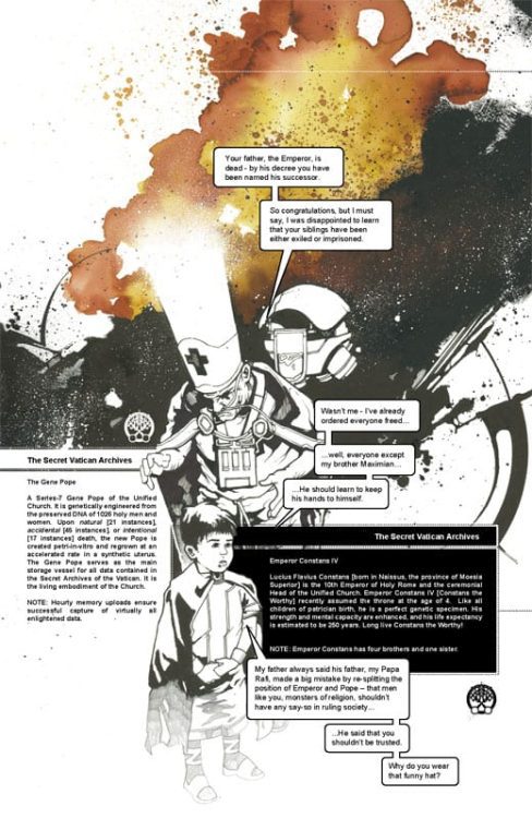
In 2007 Image Comics published Pax Romana by the upcoming writer/artist Jonathan Hickman. With this being one of his first forays into comic book publishing, with his first title The Nightly News just starting to make waves, has Hickman written a reader friendly, industry embracing, historical romp packed with action and adventure?
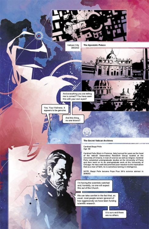
The plot In summary: The Emperor has died and a new Emperor must rise but first he must learn of the secret history of Rome. A history that starts centuries in the future. In 2053, the discovery of time travel allows the Vatican the opportunity to influence history in a whole new way. Plans are drawn, an army raised, and the journey into the past begins.
Drawing on the political intrigues of the Roman Empire and a modern obsession with conspiracies, Hickman weaves a complex narrative with an interesting framing sequence. Starting in the middle, with the Gene Pope instructing the new child Emperor, the story takes the form of a dry history lesson based on the archived files within the Church. Elements of the modern world, including the CERN laboratories in Switzerland, become merged with the political world of ancient Rome.
The narrative is told through a mix of dossier style caption boxes, recorded conversations, prose, and occasionally panelled comics. It is this structure that makes Pax Romana so distinctive and surprising for a creator’s early work. Most readers will know Hickman from his current Marvel work, as overseer of the current X-Men line, but the groundwork for the style of those big comics is founded in his early works such as Pax Romana. Divergent timelines? Check. Resurrected characters? Check. Complex narratives that build up from the first page to the last? Double check.
Pax Romana has, on the surface, a very simple story-line. Hickman, however, has the skills to tear open his ideas and slowly dissect them so that the audience can see exactly how it all works and all fits together. At the start it is a mass of sinew and organs but by the end it is a complex machine where every artery serves a purpose.
Pax Romana Credit: Image Comics
Dissecting Rome
When recommending a book it helps to compare it to something else. With Pax Romana you want to say it’s like Terminator meets Gladiator, conjuring up elaborate time travel and Roman battle scenes. Although, it is actually more like a Robert Harris novel set in an episode of Quantum Leap. The future characters are trying to alter the past for the better, their better at least, but political intrigue means that they ultimately become helpless to a constant shifting world alliances and personal agendas.
To help the reader navigate all of this Hickman creates a collage of literary techniques, jumping from one form of storytelling to another with ease. There is no doubt that as an artist he holds prose, scripts, and illustration in the same regard, using whichever fits the scene best to get his ideas across. The outcome is a unique comic that has as more in common with novels like Slow Chocolate Autopsy by Iain Sinclair and Dave McKean than it does comics published by the Big Two.
The style can be difficult to adapt to if all you are used to is standard Superhero-esq comics. The linear progression of panel to panel transitions barely features in these pages. Instead vistas of dialogue cross double page spreads or trail down the centre of a page, slicing through a single, heavily inked image.
The visuals are created by using a combination of heavy shadows and negative space, colored with blocks of emotive color. It’s as if Hickman is chipping the illustrations out of narrative granite, revealing a story that has been buried for centuries. The shadowy nature of art also reflects the conspiratorial nature of the narrative. Everything is shrouded in secrecy and mere tricks of the light. At times you are not sure if what you read was real or imagined. It has a fleeting quality to it while also being, by its very nature, permanent; as solid as rock.
It’s also impressive that Hickman created everything on the page. From story, to design, to color and lettering. The main body of this comic is a one man job; not a feat that many creators can pull off with such elegance as is evident here.
Pax Romana Credit: Image Comics
Conclusion
Hickman books can look overwhelming, especially when collected together, and because of this many readers will be but off. Pax Romana is only four issues, 148 pages in the collected edition, but the ideas and concepts contained within will keep you thinking for weeks and months afterwards. It is a comic that will stay with you. This is because the style is unique and a testament to Hickman’s creativity.
Visually, this comic is beautiful. It has a look that is heavily designed and orchestrated to produce a singular world from the cover to the very last page. Knowing that Hickman worked in advertising will not come as a surprise because this comic makes an immediate, lasting impression. Normally you shouldn’t judge a book by it’s cover but in the case of Pax Romana, the cover perfectly sets up the contents.
If you read comics to see muscled guys punching other guys in the face, panel after predictable panel, then you will find nothing in Pax Romana. For everyone else, to quote from Blair Butler’s foreword in the collected edition, “If you’re looking for the future of comics, welcome aboard”.
Pax Romana is currently available as part of the Humble Bundle Creative Spotlight here.
Looking For Alaska is a drama from Hulu based on John Green’s novel of the same name that centers around the lives of teenagers at a boarding school in Alabama. Filling the world with an emotional soundscape is This Is Us composer Siddhartha Khosla’s job.
Miles “Pudge” Halter (Charlie Plummer, Boardwalk Empire) is a teenager from Florida who’s sent to Alabama to spend his days studying at Culver Creek Academy. Miles meets a cohort of characters at the school, including “The Colonel” and a girl named Alaska (Kristine Froseth, The Society). Together, these young adults learn about life and love. So far, the reaction to the series has been spectacular.
PopAxiom spent some time speaking with Siddhartha about his work on This Is Us, the Hulu series Looking For Alaska, and the only remake he’d be willing to be a part of.
Strange Days
The world is in the midst of managing COVID-19. Siddhartha shares his thoughts on the global pandemic. “In this crazy time we’re all living in right now, part of me feels uncomfortable having conversations about my work when there are so many bigger problems that people in the world are facing right now.”
But he asserts another truth “… we have to continue to live our lives as much as we can too.”
Measures taken in countries around the world have certainly changed the way we’re living life. “It’s a very strange time.”
https://www.youtube.com/watch?v=rWNlrgNNVm4
About Looking For Alaska
Looking For Alaska was going to be a movie for years. After repeated delays, producers Josh Schwartz (Gossip Girl) and Stephanie Savage (Runaways) hit the ground running when Hulu picked it up as a mini-series. But long before it was in production the show found its composer. “Josh, Stephanie, and I worked together several times over the last few years on so many different projects. The first thing we started working on together was Marvel’s Runaways, and that lead to this.”
For Siddhartha, creating the score meant more than he expected. “Working on that show was such a special experience for me. I loved every minute of it. I loved getting together with Josh and Stephanie and our whole team to talk about episodes and where music would need to go.”
Looking For Alaska takes place in 2005. Siddhartha explains how the period played in the score. “Josh and I spoke a lot about tone and music and score. There were definitely influences from all different directions. One of my favorite bands that I was listening to back in 2005 was Sigur Ros. So, in the palette, I wanted to make sure I was very atmospheric and ethereal when needed and sweeping and epic when we also needed to be as well. More of the broad stroke, Sigur Ros approach. That lends itself really nicely for this. It was a super-creative project to work on.”
To achieve the sounds on Looking For Alaska, Siddhartha says he used, “Piano, atmospheric tones made with real instruments that I run through various reverb and echo chambers and all sorts of different effects to give that wide, cinematic feel. I’m singing on the score as well …”
A textured dramatic narrative, Looking For Alaska’s score from Siddhartha features “… several signature themes that weave in and out during the show.”
Siddhartha’s voice crackles with excitement when he talks about Looking For Alaska. “It’s a dream project for me. It was really deep in my wheelhouse. It was a deeply emotional show. I was able to pull from all sorts of interesting influences.”
Timelessness
The score for This Is Us, a show that features an array of time periods, is intentionally made to feel timeless. It’s a “… classic sound. You can’t really put a stamp on where it came from …”
The same goes for Looking For Alaska. Siddhartha says, “I don’t think I really grounded the score in 2005.”
Siddhartha takes us deeper into his creative process. “I like to immerse myself in my score as much as possible. Knowing this took place in 2005,” Siddhartha thought, “… let me hear what I was listening to in 2005 to kind of put myself in an emotional space.”
For Siddhartha, this helps him “… draw more from the emotional weight of what people were listening to back then.”
Looking For Alaska features songs deeply rooted in the era, and that’s thanks to music supervisor Alexandra Patsavas. So, how does one aim for timelessness? “It’s all very subjective. For me, timeless means using instrumentation that was around 50 years ago, 80 years ago, and that will continue to be around years from now. That’s timeless. An acoustic guitar, piano, voice, cellos; those are very organic sounds. If I’m rooted in organic sounds, not drawing from something that’s trendy, because then all of a sudden, there’s a timestamp on it.”
Siddhartha continues, “I think creating your own palette in your own original voice keeps things timeless. I don’t think someone listens to the This Is Us score and says ‘It sounds like this, or it sounds like that.’”
After four seasons, Siddhartha says, “I feel like it sounds like me. It sounds like what comes out of my soul. I think that’s important to maintain artistic integrity and to also feel classic and timeless.”
Season Four
This Is Us just completed it’s fourth season on NBC. Series ratings are going strong, and so are the creative juices behind the show. “… it’s probably our most ambitious and biggest season yet. It’s been a really wonderful ride this season. The finale was epic and sweeping and big and expansive. That’s where the show continues to go.”
The evolution towards a big-screen feel on television has made This Is Us ��… really fun for me,” says Siddhartha.
Siddhartha asserts, “The score’s gotten more cinematic than ever.”
Wrapping Up
COVID-19 has changed a lot of ways people do business. Fortunately, working remotely is much more common today and easier to do now than ever. Siddhartha says, “On This Is Us, there’s a lot of cello work happening, and Ginger Murphy plays cello on the score. She does a phenomenal job. She and her husband, who’s a musician as well, they are recording and doing some arrangements from afar. I’ve never recorded Ginger in person once. This is the time when we can do more of that.”
Productions are at a standstill at the moment, but the creative process never stops. “In this off time, I’m continuing to write. I’m flirting with writing a little a classical record.”
So, what’s the remake that would get Siddhartha’s attention? “I think, E.T.. If there was an E.T. remake, that would be something that would excite me. I would love to do that.”
For now, Siddhartha ends our interview by saying, “… we should all stay safe. And who knows, maybe I’ll write a score for a project that doesn’t exist.”
Are you a fan of This Is Us? Will you be watching Looking For Alaska?
Thanks to Siddhartha Khosla and Rhapsody PR for making this interview possible.
Want to read more interviews like this? CLICK HERE.
Avengers comic tittles have undergone too many changes to count in its long history. But of the modern reboots, Mark Waid’s AVENGERS #1 is perhaps the most unique among its peers. How? It beautifully blends a passion for the history of the mythos with a yearning for the future.
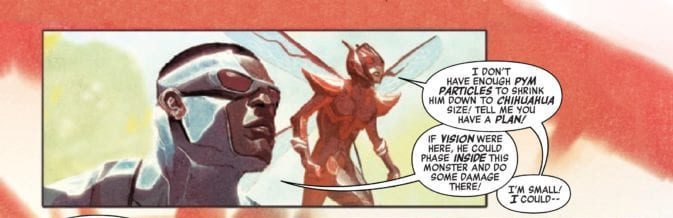
The scene is set: an all-new Avengers team assembles to take down a Frost-Wolf in classic superhero fashion. But the creature isn’t the only thing on their mind. The Vision is missing, and Peter Parker, the CEO of Parker Industries, has requested that they pay him a visit.
Story
The new roster of Avengers—consisting of Captain America (Sam Wilson), Thor (Jane Foster), Hercules, The Wasp (Nadia Pym), and The Vision (who’s suspiciously missing)—take down the Frost-Wolf with relative ease. However, they soon find themselves in Parker’s building with doubts about his intentions. But to their surprise he offers technological goodies in the hopes that they invite Spider-Man to join their crew.
The team is repelled by Parker’s overeager attitude, but are soon interrupted by Kang the Conqueror. In response, the heroes spring into action with the help of Spider-Man (who is just as cringeworthy as his alter ego). What’s more, they find the villain in conflict with The Vision, who seems to be hiding something from the rest of the team.
Waid’s narrative offers readers a breath of fresh air for fans of Earth’s mightiest heroes. The banter between Parker and the other teammates, even when facing the time warping powers of Kang, reminds us of classic Avengers stories. And Vision’s secrets adds plenty of intrigue. But the best gem in this issue is Waid’s updated roster of heroes, which adds a fresh flavor that makes this a saga to remember.
Artwork
Mike Del Mundo’s penciling, ink work, and coloring, combined with Marco D’alfonso’s color work, presents readers with a cohesive set of beautiful panels. Readers will find the illustrations transition smoothly throughout the story—it’s as if the characters blend in with the environments around them like an abstract painting. Yet at the same time each hero’s colors are differentiated to showcase their unique superhero identities. Cory Petit’s lettering, working in tandem, seems to flow with the action as if it were part of the scene itself.
Conclusion
AVENGERS #1 was an exciting start to this particular era in Avengers history. It brought fan favorites together from the past and the future in marvelous fashion.
Were you excited to see Kang make an appearance in this issue? Let us know in the comments below!