

The first thing to hit a reader when turning the page of a comic, such as AfterShock Comic’s Undone By Blood, is the panel layout. Although it might not consciously affect the reader, a well designed layout can set the scene for the page and the narrative. Emotional connections to characters and events can be built instantly just from the interaction of one panel with another.
Most people are introduced to comics through single row, newspaper comic strips such as Peanuts or Dick Tracy. The layouts are straightforward with a limited number of panels that share the same height, and for the most part are rectangle in shape. The next step is to extend the number of rows, creating a page of comic strips.
The UK publication the Beano is a fine example of a young reader comic which contains these stacked rows with a collection of rectangular panels. This format is one of the easiest to follow while still providing the writers and artist with plenty of room for creativity. Panel layouts such as these still form the basic structure of most comic books. Medium defining titles use a grid system of tiers and columns to produce immensely creative reading experiences.
Panel Placement
The page, and how it is broken up into panels, is one of the most important aspects of Comics. Unlike film, comics are static. They have more in common with photography than they do big blockbuster movies. The object of the creators is to produce a sense of movement, a journey through time, using the panel transitions to invoke that experience. It is not always necessary, however, to use a rigid grid to achieve this.
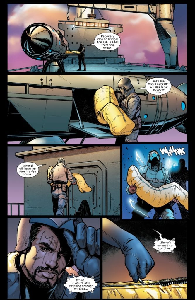
The placement of one panel next to another, with the images they contain portraying a slight movement of the characters or change in the scenery, are a very straightforward approach to time depiction. See the example above, taken from issue 8 of Marauders published by Marvel.
The guard is shown unloading the body bag and crossing the deck of the ship. Each panel represents a small moment in time, with each subsequent panel a little further along in the time-stream. It’s easy to follow and allows the artist and letterer, Stefano Caselli and Cory Petit, to spread the expositional speech across the page. In turn this makes the speech less rushed and therefore more natural. It also allows them to build up a little tension for Bishop’s sneak attack in panel 4.
But what if the moment you are depicting is, by its very nature, more static in the first place? How do you make a scene like that more exciting, more powerful? Step one might be to ask Sami Kivela to illustrate it.
Panel Against Panel
In Undone By Blood, Lonnie Nadler and Zac Thompson are telling a tale of revenge that also reflects the contents of a book the central character is reading. This already creates an interesting dynamic in the comic. Artist Sami Kivela, colorist Jason Wordie, and letterer Hassan Otsmane-Elhaou, produce two contrasting visuals for the separate parts of the narrative and each matches the genre style of each narrative thread.
The form of the narrative allows the artists to create some beautiful moments within the pages. Identical page layouts across a number of pages (see Issue 1 pages 9 and 10 for example) help the reader to compare the central character with the fictional character she is reading about. The difference in color between the two sections highlights the treatment of violence within different genres and fictional era’s.
There is one page in particular in the second issue that illustrates Kivela’s superb awareness of panel design. The fourth page in see’s central character Ethel locked in a prison cell. She is having a conversation with one of the deputies when the occupant of the adjacent cell butts in.
Just look at this page for a moment:
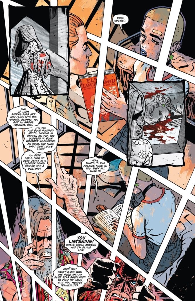
Page 4 Highlights
The layout is absolutely wonderful. It is striking in design and immediately captures your attention. The way it does this is by looking like nothing else in the comic. There are a number of different elements at work to create what appears at first glance to be a single image.
Firstly there is the general layout. Although it does abide by the accepted use of a grid system to contain the images, Kivela has subverted it’s appearance. Instead of the usual tiers of rectangle panels stacked on top of each other, the panels are mis-shapen to produce the effect of looking down across the page. There is a point, just off the page at the bottom left, that acts as a disappearing point for the trajectory of the white gutters.
The gutters then form part of the images themselves, acting as the prison bars where Ethel finds herself. In what passes for the top tier, the police deputy is on the outside of the bars, crossing the gutters. On the second tier the view has shifted into the neighbouring cell as illustrated by the manly arm that again crosses the gutters. All the while Ethel is trapped behind the bars, almost as if she is locked into her own story; unable to escape the narrative that she is a part of.
This idea of being trapped by fate is emphasised by the insert panels that stand out in discord against the rest of the page. These panels portray Ethel’s disturbing past, with a grey scale effect and heavy black panel borders informing the reader. The importance of this moment in history upon Ethel’s life is made obvious by the way that the panels cover everything else. The present day scenes are pushed to the background and obscured.
In the final tier, the anger of neighbouring prisoner is pulled out of the page. This is achieved by a shift in the color palette. Jason Wordie darkens the red from earlier in the page and gives the final panels a bloody wash. The depicted man is so enraged that his hands reach out of the panels and grab the gutters in defiance of convention. Although we have already established that the gutters form the bars of the cell, this act is still a powerful moment, squashed at the bottom of the page, ready to erupt like a volcano of frustration.
Experiments In Layouts
Overall, the page layout has a lot to say about the central character and her current situation. Just compare this to the X-Men example mentioned previously; in that comic, without images, you have a number of white boxes stacked together. There is nothing distinguishable about the panels or layout. Now, if you were to take the images away from Undone By Blood you are still left with something that feeds the narrative. The page is seemingly chaotic and expands beyond the boundaries of the page. With just the layout of the panels you get an insight into the character, the diminishing orderliness of the scene and even the imprisonment caused by the narrative.
There are a lot of exciting things happening in Undone By Blood and page 4 of issue 2 is a work of genius. By using the elements of the medium to their full advantage, Kivela and Co. have produced something expressive and unique to comics. They are elevating the storytelling and the artistic quality of the medium.