Home Blog Page 313

A Conversation With KILL WHITEY DONOVAN Writer Sydney Duncan

I got to talk with wildly talented novelist and comics writer Sydney Duncan about the recently finished first volume of “Kill Whitey Donovan” and about her process, the talent she works with, and the comic’s upcoming film adaptation.

MFR: Hi Sydney, Thanks for doing this interview. Congrats on finishing the series!

SD: My pleasure, Justin! And thank you!

MFR: While tales of revenge set up in Westerns or around this time period are a relatively popular genre, “Kill Whitey Donovan” has an ace up its sleeve in its choice of protagonists. What exactly motivated your creation of Anna and Hattie as a pair and their quest for vengeance?

SD: You know, that’s a good question because I’m not entirely sure of the answer. A lot of stuff I like to write explores identity and transition. As a woman of trans experience, that’s probably not revelatory. But Kill Whitey Donovan began as a novel and at the time I started writing that book, I’d been contemplating external and internal pressures on identity and, as I recall, I was sort of thunderstruck and the concept of these two women formed. Hattie’s journey was this struggle against how the outer world saw her and Anna’s was a conflict with this inner sense of herself versus who she was expected to be. I had all these questions like, are these characters the way they are because of their circumstances? Can they become something else, if those circumstances change? To what extent can the boundaries of that becoming be pushed? Cerebral, but not exactly page-turning stuff. So, I sought those answers against a revenge tale and voila!

As far as the genre goes, it might be a matter of writing what you know. I’m from Alabama and the Civil War still casts a pretty long shadow down here. In a real sense, it was a war for identity and dealt in a violent way with those internal and external conflicts. Also, the ideas of femininity and the narrow construct of women were very rigid, giving both our leads something to rebel against. So, it seemed a perfect backdrop.

MFR: The handling of this story’s flashback sequences as well as the overall pacing are airtight and very focused. Was the story as it happened pretty set in your mind when you started or did it change shape and evolve organically as you wrote it?

SD: Thank you!

I think every writer sets out with a story in their minds and then it evolves into something more organic. That was certainly true with KWD. I find that I may want the characters to behave a way or do a thing but after a certain point in writing them, they kind of take the reigns and tell me what’s what.

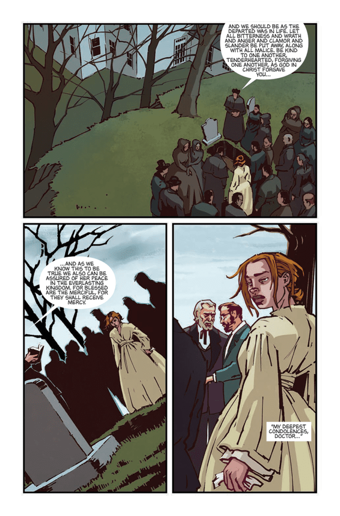
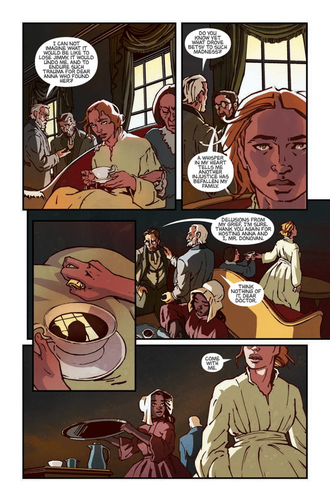
The flashbacks, though, were always part of the plan. In a sense, they are the real story. The plot device is this journey to kill Donovan, but the story is about what these characters need to become to do that. In order to express that, I wanted to show moments in their past that conveyed the person they had been and juxtapose it with the person they were becoming. That evolution is the heart of the story.

MFR: This comic is blessed with the phenomenal art of Natalie Barahona. How did you two start working together, and what was the process like?

She really is so talented. If my only claim to fame in life is to be able to say I wrote Natalie Barahona’s first comic book, I’ll die happy. I can’t wait to watch her career. She has the most amazing instincts and is such a brilliant storyteller. Honestly, we’d just hand her a script and watch her go. I can’t imagine an easier collaborator to work with.

She got involved through Brian Stelfreeze, who would come on board for Art Direction and Editing. When 12-Gauge Publisher Keven Gardner and I were first talking artists, Brian had already been giving some early advice and guidance, and at some point he suggested Natalie. My understanding is that Brian doesn’t take apprentices, but he’d made an exception for her and had worked with her for a little while when KWD came up. I think he basically concluded, She’s ready. Which was immediately apparent when she started turning in character sketches and art. And her coloring – it just blew us away.

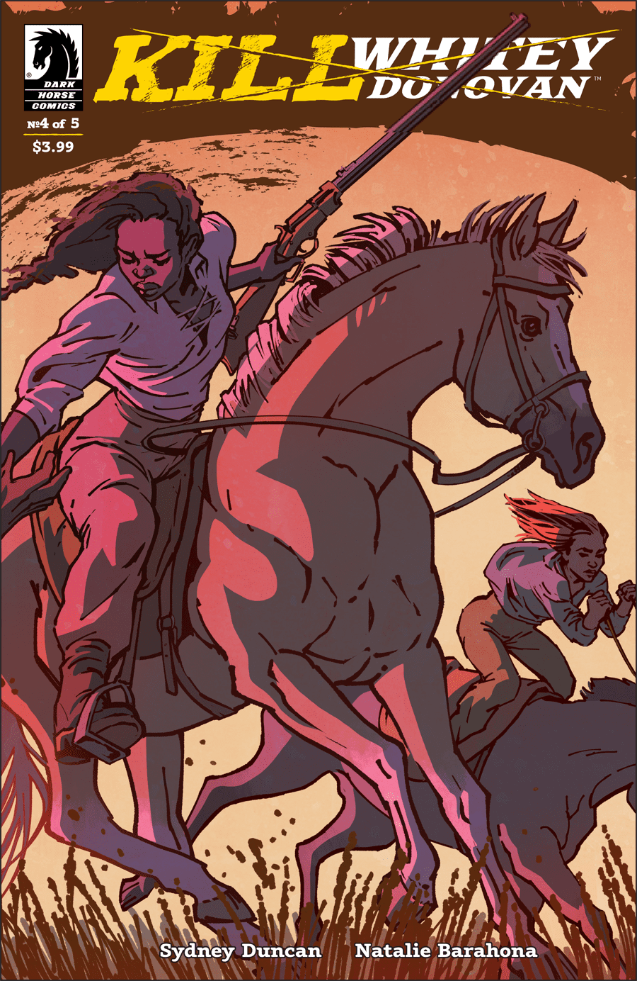
MFR: More congratulations are in order, since “Kill Whitey Donovan” is getting a big-screen adaptation! How exactly did that come about, and in what ways are you involved?

Thanks! We’re really excited about that. When I originally pitched this story, I pitched it to Keven, publisher of 12-Gauge Comics, which is the studio that produced the book before Dark Horse got involved. If you aren’t familiar with 12-Gauge, they have several Image books and have worked with properties such as Boondock Saints and Body Bags. Keven has been around the comic book business for years, working at Valliant early before doing his own thing. He also had his own comic shop for a minute – one I frequented a lot in college, without actually knowing him. Recently, he’s had some success in getting Hollywood interest in their comic books. I think he felt KWD had potential to work for the screen and set some meetings to make it happen. It was pretty quick.

Beyond an occasional note, though, I’m not terribly involved in the effort to adapt the comic. I had a call early with the screenwriter, Sigrid Gilmer, who is an amazing writer. She was incredibly generous to offer space for me to have input, but I felt strongly that she should have the opportunity to make the film hers and let it be it’s own thing. I’m privy to all the script drafts and I have to say, I’m very excited with what she’s producing. It captures the spirit of the comic and then gives you more. I can’t wait to see it in the end.

MFR: The final page of the series teases that Hattie and Anna’s story may not be over. What could we expect from a potential follow up?

Volume 2 is all about consequences and fathers: those missing, those present, and those left behind and raging with grief. It also greatly expands the world of KWD while anchoring it to this little gold rush town out west where Hattie’s mom lives under the tyrannical reign of the elder
Donovan. Meanwhile, both of our leads have to deal with what they’ve just done and the internalization of that will manifest in very different ways for them both. All while a man with every means seeks his own reckoning.

Be sure to check out “Kill Whitey Donovan” and the past and future works of Sydney Duncan!

Monkeys Fighting Robots Youtube

Review: A MAN AMONG YE #1 Sailing The High Seas In Style

A Man Among Ye #1
A Man Among Ye #1 Cover Credit: Image Comics

With a clear obsession with historical adventures, Stephanie Phillips’ new title with Image Comics, A Man Among Ye, sets sail into the murky depths of Pirate Mythology. Set towards the end of the Golden Age of Pirates, the comic revels in the Legends created around real events.

Treading a fine line between historical accuracy and romanticism, A Man Among Ye opens the door on the intriguing world of Anne Bonny, one of the most infamous and ruthless female pirates.

A Man Among Ye #1 Credit: Image Comics

Sailing the Seas

The story starts in the middle with the pirate captain Calico Jack Rackham leading his men in a raid on a English Sloop. With gleeful violence Phillips introduces the Captain in a swirl of sword play and banter. However, the big entrance is saved for the star of the show, Anne Bonny.

Illustrated here as a fiery haired, stylish, take-no-prisoners woman, Bonny made history by daring to be her own person. Although a lot of her life is speculation at best, her reputation for violence and strong headedness is well documented. Phillips makes these aspects of her character clear from the outset.

Bonny’s interactions with Rackham and the other crew members single her out among the cast as the character to follow. All of the action ultimately revolves around the Pirate Queen and Phillips makes sure that she is the centre of attention not just on the page but in the speech itself.

There is an element of the romanticised pirate narrative in this comic. The style leans more towards classic interpretations such as EC Comics Piracy series from the 1950’s rather than the overly fanciful Pirates of the Caribbean movies. However, Phillips gives the impression that she has something more to say. By focusing on Bonny and making her obviously feminine from the opening, Phillips is making a statement about representation in the genre.

It is documented that Bonny often posed as a man during raids and fights but Phillips instead allows the character to flaunt her femininity. This is significant and reflects a greater movement within the comic industry. Female characters are no longer sidelined and creators are allowing their stories to be told. A Man Among Ye is embracing that by celebrating the female lead and challenging a social concept of piracy.

A Man Among Ye
A Man Among Ye #1 Credit: Image Comics

Maritime Rendering

The artwork has a theatrical style to it, similar to the recent Titan Comics title, Adler. The design, especially the costumes, has a dramatic flair that gives the initial impression of a period drama. However Craig Cermak injects his layouts with dynamic energy pulling the reader across the page with the action. Aiding the narrative flow is the lettering, provided by Troy Peteri. Well placed word balloons flip a reader across an image, while alterations to the text or balloon stop the reader dead.

The characters strike superhero-esq poses with their jackets and hair blowing in the wind, sails whip in the wind, and everything looks slightly staged. This is the world that Cermak depicts, giving the reader a stylised view of a historical story and as such is fitting for Phillips’ approach to the tale. A Man Among Ye is not a realistic representation, a regurgitation of passages from a history book, it is an adventure story celebrating a rebellious woman who stood up for herself and others.

That’s not to say this is a pantomime and Cermak doesn’t treat it as one. There are moments of malice and disturbing violence that breaks up the swashbuckling fun. One scene in particular contains an air of threat that Cermak brings to the foreground using large areas of shadow. He turns the safety of the open air into dangerous, claustrophobic, spaces where anything could happen.

The changing atmosphere is helped along by Brittany Pezzillo’s color work. The use of bold colors is almost a necessity but it is the shifts in saturation that mark the shift in narration. Bright skies and clear water accompany the high jinx elements of the comic but these are soon flooded by cold hues and ice blues when the actions turn threatening.

Throughout it all the central character, Bonny, sets a striking image on the page. No matter what the pirate queen’s surroundings Pezzillo always colors her with the fiery red running through her figure. She stands out, as she should, like a beacon drawing the reader’s gaze. At the end of the day this is a comic about Anne Bonny and Pezzillo makes sure you don’t forget it.

A Man Among Ye #1
A Man Among Ye #1 Alternative Cover Credit: Image Comics

Conclusion

On the surface A Man Among Ye is a fun pirate romp with all the classic swashbuckling action you could want. But, if you dive a bit deeper, you can find hidden depths. Comments on the representation of figures and events from history; the depiction of women in modern comics; a desire to educate as well as entertain. All of these aspects can be read into Phillips narrative.

With a number of exciting and intriguing comics under her belt Stephanie Phillips is a name worth watching. There is a sense of enjoyment and fascination in all of her work that instantly pulls a reader in. The art teams pick up on this and as a result produce work that is equally as compelling.

Falling style wise somewhere between Marvels’ Marauders and Image’s Shanghai Red, A Man Among Ye is a pleasing adventure comic that has a lot to offer the reader.

A Man Among Ye #1 is released under the Top Cow banner of Image Comics on 17 June 2020

Monkeys Fighting Robots Youtube

Review: DOCTOR WHO: 13TH DOCTOR #2.4

Doctor Who 13th Doctor
Doctor Who 13th Doctor Season 2.4 Credit Titan Comics

Two Doctors, two timeless enemies, and only one chance to save the universe as we know it. The second season of Titan ComicsDoctor Who: The 13th Doctor reaches the end of it’s first arc with an abundance of characters and Time Lord personality.

Jody Houser and Roberta Ingranata have infused this series with Doctor Who spectacle and wit, merging two different era’s together seamlessly. After the slow build up through the previous issues, how do the creators handle the difficult finale?

Doctor Who 2.4 cover
Doctor Who 13th Doctor Season 2.4 Credit Titan Comics

Timey Wimey, but not Wibbly Wobbly

Successfully writing such a beloved character can be difficult, fans aren’t the easiest to please, but Jody Houser is in her element here. She is pulling all of the right kind of influences from the television show and making this comic her own. The biggest selling point is that she represents the characters perfectly. There is no doubt the words coming out of the 13th Doctor’s mouth belong to that incarnation of the Time Lord, and the same can be said for each cast member.

Speech inflections, accents, and personality shine through Housers script. Some of the emphasis comes from Richard Starkings and Sarah Hedrick’s lettering, their placement and breakdowns of the speech, but Houser is channelling the actors’ voices. Take the images away from the panels and you can still tell who is talking.

This characterisation helps the plot along. Like a number of the television episodes, more time is spent on the build up then the final confrontation and this can result in a rushed ending. There was a worry of that happening here, especially as there are so many elements in play. However, Houser uses the large cast to her advantage by making it an important factor in the denouement of the adventure.

Something Old, Something New

One of the beauties of this story arc is the crossover element. It is more than just a gimmick because the interaction between past and present Doctors informs the reader. You learn about the current incarnation of the Time Lord by her reactions to her past self. Her sense of confidence grows and she embraces the dangerous side of her adventure with more humour. The 10th Doctor had a cheekiness about him that Houser uses to open up the 13th Doctor’s personality.

But the series is not just about the Doctor. Her companions get to see a new take on life with the Doctor. This is an idea that has been touched on in the T.V. series, especially with the return of Sarah Jane Smith in the School Reunion episode. Houser reaches into the continuity of the series and pulls it together to comment on who the Doctor is and how the franchise has changed while also staying the same. It’s as if Houser is making a statement about modern Doctor Who: Yes, it has changed but it is still the same Doctor Who.

Doctor Who cover
Doctor Who 13th Doctor Season 2.4 Credit Titan Comics

Picture Perfect

If the underlying theme of this story is to reintroduce the gleeful sense of adventure from David Tennant’s early years then Ingranata’s artwork is a perfect fit. By capturing the essence of the casts appearances without committing to identical likenesses, Ingranata is able to play with the characterisation. Overtly expressive faces and staged physical gestures accentuate the playfulness present in both era’s of Doctor Who.

The page layouts are equally expressive with some interesting decisions made about the backgrounds that the panels rest on. Ingranata uses the page background to increase the drama unfolding in the foreground. When the TARDIS is under threat, the panels depicting the interior are surrounded by a chaotic blur of the exterior. The backgrounds and gutters become part of the storytelling process, helping Ingranata to set each scene.

If the layouts set the scene, the colors definitely give them the mood. The electricity between the two incarnations of the Doctor, the danger faced by the Tardis crew, and the gloom of the tunnels beneath the Thames all exist because of Enrica Eren Angiolini’s color choices. Each page is given a color theme that washes across the panels with subtle variants to add emphasis to something specific.

Brought together, the art choices create a single dominant idea for each page that leads the story and the reader.

Conclusion

This year the Doctor Who television series made some massive waves in the Whoniverse and Jody Houser isn’t holding back in the comic book version. Big narrative ideas have been merged with a complex character study of the Doctor while maintaining an entertaining story.

It could be argued that the ending of this arc comes too soon, with the Doctors facing both villainous forces in a single issue however the cliffhanger makes up for any shortfall. With a jaw dropping scene that looks like it was stolen from Pyramids Of Mars, Houser leaves the reader gasping for more.

Brilliant and inclusive, this series of Doctor Who: The 13th Doctor is promising to be bigger and better than the last.

Monkeys Fighting Robots Youtube

DC CONNECT: New Monthly Catalog Debuts

DC Connect

DC is rolling out a new digital product catalog called DC Connect, the publisher announced today. Connect will be the new, online version of the DC Previews catalog, which was found in comic stores. The first issue cover is already teeing up one of DC’s big books of the year: Three Jokers.

Check out the official description and images below:

DC ANNOUNCES DC CONNECT, AN ALL-NEW MONTHLY CATALOG

Download for Free Now at www.dccomics.com/connect

DC is pleased to introduce DC Connect, the new catalog of what’s coming from DC publishing each month! This downloadable, digital-only catalog features solicitation information for DC’s comic books, original graphic novels, collected editions, and collectibles—and that’s just the start!

In the coming months DC Connect will update and evolve in order to maximize the advantages of its digital format. Future issues will include expanded content, featuring talent interviews, preview pages from upcoming stories, behind-the-scenes looks at projects in development, multimedia content, and more! The catalog will also have a new look and layout compared to its predecessor, DC Previews, making it more engaging and easier to get the latest intel on current and future DC comic book projects.

Here’s a look at the debut cover to DC Connect, featuring stunning artwork by Jason Fabok and Brad Anderson for the highly anticipated miniseries Batman: Three Jokers, launching Tuesday, August 25. To learn more about the titles that are on sale in August, download the full PDF now from www.dccomics.com/connect.

Monkeys Fighting Robots Youtube

DC Comics First Look: GREEN LANTERN 80th Anniversary Spectacular

Green Lantern 80th

DC Comics has released some preview pages from the upcoming Green Lantern 80th Anniversary issue, including a reunion of Geoff Johns and Ivan Reis from their epic run in the earlier 2000s. Between this, the monthly title by Grant Morrison and Liam Sharp, and The Far Sector, it’s a great time to be a GL fan.

Check out the official story descriptions and pages below:

“BEWARE MY POWER!”

Your DC “First Look” at Pages from the Green Lantern 80th Anniversary 100-Page Super Spectacular #1

 On June 23, join DC in celebrating eight decades of intergalactic justice and peacekeeping with the Green Lantern 80th Anniversary 100-Page Super Spectacular #1. You’ve already seen the incredible decade variant covers depicting the Green Lantern Corps across 80 years; here’s your first look at some of the awesome stories that make up this must-have collectors’ item:

“Last Will,” by Geoff Johns and Ivan Reis

The team that brought you Sinestro Corps War and Blackest Night reunites to deliver one more story featuring the Emerald Warrior. Hal Jordan crashes onto an unknown planet with only enough power in his ring to send three messages out.

“Legacy,” by Ron Marz and Darryl Banks

The co-creators of Kyle Rayner return to tell another adventure with the Torchbearer. Kyle travels to New York to grab a few things from the old Warriors location in storage, but he finds that not everything Guy Gardner displayed in his bar was totally safe.

“Four,” by Robert Venditti and Rafa Sandoval

The team that brought you Hal Jordan and the Green Lantern Corps power up again for one more tale with the 4 Corpsmen. Hal Jordan, John Stewart, and Kyle Rayner reunite to reminisce and tell old war stories, but where’s Guy Gardner?

“Reverse The Polarity,” by Charlotte (Fullerton) McDuffie and ChrisCross

In a story that should pluck the heartstrings of any Justice League Unlimited fan, Charlotte (Fullerton) McDuffie and ChrisCross team up for an adventure featuring John Stewart and Hawkgirl. In this sweet tribute to the late Dwayne McDuffie. John and Kendra are trapped in the Watchtower by Dr. Polaris after her takes control of a mysterious element that enhances his powers.

The book also features Green Lantern tales from other celebrated talents, including Peter J. Tomasi/Fernando Pasarin, Denny O’Neil/Mike Grell, Sina Grace/Ramon Villalobos, Mariko Tamaki/Mirka Andolfo and Cullen Bunn/Doug Mahnke. A renowned collection of artists has also contributed tribute art recognizing the legacy of the Green Lantern Corps, including Far Sector artist Jamal Campbell, Green Lantern: Legacy artist Andie Tong, Catwoman artist Joelle Jones with Jordie Bellaire, Batman: Dark Knight: The Golden Child artist Rafael Grampa, and others.

The Green Lantern 80th Anniversary 100-Page Super Spectacular #1 arrives in comic book stores open and operating and digitally on Tuesday, June 23, 2020 for $9.99.

Monkeys Fighting Robots Youtube

Review: The Fires of War and Retribution Burn in KILL WHITEY DONOVAN #5

Writer Sydney Duncan and artist Natalie Barahona bring their Civil War-era quest for vengeance to a close with “Kill Whitey Donovan” #5. This final chapter raises the usual stakes and tension to an intense high and crafting the most intense conflicts in this mini-series thus far. It all ends in a state of brutal satisfaction with a promise of more retribution to come.

“As Atlanta burns around her, Anna finally tracks down and confronts ”Whitey” Donovan. But men like him aren’t easy prey, as she and Hattie will soon discover. Blood will be shed and their lives forever changed–all in the name of revenge.”

Writing & Plot

Sydney Duncan‘s intimate characterization and concise plotting throughout “Kill Whitey Donovan” culminate in a satisfyingly intense final issue. The plot that weaves from Anna and Hattie’s past explaining the journey they’ve taken and back to present creates the perfect emotional tension to end this revenge tale. The complexity of the relationship between the two leads, with Hattie being a slave and Anna the daughter of a slave-owning family, is never forgotten and continues to be an underlying pressure point in the plot. The backdrop of the American Civil War has been a brilliant atmospheric tool for the series that plants the reader firmly in the time period this comic takes place in. This is especially true for the finale, as Hattie and Anna face off against the man who took their lives from them while Atlanta is besieged by Union forces. The setup for the final conflict utilizes the facts and features from each character that have been detailed to craft a crowning moment that feels naturally focused while offering satisfying conclusions (?) for all characters involved. Duncan’s willingness to write scripts that make full use of comics as a visual medium creates stellar pacing and tension through this chapter’s climactic moments, especially in standoffs when all the cards are on the table. This is as fine an ending as any revenge story could ever hope for, and a fitting finale for the excellent character work in this mini-series.

Art Direction

For one last time, artist Natalie Barahona crafts a crisp and gorgeous visual experience for “Kill Whitey Donovan” in its final chapter. Her focus on character detail makes the protagonists easy to interface with as a reader while the villains are just as hateable and slimy as they should be. The gloomy, humid conditions of Civil War-era Georgia are met with the almost southern-gothic views of a burning Atlanta under by mortar fire. The stunning color choice not only fills in the details of the characters and environments, but saturates the story in a chaotic and opressive tone. The visuals of this series are rounded out by the crisp and concise lettering of Troy Peteri, whose more traditional font choice is cleverly varied with subtle changes in size and bolds to indicate volume and emphasis. Barahona’s ability to take Duncan’s script and turn it into such an intense and well-directed visual story is some of the best work of its kind in comics this year.

“Kill Whitey Donovan” #5 is a tension-filled, emotionally cathartic, and wholly satisfying end to this gripping mini-series. “Sydney Duncan’s script that focuses on the characters’ traumatic experiences and intense escapes finishes with a smart and rewarding bang. Natalie Barahona’s gorgeous and atmospheric artwork captures the audience in the story’s captivating final moments. This is a fitting ending to stellar comic, and one that may promise more on the horizon. Be sure to head to your local comic shop to grab this issue or pre-order the trade paperback!


Monkeys Fighting Robots Youtube

AfterShock Comics Exclusive Preview: DEAD DAY #2

aftershock comics dead day exclusive preview

DEAD DAY #2 hits your local comic book store August 19th, but thanks to AfterShock Comics, Monkeys Fighting Robots has an exclusive four-page preview for you.

About the issue:
As the dead begin to rise, Melissa follows a mysterious rider on a journey back into a life that could have been, and Brandon witnesses how both the faithful and faithless deal with the undead walking the earth.

DEAD DAY #2 is by writer Ryan Parrott and artist Evgeniy Bornyakov, with colors by JUANCHO! and letters by Charles Pritchett. The main cover is by Andy Clarke with Jose Villarrubia.

The series is described as “an unnerving tale of existential horror with grave consequences.”

Check out the DEAD DAY #2 preview below:

aftershock comics dead day exclusive preview

aftershock comics dead day exclusive preview

aftershock comics dead day exclusive preview

aftershock comics dead day exclusive preview

aftershock comics dead day exclusive preview

aftershock comics dead day exclusive preview


Are you reading DEAD DAY from AfterShock Comics? Sound off in the comments!

Monkeys Fighting Robots Youtube

PROMETHEUS: THE COMPLETE FIRE AND STONE – What The Movies Should Be

Prometheus The Complete Fire and Stone cover

Prometheus: The Complete Fire and Stone is the big crossover event of Dark Horse’ Aliens vs. Predator universe. After the divisive introductions of the Prometheus movie, this series brings together different creative teams about an epic of obsession. With Ridley Scott’s films failing to meet expectations, Fire and Stone reuses the premise to do the concept justice.

Overall Story of Prometheus: Fire and Stone

Prometheus: Fire and Stone begins its epic with a salvage crew on the setting of the original movie, LV-223. The captain, Angela Hope, keeps from the crew that she intends to discover the events of the film. Coming off of YouTube Channel Wisecrack’s interpretation of Prometheus, however, such obsessions lead to disappointments. Yet that’s putting it mildly. As it turns out, a lot of people, including survivors from Aliens, also set up shop less than a century ago. And their lives turn for the worse as the actions of these people lead to the current cast’s predicaments. Just about everybody keeps crucial details (like Angela’s quest) to themselves, which leads to disastrous consequences. Most of which end up with people under attack by Xenomorphs.

The Flow of Themes

This cyclical nature outlines the themes of the respective franchise: from Prometheus come obsessions, leading to the brutal nature of Aliens, finishing with the need to overcome this brutality in Predator. Paul Tobin begins the series with how Captain Angela Foster’s obsession with learning the events of Prometheus leads her crew into danger. Chris Roberson meanwhile creates a prequel on Fire and Stone’s setting. One that sets up the conflict of the present by demonstrating how one character’s obsession melds with the setting.

All of which leads to the Predators as they clash with the Xenomorphs in Christopher Sebela’s story. Between all of the philosophical monologues by mutating cyborg Eldan, he pushes the climax of the series where the characters question their obsessions. The main Predator even gets the name Ahab in Joshua Williamson’s Predator run, referencing the conflict of Moby Dick. These obsessions could kill the rest of the cast despite becoming aware of their actions. All before going full circle with the Omega issue by Kelly Sue DeConnick, where the cast makes peace with their decisions, no longer burdened by their obsessions.

Artwork

The Prometheus Fire and Stone epic features many of the pencilers serve as inkers as well. This method allows for a myriad of detail. Juan Ferreyra in the Prometheus section, shows a photorealistic depiction almost looking like this is from the movie this series gets its title from. Patric Reynolds displays a more eerie style in the Aliens section with his depiction of the mountain base setting evoking feelings from the classic H.P. Lovecraft story At The Mountains of Madness. Ariel Olivetti employs more grotesque imagery in addition to the sleek details of the ship Alien vs. Predator takes place on. The fact Olivetti does the coloring with an airbrush shows the amount of detail into just Elden.

Chris Mooneyham’s art has a much rougher detail to display in Predator; the additional shading by John Lucas almost acts as an indicator of something hiding in the shadows to strike. Agustin Alessio finishes Prometheus Fire and Stone’s Omega issue with the photorealistic art, the grotesque imagery, the eerie, claustrophobic atmosphere while ditching rougher sides. Because with an ending about making peace even in the darkest place, who cares about potential actions?

Coloring

The above art styles are further accented by the numerous colorists. It is unknown how much of the coloring in Prometheus Fire and Stone is by Juan. By issue 2 onward, some of the tasks are shared with his brother Eduardo Ferreyra. Yet the cooperation between them goes into the depths of detail surrounding such a complex story. Especially with its equally vibrant setting. Aliens in the meantime gets its coloring by Dave Stewart, which between all of the shading highlights what it brings to all the other installments. This includes the cave notes in the mountain camp that the Prometheus cast likes to use as a reference. Dan Brown does something a little similar in Predator by highlighting the bright backgrounds against the darkened settings.

The rest of the series have their coloring by the penciler/inkers. The dedication these artists go to provide such detailed and elaborate artwork over the span of a few months is worthy of high praise. It’s practically comparable to the work of the late Frank Frazetta in his work with Conan the Barbarian. Each layer from the pencils, the inks, to color upon colors creates a fully realized image.

Lettering by Nate Piekos

The one constant throughout Prometheus The Complete Fire and Stone is Nate Piekos, the letterer. His presence and lettering ensure the reader that this entire epic stays connected. From the moment the Prometheus crew steps out the word balloons waste no time in displaying the scenery. Keeping dialog to a minimum allows for the really tense moments to move uninterrupted. For the bigger panels he has captions slow the reader down enough to fully embrace the artwork. If that’s not enough his ability to depict alien languages matches only with how he communicates with the creative teams. Because without their input, the Predator dialog would either be too short or too long to keep the reader focused.

Prometheus The Complete Fire and Stone is Epic

If Prometheus The Complete Fire and Stone was a movie, it would be the sequel that Alien Covenant failed to be. Continuing its themes of obsessive curiosities and its destructive aftermath, this entire event series does that theme justice. All by encompassing every thematic element from the franchises it shares a universe with. None of this would even be possible without the creative teams bouncing off each other the way they do. Unlike the movie studios’ getting in the way of what could be a great flick. It’s the communication between parties that make this series stand out.

Monkeys Fighting Robots Youtube

THE ATOMIC VICTORY SQUAD – Heroes of Unlikely Nature

When earth’s greatest heroes die in The Atomic Victory Squad, all that’s left is a motley crew of obscure characters to save us; but can they?

This review covers The Atomic Victory Squad #1-4, written by Lowell Dean, director/creator of WolfCop. On art and colors is Javier Martin Caba, and Micah Myers on letters. As of the publication of this review, The Atomic Victory Squad #1 is on ComiXology, with the others soon to follow.

THE ATOMIC VICTORY SQUAD’S FORMATION

Dean uses the page count to his advantage by taking the four issues to flesh out the team. Granted, it seems that the origin story arc isn’t complete; the slow pace is nice. Instead of making it a quick-paced origin, Dean uses each issue to introduce you to the team. That’s The Atomic Victory Squad’s strength; it takes the time to make you root for the team. Yeah, some of the characters will annoy or piss you off from the get-go, but later on, you learn why they’re like that. You can tell this was the plan from the first issue, as Dean spends no time building up the old team. Instead, he kills them off so we can learn of the new team.

At first glance, The Atomic Victory Squad’s cover seems a bit cartoonish, especially the character designs which will have you thinking it may be for kids. However, don’t let the cover fool you because the inside is filled with drama, action, and themes more suitable for teenagers and up. Be that as it may, not all of these story elements pay off. These moments are a handful of jokes and humorous scenes. The Atomic Victory Squad does include some hilarious dialogue and some hijinks, yet it doesn’t always pay off. In a few cases the joke doesn’t hit the high notes as the others.

A family photo
A family photo – Lowell Dean, Javier Martin Caba, and Micah Myers

Yet, each character is endearing in their own manner. As The Atomic Victory Squad is Dean’s first steps in the comic writing game, there a few stumbles, but nothing that’ll kill your enjoyment.

THE CRAZY WORLD WE LIVE IN

Dean mentions a few times that this story has been living in his head since the ’80s. Included at the end of each issue are character designs he and others have created throughout the years. As great as those designs are, Caba’s art really brings them to life. The world at large in The Atomic Victory Squad isn’t ever fully shown, but the parts that are are quite interesting. Not only do humans inhabit the earth, but so do anthropomorphic animals and other oddities. However, Caba makes none of it look out of the normal. Instead, each design and background character seems like they belong.

Yet, one of the funniest moments visually is when Invincibull’s (Alien Cow hero) planet is showcased. His planet, Cowtopia resembles earth, yet it has udders on it. The design makes absolutely no sense, but it matches the comic so well, and his hilarious to boot. Caba also handles colors, which he handles very well. The color palette throughout The Atomic Victory Squad matches the story’s tone. When the team starts to fight, the colors are bright, poppy and gives the scenes more emphasis. Nonetheless, when the scene transitions to a sneaking mission, the colors as well adapt.

Moooooove over Superman
Moooooove over Superman – Lowell Dean, Javier Martin Caba, and Micah Myers

MONSTER IS A BIG WORD

Much like Caba’s art helping tell the story, Myers’ lettering magnifies the scenes just as much. When the villain Ridando is introduced, its design is cool, but Myers’ lettering takes the introduction up a notch. Instead of having the villain use usual word balloons, Myers forgoes those and uses a huge gnarly looking font. Not only does that help set the villain apart, but it makes the creature even more terrifying. Howbeit, this doesn’t only apply to Ridando, as other characters often have unique fonts and colors.

Manners – Lowell Dean, Javier Martin Caba, and Micah Myers

THE FUTURE OF THE ATOMIC VICTORY SQUAD

While reading the four issues, I was often reminded of Axecop. If you didn’t know, Axecop was created by two brothers with the younger (aged 5) coming up with the ideas. It’s a fun, senseless ride at points, and that’s how Atomic Victory Squad feels. It makes sense as Dean started work on these when he was much younger in the ’80s. Yet, that’s what makes the first four issues a blast to read. At some points, it makes sense, while others it leaves you stunned, while still having fun. The origin stories of each character are fun to read, as well. Despite a few bumps, Atomic Victory Squad is a fun start to a new superhero team.

Monkeys Fighting Robots Youtube

Longbox Legends: ULTIMATE SPIDER-MAN VOL. 1 – An Origin Reborn

Twenty years after it’s initial launch, Ultimate Spider-Man Vol.1 continues to astound and show why this incarnation of the age-old character stood the test of time, while creating a myriad of media and spin-offs.

Ultimate Spider-Man Vol.1: Powers and Responsibility covers the first seven issues of the series. Beware of spoilers, and if you’re able to support your local comic book shop, pick a copy up there!

ULTIMATE SPIDER-MAN AND THE NEW ORIGIN

Before you even open Ultimate Spider-Man Vol.1, one colossal change rears its head; the origin story is seven issues. When compared to the original origin in Amazing Fantasy #15, that was only a few pages long. Nonetheless, this was nothing new with writer Brian Michael Bendis, who is known for being heavy with dialogue and taking his time. However, this extended origin was a smart move. Instead of trying to cram one issue full of backstory, Bendis is able to expand it throughout seven. The slow speed does work for some parts, but others feel like they drag on, yet nothing too bad.

Cool Story
Brian Michael Bendis, Mark Bagley, Art Thibert, Dan Panosian, Steve Buccellato, Marie Javins, Colorgraphix, Transparency Digital, Richard Starkings, Comicraft

Bendis takes Spider-Man and gives him a more modern setting. Albeit, it released 20 years ago, some of the elements still relate to teenagers. By having the opportunity to expand the origin to multiple issues, he is able to focus on the everyday life of Peter Parker before and after the spider bite. This extra page count is both Ultimate Spider-Man VOL.1’s strength and weakness. At times it feels as if Bendis is working towards a word count instead of letting parts breathe. Sadly, this isn’t anything new with him, as he tends to get wordy in some of his works. However, this does lead to one of the story’s strengths—its characters.

Not only does Bendis write an amazing Peter and Spider-Man, but the other character’s voices just as well. Sometimes with teenager centric stories the characters feel like they are trying to hard to be young and “hip”. However, the characters in Ultimate Spider-Man VOL.1 don’t feel as such. Instead, they feel organic, especially for the Spider-Man persona that is just starting out.

ULTIMATE ORIGIN, ULTIMATE ART

Helping bring the new origin to life is Mark Bagley on art, with Art Thibert and Dan Panosian inking. Bagley went over 100 issues on art duty throughout Ultimate Spider-Man’s history, so it’s nice to look back at his first few. Bagley’s style melds nicely with the modern tone the team set out for, but at times his faces seem off. The amount of medium and close shots the team employs doesn’t help this weakness either. However, when Bagley hits his stride, it’s fantastic.

Contained within Ultimate Spider-Man Vol.1 are some iconic Spider-Man poses and some that would later become iconic. Not only that, since it was a new universe started from scratch, some designs got changed. Spider-Man’s suit wasn’t changed too much, yet the biggest change was Green Goblin. Instead of being a man in a suit, Green Goblin becomes a seven-foot-tall monster that’s extremely intimidating. This change at first might surprise you, – which it should with it being a new universe – but it works amazingly storywise.

The ink jobs by Thibert and Panosian work well throughout the series. The shade they add to Green Goblin’s muscles when he is introduces, makes him seem that much more terrifying. Yet, their inks sadly don’t help the obscure faces in some scenes. Nonetheless, their collaboration helps in most moments.

Brian Michael Bendis, Mark Bagley, Art Thibert, Dan Panosian, Steve Buccellato, Marie Javins, Colorgraphix, Transparency Digital, Richard Starkings, Comicraft

A COLORFUL NEW START

During the seven issues, colors are handled by Steve Buccellato, Marie Javins, Colorgraphix, and Transparency Digital. Having this many colorists working on the origin story seems like, at times, it would be a noticeable change, but that doesn’t transpire. Instead, the colors stay consistent with each other while helping the art. Spider-Man’s suit is bright and popping, making it fly off the page, especially compared to the other colors. For the most part, Ultimate Spider-Man Vol.1 feels grounded with the art and the colors helping. Yet, when it comes to Richard Starkings and Comicraft’s lettering, it’s a different story.

Whereas the art and colors have a more grounded feel, the sound effects feel as much as a comic as they come. Starkings and Comicraft make sure they are big, loud, and in your face. These sound effects give the panel an oomph that helps the action sound that much louder.

Pow! Right in the kisser
Brian Michael Bendis, Mark Bagley, Art Thibert, Dan Panosian, Steve Buccellato, Marie Javins, Colorgraphix, Transparency Digital, Richard Starkings, Comicraft

THE BEGINNING OF SOMETHING NEW

At times Ultimate Spider-Man Vol. 1 shows its age, but that’s to be expected. Be that as it may, it’s still an amazing jumping-on point for those that want to read about Spider-Man. Not only is it a well-updated origin, but it was a comic that inspired further Spider-Man media while making a fan of many at the time.

Scary looking spider
Brian Michael Bendis, Mark Bagley, Art Thibert, Dan Panosian, Steve Buccellato, Marie Javins, Colorgraphix, Transparency Digital, Richard Starkings, Comicraft

EVERYONE REMEMBERS THEIR FIRST

One of the reasons I wanted to look back at Ultimate Spider-Man Vol.1 was because this trade paperback (TPB) holds a special place in my heart. As the header indicates, it was my first. Not my first comic, but the first TPB I owned, which I received as a gift from my Grandma. I read it so many times as a kid; I had to tape the spine because it was falling apart. It finally met its demise at the hands of a kid. Alas, nothing lasts forever. With that in mind, what was your first trade?

Monkeys Fighting Robots Youtube