

Two Doctors, two timeless enemies, and only one chance to save the universe as we know it. The second season of Titan Comics’ Doctor Who: The 13th Doctor reaches the end of it’s first arc with an abundance of characters and Time Lord personality.
Jody Houser and Roberta Ingranata have infused this series with Doctor Who spectacle and wit, merging two different era’s together seamlessly. After the slow build up through the previous issues, how do the creators handle the difficult finale?
Timey Wimey, but not Wibbly Wobbly
Successfully writing such a beloved character can be difficult, fans aren’t the easiest to please, but Jody Houser is in her element here. She is pulling all of the right kind of influences from the television show and making this comic her own. The biggest selling point is that she represents the characters perfectly. There is no doubt the words coming out of the 13th Doctor’s mouth belong to that incarnation of the Time Lord, and the same can be said for each cast member.
Speech inflections, accents, and personality shine through Housers script. Some of the emphasis comes from Richard Starkings and Sarah Hedrick’s lettering, their placement and breakdowns of the speech, but Houser is channelling the actors’ voices. Take the images away from the panels and you can still tell who is talking.
This characterisation helps the plot along. Like a number of the television episodes, more time is spent on the build up then the final confrontation and this can result in a rushed ending. There was a worry of that happening here, especially as there are so many elements in play. However, Houser uses the large cast to her advantage by making it an important factor in the denouement of the adventure.
Something Old, Something New
One of the beauties of this story arc is the crossover element. It is more than just a gimmick because the interaction between past and present Doctors informs the reader. You learn about the current incarnation of the Time Lord by her reactions to her past self. Her sense of confidence grows and she embraces the dangerous side of her adventure with more humour. The 10th Doctor had a cheekiness about him that Houser uses to open up the 13th Doctor’s personality.
But the series is not just about the Doctor. Her companions get to see a new take on life with the Doctor. This is an idea that has been touched on in the T.V. series, especially with the return of Sarah Jane Smith in the School Reunion episode. Houser reaches into the continuity of the series and pulls it together to comment on who the Doctor is and how the franchise has changed while also staying the same. It’s as if Houser is making a statement about modern Doctor Who: Yes, it has changed but it is still the same Doctor Who.
Picture Perfect
If the underlying theme of this story is to reintroduce the gleeful sense of adventure from David Tennant’s early years then Ingranata’s artwork is a perfect fit. By capturing the essence of the casts appearances without committing to identical likenesses, Ingranata is able to play with the characterisation. Overtly expressive faces and staged physical gestures accentuate the playfulness present in both era’s of Doctor Who.
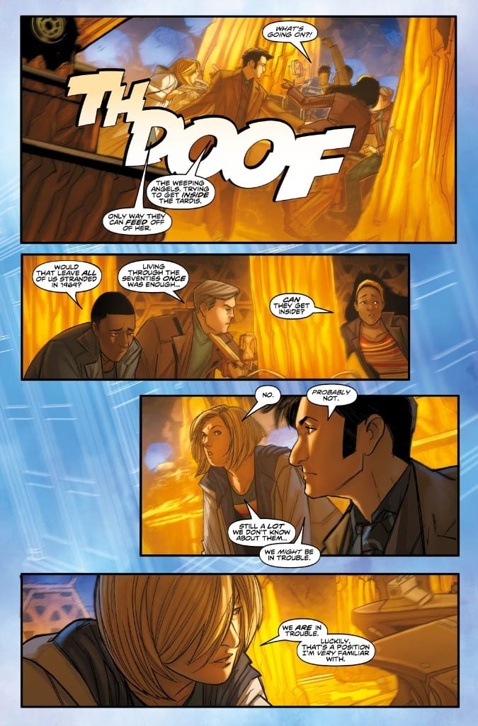
The page layouts are equally expressive with some interesting decisions made about the backgrounds that the panels rest on. Ingranata uses the page background to increase the drama unfolding in the foreground. When the TARDIS is under threat, the panels depicting the interior are surrounded by a chaotic blur of the exterior. The backgrounds and gutters become part of the storytelling process, helping Ingranata to set each scene.
If the layouts set the scene, the colors definitely give them the mood. The electricity between the two incarnations of the Doctor, the danger faced by the Tardis crew, and the gloom of the tunnels beneath the Thames all exist because of Enrica Eren Angiolini’s color choices. Each page is given a color theme that washes across the panels with subtle variants to add emphasis to something specific.
Brought together, the art choices create a single dominant idea for each page that leads the story and the reader.
Conclusion
This year the Doctor Who television series made some massive waves in the Whoniverse and Jody Houser isn’t holding back in the comic book version. Big narrative ideas have been merged with a complex character study of the Doctor while maintaining an entertaining story.
It could be argued that the ending of this arc comes too soon, with the Doctors facing both villainous forces in a single issue however the cliffhanger makes up for any shortfall. With a jaw dropping scene that looks like it was stolen from Pyramids Of Mars, Houser leaves the reader gasping for more.
Brilliant and inclusive, this series of Doctor Who: The 13th Doctor is promising to be bigger and better than the last.