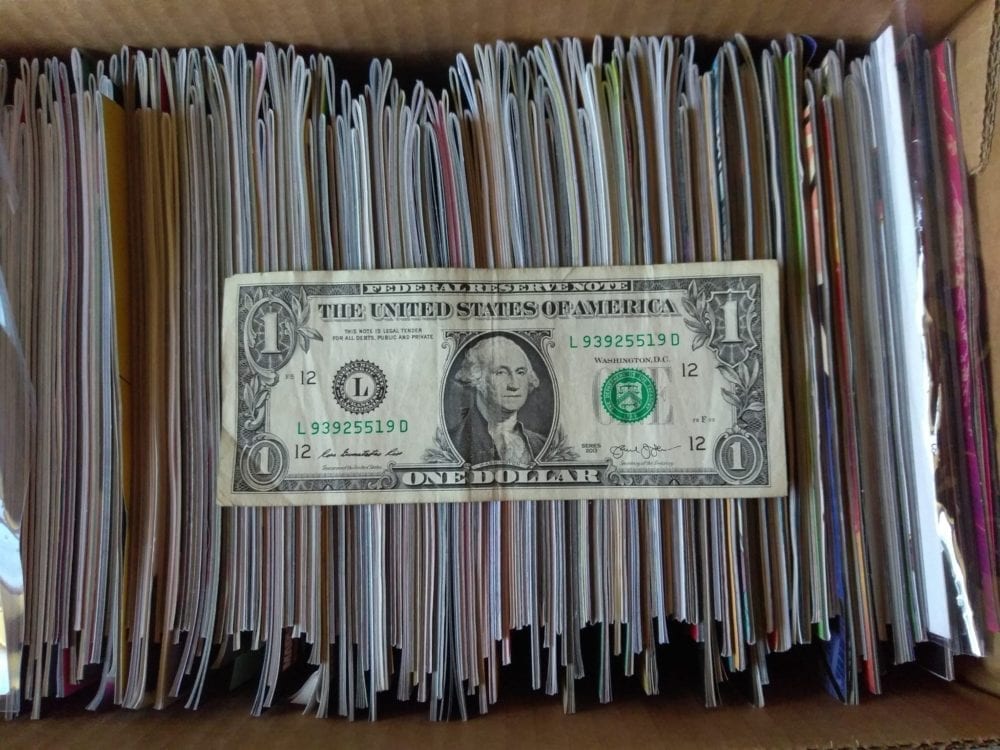
Welcome to ‘I’d Buy That For A Dollar’ a column where I will be exploring the weird and wonderful world of dollar bin diving. The only rule is each and every comic is purchased for one dollar (or less!).
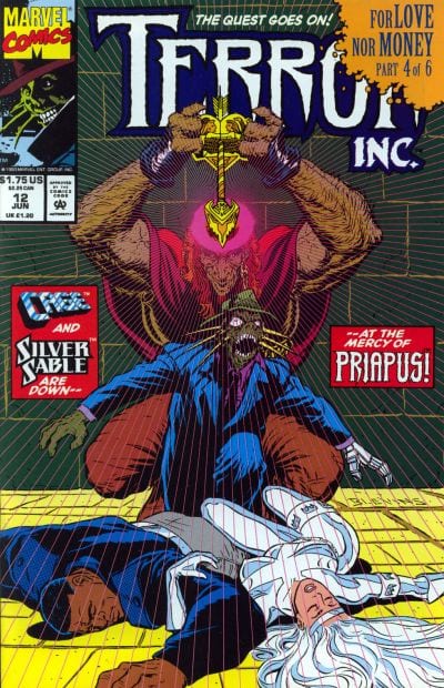
This week’s comic is Terror Inc. #12.
Terror Inc. #12 Written by: D.G. Chichester Pencils by: Kirk Van Wormer Inks by: Bud LaRosa, Jason Temujin Minor, Steve George Colors by: Kevin Sommers & James Hoston Letters by: Vickie Williams
Terror Inc. has to be one of Marvel’s weirdest 90s books (and that’s saying A LOT). I don’t ever remember reading it much as a kid, but it was definitely present on spinner racks. I probably had one issue at most. Terror Inc.’s origin is very complicated, but the main thing you gotta know is he can attach the limbs, body parts and organs of people and absorb powers and or memories, etc. It’s gruesome shit and borders on Cronenberg levels of body horror. It could almost be a mature readers title (a relaunch of it was actually put out under Marvel’s Max line not long ago).
This issue has Terror teaming up with Siver Sable and Luke Cage to go against a demon called Priapus. It’s the fourth chapter of a six-part arc, so the plot is hard to grasp. Still, there are plenty of crazy images and the whole issue has S&M and sexual undertones that I don’t think any kid would have understood back then. The issue definitely makes me want to read more and I’ll grab any I see in dollar bins from now on. Anyway, let’s look at some pages!
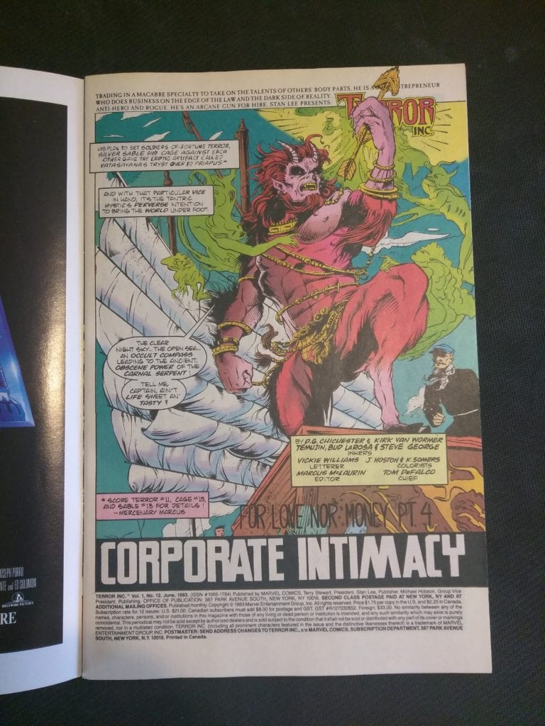
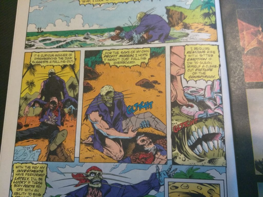
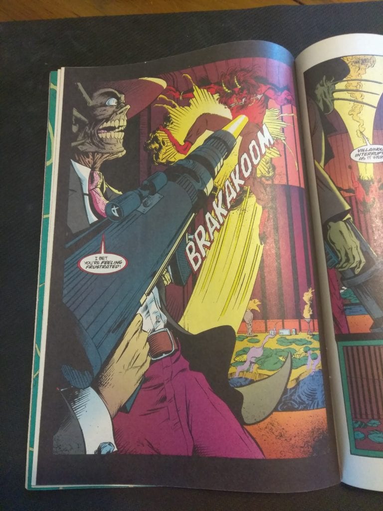
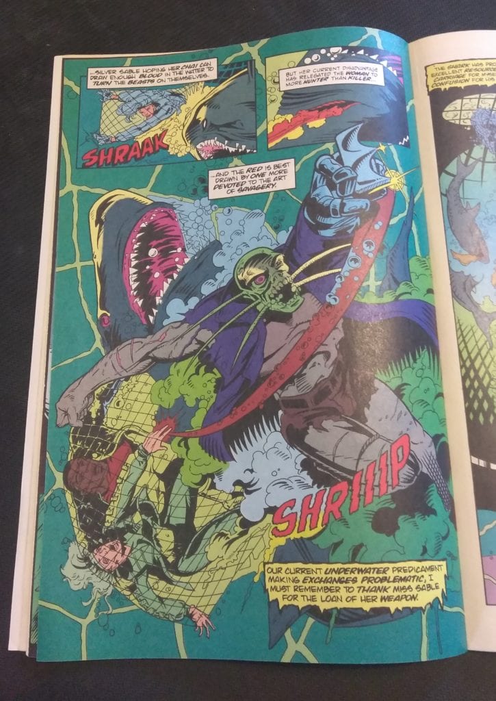
Check out the opening page. Right off the bat, there’s a mention of a ‘carnal serpent’. That’s also a crazy looking satyr.Here’s a scene where Terror attaches a leg and an eyeball to himself after dragging a corpse out of the water. That’s pretty gruesome for a newsstand Marvel comic.A big gun going off? Not phallic at all…This page is pretty awesome. The composition is great as are the colors. And there’s a fucking shark!
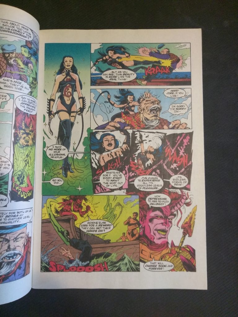
This whole scene is very S&M and bloody too.Another very cool looking page. There’s even some neat lettering work in this book.
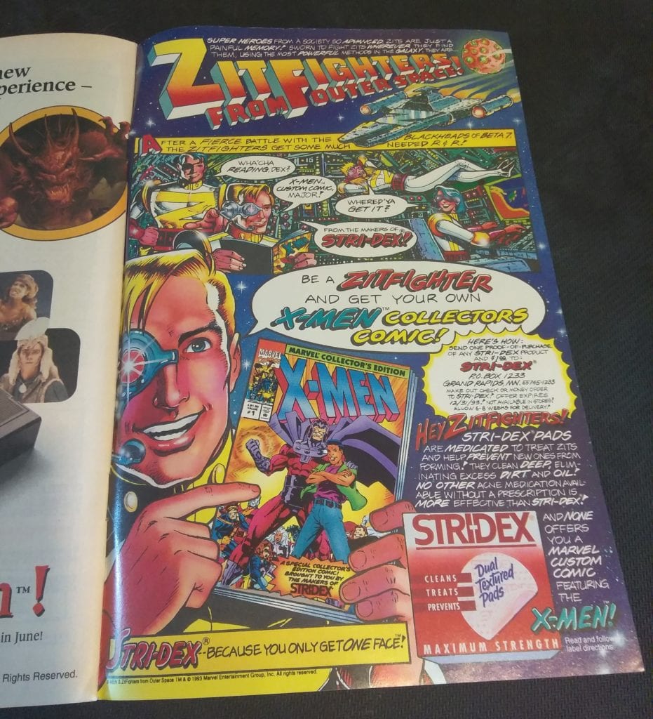
And I just had to end it with this following ad for acne medication. How perfect is it to sell acne meds with comics!
You can find great dollar bins at almost every local comic shop. So find a shop, ask a comic clerk what they can do for you during this time and get some dollar comics! Pick them up curbside and have them delivered if you must!
“Still Got It” was a unique episode of Killing Eve as it divides its story into individual perspectives.
After discharging himself from a psychiatric hospital, Niko has returned home to Poland. Because of this Eve has fallen into a depression but given hope when Niko sends a photo. Villanelle finally gets promoted to be a keeper by The Twelve but Konstantin asks for a favor. While Dasha gets told by The Twelve that she needs to rein Villanelle in.
Due to this episode being structured as individual point-of-view it end up having an overlapping timeline as various characters cross paths. “Still Got It” was the Killing Eve version of The Simpsons episode “Trilogy of Errors,” an experimental episode that told the same story from three different viewpoints. Another Simpsons comparison would be the episode “22 Short Films About Springfield” which told individual stories that occasionally intersected.
The approach used by the writer Elinor Cook and director Miranda Bowen makes “Still Got It” stand out as an episode. If the episode didn’t use this style of storyline then it would have been a standard episode, i.e., Villanelle does some killing, Eve and Konstantin do some investigating, and Carolyn makes some sort of backroom deals.
The strongest story in the episode was Eve’s. In the episode Eve had stopped caring about her appearance and hygiene and gets taunted by Villanelle who sends her a birthday cake. Eve has an emotional heart-to-heart with Danny as they reveal all the bad things they have in their lives. It hints that the pair may form a romance. Eve has been the ringer this season, she started in a low place and she has sunk even lower by this episode.
Gemma Whelan also has a moment to shine as Carolyn’s daughter, Geraldine. Whelan has a powerful monologue when she states she’s worried about her mother because Carolyn doesn’t talk about Kenny. Whelan was best known for playing Yaya Greyjoy in Game of Thrones, a badass warrior woman, so she gets to show her range by playing a more vulnerable character.
Jodie Comer continues to be great as Villanelle. She finally gets to interact with Konstantin like they used to. In this case, Villanelle acts like a child when in a cable car. There was also an important development because Villanelle wants to go to Russia and find her family, information that Konstantin has. Villanelle showed her sadistic side when she goes on her assassination mission in this episode. Villanelle plays with a grieving widow and showed herself as the psychopath she is by acting kind before killing the woman.
As well as the character drama “Still Got It” continues the plot point involving the missing $6 million. Even though the accountant in the previous episode was suspected to have taken the money, Carolyn believes that there was some else stealing from The Twelve.
“Still Got It” was a decent repacking of a standard Killing Eve plot and sets up something interesting for the next episode.
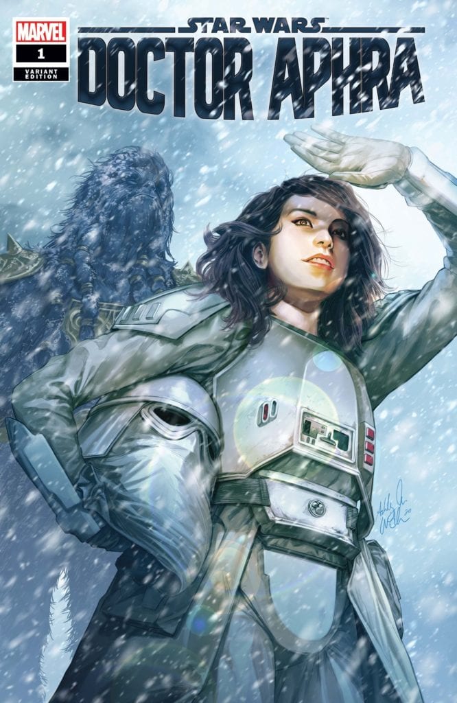
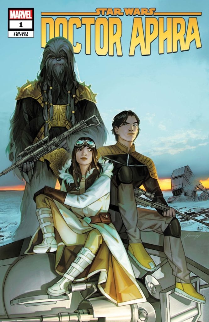
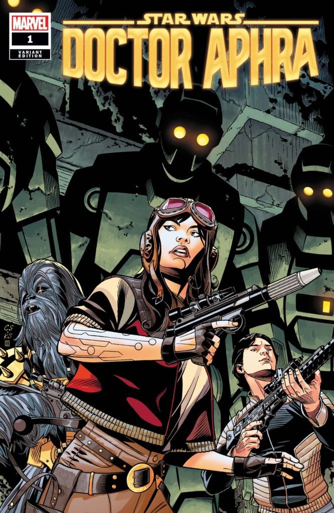
Doctor Aphra is spending some time with a couple of her crew mates.
Writer Alyssa Wong and artist Marika Cresta, along with Rachelle Rosenberg on colors and Joe Caramagna on letters revive another recent Star Wars comics character with “Doctor Aphra” #1. This series presents itself as an Indiana Jones-style treasure hunting romp, and while this seems a great idea, it unfortunately doesn’t do enough to sell the new premise or its cast to any fans of the franchise.
“New Crew, New Mission! With the Rebel Alliance back on the run after their defeat at the Battle of Hoth, it has never been a more dangerous time for outlaws, scoundrels and the errant rogue archaeologist to make their way in the galaxy. But after a string of bad luck and near escapes, Doctor Aphra is back on the job! She’s been keeping a low profile – jobs are scarce and credits scarcer. But the promise of the score of a lifetime is a chance too good for her to pass up. And to find the cursed Rings of Vaale, Aphra will need a crew of treasure hunters the likes of which the galaxy has never seen before! But Ronen Tagge, heir to the powerful Tagge family, also has his eyes on the prize. Do Aphra and her team stand a chance at fortune and glory?”
Writing & Plot
“Doctor Aphra” #1 is a bit of a mixed bag in terms of its plotting and characterization. One element that sticks out as being a unique addition to the Star Wars universe is the notion of intergalactic treasure hunting. The scouting of ruins and discovery of ancient treasures on distant planets, all while dodging dastardly rich Imperials is a fantastic concept for this universe. Turning Aphra from a thief to a lightspeed-jumping Indiana Jones is a brilliant idea, and I hope we get to see more in that respect in future issues. Unfortunately, while there is some adventurous fun to be had in this issue, it never really gets off the ground in terms of the grand Star Wars adventure one might be expecting. Or, for that matter, the characterization of the new cast. The former is offset by some a couple of setpiece action moments, but this chapter feels like more of an introduction than anything else. The new cast members are presented with their motives and stakes in Aphra’s venture for cash, it’s just a shame they don’t seem terribly interesting thus far. Many of the problems here could just be first issue woes, so hopefully more pieces come together in future chapters.
Art Direction
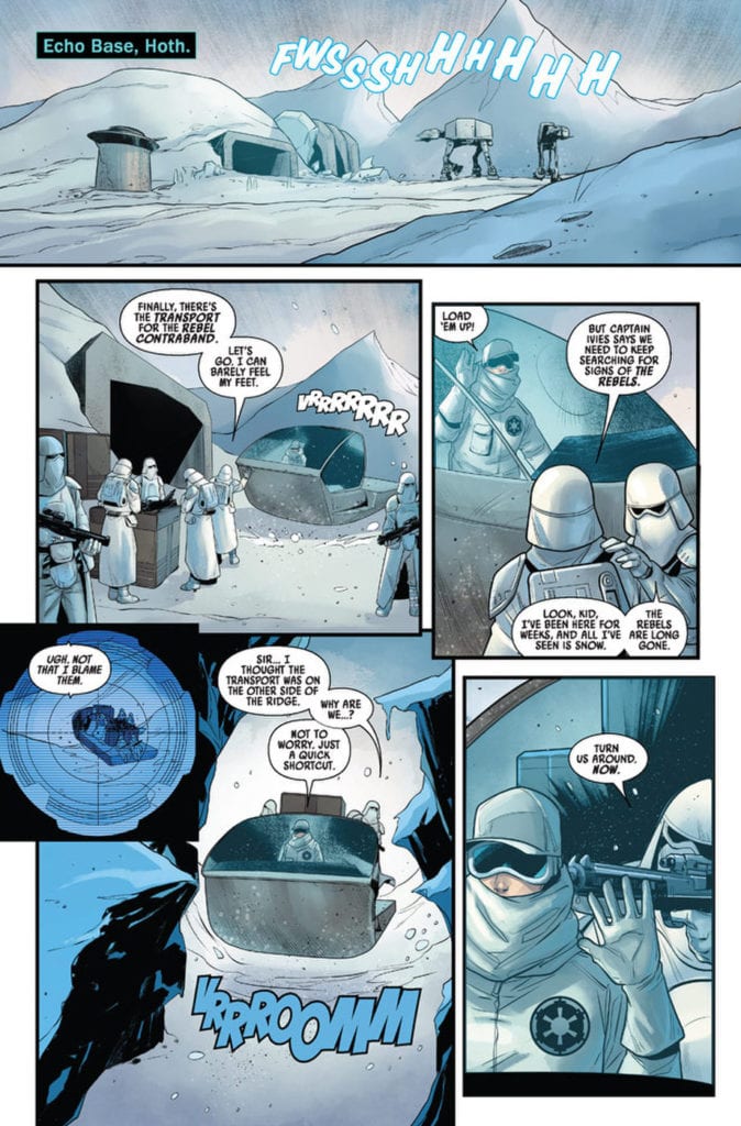
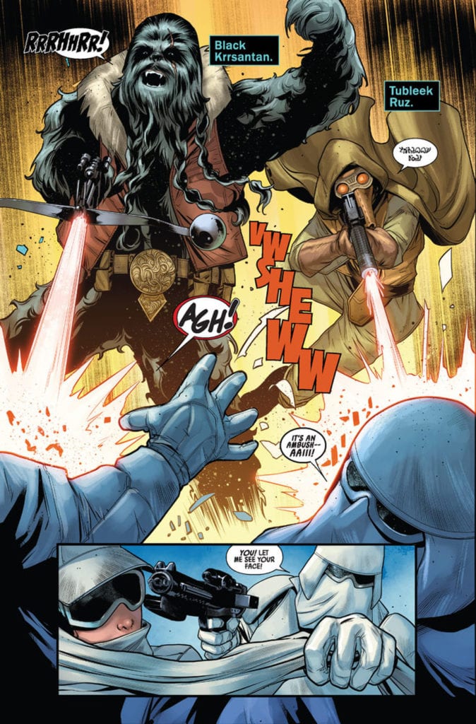
Marika Cresta provides a vibrant view of different Star Wars locales in “Doctor Aphra” #1. From the barren tundra of Hoth to an alien nightclub and then to an ancient forgotten tomb, Cresta nails the environments of the Star Wars universe. Her character drawings offer a solid amount of variety in terms of striking personal features and cast of aliens both recognizable and obscure. However, there’s an element of sameness across the board with the human characters in terms of facial detail. This is a bit of a minor trifle in an otherwise great looking comic, but it is noticeable after a point. Some of this effect is taken away by the colors of Rachelle Rosenberg, who brings the Star Wars universe to life with a massive array of varied colors. The aesthetic here blends in perfectly with the aesthetic across the board of Star Wars comics, including the main series and Greg Pak’s ongoing Darth Vader comic. This is great as both a reminder that these are part of a shared comic universe, and in that this is still a sharp-looking issue all on its own.
“Star Wars: Doctor Aphra” #1 is a good-looking Star Wars comic that’s unfortunately not a very engaging read. It has great ideas and the potential for an Indiana Jones-like intergalactic treasure hunt with a cast of memorable characters, but at the moment potential is all it looks like. The visuals from Marika Cresta and Rachelle Rosenberg are visually up to par with some of the best Star Wars comics have to offer, even if there’s a bit of a lack of variance among character facial models. If you’re a diehard fan of Doctor Aphra’s story so far in Marvel’s comics in a galaxy far far away, then pick up this debut issue when it hits stands on 5/27!
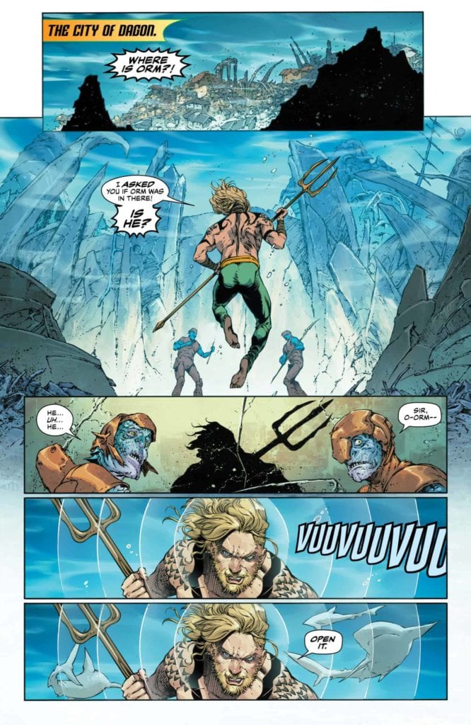
After a brief hiatus, AQUAMAN is ready to turn the tide with another action-packed story. Hitting comic book stores on Wednesday, May 27th, issue #59 features a clash between kingdoms, gods, and monsters unlike ever before. The sleeping Mera, unaware of her and Arthur’s child Andy’s disappearance, lies helpless, leaving Arthur to search for answers alone.
Story
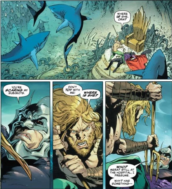
Like a mighty underwater current, Arthur storms the throne of his (supposed) villainous brother Orm once dispatched to find Andy. The king of Atlantis knows how much trouble his sibling has caused in the past and deems him the most likely culprit.
Soon Orm’s guards attempt to subdue Arthur, but it is the ruler of Dagon himself who calls for mercy. In this way, writer Kelly Sue DeConnick gives us a lesson in preconceived notions—we should be open to change, even in our greatest foes.
Just as Arthur hits this dead end, readers are brought to the home of the Old Gods. It seems Caille is the only one in the group taking the disappearance of Andy seriously, going so far as to claim the gods are impotent. In a sense, she demands something that’s so often shared by many when faced with the problem of theodicy: “You’re gods. Do god things.” In this instance, we feel her rage at supposedly supernatural beings taking a backseat when they seemingly solve the problem.
Alas, Caille gives up on her divine friends and seeks out Jackson Hyde for help. But the only source he finds may be the biggest gamble of the series so far.
Artwork
The illustrations of underwater life leap off the page in this issue. Creating engaging scenes in such a setting is often difficult for artists, but this group was clearly up for the task. Robson Rocha’s penciling and Daniel Henriques’s ink work craft beautiful buildings that litter the Atlantis cityscape, which are full of deep oceanic hues thanks to Romulo Fajardo Jr.’s coloring. And Clayton Cowles’s lettering fits in perfectly; the fluid fonts seem to flow alongside the water itself.
Conclusion
AQUAMAN #59 provides readers with a thrilling clash between brothers, employing the forces of nature in the process. We hold our collective breaths as our heroes attempt to control the harsh realities of life.
Do you think Arthur could have beaten Orm in a true one-on-one fight? Let us know in the comments below!
In Marvel Comics‘ Venom #25, on sale May 27, writer Donny Cates smoothly wraps up the first major branch of his run and leaves the reader anxiously waiting for the next chapter. This oversized issue serves as the culmination of “Venom Island” and a captivating preview of its follow-up. Plus, Cates indirectly thanks readers for their support and promises us that he’s just getting started.
Venom #25
Writer: Donny Cates
Penciler: Mark Bagley
Inker: Andy Owens
Color artist: Frank Martin
Letterer: VC’s Clayton Cowles
Two-Page Montage Sequence Artists: Ryan Stegman, JP Mayer & Frank Martin
Early in the issue, Cates expresses his appreciation for the fans’ loyalty with this series, you could just leave it at that. “You’ve stuck with me,” Eddie Brock says. “So thank you.” Later, Cates also assures us that the best is yet to come. Maybe he’s just discussing his own series. But it’s all too easy to connect Cates’ sentiment with the real world, where the COVID-19 pandemic has drastically affected the comic book industry. Comics are slowly resuming some semblance of normalcy, and that may be the reason Cates’ message to his readers particularly resonates. If nothing else, we can all agree, as Cates writes in this issue, that his Venom run as been bonkers from the start. He acknowledges that, at times, the series seems like it’s going off the rails. But, 25 issues in, it’s been a wild, fun ride and we can’t wait to see what comes next.
The week’s installment concludes “Venom Island,” but it also revisits some of the hero’s classic hits. Two staples of any Venom comic are the character’s morality (or lack thereof) and his relationship to symbiotes and/or other people. Cates has consistently explored these themes and they both come to the forefront here. On the first page, Brock asks, “Is Venom a good guy or a bad guy?” He then reflects on his morality, and penciler Mark Bagley brilliantly captures this emotional struggle. He shows prominent worry lines all over Brock’s face to convey Brock’s turmoil. The antihero questions his past self and wonders, “What was wrong with me?” as he shamefully covers his face with his hand. Lifelike facial expressions have always been a strength during Cates’ run, and Bagley continues that tradition.
Brock’s relationship with his son, Dylan, is also a major factor in this issue. When the Carnage symbiote possesses Eddie, it’s up to Dylan to save him. But the boy’s inexperience is costly, as he’s outmatched by Carnage’s powers. But one of Cates’ primary themes, that we are stronger together, tips the scales in Dylan’s favor. United once more, the father-son duo counter Carnage’s evil force with their connection. The art team’s subtlety adds a lot of nuance to a scene that begins with a fight involving a Tyrannosaurus rex.
As seen at the end of Venom #24, Dylan arrives on Venom Island in the form of a Tyrannosaurus rex, thanks to his symbiote powers. Bagley, inker Andy Owens and color artist Frank Martin combine to make the ensuing battle as wild as anything featured in Absolute Carnage. In a full-page spread, Carnage and the dinosaur battle against a blood red background, and the creature’s teeth look like they’re as sharp as knives. As exciting as this battle is, Cates and the art team dig deeper and pack it with emotional weight. Brock is mentally trapped in a prison cell that’s floating in a sea of blackness. The cell’s bars are scarlet red, clearly showing that Brock is imprisoned within Carnage. The fight continues to escalate but the real conflict comes in Brock’s mind, where he, Dylan and Carnage all vie for his soul. The war on both fronts sets up a thrilling climax that firmly changes the status quo in Venom.
Venom #25 is the perfect book to celebrate the return of comics as we know them. It pays tribute to the character’s past and paves the way for his promising future. With Cates at the helm, Venom remains in good hands, and we can’t wait see what happens next.
What did you think of Venom #25? Did you enjoy “Venom Island?”
Check out your local comic book shop to see if you can get Venom #25 and other books.
Comics are back, and diving into writer Jason Aaron’s new Avengers epic is the perfect way to celebrate. In Marvel Comics’ Avengers #33, on sale May 27, Aaron kicks off “The Age of Khonshu” with a bang. By the end of the story, several of the Earth’s Mightiest Heroes have been taken off the board and the villain has already seemingly won the war.
Avengers #33
Story: Jason Aaron and Javier Garrón
Color artist: Jason Keith
Letterer: VC’s Cory Petit
Right away, the title of this arc reminds us of “Age of Ultron,” a famous Avengers story in which the team is immediately put on the defensive. The same structure is used here, as Moon Knight easily topples some of the Marvel Universe’s most famous heroes. For fans unfamiliar with the character, Aaron succinctly tells us everything we need to know about Moon Knight, who has faded into relative obscurity in recent years. But Aaron has publicly said he has plans for the hero, and they’re finally coming to fruition.
Aaron’s passion for this story is evident on every page; robust enthusiasm is packed into every word of dialogue and every line of narration. Rather than opting for a slow burn, Aaron begins this arc in a high gear, leaving us floored by the issue’s thrilling end. Moon Knight goes on an Easter egg hunt for the Avengers’ mystical powers and his practically effortless success is eye-opening. Aaron clearly views Moon Knight as a legitimate hero, and he wants the reader to feel the same way.
To show just how powerful The Fist of Khonshu is, Aaron and the art team combine to make him look almighty in several fight scenes. First, Moon Night travels to K’un-Lun, where he battles a reluctant Iron Fist. Danny Rand tries to reason with his peer, but the time for talking has passed. Moon Knight fights the martial art master, and Javier Garrón brings the energy of a classic kung fu movie to the scene. He uses numerous movement lines, emphatic impact points and narrow close-ups of the heroes’ hands to show the exchange of heavy strikes. Most notably, Garrón also shows multiple fists in the same panel to convey the rapid velocity of the blows. This effect is even more impressive when Moon Knight battles Thor.
A fight on the moon is quite fitting for the Fist of Khonshu. That’s where he meets Thor in the issue’s climax. After Moon Knight defeats several Avengers, Thor may be the most mighty adversary left standing. Thanks to Garrón, the God of Thunder looks majestic as he soars through the night sky; he receives a close-up in which he heroically soars with his cape billowing behind him. But the presence of the supermoon behind him spells potential doom for the Asgardian.
Even when Thor uses his legendary hammer to battle Moon Knight, he’s no match for the mystical hero. Garrón shows multiple images of Mjolnir, which are complemented by the work of color artist Jason Keith, to convey Thor’s strength. The God of Thunder rapidly swings the hammer, glowing with electric blue energy. But in a moment right out of Thor: Ragnarok, Moon Knight stops the hammer in mid-air, showing that he even outmatches the Asgardian. Once Thor falls, the Fist of Khonshu looks truly unstoppable.
With a heart-pounding introduction to his latest arc, Aaron resumes up his Avengers run with vibrant, contagious energy that’s sure to excite readers. Unlike other stories about the Earth’s Mightiest Heroes, there’s no alien invasion or universal threat here. Instead, they’re dominated by one of their own, which offers us a breath of fresh air.
What’d you think of Avengers #33? Are you glad to see Moon Knight in the spotlight?
Check out your local comic shop to see what books you can get this week.
Aphra is back, and with a new team in Star Wars Doctor Aphra #1.
The only and only, infamous Doctor Aphra is back in STAR WARS: DOCTOR APHRA #1, out this Wednesday from Marvel Comics. If you’re a fan of this mischief-maker, then you’ll be pleased to hear that she has survived her trials on Hoth, and is now assembling a new team.
***SPOILER WARNING***
Fans of Star Wars are surely aware of Doctor Aphra. She’s a force of chaos within the comic book world, and with good reason. Her love of gold tends to outweigh her love of life, and her ambition outweighs both.
That is probably the reason she’s found herself in hot water a time or two. Her first series ended with a moment of redemption, giving us fans something to be proud of her for. But now she’s back, apparently deciding that laying low isn’t as much fun as it sounds. Which actually sounds exactly like Aphra, don’t you think?
Doctor Aphra #1 is going to have to make a point of explaining several things, not least of which is the reason why she’s no longer hiding. Do recall the actions she took against Darth Vader in her final arc.
Doctor Aphra is rocking the Hoth look on Star Wars Doctor Aphra #1.
The Writing
If we’re honest, it never felt likely that Doctor Aphra would lie low for long. It’s just not her style. So the news of Doctor Aphra #1, as well as her formation of a new team, really shouldn’t have been a surprise at all.
Written by Alyssa Wong, this is a fun first issue to a brand new series, one that is naturally full of schemes, grudges, and heists. This is Aphra we’re talking about, after all. The first issue may have a lot it has to establish, and yet it felt comfortable having a bit of fun and showing off some banter between Aphra and the new characters.
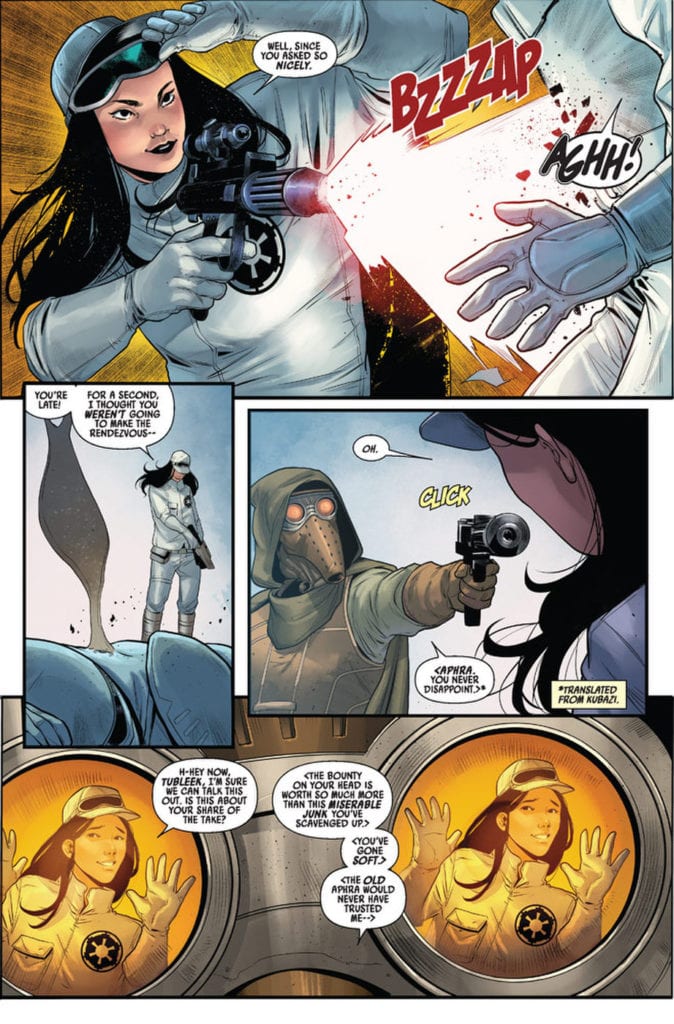
Speaking of, like any formation issue, there is a team that we must get to know. The introduction of these adventurers fits the style of Aphra’s series thus far. By that, we mean, they have reason to be concerned about Aphra’s plans.
Each character introduced is unique from the other, and while we only got flashes into their history and personality, it was enough to get an idea of what is in store. More than that, a new antagonist has also been hinted at, making this a well-rounded issue.
Doctor Aphra is spending some time with a couple of her crew mates.
The Art
The art within Doctor Aphra #1 is a thing of beauty. We’re talking about a variety of characters, with different backstories and characteristics worth portraying, plus so much more. Together Marika Cresta (art), Rachelle Rosenberg (colors), and VC’s Joe Caramagna (letters) brought yet another adventure to life.
The character designs are a particular highlight of the issue, though only one of many. All characters, both new and old, have memorable qualities to them, as well as some bold expressions worth featuring.
The backgrounds and color palettes are another highlight, naturally. Both of these help to accentuate the sense of movement (because of course, there’s at least one scene where Aphra is being shot at).
Let us not forget the lettering, which is perfection. There’s nothing more satisfying than the ‘click’ of a weapon pointed at our new leading characters, or the resounding response to their actions.
Trouble is looming on the horizon in Star Wars Doctor Aphra #1.
In Conclusion
Doctor Aphra #1 had a lot to live up to, as far as fans of her series are concerned. That being said, it does so with gusto. While she may have had a redeeming character arc recently, it’s clear that she is not ready to change her ways for good. Never change Aphra, never change.
MIRKA ANDOLFO’S MERCY #2, out this Wednesday from Image Comics, continues the tale of the Woodsburgh Devil, and the townspeople who must suffer so. This tale is as haunting as it is beautiful, with plenty of horrors to go around.
A haunting cover for Mercy #2.
***SPOILER WARNING***
The eerie tale of Lady Hellaine is back with Mercy #2. This is the second issue in a six-part miniseries, one that is proving to be as traumatizing as it is mesmerizing. This series has already been getting a lot of attention, not least of which because it is both written and illustrated by Mirka Andolfo.
Last we saw, our unusual lady had made her way to the middle of nowhere (aka Woodsburgh), for reasons yet to be fully revealed to readers. If that was the only disturbing element of the series, the town would be so much safer.
But no, this little town has had it’s fair share of death and betrayal, going back over a decade now. A pattern that looks ready to repeat itself once again.
An ethereal version of Lady Hellaine can be found on the alternate cover for Mercy #2.
The Writing
There are many mysteries in Mercy #2. Or perhaps it is simply one mystery, with multiple faces. Regardless, there are lots for readers to work through in this issue. There are layers to this story, and that has already proven to be half the journey.
The tale itself is told through multiple perspectives, a clever storytelling technique that allows for revelations and obfuscation, depending on the need. We’re given glimpses of all over the town, and yet we don’t yet see how it’s all connected.
The intrigue surrounding Lady Hellaine increased significantly during this issue, as was surely the intent. What is surprising is the developing connection between her and several other members of the town. It’ll be interesting to see how that progresses over the next few issues.
It is fascinating how, in many ways, the characters in this series feel so human. Slightly ironic, given that at least one of them is anything but. The juxtaposition feels intentional and does well to highlight certain parts of human nature.
That’s ignoring the horror element as well, of which there is a significant amount of in Mercy #2. It weaves throughout the plot, in a way that feels both organic and shocking – a careful balance has been struck.
Lady Hellaine is looking more striking and intimidating than ever before.
The Art
While Mirka Andolfo was the lead artist for Mercy #2, they did receive help as well. They had Gianluca Papi as a color assistant and Fabio Amelia for the lettering. Together they created something cohesive and utterly…outstanding.
There is something so elegant about the art style within this series. That makes the horror elements all the more shocking and intense. Speaking of, the specific way in which the monstrous beings are drawn is oddly enchanting and fits in nicely with the series.
The colors in this issue are simply divine, from the elegant details on the women’s clothing to the decision to go with brightly colored dangers of the night. It’s all aesthetically pleasing while demanding that you stop and take note.
Finally, we have the lettering, which is carefully placed throughout the issue, with clear intent in mind. You are meant to notice all of the little details woven into the series, and the lettering has been done in such a way as to ensure that.
Better run faster, little one.
In Conclusion
Mercy #2 is a dramatic continuation of the series, proving that one can be both elegant and horrifying at the same time. This series may only have four issues left, but you just know that it’s going to pack a few punches in the meantime.
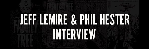
Family Tree, Vol. 1: Sapling hits your local comic book shop this week, but thanks to Image Comics, Monkeys Fighting Robots gets a chance to explore the creative relationship between Jeff Lemire And Phil Hester.
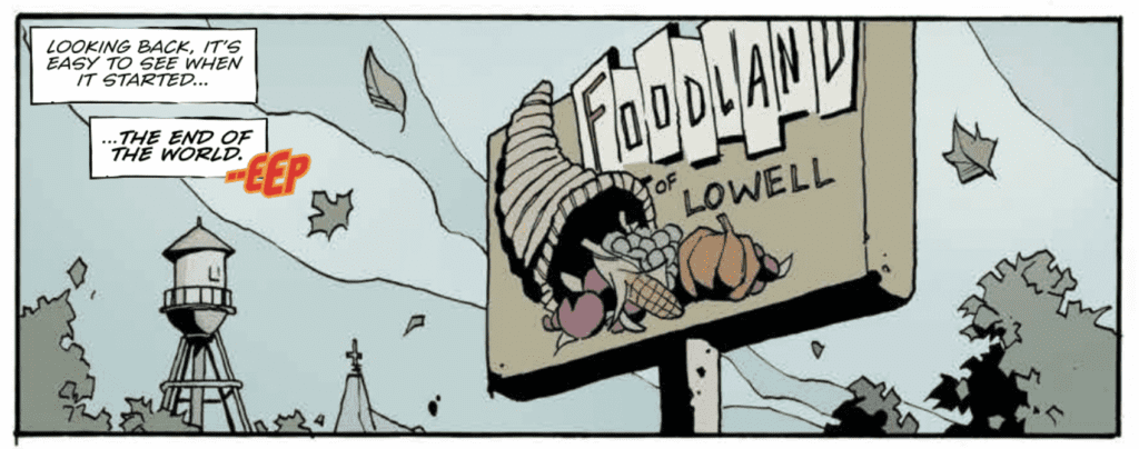
About the book: When an eight-year-old girl begins to transform into a tree, her single Mom, troubled brother, and possibly insane Grandfather embark on a bizarre and heart-wrenching odyssey across the back roads of America, desperately searching for a way to cure her horrifying transformation before it’s too late.
MFR: With the recent pandemic, we’ve seen a real-world example of how people react to pestilence. That’s something you begin to tackle with FAMILY TREE, along with the world feeling like it’s coming to an end. How do you feel when life is crazier than art?
LEMIRE: It’s very surreal to have written something like this right before the pandemic, that’s for sure. I did echoes of Family Tree in the way that things developed during the pandemic, mostly in how fast things moved and how it was just beyond our control, and we were swept up in it, much like the characters in the book.
HESTER:In all honestly, it’s no fun. I feel like horror works best when it comes back to the reader through a lens that allows them to separate a little, to see it in the abstract. I think that little bit of stagecraft makes the themes easier to process. When you’re hitting the exact same notes as the nightly news, it can get a little depressing. Thankfully, the series goes way, way beyond a typical pandemic tale, and enters a sort of metaphysical realm that may serve as the “lens” I was rambling about at the beginning of this answer forty years ago.
MFR: Jeff, From early on in this series, we get a real sense that we shouldn’t judge the otherworldly so quickly. While our gut instinct is to be afraid, that’s sometimes ill-founded. This is a theme in a lot of your work, like SWEET TOOTH, BLACK HAMMER, and ANIMAL MAN. FAMILY TREE is another brilliant example. What draws you to this theme and keeps bringing you back?
LEMIRE:Seeing the beauty in horror and in unusual things is something I’ve always been drawn to. I also like subverting expectations when I can as a storyteller, so I think it comes from both those places. In the case of Family Tree, I was really drawn to the idea of a return to nature and that maybe, in some ways, we would be better off if that happened.
MFR: Speaking of ANIMAL MAN, there seem to be traces of SWAMP THING here. Is there a SWAMP THING influence, and if so, can talk about why it resonates with you?
LEMIRE:I suppose the nods to Swampy are obvious. I have always loved that book and that character and, ironically, the first time I saw Phil’s work was when he was drawing Swamp Thing. I love the aesthetic of the character, but I also loved how Alan Moore used him as a vehicle to explore things beyond just the genre trappings. I try to do that in my work too.
MFR: Phil, many of these characters have a rough and tumble look about them. It seems to be an extension of his or her personality, and it works very well. Did you plan for this world to have that kind of vibe, or was that something you discovered as you sketched out the characters?
HESTER:I know what the story was about before I started, so the idea of very “lived-in” characters seemed appropriate. They’ve all been through a lot, and are headed for worse, so I wanted to show that wear and tear on them, especially Judd, who has officially one of my favorite characters to draw in my career.
MFR: Phil, the panels in FAMILY TREE are continually changing shape and function. They jump off the page and feel intrinsically linked to the storytelling. How do you feel this approach has lent itself to the series as opposed to a more traditional approach?
HESTER:The story has a very dreamlike, inescapable tone to it. It’s like when you can’t run in a nightmare, but find yourself being dragged inexorably toward what you’re trying to avoid. I want every page, or at least every scene, to have that kind of yawning vortex vibe about it. The pages have a lot of open ends and deep whorls that you sort of fall into as a reader. I want the readers to be trapped in this comic.
MFR: When you’re plotting, outlining, and designing the characters and their world, how do you approach an original story compared to something at Marvel or DC?
LEMIRE:We certainly have more freedom to just build it all from the ground up and not have to fit it into anyone else’s vision or world. It really comes down to that, the freedom to explore ideas and to write and draw for ourselves and each other rather than a publisher.
HESTER:Frankly, I approach them the same way. It’s just that at the Big Two, there are more people to rein me in.
MFR: You both write AND draw – how does that impact or change your dynamic and collaboration process? Do either of you approach this project differently than you would with a partner who strictly writes OR draws?
LEMIRE:For me, I think it just means giving Phil the freedom to tell the story visually. I know he is a great writer and storyteller, so I don’t need to focus too much on trying to dictate that in my scripts. Rather, I just need to give him the framework to do what he does so well, and then I get to focus on plot and character and dialogue.
HESTER:I think it helps us respect the other person’s effort a bit more. I know where the line is as a collaborator. If Jeff asks for something in a script, I know that he needs it. He’s been on my side of the equation, so he’s not going to ask for anything that’s not crucial.
MFR: FAMILY TREE has a good amount of white space, can you talk about the color palette Ryan Cody used in the first volume?
HESTER: Ryan’s been great. When we were trying to find the right palette, I kept pushing him to wash out the colors even more, almost to the point the book barely had color at all. He found that groove and became a master of it. Like I said earlier, I want this book to feel like a dream, so it’s pretty important to me that the color be non-literal. It should only make sense in the context of the book. Ryan’s mastered that, as has Eric Gapstur on inks. Every itchy line I lay down gets even itchier when I get it back from Eric.
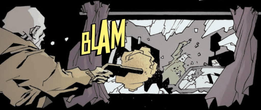
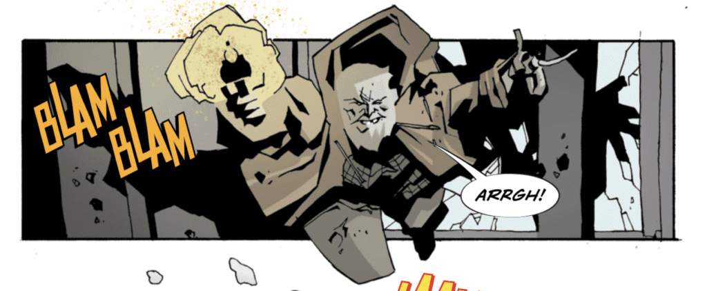
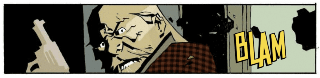
MFR: By the end of the first volume, Steve Wands’ “BLAM” becomes so iconic and jumps off the page during action sequences. What’s it feel like when the story, art, and letters work in harmony during an intense action sequence like at the end of the first volume?
LEMIRE:That all comes from trust. Letting every member of the creative team contribute and do their thing. When you do that, it allows for everyone to feel like a real team, and hopefully that shows on the page.
HESTER:It’s a joy to see everyone firing on all cylinders. Steve letters so many books that I’m always amazed at how he never loses focus regarding what makes this project special.
MFR: With the COVID-19, the comic book industry is at an evolutionary moment. What do you think the comic book industry will look like in 10 years?
LEMIRE:Obviously it won’t matter because the world will be covered in human trees by then.
HESTER:No one knows, especially anyone telling you they do.
Have you been reading Family Tree? Comment below with your thoughts.
Family Tree #4 was an alarming and dramatic issue, one that was unafraid to show the brutality and desperation that comes from fighting for your life. This is an issue that will leave fans on the edge of their seat, waiting for the fifth issue to drop. – Cat Wyatt
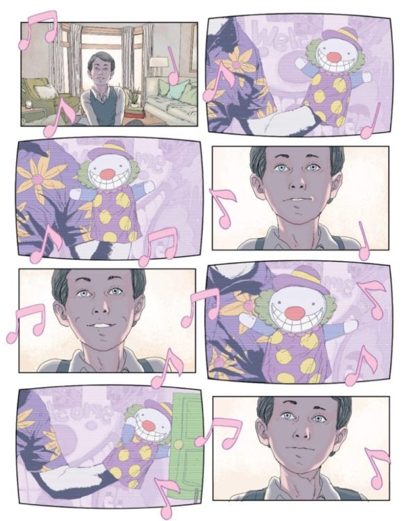
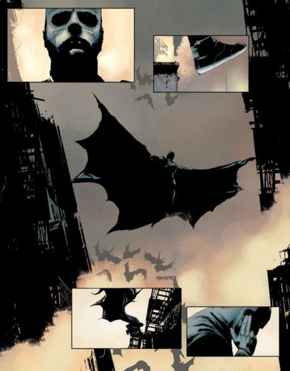
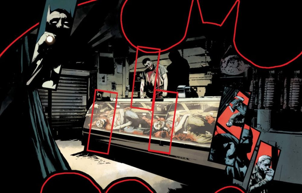
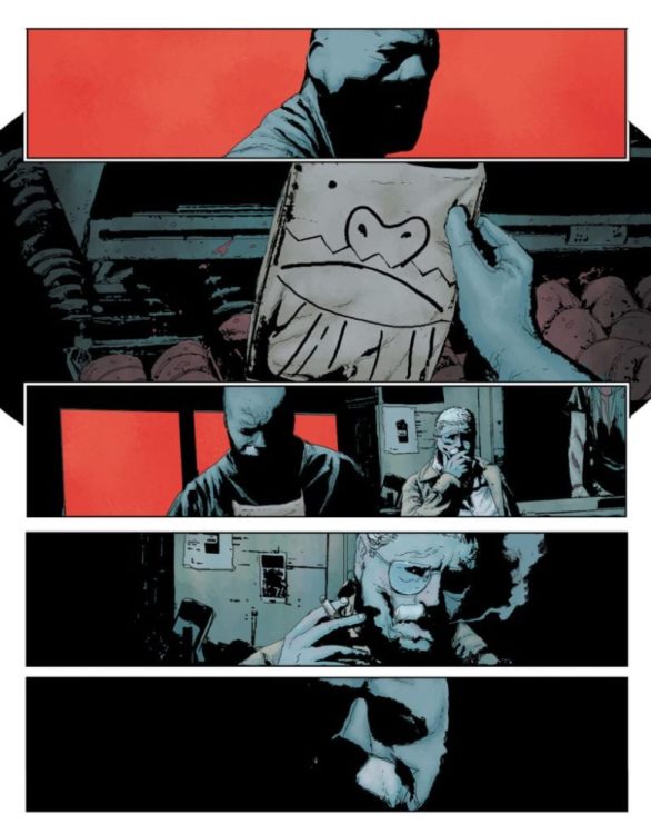
Jeff Lemire and Andrea Sorrentino — the creative team behind Joker: Killer Smile — are reuniting for a new Batman one-shot: The Smile Killer. DC is calling this an “epilogue [that] takes a different look at the Clown Prince of Crime, through the eyes of a young Bruce Wayne and his favorite cartoon television show.” The Black Label book will debut in June.
Here’s the official description from DC, along with some preview pages:
Bruce Wayne grew up watching The Mr. Smiles Show – and the show might have been watching him back! And not only was young Bruce watching, he was listening… listening as Mr. Smiles spoke across the airwaves only to him… Lemire and Sorrentino land one last gut-punch to the mythos of the Batman, turning it on its head in the most devastating trick The Joker has ever devised!
Batman: The Smile Killer is a $5.99 Prestige Format one-shot available on Tuesday, June 23, 2020.