Home Blog Page 313

REVIEW: SUICIDE SQUAD #5 Bounces Back with a Vengeance!

Suicide Squad Tom Taylor DC

Suicide Squad #4 was the first in this series to not get a perfect score in my reviews. After three brilliant issues, the writing began to slip a little as it became exposition-heavy. However, if DC Comics’ Suicide Squad #5 tells us anything, it’s that this creative team knows how to bounce back with a vengeance. Back to cranking out one of the best series on the stands, writer Tom Taylor, artist Bruno Redondo, colorist Adriano Lucas, and letterer Wes Abbott make Suicide Squad #5 the ride of a lifetime.

Writing

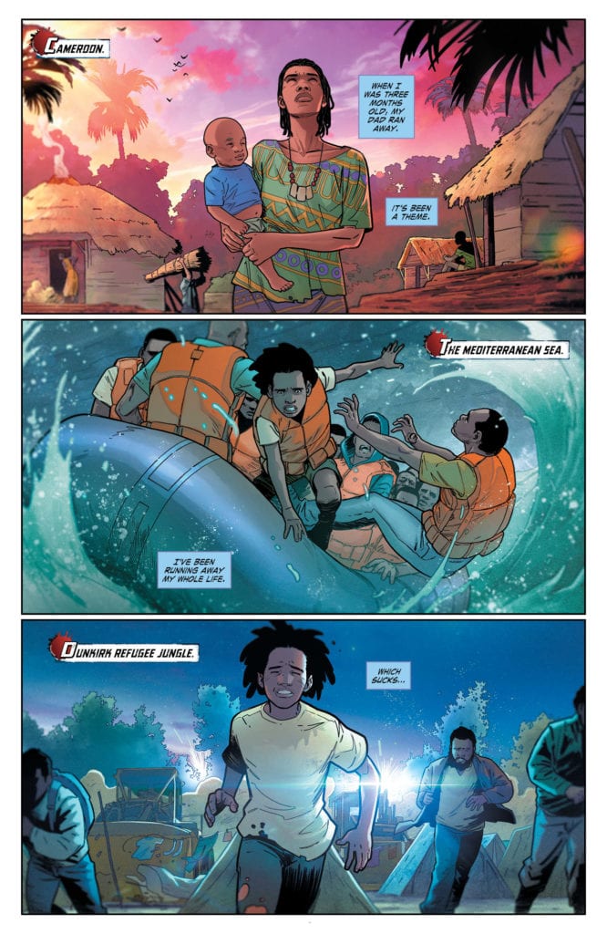
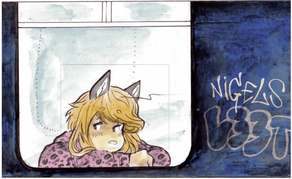
Taylor almost seems to specifically go out of his way to show he can do great exposition. As the issue opens, one of the new Squad members begins to talk about his childhood. But instead of retelling past stories that feel slightly out of place, Taylor allows Redondo’s art to do most of the work there. We see and hear just enough to piece together who this character is. Taylor makes us love a character we’ve barely met in the space of four pages, while never missing a beat in the main plot. And as the issue comes to a close, and a major question gets answered, we’re left with more questions than ever. Taylor manages to keep us balanced on the edge of our seats, and it’s clear he’s going to keep us there.

Suicide Squad Tom Taylor DC

Art

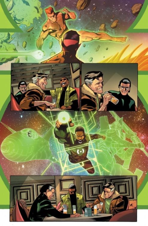
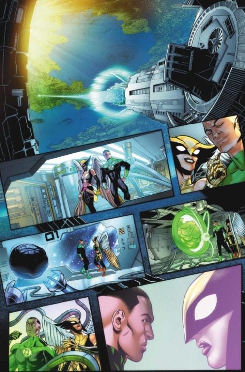
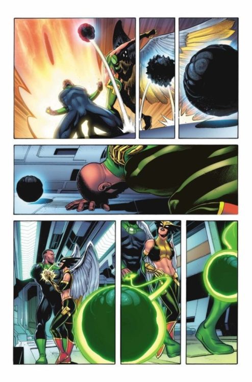
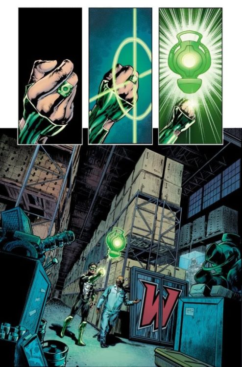
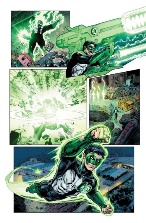
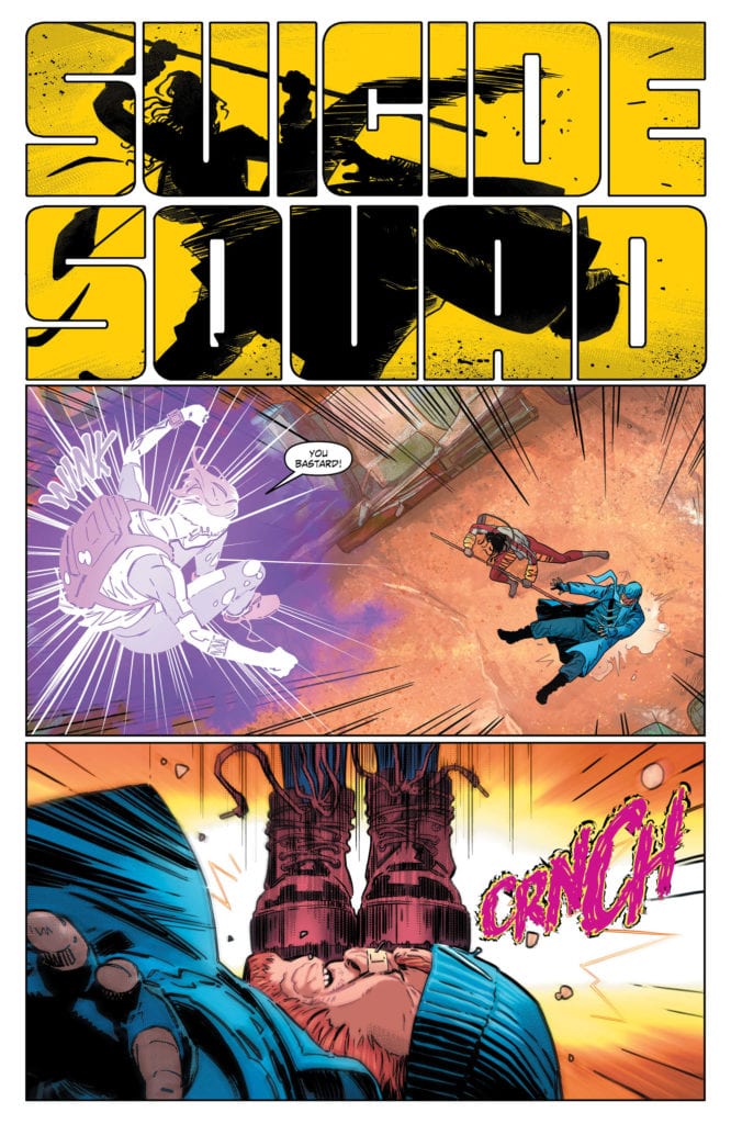
Part of the reason Taylor’s minimalist approach to writing works in this series is because Redondo’s art communicates so much. We learn a ton about the characters through his art. When things get violent, Redondo shows us who the characters are who set their jaws, and who the characters are who light right up. And you don’t blame them for lighting up, as one specific use of violence in this issue is one of the funniest things you’ll see in any comic. But Redondo also knows how to pull our heartstrings. And he does it by not trying too hard. In one scene, two characters say goodbye to each other for the last time, but Redondo makes it seem almost nonchalant. Yet there is something more intimate about it for that reason. These characters know each other too well to weep and moan. The pain is implied. The fact that Redondo can break our hearts one minute, and make us laugh out loud the next is a testament to his extreme range.

Coloring

Lucas continues to make so much about this series fun. From purple glasses to neon backgrounds. Lucas is the one who comforts us when things get tragic and cheers us on to get into the shenanigans. The grittiness and the tragedy in this series are always offset by Lucas. He’s one of the reasons this series is so balanced and versatile. Shocking violence quickly gives way to bright yellow backgrounds and delighted characters. Lucas hasn’t just set a tone for this series; it’s like he sits down at every page and says, “How can I make this as beautiful as possible?” When colors aren’t jumping off the page, they’re bleeding into one another. It doesn’t feel like looking at a comic book page. Each panel feels like a meticulously crafted work of art.

Suicide Squad Tom Taylor DC

Lettering

Abbott’s lettering makes you feel what the characters are feeling. When Captain Boomerang’s hand is brought down on one of his boomerangs, the red lettering looks like it’s cut into skin. And when one character stomps vengefully on another’s face, the bright pink lettering gives a sense of her twisted joy. But there are two specific moments where Abbott hits it out of the park. When things boil to a head, and someone fires the first shot, Abbott doesn’t write a sound effect. But it works. Because, at that moment, time almost seems to freeze, and everyone’s words are caught in their mouth. In the opposite vein, when one character tragically blows up, the “BOOM” takes up the whole panel in the background. It seems to go on forever. Abbott shows us first what it’s like to feel the shock of violence, and be lost for words, and then what it’s like to lose someone dear and feel as though nothing exists beyond that moment.


Read this series. Buy this issue. DC Comics has struck gold with this creative team. Taylor, Redondo, Lucas, and Abbott mesh-like Shakespeare and hard liquor. They’re the perfect team, writing a book that’s going to be a classic. If for no other reason, than for this issue alone. Suicide Squad #5 is out from DC Comics now!

Monkeys Fighting Robots Youtube

Interview: Deep Dive With Remy Boydell Creator Of 920LONDON

Interview: Deep Dive With Remy Boydell Creator Of 920LONDON

920London hits your local comic book shop on June 10, but thanks to Image Comics, Monkeys Fighting Robots gets to take a deep dive with creator Remy Boydell.

About 920London:
2005, north of London. A doomed romance between two emo kids. More than friends, less than lovers, they’re trying to grow shrooms before the world ends. Send help.

Interview: Deep Dive With Remy Boydell Creator Of 920LONDON

920London is a perfect read for anyone at this time. COVID-19 has turned the world on its head, and this book reflects on 90% of the emotions you are going through right now. This is not my typical read, but the characters grew on me, and by the end, I was emersed in their universe.

Enjoy the Remy Boydell Interview Below

MFR: Did you need to make 920London, or did you want to make this book?

Boydell: I think I was definitely pretty depressed when I started! At the same time, I realized I could tap into something by working from the things that I originally fully loved around 2005. Hopefully, the book stands on its own though.

By the time it was finished, a couple of things had happened which made it feel like it had come ‘full circle,’ so I felt I’d made the right choices. I was happy to get Jorden Haley on board for the book’s title/logo; I liked his design work for Mindless Self Indulgence. I also tracked down one of the original artists that I remembered loving from back in the day on Deviantart (a Chilean artist who goes by Paroro), and it felt great to reminisce.

MFR: For me, your book has a bit of a Trainspotting feel to it. What are your influences that brought 920London to life?

Boydell: This was the first time I’ve gone outside of a square panel format for a whole book, so I wrestled with paneling, and re-read a lot from Asano Inio. The book is also a bit of a callback to the UK tv series ‘Skins,’ which is pretty nostalgic for me.

Interview: Deep Dive With Remy Boydell Creator Of 920LONDON

MFR: 920London was a very therapeutic read for me with the chaos and massive loss of life of COVID-19. Do you think about or realize how impactful your work can be on a reader?

Boydell: I don’t really think about how people are going to react to my work, since I’m too far inside of it, I can’t really ‘get’ it. I don’t know what the world will be like when I’m two years into a project, so all I can do is just put the book out. For people still quarantining/social distancing, I think the anxiety and sense of longing might be relevant, but I can’t speak for anyone else. I’m really happy that it felt therapeutic for you, that means a lot to me.

MFR: The silent pages and chapters acted like time jumps and deepened the relationships of the main characters for me. Can you talk about the silent pages and what they mean to you.

Boydell: This sounds strange in the context of print books, but I came up posting art on Tumblr, and I started doing splash pages that work as extended beat panels to just like, demand a bit more attention in the context of a vertically scrolling feed. I tried hard to edit the dialogue down as much as possible, I did a fair bit of that when I was editing the script of ‘The Pervert,’ and I wanted to pare stuff down as much as I could. I don’t know why; it just felt important.

Marlo Mogensen, a friend who’s much more eloquent than I am, described the characters existing in a kind of trauma limbo. There’s a fair amount of silence and disconnect between them. I just love a good full silent page.

Interview: Deep Dive With Remy Boydell Creator Of 920LONDON

MFR: As soon as you mentioned Ween, I started to give the book a soundtrack. What did you listen to when you were working on 920London?

Boydell: Ween was name-dropped in honor of my friend Charlie, who, during production of the book was sort of carving his life into a rudimentary shrine to Gene and Dean Ween.

I haven’t updated my iPod since I worked on the book, so I have a real list. The quality of the music varies violently:

The Secret Handshake, Amy Can Flyy, brokeNCYDE, Cobra starship, EATMEWHILEIMHOT, Hellogoodbye, I SET MY FRIENDS ON FIRE, Ima Robot, The Medic Droig, Metro Station, Paramore, The Rasmus, She Wants Revenge, 30H!3, The Arctic Monkeys, The Killers, Hadouken!, Breathe Carolina, Red Jumpsuit Apparatus, The Raconteurs, Dance Gavin Dance, Modest Mouse, Henry Homesweet, The Fratellis, Cute Is What We Aim For, Panic! At The Disco, Avril Lavigne, MCR, MSI.

I’m definitely missing a few, I know I had the soundtrack for the show ‘Skins’ going at one point too.

Interview: Deep Dive With Remy Boydell Creator Of 920LONDON

MFR: The indie comic book scene is a very crowded marketplace, what will success look like for 920London?

Boydell: I don’t think it’s crowded, I think there’s a good amount of indie comics. (We need) more indie comics. If someone reads it and makes their own weird comic, that would feel like success to me.

I’m not being glib, I genuinely met the goal I had for my last book in terms of numbers of copies sold, and that kind of thing can be a bit hollow. If anyone is unsure of their ability and worried the comic they genuinely want to write will repel or annoy their peers, please go for it.

MFR: Because of the emotional impact of COVID-19 and how the world has been shut down, what is your emotional state going to be like on June 10 when your book finally drops on the public?

Boydell: I feel grateful to everyone at Image; they’ve been working incredibly hard through a lot of chaos to get books out. I try not to focus on the reception of work, and I’m pretty deep into my next project already, I’ve been animating for a while. Having said that, it makes me happy to see a bit of fan art; I save it all carefully.

MFR: Thank you for your time, and best of luck with 920London.

Boydell: Thank you!!


What did you think of the interview? Comment below with your thoughts.

Monkeys Fighting Robots Youtube

BLEED THEM DRY #1 – Diving Into A Whole New World

Bleed Them Dry #1 cover

Bleed Them Dry #1 begins a new series by Vault Comics in some post-disaster cyberpunk world. One where vampires who coexist with humans are not the most interesting thing about it. Instead, a ninja is going around killing these supposed immortals who hide a dark agenda. And the detective in charge of the case finds herself going deep into a potential conspiracy.

Bleed Them Dry #1 Background

Let’s talk about the creator Hiroshi Koizumi’s vision. Bleed Them Dry combines two things that fascinate audiences: vampires and ninjas. It’s not an exaggeration to say that vampires are a pop-culture norm. From the Castlevania Netflix series, new Vampire: The Masquerade video games and even Sony is trying to capture the craze with Morbius. This reflects the world in Bleed Them Dry #1; vampires have an entire culture that has been long established. For example, they can take blood substitutes in place of coffee. It’s a world readers just want to know more about, even if they have to theorize.

Especially since the allure surrounding the blood-sucking immortals is anything but mundane, the main character’s partner Atticus Black presents himself as the smooth-talking figure who steals the spotlight. With the way he talks, he always ensures that he’s on top of any discussion. This makes him interesting and a little intimidating, perfectly encapsulating the revelation near the end of the issue. A revelation that pushes POV character Harper Halloway into the hands of the ninja vampire slayer. Something that series writer Eliot Rahal is more than eager to show.

Artwork

Setting and pace for vampire city
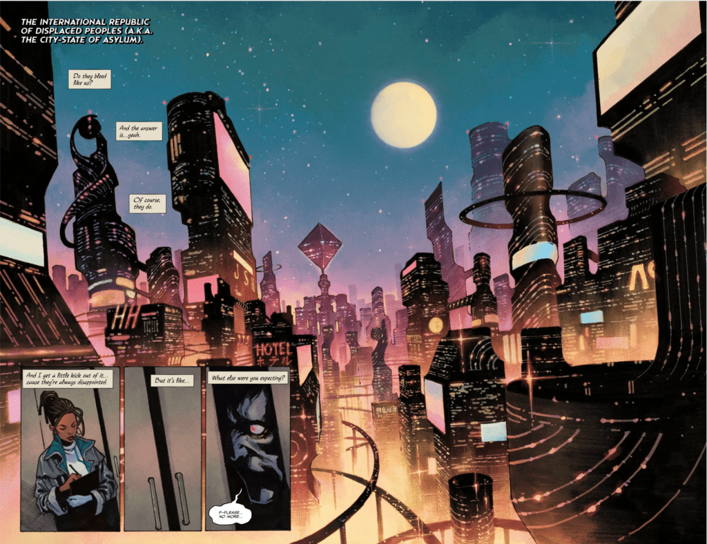
Series artist Dike Ruan illustrates an always changing perspective where momentum shifts accordingly. In just the first pages, a police procedure quickly establishes its stakes, all while presenting the setting of Bleed Them Dry #1. The best part comes from how they never get in one another’s way. With a city like Asylum who wouldn’t want to feel like they’re on a ride. Thanks in no small part to Deron Bennett’s letters. Perhaps the best display of this comes from how Ruan and Bennett have Atticus’ quickdraw cuts a vampire. The bisected panels in addition to the letters popping out of the word balloon perfectly illustrates this action.

Colorist Miquel Muerto provides an equally shifting tone. The bright lights of the city of Asylum live up to its name, where the main characters feel safe. But then when something in shadows appears, this safety becomes compromised. It takes someone who knows their way around the shadows to feel safe again. Hopefully, Halloway finds that with her savior.

Bleed Them Dry #1 Is The Beginning of Something Great

Bleed Them Dry #1 does its job by introducing the reader to a world of intrigue. This opening issue wastes no time putting everything about the city of Asylum on display. From the coloring that emphasizing the themes of light and darkness to the flow of movement. Because in a world full of vampires, there’s always something more exciting. This issue certainly has me waiting for the next one where the ninja hopefully comes into focus.

Monkeys Fighting Robots Youtube

The History of Shazam: From Fawcett Comics to the Big Screen

The History of Shazam: From Fawcett Comics to the Big Screen

Since 1940 the World’s Mightiest Mortal has been fighting crime, but his journey through the years has been long and difficult. Several times Shazam has been off the comic book shelves completely, and this article is here to inform you about how the Big Red Cheese eventually found his way onto the big screen.

Shazam, originally sporting the name Captain Marvel, first appeared in Whiz Comics #2, which was published in 1940 by Fawcett Comics. Captain Marvel was a simple golden age hero but stood out among the rest because his alter ego was a ten-year-old boy. The child was able to transform between normal child and superhero by merely uttering the magic word Shazam. This secret identity allowed children to relate to Captain Marvel more than any other hero, and Fawcett comics was able to connect to even more people with the introduction of Mary Marvel and Captain Marvel Jr. After a short while, Fawcett introduced more fantastical ideas into their issues, which led to characters like Mr. Tawny, a talking tiger, and Hoppy the Marvel Bunny, who possessed the same powers as Shazam. This strange group of superheroes, combined with the fantastical adventures they went on, made the Marvel Family (no association with Marvel comics, which had not adopted that name at the time) a beloved superhero team. At one point, sales of Captain Marvel rivaled that of even Superman.

Cover of Whiz Comics #2

As Captain Marvel was in his prime, issues arose in the form of a lawsuit. National Comics (eventually to become the DC Comics we know today) sued Fawcett Comics because Captain Marvel was similar to Superman in too many ways. There were even instances where actions performed by Captain Marvel mirrored that of Superman in earlier issues, such as pulling an elevator up by its cable. The case was complex and took twelve years, cementing it as one of the longest-running legal battles in all of comic book publication history. National Comics emerged victorious, and the case resulted in Fawcett Comics being forced to cancel all superhero-related comic books, including those containing Captain Marvel or the Marvel Family.

During this time Fawcett Comics was unable to publish anything featuring Captain Marvel, and the trademark they possessed on the name lapsed. This allowed Marvel Comics to use the name for a character of their own: a predecessor of the Captain Marvel that premiered in the Marvel Cinematic Universe in 2019. This Captain Marvel was male and has a very similar origin to the Carol Danvers Captain Marvel that is in the mainstream today. Carol Danvers took over as the Marvel Universe’s Captain Marvel in 2012 (and there were additional heroes who held the mantle after the original’s death in 1982.)

Marvel Comics Captain Marvel

Even though Fawcett Comics was unable to publish anything containing the character, the original Captain Marvel — eventually to be known as Shazam — was far from extinct. In 1972, DC entered into an agreement with Fawcett Comics to license the Marvel Family of characters, and the world’s mightiest mortal found his way onto comic book pages again. However, due to Marvel Comics now possessing a character named Captain Marvel, the series that DC premiered in 1973 was entitled Shazam!: The Original Captain Marvel. Marvel later forced DC to change the subtitle to The World’s Mightiest Mortal, resulting in the character’s name appearing nowhere on the cover of each issue. This eventually led to people referring to Captain Marvel as Shazam, and was what caused his name to eventually be changed.

Cover of Shazam 1973 Revival

The 1973 series Shazam!: The World’s Mightiest Mortal initially had C.C Beck doing the art. He was the artist of Captain Marvel in the Golden Age, so the new series continued to have a feeling of Golden Age comic books well into the Silver Age. This archaic art style turned many off from the new series, and even the creators had a distaste for what they were publishing. This series also made it so that the Marvel Family existed on Earth-S, separate from DC’s Earth-1 main continuity. Despite only lasting 35 issues, the 1970’s revival of Shazam was important because it marked the first time Captain Marvel returned to the page when he could have been left unused forever.

Shazam made several appearances in the late seventies and eighties in series such as in Justice League and All-Star Squadron, but never got a series of his own. He played a role in Crisis on Infinite Earths, which also brought Captain Marvel from Earth-S to the main continuity.

In 1994, The Power of Shazam! written and illustrated by Jerry Ordway was released, bringing back the beloved character in a new art style similar to mainstream comic books at the time. The graphic novel led into an ongoing series of the same name, which was a more realistic version of Captain Marvel than we had seen before that still managed to bring the fun and fantastic characters from the golden age into play. Throughout the series, Hoppy the Marvel Bunny, Mr. Mind, and several other goofy characters made appearances in a more realistic setting. This revival of the character is some fans’ favorite portrayal, and it is well deserved. The series ran until 1999.

The Power of Shazam Cover

After the cancellation of Power of Shazam!, it was a while before the hero saw a series of his own. In the early 2000s, Shazam made appearances in JSA, Infinite Crisis, and 52 without very significant roles. He was also featured heavily in the 12-issue maxiseries Justice, but it wasn’t until the maxiseries The Trials of Shazam! that the Shazam family was the focus of a story. This series had Captain Marvel take on the role of the Wizard, and focused on Captain Marvel Jr. attempting to pass certain trials to prove he could become the new hero Shazam. This maxiseries made many changes to the Shazam lore, but sadly very few had a significant effect because DC continuity was rebooted as a result of the New 52 rebranding.

After the New 52 relaunch, Shazam was not given a series of his own, and initially did not seem to exist in the new continuity. Luckily, in the back of issues of Justice League, fans were treated with a new origin for the world’s mightiest mortal. This time, several changes were made to the origin of Shazam, including a much larger cast of supporting characters, more people who can summon the magic of the wizard, and officially changing the name of the hero to Shazam. Many had already been referring to Captain Marvel as Shazam, so the name change was expected. Written by Geoff Johns, the new origin brought freshness to the character and introduced him to many readers who were unfamiliar to the character.

In 2019, the film Shazamarrived in theaters. Directed by David F. Sandberg and starring Zachary Levi, the movie heavily reflected the origin set forth by Johns during the New 52. The most prominent change of the film, other than Doctor Sivana being the main villain instead of Black Adam, is that Shazam is now incapable of saying his own name. In the Johns story, he added a clause that Shazam needed to say his name with meaning to transform, but in the movie any attempt made by Shazam to say his own name will result in him transforming back into Billy Batson.

Shazam Movie Poster

Currently, Shazam has his own ongoing series started in 2018 and written by Johns, which will hopefully continue for many years. Johns has slowly introduced new ideas to Shazam lore, while also bringing back beloved characters and villains for the whole Shazam Family to interact with.


What’s your favorite appearance of The Big Red Cheese? Leave your answer in the comments below!

Monkeys Fighting Robots Youtube

A Conversation With KILL WHITEY DONOVAN Writer Sydney Duncan

I got to talk with wildly talented novelist and comics writer Sydney Duncan about the recently finished first volume of “Kill Whitey Donovan” and about her process, the talent she works with, and the comic’s upcoming film adaptation.

MFR: Hi Sydney, Thanks for doing this interview. Congrats on finishing the series!

SD: My pleasure, Justin! And thank you!

MFR: While tales of revenge set up in Westerns or around this time period are a relatively popular genre, “Kill Whitey Donovan” has an ace up its sleeve in its choice of protagonists. What exactly motivated your creation of Anna and Hattie as a pair and their quest for vengeance?

SD: You know, that’s a good question because I’m not entirely sure of the answer. A lot of stuff I like to write explores identity and transition. As a woman of trans experience, that’s probably not revelatory. But Kill Whitey Donovan began as a novel and at the time I started writing that book, I’d been contemplating external and internal pressures on identity and, as I recall, I was sort of thunderstruck and the concept of these two women formed. Hattie’s journey was this struggle against how the outer world saw her and Anna’s was a conflict with this inner sense of herself versus who she was expected to be. I had all these questions like, are these characters the way they are because of their circumstances? Can they become something else, if those circumstances change? To what extent can the boundaries of that becoming be pushed? Cerebral, but not exactly page-turning stuff. So, I sought those answers against a revenge tale and voila!

As far as the genre goes, it might be a matter of writing what you know. I’m from Alabama and the Civil War still casts a pretty long shadow down here. In a real sense, it was a war for identity and dealt in a violent way with those internal and external conflicts. Also, the ideas of femininity and the narrow construct of women were very rigid, giving both our leads something to rebel against. So, it seemed a perfect backdrop.

MFR: The handling of this story’s flashback sequences as well as the overall pacing are airtight and very focused. Was the story as it happened pretty set in your mind when you started or did it change shape and evolve organically as you wrote it?

SD: Thank you!

I think every writer sets out with a story in their minds and then it evolves into something more organic. That was certainly true with KWD. I find that I may want the characters to behave a way or do a thing but after a certain point in writing them, they kind of take the reigns and tell me what’s what.

The flashbacks, though, were always part of the plan. In a sense, they are the real story. The plot device is this journey to kill Donovan, but the story is about what these characters need to become to do that. In order to express that, I wanted to show moments in their past that conveyed the person they had been and juxtapose it with the person they were becoming. That evolution is the heart of the story.

MFR: This comic is blessed with the phenomenal art of Natalie Barahona. How did you two start working together, and what was the process like?

She really is so talented. If my only claim to fame in life is to be able to say I wrote Natalie Barahona’s first comic book, I’ll die happy. I can’t wait to watch her career. She has the most amazing instincts and is such a brilliant storyteller. Honestly, we’d just hand her a script and watch her go. I can’t imagine an easier collaborator to work with.

She got involved through Brian Stelfreeze, who would come on board for Art Direction and Editing. When 12-Gauge Publisher Keven Gardner and I were first talking artists, Brian had already been giving some early advice and guidance, and at some point he suggested Natalie. My understanding is that Brian doesn’t take apprentices, but he’d made an exception for her and had worked with her for a little while when KWD came up. I think he basically concluded, She’s ready. Which was immediately apparent when she started turning in character sketches and art. And her coloring – it just blew us away.

MFR: More congratulations are in order, since “Kill Whitey Donovan” is getting a big-screen adaptation! How exactly did that come about, and in what ways are you involved?

Thanks! We’re really excited about that. When I originally pitched this story, I pitched it to Keven, publisher of 12-Gauge Comics, which is the studio that produced the book before Dark Horse got involved. If you aren’t familiar with 12-Gauge, they have several Image books and have worked with properties such as Boondock Saints and Body Bags. Keven has been around the comic book business for years, working at Valliant early before doing his own thing. He also had his own comic shop for a minute – one I frequented a lot in college, without actually knowing him. Recently, he’s had some success in getting Hollywood interest in their comic books. I think he felt KWD had potential to work for the screen and set some meetings to make it happen. It was pretty quick.

Beyond an occasional note, though, I’m not terribly involved in the effort to adapt the comic. I had a call early with the screenwriter, Sigrid Gilmer, who is an amazing writer. She was incredibly generous to offer space for me to have input, but I felt strongly that she should have the opportunity to make the film hers and let it be it’s own thing. I’m privy to all the script drafts and I have to say, I’m very excited with what she’s producing. It captures the spirit of the comic and then gives you more. I can’t wait to see it in the end.

MFR: The final page of the series teases that Hattie and Anna’s story may not be over. What could we expect from a potential follow up?

Volume 2 is all about consequences and fathers: those missing, those present, and those left behind and raging with grief. It also greatly expands the world of KWD while anchoring it to this little gold rush town out west where Hattie’s mom lives under the tyrannical reign of the elder
Donovan. Meanwhile, both of our leads have to deal with what they’ve just done and the internalization of that will manifest in very different ways for them both. All while a man with every means seeks his own reckoning.

Be sure to check out “Kill Whitey Donovan” and the past and future works of Sydney Duncan!

Monkeys Fighting Robots Youtube

Review: A MAN AMONG YE #1 Sailing The High Seas In Style

A Man Among Ye #1
A Man Among Ye #1 Cover Credit: Image Comics

With a clear obsession with historical adventures, Stephanie Phillips’ new title with Image Comics, A Man Among Ye, sets sail into the murky depths of Pirate Mythology. Set towards the end of the Golden Age of Pirates, the comic revels in the Legends created around real events.

Treading a fine line between historical accuracy and romanticism, A Man Among Ye opens the door on the intriguing world of Anne Bonny, one of the most infamous and ruthless female pirates.

A Man Among Ye #1 Credit: Image Comics

Sailing the Seas

The story starts in the middle with the pirate captain Calico Jack Rackham leading his men in a raid on a English Sloop. With gleeful violence Phillips introduces the Captain in a swirl of sword play and banter. However, the big entrance is saved for the star of the show, Anne Bonny.

Illustrated here as a fiery haired, stylish, take-no-prisoners woman, Bonny made history by daring to be her own person. Although a lot of her life is speculation at best, her reputation for violence and strong headedness is well documented. Phillips makes these aspects of her character clear from the outset.

Bonny’s interactions with Rackham and the other crew members single her out among the cast as the character to follow. All of the action ultimately revolves around the Pirate Queen and Phillips makes sure that she is the centre of attention not just on the page but in the speech itself.

There is an element of the romanticised pirate narrative in this comic. The style leans more towards classic interpretations such as EC Comics Piracy series from the 1950’s rather than the overly fanciful Pirates of the Caribbean movies. However, Phillips gives the impression that she has something more to say. By focusing on Bonny and making her obviously feminine from the opening, Phillips is making a statement about representation in the genre.

It is documented that Bonny often posed as a man during raids and fights but Phillips instead allows the character to flaunt her femininity. This is significant and reflects a greater movement within the comic industry. Female characters are no longer sidelined and creators are allowing their stories to be told. A Man Among Ye is embracing that by celebrating the female lead and challenging a social concept of piracy.

A Man Among Ye
A Man Among Ye #1 Credit: Image Comics

Maritime Rendering

The artwork has a theatrical style to it, similar to the recent Titan Comics title, Adler. The design, especially the costumes, has a dramatic flair that gives the initial impression of a period drama. However Craig Cermak injects his layouts with dynamic energy pulling the reader across the page with the action. Aiding the narrative flow is the lettering, provided by Troy Peteri. Well placed word balloons flip a reader across an image, while alterations to the text or balloon stop the reader dead.

The characters strike superhero-esq poses with their jackets and hair blowing in the wind, sails whip in the wind, and everything looks slightly staged. This is the world that Cermak depicts, giving the reader a stylised view of a historical story and as such is fitting for Phillips’ approach to the tale. A Man Among Ye is not a realistic representation, a regurgitation of passages from a history book, it is an adventure story celebrating a rebellious woman who stood up for herself and others.

That’s not to say this is a pantomime and Cermak doesn’t treat it as one. There are moments of malice and disturbing violence that breaks up the swashbuckling fun. One scene in particular contains an air of threat that Cermak brings to the foreground using large areas of shadow. He turns the safety of the open air into dangerous, claustrophobic, spaces where anything could happen.

The changing atmosphere is helped along by Brittany Pezzillo’s color work. The use of bold colors is almost a necessity but it is the shifts in saturation that mark the shift in narration. Bright skies and clear water accompany the high jinx elements of the comic but these are soon flooded by cold hues and ice blues when the actions turn threatening.

Throughout it all the central character, Bonny, sets a striking image on the page. No matter what the pirate queen’s surroundings Pezzillo always colors her with the fiery red running through her figure. She stands out, as she should, like a beacon drawing the reader’s gaze. At the end of the day this is a comic about Anne Bonny and Pezzillo makes sure you don’t forget it.

A Man Among Ye #1
A Man Among Ye #1 Alternative Cover Credit: Image Comics

Conclusion

On the surface A Man Among Ye is a fun pirate romp with all the classic swashbuckling action you could want. But, if you dive a bit deeper, you can find hidden depths. Comments on the representation of figures and events from history; the depiction of women in modern comics; a desire to educate as well as entertain. All of these aspects can be read into Phillips narrative.

With a number of exciting and intriguing comics under her belt Stephanie Phillips is a name worth watching. There is a sense of enjoyment and fascination in all of her work that instantly pulls a reader in. The art teams pick up on this and as a result produce work that is equally as compelling.

Falling style wise somewhere between Marvels’ Marauders and Image’s Shanghai Red, A Man Among Ye is a pleasing adventure comic that has a lot to offer the reader.

A Man Among Ye #1 is released under the Top Cow banner of Image Comics on 17 June 2020

Monkeys Fighting Robots Youtube

Review: DOCTOR WHO: 13TH DOCTOR #2.4

Doctor Who 13th Doctor
Doctor Who 13th Doctor Season 2.4 Credit Titan Comics

Two Doctors, two timeless enemies, and only one chance to save the universe as we know it. The second season of Titan ComicsDoctor Who: The 13th Doctor reaches the end of it’s first arc with an abundance of characters and Time Lord personality.

Jody Houser and Roberta Ingranata have infused this series with Doctor Who spectacle and wit, merging two different era’s together seamlessly. After the slow build up through the previous issues, how do the creators handle the difficult finale?

Doctor Who 2.4 cover
Doctor Who 13th Doctor Season 2.4 Credit Titan Comics

Timey Wimey, but not Wibbly Wobbly

Successfully writing such a beloved character can be difficult, fans aren’t the easiest to please, but Jody Houser is in her element here. She is pulling all of the right kind of influences from the television show and making this comic her own. The biggest selling point is that she represents the characters perfectly. There is no doubt the words coming out of the 13th Doctor’s mouth belong to that incarnation of the Time Lord, and the same can be said for each cast member.

Speech inflections, accents, and personality shine through Housers script. Some of the emphasis comes from Richard Starkings and Sarah Hedrick’s lettering, their placement and breakdowns of the speech, but Houser is channelling the actors’ voices. Take the images away from the panels and you can still tell who is talking.

This characterisation helps the plot along. Like a number of the television episodes, more time is spent on the build up then the final confrontation and this can result in a rushed ending. There was a worry of that happening here, especially as there are so many elements in play. However, Houser uses the large cast to her advantage by making it an important factor in the denouement of the adventure.

Something Old, Something New

One of the beauties of this story arc is the crossover element. It is more than just a gimmick because the interaction between past and present Doctors informs the reader. You learn about the current incarnation of the Time Lord by her reactions to her past self. Her sense of confidence grows and she embraces the dangerous side of her adventure with more humour. The 10th Doctor had a cheekiness about him that Houser uses to open up the 13th Doctor’s personality.

But the series is not just about the Doctor. Her companions get to see a new take on life with the Doctor. This is an idea that has been touched on in the T.V. series, especially with the return of Sarah Jane Smith in the School Reunion episode. Houser reaches into the continuity of the series and pulls it together to comment on who the Doctor is and how the franchise has changed while also staying the same. It’s as if Houser is making a statement about modern Doctor Who: Yes, it has changed but it is still the same Doctor Who.

Doctor Who cover
Doctor Who 13th Doctor Season 2.4 Credit Titan Comics

Picture Perfect

If the underlying theme of this story is to reintroduce the gleeful sense of adventure from David Tennant’s early years then Ingranata’s artwork is a perfect fit. By capturing the essence of the casts appearances without committing to identical likenesses, Ingranata is able to play with the characterisation. Overtly expressive faces and staged physical gestures accentuate the playfulness present in both era’s of Doctor Who.

The page layouts are equally expressive with some interesting decisions made about the backgrounds that the panels rest on. Ingranata uses the page background to increase the drama unfolding in the foreground. When the TARDIS is under threat, the panels depicting the interior are surrounded by a chaotic blur of the exterior. The backgrounds and gutters become part of the storytelling process, helping Ingranata to set each scene.

If the layouts set the scene, the colors definitely give them the mood. The electricity between the two incarnations of the Doctor, the danger faced by the Tardis crew, and the gloom of the tunnels beneath the Thames all exist because of Enrica Eren Angiolini’s color choices. Each page is given a color theme that washes across the panels with subtle variants to add emphasis to something specific.

Brought together, the art choices create a single dominant idea for each page that leads the story and the reader.

Conclusion

This year the Doctor Who television series made some massive waves in the Whoniverse and Jody Houser isn’t holding back in the comic book version. Big narrative ideas have been merged with a complex character study of the Doctor while maintaining an entertaining story.

It could be argued that the ending of this arc comes too soon, with the Doctors facing both villainous forces in a single issue however the cliffhanger makes up for any shortfall. With a jaw dropping scene that looks like it was stolen from Pyramids Of Mars, Houser leaves the reader gasping for more.

Brilliant and inclusive, this series of Doctor Who: The 13th Doctor is promising to be bigger and better than the last.

Monkeys Fighting Robots Youtube

DC CONNECT: New Monthly Catalog Debuts

DC Connect

DC is rolling out a new digital product catalog called DC Connect, the publisher announced today. Connect will be the new, online version of the DC Previews catalog, which was found in comic stores. The first issue cover is already teeing up one of DC’s big books of the year: Three Jokers.

Check out the official description and images below:

DC ANNOUNCES DC CONNECT, AN ALL-NEW MONTHLY CATALOG

Download for Free Now at www.dccomics.com/connect

DC is pleased to introduce DC Connect, the new catalog of what’s coming from DC publishing each month! This downloadable, digital-only catalog features solicitation information for DC’s comic books, original graphic novels, collected editions, and collectibles—and that’s just the start!

In the coming months DC Connect will update and evolve in order to maximize the advantages of its digital format. Future issues will include expanded content, featuring talent interviews, preview pages from upcoming stories, behind-the-scenes looks at projects in development, multimedia content, and more! The catalog will also have a new look and layout compared to its predecessor, DC Previews, making it more engaging and easier to get the latest intel on current and future DC comic book projects.

Here’s a look at the debut cover to DC Connect, featuring stunning artwork by Jason Fabok and Brad Anderson for the highly anticipated miniseries Batman: Three Jokers, launching Tuesday, August 25. To learn more about the titles that are on sale in August, download the full PDF now from www.dccomics.com/connect.

Monkeys Fighting Robots Youtube

DC Comics First Look: GREEN LANTERN 80th Anniversary Spectacular

Green Lantern 80th

DC Comics has released some preview pages from the upcoming Green Lantern 80th Anniversary issue, including a reunion of Geoff Johns and Ivan Reis from their epic run in the earlier 2000s. Between this, the monthly title by Grant Morrison and Liam Sharp, and The Far Sector, it’s a great time to be a GL fan.

Check out the official story descriptions and pages below:

“BEWARE MY POWER!”

Your DC “First Look” at Pages from the Green Lantern 80th Anniversary 100-Page Super Spectacular #1

 On June 23, join DC in celebrating eight decades of intergalactic justice and peacekeeping with the Green Lantern 80th Anniversary 100-Page Super Spectacular #1. You’ve already seen the incredible decade variant covers depicting the Green Lantern Corps across 80 years; here’s your first look at some of the awesome stories that make up this must-have collectors’ item:

“Last Will,” by Geoff Johns and Ivan Reis

The team that brought you Sinestro Corps War and Blackest Night reunites to deliver one more story featuring the Emerald Warrior. Hal Jordan crashes onto an unknown planet with only enough power in his ring to send three messages out.

“Legacy,” by Ron Marz and Darryl Banks

The co-creators of Kyle Rayner return to tell another adventure with the Torchbearer. Kyle travels to New York to grab a few things from the old Warriors location in storage, but he finds that not everything Guy Gardner displayed in his bar was totally safe.

“Four,” by Robert Venditti and Rafa Sandoval

The team that brought you Hal Jordan and the Green Lantern Corps power up again for one more tale with the 4 Corpsmen. Hal Jordan, John Stewart, and Kyle Rayner reunite to reminisce and tell old war stories, but where’s Guy Gardner?

“Reverse The Polarity,” by Charlotte (Fullerton) McDuffie and ChrisCross

In a story that should pluck the heartstrings of any Justice League Unlimited fan, Charlotte (Fullerton) McDuffie and ChrisCross team up for an adventure featuring John Stewart and Hawkgirl. In this sweet tribute to the late Dwayne McDuffie. John and Kendra are trapped in the Watchtower by Dr. Polaris after her takes control of a mysterious element that enhances his powers.

The book also features Green Lantern tales from other celebrated talents, including Peter J. Tomasi/Fernando Pasarin, Denny O’Neil/Mike Grell, Sina Grace/Ramon Villalobos, Mariko Tamaki/Mirka Andolfo and Cullen Bunn/Doug Mahnke. A renowned collection of artists has also contributed tribute art recognizing the legacy of the Green Lantern Corps, including Far Sector artist Jamal Campbell, Green Lantern: Legacy artist Andie Tong, Catwoman artist Joelle Jones with Jordie Bellaire, Batman: Dark Knight: The Golden Child artist Rafael Grampa, and others.

The Green Lantern 80th Anniversary 100-Page Super Spectacular #1 arrives in comic book stores open and operating and digitally on Tuesday, June 23, 2020 for $9.99.

Monkeys Fighting Robots Youtube

Review: The Fires of War and Retribution Burn in KILL WHITEY DONOVAN #5

Writer Sydney Duncan and artist Natalie Barahona bring their Civil War-era quest for vengeance to a close with “Kill Whitey Donovan” #5. This final chapter raises the usual stakes and tension to an intense high and crafting the most intense conflicts in this mini-series thus far. It all ends in a state of brutal satisfaction with a promise of more retribution to come.

“As Atlanta burns around her, Anna finally tracks down and confronts ”Whitey” Donovan. But men like him aren’t easy prey, as she and Hattie will soon discover. Blood will be shed and their lives forever changed–all in the name of revenge.”

Writing & Plot

Sydney Duncan‘s intimate characterization and concise plotting throughout “Kill Whitey Donovan” culminate in a satisfyingly intense final issue. The plot that weaves from Anna and Hattie’s past explaining the journey they’ve taken and back to present creates the perfect emotional tension to end this revenge tale. The complexity of the relationship between the two leads, with Hattie being a slave and Anna the daughter of a slave-owning family, is never forgotten and continues to be an underlying pressure point in the plot. The backdrop of the American Civil War has been a brilliant atmospheric tool for the series that plants the reader firmly in the time period this comic takes place in. This is especially true for the finale, as Hattie and Anna face off against the man who took their lives from them while Atlanta is besieged by Union forces. The setup for the final conflict utilizes the facts and features from each character that have been detailed to craft a crowning moment that feels naturally focused while offering satisfying conclusions (?) for all characters involved. Duncan’s willingness to write scripts that make full use of comics as a visual medium creates stellar pacing and tension through this chapter’s climactic moments, especially in standoffs when all the cards are on the table. This is as fine an ending as any revenge story could ever hope for, and a fitting finale for the excellent character work in this mini-series.

Art Direction

For one last time, artist Natalie Barahona crafts a crisp and gorgeous visual experience for “Kill Whitey Donovan” in its final chapter. Her focus on character detail makes the protagonists easy to interface with as a reader while the villains are just as hateable and slimy as they should be. The gloomy, humid conditions of Civil War-era Georgia are met with the almost southern-gothic views of a burning Atlanta under by mortar fire. The stunning color choice not only fills in the details of the characters and environments, but saturates the story in a chaotic and opressive tone. The visuals of this series are rounded out by the crisp and concise lettering of Troy Peteri, whose more traditional font choice is cleverly varied with subtle changes in size and bolds to indicate volume and emphasis. Barahona’s ability to take Duncan’s script and turn it into such an intense and well-directed visual story is some of the best work of its kind in comics this year.

“Kill Whitey Donovan” #5 is a tension-filled, emotionally cathartic, and wholly satisfying end to this gripping mini-series. “Sydney Duncan’s script that focuses on the characters’ traumatic experiences and intense escapes finishes with a smart and rewarding bang. Natalie Barahona’s gorgeous and atmospheric artwork captures the audience in the story’s captivating final moments. This is a fitting ending to stellar comic, and one that may promise more on the horizon. Be sure to head to your local comic shop to grab this issue or pre-order the trade paperback!


Monkeys Fighting Robots Youtube