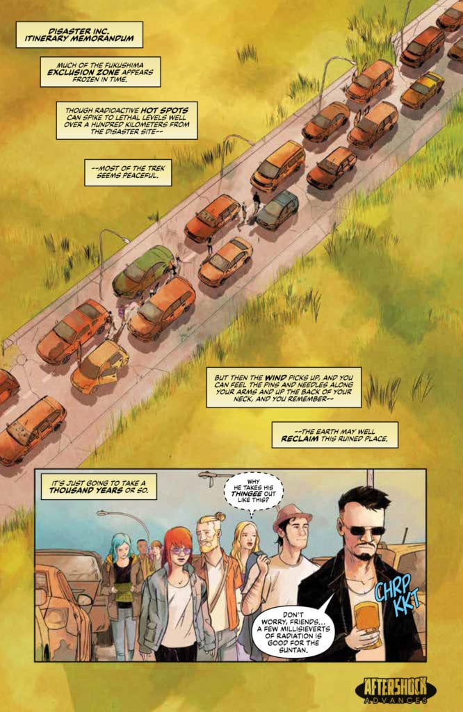
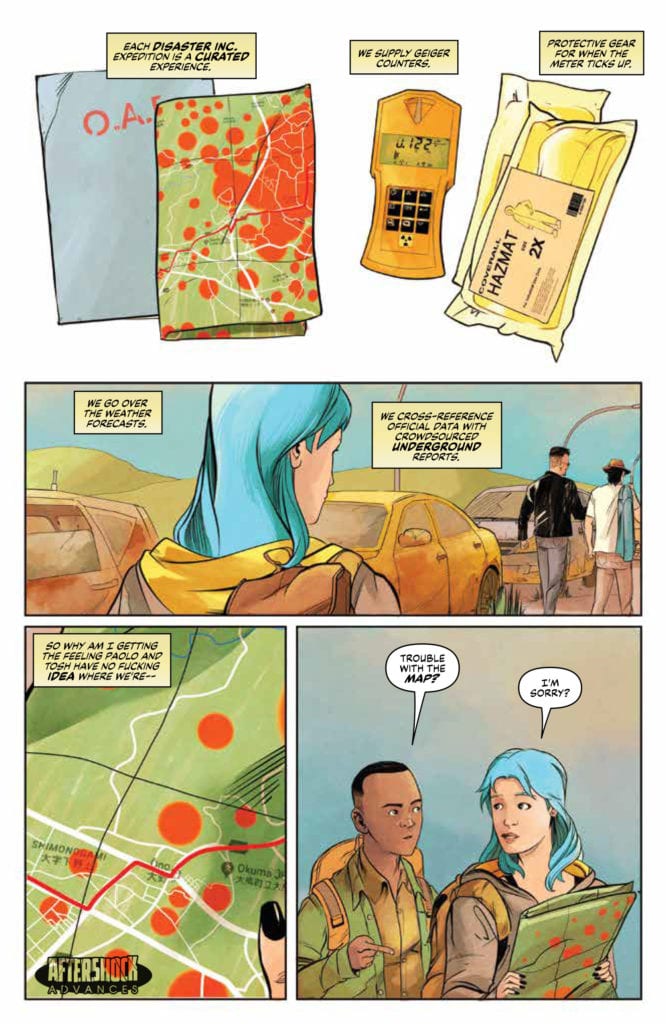
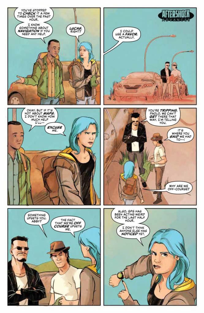
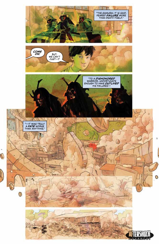
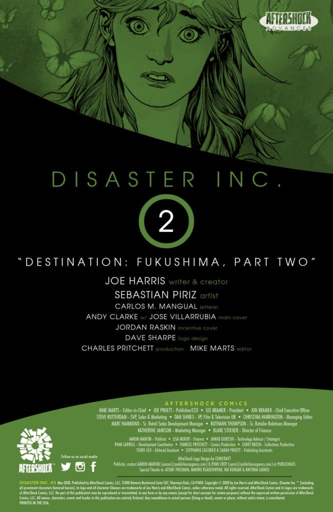
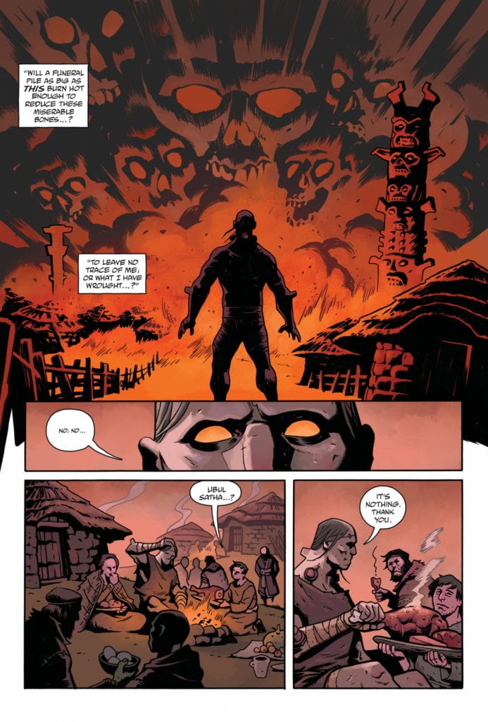
DISASTER INC. #2 hits your local comic book store August 5th, but thanks to AfterShock Comics, Monkeys Fighting Robots has an exclusive four-page preview for you.
About the issue: Paolo, Abby, and Tosh lead their assemblage of “disaster tourists” deep inside the Fukushima Exclusion Zone for what they expect to be a (relatively) mundane experience…if radioactive hotspots, irradiated feral animals, and the promise of swift and harsh arrest by authorities could be classified as mundane. But this is an ancient place with no shortage of legends or ghosts. And nobody told the Samurai they were coming!
DISASTER INC. #2 is by writer Joe Harris and artist Sebastian Piriz, with letters by Carlos M. Mangual. The main cover is by Andy Clarke with Jose Villarrubia.
In a world on fire and rife with calamity, catastrophe, war, and unrest…you’re going to need the right guides to see it for yourself!
Check out the DISASTER INC. #2 preview below:
What is your favorite AfterShock Comics title? Sound off in the comments!
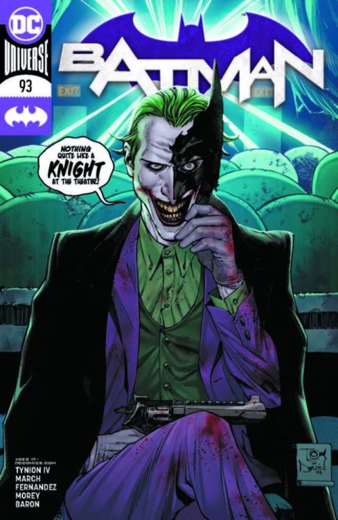
With comic book shipping now on the way back to normal, DC Comics has released a preview of Batman #93 by writer James Tynion IV, and artists Guillem March & Javier Fernandez. With new villain Punchline and the upcoming “Joker War” storyline, the next few months promise to be big ones in the Bat-books.
Here’s the description and some preview art:
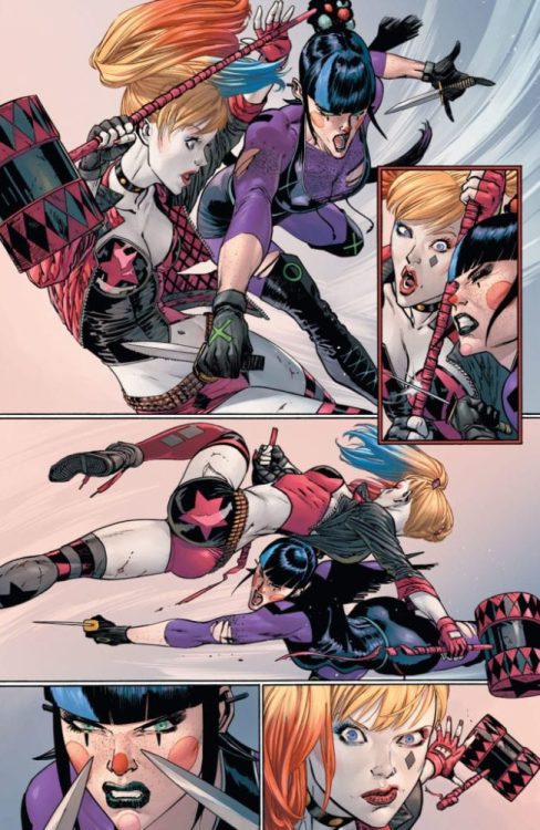
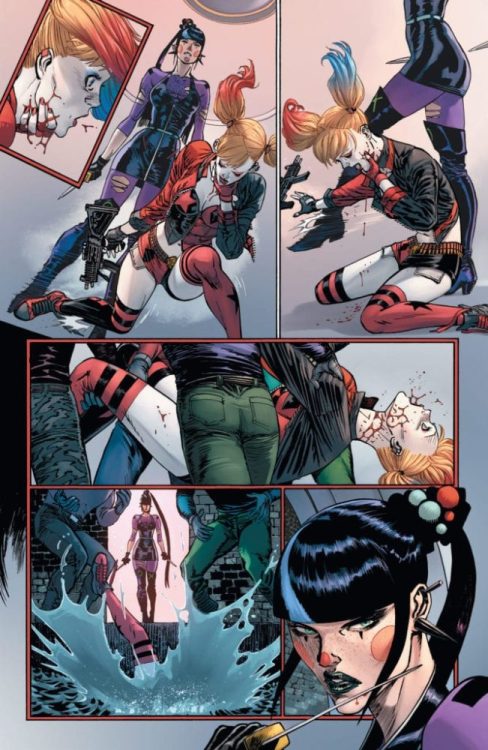
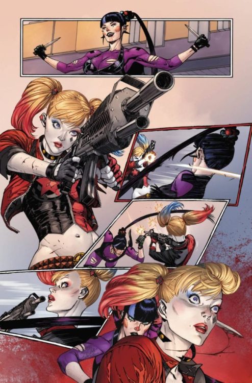
PUNCHLINE VS. HARLEY QUINN, ROUND ONE!
Batman #93 Features the Biggest Showdown of 2020
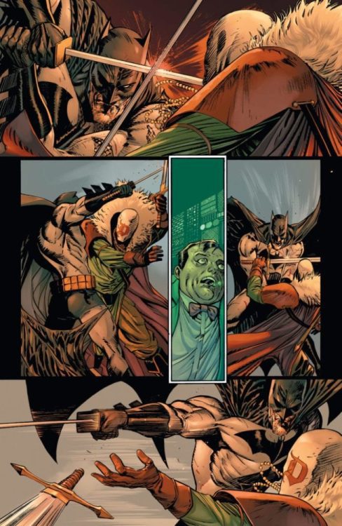
In Batman #93 (on sale June 23), The Designer finally crosses swords (literally) with Batman as he reveals his grand plan for Gotham’s worst criminals to finally take control of the city! And if that’s not enough, this must-have issue features the showdown that every comic book fan has been waiting for, as Punchline squares off against Harley Quinn!
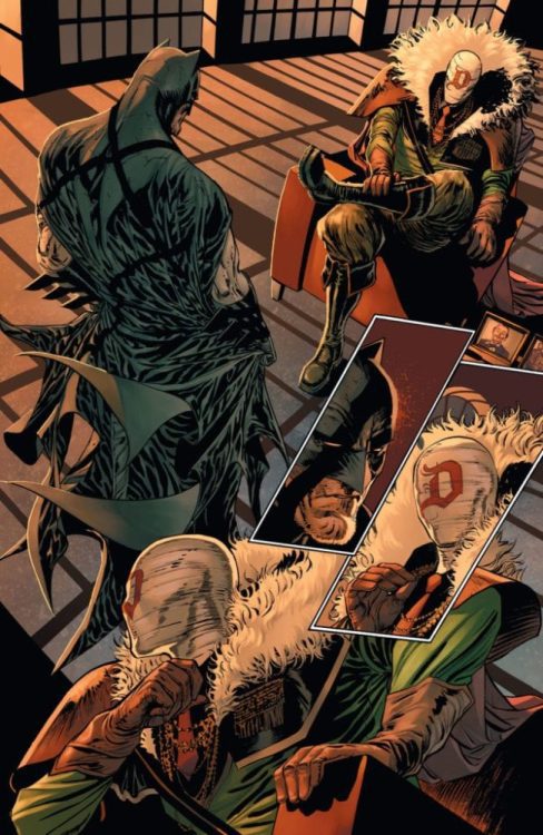
Batman faces off with the Designer as “Their Dark Designs” nears its epic climax! In the last year, Batman has lost more than he could have imagined, and now he faces a cost so dear it will change the course of his life. And there is worse on the horizon. Amid all the horror, he can feel the drumbeat of battle. “The Joker War” is coming, and Gotham City will never be the same!
Enjoy these interior pages featuring awesome art by Guillem March and Javi Fernandez, and don’t miss this issue when it hits comic book stores and participating digital retailers on Tuesday, June 23!
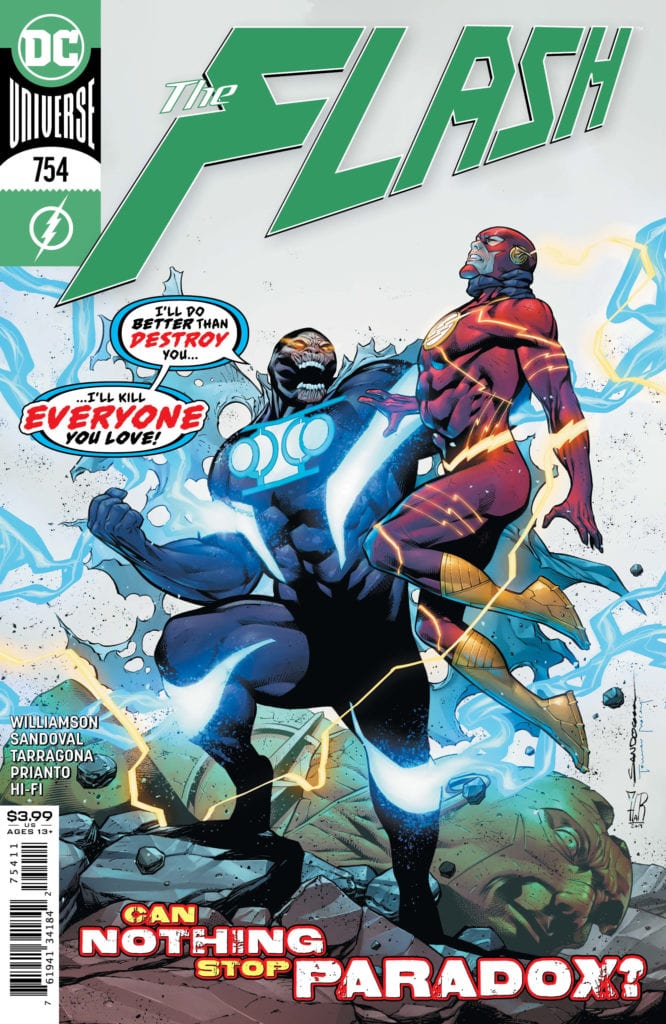
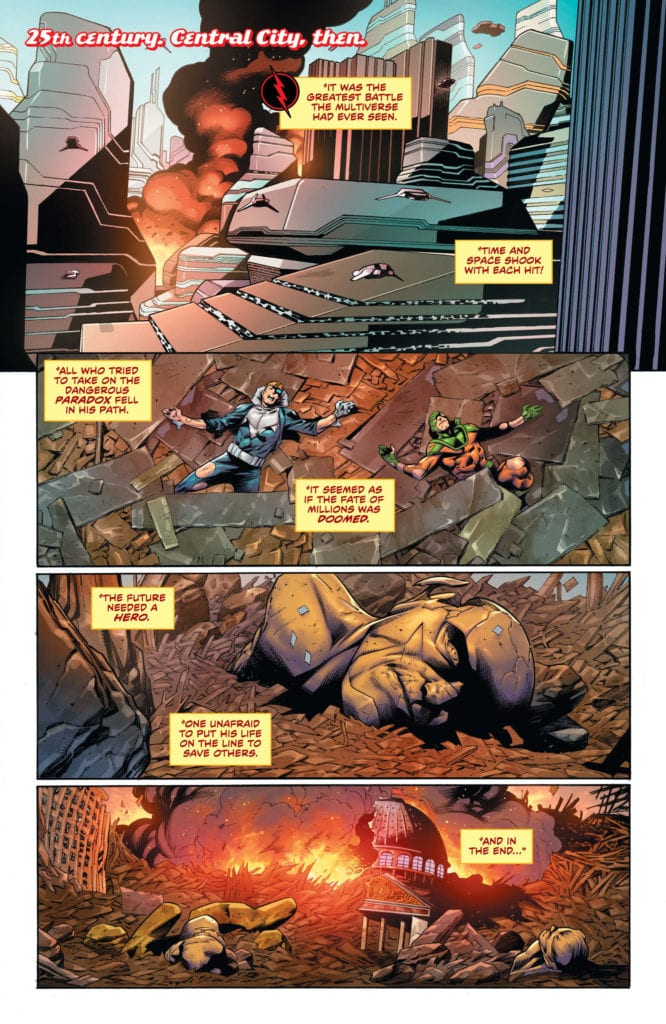
The Flash Age has been more destructive than ever expected. While Paradox has begun his journey through the timestream, Barry has done some trekking as well. He realizes the only person who had a chance of beating Paradox was the Reverse Flash. With that information, Barry runs to the future, hoping to find him. When Barry finds the future damaged, he realizes there is only one other place he can be: The past. He returns to his home the night of his mother’s murder and waits for Thawne. The evil speedster soon finds him and asks what has happened.
When he realizes how bad the damage is, Eobard proposes a team-up. Can they win, or will they kill each other first?
**Some Spoilers Below**
Story:
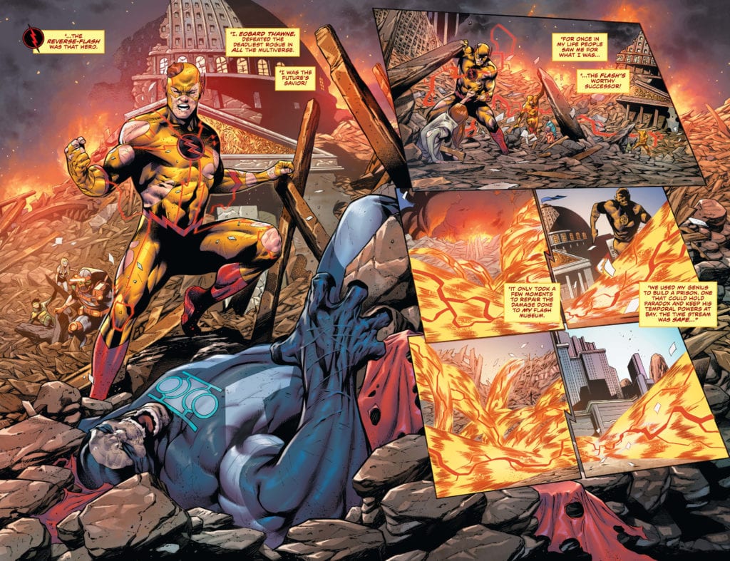
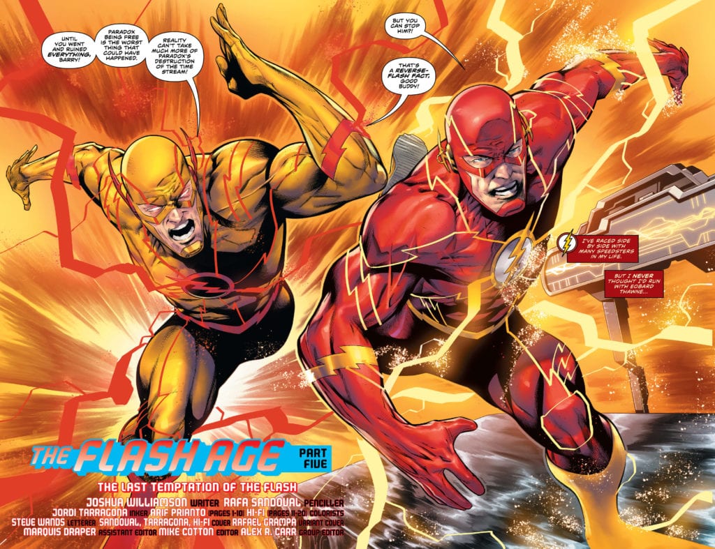
We open with Thawne explaining to Barry how difficult the battle against Paradox was. The villain arrived in the 25th century, and it took the united might of the Reverse Flash and the Renegades to defeat him. Thanks to Flash War, this is undone, and the two speedsters head back to the future for a weapon to fight him. Eobard reveals that his lightning rod, which could redirect the speed force into destructive energy, is perfect to face Paradox. Meanwhile, the time-manipulating villain continues to traverse the timeline. Each new place he comes to, he kills that version of the Flash.
While we don’t get as much action as I hoped from the last issue, we get something better: Tension. You can tell from the first page; Barry already hates every moment he spends with Thawne. The man who killed his mom belittling him for causing so much trouble would make anyone tense. It doesn’t stop there either. From the belittling to seeing the plan of Paradox unfold, this reviewer became more and more nervous as to what was coming. When readers see what exactly Thawne has in mind, they’re going to feel that tension too. The problem I have with this issue is the reveal of Paradox’s plan. The villain is able to successfully kill Flash at legendary moments from across history, but it changes very little. This is implied that it’s because his actions still have revered as a hero. Paradox’s new plan is to make an even bigger paradox so he can use it to wipe out everyone. How he goes about it, however, doesn’t make a lot of sense. Maybe it’ll be cleared up in the finale, but as it stands, it doesn’t work for me.
Art:
I’ve made it clear that Rafa Sandoval is one of the best artists for this series in the past. He’s able to design characters exceptionally well, along with their powers. The Flash and his villains have been prime examples of that. There is a two-page spread near the beginning that shows the speedsters, and it looks incredible. From their determined expressions to the lightning flying around them, it’s just a great image. The colorists also played a part in allowing scenes like this to come alive. This team gave this book their best, and It shows.
Conclusion:
Overall this is a decent penultimate issue of The Flash Age arc. Joshua Williamson knows how to build-up tension as we approach the finale. As we enter into it, the stakes have never been higher for both the world and the character’s soul. When it comes to art, the team continues to knock it out of the park. The Flash series probably has the best art teams at the moment, continually rotating out. We have one more issue to go, and I’m on the edge of my seat.
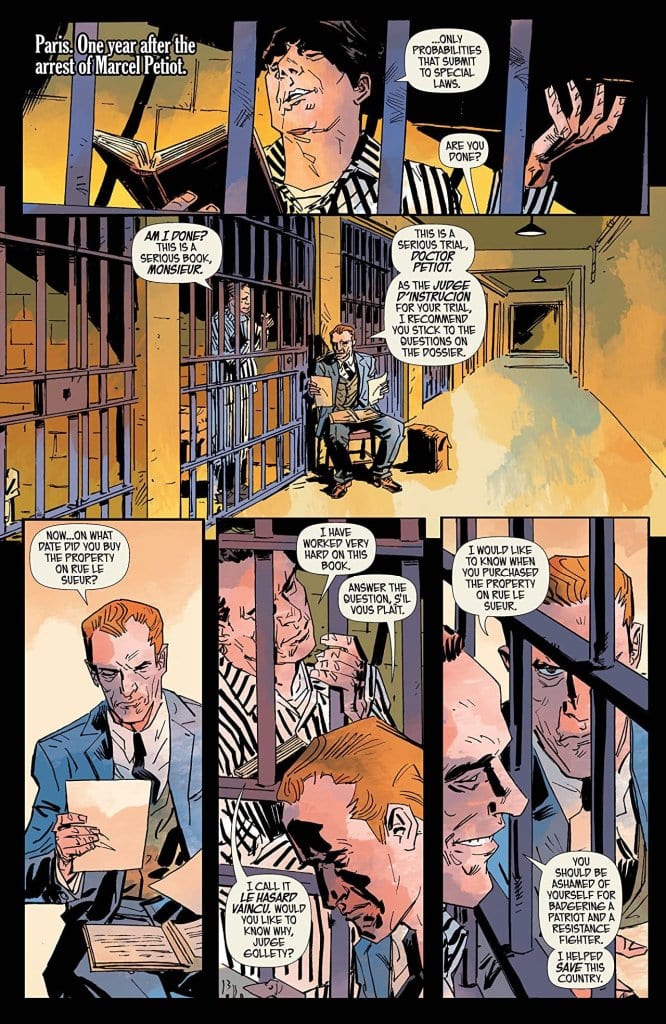
From writer Stephanie Phillips, artist Dean Kotz, colorist Jason Wordie, and letterer Troy Peteri comes the fifth and final issue of historical murder-thriller series “The Butcher of Paris.” This final chapter chronicling the final days of the serial killer Dr. Marcel Petiot is a frustratingly turbulent examination of due process that still brings about a satisfying end for all parties involved. With a stellar script and excellent visual work, “The Butcher of Paris #5” rounds out one of the most memorable series of its kind.
“Behind bars, Petiot proclaims himself a resistance fighter and patriot. As the trial begins, a new spectacle presents itself. With the magnitude of the murders coming to light, what possible justice can be served?”
Writing & Plot
Stephanie Phillips’ scripts in “The Butcher of Paris” have always played host to a delicate mix of historical political thriller, murder mystery, character drama, and horror. With this fifth and final chapter, she adds to that stable with a poignant treatise on the inner workings of the court as well as the gullible sensibilities of the bystander. Phillips goes out of her way to make Petiot as charming and clever as possible, to the point where out of context, one would deem him a likable chap. It is here that the frustrations in this issue are laid bare, as are the observations regarding the attraction to monsters. The court bystanders’ reaction to Petiot’s playful jabs is reminiscent of the modern attraction to more contemporary serial killers. Meta commentary aside, the climactic final showdown between Detective Massau and Dr. Petiot is a riveting and wholly satisfying affair that ends the only way it can – in dismemberment.
Art Direction
“The Butcher of Paris” has been gifted with the unique art of Dean Kotz. This final issue features some of his best work on the series yet, with detailed character facial models and atmospheric environmental art. His signature character designs are full of life in terms of emotional range, and offer a somewhat cinematic view of the story’s cast. The world of 1940’s Paris is drawn with a detail that draws the reader into the setting. Kotz is helped by the colorwork of Jason Wordie, whose choice of shading post-war Paris in rust-colored hues adds a tone specific to this comic that further envelops the reader into the bloody world the story explores. This aesthetic is finished by the jagged lettering of Troy Peteri, whose fonts add venom to the words spoken by the Butcher Petiot. The outstanding visual work is pitch-perfect for this kind of comic, and it’s an element worth picking up all on its own.
“The Butcher of Paris” #5 is a poignant finish to this unique and suspenseful mini-series. Stephanie Phillips’ script offers an intense final bout for both the hero detective and the titular killer, while also doling out some contemporary meta-commentary. Dean Kotz stylistic touch is full of detail, and with the help of Wordie’s colors and Peteri’s letters creates a series that is as visually striking as it is a thrill to read. Be sure to pick up this penultimate issue from your local comic shop on 5/27!
Written by Mike Mignola and Scott Allie, with art by Ben Stenbeck, colors by Brennan Wagner, and letters by Clem Robins, Dark Horse’s Frankenstein Undone #2 rushes to tell its story. The slow, quiet story from the first issue is brushed aside. What now follows quickly becomes confusing. Spoilers abound, so be sure you’ve read this issue from Dark Horse before reading this review.
Writing
Mignola and Allie are typically writers that take their time with their stories. The first issue in this series was proof of that. Very little happened, Frankenstein’s monster jumps from a ship and is “adopted” by a village. But it was all a compelling human drama about a character who was deeply worried he wasn’t human. Unfortunately, Mignola and Allie act out of character in this issue. The plot of the first issue is disposed of rather unceremoniously and with little sense of why.
Soon, Frankenstein’s monster finds himself back on a ship with a crew that seems almost unaware of the fact that he’s a monster. Their fear is minimal, at best. There is no mention of his scars or bolts. Frankenstein is immediately welcomed into the company of European gentlemen, though the book from which he sprung suggests things wouldn’t be that simple. In a sense, the entire premise of Shelley’s Frankenstein itself is abandoned. The monster is treated like a fellow human and has casual conversations. If this were the monster Shelley wrote about (as he was in the first issue) the novel would have had a far happier ending. In some ways, it feels like Mignola and Allie complete Frankenstein’s arc, but way too soon. He gets what he wants: acceptance and dignity. With too few obstacle, in too short a time. Which raises the question: what now?
Art
Stenbeck’s art, while stunning, does suffer in terms of clarity as well. In one scene, Frankenstein goes to sleep and wakes up to find the hut he now lives in long deserted, with the old man who lived there dead. He steps outside the old man’s hut to see there’s no village at all. It was all just a dream of some kind. But because we never see the old man and Frankenstein exit the hut, it’s unclear what we’re seeing. Essentially, we never saw the blank spot that used to be a village from that angle when it was a village. At first, it just seems like the old man’s hut is secluded and it snowed overnight. The actual extinction of the village is unclear. Of course, despite this, Stenbeck does a beautiful job. He manages to make Frankenstein look both terrifying and relatable at the same time.
Coloring
Wagner’s coloring does amazing things to clarify the events of the comic. He gives each “level of existence,” for lack of a better term, its own color palette. When Frankenstein is in the village, the hues are red and yellow. The color palette is warm. So when he wakes up to “reality,” the bleak greys and whites are as bitter as the sun in your eyes after a good dream. Wagner washes out the palette here so that everything seems to pale in comparison to what Frankenstein just dreamed. There is even a surreal purple twilight coloring given to the night Frankenstein goes to sleep in the village, and the morning he wakes to find it gone.
Lettering
Robins’ lettering is subtle but brilliant. He varies the size of lettering in characters’ lines slightly, so the change doesn’t take you out of the story. But you still get a sense of whether someone is yelling or whispering, without even having to think about it. Interestingly, Robins doesn’t include any sound effects in the village “dream state.” This accomplishes two contradictory things at once: it makes the village seem slightly wrong and unreal, while also feeling more real than anything else.
In the village scenes, there are plenty of moments when sound effects could be used. The lighting of a candle, even a fist fight. But not having them there makes the village seem too quiet, like something is up. Though, when sound effects are finally used, once Frankenstein is awake, they seem jarring. They remind us that we’re reading a comic. So, we find ourselves missing the village. It holds a deeper significance, it feels closer to real life than “real life.” At once, we’re made aware of the fact that the village is a dream, but feel that maybe the dream is more real than anything else.
This issue struggles. But it primarily struggles because this is an incredible creative team who’s first issue was fantastic. This issue, however, feels rushed and like a general abandonment of the tone and arc that the first issue promised. But, with three more issues to go, there is plenty of time for this team to steady the ship. Frankenstein Undone #2 is out from Dark Horse now.
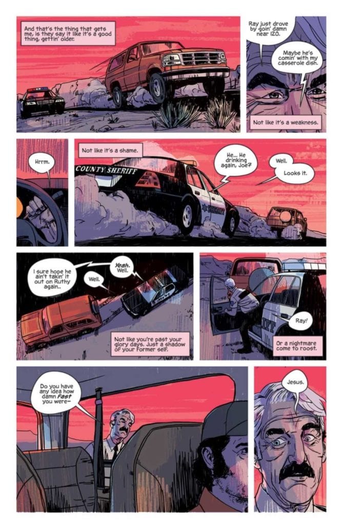
THAT TEXAS BLOOD #1, available from Image Comics on June 24th, is the latest neo-Western series from Chris Condon and Jacob Phillips. Sheriff Joe Bob Coates is feeling the weight of age and the end of his career in the sleepy Texas county of Ambrose. What starts as a day-in-the-life profile of a Texas sheriff ends in a violent gut punch. Ambrose County harbors ghosts of regret and bloody secrets, and it’s not done with Sheriff Joe Bob just yet.
Cover Art
True to the genre, Phillips’ cover work is reminiscent of every Sergio Leone spaghetti western poster from the 1960s. Sheriff Coates is painted in great detail while the background is fiery red paint strokes. This style keeps you focused where it matters, squarely on the main character in his Hell on Earth. Phillips’ cover is a gorgeous piece that foreshadows the series perfectly.
Writing
Condon sets up a profoundly oppressive – almost crushing – sense of dread on nearly every page for this story. Sheriff Coates goes about his daily routine as he tries to forget it’s his 70th birthday. The gruesome acts of violence he’s witnessed in his career haunt him, and he increasingly thinks about how there’s less life ahead than behind. In many ways, Sheriff Coates’ story is about wanting to forget the bad things in life and how life finds ways to bring the painful past back.
As you can imagine, not everyone or everything is as peaceful as they seem in Ambrose County. Condon creates a world that’s slowly simmering underneath with anger and violence that keeps building through the issue. The publisher’s description makes comparisons to No Country For Old Men (2007) in tension and tone, and that would be accurate.
Pencils/Inks
Phillips’ art excels where it counts most for this type of story: the faces. The interior is much less detailed than the cover, so every panel Phillips draws is focused on the facial expression of the characters. There’s not a lot of action here, and when the violence happens, it’s brief, albeit no less shocking. So the weight of each panel is carried by the characters’ emotions. Sheriff Coates’ eyes are expressive, especially the wrinkles around the eyes that betray the tiredness he’s trying to hide. Without realizing it, you intuitively understand that every line and every wrinkle and every bruise is deliberately placed to let you know what the characters are feeling.
Favorite Page/Panel: The last panel on page 23 stood out as the favorite because it’s the only real bit of humor in the whole issue. The Sheriff radios to his wife that he has her casserole dish (you have to be there to get it) and the juxtaposition between the Sheriff’s comment and the events of the scene is both surreal and brimming with black humor. You know, at that point, that you’re in for a wild ride.
Coloring
Consistent with the poster, colors are a red-hued spectrum that immerses the reader in the heat and oppression of this Texas setting. In another story, the colors would look flat and garish. Combined with the artwork here, the colors become feverish and tense, adding to the slow burn of the story.
Lettering
Since this is more a character piece than an action book, there’s a heavy emphasis on the dialog. Specifically, you have a county where folks who’ve known each other forever interact in short phrases and casual chit chat. The dialog needs to feel authentic and real, and the lettering completely works on that level with the artwork. The short, clipped phrases spoken by each character are executed just right to make the reader feel like they’re witnessing a conversation that can happen on any street corner or grocery store of some old town.
Conclusion
THAT TEXAS BLOOD #1, available from Image Comics on June 24th, is a slow burn that packs a punch at the end. The writing builds tension almost to the breaking point, and the artwork convinces you there are ten years of history behind every glance. THAT TEXAS BLOOD #1 is a must-read book for neo-Western fans.
Author’s Note: Local Comic Shops (LCS) are going through a tough time right now with the pandemic outbreak of COVID-19. Comics fans of every flavor that care about his or her LCS should try to do what they can. So, here’s my part:
If you’re in Northern Delaware, South East Pennsylvania, or Southern New Jersey area, please take a moment to visit Captain Blue Hen Comics in Newark, DE. Say ‘hi,’ pick up a book, order a book (they’re on Comichub.com), and let them know you support them.
If you’re nowhere near that area, please find YOUR LCS using Comic Shop Locator and lend your support.
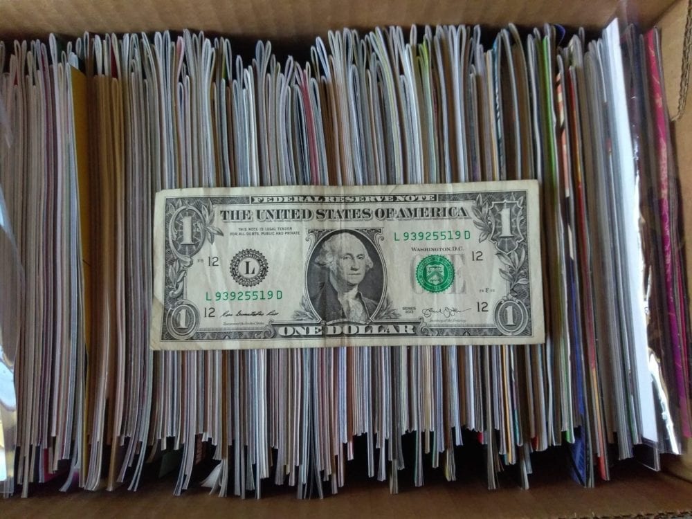
Welcome to ‘I’d Buy That For A Dollar’ a column where I will be exploring the weird and wonderful world of dollar bin diving. The only rule is each and every comic is purchased for one dollar (or less!).
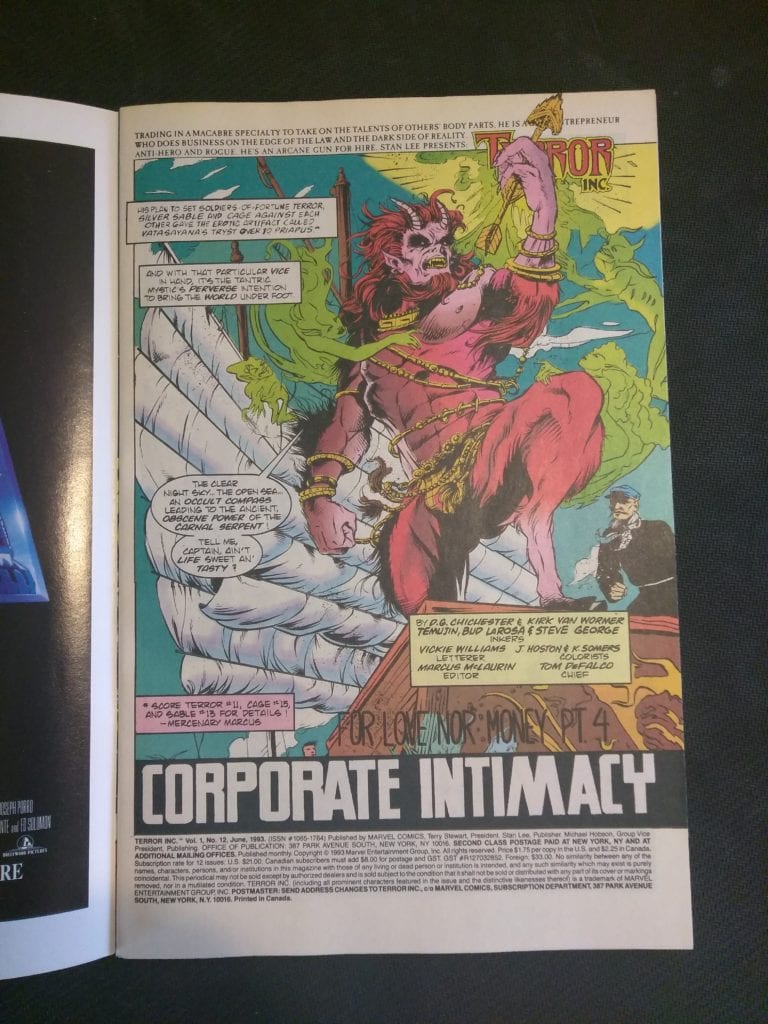
This week’s comic is Terror Inc. #12.
Terror Inc. #12 Written by: D.G. Chichester Pencils by: Kirk Van Wormer Inks by: Bud LaRosa, Jason Temujin Minor, Steve George Colors by: Kevin Sommers & James Hoston Letters by: Vickie Williams
Terror Inc. has to be one of Marvel’s weirdest 90s books (and that’s saying A LOT). I don’t ever remember reading it much as a kid, but it was definitely present on spinner racks. I probably had one issue at most. Terror Inc.’s origin is very complicated, but the main thing you gotta know is he can attach the limbs, body parts and organs of people and absorb powers and or memories, etc. It’s gruesome shit and borders on Cronenberg levels of body horror. It could almost be a mature readers title (a relaunch of it was actually put out under Marvel’s Max line not long ago).
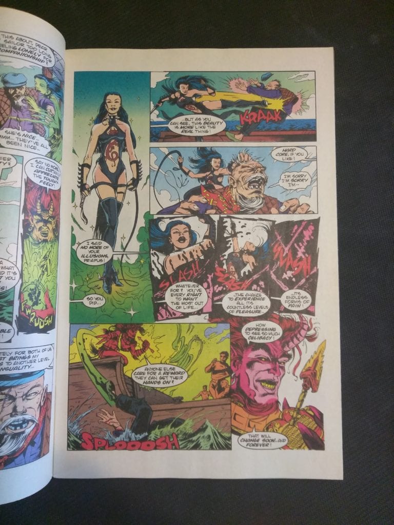
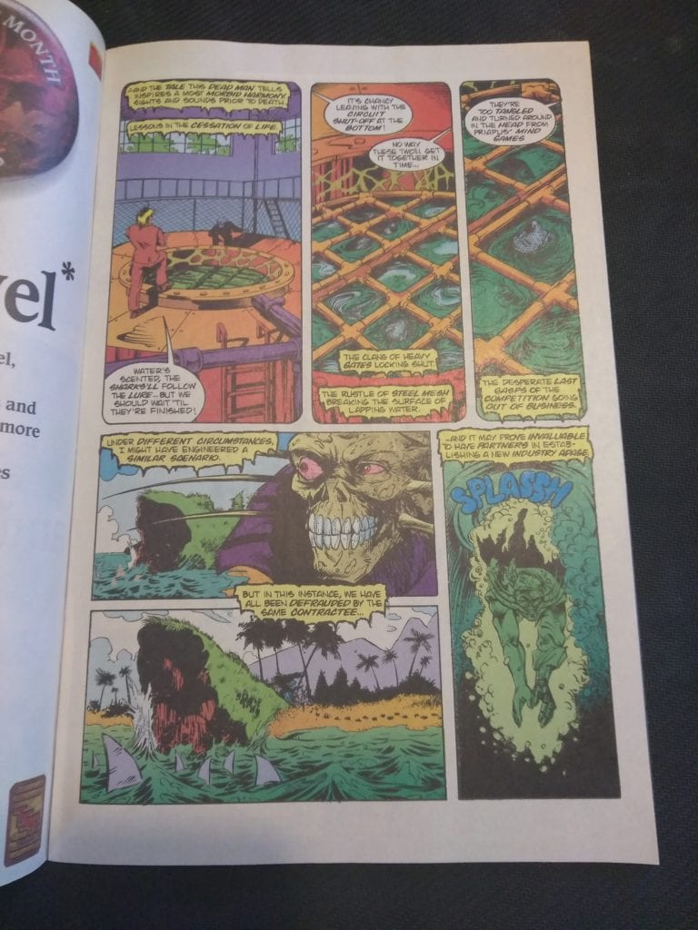
This issue has Terror teaming up with Siver Sable and Luke Cage to go against a demon called Priapus. It’s the fourth chapter of a six-part arc, so the plot is hard to grasp. Still, there are plenty of crazy images and the whole issue has S&M and sexual undertones that I don’t think any kid would have understood back then. The issue definitely makes me want to read more and I’ll grab any I see in dollar bins from now on. Anyway, let’s look at some pages!
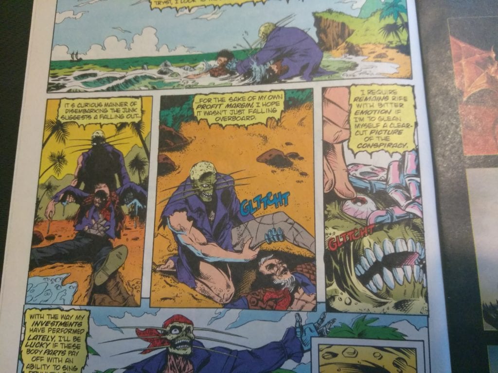
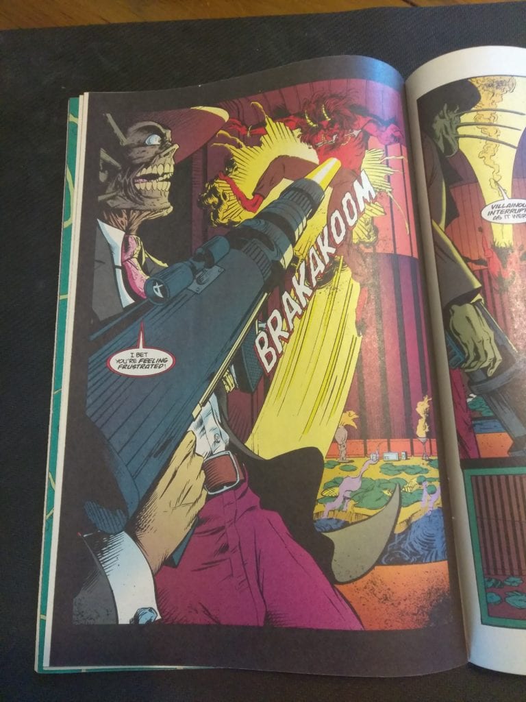
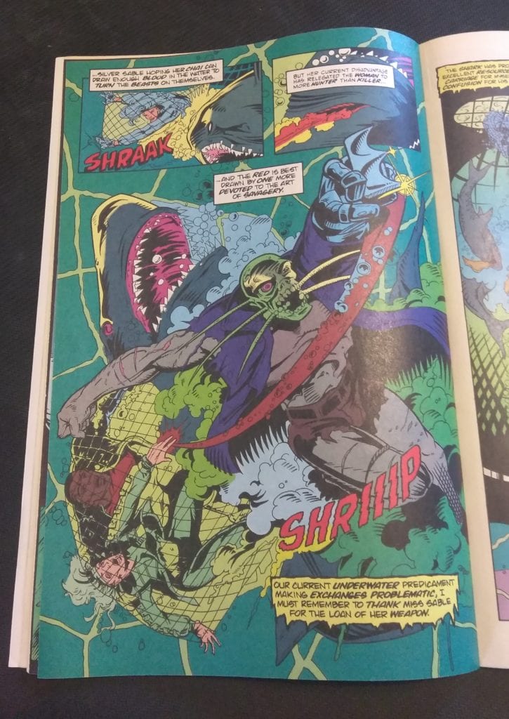
Check out the opening page. Right off the bat, there’s a mention of a ‘carnal serpent’. That’s also a crazy looking satyr.Here’s a scene where Terror attaches a leg and an eyeball to himself after dragging a corpse out of the water. That’s pretty gruesome for a newsstand Marvel comic.A big gun going off? Not phallic at all…This page is pretty awesome. The composition is great as are the colors. And there’s a fucking shark!
This whole scene is very S&M and bloody too.Another very cool looking page. There’s even some neat lettering work in this book.
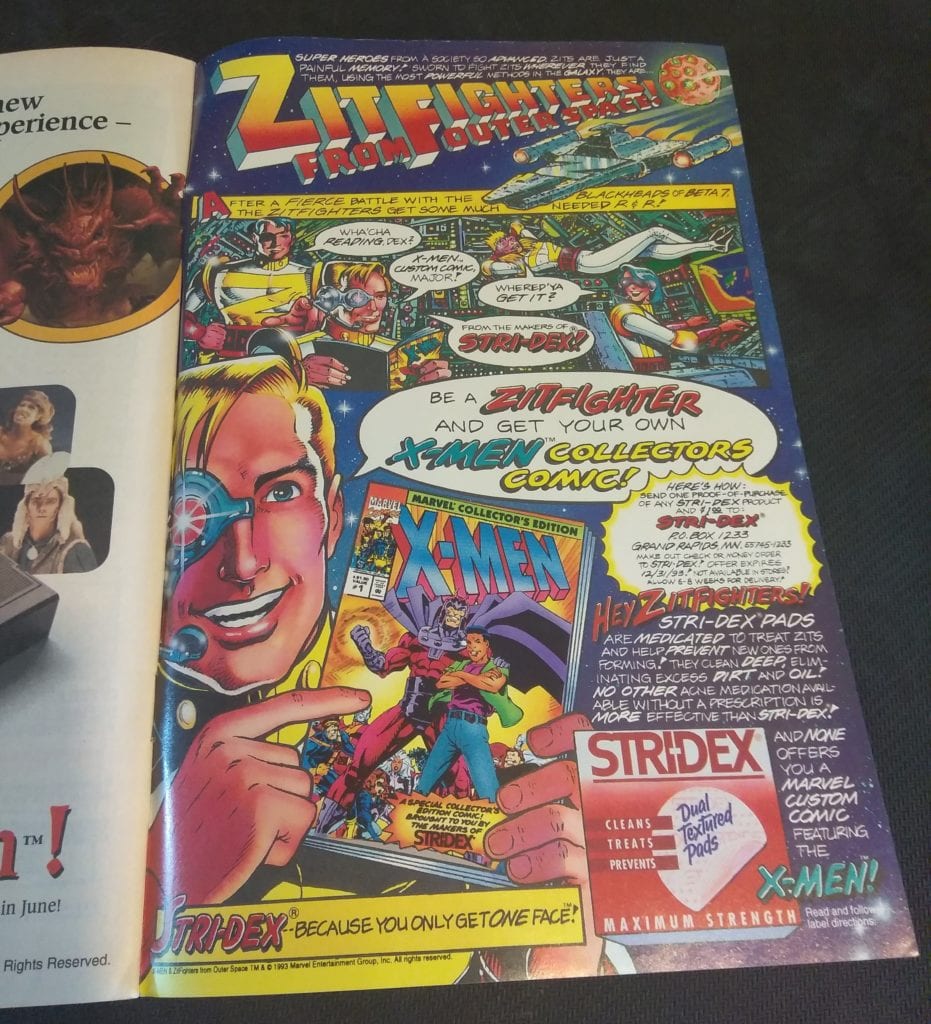
And I just had to end it with this following ad for acne medication. How perfect is it to sell acne meds with comics!
You can find great dollar bins at almost every local comic shop. So find a shop, ask a comic clerk what they can do for you during this time and get some dollar comics! Pick them up curbside and have them delivered if you must!
“Still Got It” was a unique episode of Killing Eve as it divides its story into individual perspectives.
After discharging himself from a psychiatric hospital, Niko has returned home to Poland. Because of this Eve has fallen into a depression but given hope when Niko sends a photo. Villanelle finally gets promoted to be a keeper by The Twelve but Konstantin asks for a favor. While Dasha gets told by The Twelve that she needs to rein Villanelle in.
Due to this episode being structured as individual point-of-view it end up having an overlapping timeline as various characters cross paths. “Still Got It” was the Killing Eve version of The Simpsons episode “Trilogy of Errors,” an experimental episode that told the same story from three different viewpoints. Another Simpsons comparison would be the episode “22 Short Films About Springfield” which told individual stories that occasionally intersected.
The approach used by the writer Elinor Cook and director Miranda Bowen makes “Still Got It” stand out as an episode. If the episode didn’t use this style of storyline then it would have been a standard episode, i.e., Villanelle does some killing, Eve and Konstantin do some investigating, and Carolyn makes some sort of backroom deals.
The strongest story in the episode was Eve’s. In the episode Eve had stopped caring about her appearance and hygiene and gets taunted by Villanelle who sends her a birthday cake. Eve has an emotional heart-to-heart with Danny as they reveal all the bad things they have in their lives. It hints that the pair may form a romance. Eve has been the ringer this season, she started in a low place and she has sunk even lower by this episode.
Gemma Whelan also has a moment to shine as Carolyn’s daughter, Geraldine. Whelan has a powerful monologue when she states she’s worried about her mother because Carolyn doesn’t talk about Kenny. Whelan was best known for playing Yaya Greyjoy in Game of Thrones, a badass warrior woman, so she gets to show her range by playing a more vulnerable character.
Jodie Comer continues to be great as Villanelle. She finally gets to interact with Konstantin like they used to. In this case, Villanelle acts like a child when in a cable car. There was also an important development because Villanelle wants to go to Russia and find her family, information that Konstantin has. Villanelle showed her sadistic side when she goes on her assassination mission in this episode. Villanelle plays with a grieving widow and showed herself as the psychopath she is by acting kind before killing the woman.
As well as the character drama “Still Got It” continues the plot point involving the missing $6 million. Even though the accountant in the previous episode was suspected to have taken the money, Carolyn believes that there was some else stealing from The Twelve.
“Still Got It” was a decent repacking of a standard Killing Eve plot and sets up something interesting for the next episode.
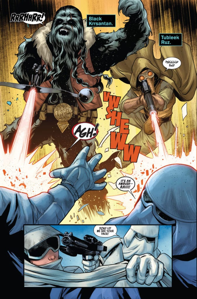
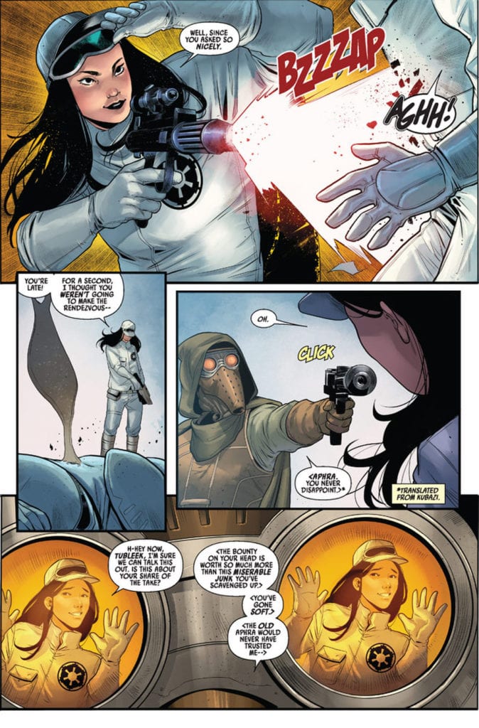
Doctor Aphra is spending some time with a couple of her crew mates.
Writer Alyssa Wong and artist Marika Cresta, along with Rachelle Rosenberg on colors and Joe Caramagna on letters revive another recent Star Wars comics character with “Doctor Aphra” #1. This series presents itself as an Indiana Jones-style treasure hunting romp, and while this seems a great idea, it unfortunately doesn’t do enough to sell the new premise or its cast to any fans of the franchise.
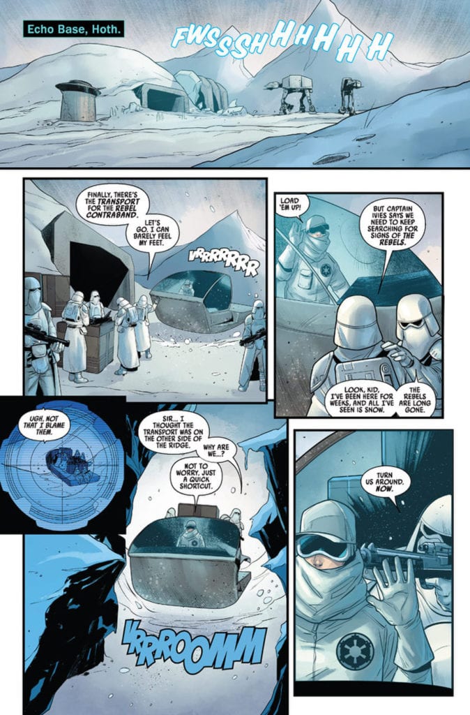
“New Crew, New Mission! With the Rebel Alliance back on the run after their defeat at the Battle of Hoth, it has never been a more dangerous time for outlaws, scoundrels and the errant rogue archaeologist to make their way in the galaxy. But after a string of bad luck and near escapes, Doctor Aphra is back on the job! She’s been keeping a low profile – jobs are scarce and credits scarcer. But the promise of the score of a lifetime is a chance too good for her to pass up. And to find the cursed Rings of Vaale, Aphra will need a crew of treasure hunters the likes of which the galaxy has never seen before! But Ronen Tagge, heir to the powerful Tagge family, also has his eyes on the prize. Do Aphra and her team stand a chance at fortune and glory?”
Writing & Plot
“Doctor Aphra” #1 is a bit of a mixed bag in terms of its plotting and characterization. One element that sticks out as being a unique addition to the Star Wars universe is the notion of intergalactic treasure hunting. The scouting of ruins and discovery of ancient treasures on distant planets, all while dodging dastardly rich Imperials is a fantastic concept for this universe. Turning Aphra from a thief to a lightspeed-jumping Indiana Jones is a brilliant idea, and I hope we get to see more in that respect in future issues. Unfortunately, while there is some adventurous fun to be had in this issue, it never really gets off the ground in terms of the grand Star Wars adventure one might be expecting. Or, for that matter, the characterization of the new cast. The former is offset by some a couple of setpiece action moments, but this chapter feels like more of an introduction than anything else. The new cast members are presented with their motives and stakes in Aphra’s venture for cash, it’s just a shame they don’t seem terribly interesting thus far. Many of the problems here could just be first issue woes, so hopefully more pieces come together in future chapters.
Art Direction
Marika Cresta provides a vibrant view of different Star Wars locales in “Doctor Aphra” #1. From the barren tundra of Hoth to an alien nightclub and then to an ancient forgotten tomb, Cresta nails the environments of the Star Wars universe. Her character drawings offer a solid amount of variety in terms of striking personal features and cast of aliens both recognizable and obscure. However, there’s an element of sameness across the board with the human characters in terms of facial detail. This is a bit of a minor trifle in an otherwise great looking comic, but it is noticeable after a point. Some of this effect is taken away by the colors of Rachelle Rosenberg, who brings the Star Wars universe to life with a massive array of varied colors. The aesthetic here blends in perfectly with the aesthetic across the board of Star Wars comics, including the main series and Greg Pak’s ongoing Darth Vader comic. This is great as both a reminder that these are part of a shared comic universe, and in that this is still a sharp-looking issue all on its own.
“Star Wars: Doctor Aphra” #1 is a good-looking Star Wars comic that’s unfortunately not a very engaging read. It has great ideas and the potential for an Indiana Jones-like intergalactic treasure hunt with a cast of memorable characters, but at the moment potential is all it looks like. The visuals from Marika Cresta and Rachelle Rosenberg are visually up to par with some of the best Star Wars comics have to offer, even if there’s a bit of a lack of variance among character facial models. If you’re a diehard fan of Doctor Aphra’s story so far in Marvel’s comics in a galaxy far far away, then pick up this debut issue when it hits stands on 5/27!
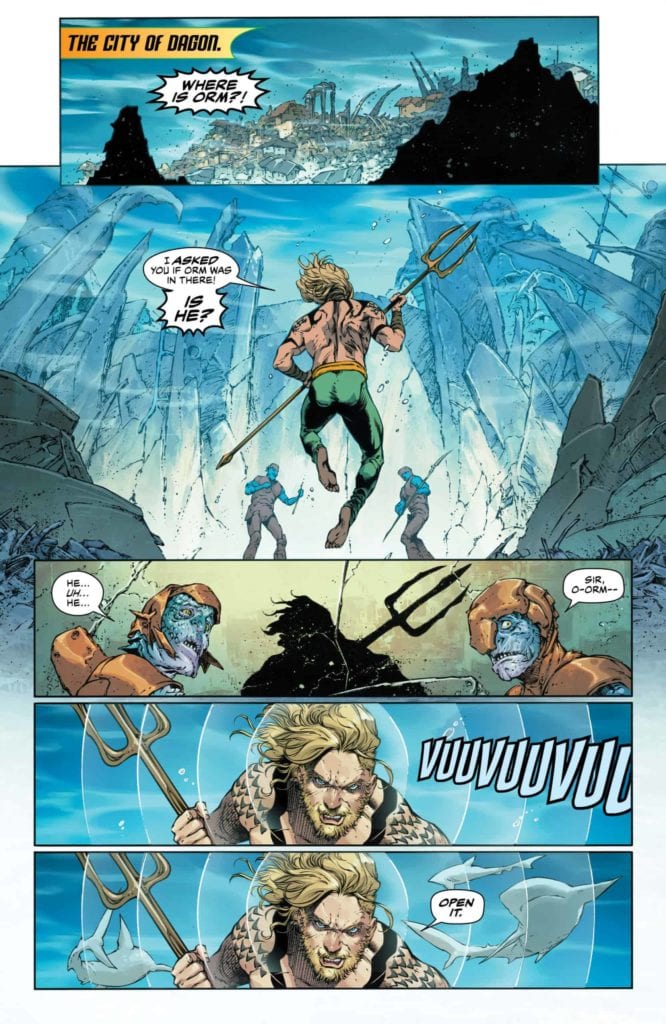
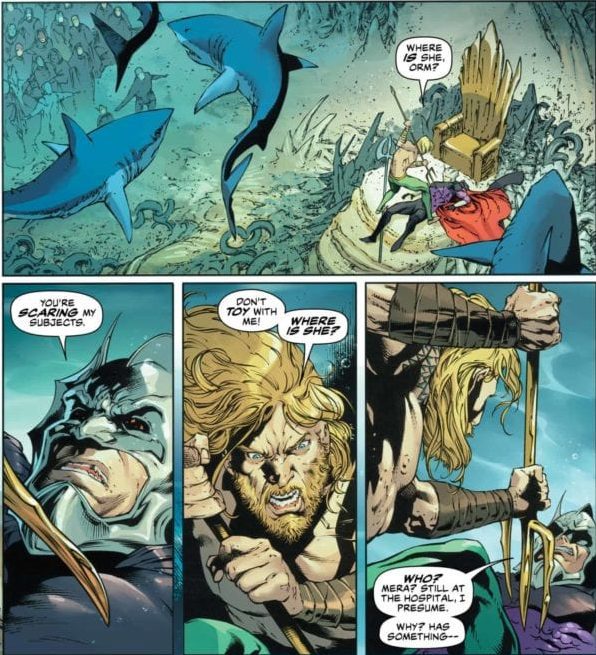
After a brief hiatus, AQUAMAN is ready to turn the tide with another action-packed story. Hitting comic book stores on Wednesday, May 27th, issue #59 features a clash between kingdoms, gods, and monsters unlike ever before. The sleeping Mera, unaware of her and Arthur’s child Andy’s disappearance, lies helpless, leaving Arthur to search for answers alone.
Story
Like a mighty underwater current, Arthur storms the throne of his (supposed) villainous brother Orm once dispatched to find Andy. The king of Atlantis knows how much trouble his sibling has caused in the past and deems him the most likely culprit.
Soon Orm’s guards attempt to subdue Arthur, but it is the ruler of Dagon himself who calls for mercy. In this way, writer Kelly Sue DeConnick gives us a lesson in preconceived notions—we should be open to change, even in our greatest foes.
Just as Arthur hits this dead end, readers are brought to the home of the Old Gods. It seems Caille is the only one in the group taking the disappearance of Andy seriously, going so far as to claim the gods are impotent. In a sense, she demands something that’s so often shared by many when faced with the problem of theodicy: “You’re gods. Do god things.” In this instance, we feel her rage at supposedly supernatural beings taking a backseat when they seemingly solve the problem.
Alas, Caille gives up on her divine friends and seeks out Jackson Hyde for help. But the only source he finds may be the biggest gamble of the series so far.
Artwork
The illustrations of underwater life leap off the page in this issue. Creating engaging scenes in such a setting is often difficult for artists, but this group was clearly up for the task. Robson Rocha’s penciling and Daniel Henriques’s ink work craft beautiful buildings that litter the Atlantis cityscape, which are full of deep oceanic hues thanks to Romulo Fajardo Jr.’s coloring. And Clayton Cowles’s lettering fits in perfectly; the fluid fonts seem to flow alongside the water itself.
Conclusion
AQUAMAN #59 provides readers with a thrilling clash between brothers, employing the forces of nature in the process. We hold our collective breaths as our heroes attempt to control the harsh realities of life.
Do you think Arthur could have beaten Orm in a true one-on-one fight? Let us know in the comments below!