

Written by Mike Mignola and Scott Allie, with art by Ben Stenbeck, colors by Brennan Wagner, and letters by Clem Robins, Dark Horse’s Frankenstein Undone #2 rushes to tell its story. The slow, quiet story from the first issue is brushed aside. What now follows quickly becomes confusing. Spoilers abound, so be sure you’ve read this issue from Dark Horse before reading this review.
Writing
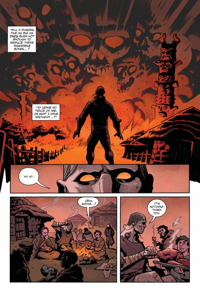
Mignola and Allie are typically writers that take their time with their stories. The first issue in this series was proof of that. Very little happened, Frankenstein’s monster jumps from a ship and is “adopted” by a village. But it was all a compelling human drama about a character who was deeply worried he wasn’t human. Unfortunately, Mignola and Allie act out of character in this issue. The plot of the first issue is disposed of rather unceremoniously and with little sense of why.
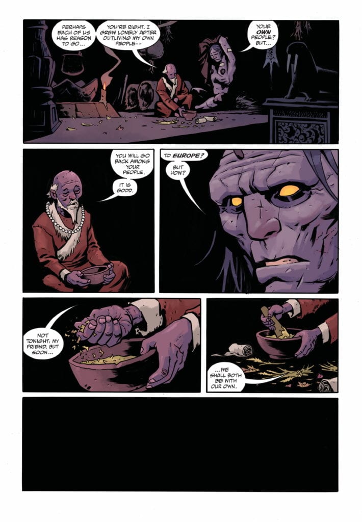
Soon, Frankenstein’s monster finds himself back on a ship with a crew that seems almost unaware of the fact that he’s a monster. Their fear is minimal, at best. There is no mention of his scars or bolts. Frankenstein is immediately welcomed into the company of European gentlemen, though the book from which he sprung suggests things wouldn’t be that simple. In a sense, the entire premise of Shelley’s Frankenstein itself is abandoned. The monster is treated like a fellow human and has casual conversations. If this were the monster Shelley wrote about (as he was in the first issue) the novel would have had a far happier ending. In some ways, it feels like Mignola and Allie complete Frankenstein’s arc, but way too soon. He gets what he wants: acceptance and dignity. With too few obstacle, in too short a time. Which raises the question: what now?
Art
Stenbeck’s art, while stunning, does suffer in terms of clarity as well. In one scene, Frankenstein goes to sleep and wakes up to find the hut he now lives in long deserted, with the old man who lived there dead. He steps outside the old man’s hut to see there’s no village at all. It was all just a dream of some kind. But because we never see the old man and Frankenstein exit the hut, it’s unclear what we’re seeing. Essentially, we never saw the blank spot that used to be a village from that angle when it was a village. At first, it just seems like the old man’s hut is secluded and it snowed overnight. The actual extinction of the village is unclear. Of course, despite this, Stenbeck does a beautiful job. He manages to make Frankenstein look both terrifying and relatable at the same time.
Coloring
Wagner’s coloring does amazing things to clarify the events of the comic. He gives each “level of existence,” for lack of a better term, its own color palette. When Frankenstein is in the village, the hues are red and yellow. The color palette is warm. So when he wakes up to “reality,” the bleak greys and whites are as bitter as the sun in your eyes after a good dream. Wagner washes out the palette here so that everything seems to pale in comparison to what Frankenstein just dreamed. There is even a surreal purple twilight coloring given to the night Frankenstein goes to sleep in the village, and the morning he wakes to find it gone.
Lettering
Robins’ lettering is subtle but brilliant. He varies the size of lettering in characters’ lines slightly, so the change doesn’t take you out of the story. But you still get a sense of whether someone is yelling or whispering, without even having to think about it. Interestingly, Robins doesn’t include any sound effects in the village “dream state.” This accomplishes two contradictory things at once: it makes the village seem slightly wrong and unreal, while also feeling more real than anything else.
In the village scenes, there are plenty of moments when sound effects could be used. The lighting of a candle, even a fist fight. But not having them there makes the village seem too quiet, like something is up. Though, when sound effects are finally used, once Frankenstein is awake, they seem jarring. They remind us that we’re reading a comic. So, we find ourselves missing the village. It holds a deeper significance, it feels closer to real life than “real life.” At once, we’re made aware of the fact that the village is a dream, but feel that maybe the dream is more real than anything else.
This issue struggles. But it primarily struggles because this is an incredible creative team who’s first issue was fantastic. This issue, however, feels rushed and like a general abandonment of the tone and arc that the first issue promised. But, with three more issues to go, there is plenty of time for this team to steady the ship. Frankenstein Undone #2 is out from Dark Horse now.