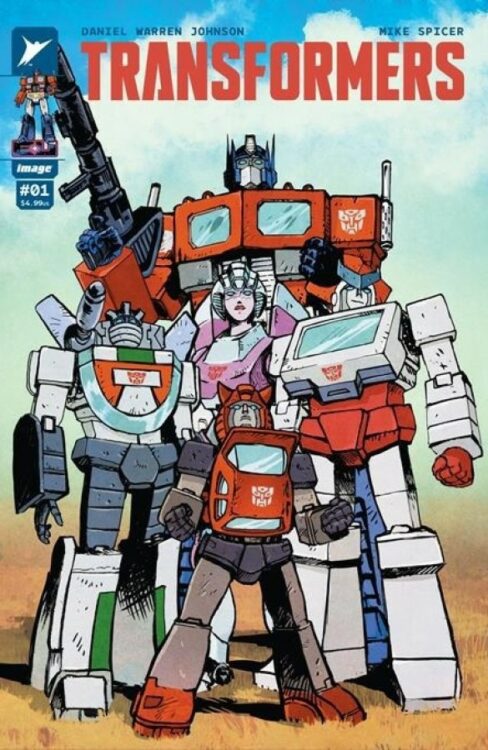
From current comics superstar Daniel Warren Johnson (Murder Falcon; Beta Ray Bill) comes a high-octane reset for some of modern fiction’s most beloved characters with Transformers #1. Featuring colors by longtime collaborator Mike Spicer, this opening issue is packed with intense action and compelling character storytelling that brings humans and bots together in impactful fashion. With an emotionally engaging script and unsurprisingly stellar art, this is a must-read #1 for longtime fans and newcomers.
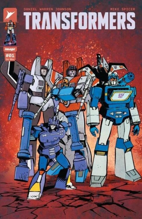
“Optimus Prime was supposed to have led the Autobots to victory. Instead, the fate of Cybertron is unknown, and his allies have crash-landed far from home, alongside their enemies—the Decepticons.
As these titanic forces renew their war on Earth, one thing is immediately clear: the planet will never be the same. New alliances are struck. Battle lines are redrawn. And humanity’s only hope of survival is Optimus Prime.”
Writing & Plot
Daniel Warren Johnson sets up his story for Transformers #1 by focusing on the emotional core of his cast. At the start of the comic, we are introduced to Spike, a teenage boy with aspirations of being an astronaut struggling to deal with the loss of his brother – also an astronaut, but was killed during a takeoff gone wrong. To make matters worse, Spike’s father has no idea how to handle the loss of his eldest son, leaving Spike to handle things on his own. When Spike and his friend Carly go into the mountains for some stargazing, they stumble upon a crashed ship – a ship carrying both Autobots and Decepticons. From here, the action and dynamic between Spike and the bots takes off. As per usual, Johnson’s character writing is compelling and heartfelt. He immediately gets us into the lives and heads of his human cast, making for some of the most interesting people ever introduced in a Transformers story. Johnson then extends that humanity to the Autobots. Spike can see the struggle that Optimus and the others are working through, having awoken after a long war on CyberTron only to be surrounded by foes once again. The dynamic between Spike and the Autobots going forward is no doubt going to be a wonder to watch. Of course, none of this would feel like a Transformers comic if the bots themselves didn’t feel right. Fortunately, Johnson writes this cast of classic characters with the familiarity of a longtime fan. With a compelling, character driven plot and great treatment of an iconic cast, Johnson’s script for this opening issue makes for a blast of a read.
Art Direction
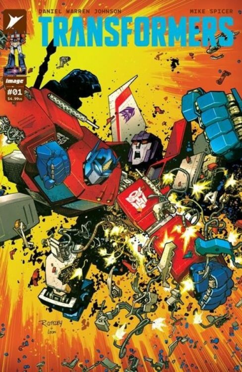
If you’ve ever read a Daniel Warren Johnson book, it shouldn’t come as a surprise that Transformers #1 is an excellent looking and energetic comic book. The Do A Powerbomb! creator applies his signature style to the mechanoid forms of the Autobots and Decepticons with awesome results. All of the classic Transformers, from Optimus to Starscream, look as great as they ever have and are drawn with the same attention to facial animation as any of his human characters. Johnson’s environmental detail combined with his sequential direction make the world and lives of Spike and his family feel fleshed out, selling the notion that the Autobots and Decepticons have stumbled into the complex lives of our human cast. When the action hits, it delivers a mean right hook with massive impacts and explosive force. Much of that effect is due to Johnson’s own lettering ability, specifically with how he does SFX. Mike Spicer’s colors finish off the visual experience with the same sort of vivid yet subdued work that he has done on all of Johnson’s other comics. The color still pops, but it sort of sits behind the action, letting the kinetic energy of Johnson’s pencils take the lead in guiding the reader. What is in this comic isn’t among Johnson’s best work, but it’s still astonishingly good and will doubtless make readers beg for the next issue.
Verdict
Transformers #1 is a compelling and thrilling start to this brand-new era for an iconic franchise. Daniel Warren Johnson continues his streak of kick-ass yet emotionally stirring stories with a familiar plot that focuses on the struggles of both the human and bot characters and how they come together – when stuff isn’t being blown up. His artwork packs as much power as ever, with his faithful recreations of iconic Transformers colliding with the unbeatable kinetic power of his pencils and ability to imbue sequences with emotional weight. Be sure to grab this new beginning from your local comic shop today!
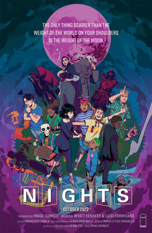
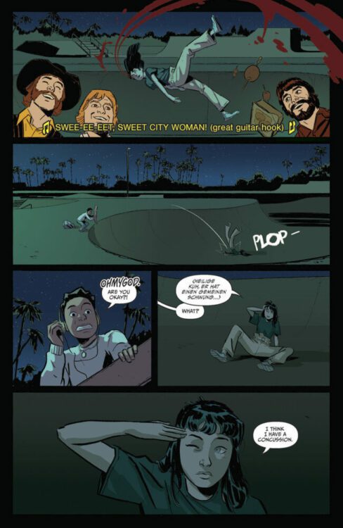
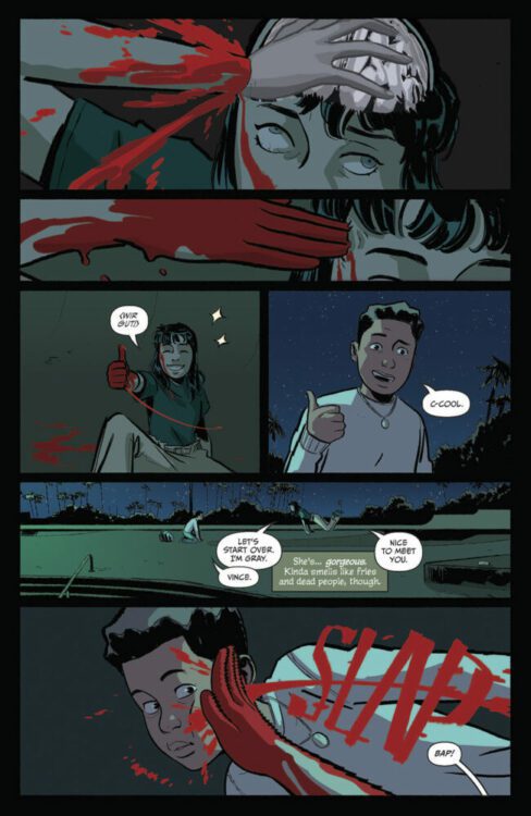
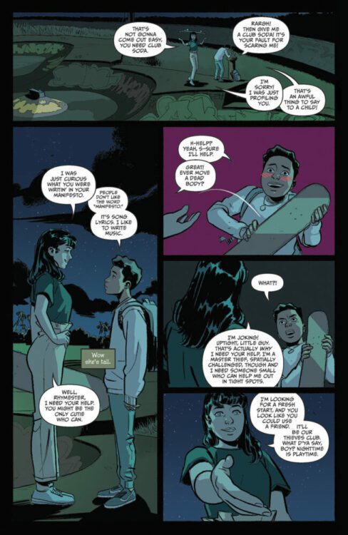
NIGHTS #1 hits your local comic book shop on October 11 from Image Comics. This new ongoing series is written by Wyatt Kennedy, with art by Luigi Formisano, Francesco Segala drops the colors, and you will read Maria Letizia Mirabella’s letter work. Check out my review and a five-page preview below.
https://youtu.be/DU8Glzzshoo
About the series: It’s 2003, Supernatural creatures casually exist amongst humans, and America is made up of 31 states. Vince Okonma has lost his parents, moved in with his secret mercenary cousin, his video game-making roommate, and befriends “the greatest vampire who’s ever lived.” And that’s just the first 20 pages. Welcome to Florida, youth is wasted on the young…
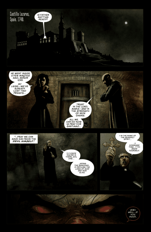
THE DEVIL THAT WEARS MY FACE #1 hits your local comic book shop on October 4th from Mad Cave Studios. The book is written by David Pepose, with art by Alex Cormack, and you will read Justin Birch’s letter work.
The entire creative team was in sync on this issue, which made for an exciting entry way into the of THE DEVIL THAT WEARS MY FACE. Check out my full review and a three page preview below.
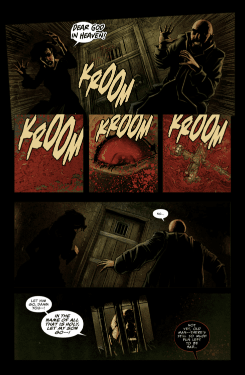
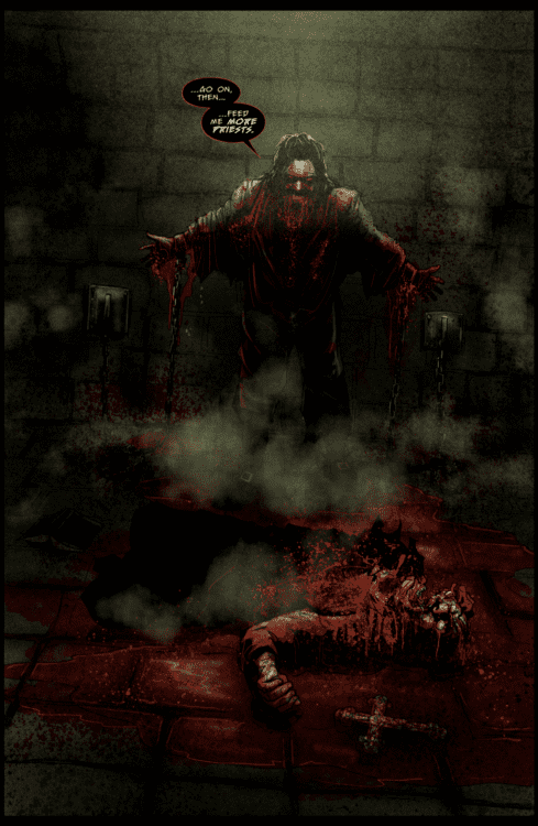
About the series: The year is 1740, and the Vatican is in turmoil. Grappling with a profound crisis of faith, outcast exorcist Father Franco Vieri is dispatched on a mission of grave importance — to rescue a Spanish nobleman from the clutches of the sadistic demon known as Legion. But when the exorcism goes tragically wrong, Vieri finds himself trapped in a stranger’s body… and learns what horrors lie ahead when the Devil wears his face. Equal parts Face/Off and The Exorcist, Ringo Award-winning writer David Pepose (Moon Knight: City of the Dead, Savage Avengers) and Bram Stoker Award-nominated artist Alex Cormack (Sea of Sorrows, The Crimson Cage) conjure a harrowing tale of terror, action, and body-swap intrigue that will leave comic readers at the edge of their seats.
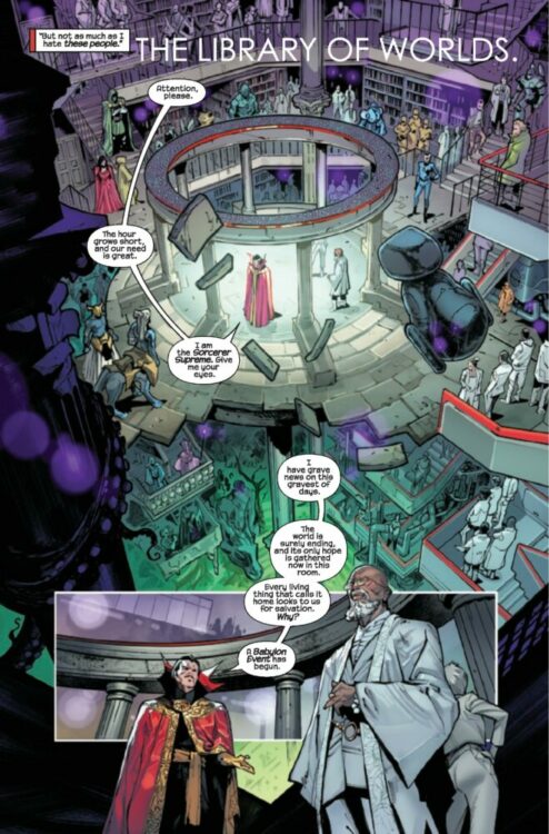
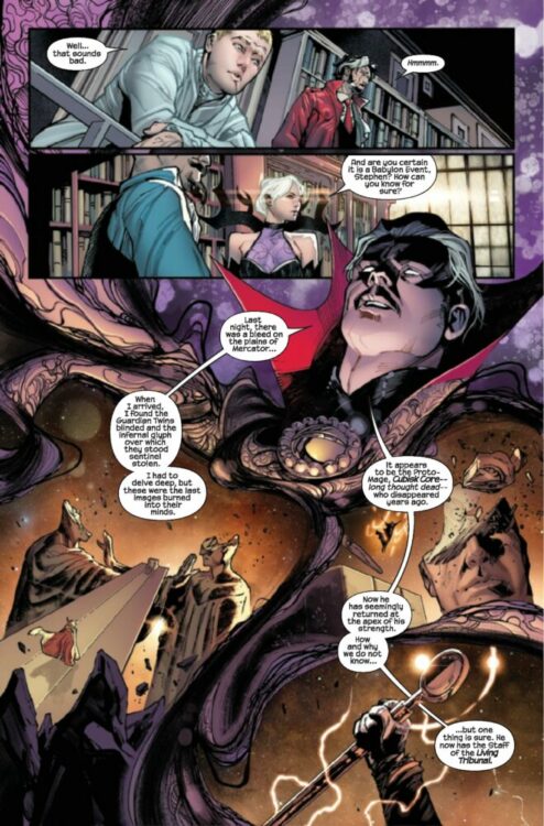
G.O.D.S. #1 hits your local comic book shop this week from Marvel Comics. This is an epic over-sized first issue from writer Jonathan Hickman, artist Valerio Schiti, colorist Marte Gracia, and letterer Travis Lanham. Hickman and the creative team surprised me with this issue and I’m excited to see where the series goes, check out my full review and five-page preview below.
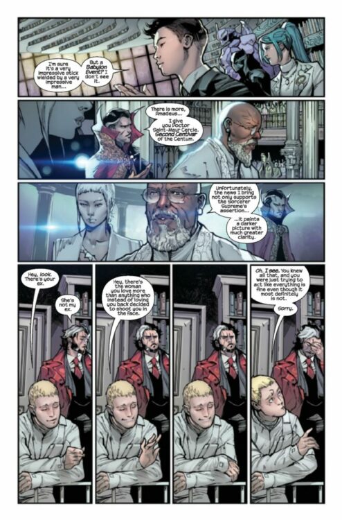
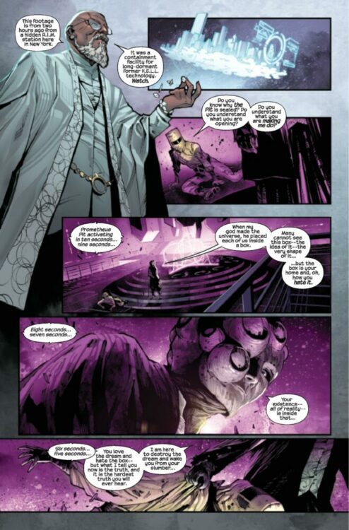
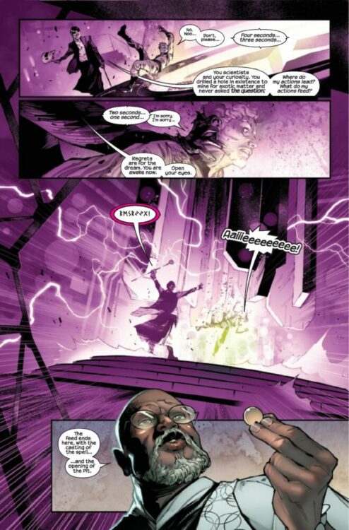
About the series: JONATHAN HICKMAN RE-INVENTS THE COSMOLOGY OF THE MARVEL UNIVERSE! WHAT HAPPENS WHEN THE-POWERS-THAT-BE MEET THE-NATURAL-ORDER-OF-THINGS? The infinite détente between THE-NATURAL-ORDER-OF-THINGS and THE-POWERS-THAT-BE nears an end. Old acquaintances are reunited during a Babylon Event. The Lion of Wolves throws the worst parties. Don’t look under the table. There’s a John Wilkes Booth penny on the ground. This ENORMOUS EXTRA-SIZED first issue features DOCTOR STRANGE, who, while not boring at all, is easily the most boring person in the book.
The premise is simple: read one comic every day for the entire year. It seems like a simple task but there is no way that I read 365 comics last year, even if you count the individual issues in collections. So, this year, I am committing myself to this reading challenge, in the hope that I can broaden my reading habits and fully engage with my favorite hobby again.
If you are still reading the opening paragraph to this ongoing series of articles, then you will know not only the general aim of this project but also the purpose behind it: to rediscover my love of comics. During the early days of Covid times, I found it hard to enjoy comics, as a medium. My interest had been waning for a while and then, suddenly, I lost access to new comics. Even when the trickle of publications began to seep back into the UK, I had removed myself enough to no longer feel the excitement of new comic book day.
For a couple of years, I only went to my local comic shop every other month, picking up what was in my standing order and almost ignoring everything else on the shelf. Then two things happened: Firstly, I completed a Master’s Degree in Comic Studies, where I found a new interest in the historical and cultural impact that comics have had on society. Secondly, I changed jobs, meaning that I no longer worked near my local comic book shop. As a result of the latter, I canceled my standing order. For the first time in 15 years, I didn’t buy comics on a regular basis. And (don’t tell my editors) it is probably the first time in much longer that I don’t look at solicitations and know well in advance what is due to come out in the coming months.
This project was supposed to change that. And in the last few weeks, I’ve come to realize it hasn’t.
“Oh, yeah!” I hear you cry, “We’re missing a bunch of weeks. Where are the comics, Darryll? What have you been reading?”
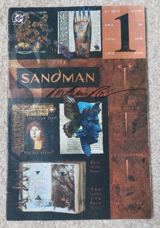
The Sandman #41 Credit: DC Vertigo
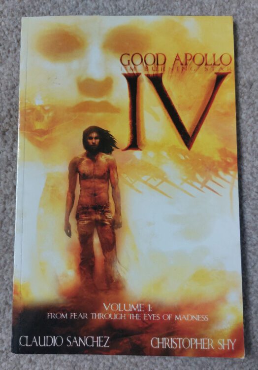
I am still reading and I’ll let you know what I’ve read at the end. My writing, however, stalled. Summer is a busy time — I have two children — so it’s difficult to pick up my laptop once a week, never mind every day. Excuses, excuses! And not the real reason my writing dried up. I started with Week 34, delving into a couple of X-Files comics, leading into an issue of The Sandman (above), with the intention of moving, via This Damned Band and Good Apollo: I’m Burning Star IV, on to Tori Amos’ Comic Book Tattoo (which deserves a proper review). I read all of these but only got as far as writing about The X-Files and The Sandman.
As the week dragged on, and my words dried up, I looked for other comics to read. Each and every one I picked was from my collection. Not a single new title. Even ones that I liked the look of passed me by because, and this is the crux of it, I can’t afford to buy comics any more. Everything in England, where I live, is increasing in cost month on month. I get paid more now than I ever have but I have less disposable income. I was better off when I was a student in the 1990s, where some weeks it was a choice between eating or going to the pub. I was an Art student; the pub always won.
The intense scrutiny I have been giving to my reading habits has had the opposite effect than I had expected. Instead of increasing my excitement for the comics I was reading, and looking forward to reading, I became disillusioned. A lot of the new comics I have read were not entertaining me at all. The likes of the new Planet of the Apes, a franchise that I love, was a disappointment, a wasted opportunity, and ultimately a waste of money I don’t really have.
I need to write something about the comics I’m reading. I need to shout about what I love, and don’t love, about each issue. However, a lot of the time I am reading comics that aren’t easy to get hold of. If I was to say a particular comic was a must-read, the chances are you wouldn’t be able to get a copy. My excitement is pointless unless you want to come round to my house and dig through my collection.
Where do I go from here? How do I make this ongoing article worth reading? It has, for the most part, become historical in nature, often a nostalgic look at my personal journey through comics. Maybe, instead of writing about the comics themselves, I should be focusing on an aspect of them, an element of the storytelling or production, that has something to say about the medium. I think I have touched on this before, especially when it comes to adaptations, a personal favorite area of study.
What I am saying is, I have faltered but I will get back on track. I haven’t stopped reading, but I need to find the reason why certain comics bring me pleasure and verbalize that. Otherwise, you’ll all stop reading, right?
So, to bring the list up to date, here are the comics I have read over the last few weeks with thoughts about a few of them:
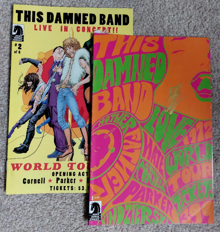
This Damned Band #1-2 Credit: Dark Horse Publications
Week 34:
The X-Files #13 – 14 (UK edition)
The story by Stefan Petrucha and Charles Adlard is a classic ghost tale with some biblical elements thrown in for good measure. There are elements within the two parter that are creepy and unnerving and some lovely nods to the television series, such as the series one story Beyond the Sea, which features a ghostly presence in the form of Scully’s father. In fact, Hallow Eve (the story in these two issues) is a better story for Scully than it is for Mulder. It draws on the strengths of the character and, for the first time in the comic series, there is some real attempt to reconcile what she witnesses with scientific fact. If you wanted to know about Dana Scully, this is a great place to start, featuring as it does many facets of her character
The Sandman #41
I picked this story because of a Tori Amos lyric link to the X-Files comics above. This musical link dictated the rest of this week’s, and next week’s, reading.
This Damned Band #1-6 and Good Apollo and I’m Burning Star IV (a graphic novel, but it is a quick, and visually beautiful, read)
Good Apollo, I’m Burning Star IV Credit: Evil Ink Comics
Week 35:
Tori Amos’ Comic Book Tattoo.
This is a large book with many stories by many of the industry’s greats. It’s a week’s worth of reading, easily. And a must read in my opinion, if you can get hold of a copy.
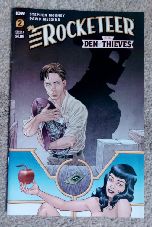
The Rocketeer in the Den of Thieves #2 Credit: IDW Publishing
Week 36:
The Rocketeer in The Den of Thieves #2
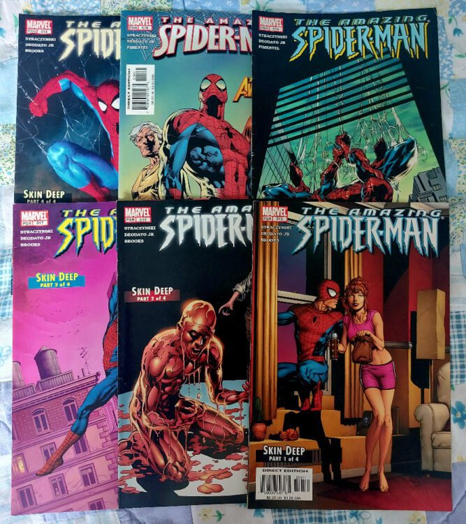
The Amazing Spider-Man #514 – 519.
This was the start of a long run of Spider-Man comics that I’m reading. Spider-Man is my go-to comic when I need a pick me up (Doctor Who is the television equivalent) and I enjoy mindlessly re-reading the older Spidey comics in my collection.
Various The Amazing Spider-Man comics Credit: Marvel Comics
Week 37:
Doctor Who: Once upon a Timelord and Werewolf by Night #1 (2023)
These two titles shared one thing in common: I enjoyed the thought of them more than I did the reading.
The Amazing Spider-Man # 520 – 524
More classic Spidey. It saddens me that I can correctly refer to comics published in 2005 as “classics.”
Various Spider-Man titles Credit: Marvel Comics
Week 38:
The Other: Evolve or Die (featured in Friendly Neighborhood Spider-Man #1-3, Marvel Knights Spider-Man #19-20, The Amazing Spider-Man #525 – 526)
This is the first half of my readthrough of the surprisingly-not-actually-that-controversial Spider-Man story The Other. The basic premise is that Spidey is being stalked by Morlun, who can sense that Spidey will be at his weakest very soon, perfect for the life sucker to strike. Spidey’s luck almost runs out when he is shot by Tracer, a two-bit villain with an inflated sense of importance, and Morlun strikes, beating the superhero to within an inch of his life and tearing out one of his eyes.
In the hospital, Morlun makes his final move but is stopped initially by Mary Jane. When Morlun threatens her life, Peter has one last outburst of strength and attacks Morlun; fury spreads across his mutilated face and stingers spring from his arms. He dispatches Morlun but the cost is his own life. And so ends the story of Peter Parker, the Amazing Spider-Man.
The build up to his death is actually very entertaining and, in many moments, quite tense. The violence that runs through this story is not toned down and Morlun’s first attack on Spidey is brutal. There is a consistency to the characters and the narrative across the various titles which is a testament to the writers and artists who worked on each title. This reads like a single story from a single comic and not a crossover event.
Obviously the ‘death’ of Spider-Man would be big news and many fans would have their opinions, but unlike other high profile death storylines, it’s made very clear that this isn’t going to be a lasting event. This story is less about the actual death and more about what comes next. So what did writer J. Michael Staczynski have planned for everyone’s favorite wall crawler?
The Other in Spider-Man Credit: Marvel Comics
Week 39:
The Other: Evolve or Die (featured in Marvel Knights Spider-Man #21-22, The Amazing Spider-Man #527 -528, Friendly Neighborhood Spider-Man #4)
As with all changes made to legacy characters, there are some fans who get their panties in a twist, but I think The Other didn’t get chance to make a lasting impression on the hive mind. Possibly, the reason for this is that it is bookended by two much more controversial stories. Pre-The Other, in the story Sins Past, Staczynski introduces the children of Gwen Stacy and Norman Osbourne. Post-The Other (and post-Civil War), the same writer* ret-conned the marriage of Peter Parker and Mary Jane, thus changing decades of storylines. In essence, everything that happened in The Other was overshadowed by three stories that surrounded it.
Personally, I love The Other. I think the way that the story unfolds is intriguing and handles the concept of premature death with compassion. The interactions between Peter and Mary Jane are touching, and MJ’s reaction to Peter’s death is moving and heartbreaking. The story also allows the creators to show how the superhero world would deal with such a death, offering a different perspective on the superhero genre, something that was done well in the aftermath of Superman’s death in the 1990s.
As a standalone story, The Other is definitely worth checking out and, from my point of view, it’s a shame that the changes Spidey went through never really got the chance to be investigated.
And to finish off the last 6 weeks (has it been that long?) I read Nightmare on Elm Street #1-2 by Innovation Comics. The story links into the first three movies, employing characters from the cinematic adventures to once again fight Freddy. Andy Mangels nails the characters and creates sequences straight from the 1980s slasher movie genre. Tony Harris’ painted artwork is beautiful and reminds me of the more expressive artwork of the 1990s. It was an enjoyable read back then and has stood the test of time in the same way that the early movies have. Yes, there are some rough edges but isn’t that what we want from this genre?
A Nightmare on Elm Street #1-2 Credit: Innovation
That takes us up to Comic Number 271.
*Sort of. The production of this story is, itself, quite a controversy and led to falling outs between writers and editors at Marvel.
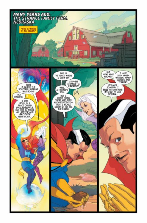
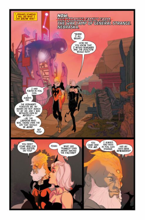
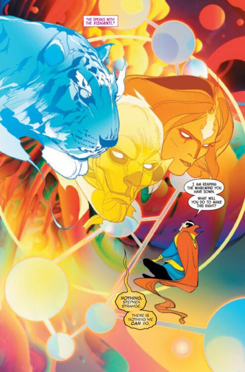
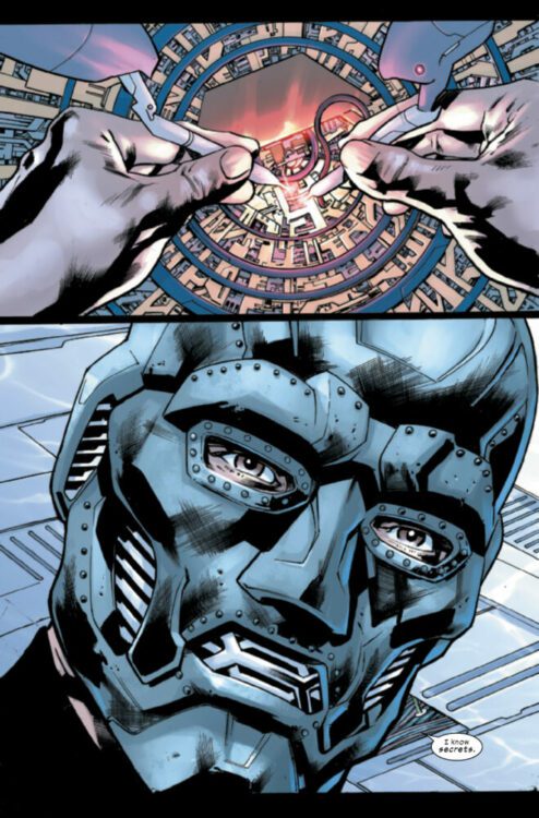
DOCTOR STRANGE #8 hits your local comic book store on October 4th, but thanks to Marvel Comics, Monkeys Fighting Robots has an exclusive four-page preview for you!
About the issue: With the enemy revealed, Doctor Strange and his allies rush to confront his evil doppelganger, General Strange! But does the Doctor stand a chance again the General’s five thousand years of experience? And will Stephen and Clea’s marriage hold in the face of such a threat?
The issue is by writer Jed MacKay and artist Pasqual Ferry, with colors by Heather Moore, and letters by Cory Petit. The main cover is by Alex Ross.
Check out our DOCTOR STRANGE #8 preview below:
Have you been reading DOCTOR STRANGE? Sound off in the comments!
USAGI YOJIMBO: ICE AND SNOW #1 hits your local comic book shop today from Dark Horse Comics; this is my introduction to the character, and it was awesome! Stan Sakai is the cartoonist and creator of the series, with colors by HiFi Colour Design. Check out my full review below.
About the USAGI YOJIMBO: ICE AND SNOW #1: Usagi and Yukichi are still in the snowy mountaintops of Northern Japan, following Stan Sakai’s Usagi Yojimbo story arc, “The Green Dragon.” They are led to the hut of a strange woman hermit who allows them to spend the night. Meanwhile, the maniacal Jei and his familiar, Keiko, are on Usagi’s trail when they stumble upon a bandit lair and subdue the band of cutthroats and thieves. * A new story starring Usagi Yojimbo and the new character, his cousin, Yukichi! * Follows directly after the story The Green Dragon.
Sometimes taking in a new comic is like having a wrestling match with your expectations. You have to push through what you thought something would be to see it for what it is. Marvel Comics’ Ultimate Invasion feels completed unexpected. In some ways, it feels like it delivers less than what it says on the box, but in a much more real way, it’s about so much more than you’d think. Writer Jonathan Hickman, penciller Bryan Hitch, inker Andrew Currie, colorist Alex Sinclair, and letterer Joe Caramagna dress their story up as a multiversal epic. What they deliver instead is a down-to-earth discussion of politics, power, and responsibility.
Writing
Hickman’s first issue of this run is a kind of fake-out. We are introduced to a cat and mouse game between the Reed Richardses of different realities. The Maker — the evil Reed Richards of Universe 1610 — has begun gathering resources to jumpstart a universe of his own. As he dives into a portal, the main Marvel Universe’s Reed Richards solemnly promises to hunt his evil doppelganger down. But that’s the last we see of Mr. Fantastic, and the scope of this series never again travels outside the borders of the Maker’s newfound reality, Universe 6160. The story Hickman actually has in store for us is more contained and far deeper than the one he’d have us expect to find.
It’s in 6160 that we meet the Maker’s new adversary, the playboy billionaire Howard Stark. It’s through Howard that Hickman really dives into his discussions of power and responsibility. Everything about Howard would make you think he would be more than willing to fall in line with the Maker’s way of doing things. He’s a filthy rich, powerful, middle-aged white man who has benefited greatly from the way that things are. Why would he want things to be any different? The main reason Hickman gives us is that he has a son, the familiar Tony Stark, whose young eyes are perhaps more ready to see how the world should be.
In Ultimate Invasion, Hickman discusses world politics, the human need for conflict, and the diabolical cost of “perfection.” But this series isn’t just big picture. It doesn’t just deal with nation-states and world tyrants. Our window into this world, Howard, is also a beautifully human character. While others are discussing how to trick the world populace into staying peaceful, he’s desperately trying to figure out what it means to do something that’s truly right. His discussions with Tony weigh heavily on his soul and pull you headfirst into the stakes of the story. Hickman really does build a new universe in these pages — we get fantastic new versions of many well known characters. But it’s ultimately the subtle emotions and intimate struggles we see take place that pulls this whole series together.
Art
A big reason that Howard is such a likeable character is because he seems to be the only person who actually feels what’s happening around him. In a room full of unfeeling political puppeteers, it’s only Howard who looks disturbed by their decisions. Hitch and Currie often show Howard looking away from the reader. His back is turned to us or he’s got his head down. He looks at Tony from the corner of his eyes and is often seen with his face in his hands. Nearly every panel Howard is in has him with a look of subtle sadness. The world is falling apart around him — or rather, it’s being held together in ways he can’t abide — and you can see just how much he’s kicking himself for not doing more.
Hitch and Currie’s attention to detail is also mesmerizing. On pages full of characters in action, all of which seem to clamber over one another, the linework is clear and specific. People are rarely shown as silhouettes and even then it’s when they’re practically dots on the horizon. Similarly, you often see what look like identical images being reused for efficiencies sake. But there’s always a subtle change — the raising of an eyebrow or the shifting of a shadow — that show these to be wholly new panels. The page layouts feel incredibly conventional and ordered. You don’t get any panels overlapping each other or tilting at strange angles. This is the Maker’s meticulously crafted world that we’re seeing, and Hitch and Currie never let us forget that.
Coloring
Sinclair highlights a very specific shift that happens when we travel from the main 616 universe to the Maker’s 6160. In 616, nearly every scene is shown in some dramatic, colorful lighting. The assault on Damage Control is cast in a deep red glow. The confrontation between Miles and his “brother” from another universe is set in a cool blue. When the Illuminati are hot on the Maker’s tail, the moment crackles with orange life. But when we enter into 6160, everything becomes a little more realistic. Sure, there are still splashes of color, but they’re rarer. Most scenes are full of muted, run-of-the-mill, everyday colors — with one notable exception. When the Maker takes Howard Stark deeper into the City, the panels are all depicted in a blue haze. It’s as though the Maker is trying to start fresh and leave all the drama of 616 behind him, but he’s been changed by his stay in that universe, whether he likes it or not.
There are a few other instances that Sinclair uses similar methods to get a message across. When the heads of nation-states callously discuss the fate of the world in their secret meeting, the entire room is gold, white, and green. It’s opulent, yes, but it actually isn’t very eye-catching on the page. Instead, it’s the vibrant costume pieces that these characters wear that jump out at you. They’re reveling in being front and center in the political spectacle they’re all putting on, but they’re also unrealistic. You immediately feel that these caricatures ought not to be the ones deciding the fate of your average man. They’re far too “above” all of that to be relatable.
Lettering
Caramagna’s lettering is completely restrained in Ultimate Invasion. There are no flashy uses of word balloons or splashy sound effects. In fact, the entire series only has two sound effects. When they do show up, Caramagna depicts them in big, red, block letters to help them stand out. But otherwise, the lettering feels totally controlled. Because of this, it’s the incredibly small moments where Caramagna changes things up a little that carry the most weight. At one point, a character’s word balloon juts out past the borders of their panel. While this is a very typical convention in comics, it only happens once in this whole series and the line feels that much more sinister as a result.
When things finally come to a head in the concluding issue, Howard’s letters begin to vary. As he’s flung about in a battlefield, the “AARRGGHHH!” sound he makes is wobbly and stretches the edges of his word balloon. This marks a definite shift in the mood of the story, which Caramagna shows in the simplest of ways.
Conclusion
If you’re coming to Ultimate Invasion to read an adventure that spans universes, you’re going to get both less and more than what you asked for. This isn’t the explosive event it may seem like it would be. It’s a personal tale that feels like it has as much to say about the real world as it does about its own characters. It’s a story that’s more preoccupied with how hard it is to dismantle unjust systems than it is with magic hammers or heroic androids. And in many ways, Ultimate Invasion is just the beginning — there are plenty more Ultimate comics to come in the coming months. But it sets an interesting backdrop for the stories that are on their way. This isn’t a comic book universe like we’ve seen before. It’s not even much like the Ultimate Universe of the past. This is something knew that you don’t want to miss. The final chapter of this series, Ultimate Invasion #4, is out today from Marvel at a comic shop near you!
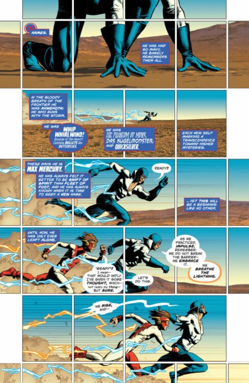
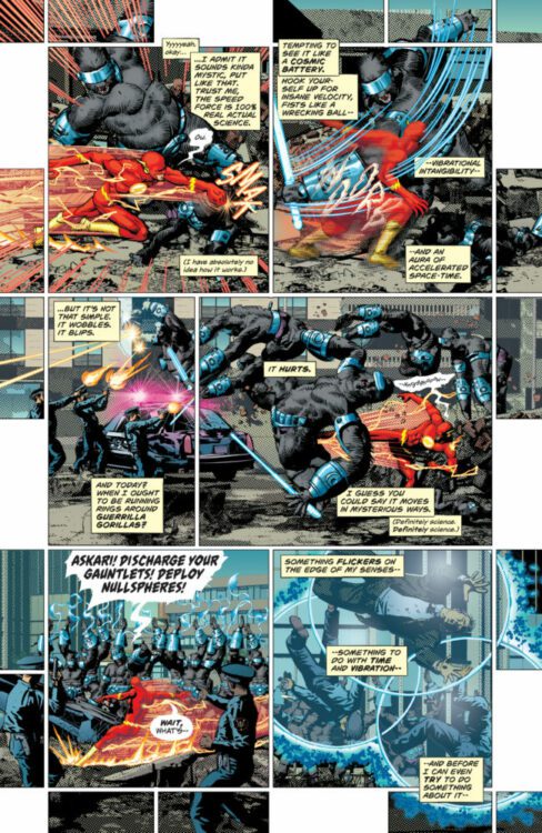
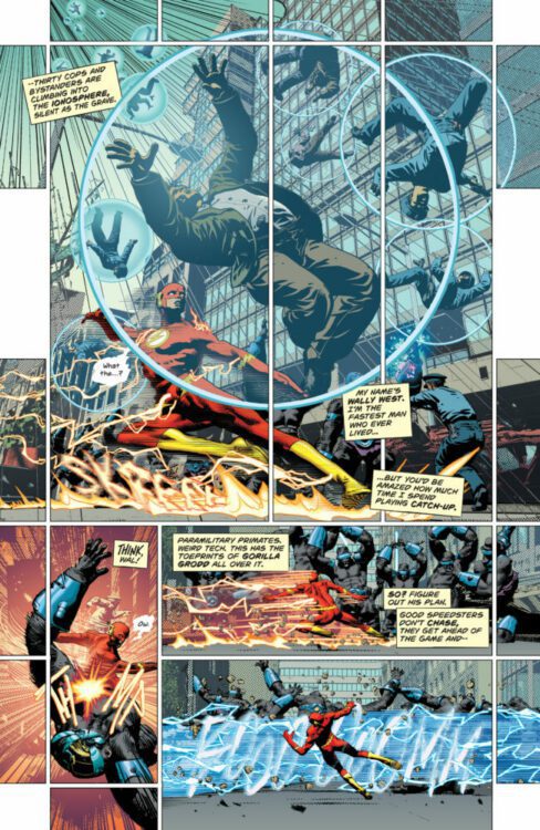
Most comics are either high concept romps through space and time or they’re intimate character studies with grounded stakes. Writer Si Spurrier, artist Mike Deodato Jr, colorist Trish Mulvihill, and letterer Hassan Otsmane-Elhaou assure us that The Flash #1 is not “most comics.” This creative team has brilliantly crafted a story that manages to have its cake and eat it too. Its wild and otherworldly moments are punctuated by realistic interactions between its accessible characters.
Writing
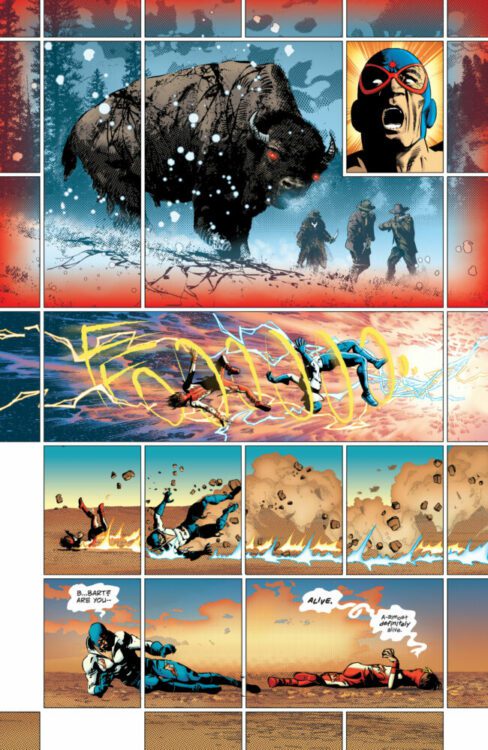
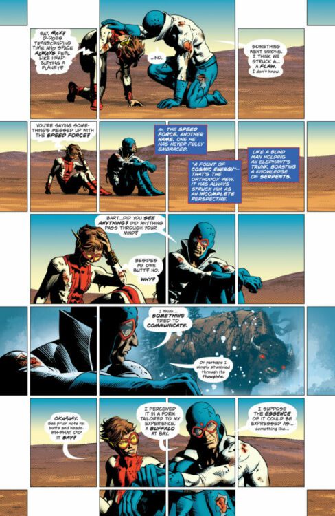
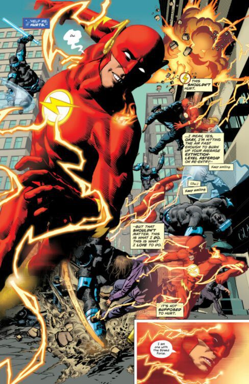
Spurrier feels like he’s totally cut loose in this script. He has his cast ripping holes through space and time, all while philosophizing about their powers. As Wally fights off an army of “guerilla gorillas” — you’ve got to love that wordplay — he’s also dealing with worries that the Speed Force isn’t behaving as it should. And when Wally comes home to his wife Linda, everything gets thrown into stark contrast. Spurrier writes Linda’s narrations like excerpts from a detailed newspaper article. She’s sitting in the midst of the chaos of being married to a superhero, feeling like life is rushing past her. It’s a scene that’ll make your heart ache while bringing a truly human perspective to what you’re reading. Linda isn’t the only one that Spurrier gives a unique voice to. In fact, that’s one of the highlights of this script. Every character feels so brilliantly distinct. Wally narrates as a good hero should, but his more repressed and anxious thoughts keep popping up and making him question his own bravado. Max Mercury is always eloquently dissecting everything he sees. And Irey — not unlike her dad — is doing her best to sound like a true superhero, even when she’s not sure what she’s doing.
Finally, there’s the spooky atmosphere that Spurrier creates. There are plenty of unexplainable goings-on that will send a shiver down your spine. Mostly, Spurrier has these developments show up as only brief flashes of information. We get panels, narrations, or even pages that break from the story to tease a greater evil. In fact, it’s when Spurrier brings some of these things into center stage that this issue loses some of its oomph. The final pages fall a little flat as the undefinable horror becomes a little less mysterious. But hopefully there’s far more going on here than meets the eye and Spurrier has shown us less than we think.
Art
Deodato Jr is the perfect artist for The Flash. All of his page layouts really give you the sense that you’re experiencing everything in hyper-speed. There are what feel like millions of panels breaking up each page. Often a single image is broken up into five or six panels, communicating that every second for a speedster feels longer than we can imagine. There are also amazing ways that Deodato Jr creates contrast between Wally and Linda. On one page, Linda sits on the couch as Wally whirls around her in a tornado of red lightning. Small panels frame her, showing the time that’s passing her by. She’s a constant in a storm, but she’s also left out of the busy rush of her husband’s life.
But it’s not just the big picture that Deodato Jr gets pitch perfect. His character acting is incredible. Rarely do we see any strong emotions on their faces. They’re subtle in their panic, anguish, and confusion. There are only a few big expressions that we see. Occasionally, Wally gives a big smile as he fights bad guys. It seems like he’s assuring everyone that he’s got everything in hand, but as the story progresses it seems more like he’s assuring himself of that. Elsewhere, we see Wally and Max Mercury both react to things they can’t believe they’re seeing. Their faces are full of unadulterated shock. Deodato Jr pulling back in every other moment makes these scenes stick.
Coloring
Mulvihill ties prime colors to the comic book action scenes we know and love. It’s when Wally is busting heads that everything feels like its coming through in shades of blue and red. Even when Mercury gets a strange warning from beyond the Speed Force barrier, the warning is shown through a haze of crimson and cobalt. But then, when we see Linda in her home, she’s wearing a purple robe, sitting on a brownish green sofa. Everything about Linda and her surroundings feels different, even mundane. She’s surrounded by the scarlet blur of Wally running faster than sound, while her own world moves at a steady and tedious pace.
Elsewhere, Mulvihill uses secondary colors to show that something is a little off. When Wally gets a flash from another dimension, the whole thing is in deep purple. When one character shows up to a big fight, they’re in a faded green T-shirt. We can immediately tell that this isn’t the place for them. They shouldn’t be there. The final page of this big confrontation confirms that suspicion. Every moment that we step away from the superhero world of prime colors, Mulvihill has us on the edge of our seats, waiting for something to go wrong.
Lettering
In the same way that Spurrier gives each character a unique voice, Otsmane-Elhaou gives each of them a specific font to match. Wally’s self-doubting patter is perfectly exemplified by his straight-laced capitalized lettering which are interrupted by little moments of lower case anxiety. Linda’s article-style narrations show up like neat blocks of text from a newspaper. Irey’s bright-eyed enthusiasm is communicated through little ripped up pieces of paper that are her caption boxes. We see where she has misspelled some words and crossed them out a few times, sometimes just going with a simpler word altogether. It tells us so much about the character in the subtlest way possible.
But Otsmane-Elhaou can be just as exciting as he can be subtle. This issue is full of word balloons exploding out into bigger word balloons. Characters dive through the “FOOOOOO” noise of a force that’s pushing them backwards. Connectors between balloons loop lazily and balloon tails melt down towards their speaker. At one point, the dialogue of some mysterious creatures looks like it’s on a deeper layer of the page and only part of the first layer has been scratched away. We see only part of what they’re saying as the letters continue off the side of their balloon, invisible to us. It’s magnificently infuriating, getting us hungry for more answers. There’s so much life to the lettering, here. At times, the words almost seem to be jostling together to get our attention.
Conclusion
DC Comics’ The Flash #1 is an incredibly promising start to a spooky, grounded, and wild new run on this beloved character. If you want to be intrigued by terrifying and mysterious forces, have your heartstrings pulled by relatable characters, and experience high stakes thrills — The Flash has all of that and more. Race over to your local comic shop to pick up The Flash #1, out today!
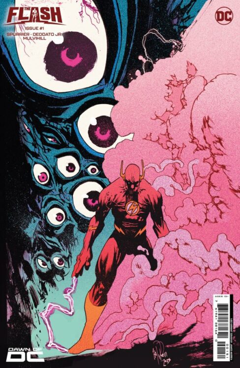
THE FLASH #1 hits your local comic book shop today, and all I could think about was how much this book felt like a VERTIGO comic. Si Spurrier and Mike Deodato Jr. are working on something special, and I’m excited to see how the first story arc plays out. Check out my review and a six-page preview below.
THE FLASH #1 is written by Si Spurrier, with art by Mike Deodato Jr., Trish Mulvihill drops the colors, and you will read Hassan Otsmane-Elhaou’s letter work.
About the issue: WALLY WEST RACES TOWARDS THE FUTURE WITH A NEW ALL-STAR CREATIVE TEAM! Wally West has never been quicker, more fulfilled, more heroic. His loving family is around him. And yet, something is off. Very off. His evolving understanding of his powers has opened Wally to new avenues of sci-fi adventure and attuned his senses to strange new ideas. Something whispers from the dark vibrations beyond the Speed Force, and as Wally experiments with creative new approaches to his powers, he encounters new realms, mysterious allies, and mind-shattering terrors. A new era for the Scarlet Speedster begins now from the team of Si Spurrier (Coda, Damn Them All) and Mike Deodato Jr. (Avengers).
")