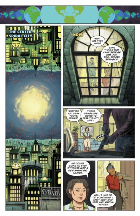
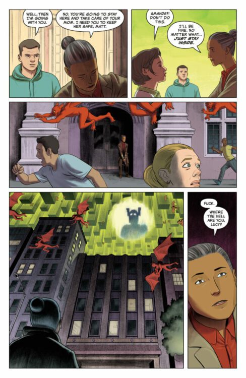
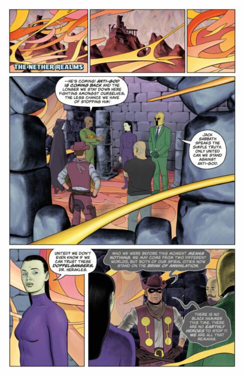
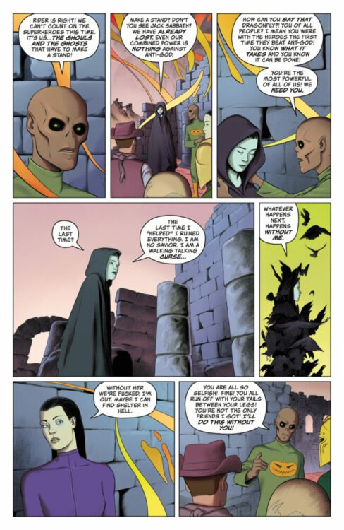
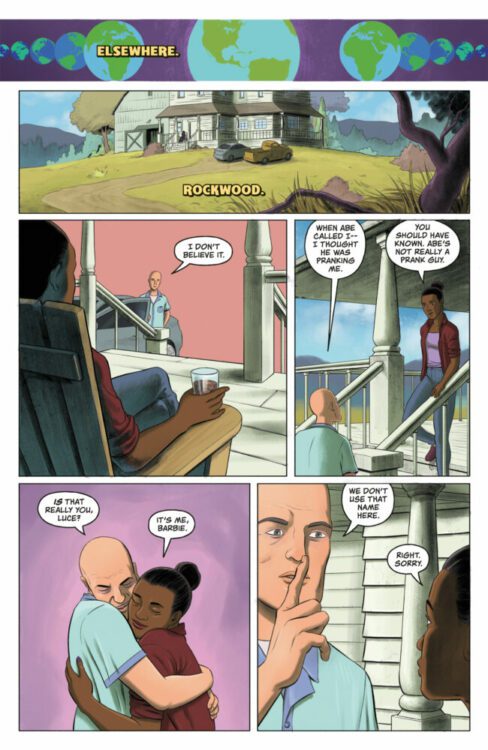
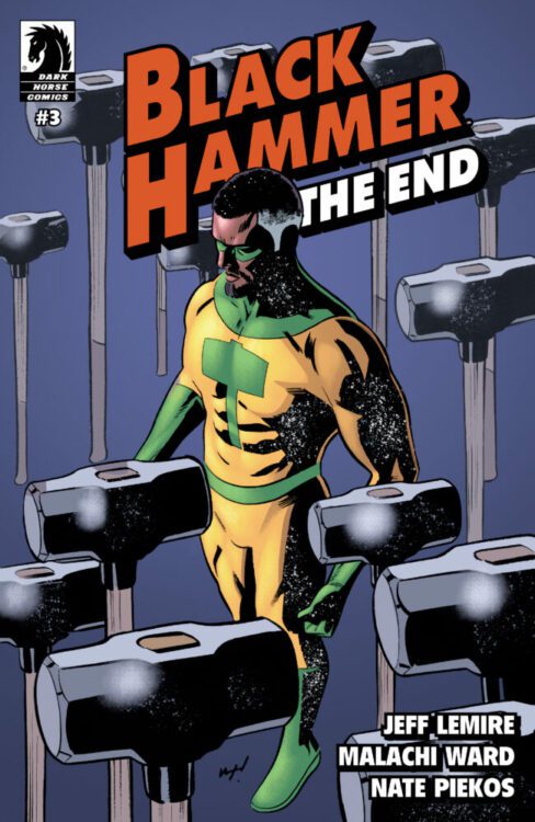
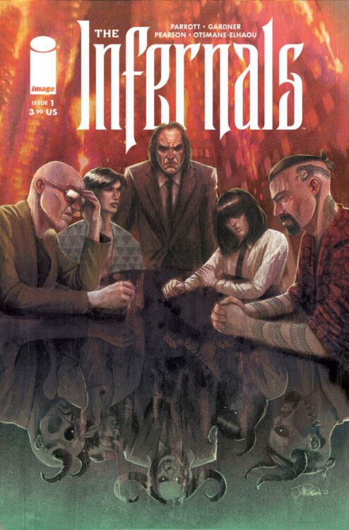
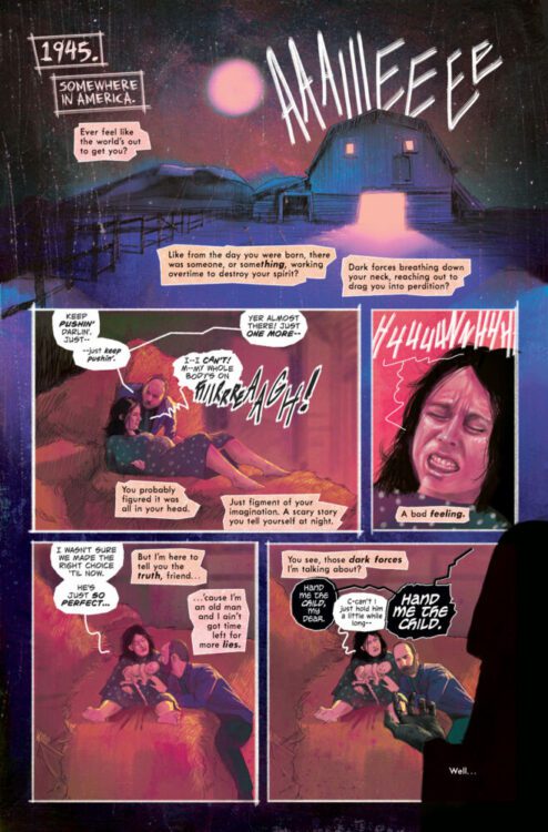
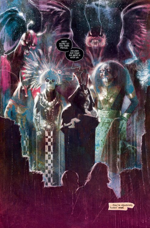
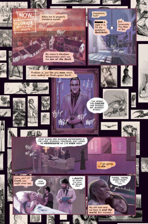
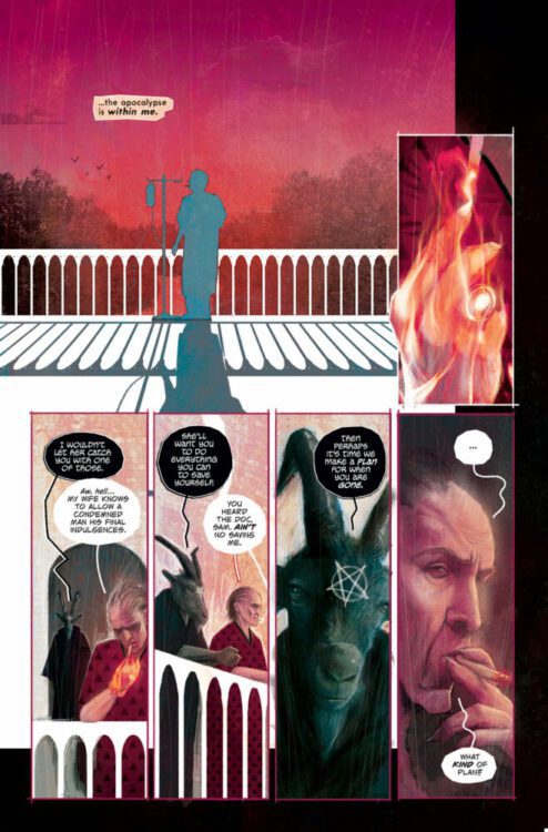
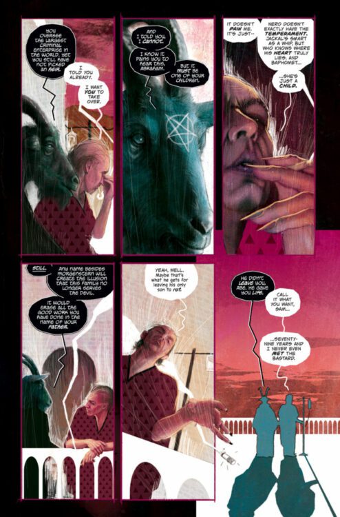
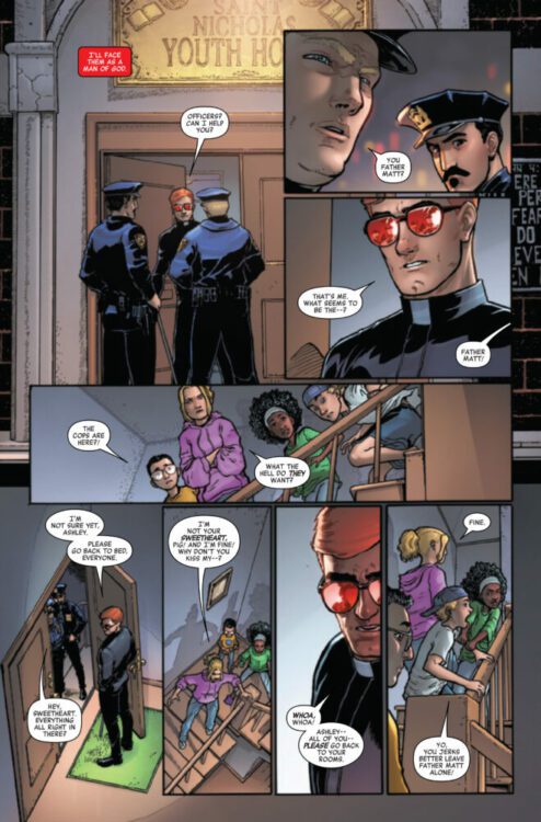
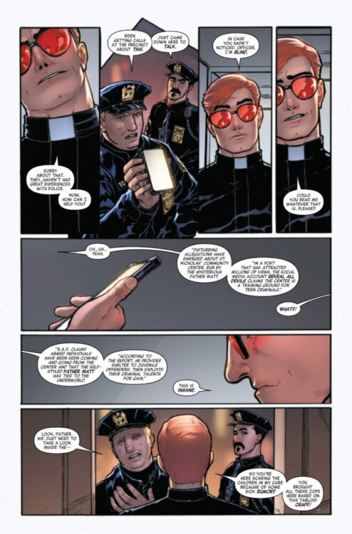
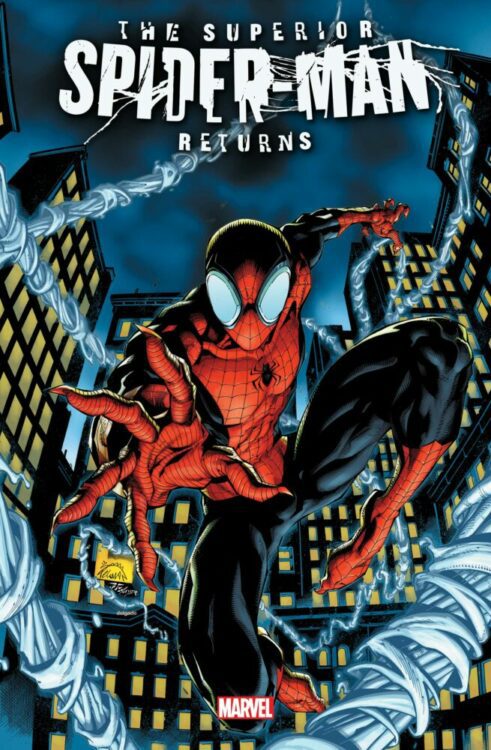
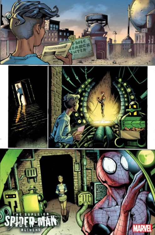
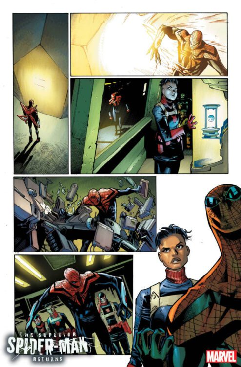
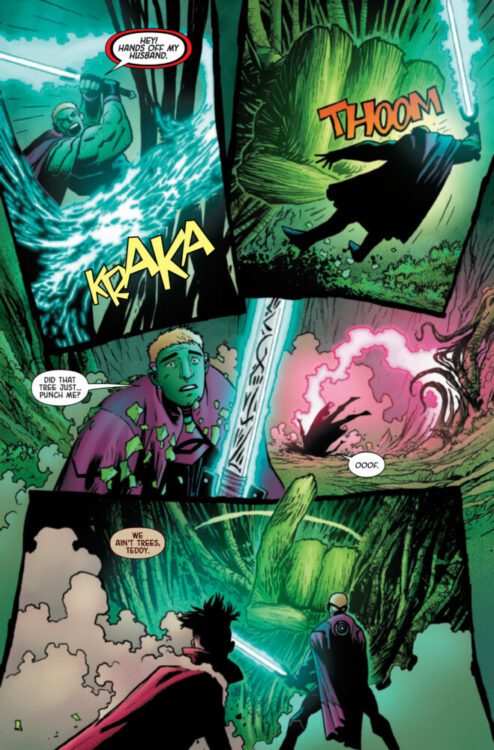
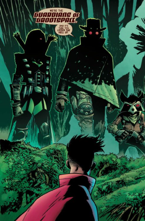
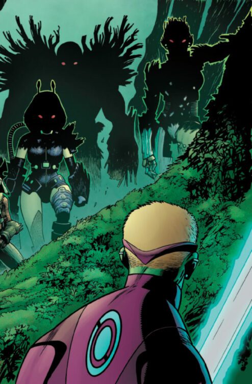
UNCANNY SPIDER-MAN #1 hits your local comic book store on September 20th, but thanks to Marvel Comics, Monkeys Fighting Robots has an exclusive four-page preview for you!
About the issue: THE NIGHTCRAWLING WALL-CRAWLER!
On the darkest of days, he is the spark in the shadows! After the devastating events of the Hellfire Gala, Kurt Wagner is on the run – and having the time of his life?! Swashbuckling about NYC in disguise, the Uncanny Wallcrawler sets aside his mutant angst and dedicates himself to the hero’s life: saving civilians, hanging with fellow wallcrawlers, battling baddies, and hunting down the best pizza on the planet. But he can’t ignore the mutant plight forever… Si Spurrier and Lee Garbett launch a joyful, sexy series that will shake Nightcrawler to his foundations – and have a hell of a good time doing it!
The issue is by writer Si Spurrier and artist Lee Garbett, with colors by Matt Milla, and letters by Joe Caramagna. The main cover is by Tony Daniel and Sonia Oback.
Check out our UNCANNY SPIDER-MAN #1 preview below:
Are you picking up UNCANNY SPIDER-MAN next week? Sound off in the comments!
From the acclaimed creative duo of writer Si Spurrier and artist Matias Bergara (John Constantine: Hellblazer; Step by Bloody Step) comes the next saga in their brilliant post-apocalyptic fantasy tale with Coda #1. Featuring lettering by Jim Campbell, this first chapter to their follow-up mini-series puts familiar faces in a series of increasingly complex conundrums – from mobs backed by religious propaganda to gnomes with firearms. With a dense, deeply clever script and staggering visual work, this sequel-series is off to a phenomenal start.
“In this brand new adventure in the apocalyptic fantasy world of Coda, the despondent bard Hum finds a slice of tranquility with his wife, the Urken named Serka, in an ever-darkening, magic-less apocalypse – or so it seems. Prophecies of paradise and the return of magic? Hum is skeptical, while Serka faces difficult moral decisions on the road, with winter quickly approaching…”
Writing & Plot
Si Spurrier drops readers new and old head first back into the world he and Bergara created in Coda #1. Taking place some years after the original series ended, Hum and Serka are living their lives keeping to their ways – with Hum preferring a quiet life away from others, Serka needing to take trips as a warrior in service of others. Naturally, things get complicated, and the pair are exposed to new, rising elements in a reality that is still reeling from the events of the last series. Spurrier does a great job setting this issue up for both newcomers and fans of the original series. The events of the last story are referenced from time to time, but there’s never a point where a newcomer may feel lost. Spurrier focuses his efforts on the here and now of this sequel series, and with the problems that have started to crop up. As with most of Spurrier’s work, much of this comic’s reading experience is tied to overhead narration that digs out the thoughts of the main character. The grumpy, sharp delivery in these boxes fits Hum’s personality very well, while also feeling like it’s the writer speaking to the audience. These blurbs do make the read more on the dense side, but they add tremendous personality to the script. Spurrier’s clever humor always lands with a mix of absurdity and the unexpected. Hum and Serka’s two very different experiences each have their own weirdness and increasing complications – complications that closely align with elements of our own world. Spurrier’s sometimes hilarious and sometimes deeply insightful dialogue gives all of his characters distinct personality while adding thematic weight to the story. Overall, this follow-up series is off to a brilliant start in terms of its unique storytelling sensibilities.
Art Direction
Few artists have as unmistakable an approach as Matias Bergara in the pages of Coda #1. His art is always amazing to witness, but what he does in Coda is pure comics magic. Bergara’s character designs for this world are a motley mix of shapes, sizes, and fantastical uniform. Hum’s now-iconic cloak, hat, and staff offset his grizzled appearance. His wife Serka is drawn with a Conan-like frame that can change into a twisted mass of berserker muscle. Every being, from gun-toting gnomes to the simple peasantry, make up an equal part of this menagerie of utterly unique fantasy. Bergara’s sequential direction carries the pacing perfectly, with an ever-shifting approach to panels based on what is happening in the plot. His colors are the stunning exclamation point to the visual experience that will draw readers to the pages with their vivid variety. Every panel is a collage of shades and contrasting tones, perfecting the collage-like numerousness of this world’s cast of beings. The lettering from Jim Campbell is just as clever as the rest of the book’s work. He fades and minimizes his fonts to capture the tone and volume of each character as they speak – especially useful for Hum since he mutters so much. Overall, the visual experience for Coda is a beautiful show of unique comics talent.
Verdict
Coda #1 is a phenomenal start to this sequel mini-series. Si Spurrier’s writing may be a bit dense for some, but its clever humor and poignant messaging make his script a hyper-engaging joy to read. Matias Bergara’s visual direction is singular and stunning, with a creative approach to character design and color art that will pull readers right into this world of strange fantasy. Be sure to grab this opening issue when it hits shelves on September 13th!
With Where the Body Was, Ed Brubaker and Sean Phillips have done it again. I mean really, this is starting to get old. Could they please just come out with one project that isn’t amazing? No, they’re too consistent in their ability to deliver a near-perfect comic. Yet they’re also so versatile in their style and tone. Where the Body Was is totally unlike anything they’ve ever done. And what’s even more brilliant is that it pretends to be just like their past works, sneaking up on you with its quiet discussion of memories and old wounds.
Writing
Brubaker frames this comic as a murder mystery and makes you think that’s all there is to it. We follow the residents of Pelican Road in the Summer of ’84. Based on the title — Where the Body Was — we know there’s going to be a dead body that shows up at some point, and that there’s going to be some question of how it got there. Brubaker knows that we’re going into his book with this preconception. The book then jumps around in time and between narrators with a looseness that almost makes it feel unplanned and disjointed. “How in the world is he going to pull this all together?” you find yourself wondering. But then there’s the conclusion. Like the rest of the story, it’s not flashy or mind-blowing. In fact, it’s beautifully simple.
That’s because this book doesn’t rely solely on the intrigue factor. It really isn’t a murder mystery, when it comes down to it. It’s not about the interlocking secrets all the characters are keeping from each other. It’s about the human hearts that beat in the chests of these complicated individuals. Brubaker lets the tropes of crime comics and whodunnits fall to the wayside in favor of diving into the intimate details of each character’s soul. By the time you’re finished reading, you’ll feel like you’ve met a new set of friends. Even with their sinister sides and their glaring imperfections, Brubaker writes his cast in a way that makes them hard not to love.
Art
There’s a wonderful chaos to Sean Phillips’ art. You feel so much movement is happening on the page. Primarily, this happens because Phillips flips the placement of his characters panel by panel. In one panel, Tommy is standing to the right of Karina’s father, listening to his questions. A couple of panels later it’s Karina’s father who’s on the right and Tommy who’s on the left. At first this would seem like this has to do with who speaks first in each panel — you generally want that person to be on the left. But this even happens in panels where no one is speaking or only a single character talks. Elsewhere, we see multiple point-of-view shots in a single page. The most effective use of this is when we see the titular dead body from one character’s perspective, but then the next panel seems to be from the angle of the body looking up through lifeless eyes at the shocked face of the person who found it. Because this is a book with many narrators piecing together what happened, it makes sense that Phillips’ pages look like a collage of different viewpoints. We’re constantly shifting perspective both in the writing and in the art.
Jacob Phillips’ coloring is — as always — outstanding. There’s just so much mood to everything he does. At one point, a character recounts old memories that make him feel various emotions. When he talks about his father’s unceremonious death, the panel glows with red anger. When he discusses his upbringing and old memories that feel distant and stale, the page yellows as if from years of wear and tear. When he talks about a fantasy he used to have where he felt cool and on top of the world, the panel is a soft blue. The whole comic is drenched with feeling. But it’s also just beautiful. The speckled look of Phillips’ pages, the textured unevenness of his brushstrokes and the vibrancy of his juxtapositions make every page feel rich and inviting.
Lettering
There’s a ton of variety to Sean Phillips’ letters, but none of them feel flashy or distracting. It’s the kind of thing where you don’t even realize the information he’s communicating with his subtle differentiations, yet you’re taking it all in on a subliminal level. It’s really simple things like the change of a font, or even the change of casing, that lets you know that we’re seeing things from another perspective now. Then there are the things he does to add a little touch of life to each panel. When a character hides behind a menu because she’s afraid of being seen, it doesn’t just cover her face but overlaps her word balloon a little too. When another character sits in traffic, the “HNNK HNNK” noise of a car behind him frames the whole scene. The sound is everywhere. Phillips works so particularly in his lettering to add to what you’re reading without you even realizing it’s happening.
Conclusion
Where the Body Was is a book that exists in its own class and genre. It rises above the simple tropes of murder mysteries to bring us more than just intrigue. You’ll laugh, cry, and love with these deeply human characters. Brubaker, Phillips, and Phillips have outdone themselves yet again. Their work has never been so paradoxically raw and thought out. All at once it feels like something that has been years in the making and like something created in a moment of uninhibited passionate creativity. It’s truly something to behold. Where the Body Was will be released by Image Comics on December 5th. Don’t miss it!
VENOM #25 hits your local comic book store on September 13th, but thanks to Marvel Comics, Monkeys Fighting Robots has an exclusive five-page preview for you!
About the issue: A TIME OF DOOM! SPECIAL OVER-SIZED ANNIVERSARY ISSUE!
Eddie Brock needed access to Doctor Doom’s time platform – and in getting to it, got more than he ever bargained for, battling the most notorious super villain in the Marvel Universe through time itself! Luckily, Eddie’s well versed in navigating the timestream thanks to his recent adventures. He’s poised to take his conflict with Meridius to its frenetic and fist-filled finish – if he survives DOOM! PLUS! Eddie’s battle with Doom will land him, briefly, in a very unexpected place…MIDTOWN HIGH SCHOOL! But what, or who, could he find there?
The oversized anniversary issue is written by Al Ewing, with art by Sergio Dávila & Sean Parsons, Ken Lashley, CAFU, and Julius Ohta. The colors are by Frank D’Armata, the letters are by Clayton Cowles, and the main cover is by Bryan Hitch and Alex Sinclair.
From writer Zac Thompson (Ka-Zar; The Dregs) and artist Valeria Burzo (Castle Full of Blackbirds) comes the tense adaptation of Dr. Colm Kelleher and George Knapp’s legendary paranormal research novel in Hunt for the Skinwalker #1. Featuring color art from Jason Wordie and lettering by Joe Sabino, this opening issue places the terrifying and unusual occurrences on the infamous Skinwalker Ranch from the perspective of a desperate family just trying to get by. With a creative adapted script and atmospheric visuals, this is a must for fans of horror and the paranormal.
“Unidentified flying objects. Animal mutilation. Terrifying otherworldly cryptids. Countless strange phenomena. For more than 50 years, a remote ranch in the Uinta Basin has been the most significant nexus for the paranormal. Inspired by one family’s confrontation with the unexplainable and terrifying… and what happened when they invited the largest scientific investigation of the paranormal to their ranch.”
Writing & Plot
Zac Thompson dives headlong into the strange and terrifying accounts of a family fending off all manner of paranormal activity in Hunt for the Skinwalker #1. Thompson’s writing consists of both character dialogue and overhead narration in the form of journal entry-type blurbs that provide additional context. Remember, this is an adaptation of a novel that investigated these very events and attempted to make some discoveries about just what the hell goes on at Skinwalker Ranch. Hunt is very similar to James Tynion and Michael Avon Oeming’s Blue Book: 1961, an adaptation of the famous “Hill Incident” alien encounters (and a comic I just recently reviewed). Tynion refers to this genre as “True Weird,” or stories based on unexplainable firsthand encounters. Thompson follows in this style by placing the story’s focus on the trials the Sherman family experiences as they simply try to get by. His use of the novel’s blurbs help maintain the nonfiction touch this adaptation is meant to have, but it still has the heart of human experience at the center thanks to the character work. Thompson maintains the litany of chaotic strangeness through suspenseful encounters from the Shermans’ perspective, as well as anecdotal flashbacks explaining what some of these cursed phenomena could be. Overall, Thompson does a stellar job of creating a narrative within what could almost be described as a paranormal autobiography.
Art Direction
Valeria Burzo is on hand to deliver a distinct, almost pulp-like visual experience to Hunt for the Skinwalker #1. Her visual style has a classic comic-strip feel to it, but with a more modern directional approach. Burzo’s thick pencils and heavy shadows make a comic that has a timeless essence to it – like it was pulled right out of a Tales from the Crypt or Eerie Magazine issue. She does a brilliant job of rendering the Sherman family as this normal group of people living on a farm – then juxtaposing that aesthetic with the horrors and oddities that come to visit. Her visual representations of the Skinwalker and various alien visitors are wildly unique. Their designs, coupled with how “quaint” the rest of the characters and environment feel, makes the strange encounters feel all the more outlandish. Jason Wordie’s color art goes a long way in perfecting this comic’s aesthetic. He uses a very Silver and Bronze Age color style to bring on a timeless aesthetic that makes the issue feel like a classic pulp comic at points. The dusty, sun-blazed desert range turns into the eerie star-filled night right before the panels explode with a litany of rainbow technicolor as UFO’s explode through the atmosphere. Joe Sabino’s lettering is easy to read but changes in font size and bolds to stress a sense of fear in the characters. He also uses a typewriter style font for the narration blocks from the novel that drive home the feeling of this comic being an accounting of “real” events. Overall, the visual experience crafted for Skinwalker goes a long way in making this comic feel like a frightening firsthand account and a strange folk tale all wrapped in one package.
Verdict
Hunt for the Skinwalker #1 is a stellar start to this new addition to the “True Weird” genre. Zac Thompson pens a script that adapts Kelleher and Knapp’s novel while still creating a character-focused narrative that lets readers share in the Sherman family’s horror. The visuals from Valeria Burzo and Jason Wordie create an eerie pulp-horror sensibility, but are still full of modern sequential direction that carries both the people-focused moments and the weird scenes a long way. Be sure to grab this debut issue when it hits shelves on September 6th!
We talk with writer Mark Russell about his latest book, Cereal, which hits your local bookstore on October 12.
About The Book
“What We Do In the Shadows” meets “Monster Squad” – a dark, distinctly adult—and lovingly funny—take on an earlier generation’s beloved monsters. The Marquis de Cocoa, recently transformed into a vampire, emerges from his castle’s crypt to face a deadly ordeal: He must brave the agony of sunrise and host another of the sumptuous breakfast parties he is known for, lest the townsfolk suspect what he has become and drive a stake through his heart. Other abominations—a creature composed of cadaver parts, a specter, a lycanthrope, a leprechaun—arise to threaten dangers of their own in this epic comedy of terror and tragedy.”
About Mark Russell
Mark Russell is the GLAAD and Eisner Award-winning writer behind The Flintstones, Second Coming, Billionaire Island, and Superman: Space Age, as well as many other comic book series.
EDITOR’S NOTE: Zac also wrote a piece about Cereal over on How To Love Comics.
BIRDS OF PREY #1 hits your local comic book shop today from DC Comics. Please stop what you’re doing and immediately pick up this issue; it is BONKERS GOOD! This book has a vibe, and it feels special. The last time I felt this way was watching GUARDIANS OF THE GALAXY VOL. 1 for the first time. With Kelly Thompson, Leonardo Romero, and Jordie Bellaire, you have fantastic writing and artwork; the second issue can’t get here soon enough. Check out my full review and a five-page preview below.
BIRDS OF PREY #1 is written by Kelly Thompson, with art by Leonardo Romero, Jordie Bellaire drops the colors, and you will read Clayton Cowles’ letter work.
About the issue: BREAKING HEARTS AND FACES—THE BIRDS OF PREY ARE BACK! Every mission matters. Every life saved is a miracle. But this time, it’s personal. Dinah Lance is one of the DCU’s most elite fighters, and combined with her sonic scream, she’s a fearsome foe in any scenario…but sometimes even the Black Canary needs help. Faced with a personal mission brought to her by a mysterious new ally, and up against near-impossible odds, she re-forms the Birds of Prey with an unrivaled group of badasses—Cassandra Cain, Big Barda, Zealot, and Harley Quinn—and only one goal: extraction without bloodshed. What could possibly go wrong? Kelly Thompson (Captain Marvel, Black Widow) makes her long-awaited DC Universe writing debut, and is joined by her Hawkeye partners-in-crime Leonardo Romero (BATMAN) and Jordie Bellaire (WONDER WOMAN) to debut an all-new, all-deadly Birds of Prey series…still breaking hearts and faces after all these years!
From modern all-star writer James Tynion IV (Detective Comics; Something is Killing the Children) and acclaimed artist Michael Avon Oeming (Powers; Cave Carson) comes a tense and fascinating adaptation of a *possible* first-hand alien encounter in Blue Book: 1961. Featuring letters from Aditya Bidikar, this 6-issue mini-series chronicles the events and subsequent fallout of the infamous Hill abduction incident – an account that effectively started the modern interest in UFO’s. With a thoughtful, compelling script and atmospheric visuals, this is a must-read for true horror connoisseurs.
“In Blue Book, teaming with artist Michael Avon Oeming and letterer Aditya Bidikar, Tynion presents what he calls his “True Weird” stories. Tales of ordinary people encountering the strange and the impossible. Volume 1 retells the infamous case of the abduction of Betty and Barney Hill of New Hampshire in 1961–the very first widely-publicized UFO abduction that went on to shape and influence all future encounter stories.”
Writing & Plot
James Tynion IV eschews much of his original writing style to create a journalist-esque recounting here in Blue Book: 1961. Tynion calls this genre, the genre of potentially *real* cryptid encounters, “True Weird” tales. Much of the story is told in factual paragraphs. Instead of dialogue balloons, we get a lot of boxes. This document-style overhead narration of the Hill encounter works perfectly, as it feeds the reader context while building atmosphere and tension. There isn’t much dialogue, but what there is feels natural while fitting into the story’s tone. While the real Hill incident is still a mystery, Tynion does a great job taking the couple’s real testimony and adding his own takes on their narrative. There’s a phenomenal sequence between Betty Hill and one of the visitors where Tynion writes their hypothetical dialogue and it works beautifully. One of the most impressive elements of Tynion’s comic writing is that he clearly understands how to leverage the visual medium. Large chunks of the story are told through silent sequential storytelling that adds both tension and mystery to this deeply fascinating sci-fi tale. Overall, Tynion does an incredible job of adapting this account from numerous sources and turning it all into a comic script.
Art Direction
The real storytelling draw for Blue Book: 1961 is the visual work of comics veteran Michael Avon Oeming. His unmistakable style fits perfectly into the mysterious narrative Tynion scripts based on these alien encounters. While Oeming’s pencils are of course distinct and impressive, it’s his use of color that is the real star here. His super-thin pencils work to create his usual unique style of character design, and allow for his dense color art to dominate the book’s aesthetic. The entire mini-series consists of only a few colors – black, white, and several shades of dark blue. The story takes place almost entirely at night or in dark offices, so Oeming’s color choice makes sense – but it’s his utilization of these colors that makes this book so special. The hill driving through the black and blue night as they’re suddenly blasted by the bright lights of a spaceship absolutely explodes off of the page. There’s a dreamlike sensibility to many of the scenes as the Hill’s process what has happened to them, and Oeming’s color art really carries that notion. The deep, eerie tone pulls readers into this thriller, but it avoids feeling entirely like a horror story. The Hill Incident as told by Oeming and Tynion is certainly an unnerving event, and this comic has its terror-filled moments, but much of the story is filled with a sense of wonder. Oeming’s sequential direction carries the story on with an eye for capturing moments that will stick with readers long after they’ve closed the book. The initial encounter is a masterwork of visual tension, with Hill’s nice vacation drive growing in terror and intensity as their alien visitors encroach ever closer. There’s a moment later in the book involving Betty and a compass that still sticks in my mind as a brilliant piece of quiet study. Oeming uses a grid-style page to show Betty piecing together parts of the night and the after-effects of their abduction. Aditya Bidikar finishes the book off with his expertly handled lettering. His fonts are easy to read and shift naturally with the tone of dialogue. The narration text mimics a typewriter font, and the actual style of the dialogue lettering has a distinctly classic appearance. This approach furthers the aesthetic of decades past, perfecting an already outstanding visual experience. Overall, the visual direction in this comic is a phenomenal work of atmospherically complex visual direction.
Verdict
Blue Book: 1961 is a fantastically original adaptation. James Tynion takes what is one of the most famous incidents in the world of “real” alien encounters and turns it into a series of tense, compelling scripts that do justice to the original account while creating a stellar narrative. The visuals from Michael Avon Oeming bring home the unique atmosphere of the comic with a simplistic yet deceptively complex use of color and his unmistakable style. The only problem with this collected edition? It lacks the great backup short stories that were featured at the end of every issue. If you’re a fan of strange tales of suspense, both real and fictional, then be sure to grab this collection when it hits shelves on September 19th!
SPIDER-GWEN ANNUAL #1 hits your local comic book store on September 6th, but thanks to Marvel Comics, Monkeys Fighting Robots has an exclusive five-page preview for you!
About the issue: GHOST-SPIDER vs. WHITE FOX!
Gwen Stacy technically isn’t even supposed to be in this universe, and now she’s cutting chem lab to go to…a theme park?! Wait, something doesn’t feel right here – and why is this masked fox attacking her? It’s symbiote versus the supernatural when GHOST-SPIDER and WHITE FOX get caught in Agatha Harkness’ tangled web in this rollercoaster of a rumble!
The issue is by writer Karla Pacheco and artists Rosi Kämpe & Marika Cresta, with colors by Irma Kniivila, and letters by Ariana Maher. The main cover is by R1c0.
Marvel’s CONTEST OF CHAOS is an event spearheaded by writer Stephanie Phillips, currently being told across eight annuals, and featuring Agatha Harkness using chaos magic to pit some of the publisher’s biggest heroes against one another. It all culminates in September’s AVENGERS ANNUAL #1.
Check out our SPIDER-GWEN ANNUAL #1 preview below:
Are you following Marvel’s CONTEST OF CHAOS? Sound off in the comments!
JUNIOR BAKER THE RIGHTEOUS FAKER #1, written by Joe Casey, with art by Ryan Quackenbush, hits your local comic book shop on September 20th from Image Comics. The first issue of the five-issue mini-series is crazy and trippy, with spectacular storytelling. Check out my review and preview pages below.
About the series: THE SURPRISE SEQUEL TO 2011’s BUTCHER BAKER THE RIGHTEOUS MAKER! Meet Daniel “Dizzy” Baker, a gonzo journalist chasing superhuman stories in a world that’s left superheroes behind. Stumbling onto the ultimate story, Baker embarks on a personal vision quest where his past and his future violently collide. Created and written by JOE CASEY, with art by dynamic newcomer RYAN QUACKENBUSH. A dark journey into a surreal family legacy, each issue contains a mind-bending 30 pages of story!