

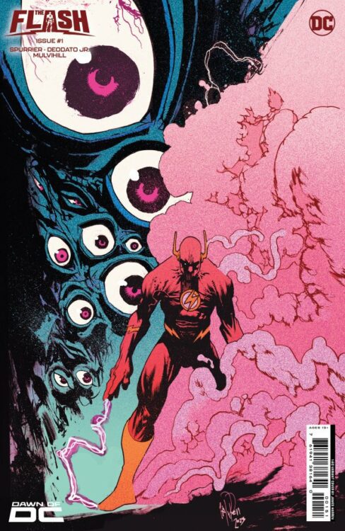
Most comics are either high concept romps through space and time or they’re intimate character studies with grounded stakes. Writer Si Spurrier, artist Mike Deodato Jr, colorist Trish Mulvihill, and letterer Hassan Otsmane-Elhaou assure us that The Flash #1 is not “most comics.” This creative team has brilliantly crafted a story that manages to have its cake and eat it too. Its wild and otherworldly moments are punctuated by realistic interactions between its accessible characters.
Writing
Spurrier feels like he’s totally cut loose in this script. He has his cast ripping holes through space and time, all while philosophizing about their powers. As Wally fights off an army of “guerilla gorillas” — you’ve got to love that wordplay — he’s also dealing with worries that the Speed Force isn’t behaving as it should. And when Wally comes home to his wife Linda, everything gets thrown into stark contrast. Spurrier writes Linda’s narrations like excerpts from a detailed newspaper article. She’s sitting in the midst of the chaos of being married to a superhero, feeling like life is rushing past her. It’s a scene that’ll make your heart ache while bringing a truly human perspective to what you’re reading. Linda isn’t the only one that Spurrier gives a unique voice to. In fact, that’s one of the highlights of this script. Every character feels so brilliantly distinct. Wally narrates as a good hero should, but his more repressed and anxious thoughts keep popping up and making him question his own bravado. Max Mercury is always eloquently dissecting everything he sees. And Irey — not unlike her dad — is doing her best to sound like a true superhero, even when she’s not sure what she’s doing.
Finally, there’s the spooky atmosphere that Spurrier creates. There are plenty of unexplainable goings-on that will send a shiver down your spine. Mostly, Spurrier has these developments show up as only brief flashes of information. We get panels, narrations, or even pages that break from the story to tease a greater evil. In fact, it’s when Spurrier brings some of these things into center stage that this issue loses some of its oomph. The final pages fall a little flat as the undefinable horror becomes a little less mysterious. But hopefully there’s far more going on here than meets the eye and Spurrier has shown us less than we think.
Art
Deodato Jr is the perfect artist for The Flash. All of his page layouts really give you the sense that you’re experiencing everything in hyper-speed. There are what feel like millions of panels breaking up each page. Often a single image is broken up into five or six panels, communicating that every second for a speedster feels longer than we can imagine. There are also amazing ways that Deodato Jr creates contrast between Wally and Linda. On one page, Linda sits on the couch as Wally whirls around her in a tornado of red lightning. Small panels frame her, showing the time that’s passing her by. She’s a constant in a storm, but she’s also left out of the busy rush of her husband’s life.
But it’s not just the big picture that Deodato Jr gets pitch perfect. His character acting is incredible. Rarely do we see any strong emotions on their faces. They’re subtle in their panic, anguish, and confusion. There are only a few big expressions that we see. Occasionally, Wally gives a big smile as he fights bad guys. It seems like he’s assuring everyone that he’s got everything in hand, but as the story progresses it seems more like he’s assuring himself of that. Elsewhere, we see Wally and Max Mercury both react to things they can’t believe they’re seeing. Their faces are full of unadulterated shock. Deodato Jr pulling back in every other moment makes these scenes stick.
Coloring
Mulvihill ties prime colors to the comic book action scenes we know and love. It’s when Wally is busting heads that everything feels like its coming through in shades of blue and red. Even when Mercury gets a strange warning from beyond the Speed Force barrier, the warning is shown through a haze of crimson and cobalt. But then, when we see Linda in her home, she’s wearing a purple robe, sitting on a brownish green sofa. Everything about Linda and her surroundings feels different, even mundane. She’s surrounded by the scarlet blur of Wally running faster than sound, while her own world moves at a steady and tedious pace.
Elsewhere, Mulvihill uses secondary colors to show that something is a little off. When Wally gets a flash from another dimension, the whole thing is in deep purple. When one character shows up to a big fight, they’re in a faded green T-shirt. We can immediately tell that this isn’t the place for them. They shouldn’t be there. The final page of this big confrontation confirms that suspicion. Every moment that we step away from the superhero world of prime colors, Mulvihill has us on the edge of our seats, waiting for something to go wrong.
Lettering
In the same way that Spurrier gives each character a unique voice, Otsmane-Elhaou gives each of them a specific font to match. Wally’s self-doubting patter is perfectly exemplified by his straight-laced capitalized lettering which are interrupted by little moments of lower case anxiety. Linda’s article-style narrations show up like neat blocks of text from a newspaper. Irey’s bright-eyed enthusiasm is communicated through little ripped up pieces of paper that are her caption boxes. We see where she has misspelled some words and crossed them out a few times, sometimes just going with a simpler word altogether. It tells us so much about the character in the subtlest way possible.
But Otsmane-Elhaou can be just as exciting as he can be subtle. This issue is full of word balloons exploding out into bigger word balloons. Characters dive through the “FOOOOOO” noise of a force that’s pushing them backwards. Connectors between balloons loop lazily and balloon tails melt down towards their speaker. At one point, the dialogue of some mysterious creatures looks like it’s on a deeper layer of the page and only part of the first layer has been scratched away. We see only part of what they’re saying as the letters continue off the side of their balloon, invisible to us. It’s magnificently infuriating, getting us hungry for more answers. There’s so much life to the lettering, here. At times, the words almost seem to be jostling together to get our attention.
Conclusion
DC Comics’ The Flash #1 is an incredibly promising start to a spooky, grounded, and wild new run on this beloved character. If you want to be intrigued by terrifying and mysterious forces, have your heartstrings pulled by relatable characters, and experience high stakes thrills — The Flash has all of that and more. Race over to your local comic shop to pick up The Flash #1, out today!